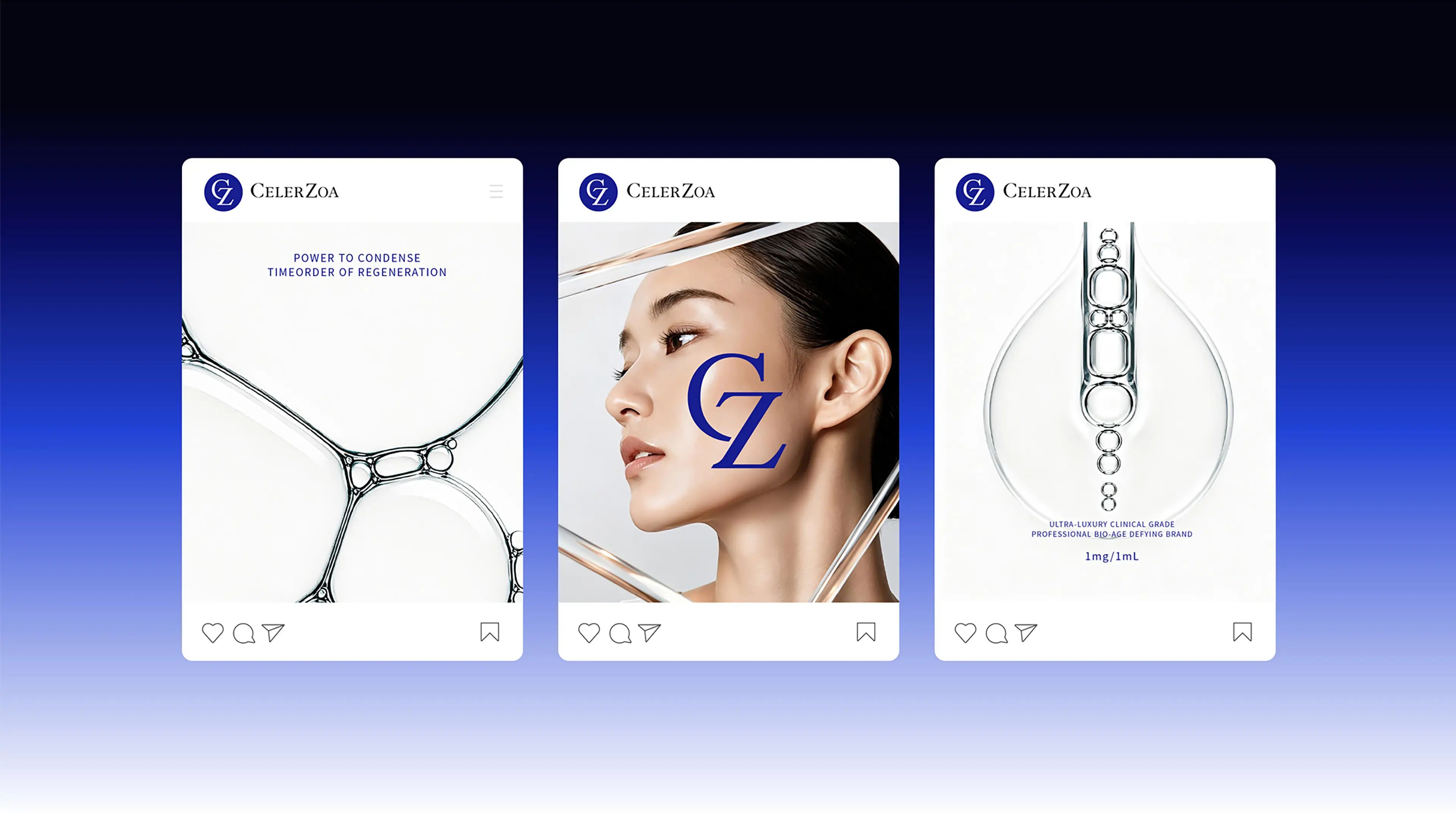

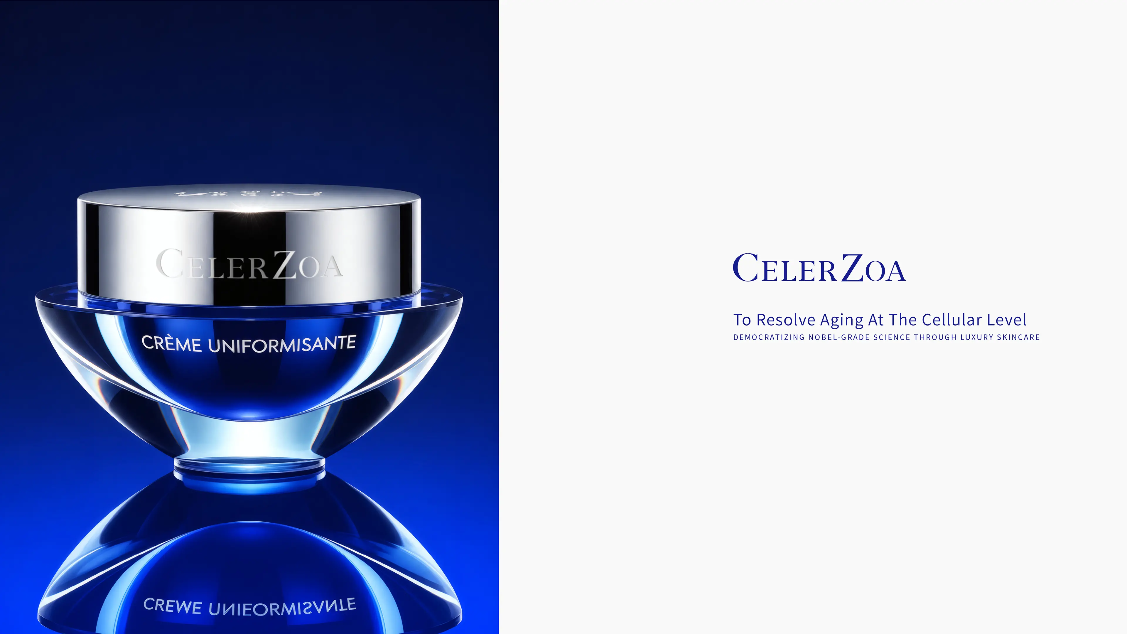

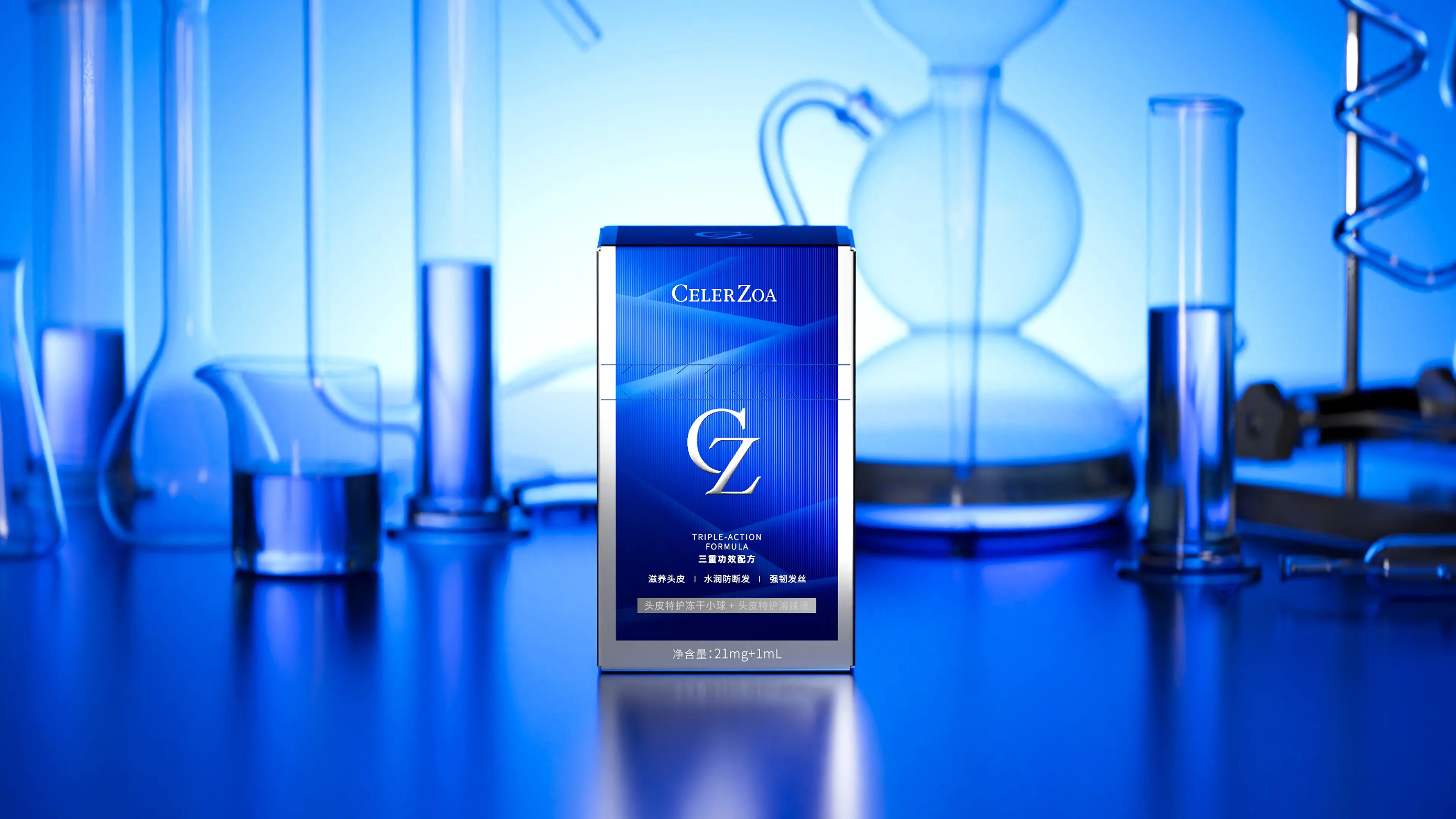
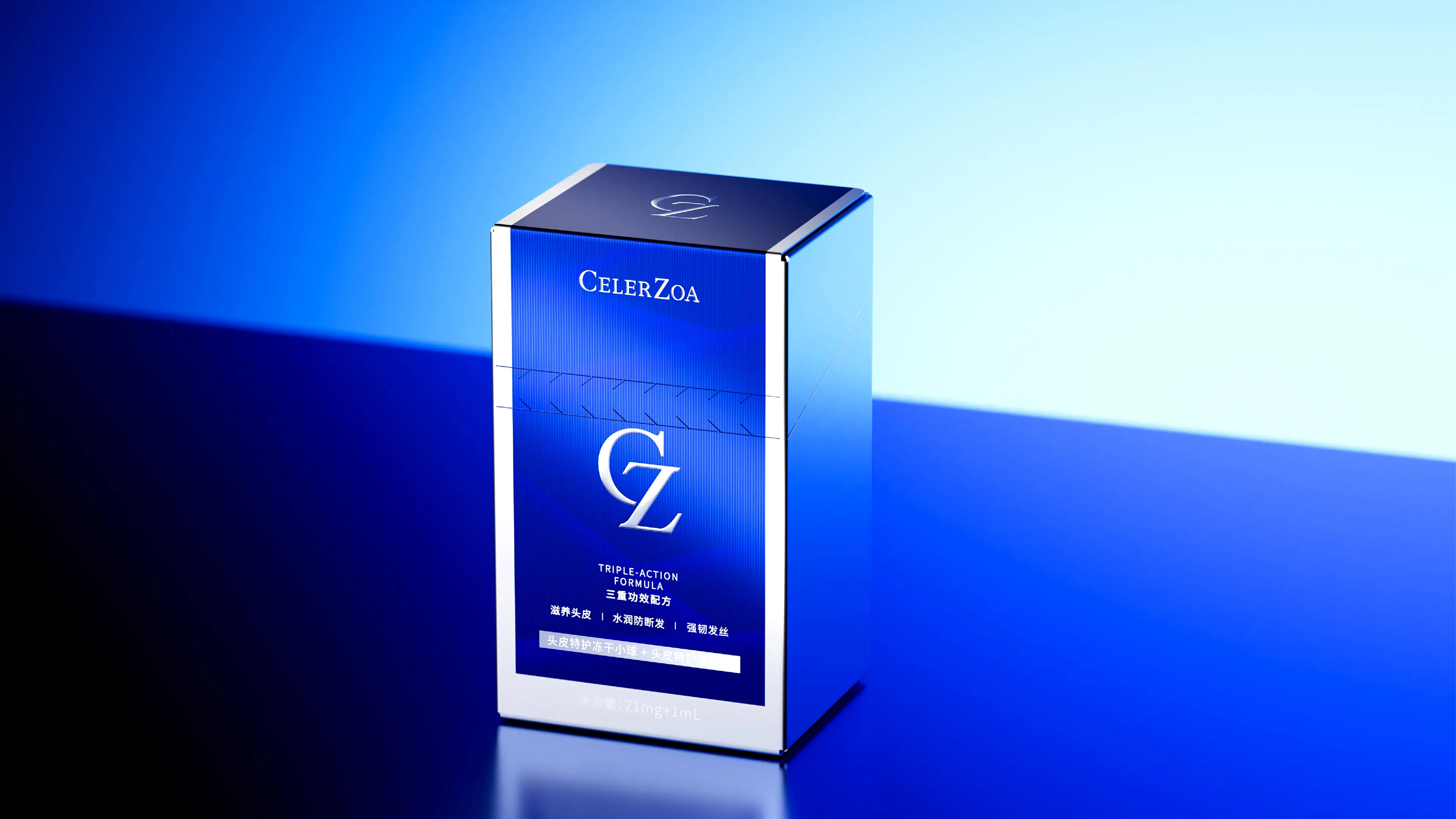
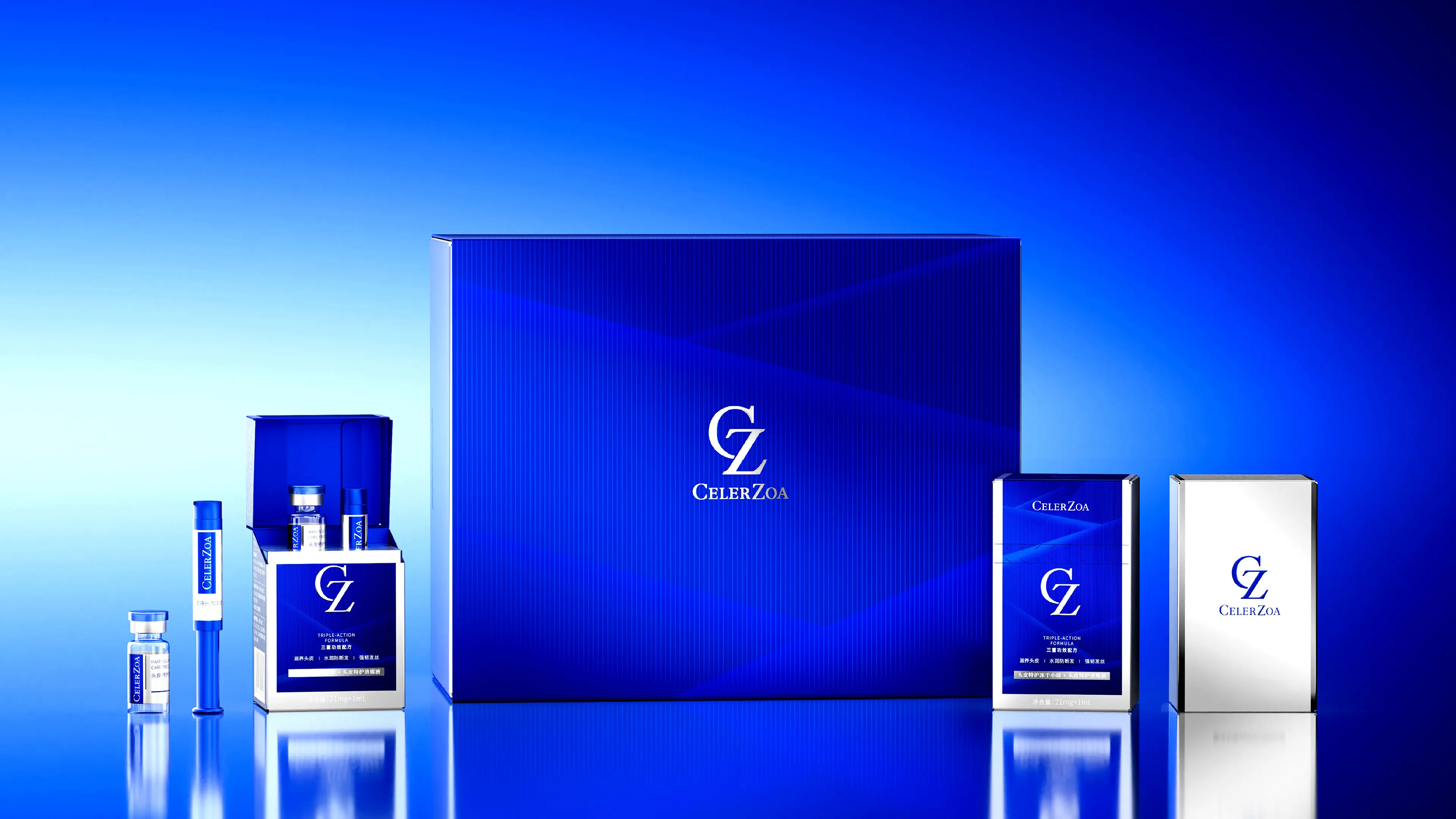
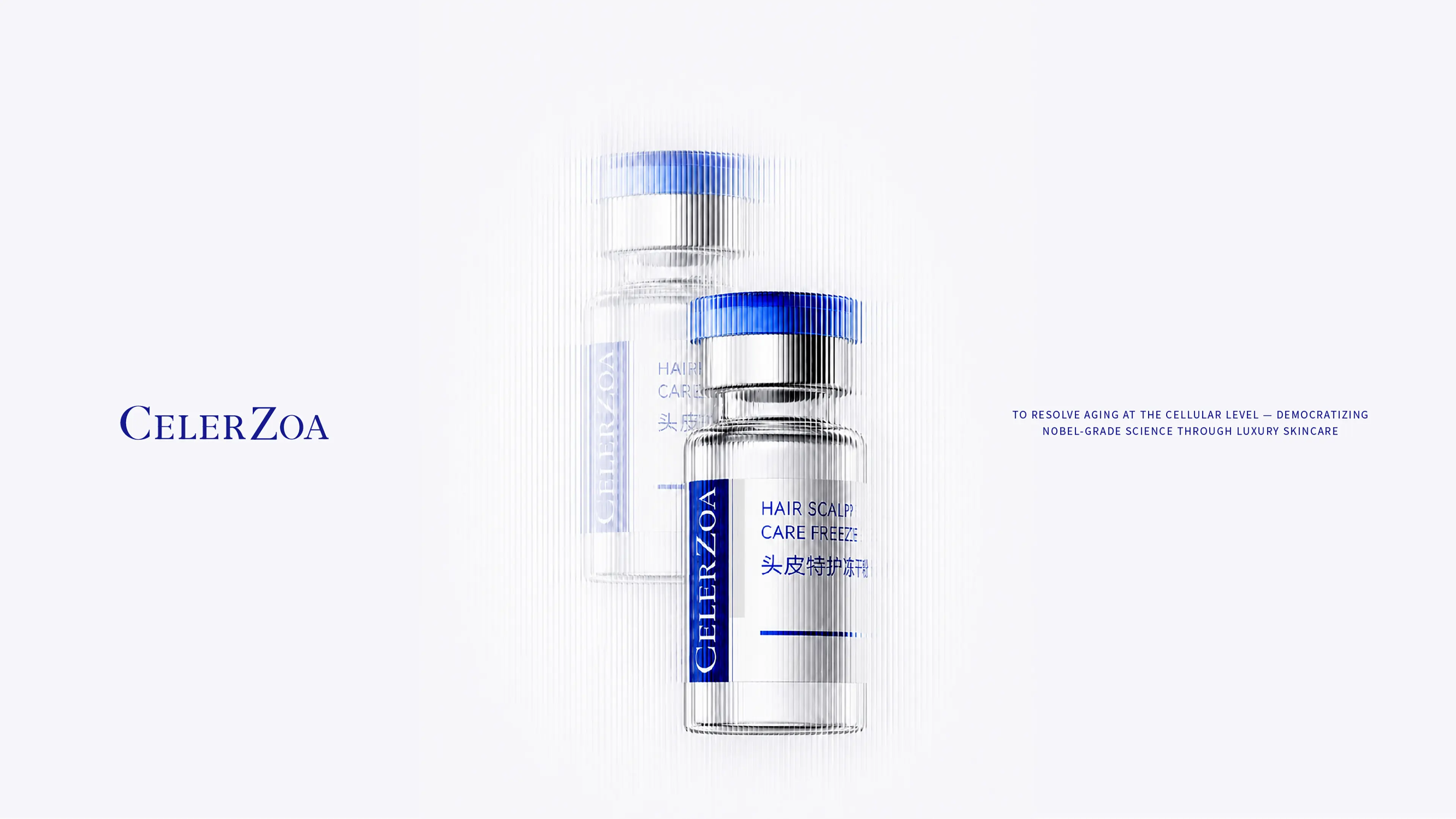
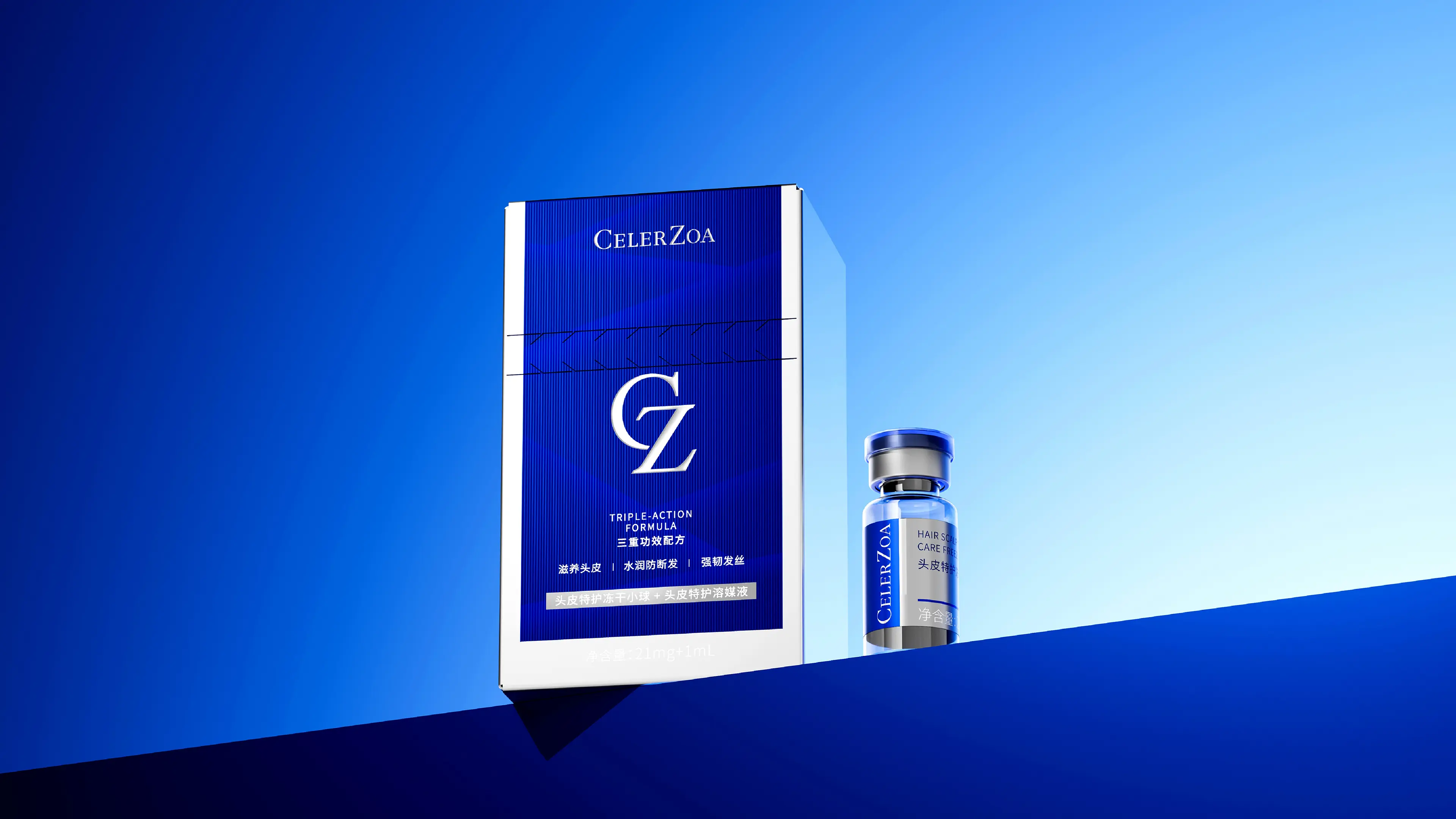
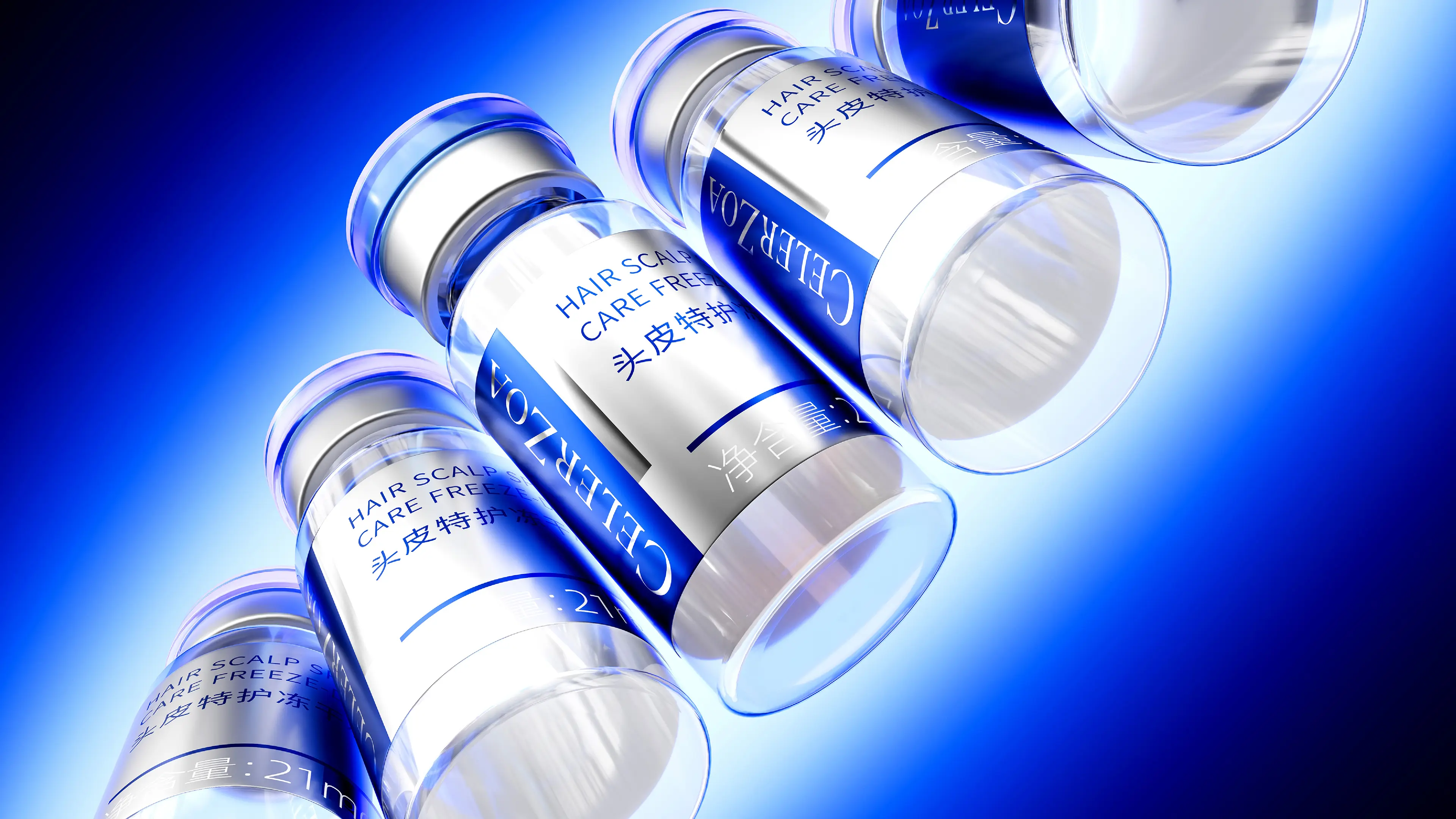

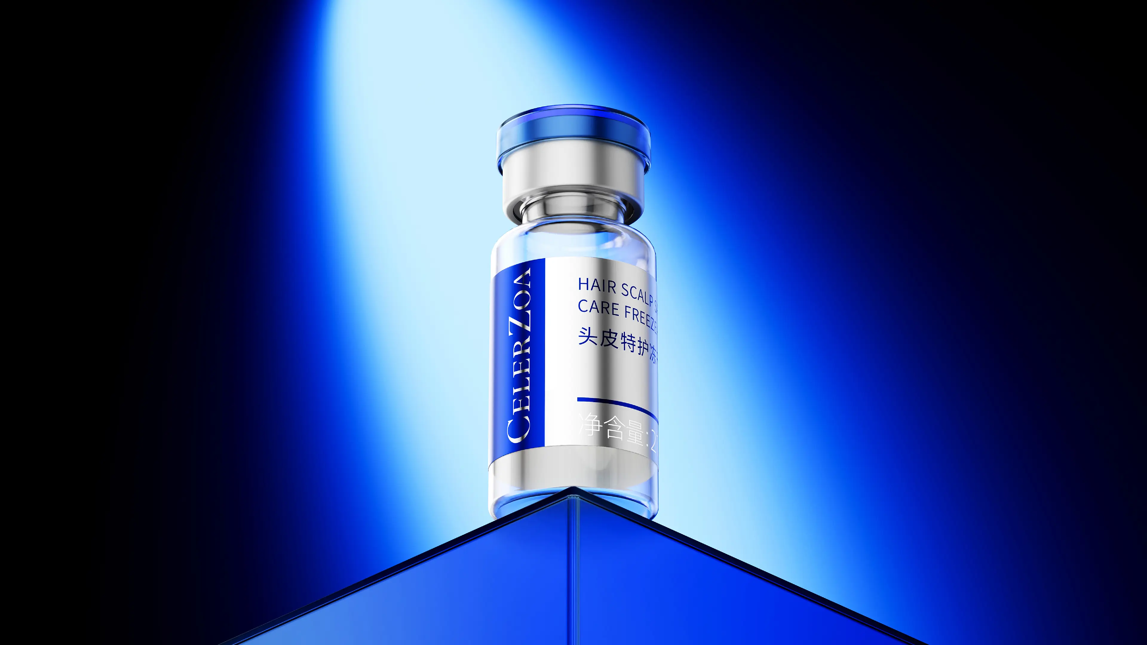
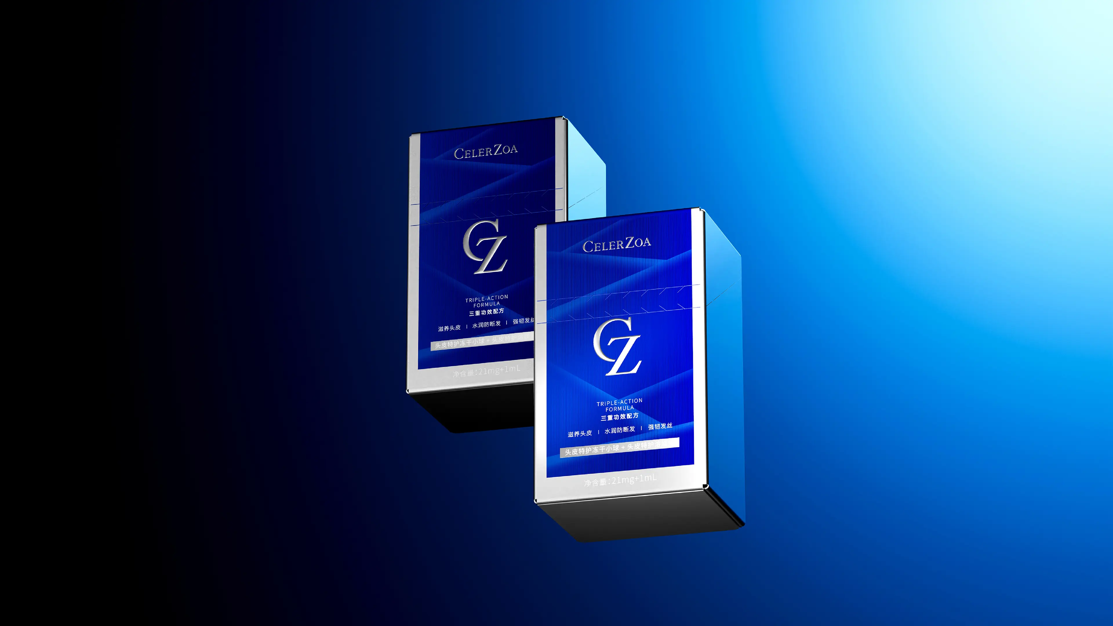
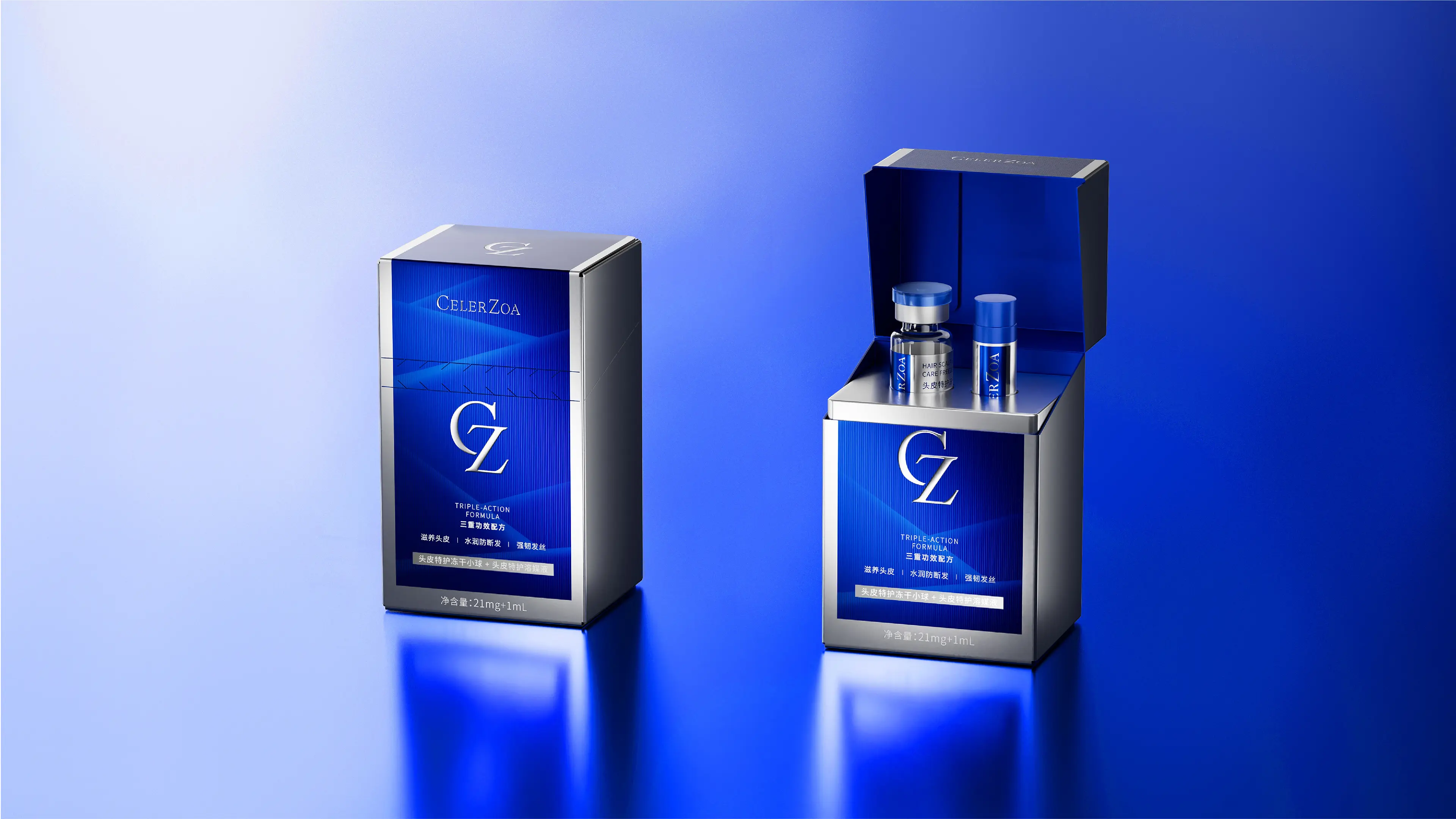
The brand initially faced three core issues. The brand image was unclear - the brand color was not defined, the high-end brand image failed to be effectively conveyed, and the visual and price positioning did not match. The brand name had a high memory cost - "CELERZOA" had 9 letters, and consumers in non-English speaking countries had an extremely high memory cost, which seriously affected the global communication efficiency. The packaging experience was lagging behind - the first hair growth essence used double vials for packaging, and it required mutual pouring during use, making the operation cumbersome and prone to spillage.
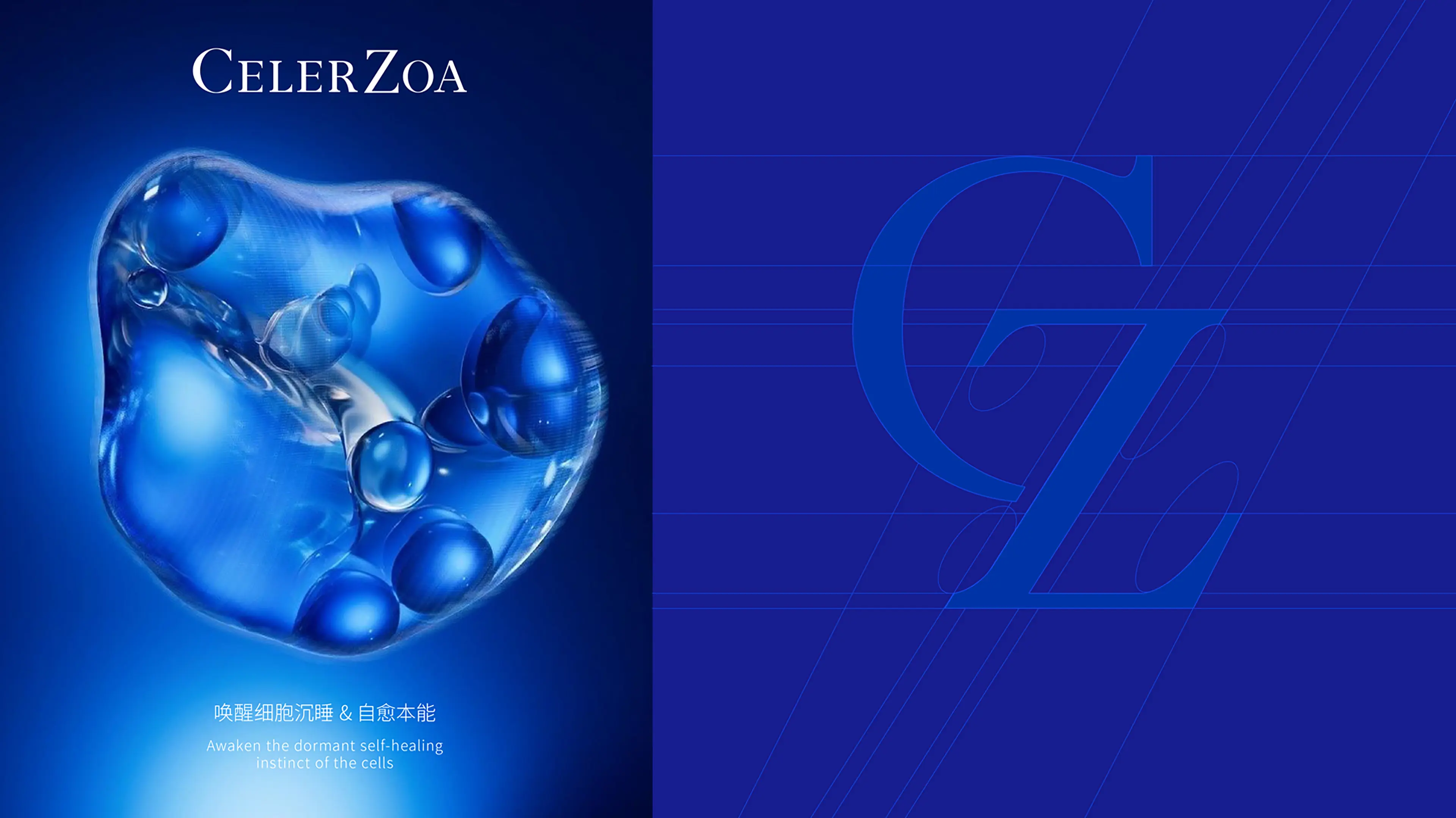
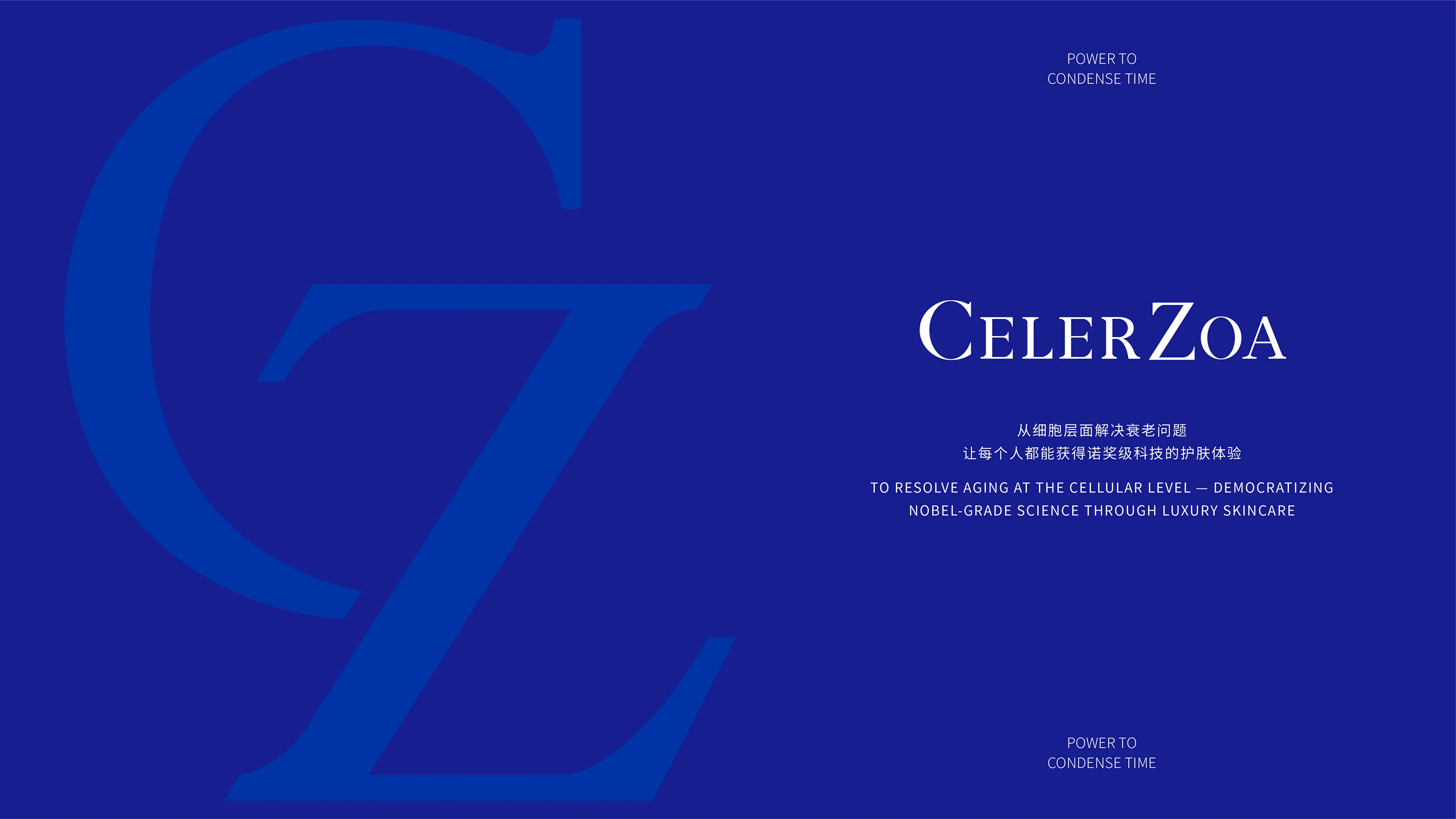
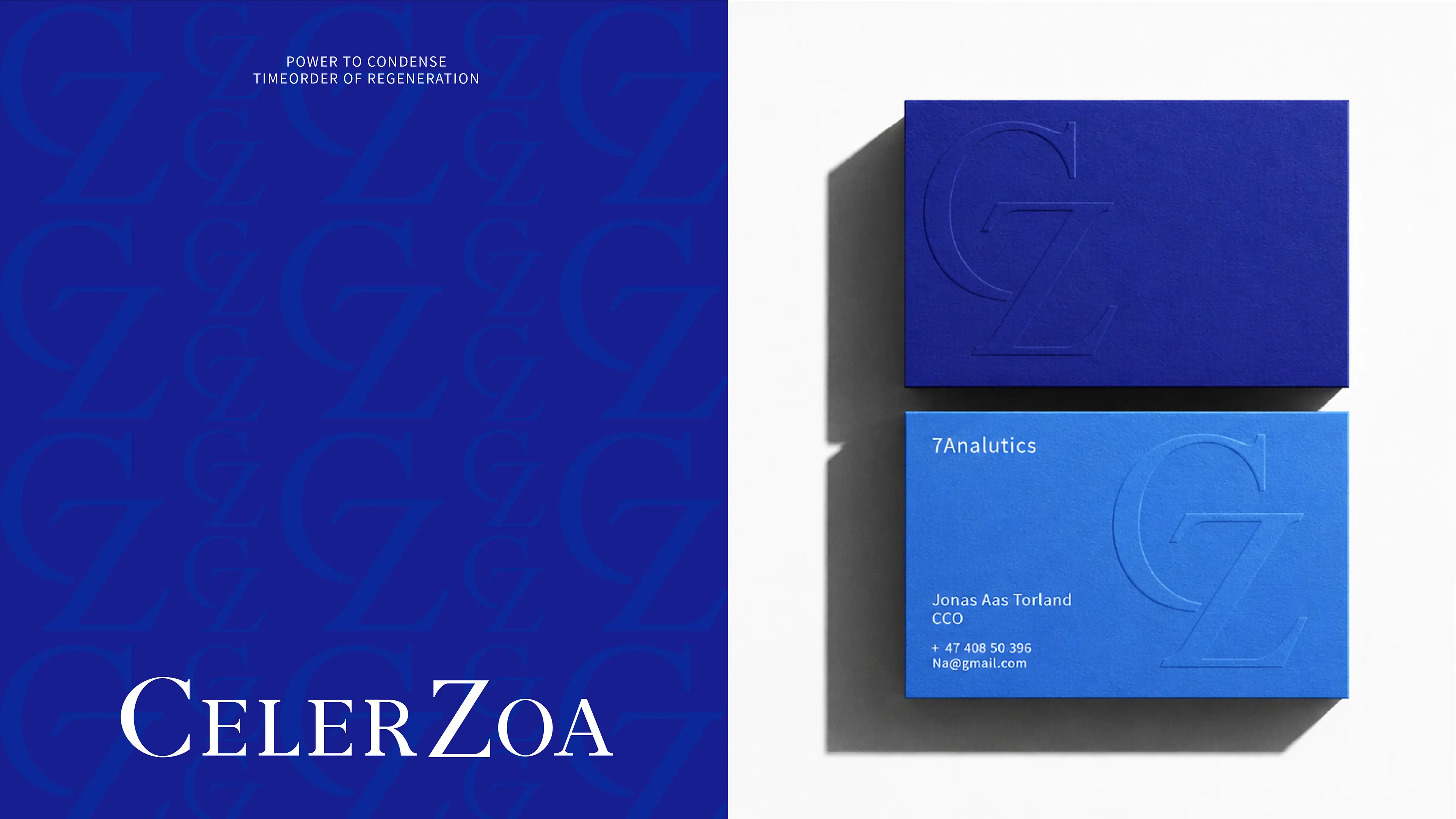
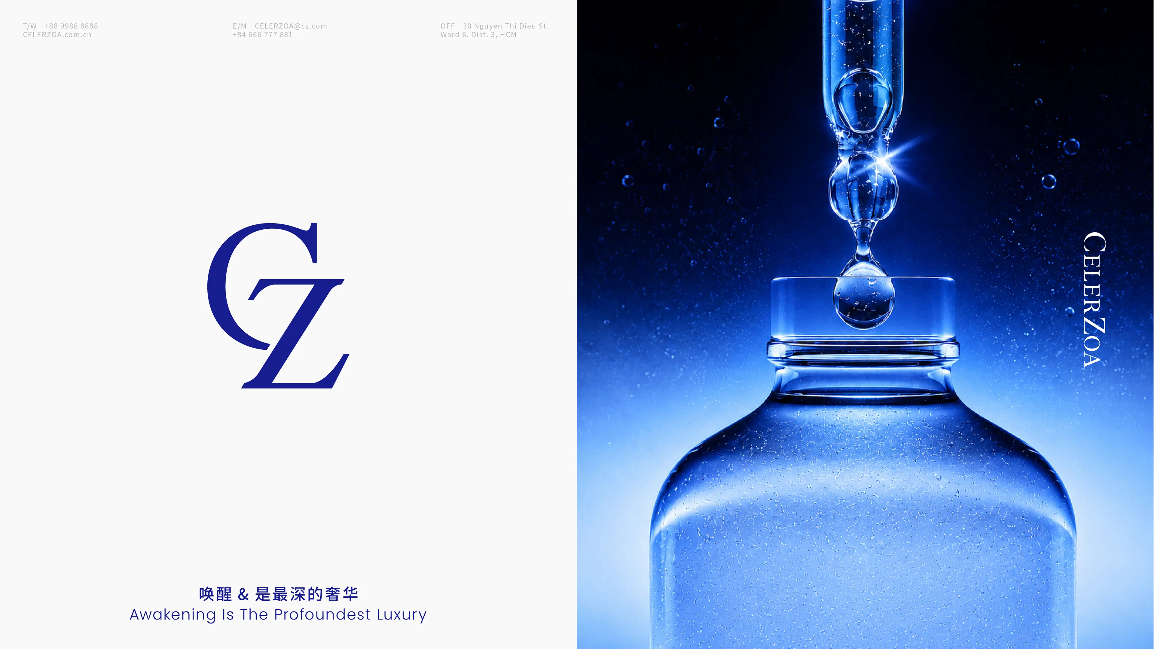
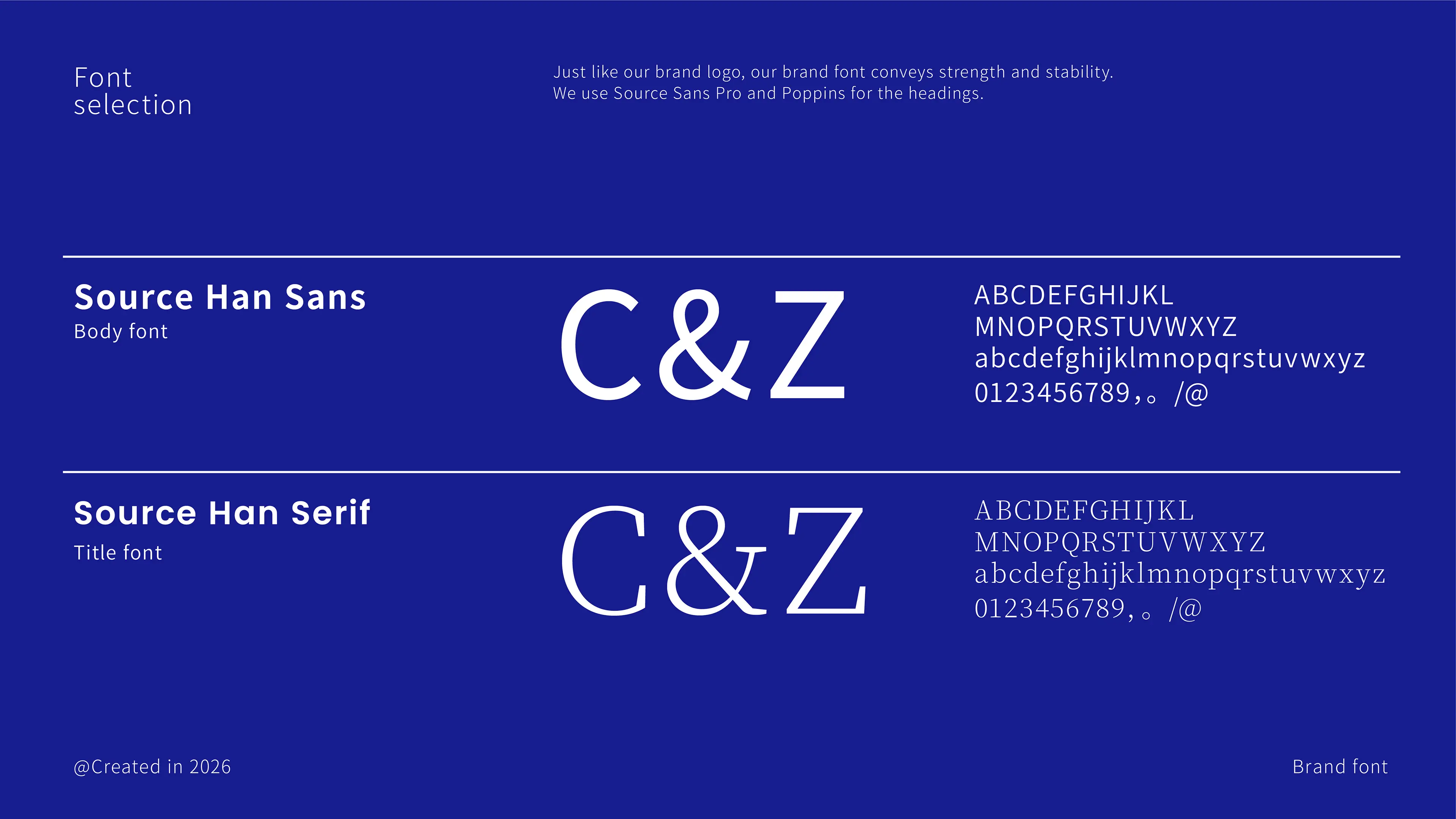
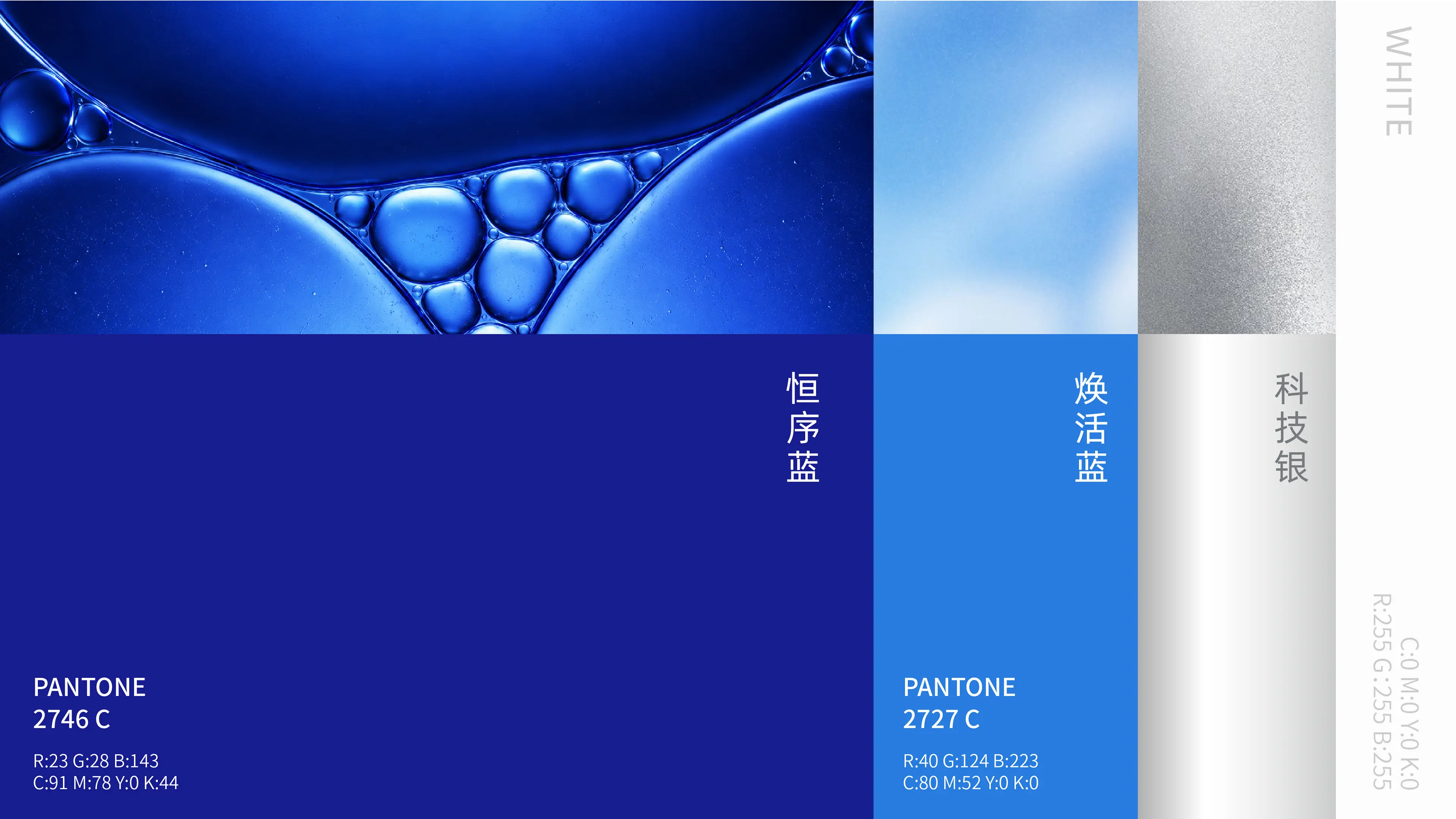
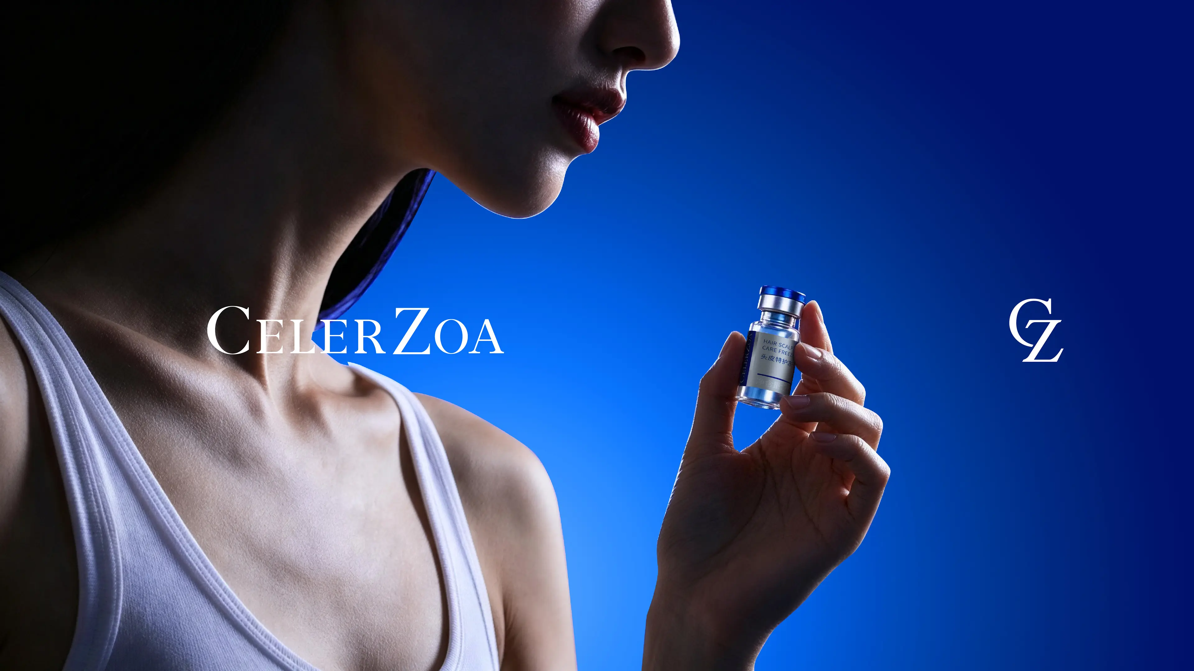
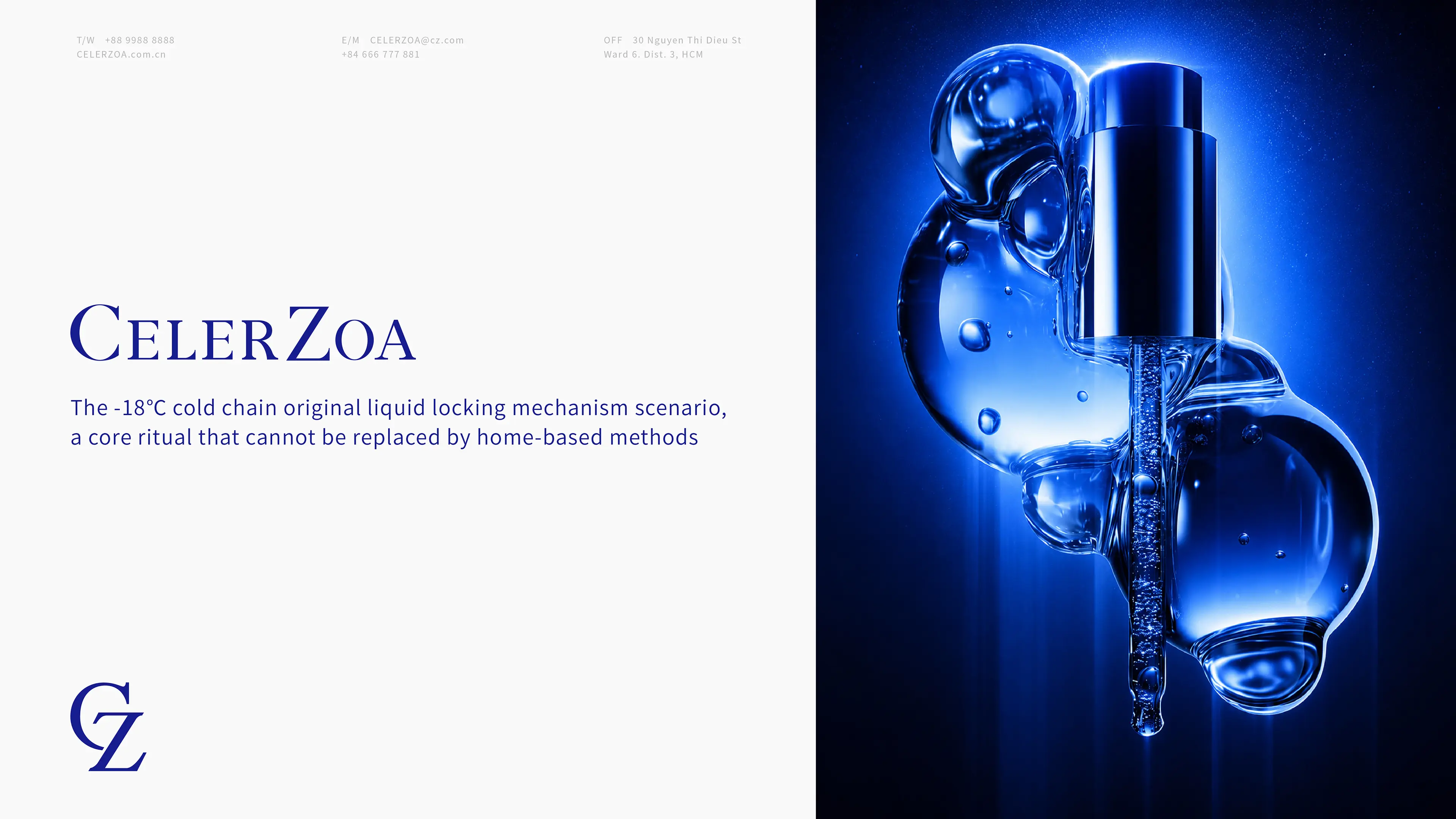
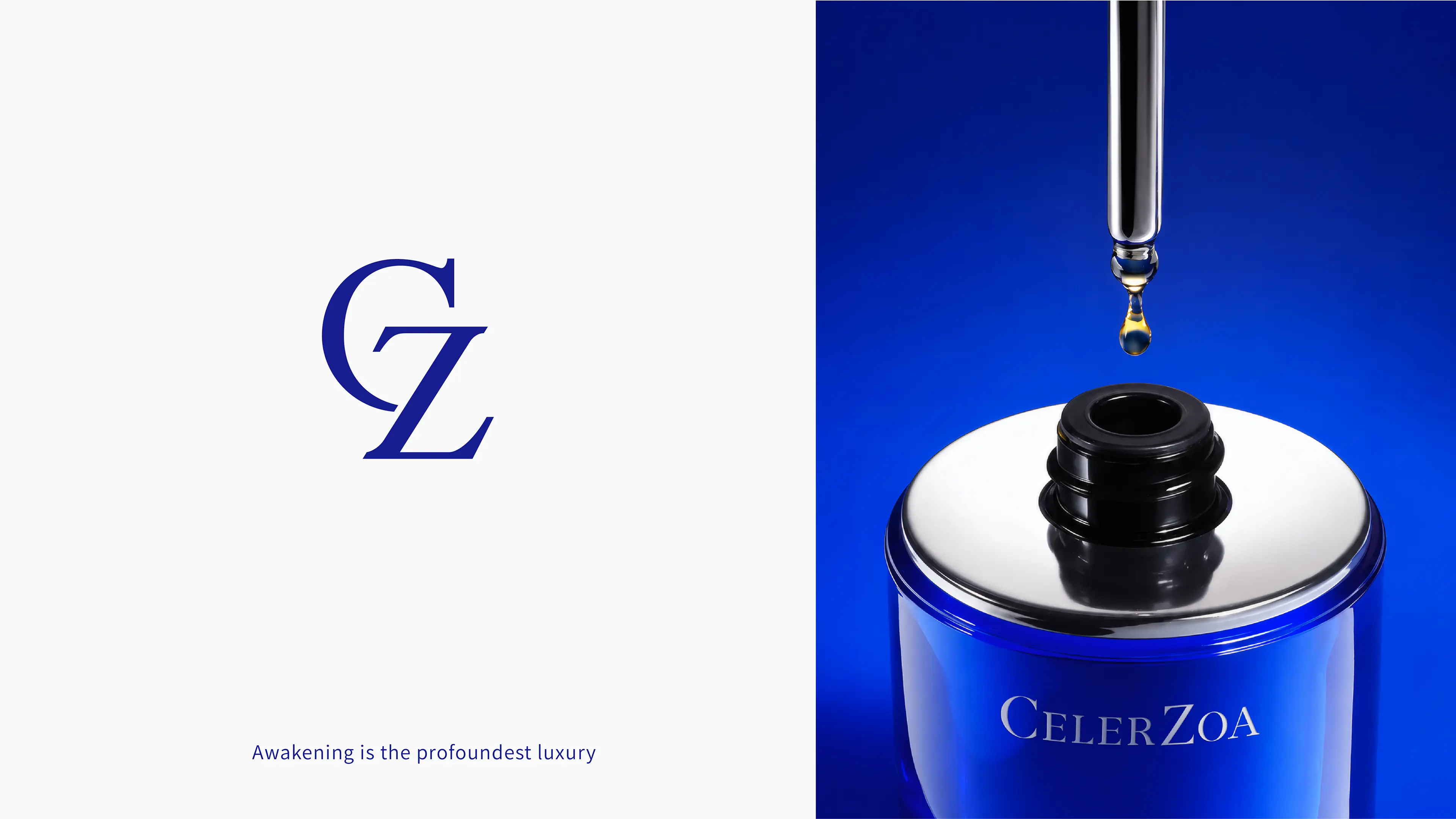
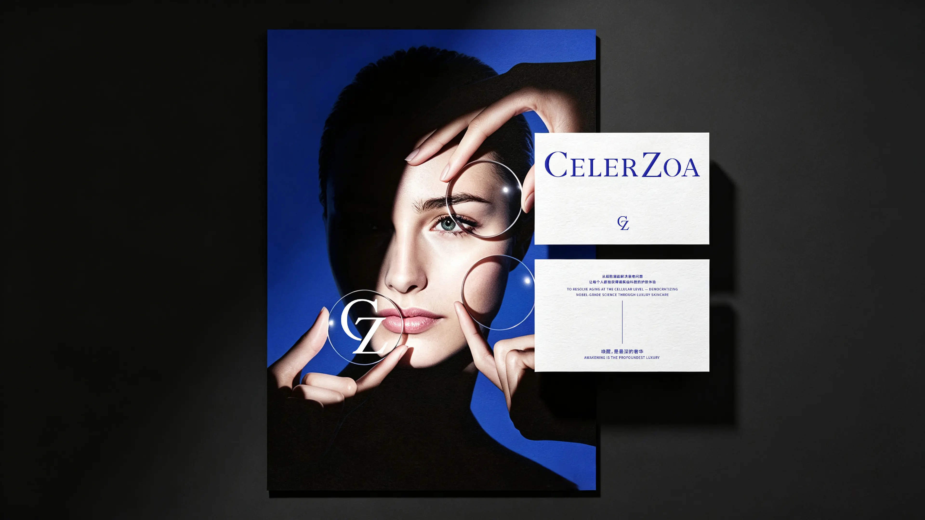
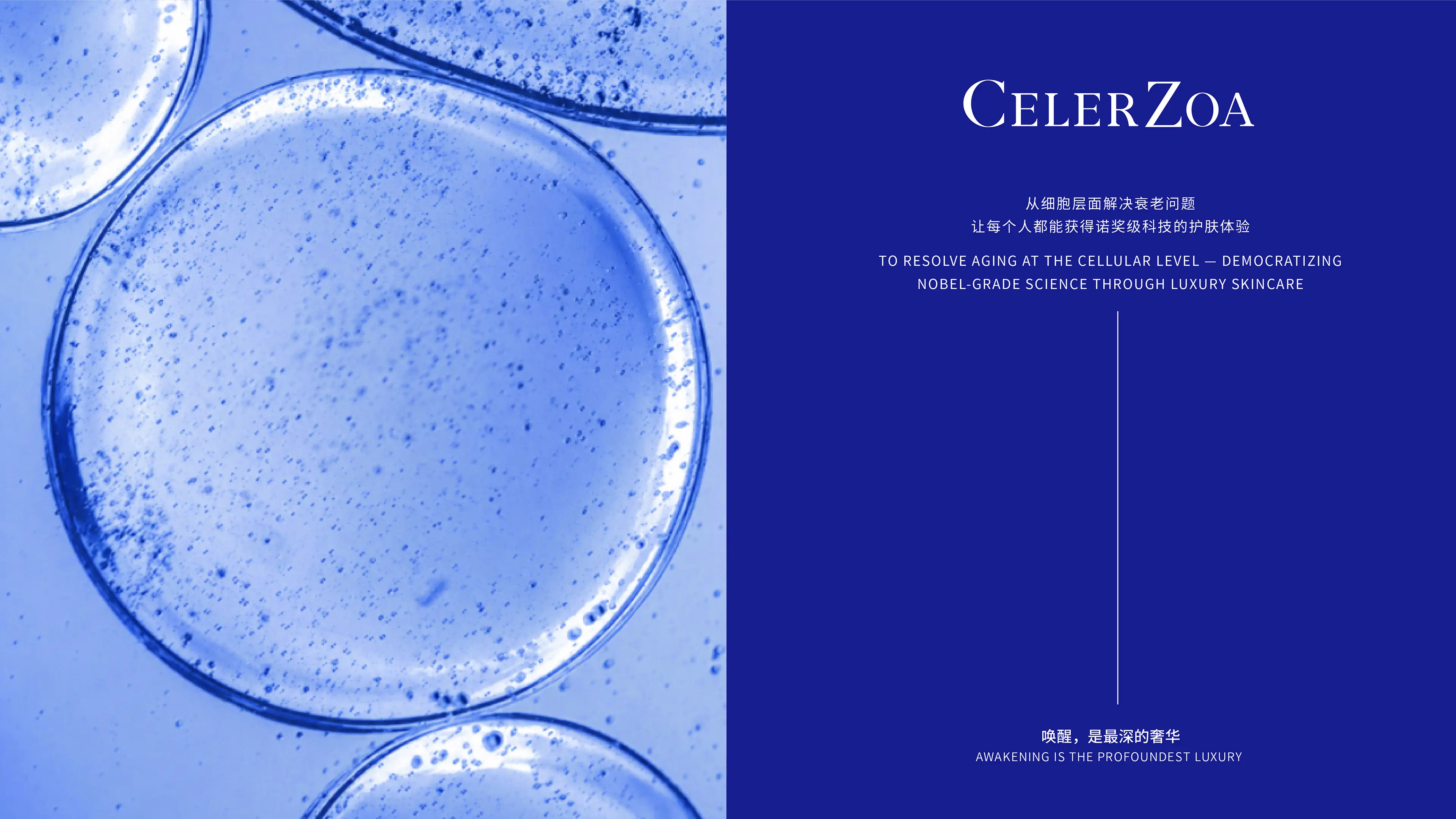
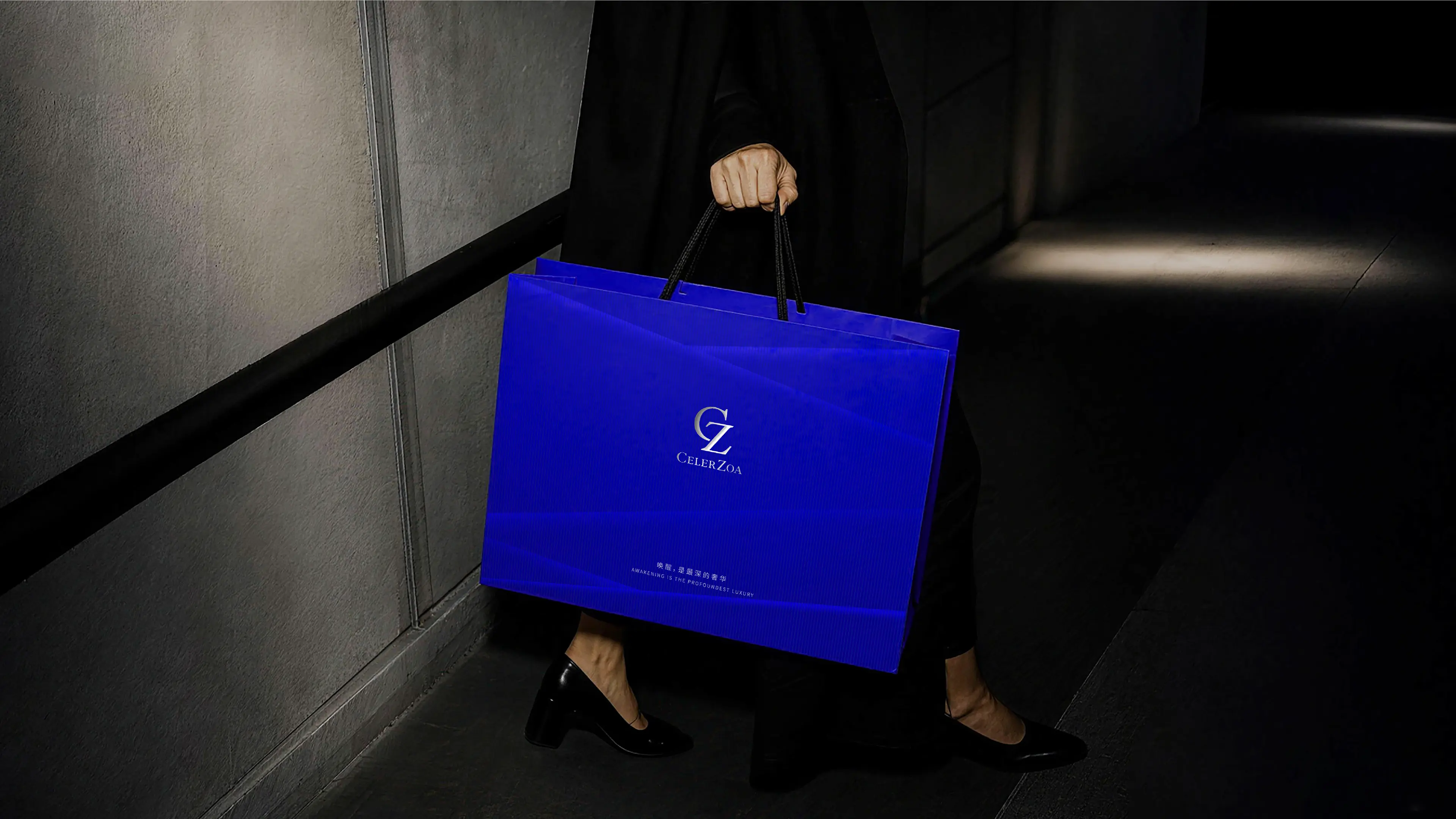
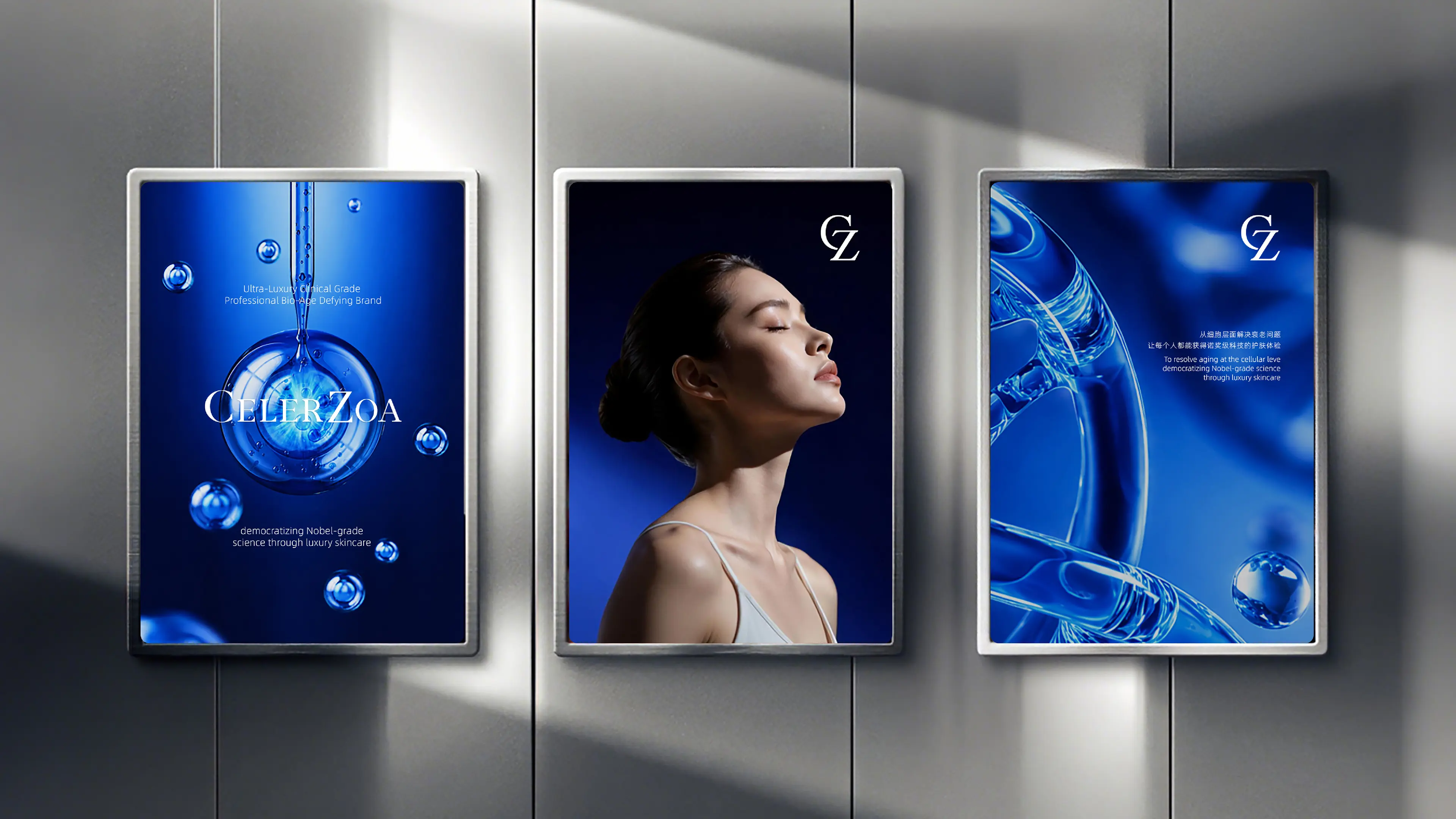
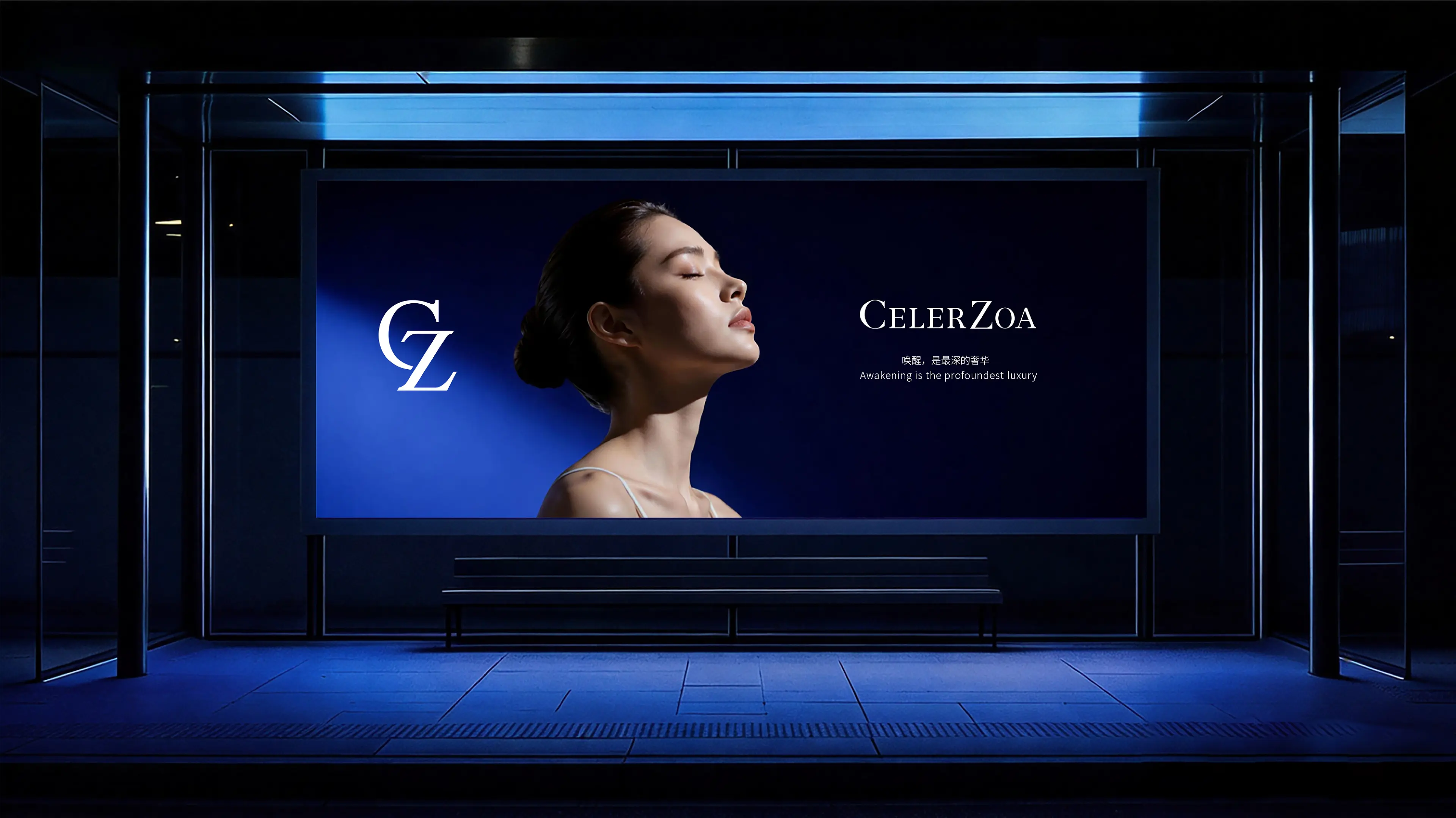
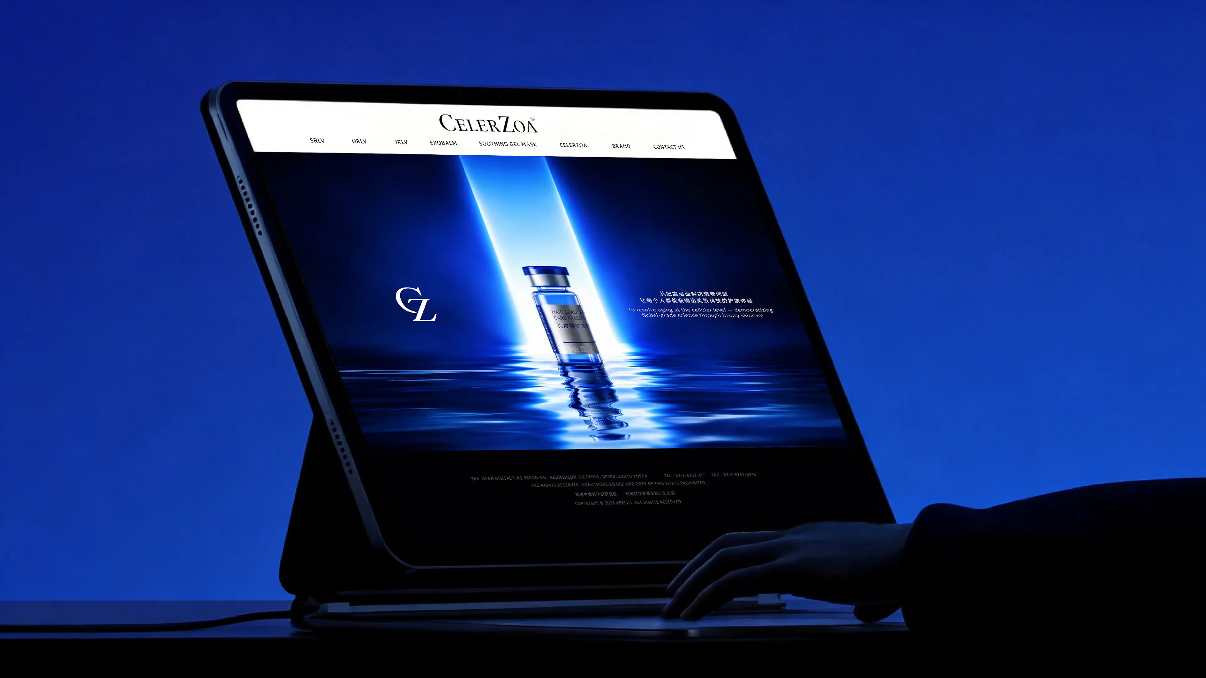
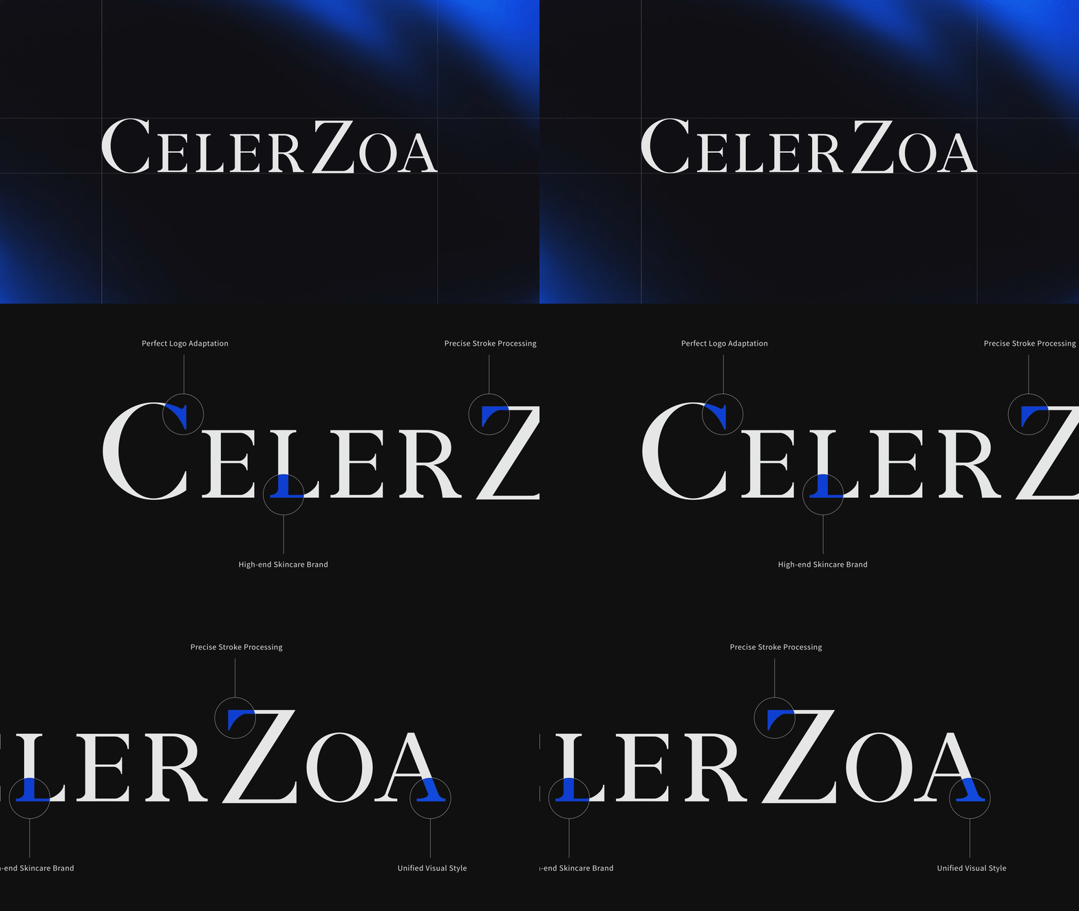
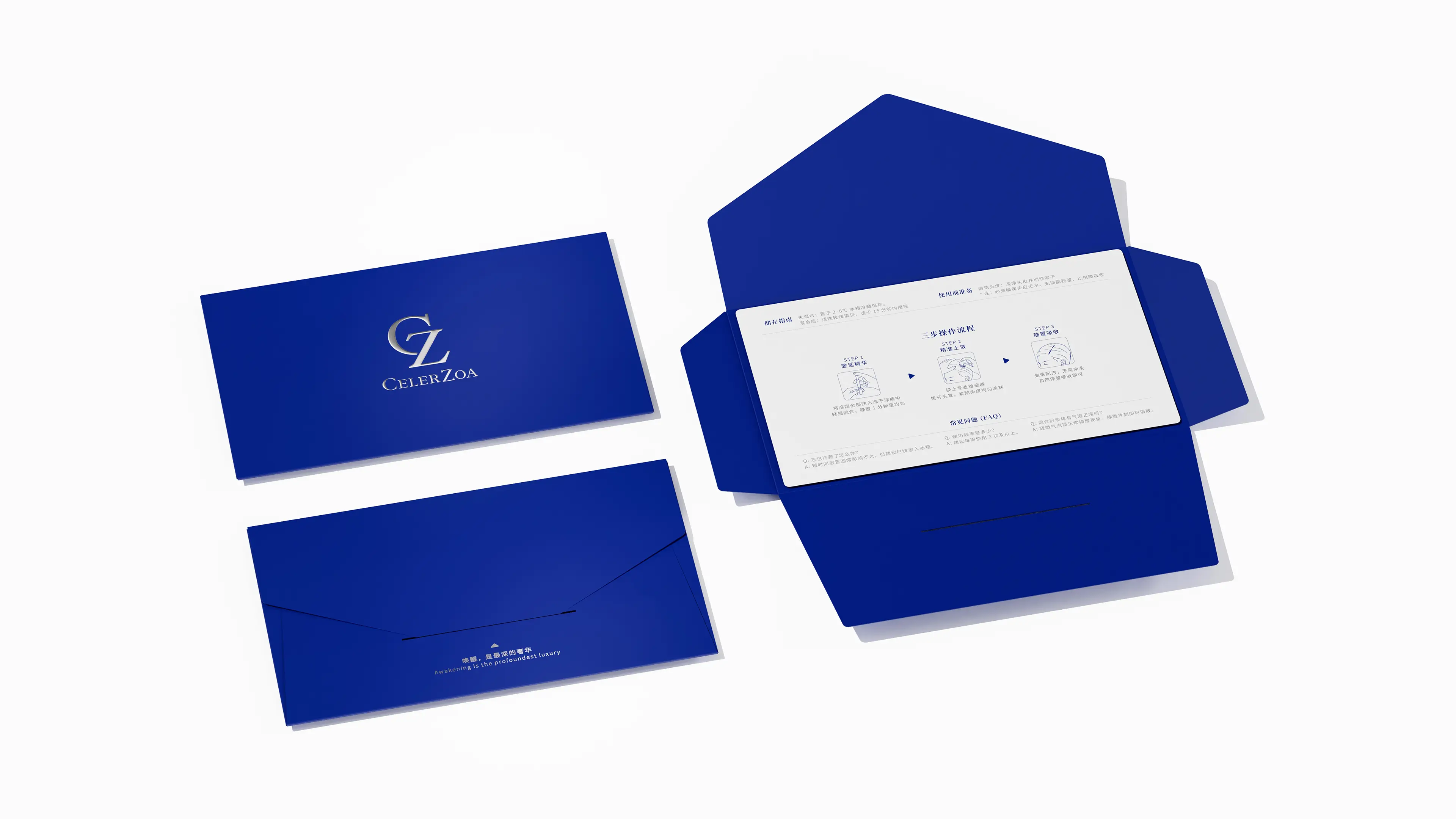
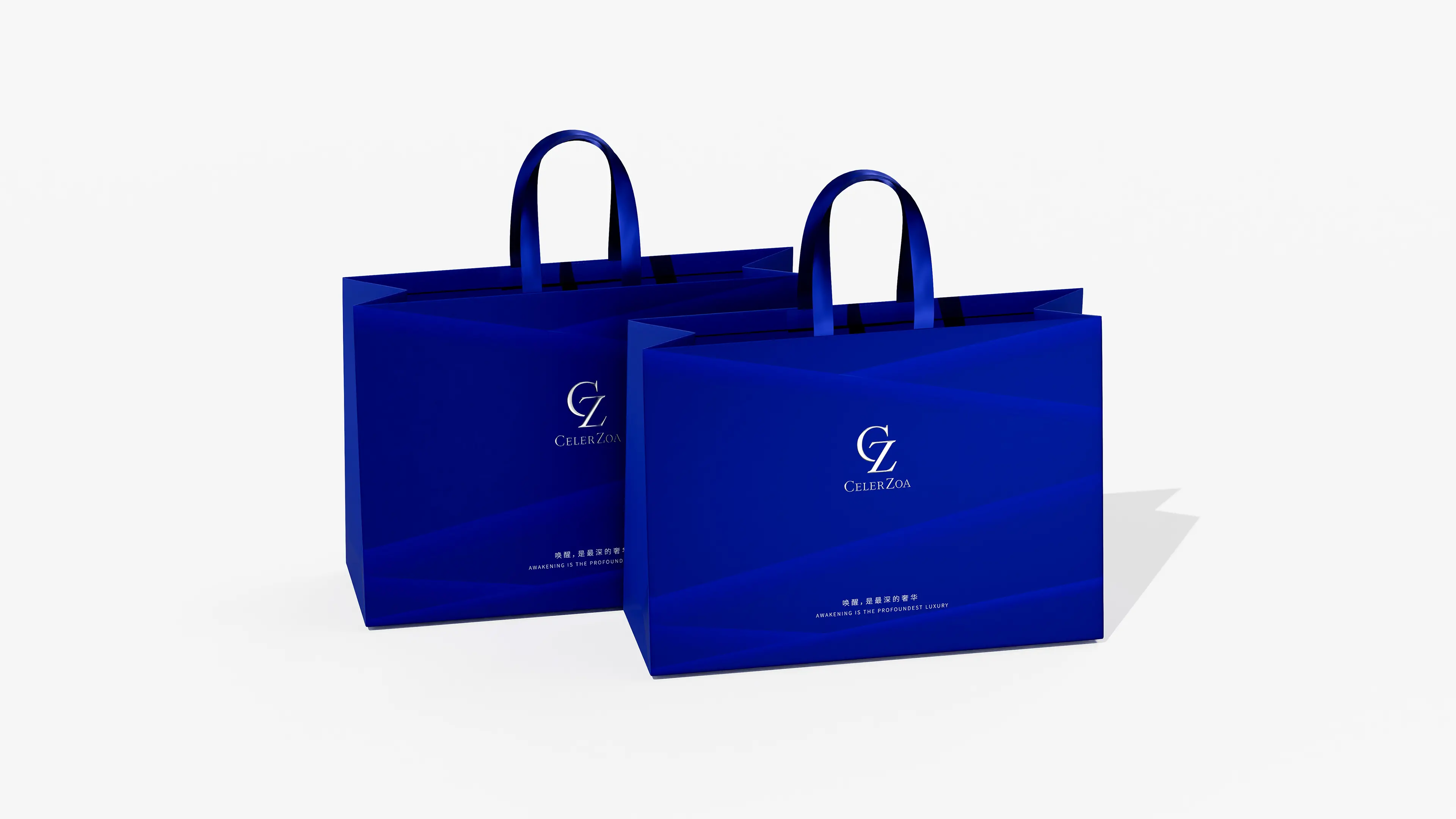
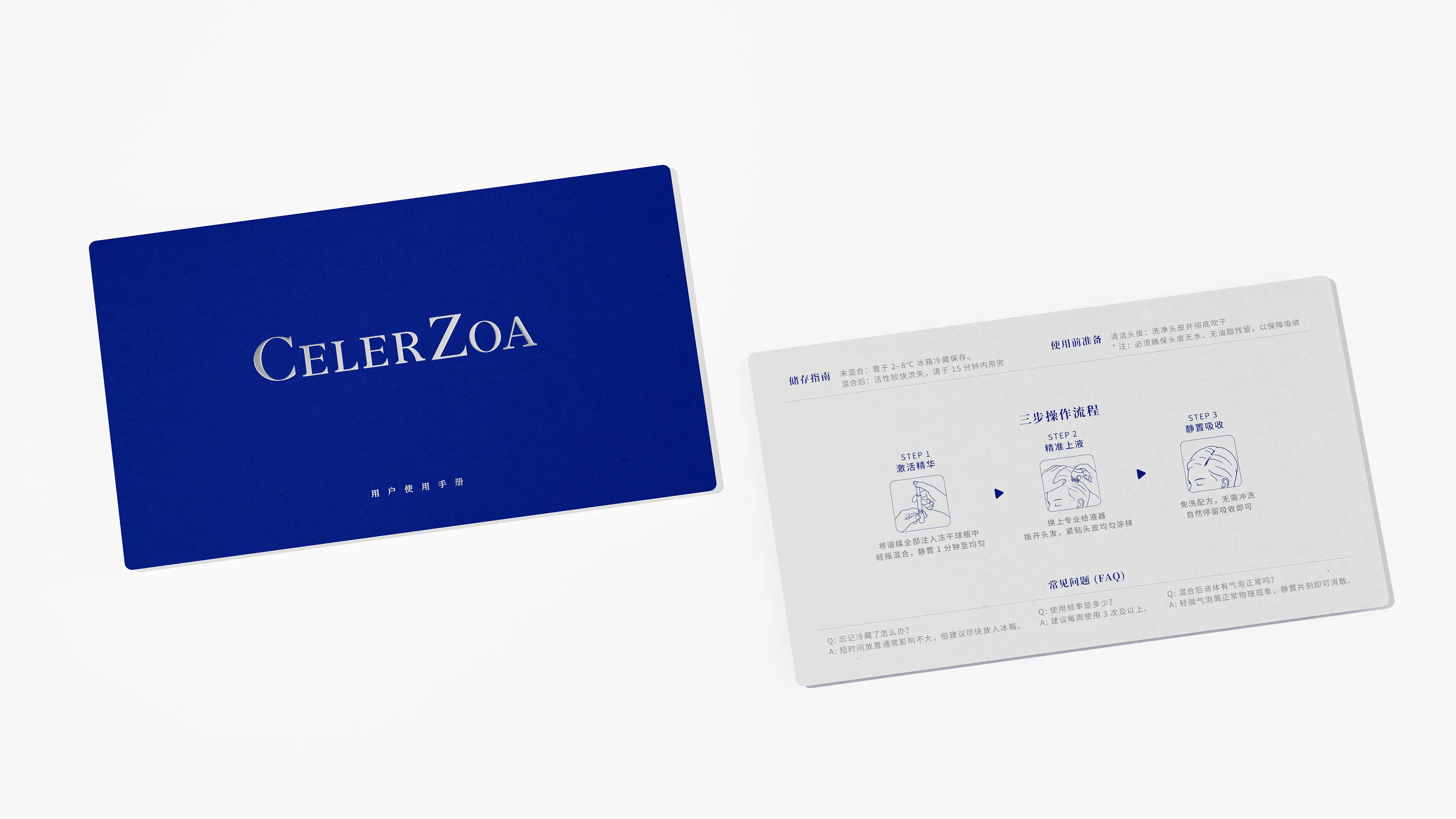
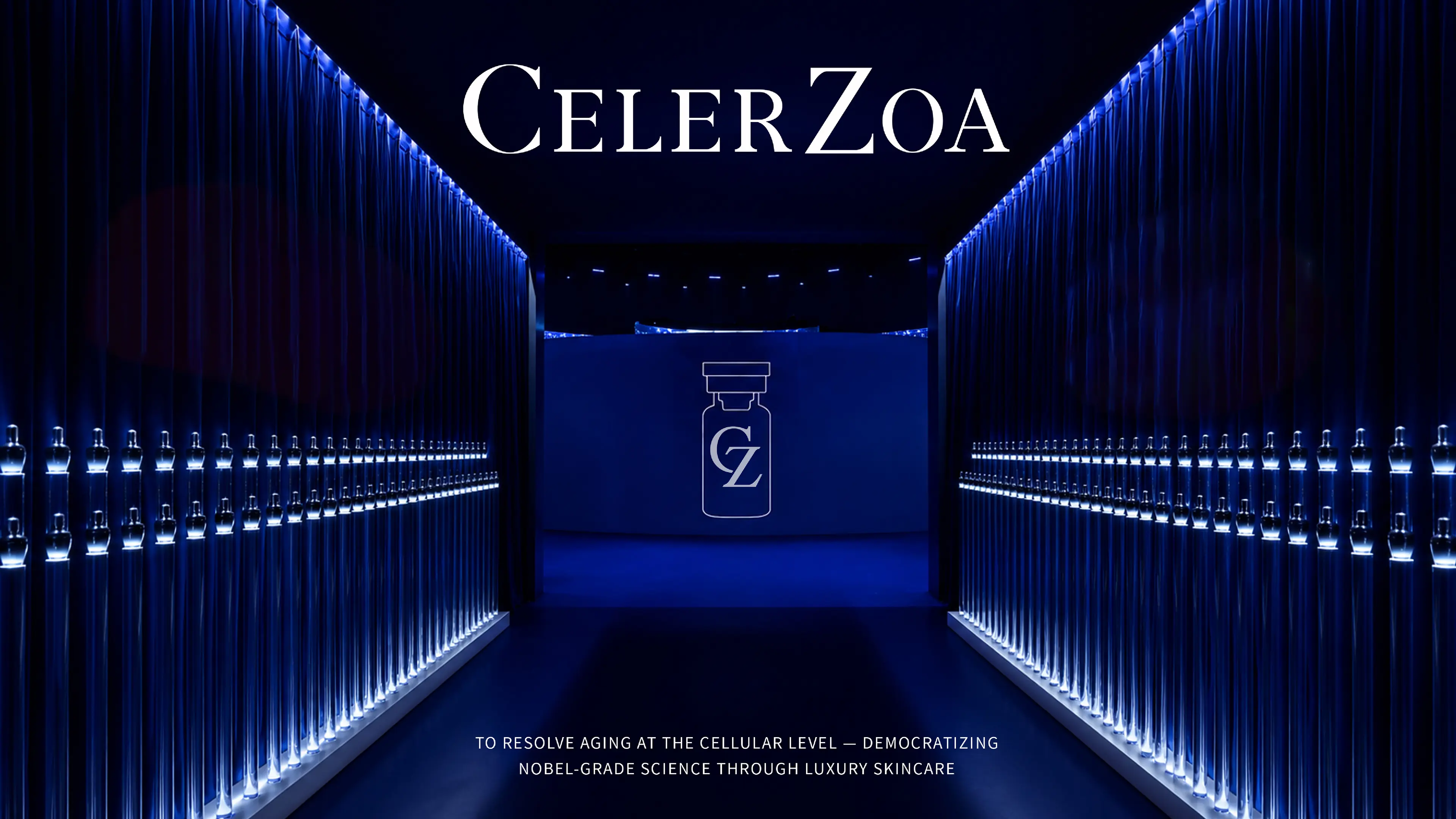
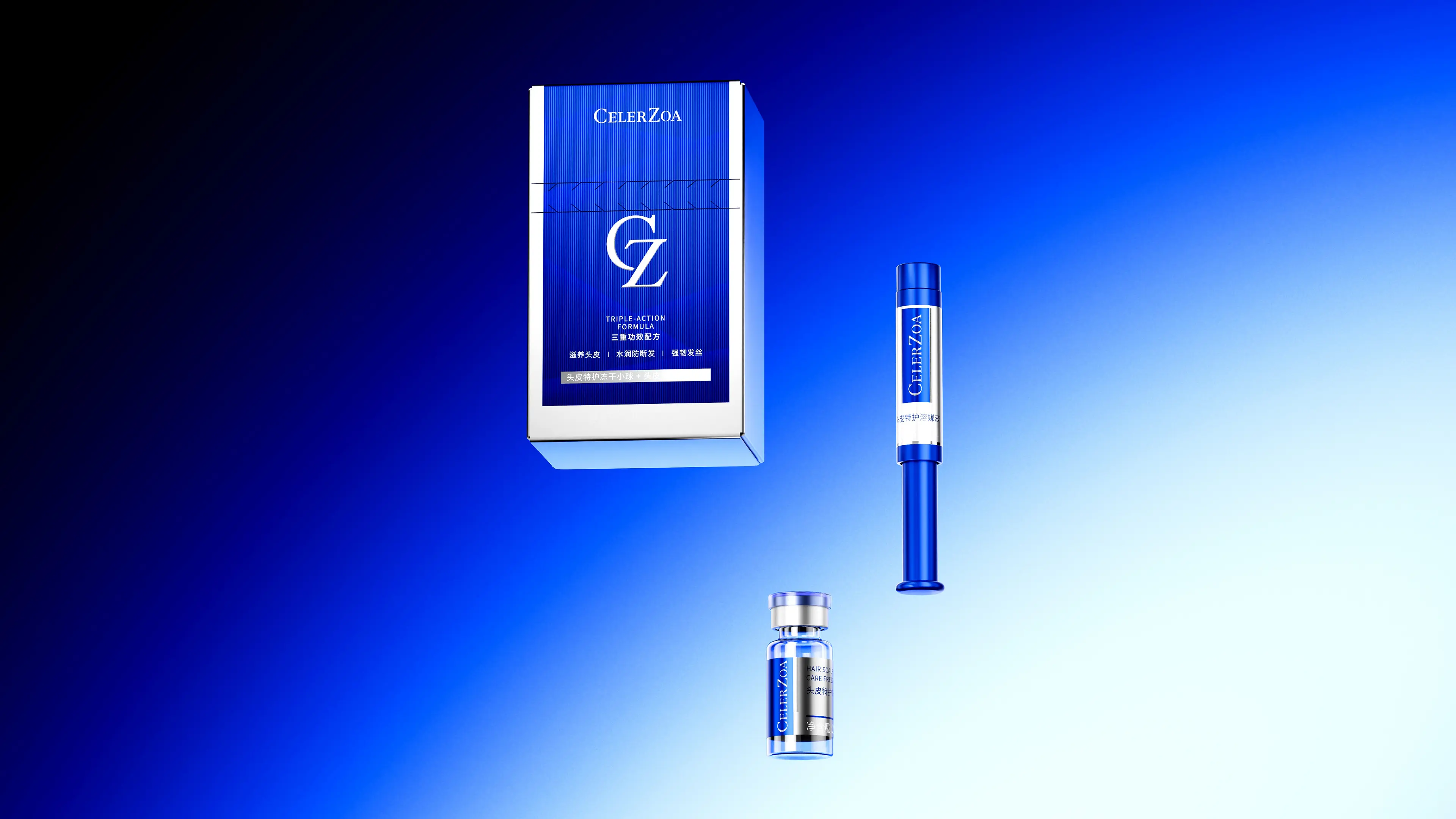
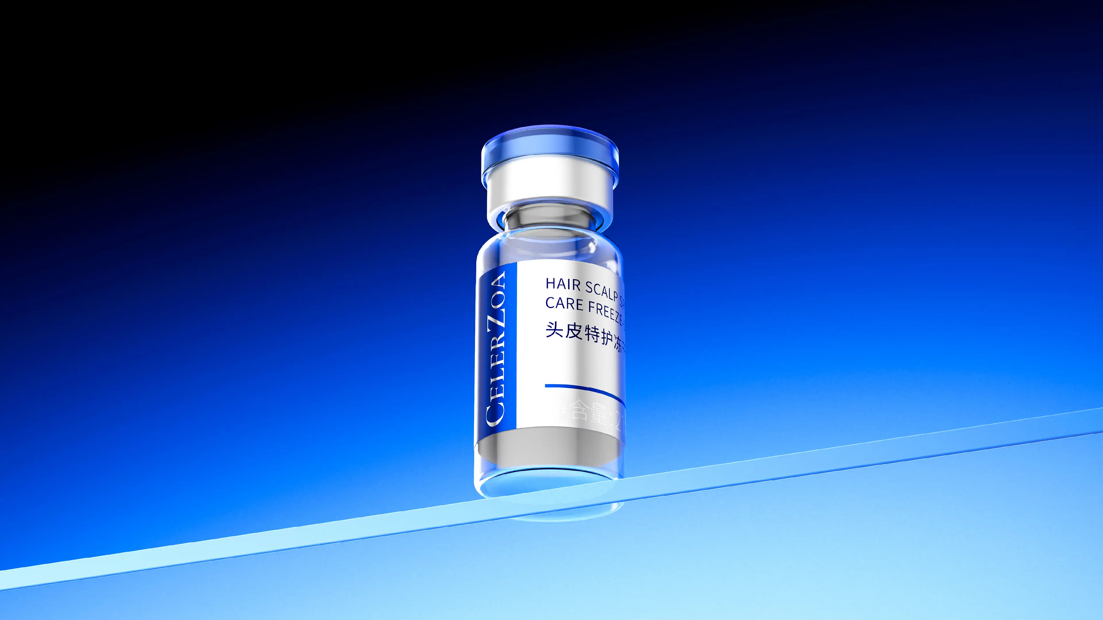
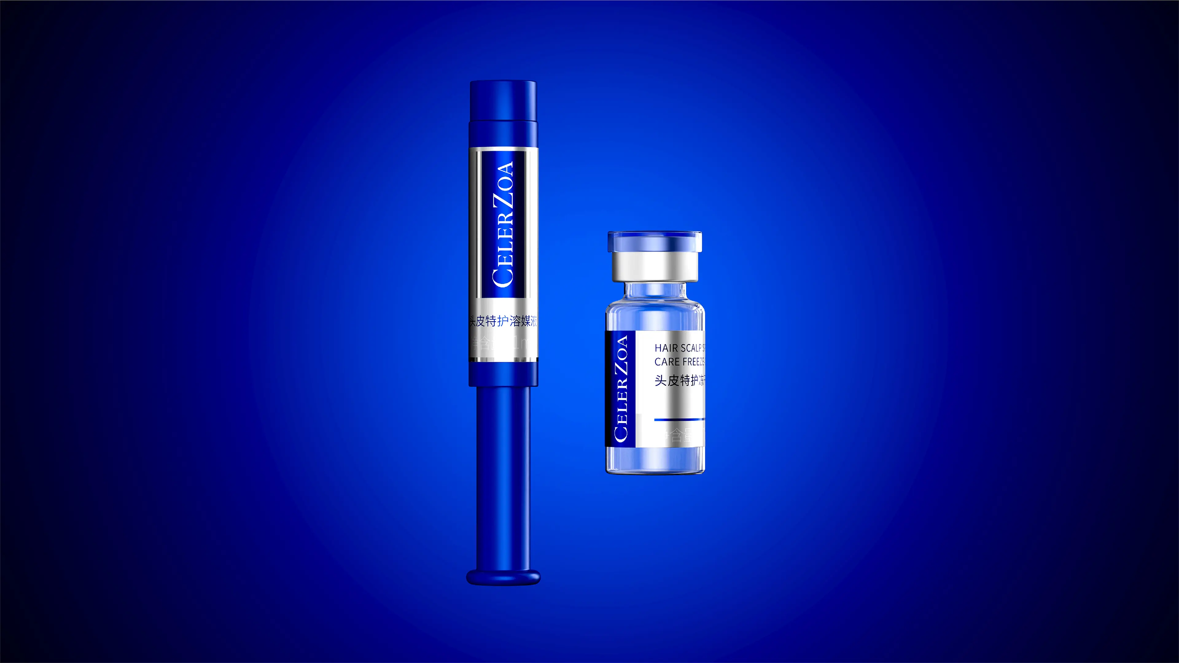
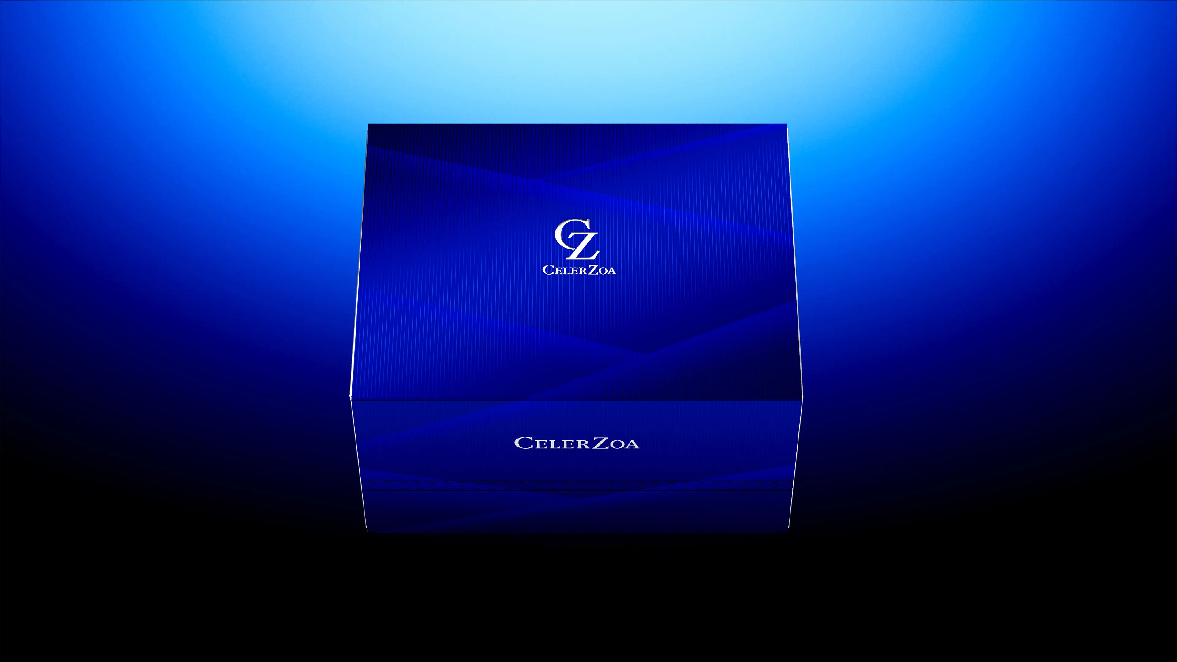
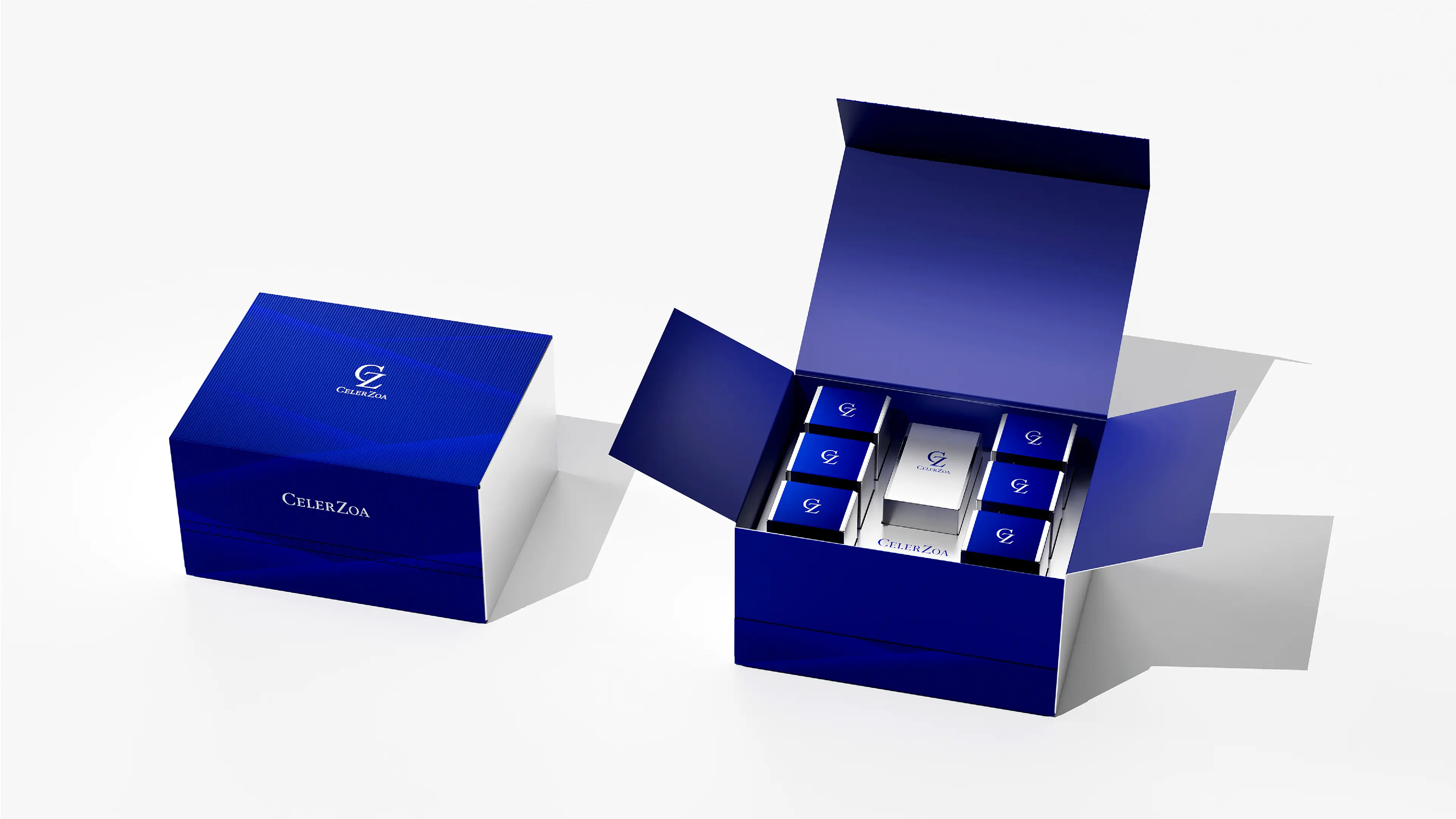
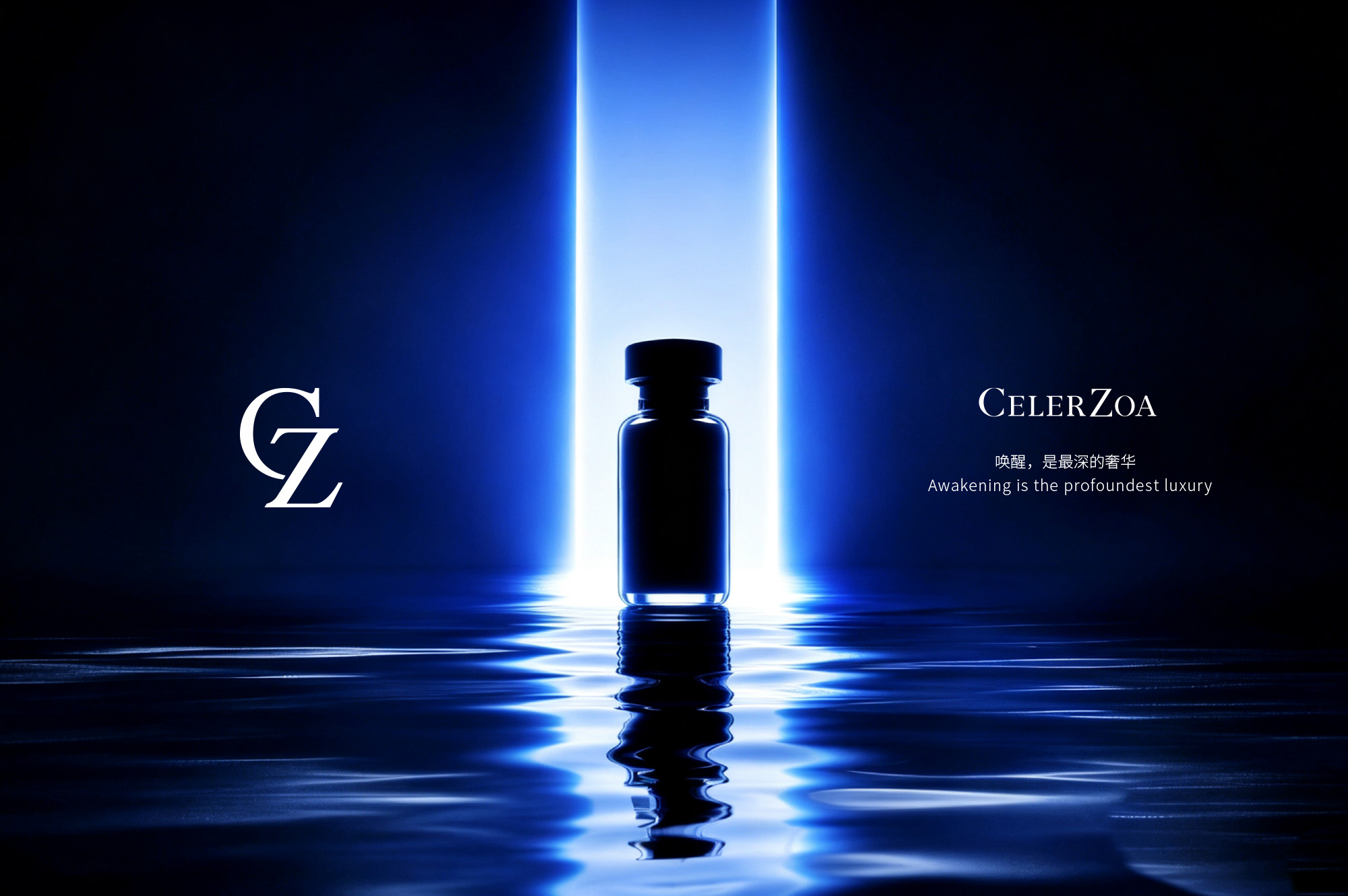
This project's services cover brand positioning, brand visual system, product packaging design, and VI extension norms. Starting from the brand's research and development genes and global strategy, we established a design direction of "high-end, restrained, and professional". At the brand positioning level, we determined a visual system with dark blue as the main color and silver as the auxiliary color, using a simple and high-quality style to convey a high-end, restrained, and professional brand image. At the brand recognition level, we reduced "CELERZOA" to the graphic symbol "CZ", significantly reducing the memory and communication costs, allowing the brand to have a more recognizable visual symbol in the global market. At the product packaging innovation level, we replaced the essence liquid packaging with a push-pinch form, making it convenient for precise injection into the freeze-dried small balls; we changed from multi-pack to single-pack to improve the ease of use; we added a scalp introduction comb to optimize the terminal user experience. At the VI extension level, while retaining the core identification elements, we set up transformable areas to reserve space for future product line extensions.