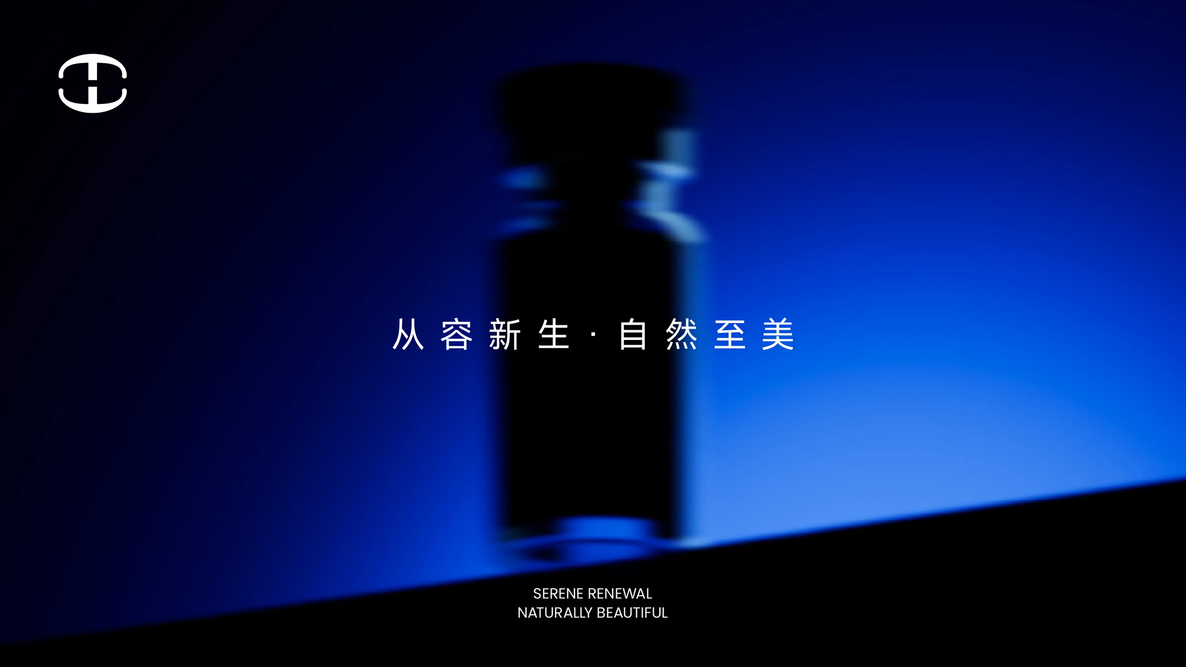
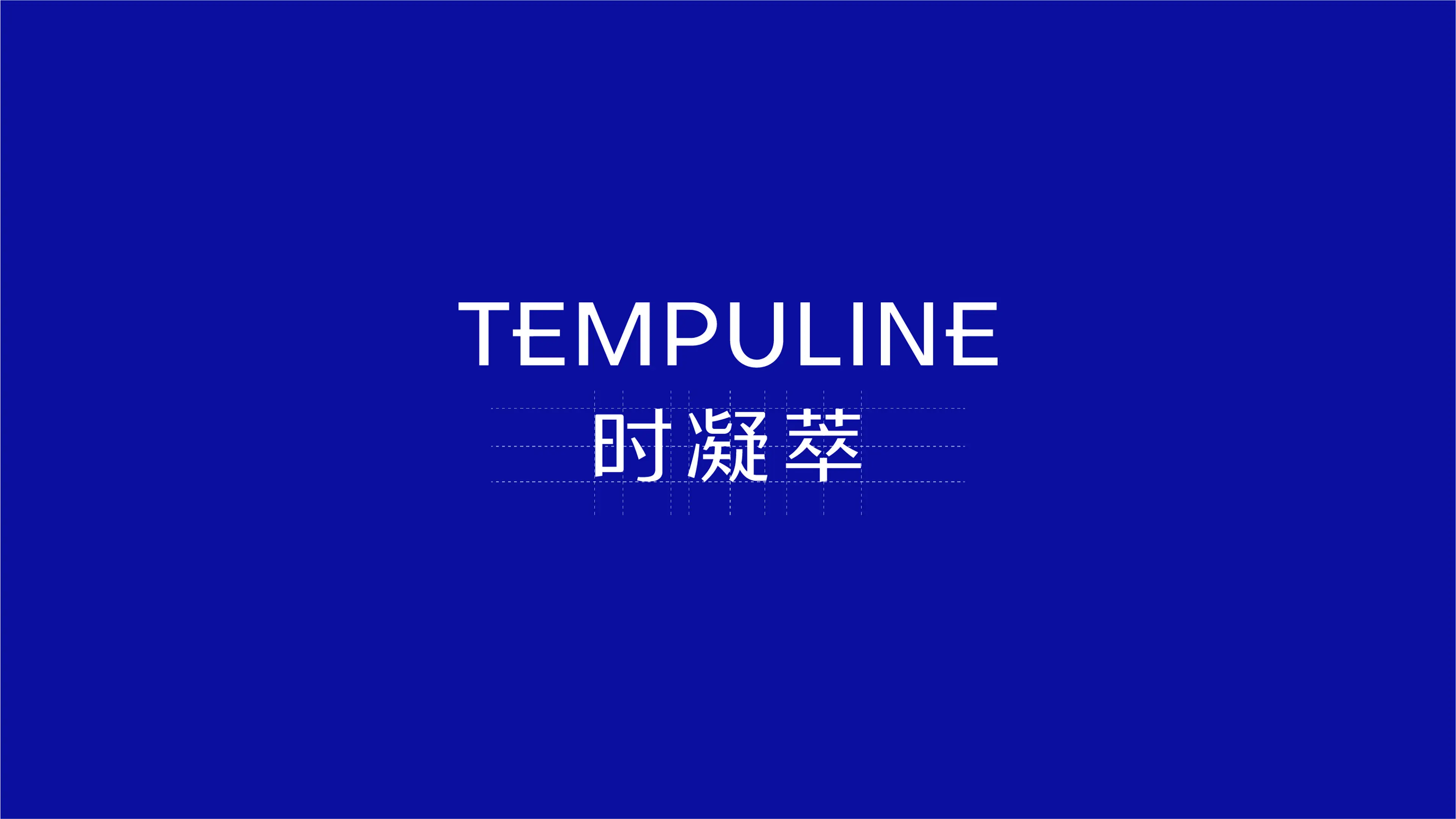

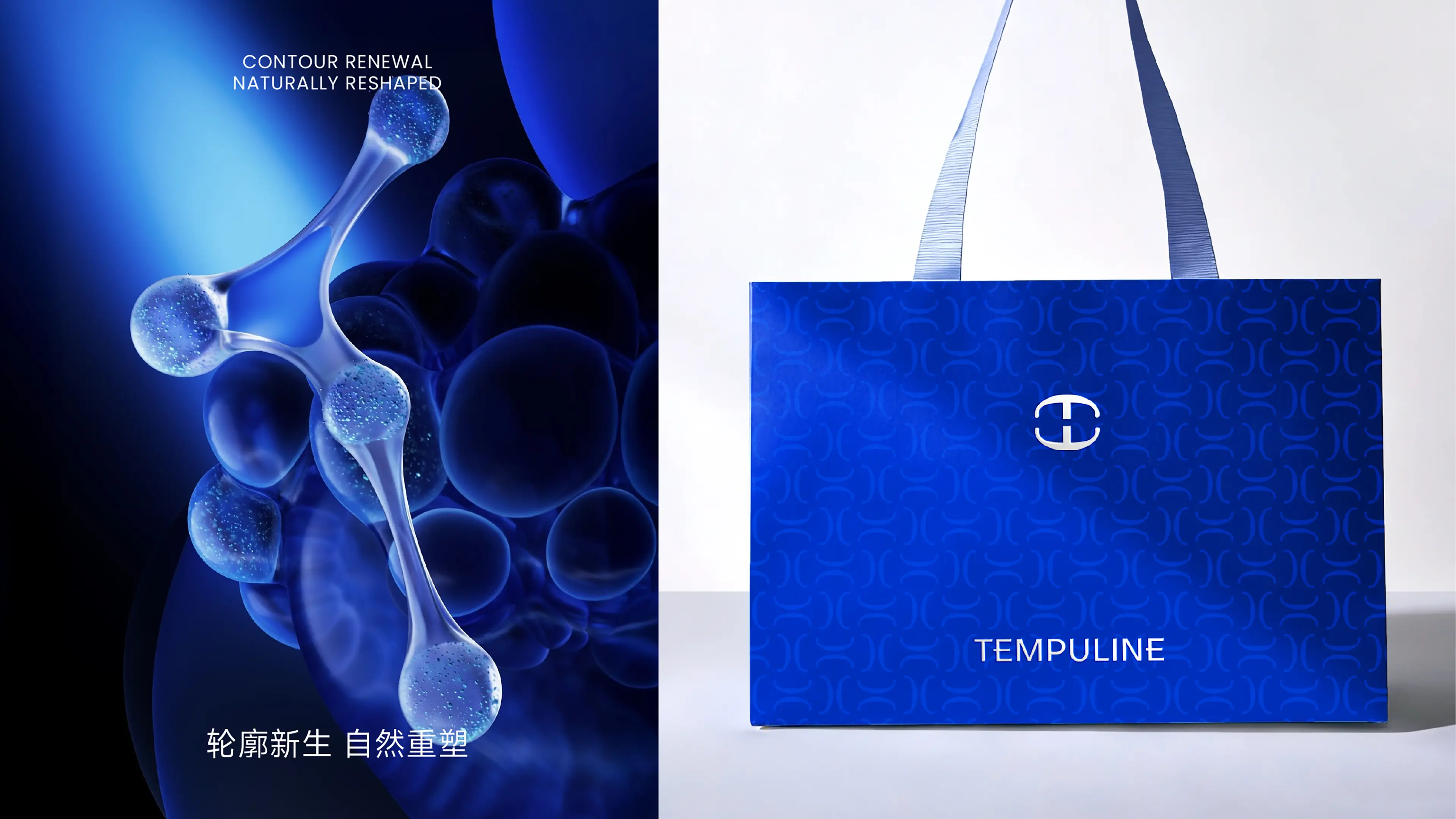
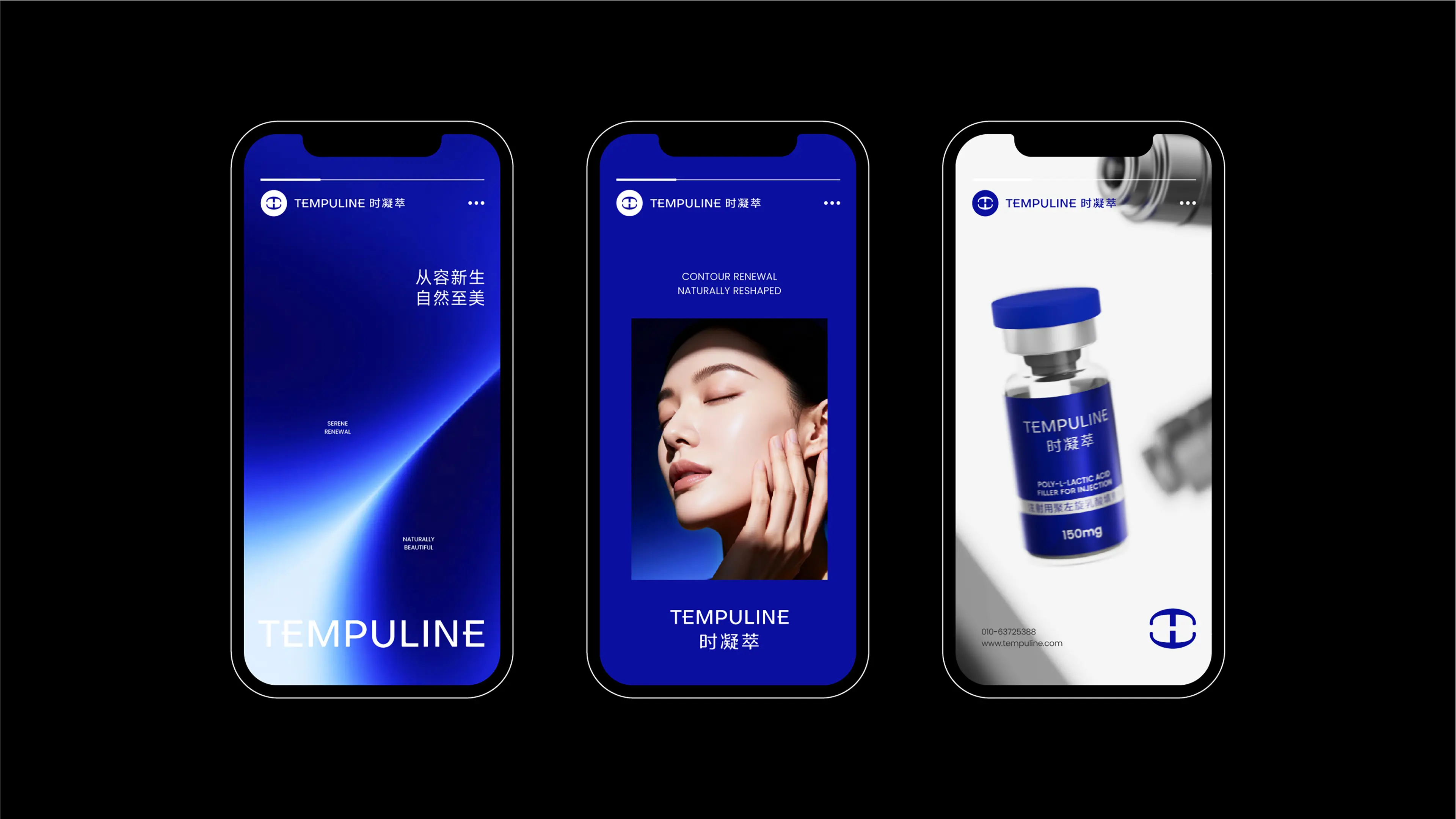
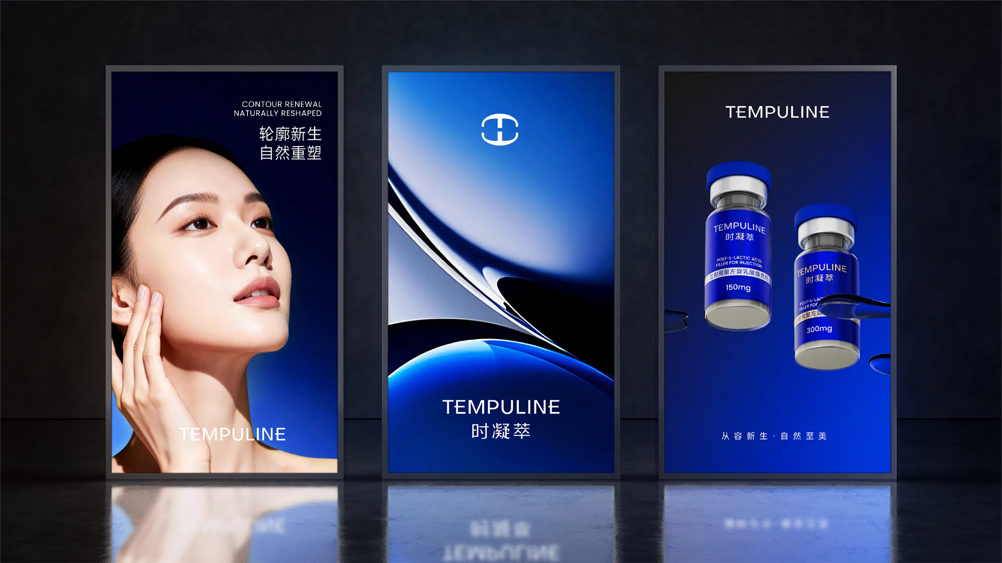
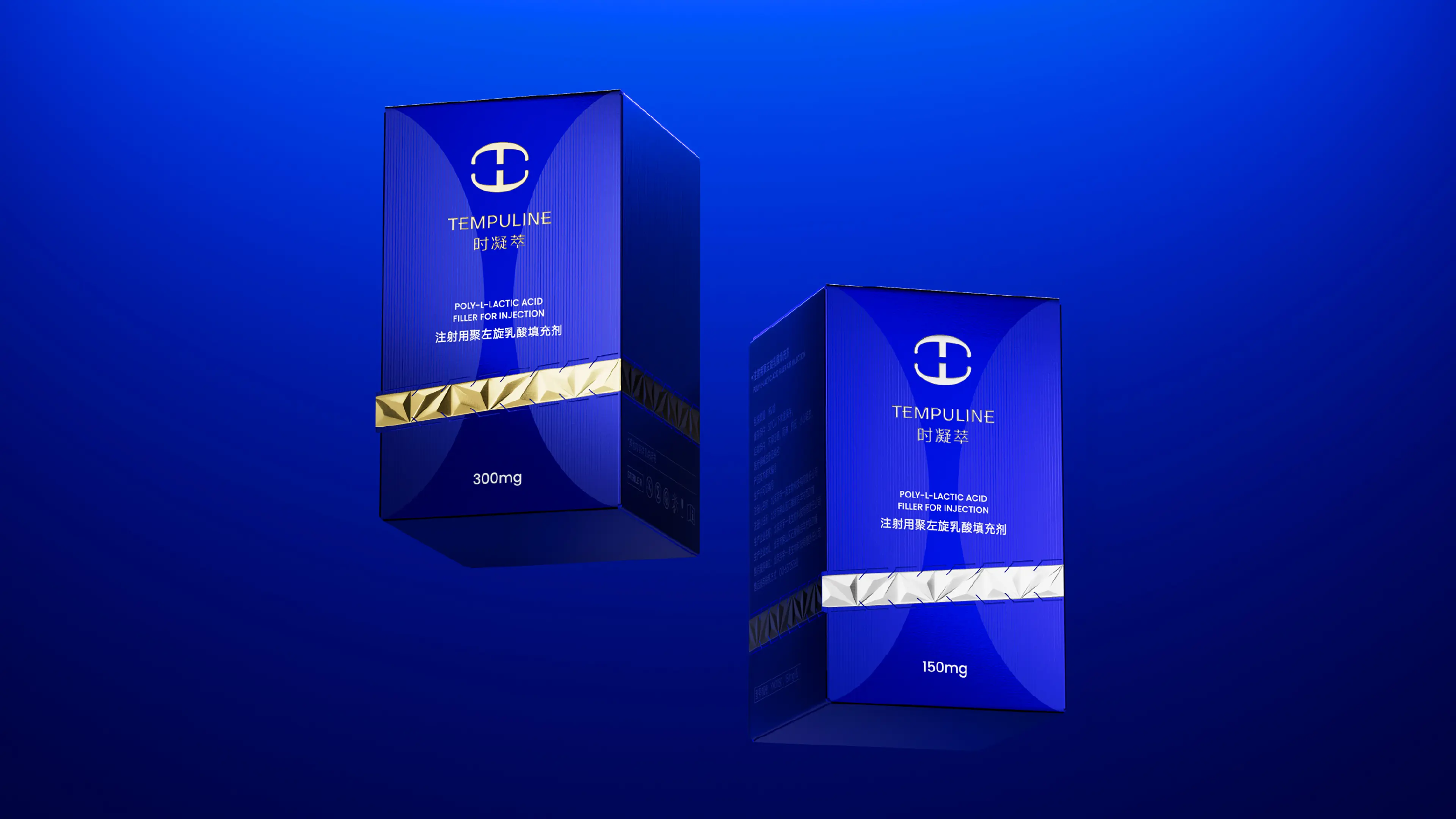
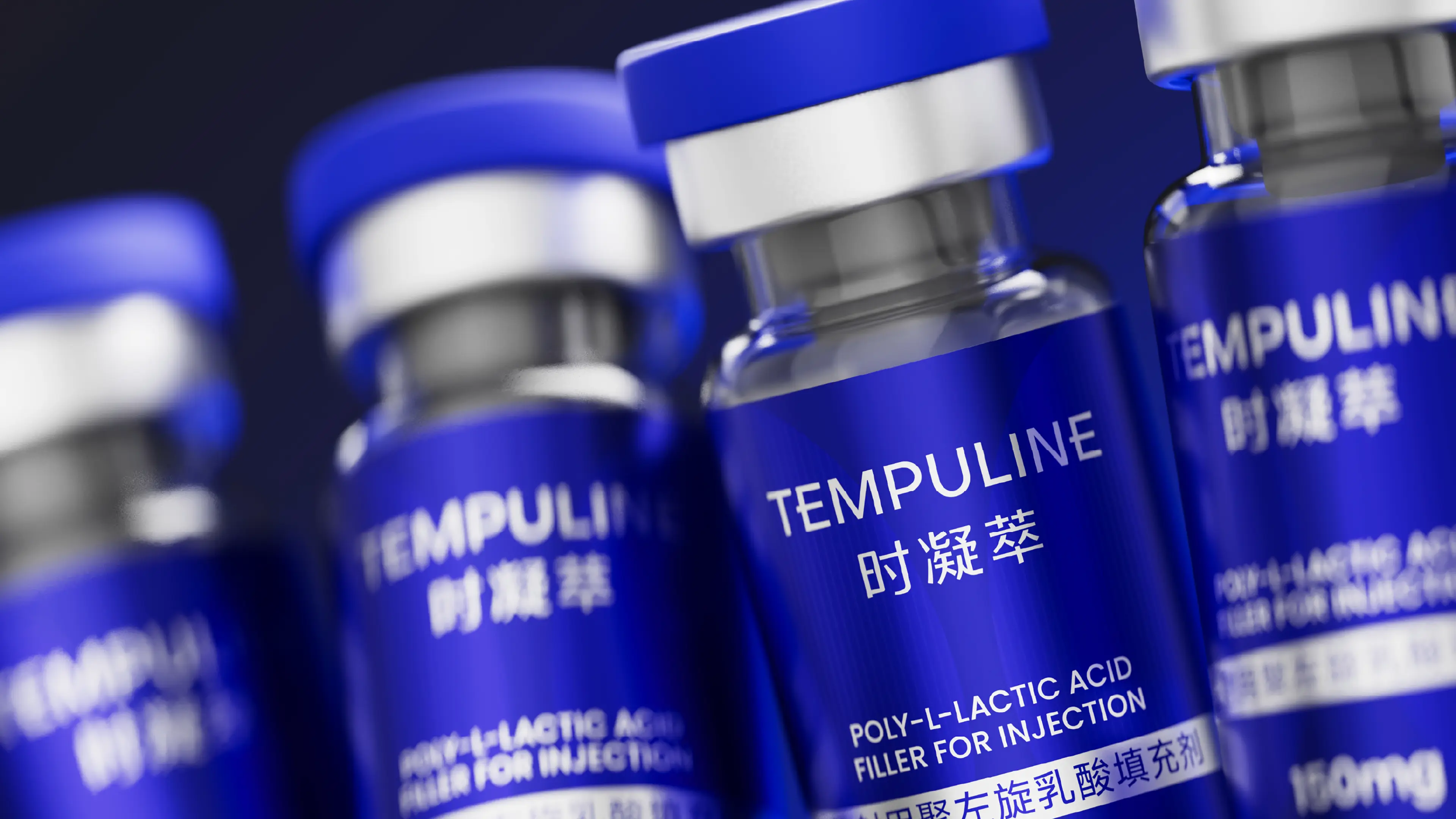
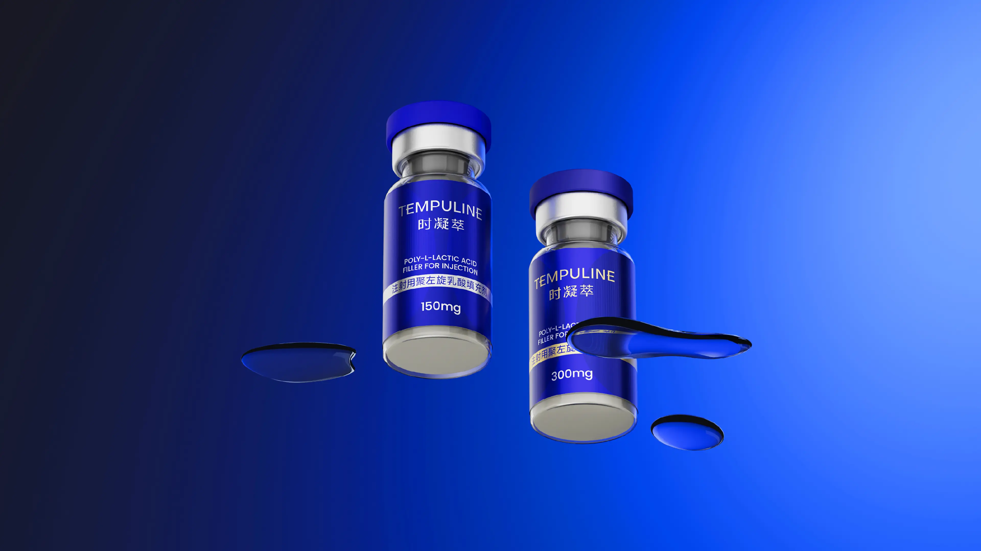
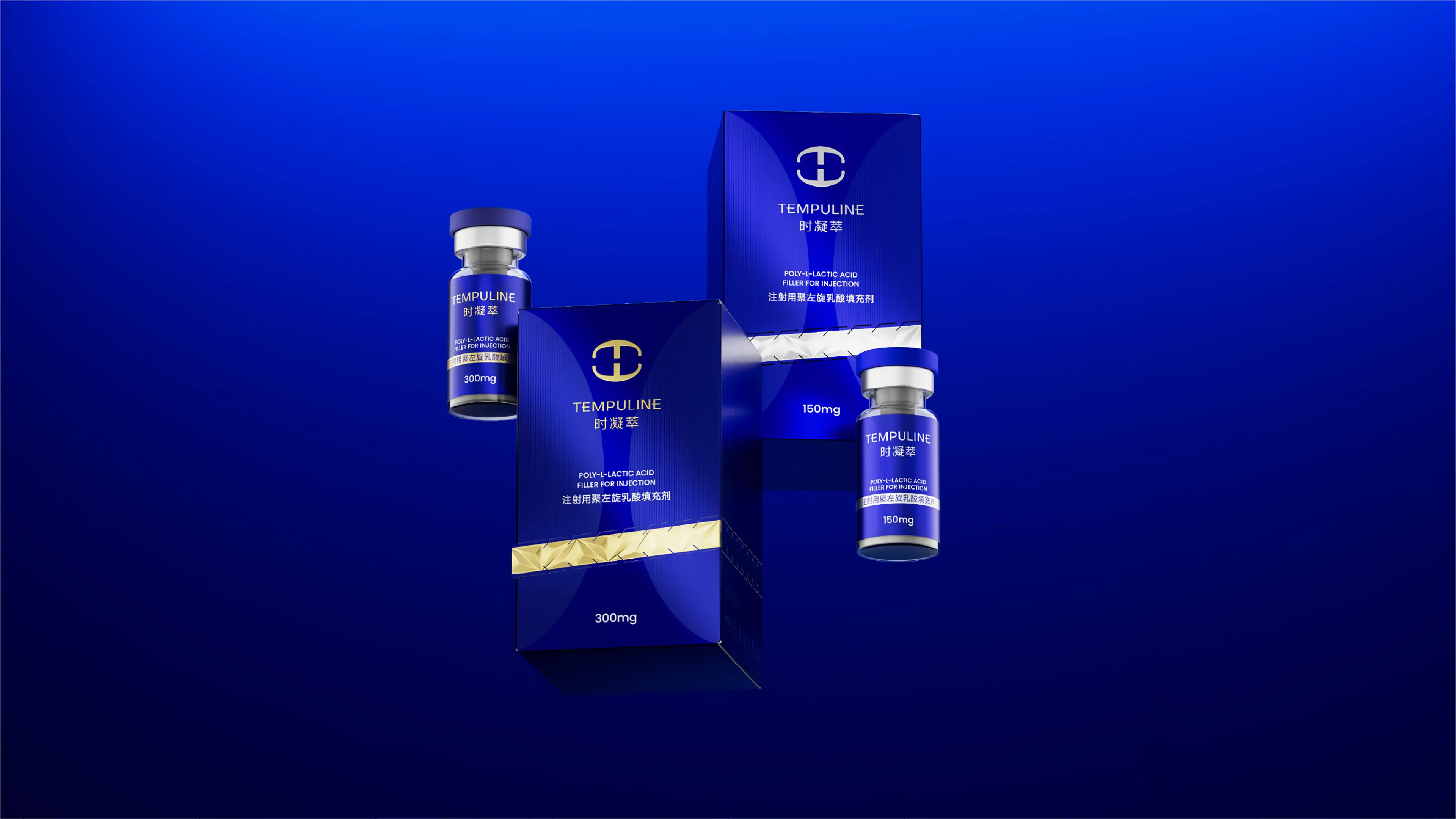
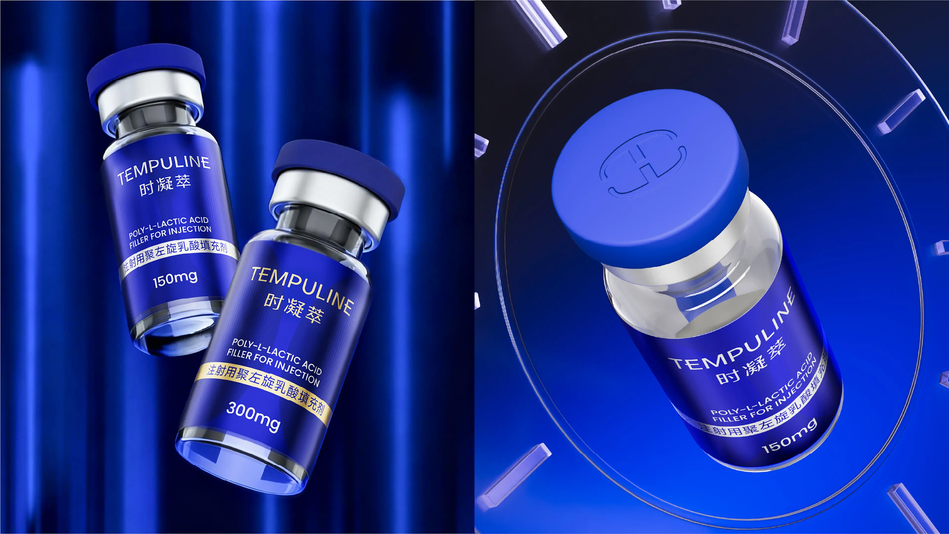
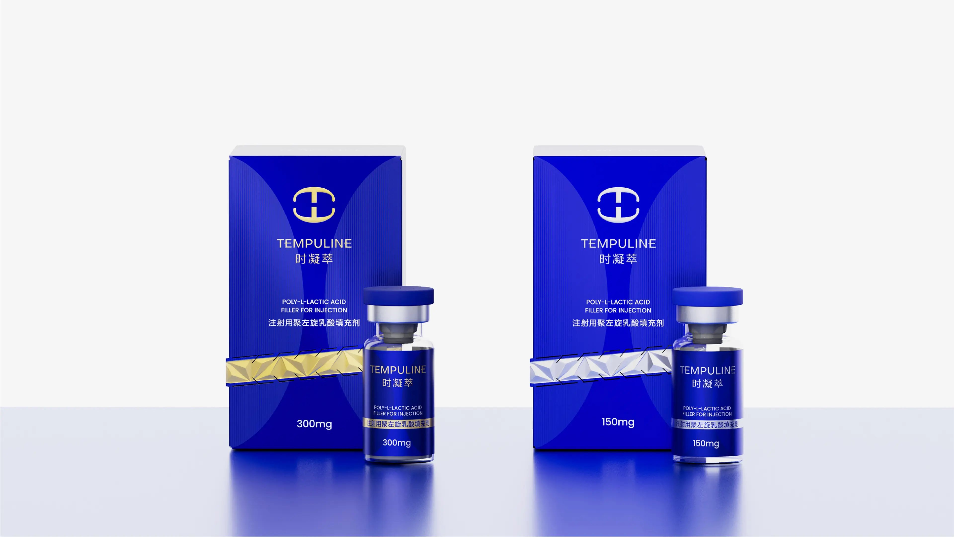
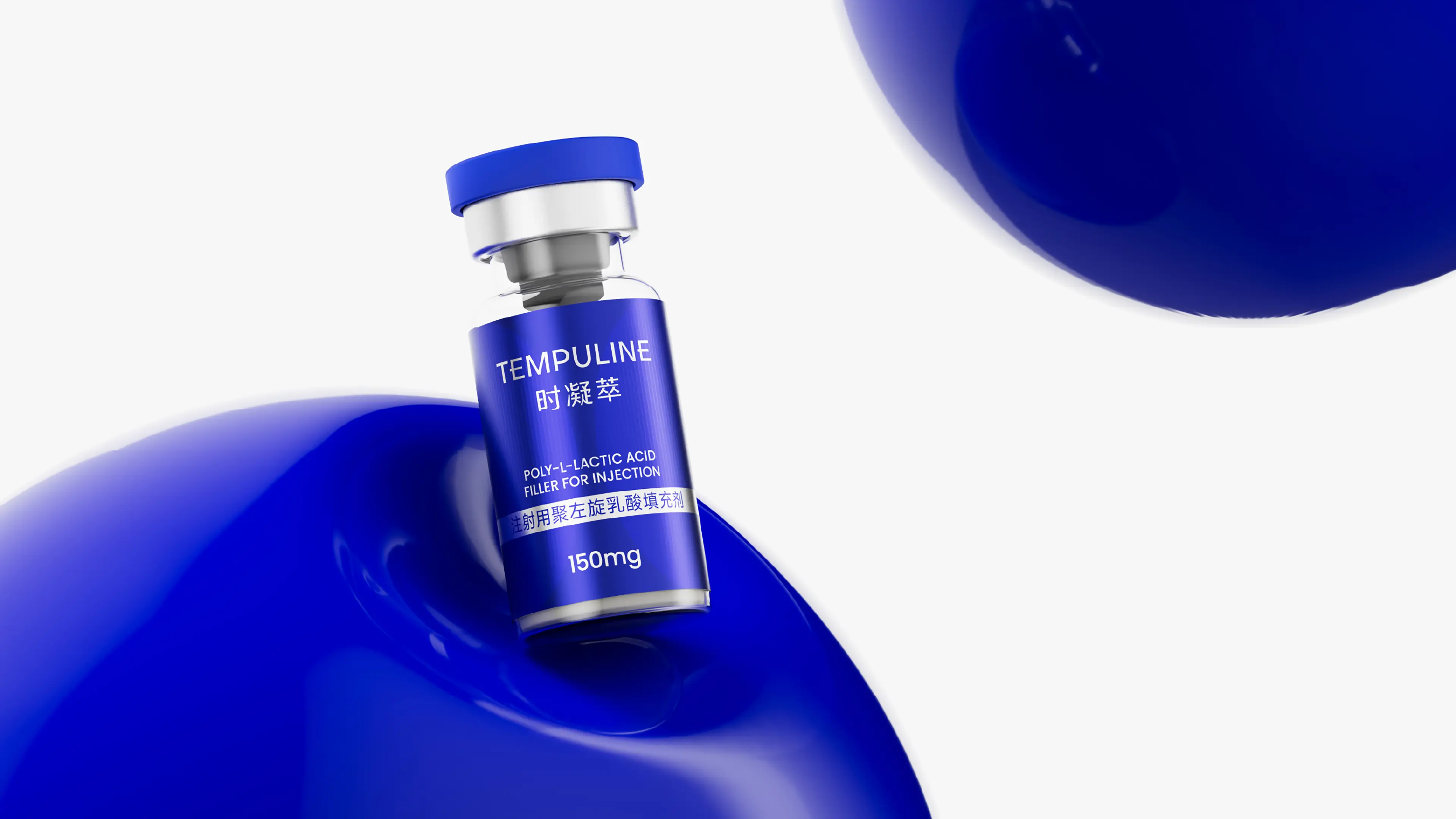
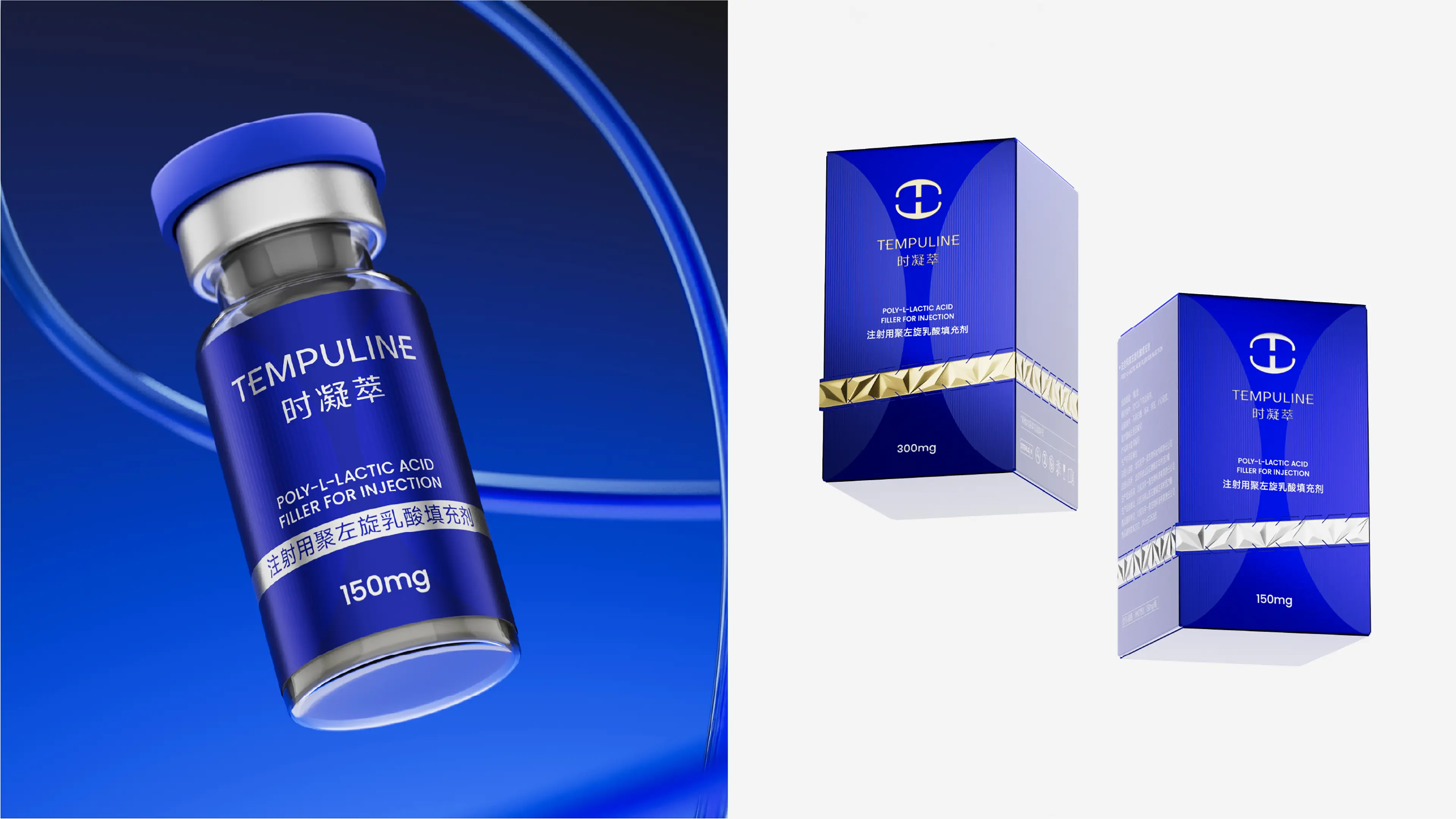
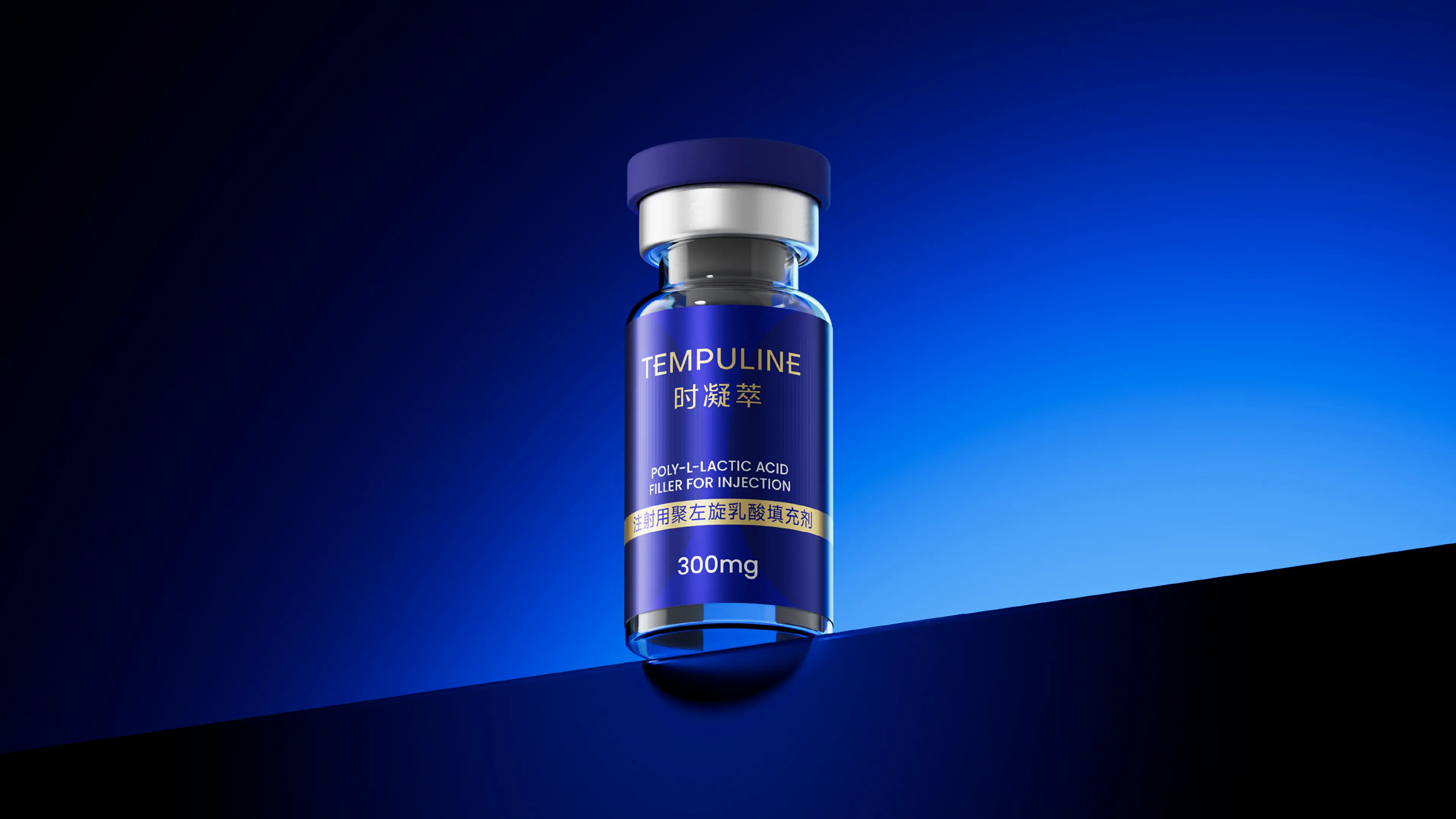
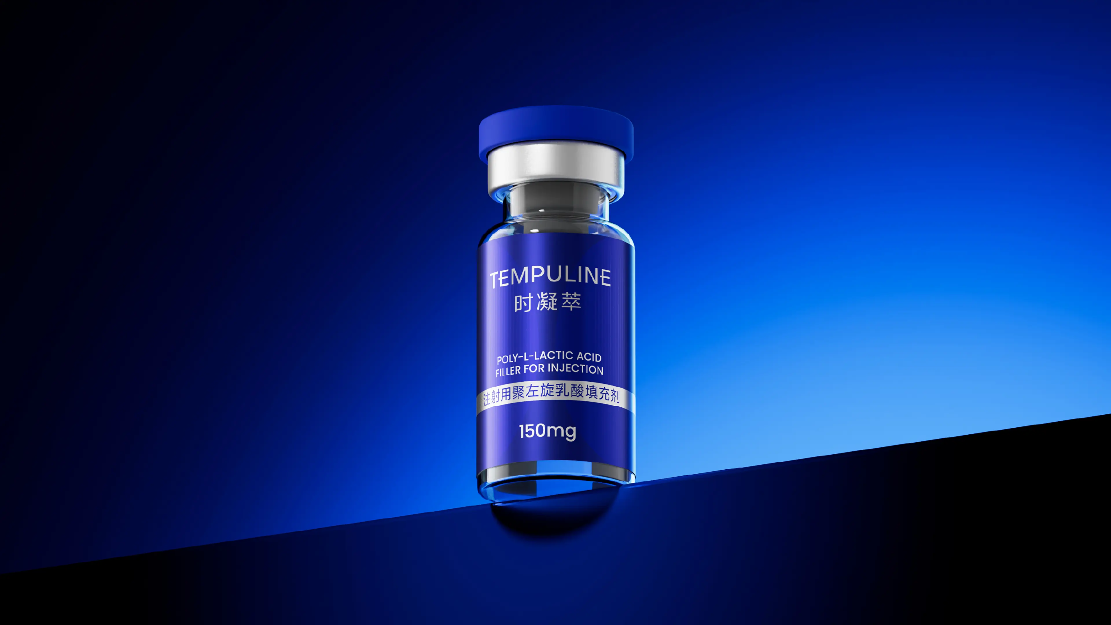
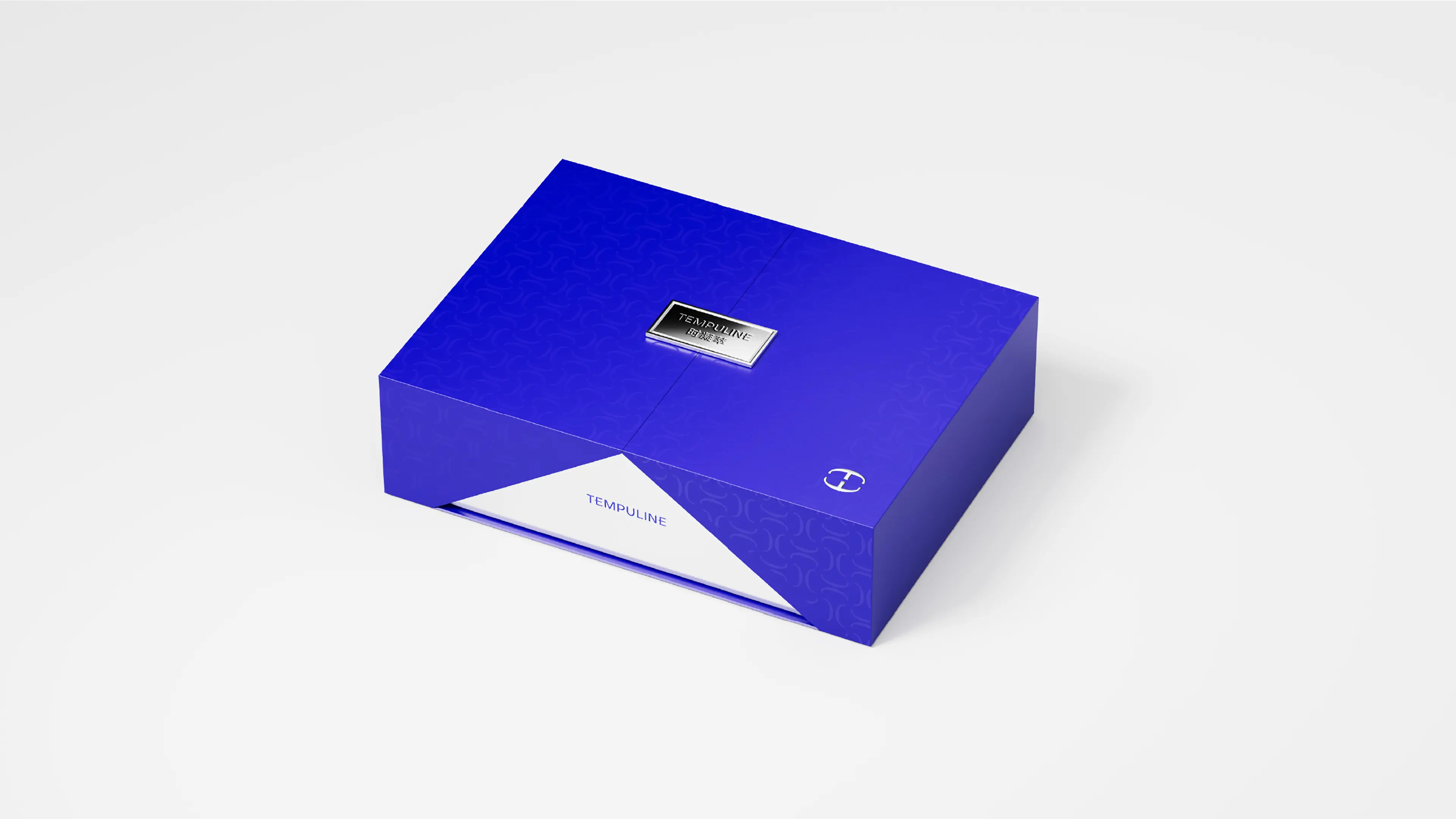
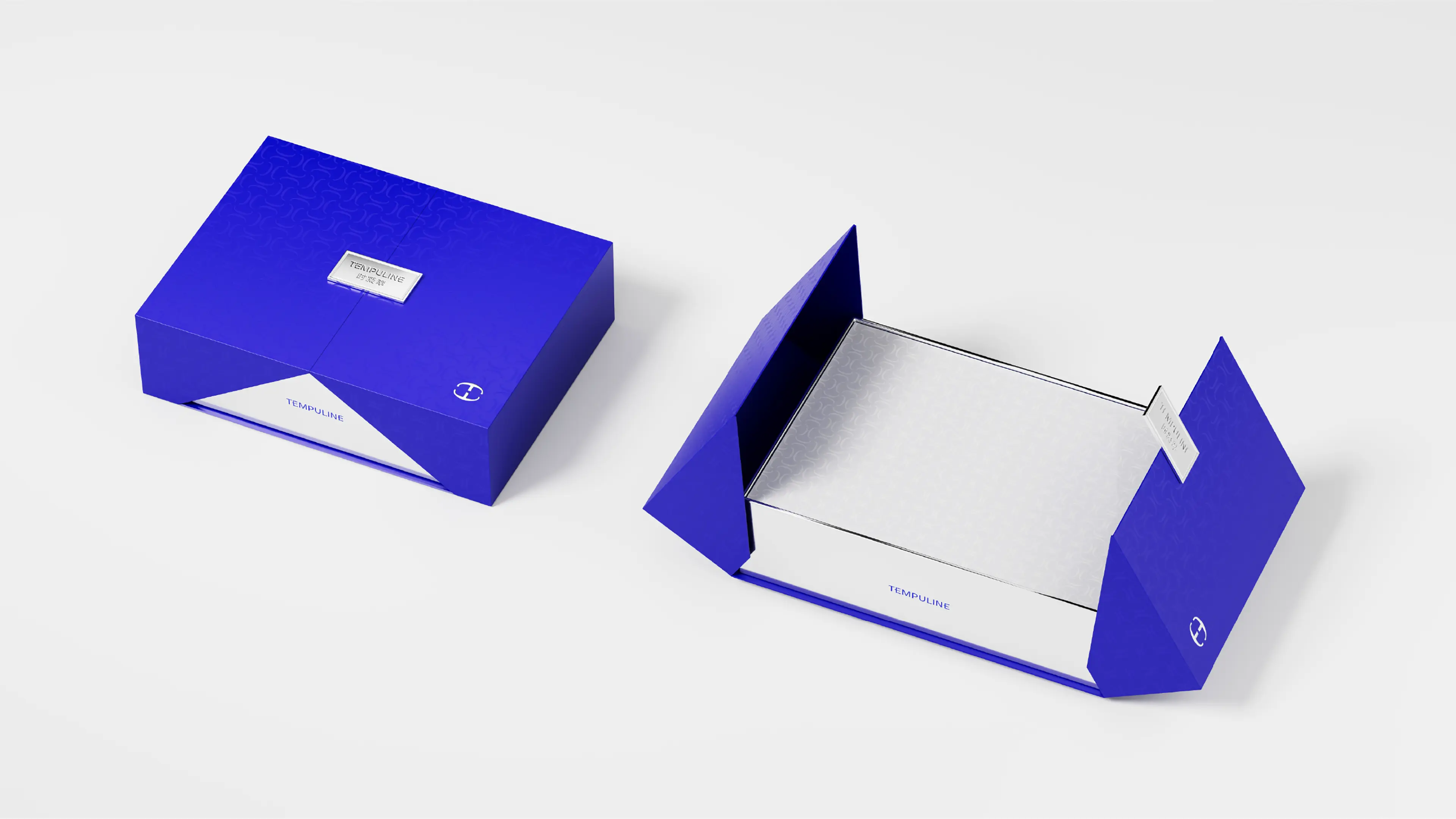
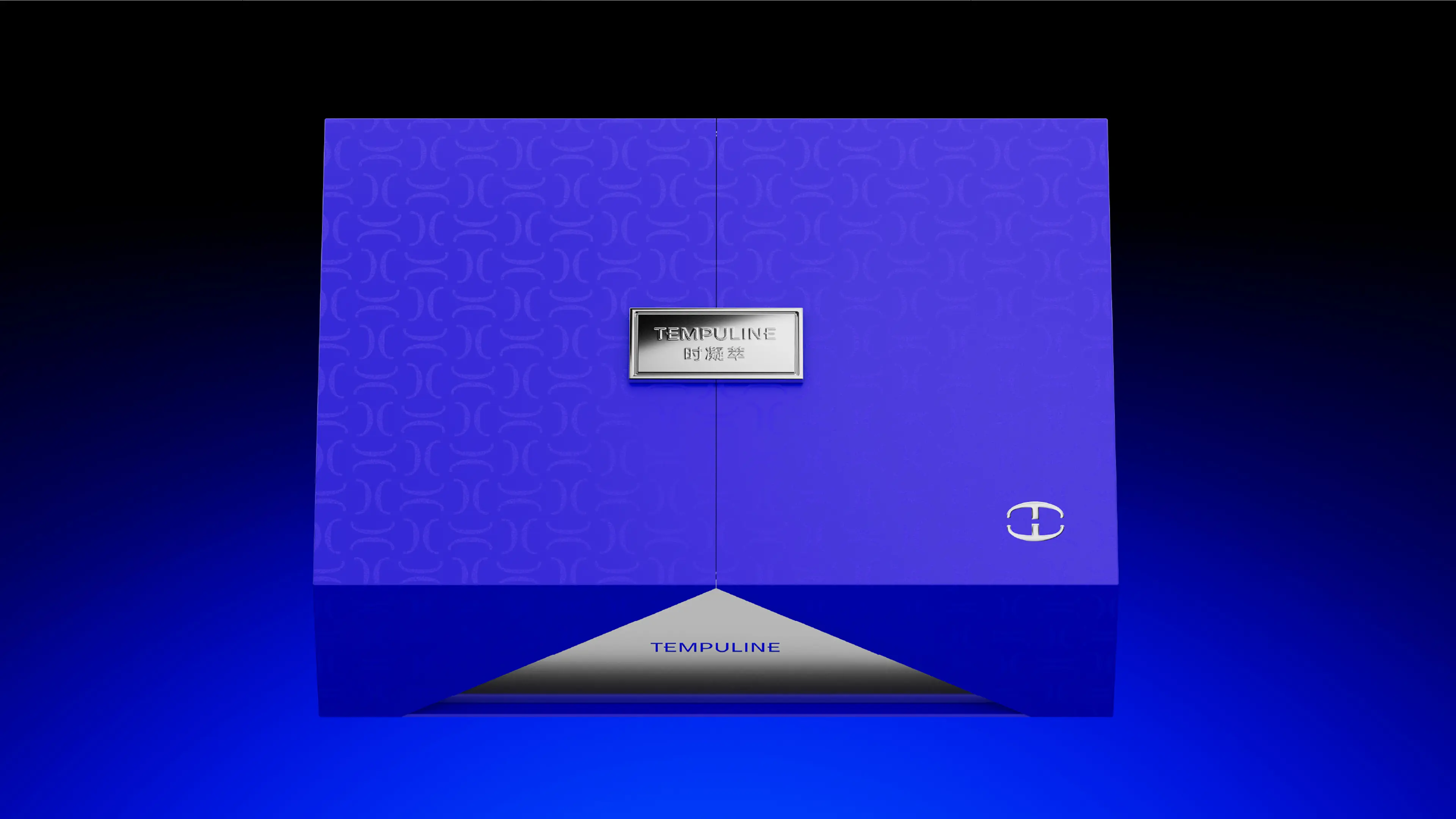
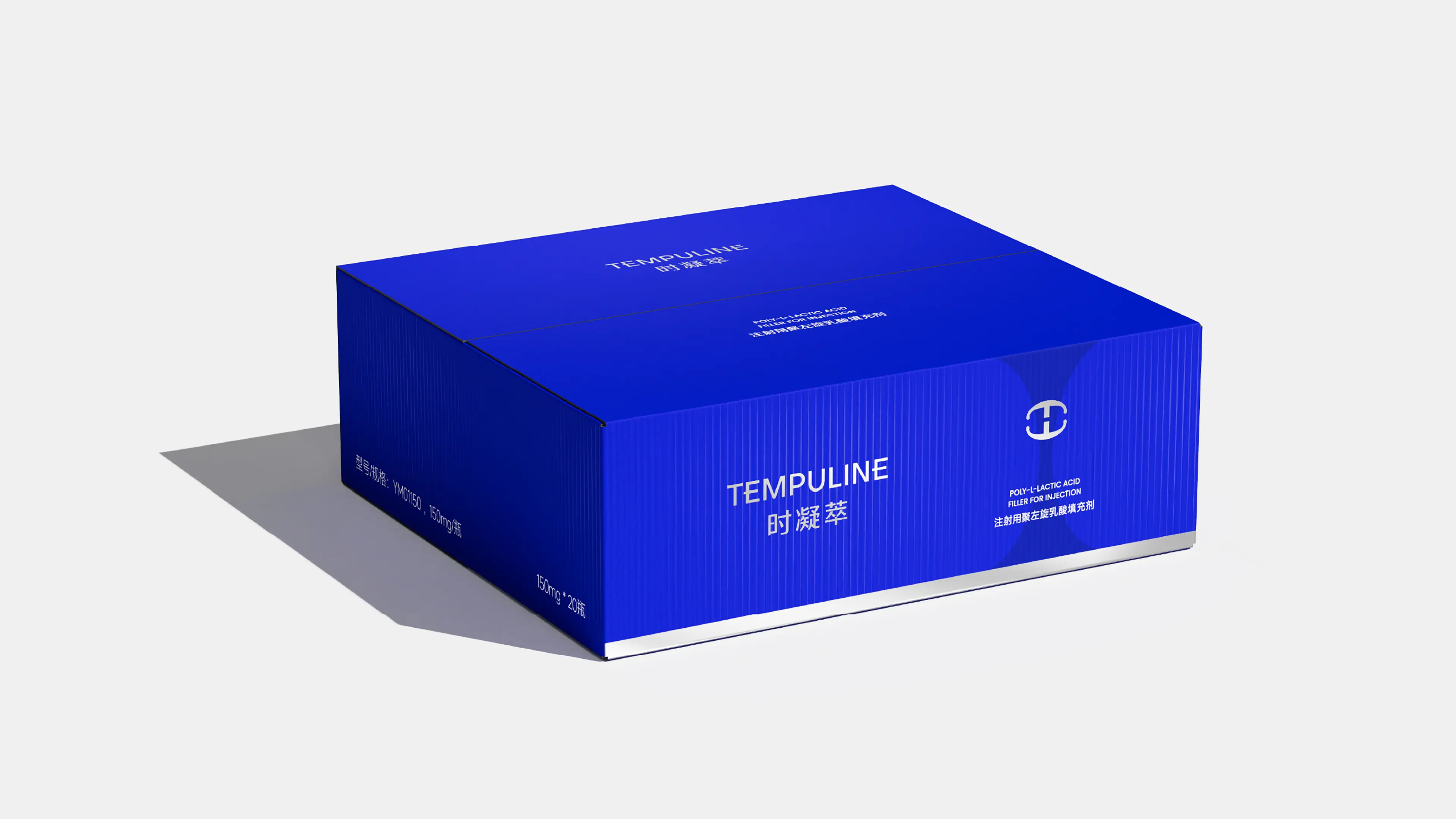
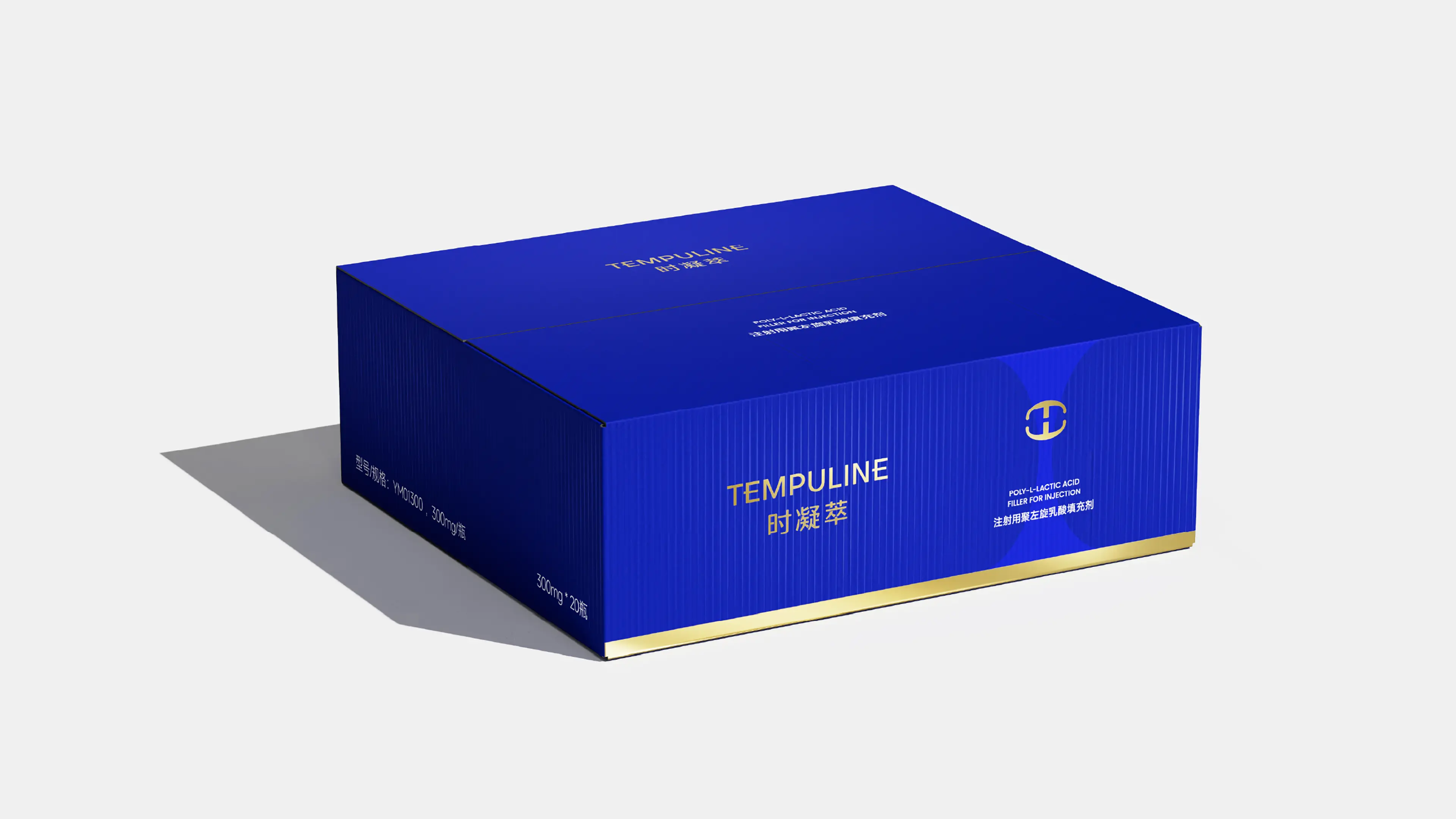
Shi Ningcuo is a high-end regenerative medical beauty brand under Beijing Jingyu Yimei Biotechnology. The brand is committed to providing safe and effective regenerative medical solutions for high-net-worth female customers with a progressive and self-generating anti-aging management concept. The brand is positioned as a progressive, self-generating anti-aging management brand - the core insight lies in: the essence of the "youth rejuvenation injection" is not "filling in", but "growing out by oneself". Based on this understanding, we have established a complete brand value system. The brand keyword "calmness" runs through the product mechanism, customer profile, and brand posture in three dimensions. The core product of the brand is Shi Ningcuo PLLA (CNDA registration number 20263130522), which is a regenerative filling product with the core component of L-lactic acid (PLLA), developed by Yimei Technology over five years, and manufactured according to pharmaceutical-grade standards.
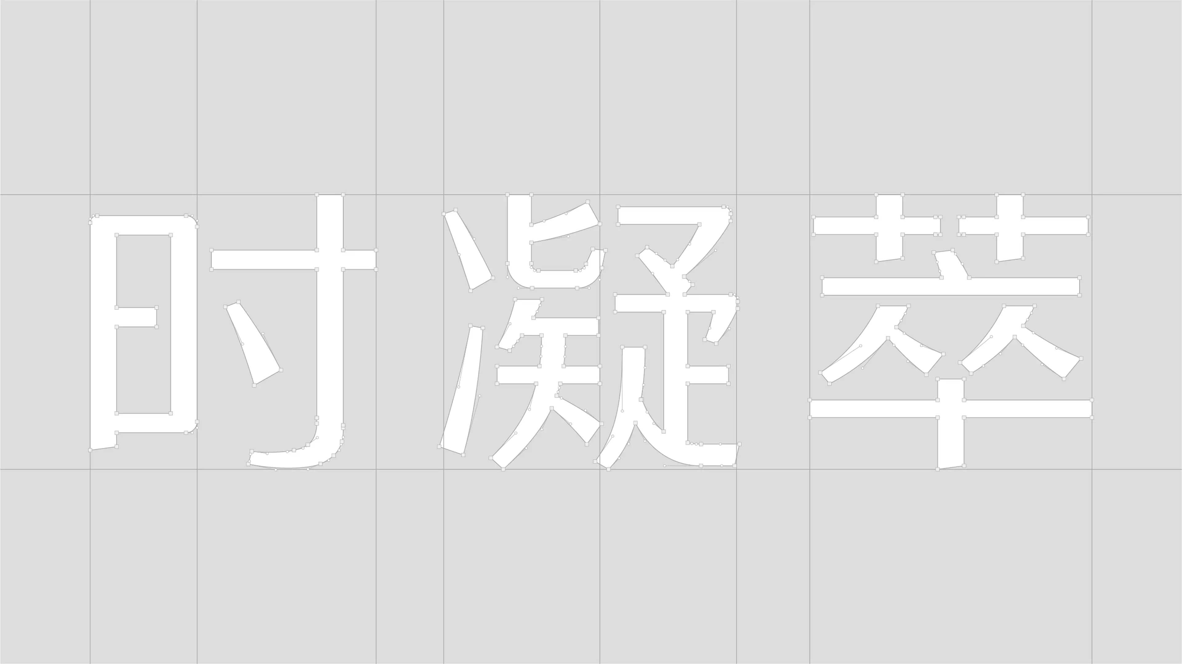
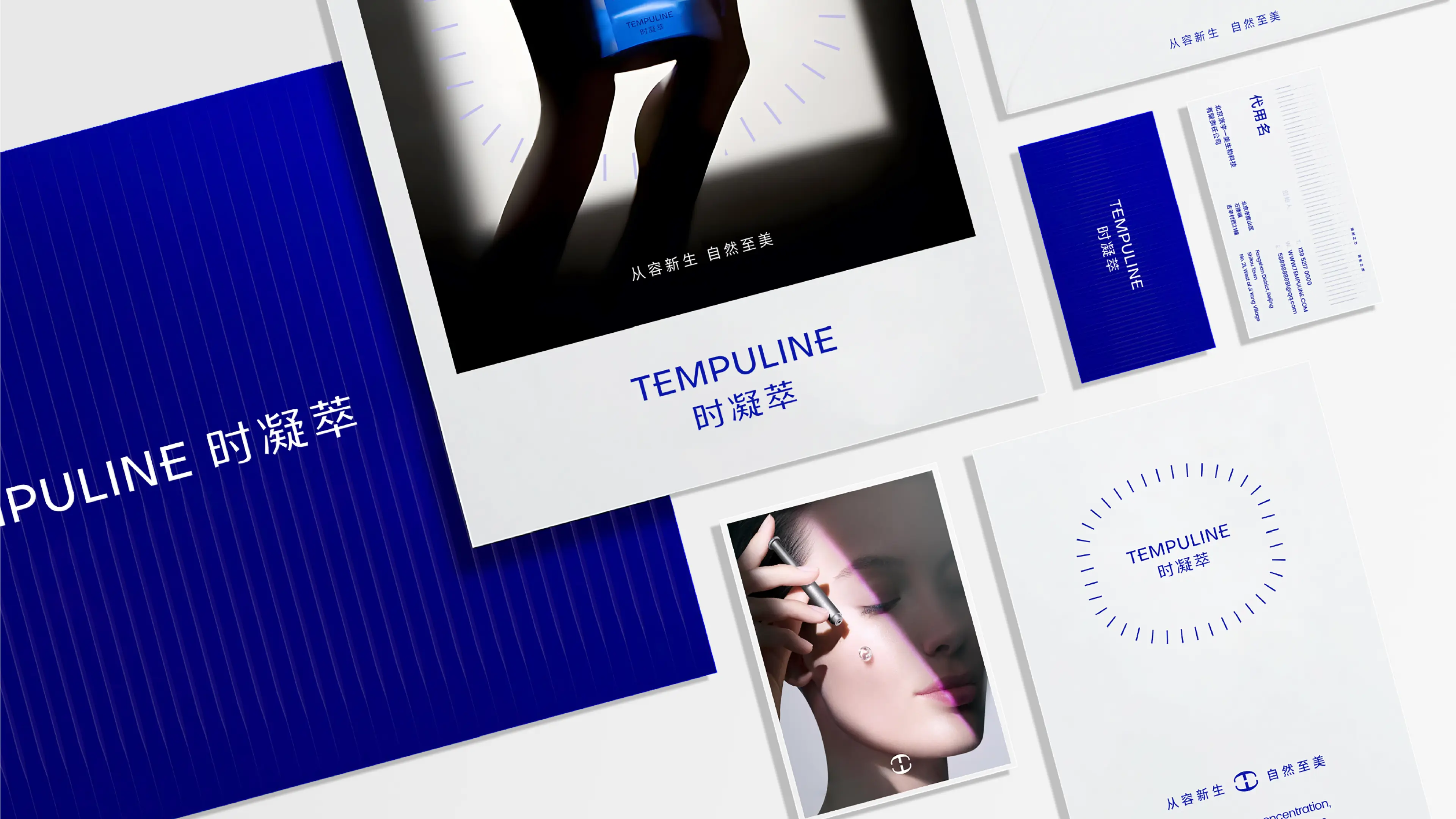
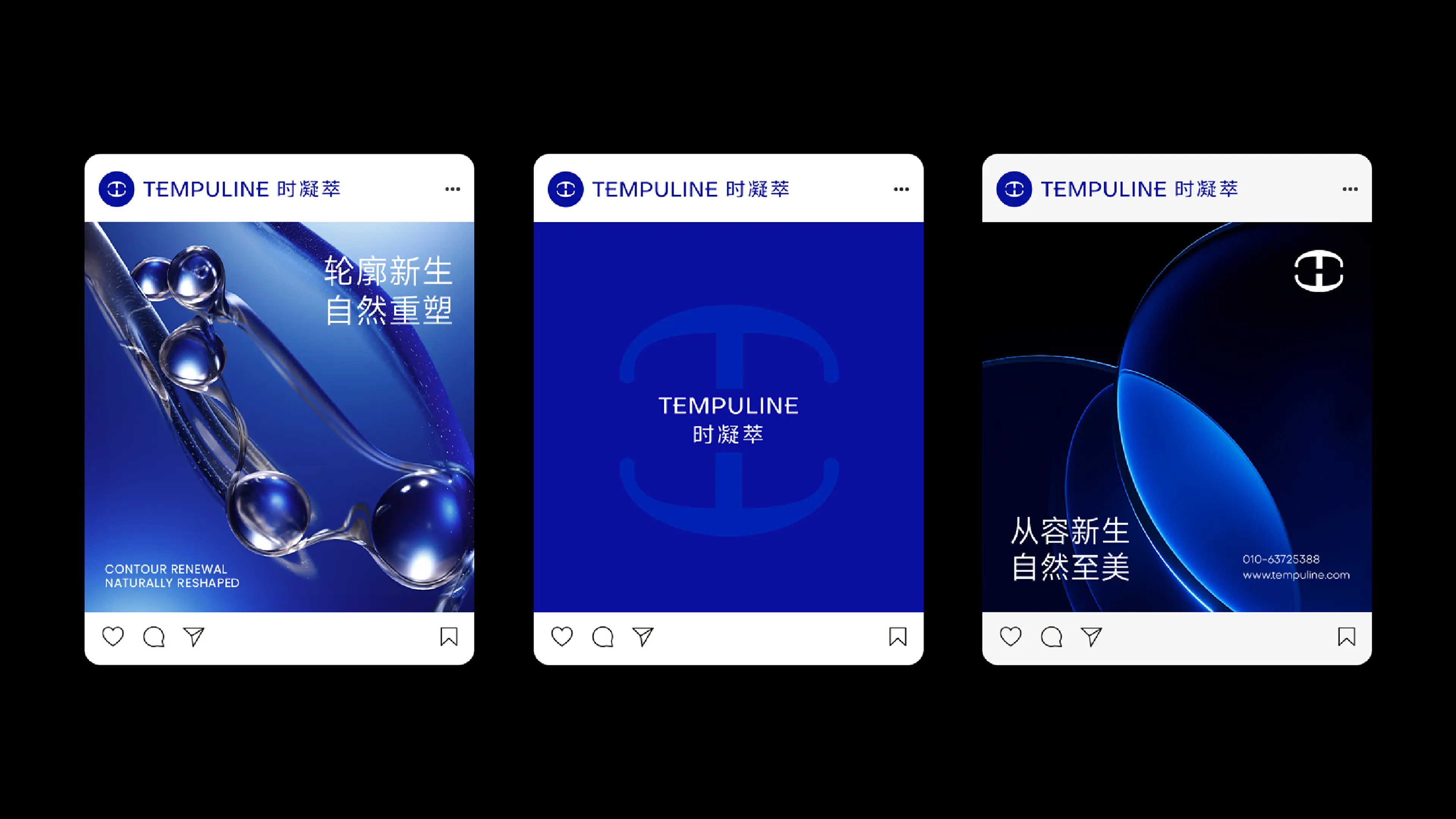
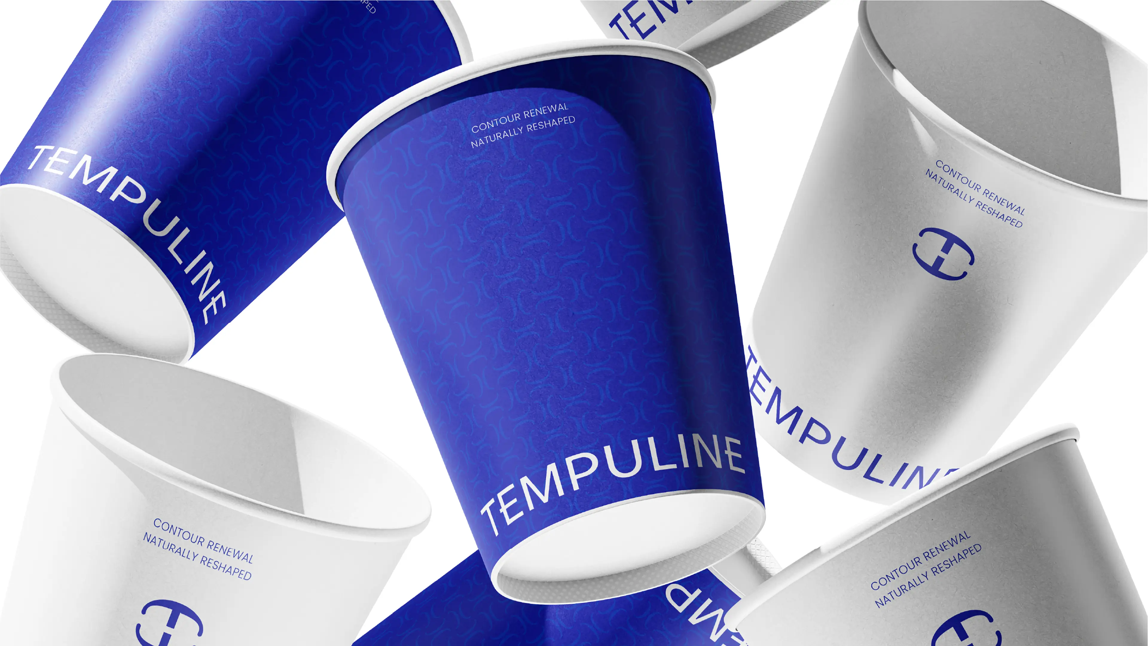
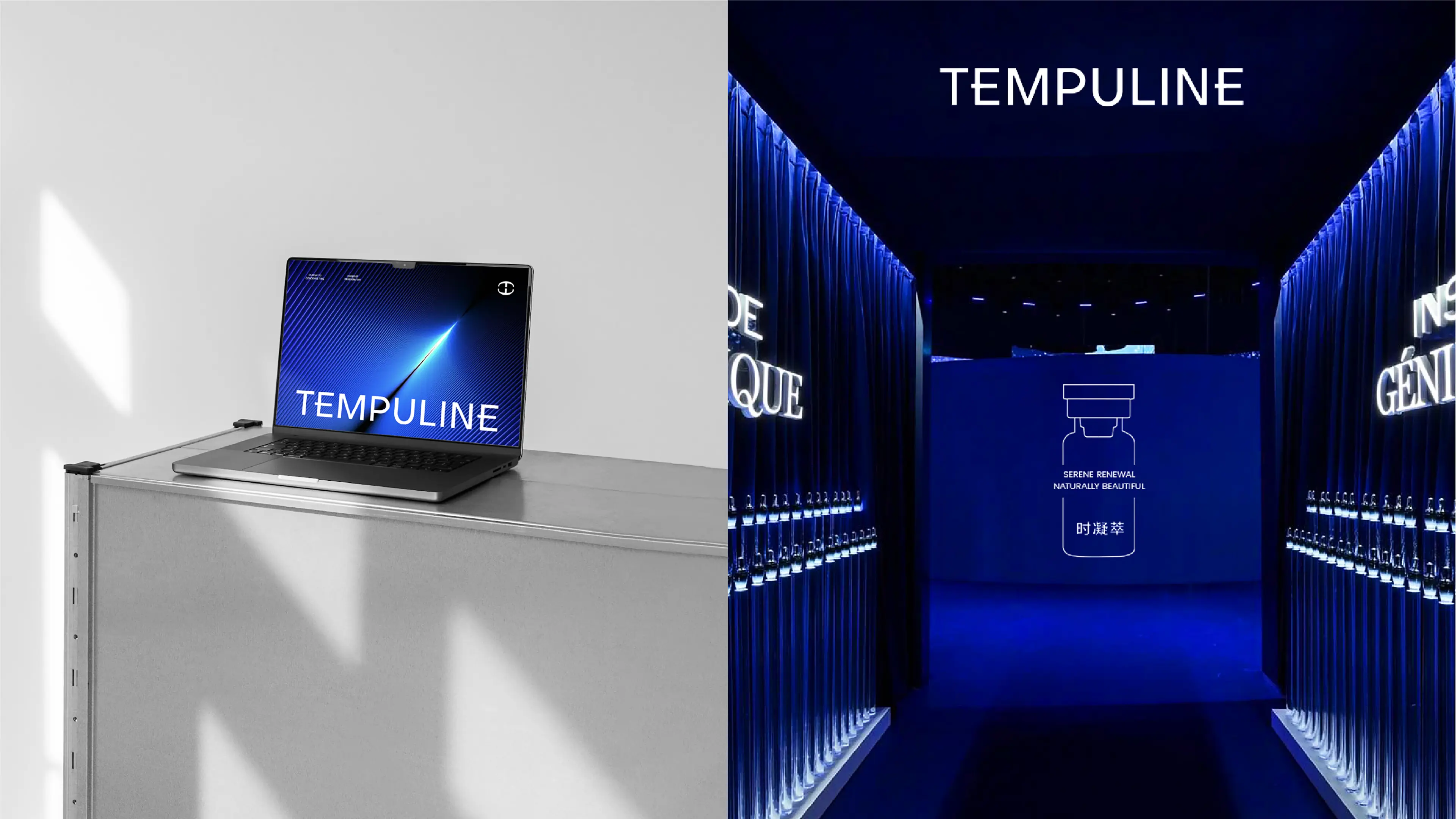
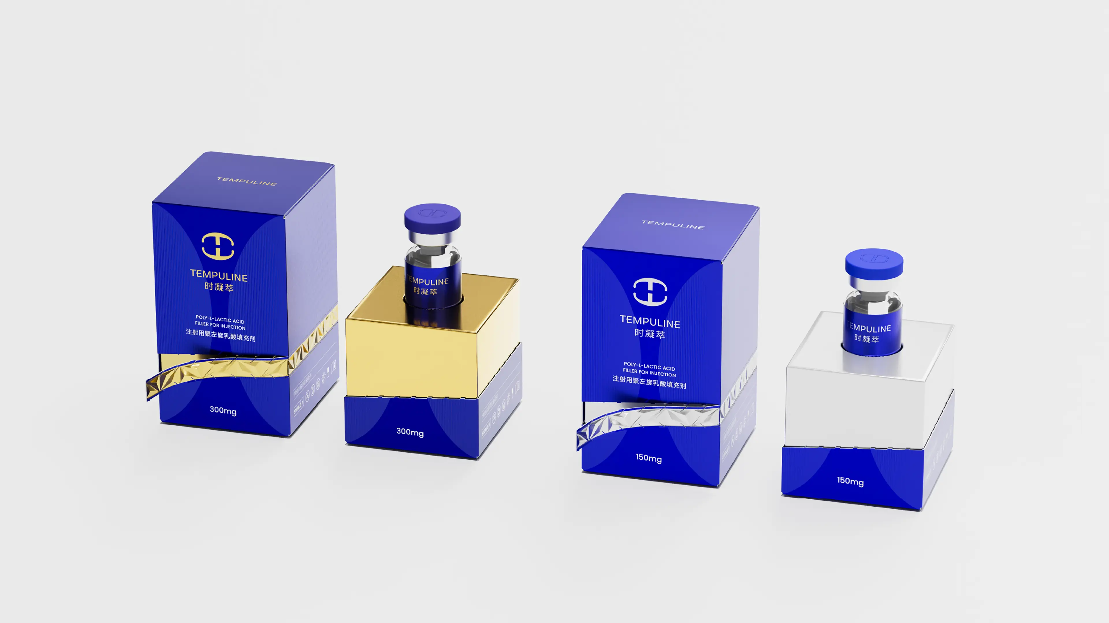
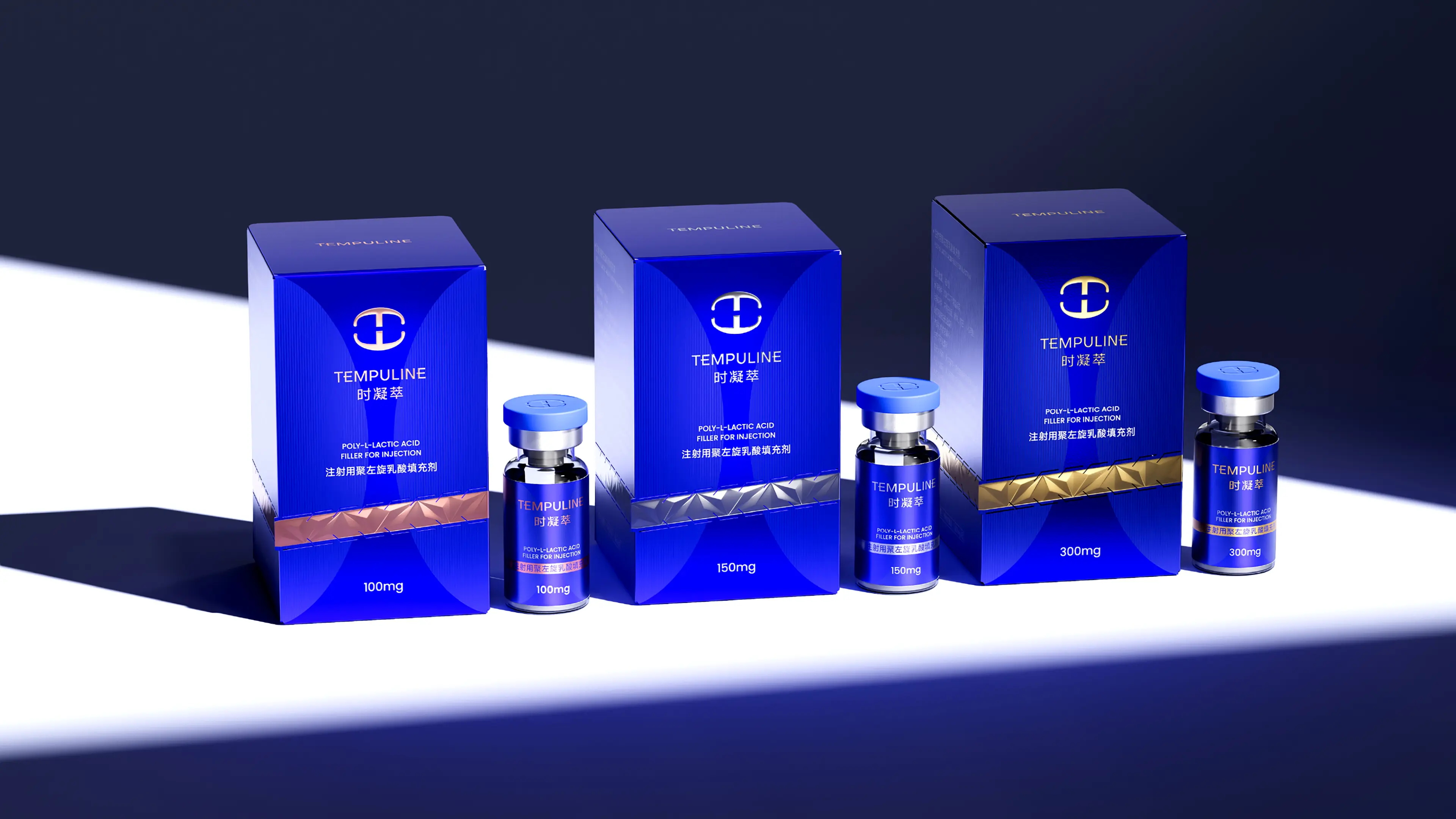
This project covers all dimensions of brand positioning, brand story writing, brand logo design, brand visual identity system (VIS), brand comprehensive booklet planning and design, product packaging design, terminal visual norms, etc. The core concept is systematically applied to the visual construction of Shi Ningcuo through the design approach of luxury - not ostentatious, emphasizing texture, and highlighting the permanence of symbols. Traditional medical beauty devices have long faced a dilemma - how to find a balance between "professional and reliable" and "high-end and warm". Traditional medical beauty device visuals are cold and highly homogeneous, while Shi Ningcuo is targeted at high-net-worth female customers and has extremely high requirements for quality and aesthetics. Our proposition is: using the design logic of luxury to reshape the brand expression of medical devices.
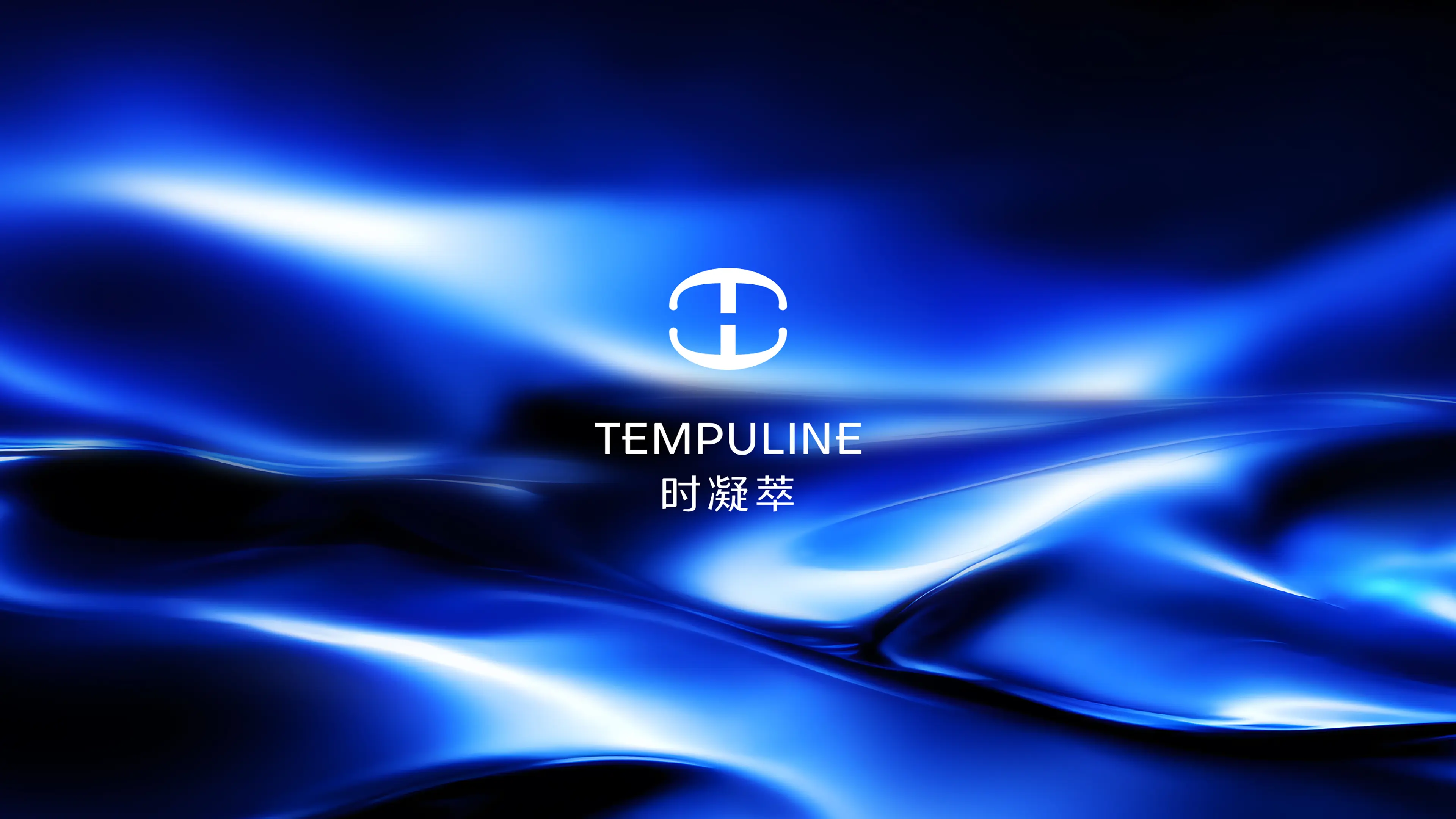
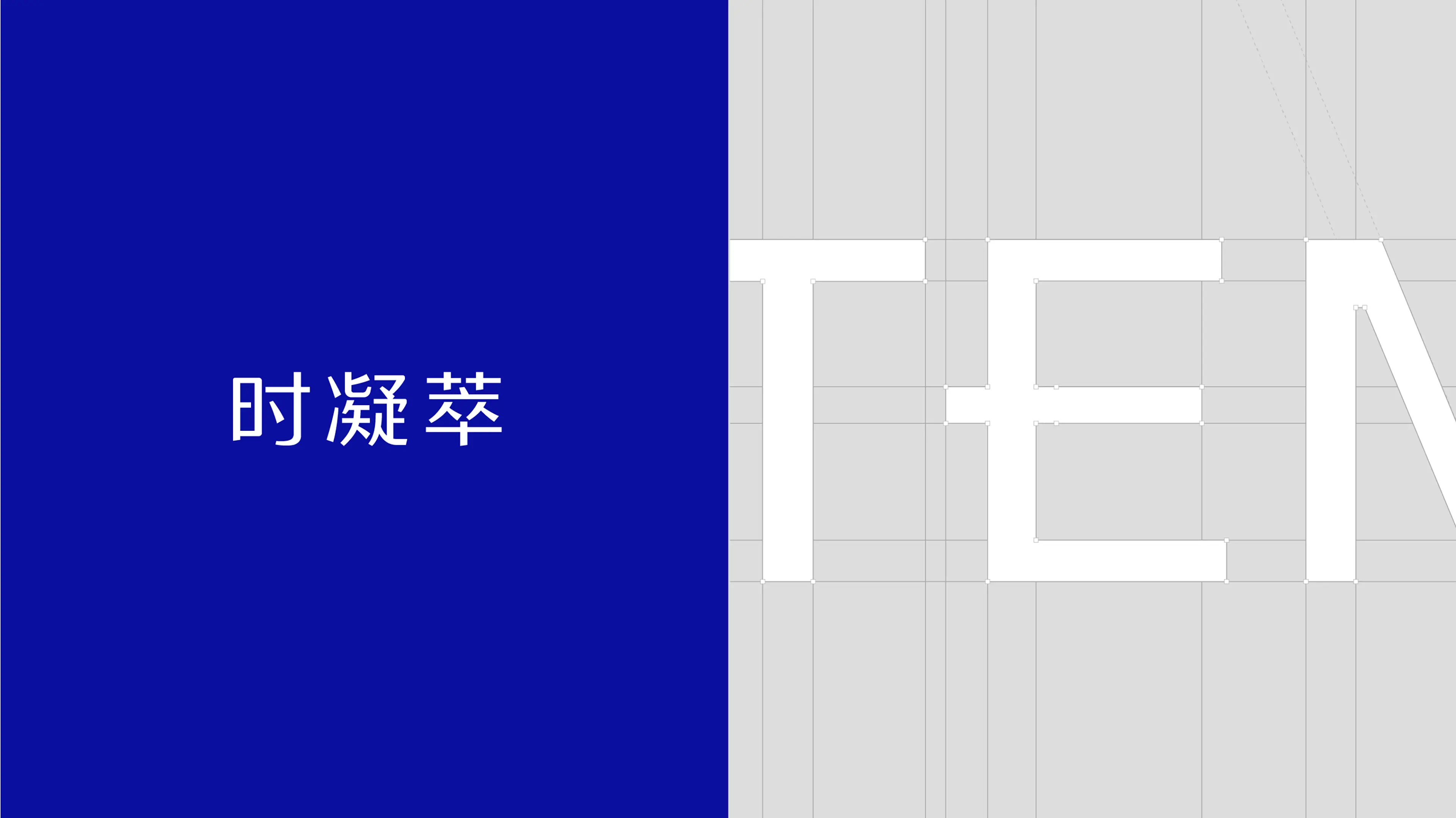
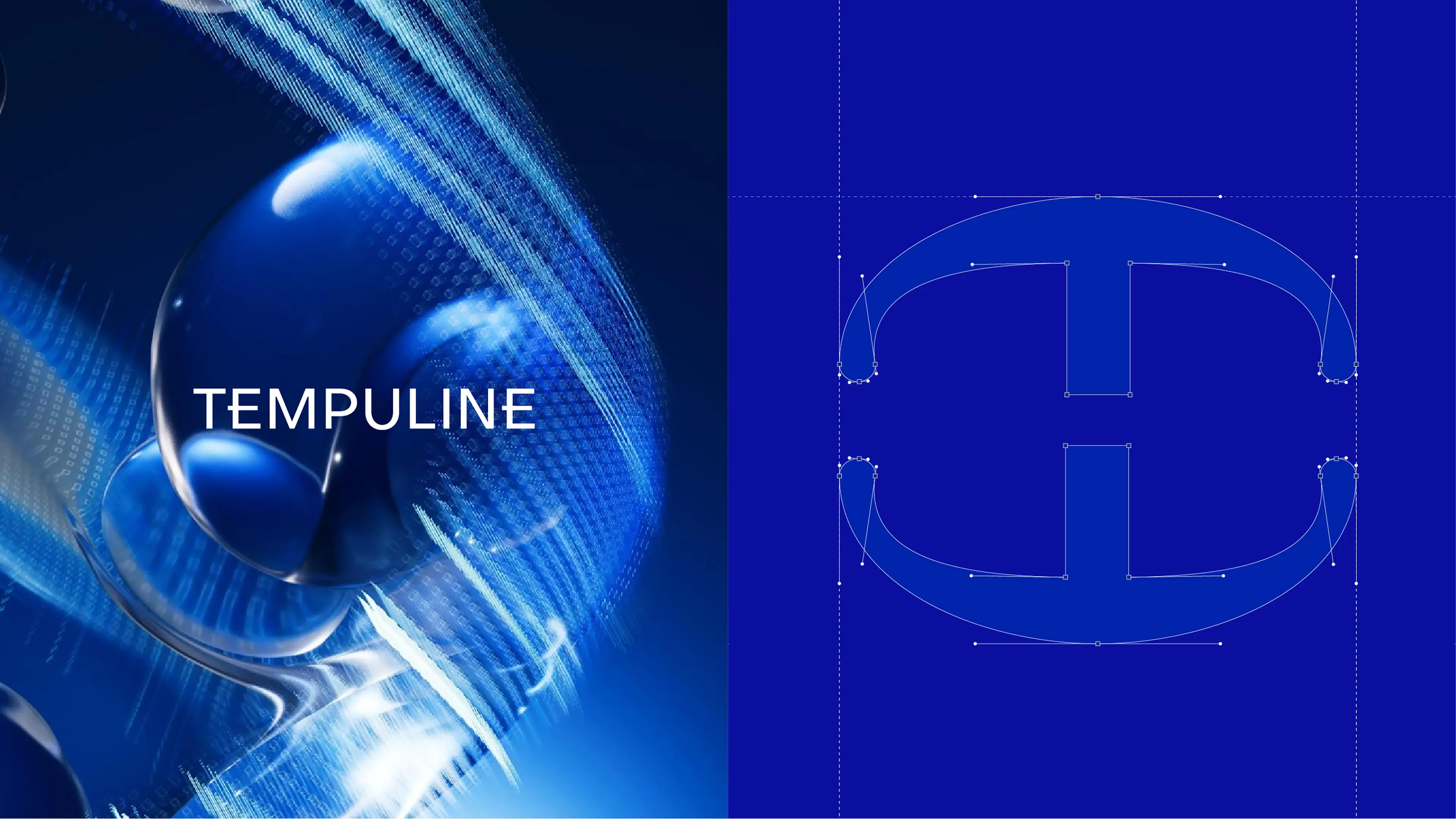
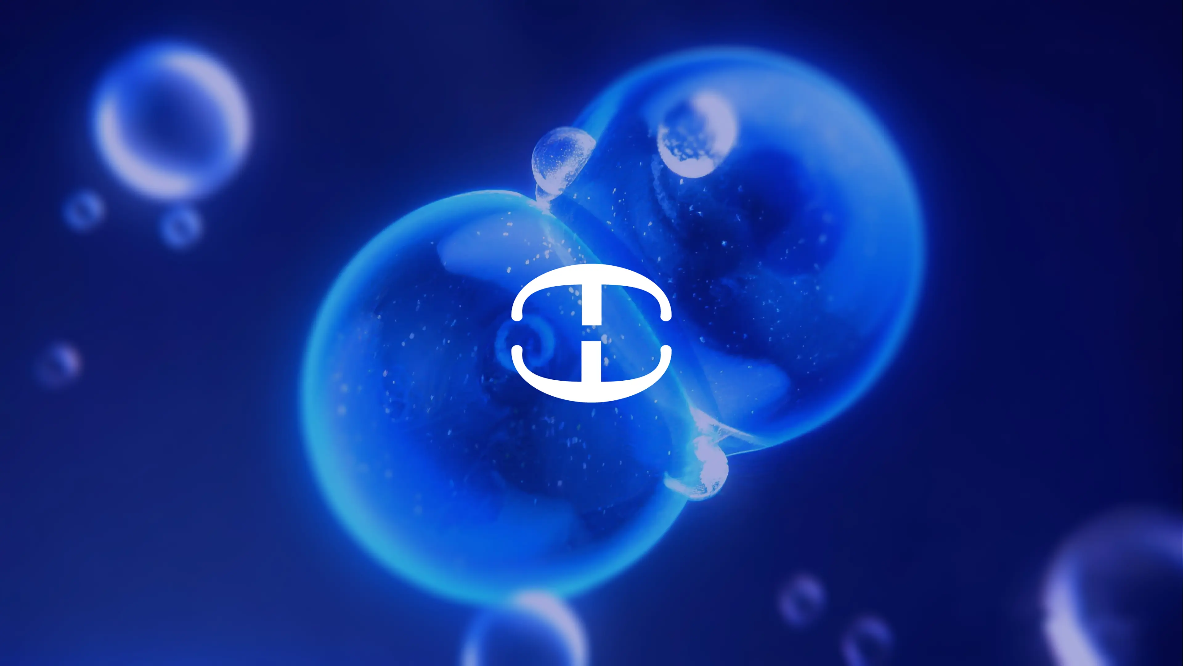
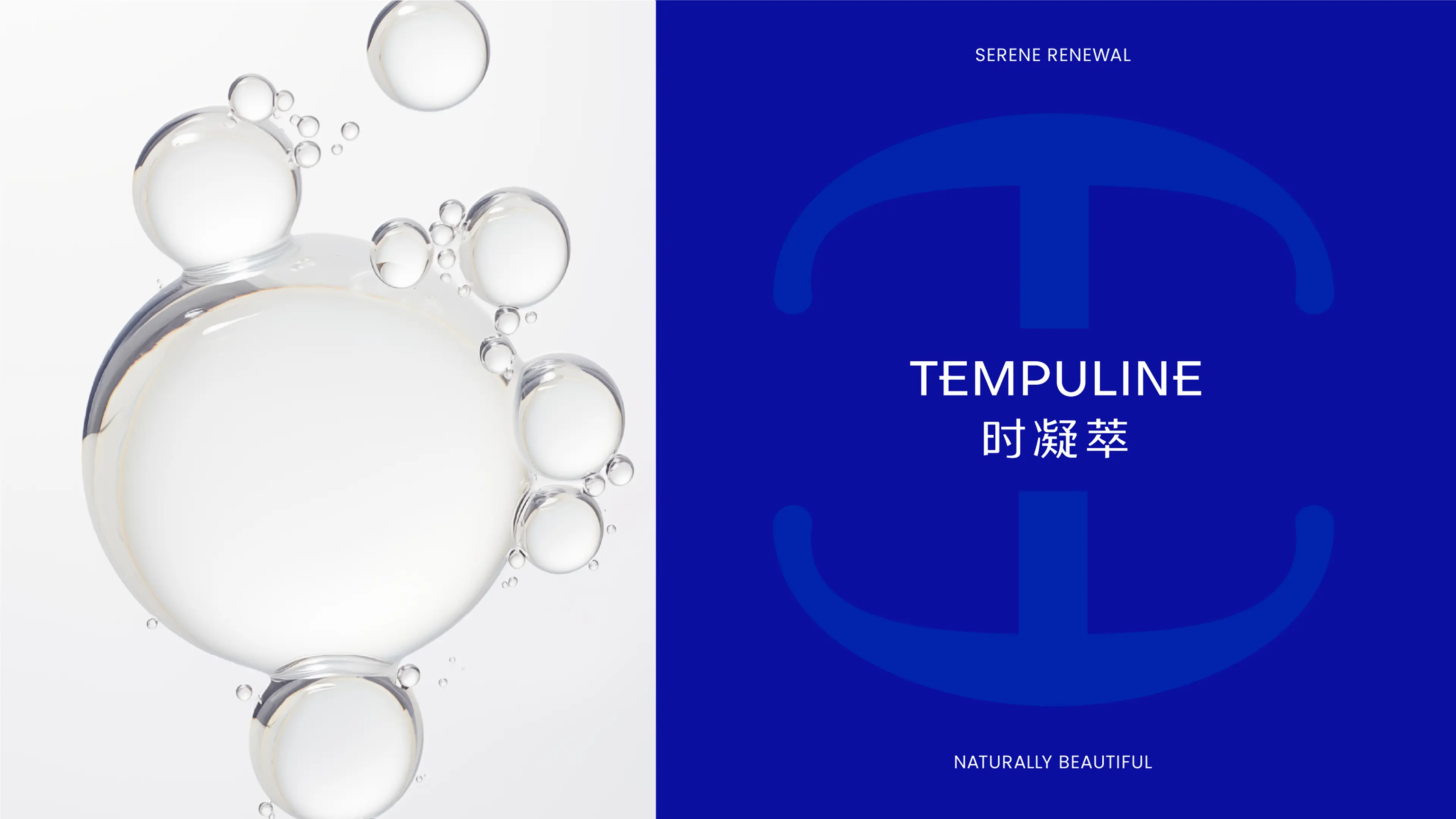
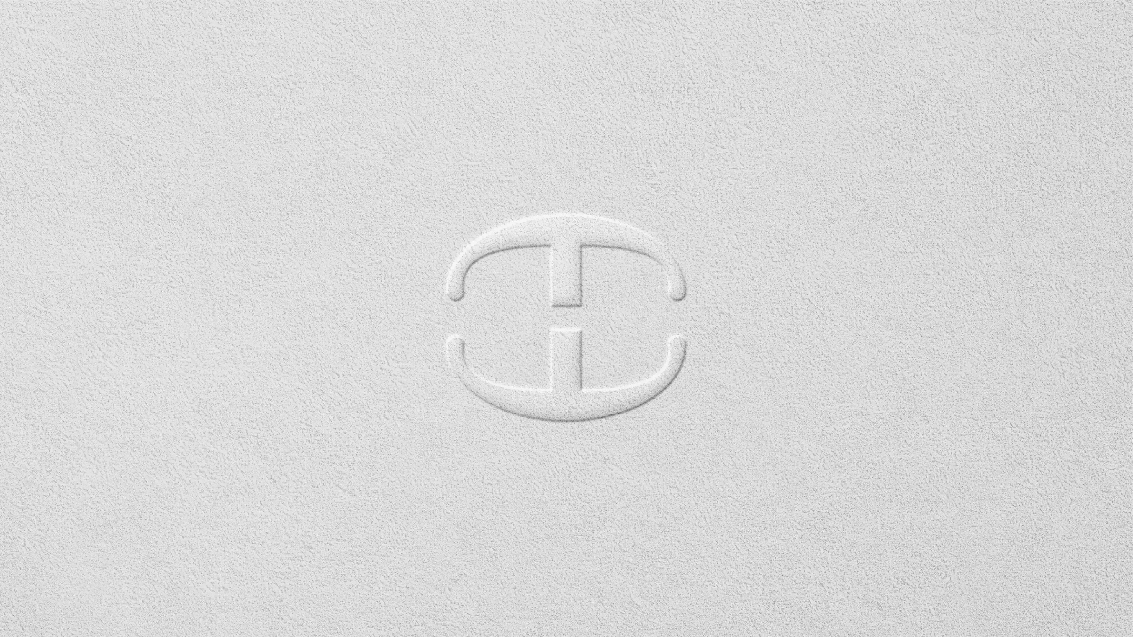
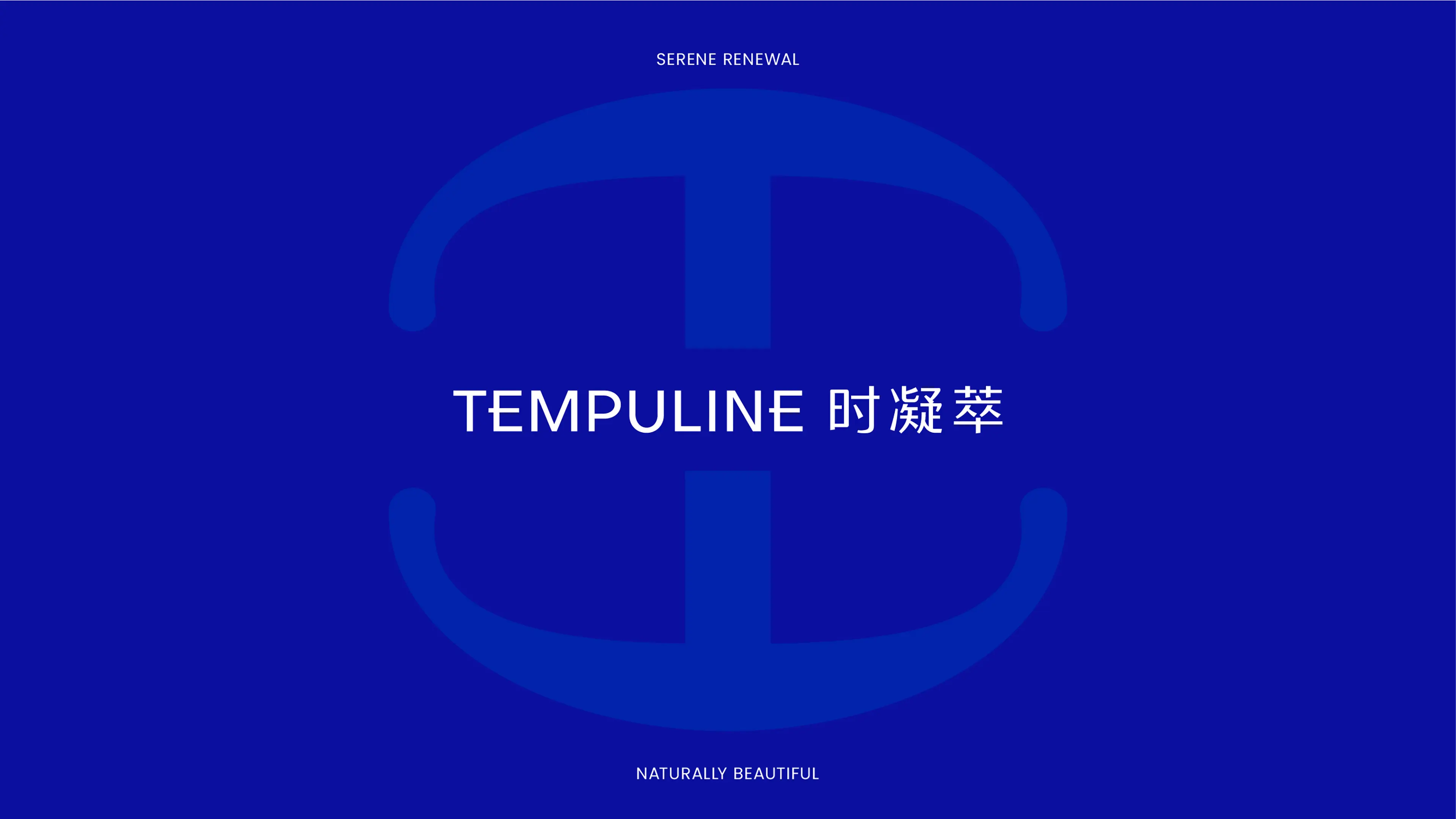
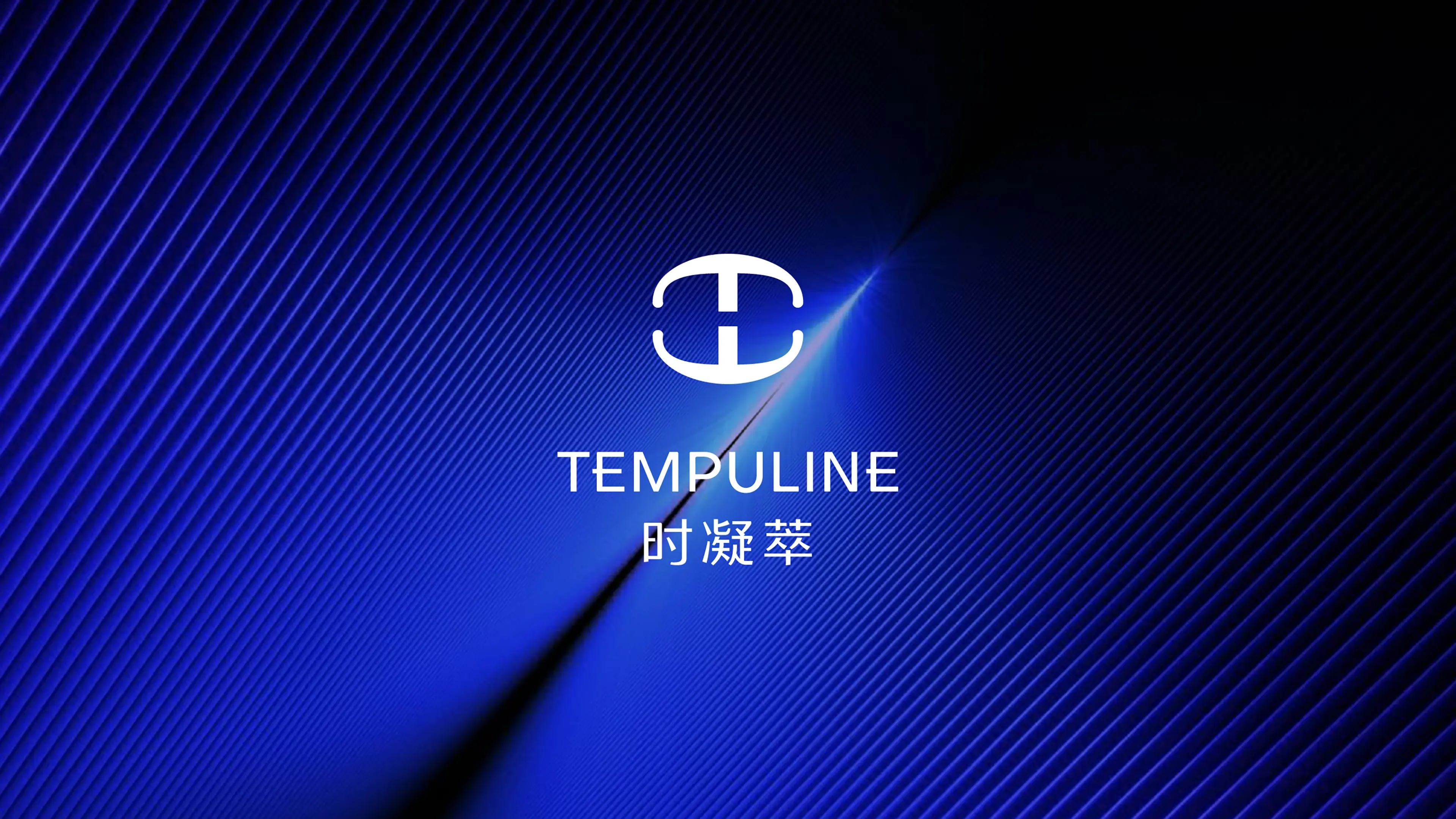
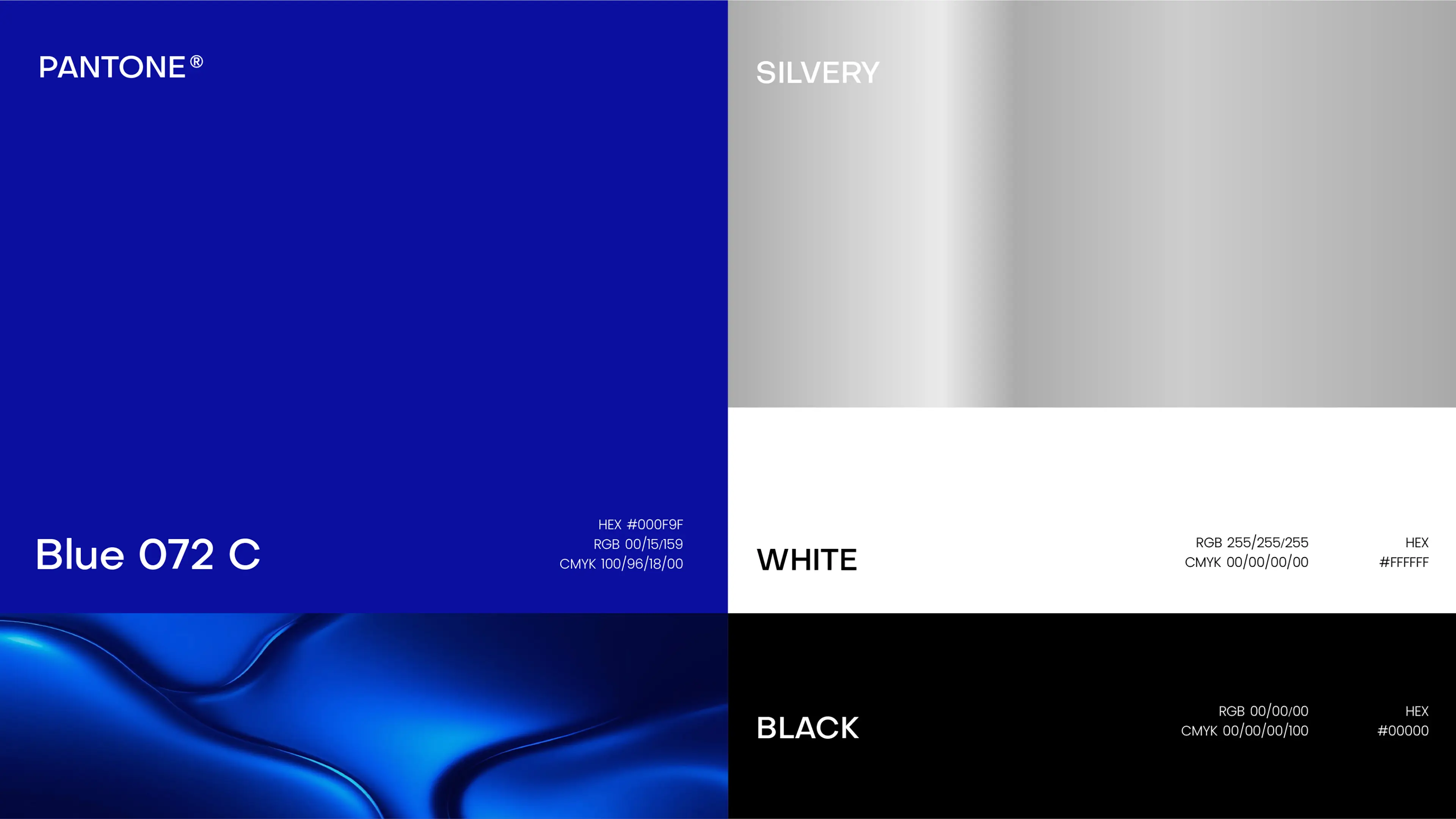
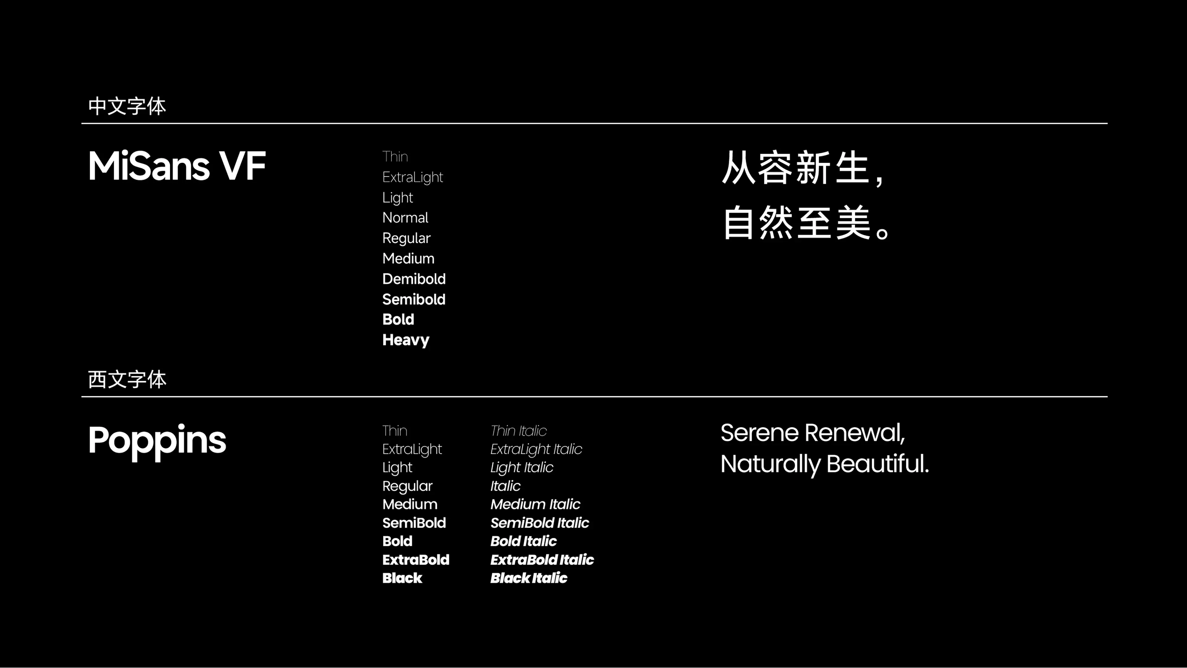
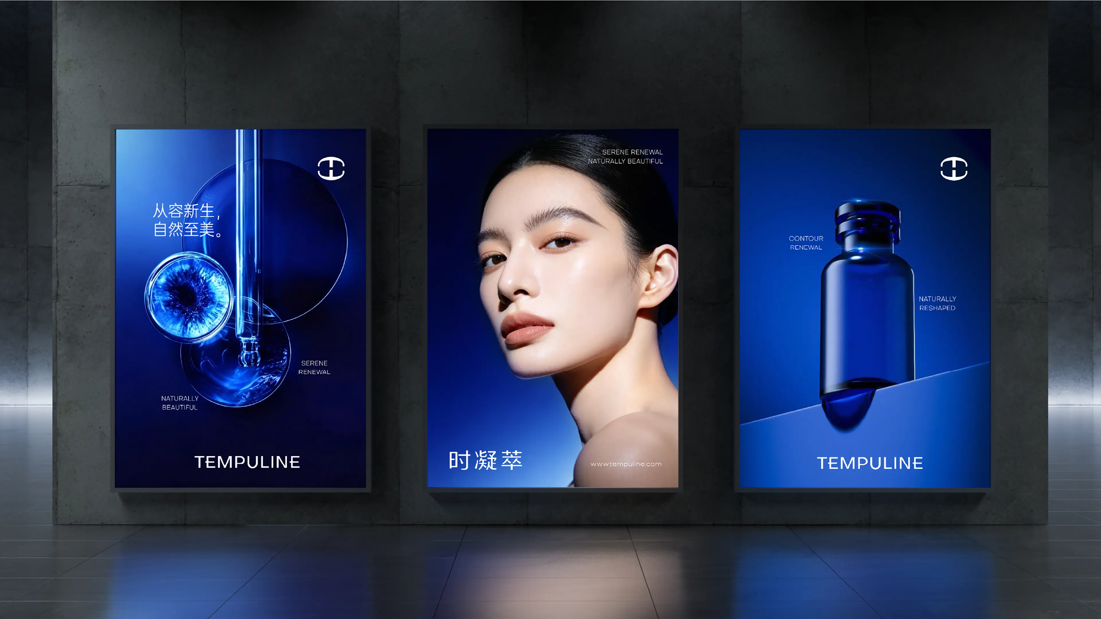
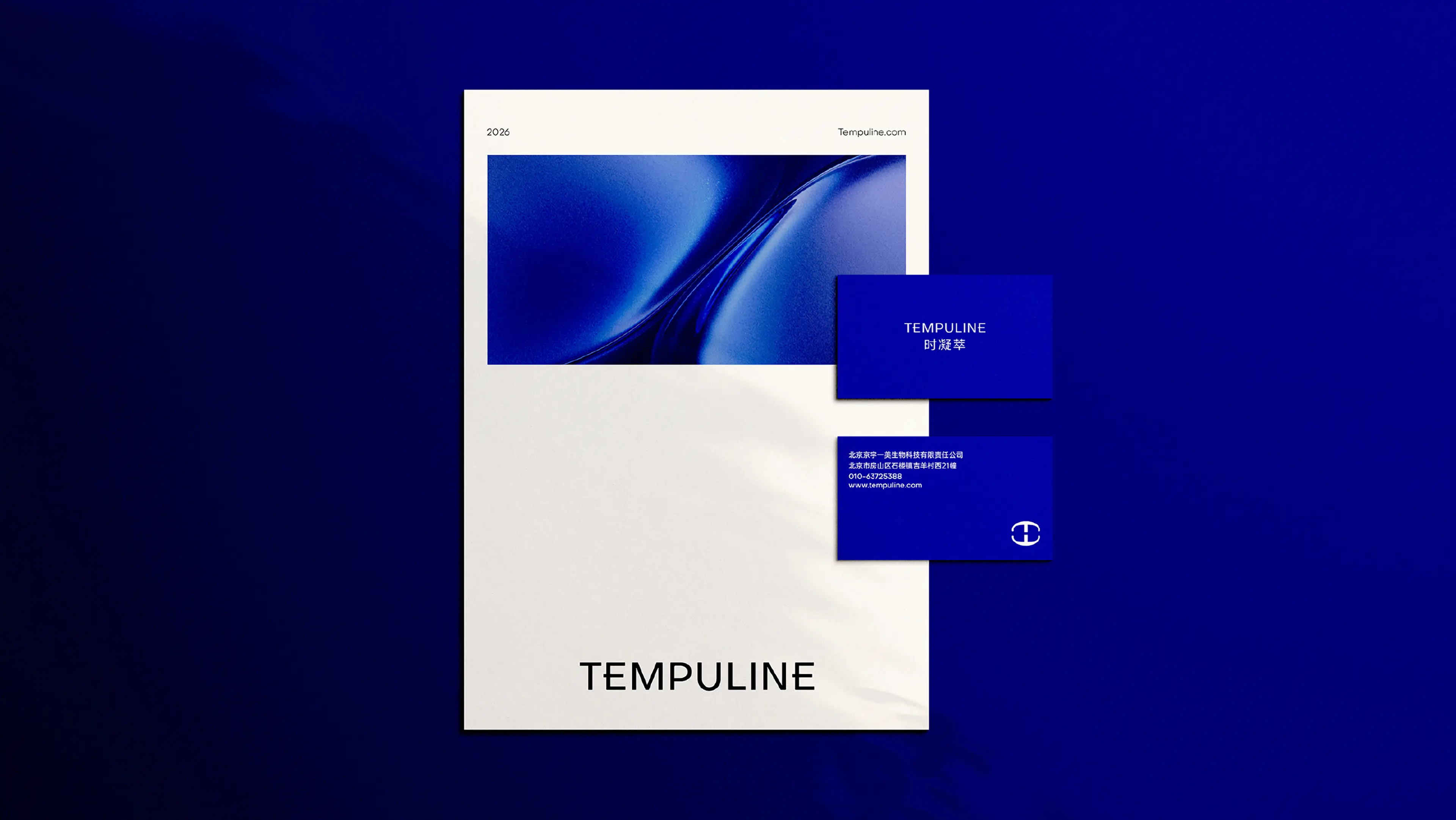
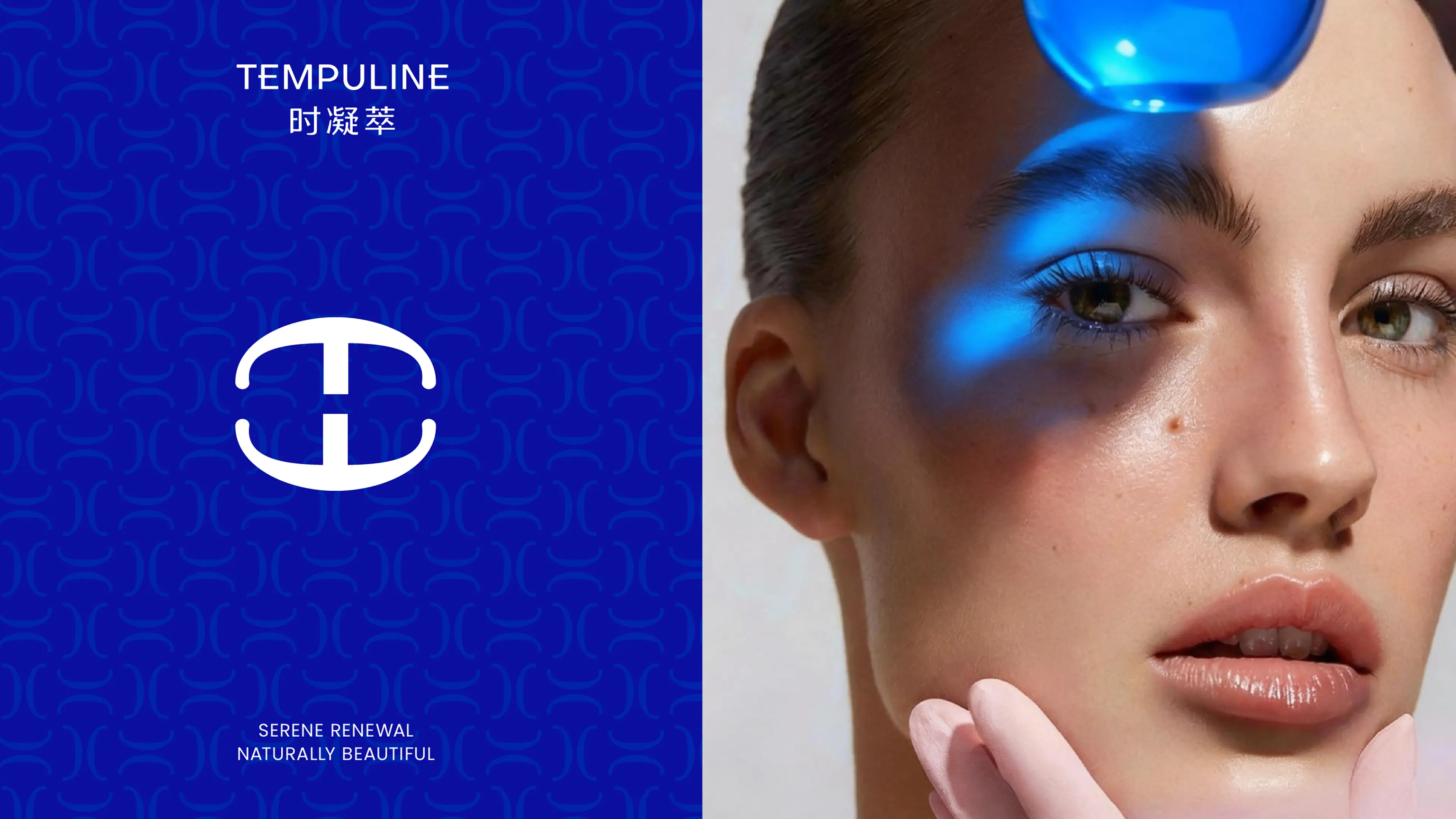
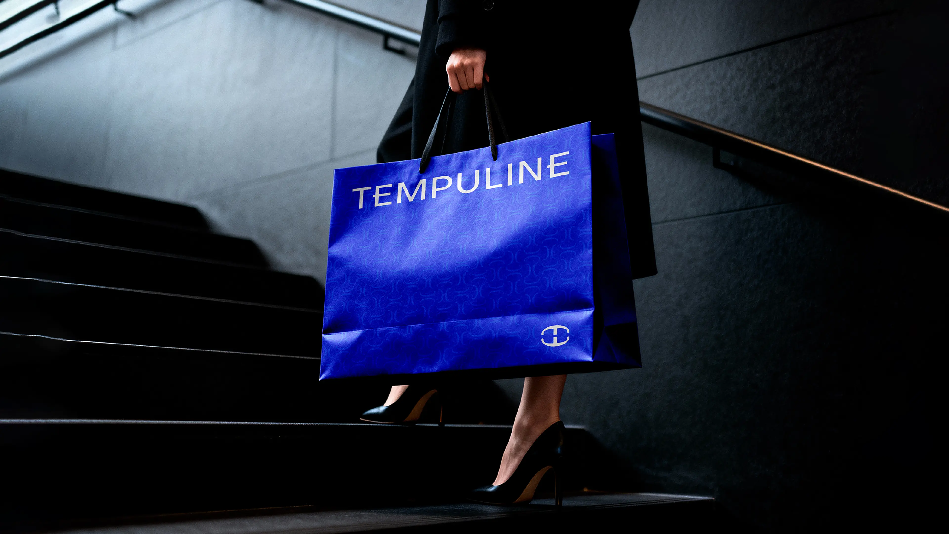
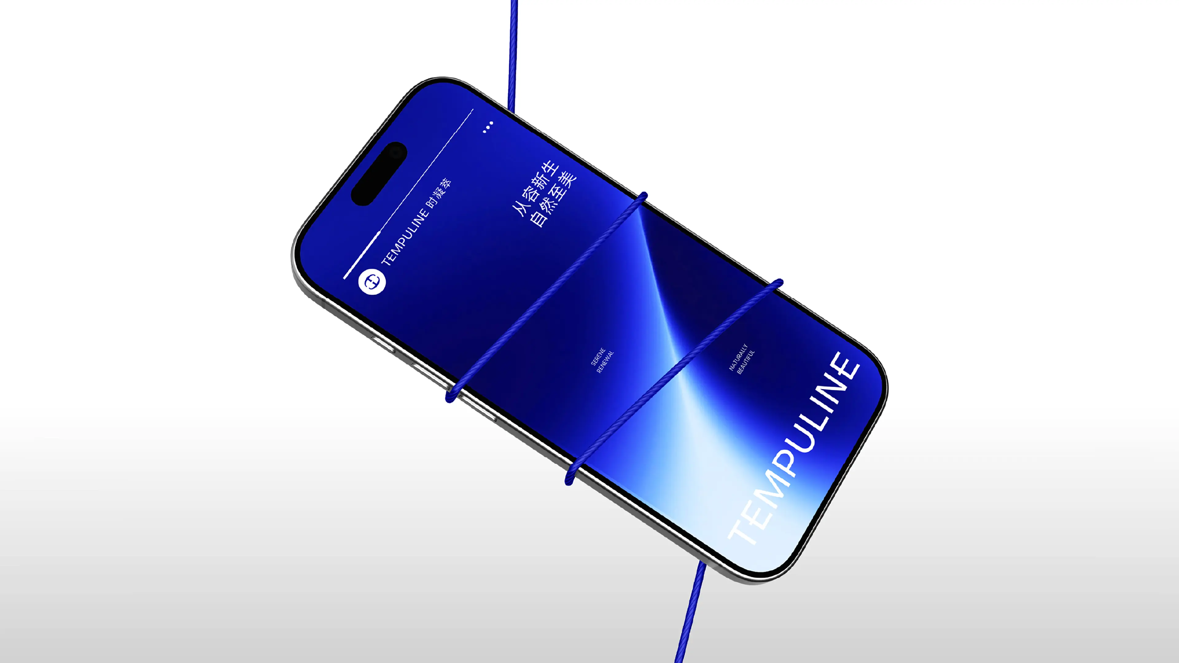
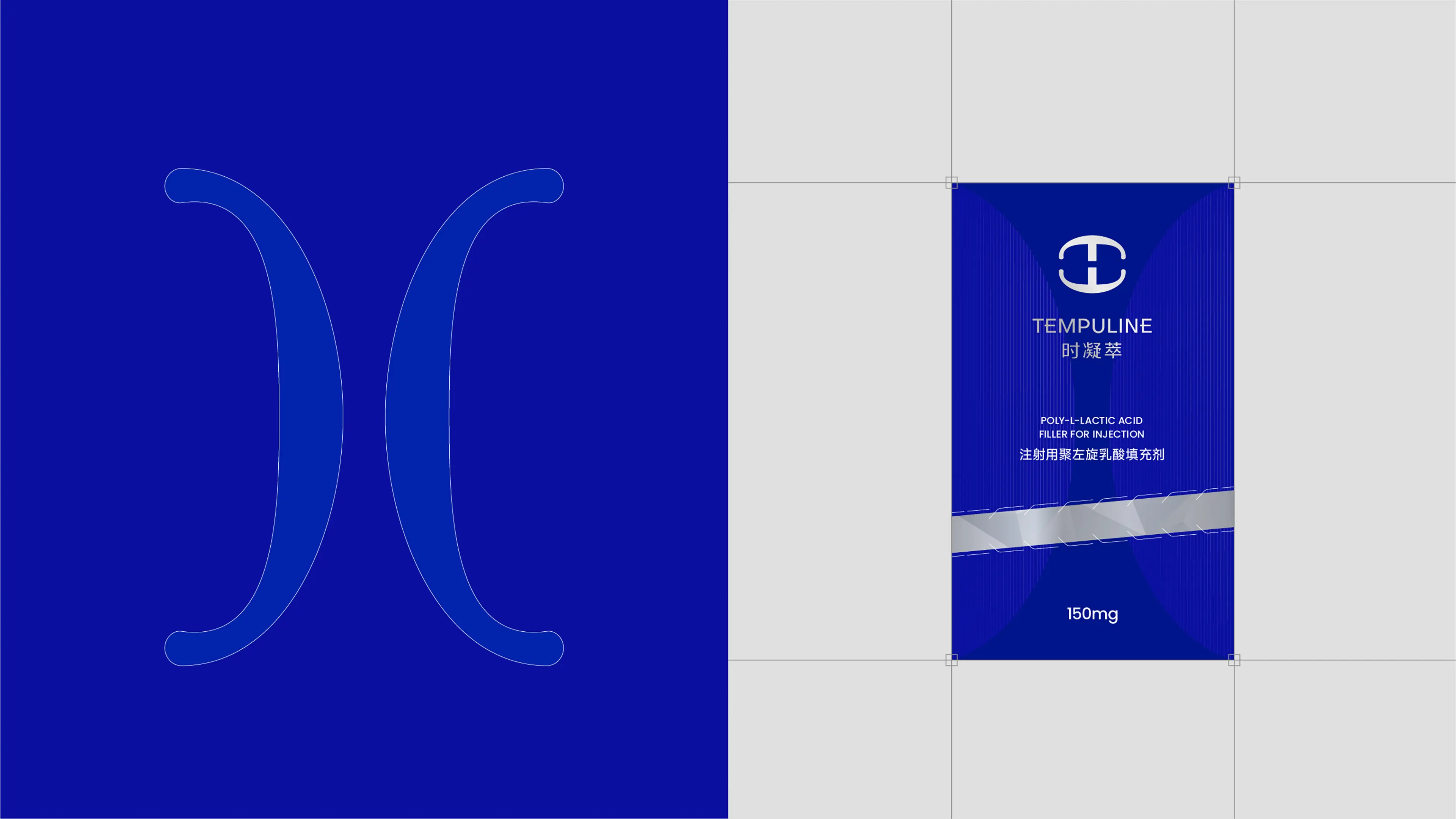
The brand logo adopts an inverted T-shaped core identification symbol, choosing a geometric and monochromatic minimalist path, giving up any decorative elements, and making the symbol itself the sole visual focus. The inverted T-shape has a natural stability and upward extensional nature, metaphorically representing the brand core of "supporting the contour and growing upward". The brand color adopts a deep blue with jewelry-like texture, carrying professional, trustworthy, and calm brand associations. In application methods, emphasizing the "large-scale uniformity" of colors and "material's luster feedback", allowing the blue to present subtle layering changes on different media, while maintaining both professionalism and luxury-level visual tension. Auxiliary graphics and layout language: establishing a restrained layout grid system, all brand materials from the comprehensive booklet to packaging strictly follow the unified font hierarchy, white space ratio, and composition logic. This "implicit order" enables the brand to achieve high visual unity, while avoiding overshadowing and highlighting the high-end nature of the product itself.
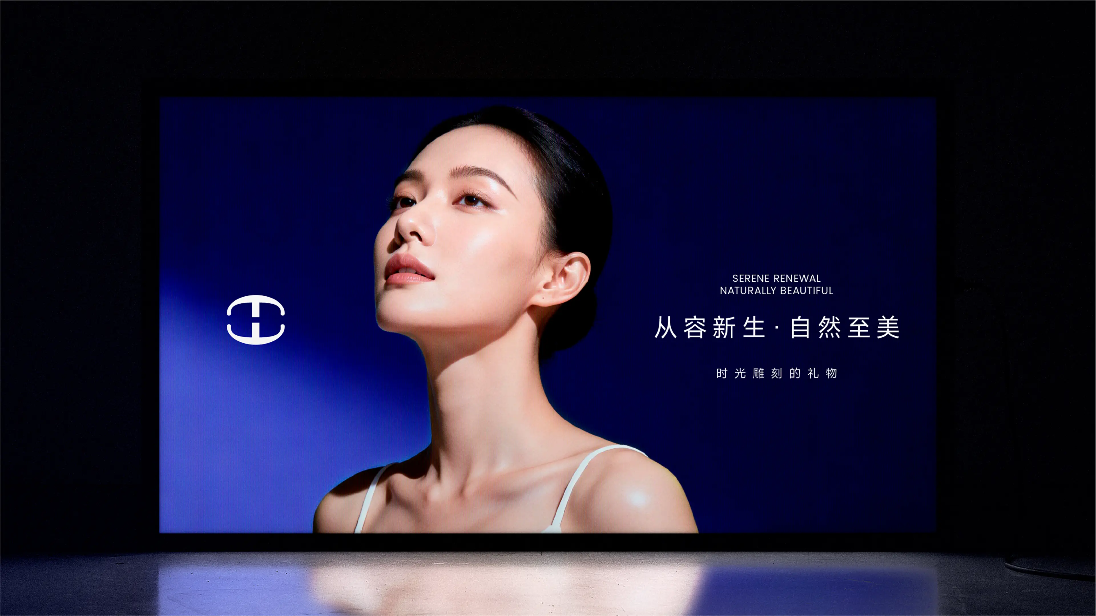
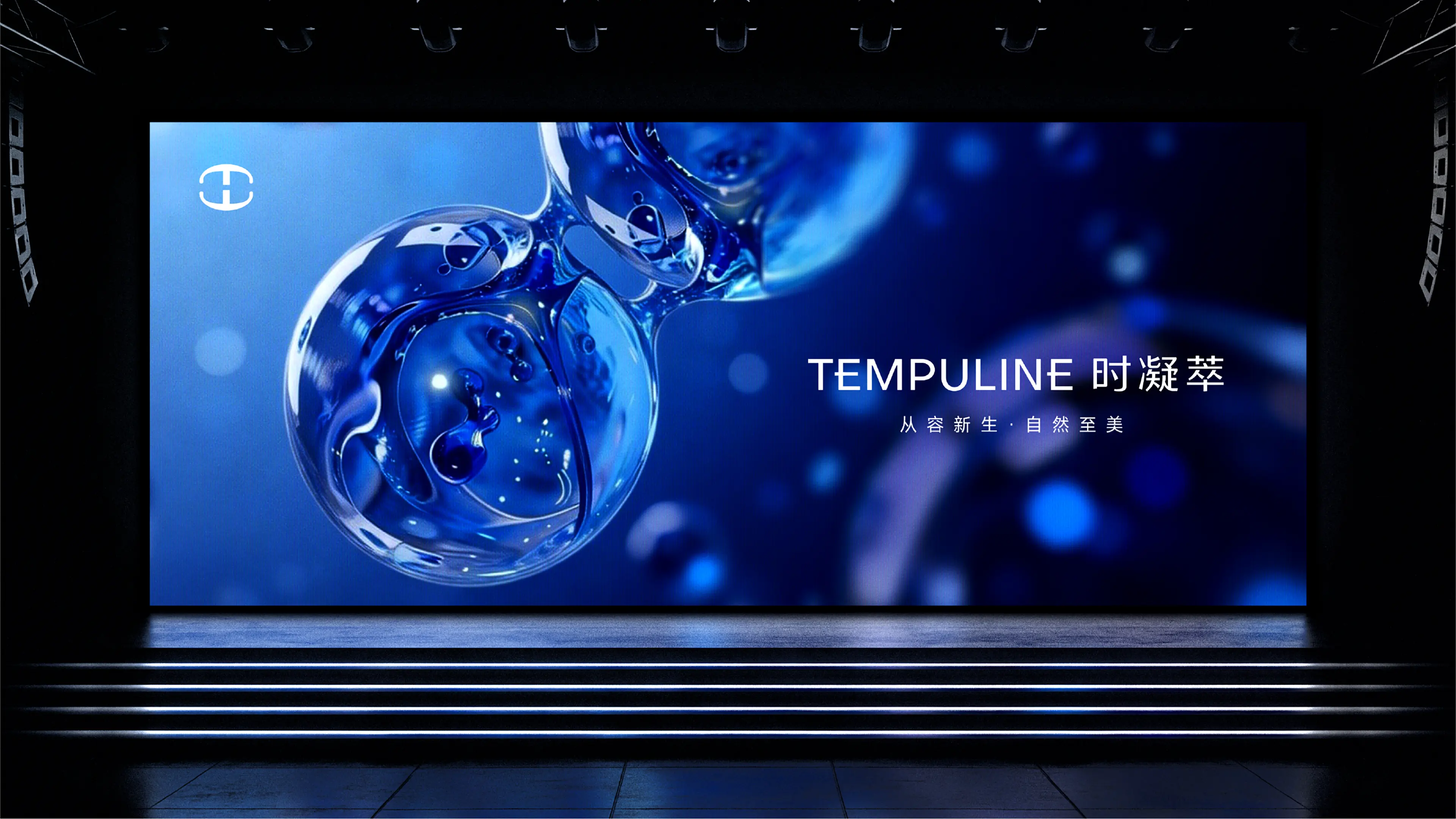
Overall tone: professional, technology, and luxury in unity. From the logo to colors, from packaging to terminals, from the comprehensive booklet to the brand story - every touchpoint is telling the same brand story, ensuring the consistency and continuity of brand identification elements in all scenarios.