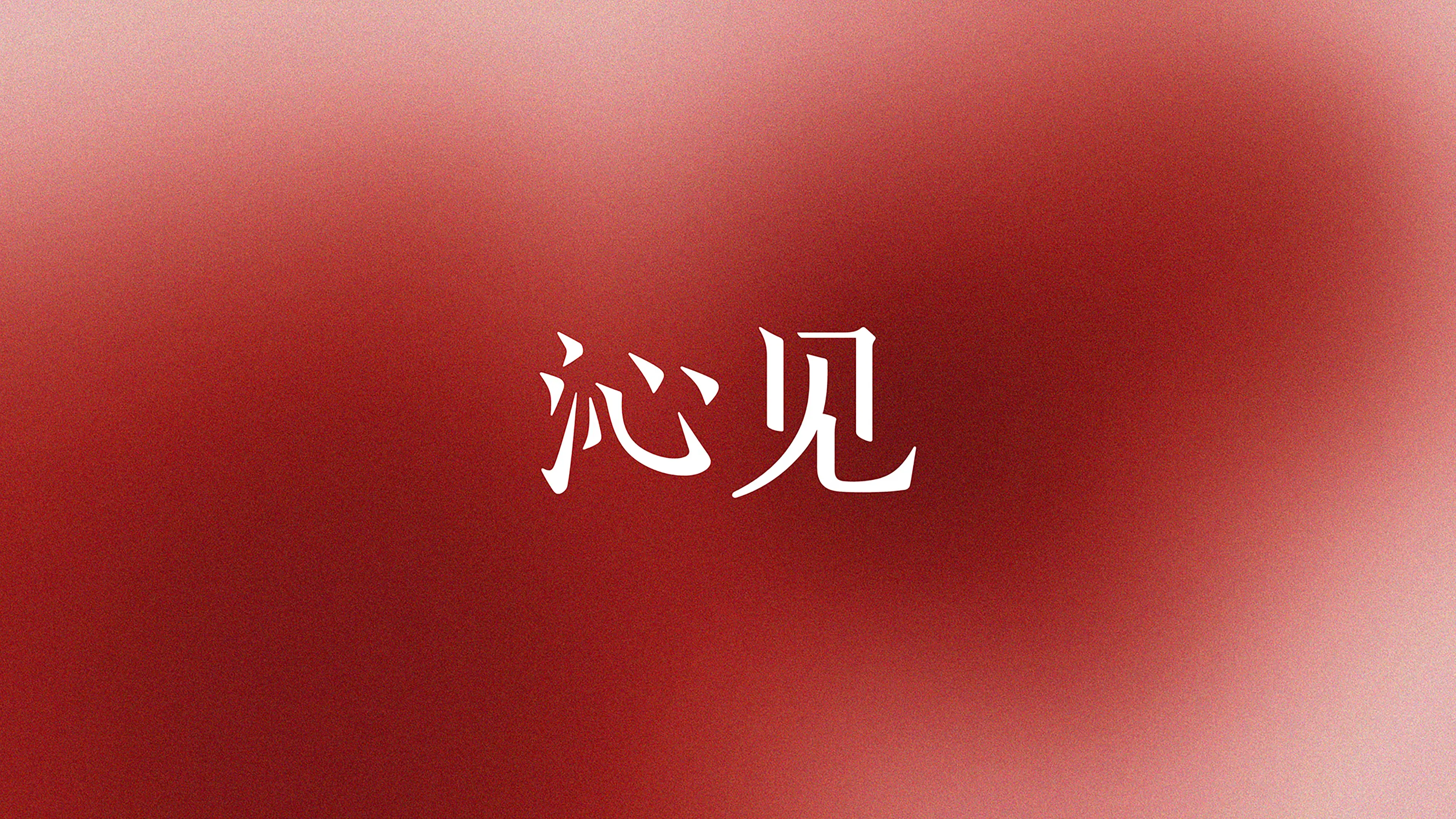
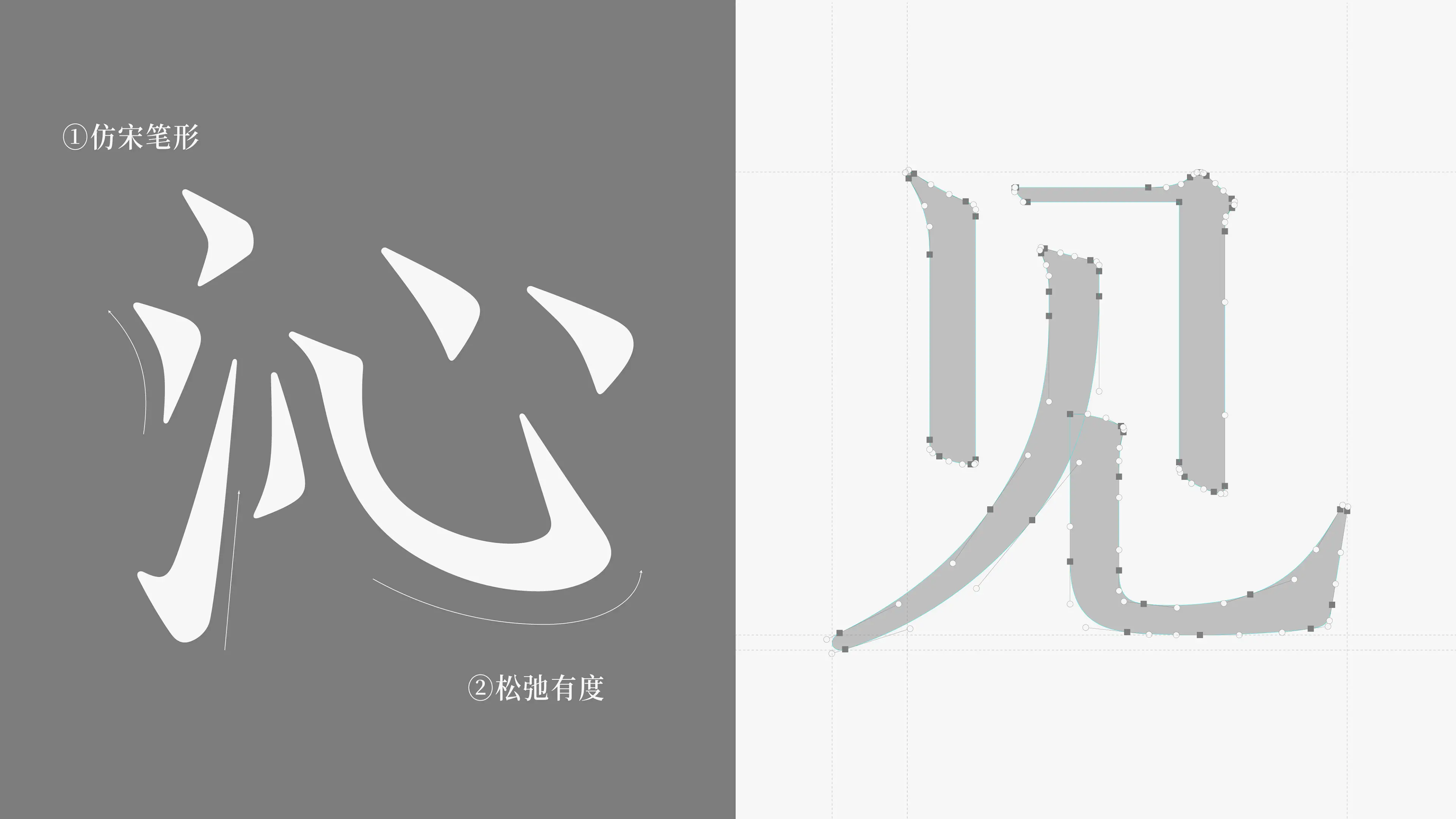
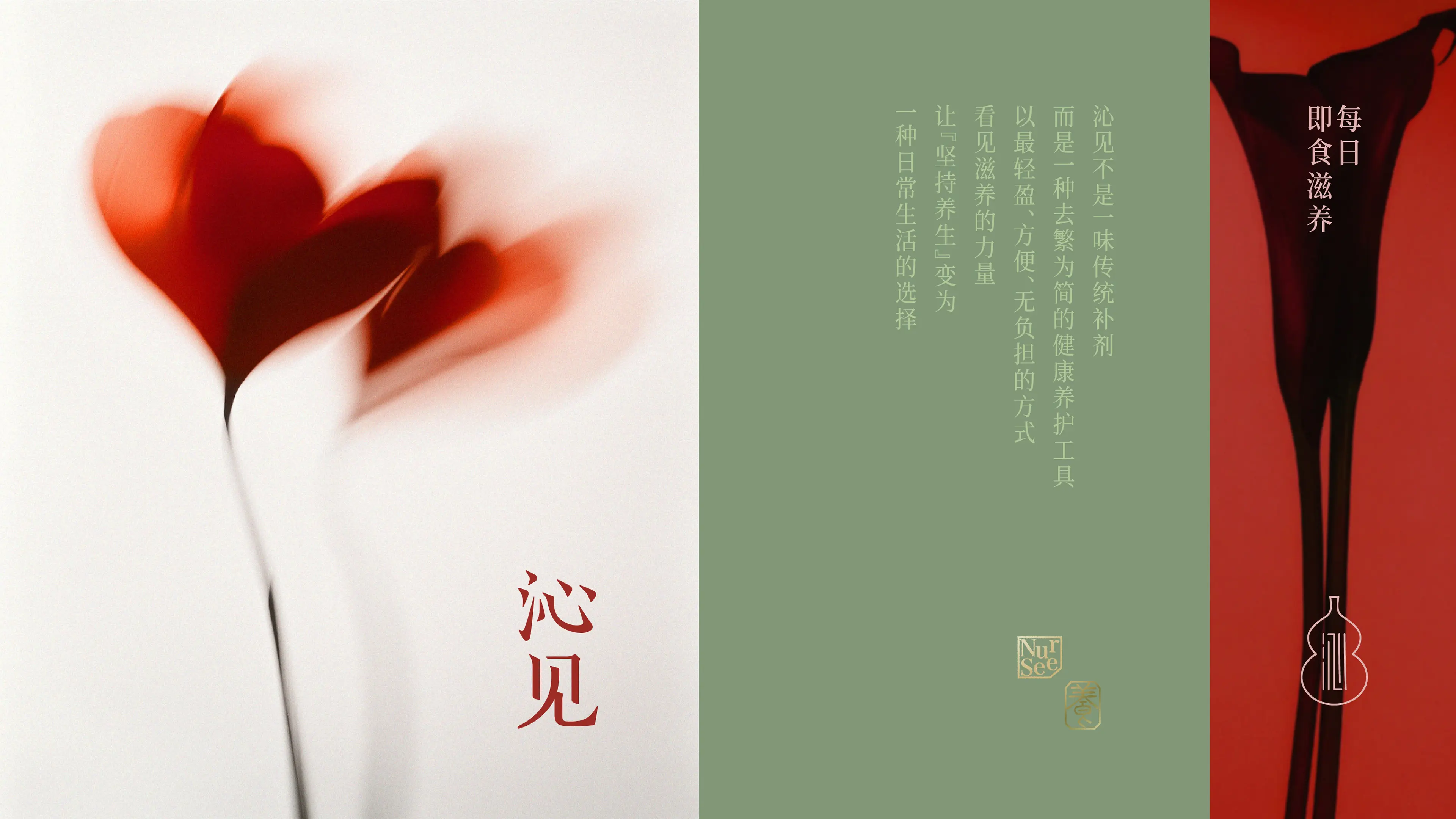
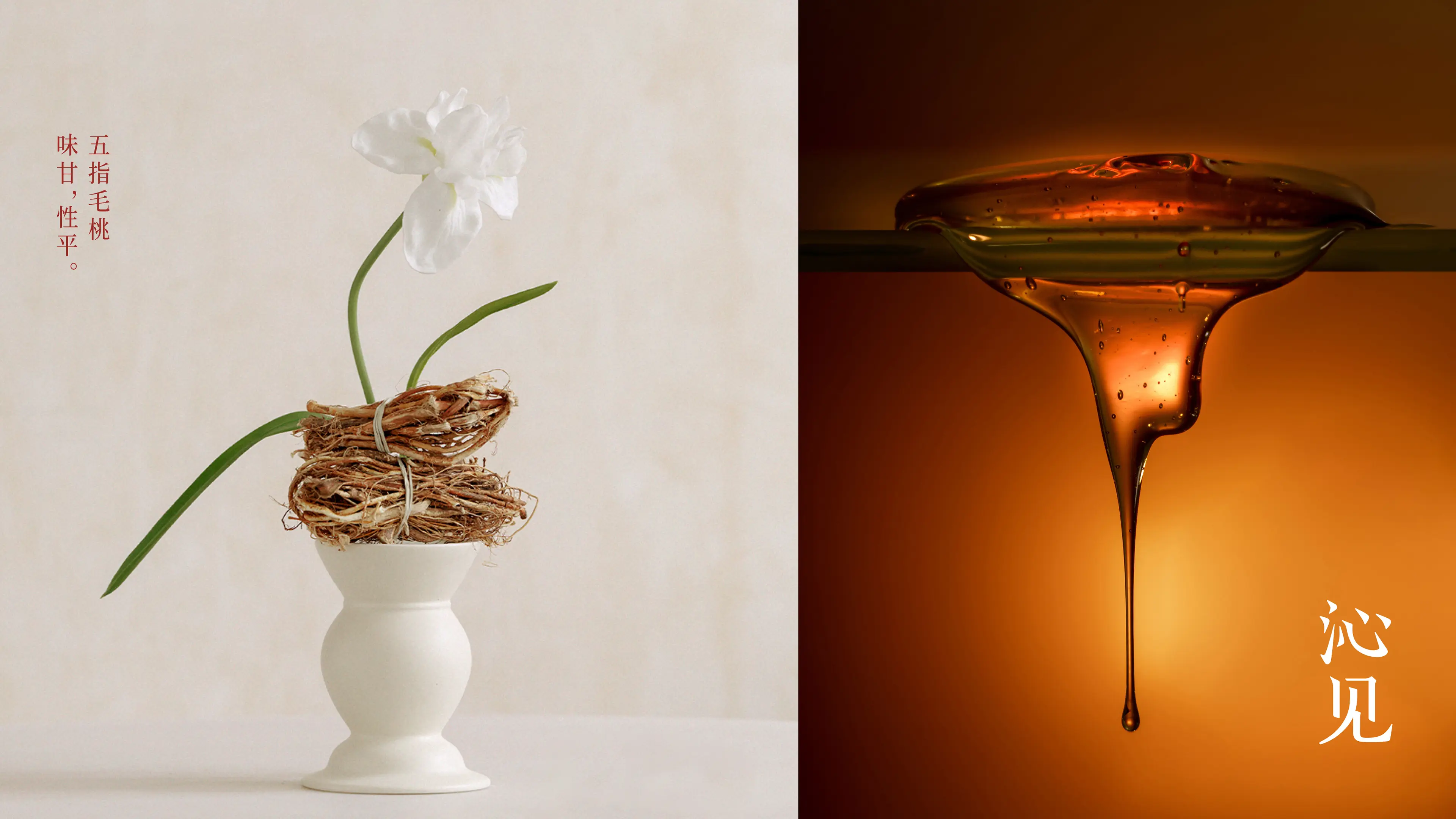
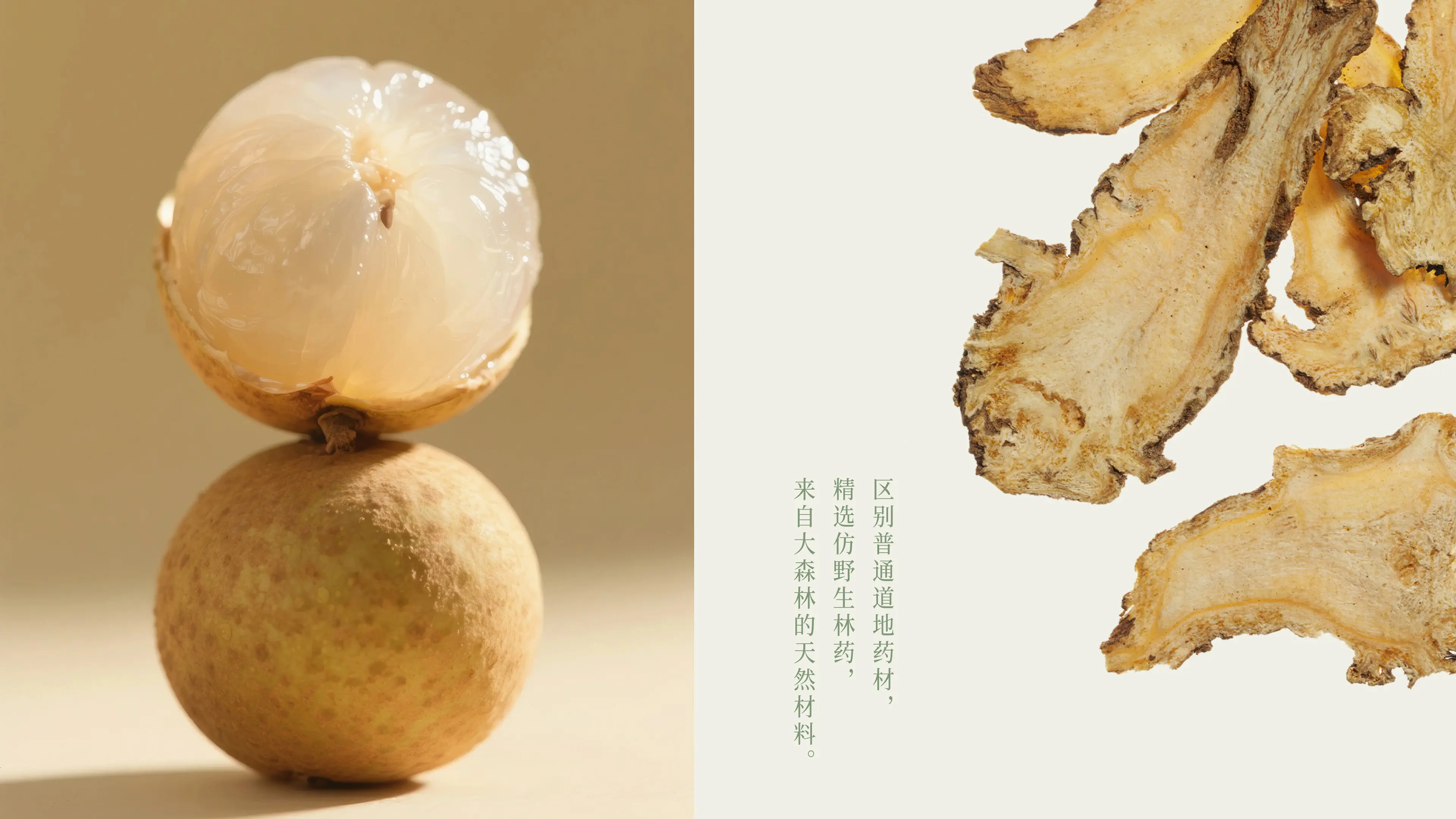
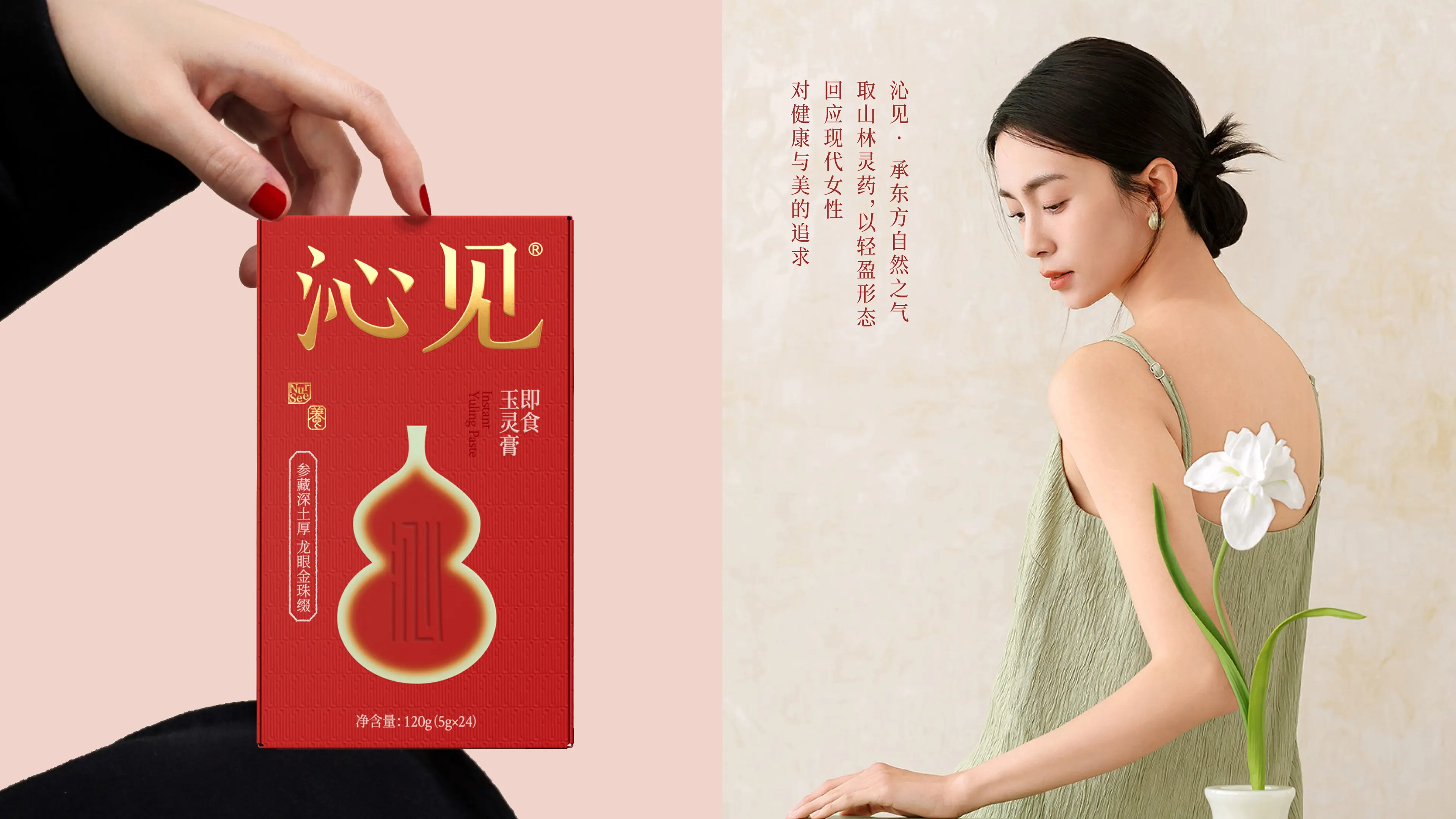
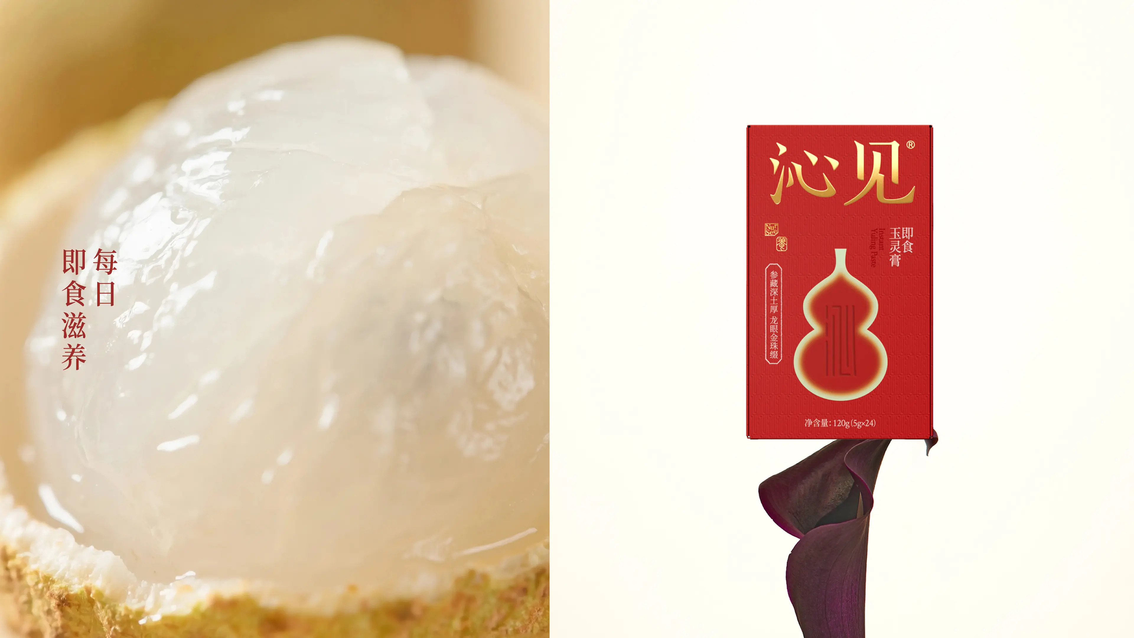
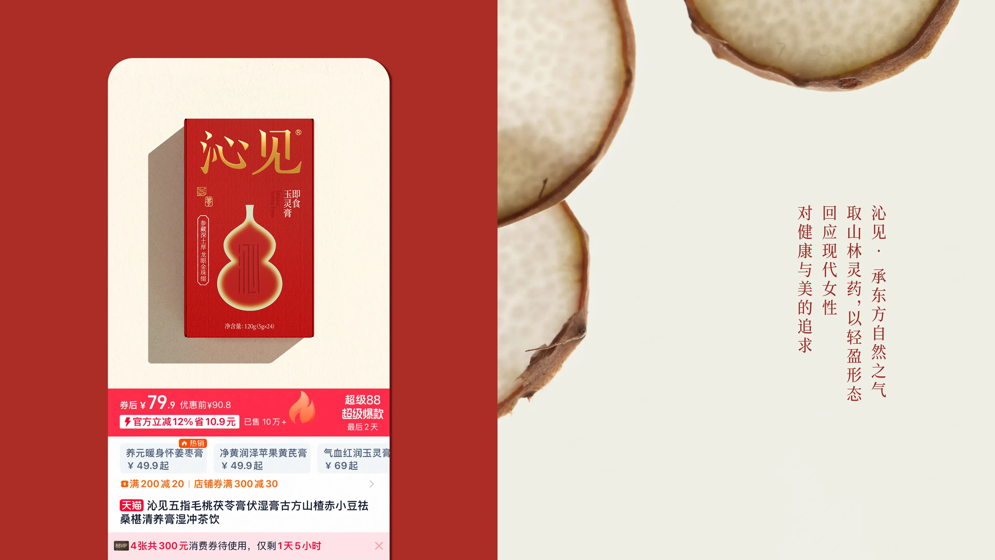
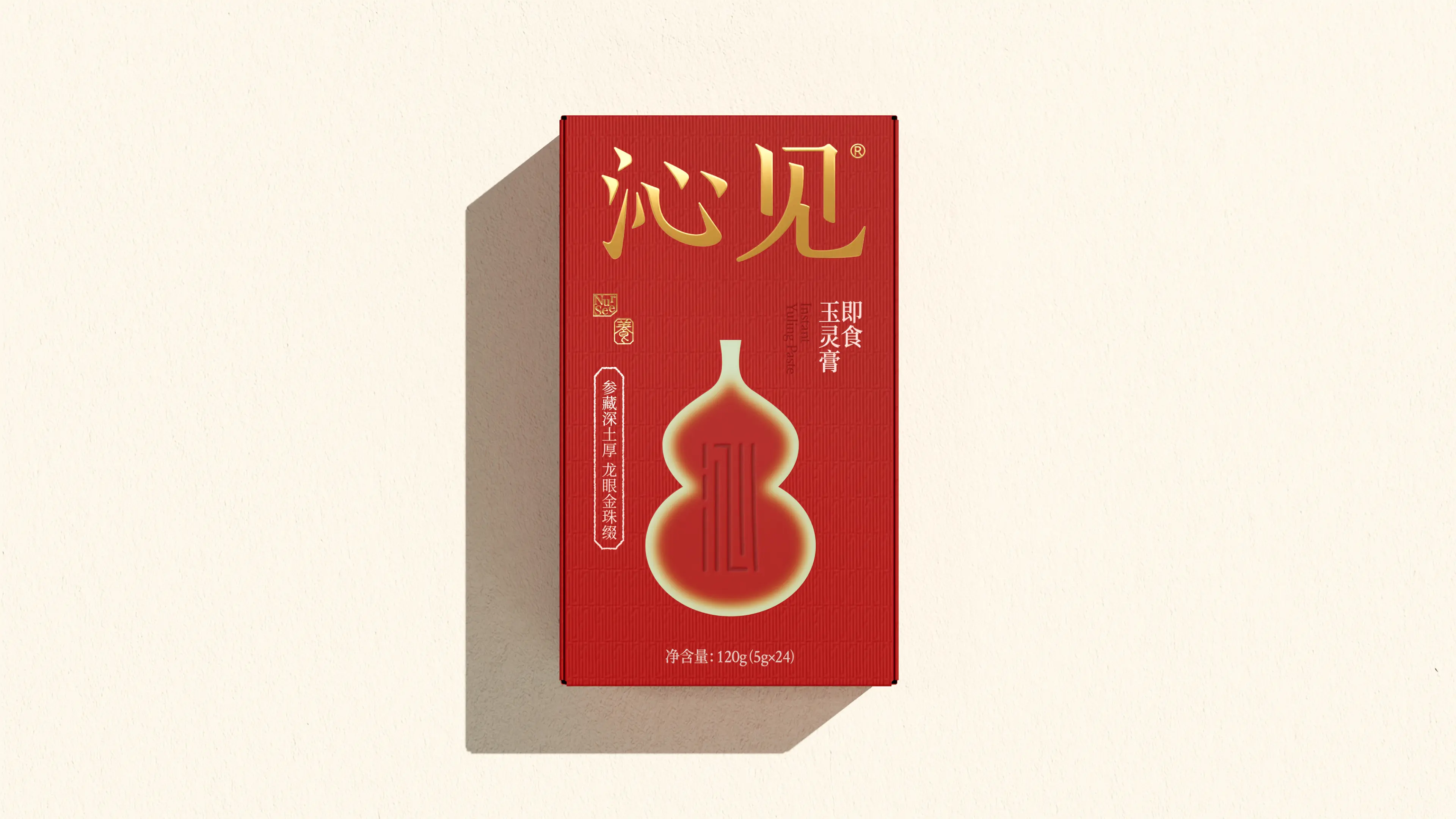
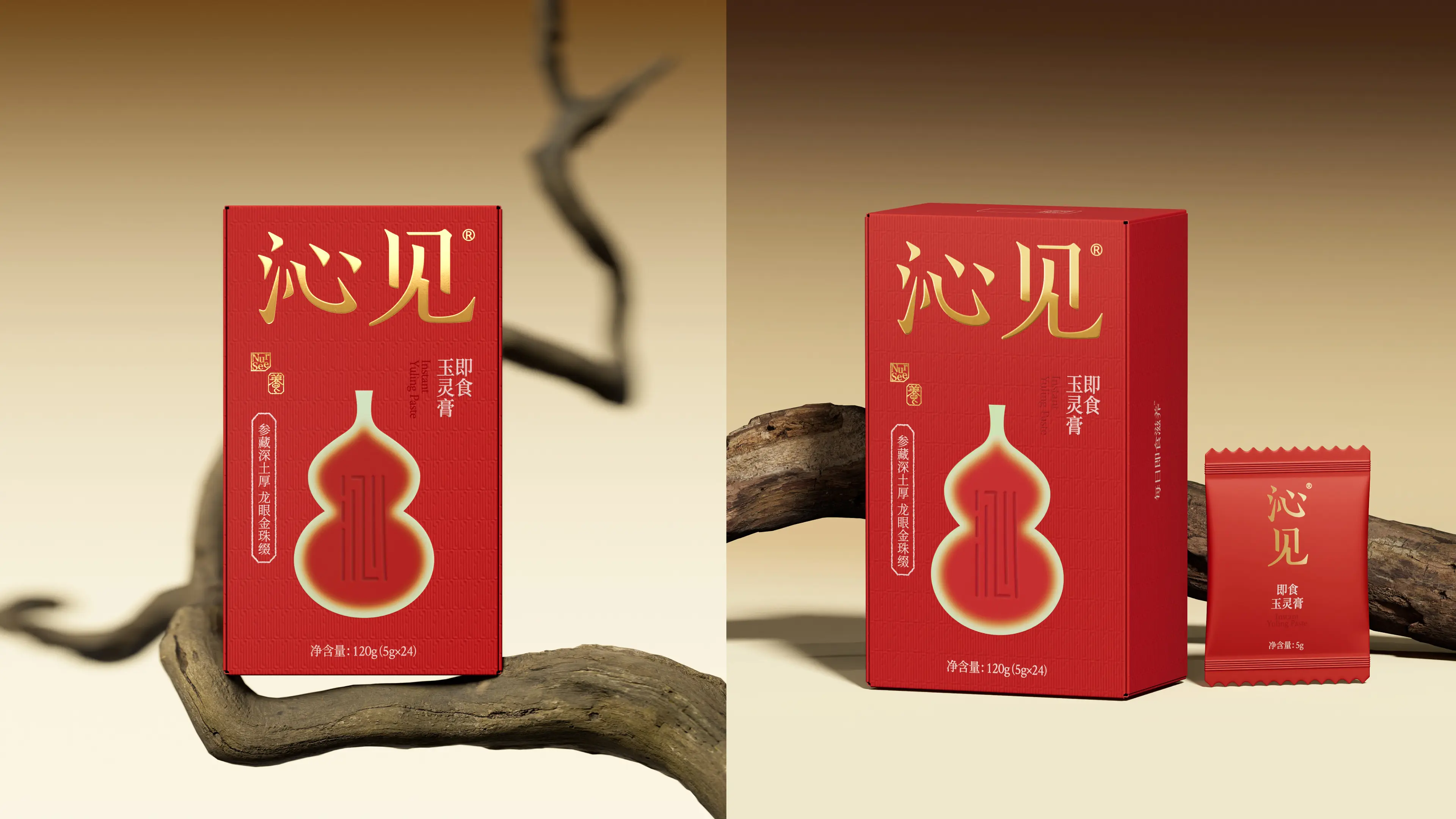
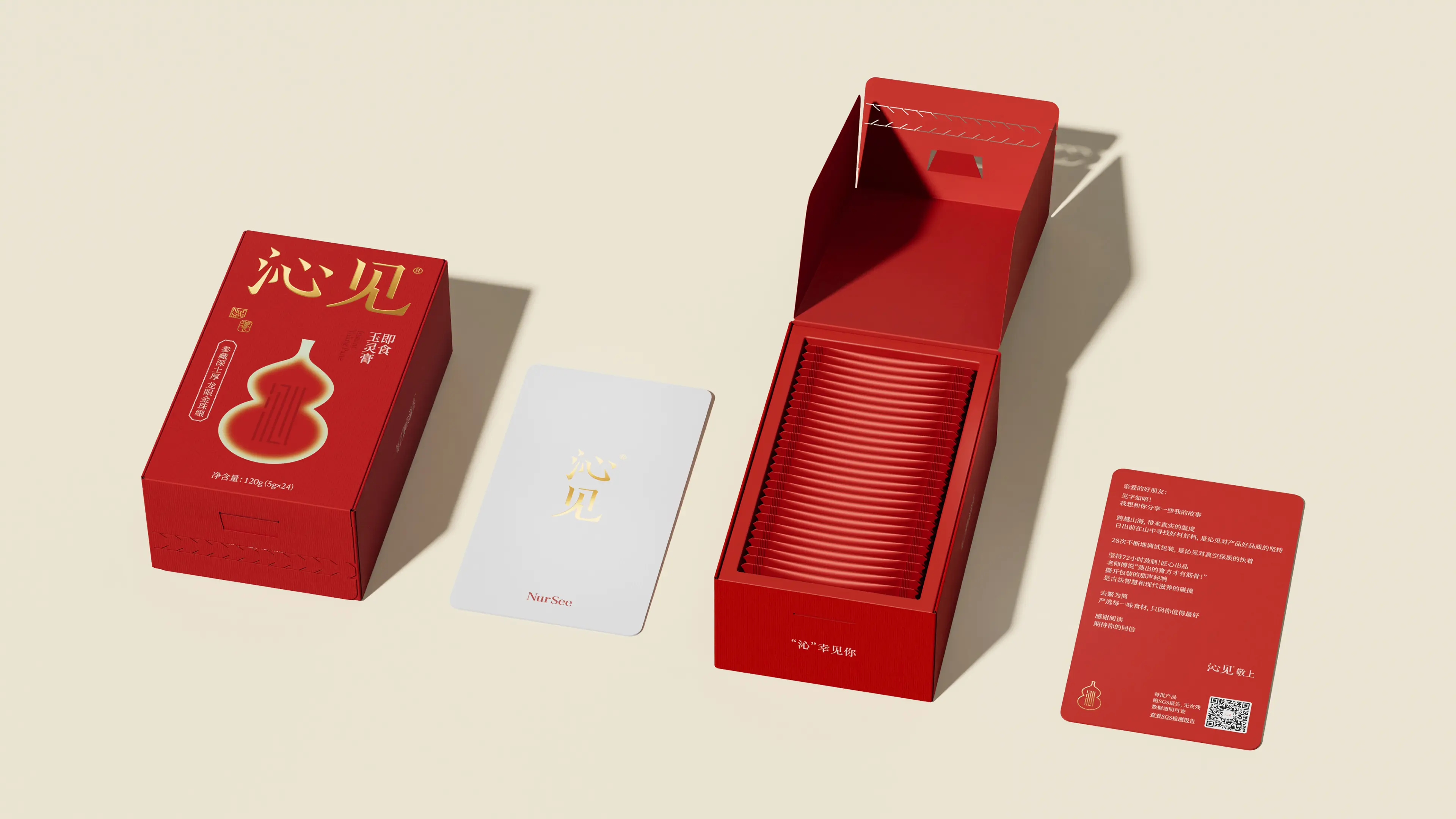
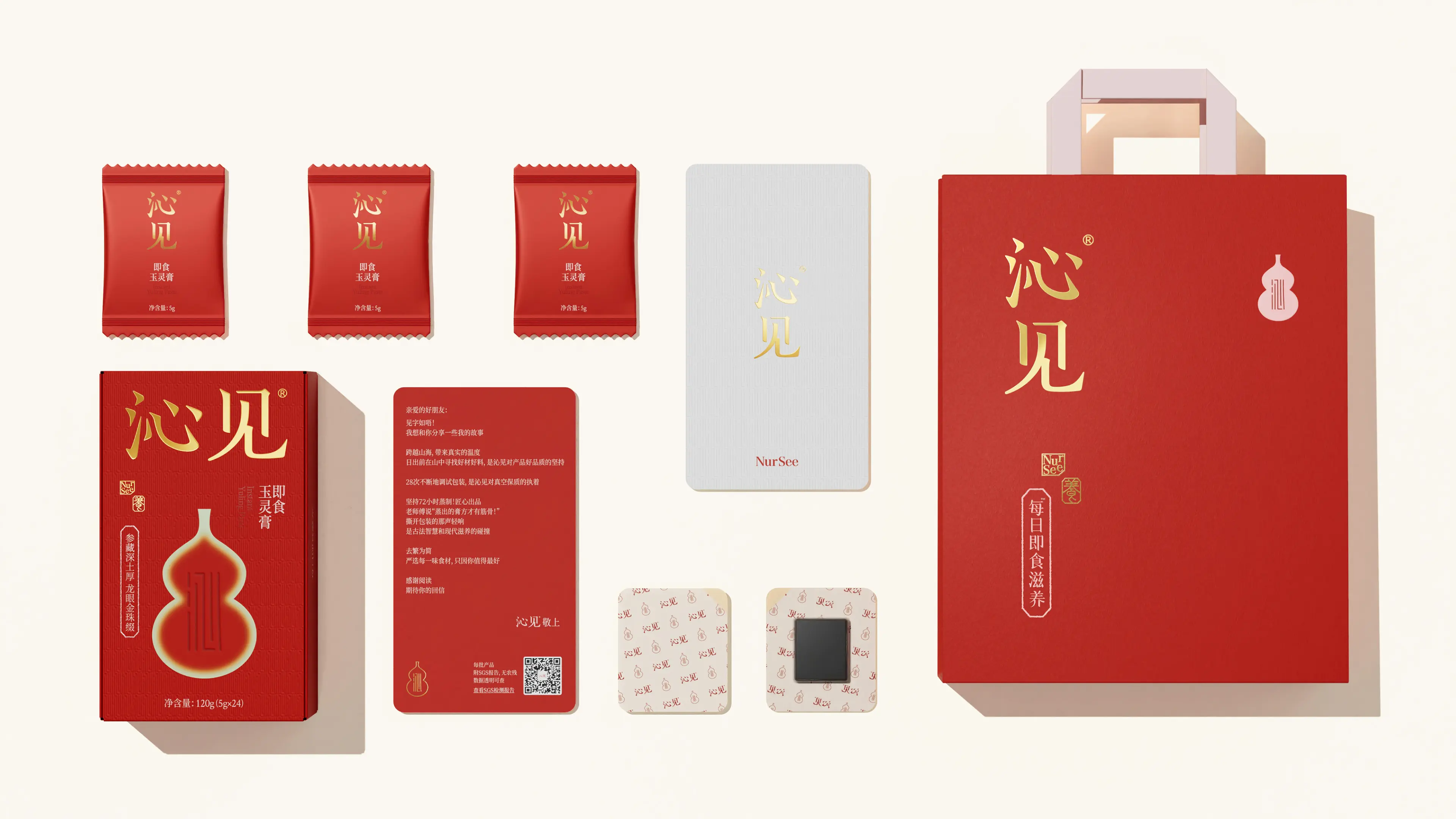
Insee belongs to Hangzhou Dongyun Xiaozhi Biotechnology Co., Ltd. It is an Eastern tonic brand that focuses on daily ready-to-eat nourishment. The brand follows ancient Eastern wisdom, selects good herbs and materials, and mainly targets female consumers who value health and beauty. Insee's core product is Yuling Paste - Yuling Paste originates from the classic dietary therapy formula of Qing Dynasty doctor Wang Mengying in "Xu Yi Ju Di Yi Pu", and is composed of ingredients such as American ginseng and dates. It mainly promotes a rosy complexion. Insee also pays attention to the visual experience of the product while providing nourishment, and strives to express Eastern aesthetics through a new Chinese visual style.
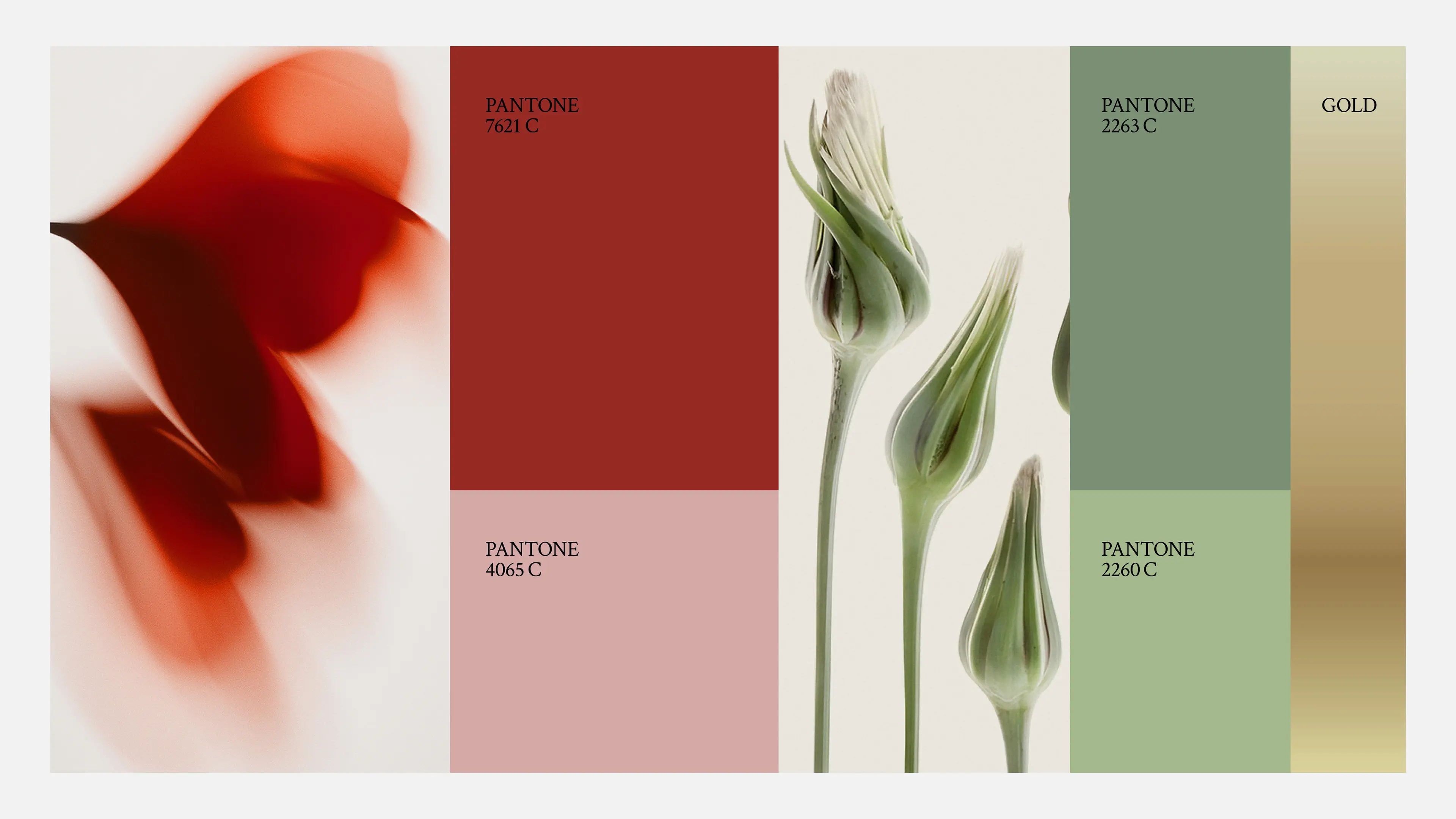
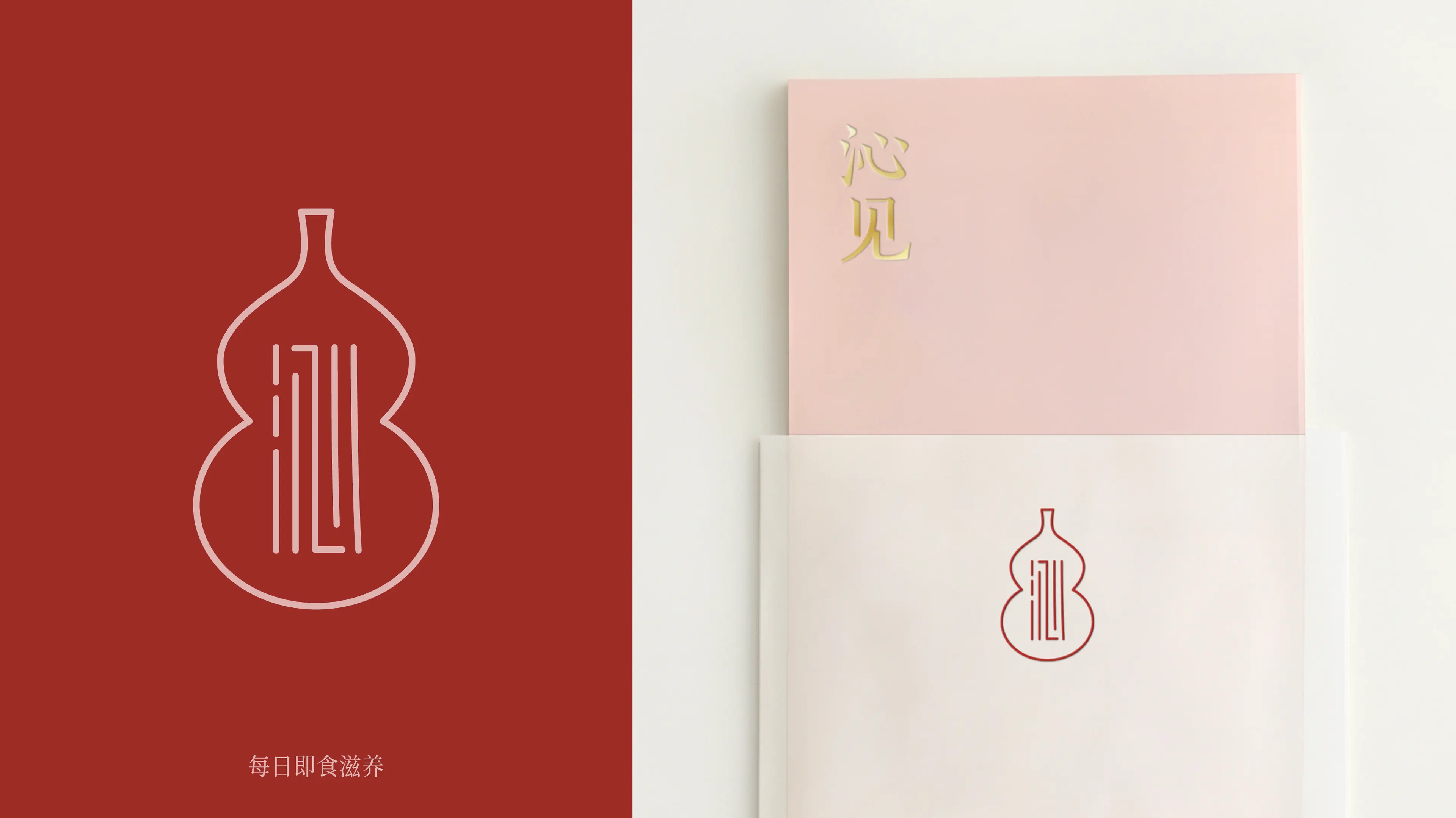
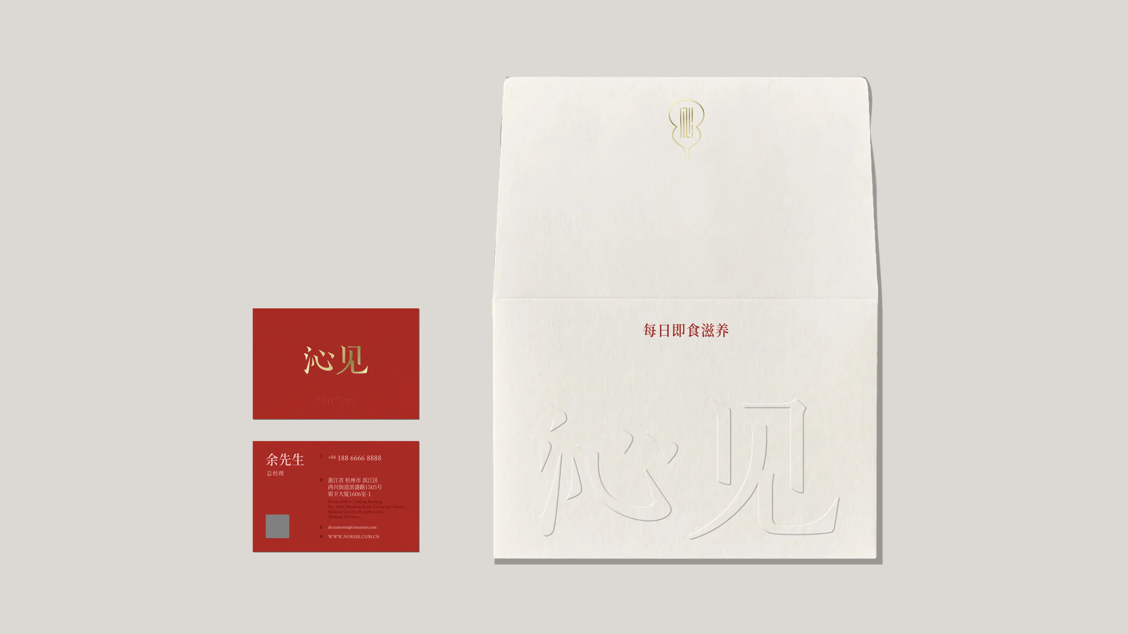
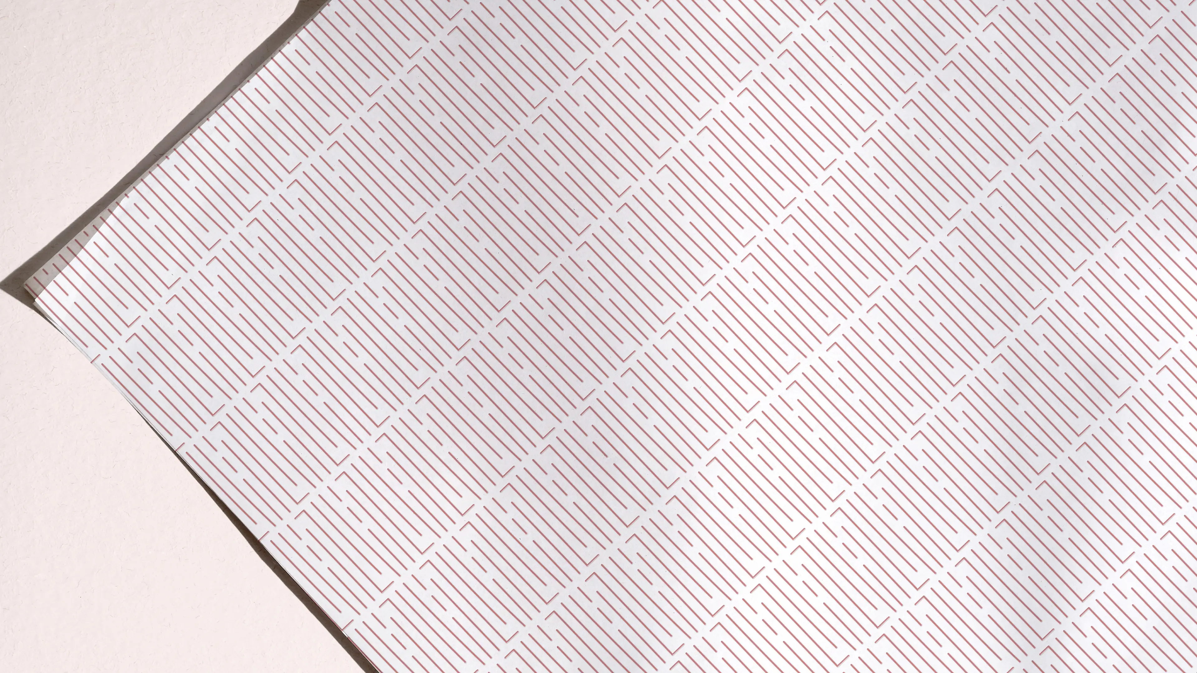
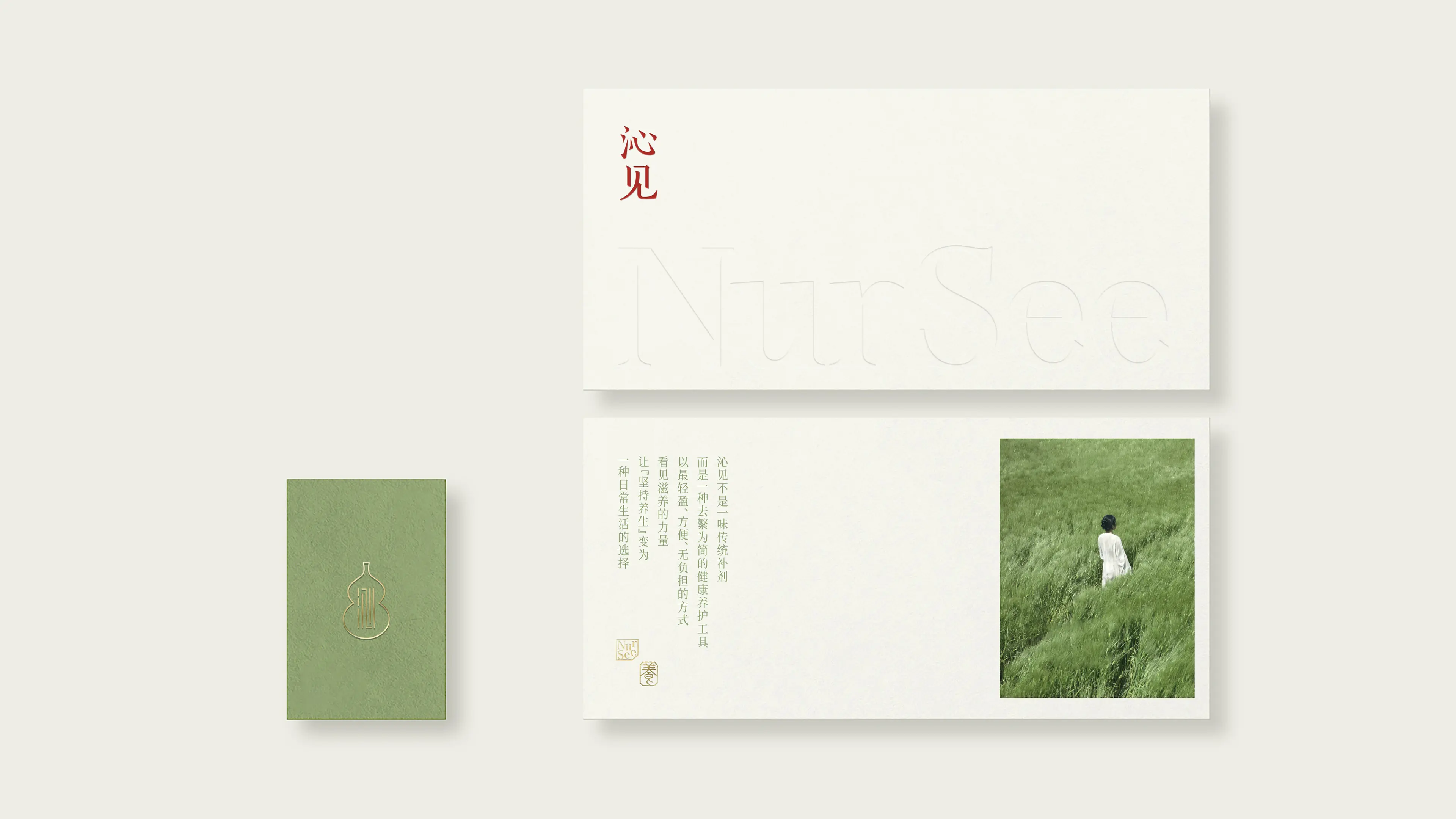
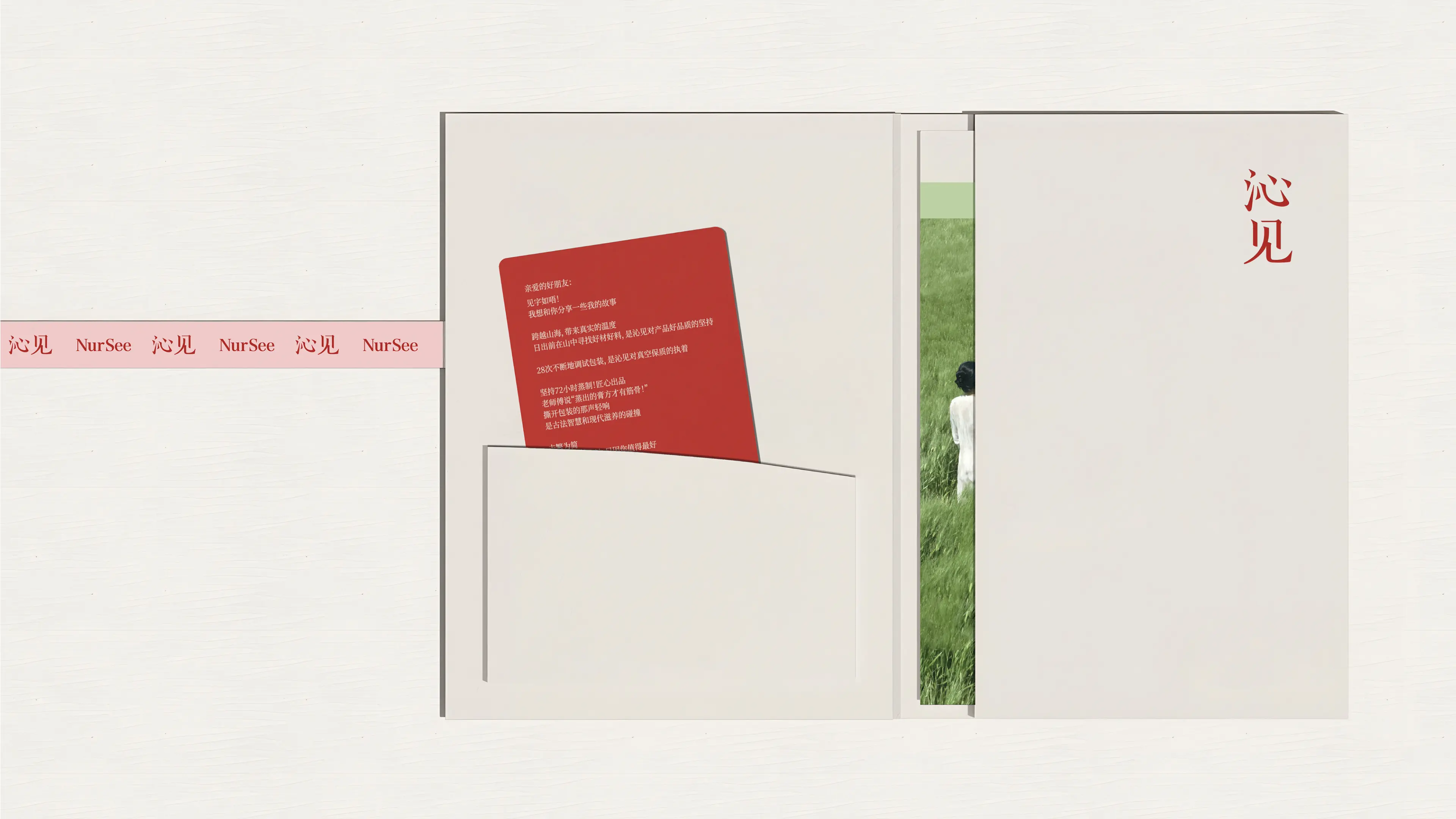
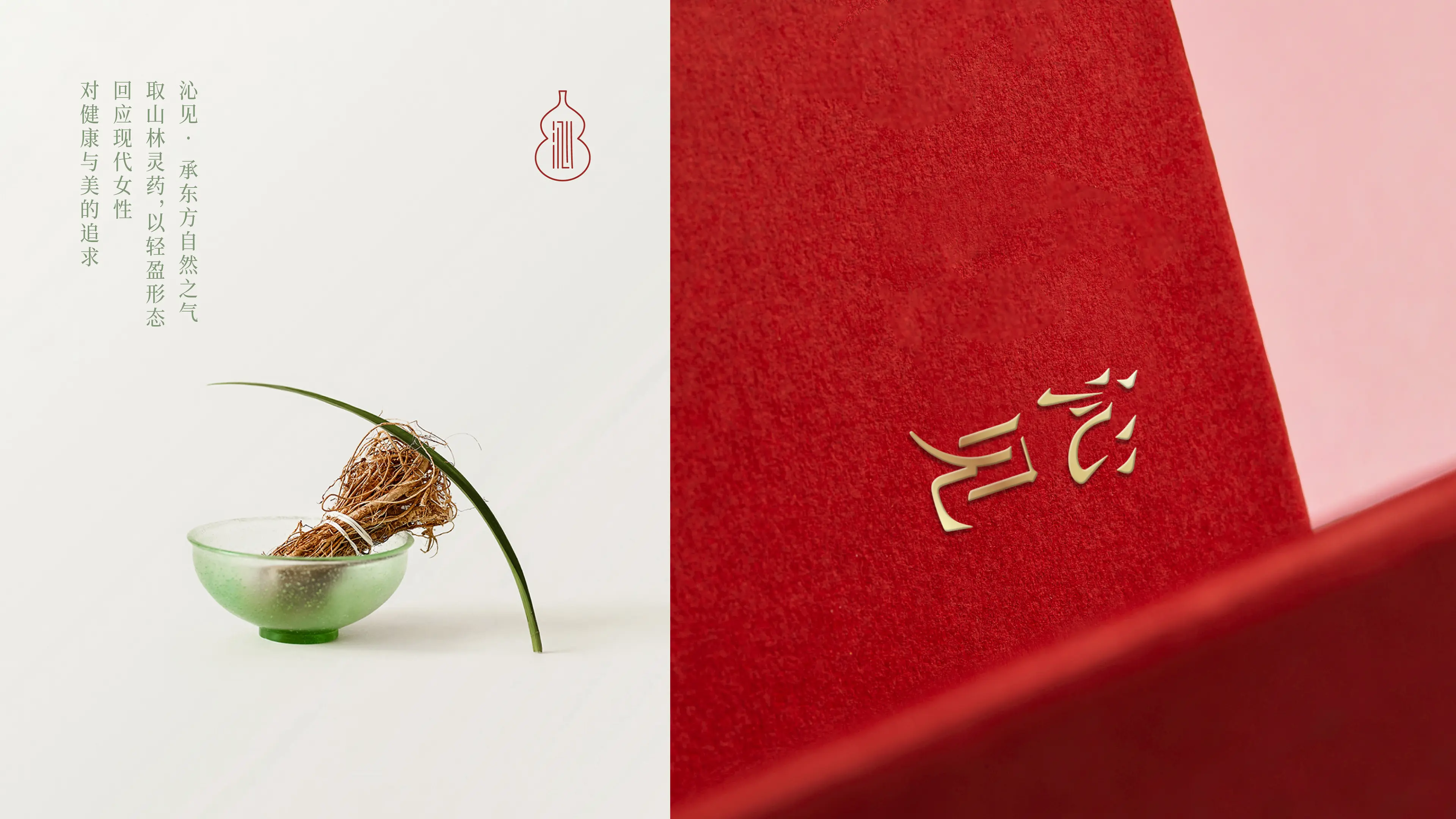
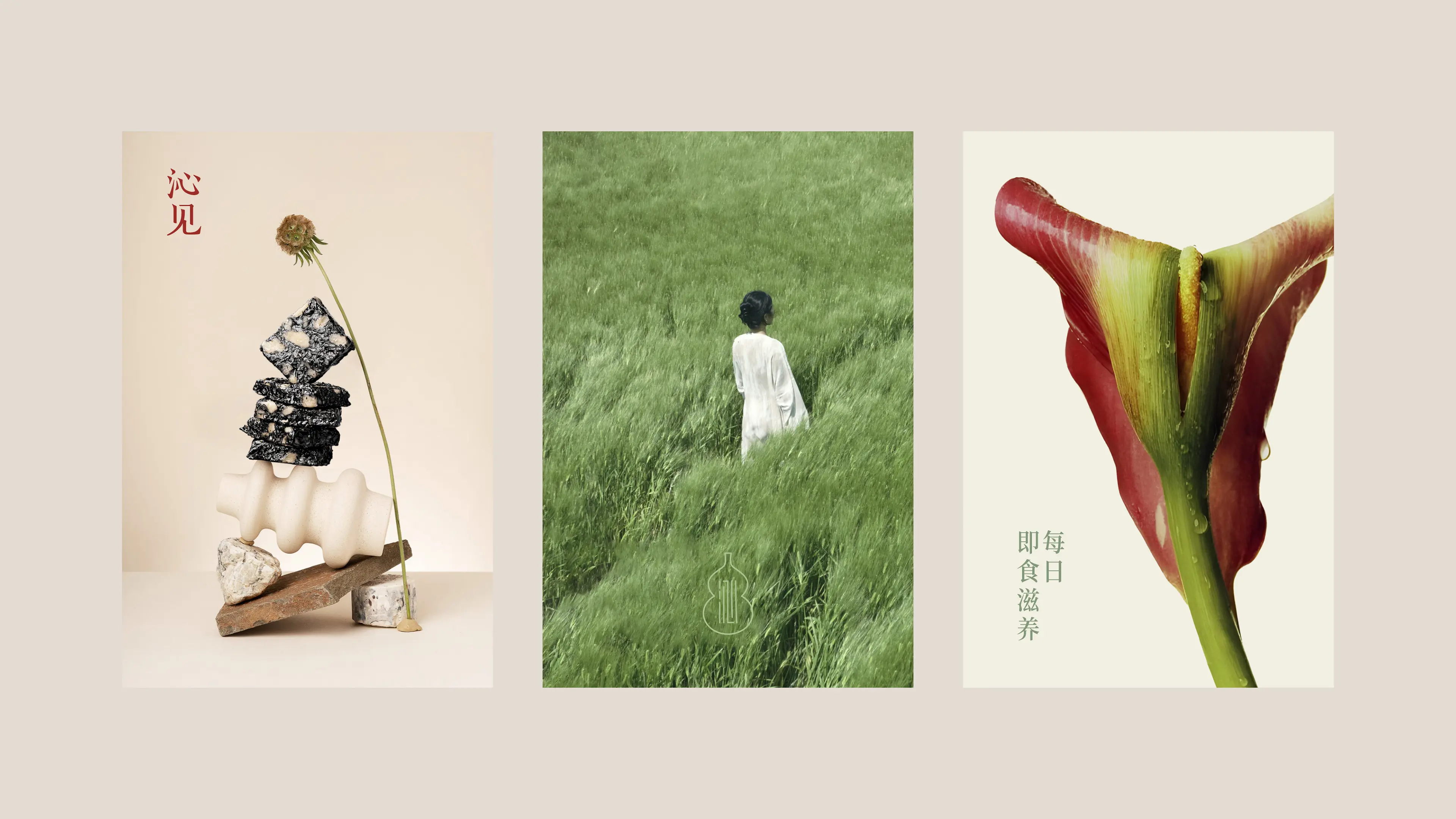
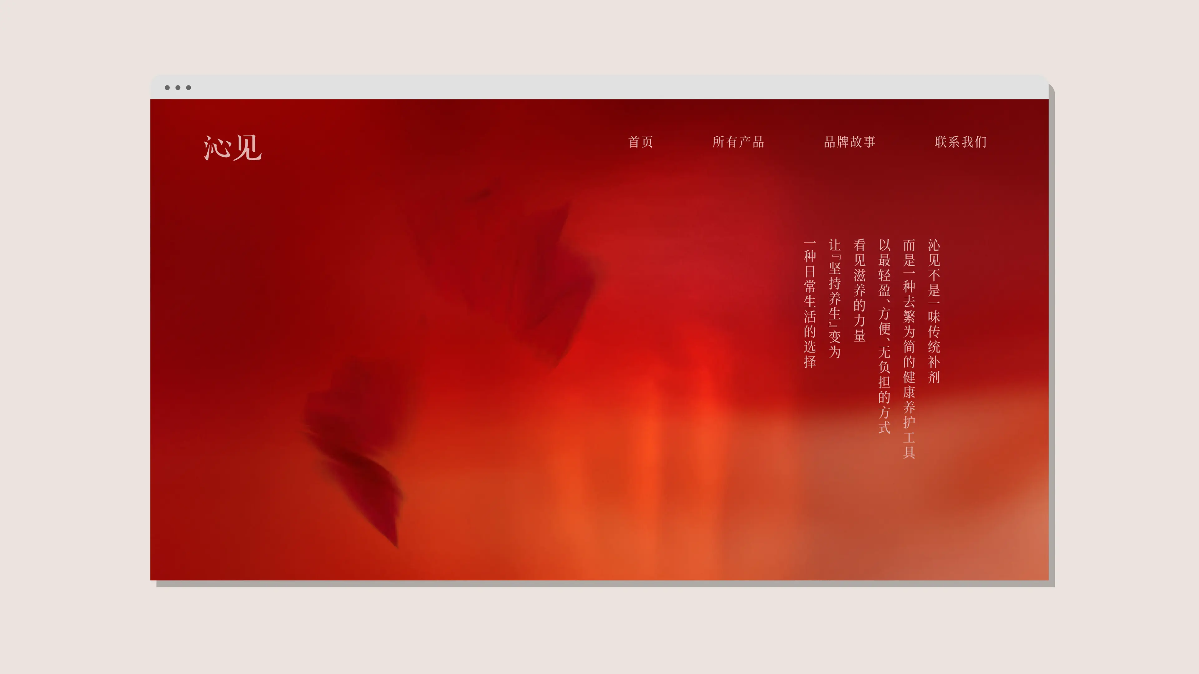
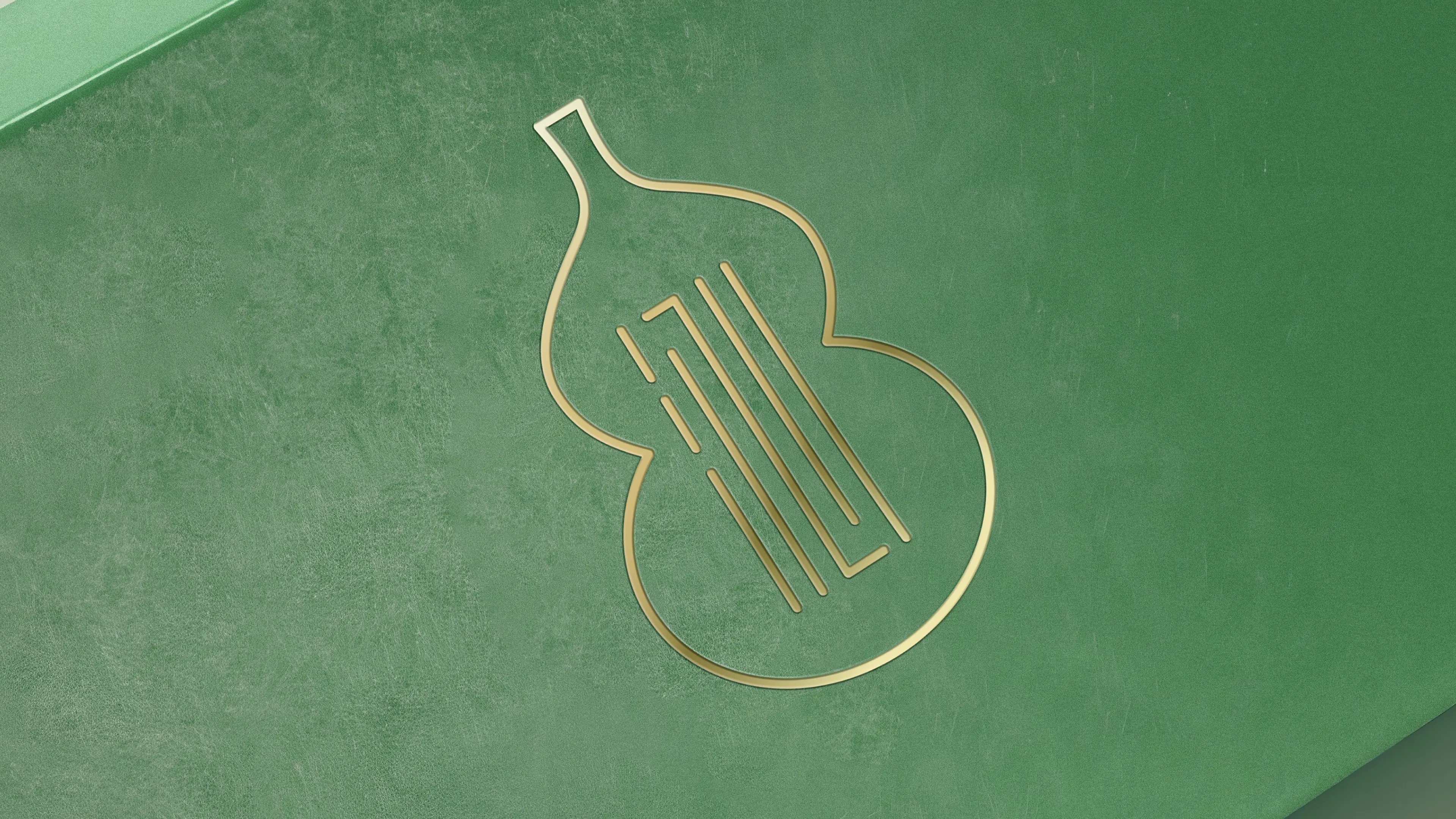
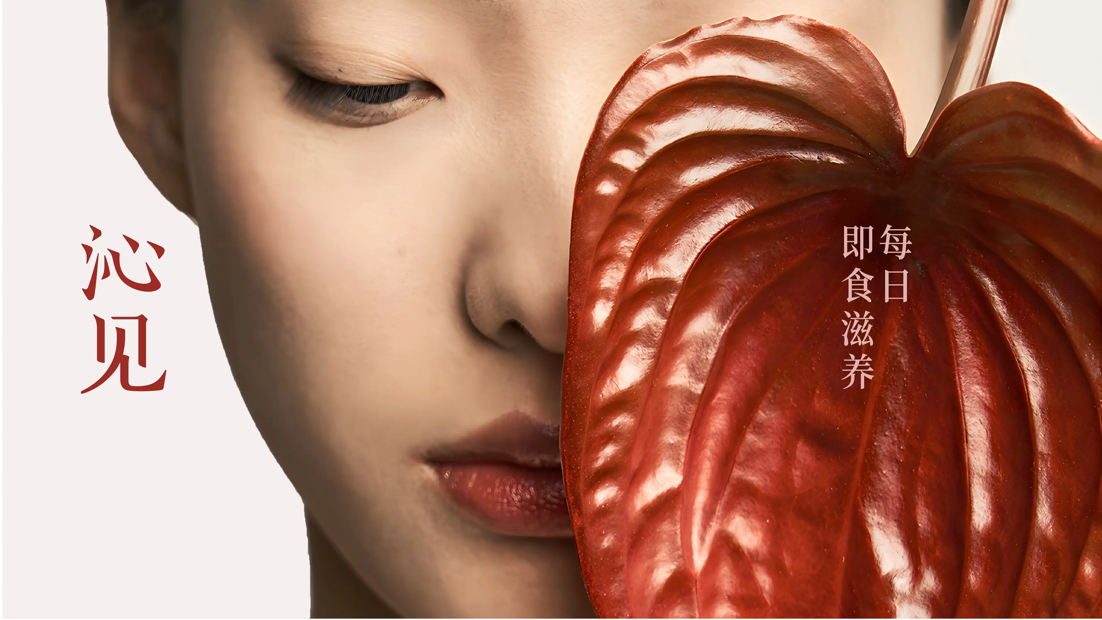
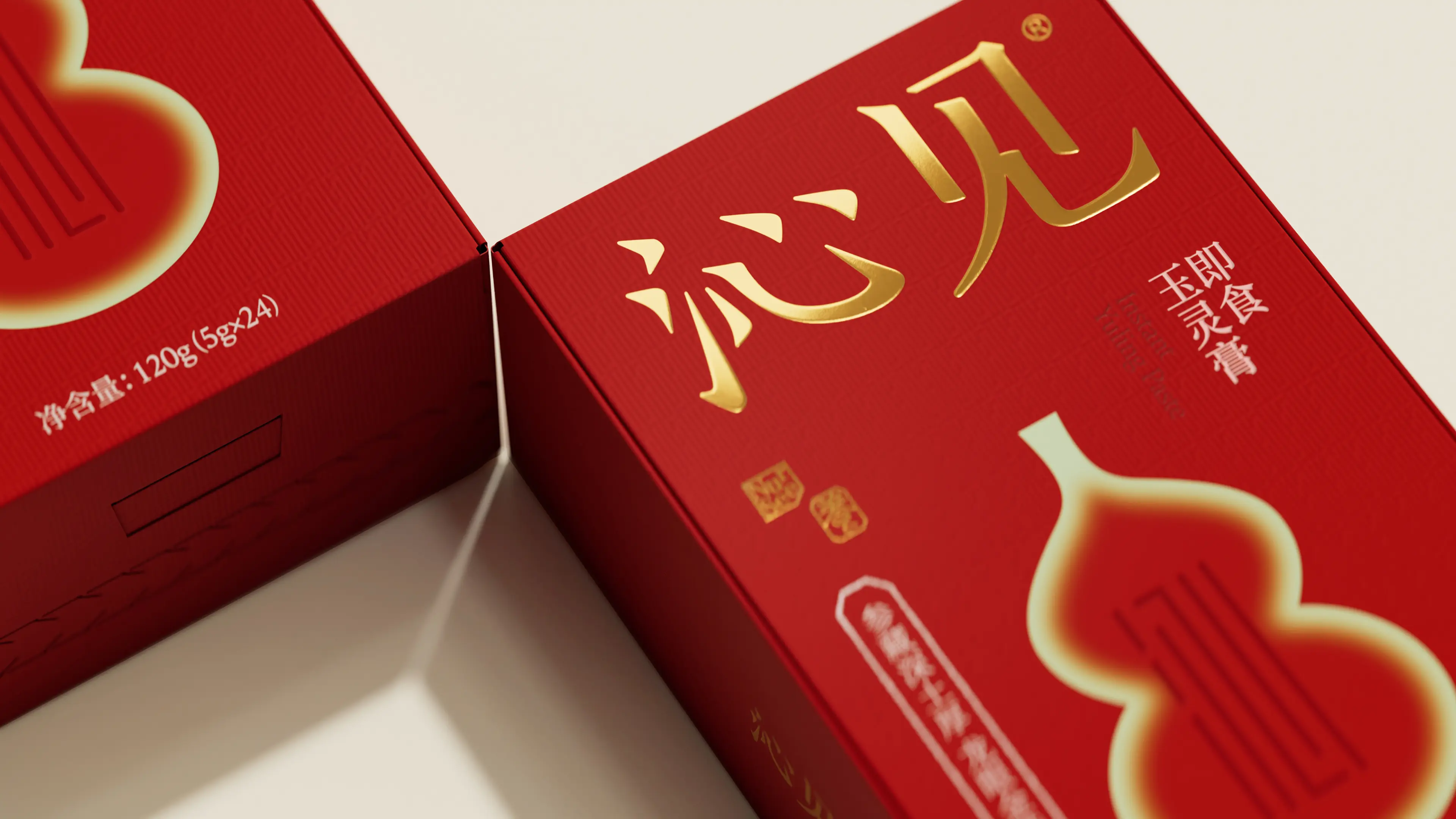
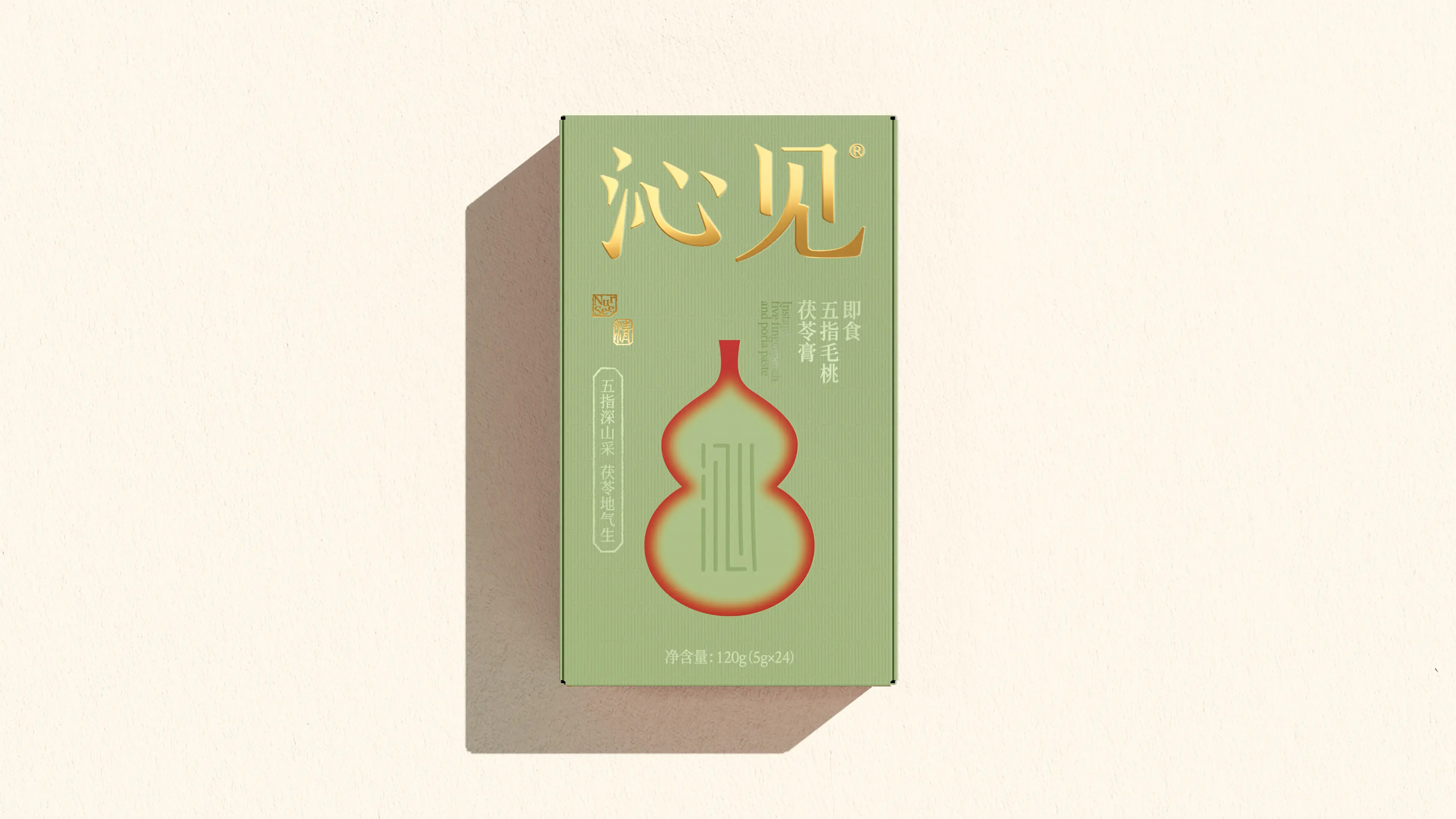
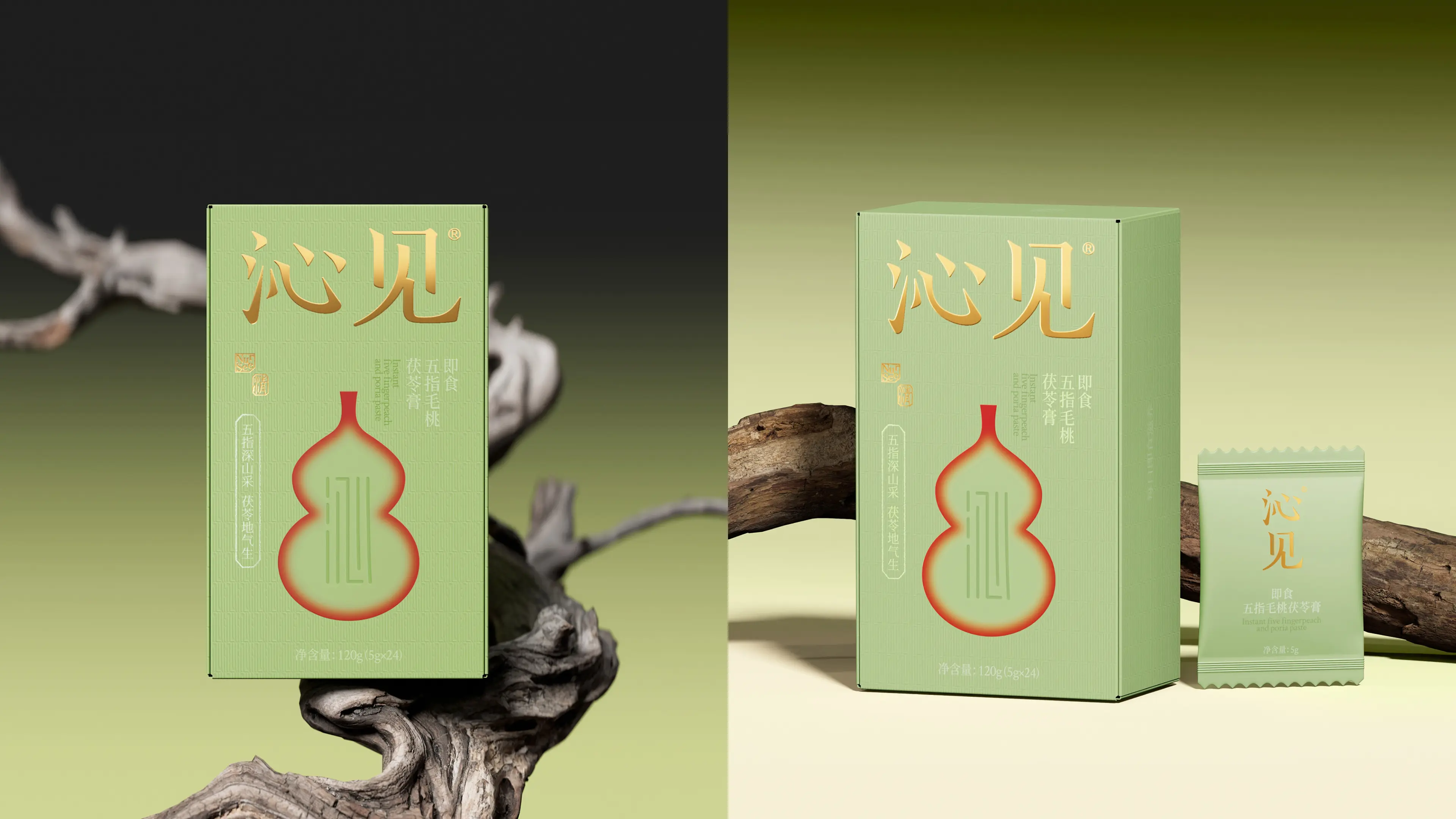
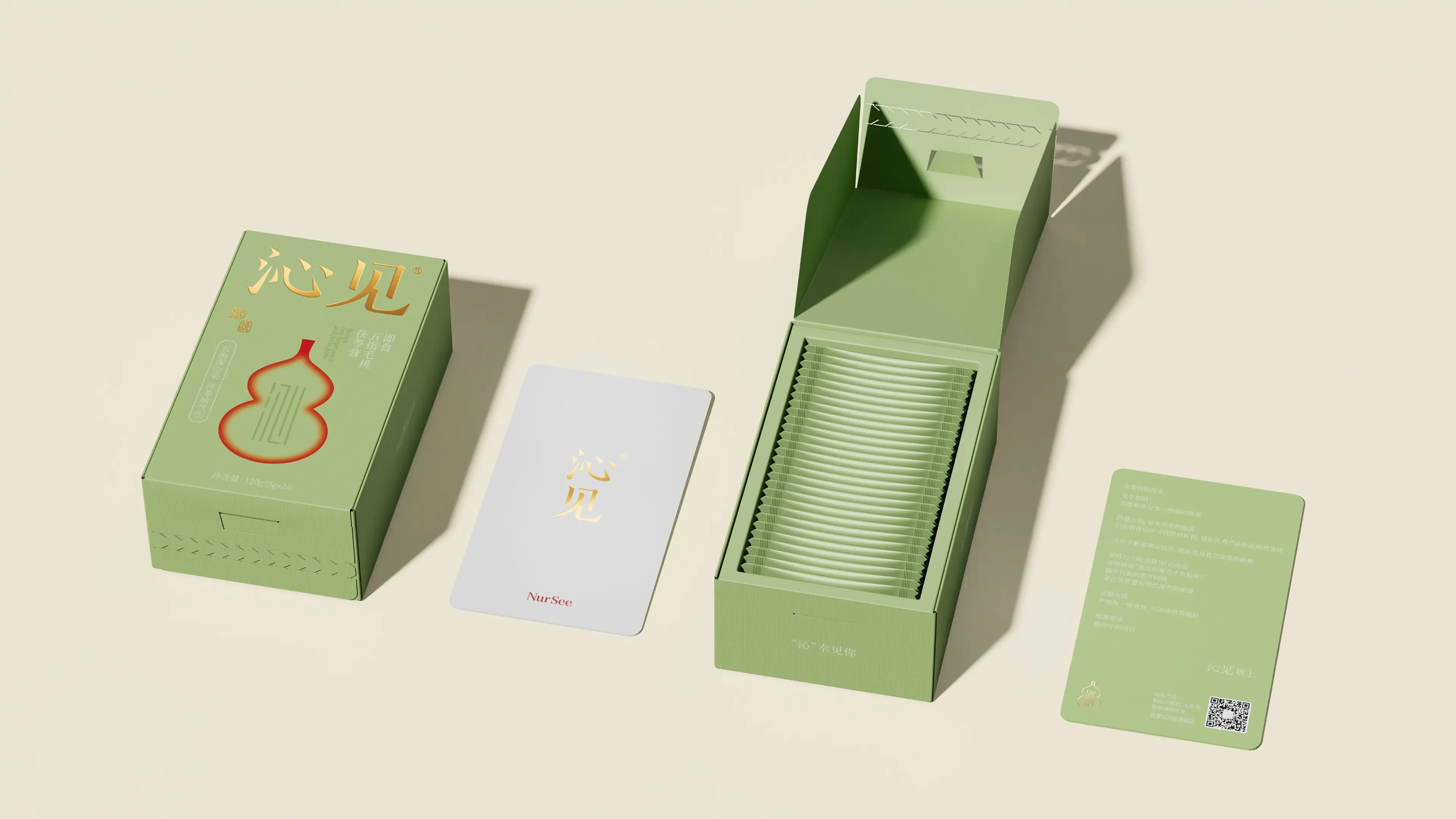
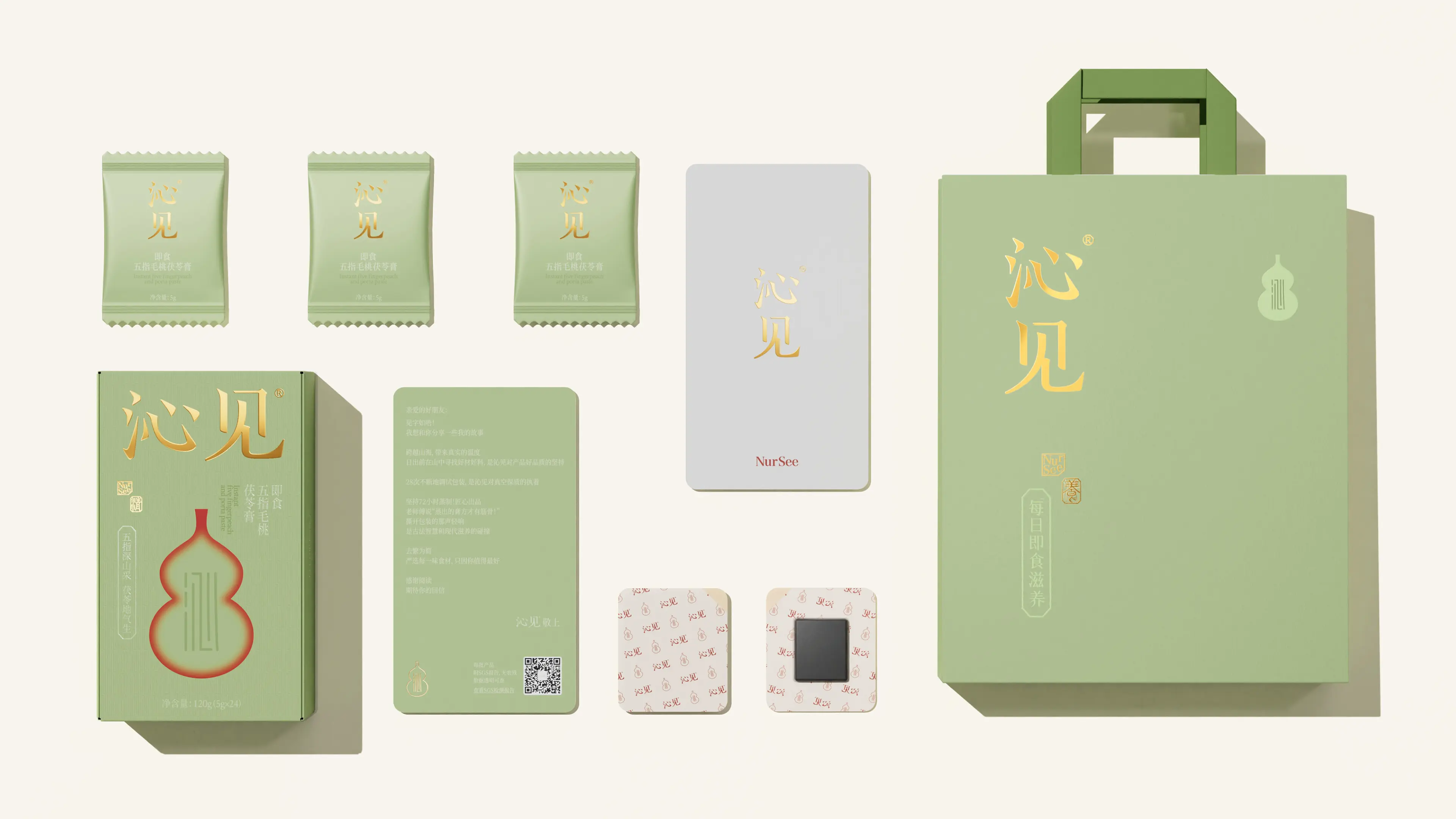
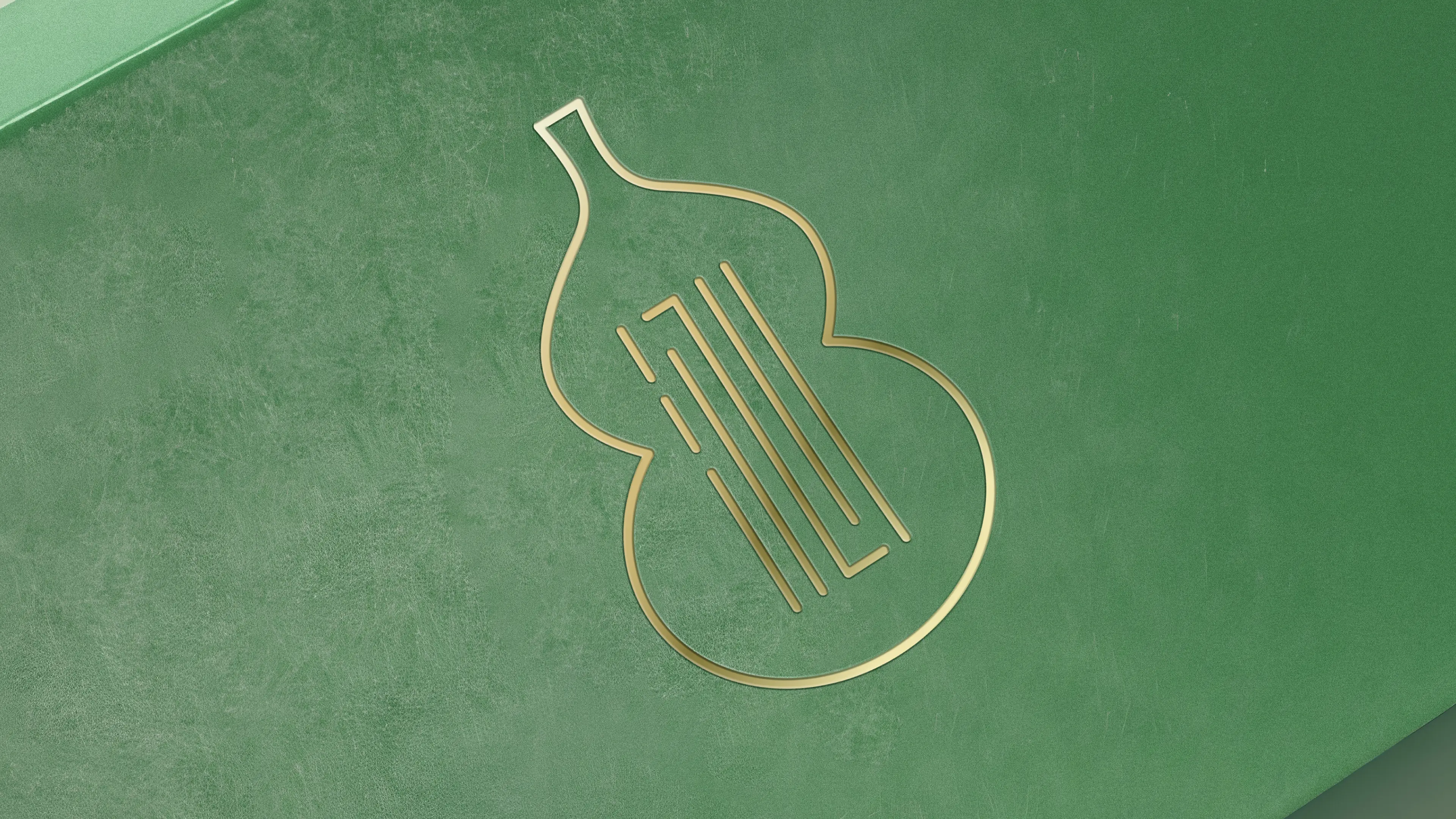
The core objective of this project is to help the brand establish a differentiated visual identity system with Eastern cultural heritage in the supplement market. We take "Harmonizing the natural essence of the East, extracting mountain and forest medicinal herbs, and responding to modern women's pursuit of health and beauty in a light form" as the brand concept, and established the design direction of "Eastern nourishment + lightness". The main visual symbol selected is the gourd as the core element of the product's main visual. The gourd carries deep Eastern connotations and nourishing meanings in traditional Chinese culture and can quickly establish associations with "Eastern" and "nourishment" concepts. The packaging design adopts a difficult red and green color scheme. This bold color strategy challenges the conventional impression of red and green combinations in traditional ideology and expresses the diversity of Eastern cultural traditions and new ideas for color application in a highly visually impactful way. The combination of bright red and peach pink makes it gentle while carrying Eastern charm, precisely responding to the aesthetic preferences of female consumers. The overall visual adopts a new Chinese style, not only expressing the Chinese aesthetics of the current aesthetic trend, but also embodying the gentle, delicate, and understanding feminine beauty. Through this brand comprehensive design system that combines cultural depth, visual impact, and female aesthetics, Insee Ready-to-Eat Yuling Paste successfully upgrades from traditional supplements to a modern ready-to-eat nourishment brand with strong visual identity, clear category positioning, and Eastern cultural genes, laying a solid visual foundation for the brand's continuous leadership in the 10 billion Yuling Paste market.