











The brand of this grandma's home is a subsidiary of Hangzhou Maishuang Food Co., Ltd. Hangzhou Maishuang Food was established in 2001 and is a leisure food enterprise that integrates independent product research and development, production, and sales. The company now has four major brands: "Grandma's Home", "Xiangchi", "Maishuang", and "Fengshun". It covers several product series such as baked potato chips, composite potato chips, crispy potato, steamed cakes, and dried dumplings. The company has a modern factory with a 14,000-square-meter area and multiple 100,000-level air purification workshops. Since its establishment, Maishuang Food has always adhered to the brand mission of "providing quality and delicious leisure foods for every Chinese person". Its product sales have achieved nationwide coverage.
In the memories of Hangzhou people, "Grandma's Home" carries the taste of childhood - in Hangzhou, there is "Grandma's Home" in the catering industry, and there is "Grandma's Home" in the leisure snack industry. After more than ten years of stable development, the brand has expanded from Hangzhou to the whole country and has become a powerful leisure food producer in China.
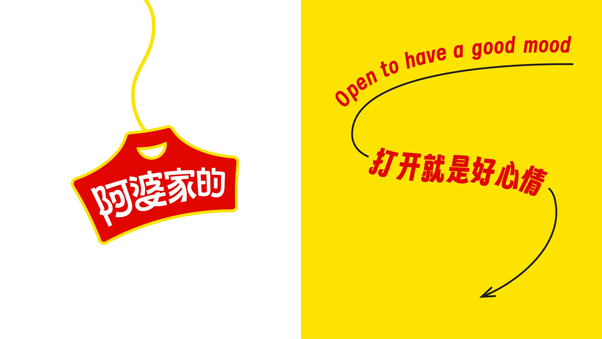
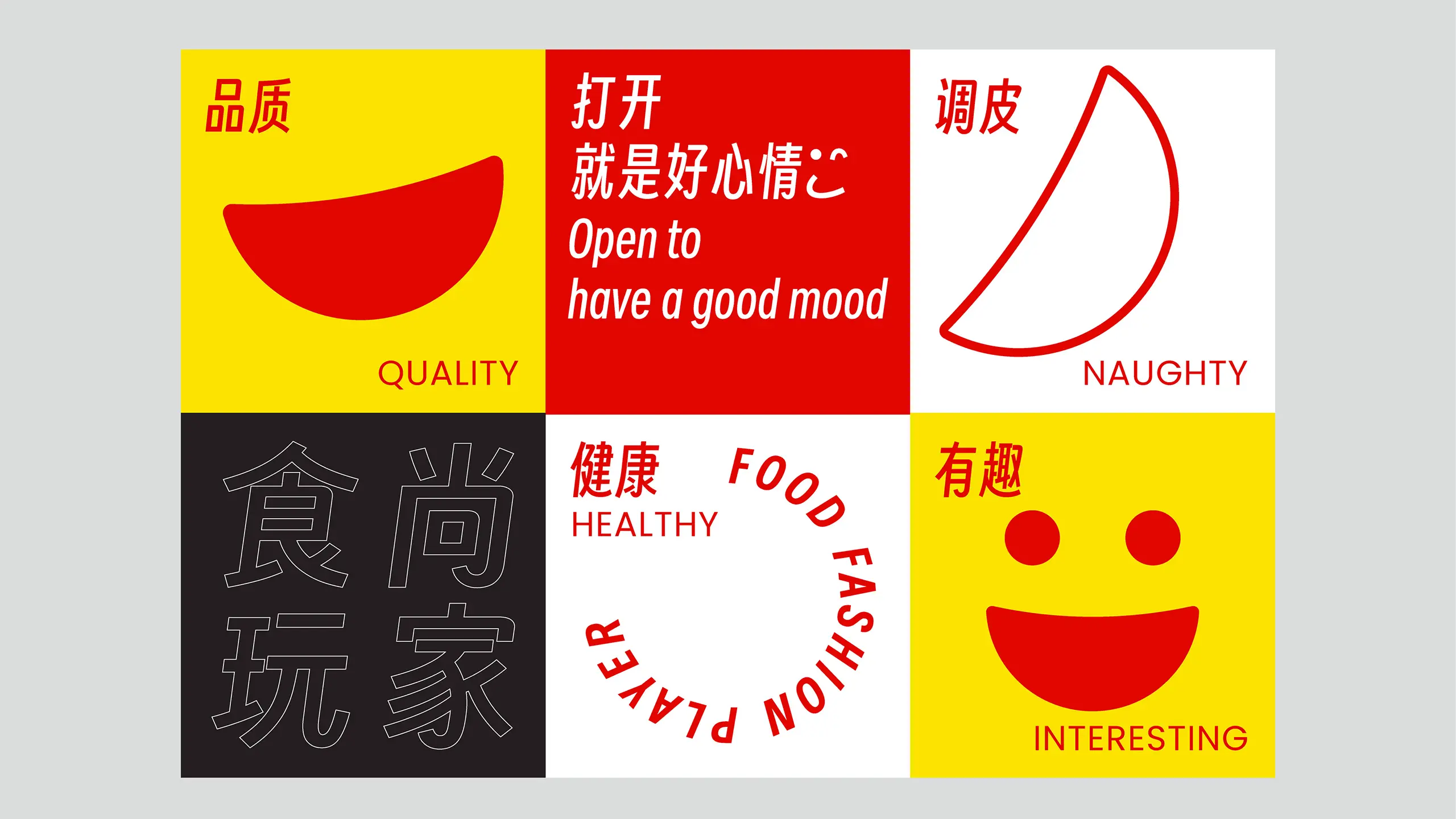
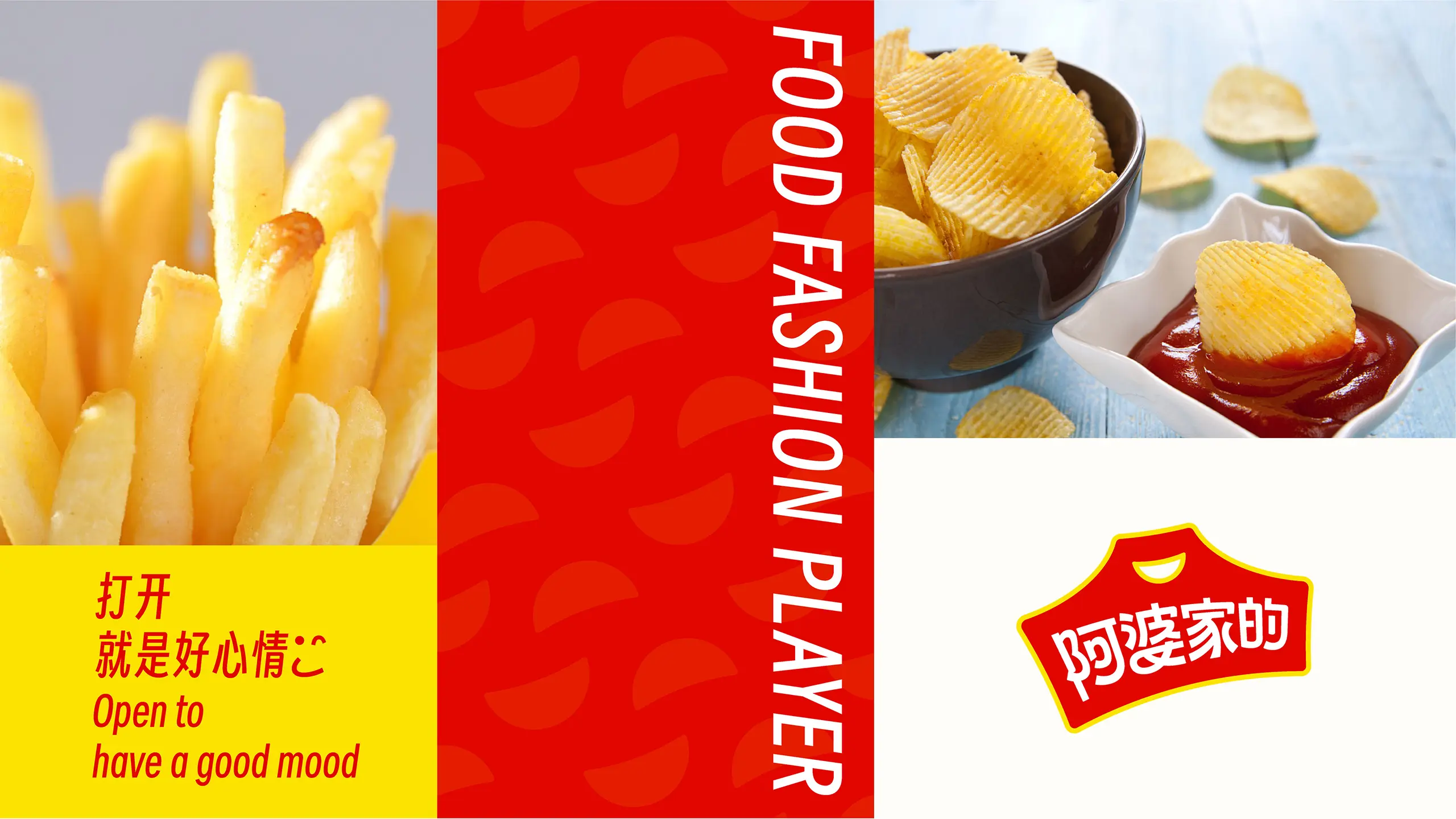
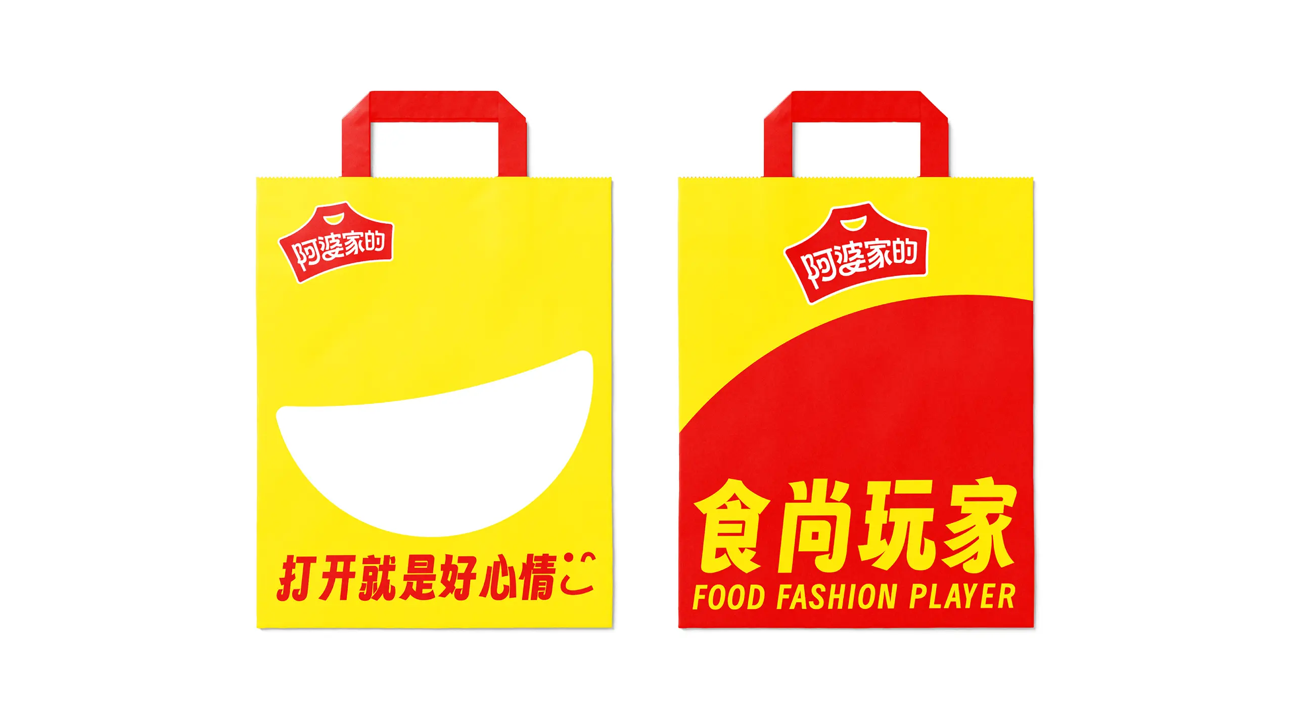
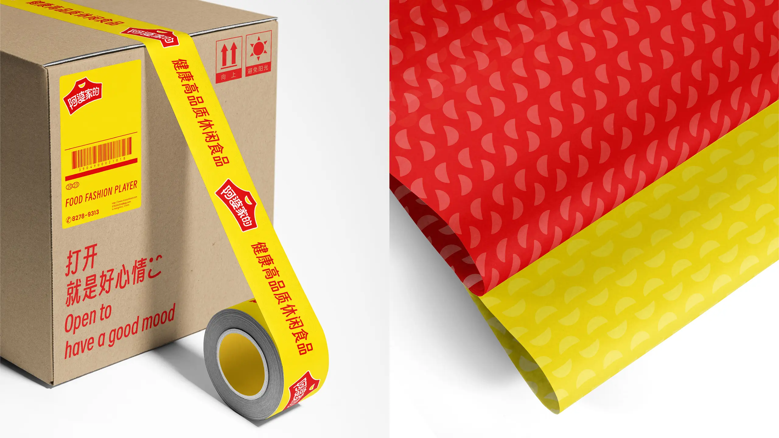
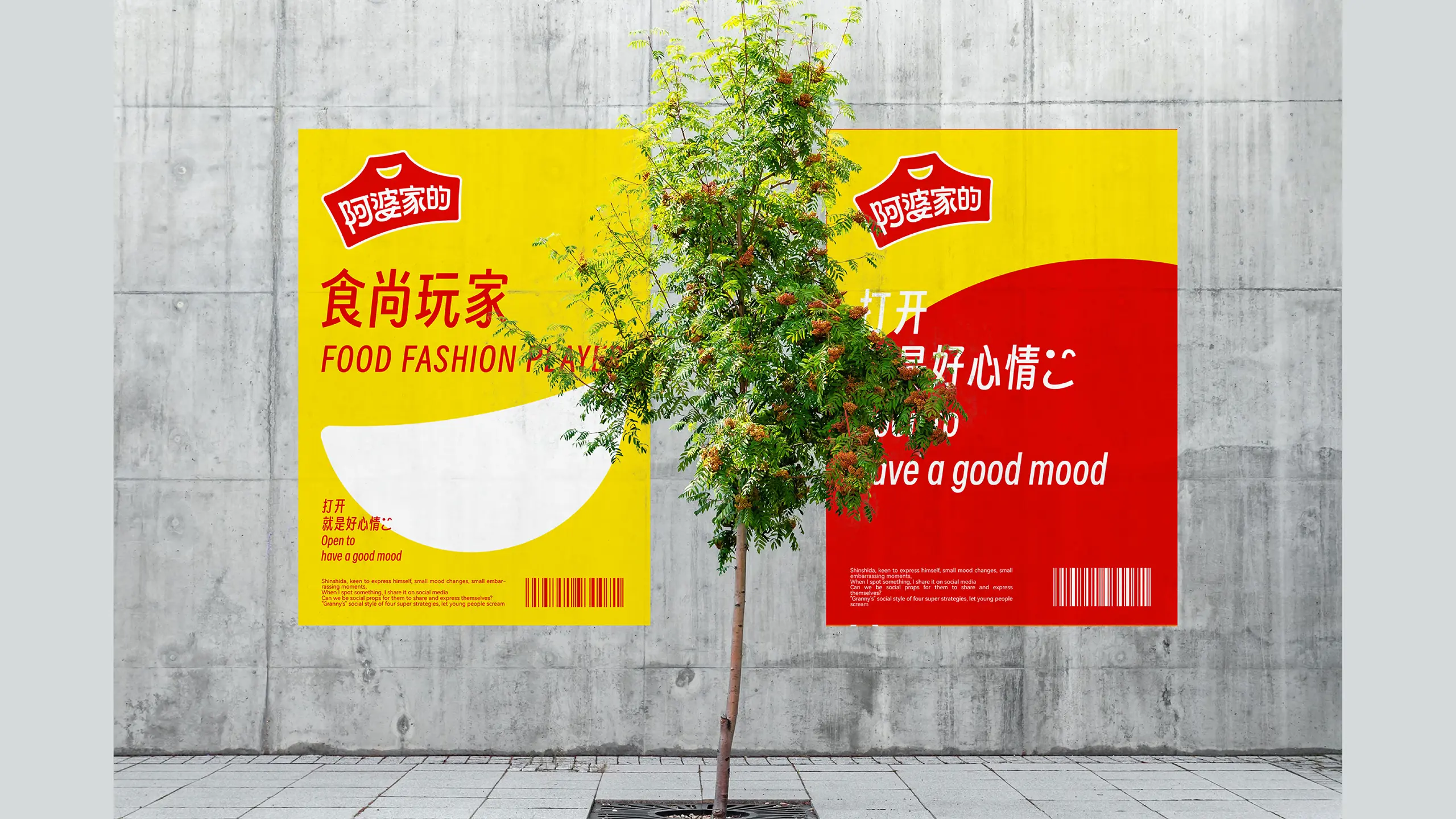
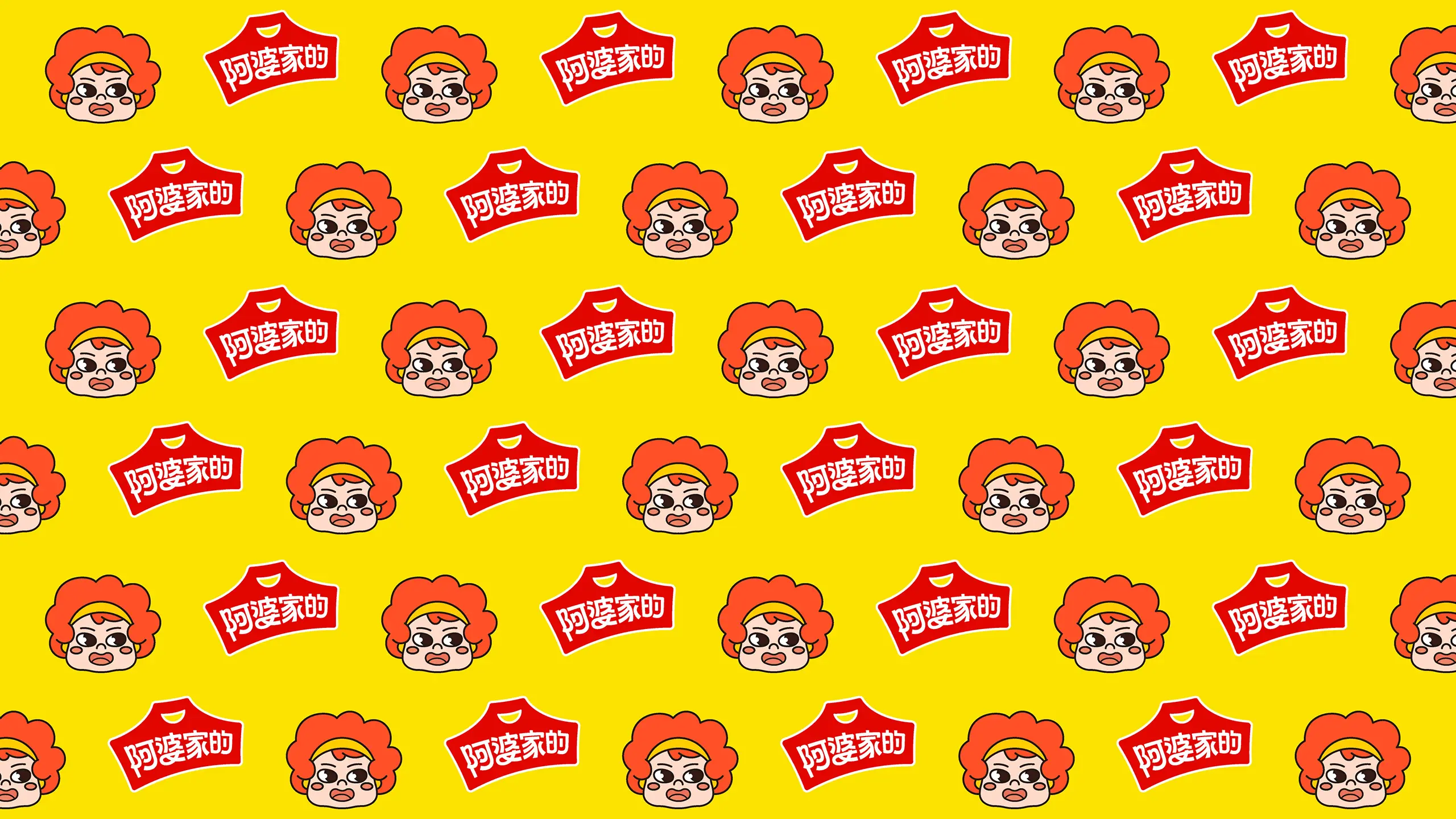
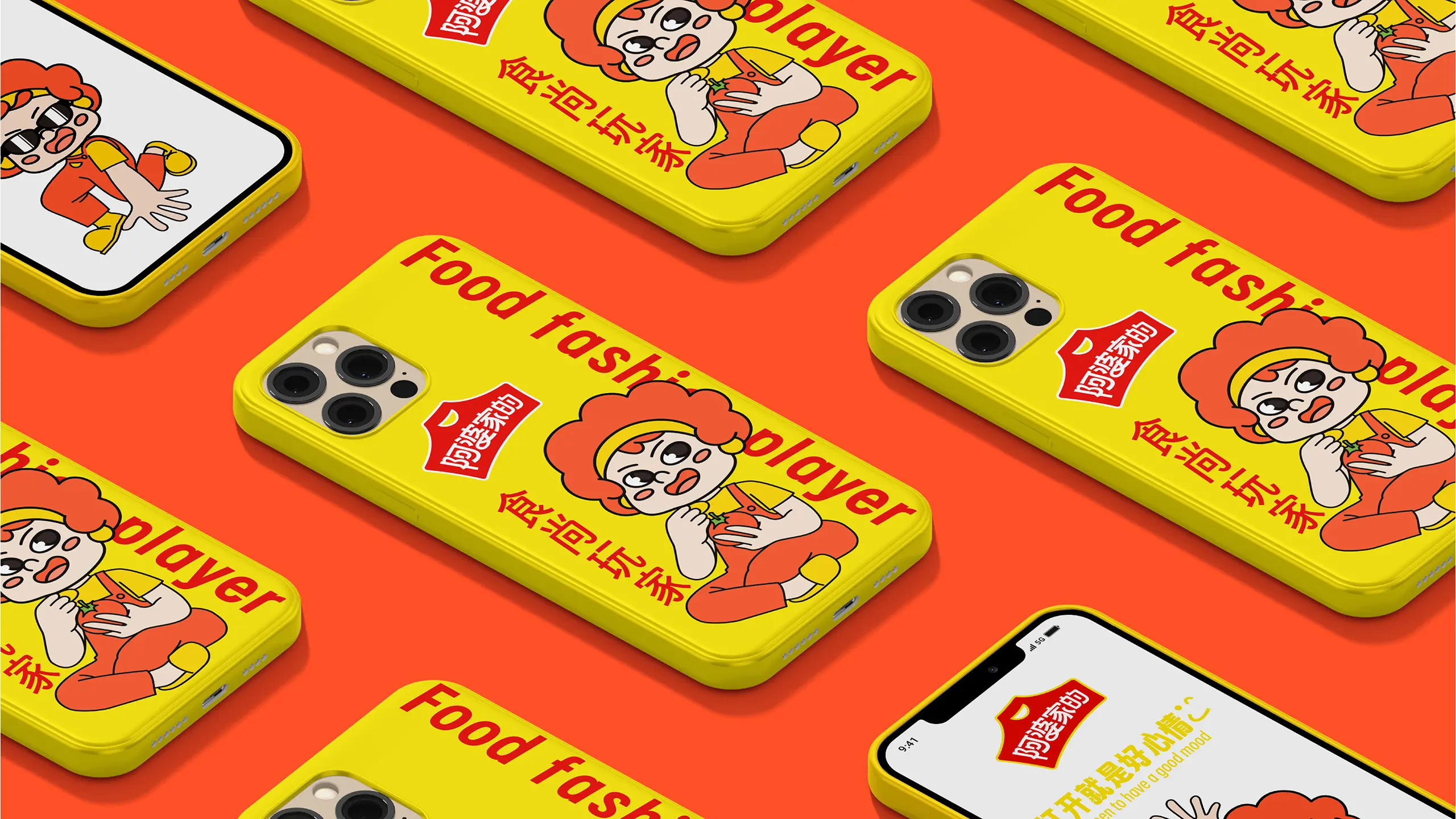
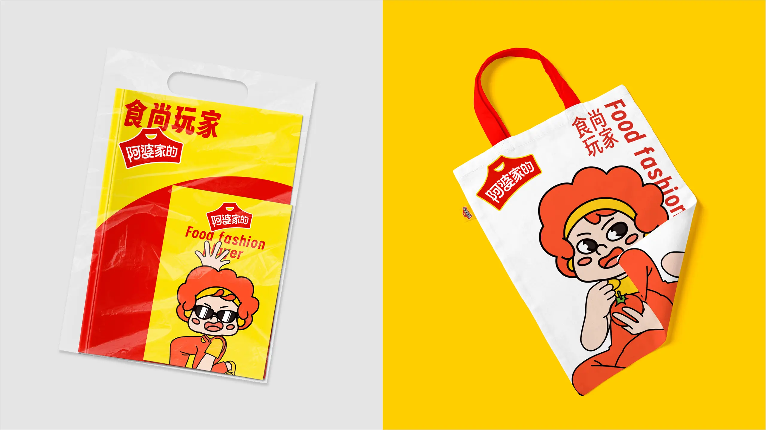
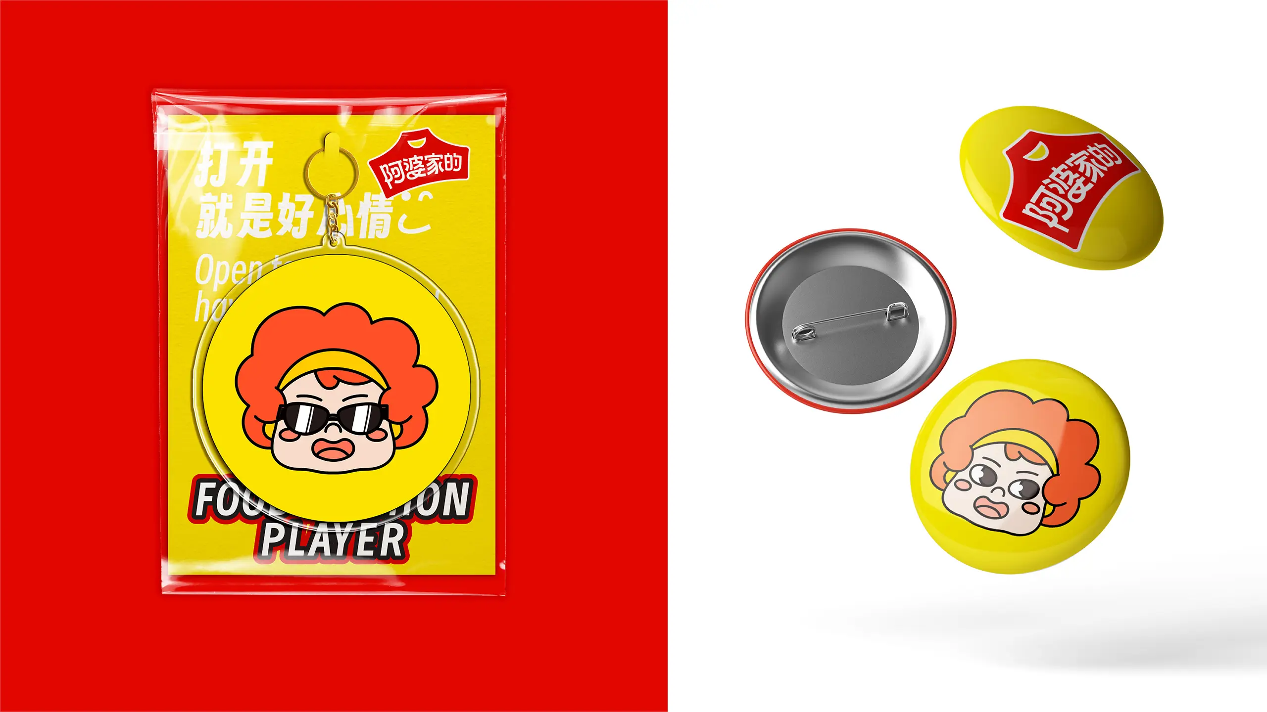
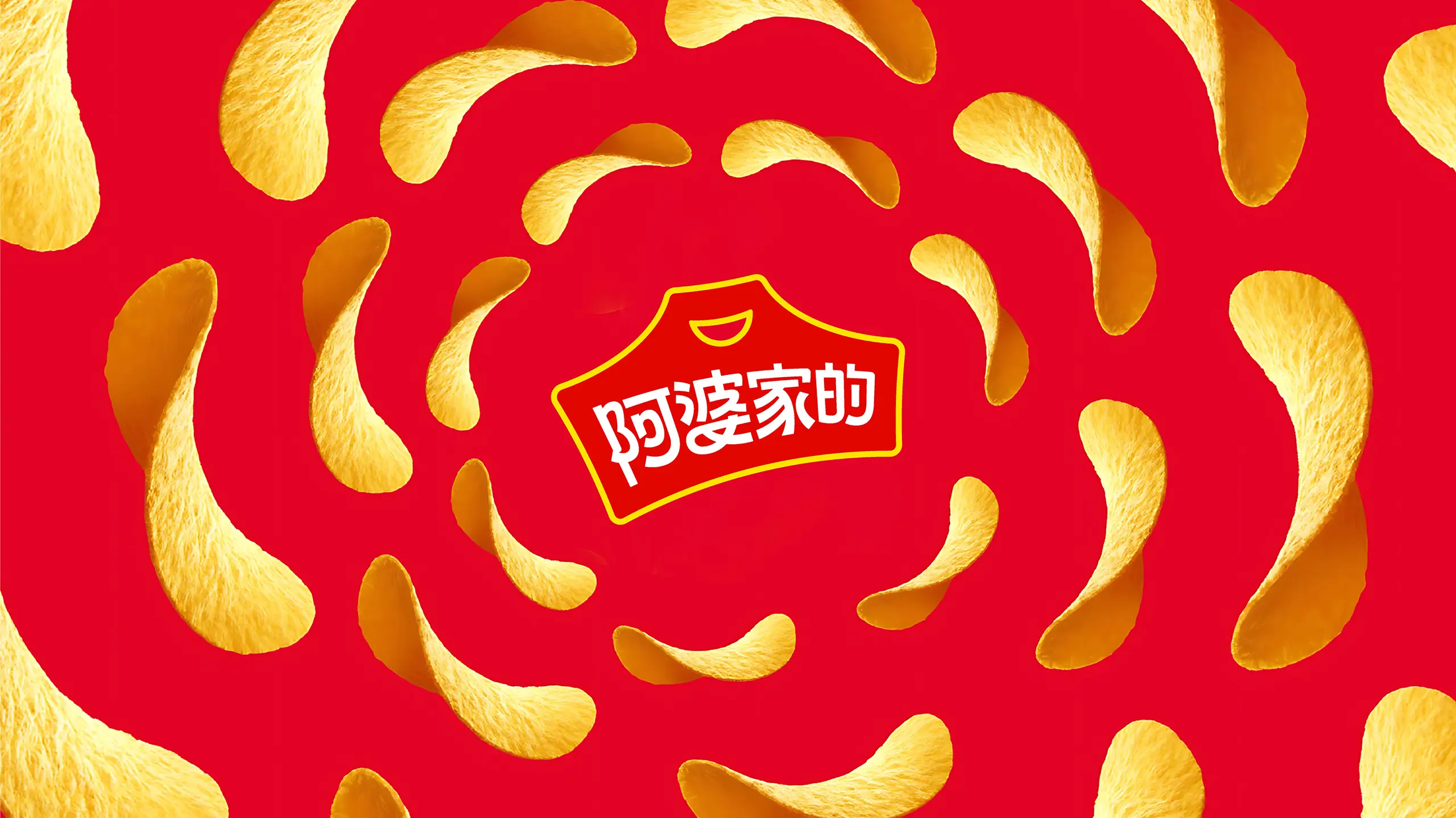
This project is to create a complete brand package design for Grandma's Home. The services cover brand strategy, logo design, VI design, and packaging design, etc. The core goal is to help Grandma's Home re-define its brand positioning and complete a visual upgrade in the increasingly competitive leisure food market, reaching out to the new generation of young consumers with a "cool player" new image. Logo design is the core breakthrough of this brand renewal. The original line and font have been upgraded to a more recognizable modern sans-serif font, and the simple and flat processing style gives the brand a stronger modern feel. At the same time, the team creatively uses "apron" as the brand graphic symbol - the apron has a natural connection with "Grandma", and every grandma has an apron. The position of the apron pocket has been ingeniously designed as a smiling shape, which not only reflects the love and closeness to consumers but also conveys the brand's good service attitude, continuously delivering the brand's commitment to healthy quality.
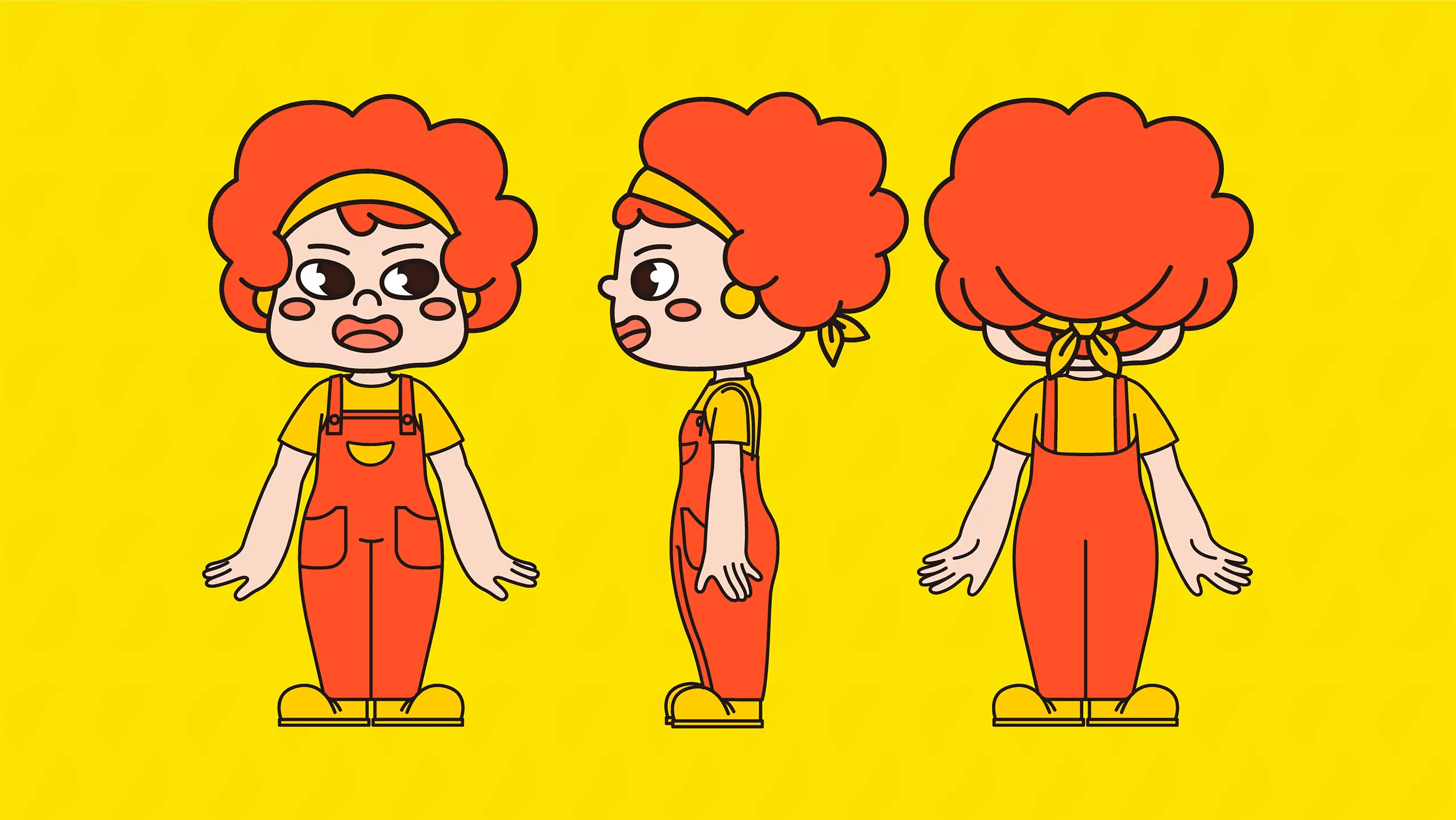
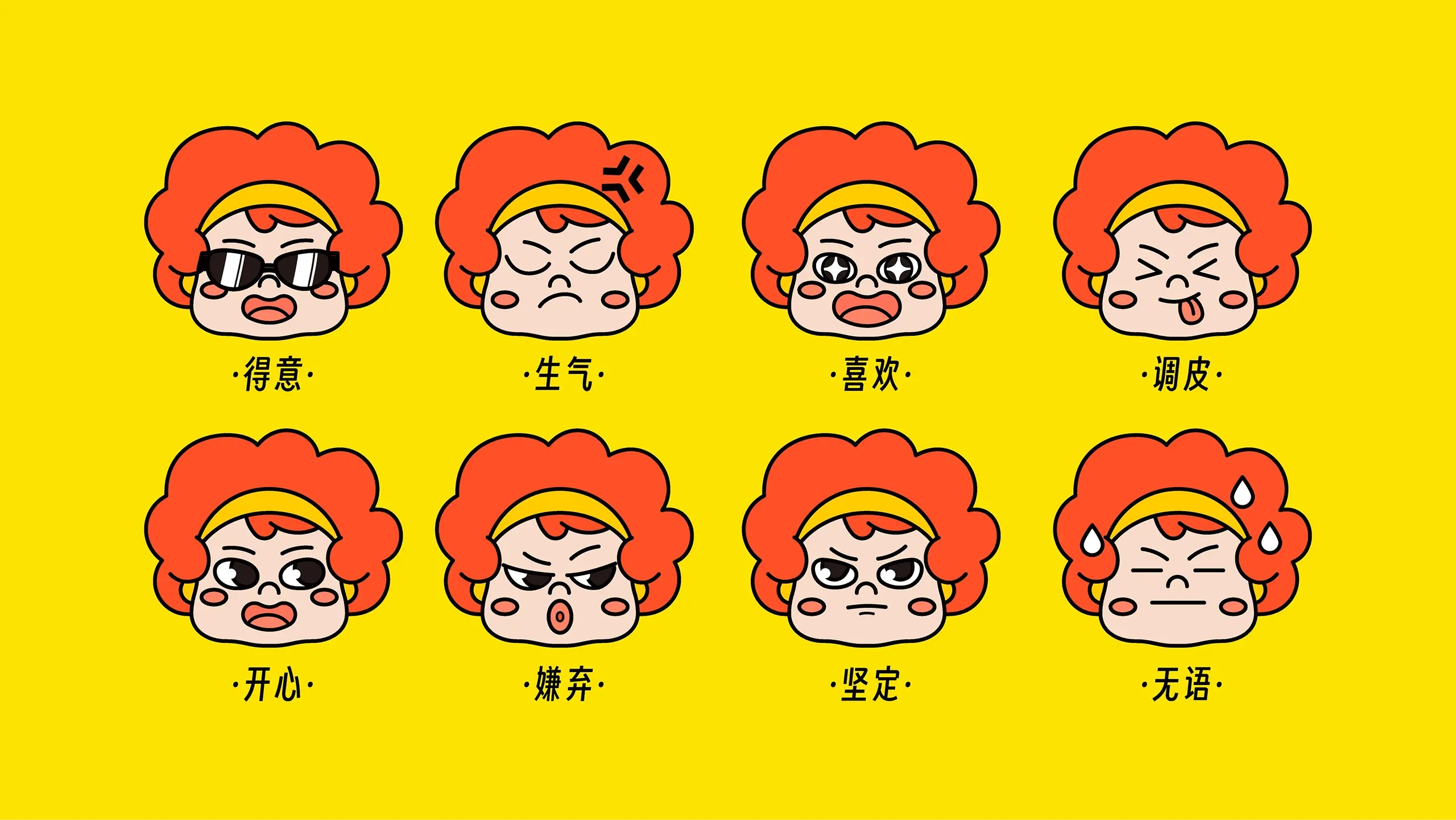
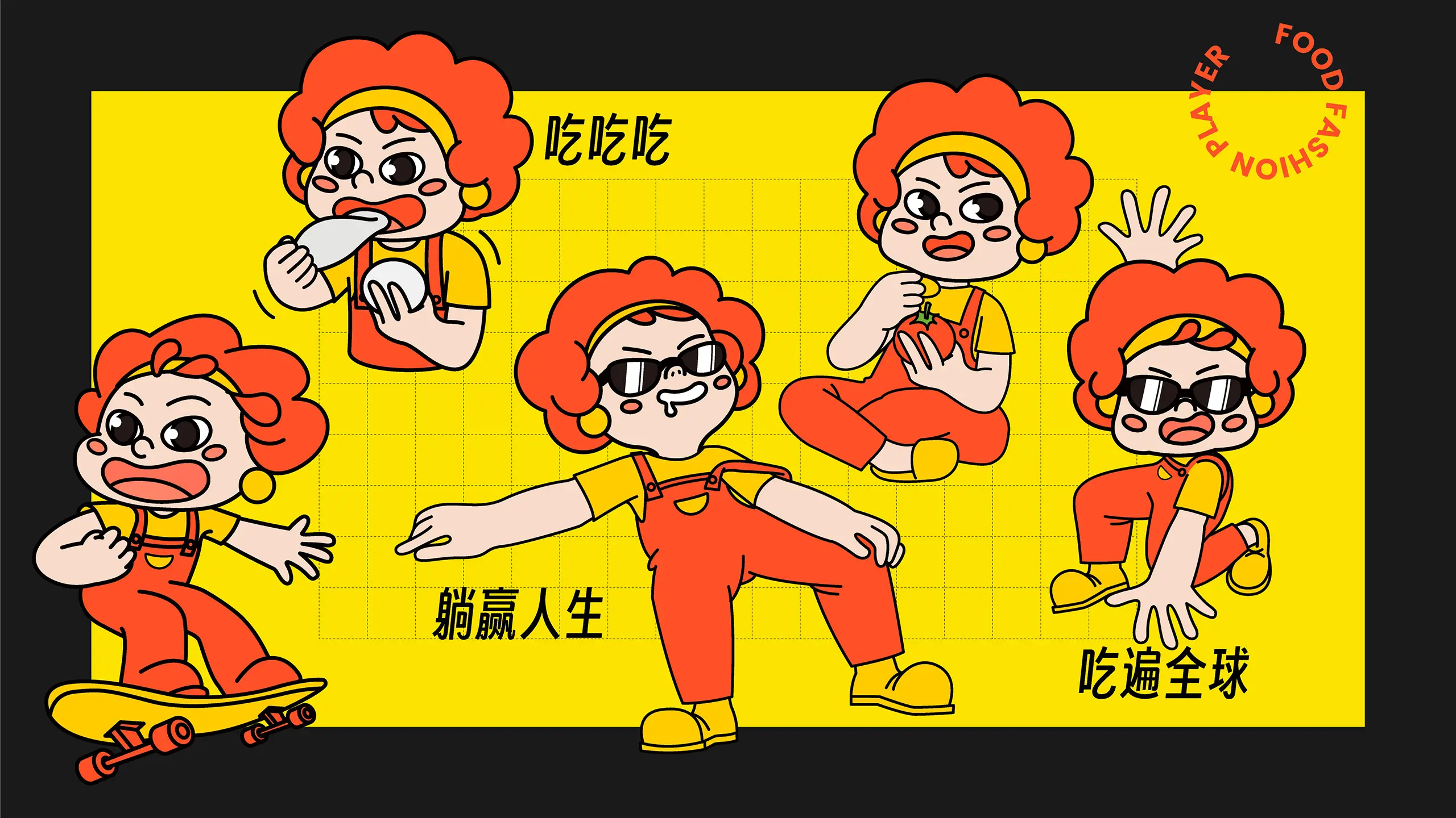
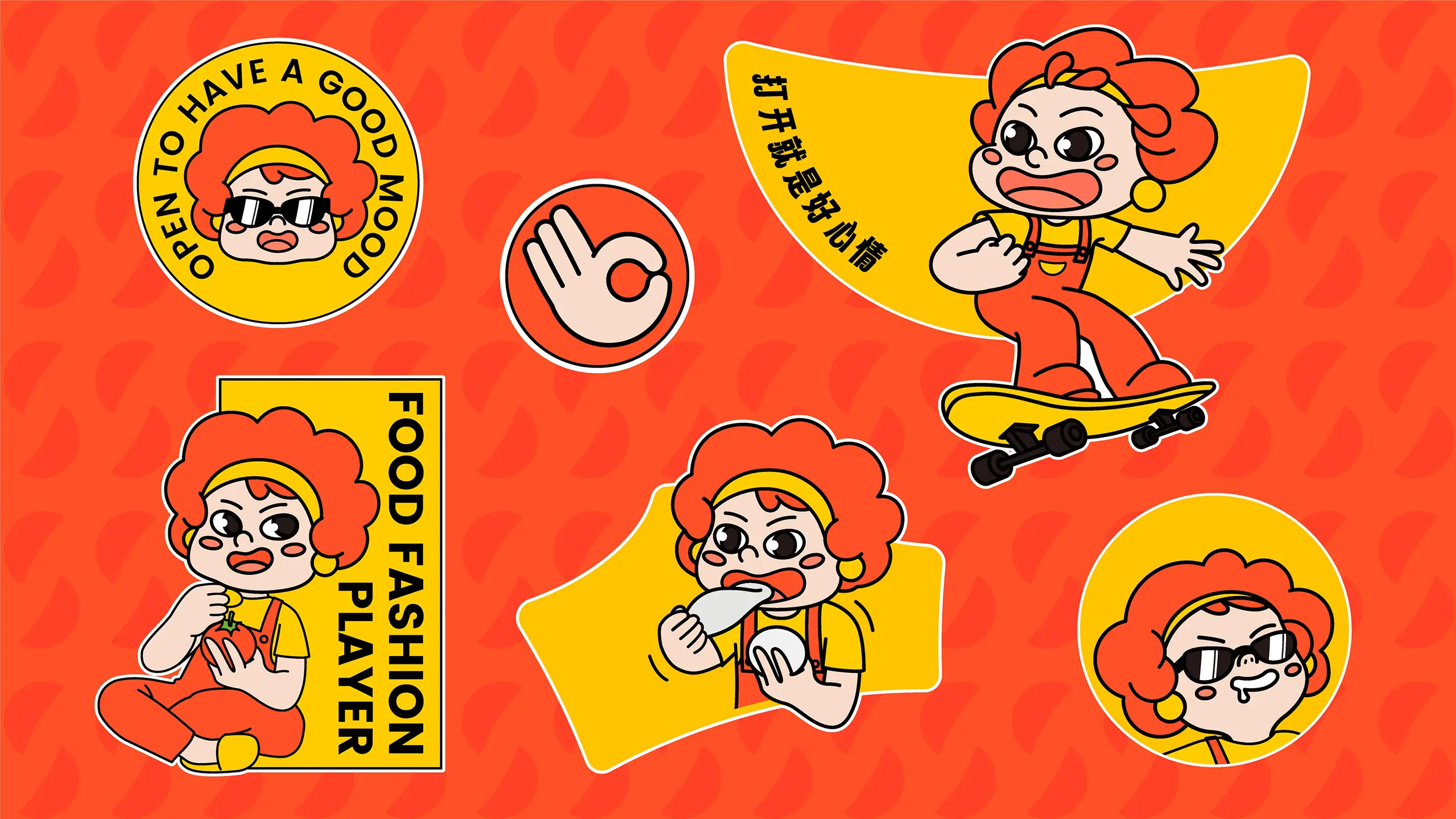
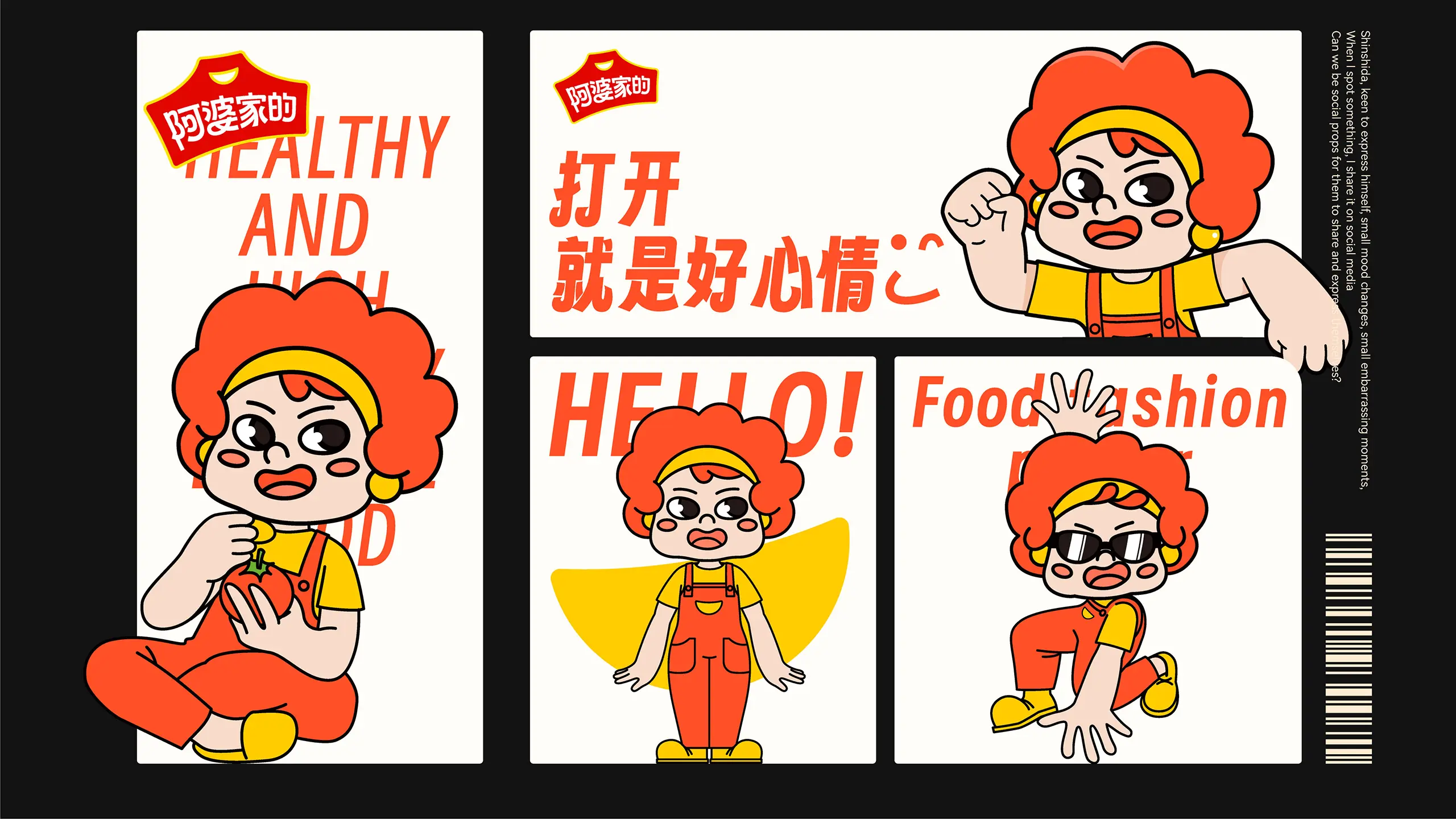
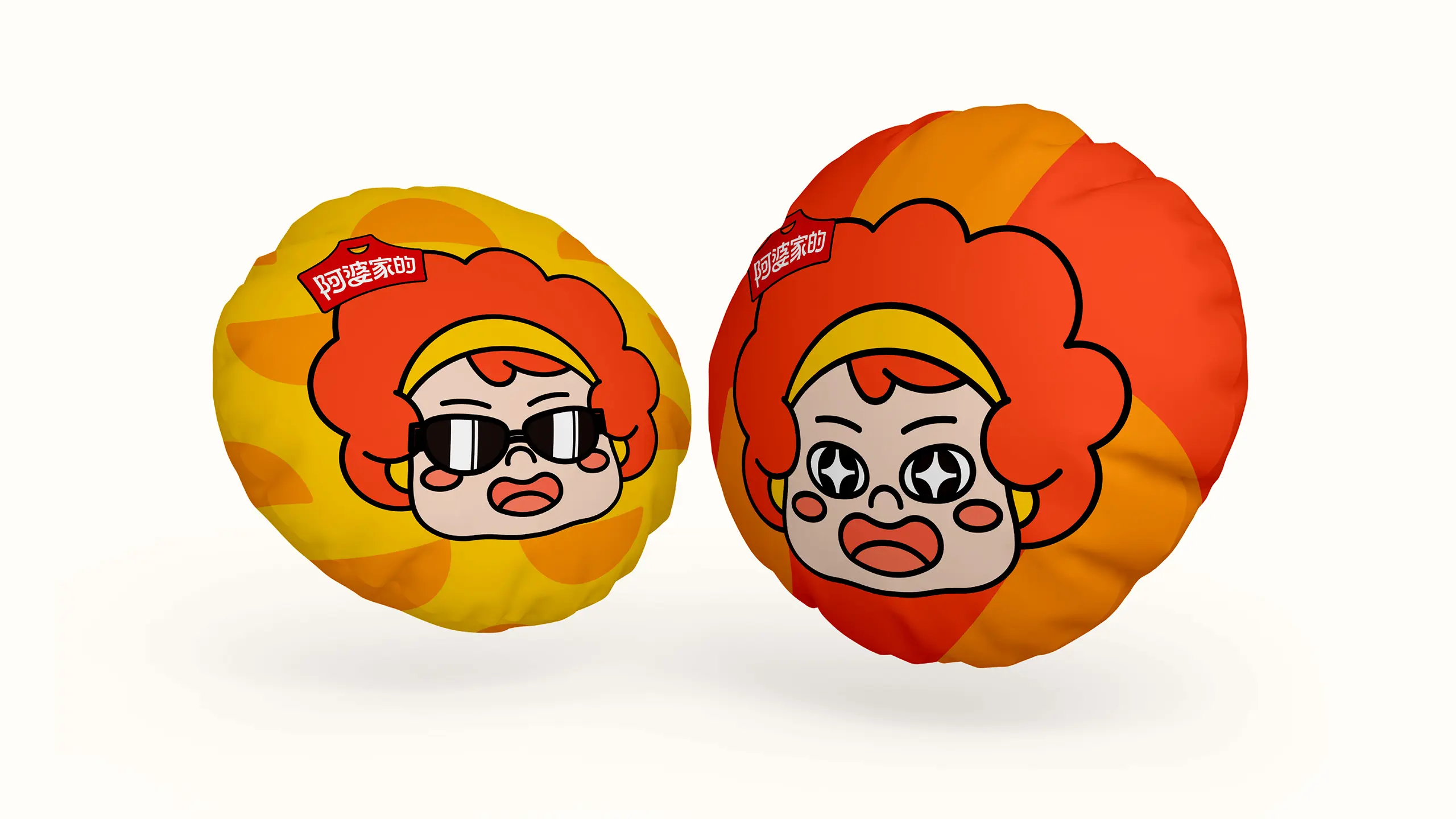
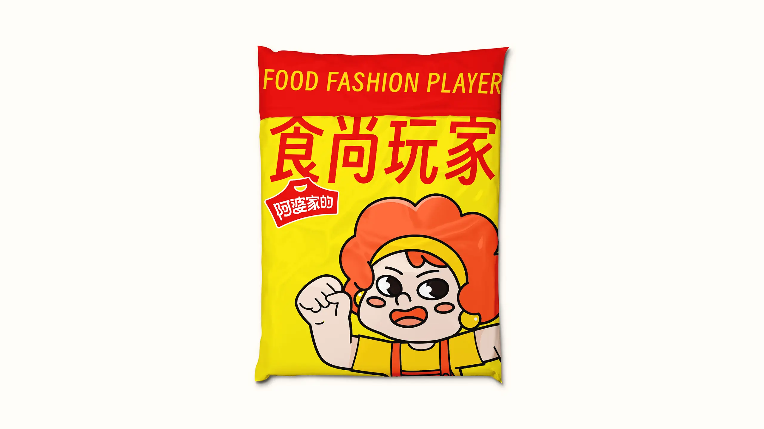
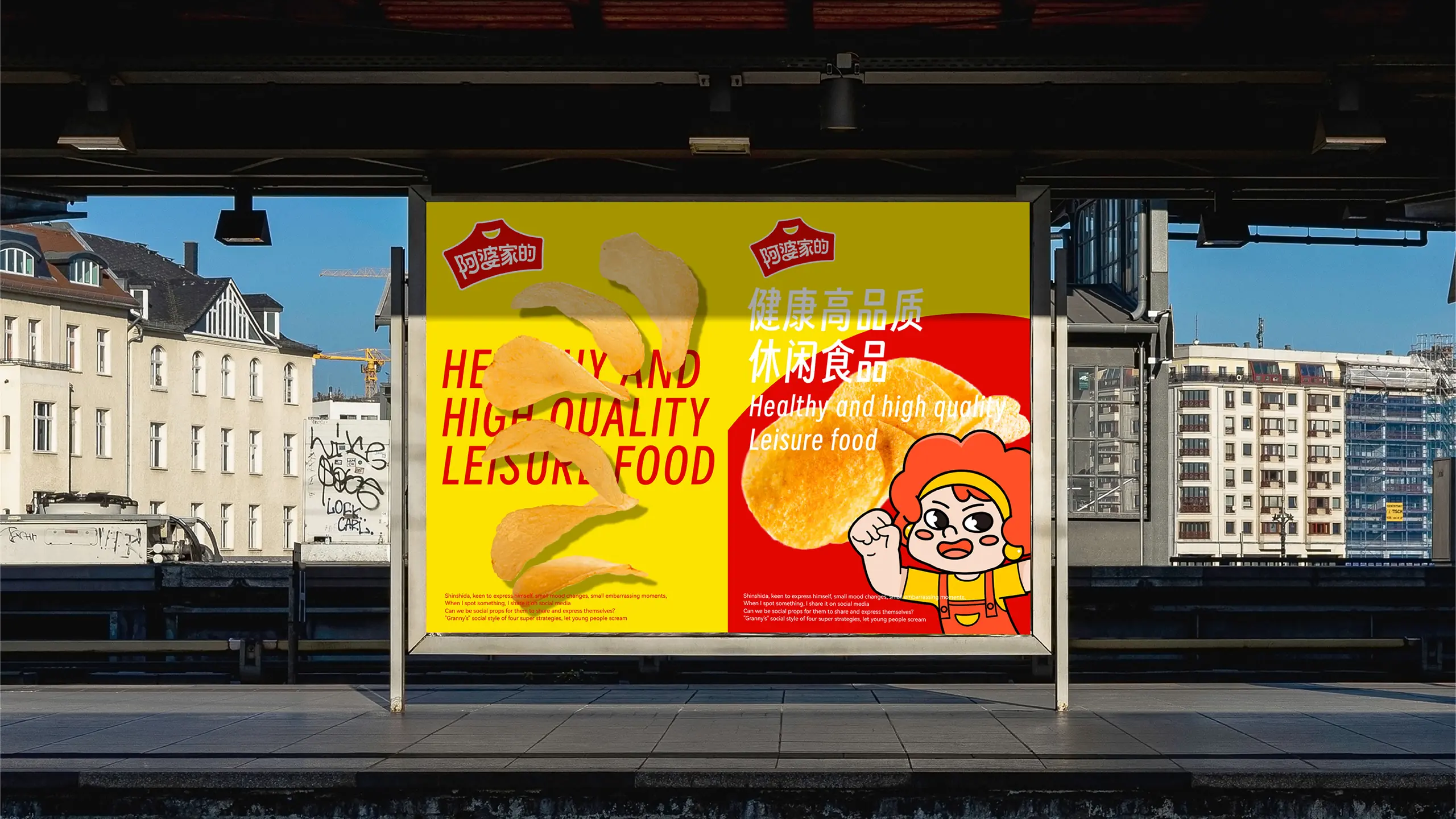
The IP image design is another highlight of this project. The team has created a new brand IP image for Grandma's Home, making the brand full of emotion and more vibrant, becoming a playful brand that can interact with consumers. This strategy effectively narrowed the distance between the brand and young consumers, upgrading "Grandma's Home" from a traditional food brand to a warm and interactive young brand symbol.
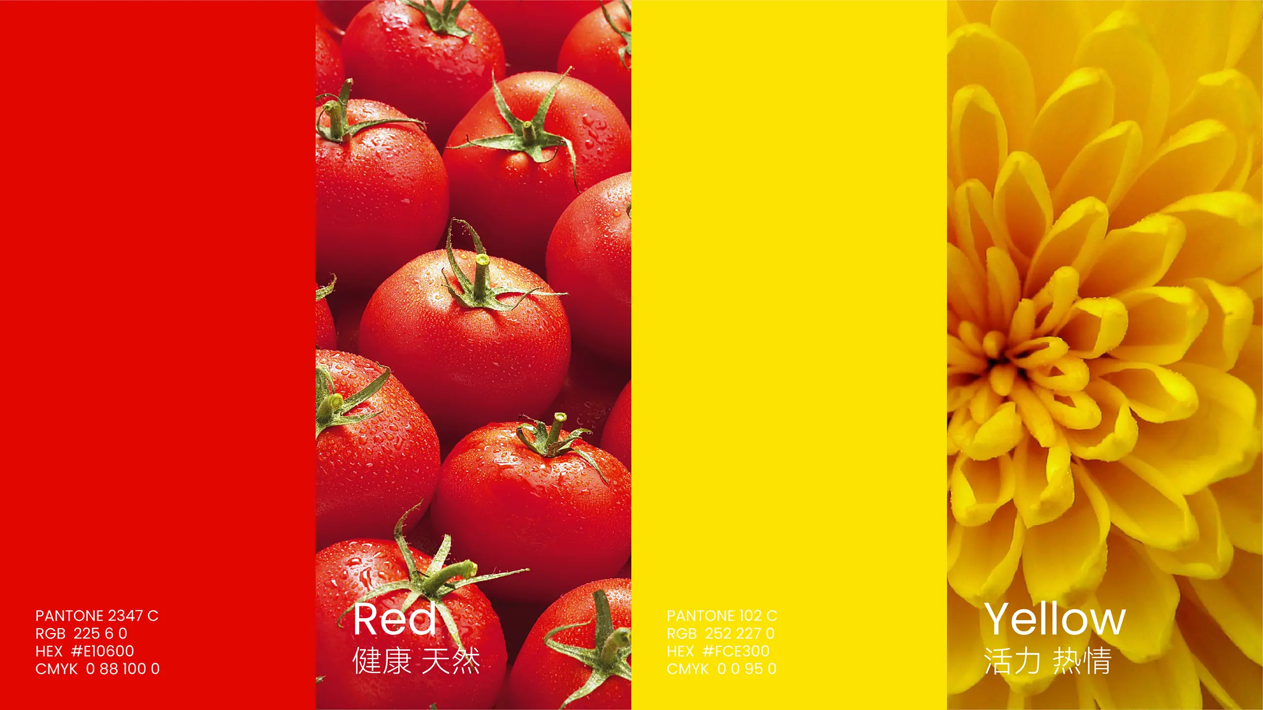
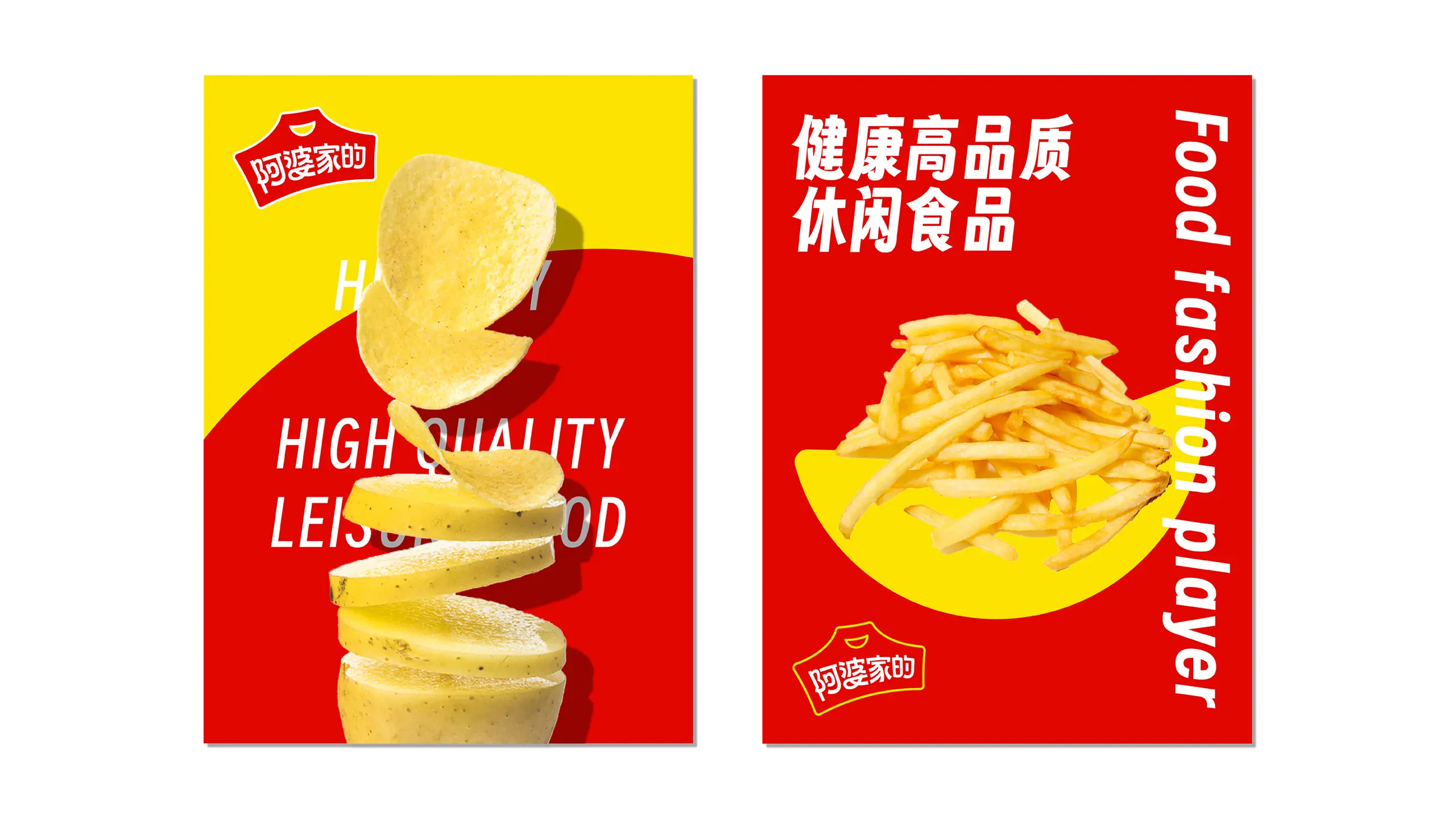
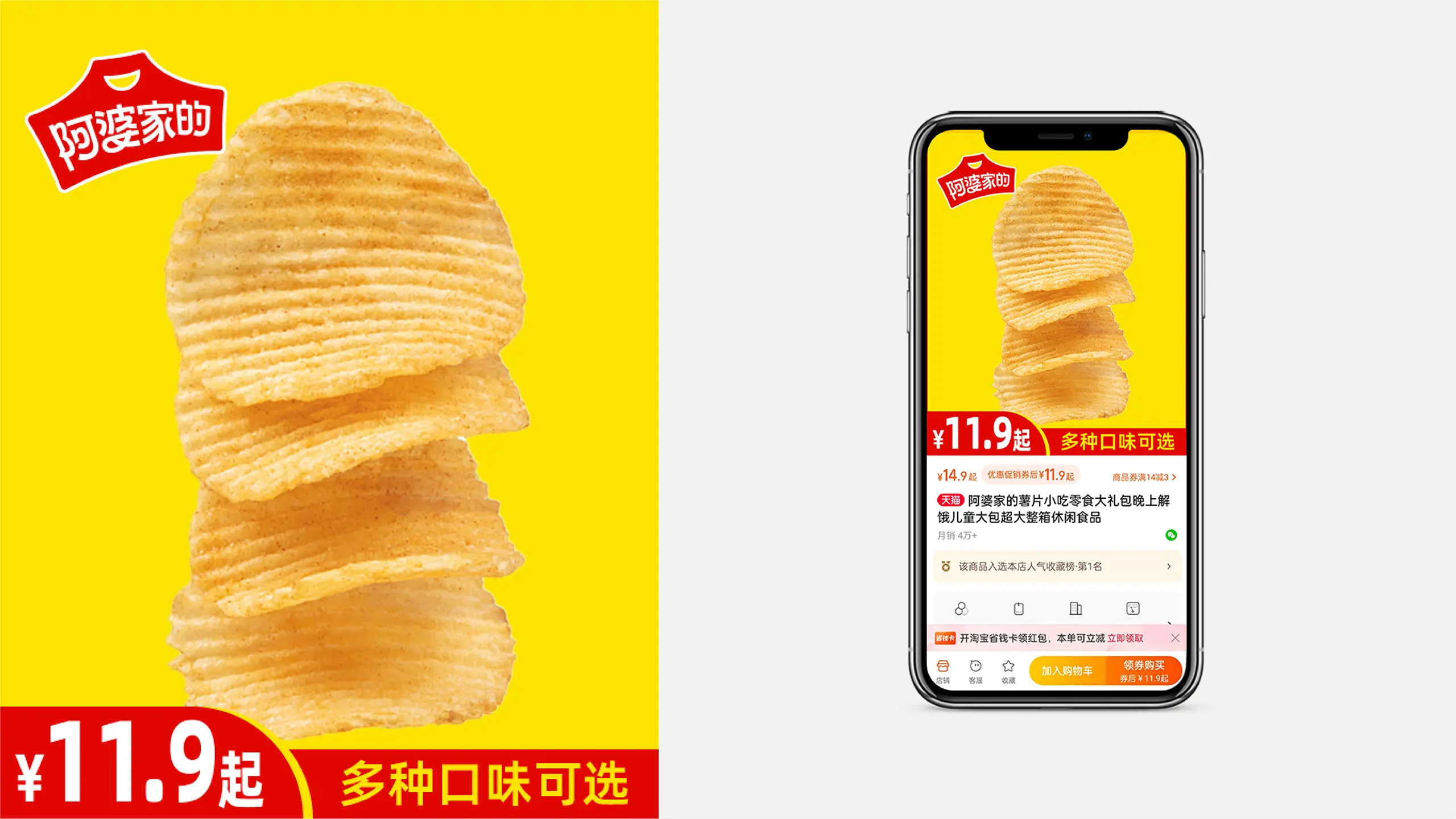
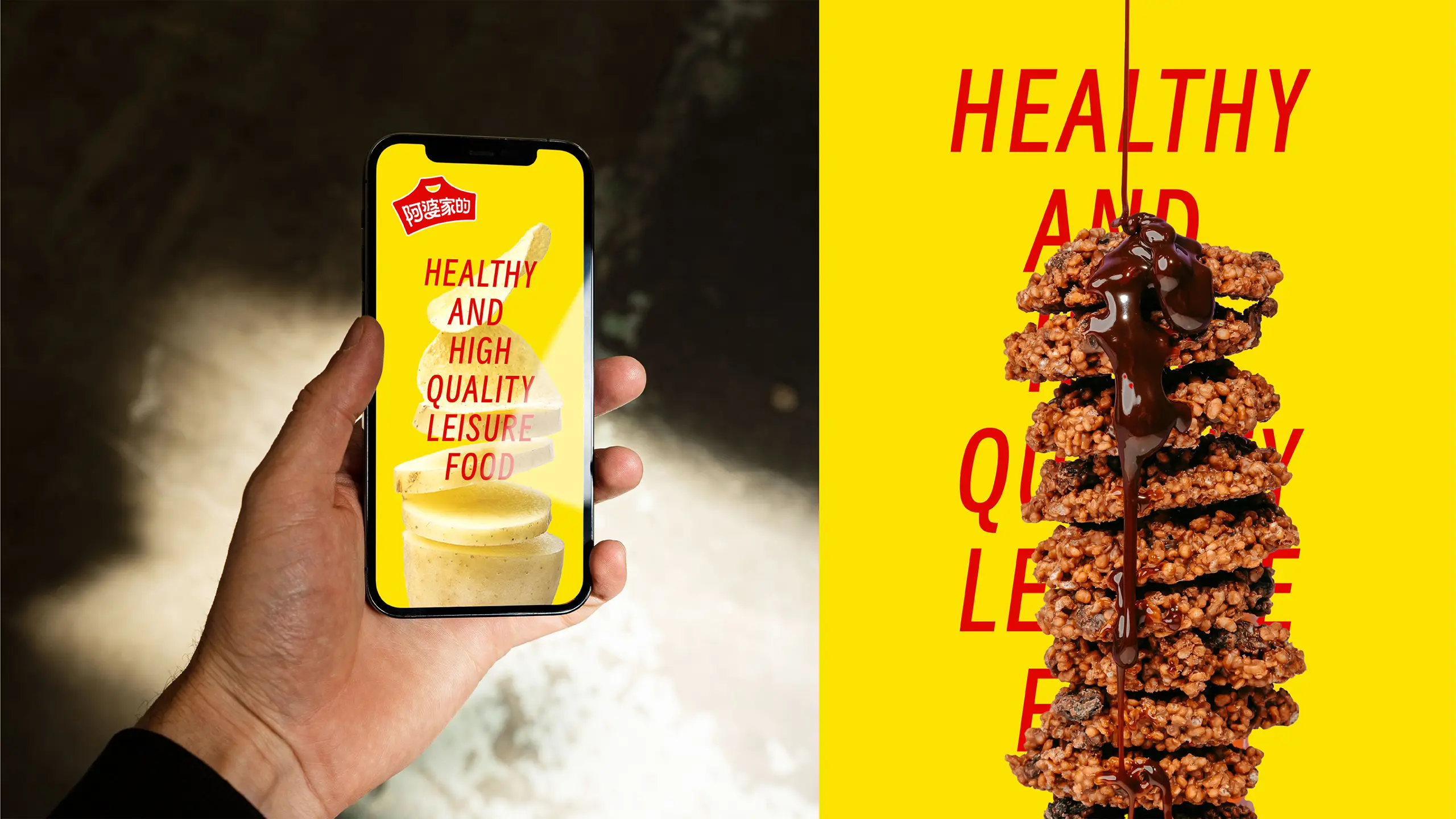
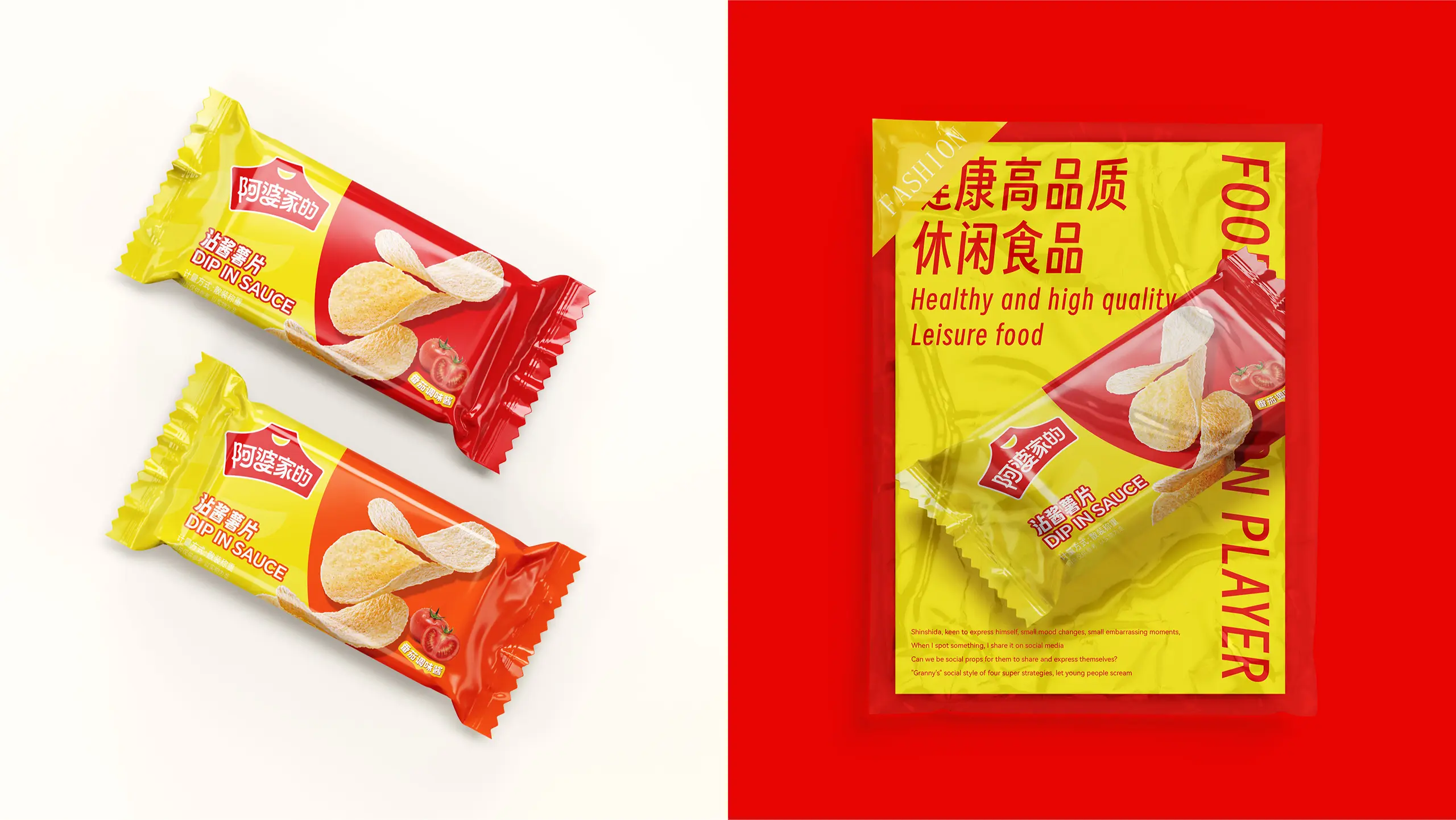
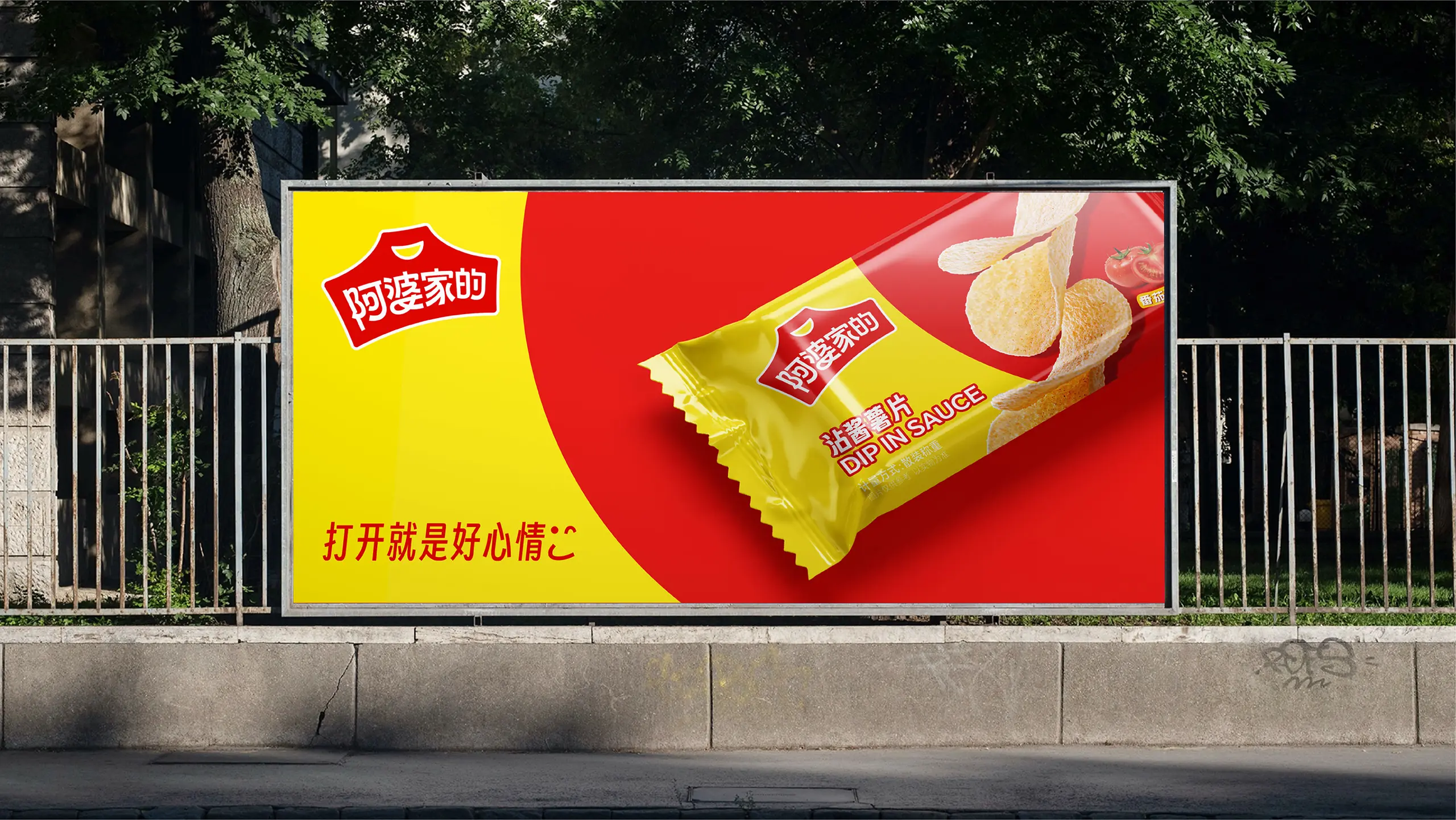
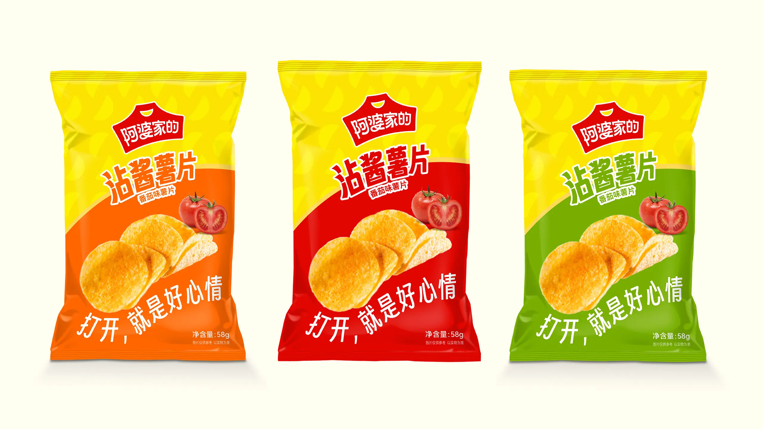
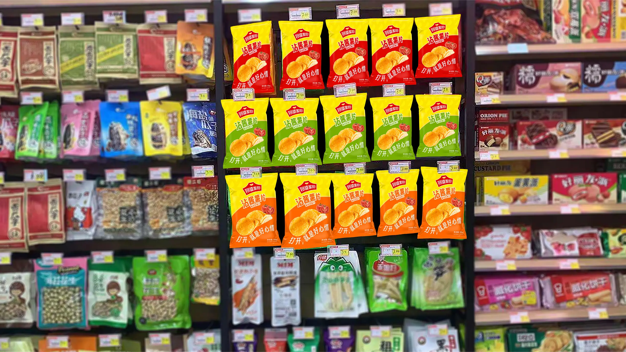
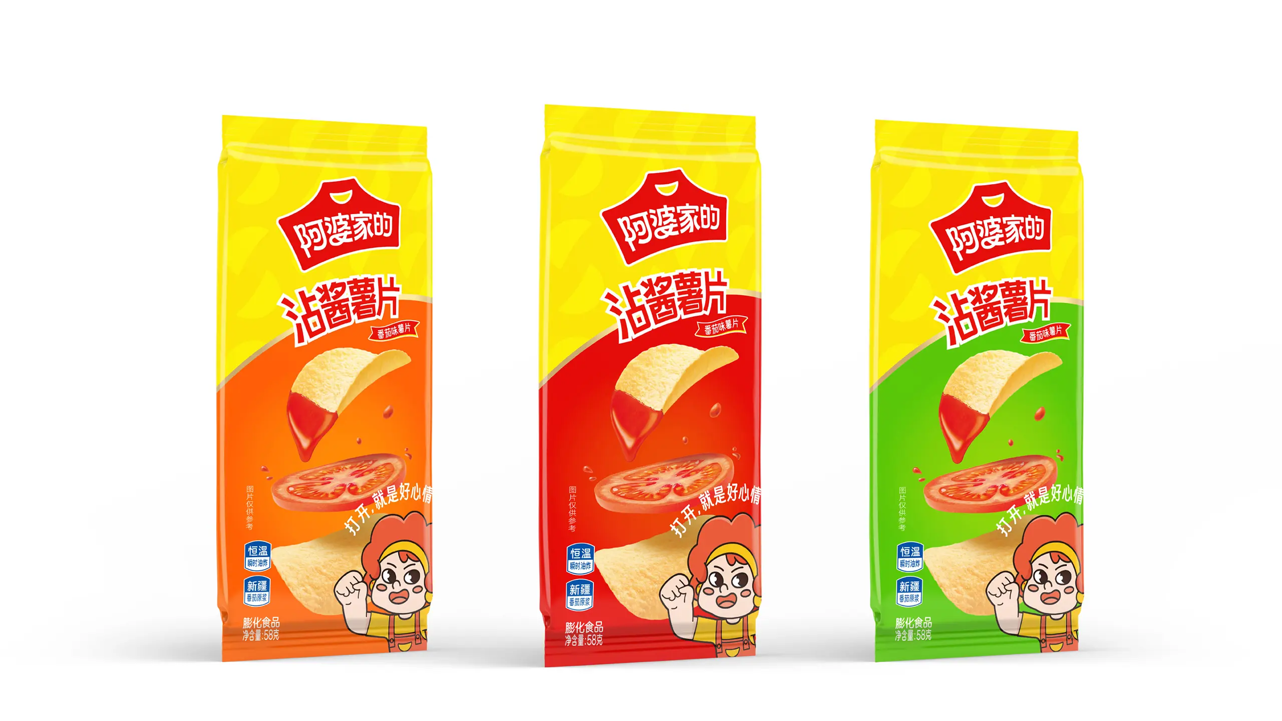
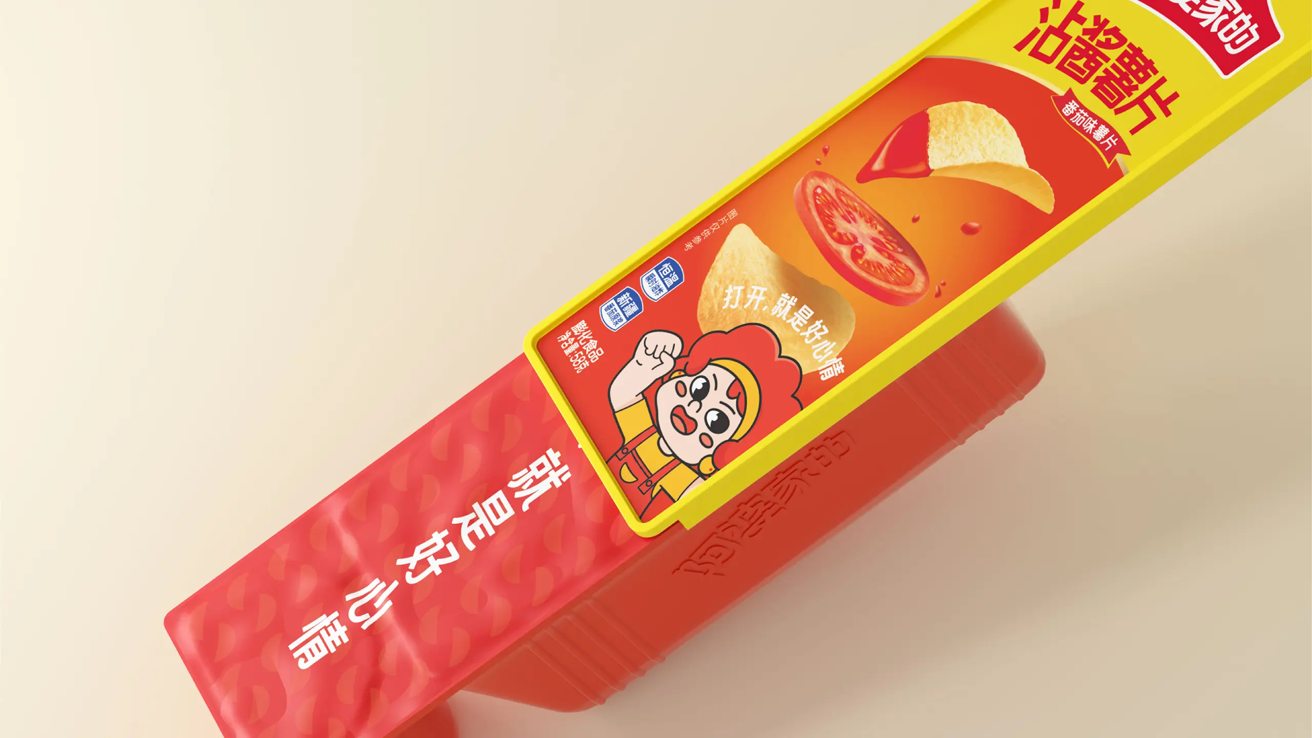
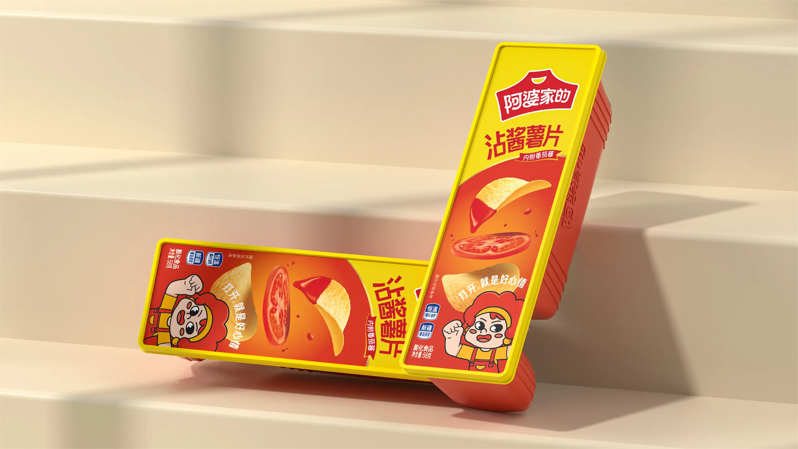
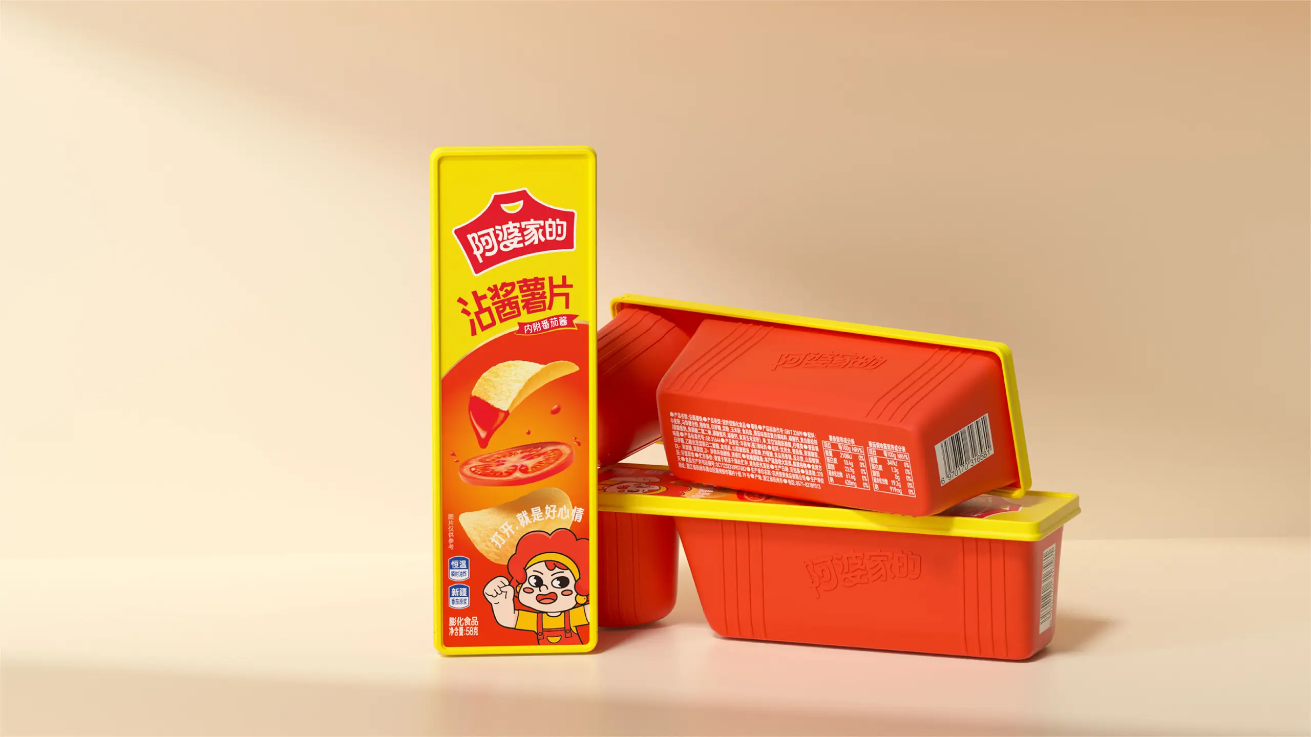
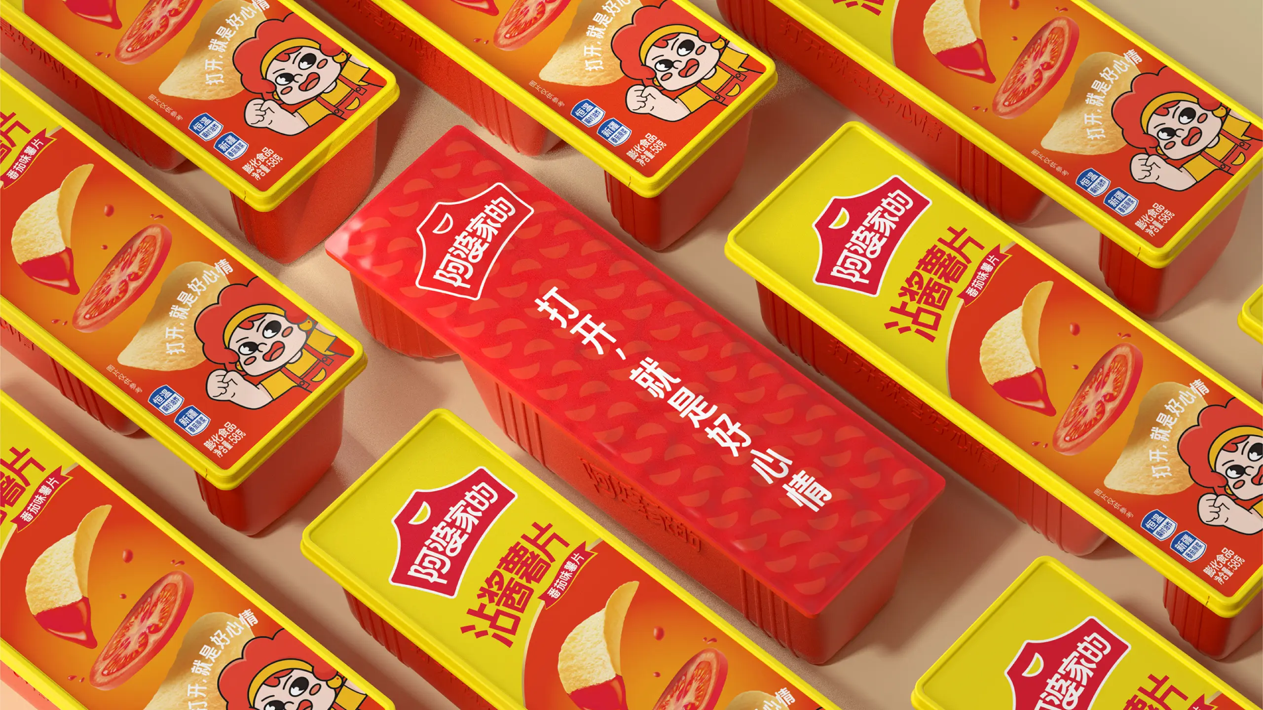
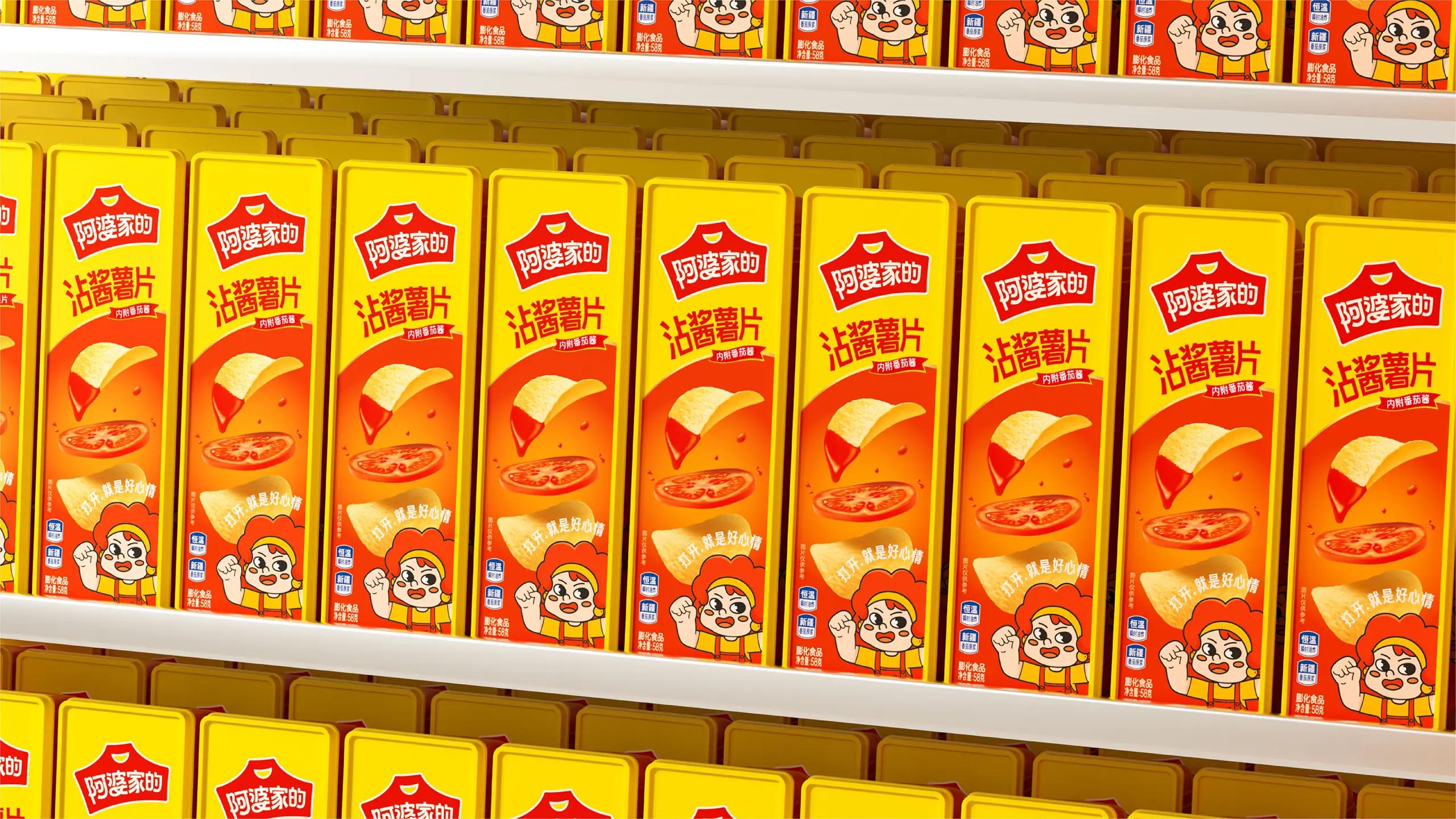
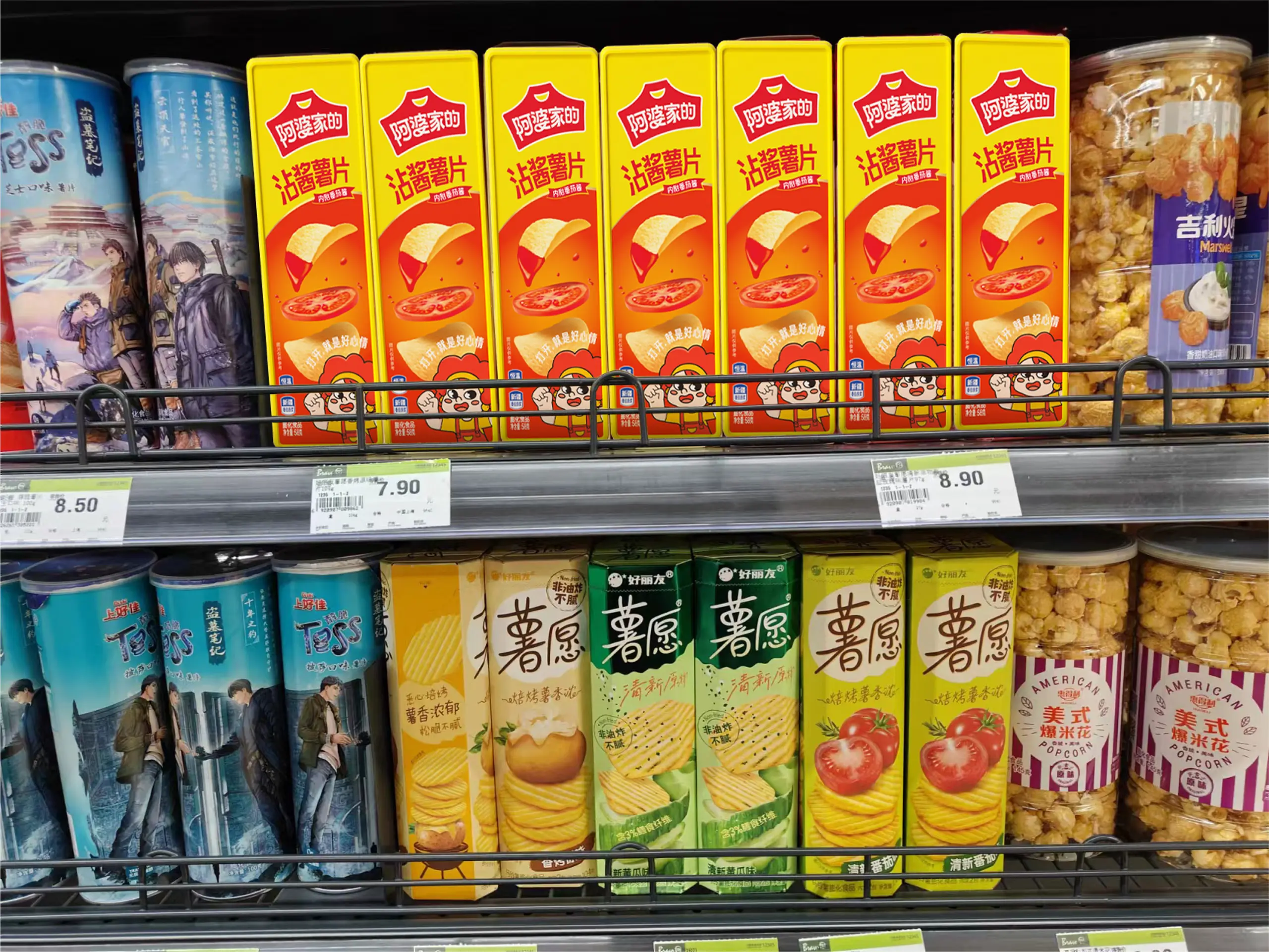
The packaging design continues the overall visual strategy of the brand and uses the form of color block division for color contrast. The red logo is fixed on the yellow background, ensuring the brand's uniform recognition on the shelves; the IP image and advertising slogan form a fixed combination, continuously strengthening the brand memory. The differentiation of different flavors is mainly presented in the creative form of the food and the background color. The use of the contrasting color of red and yellow makes the product more visually impactful and recognizable on the shelves. Through this comprehensive design system that combines recognition efficiency, emotional temperature, and shelf competitiveness, the success of Grandma's Home has upgraded from a regional leisure food brand to a benchmark brand in the leisure food industry with strong visual recognition, high brand temperature, and nationwide influence.