



The parent company of BADAONIANG Huadiao Cooking Wine was formerly Jiashan Distillery, with a history traceable to the 46th year of the Wanli reign of the Ming Dynasty (1618), giving it more than 400 years of brewing history. The brand belongs to Zhejiang Jiashan Yellow Rice Wine Co., Ltd., a subsidiary of Kuaijishan Shaoxing Wine Co., Ltd., and is a brewing house that combines honors such as “China Time-honored Brand,” “China Well-known Trademark,” and “National Geographical Indication Protected Product.”
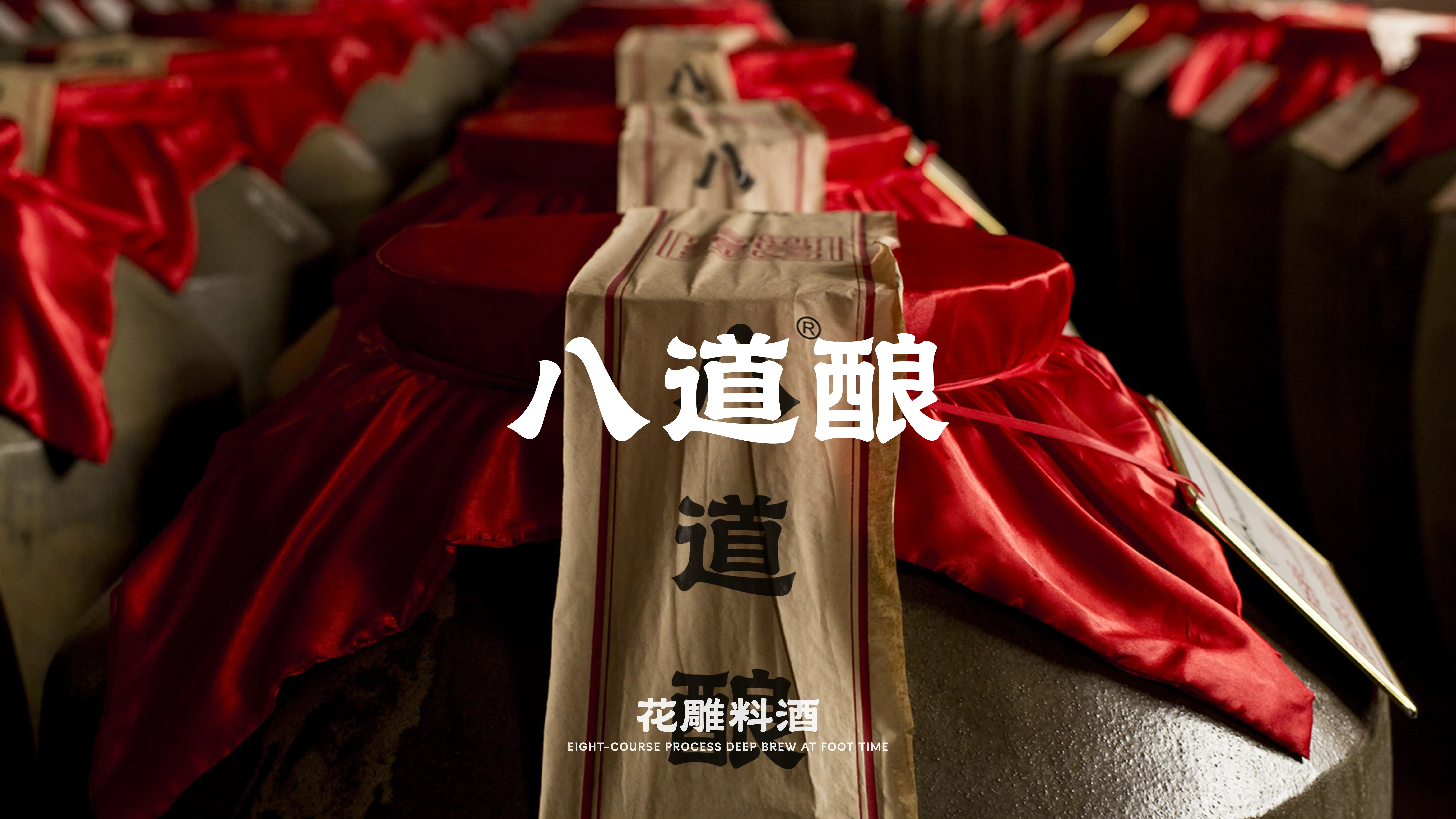
The brand name “BADAONIANG” derives from its eight core brewing processes: soaking, steaming, fermentation, raking, settling, pressing, boiling, and aging. The product uses water from Fenhu Lake and selects premium rice, then undergoes natural fermentation through eight traditional processes and sufficient aging. The liquor is clear and transparent with a rich aroma, and has a strong effect in removing fishy and gamey odors, enhancing aroma and umami, and enriching the overall flavor of dishes. With the core philosophy of “zero additives, natural eating, and eating with peace of mind,” the product is dedicated to providing consumers with high-quality pure grain-brewed cooking wine.
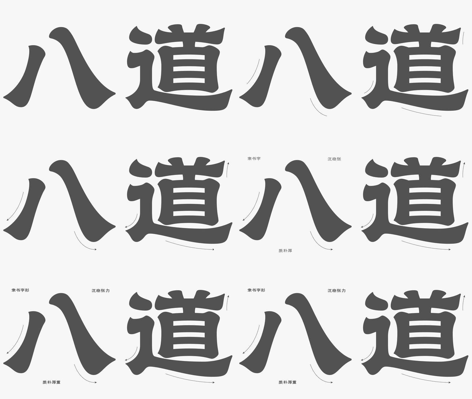
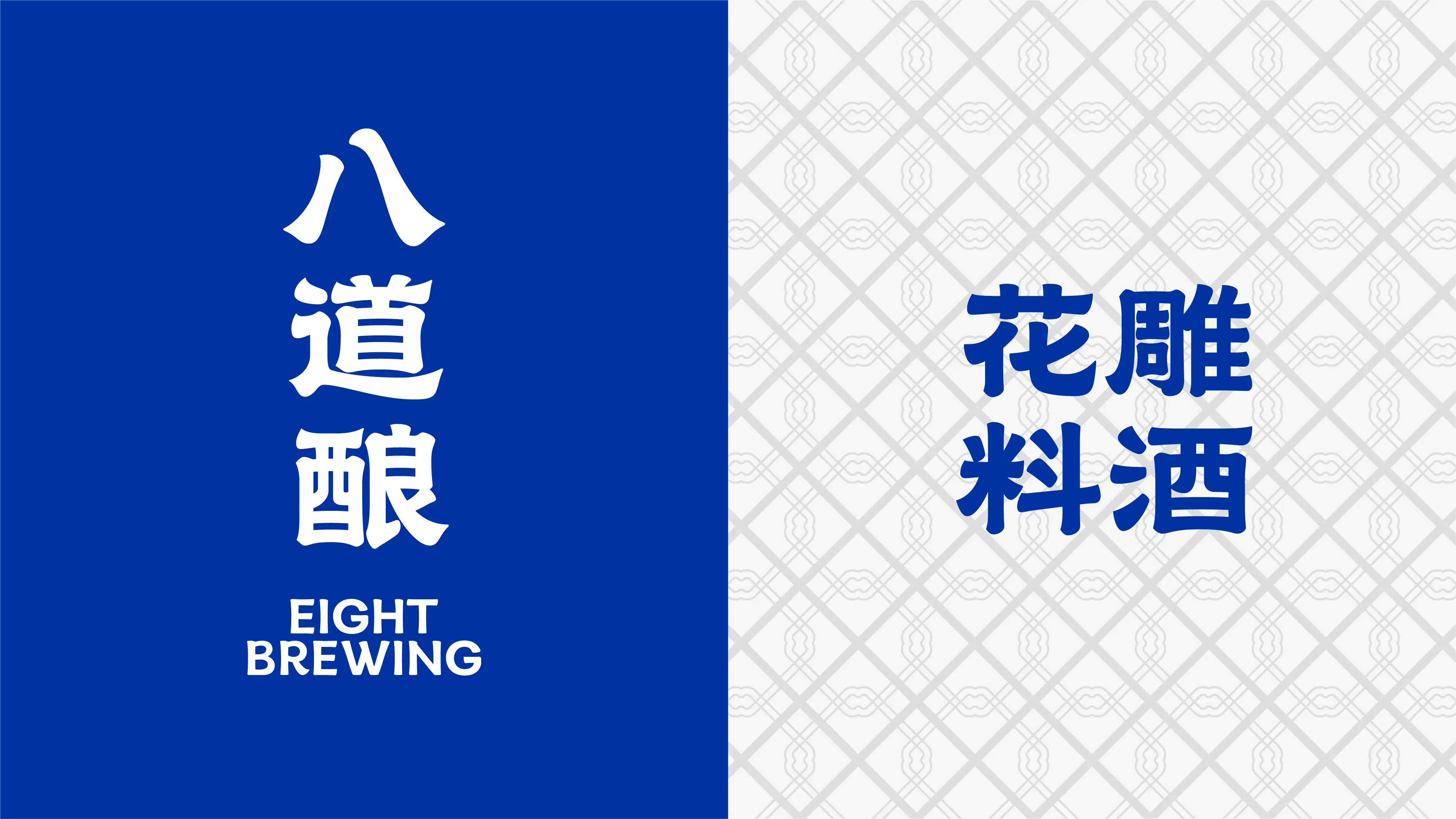
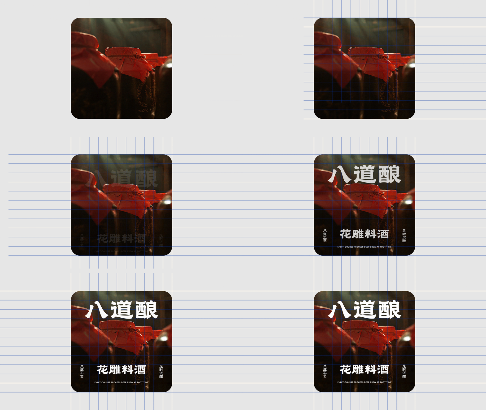
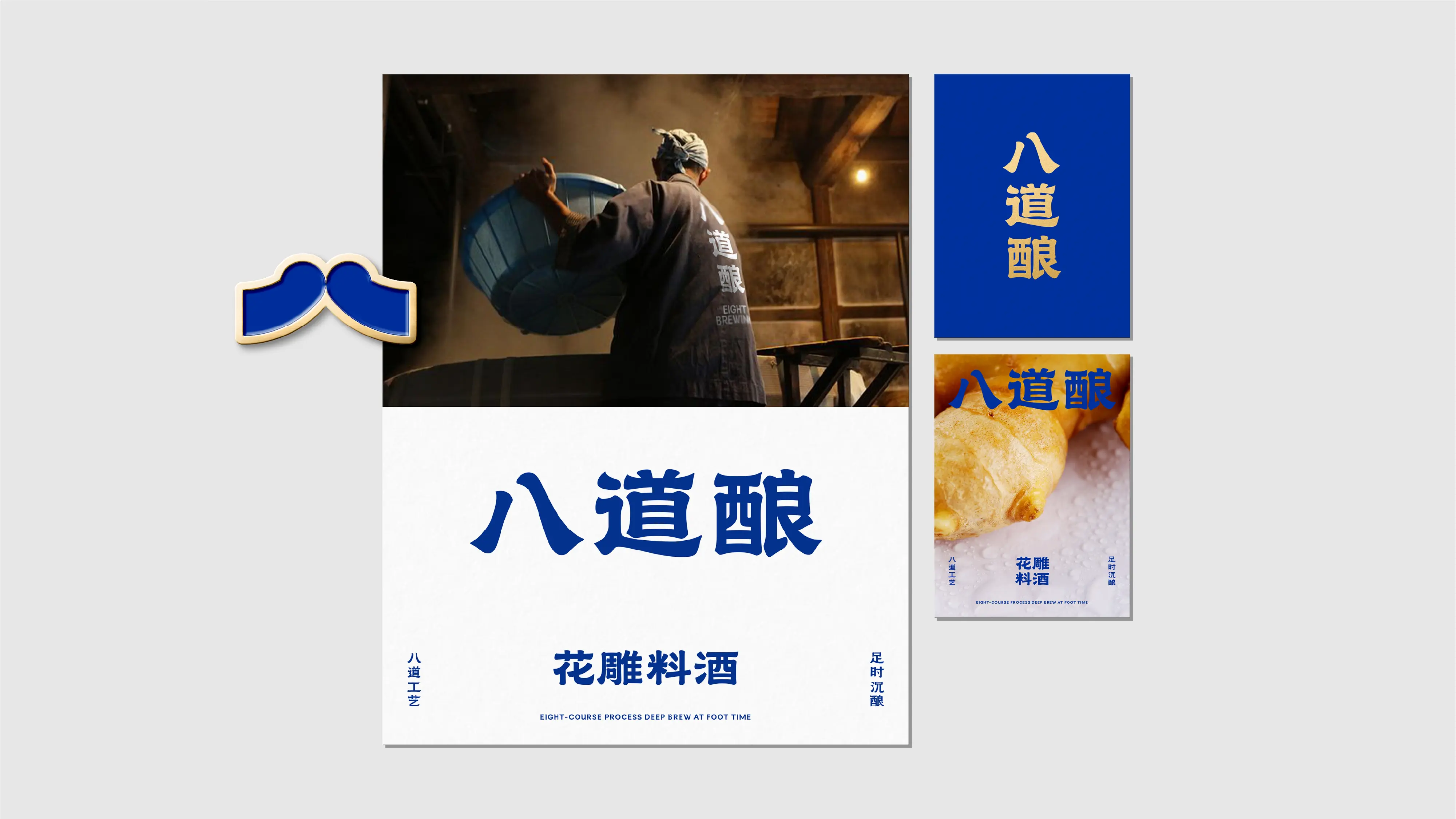
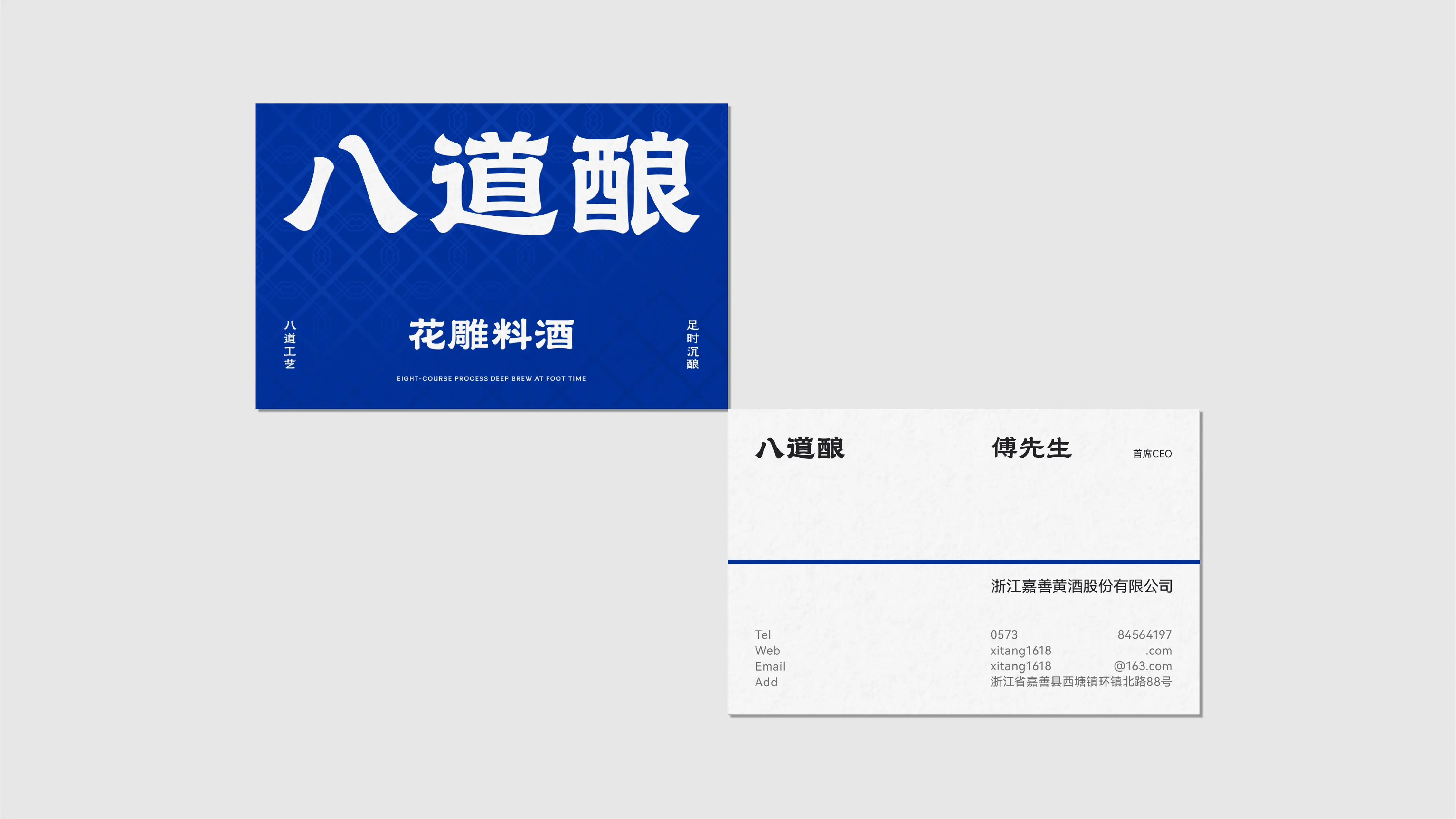
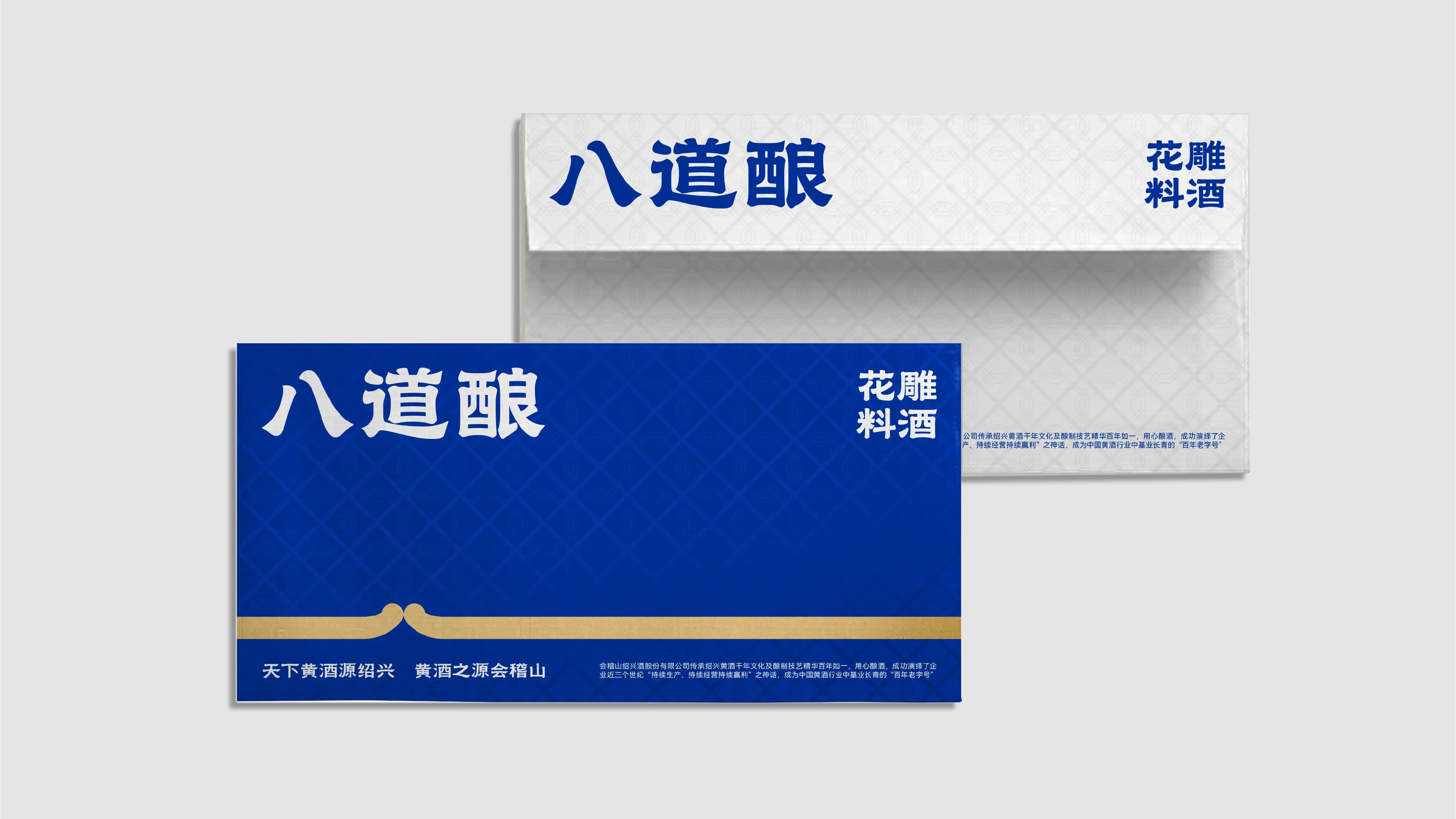
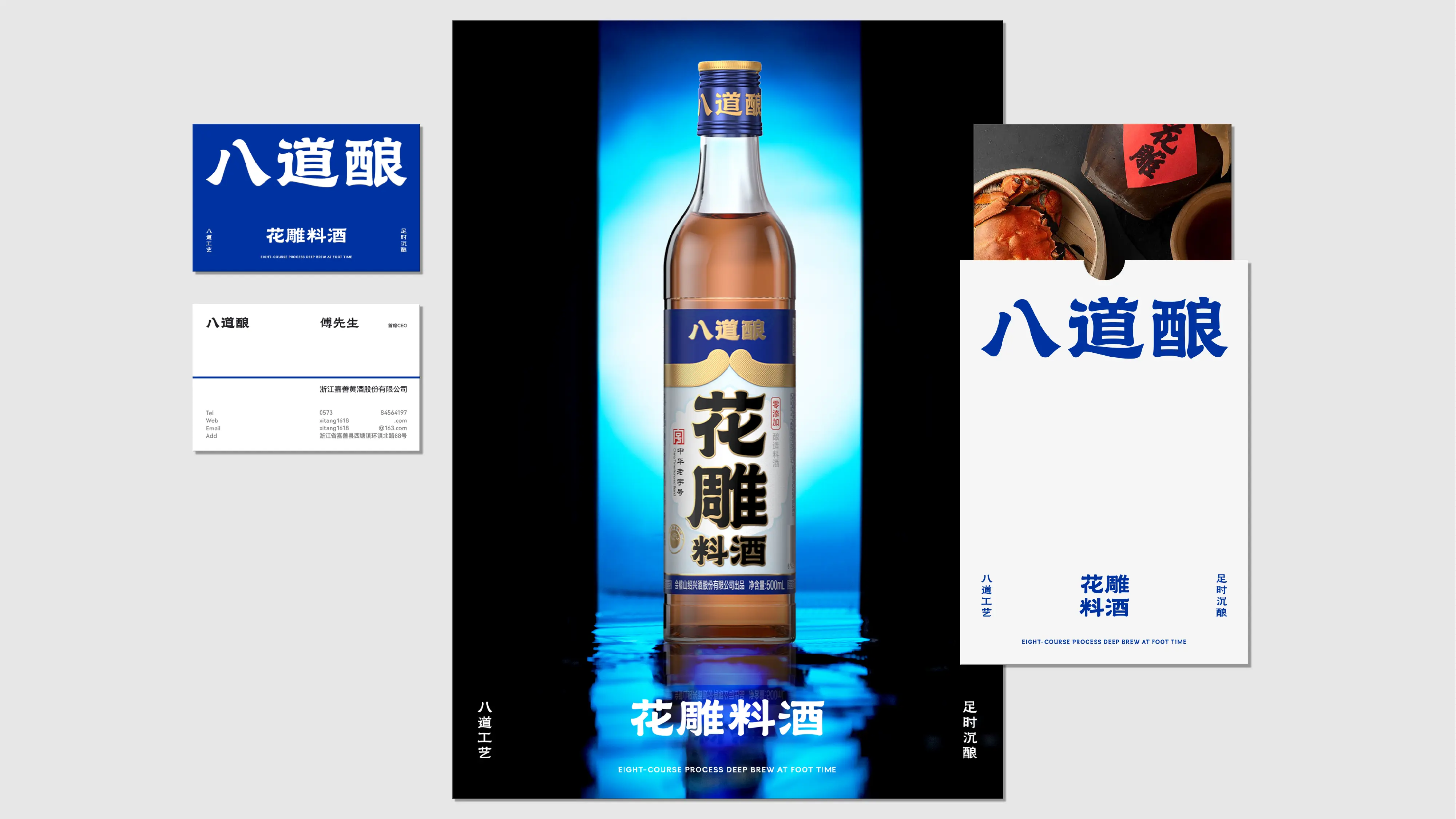
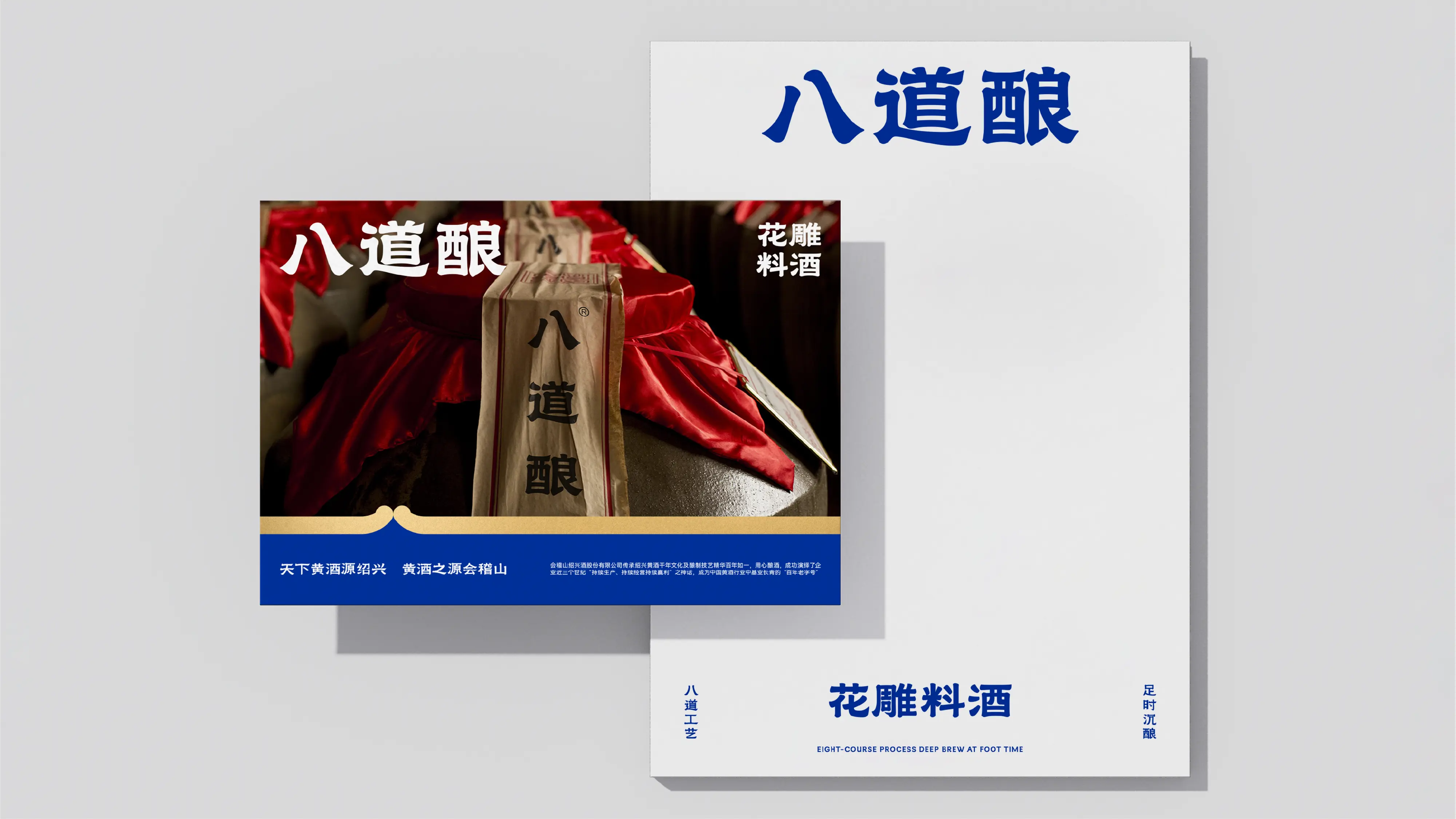
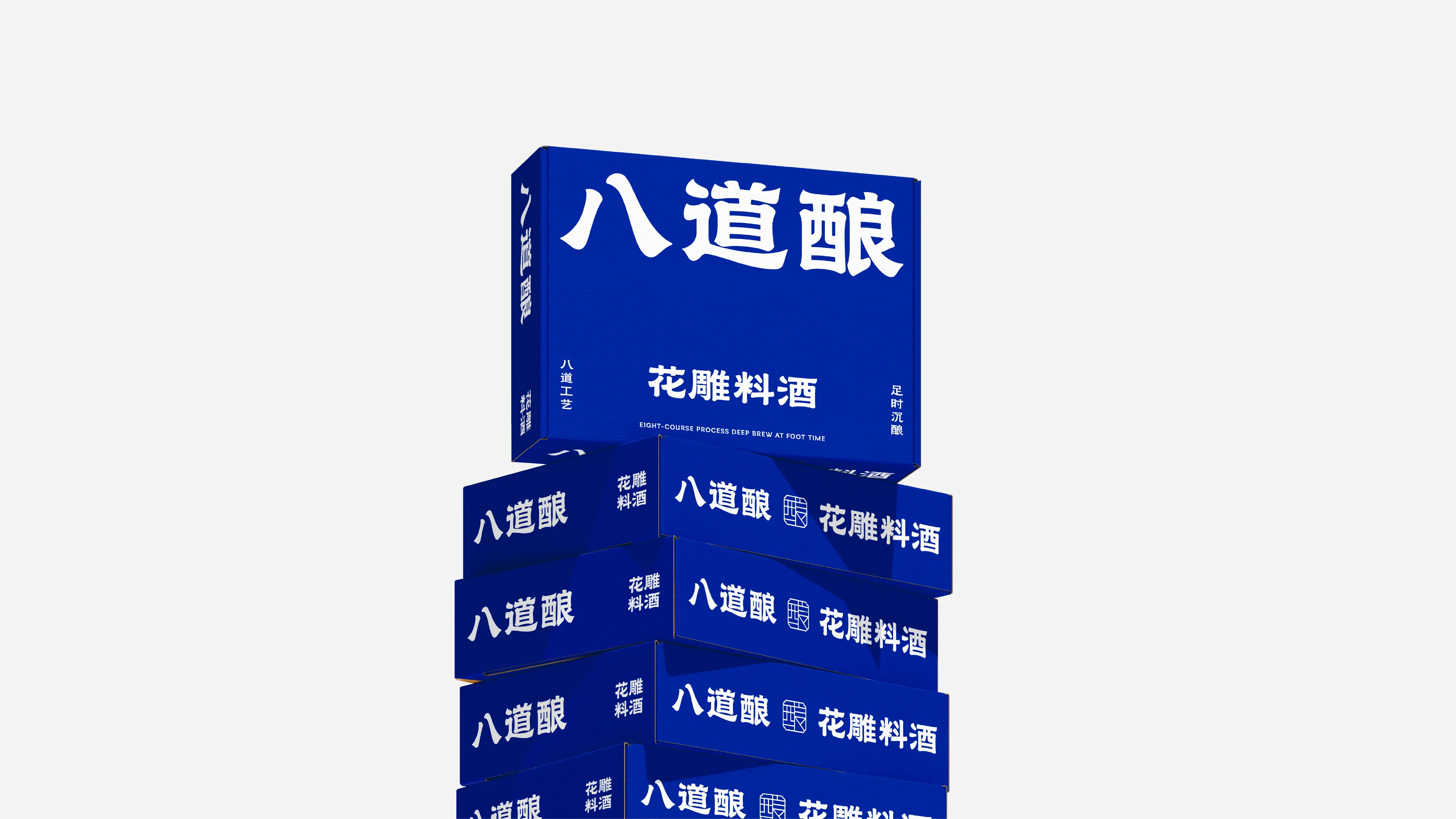
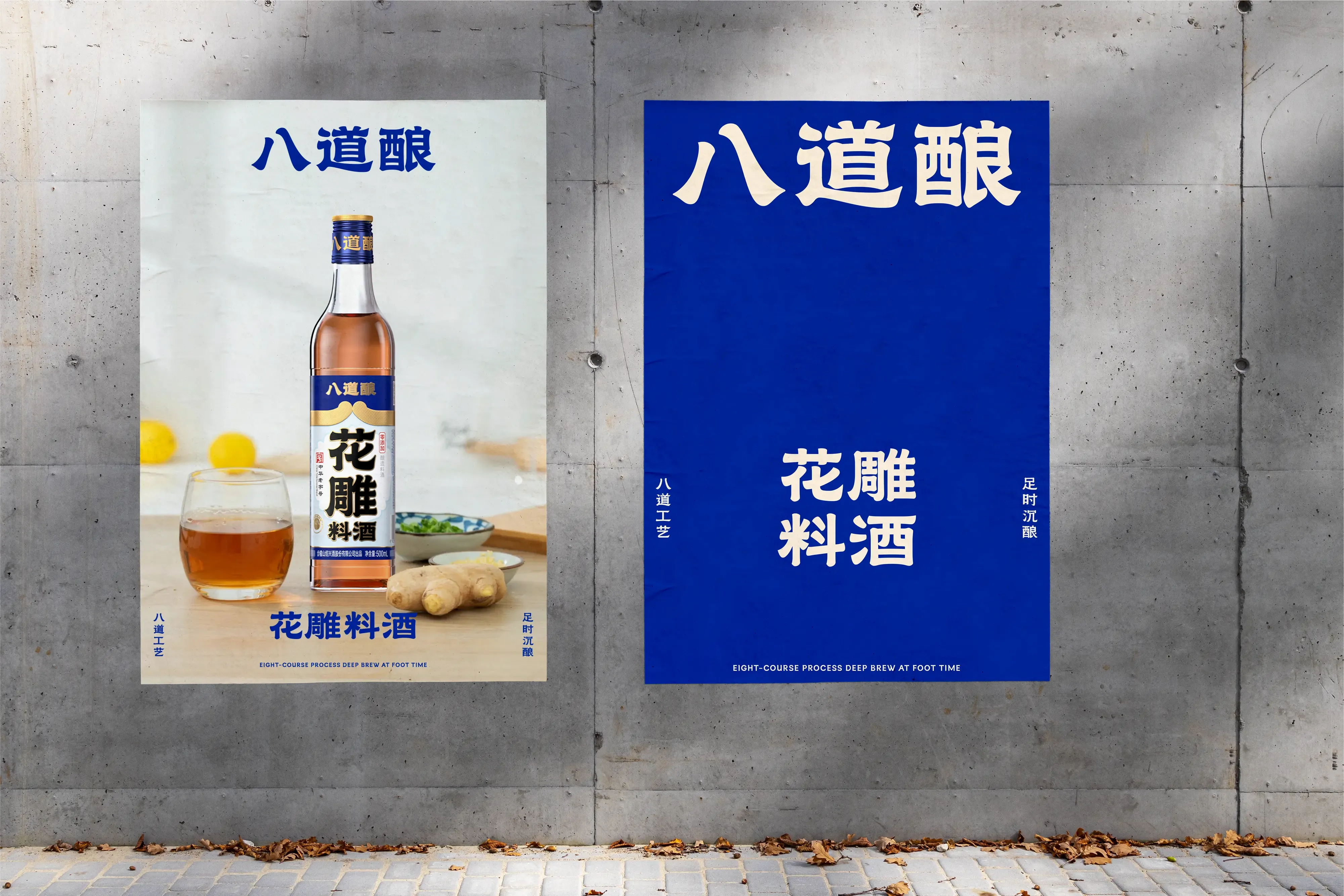
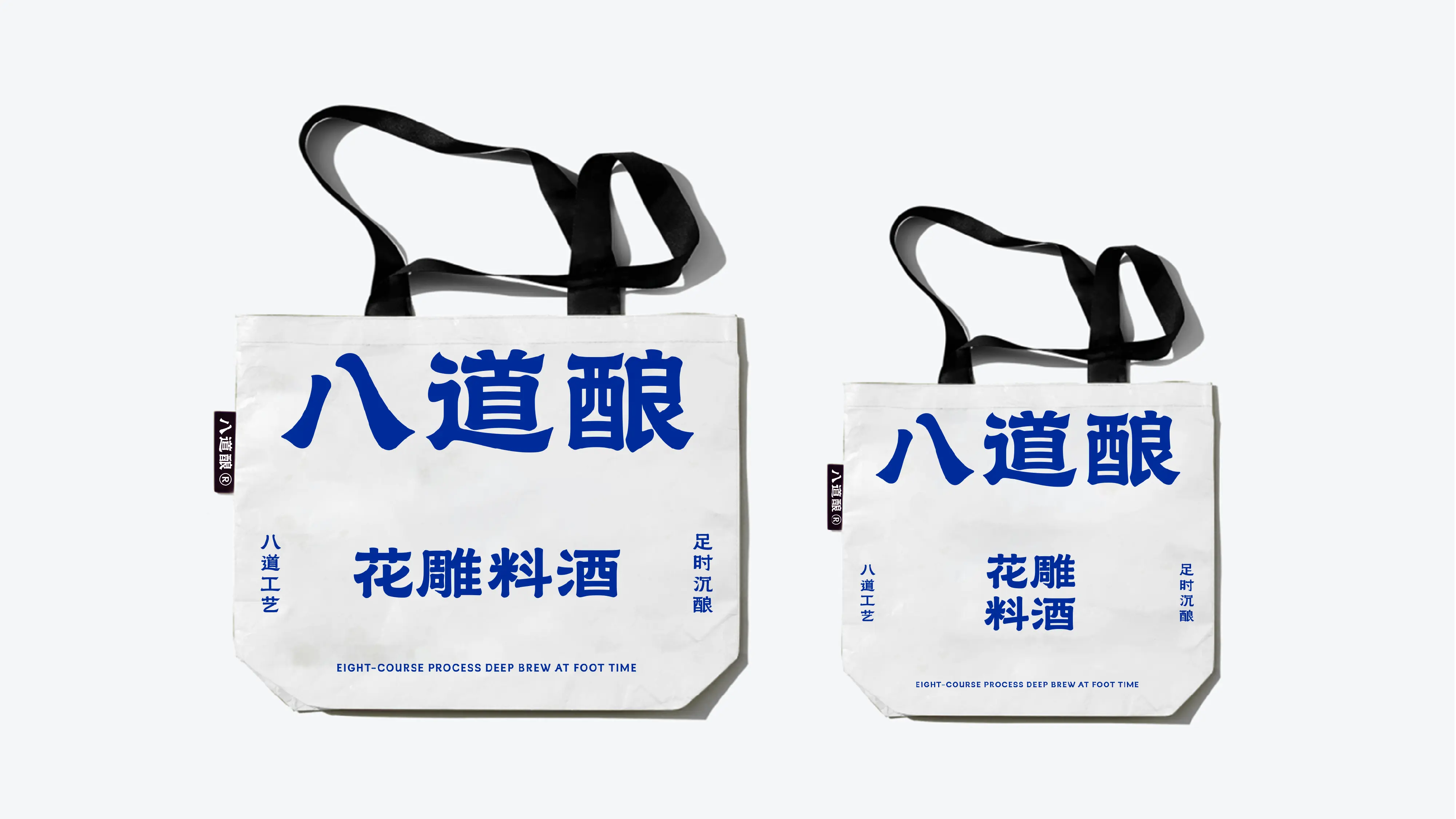
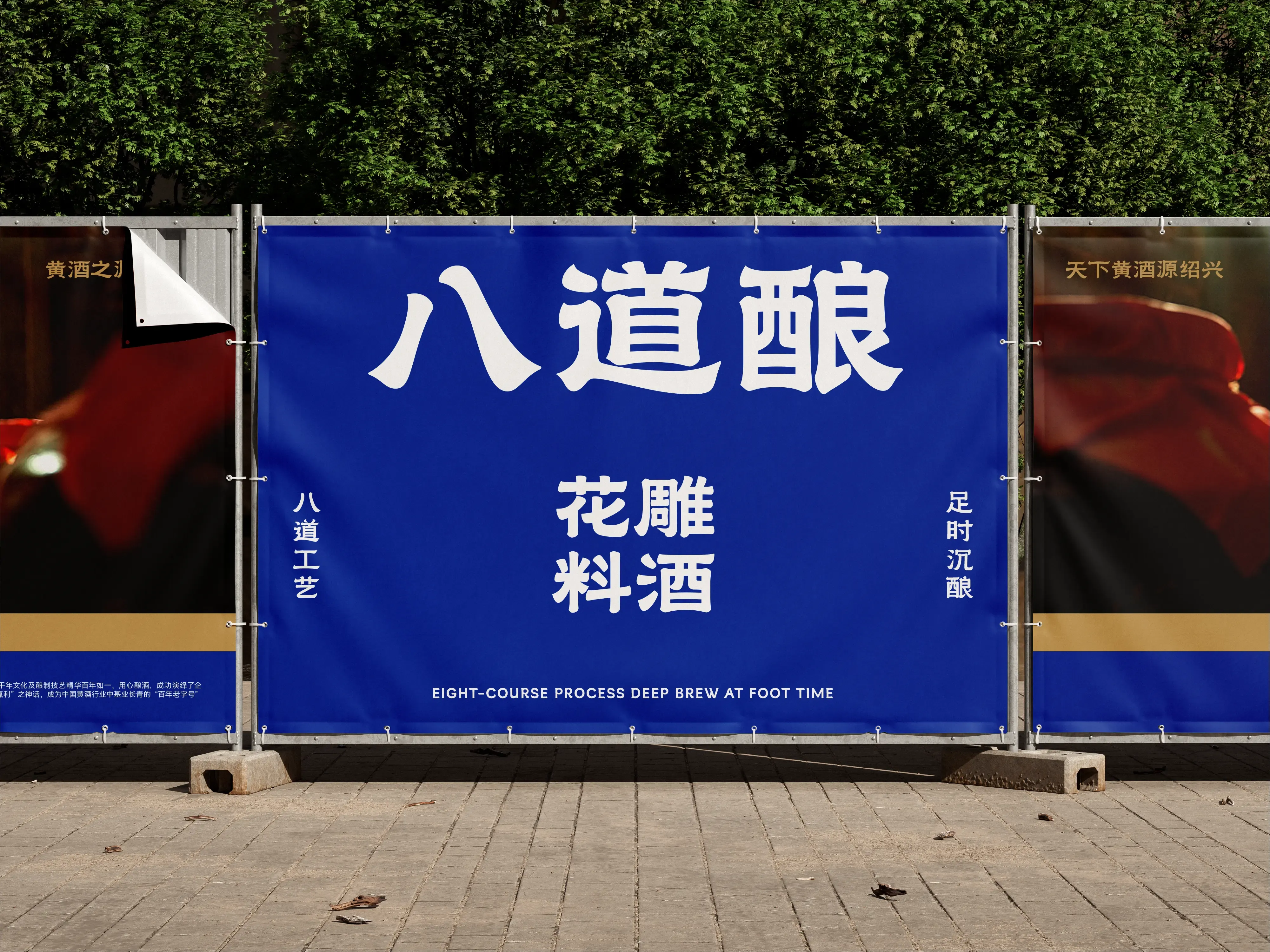
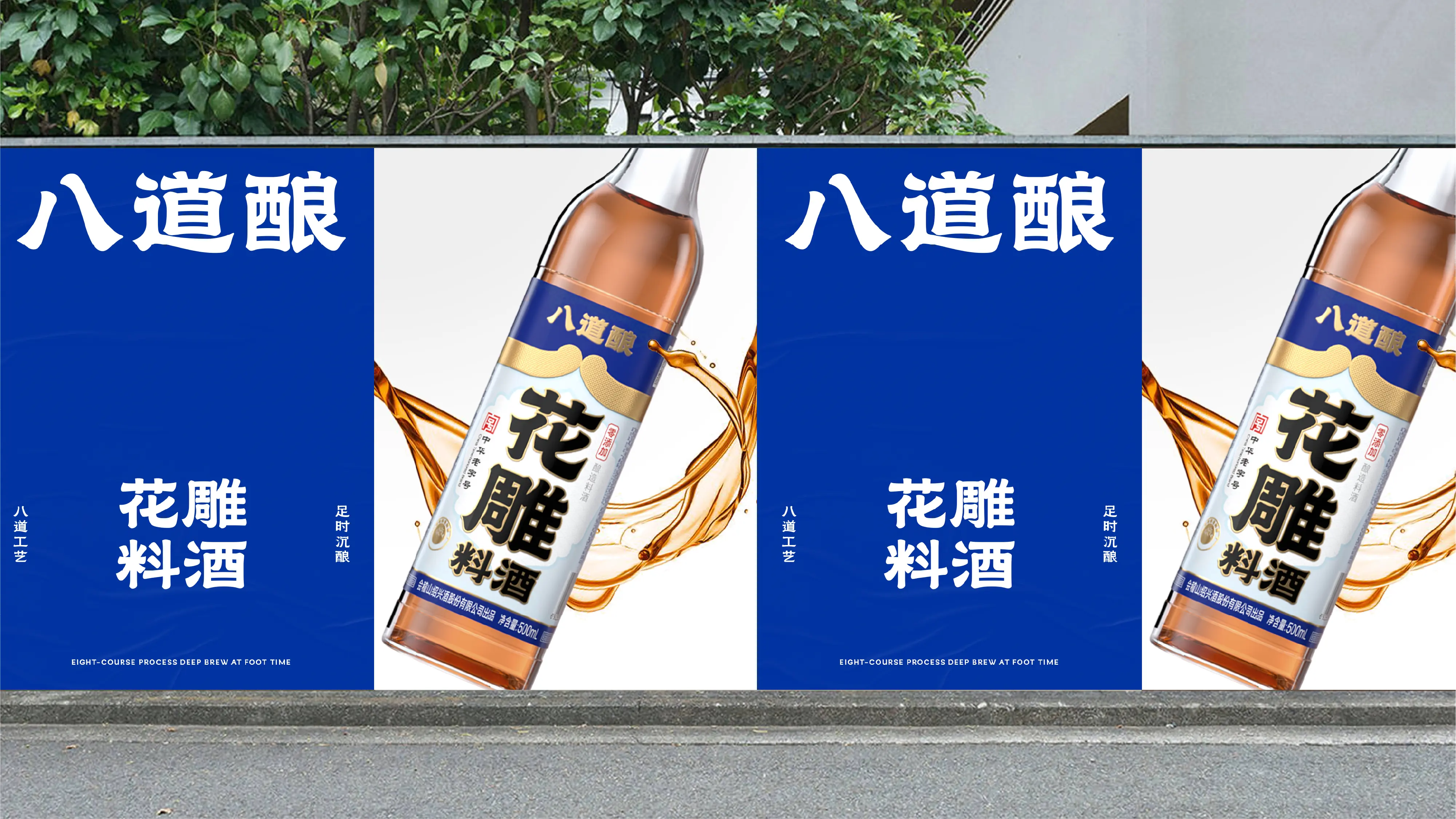
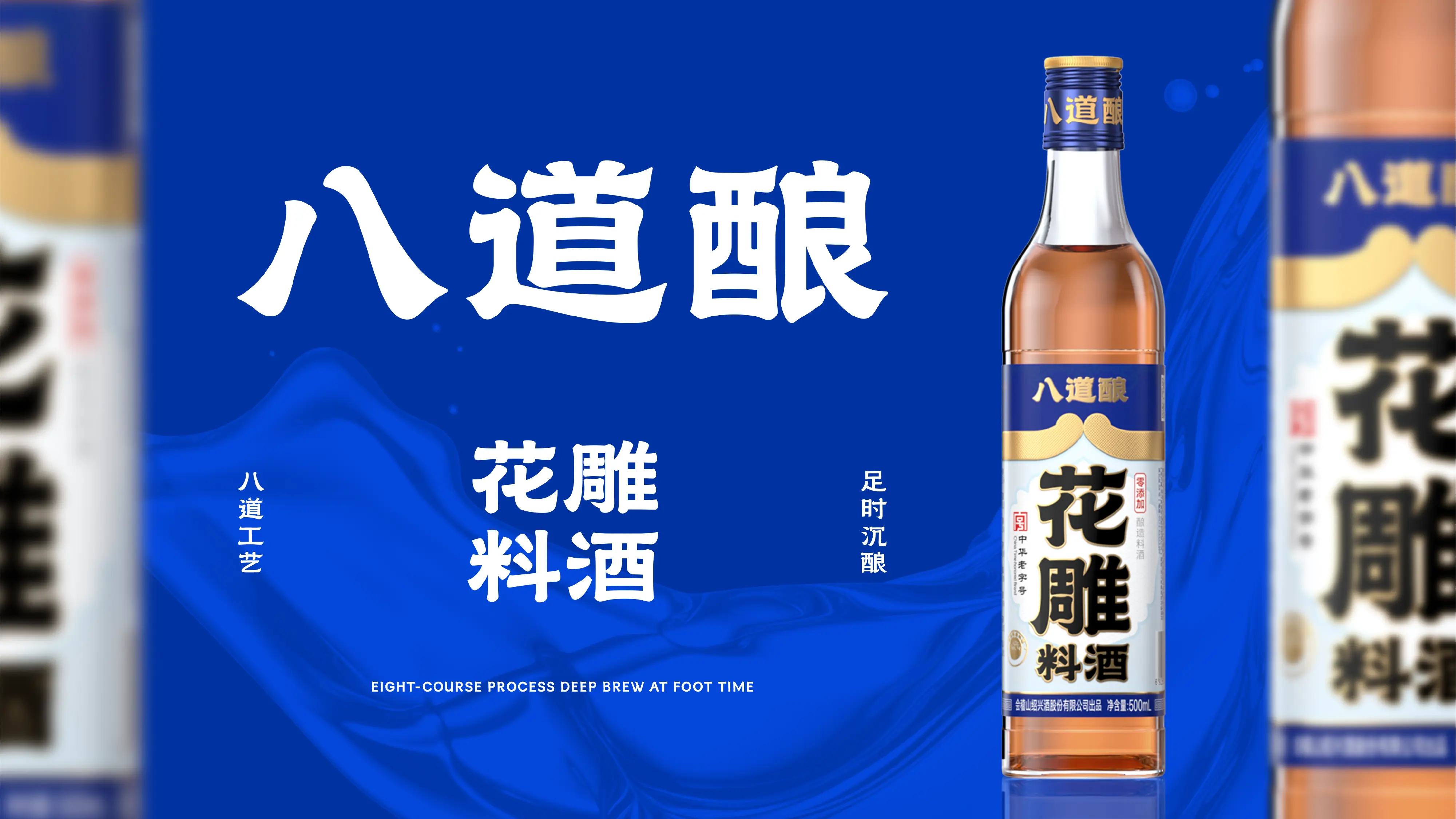
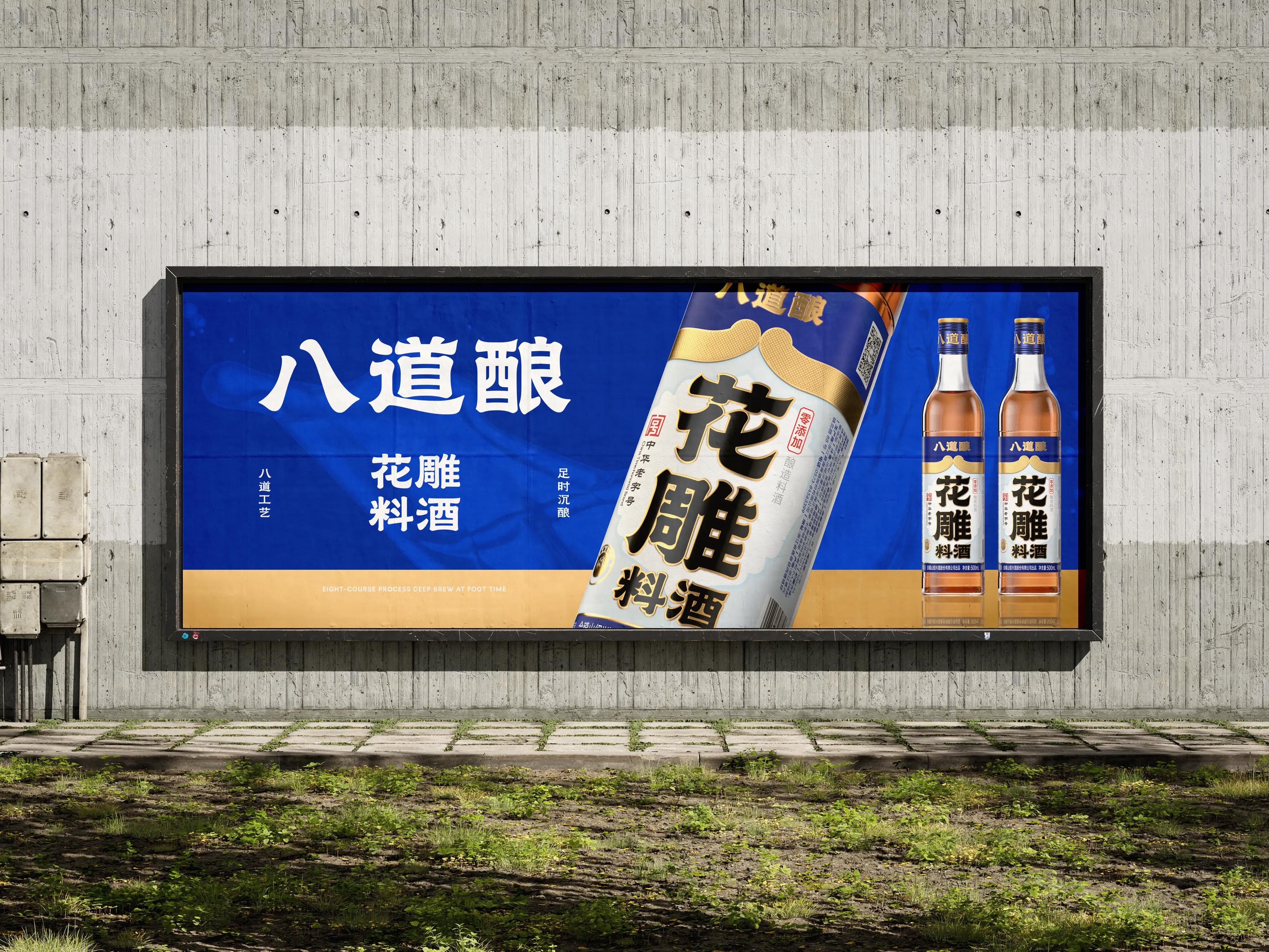
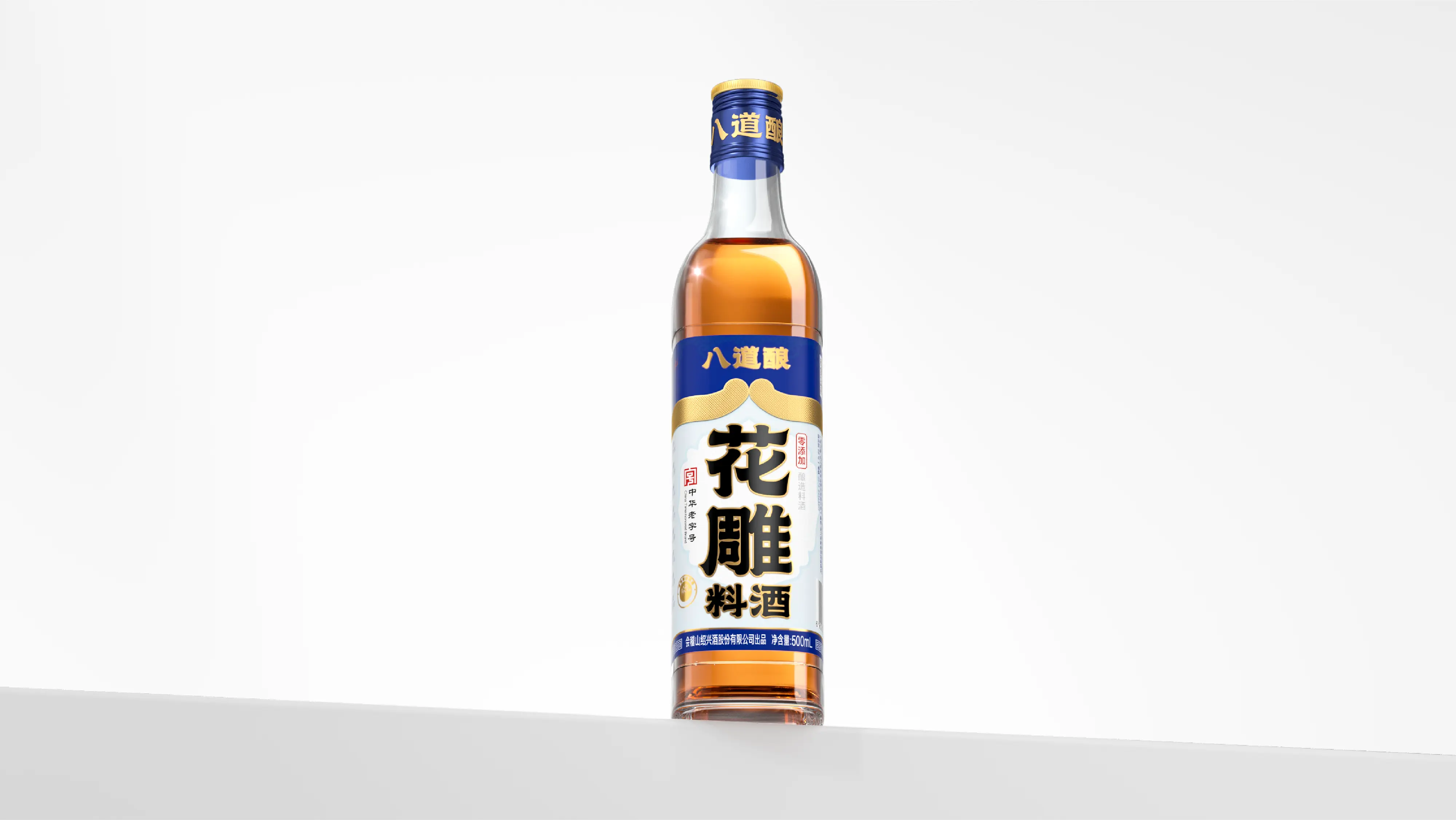
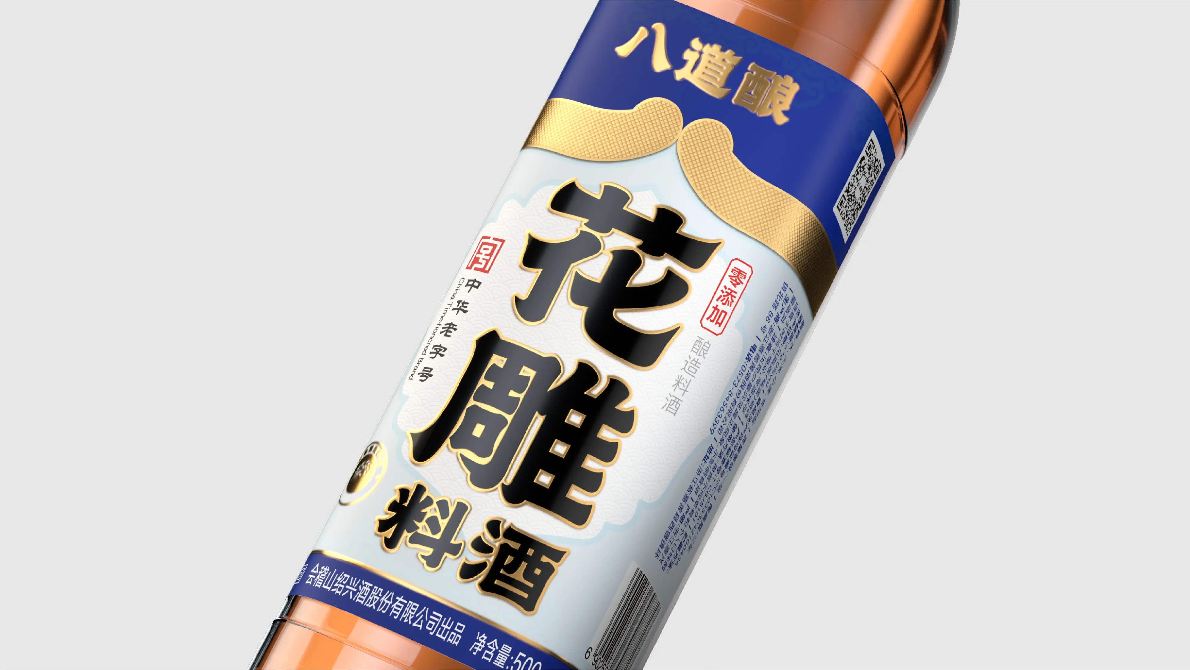
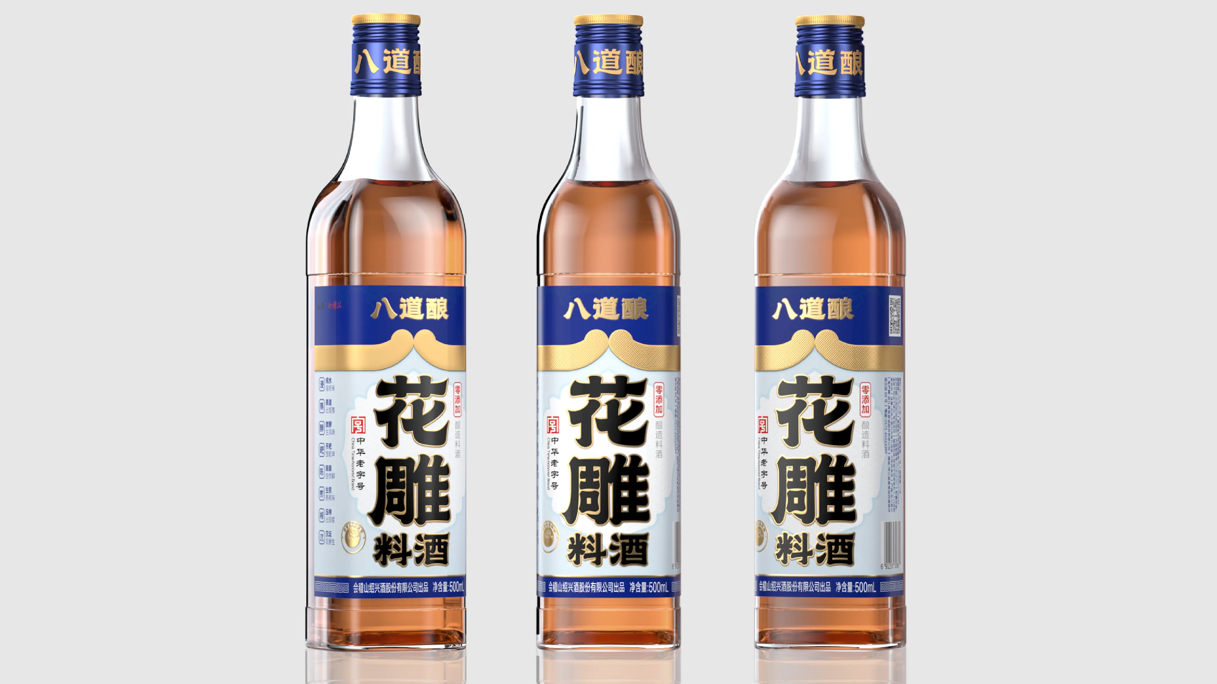
This project was to create a complete brand design program for BADAONIANG Huadiao Cooking Wine. Its core objective was to help BADAONIANG establish a differentiated brand visual system with cultural depth in an industry environment where the cooking wine market is severely homogenized and brand recognition is generally low. Typography design was the core expression of this brand visual identity. The team adopted Chinese-style clerical script (Lishu) as the brand typeface, which not only showcases the profound heritage and cultural confidence of the brand’s more than 400 years of brewing history, but also, through the unique aesthetic qualities of clerical script, makes it more readily accepted by younger consumers. In the key visual strategy, we identified that “Huadiao” is the product’s core selling point, so we enlarged and presented the two Chinese characters “花雕” (Huadiao) as the core of the key visual. This strategy allows consumers to immediately grasp the core product information in front of the shelf, effectively shortening the purchase decision path. In terms of brand color, in response to the severe homogenization of the cooking wine market, we chose red as the brand color. In traditional Chinese culture, red symbolizes festivity and quality; it has a significant recognition advantage in offline displays, helping the product quickly stand out among numerous competitors. The auxiliary graphic was designed based on the character “八” (eight) in the brand name and named “Golden Hoop” (Jingu). This auxiliary graphic can be extended and applied across all products under the brand, forming a unified brand identity language. Through this complete brand design system combining cultural depth, recognition efficiency, and shelf competitiveness, BADAONIANG has successfully upgraded from a traditional cooking wine product to a premium brewed cooking wine brand with strong visual recognition, clear brand positioning, and authoritative industry endorsement.