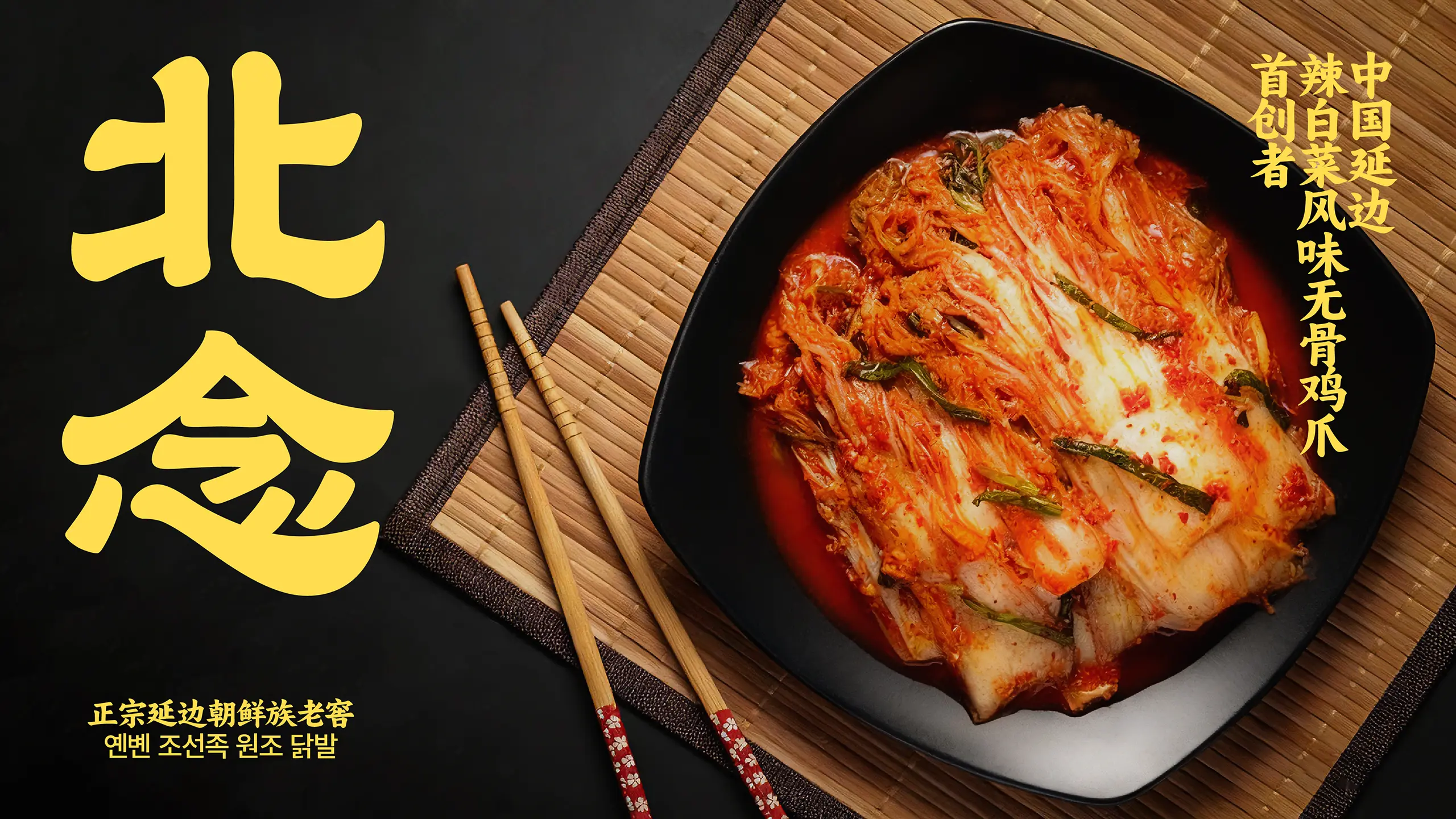


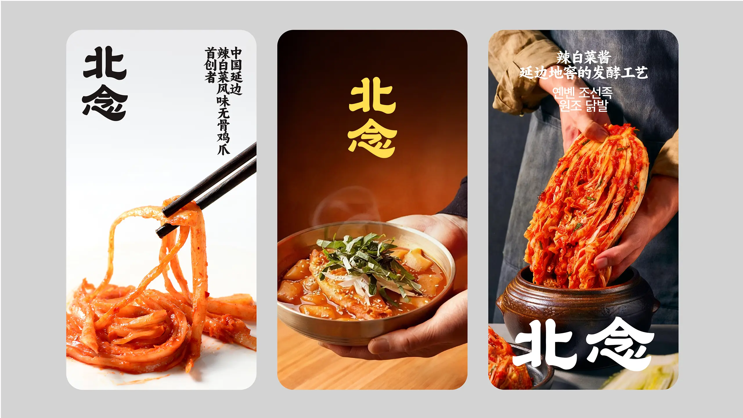
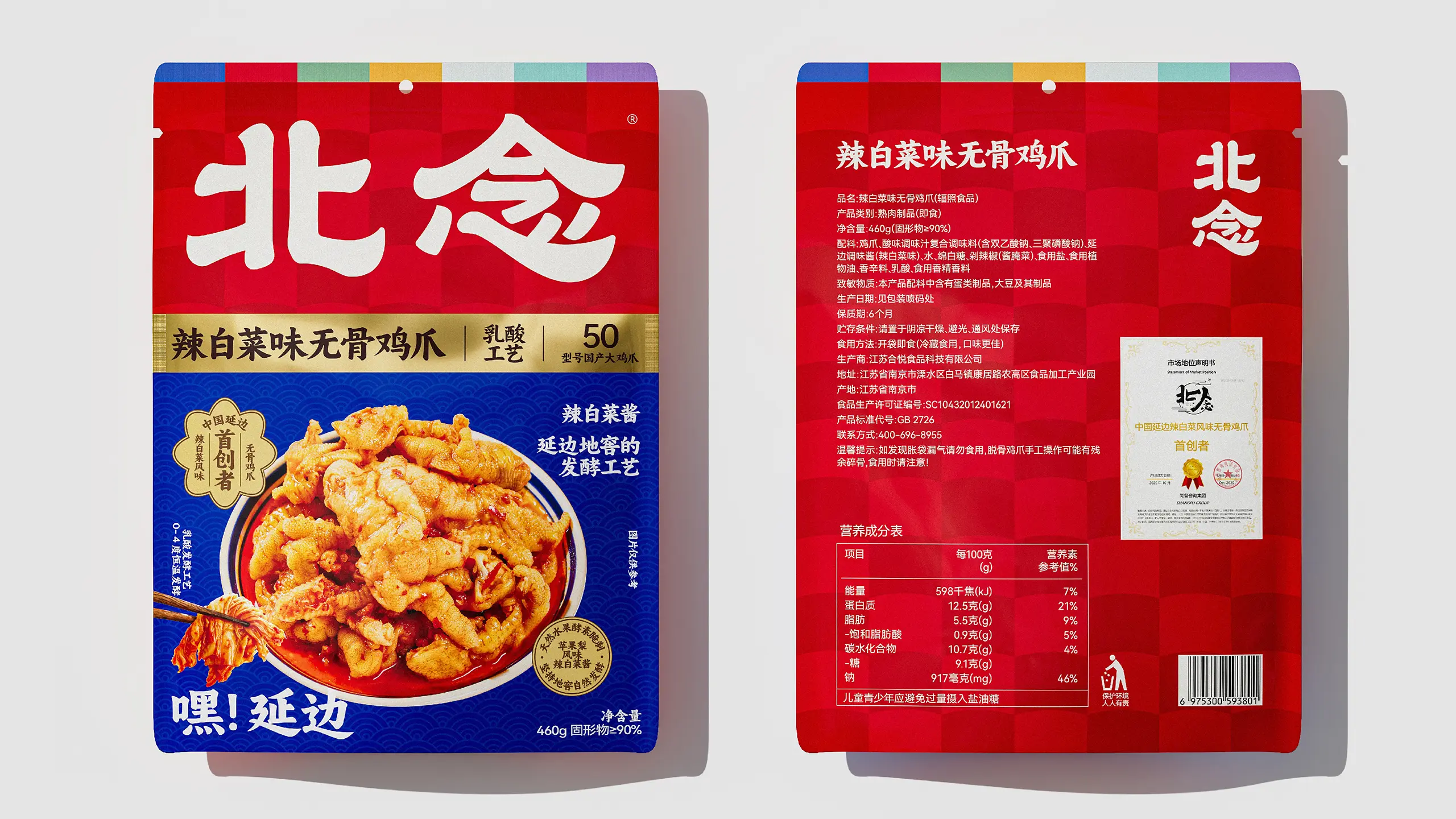
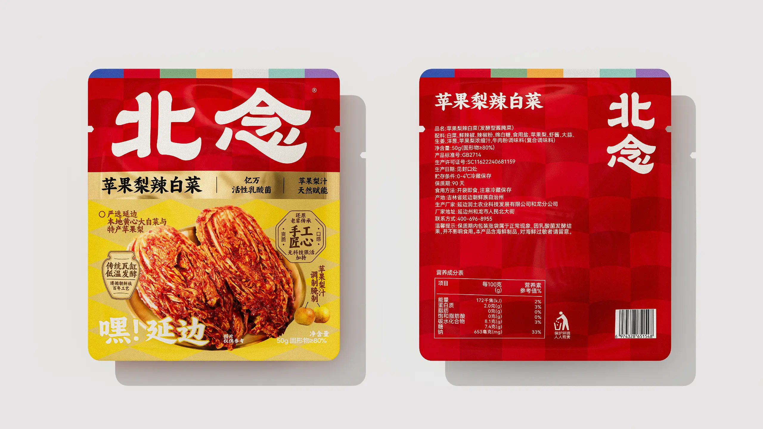
BEINIAN, meaning “Northern Land’s Treasures, an Original Intention Unchanged,” is a flavor heritage originating from the black soil at 42°N. The kimchi-making technique of Korean ethnic mothers, with its complex flavors of sourness, sweetness, spiciness, and umami, has become a profound imprint of hometown. BEINIAN is committed to becoming a leader in high-quality food, continuously exploring the treasure trove of regional flavors, and through innovation and quality control, turning more regional specialties into nationwide hit products, so that the world may fall in love with authentic and vibrant Chinese flavors through BEINIAN. With kimchi-flavored boneless chicken feet as its core product, the brand features a “Raw Deboning” process—a cold-fresh deboning technology combining low-temperature enzymatic hydrolysis and flexible mechanical separation, which completely removes toe bones at 0–4°C without damaging muscle fibers, preserving collagen activity and a crisp, tender texture.
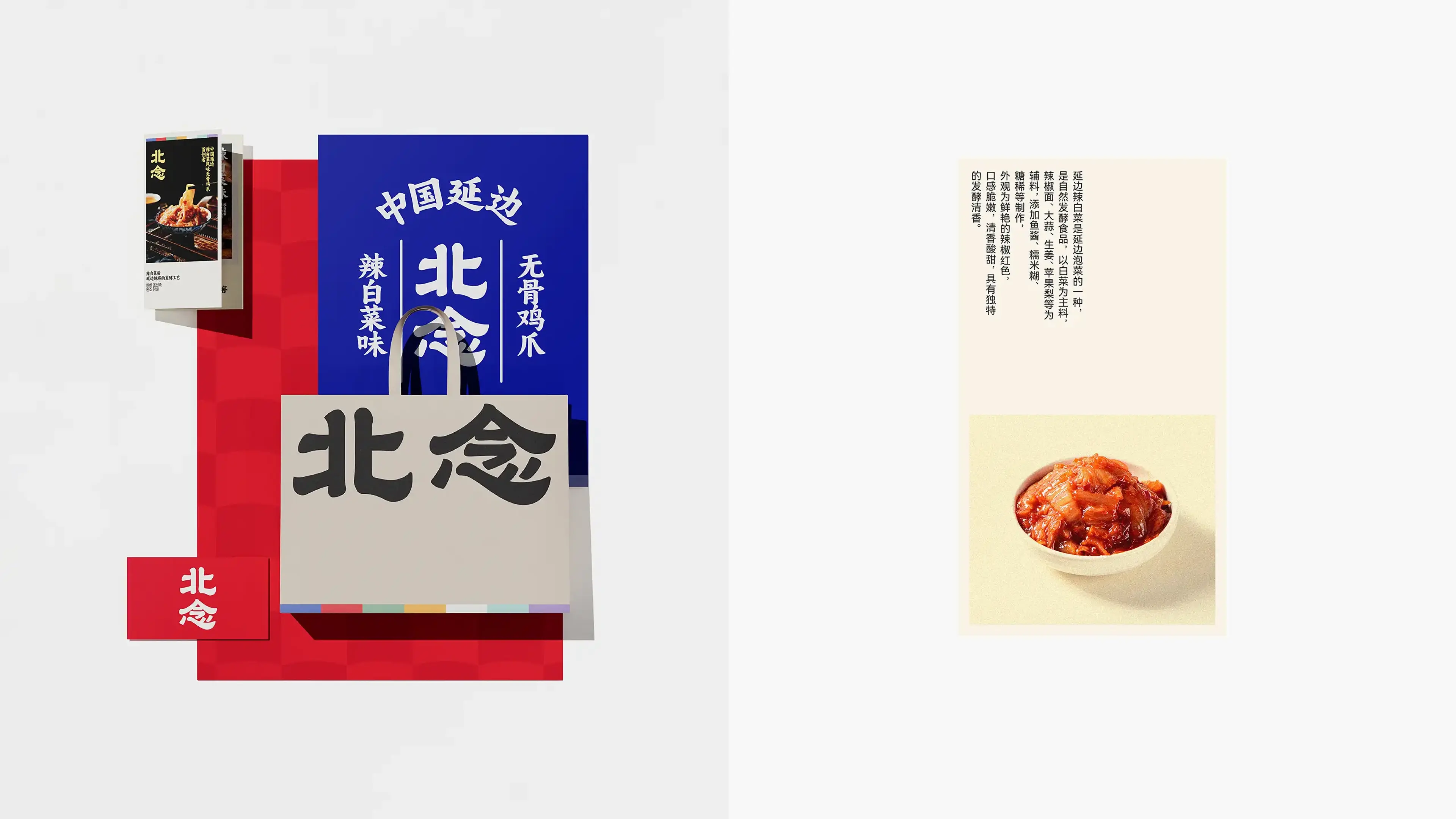
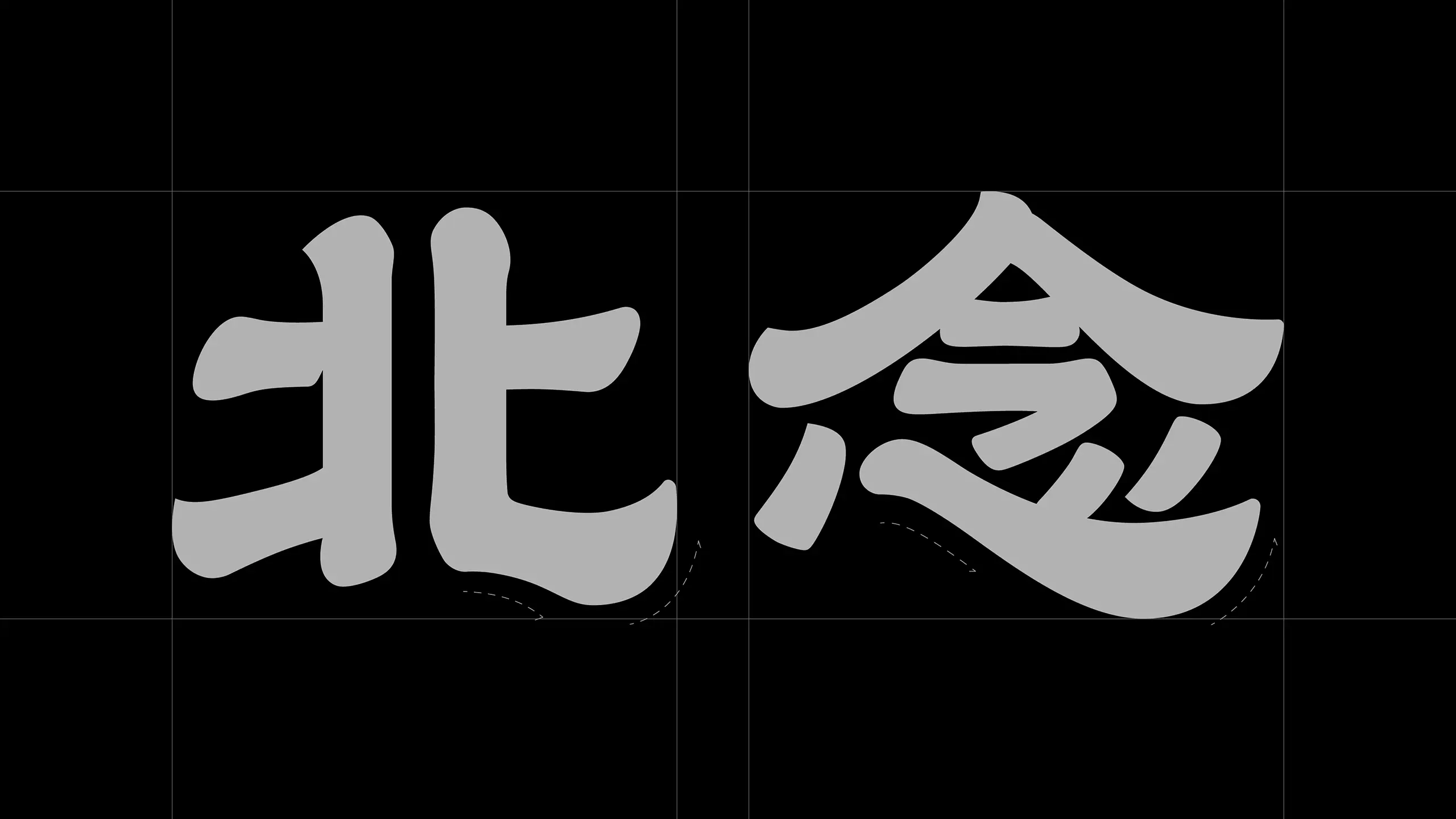
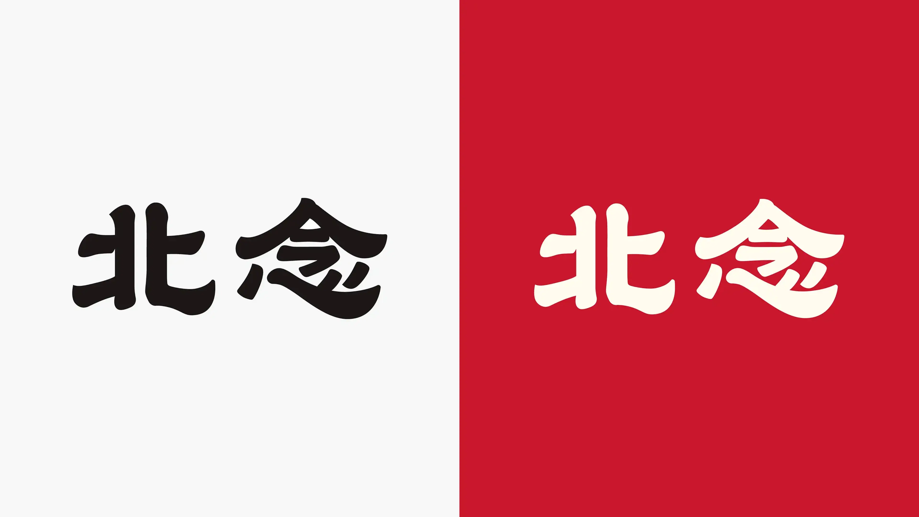
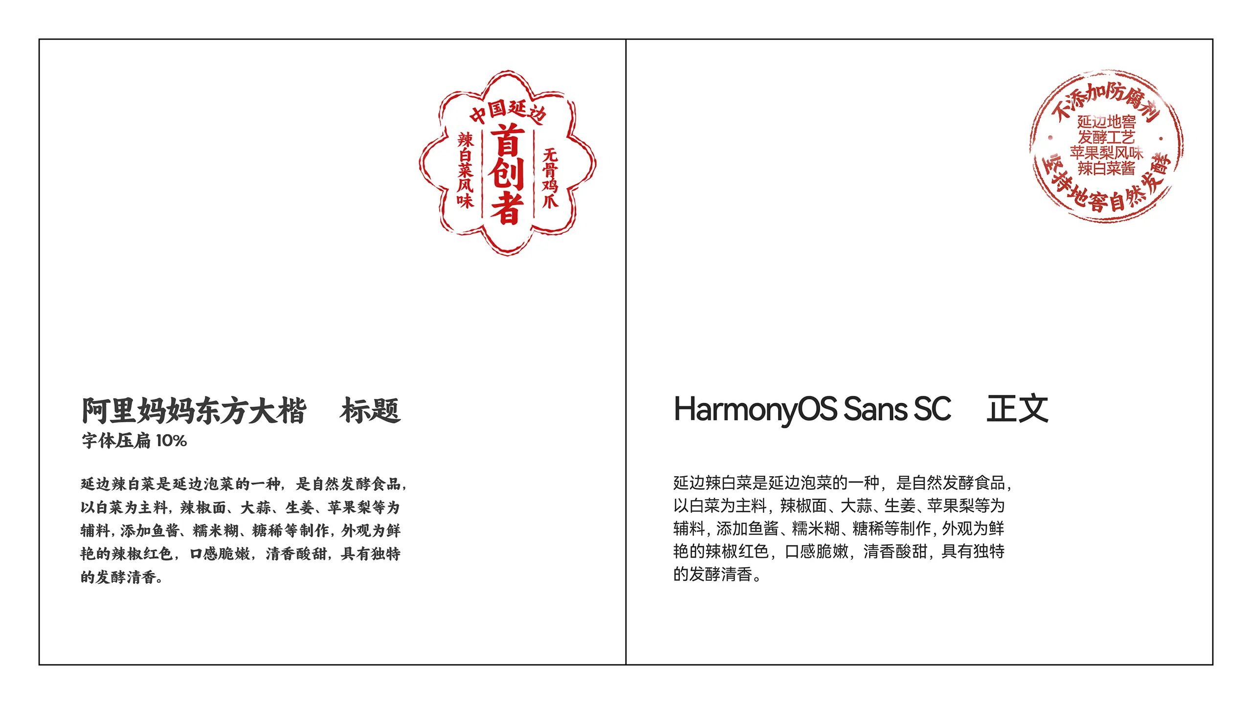
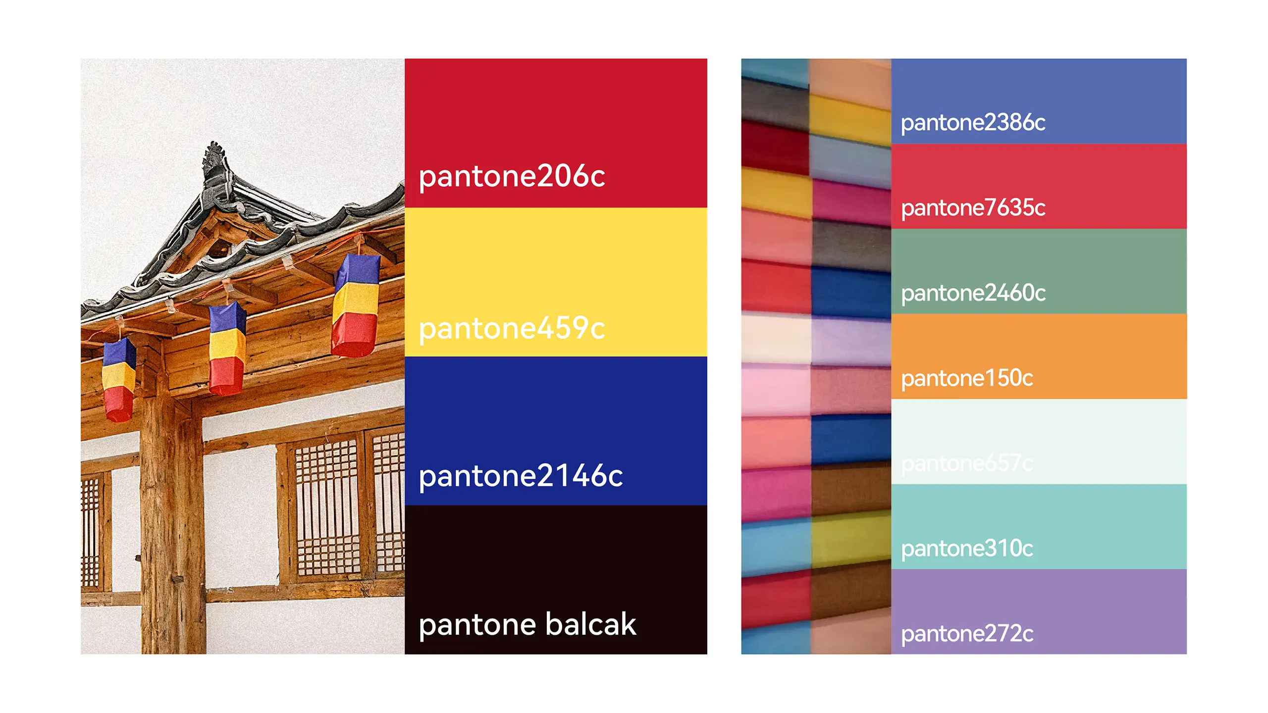
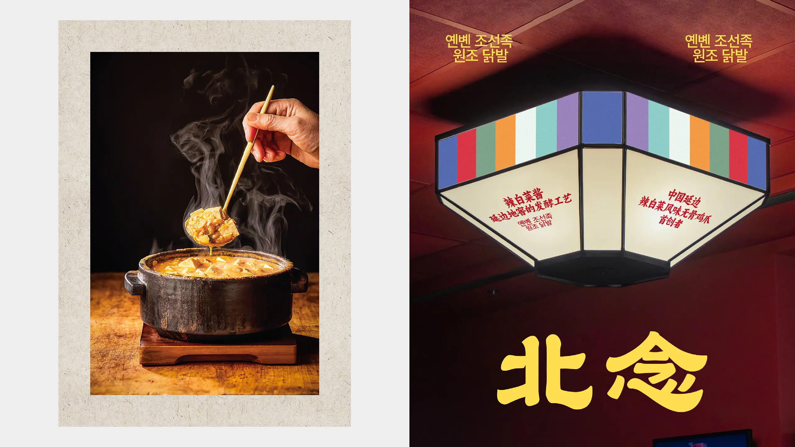
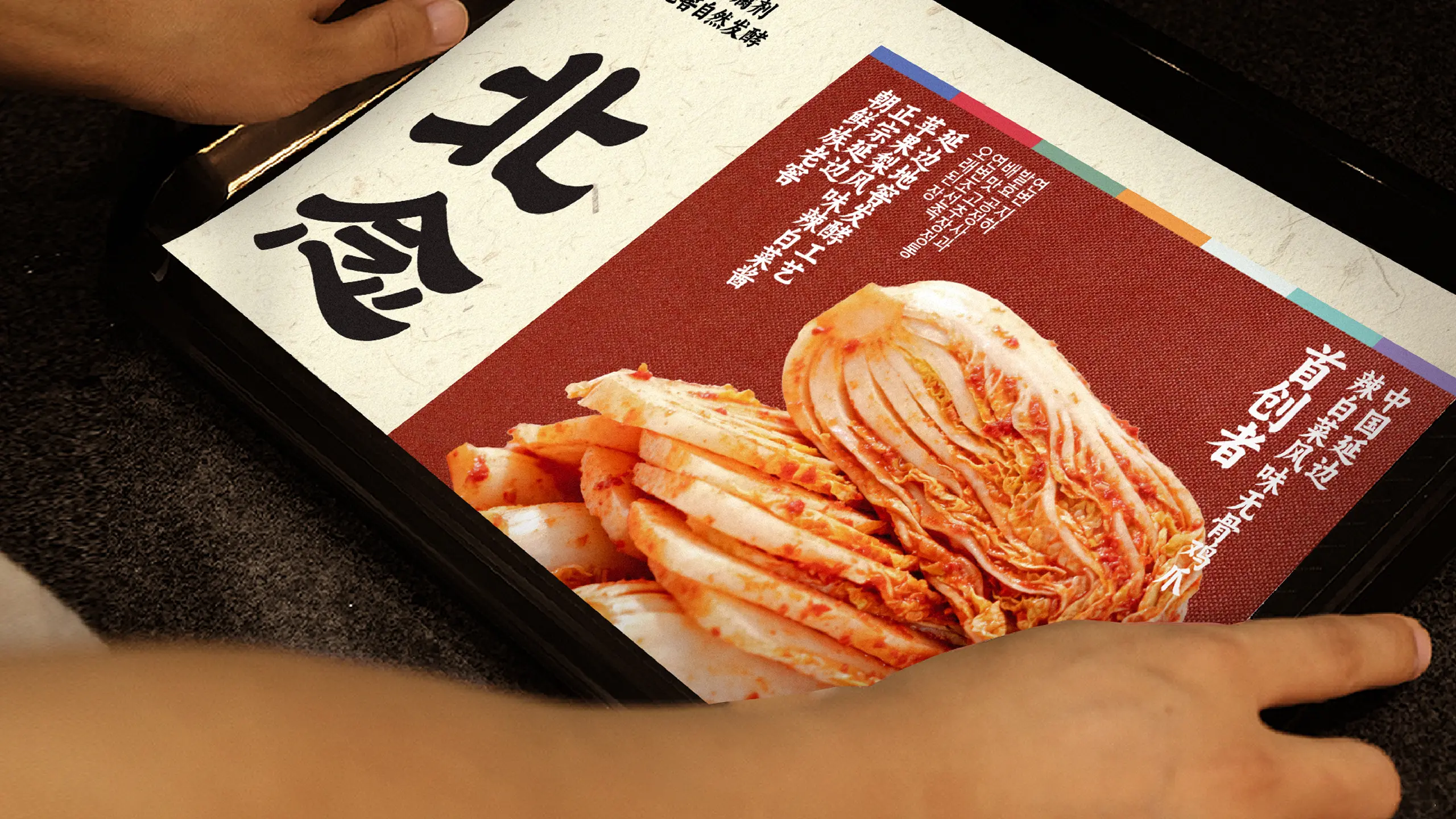
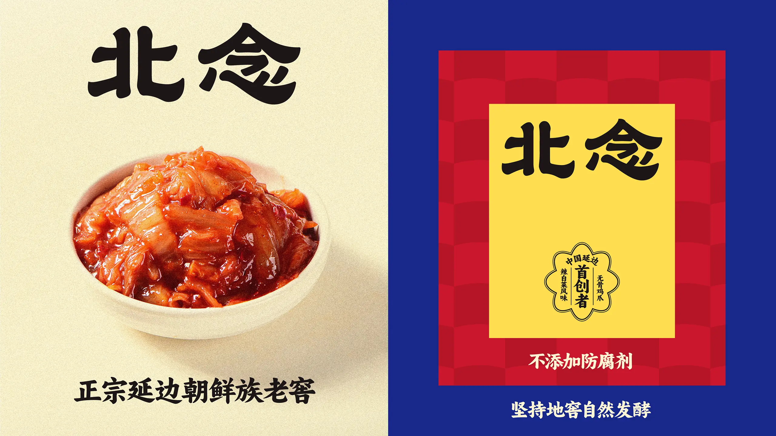
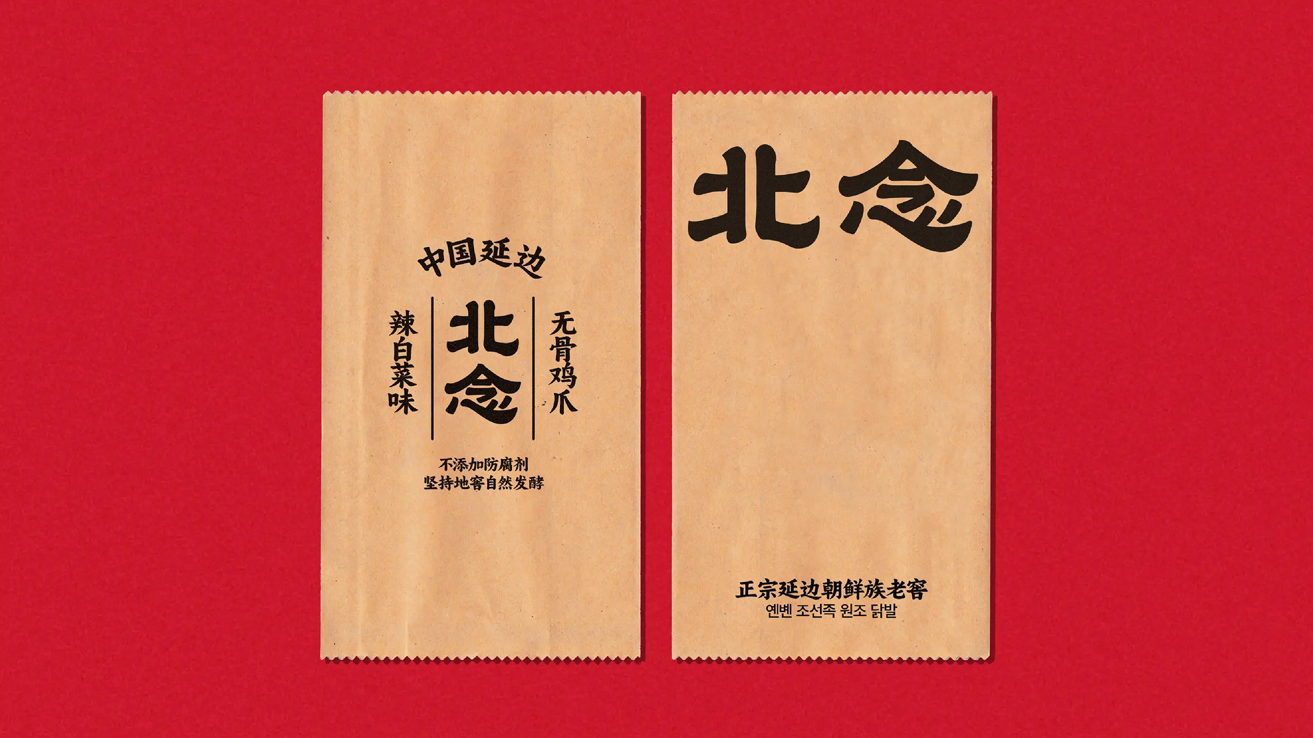
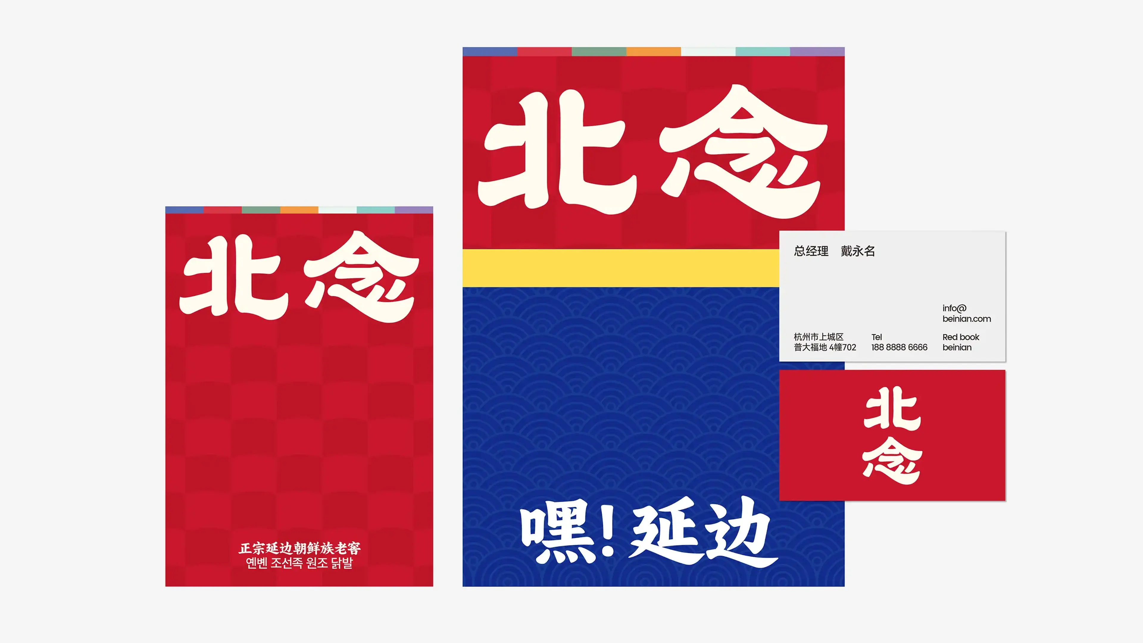
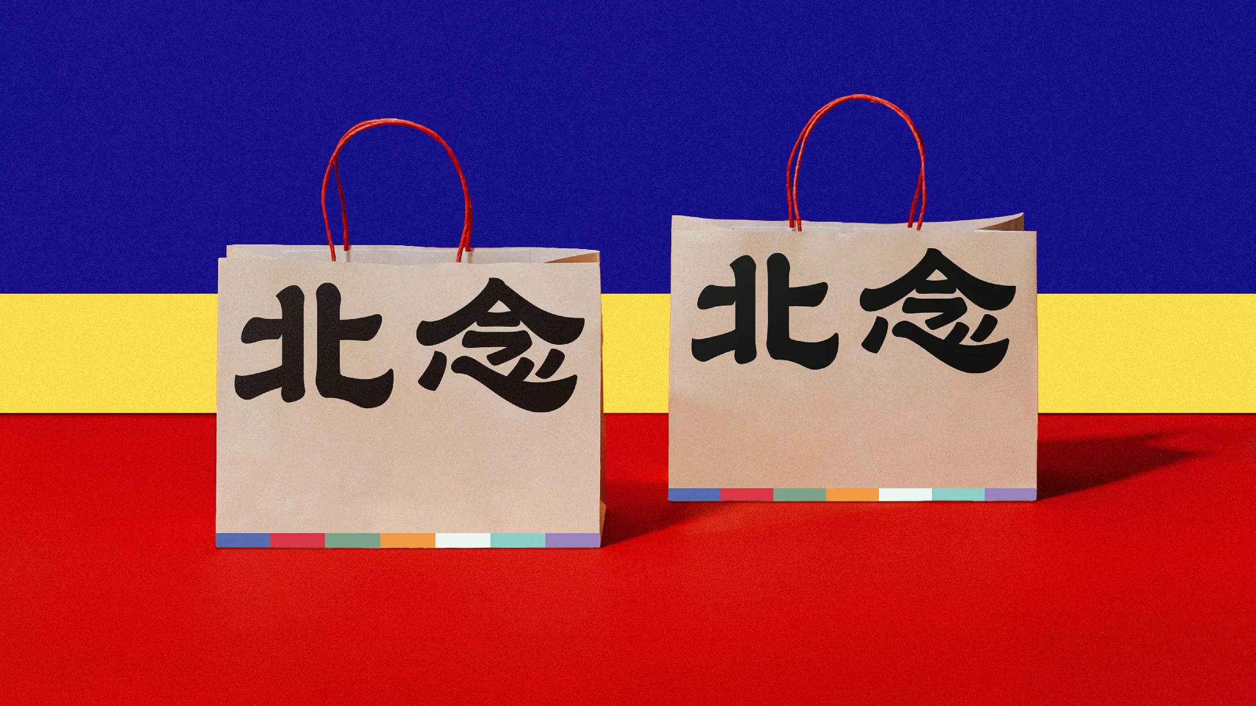
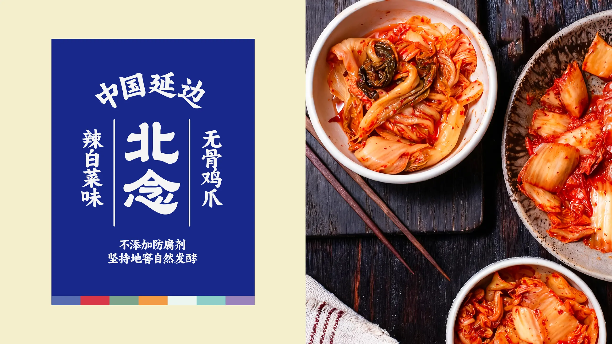
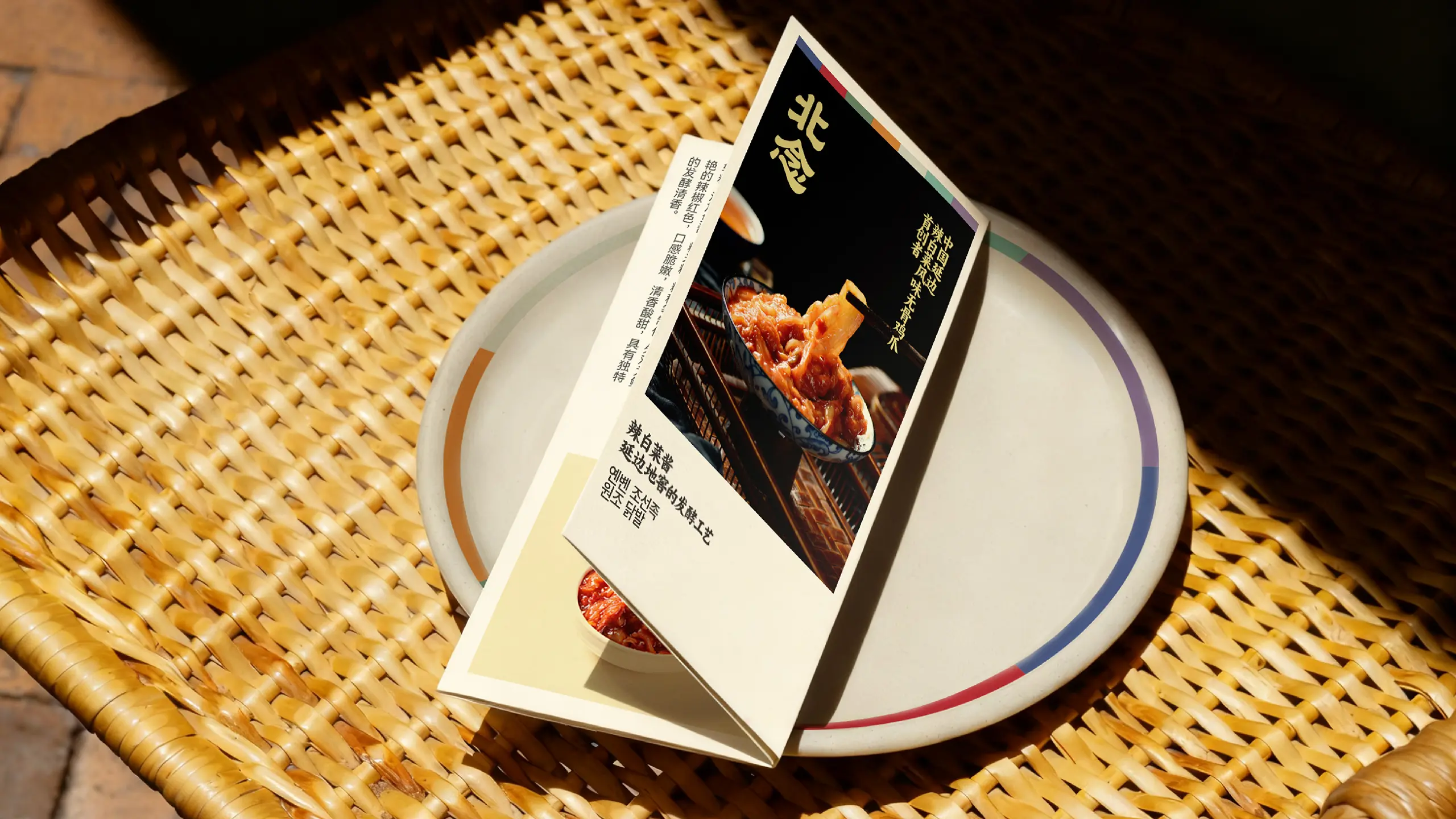
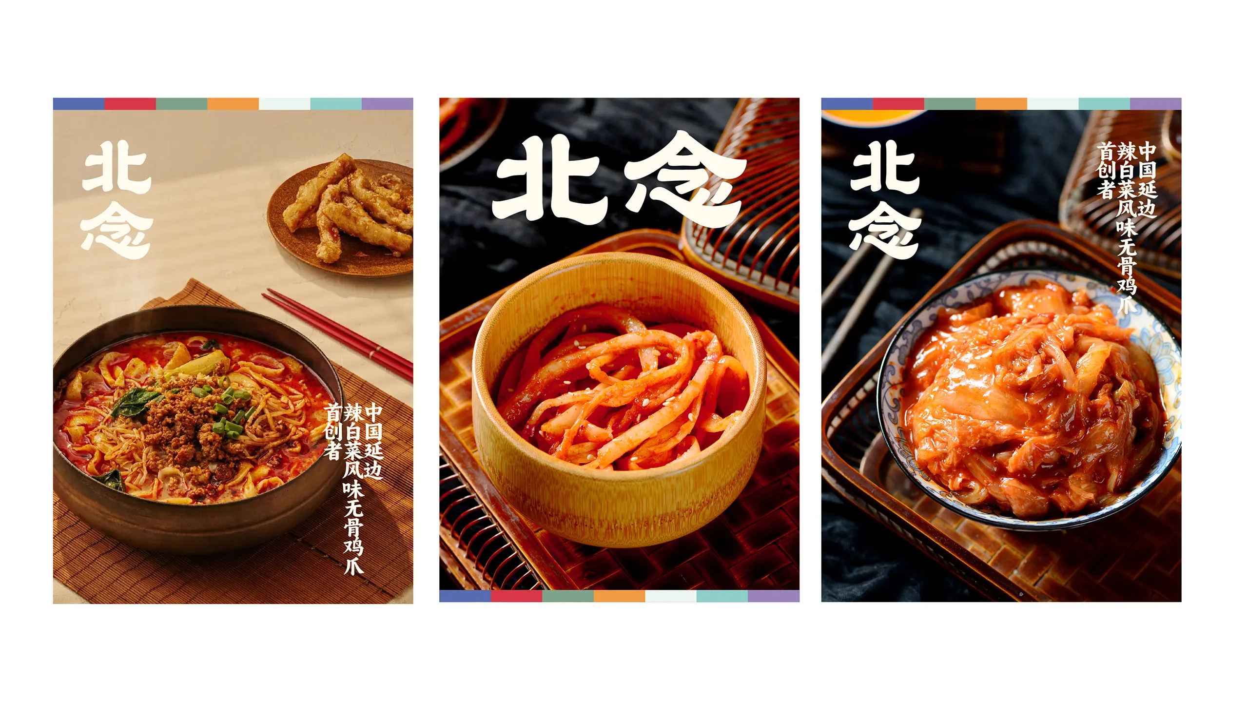
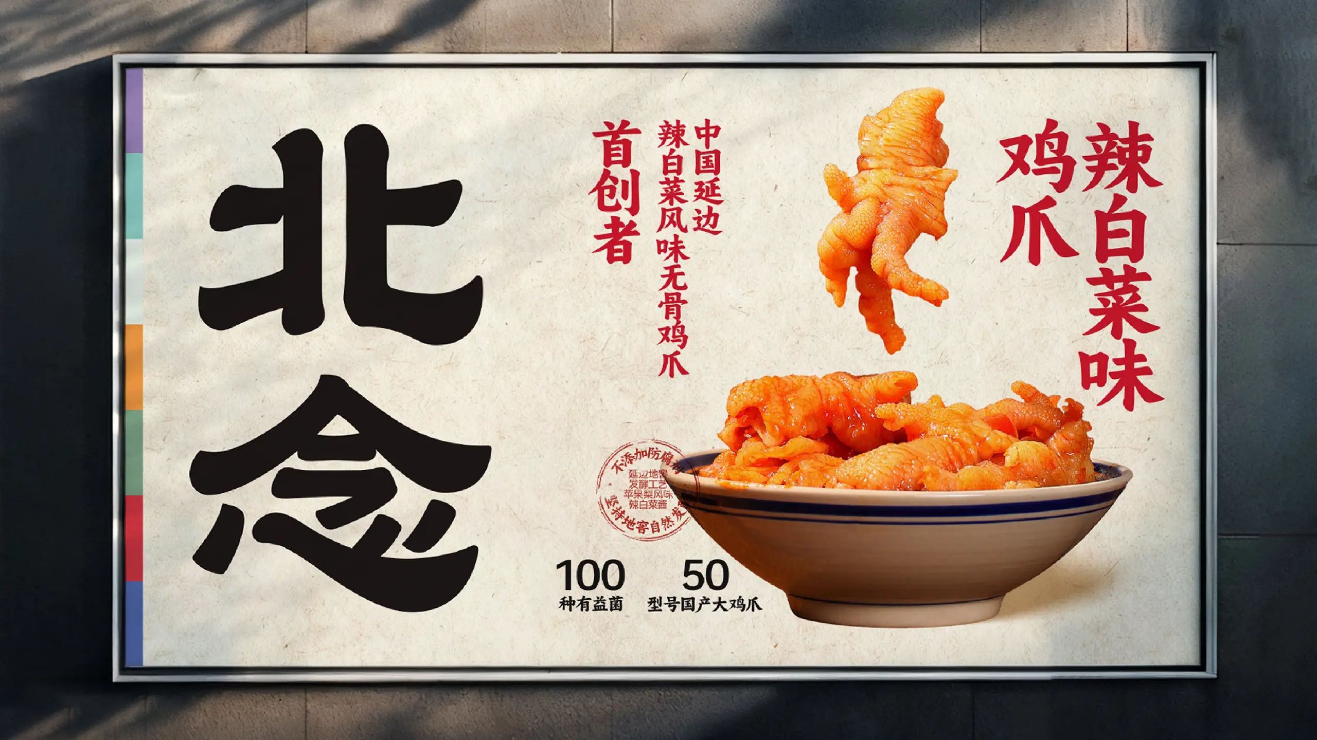
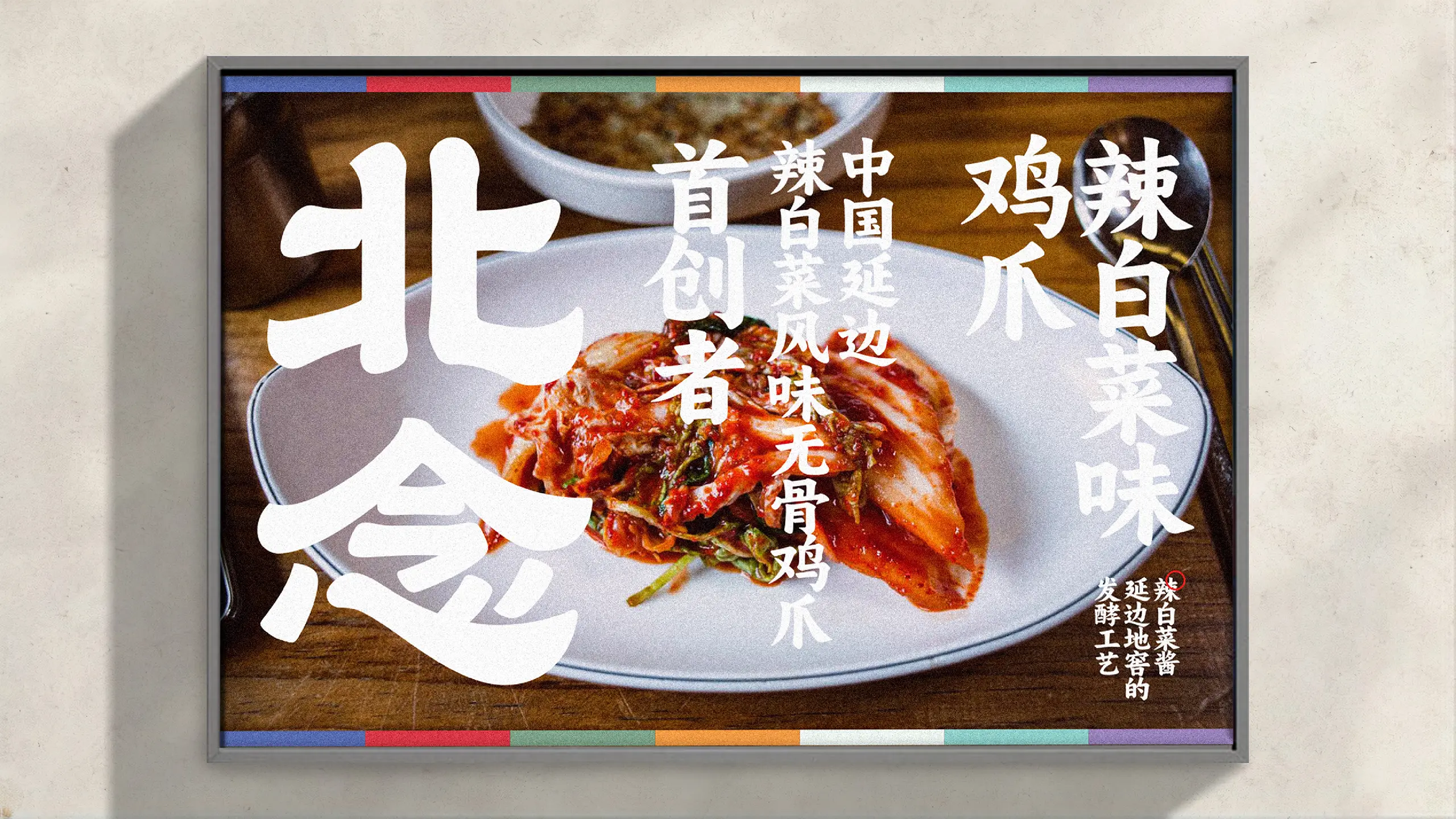
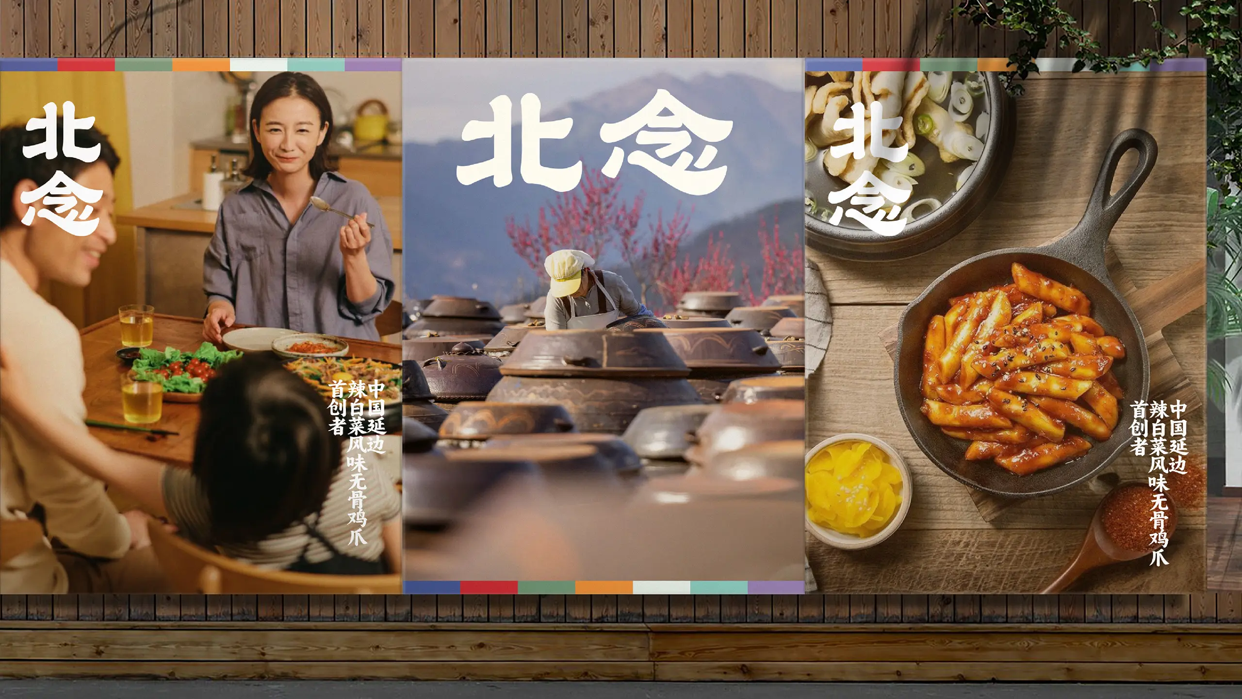
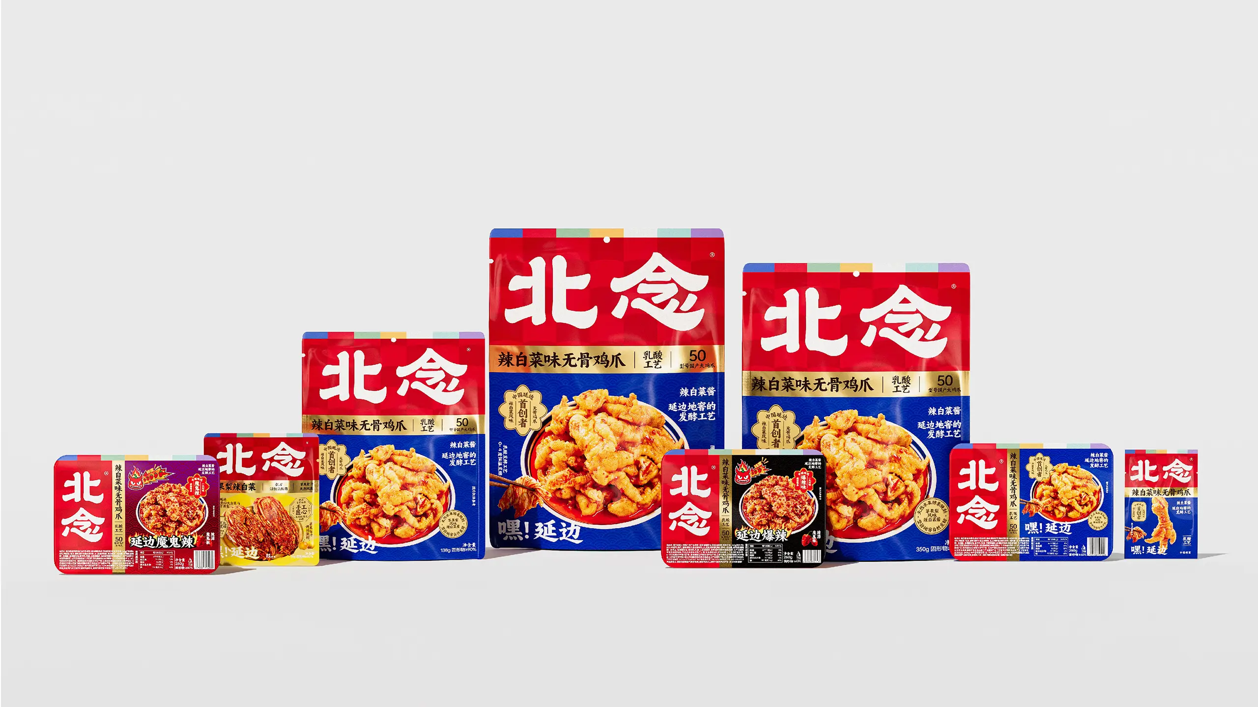
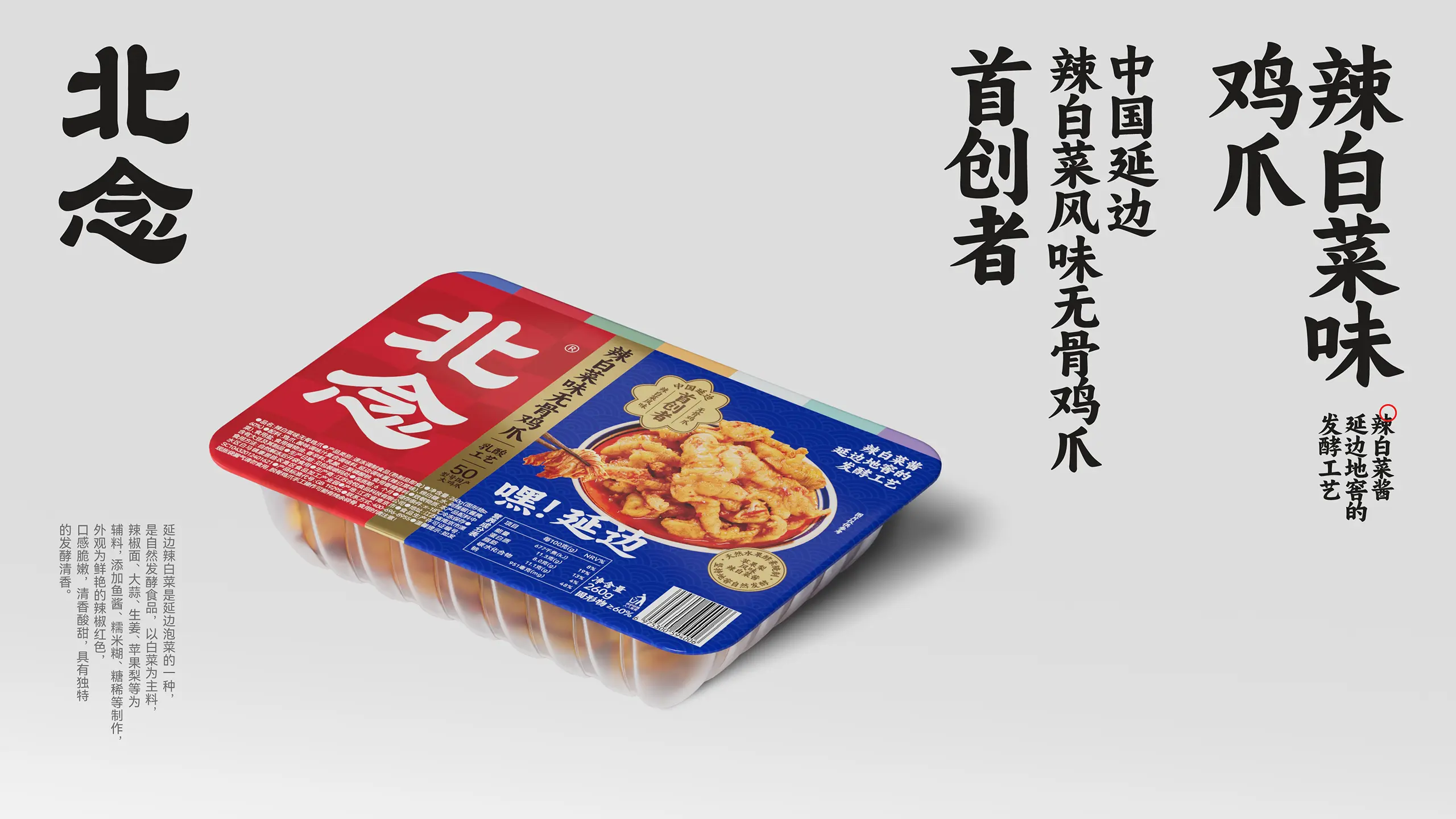
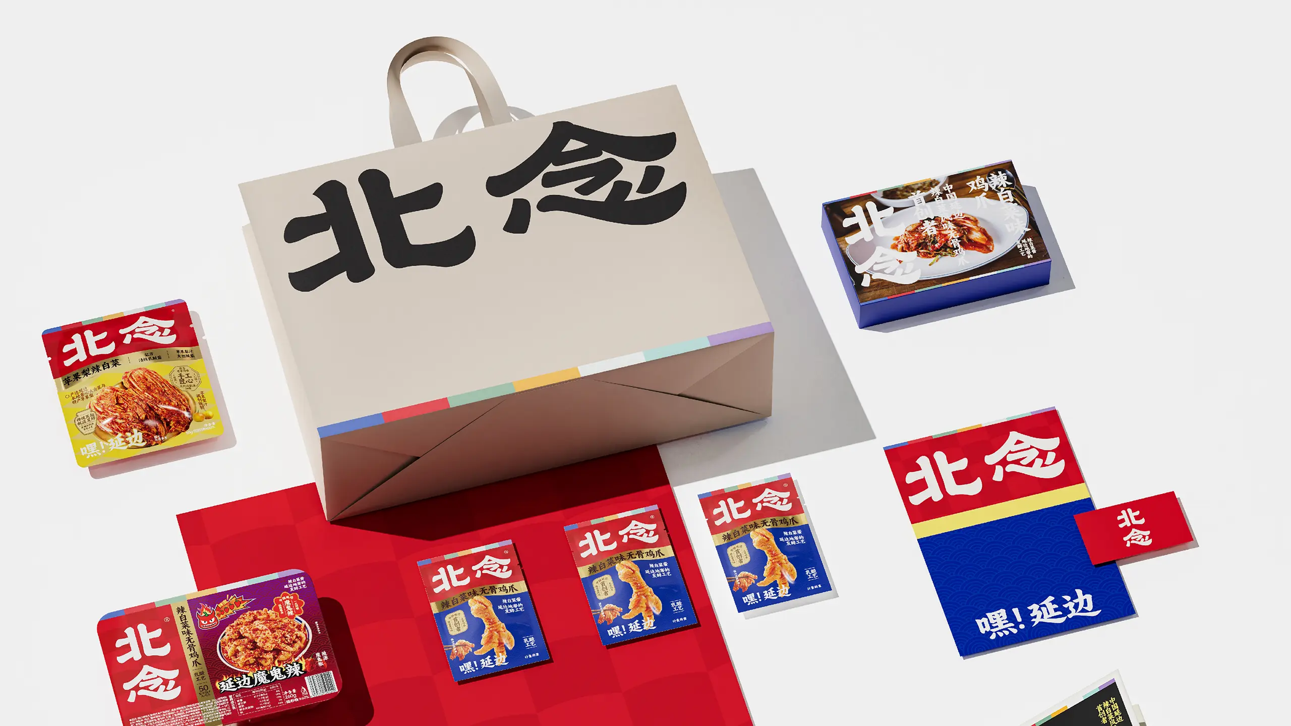
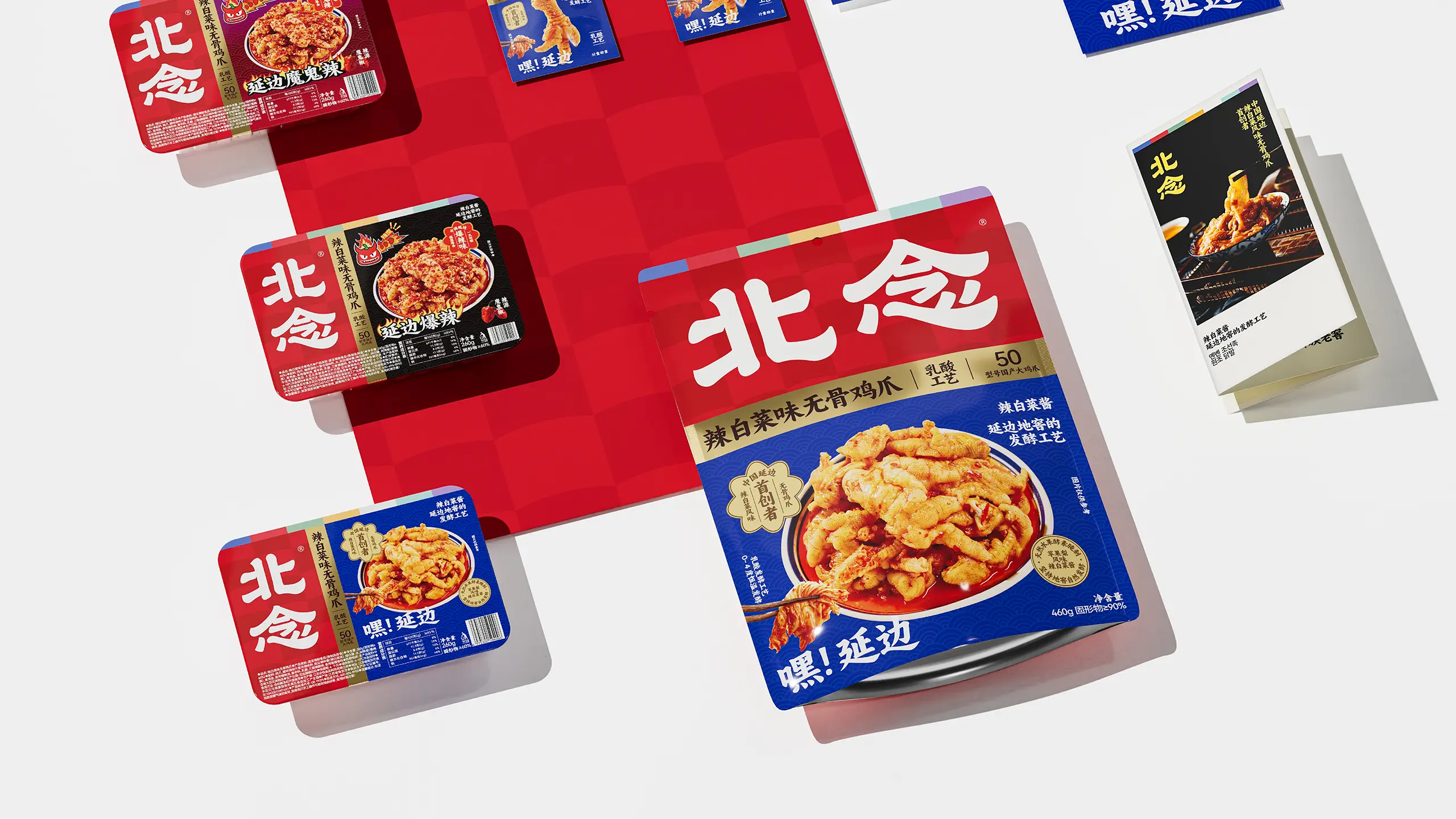
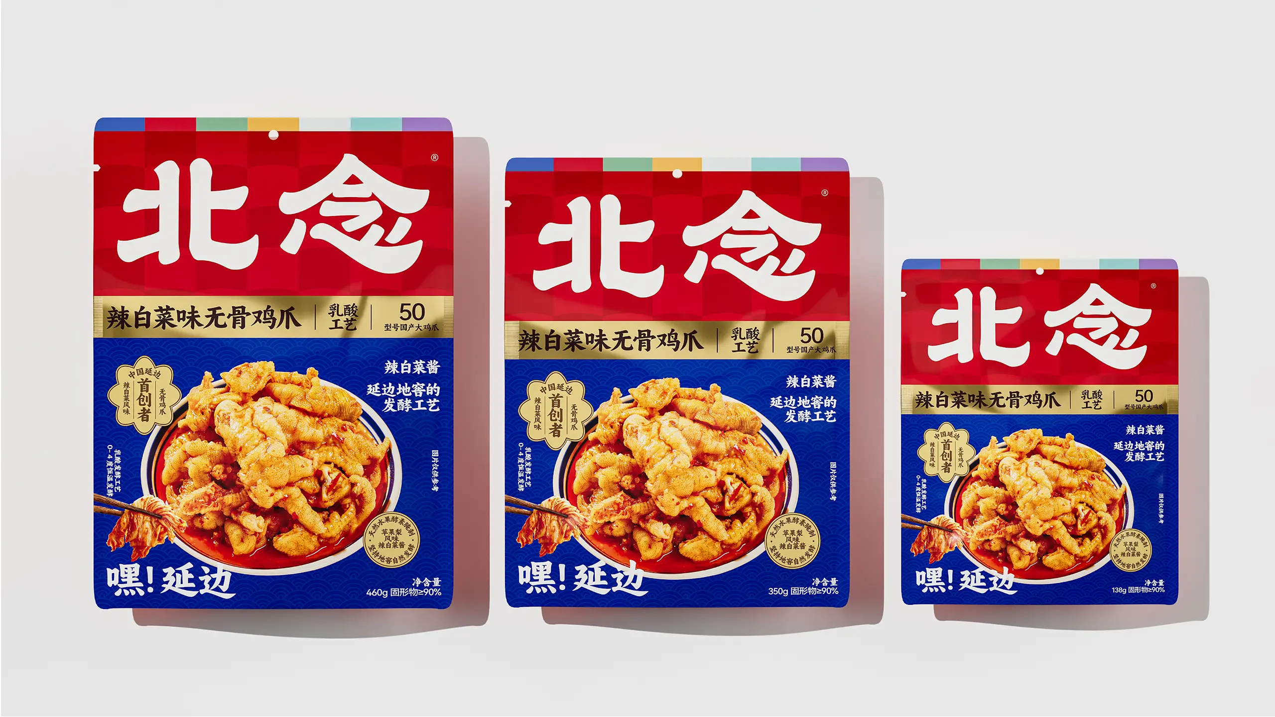
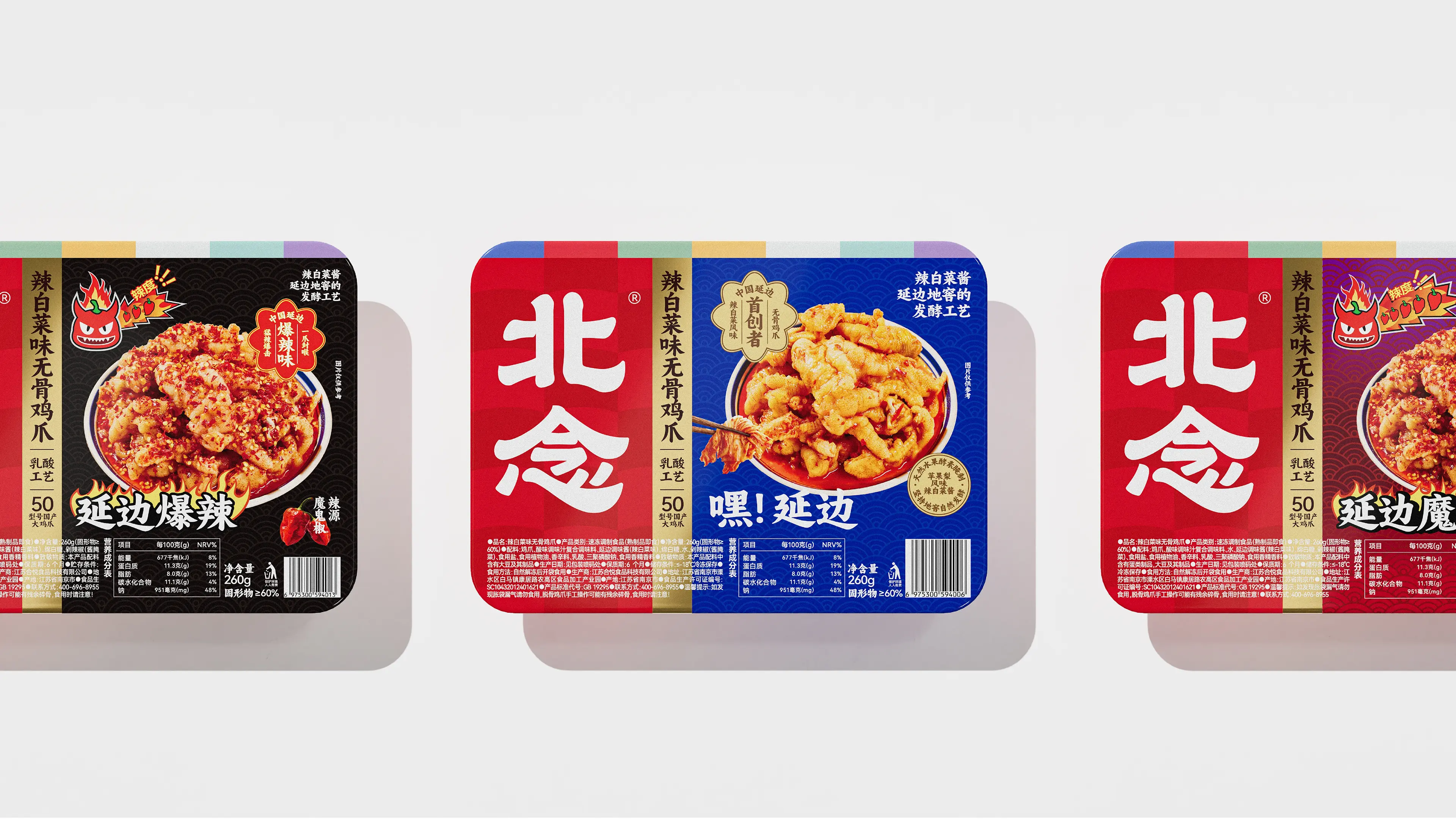
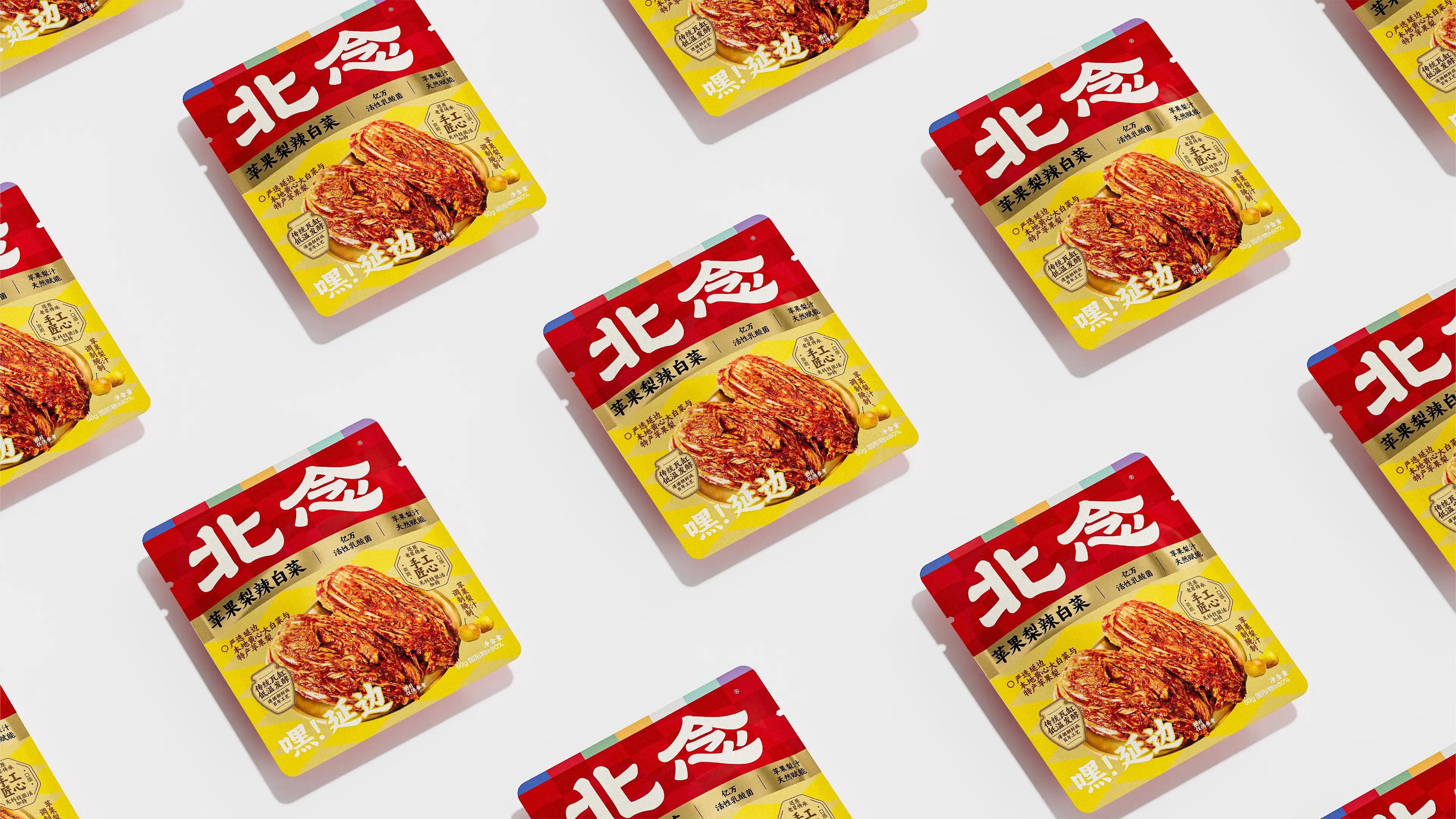
This project provides comprehensive brand design services. Its core objective is to help the brand establish a differentiated visual identity system with regional cultural heritage in a severely homogenized casual snack market. Starting from the brand’s cultural gene of “Northern Land’s Treasures,” we established the design direction of “regional culture + modern aesthetics.” The Chinese typeface is based on clerical script (Lishu), refined to be more modern, with thicker strokes conveying the brand’s sense of solidity and humanistic warmth. Traditional multicolored blocks of Yanbian are boldly used as auxiliary graphics and positioned at the edges of the composition—a layout style rooted in traditional Yanbian culture. In packaging design, the classic red-yellow-blue color scheme of Yanbian ethnic culture is used to divide the layout, ensuring the logo always occupies the visual center. Through a unified color system and layout structure, BEINIAN’s packaging forms a strong sense of array, making the direction of future product development clearer and greatly improving the brand’s recognition efficiency on retail shelves. Through this comprehensive brand design system combining cultural depth, recognition efficiency, and series extensibility, BEINIAN has successfully upgraded from a regional flavor product to a casual snack brand with strong visual recognition, clear brand positioning, and regional cultural genes, laying a solid visual foundation for the brand’s continued expansion in the RMB 10-billion boneless chicken feet sector.