
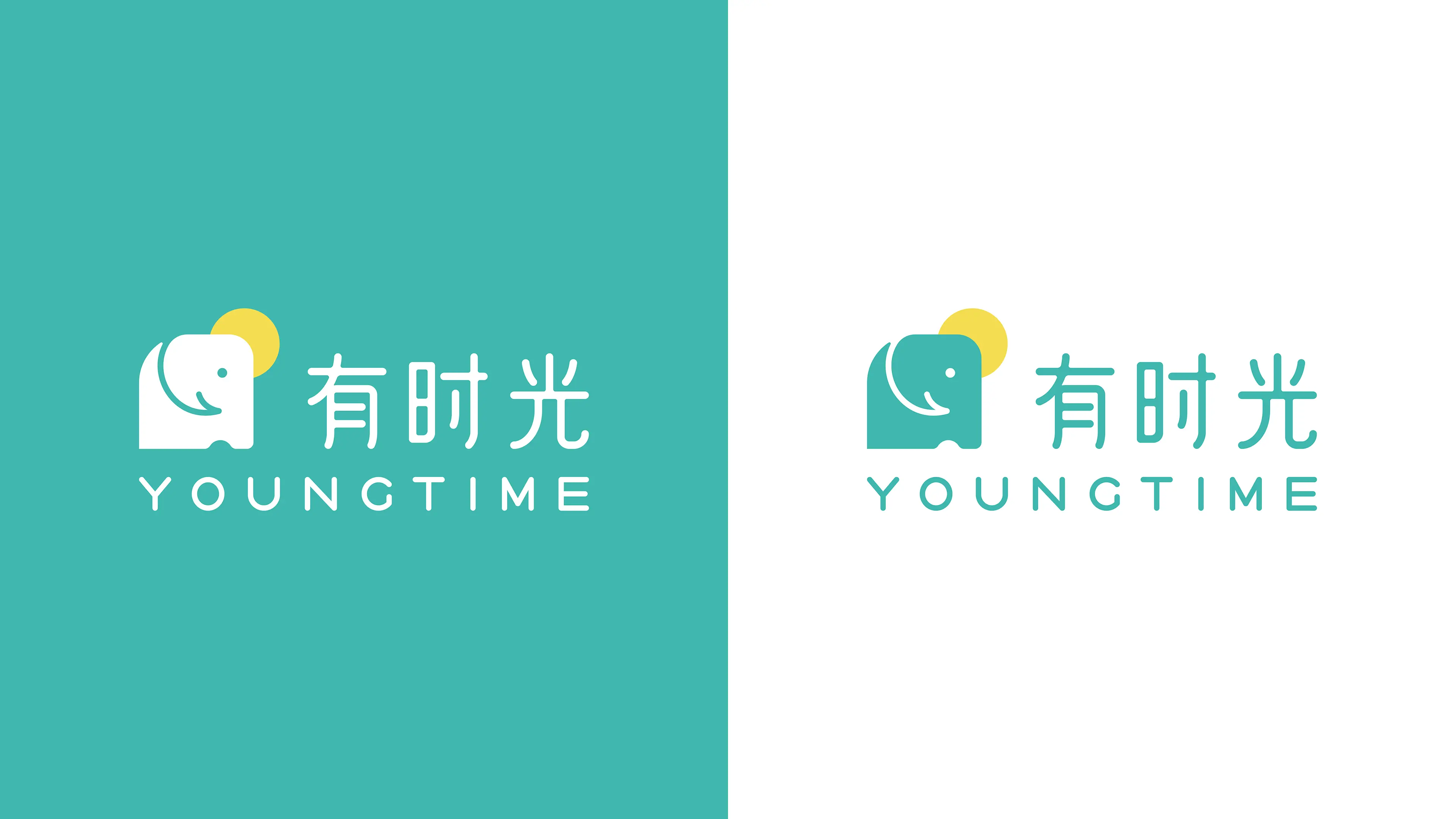
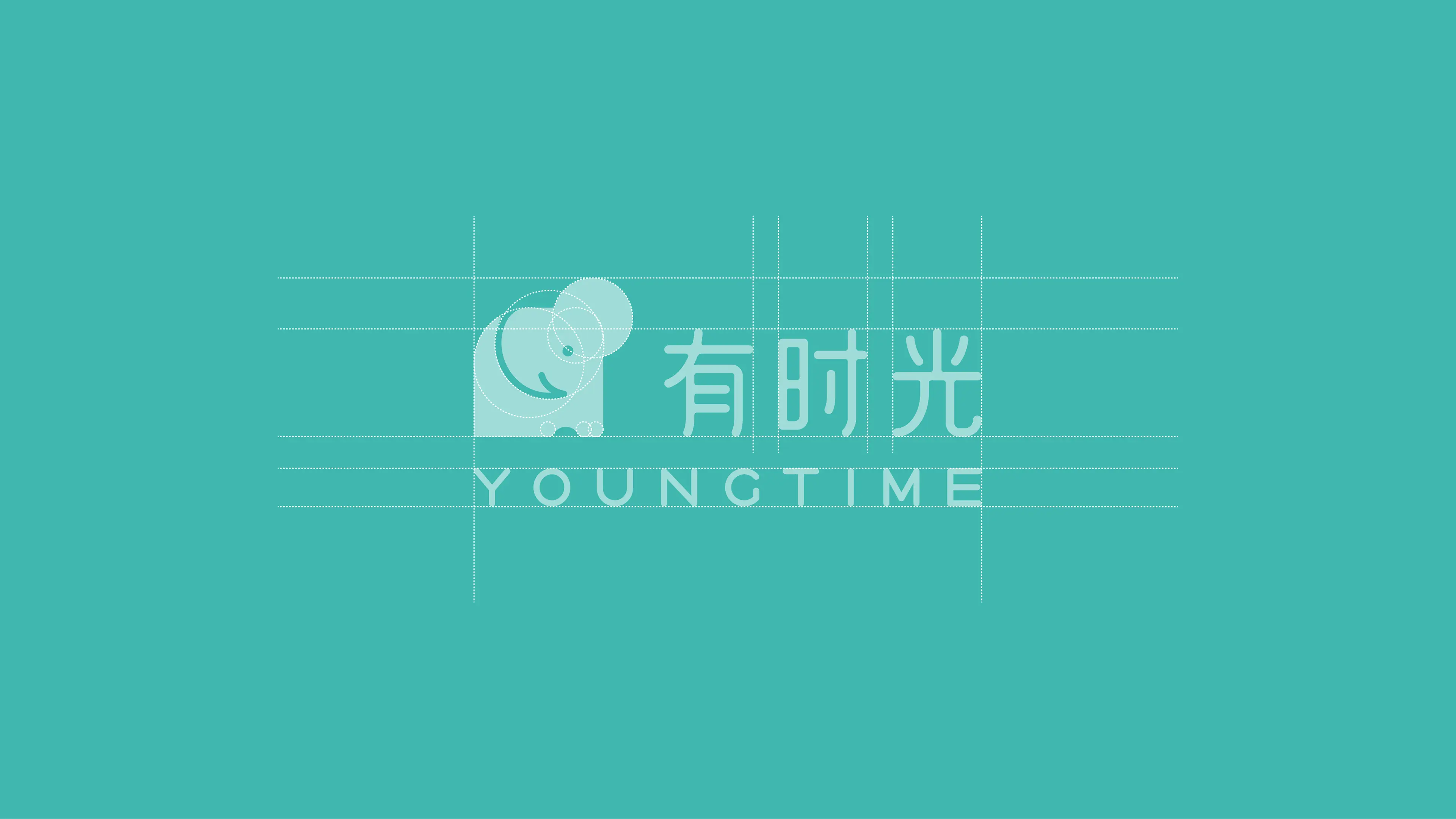
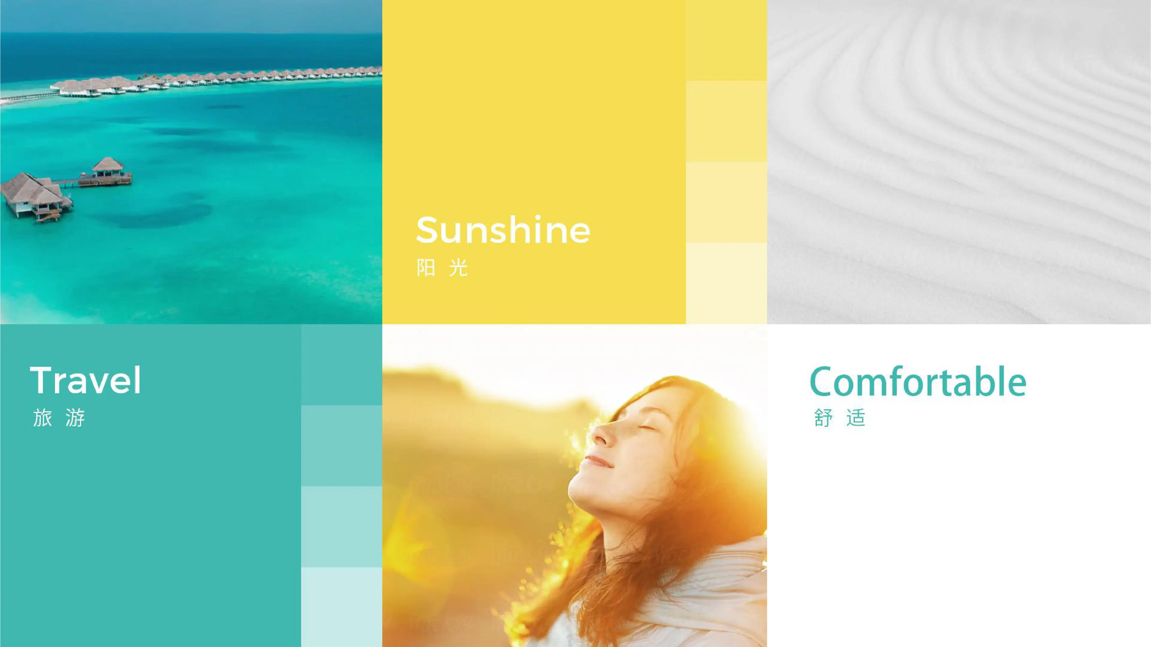
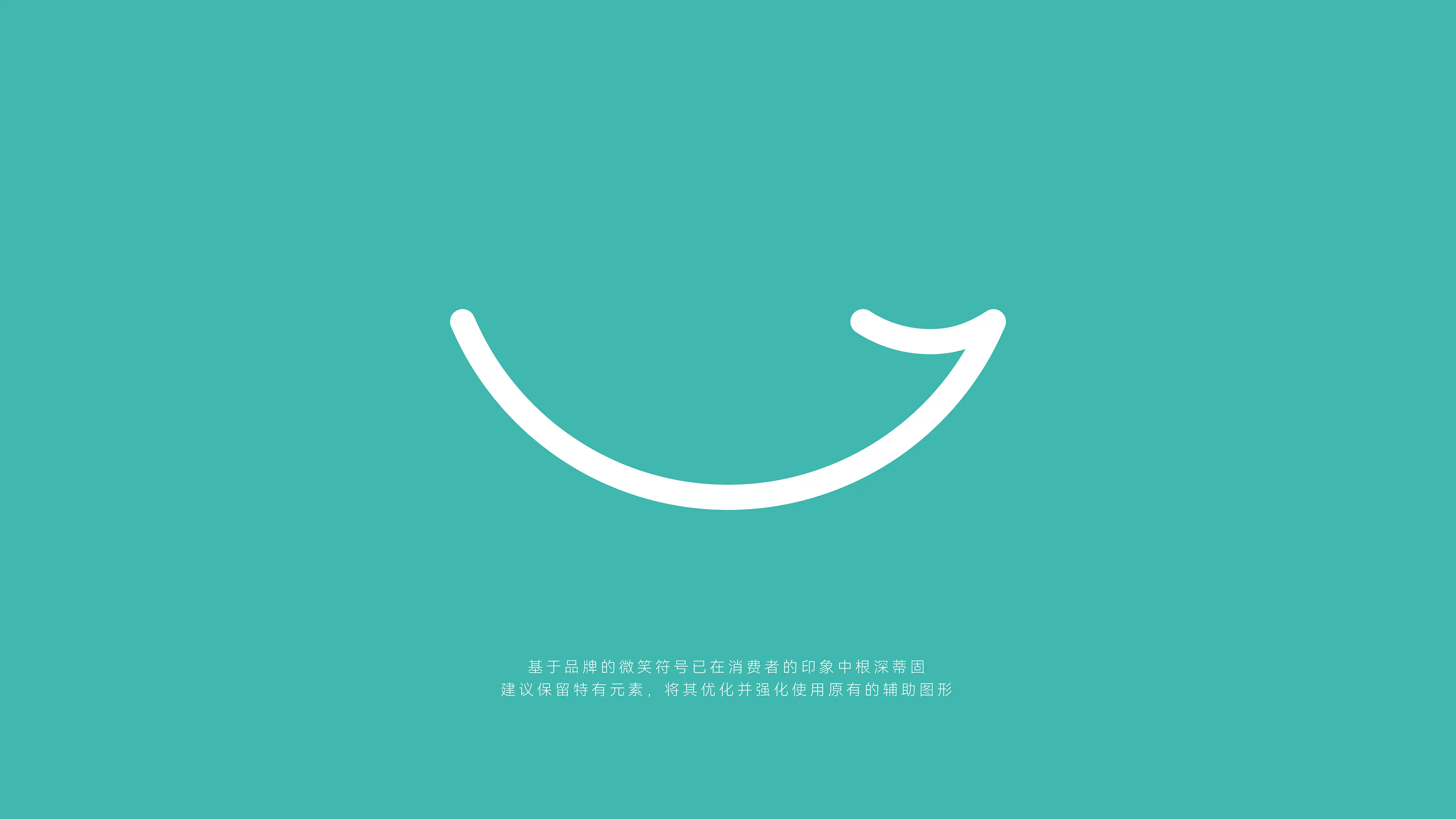
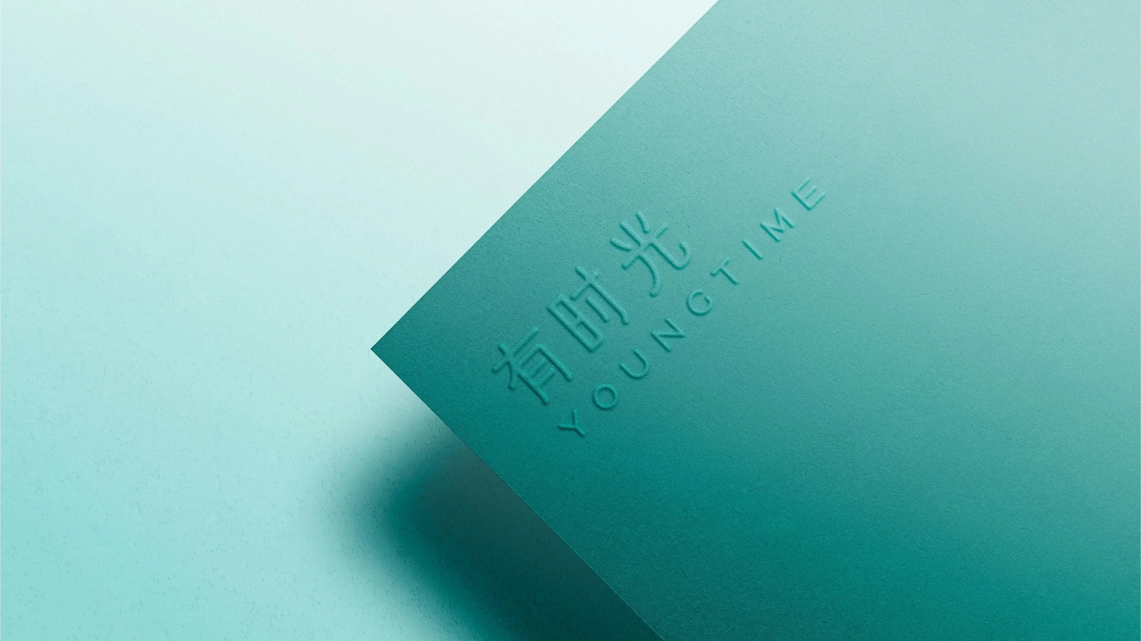
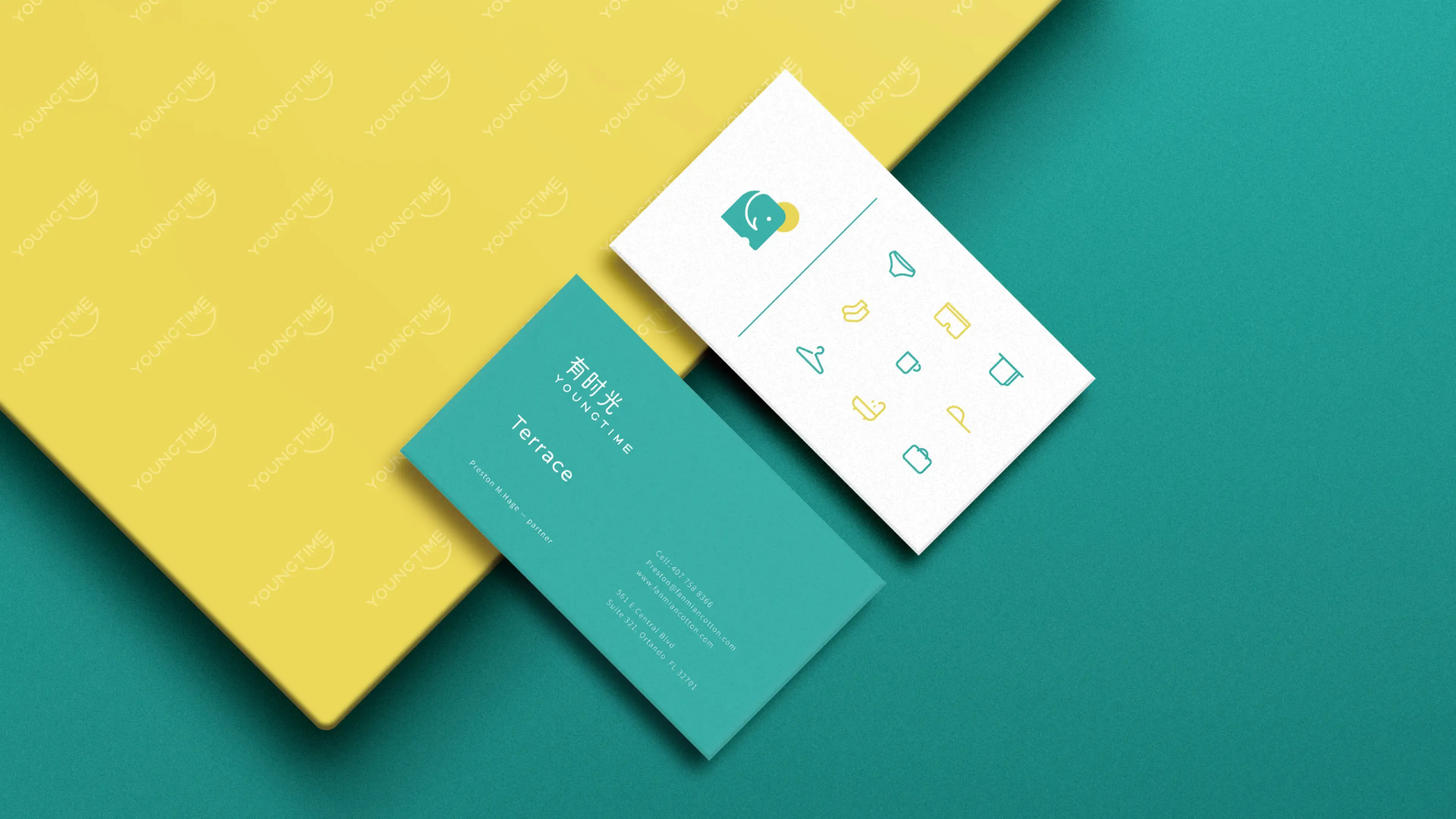
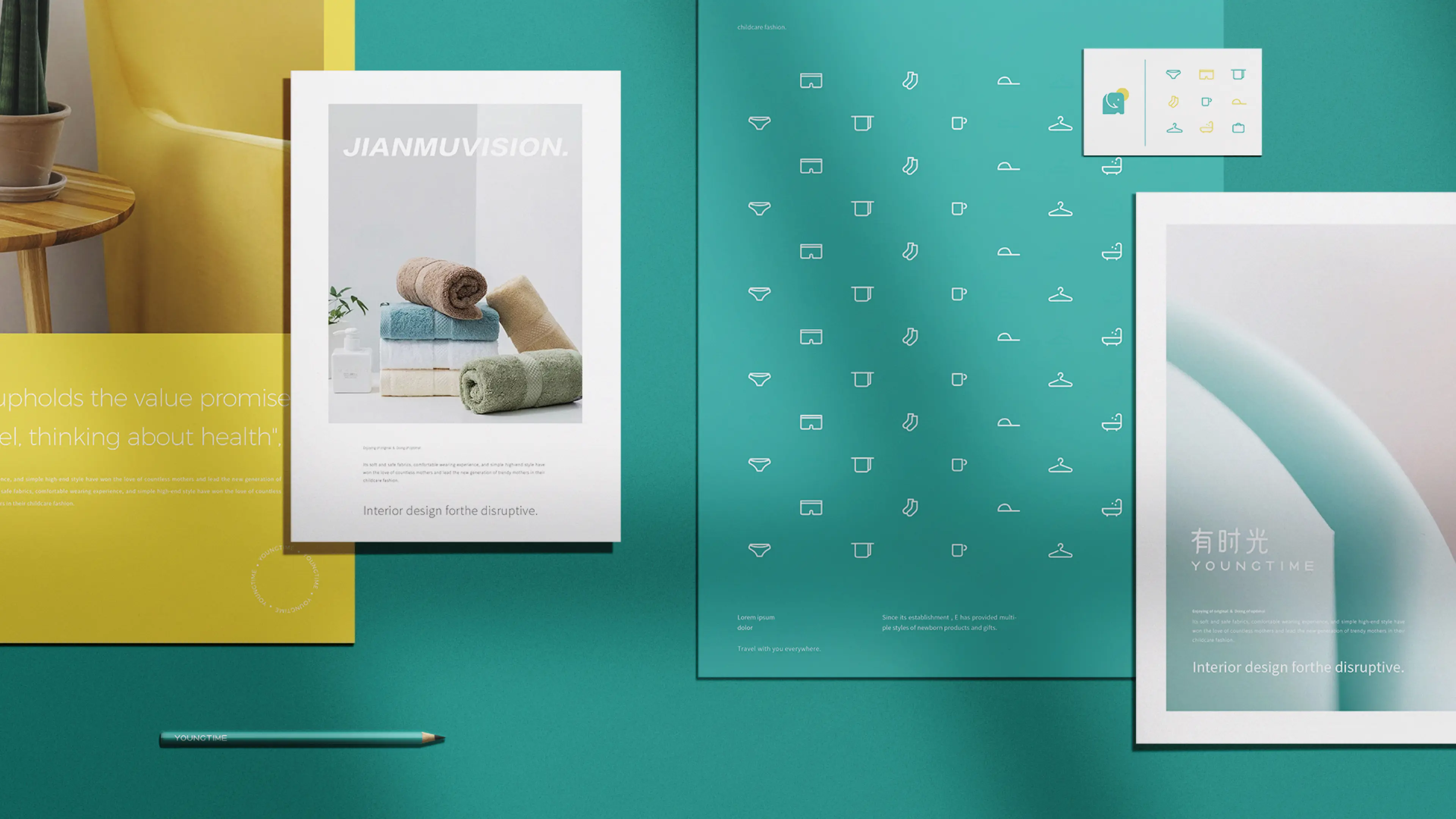
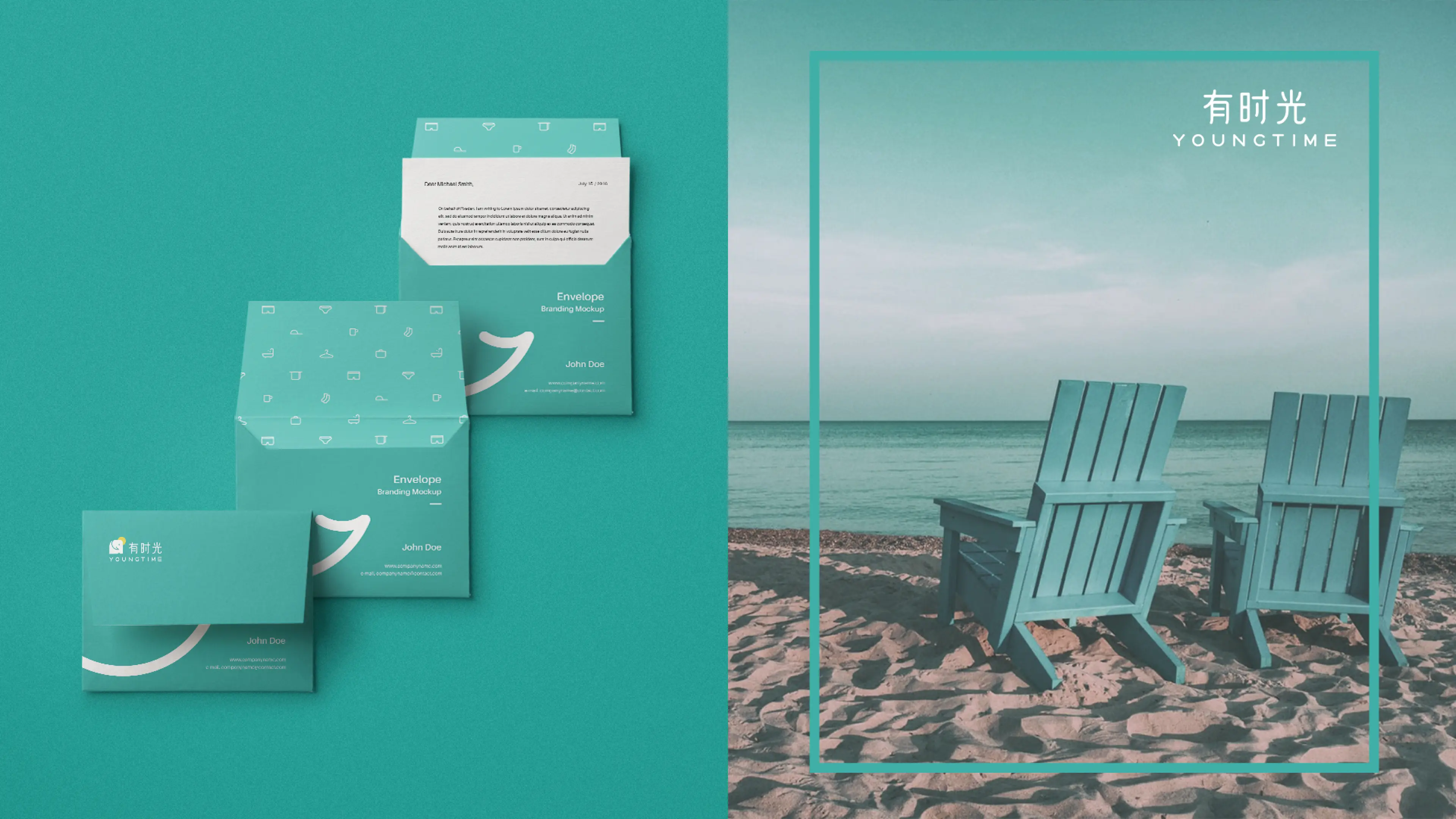
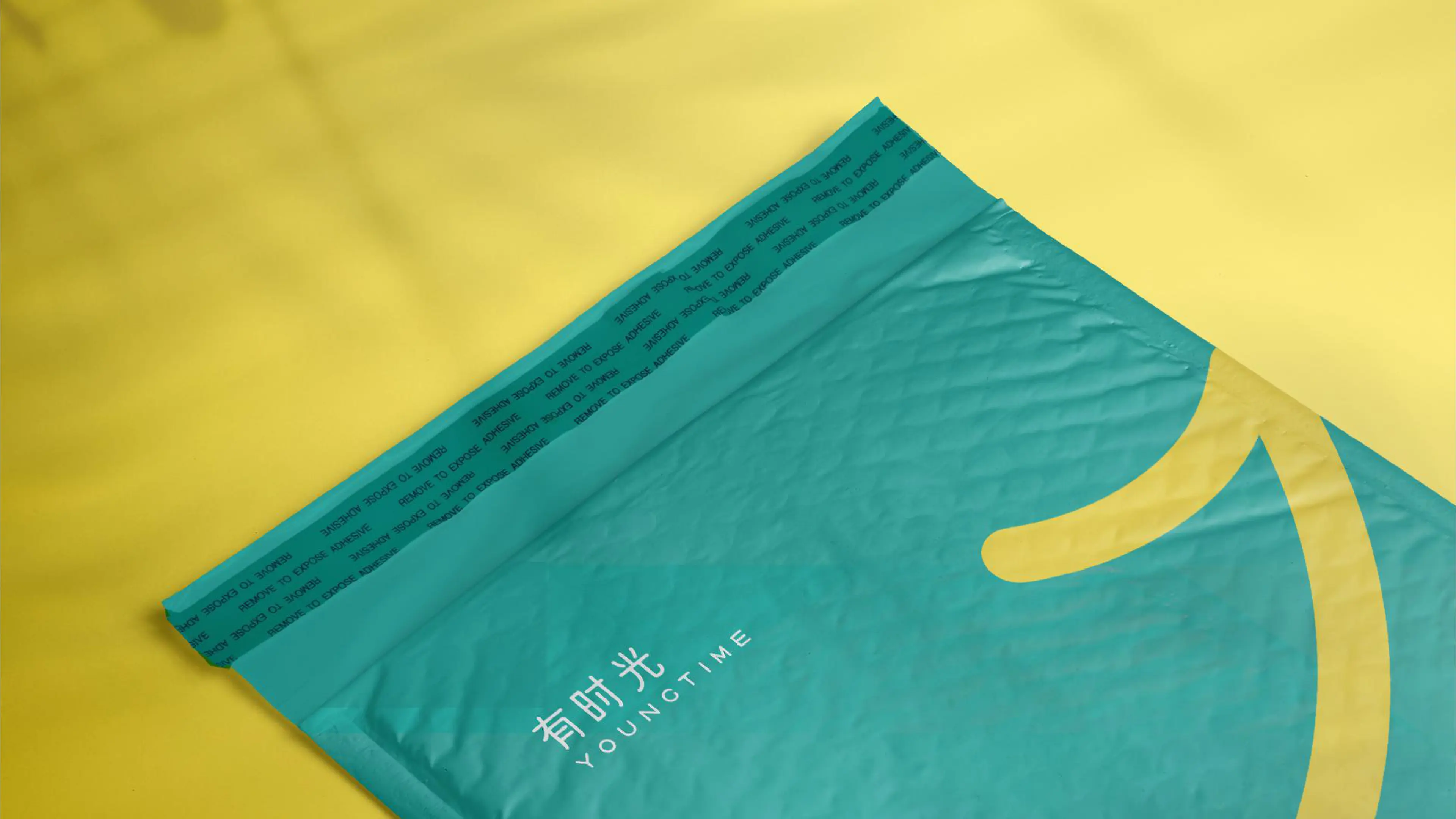
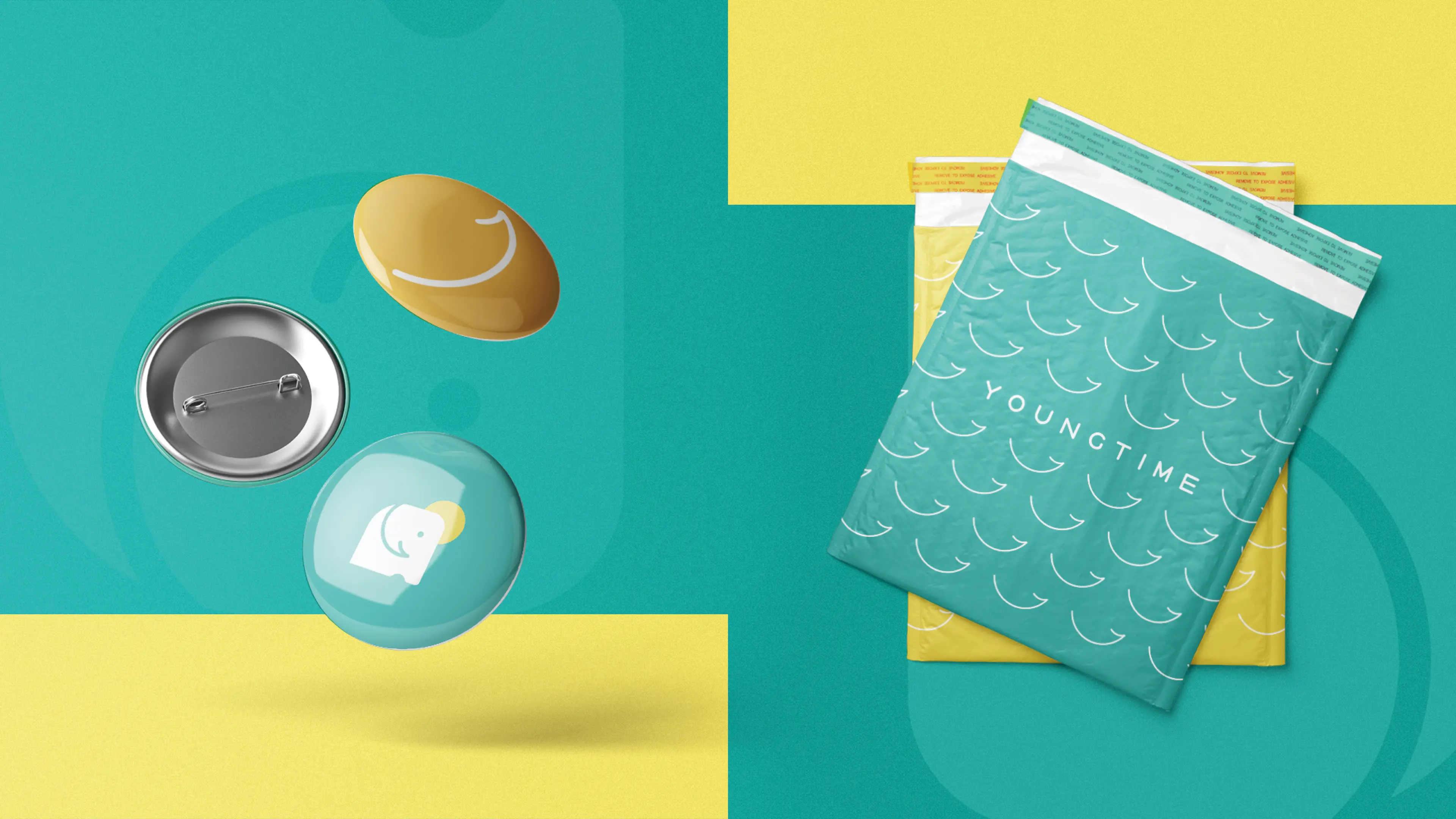
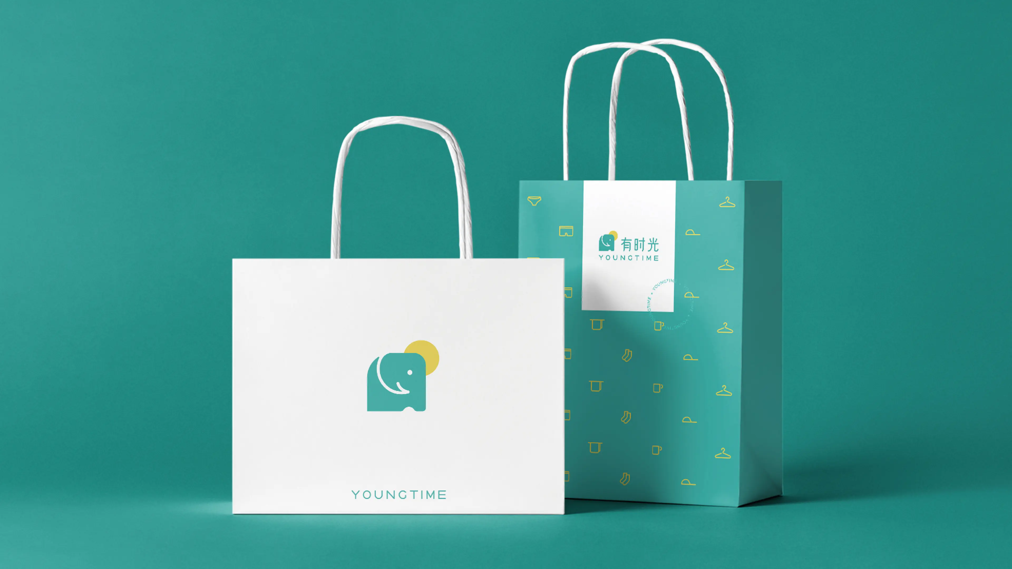
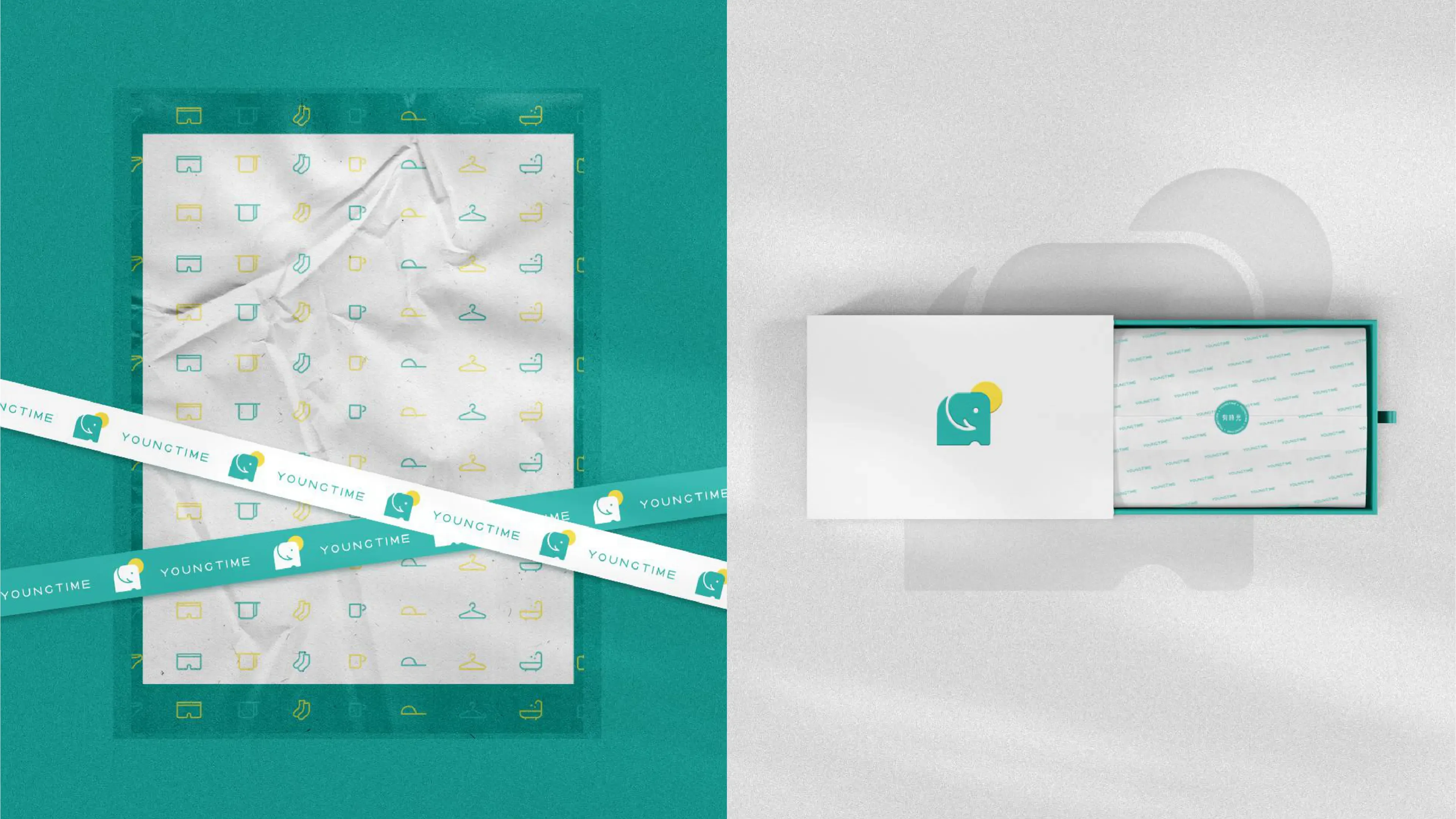
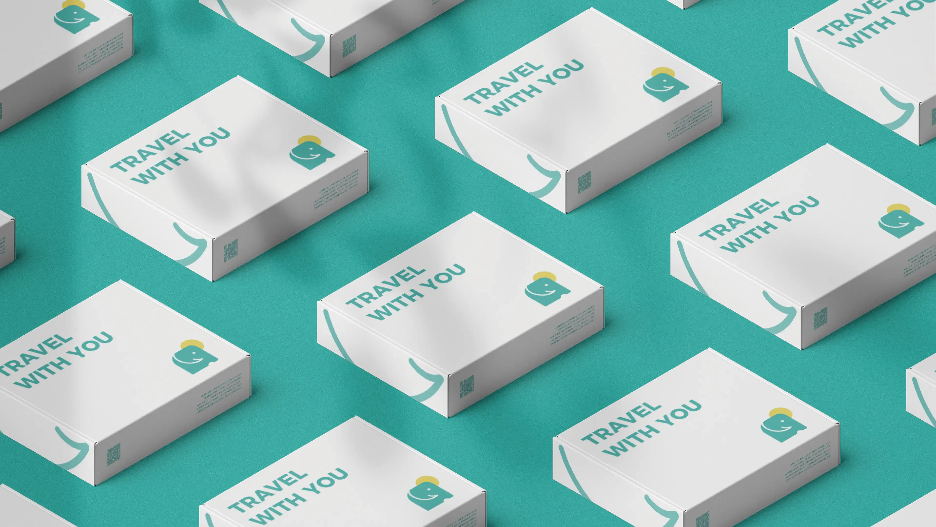
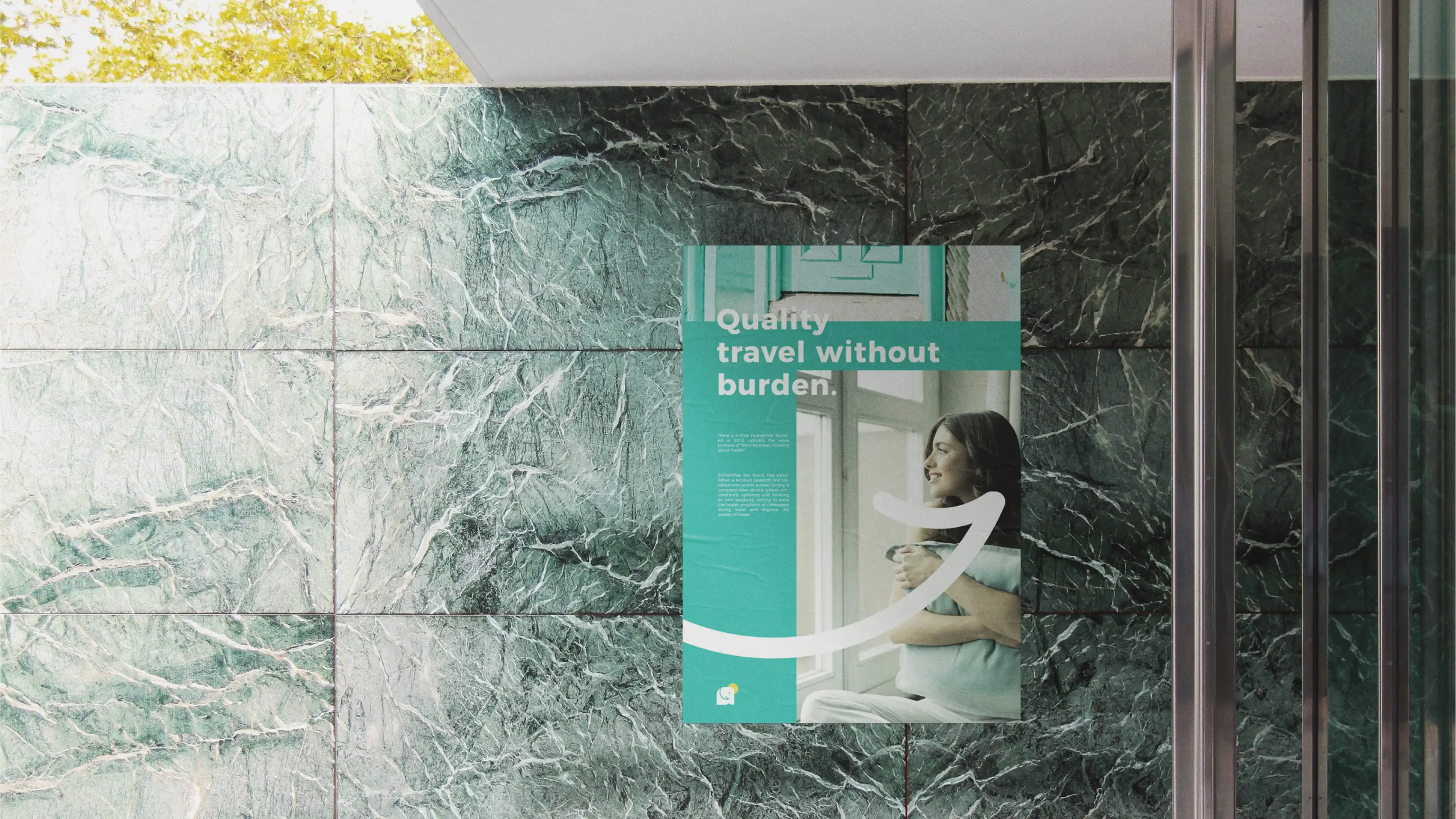
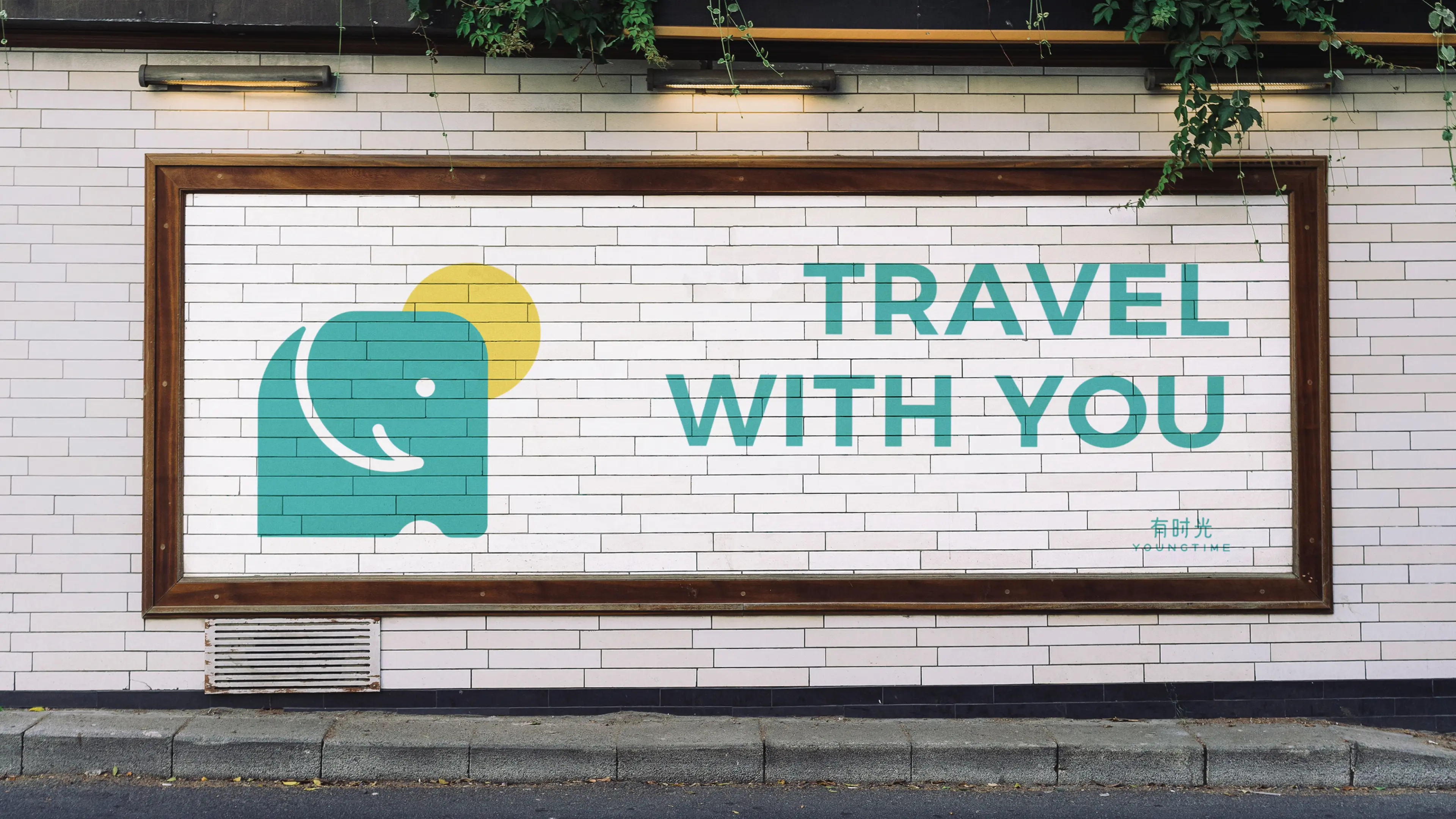
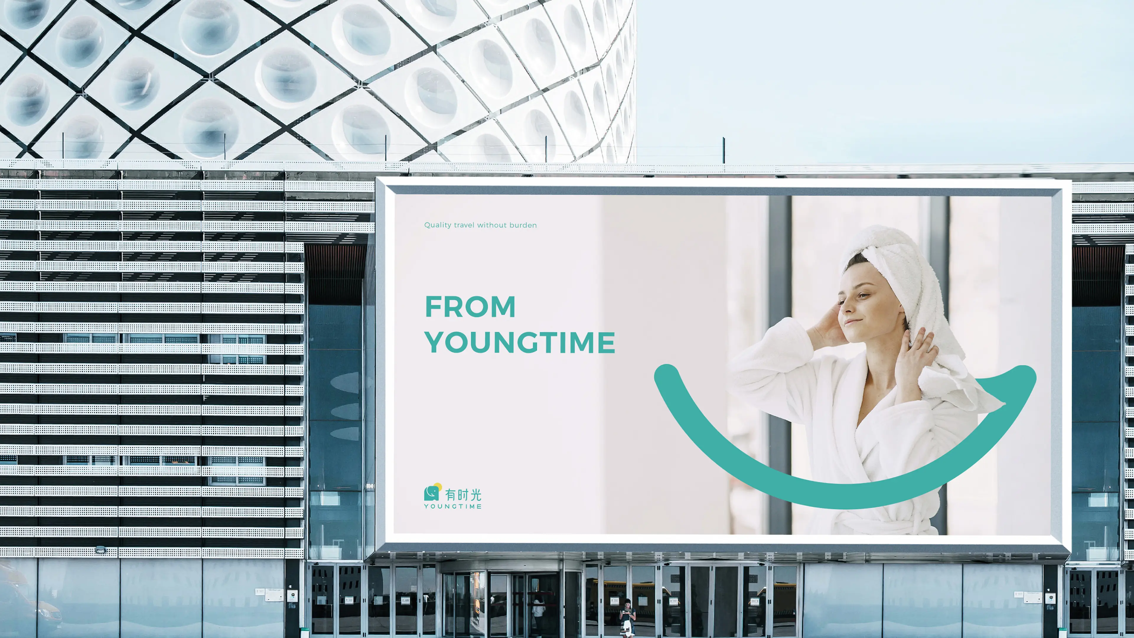
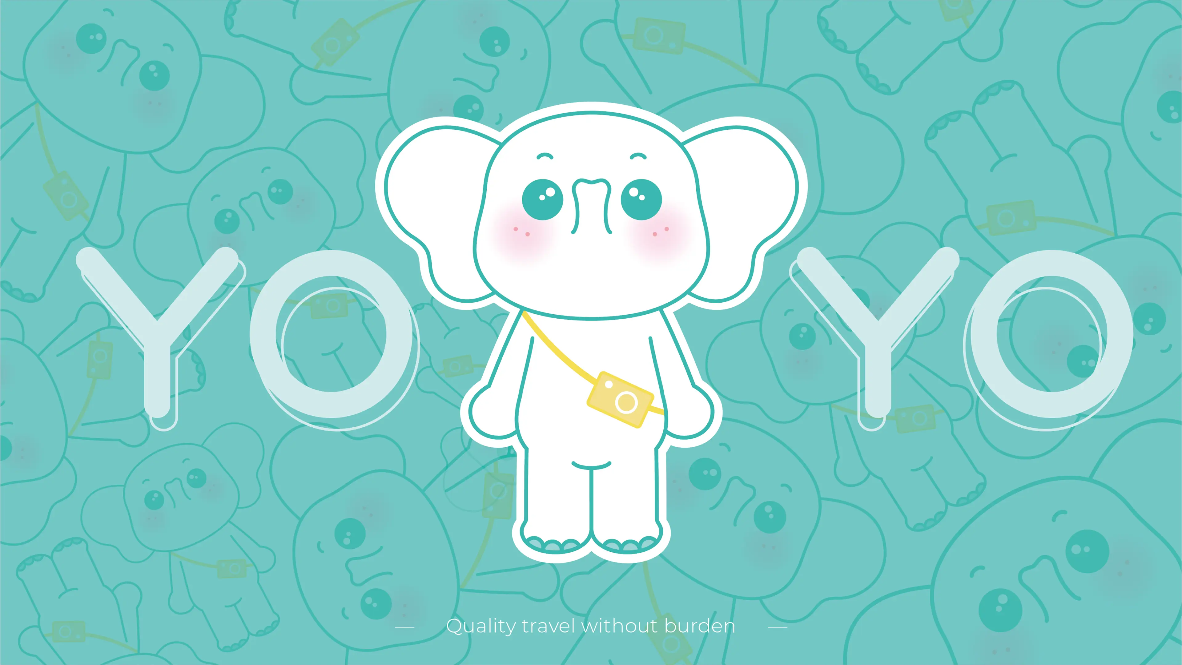
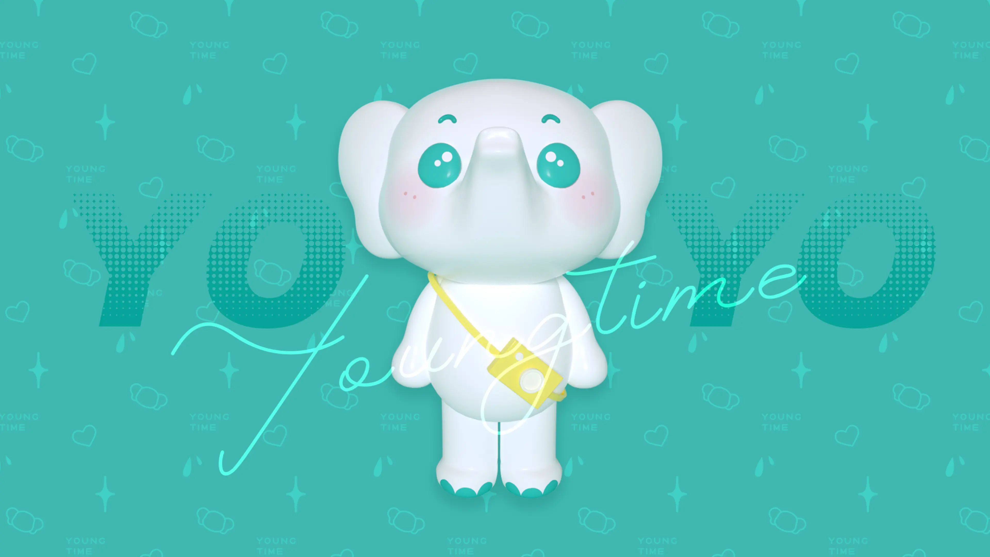
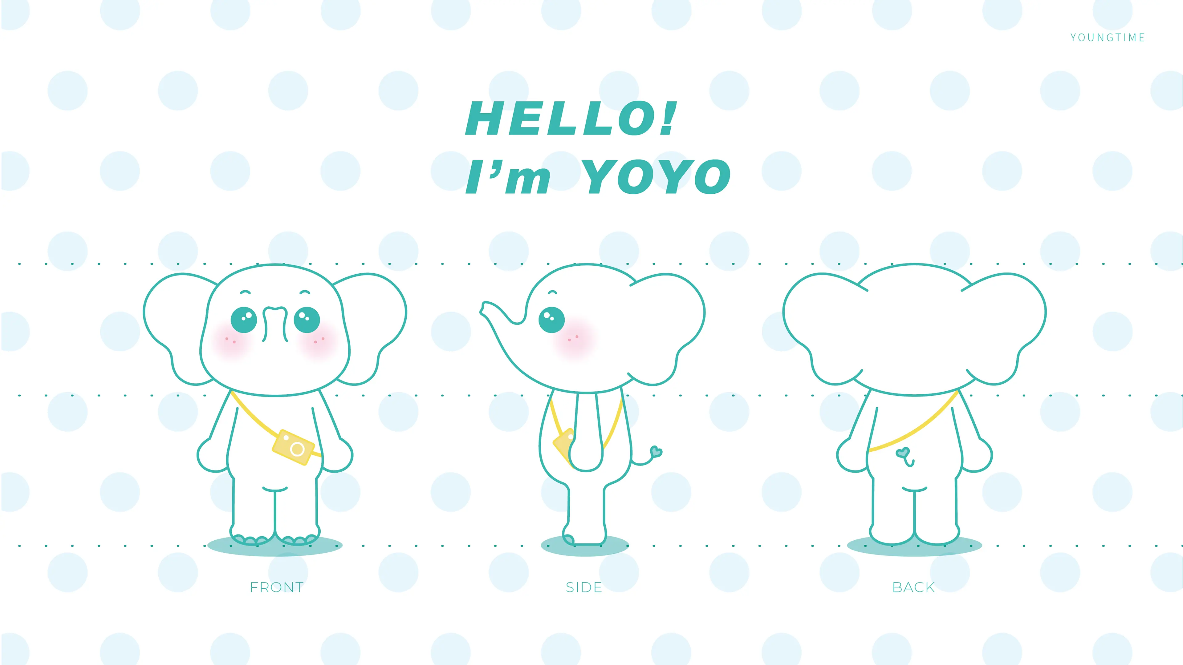
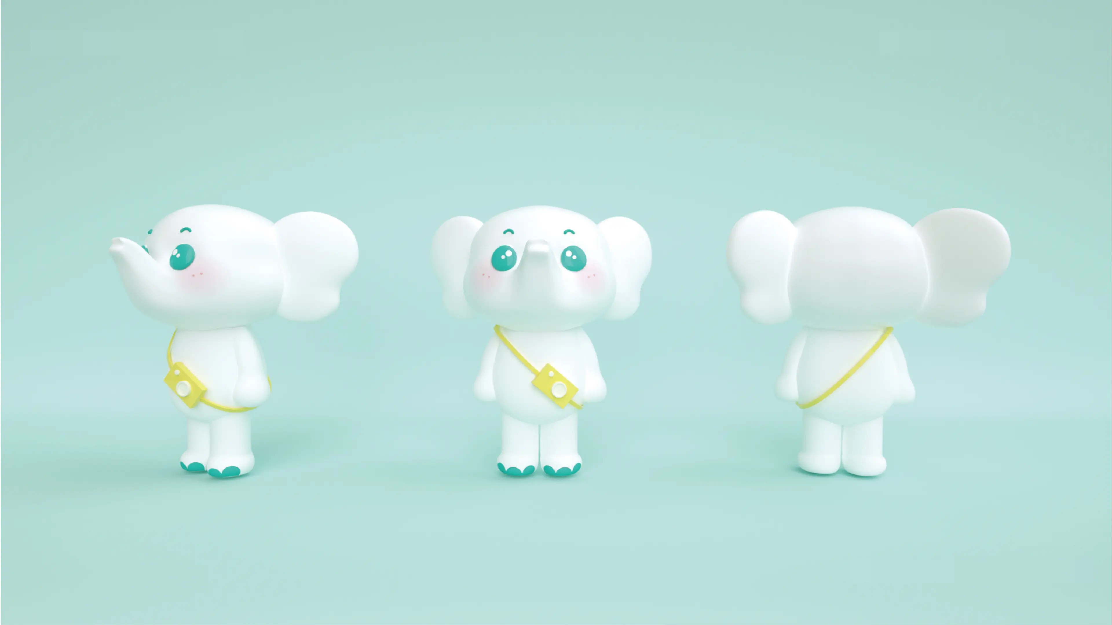
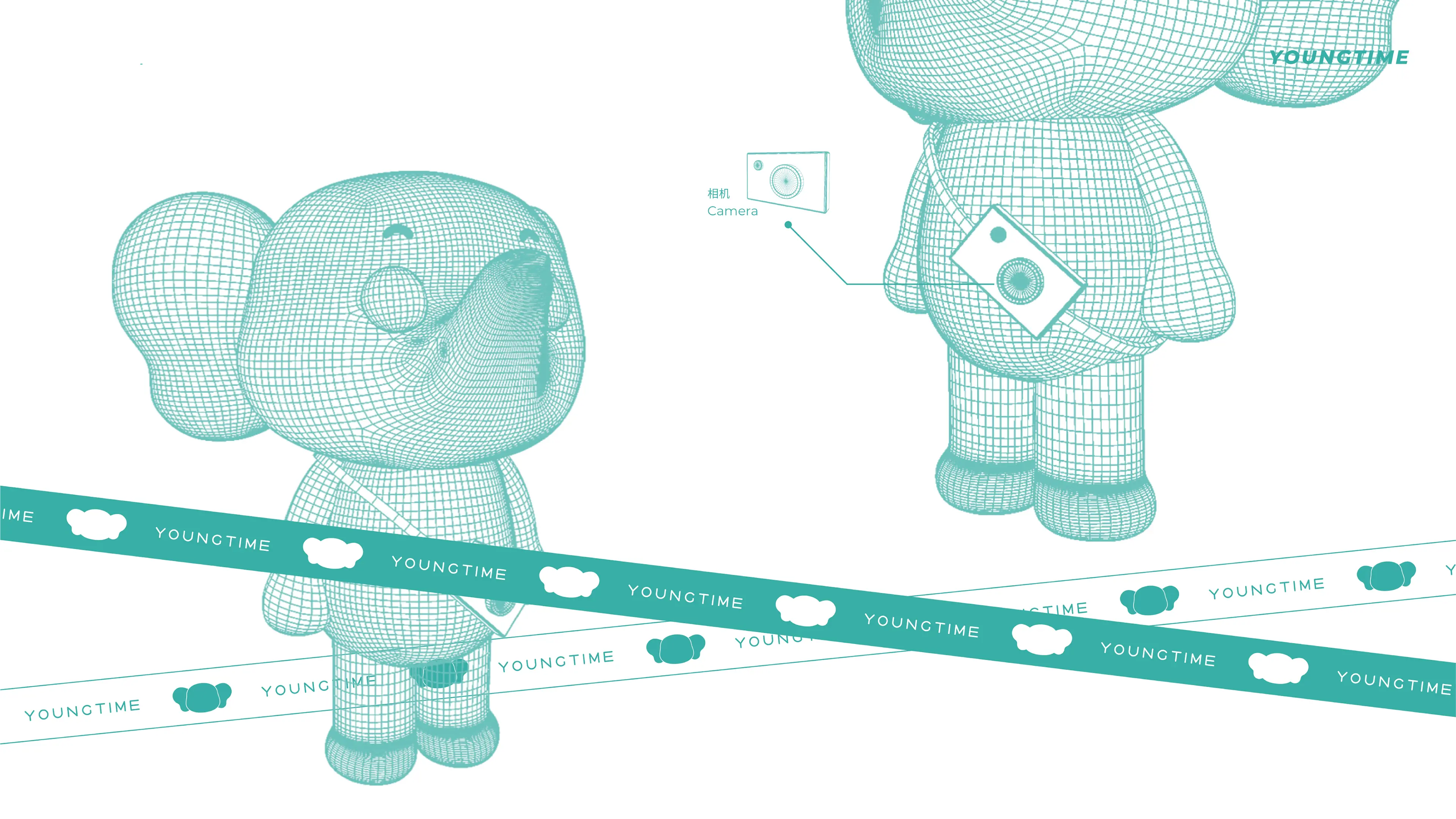
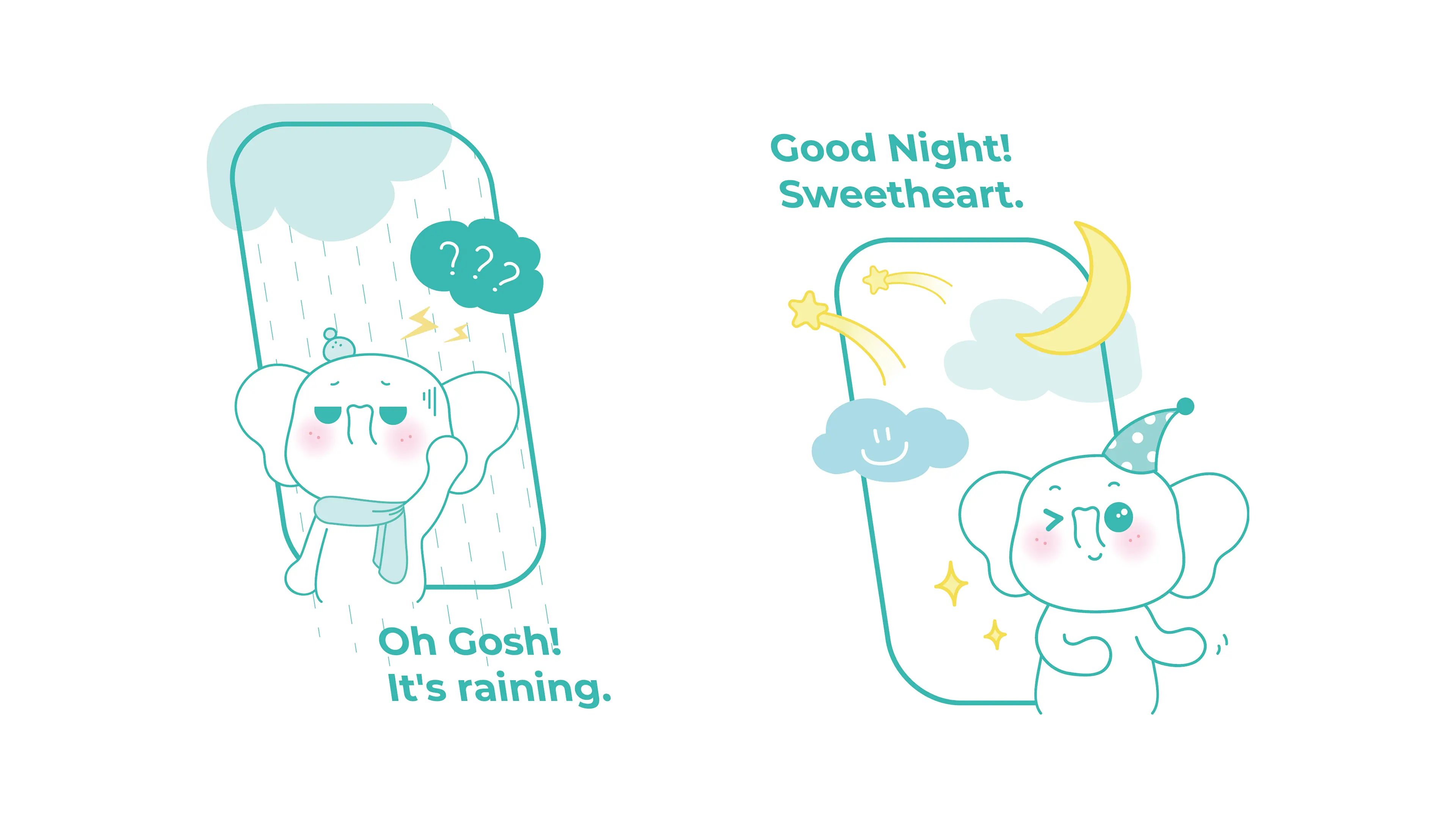
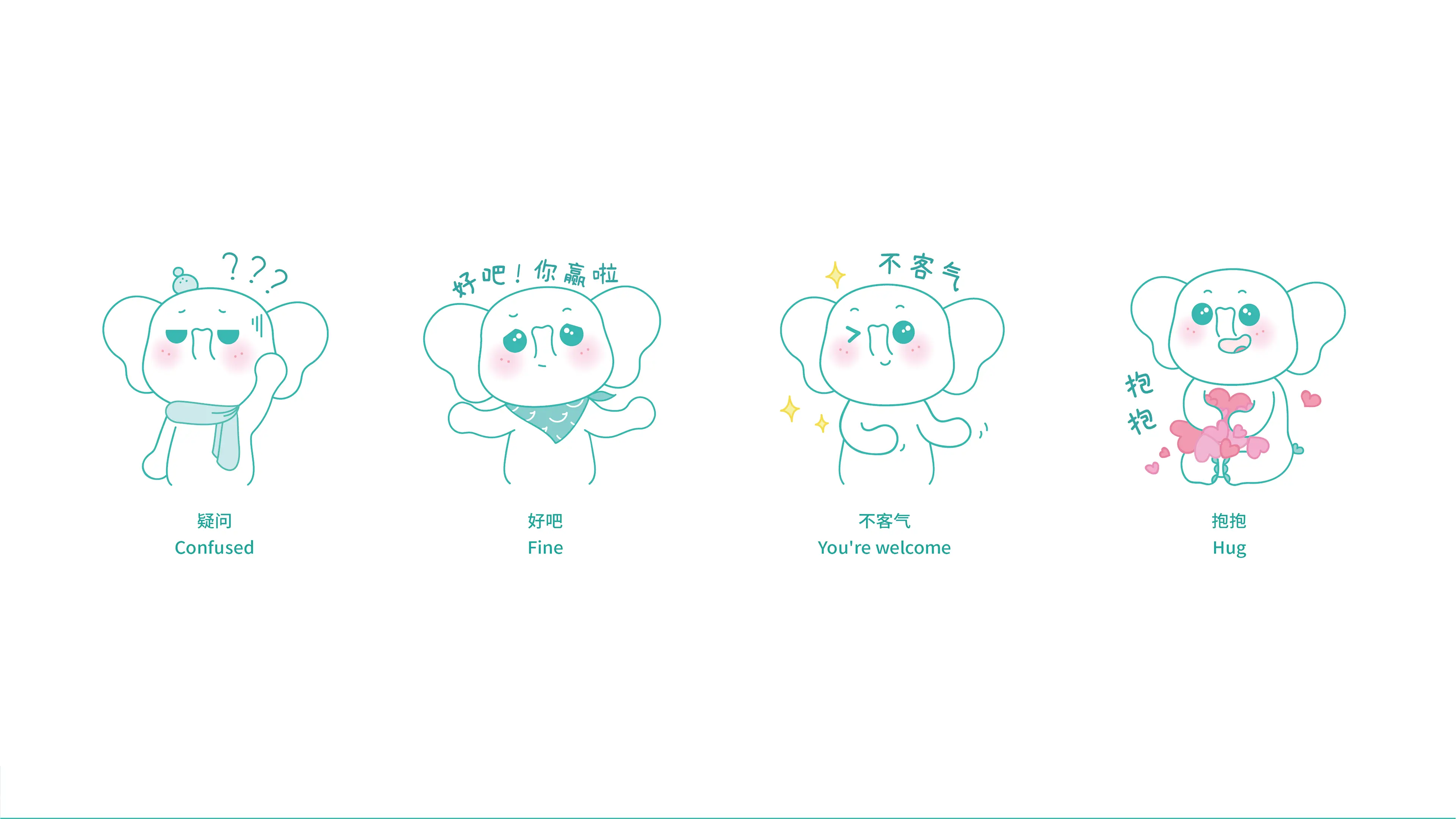
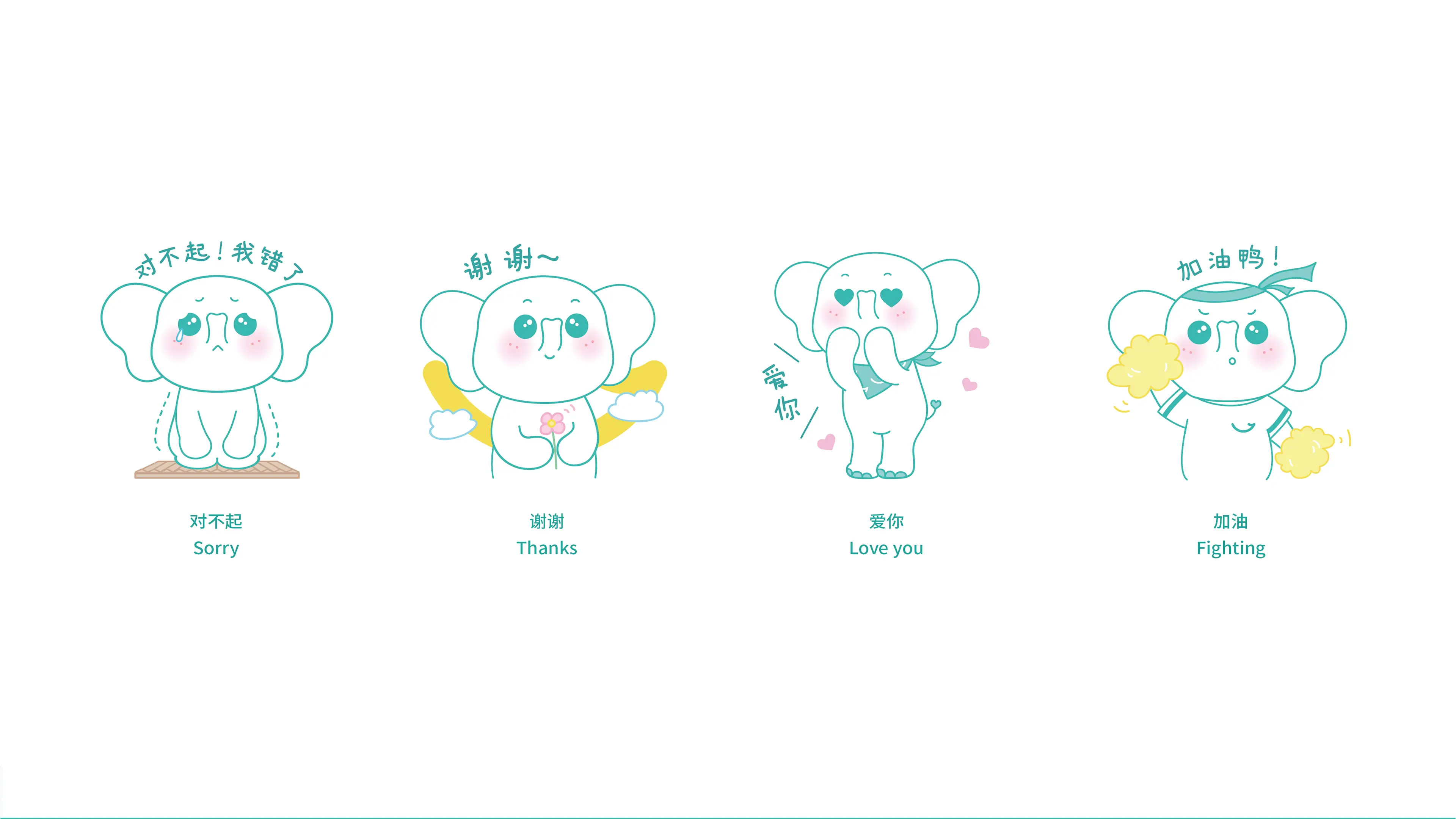
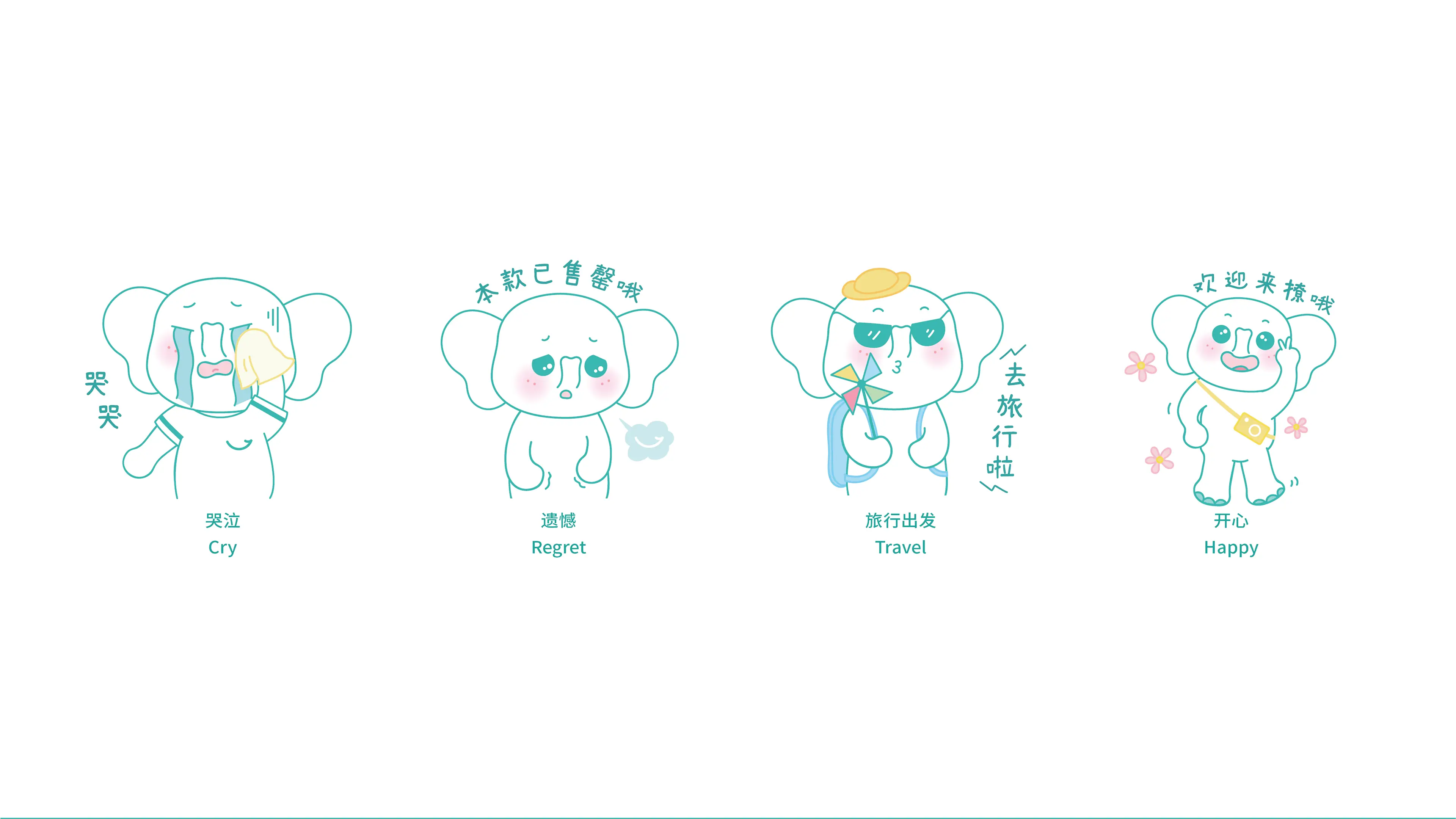
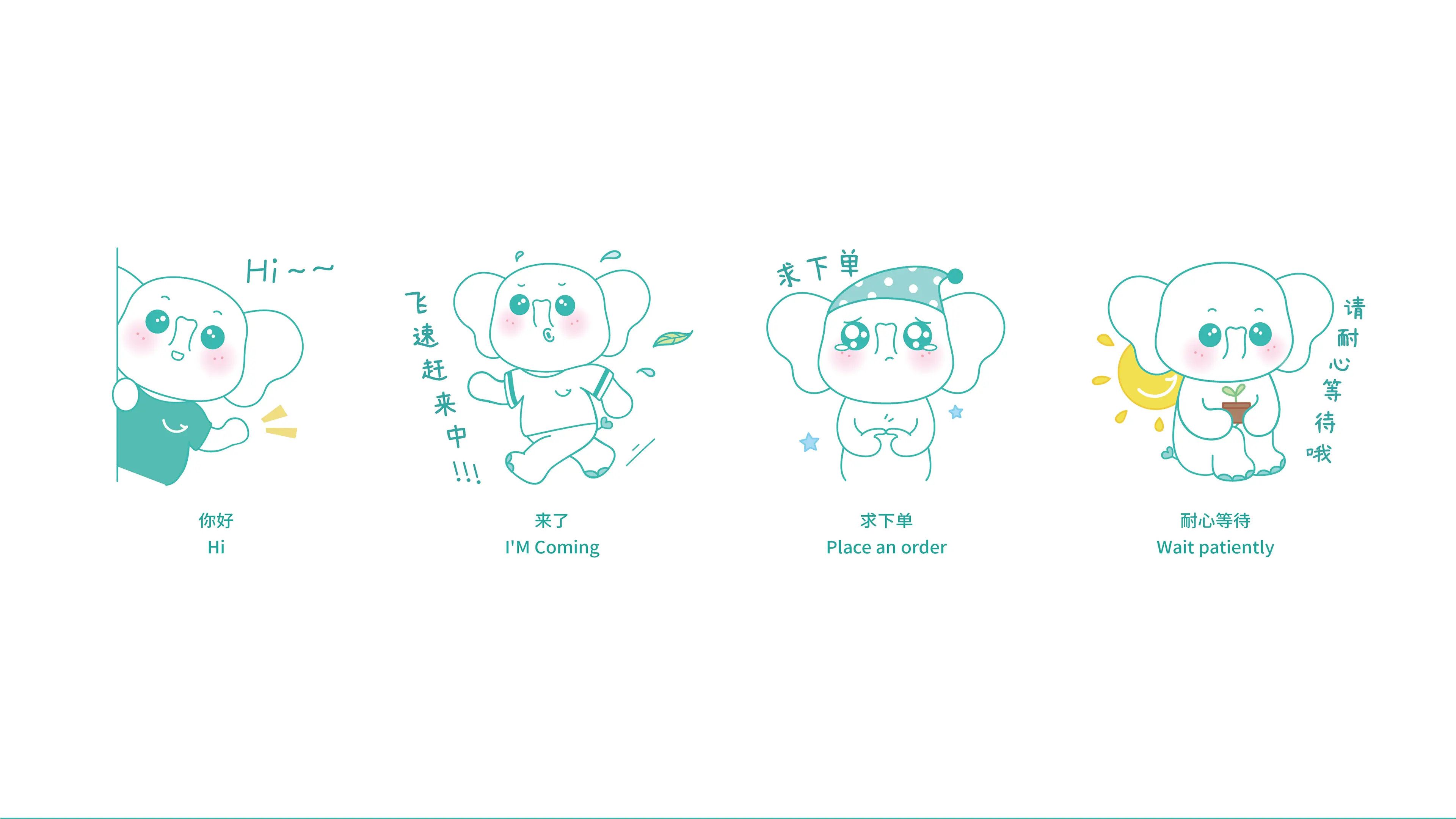
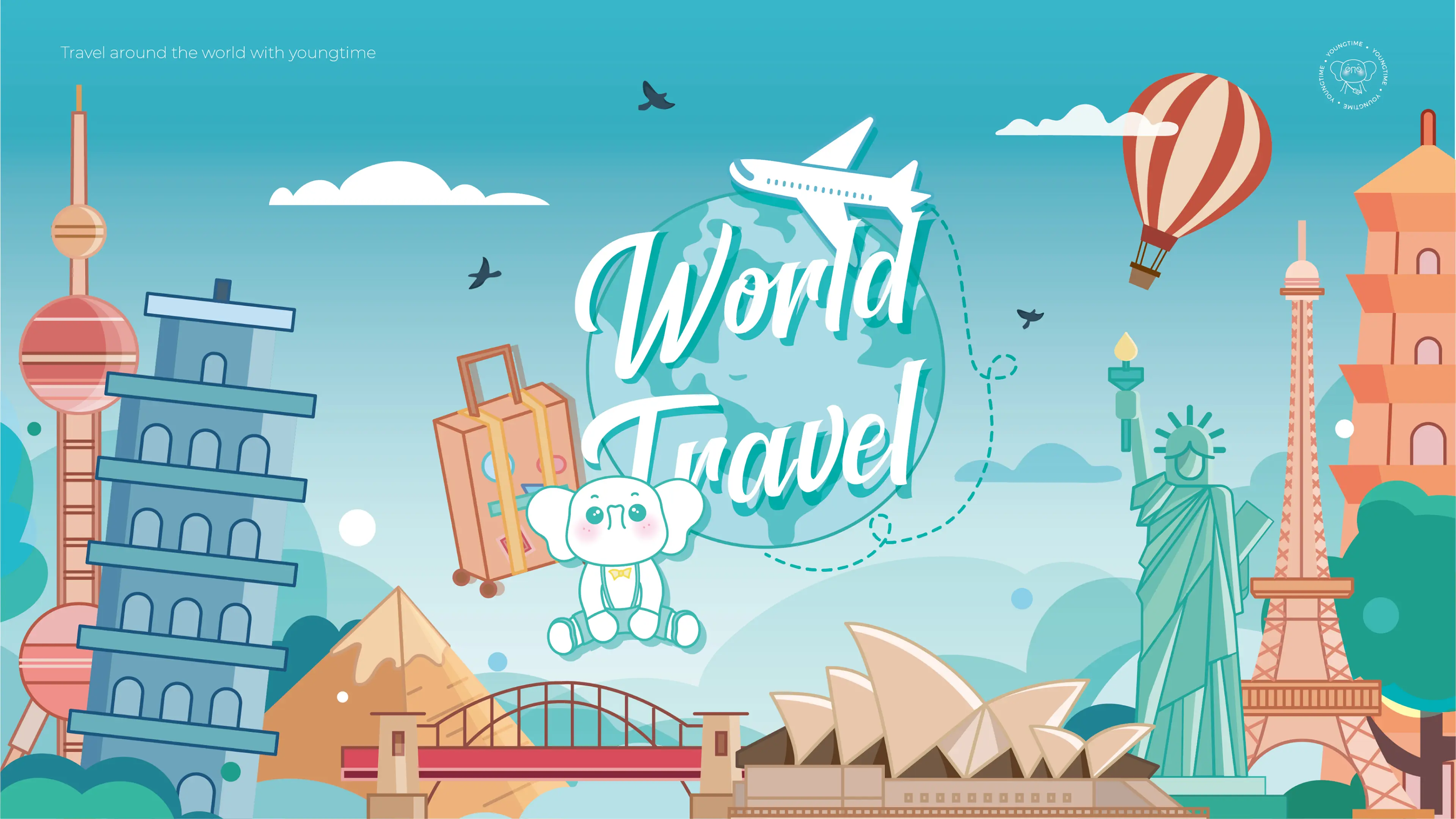
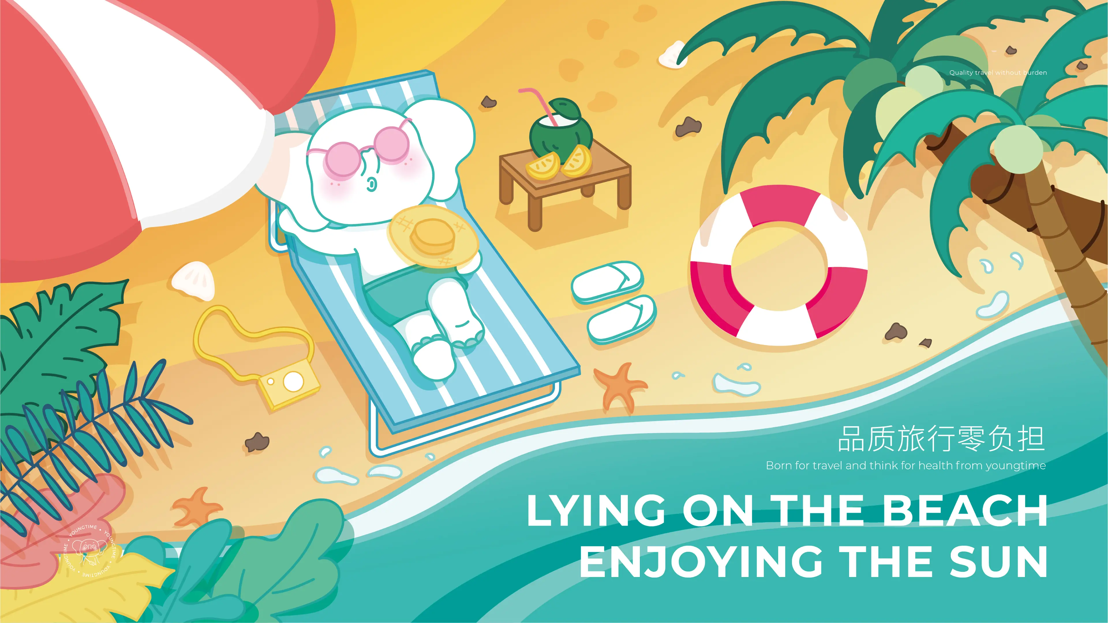
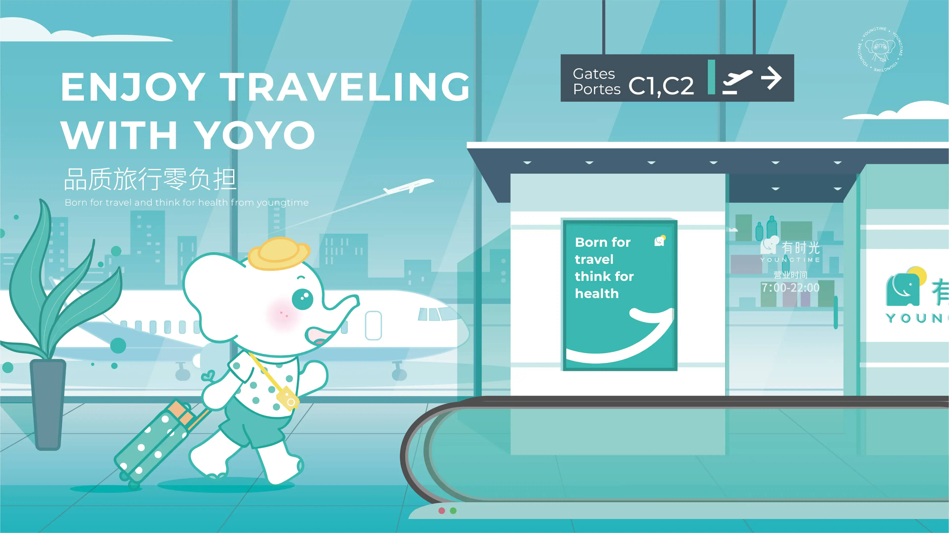
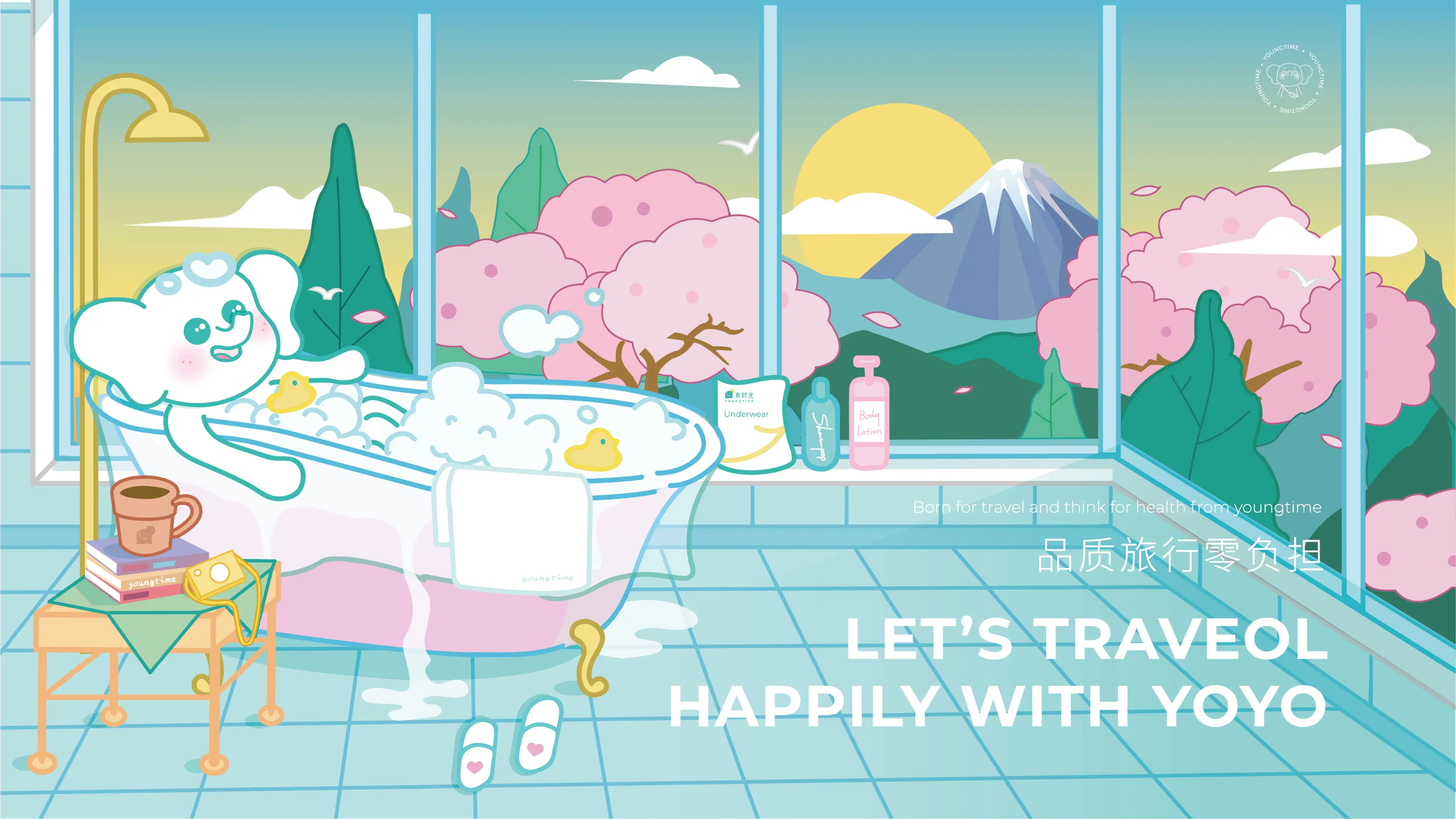
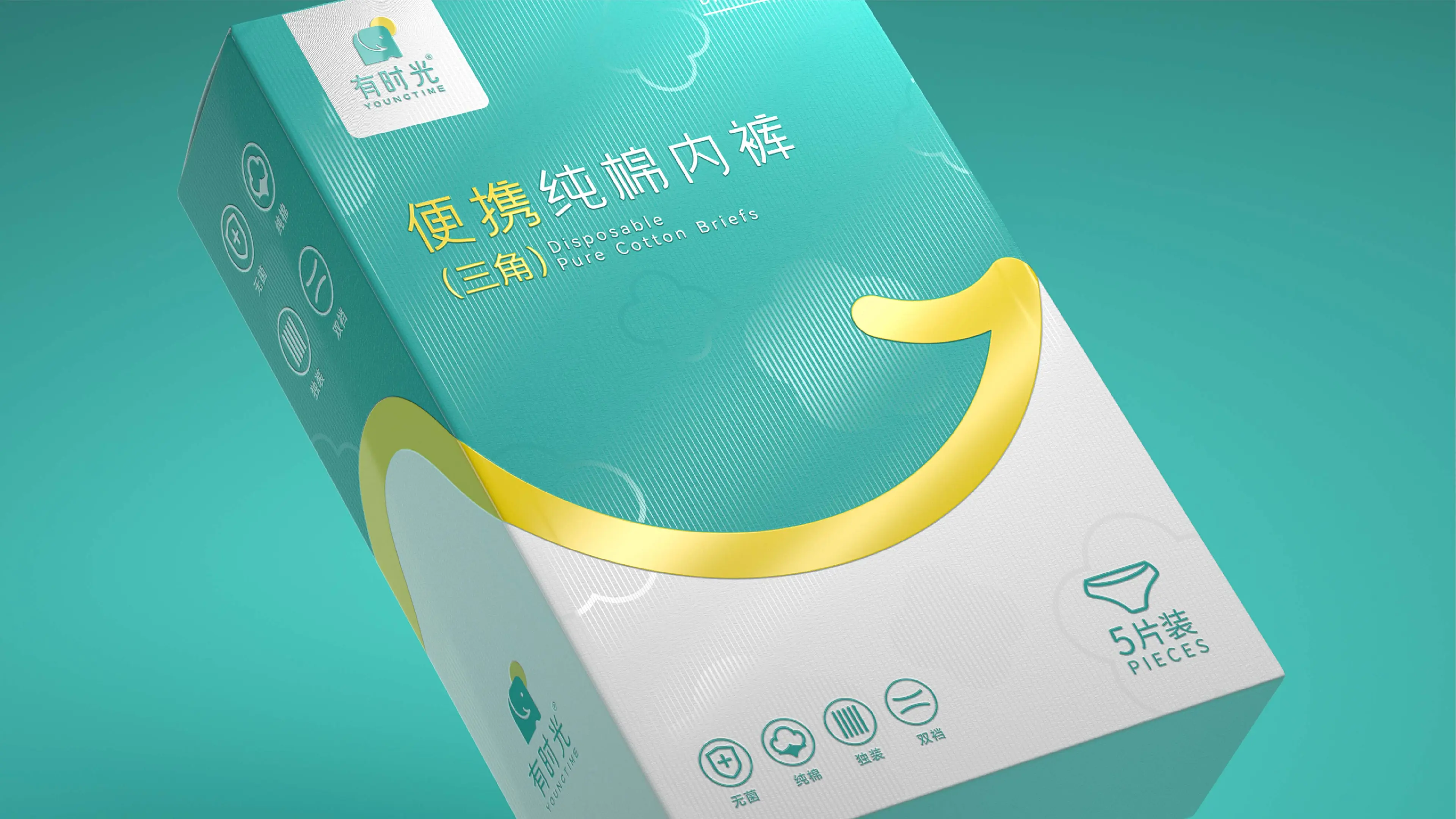
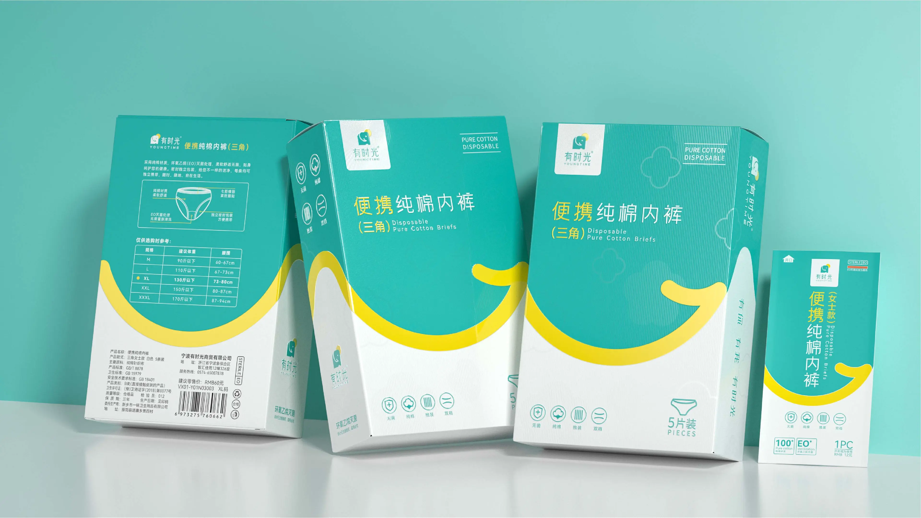
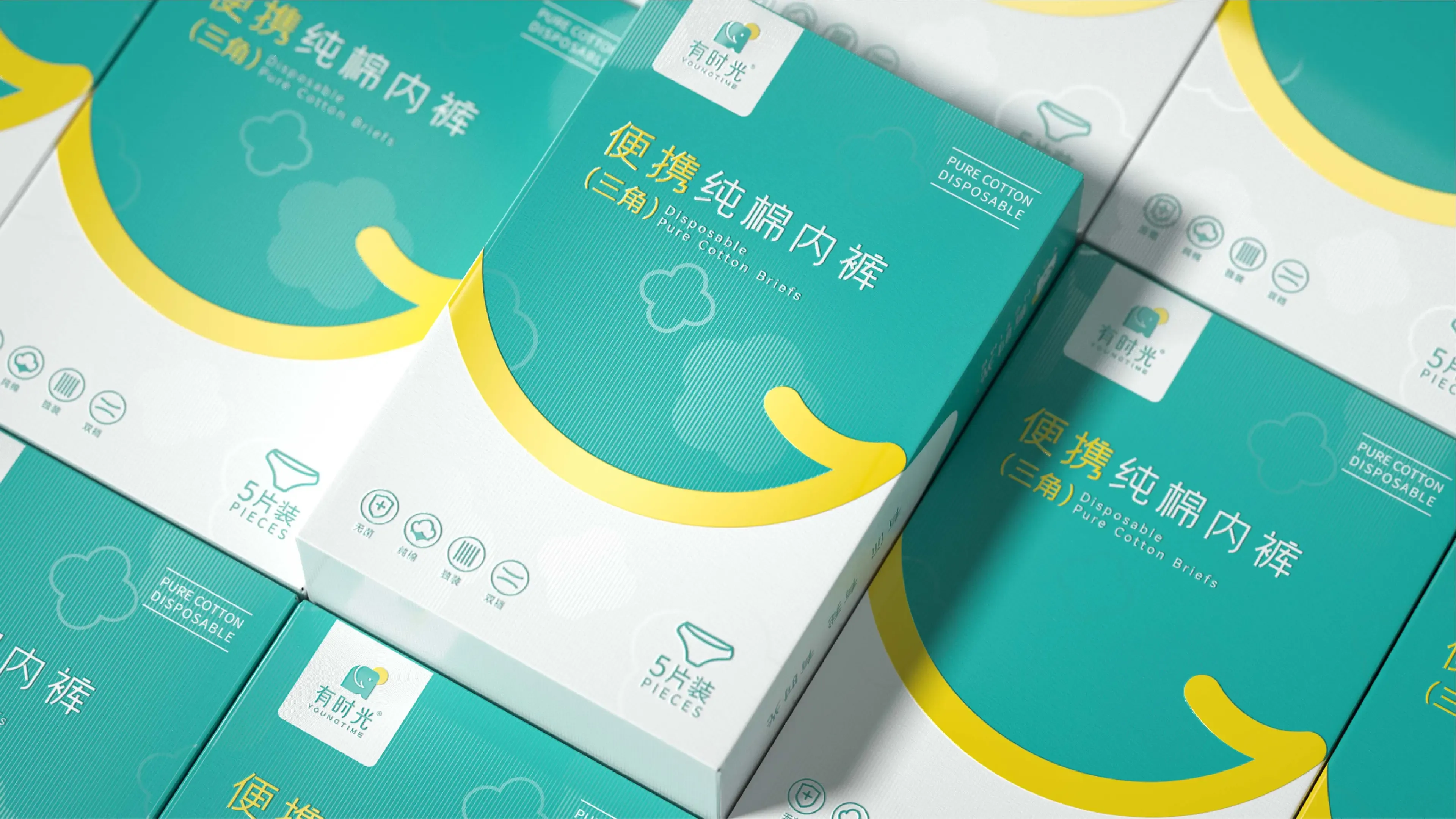
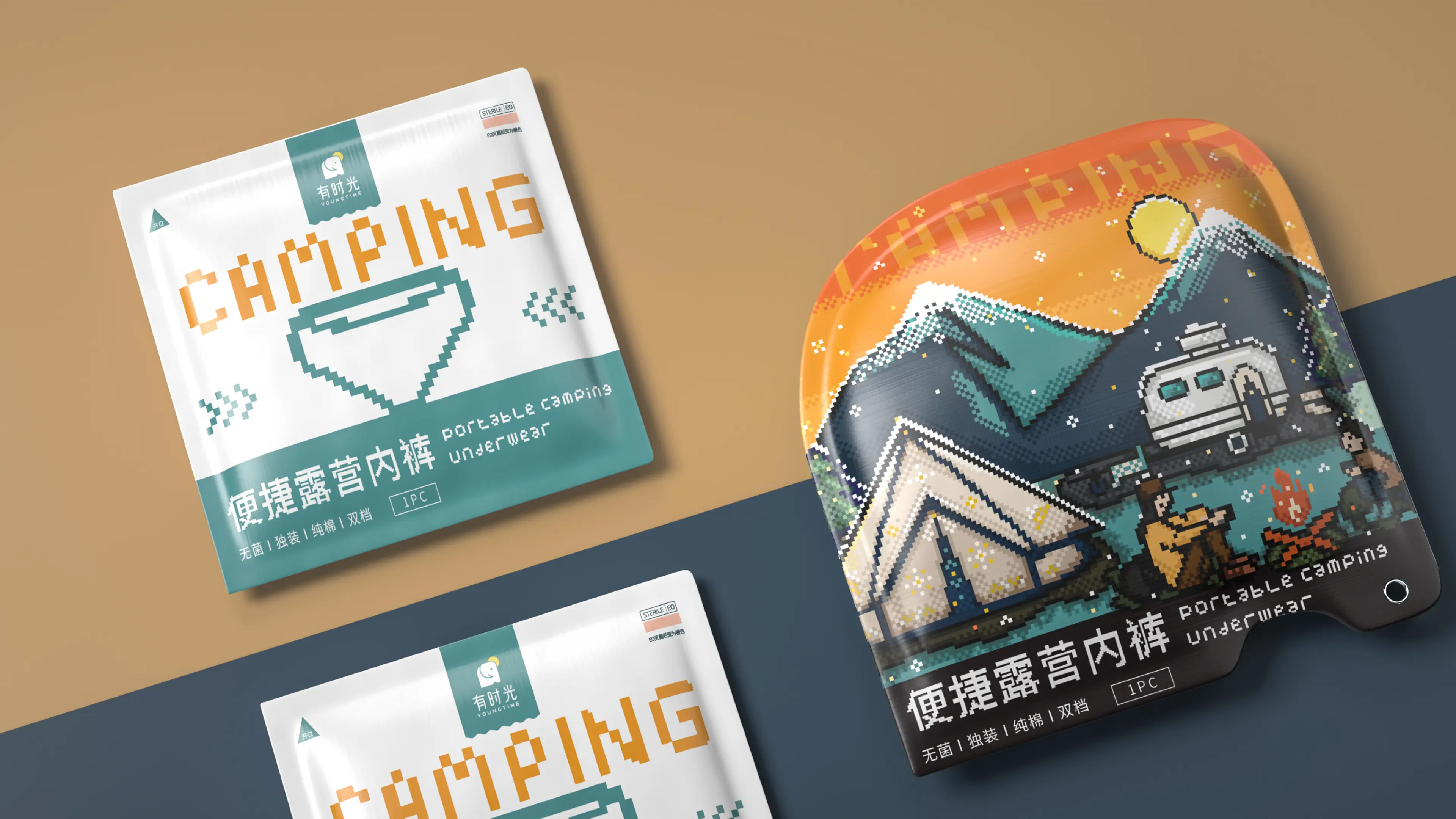
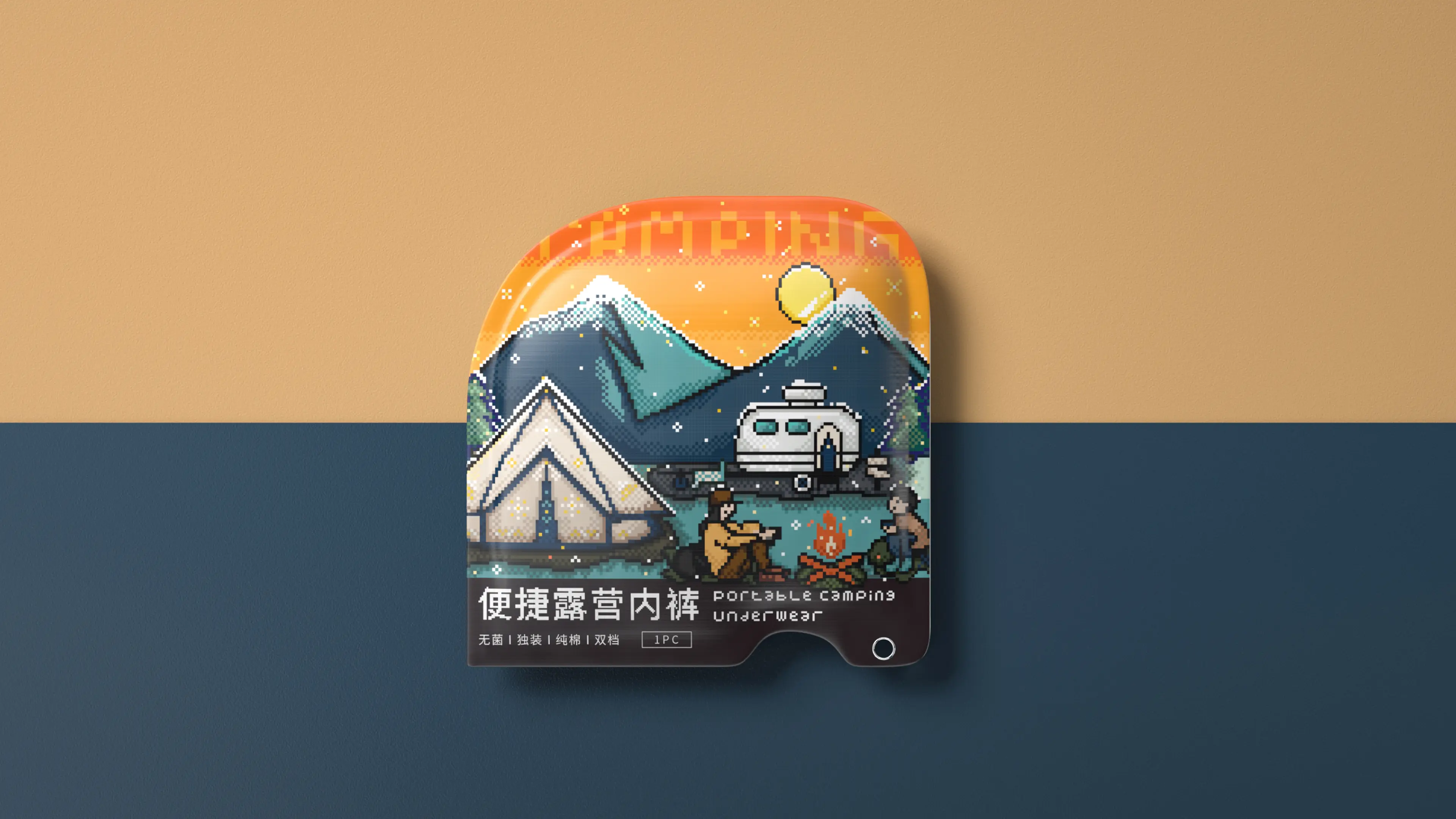
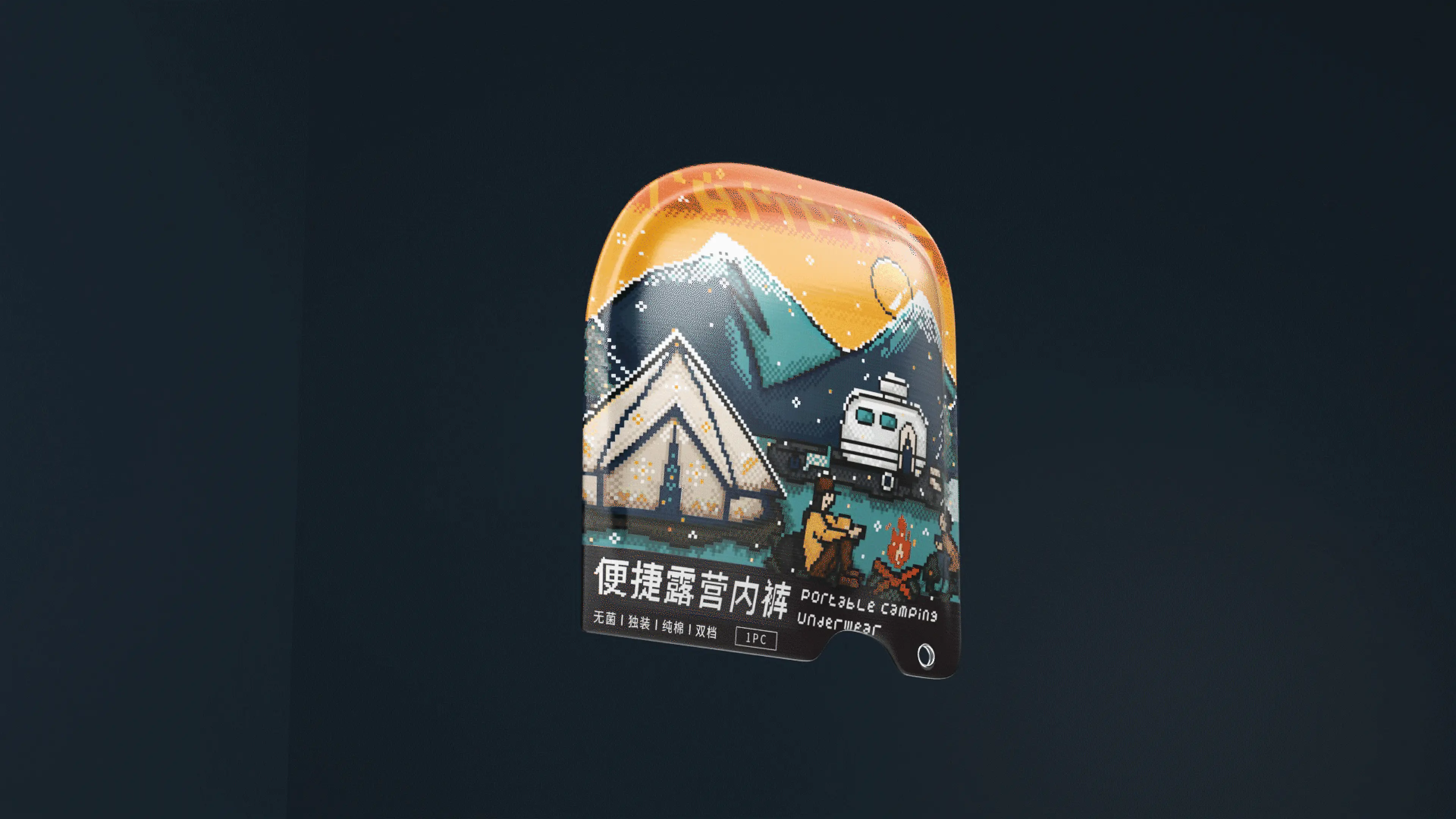
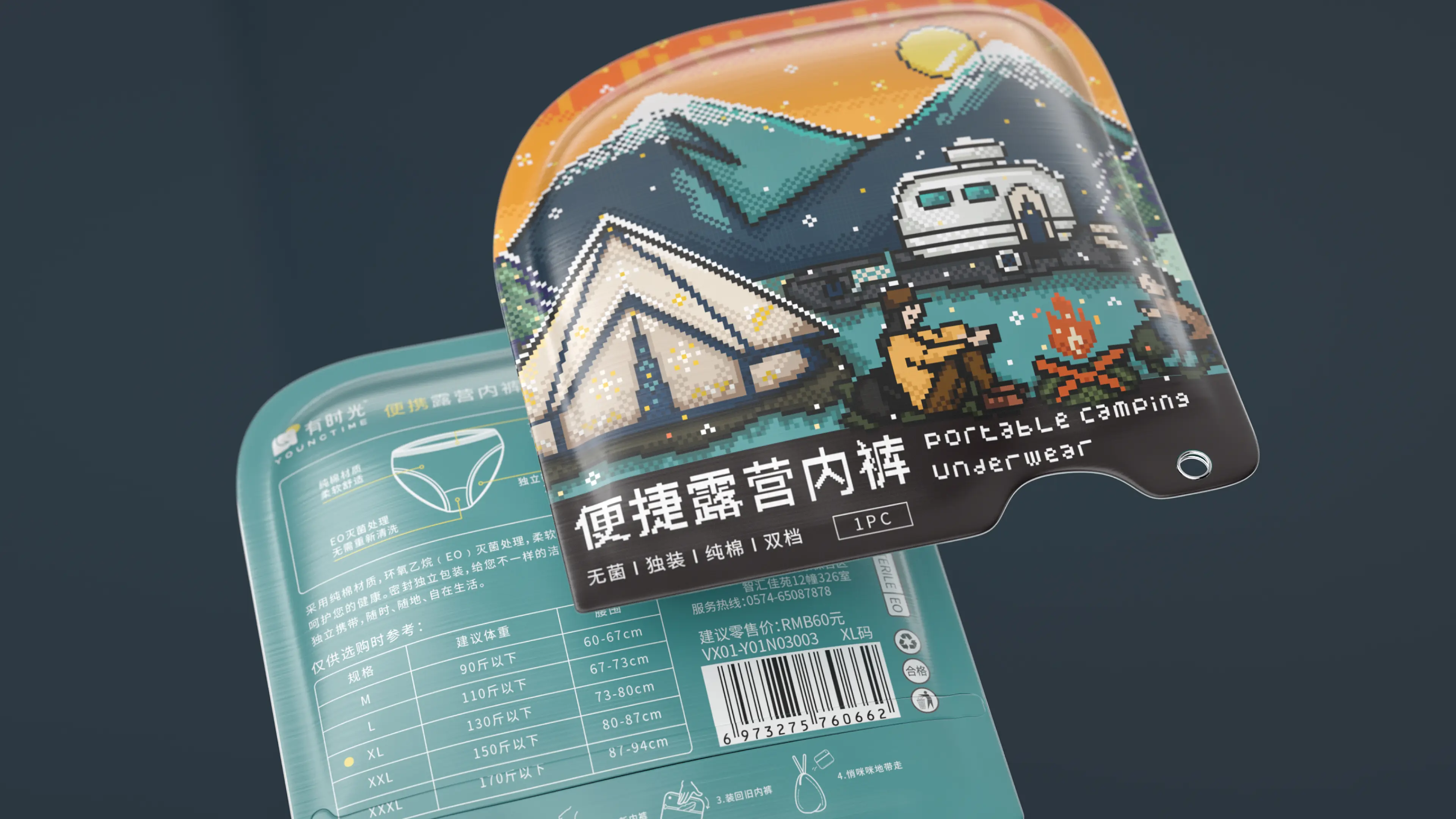
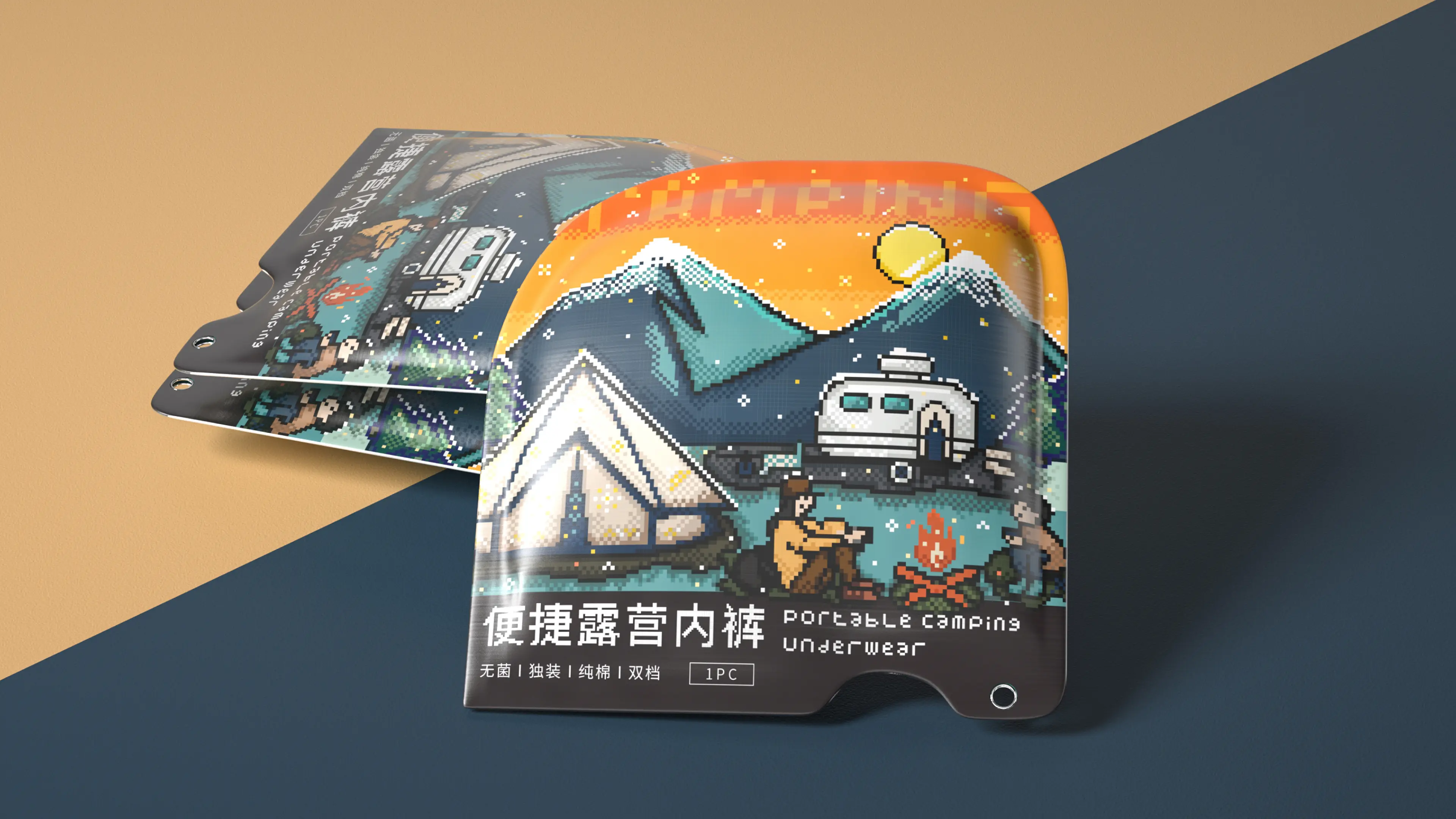
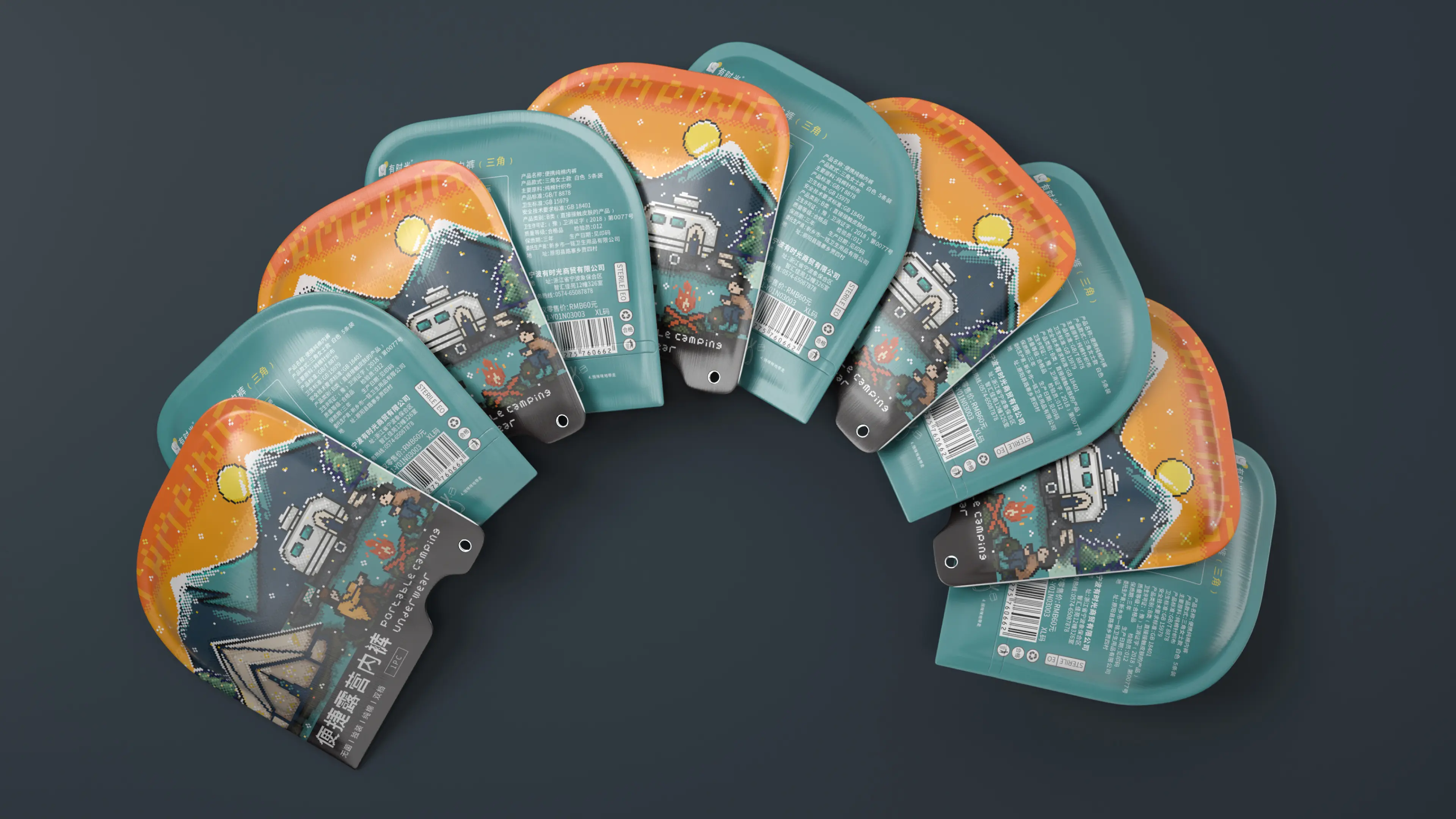
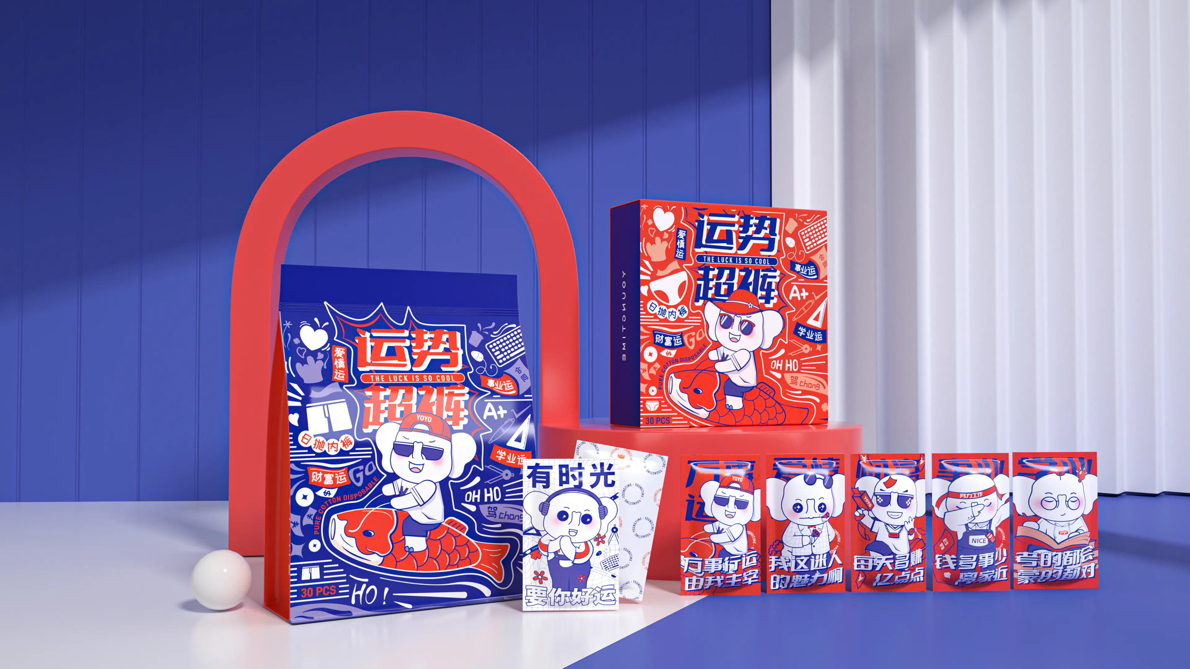
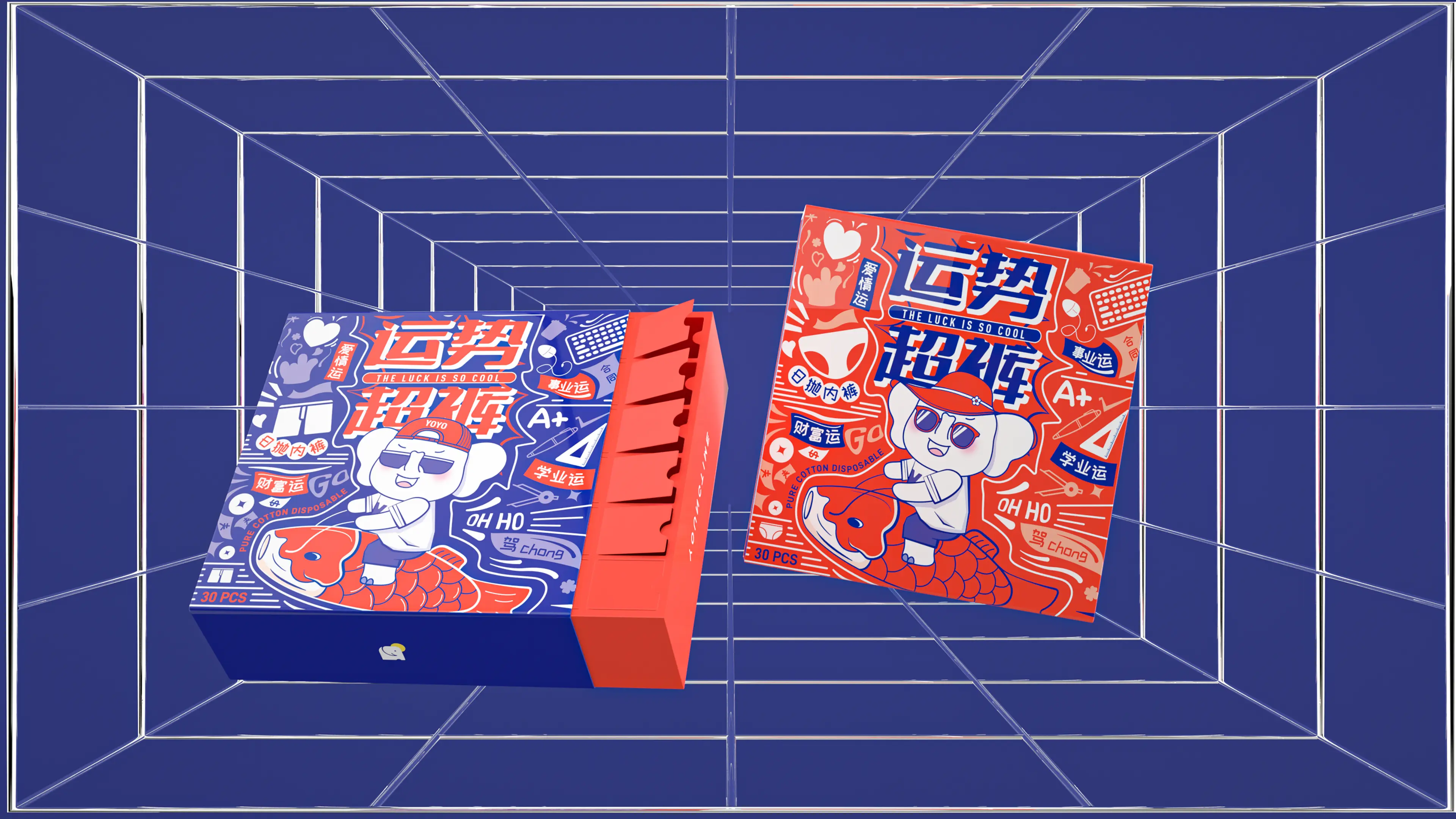
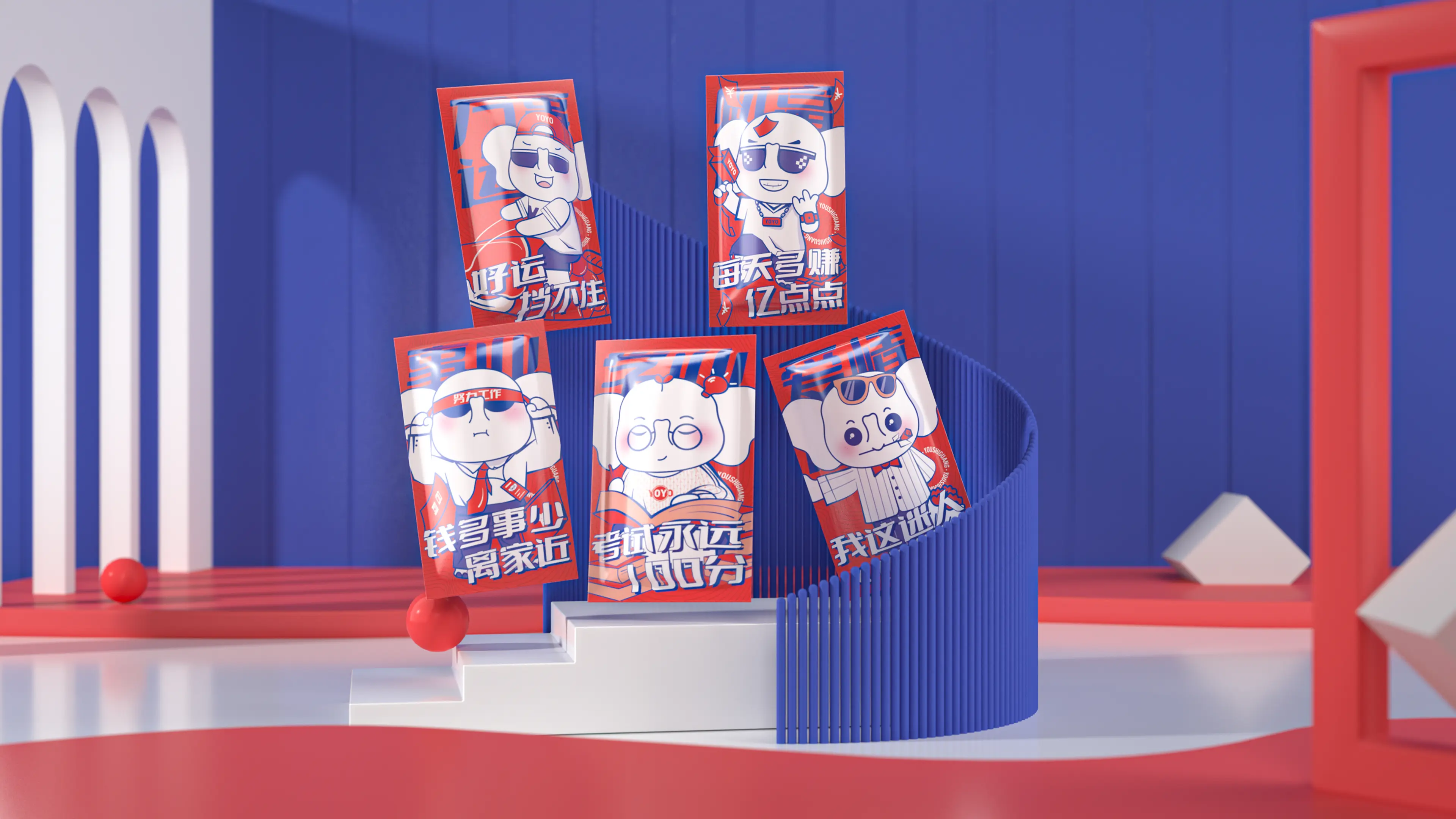
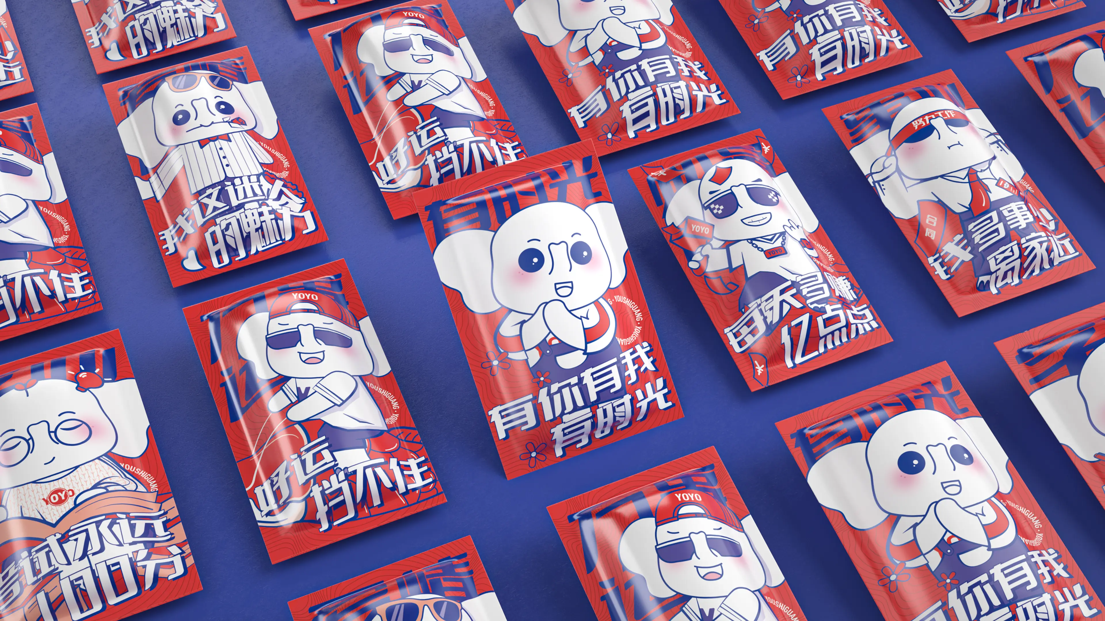
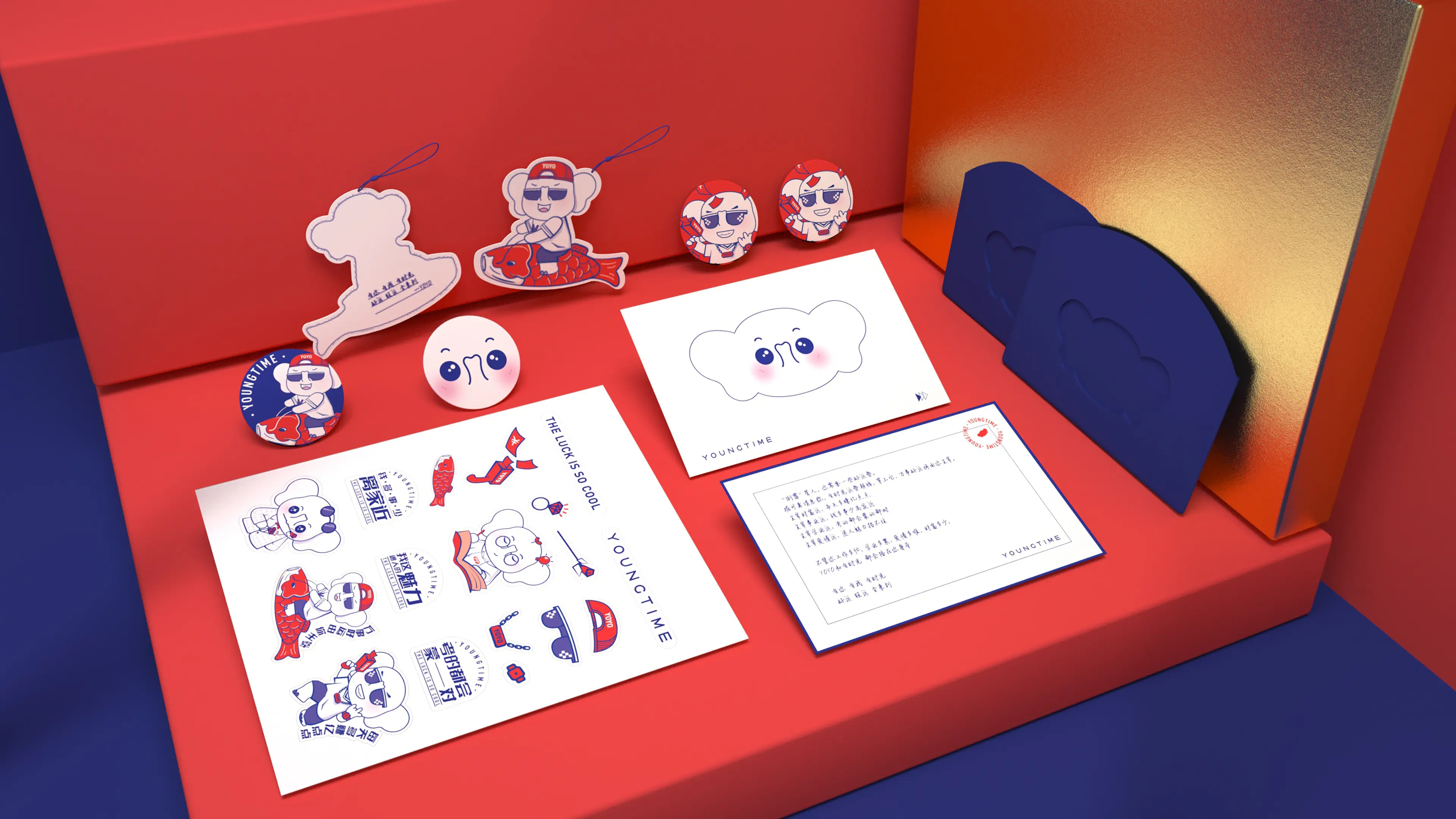
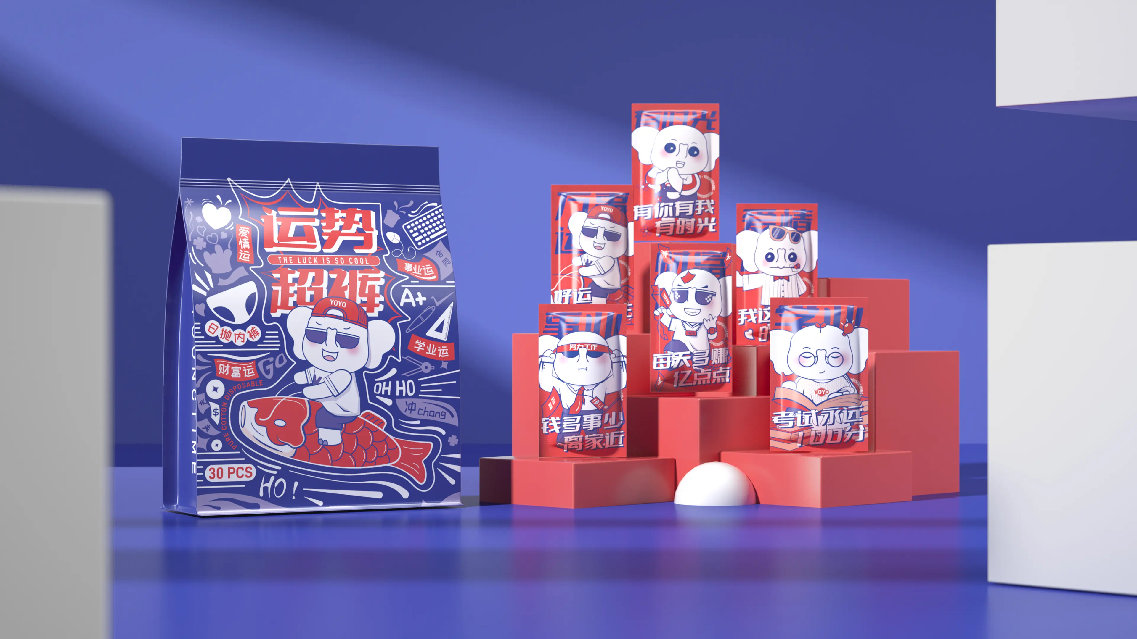
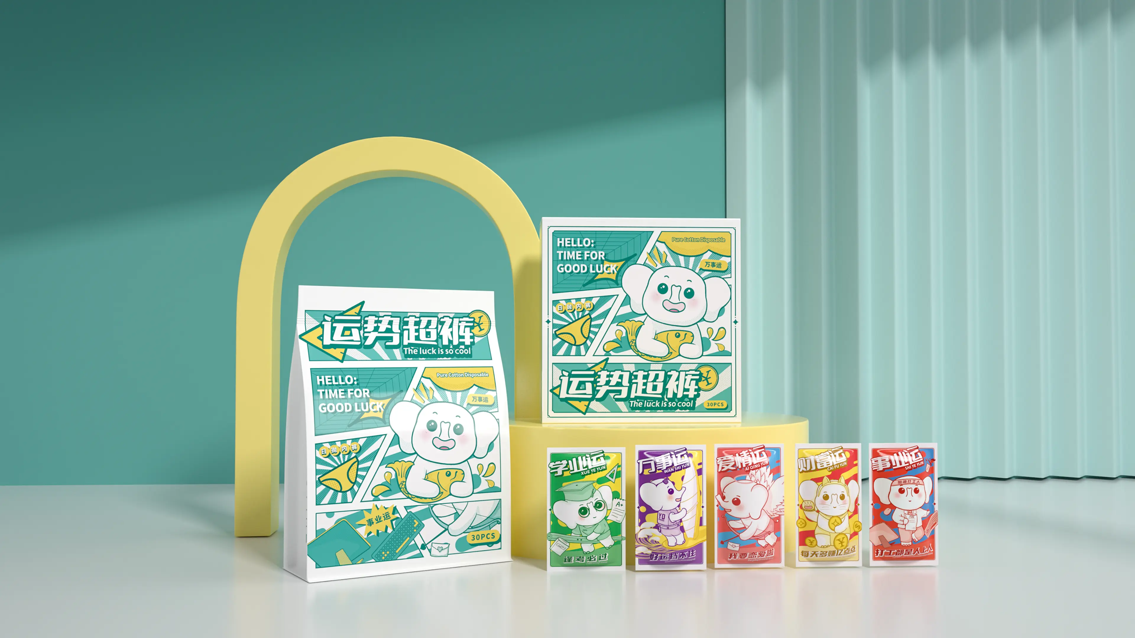
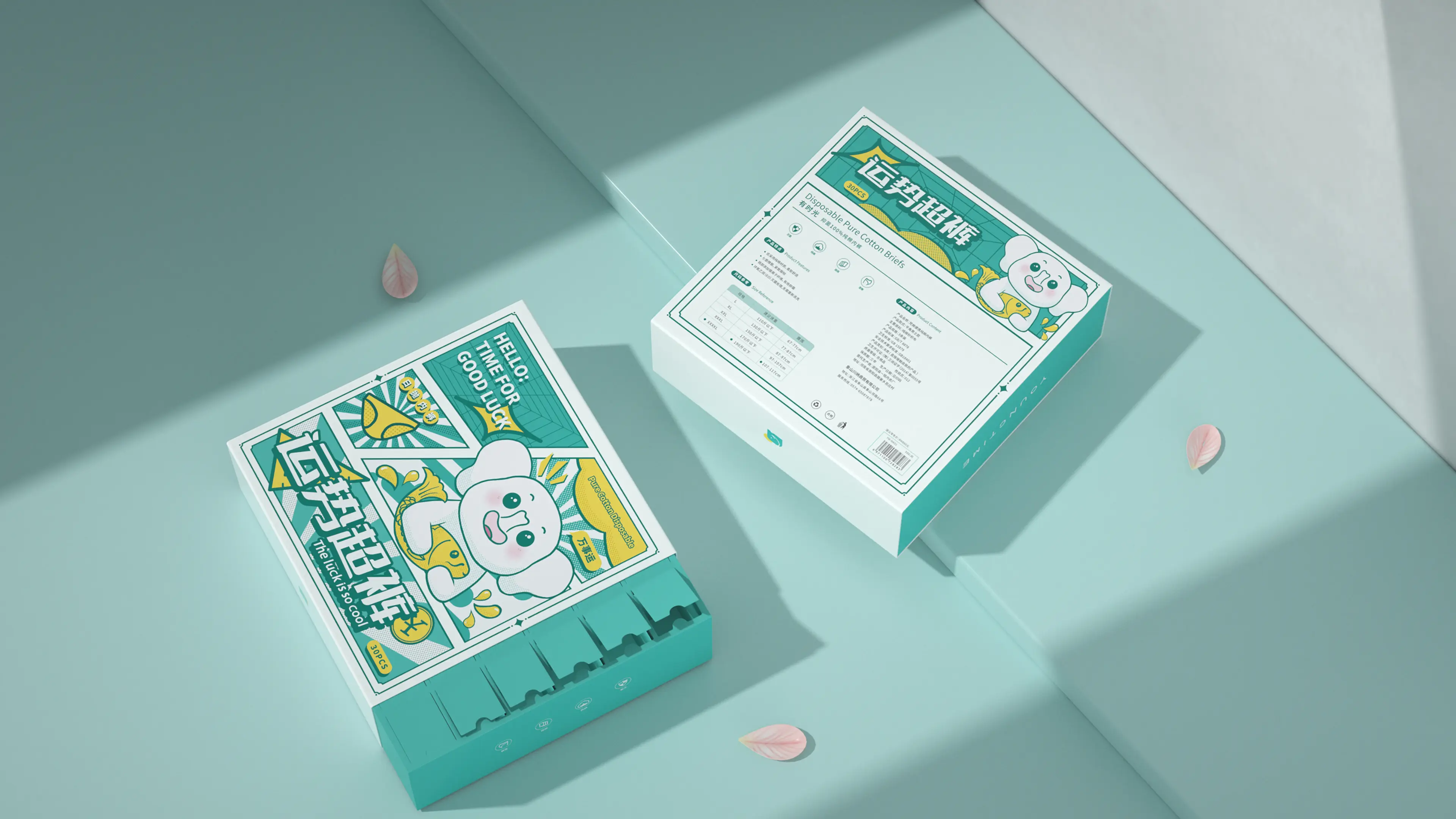
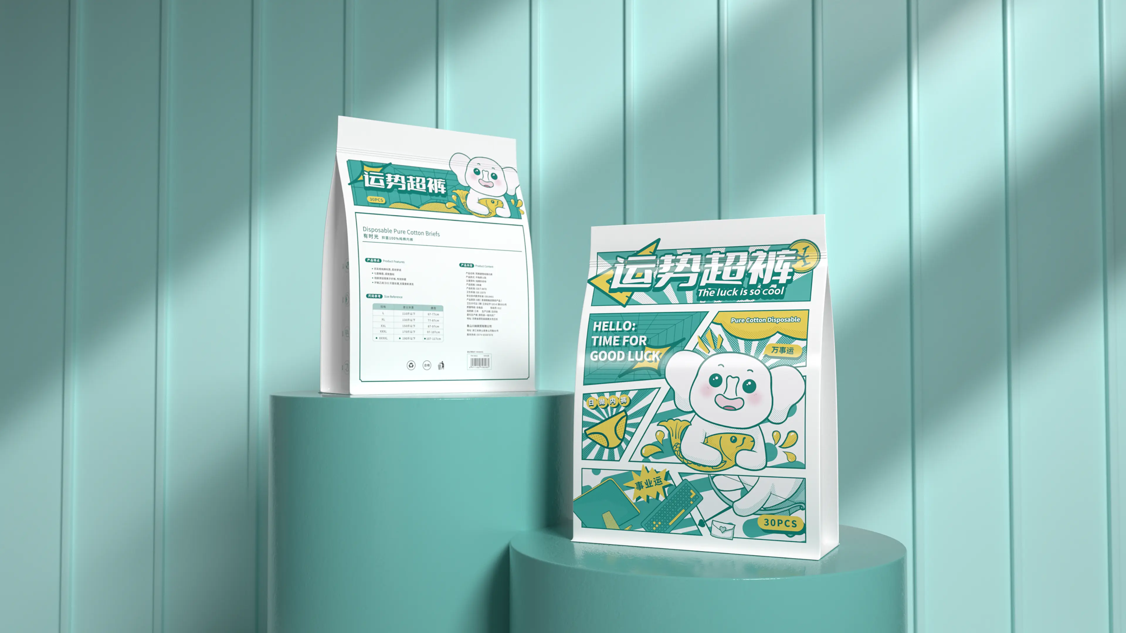

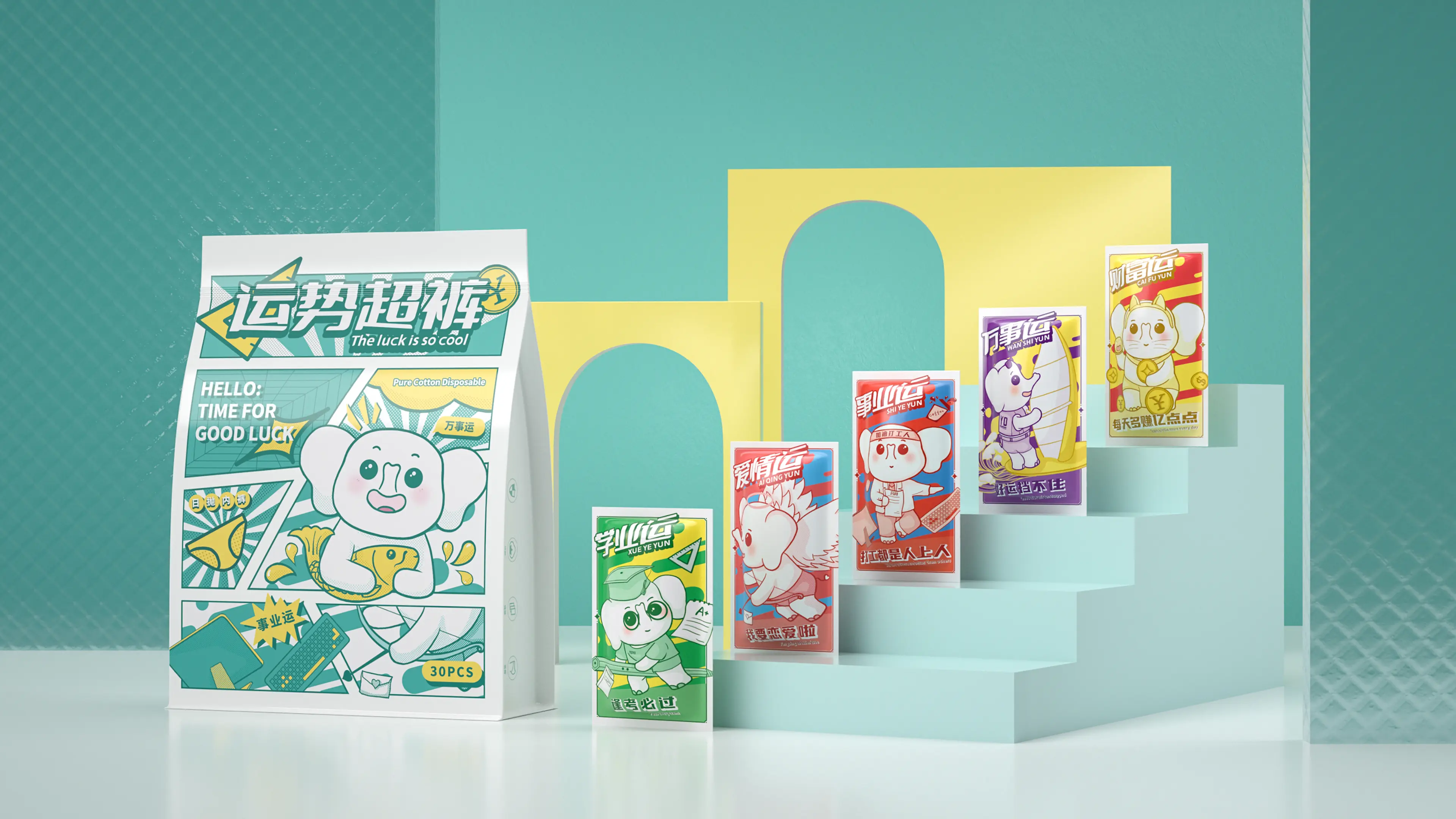
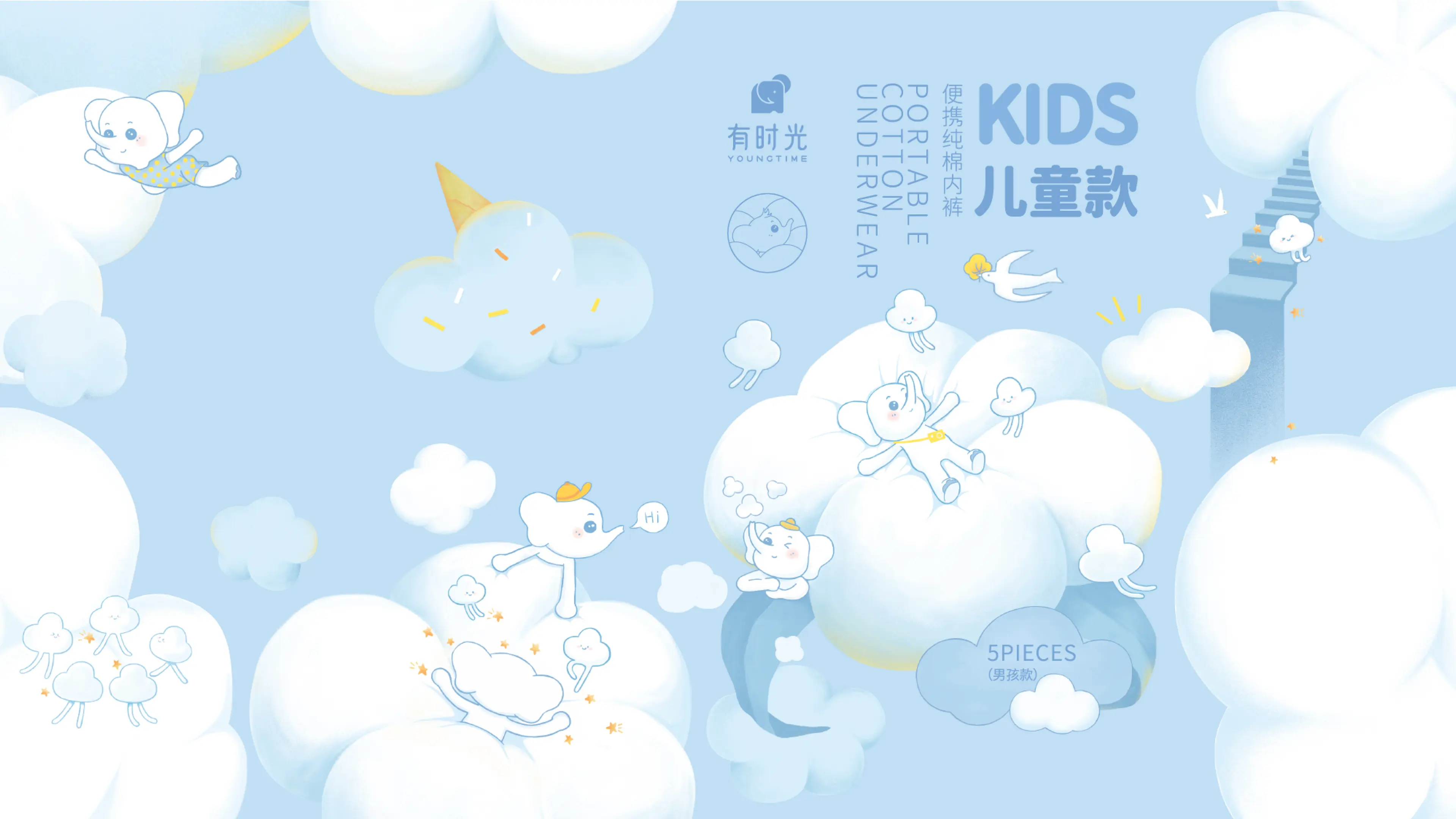
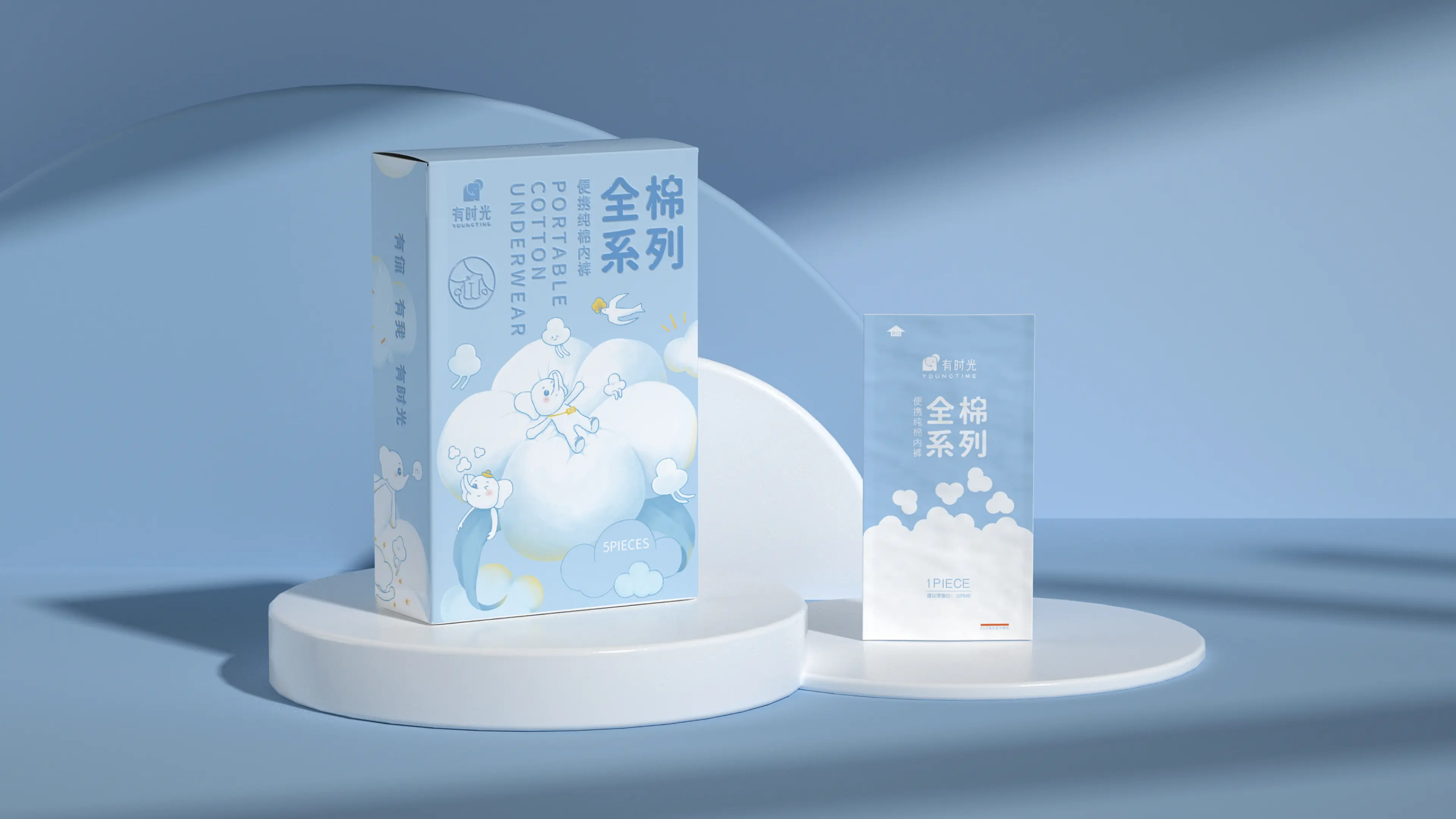
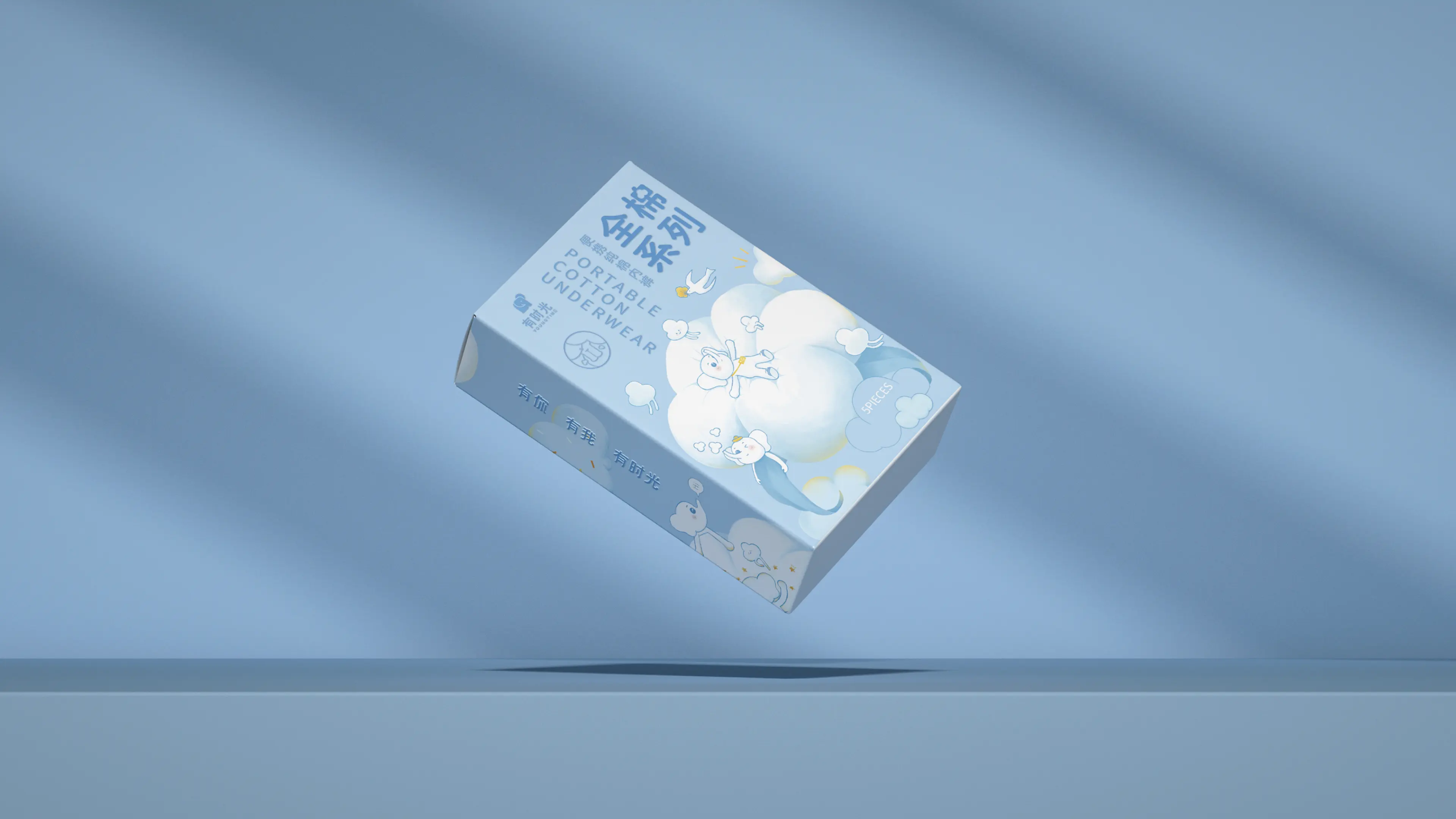
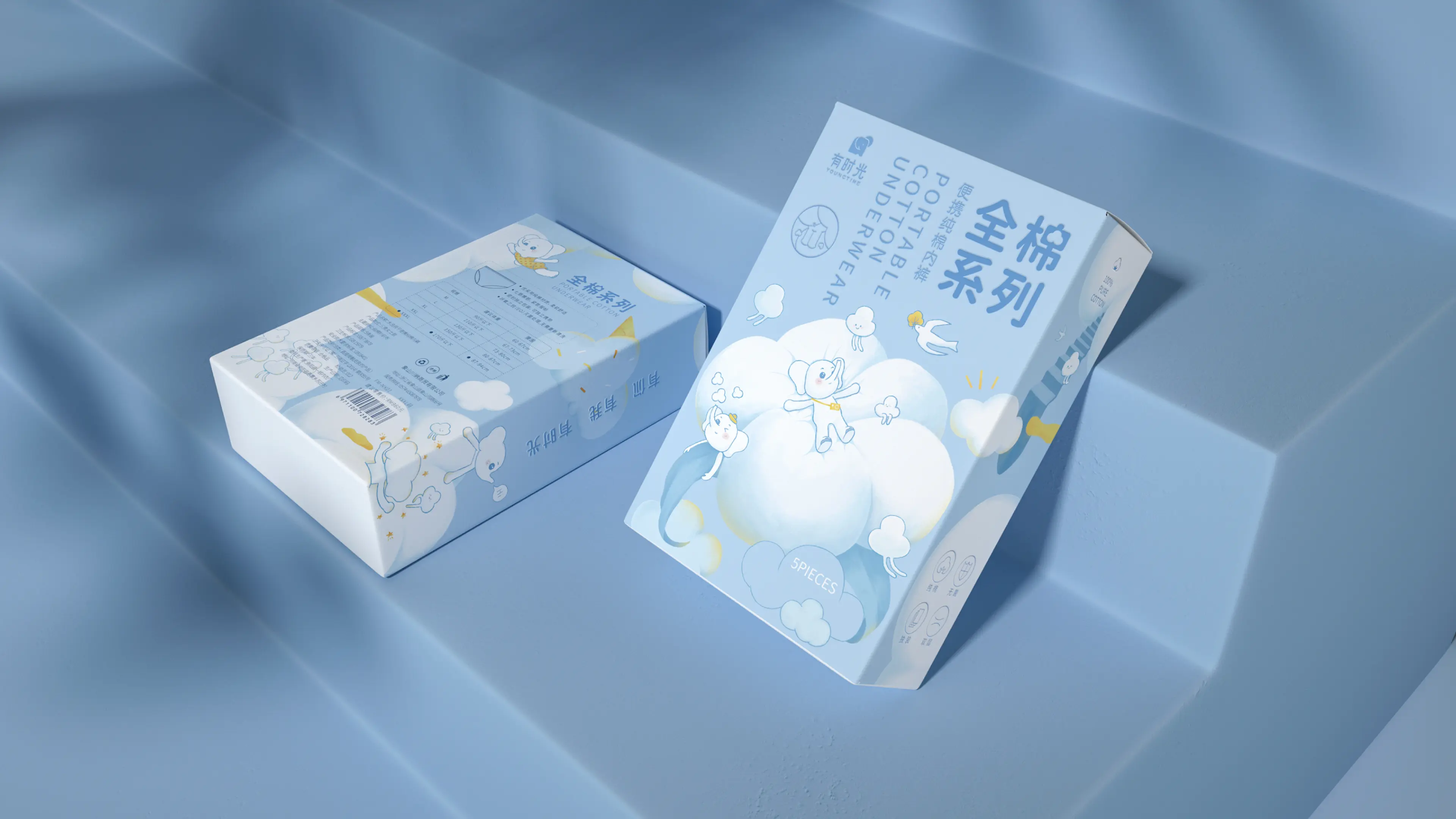
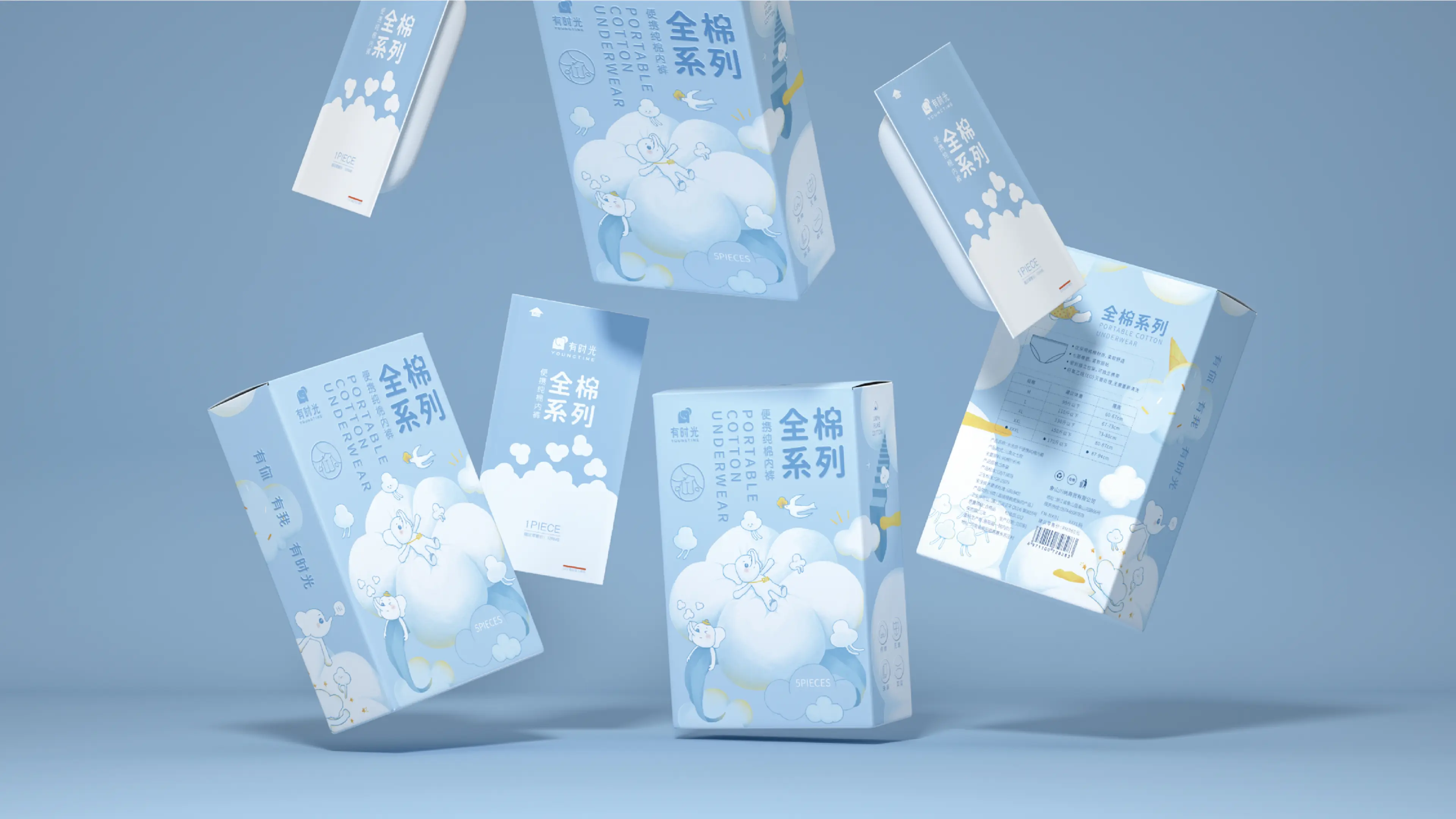
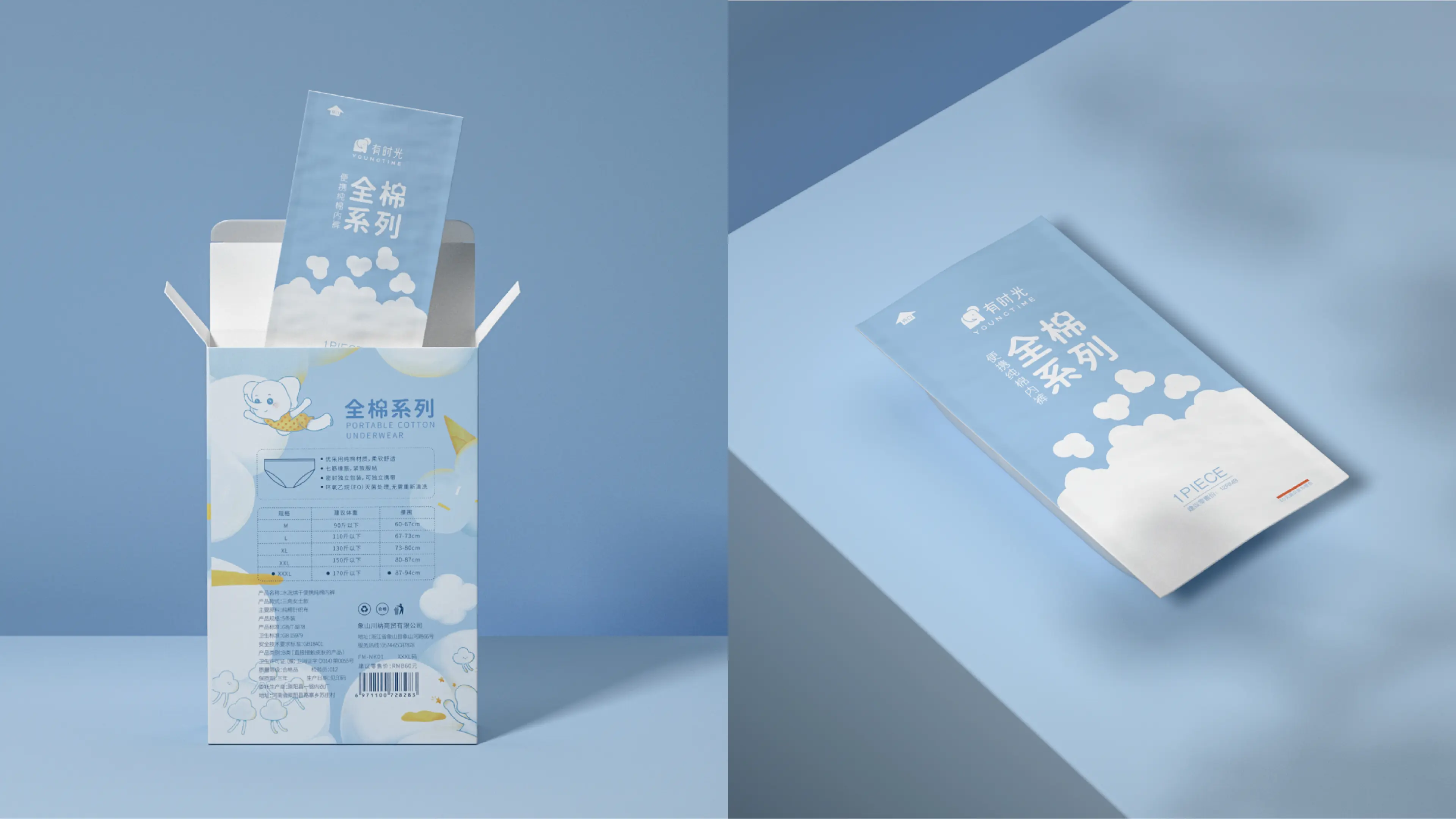
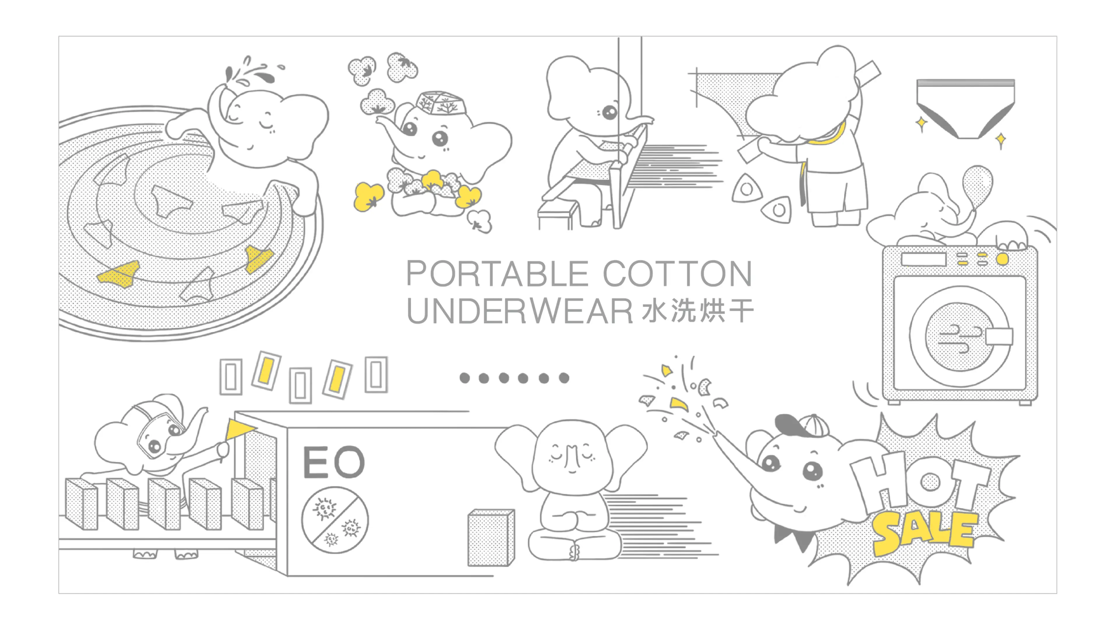
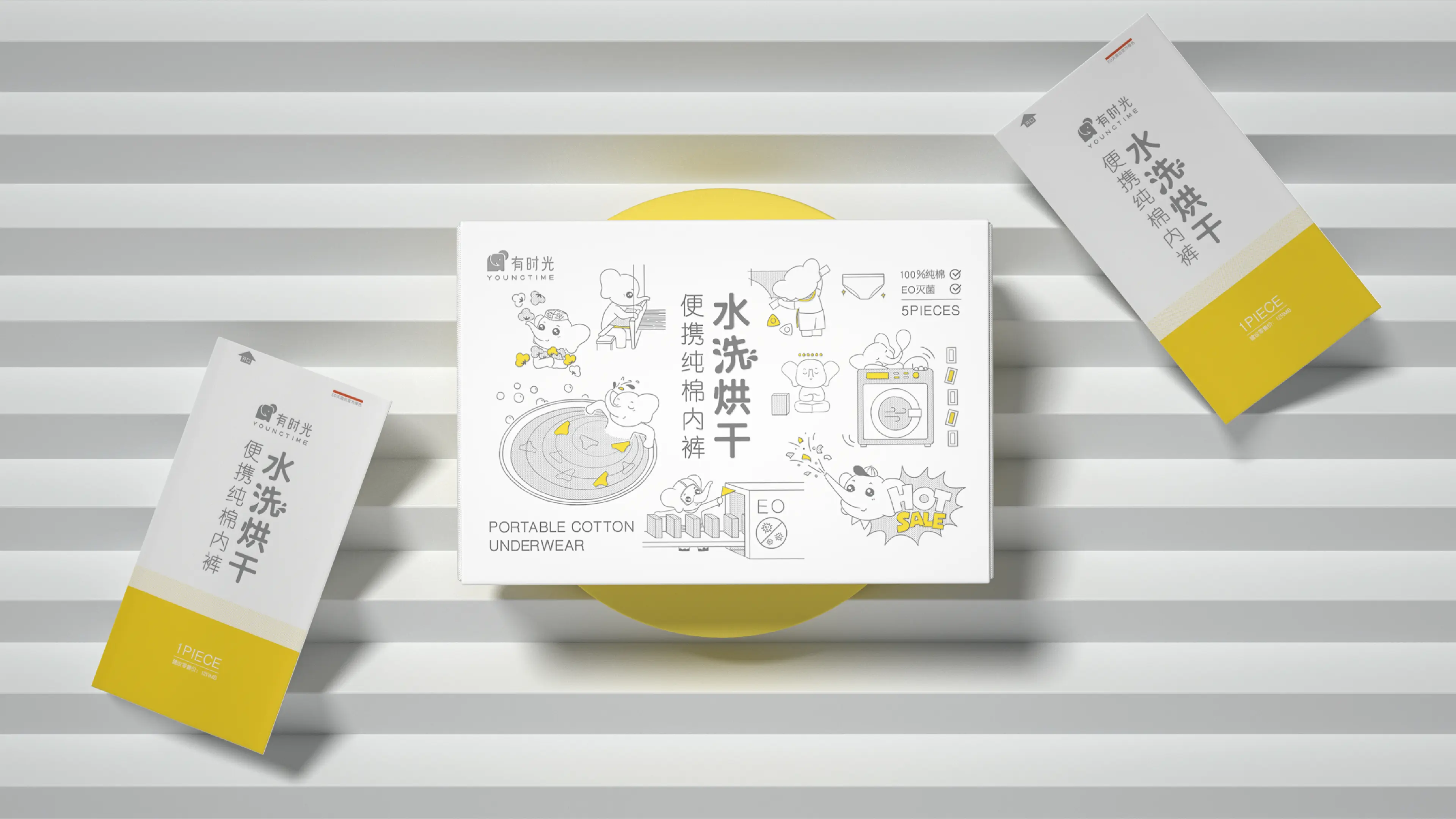
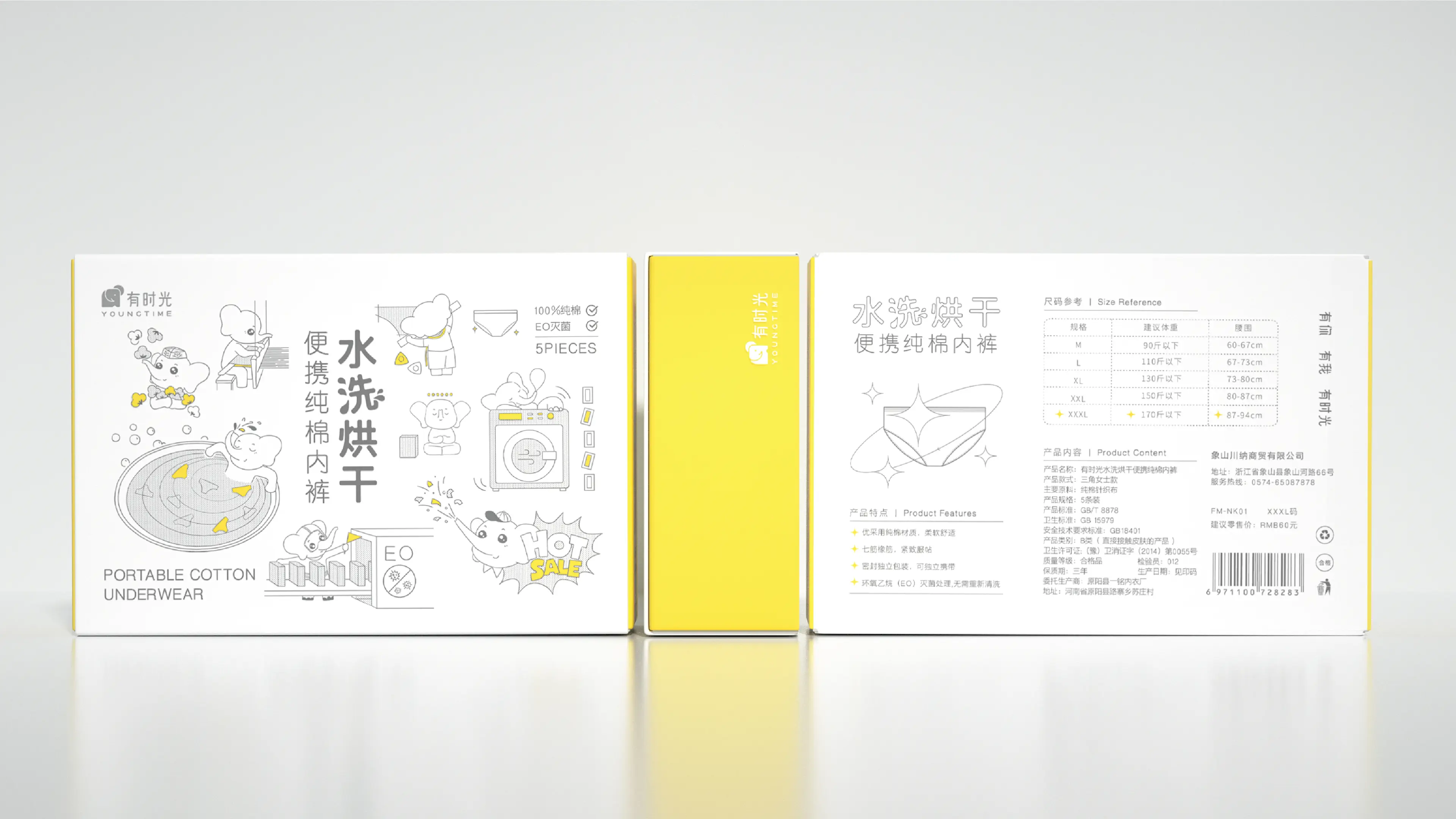
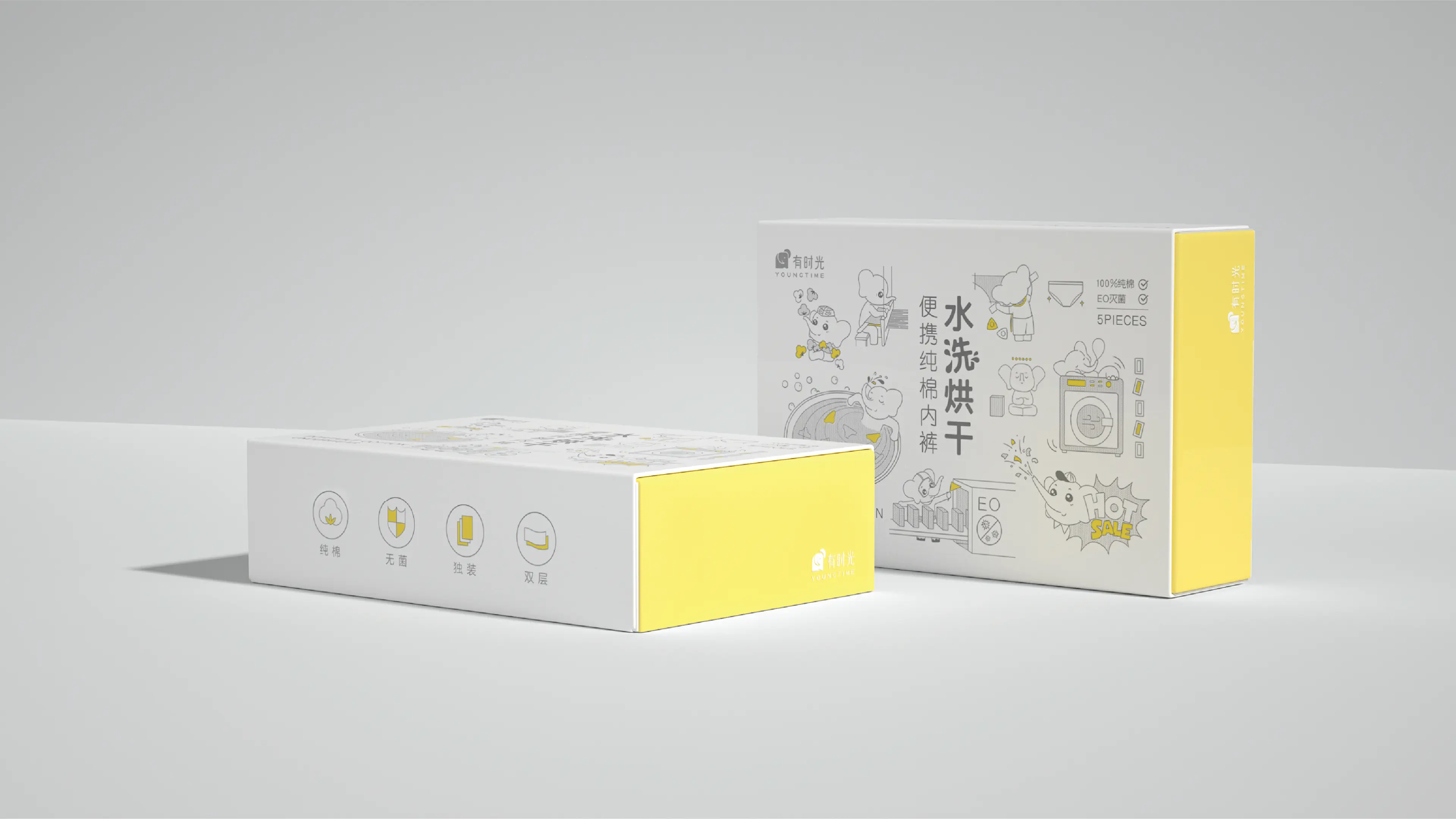
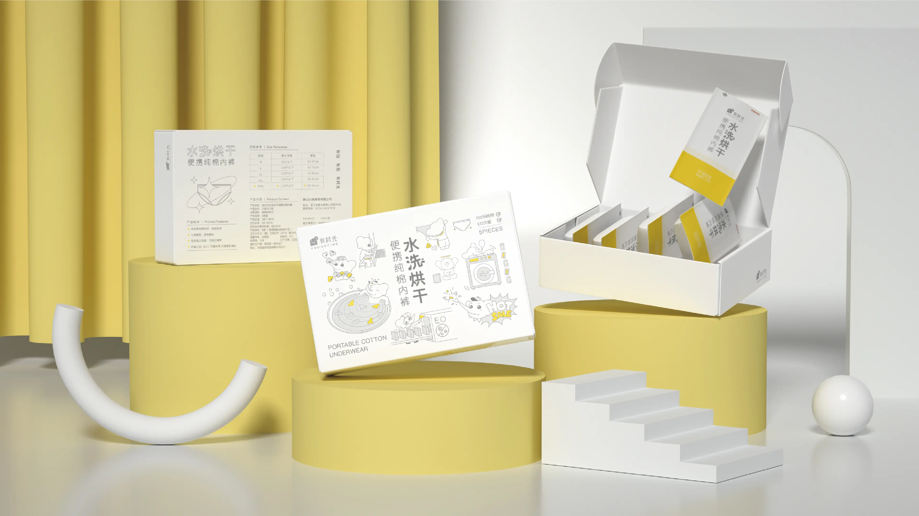
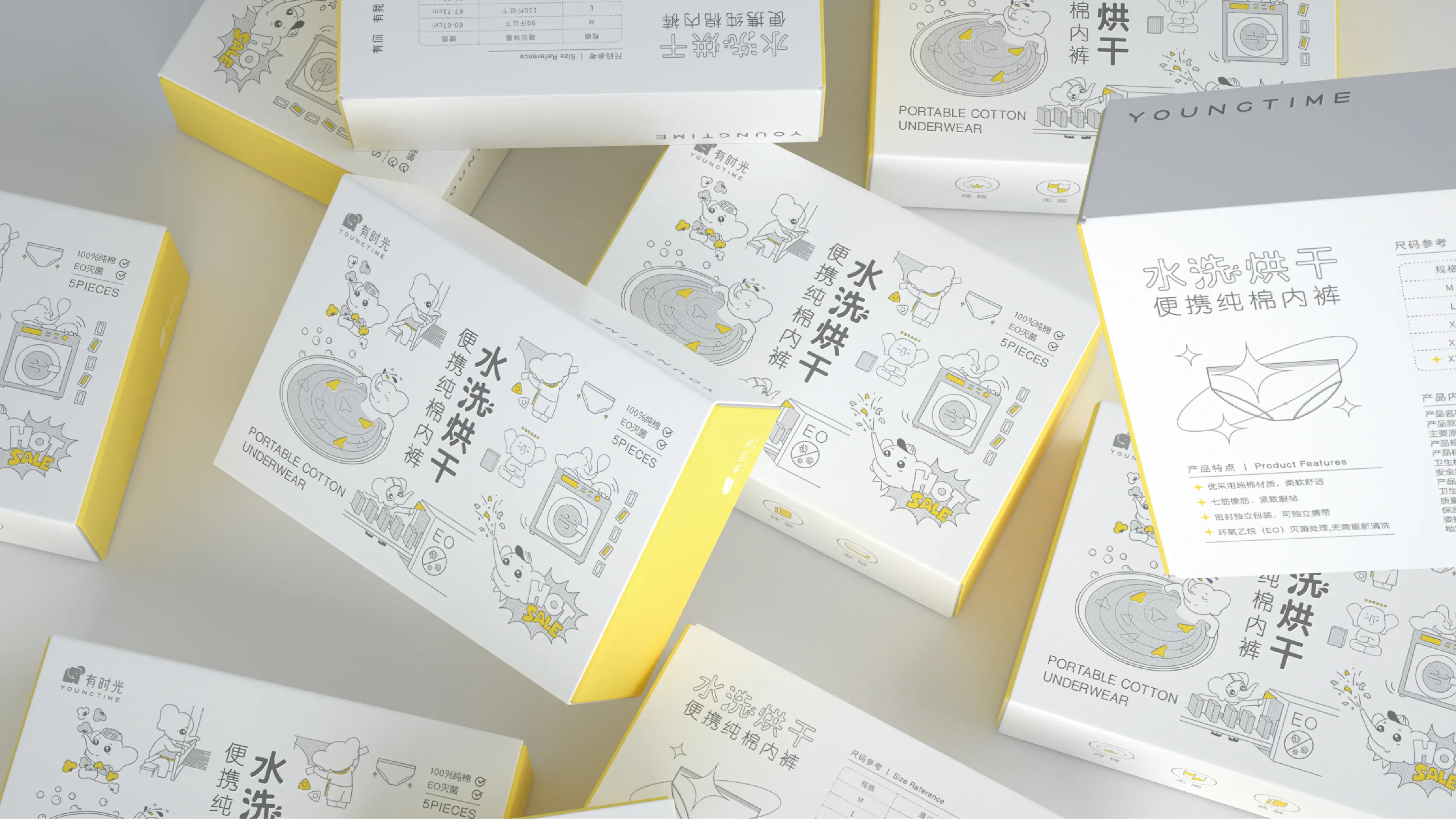
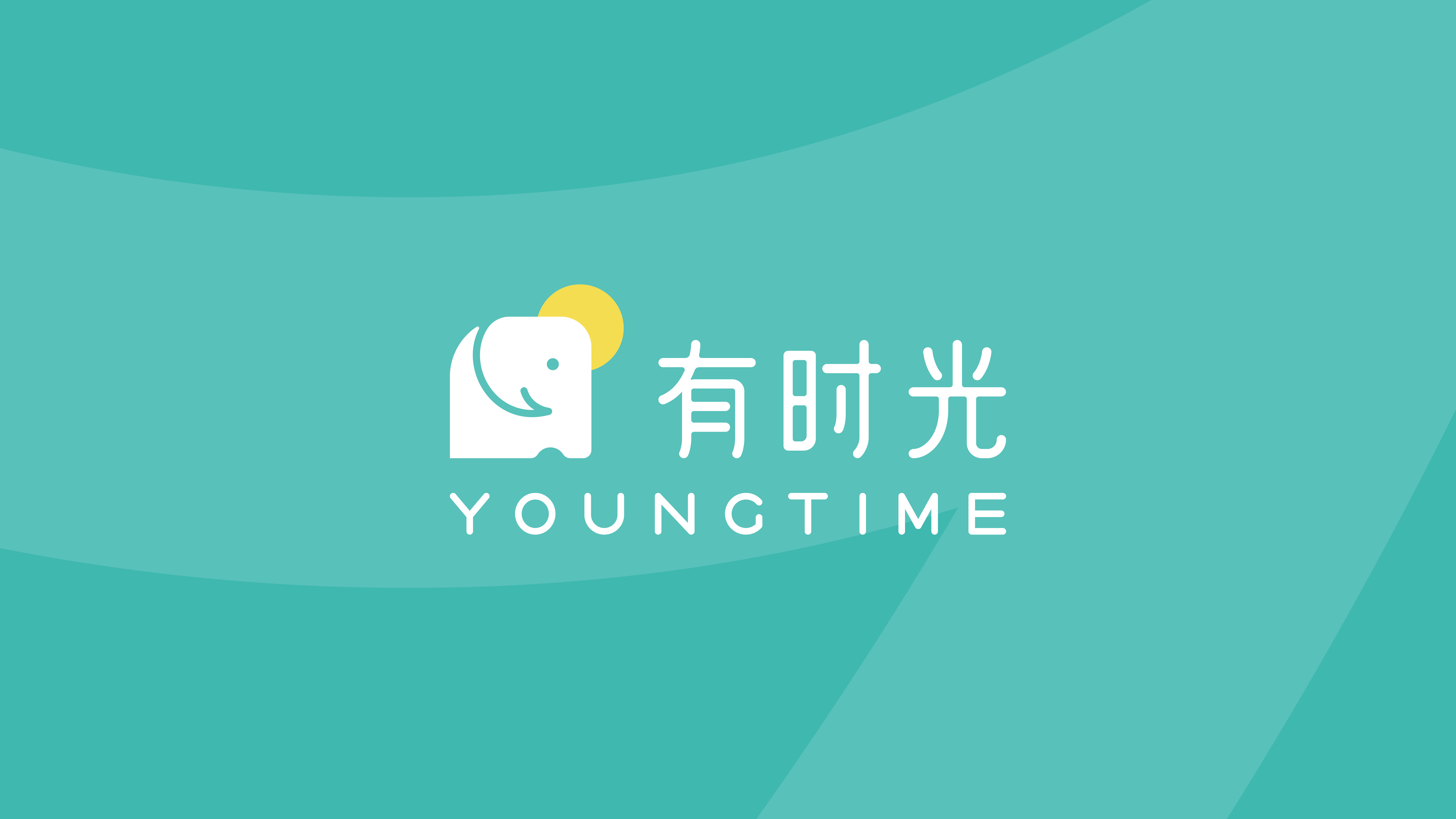
This project retains the main elements of the LOGO and the super symbol, different from the linear LOGO graphics in the past. Now, it adopts the method of color blocks to increase the recognition of the e-commerce platform; in the brand VI color, the original green color system is retained, and it is adjusted to a warmer and more relaxing destination blue; in the brand font, it is unified with the graphic LOGO; an auxiliary graphic is made using the "hook" element in the LOGO, running through the entire packaging layout, making the products under the Sometimes brand brand-oriented and having a unified identification language. This project also created an IP image for it, based on the design of the love-to-travel little elephant, increasing the brand's more playability and bringing closer to consumers. Secondly, the product packaging was upgraded. We used the elements and color schemes of the VI system, such as the auxiliary graphics, and fully utilized them in the packaging layout, distinguishing it from other products in the same category visually, and having a more unified recognition and trust. Some texture effects were also added to the packaging materials to enhance the quality.