 |
 |  |
 |  |
 |  |
 |  |
DYESOO is affiliated with Duoyanshou Health Science Co., Ltd. under BFB Group and was founded in 2015 by Jung Da-yeon, known as Asia’s Weight-Loss Queen. The brand is positioned as “the world’s leading weight management brand” and adheres to the scientific weight management philosophy of “30% exercise, 70% diet.” It has obtained 25 Chinese invention patents and 3 international invention patents, and has successively established strategic partnerships with universities such as Jiangnan University and Jinan University. In May 2023, it jointly established the Live Enzyme Fermentation Engineering Laboratory with Jiangnan University and launched its upgraded product, the “SOSO Stick Live Enzyme Series.” The brand has built a comprehensive product matrix covering three core scenarios—pre-meal calorie control, daily nutrition, and gut care—with more than 130 SKUs.
This project involved creating a brand visual and packaging design system for DYESOO New Zealand SOSO Stick. The core objective was to help the brand establish a youthful, differentiated, and highly recognizable product image in a market environment where health and wellness foods are severely homogenized. Starting from the aesthetic preferences and usage habits of Gen Z young consumers, we established three major design directions: “youthfulness, differentiation, and experience orientation.”
Brand visual system: In brand marketing, the continuous exposure of Jung Da-yeon’s image deeply influences consumers’ minds. Meanwhile, through co-branded editions with popular IPs such as Call Me by Fire Season 3, the packaging design remains consistent with the show’s official visuals, and after launch, the packaging alone can “generate its own traffic.” In 2024, BFB Group launched a VIS strategic upgrade. The logo uses green and orange as primary colors, cleverly integrating the concepts of technology and health. DYESOO, as a brand under the group, further integrated with the group’s brand image to jointly convey the brand proposition of “healthy beauty.”
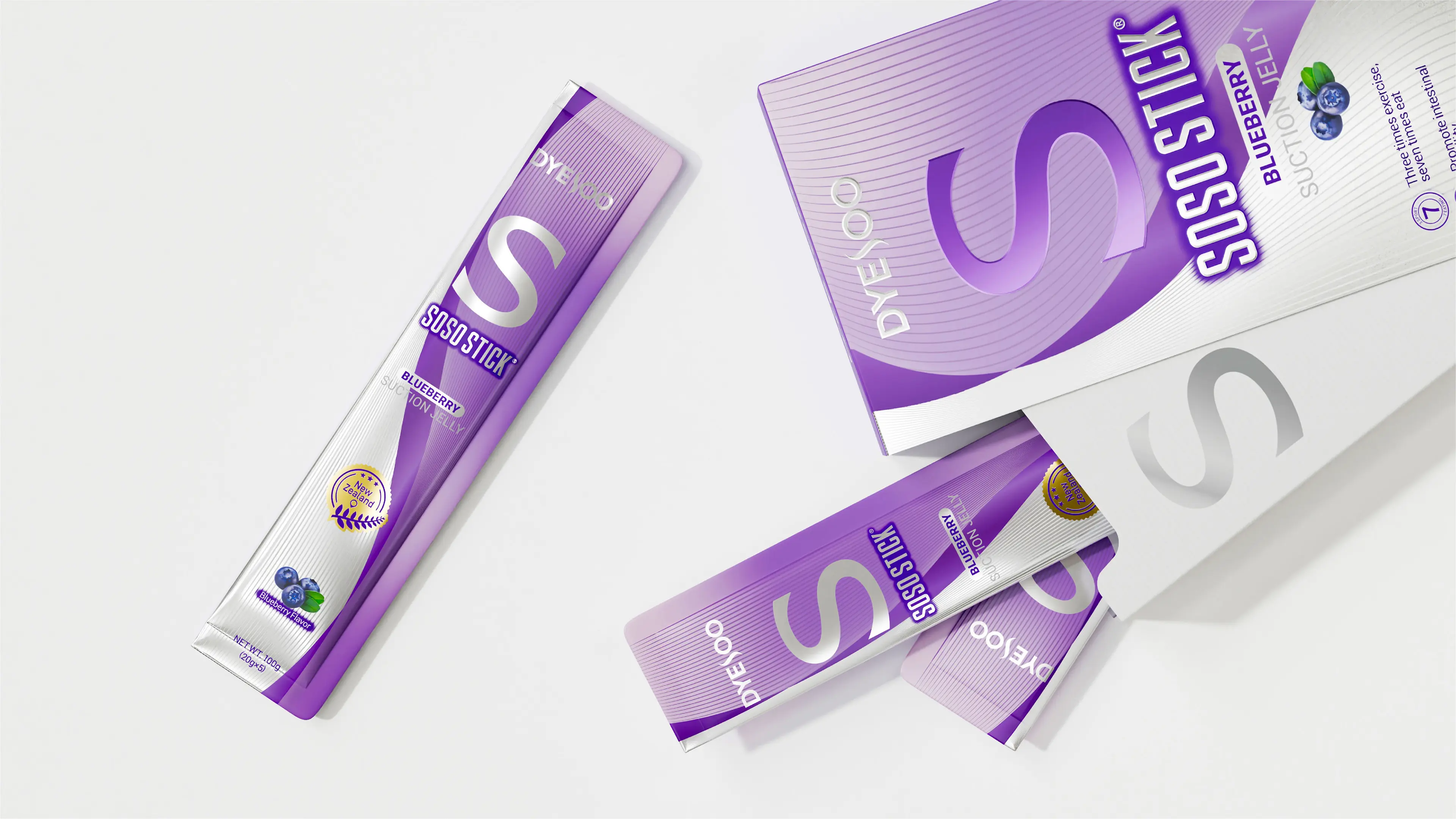
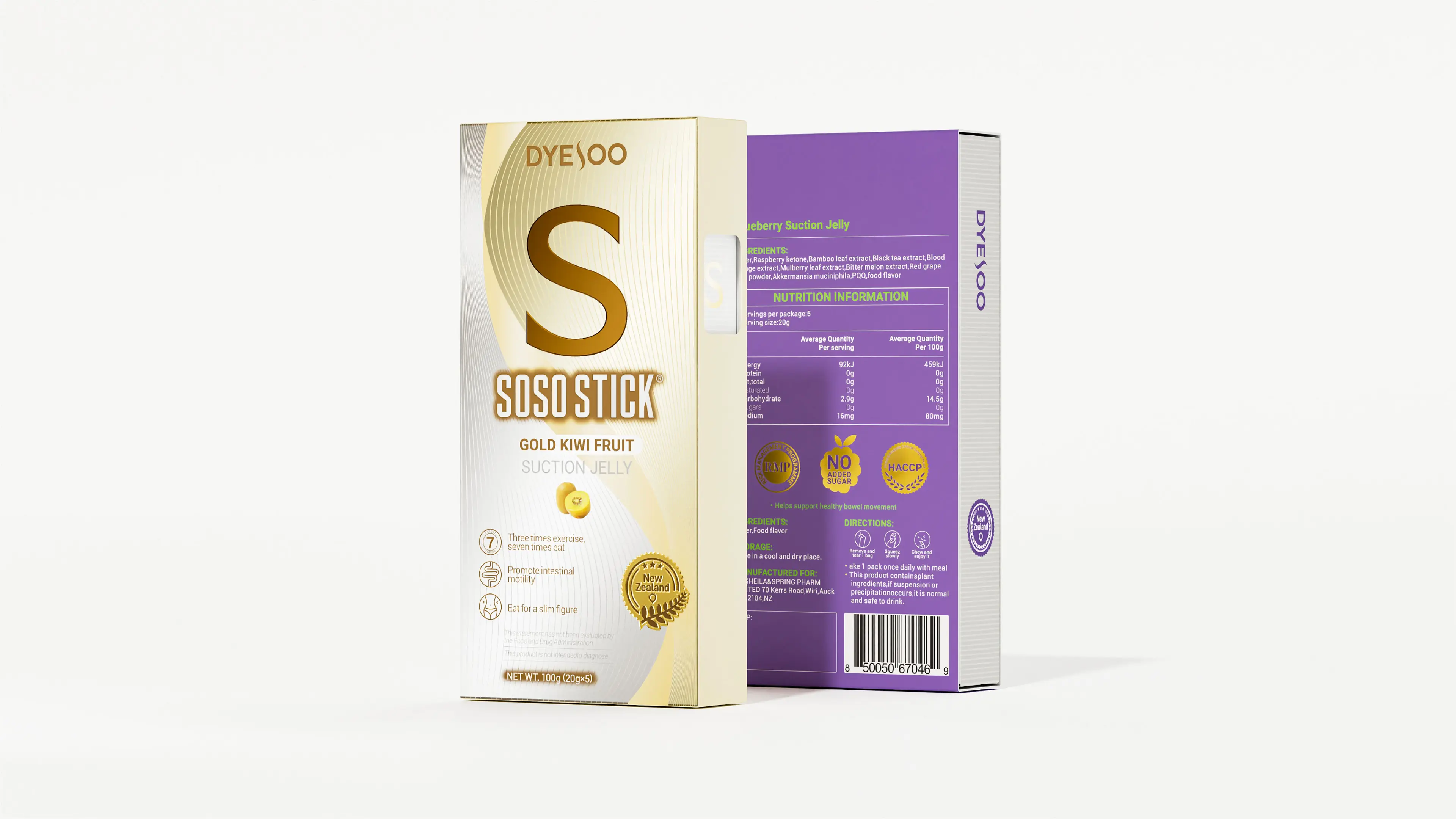
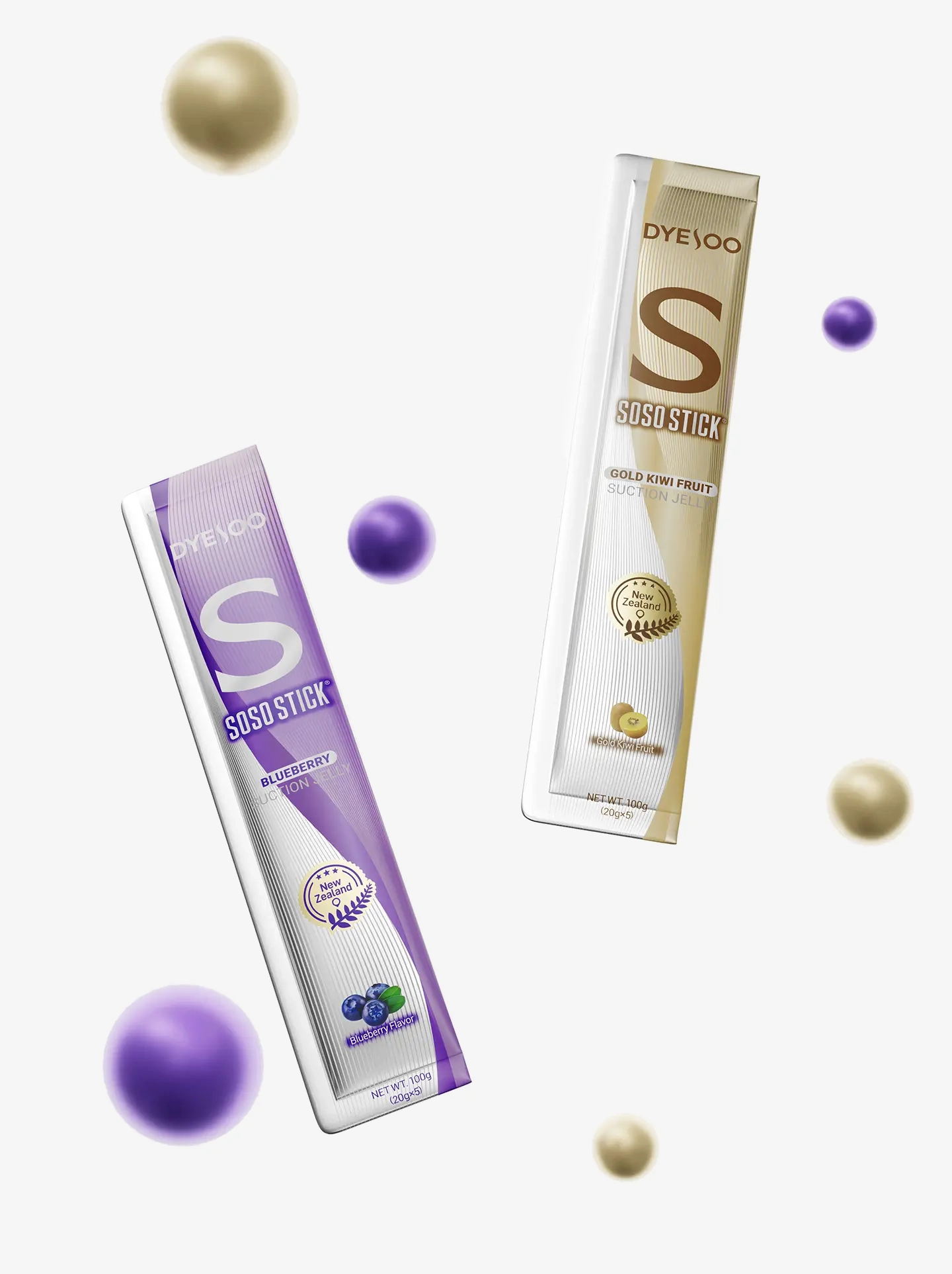
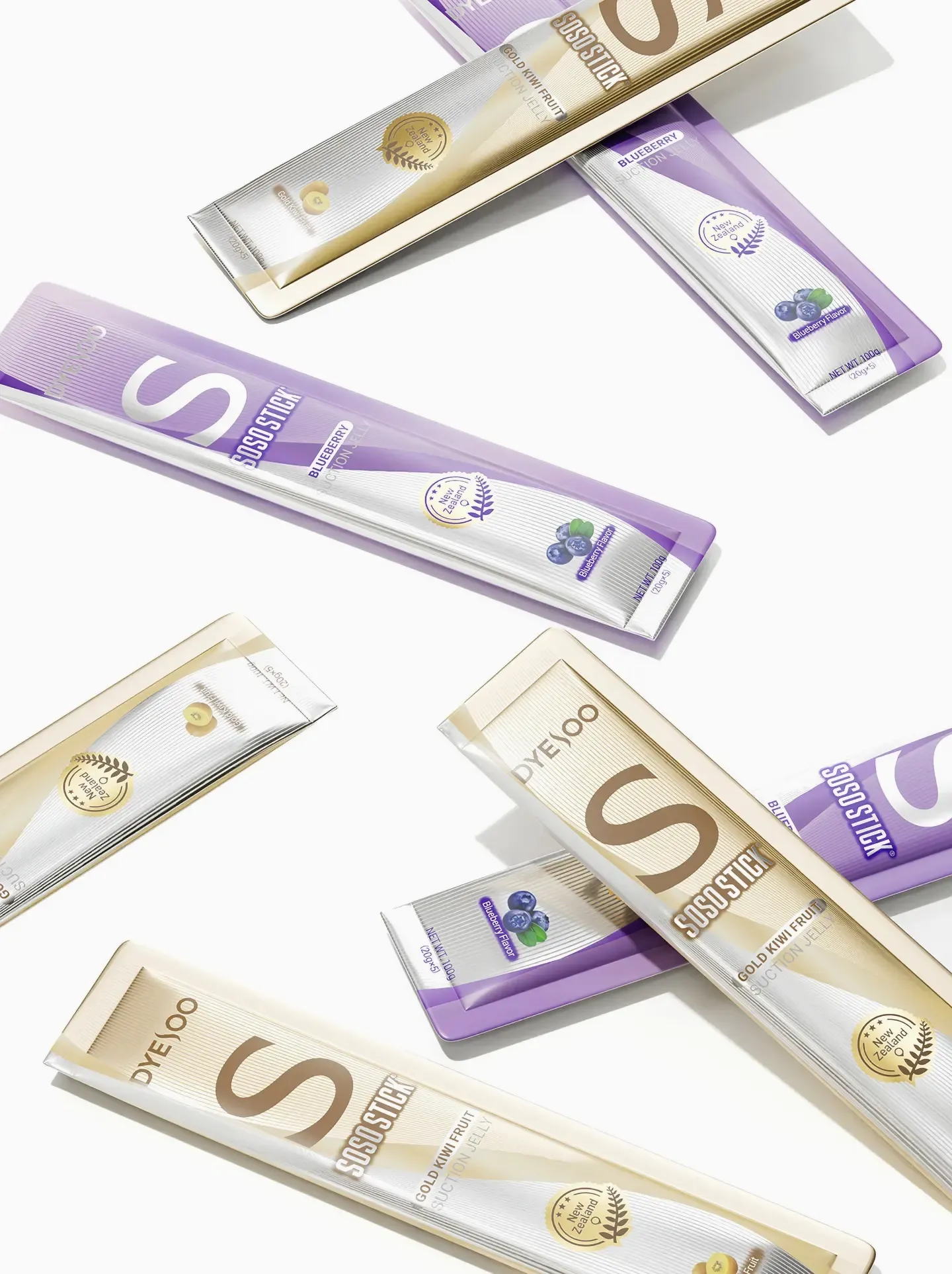
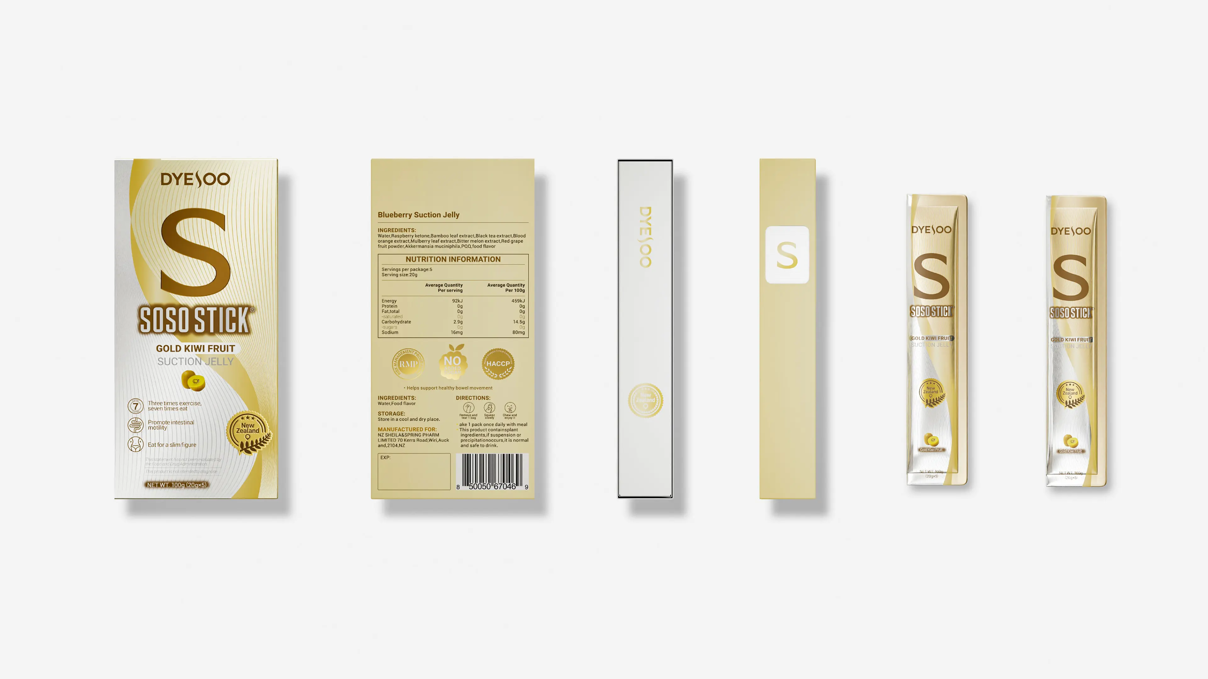
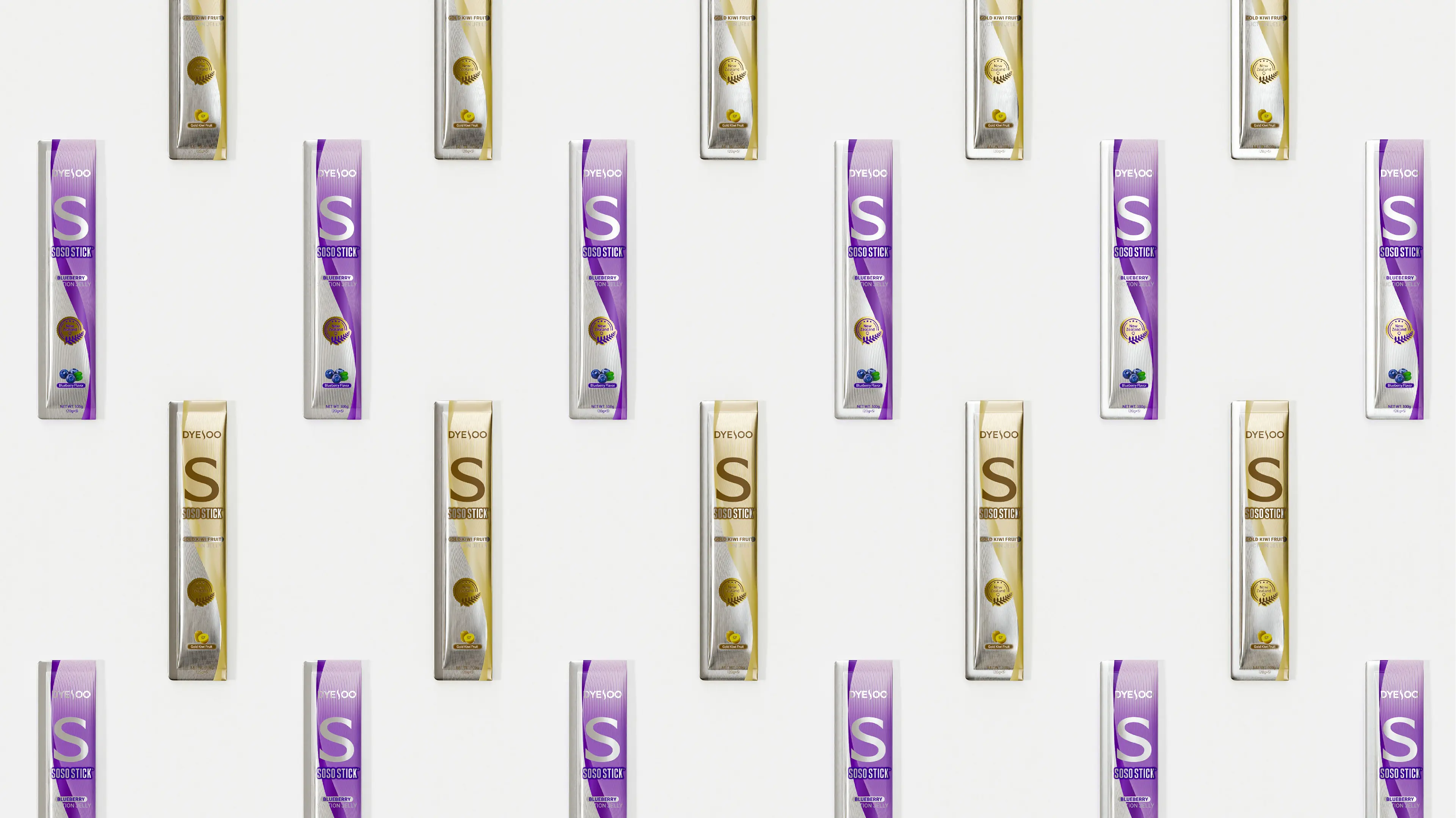
Youthful visual language: In product visualization design, bright and vivid colors are used to capture young female consumers who love trends and fashion and enjoy trying new things. The outer packaging bags intuitively present product flavors and functions, while English typography highlights the product’s tone. The overall visual design closely aligns with the aesthetic preferences of young female consumers.
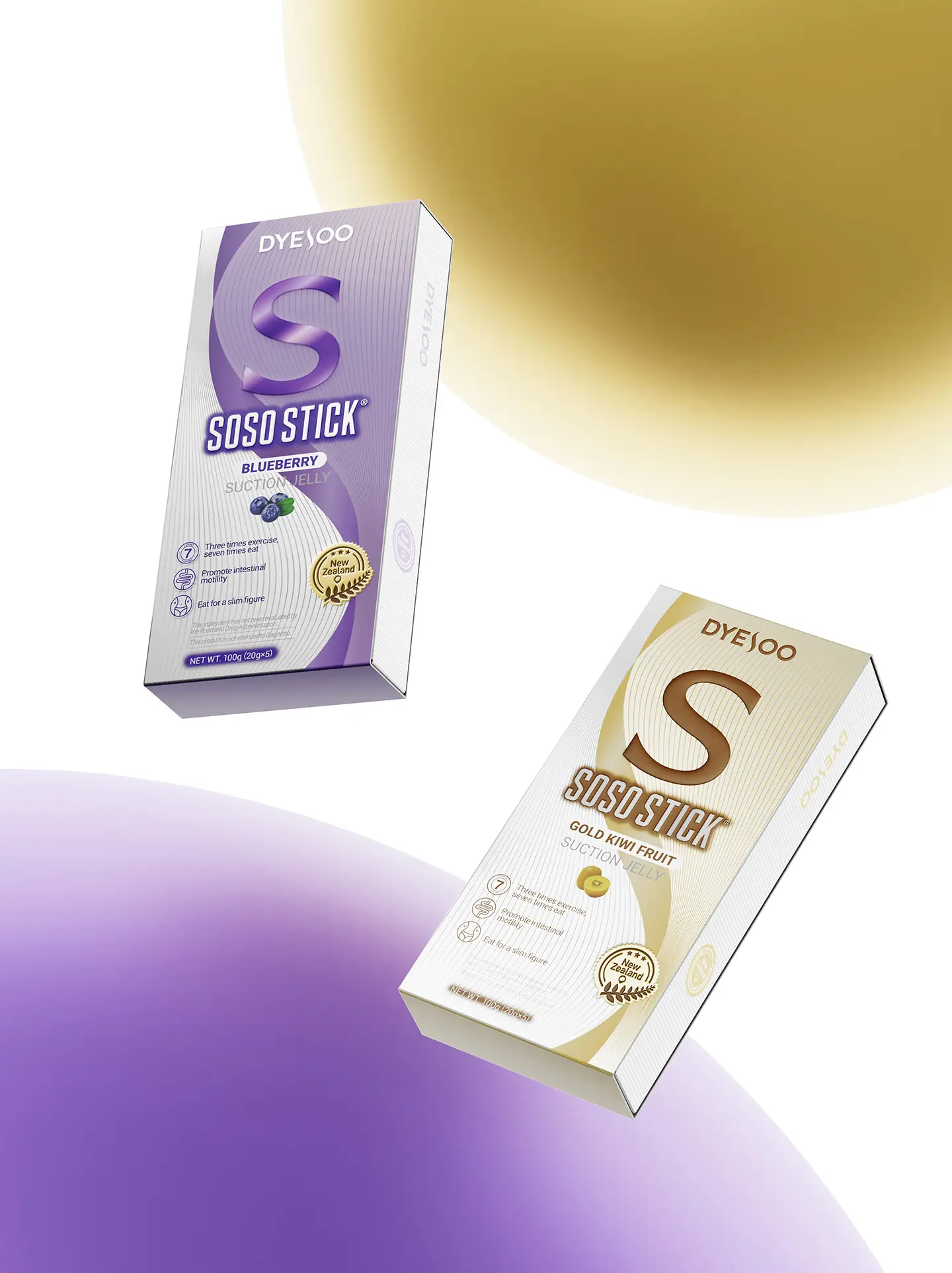
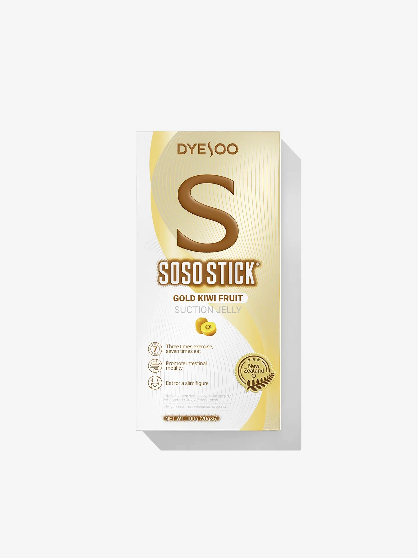
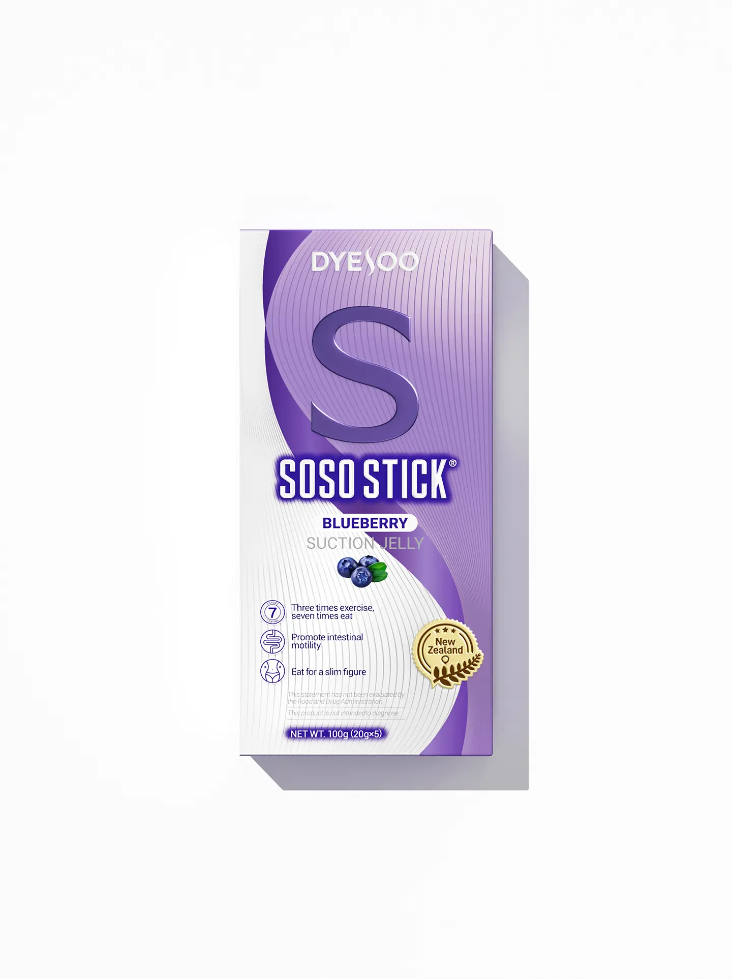
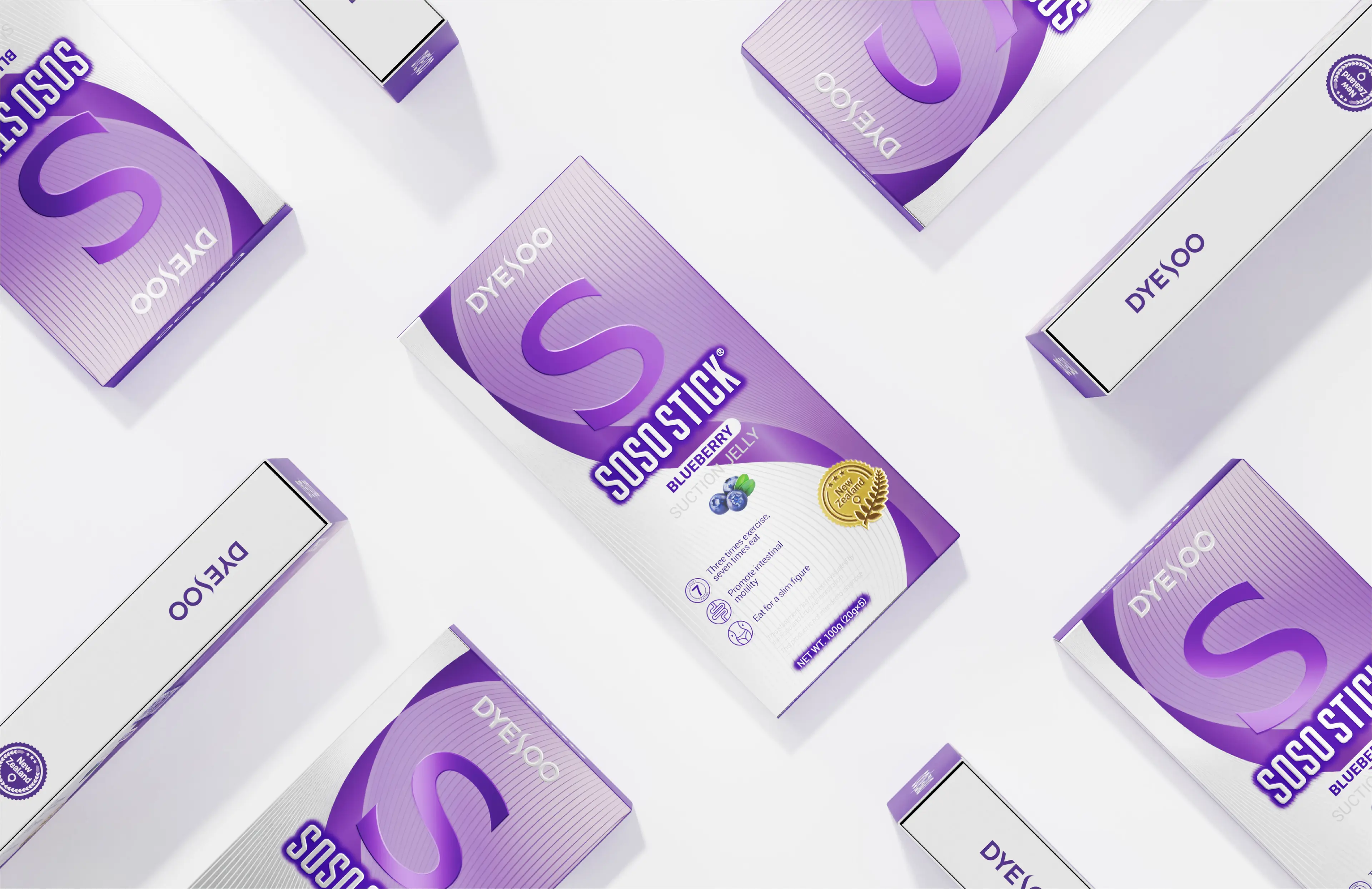
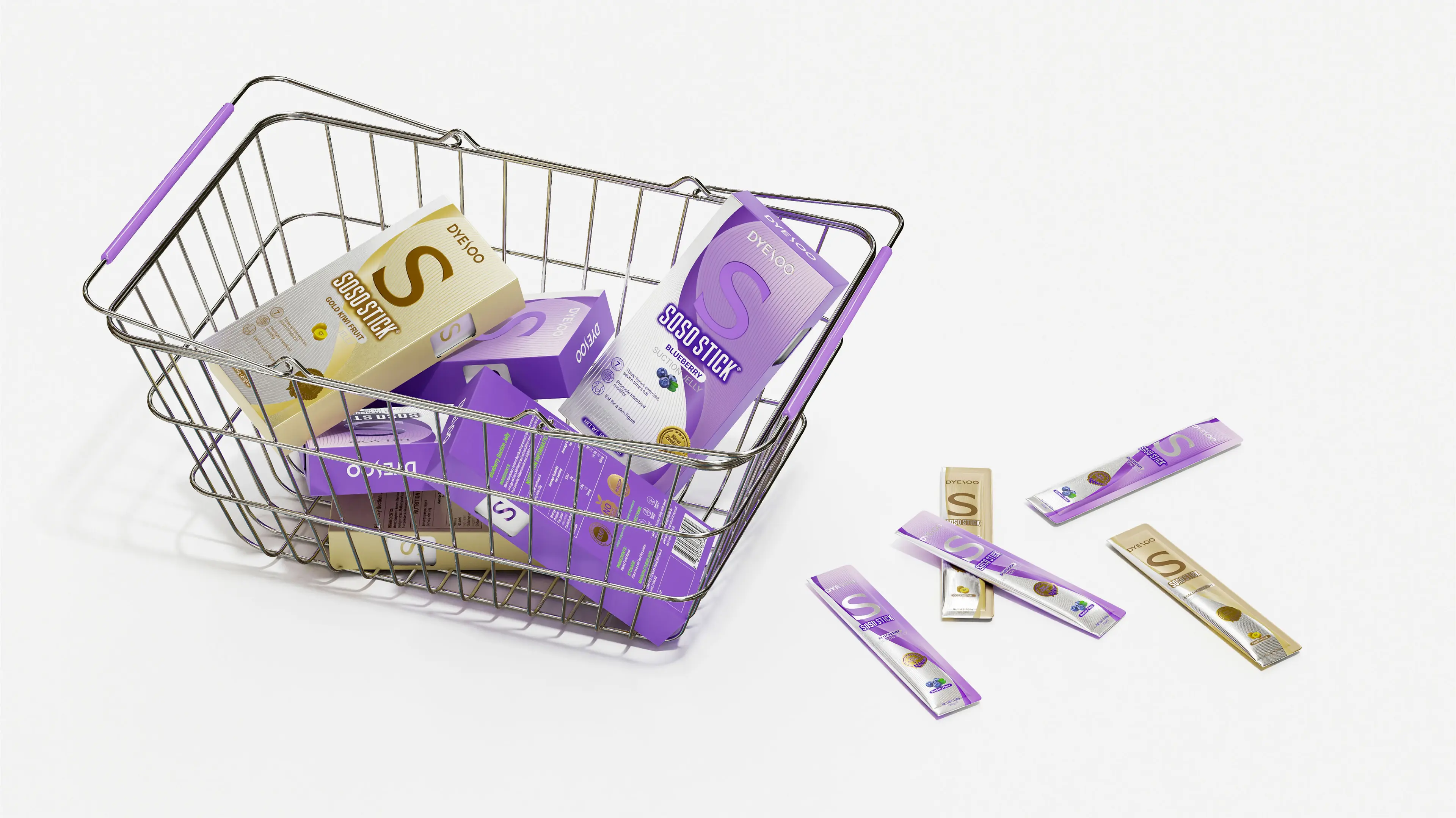
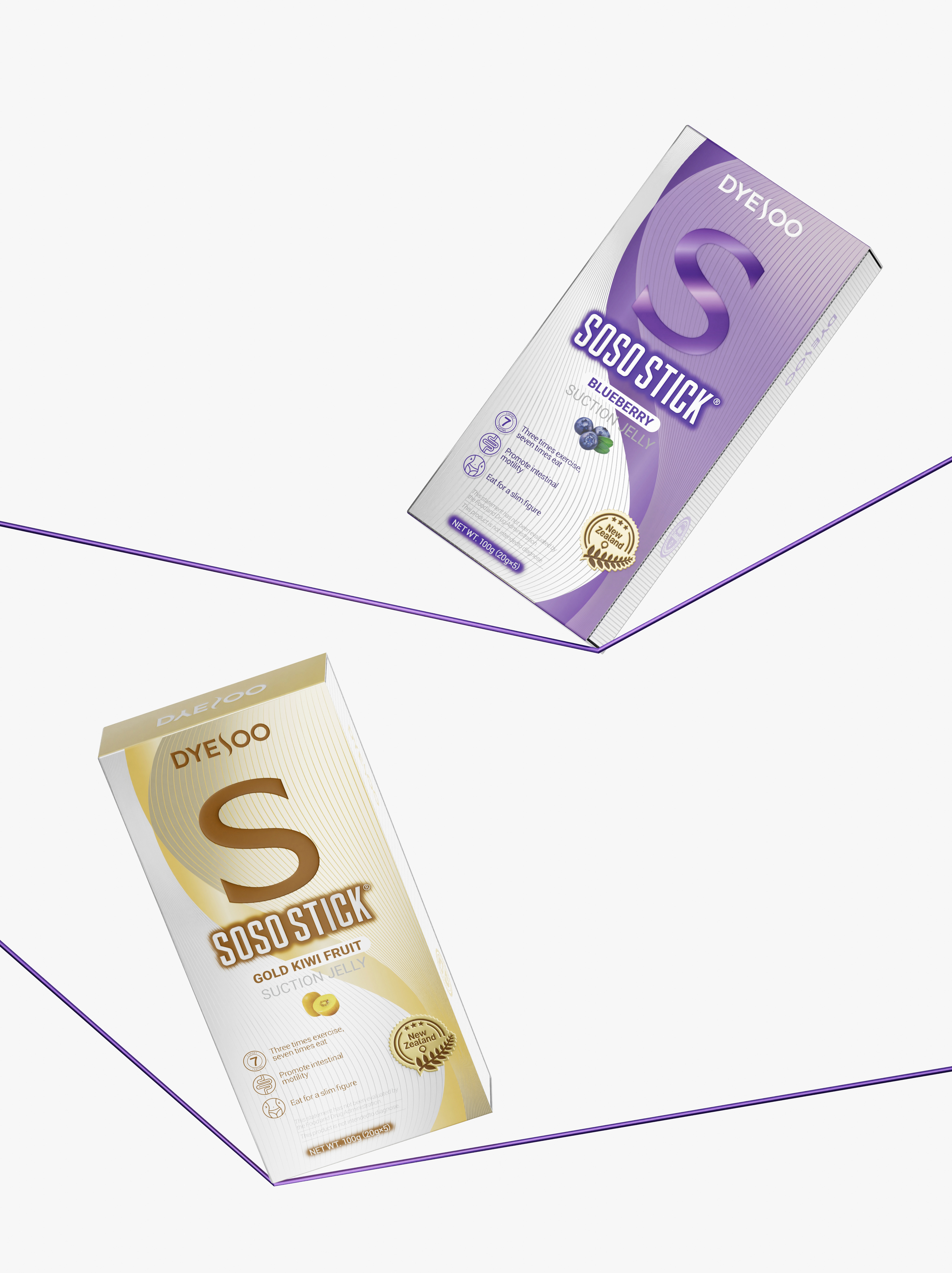
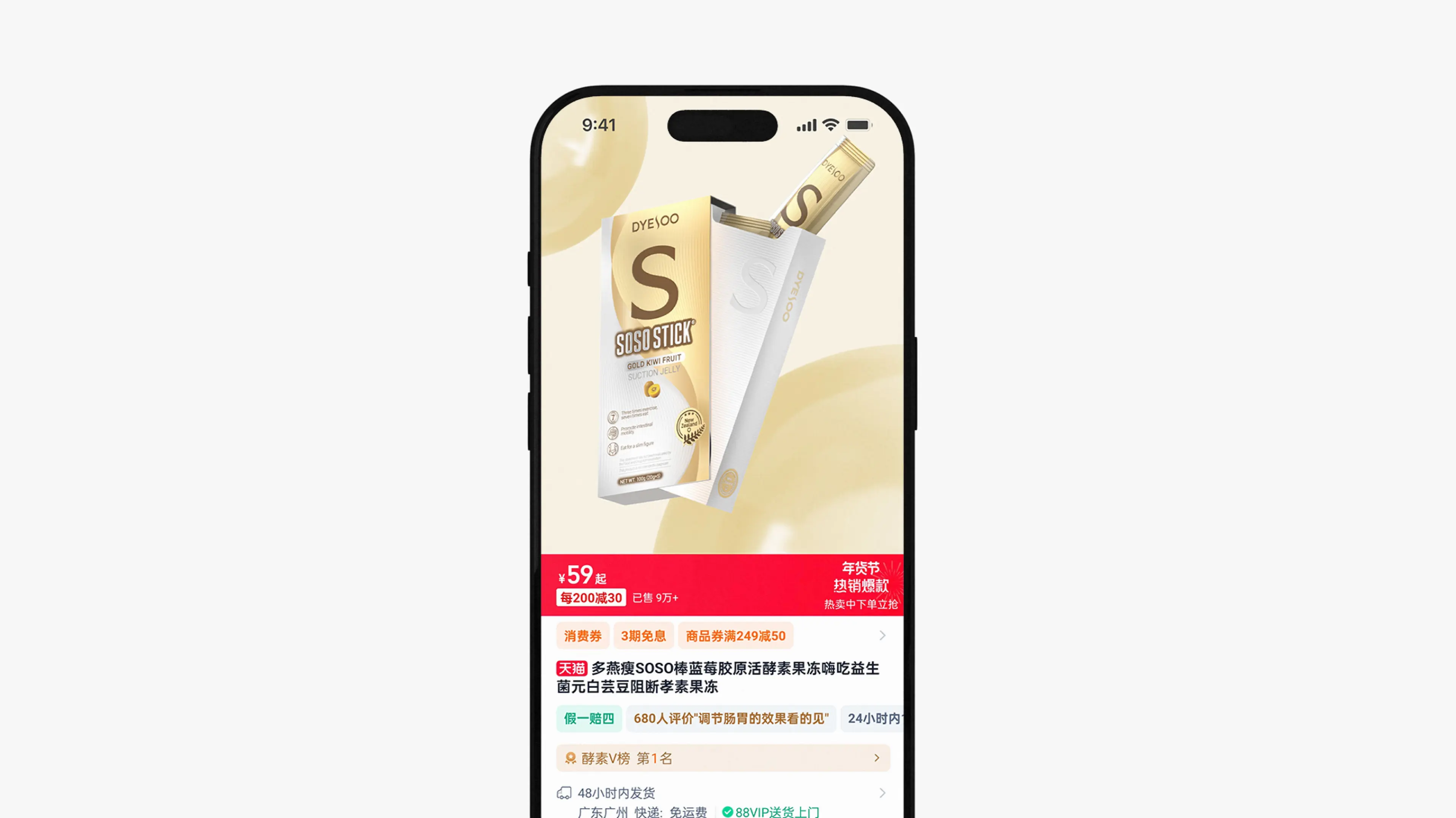
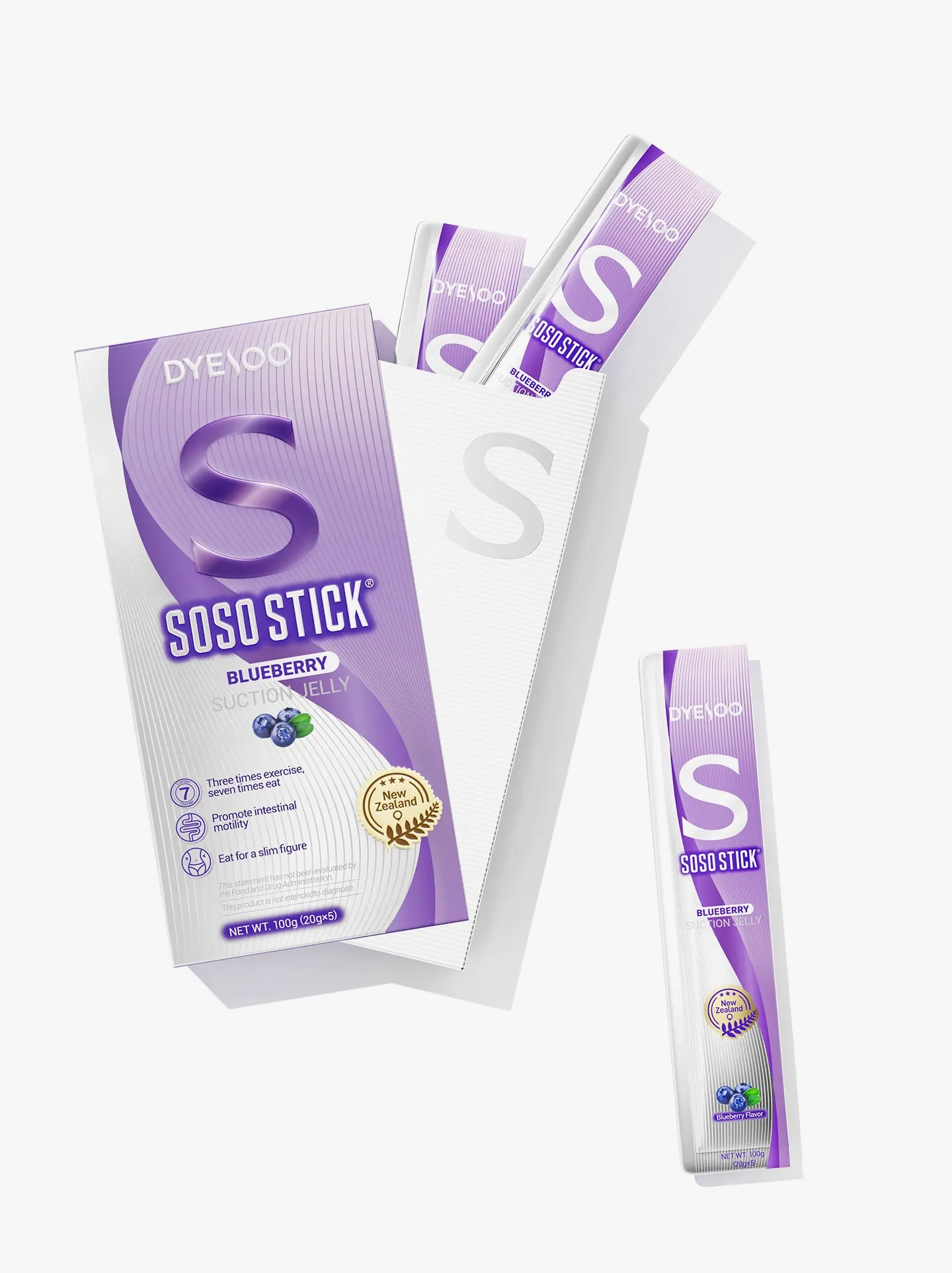
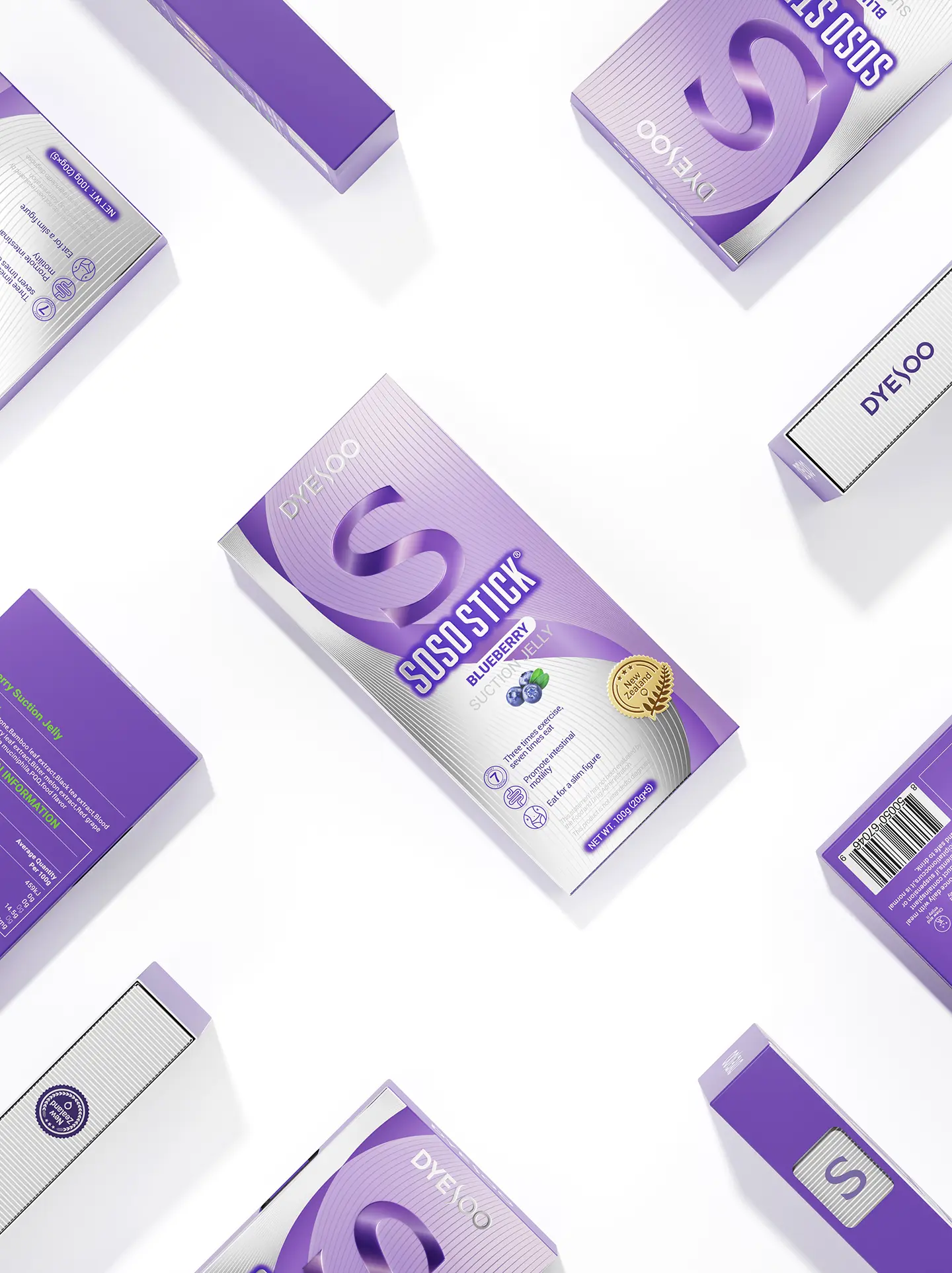
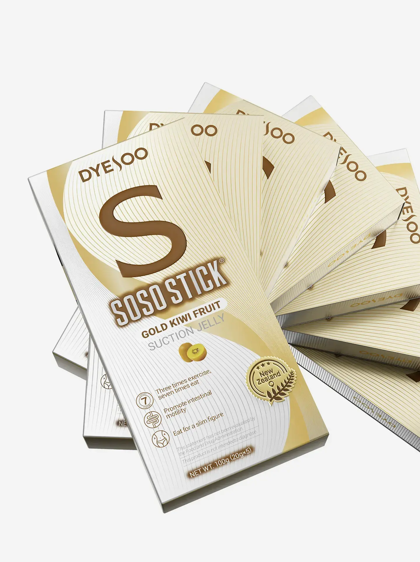
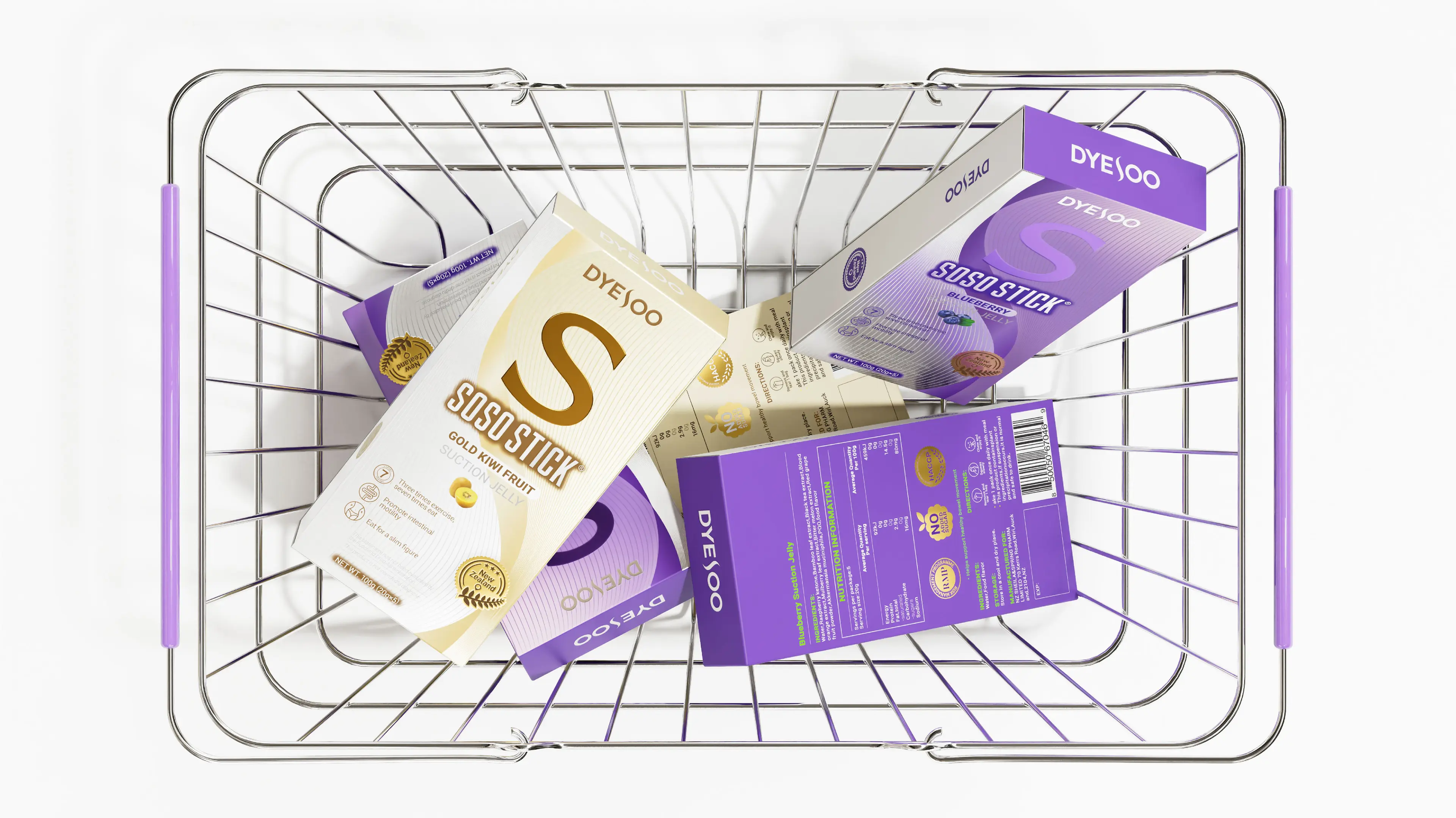
Packaging design: Product packaging uses bright colors to distinguish different flavors—blueberry flavor is presented in blue tones, while golden kiwi flavor is presented in golden tones—creating clear category recognition visually. On the front of the packaging, the product name “SOSO STICK” and flavor information are enlarged, while core selling points such as “30% exercise, 70% diet” and “promotes intestinal peristalsis” are visualized through concise auxiliary graphics, reducing consumers’ information acquisition cost. The brand uses ribbons as an auxiliary graphic throughout the packaging layout, forming a unified product family identity language.
|
| |
| |
| |
| |