

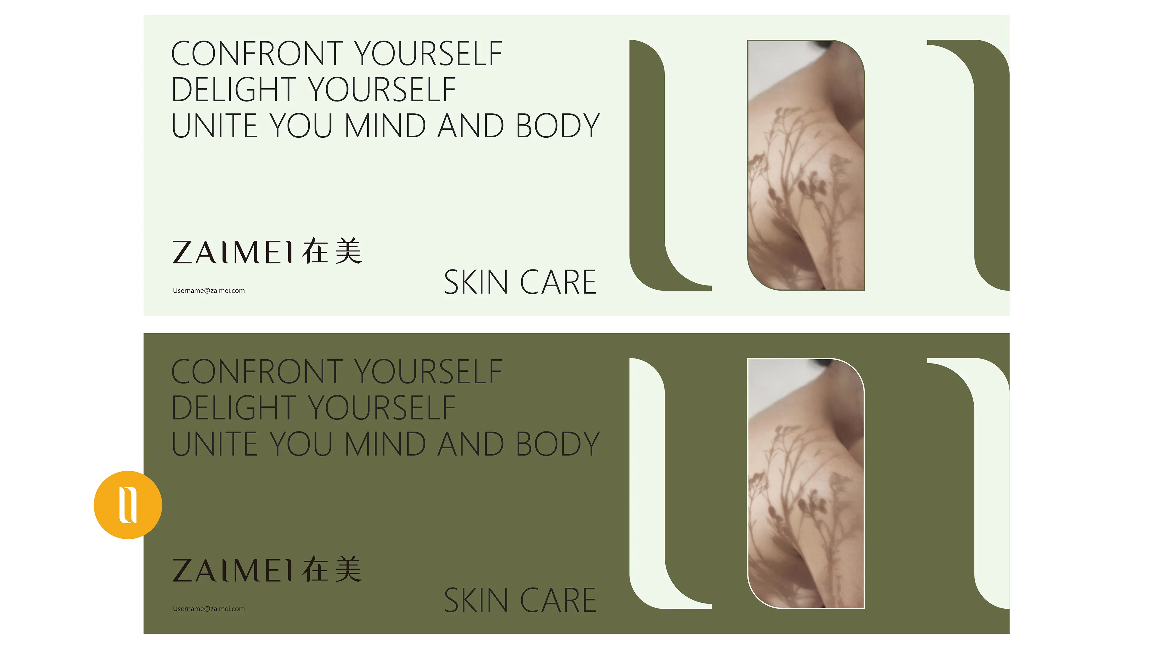
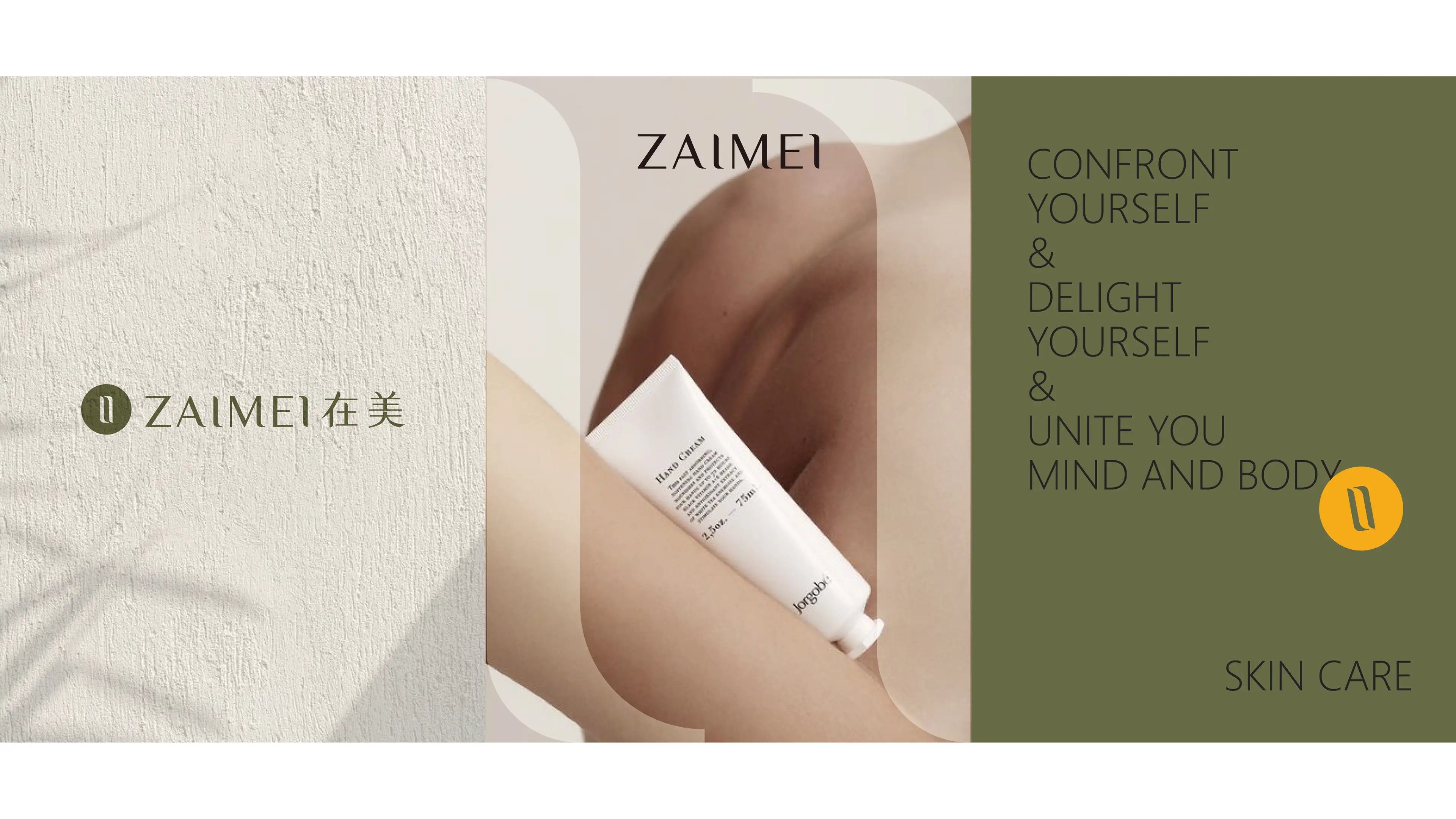
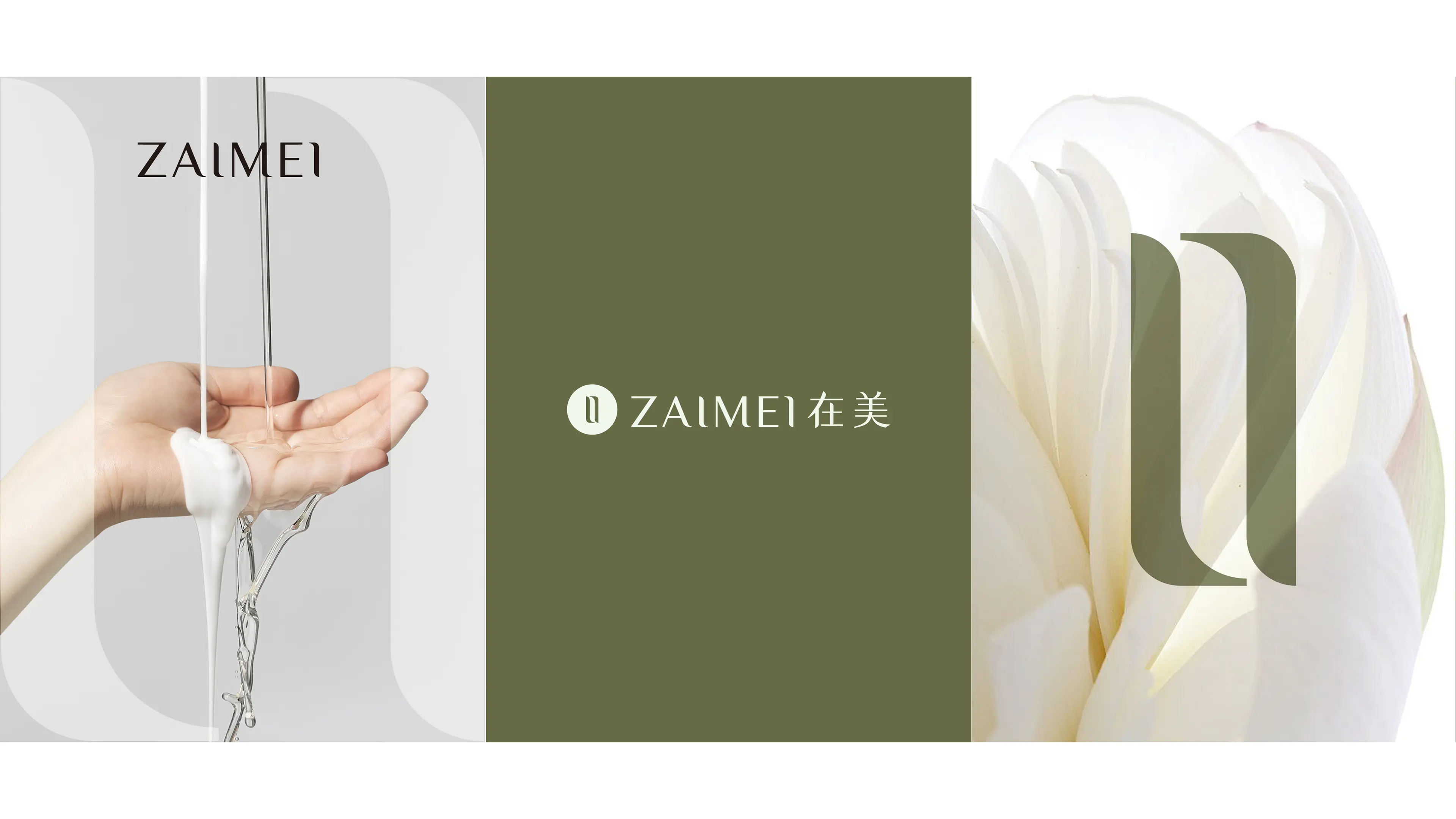
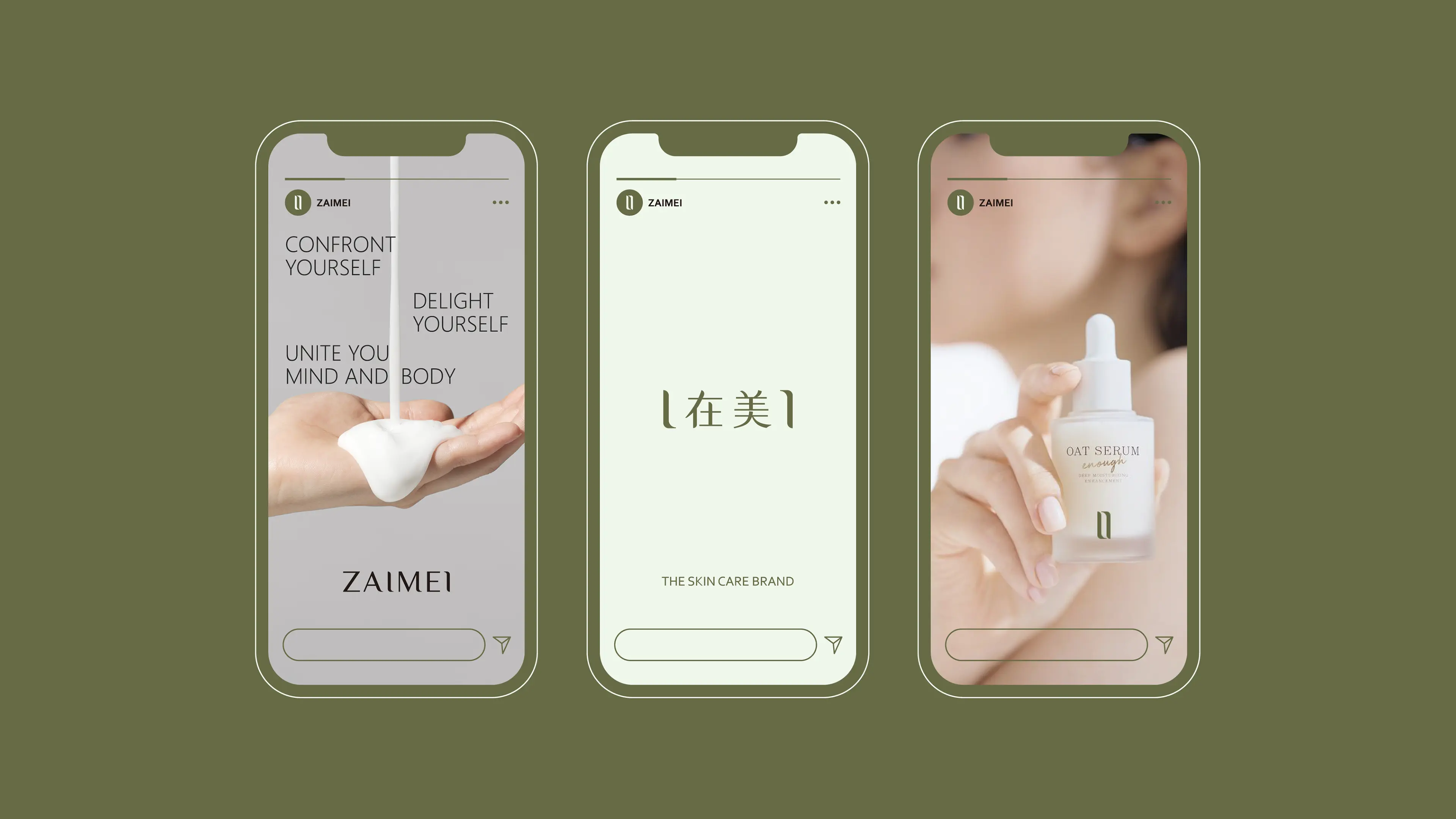
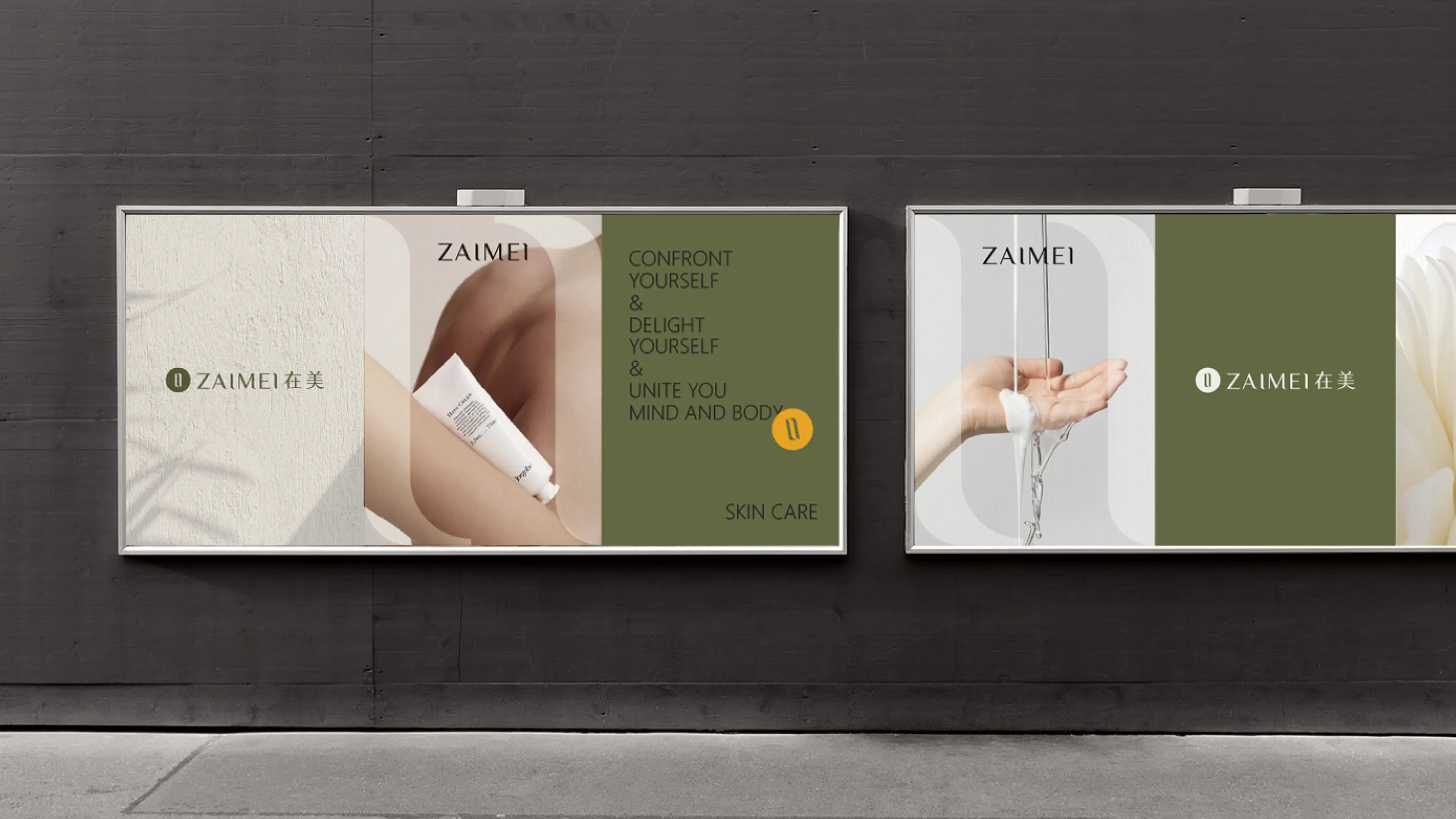
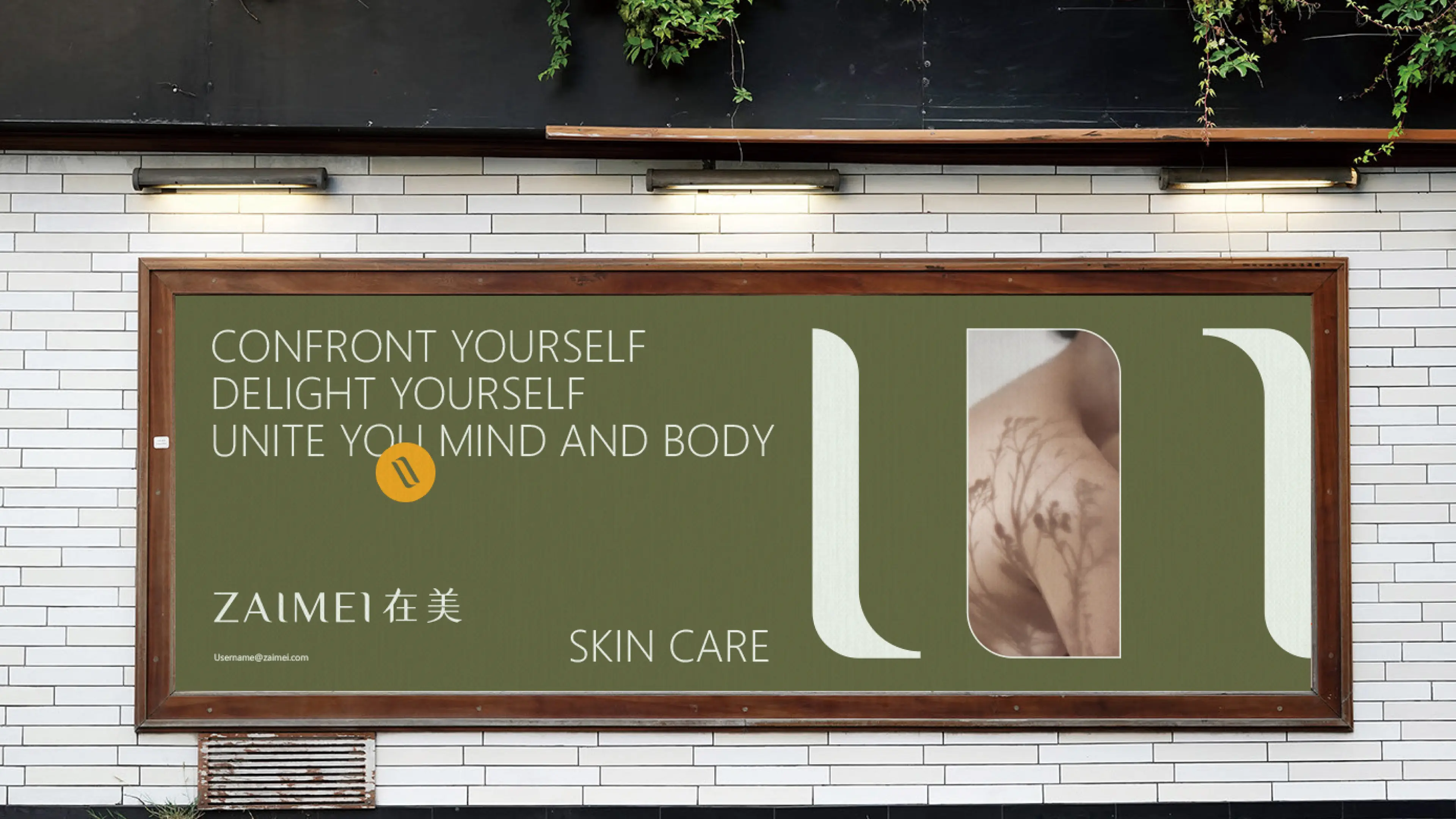

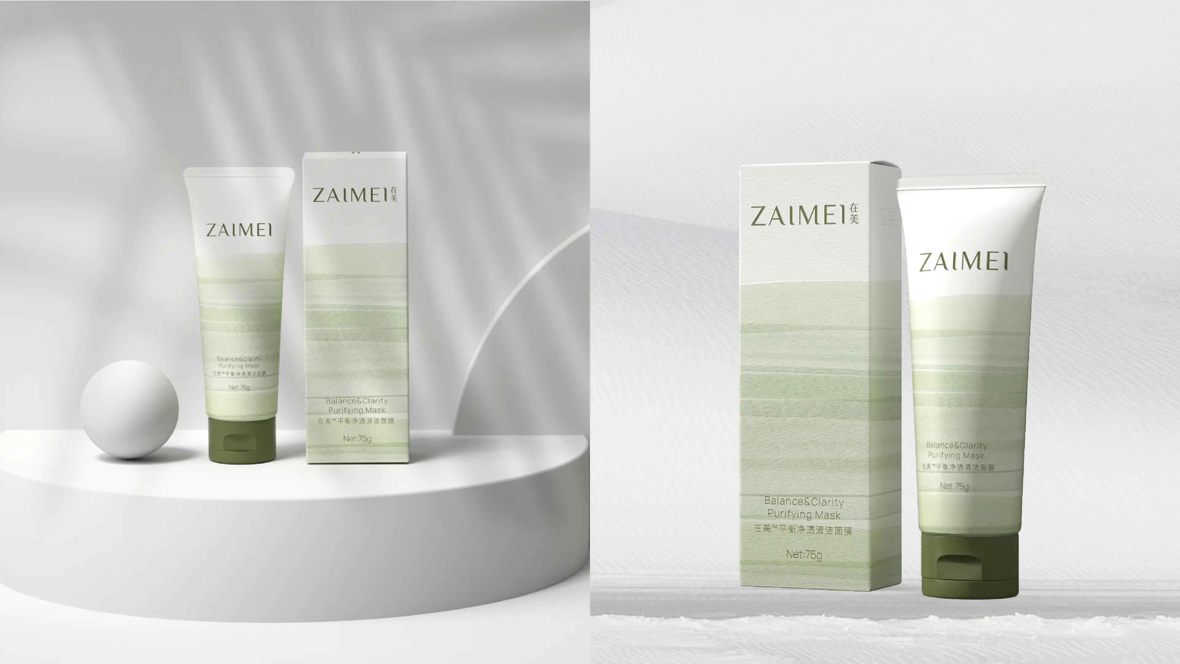
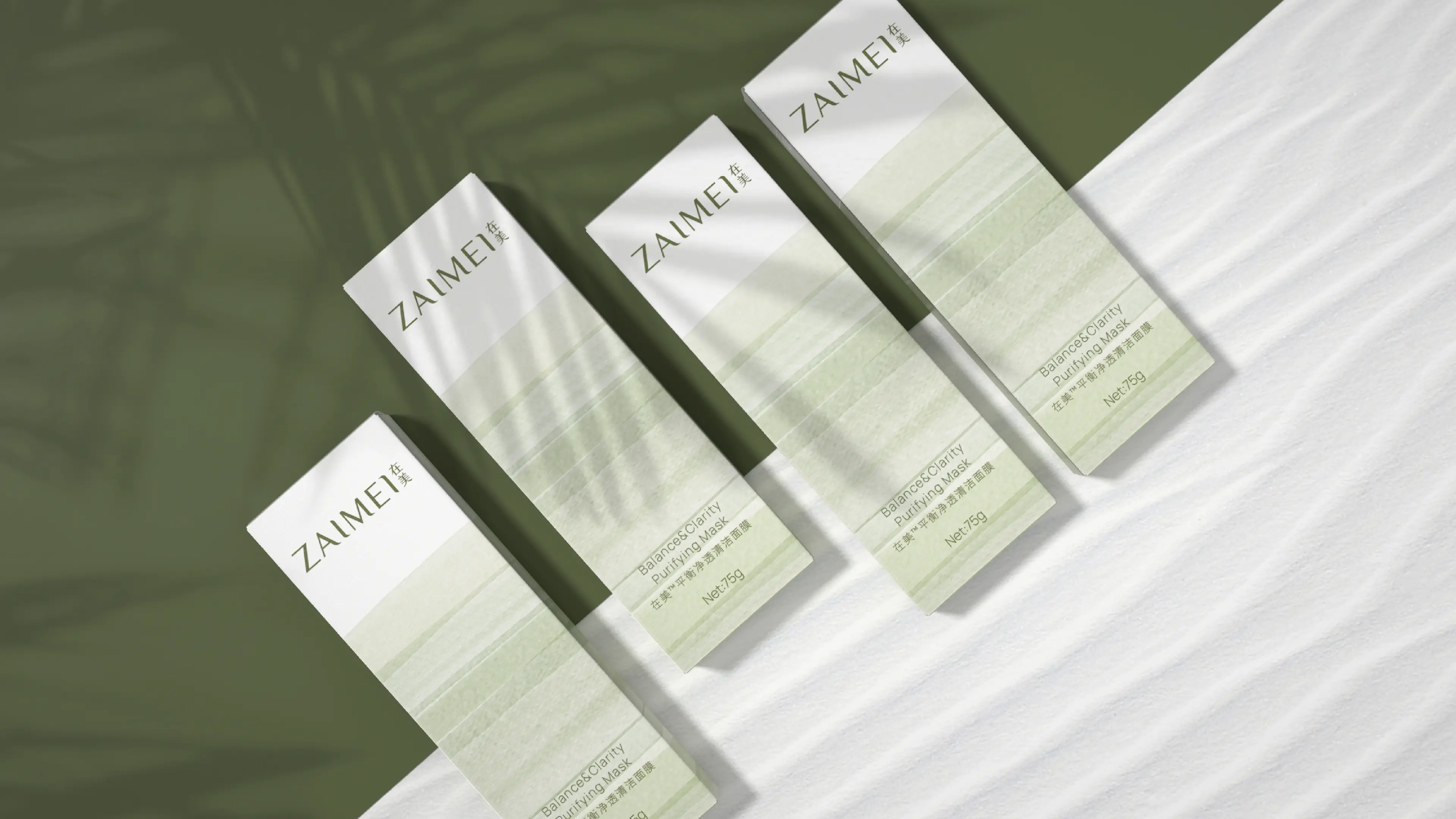
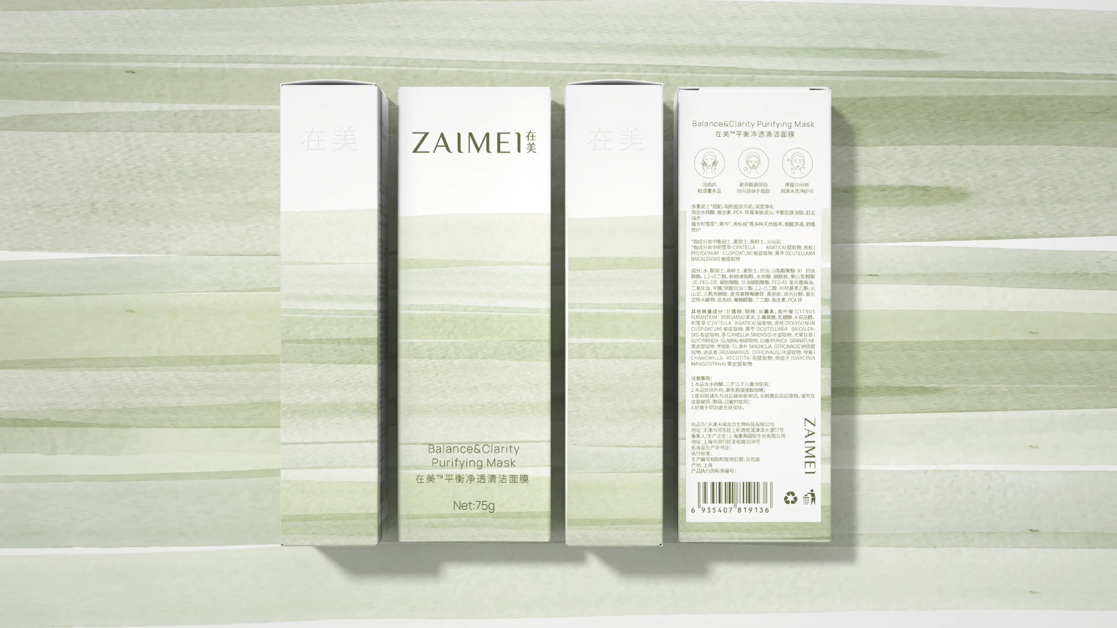
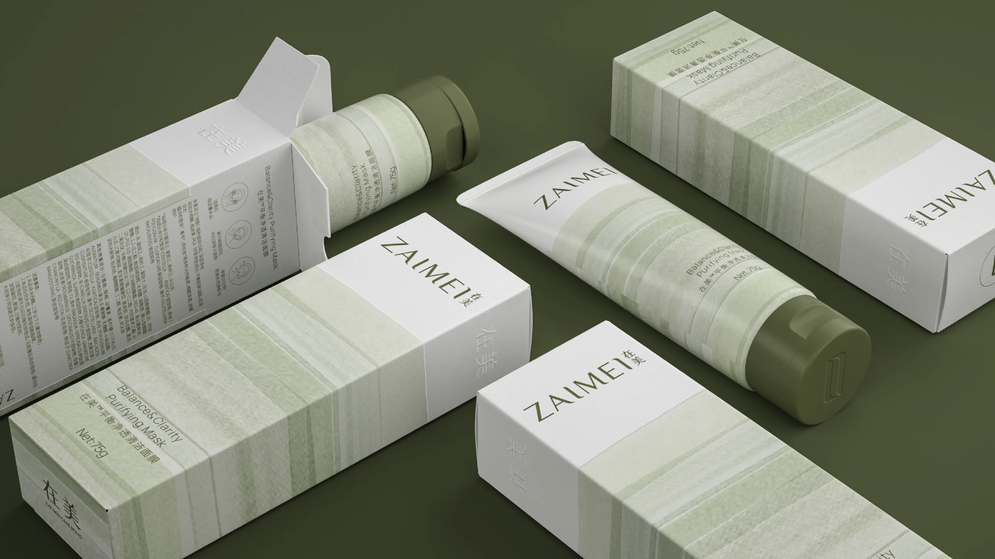
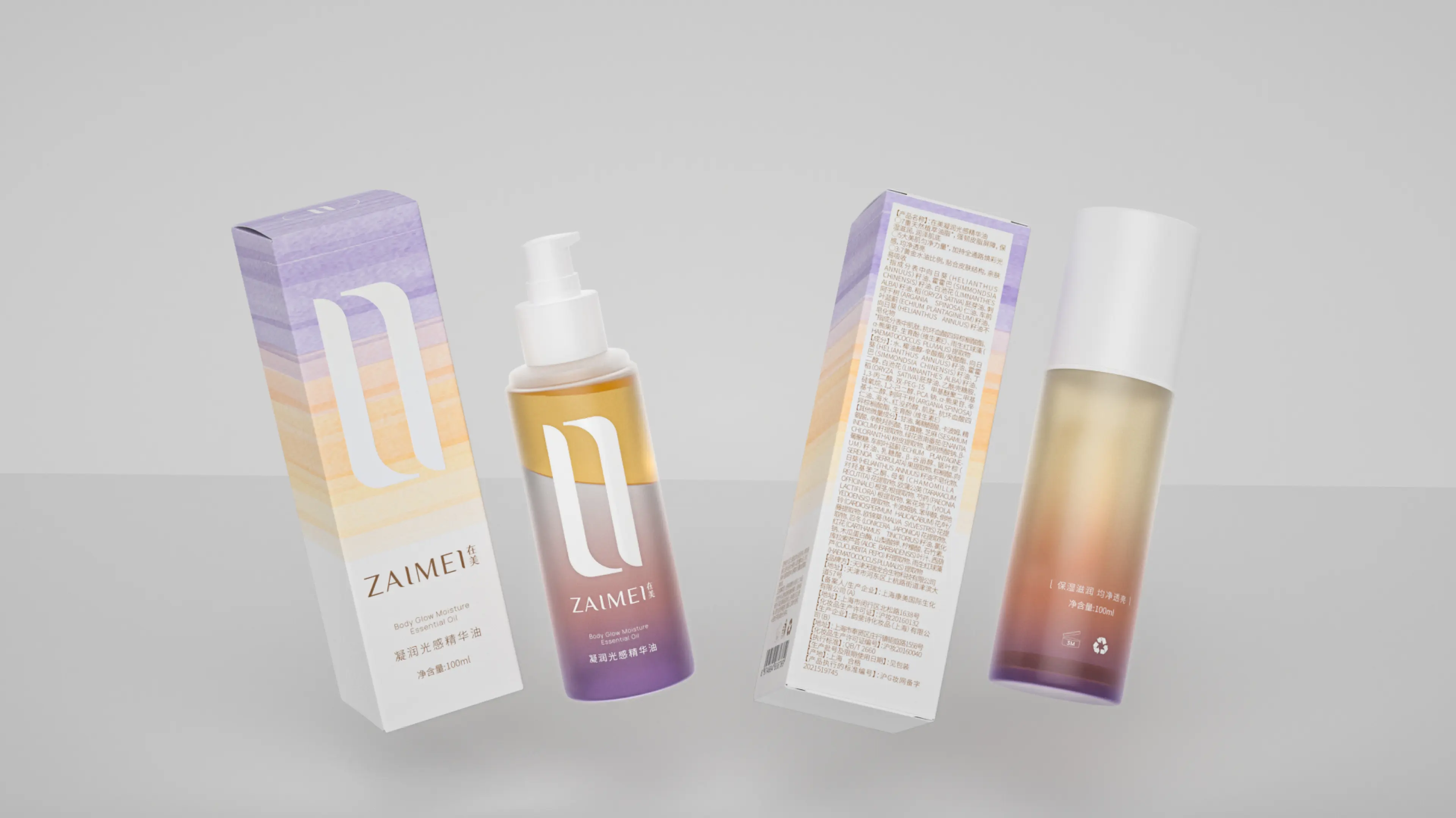
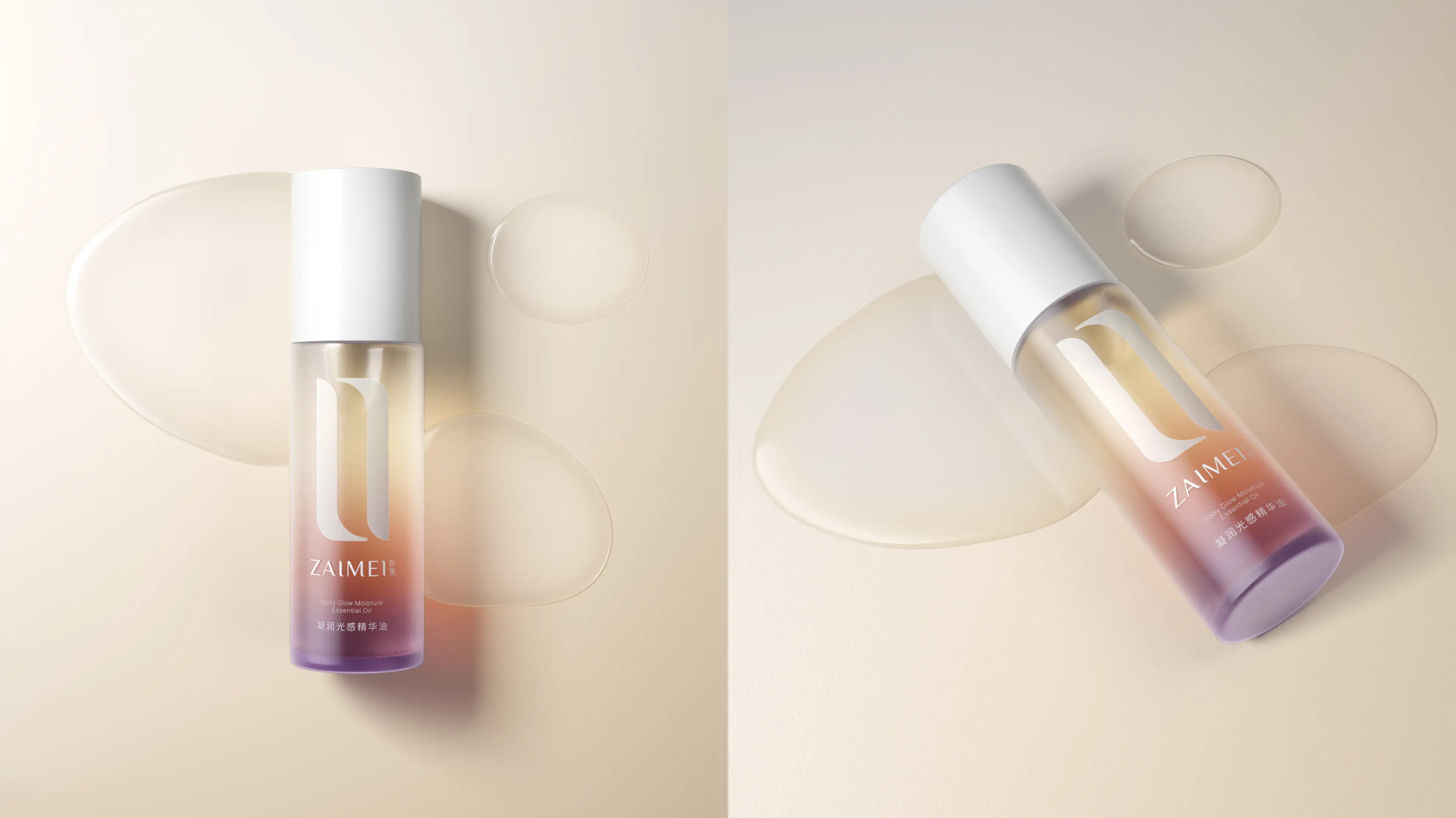
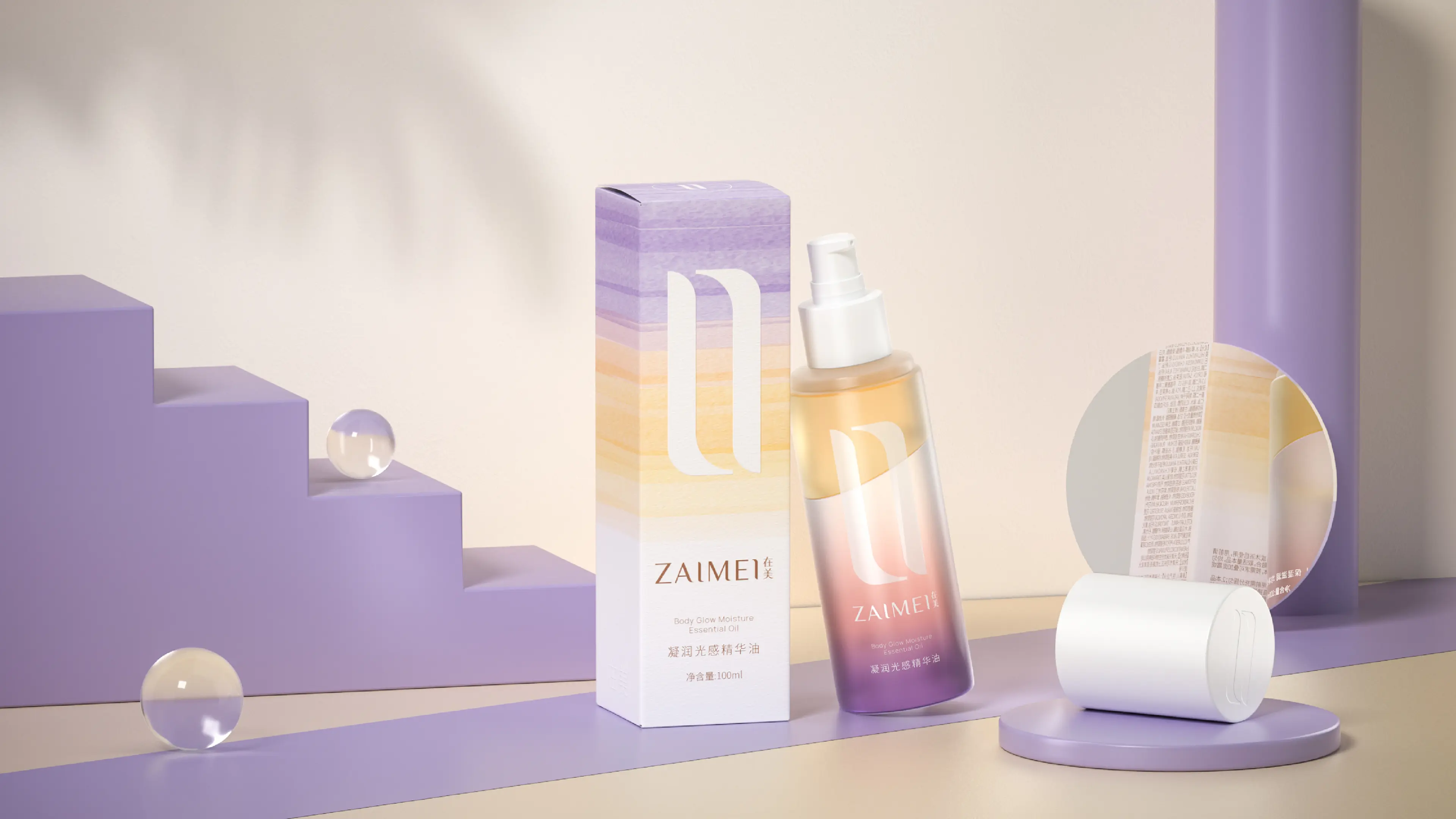
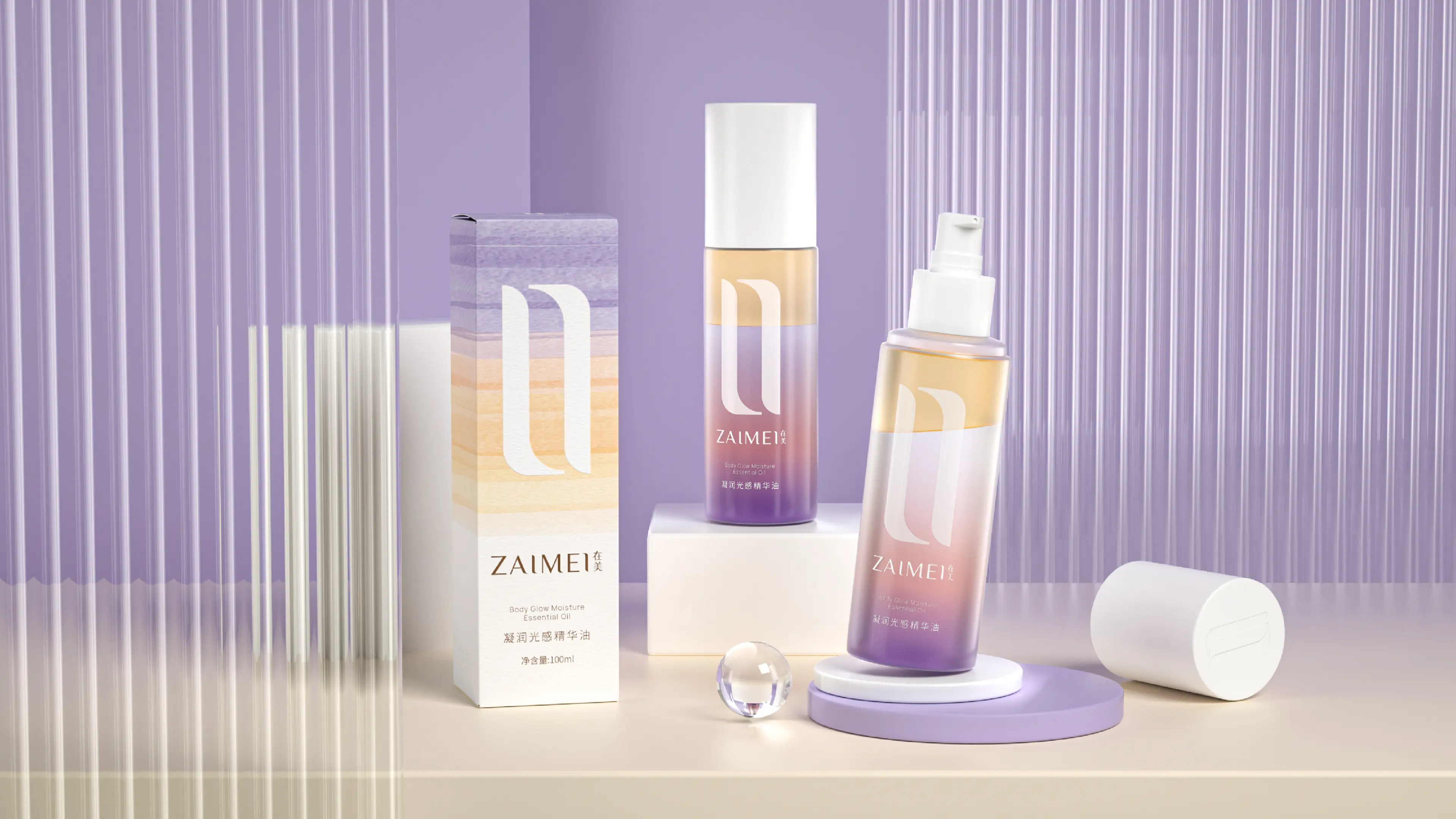
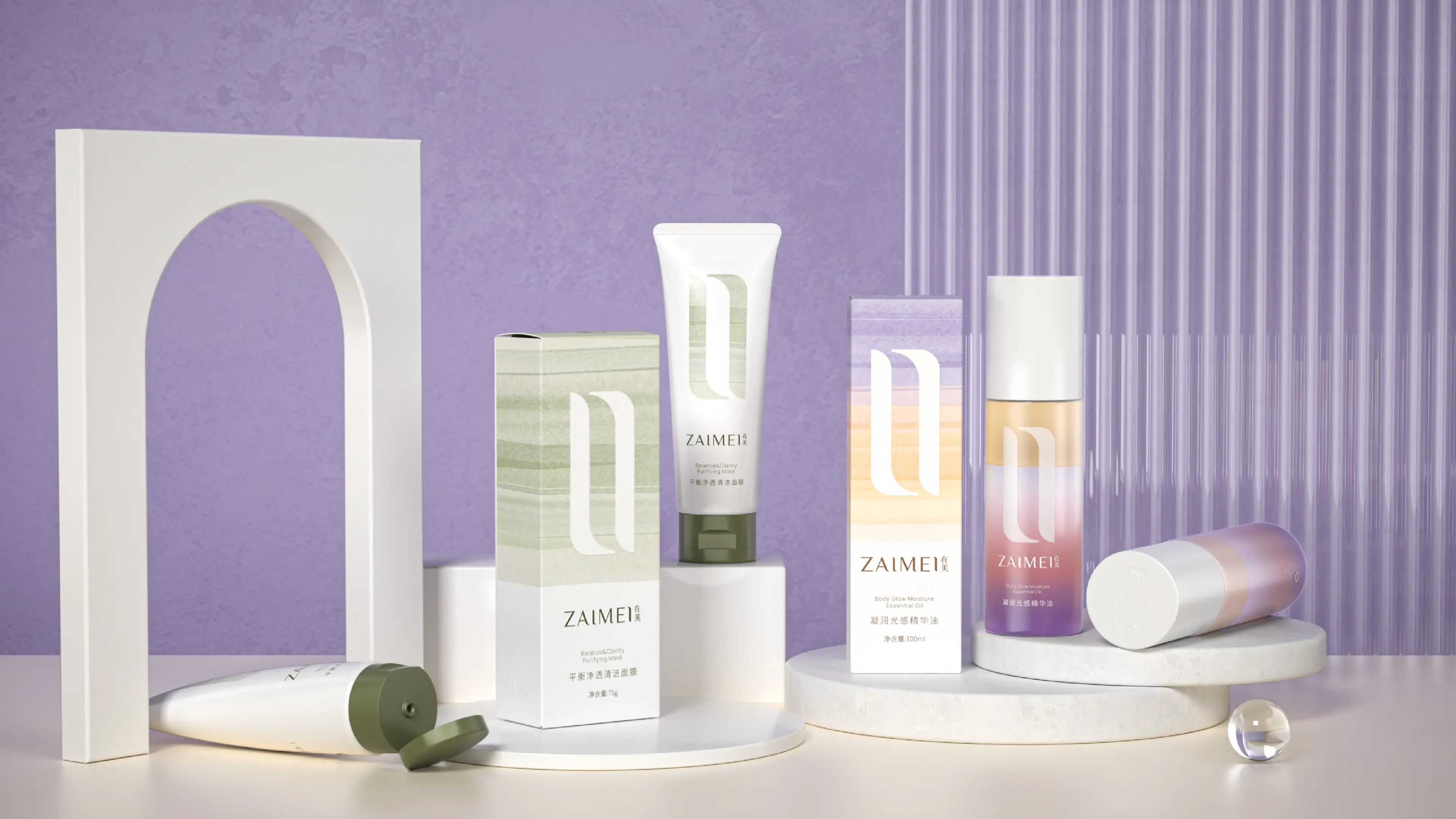

ZAIMEI in the US is a professional skincare brand originated from the US, relying on a mature overseas R&D and production system to create skincare products suitable for modern skin care. The brand deeply focuses on the physical and mental needs of contemporary urban populations, discarding the superficial skincare marketing concepts, and establishing the core brand concept of "Facing oneself, pleasing oneself, and the source of the body and mind". The brand is not only about external skin care but also advocates internal self-healing and self-pleasing, conveying a new aesthetic of relaxation, confidence, and acceptance of oneself, dedicated to providing consumers with a skincare experience that combines both skin care and physical healing, precisely meeting the refined, independent, and self-centered consumption demands of contemporary young people.
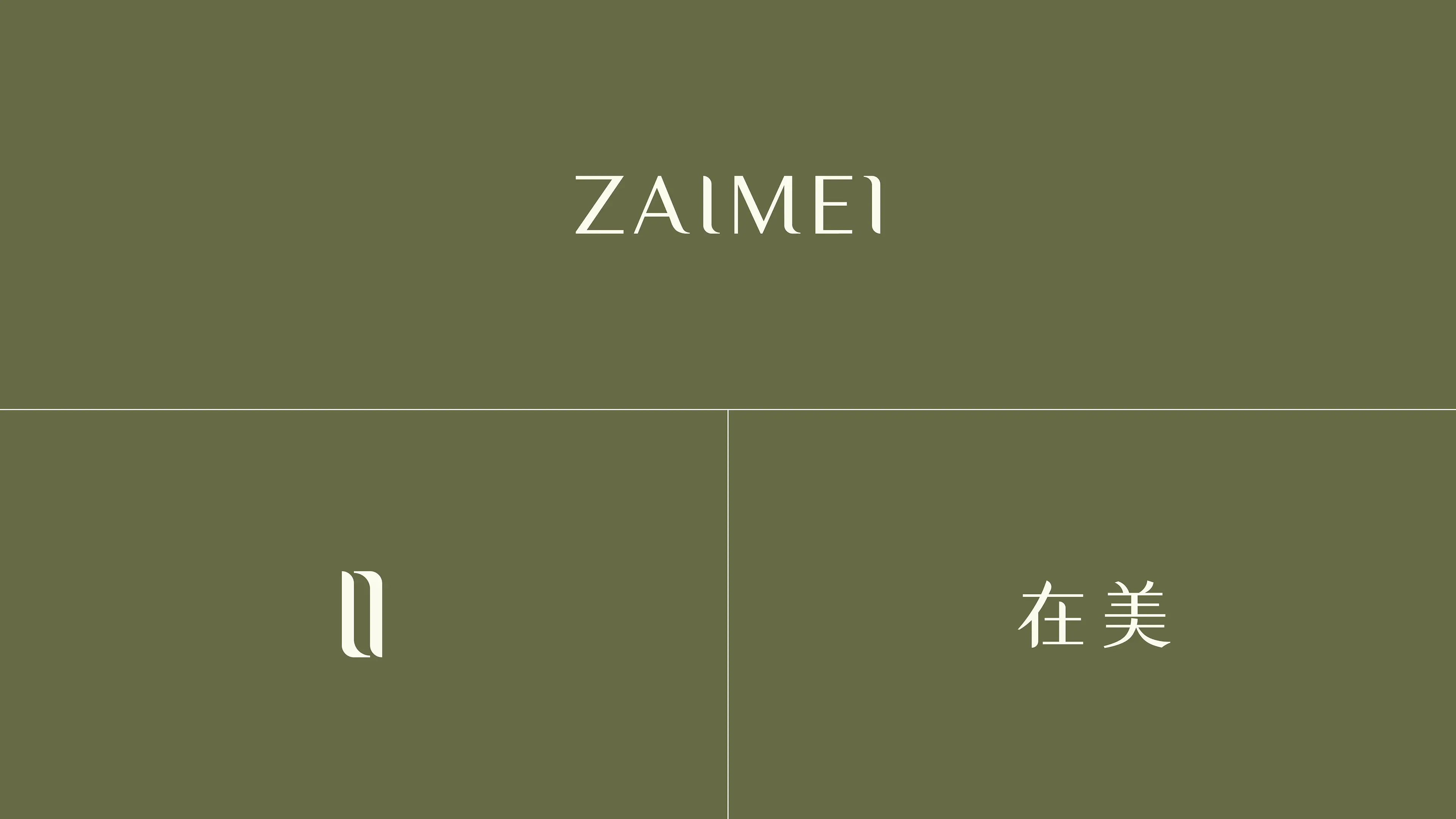
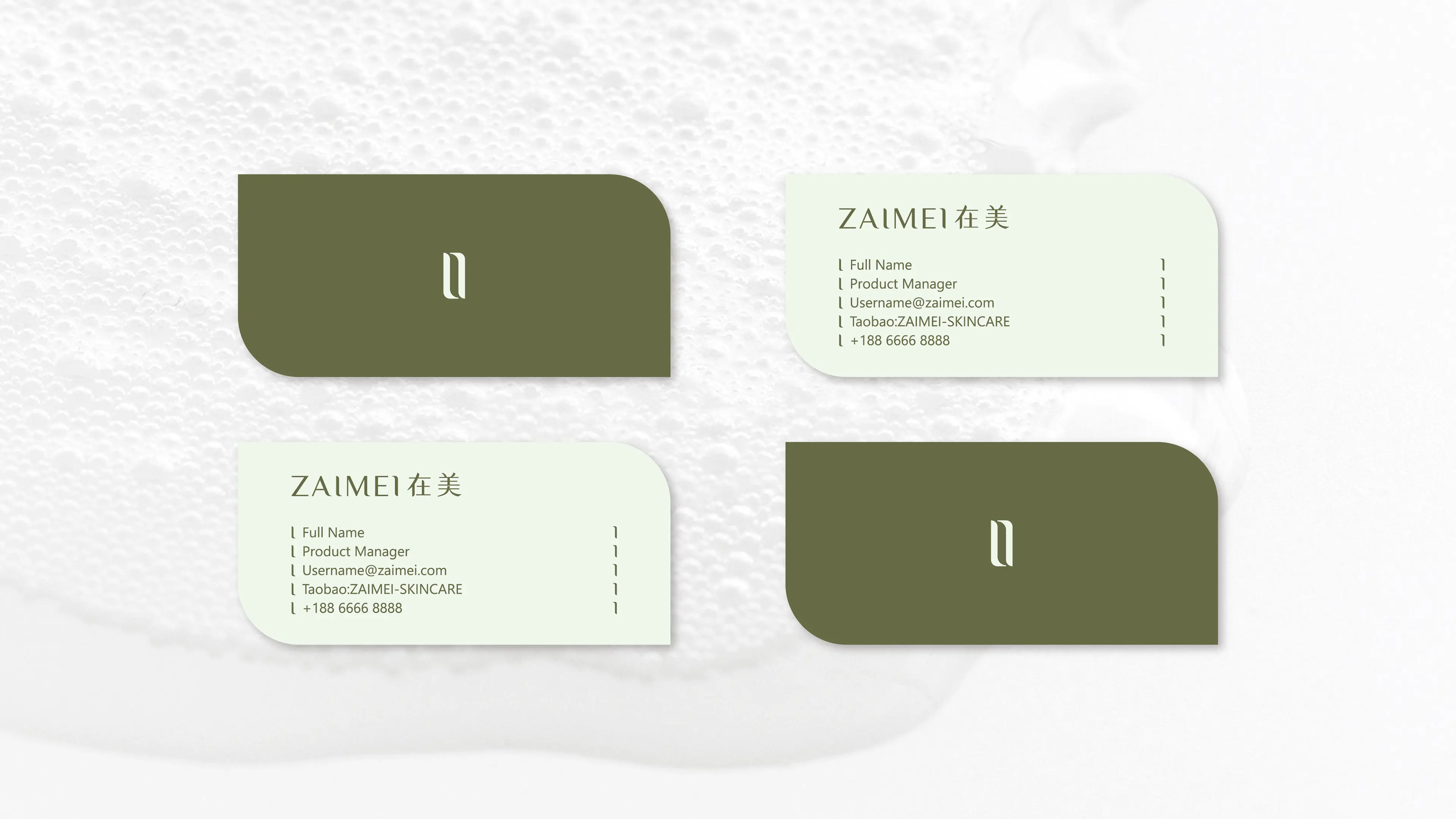
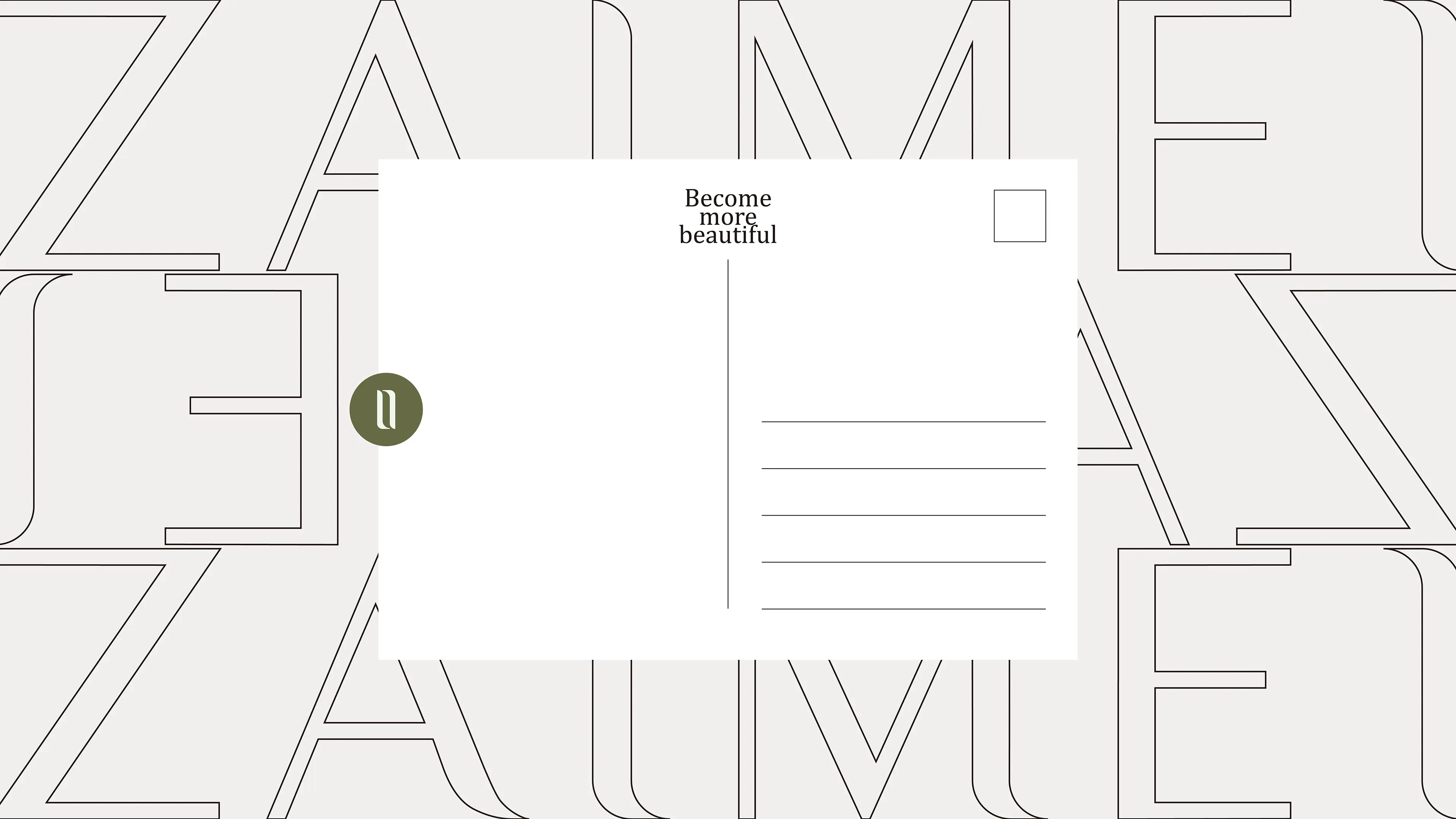
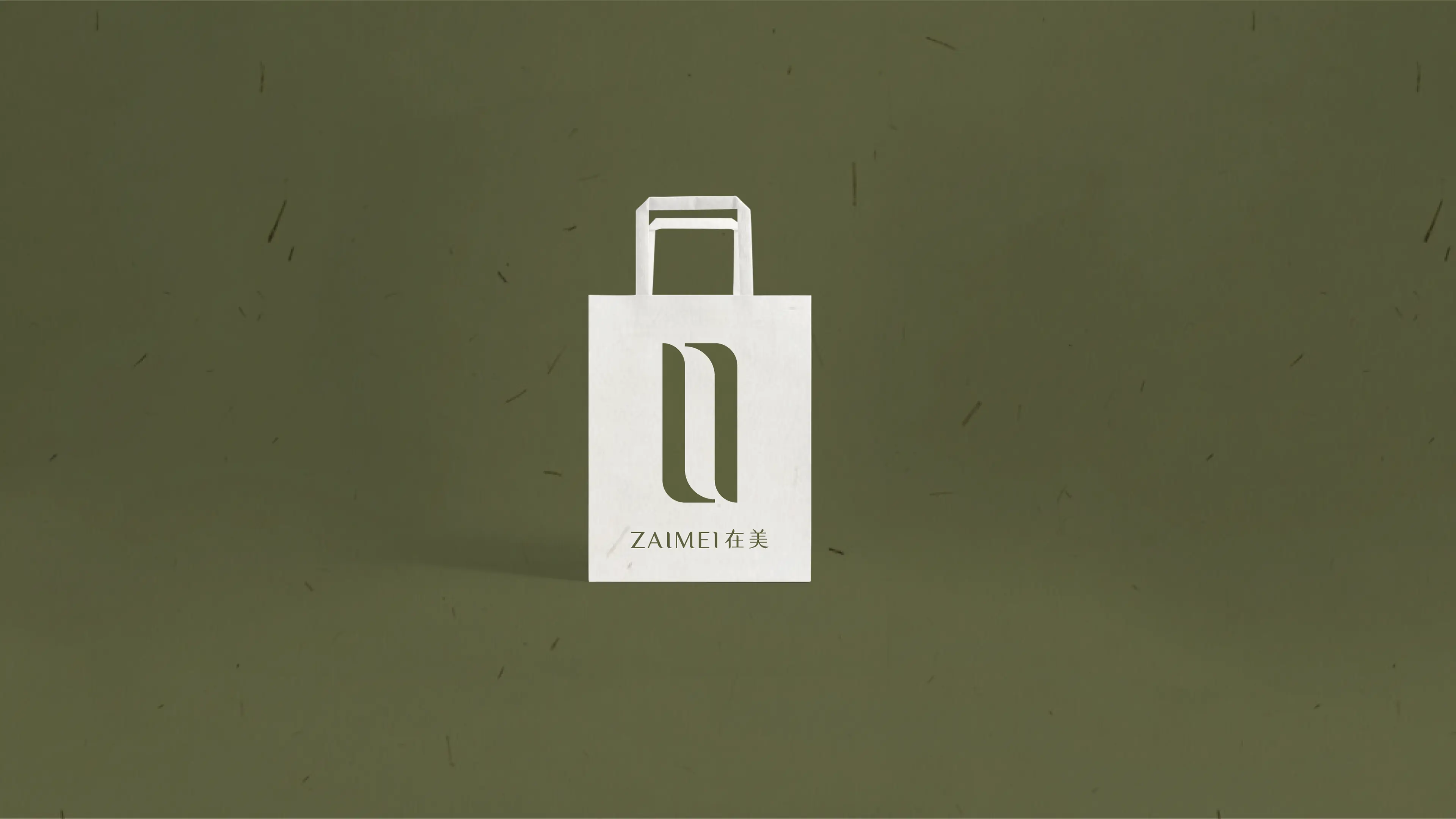
The core of this brand design focuses on the brand's self-pleasing and source-based core concept, concentrating on the creation of exclusive, simplified, and connotative brand visual symbols. The core is to achieve the visual upgrade of the brand font and LOGO. The design team abandoned conventional commercial font templates and carried out exclusive artistic deformation design for the brand name, while maintaining the font's recognizability, simple and elegant texture. The font structure and line proportions were optimized to match the gentle and exquisite visual temperament of the skincare brand.
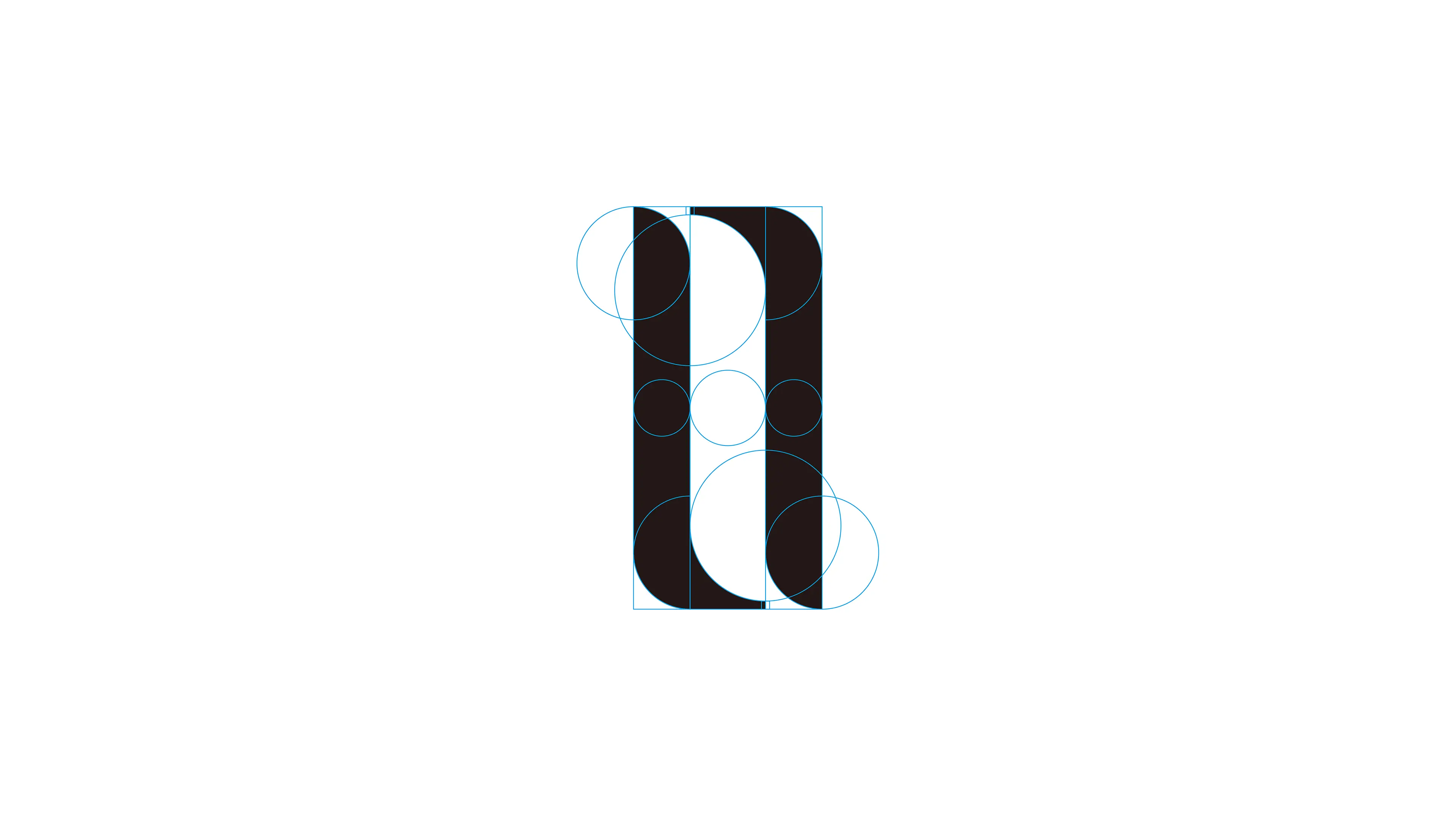
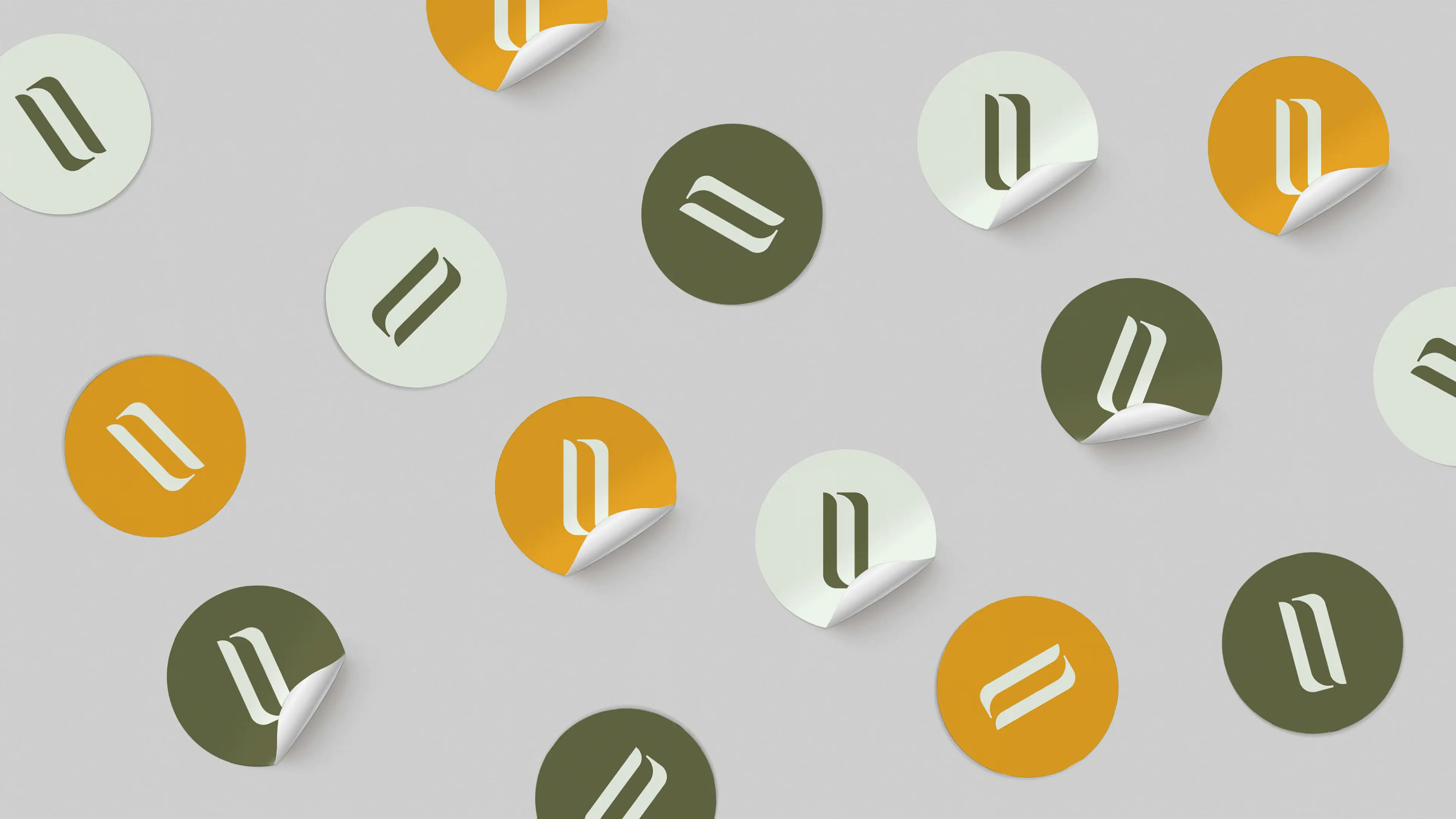
The core creative highlights focus on the letters "I" in the brand name. Through precise symmetrical aesthetic design, the letter form is redefined, creating a symmetrical, balanced, and simple and elegant exclusive LOGO visual symbol. The symmetrical design form implies the brand's core concept of "body and mind source", symbolizing self-balance and the unity of body and mind, perfectly echoing the brand's core proposition of facing oneself and pleasing oneself. The overall design is carried by minimalist aesthetics, balancing visual beauty and brand connotation, making every visual detail fit the brand positioning, achieving a high degree of unity between brand visual and brand concept.