 |  |
 |  |
 |  |
 |  |
 |  |  |
 |  |
 |  |
 |  |  |
 |  |
 |  |  |
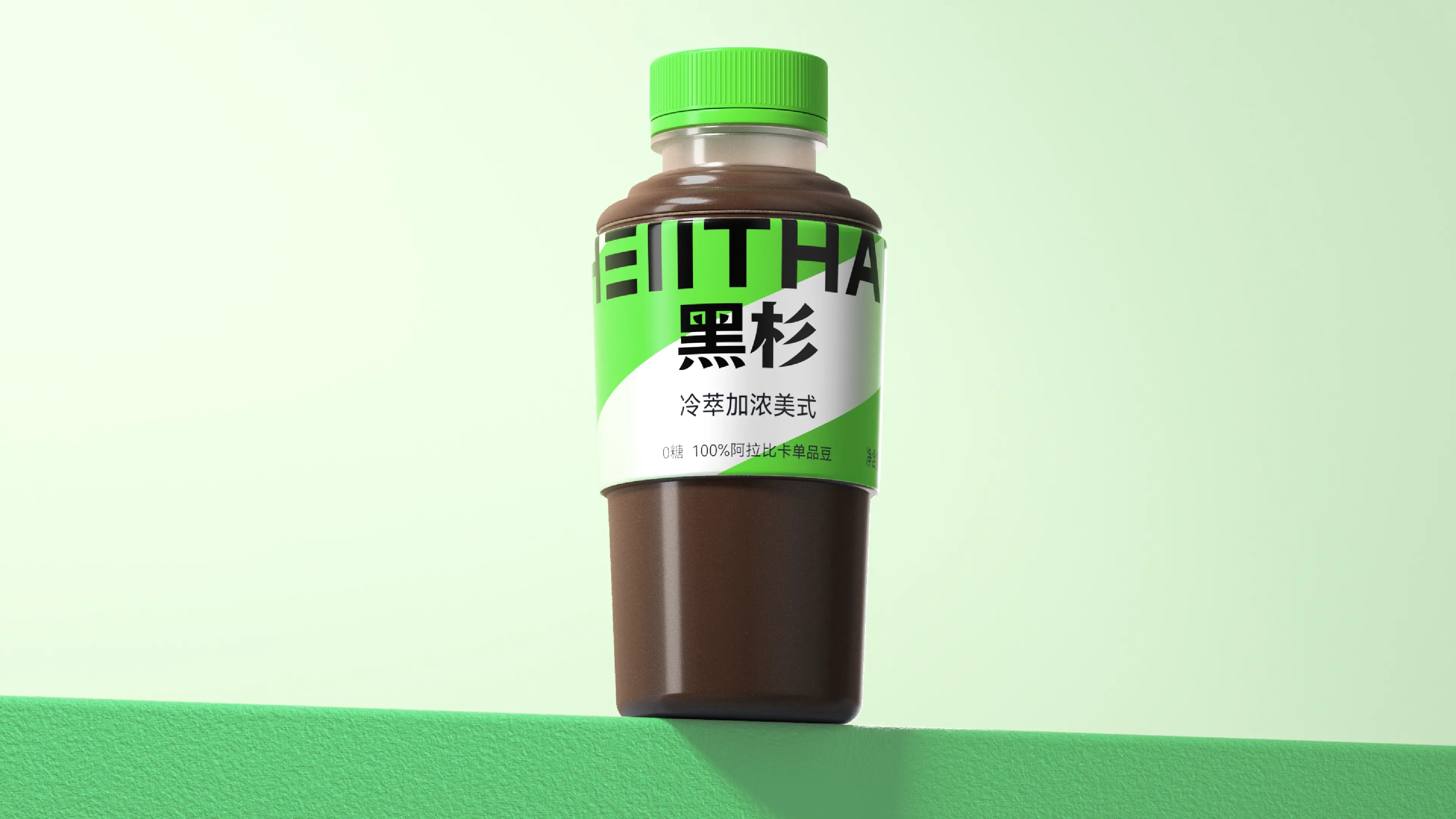
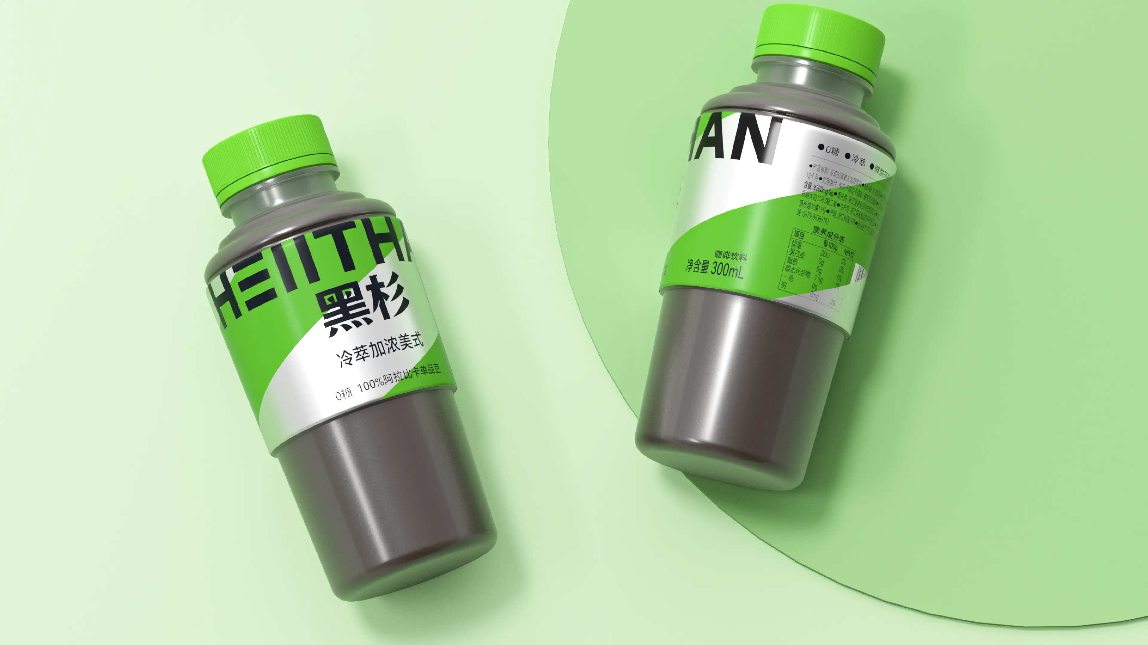
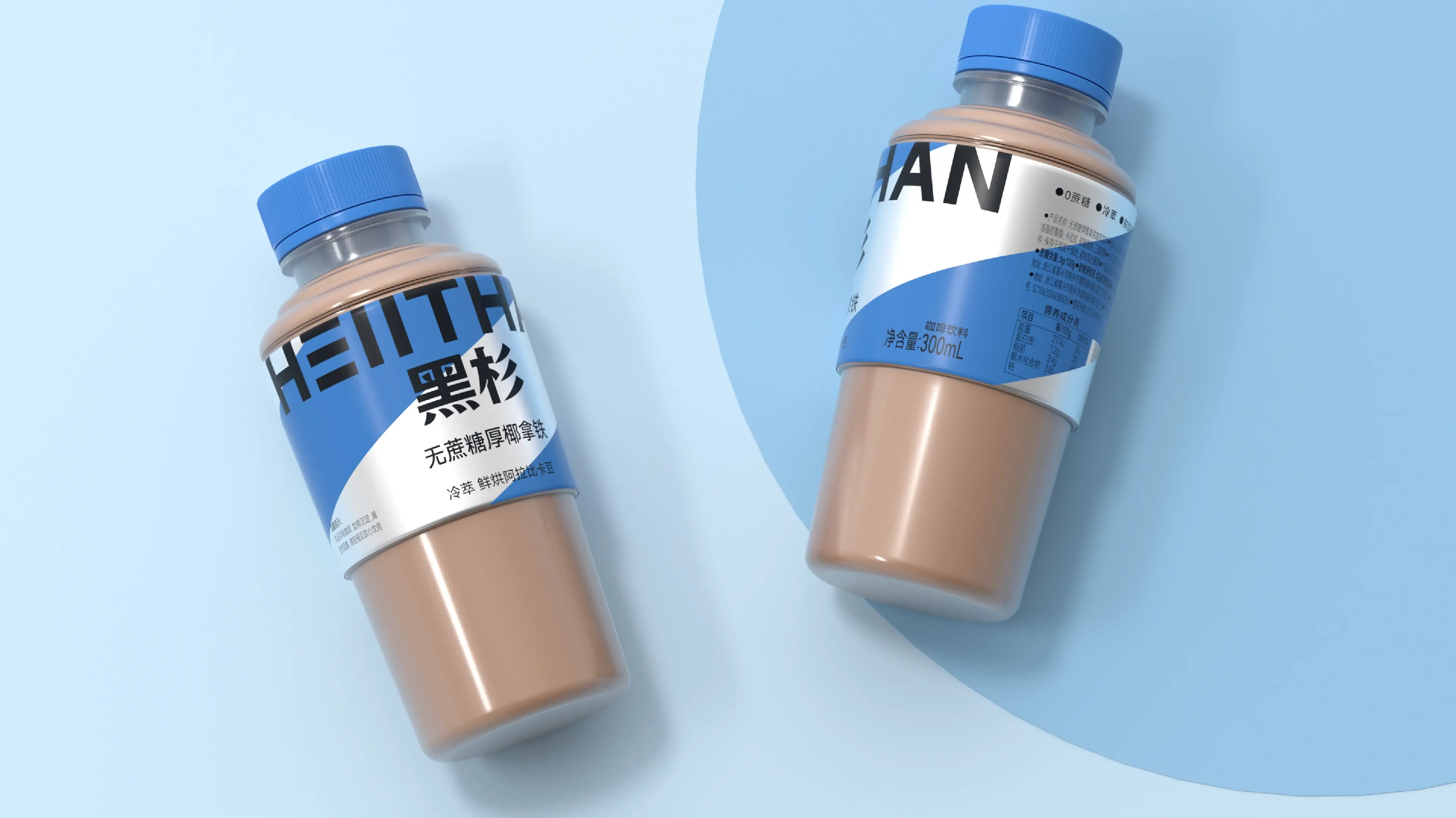
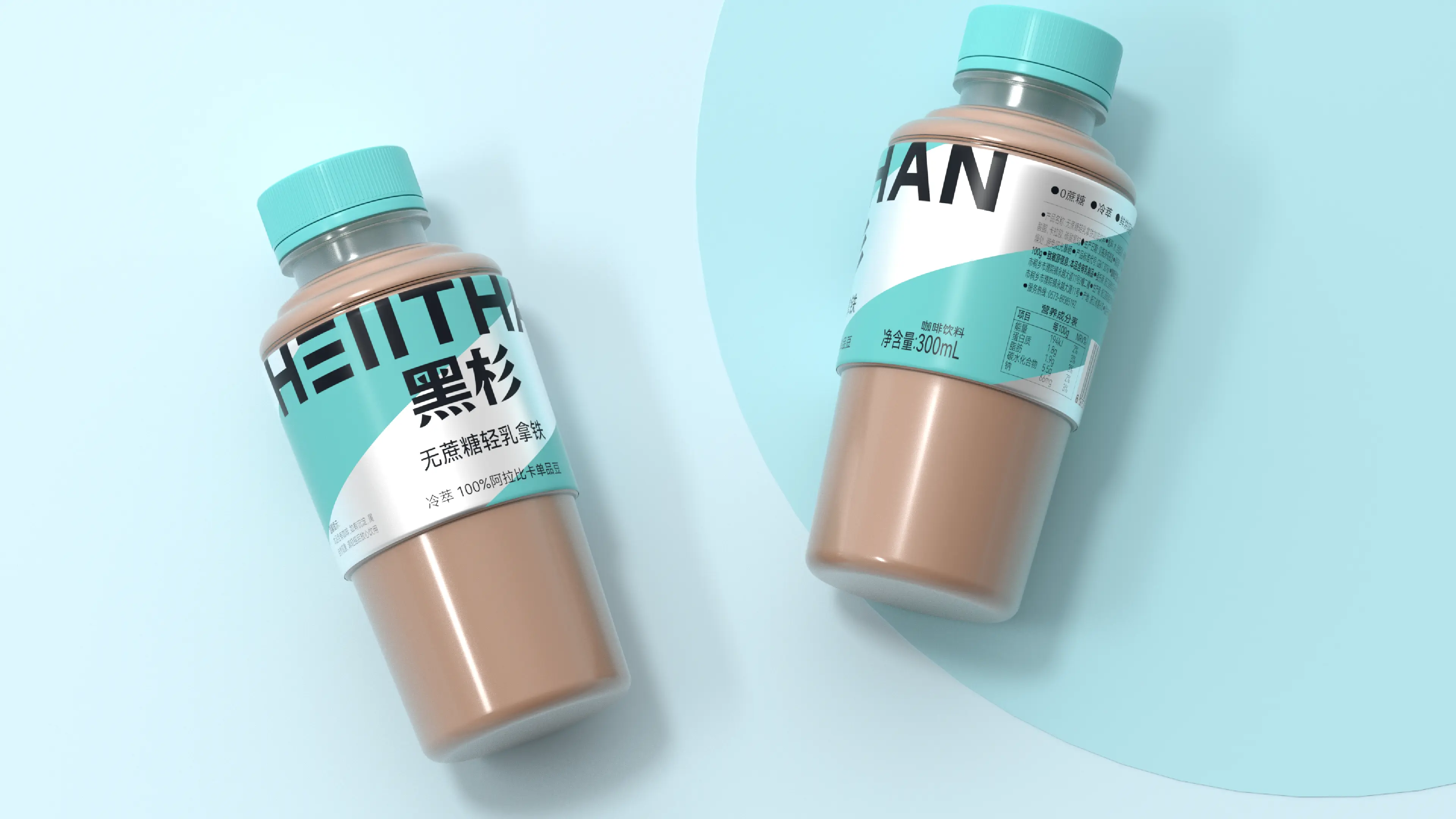
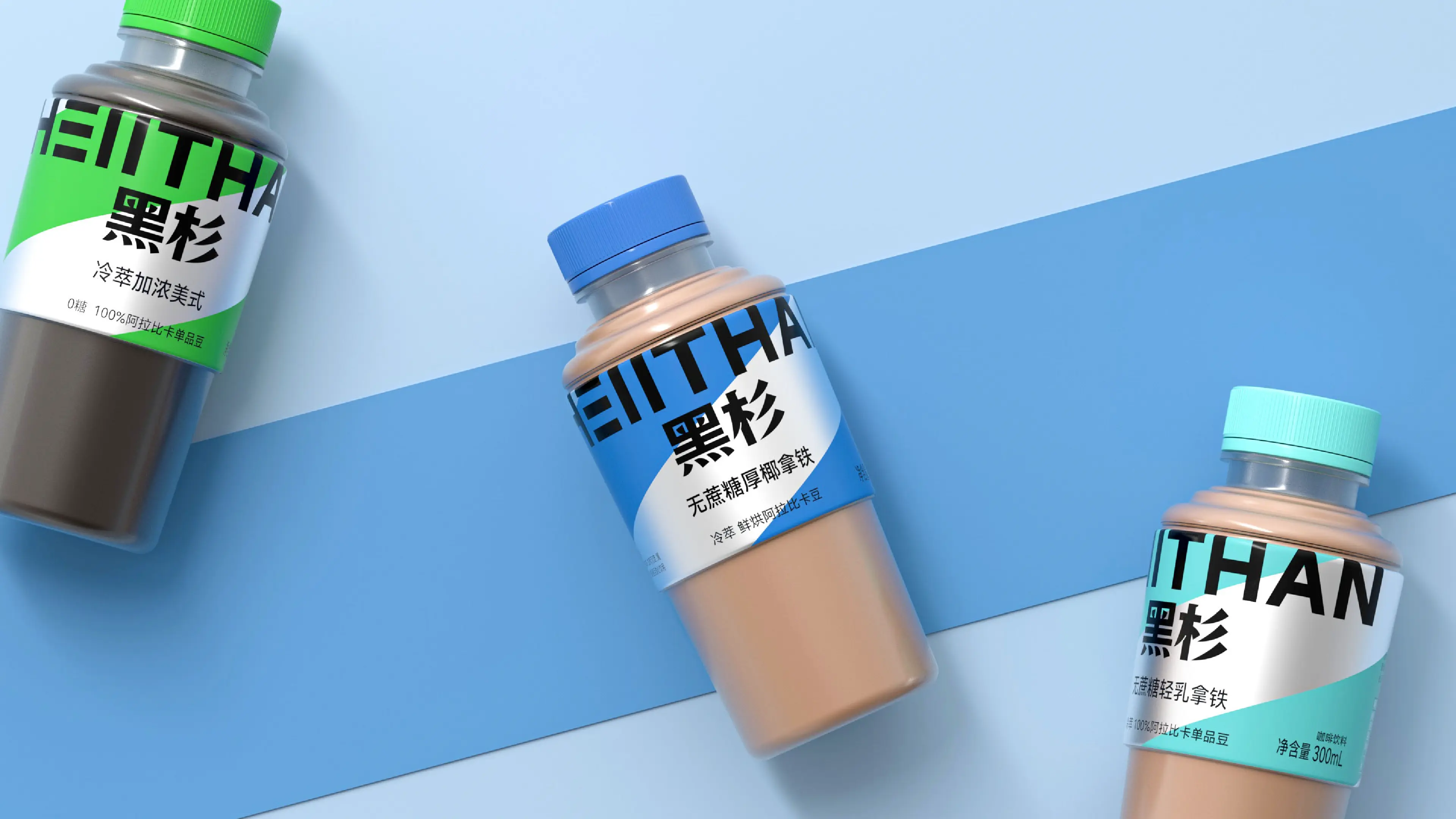
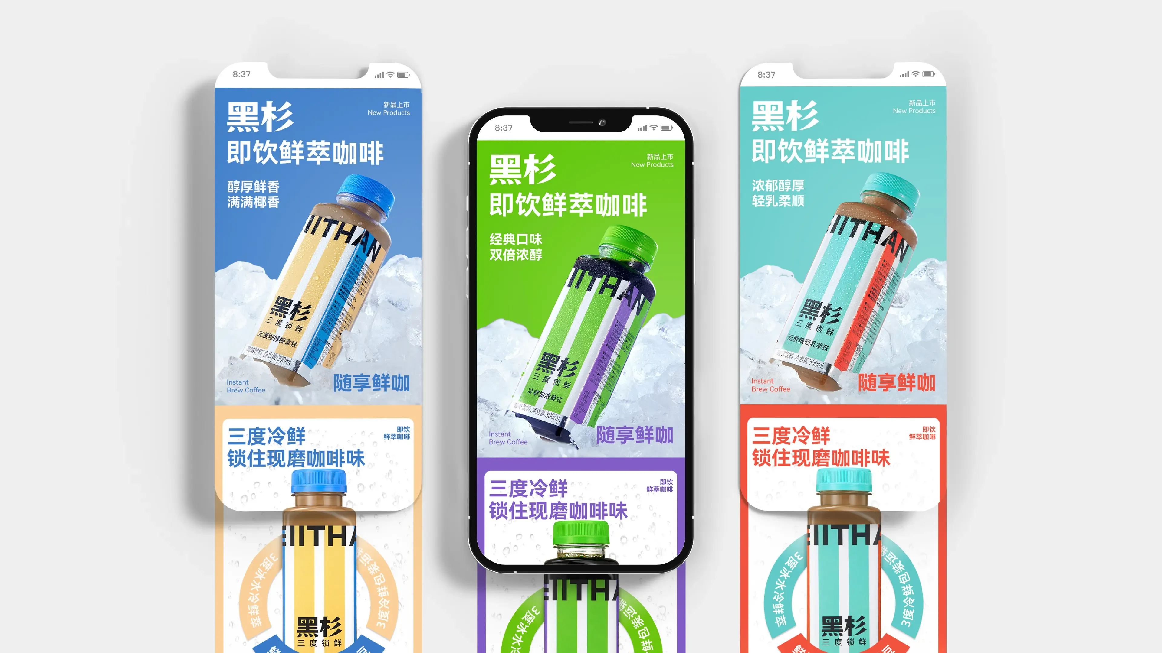
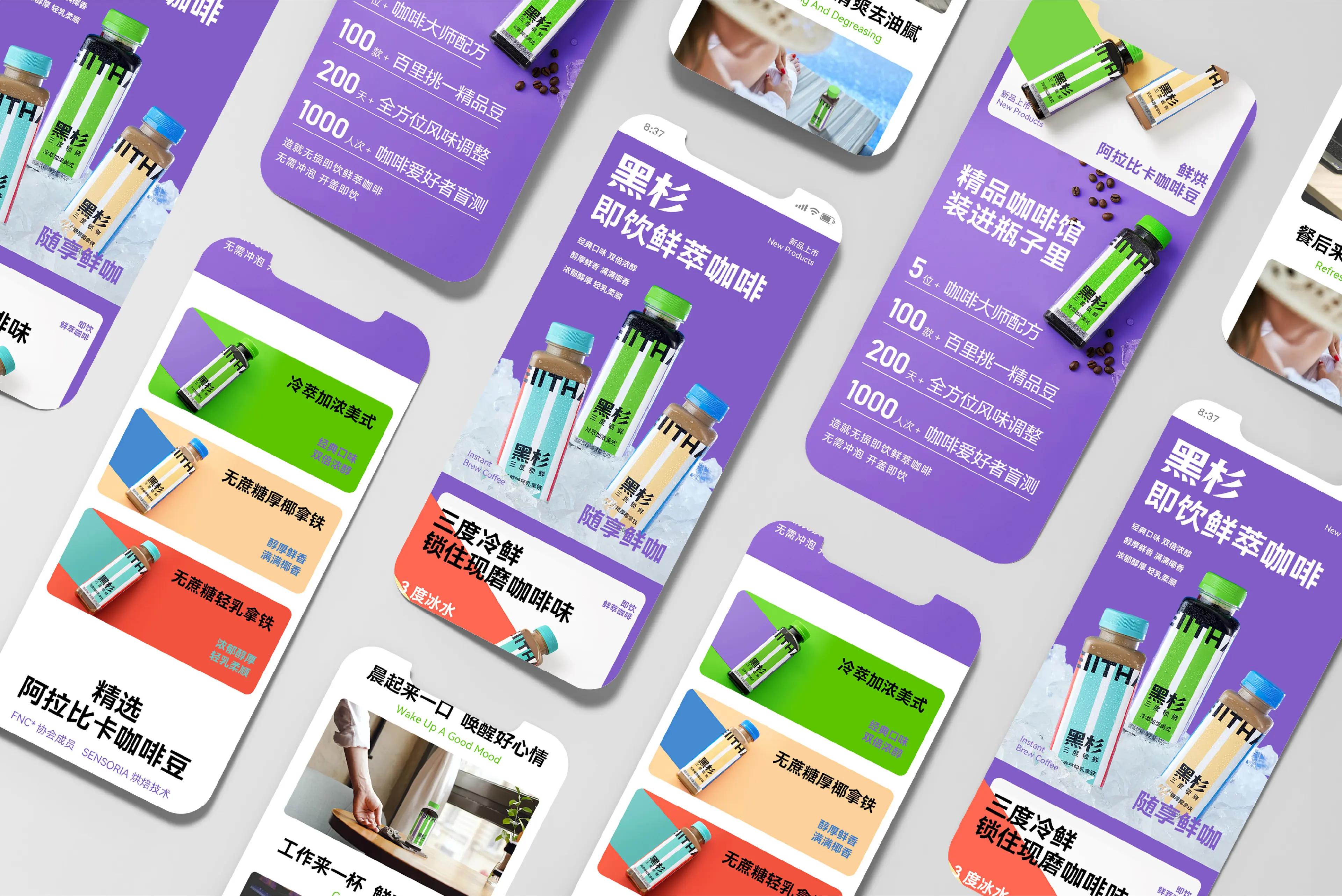
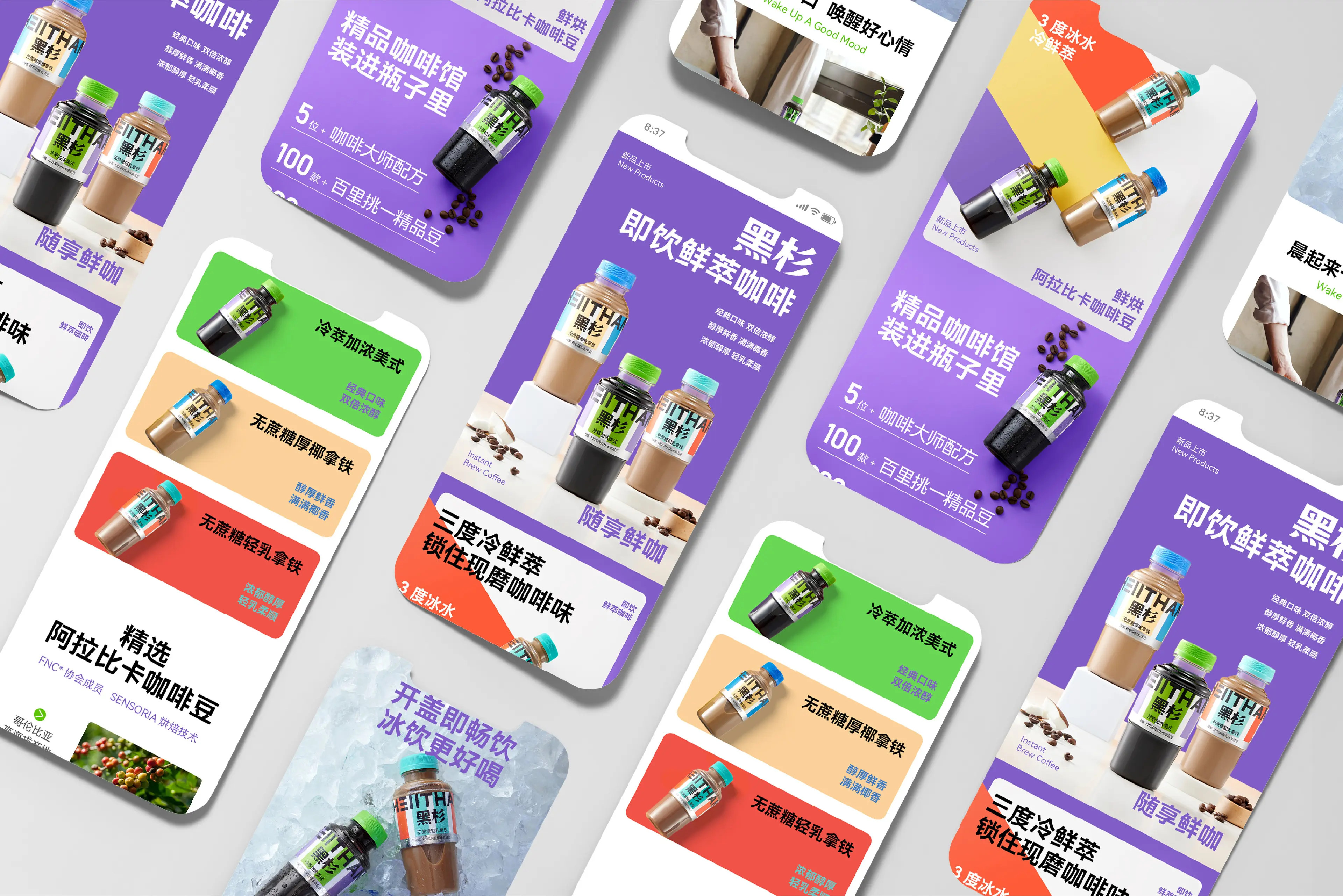
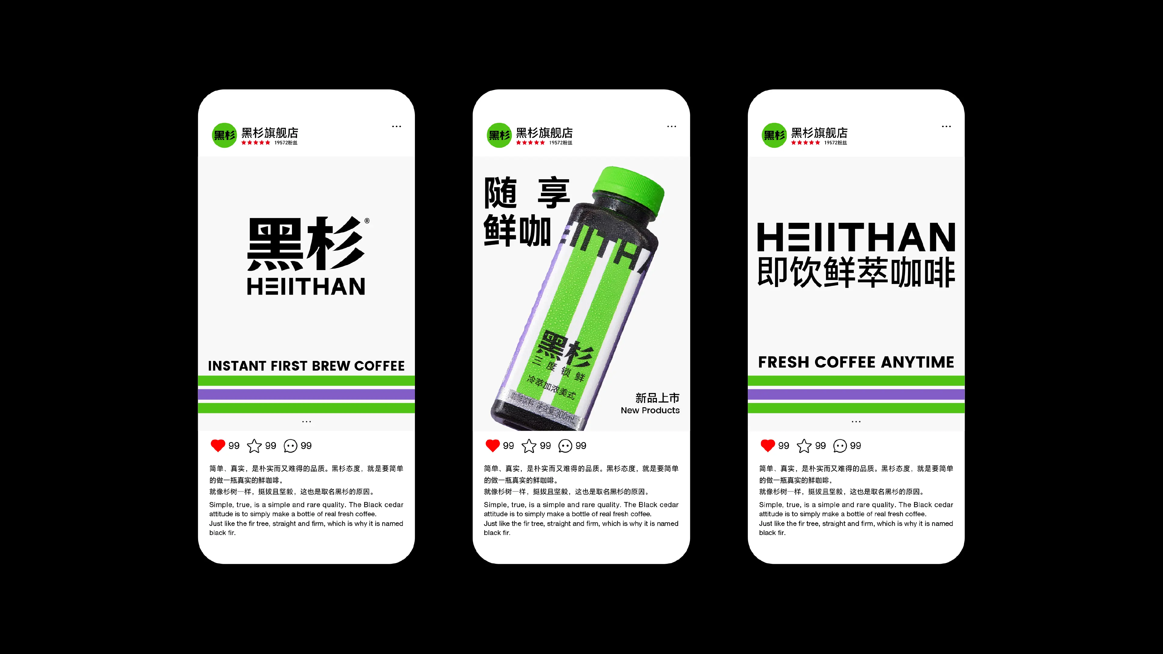
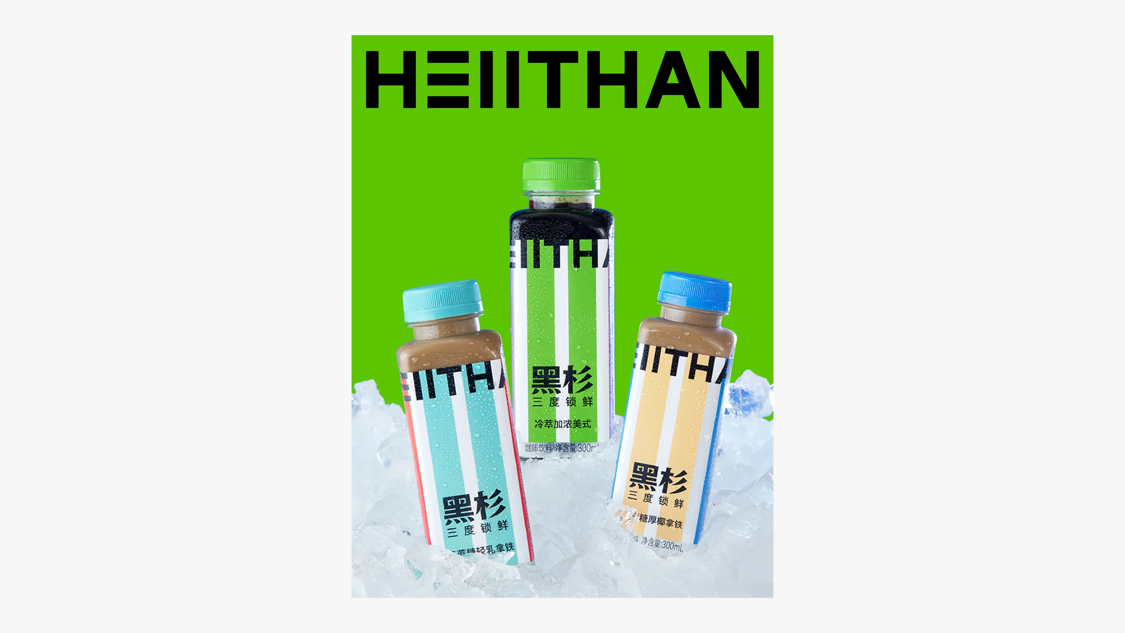
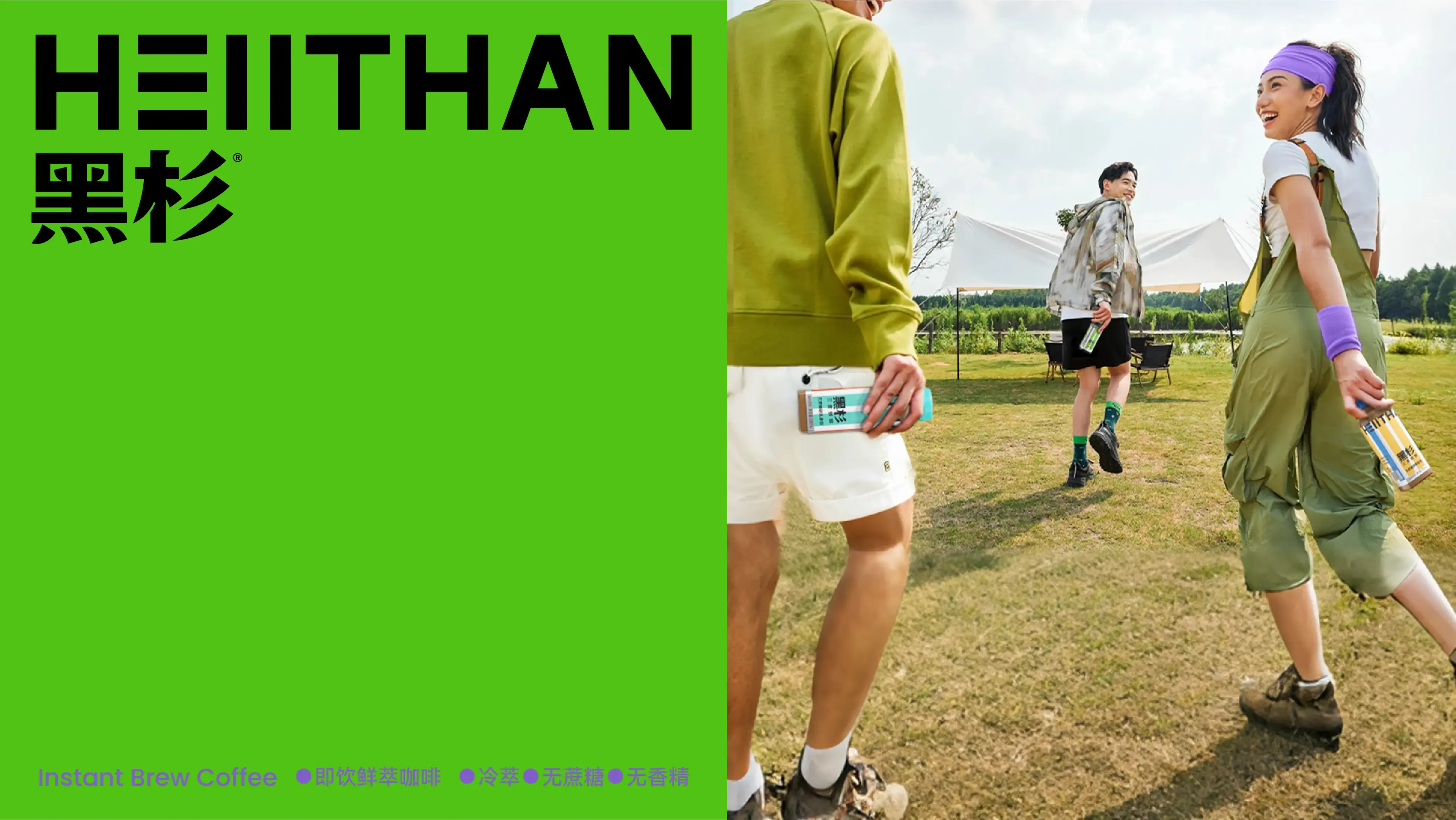
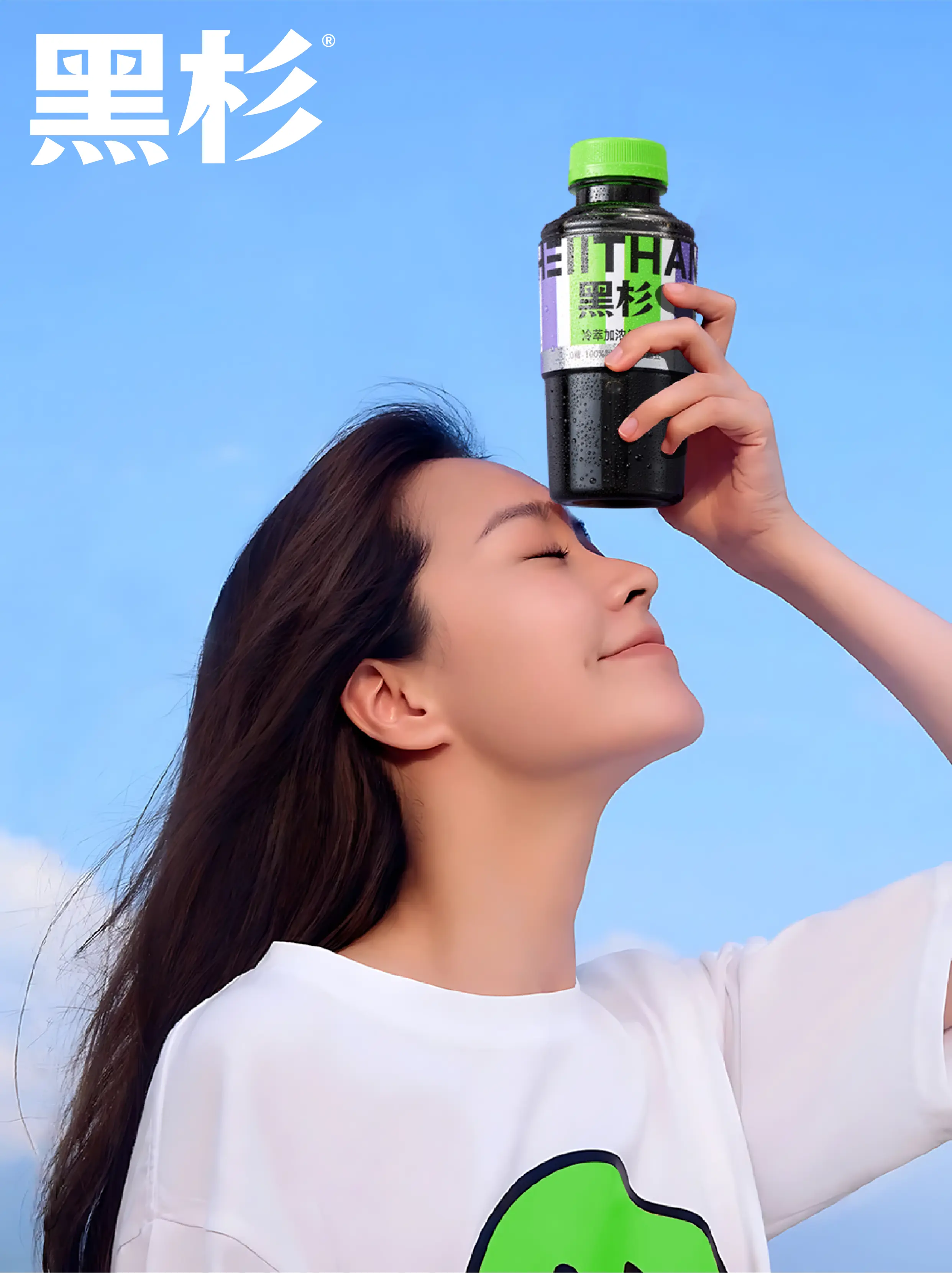
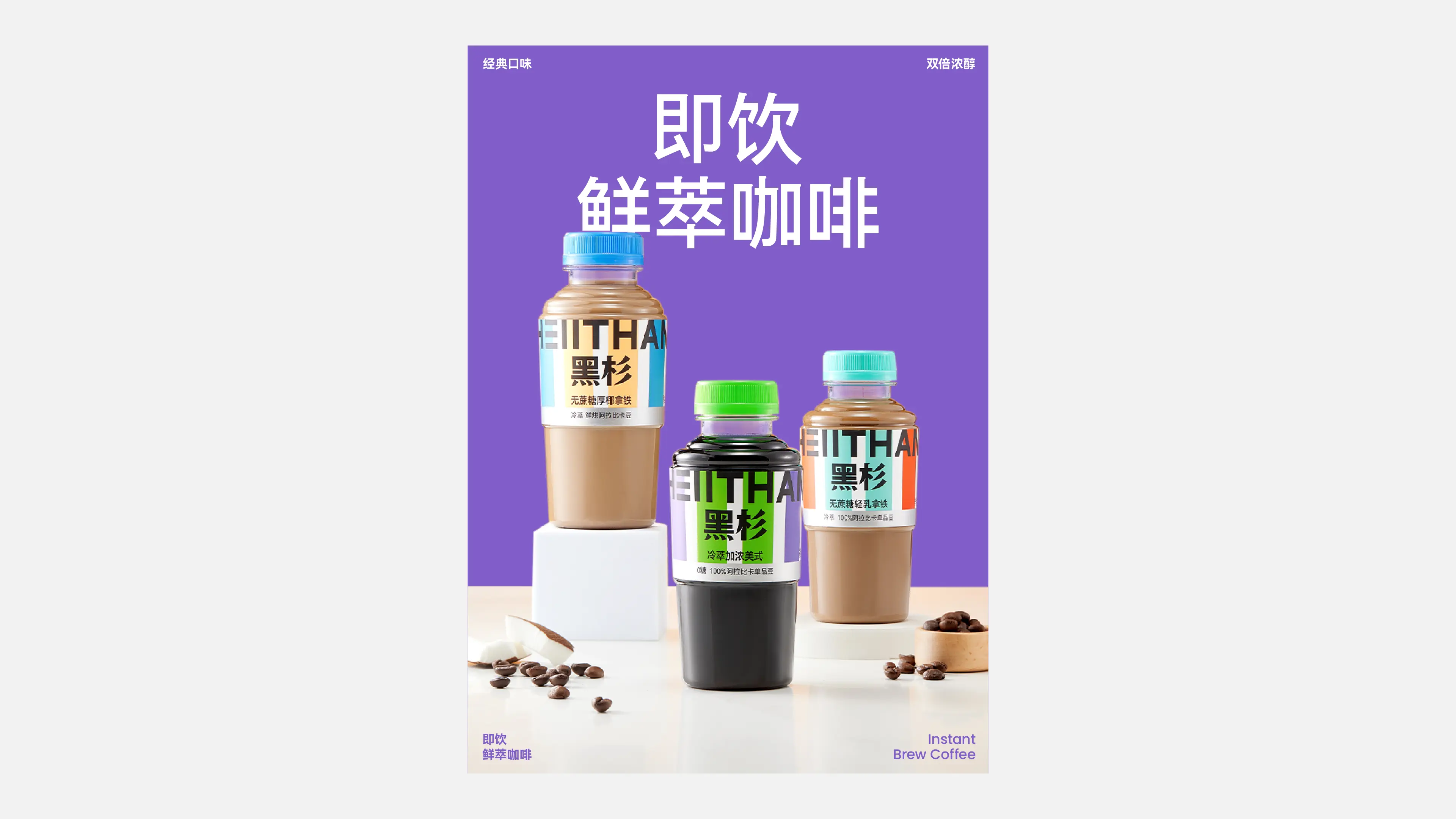
HEIITHAN is a brand-new coffee brand founded in 2022, and its parent company is Zhejiang Huimei Food & Beverage Co., Ltd. The brand is dedicated to creating ready-to-drink fresh coffee. Through the careful selection of high-quality ingredients, exploration of freshness-locking technology, and a rigorous supply chain system, it hopes to make high-quality fresh coffee no longer limited to coffee shops, allowing coffee lovers to enjoy fresh coffee anytime, anywhere. HEIITHAN has cold-chain production filling lines, cold-chain logistics and transportation, and a cold-fresh preservation system. The brand has introduced the “Triple Cold-Freshness” concept: First “freshness”—carefully selecting coffee beans of the same varieties used for freshly ground coffee and strictly controlling roasting freshness; Second “freshness”—using low-temperature soft water at 0–6°C for 20-hour drip extraction to restore the flavor of the coffee beans; Third “freshness”—no preservatives added, using low-temperature cold-chain transportation at 3°C ± 3 and cold-fresh storage. “HEIITHAN is an attitude.” Simplicity and authenticity are plain yet rare qualities. The HEIITHAN attitude is to simply make a bottle of authentic fresh coffee. The fir tree is upright and steadfast, which is also the reason “HEIITHAN” was chosen as the brand name.
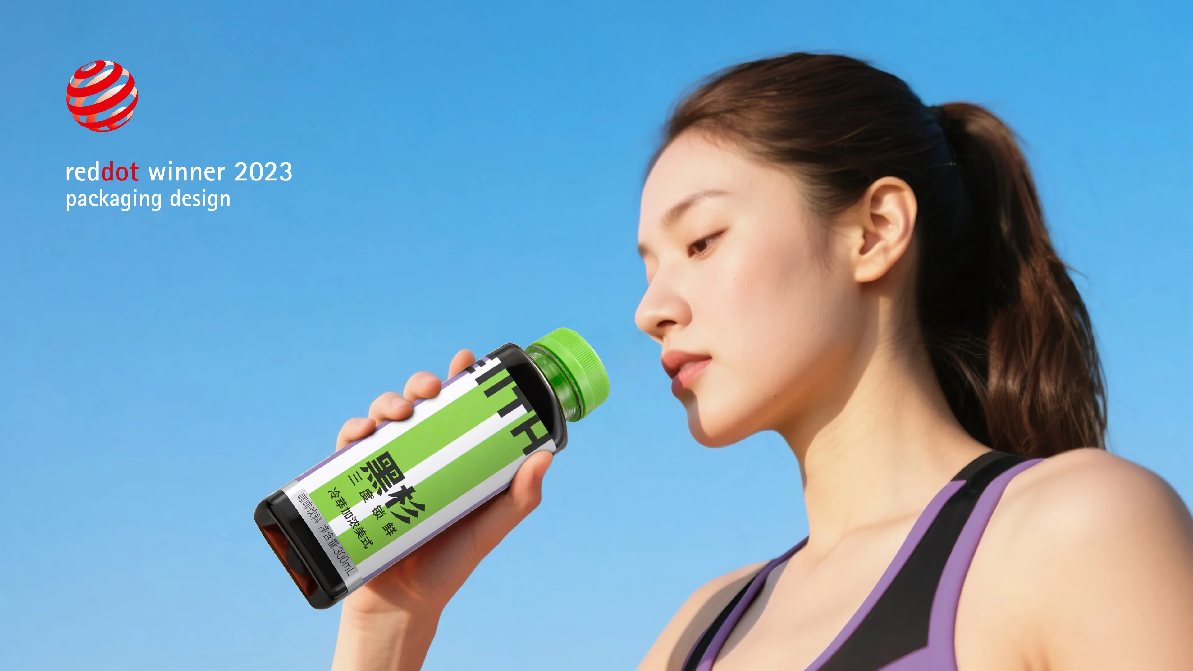
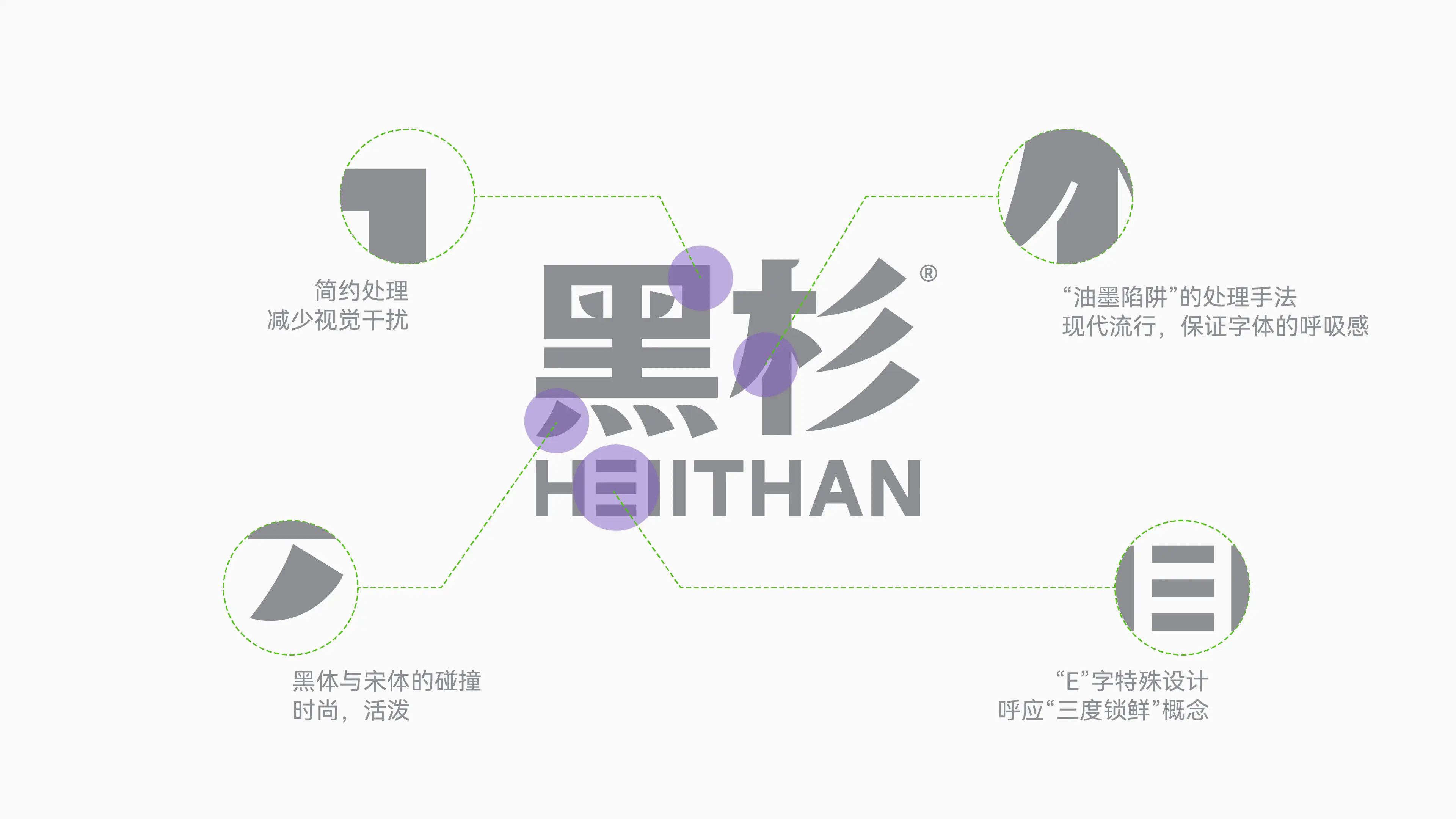
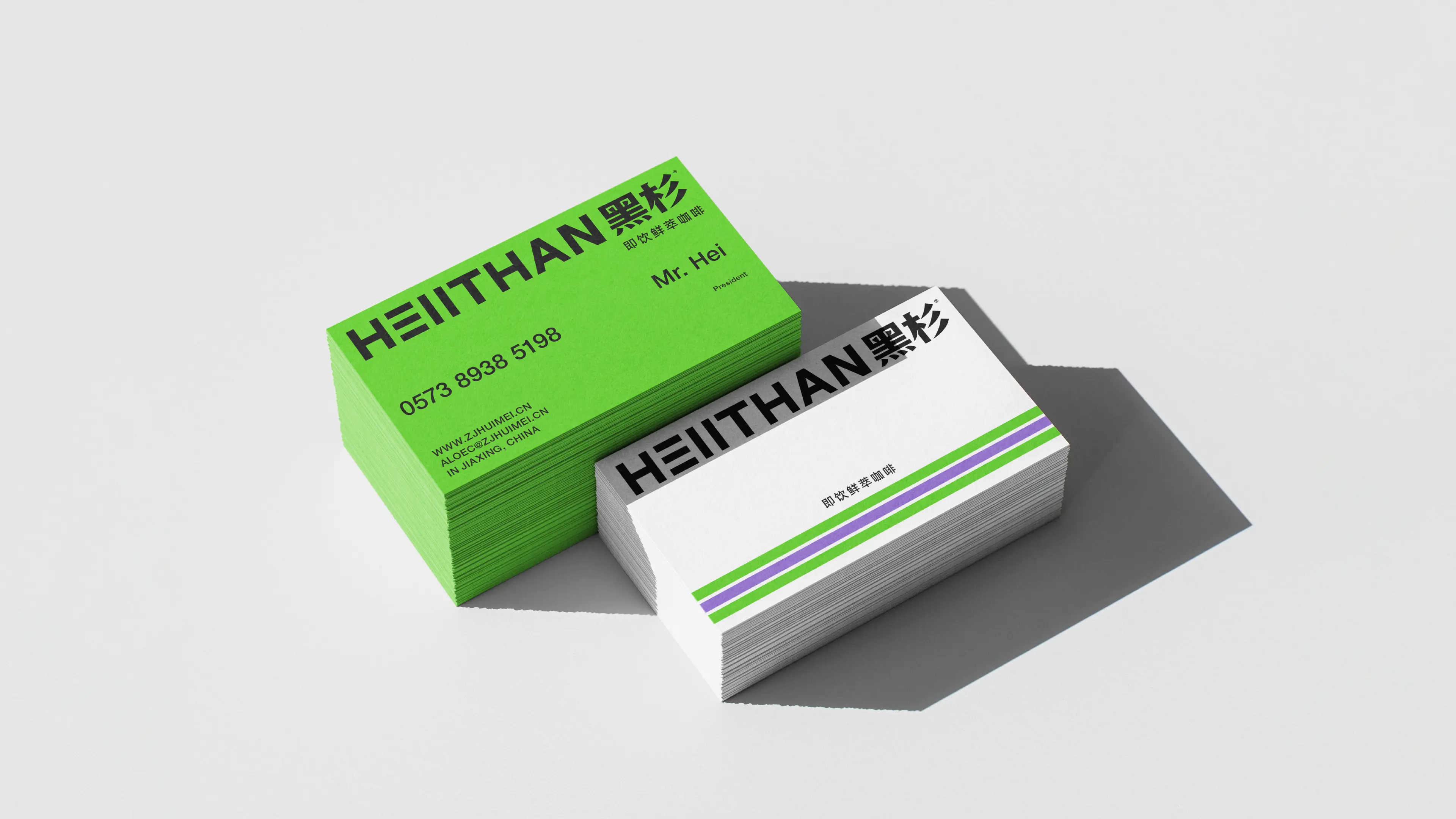
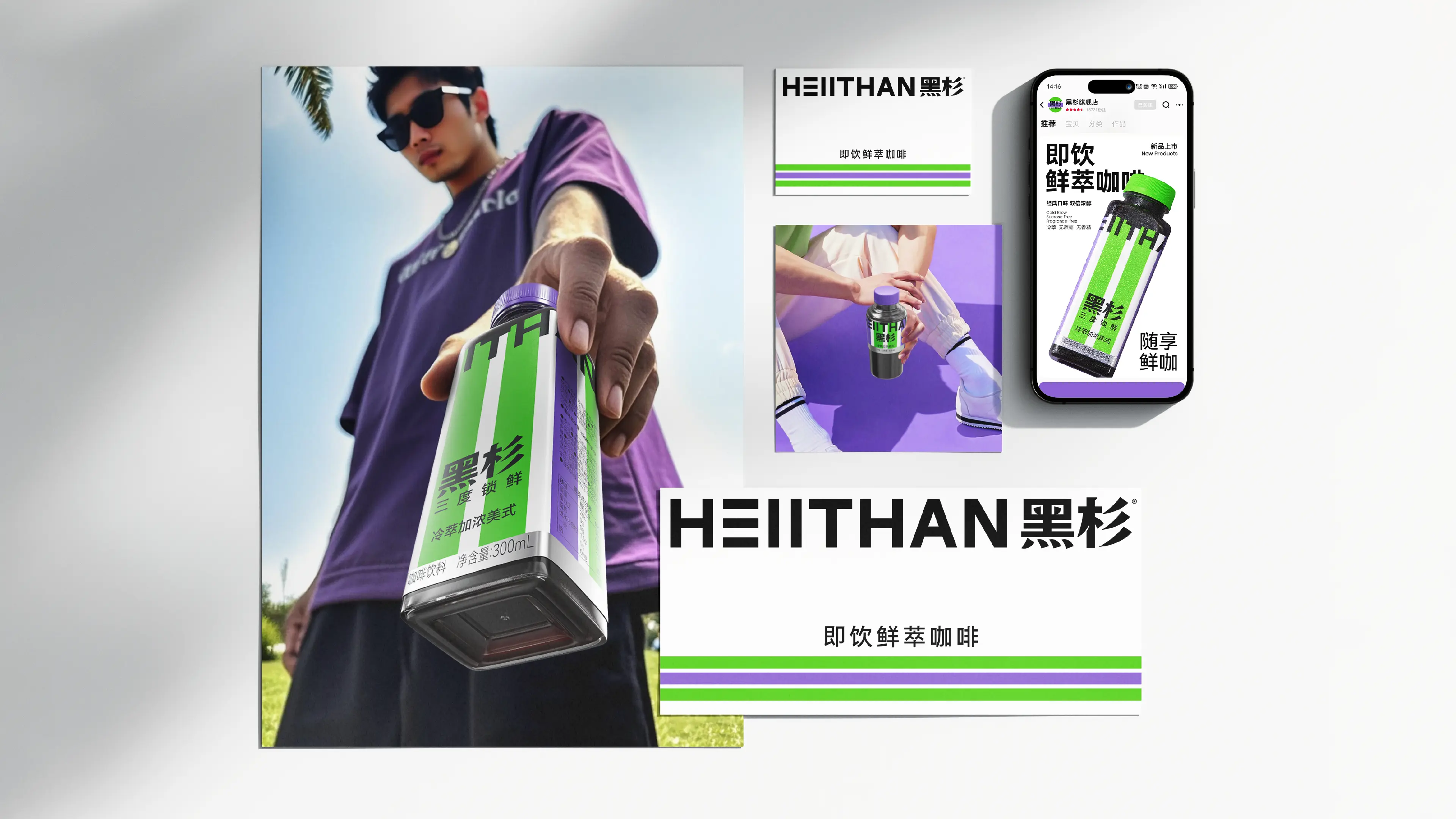
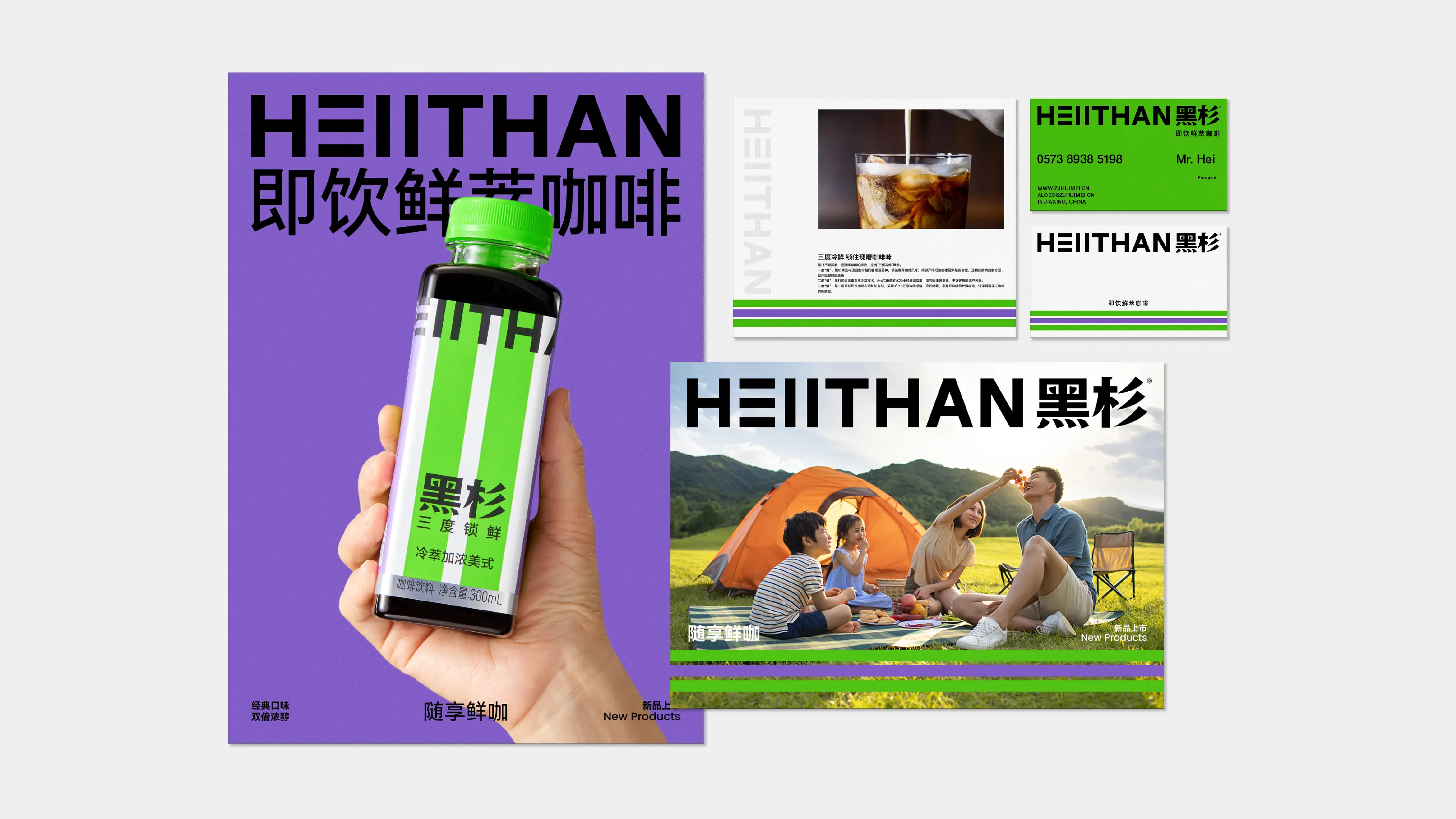
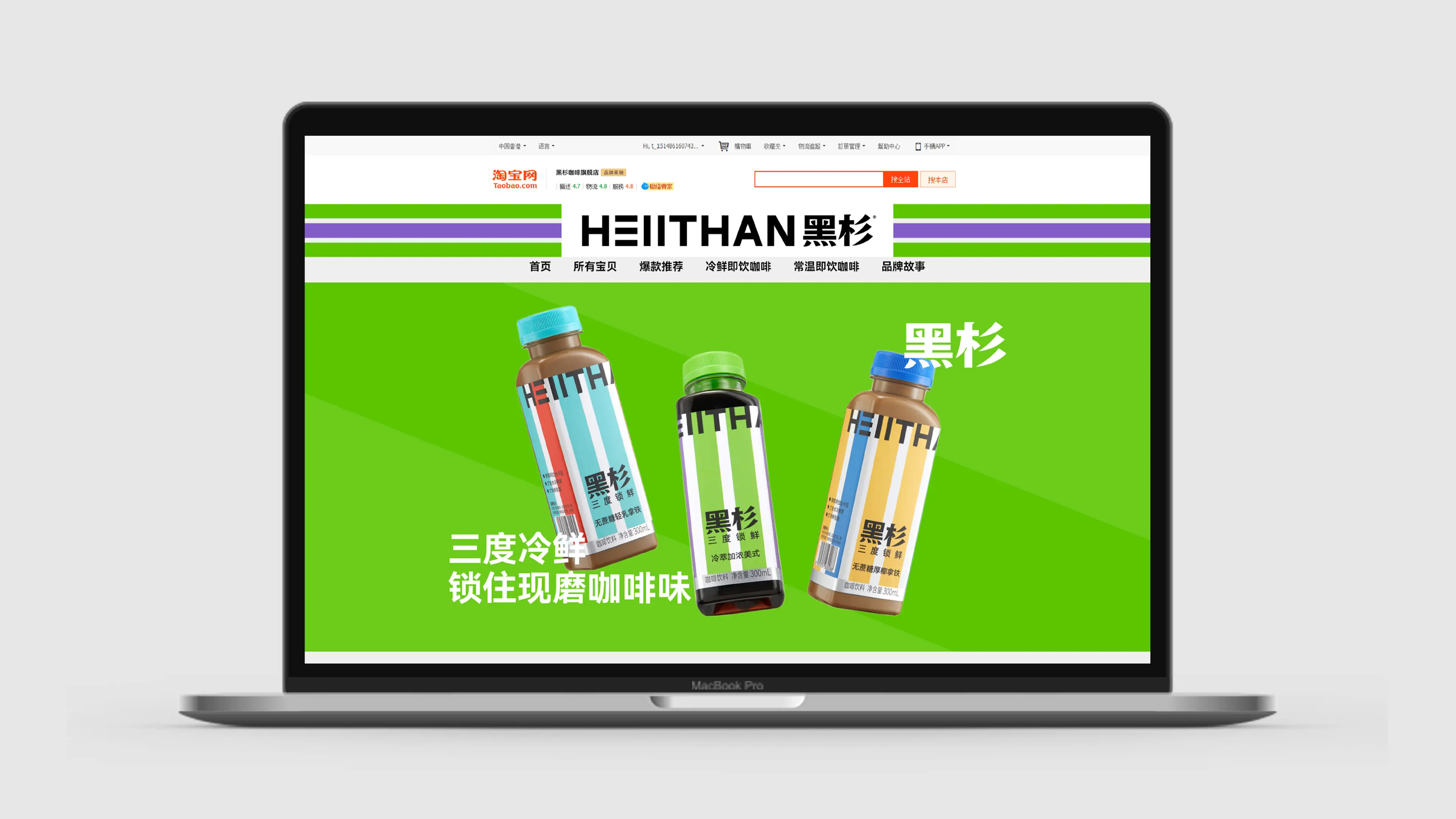
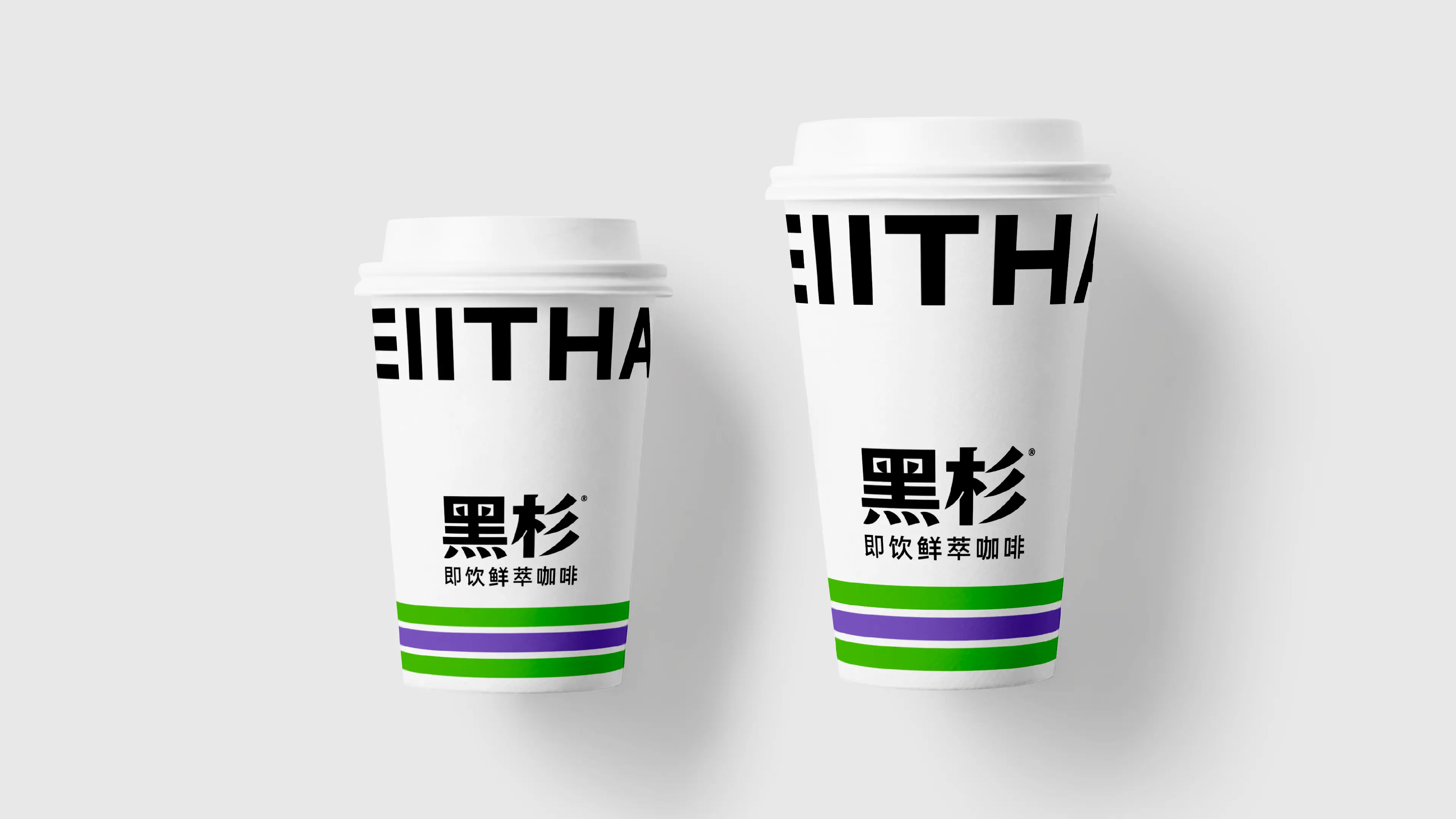
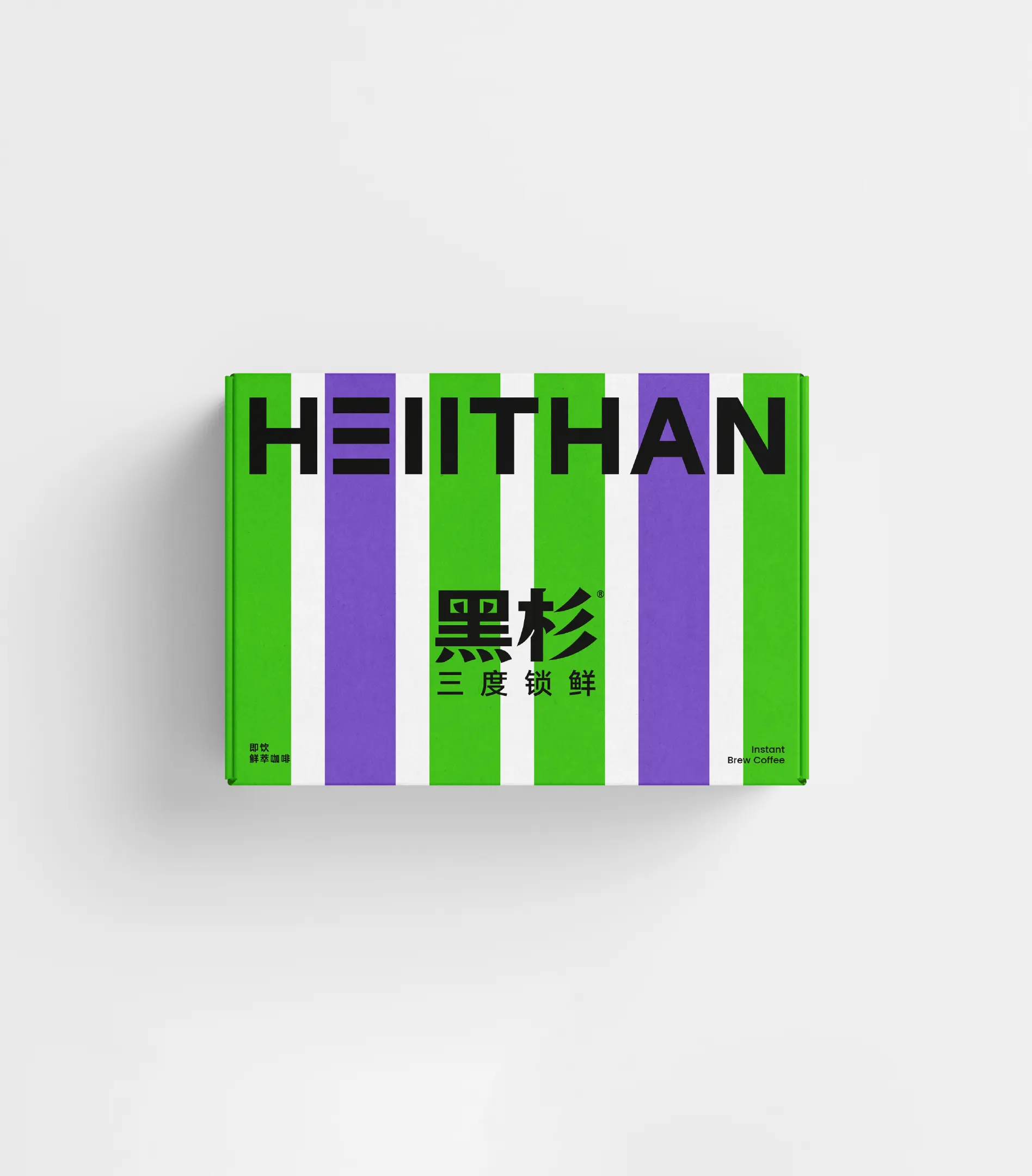
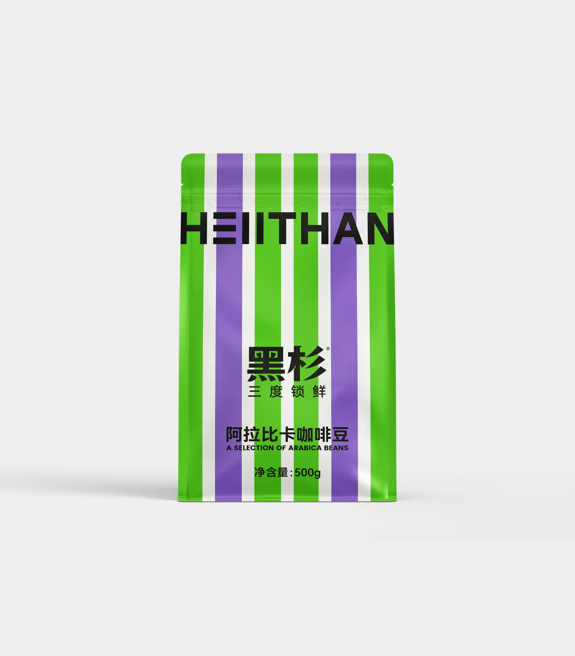
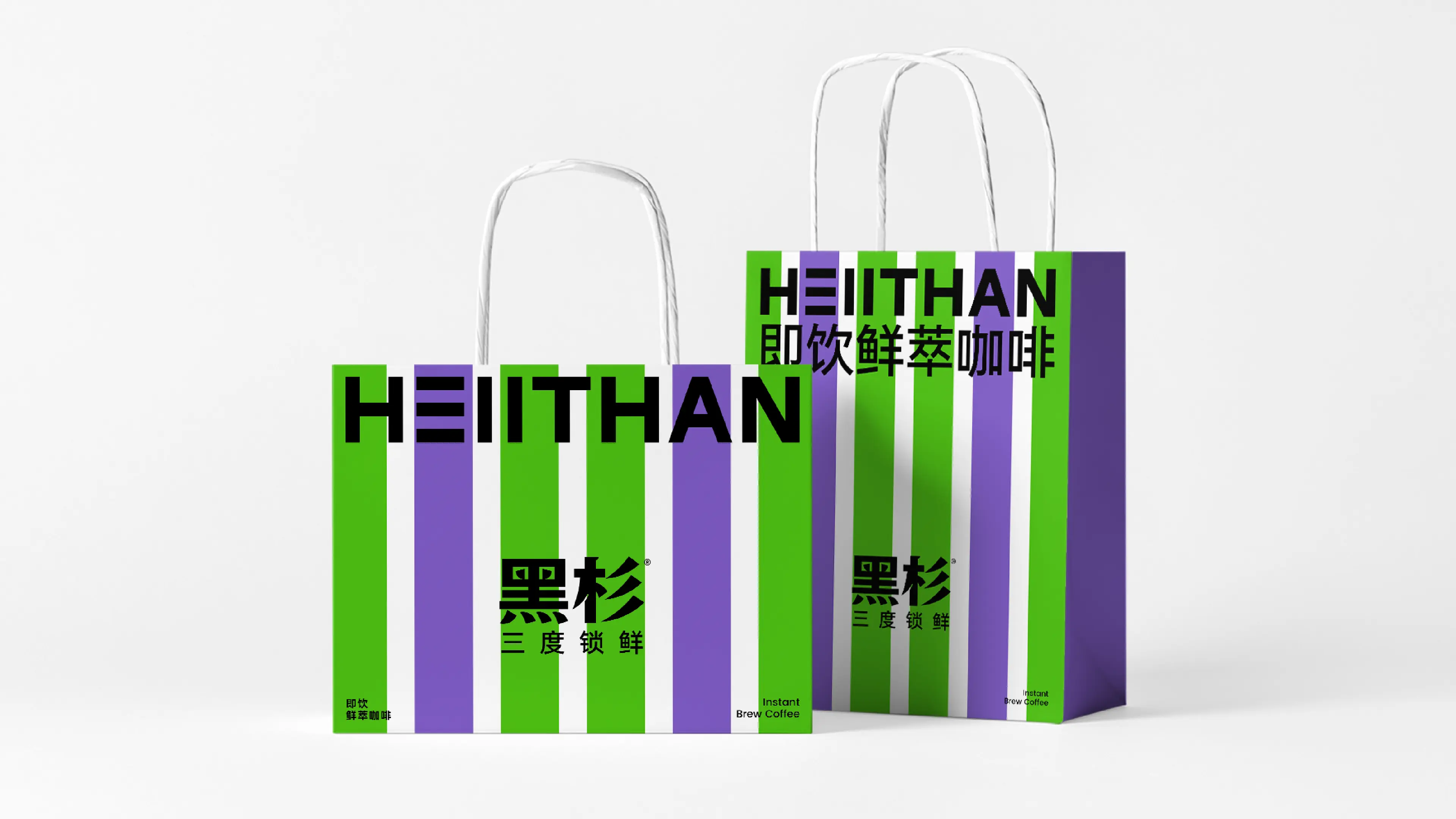
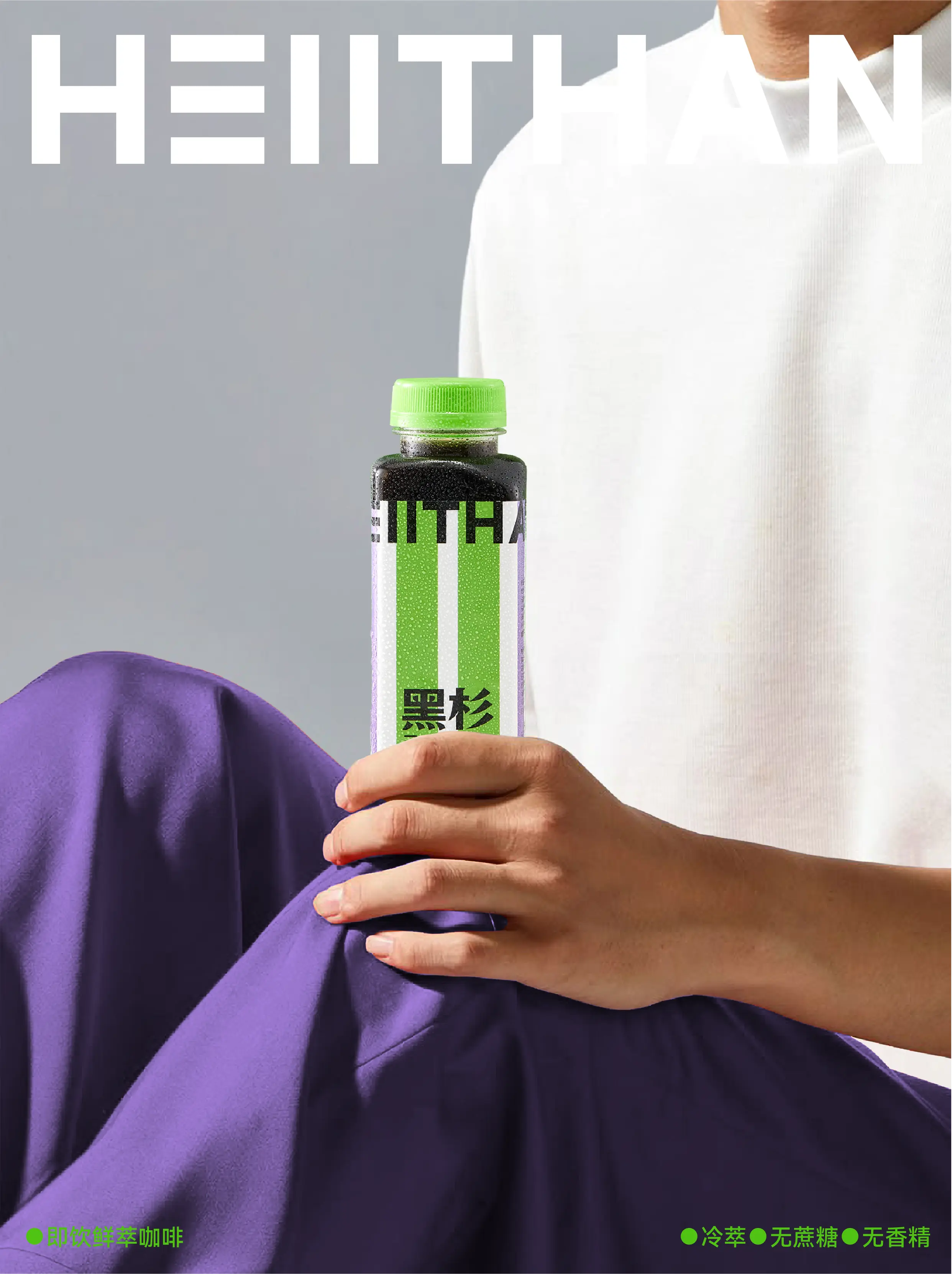
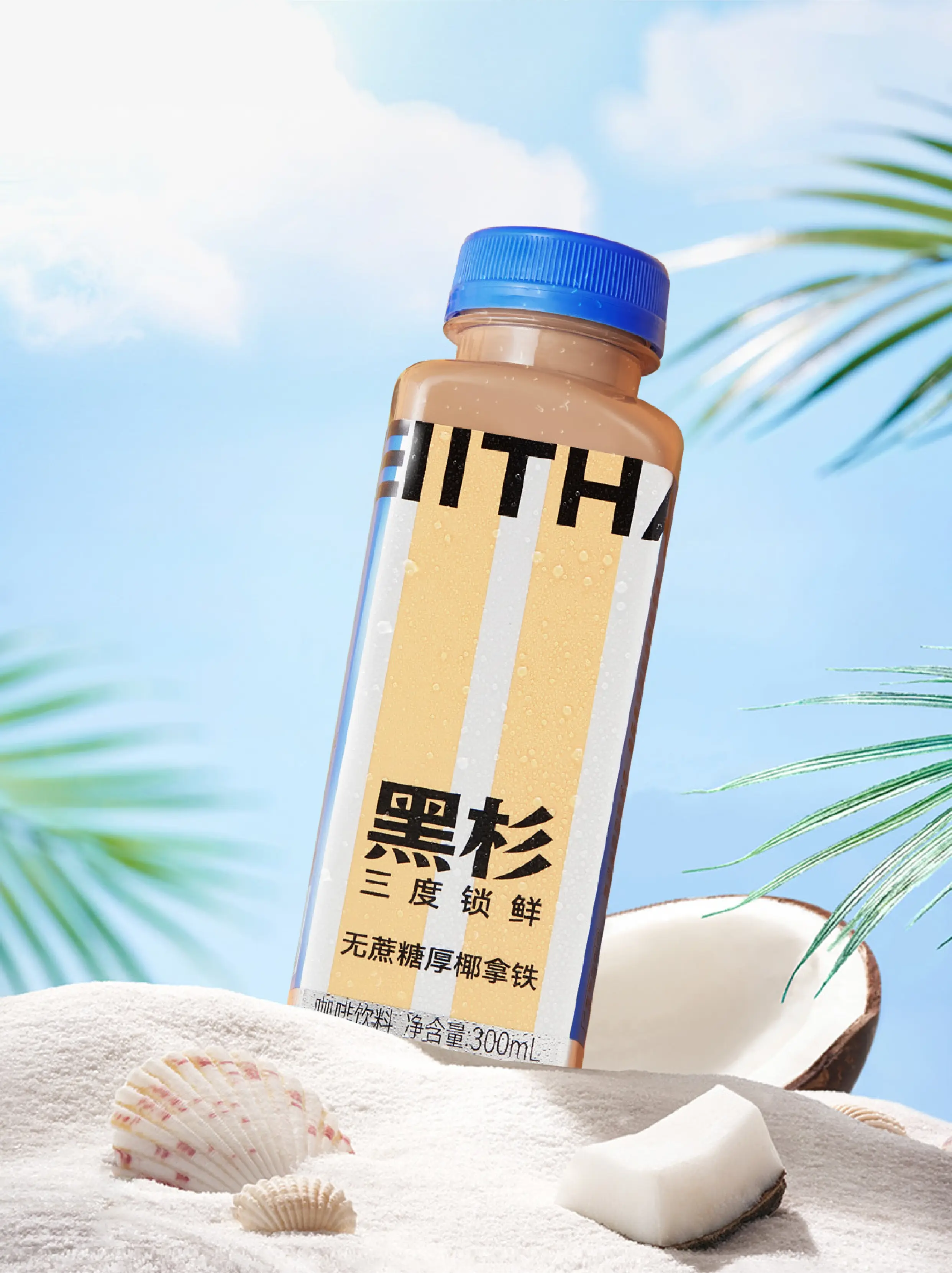
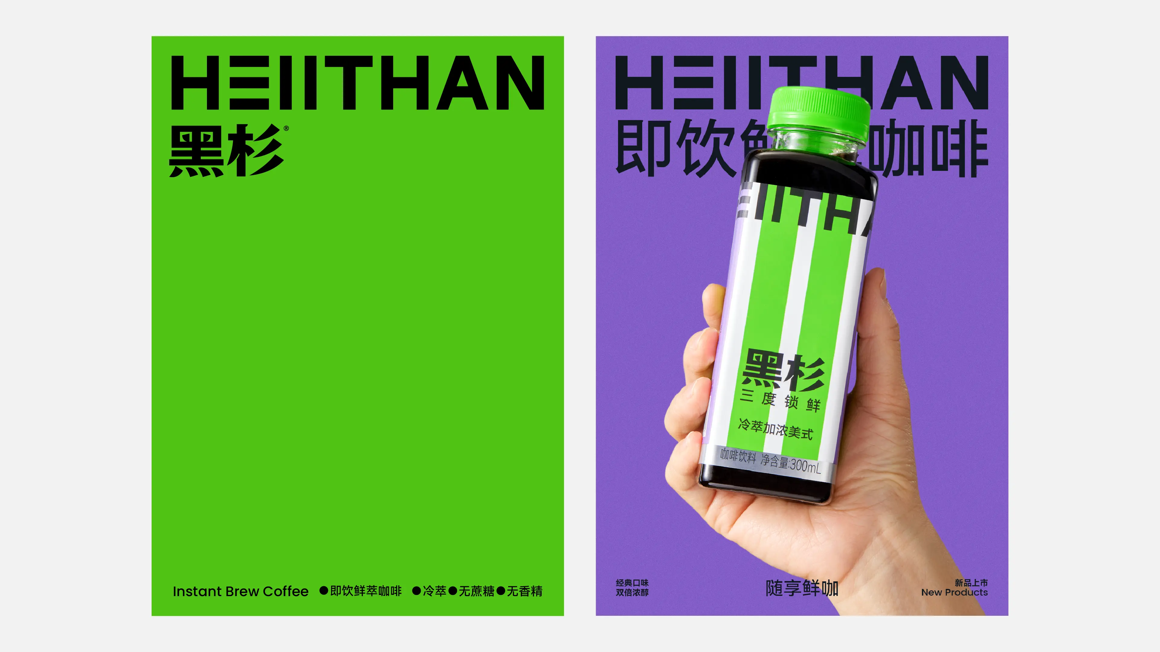
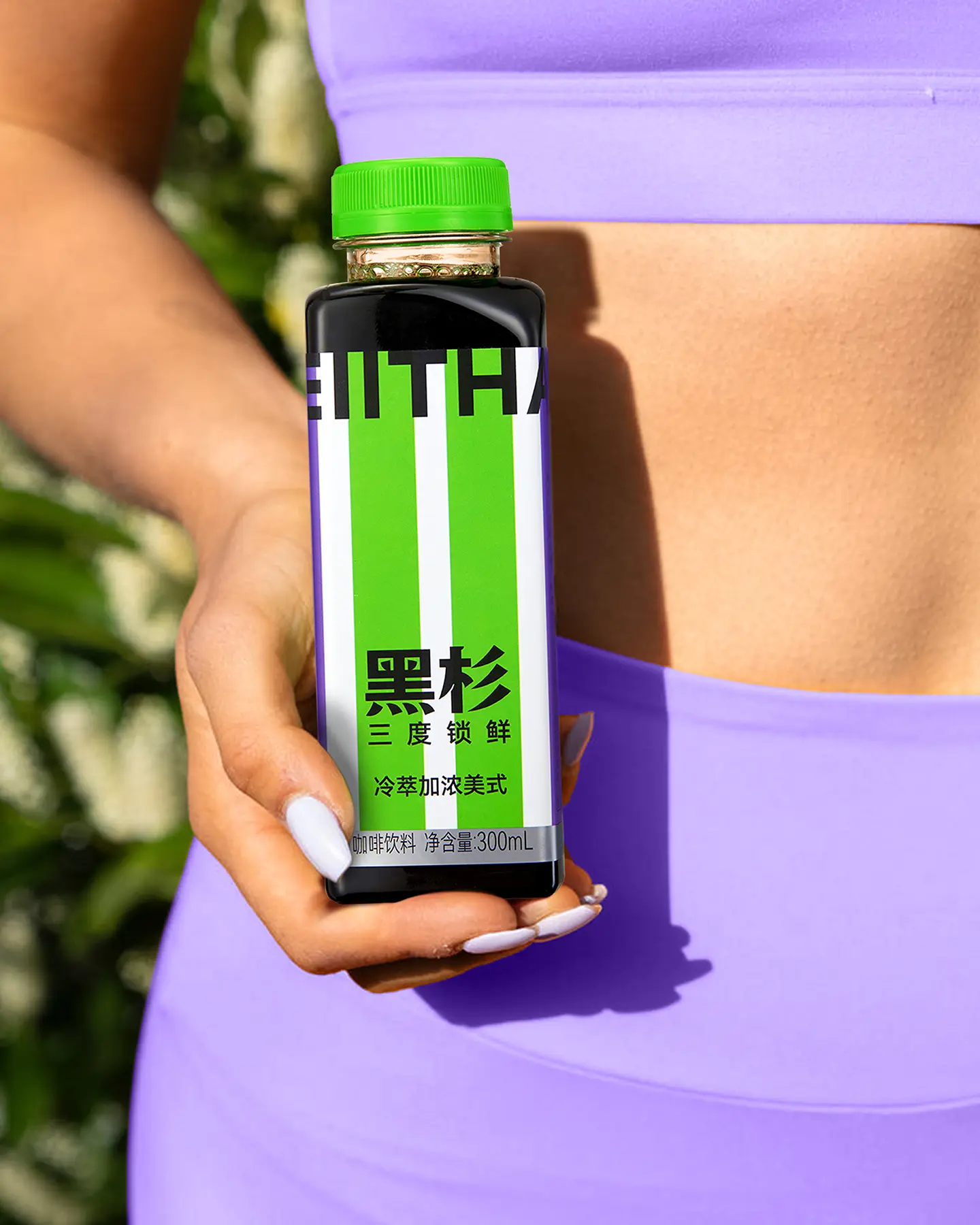
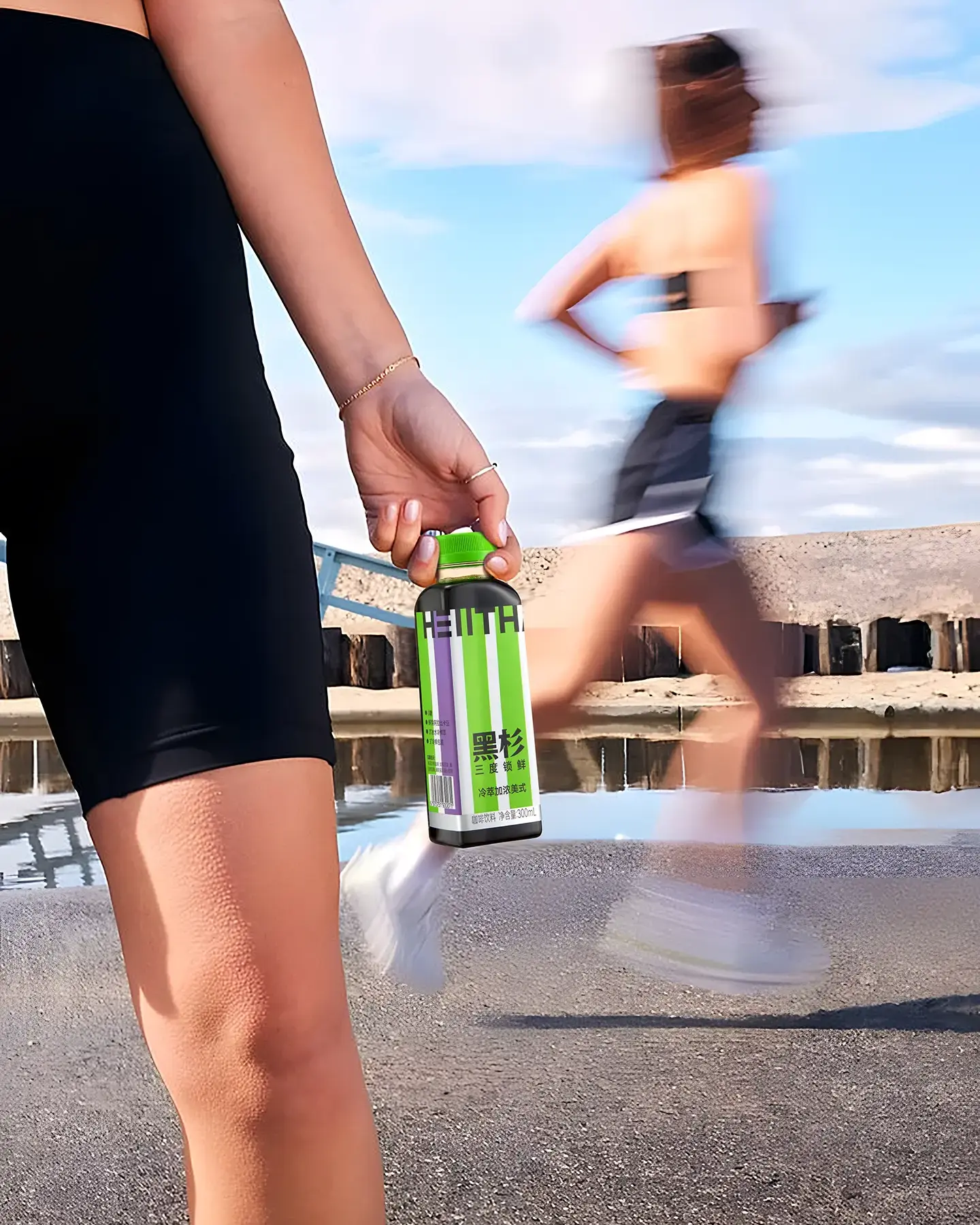
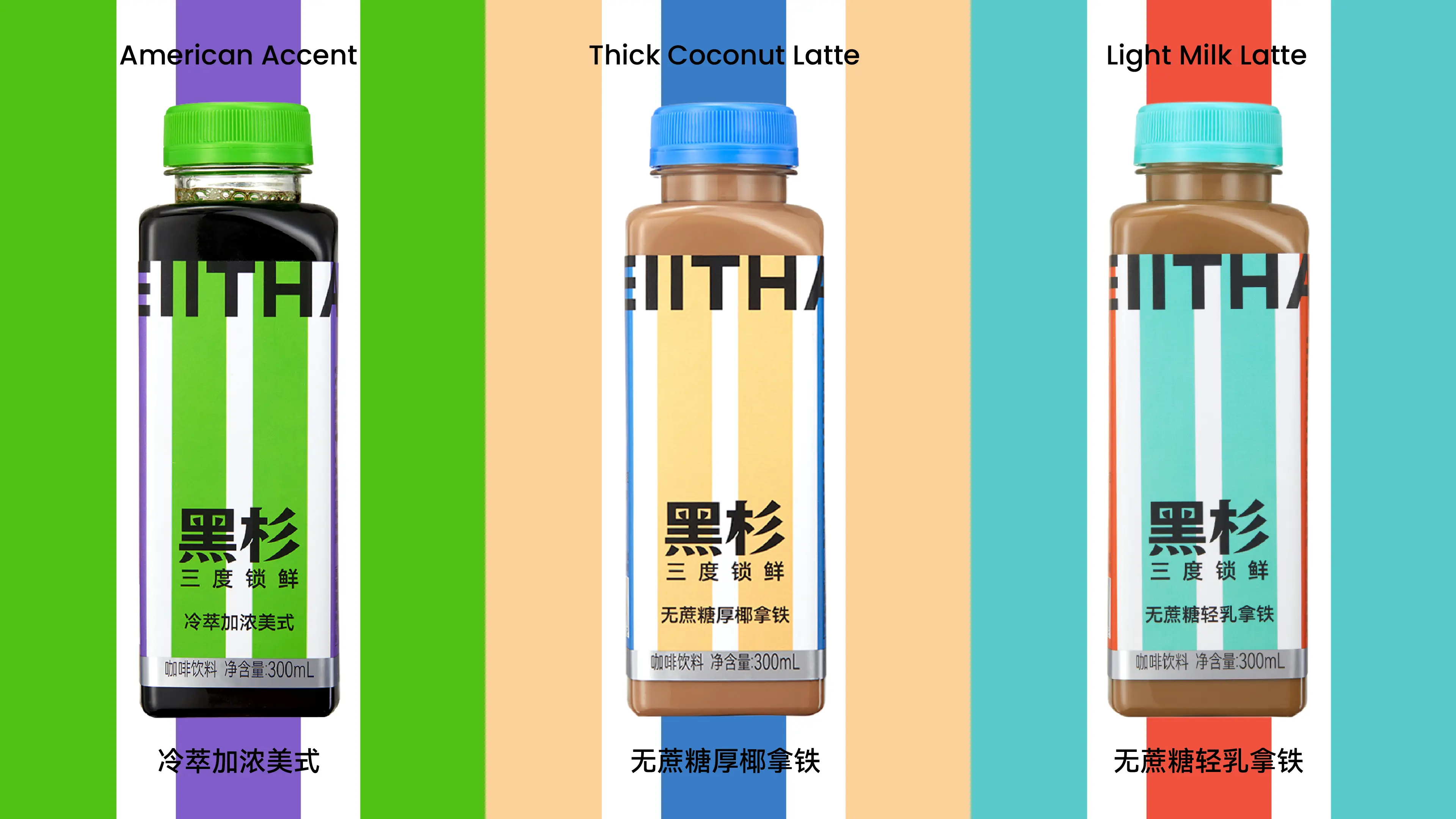
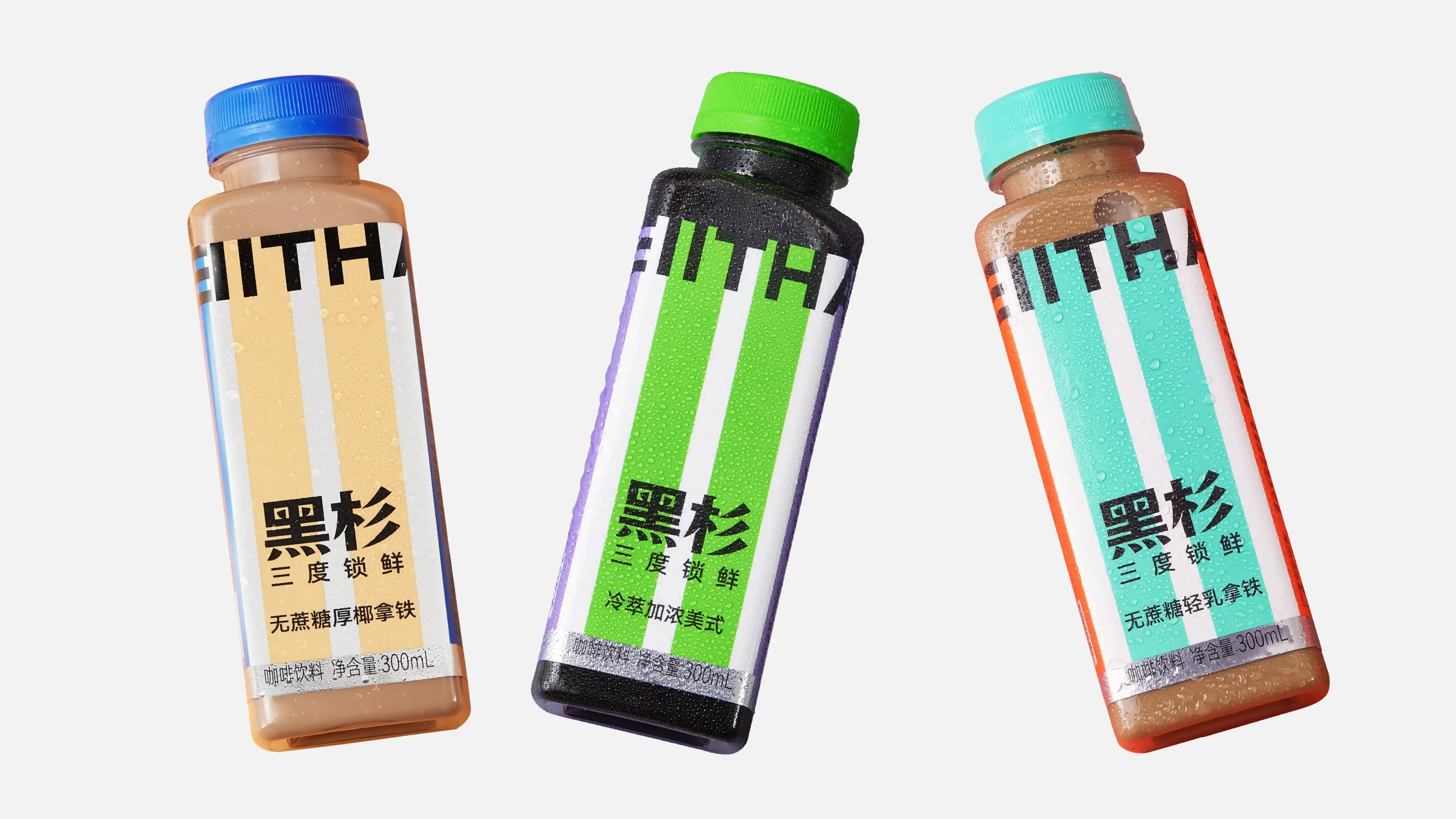
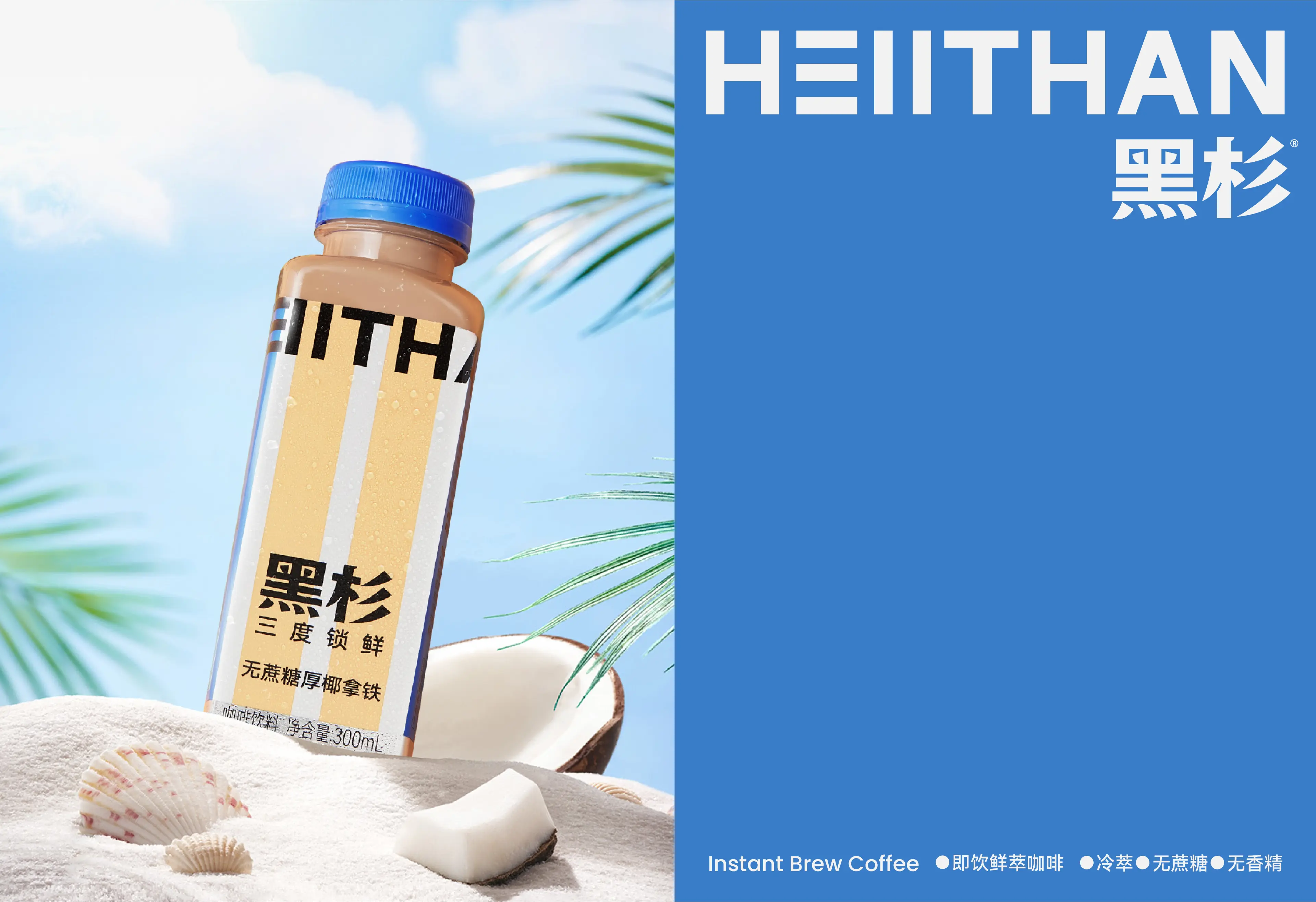
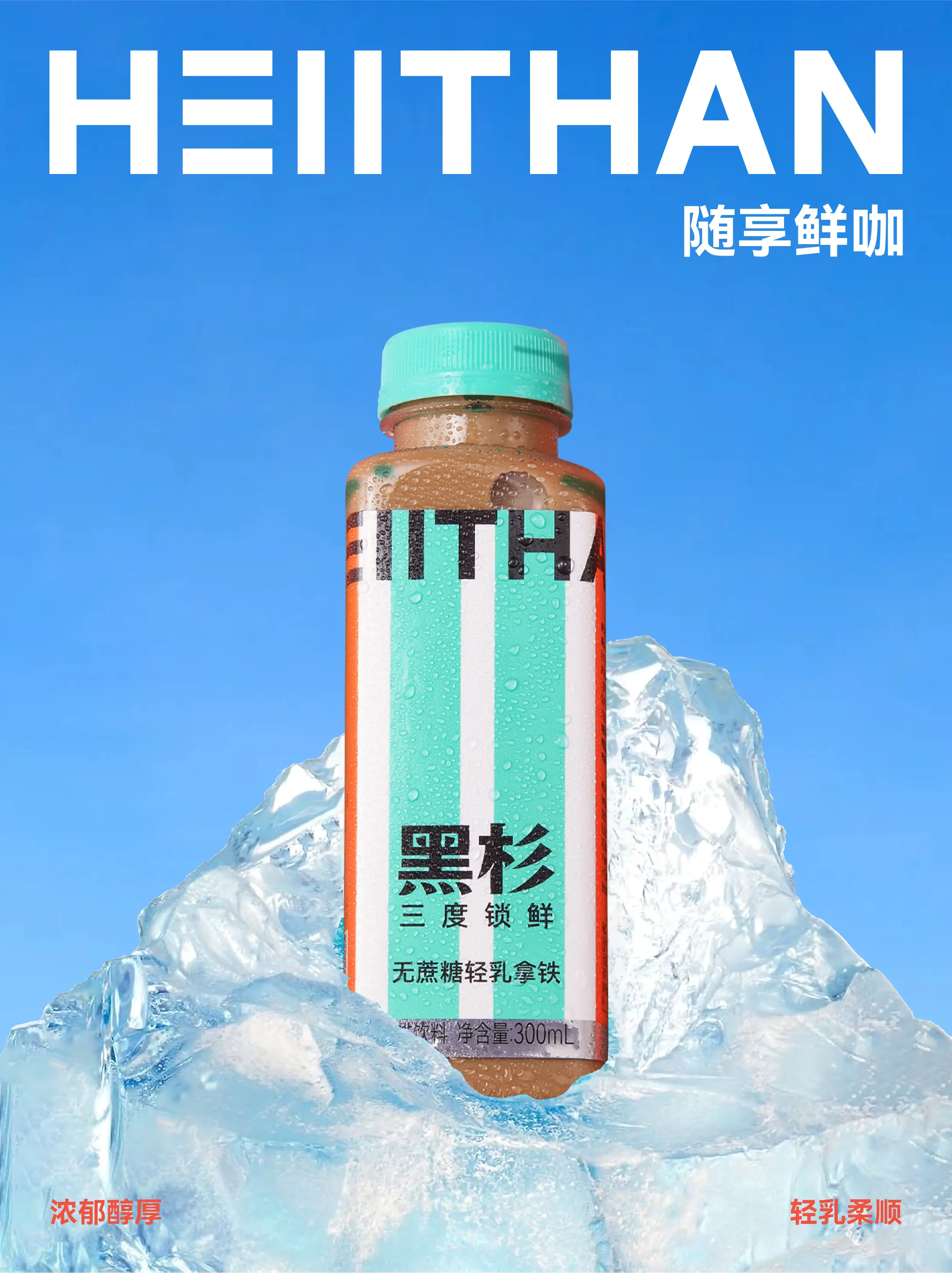
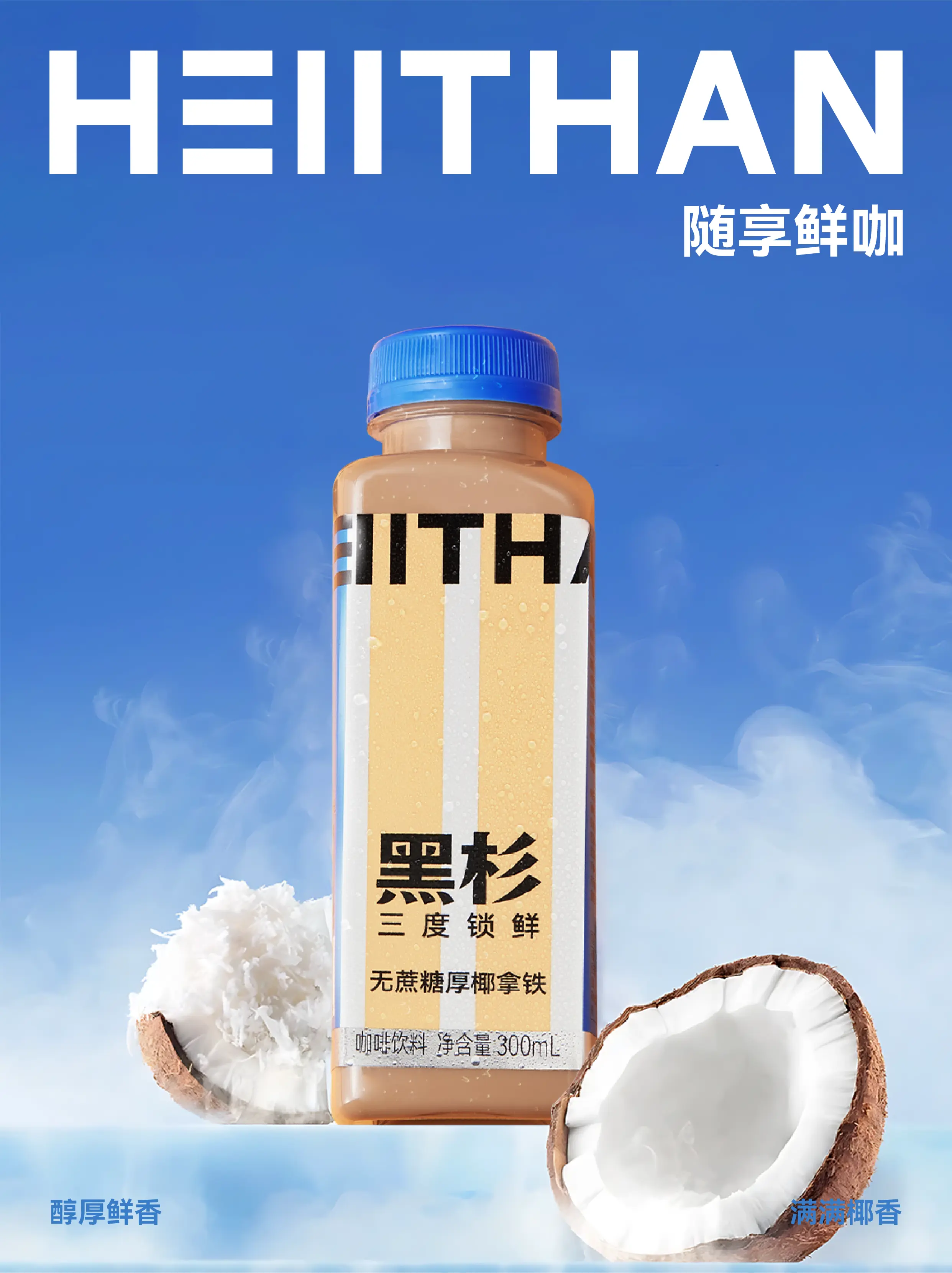
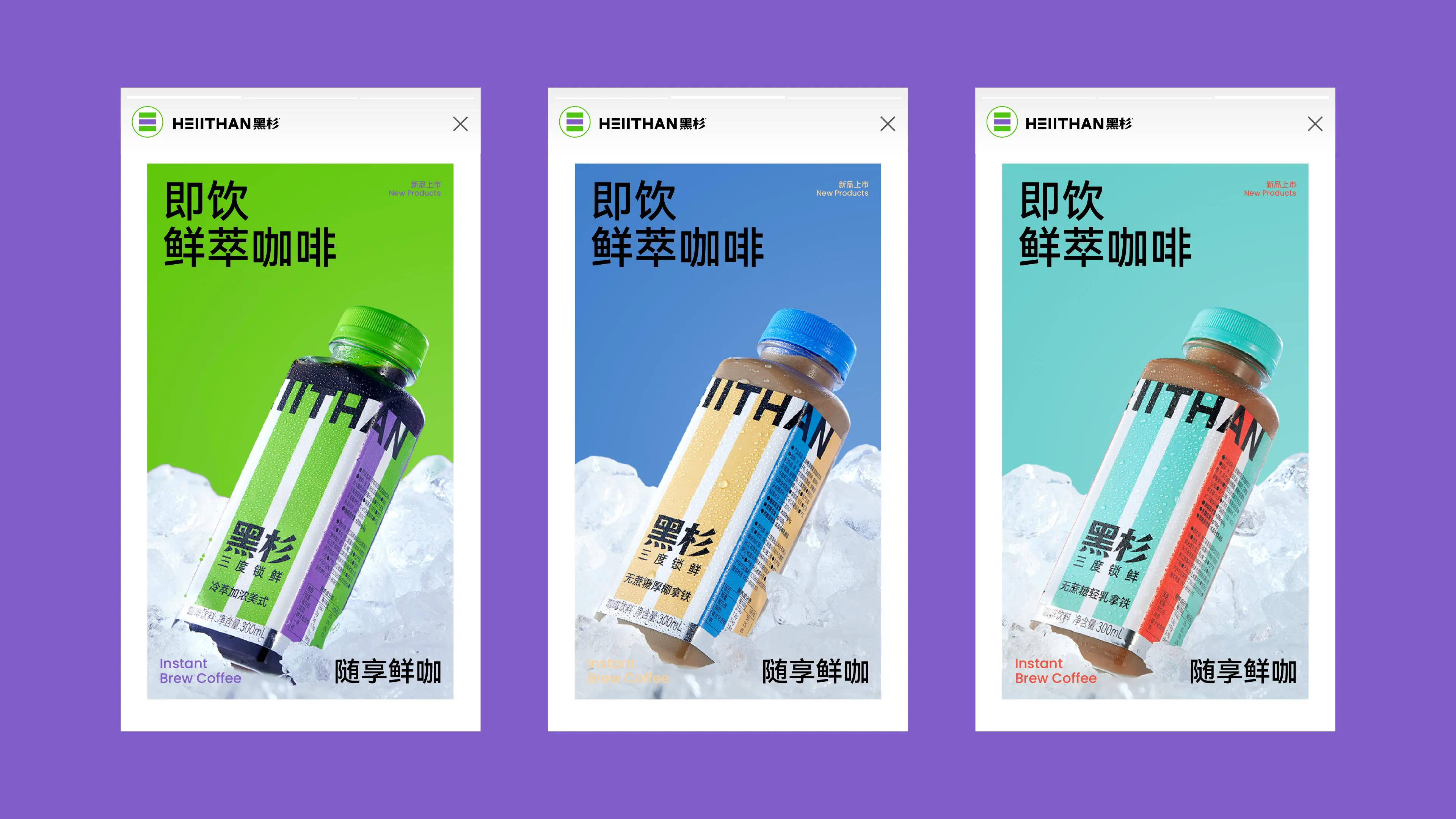
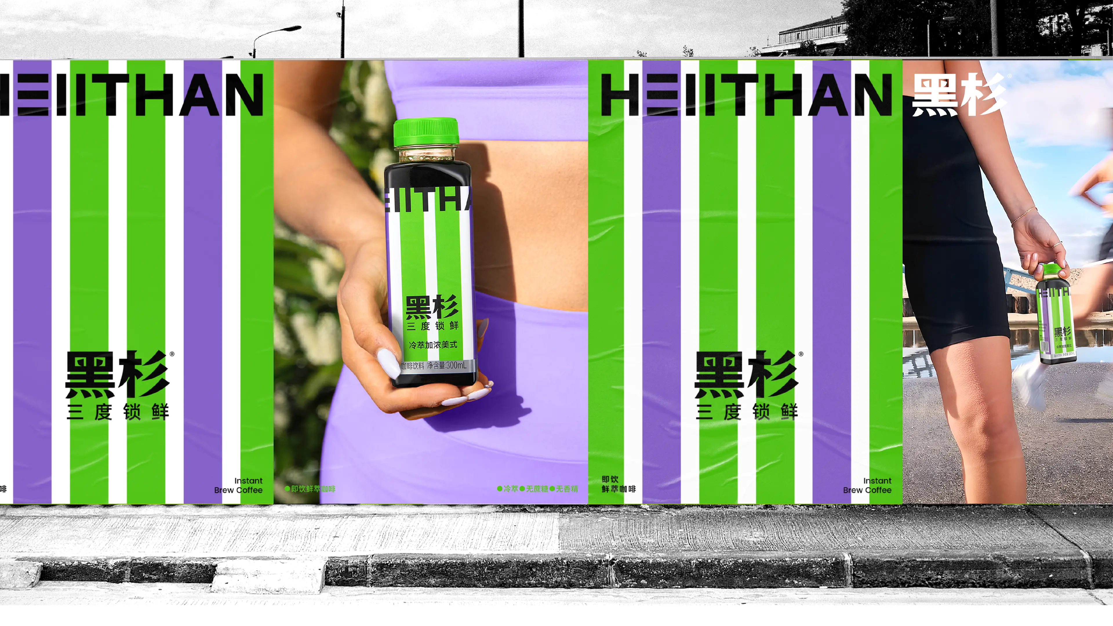
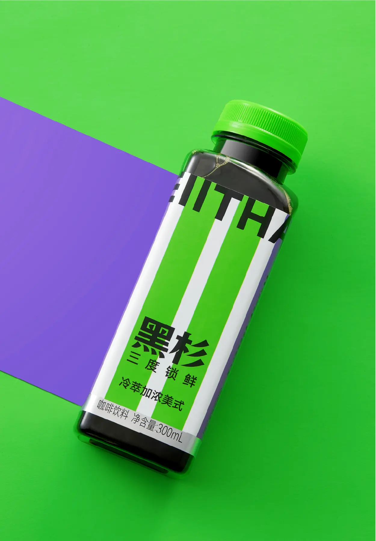
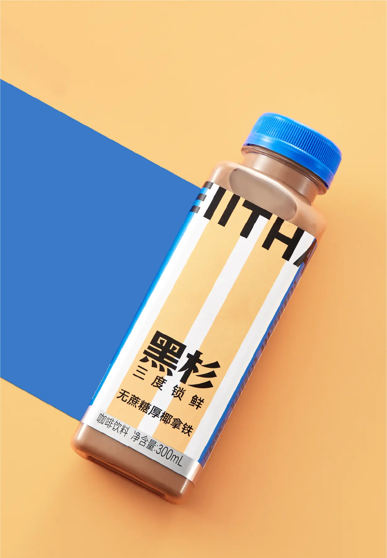
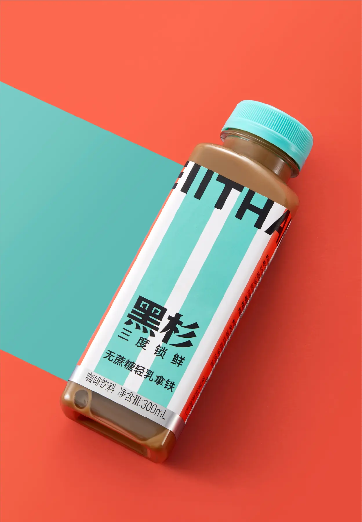
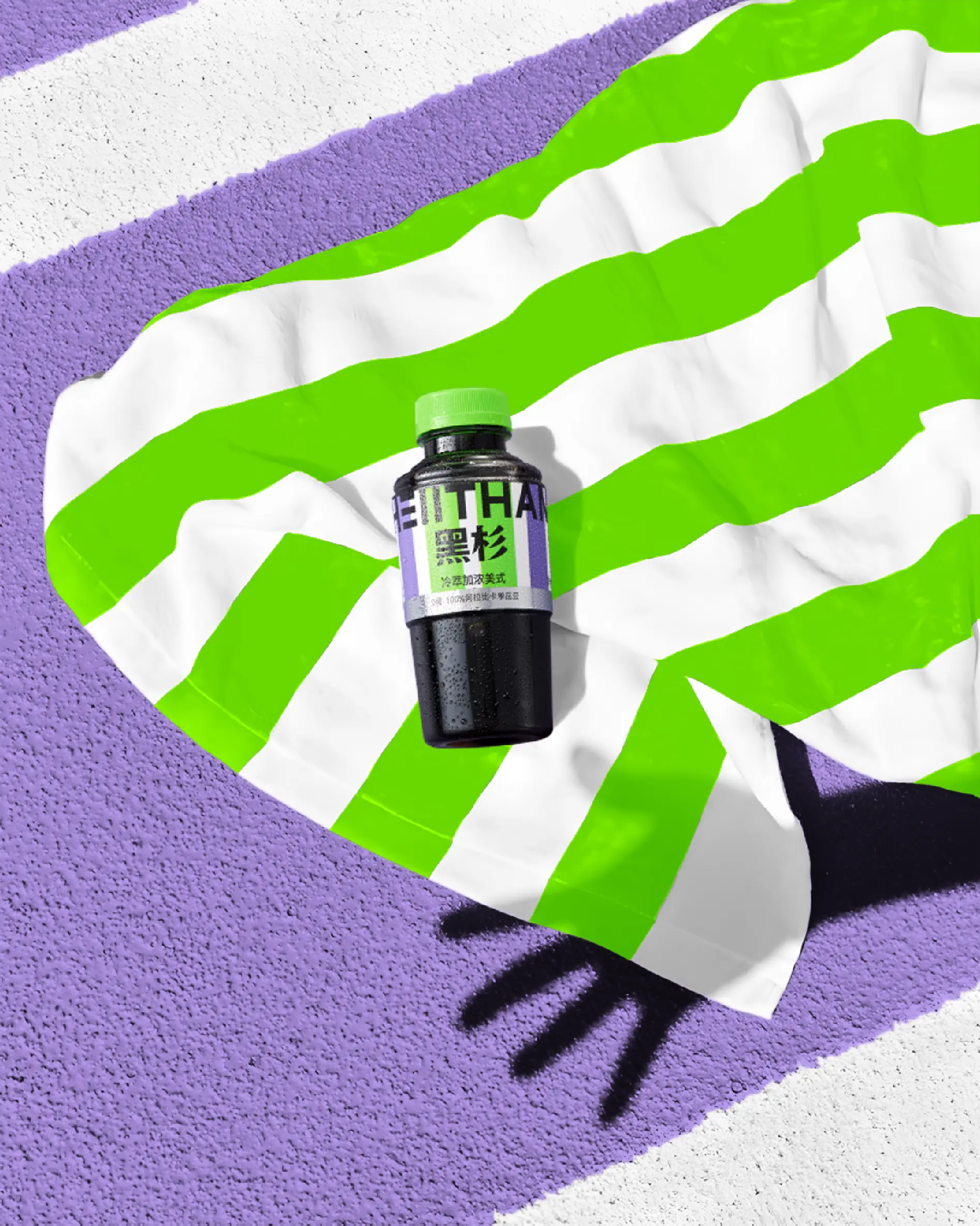
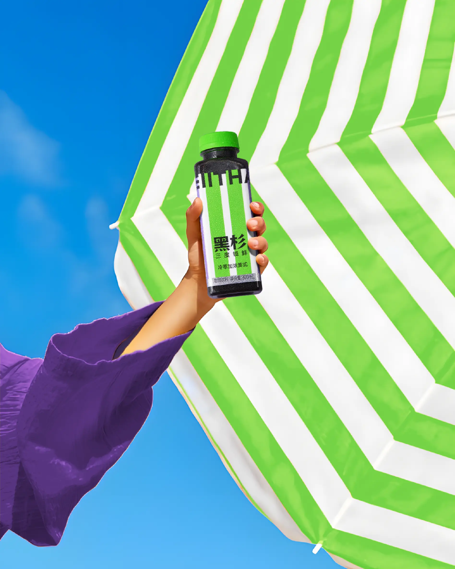
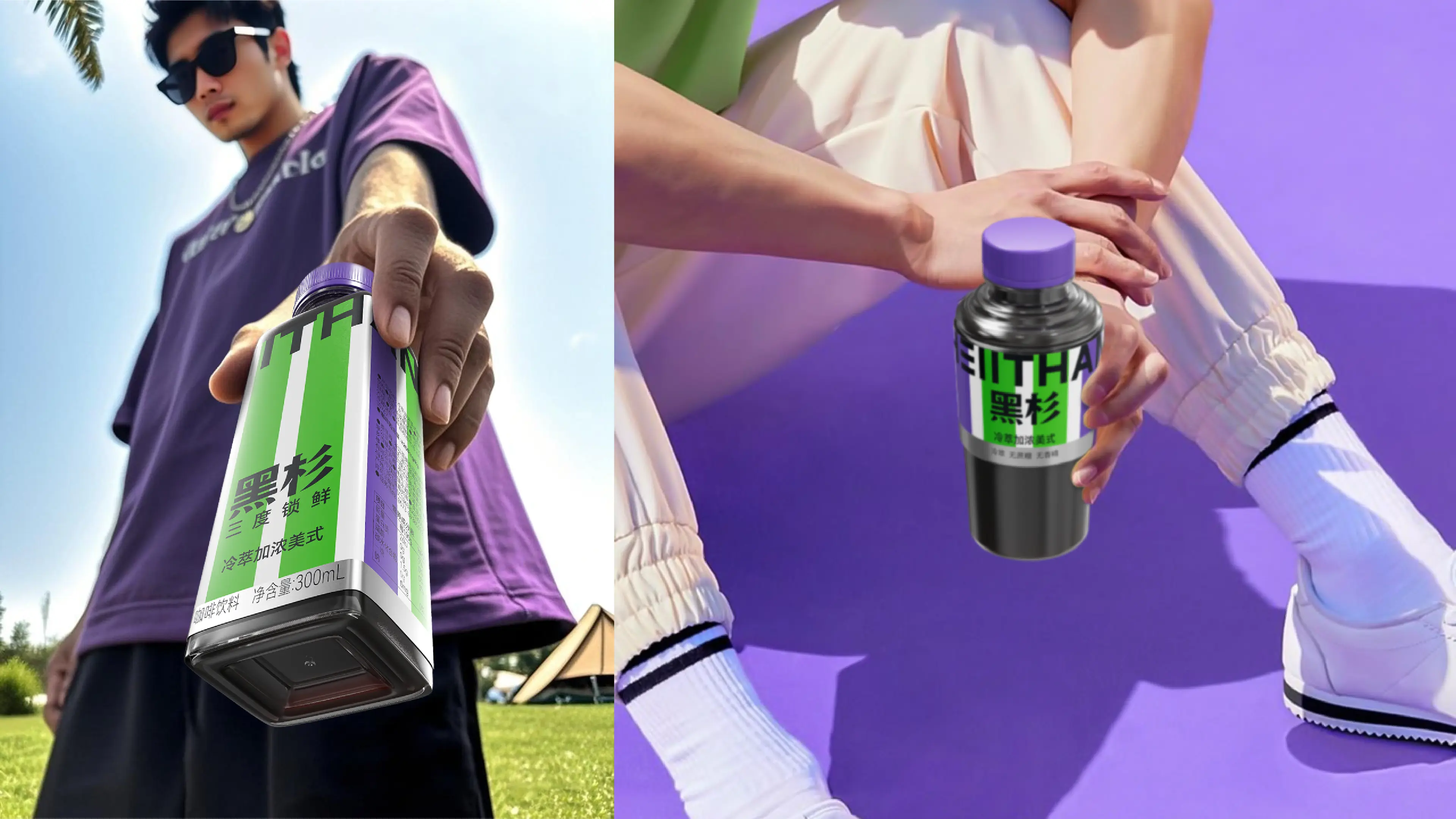
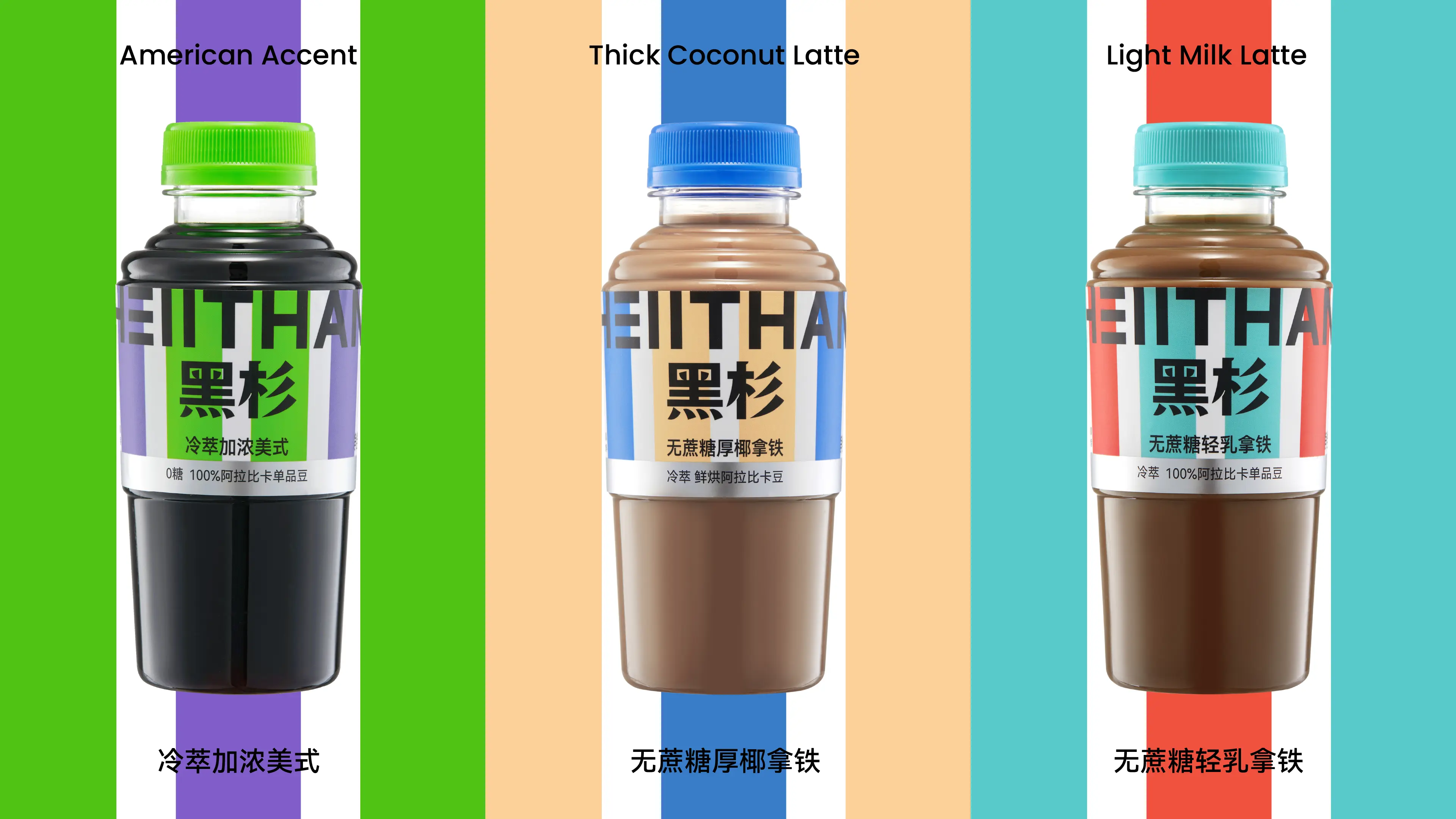
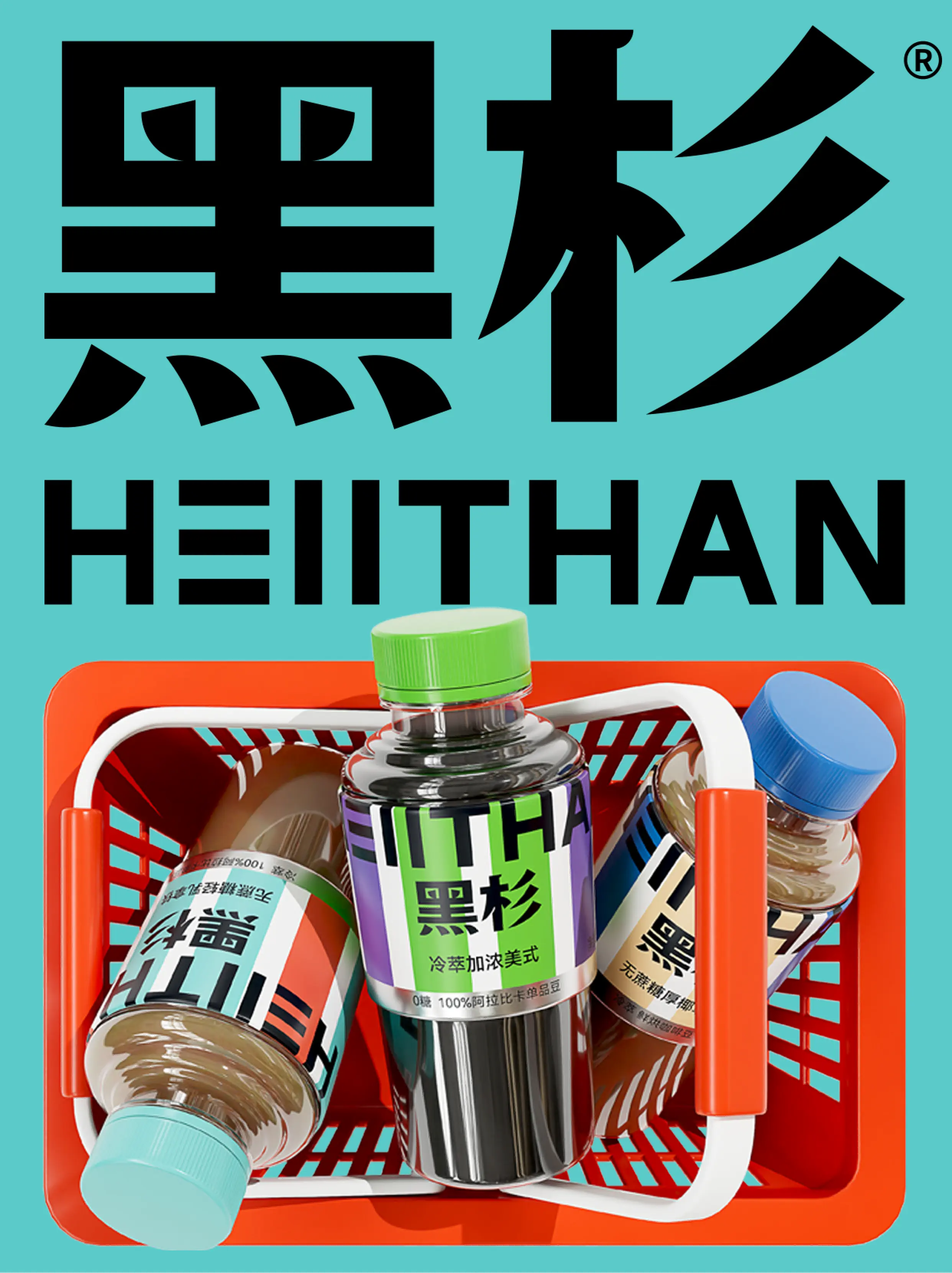
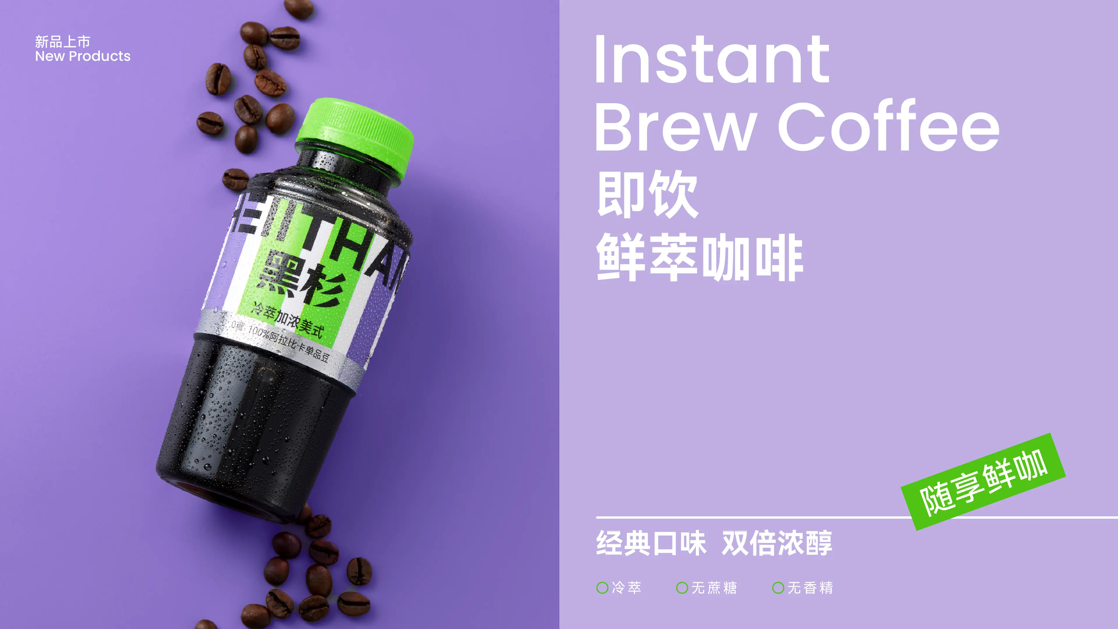
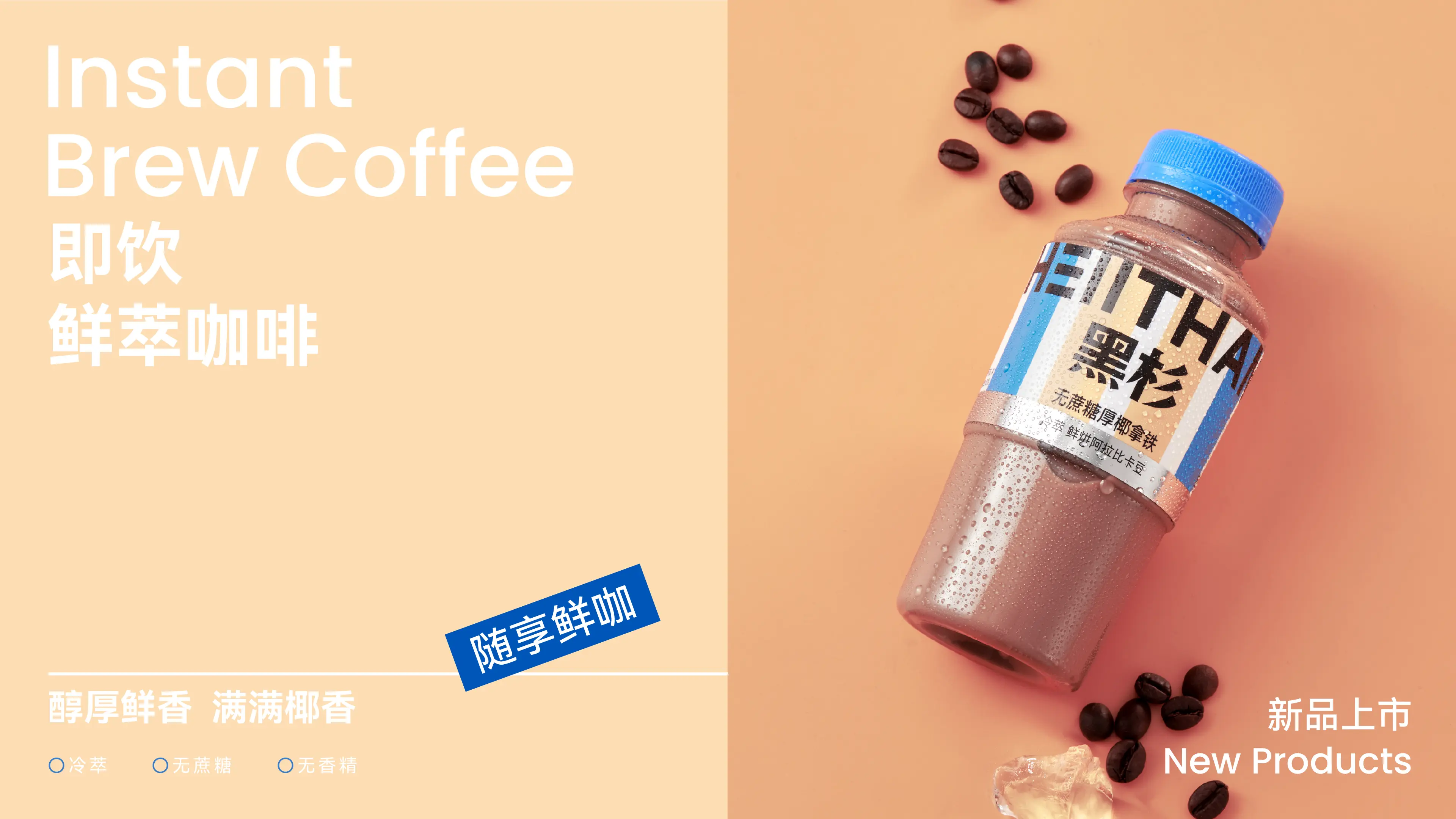
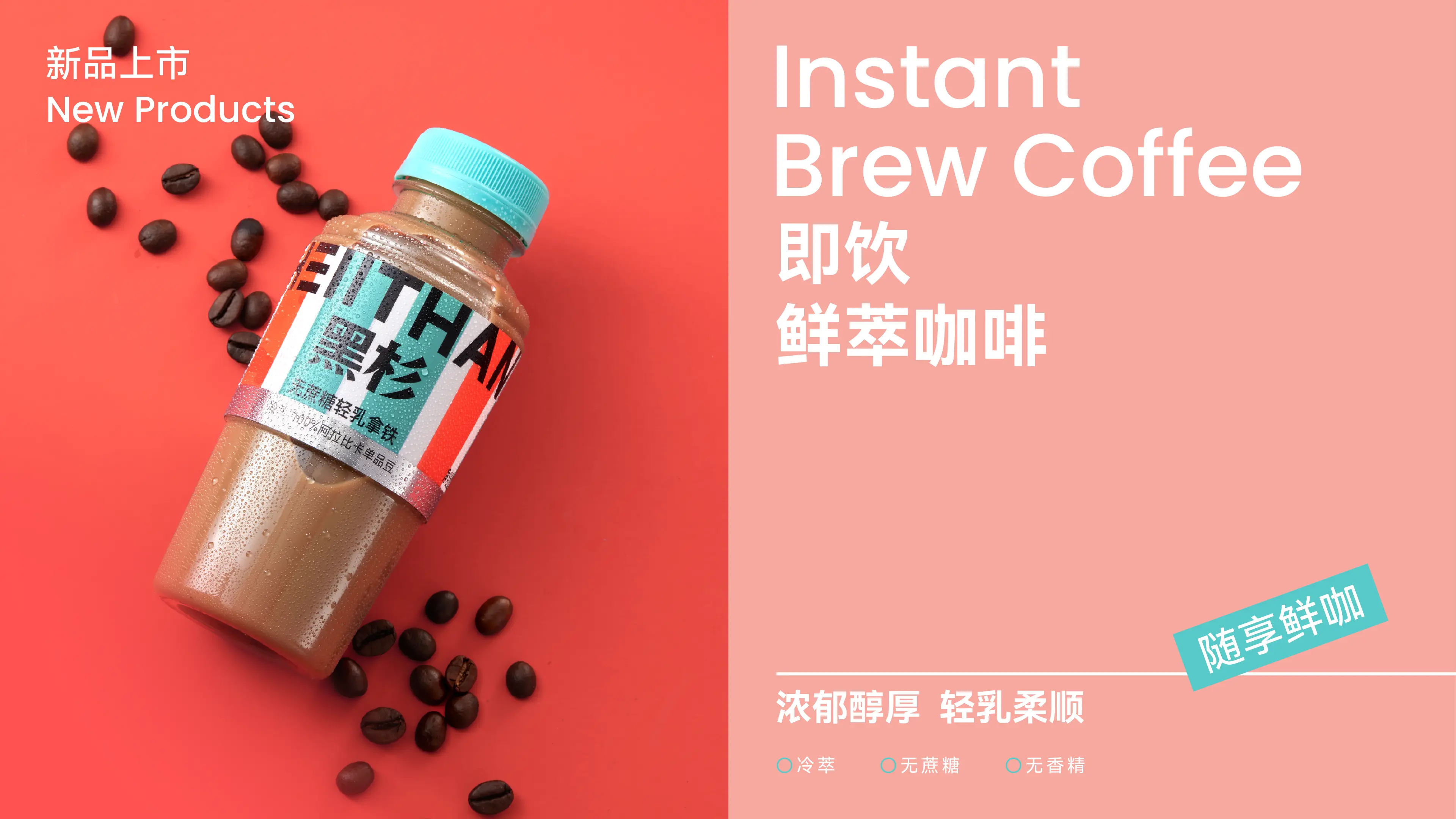
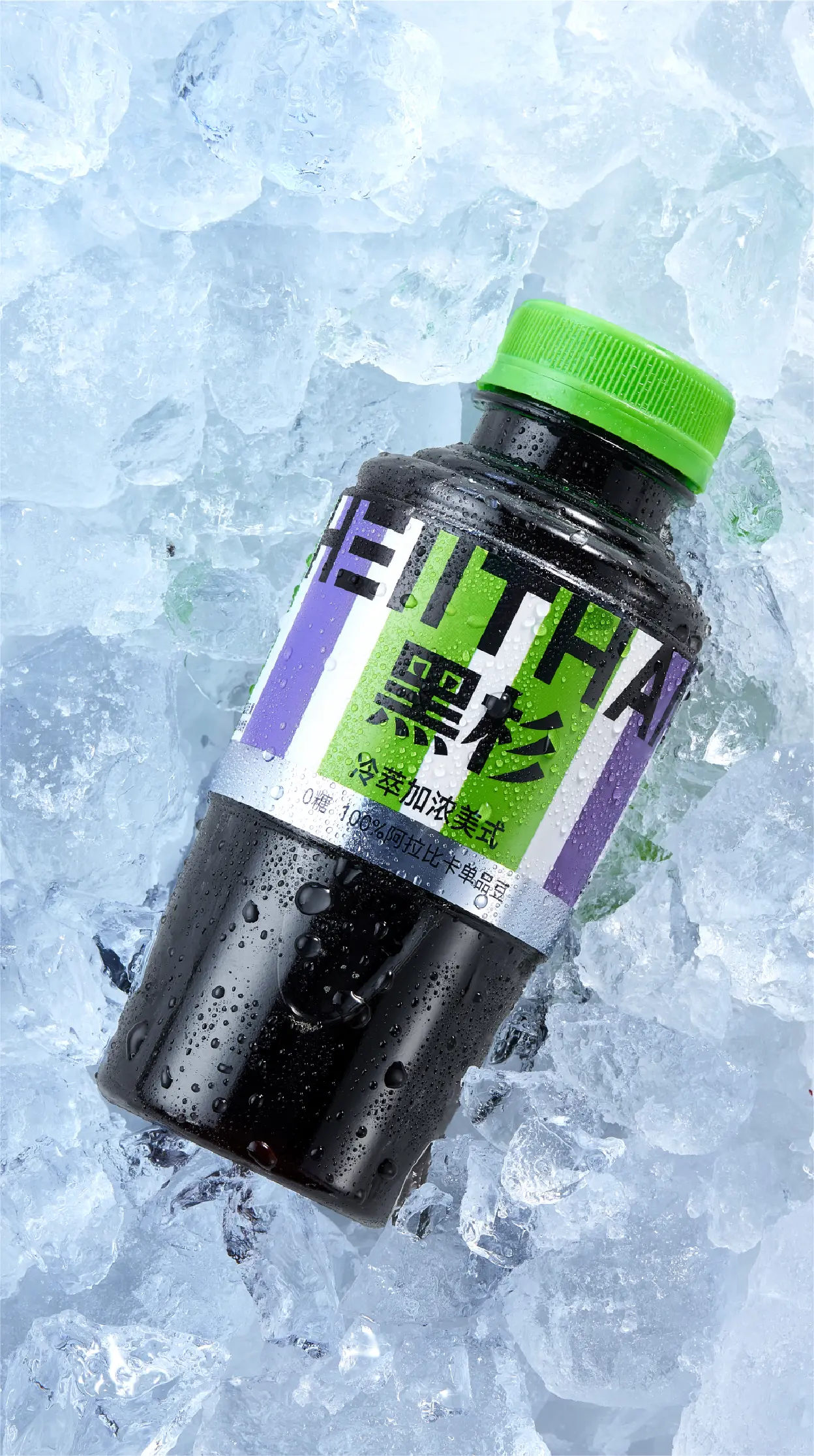
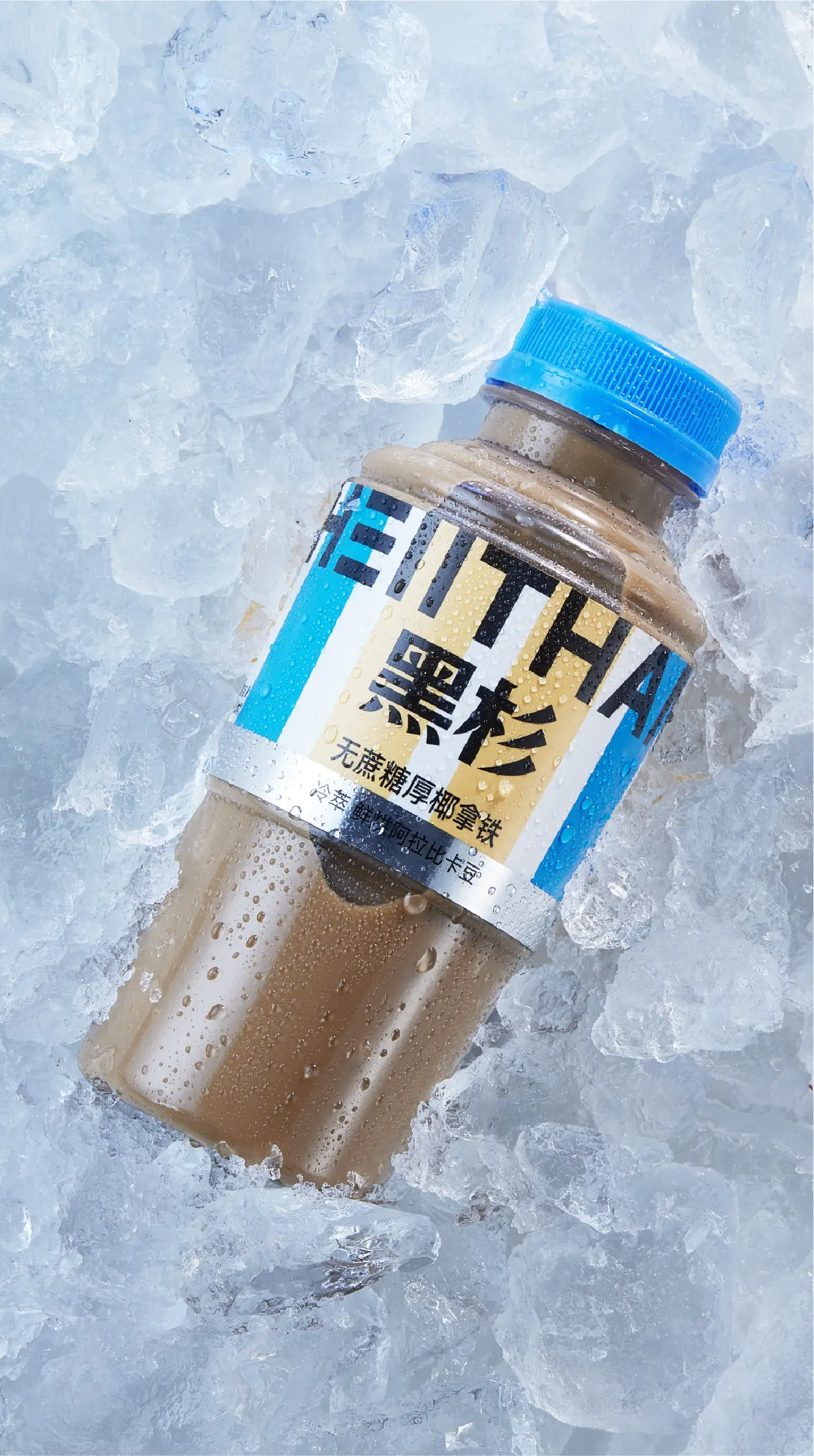
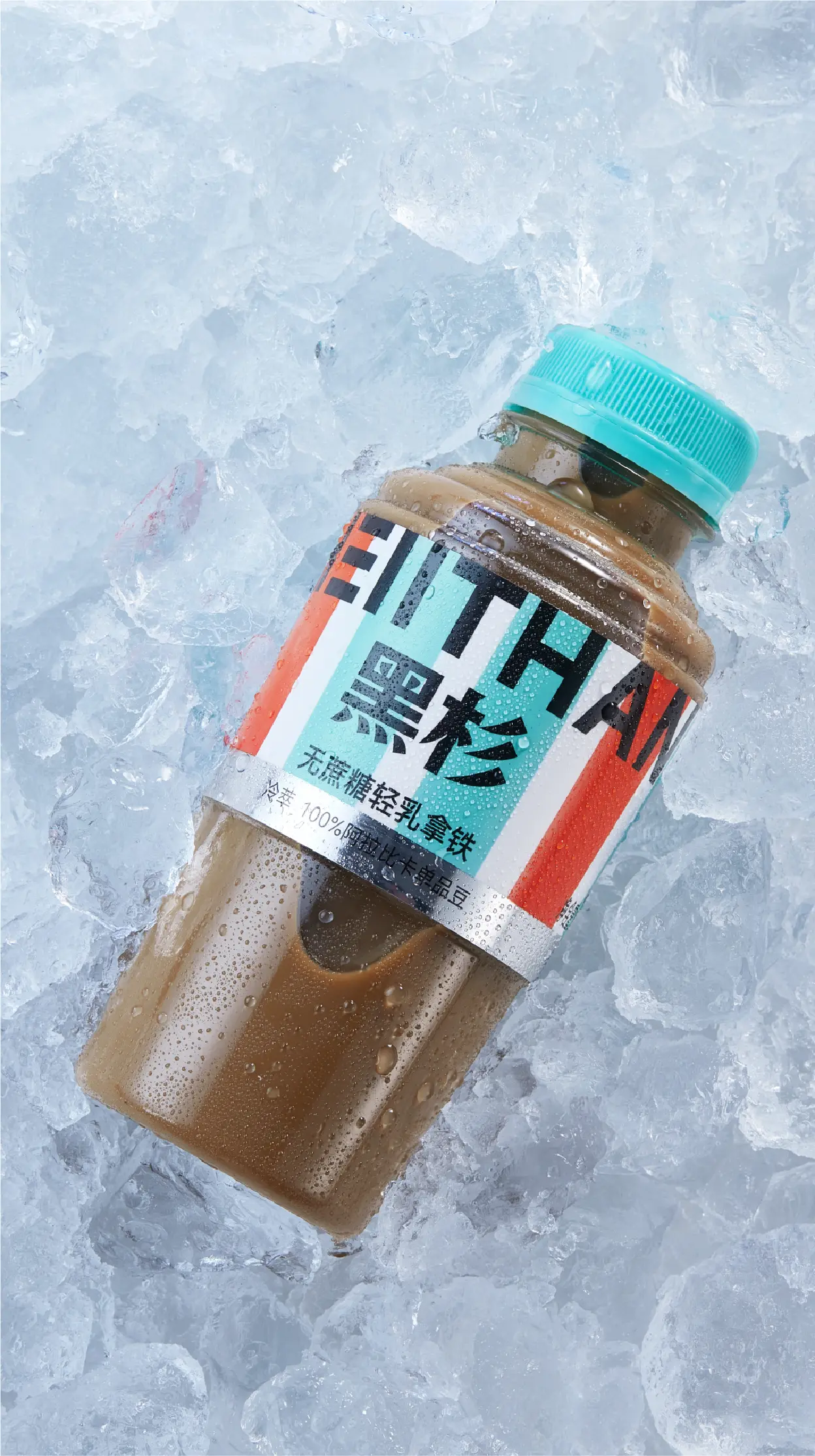
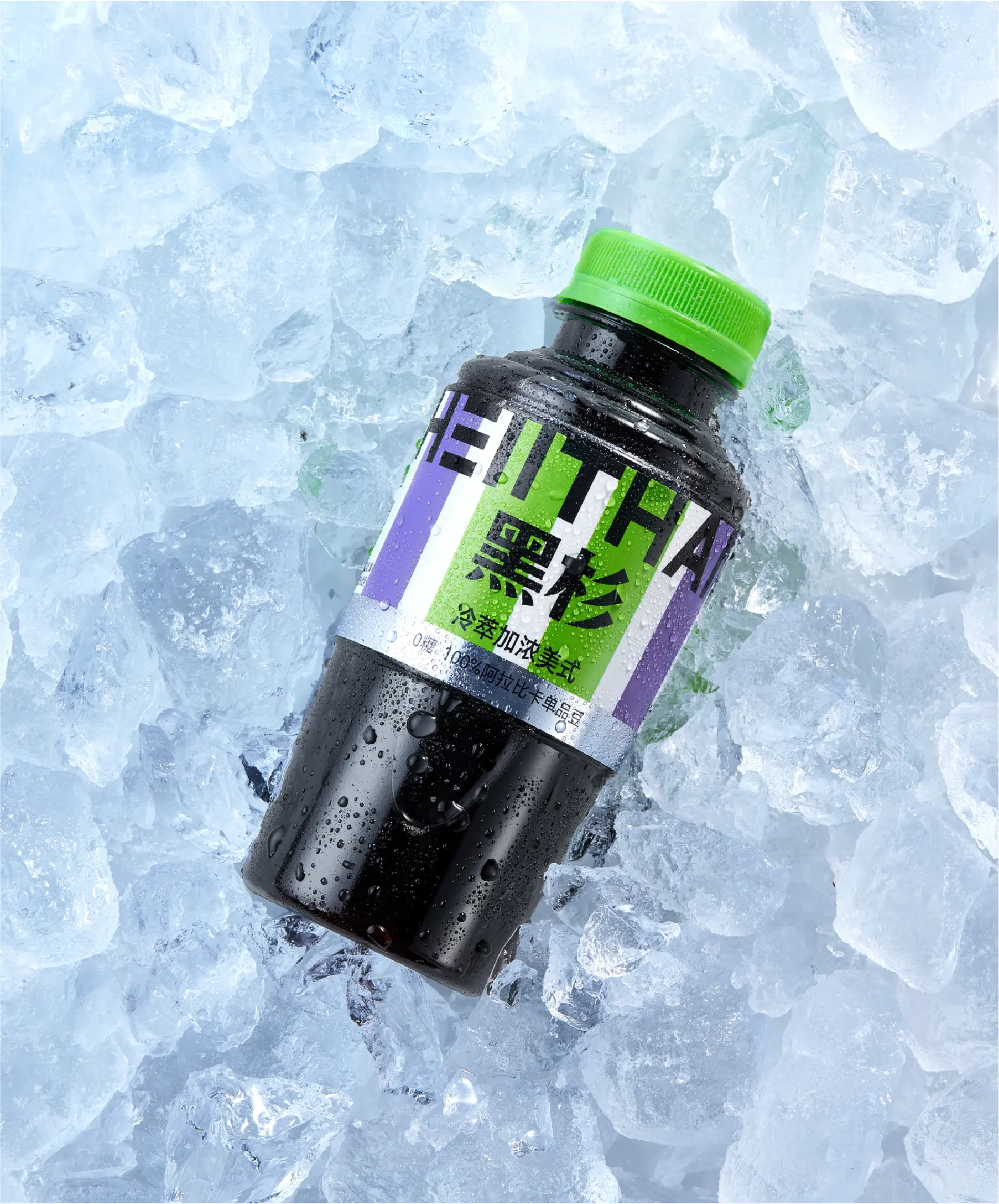
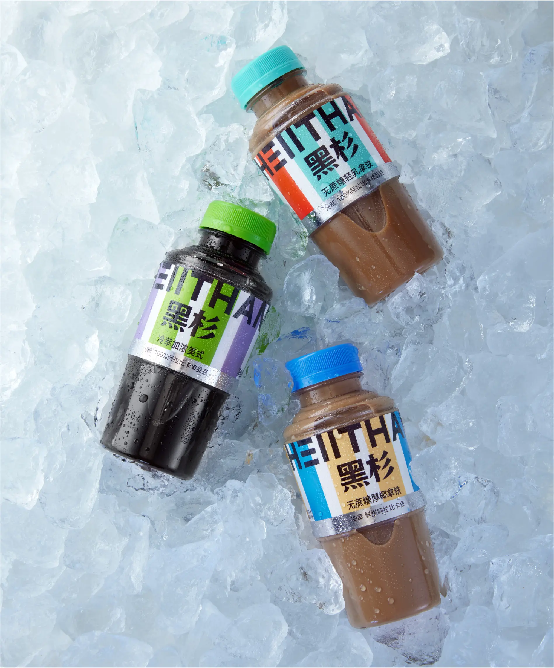
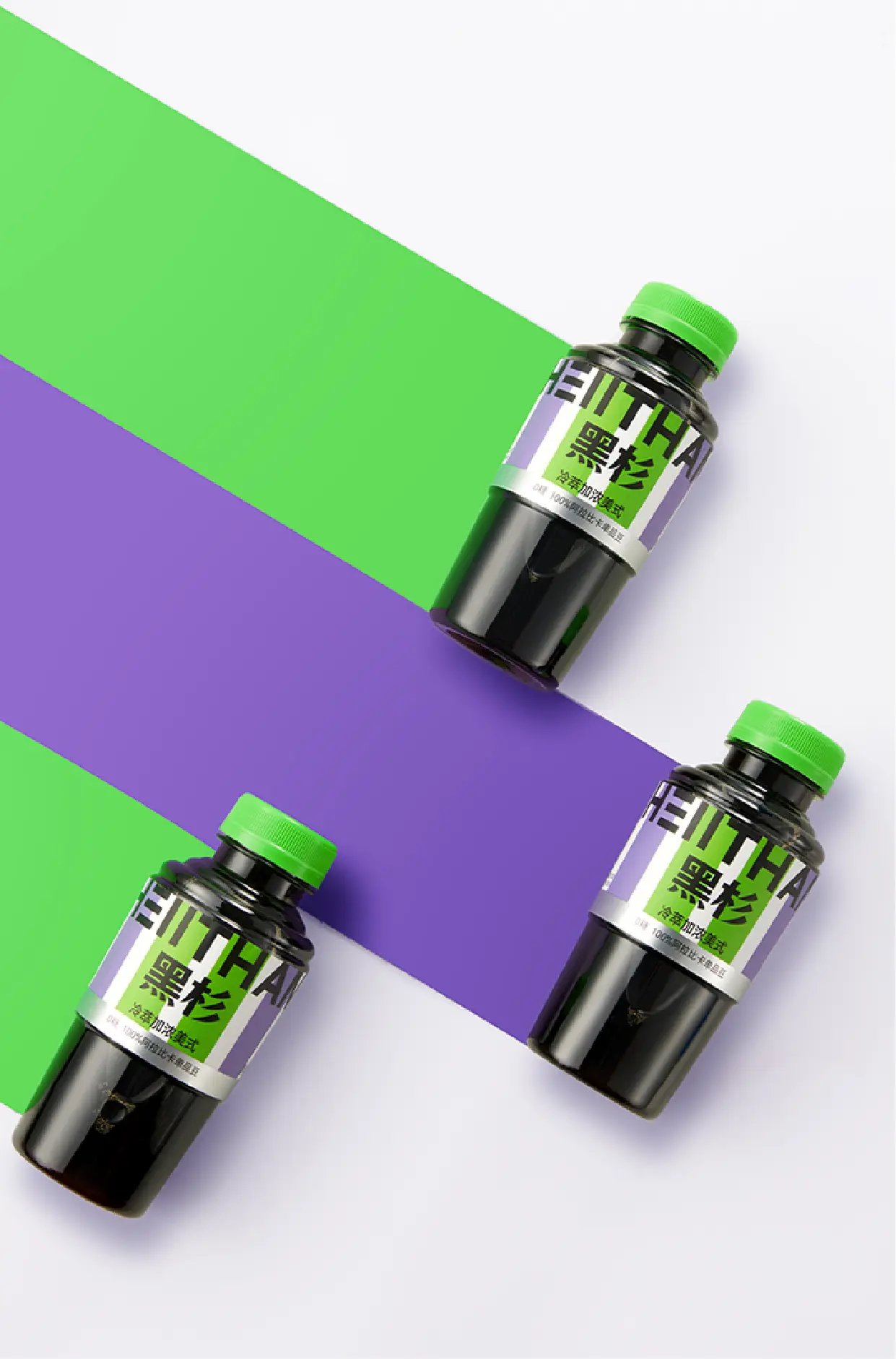
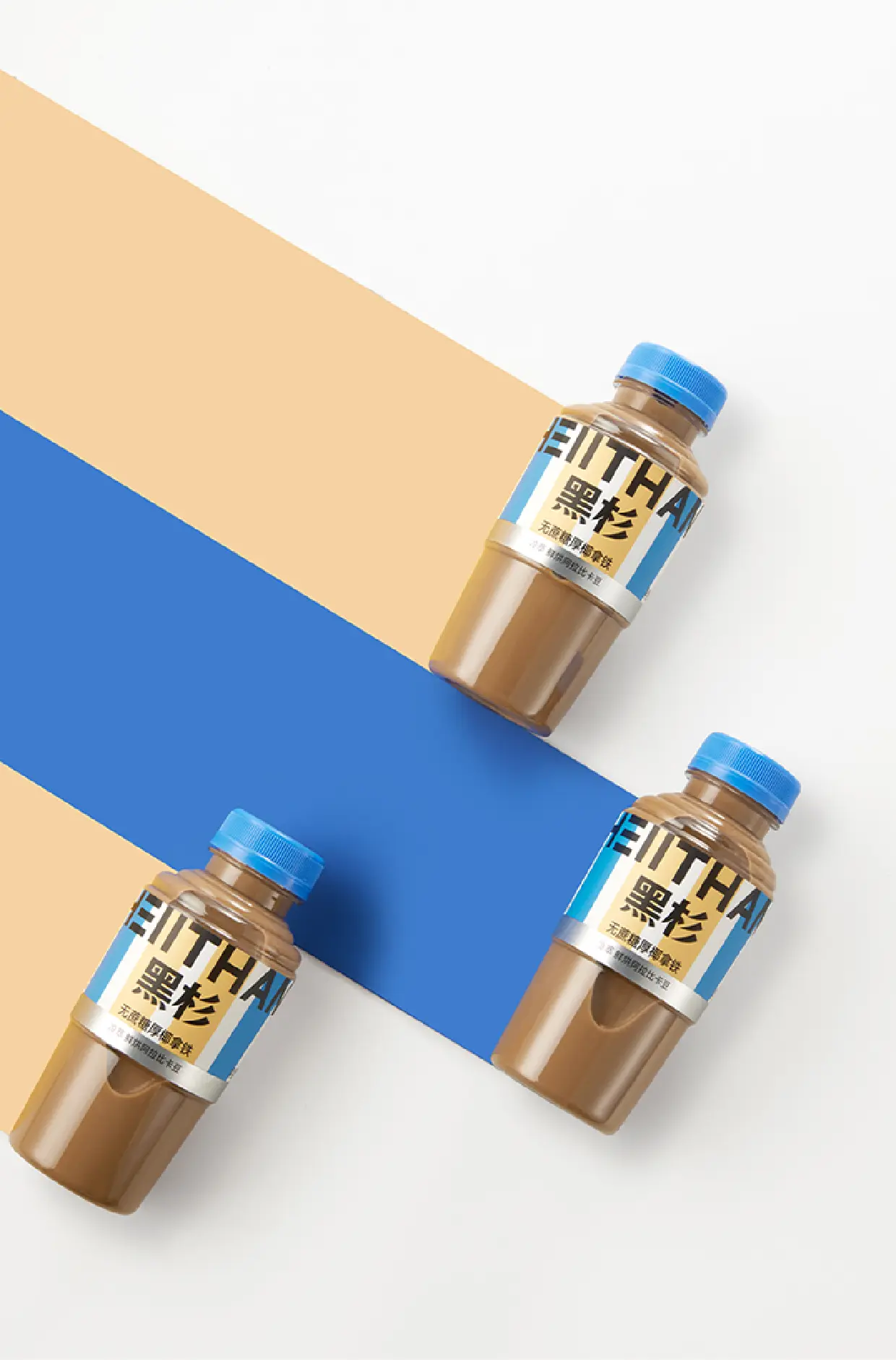
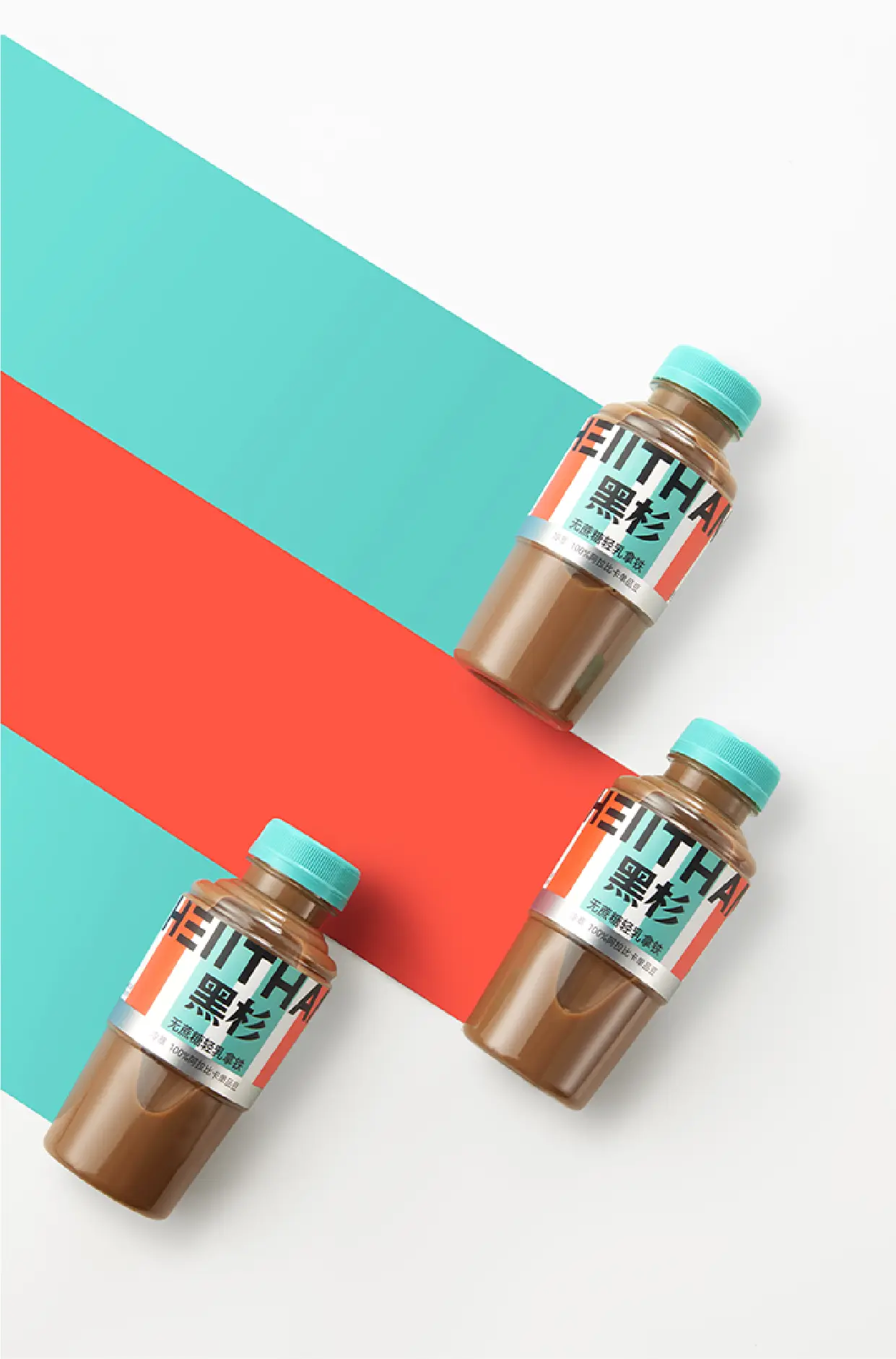
This project was to create a complete full-brand design for HEIITHAN, with services covering all dimensions including brand strategy, brand design, packaging design, page design, and video production. At the early stage of the project, we defined a design direction of strong visual impact and strong fashion—enhancing recognizability through the form of color lines, allowing good extension across layouts and material applications, while strengthening recognition of the brand name. The brand visual design starts from the letter “E” and, through symbolic treatment, evolves into three straight lines, forming a highly recognizable brand visual symbol. To reflect the cold-freshness of ready-to-drink fresh coffee, the team adopted green and purple, two cool colors, as the brand’s primary colors. In terms of packaging materials, the team broke away from the conventional round-bottle design inertia common in the bottled coffee industry and replaced it with a more novel packaging format, breaking the visual homogenization of the category. The packaging design continues the brand’s overall VI visual identity and is presented in the form of bar-shaped color blocks. Different flavors and versions are distinguished by color and bottle body—overall presenting a concise yet energetic visual language that can quickly capture consumers’ attention whether displayed online or offline. In terms of category expansion, the team designed a new “tea-coffee” category packaging for HEIITHAN—innovatively integrating Eastern tea leaves with Western coffee to create a next-generation product. While continuing the brand VI system, it strives to create high-standard brand and product visuals, helping HEIITHAN become a leader in the new tea-coffee category through an all-new product visual identity.
| |
| |
| |
| |
| | |
| |
| |
| | |
| |
| | |