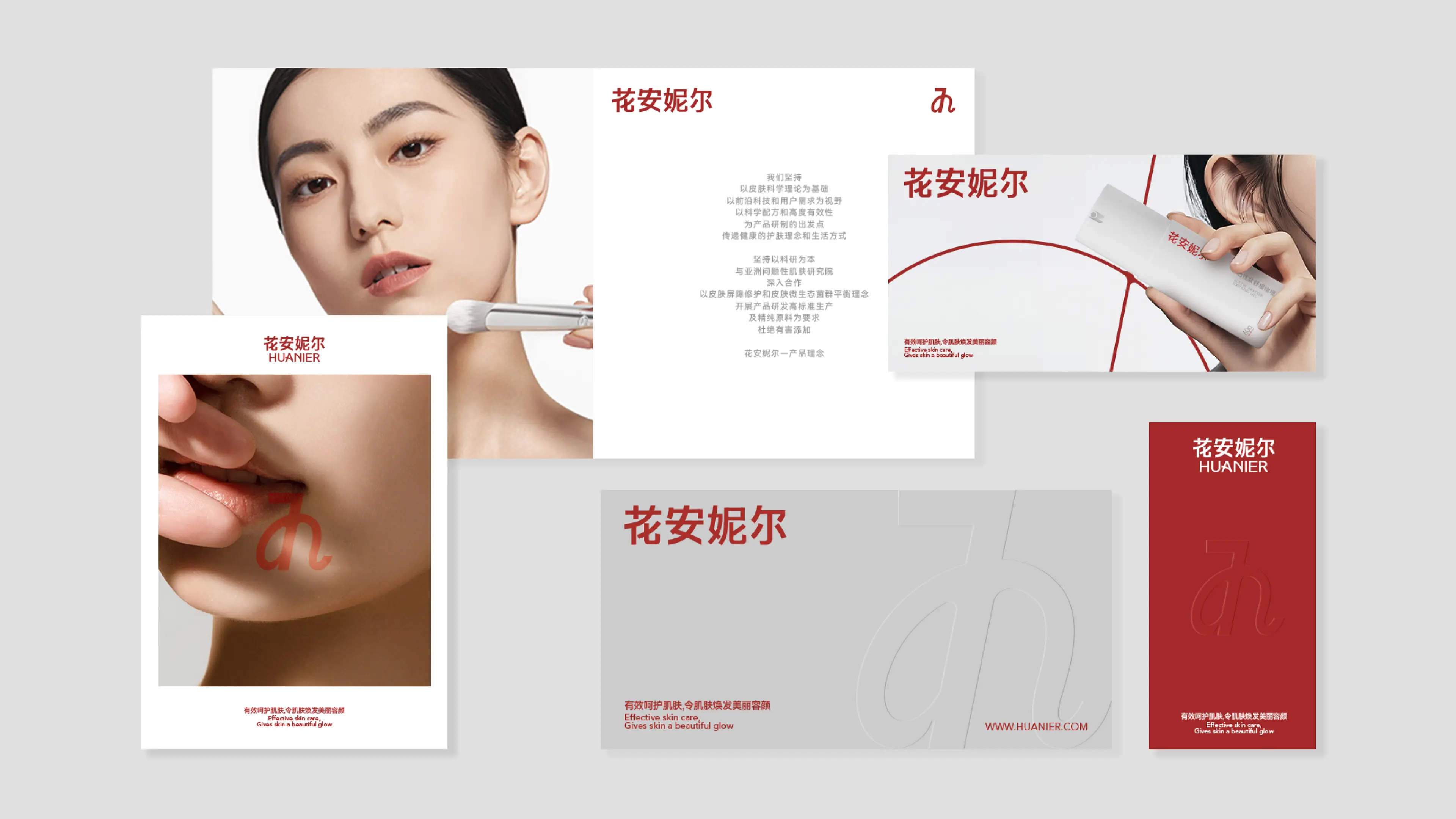
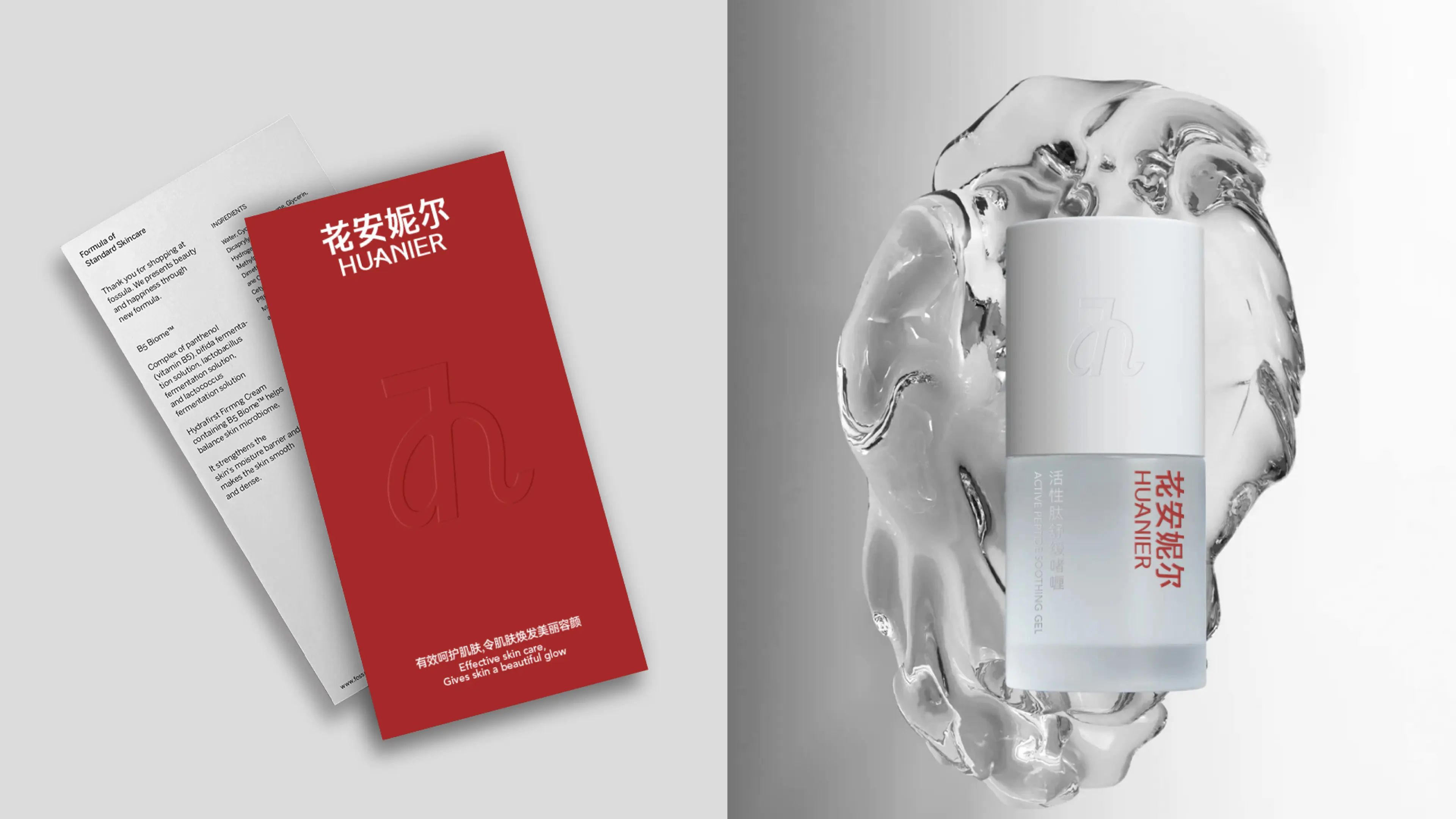
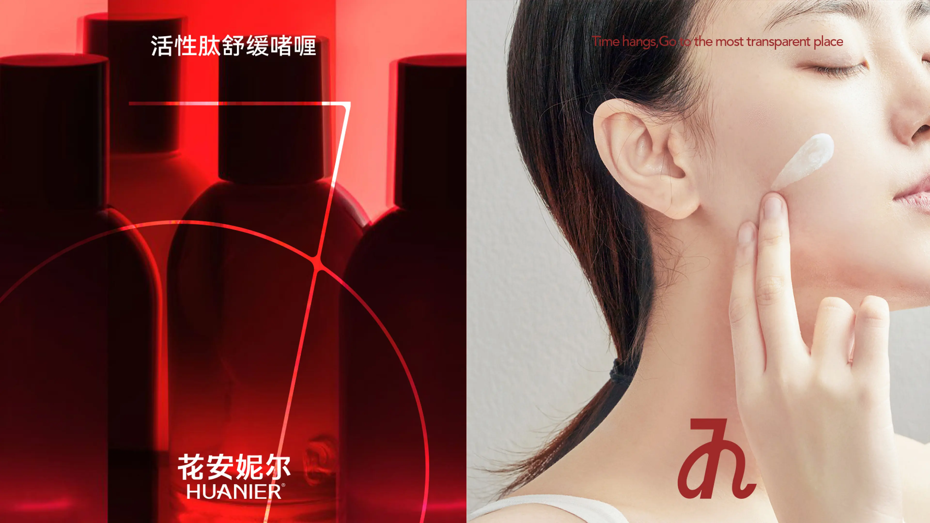
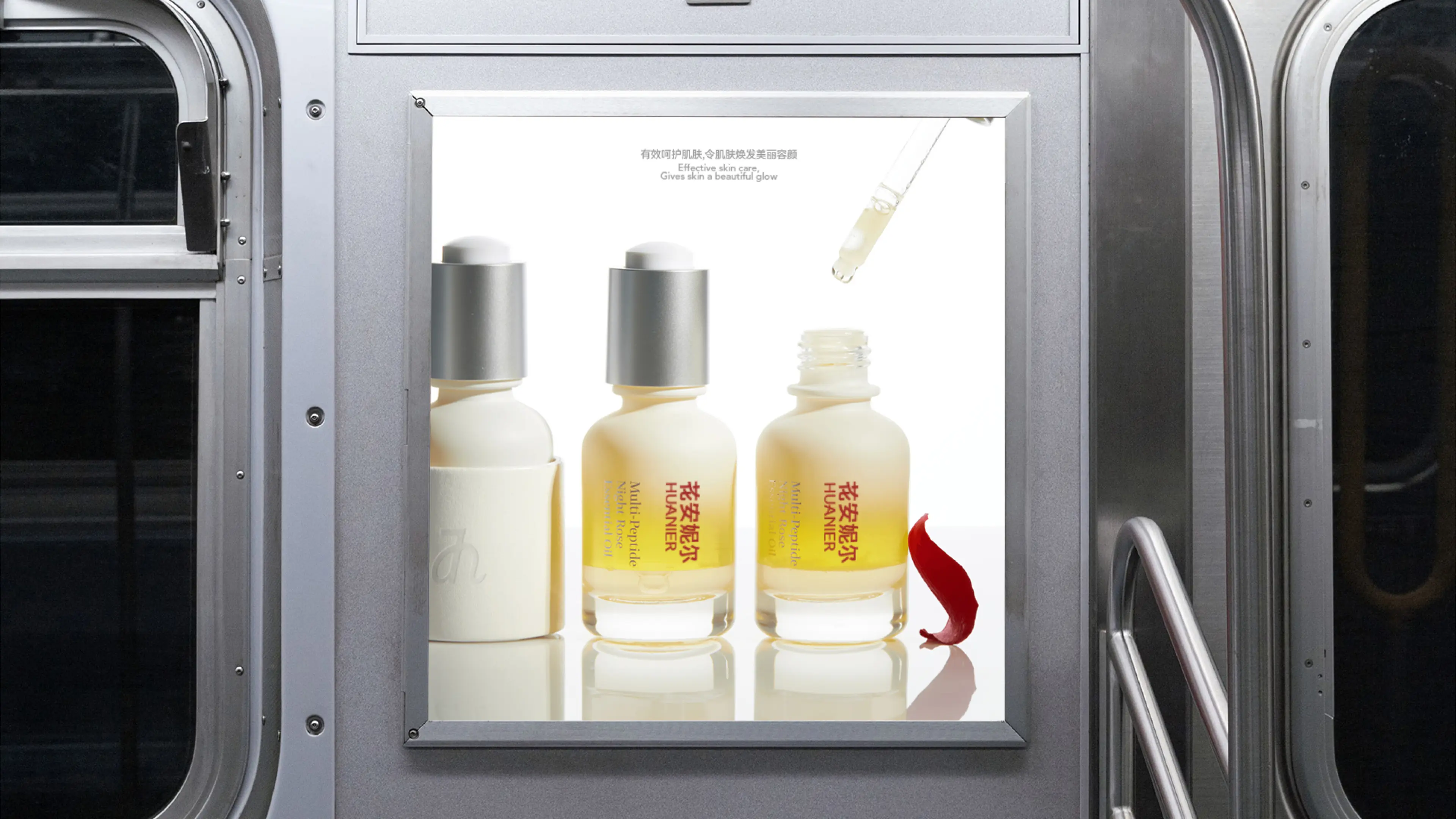
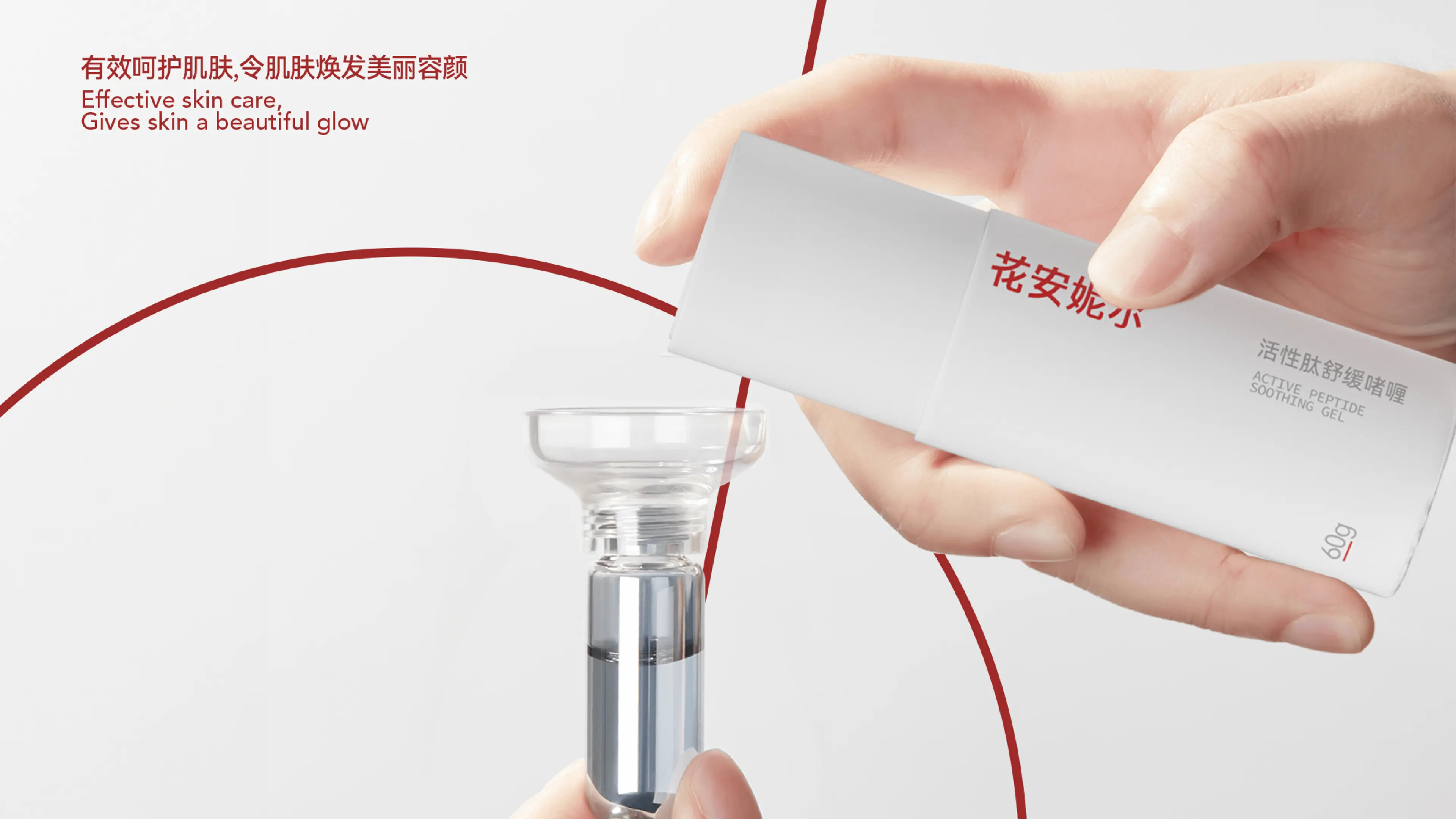
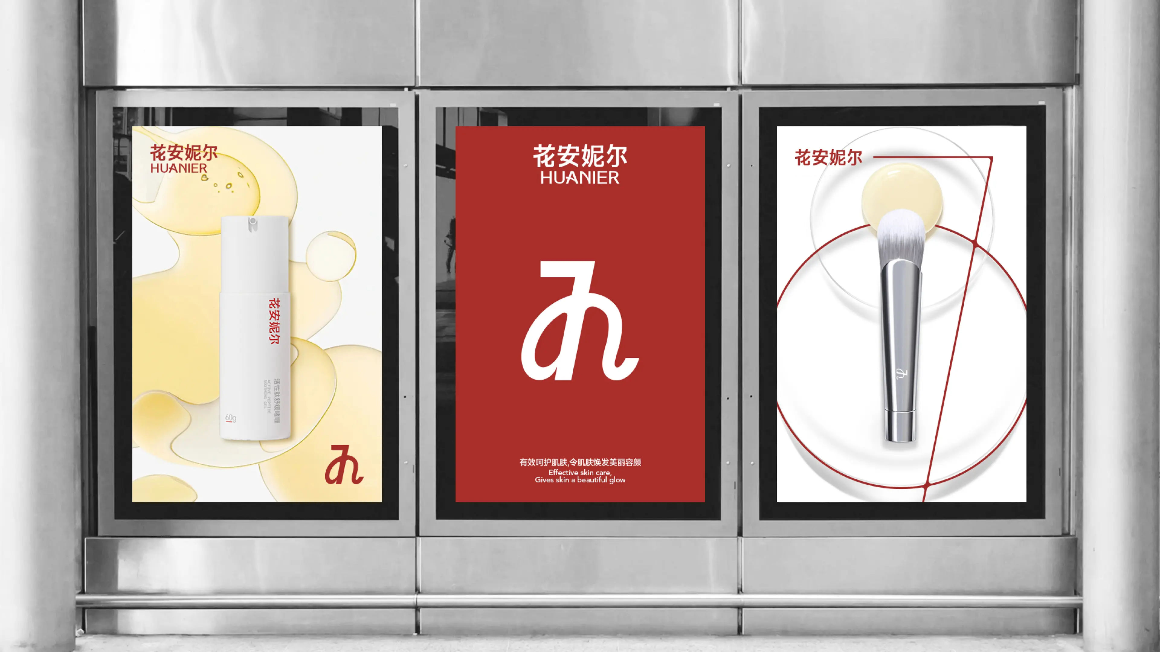
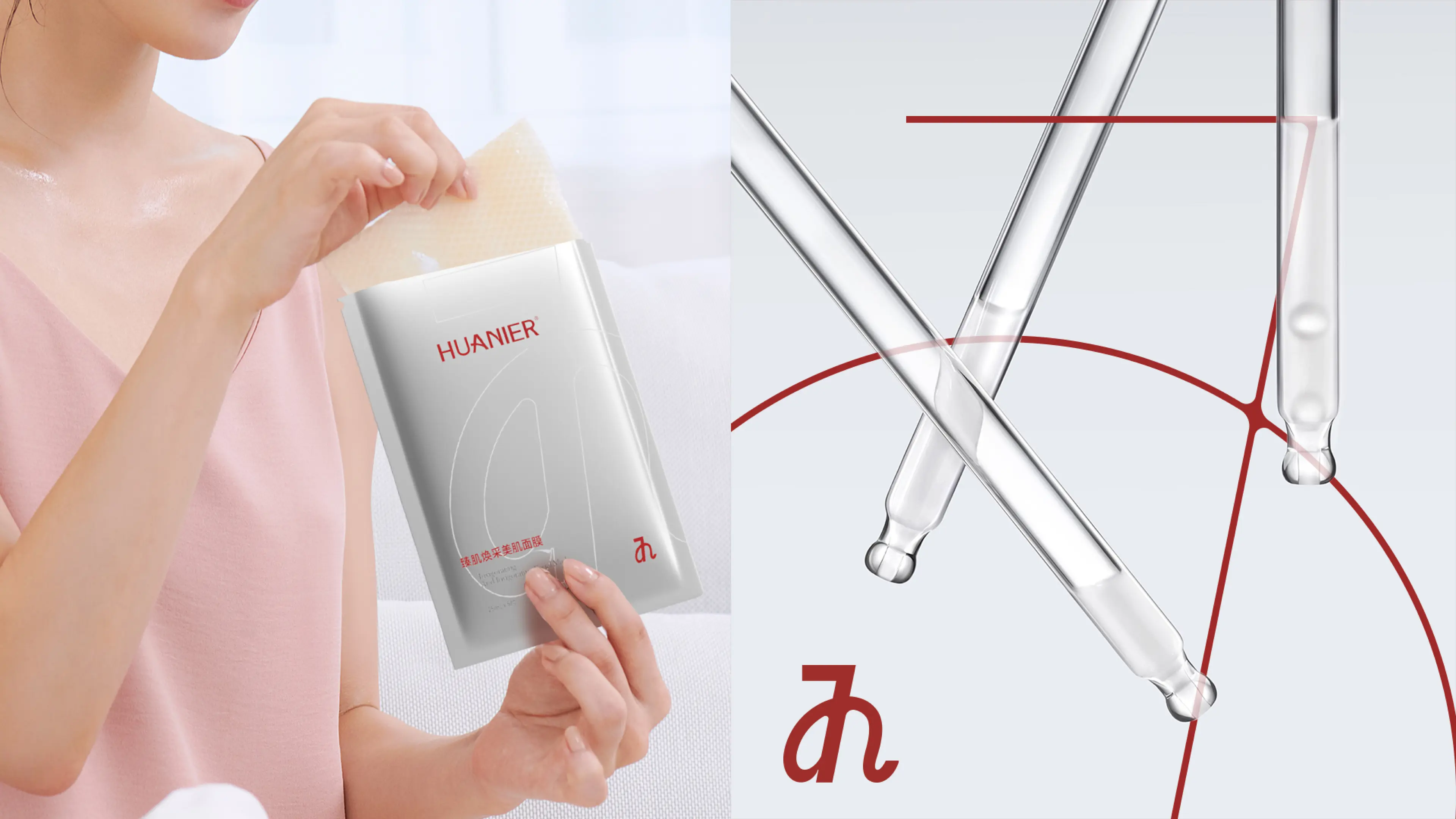
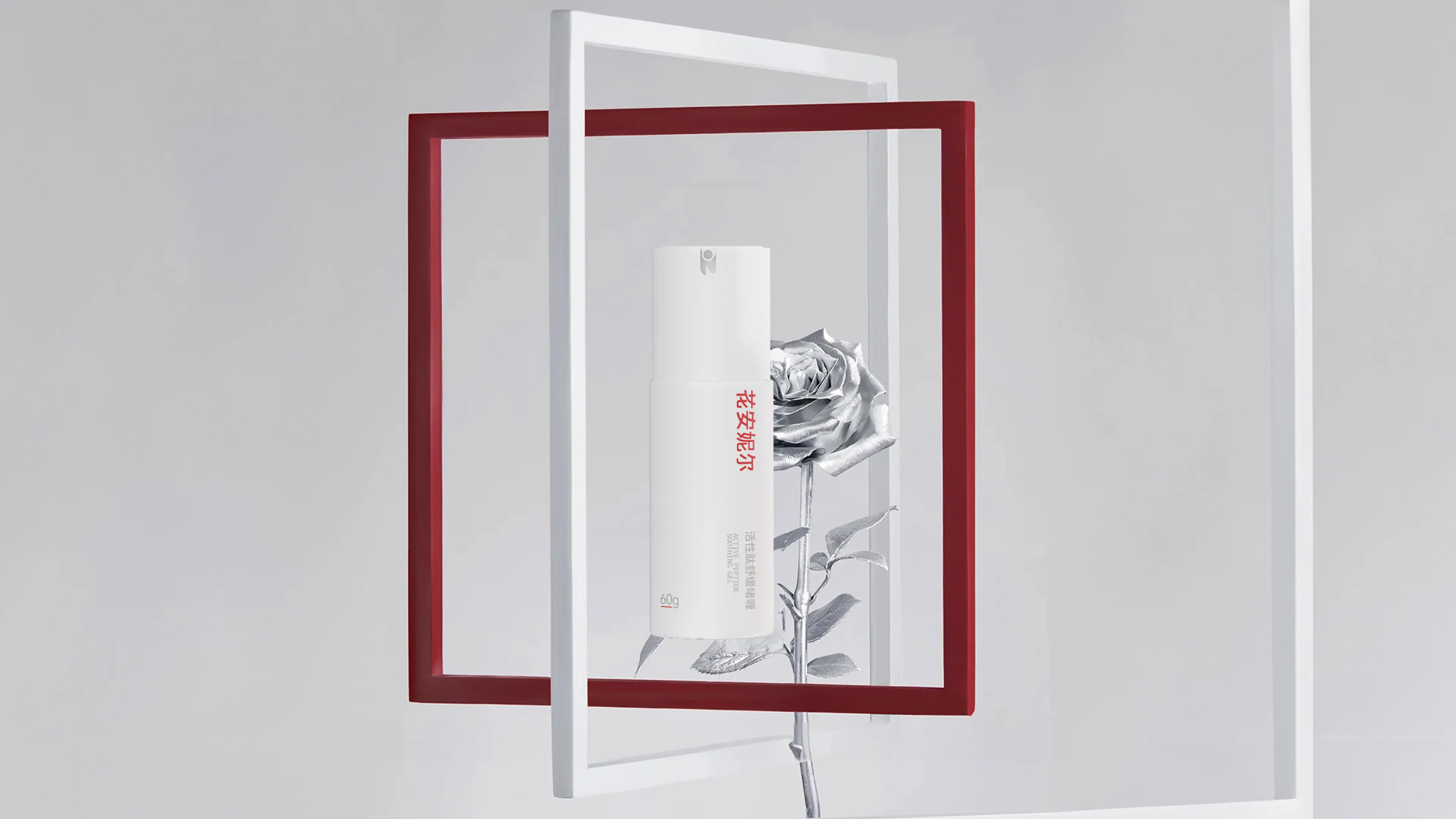
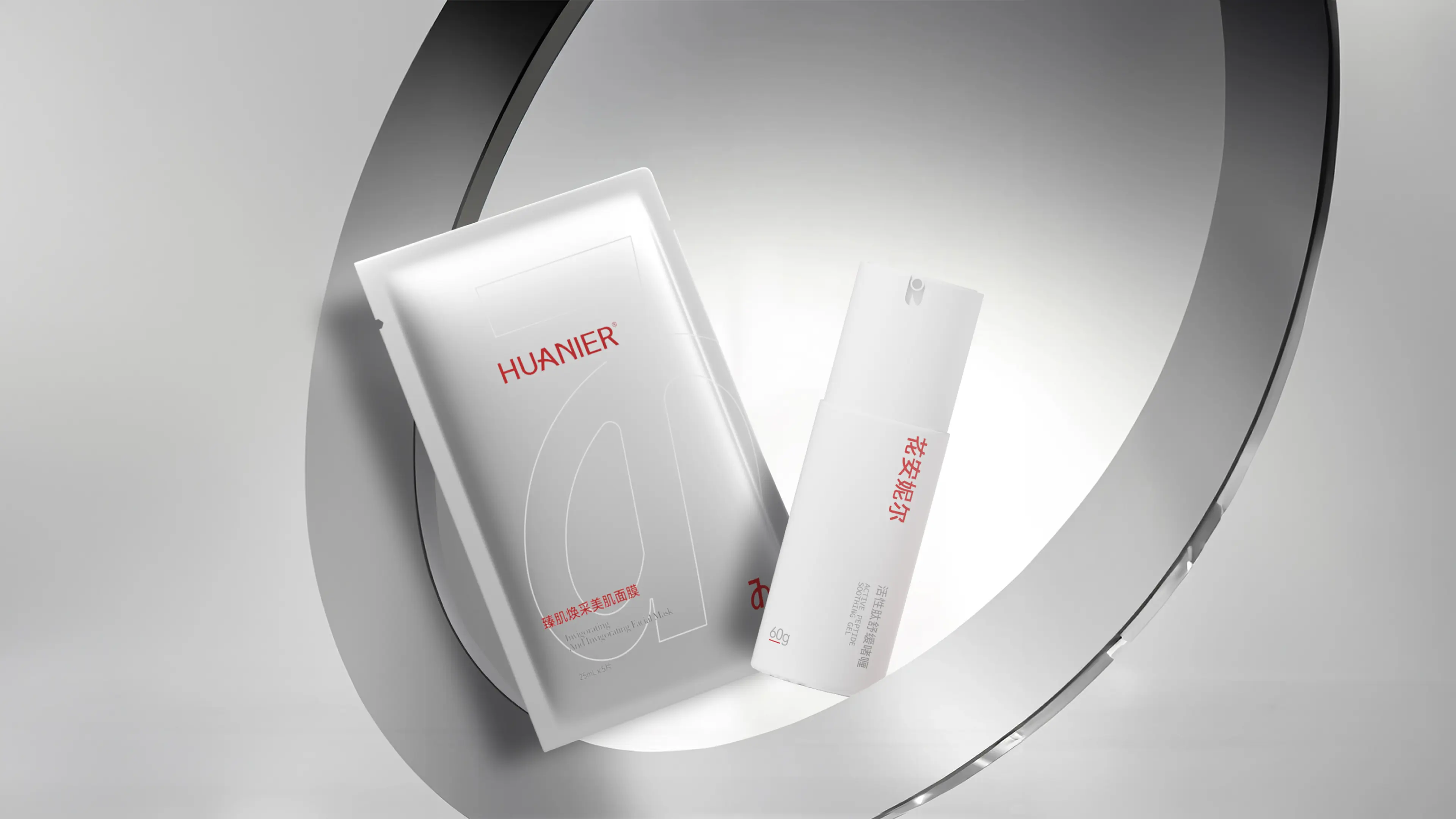
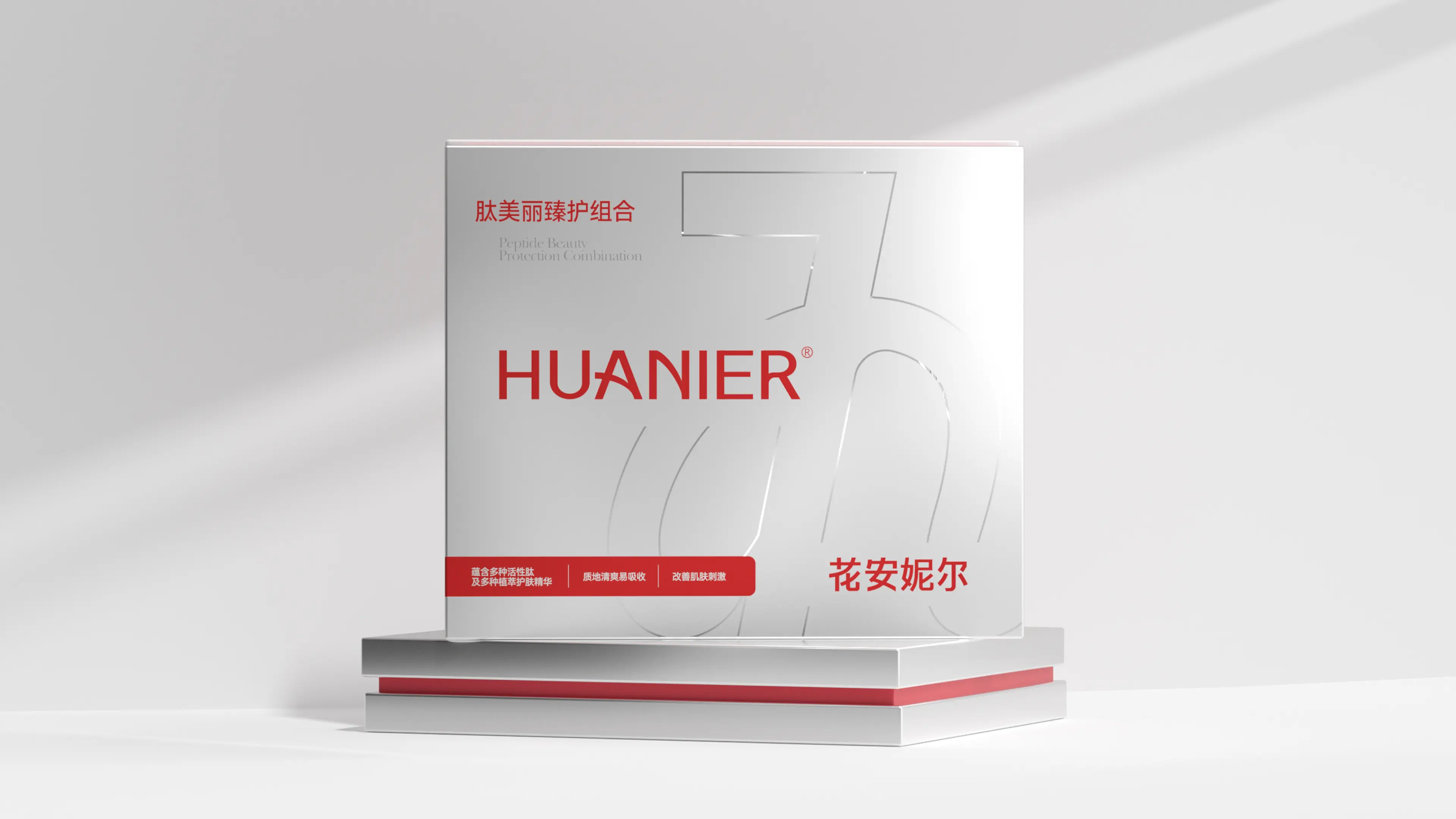
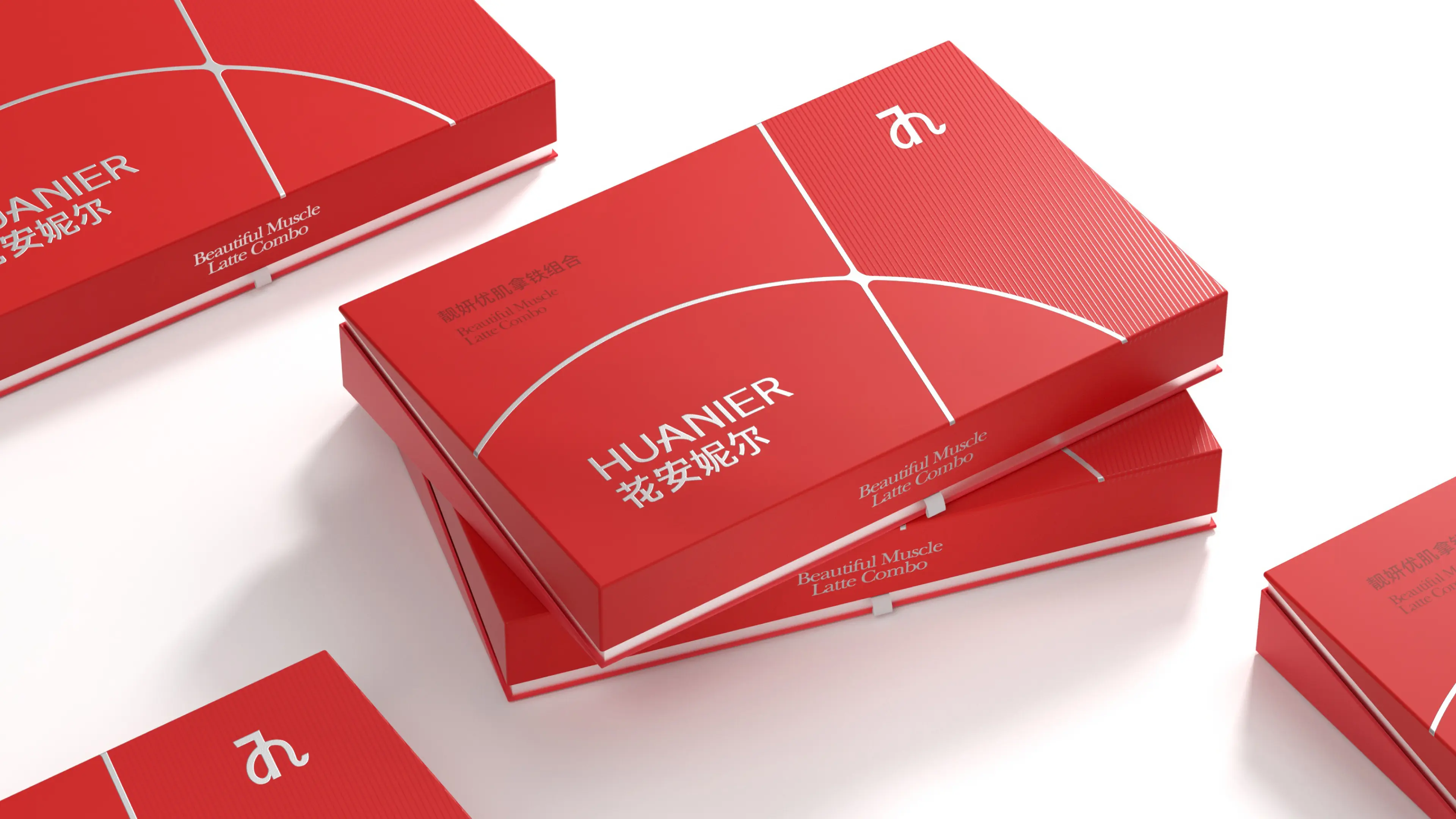
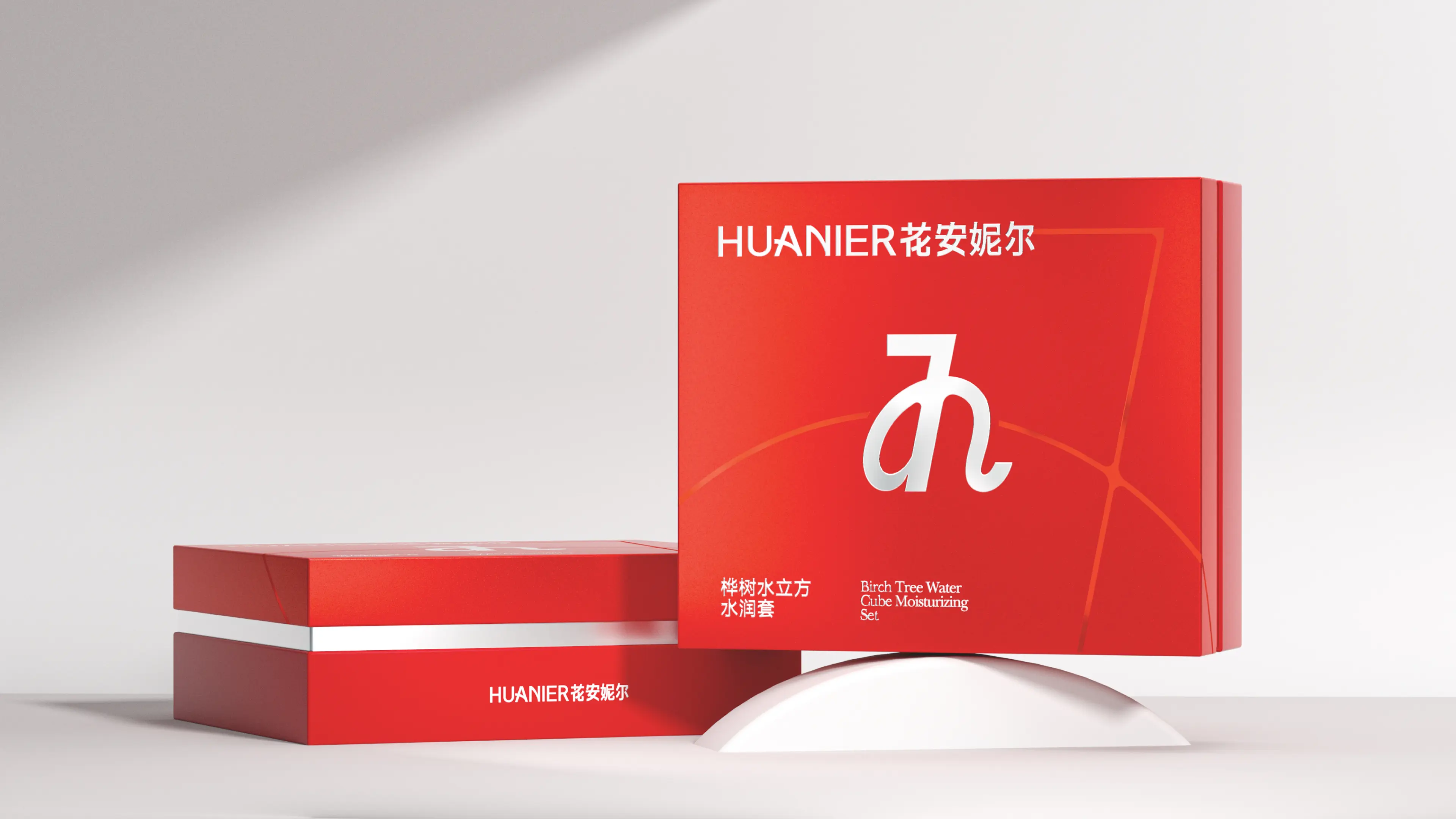
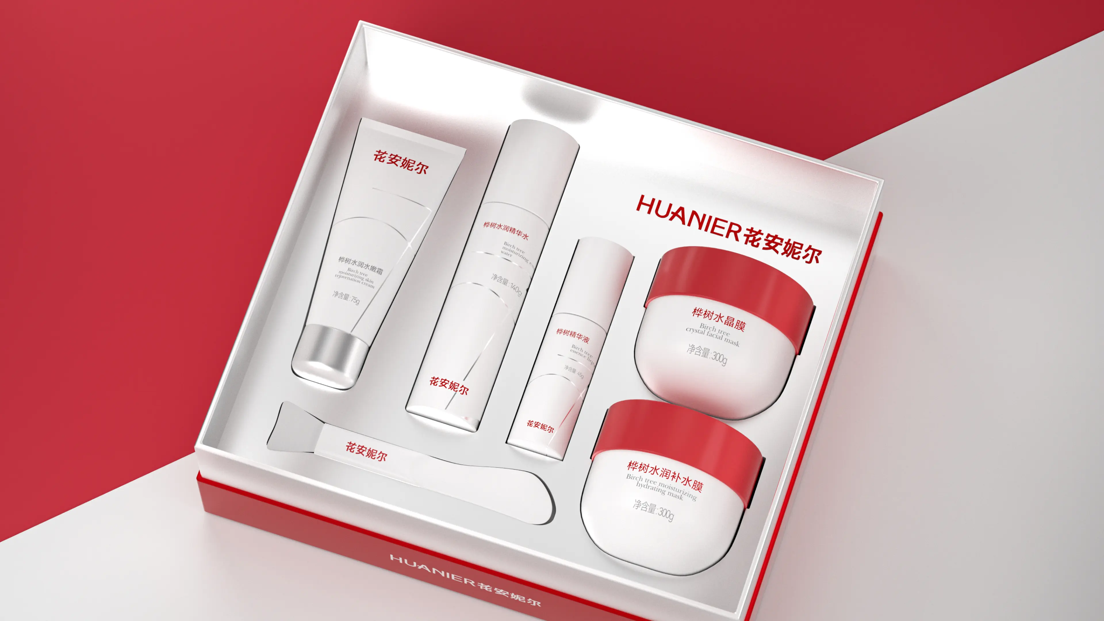
Hua'anier is a skincare brand focused on natural birch sap ingredients. Its core product line builds a water-free skincare system by "replacing purified water with birch sap." The Water Cube Set includes a Birch Essence and a Nourishing Crystal Mask, primarily targeting deep hydration and repair. Birch sap is known as "the blood of the forest," rich in various minerals and amino acids. However, in the early stages of product launch, the packaging design language was fragmented and lacked a unified visual symbol, resulting in shelf performance that never matched the product's intrinsic value despite its high quality. The brand urgently needed to transform "good ingredients" into instantly recognizable brand assets through design.
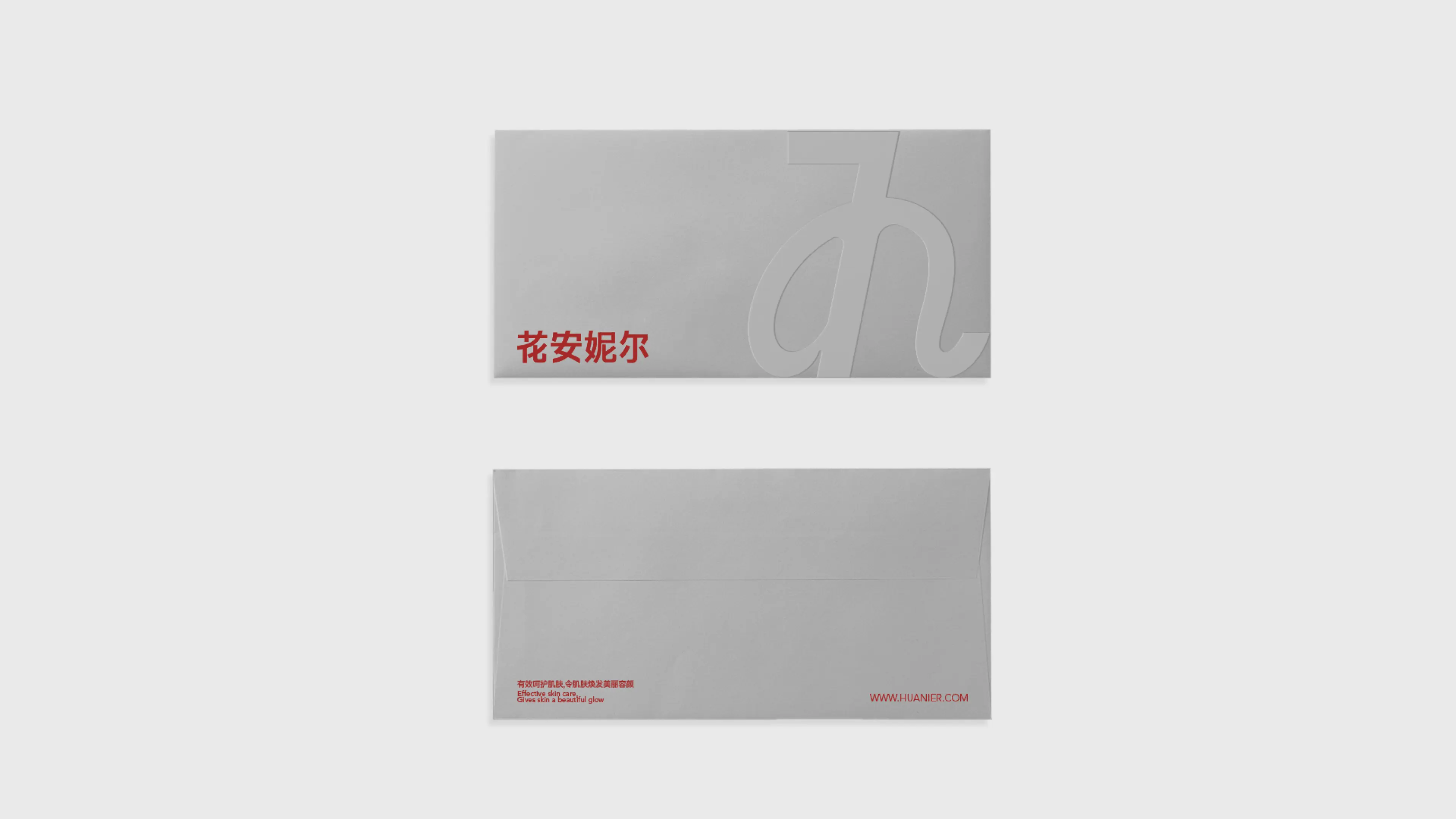
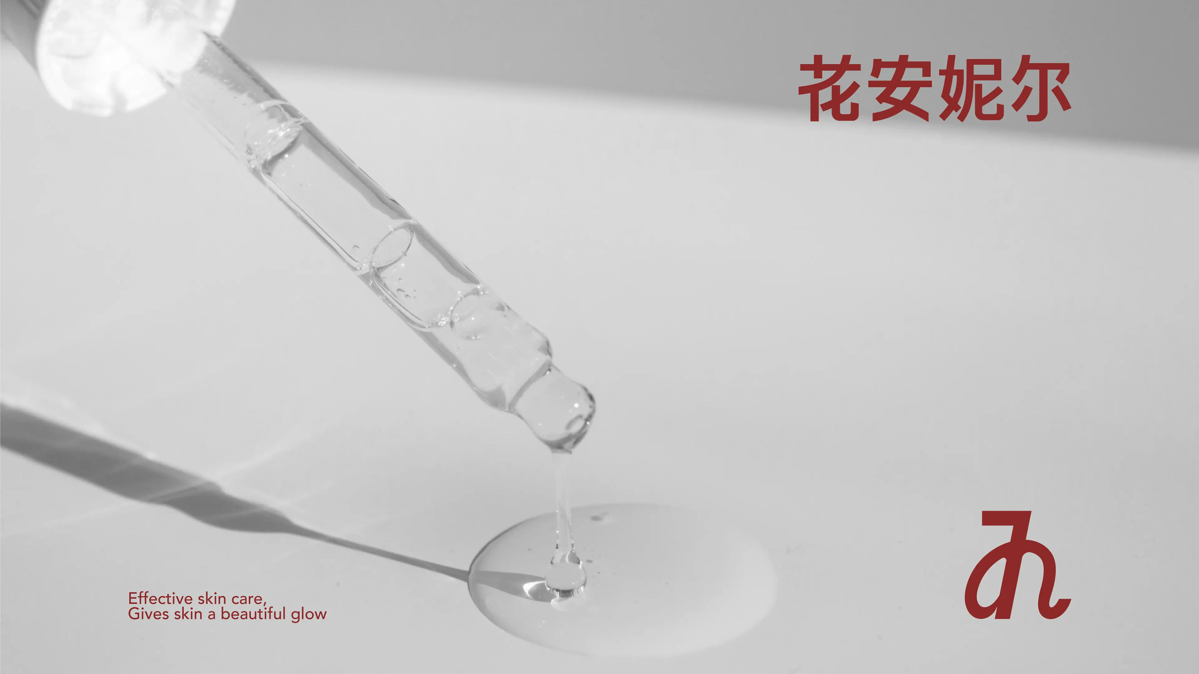
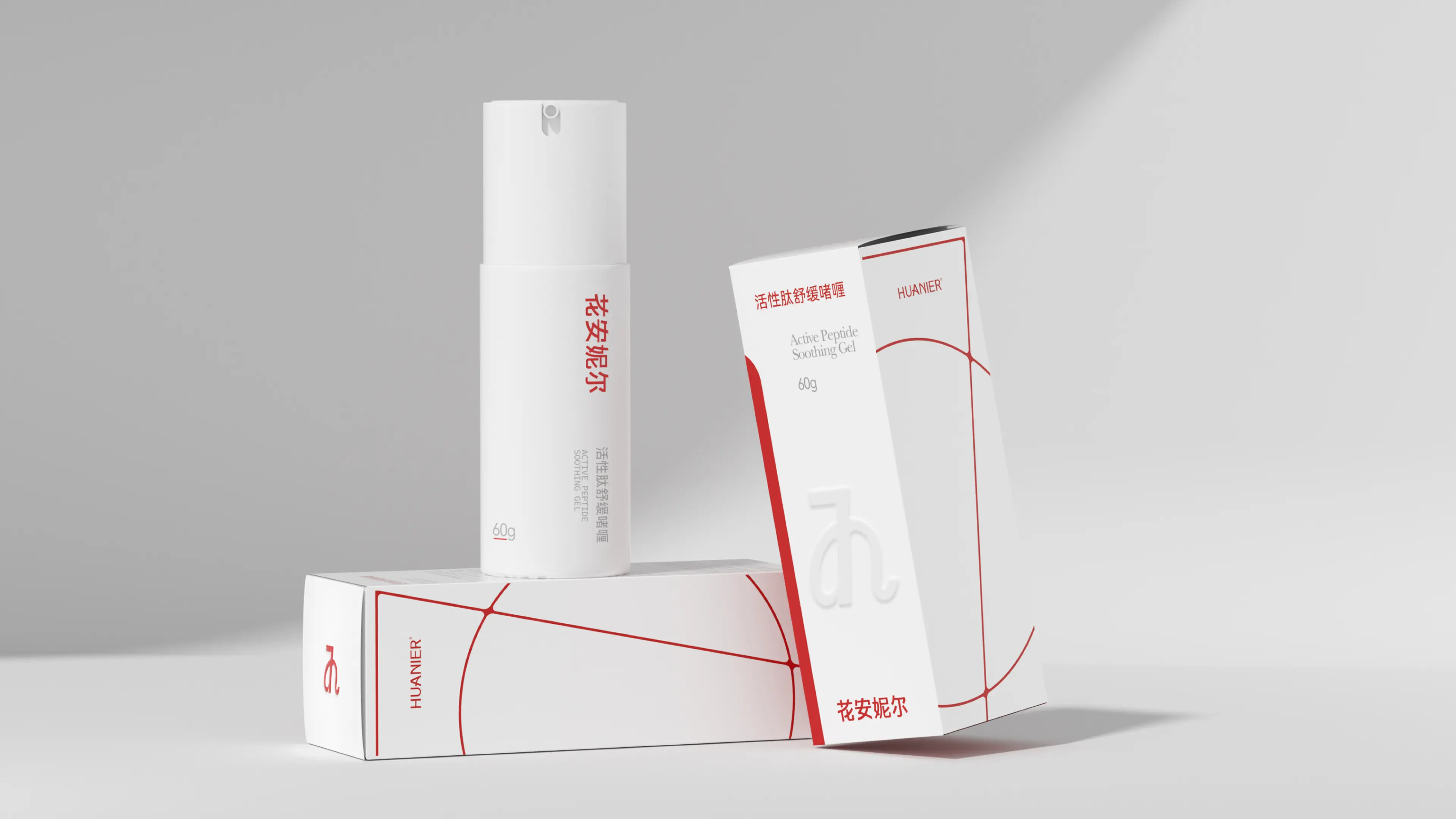
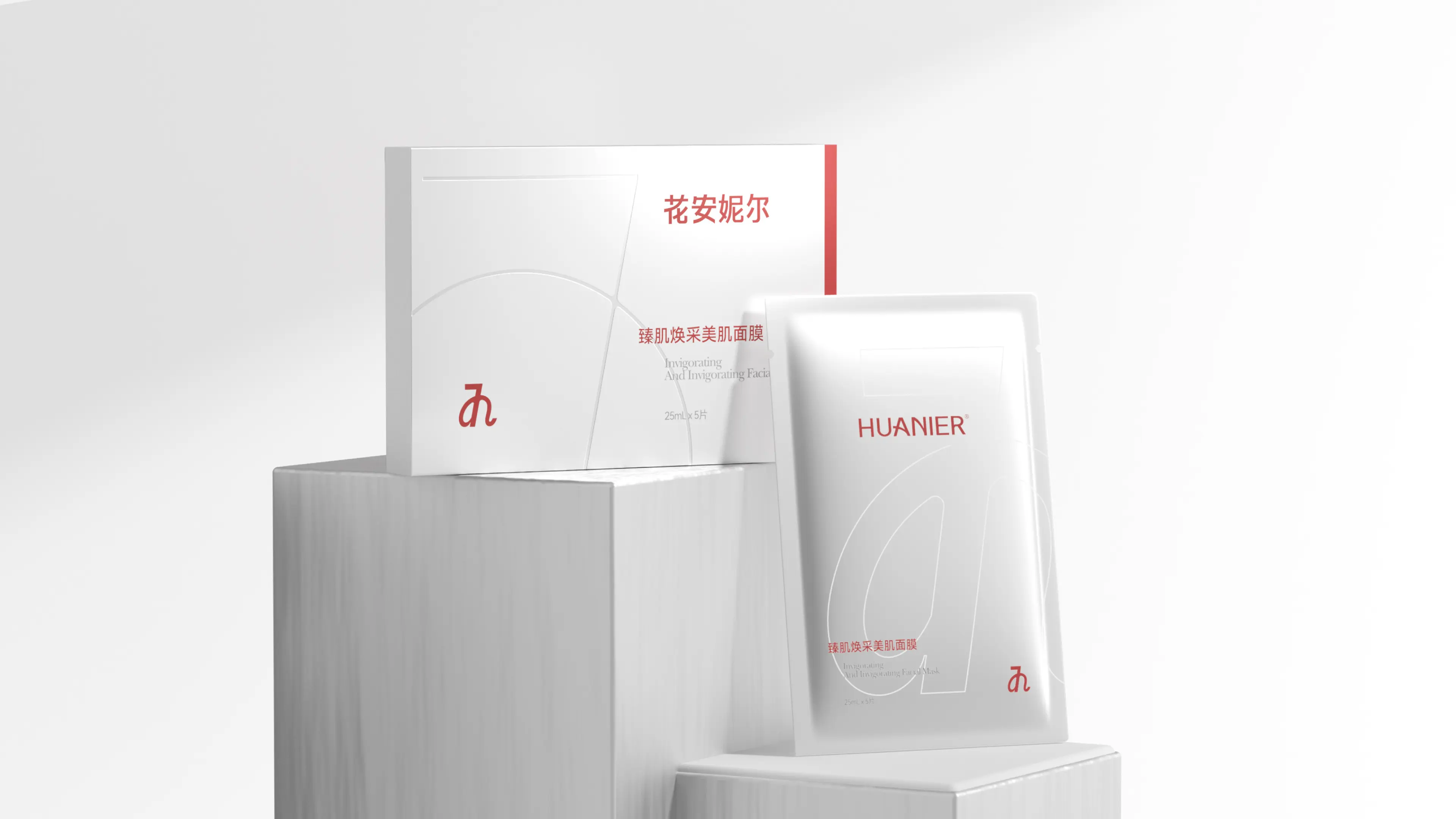
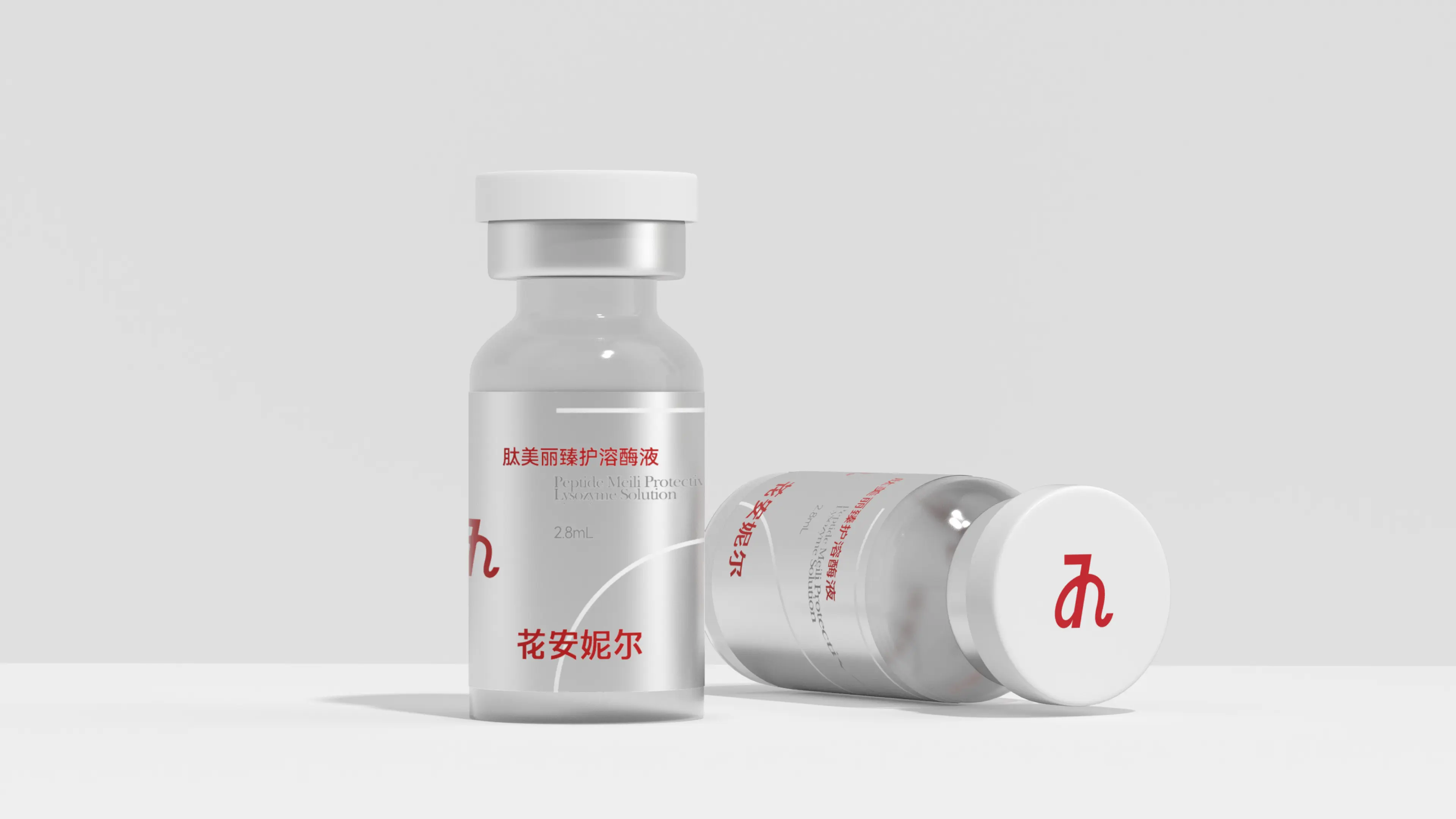
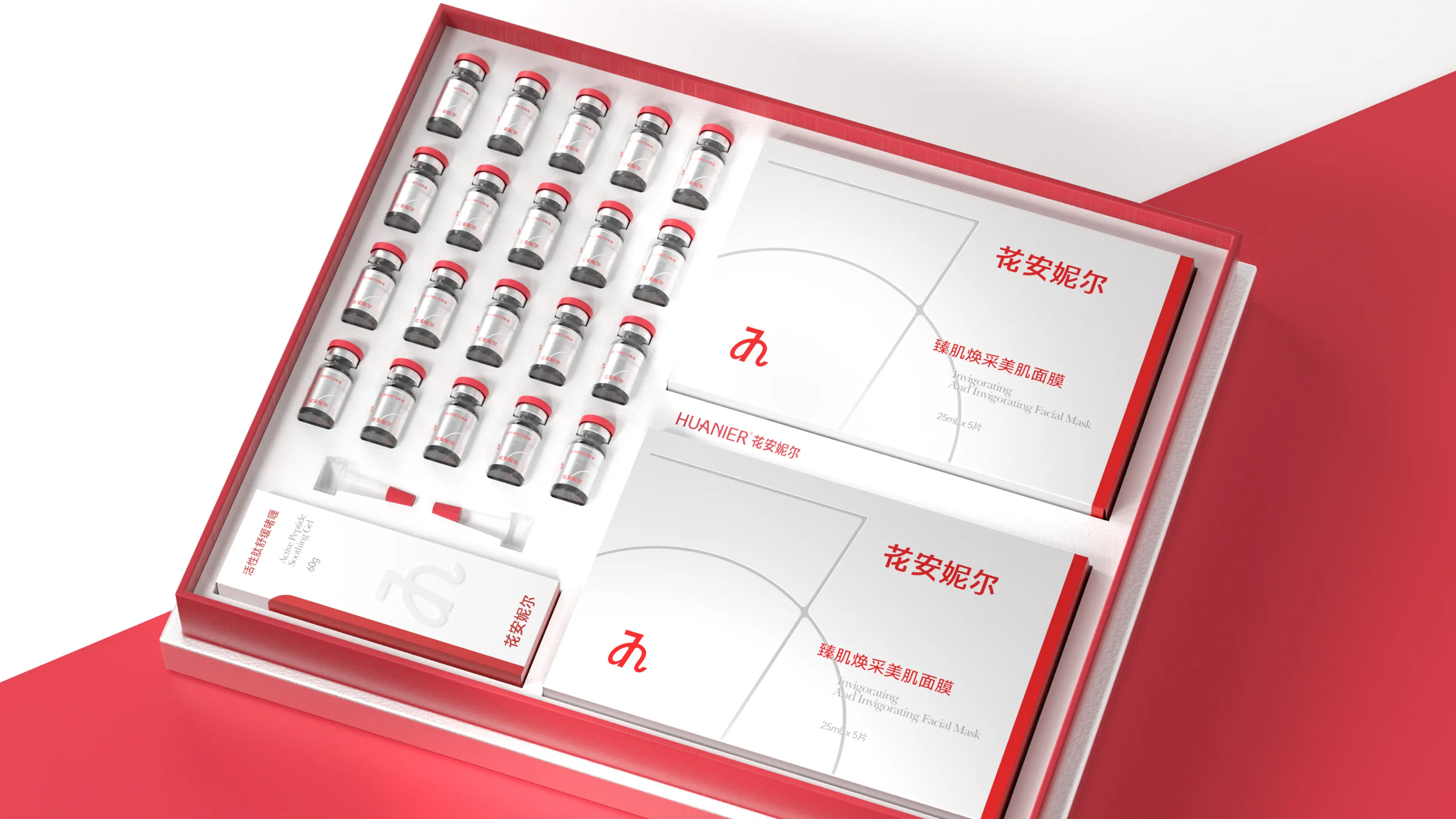
This project involved creating a brand visual and packaging design system for Hua'anier's Birch Water Cube Hydrating Set. The core objective was to help the brand establish differentiated visual recognition in the highly homogenized competitive landscape of natural-ingredient skincare. Starting from the natural attribute of birch sap as "living water transportation," we extracted the naturally interwoven black-and-white texture of birch bark and transformed it into abstract geometric stripes on the bottle body — using flowing lines to interpret the life journey of sap surging from roots to branch tips. The label uses a semi-transparent specialty material, allowing the color of the inner formula and the bark texture to overlay each other, creating a translucent sensation of morning light penetrating through the forest. The overall color palette combines matte frosted white with light cyan wood grain. We repeatedly refined the opening damping and inner lining tactile feel, striving to convey a pure, natural, and hydrating brand temperament in every detail. Through this design system combining aesthetic expression and brand recognition efficiency, Hua'anier has successfully upgraded from a set of functional skincare products to a natural skincare brand with strong visual symbols and a clear brand tonality.