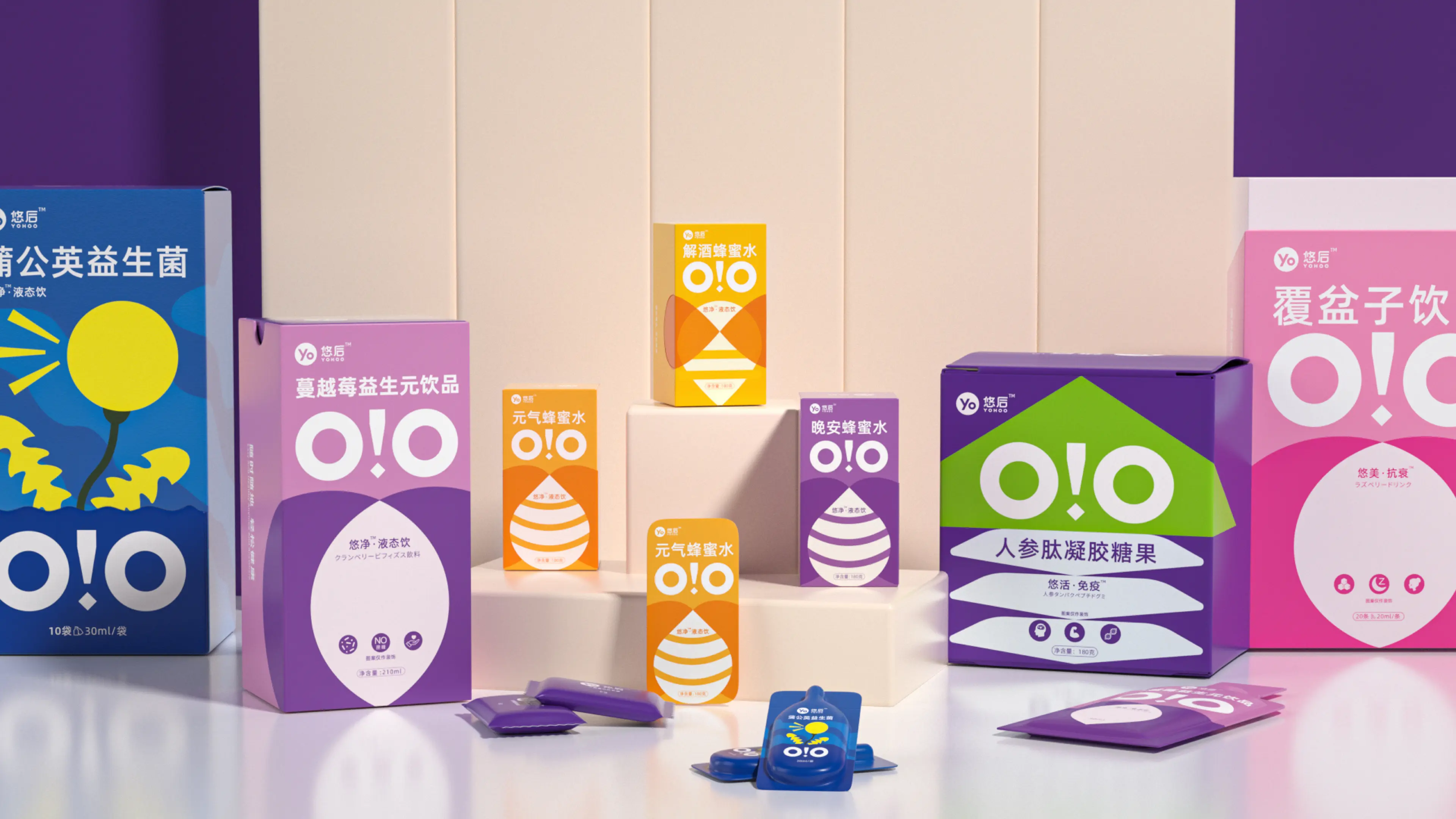




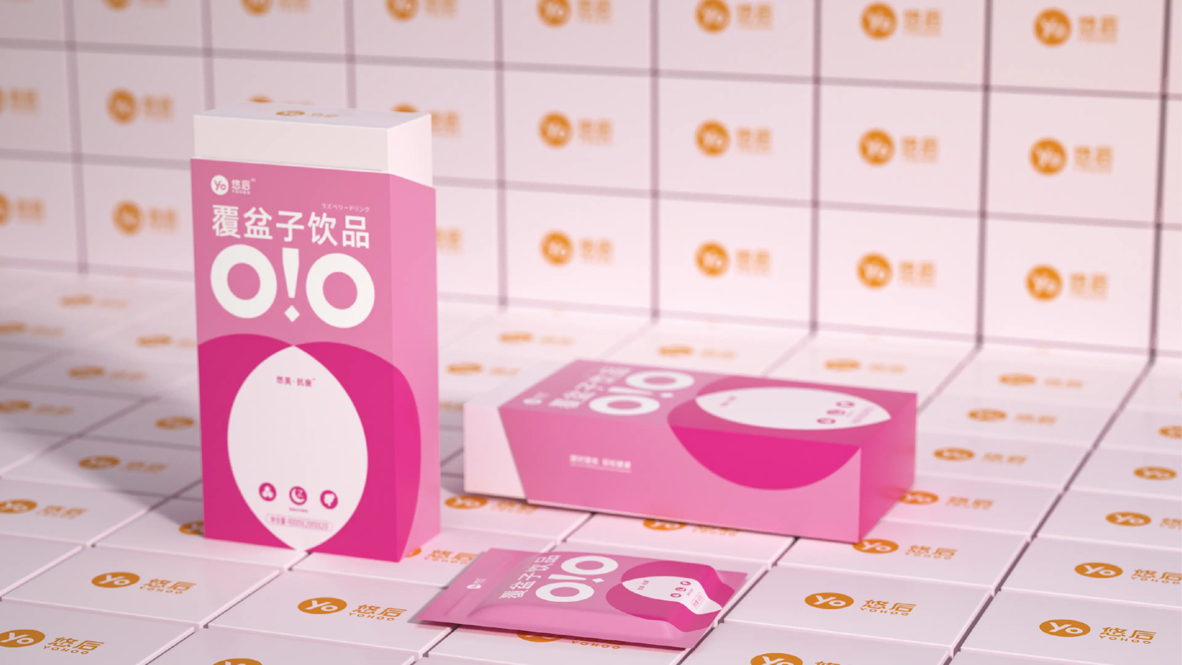
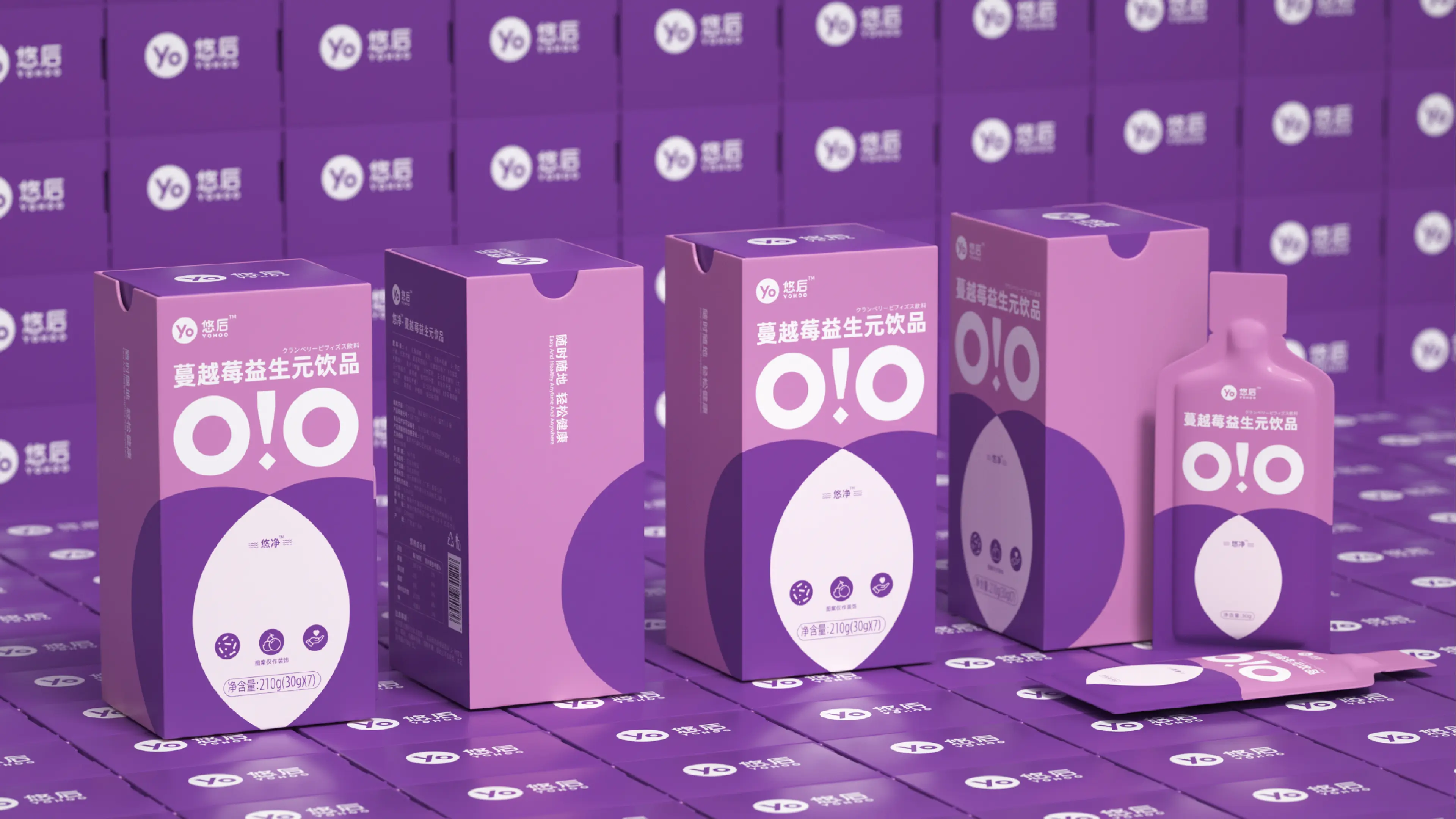
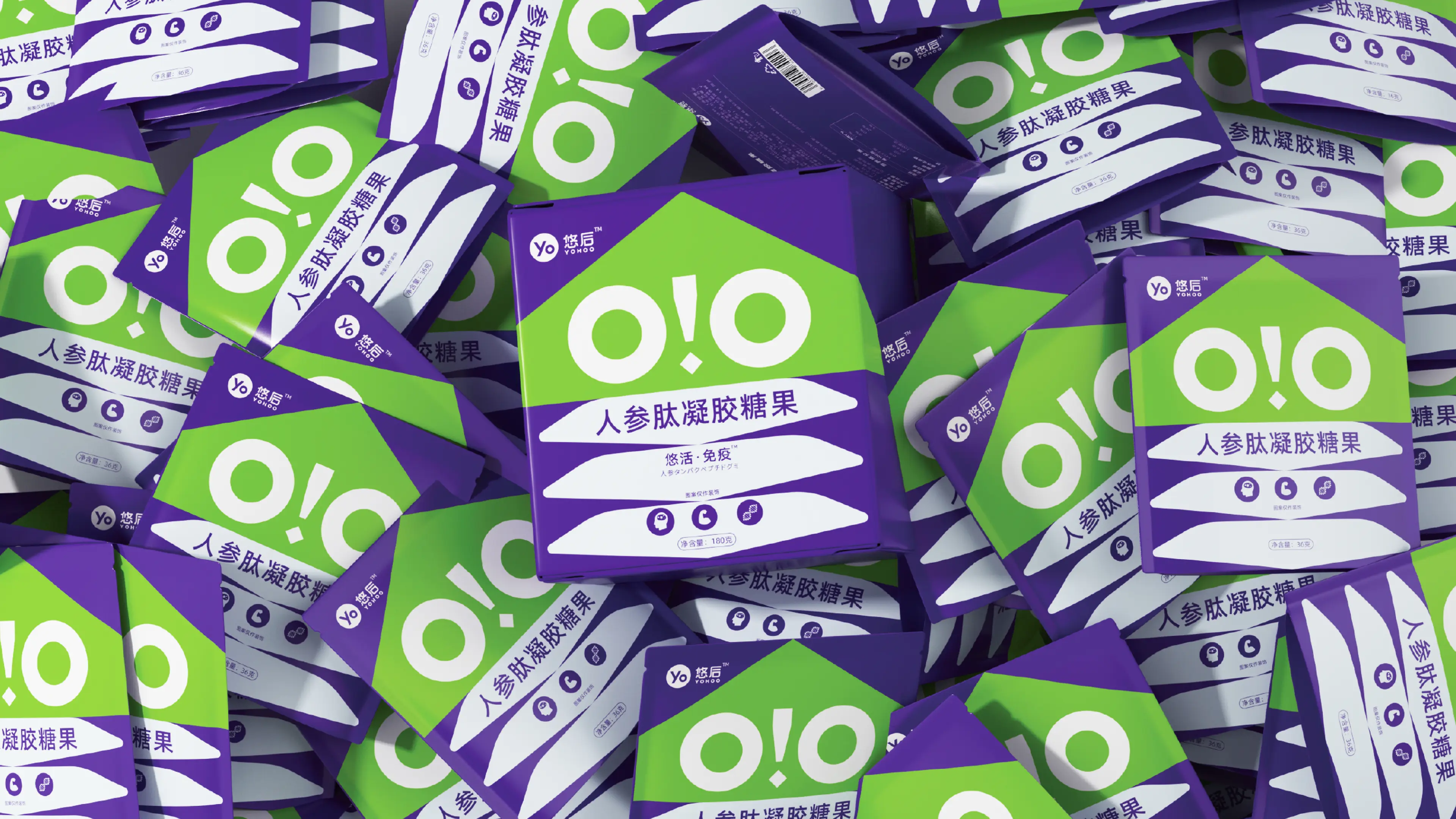
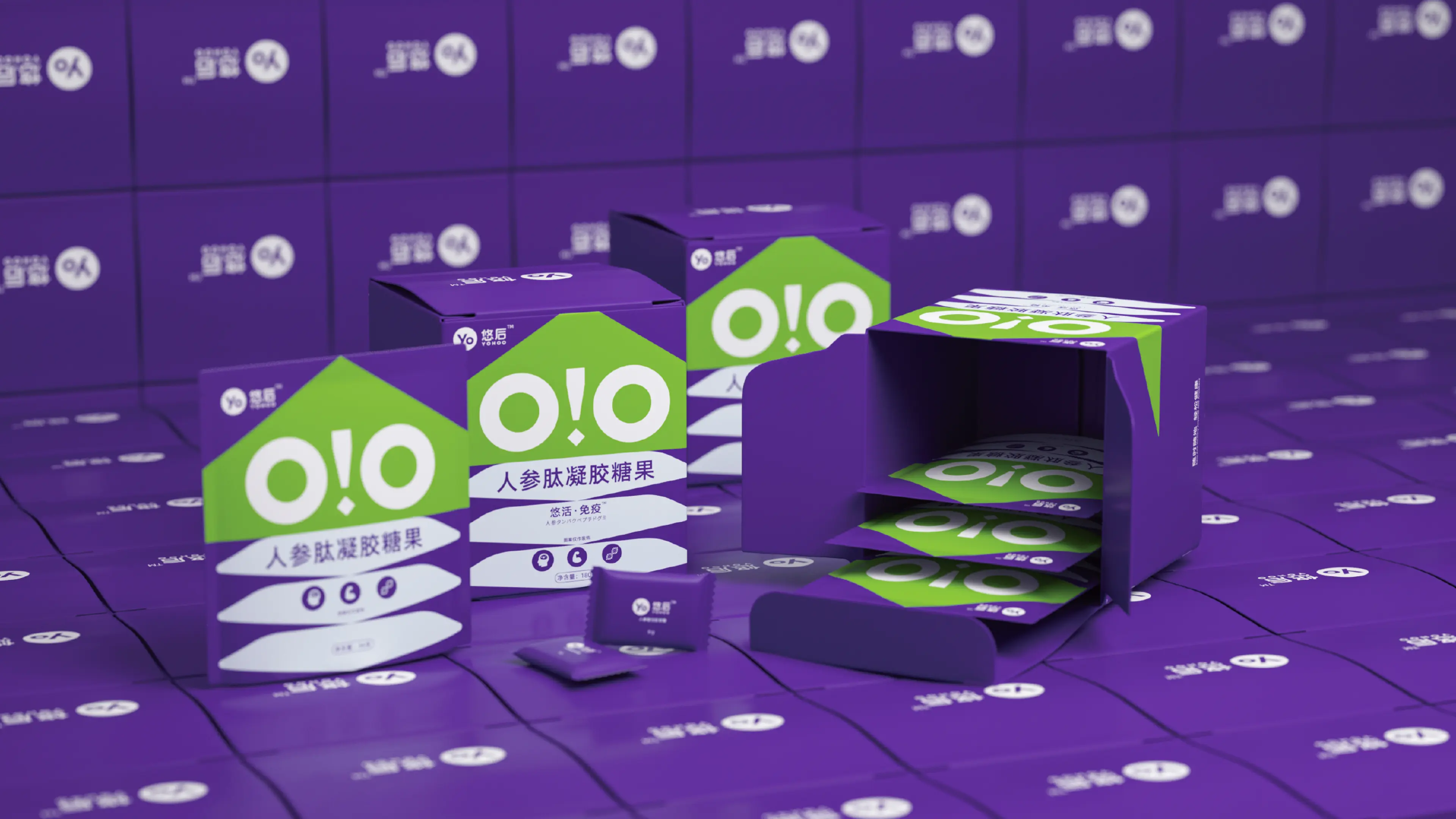
Yohoo is a natural health beverage brand created in response to the growing light-wellness trend among younger consumers. The brand focuses on high-quality, naturally sourced drinks designed to feel refreshing, uncomplicated, and easy to enjoy as part of everyday life.
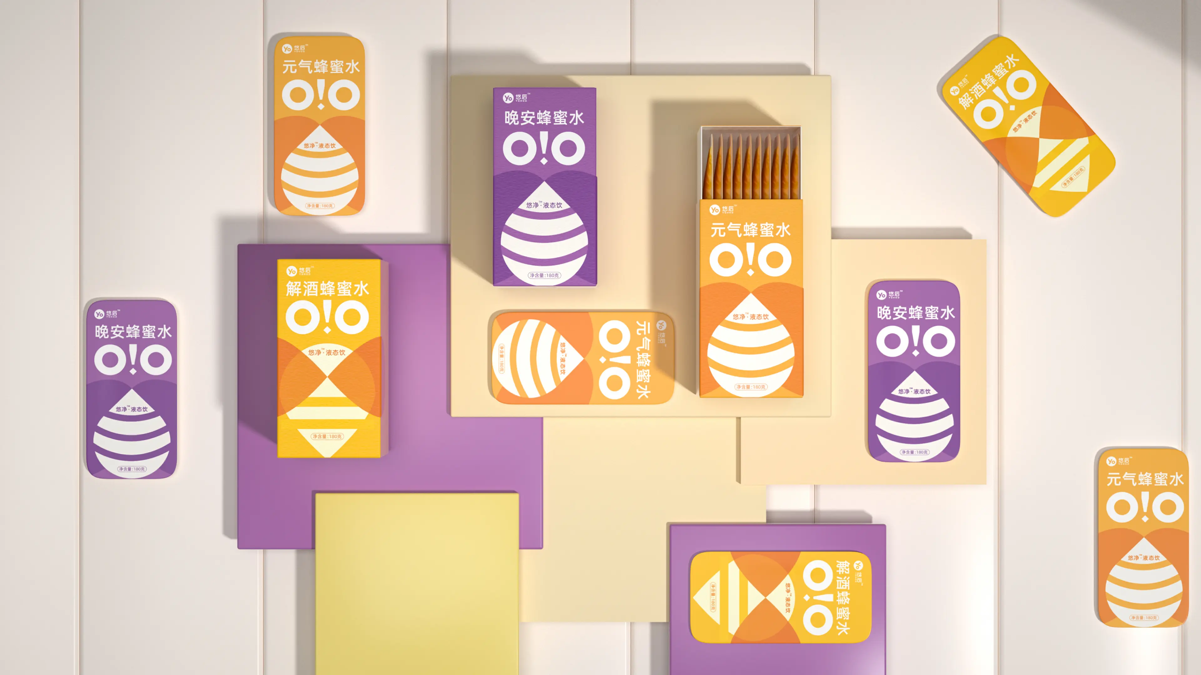
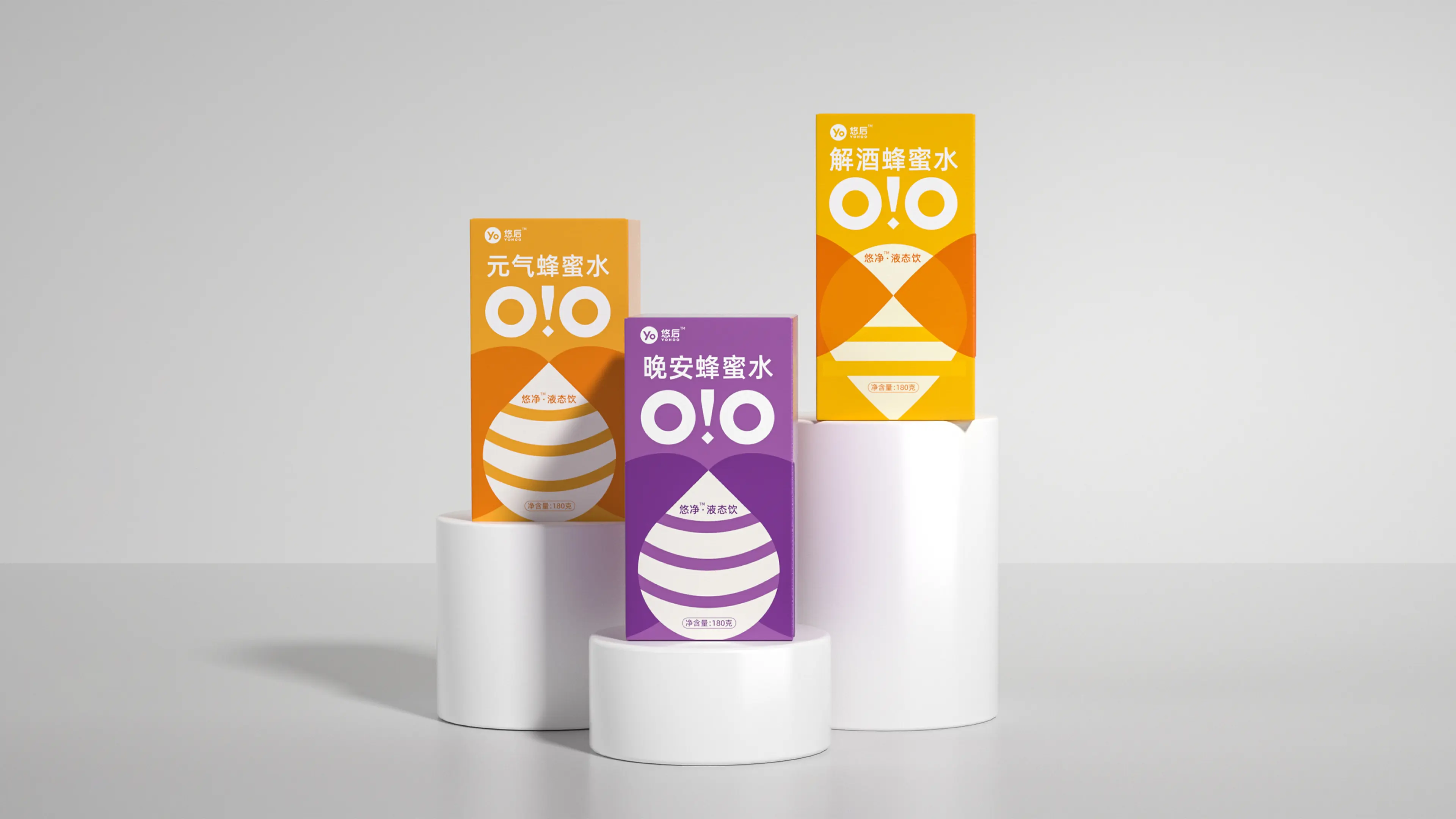
As one of Yohoo’s key new products, Honey Water is made with premium honey and positioned around natural sweetness and everyday energy replenishment. Designed for urban office workers and younger wellness-conscious consumers, the product fits a wide range of occasions, from commuting and afternoon breaks to outdoor activities and post-meal refreshment.
By moving away from the high-sugar soft drink category, Yohoo offers a lighter and more natural beverage choice that can be enjoyed throughout the day.
This packaging project was developed around four core qualities: vitality, nature, lightness, and comfort.
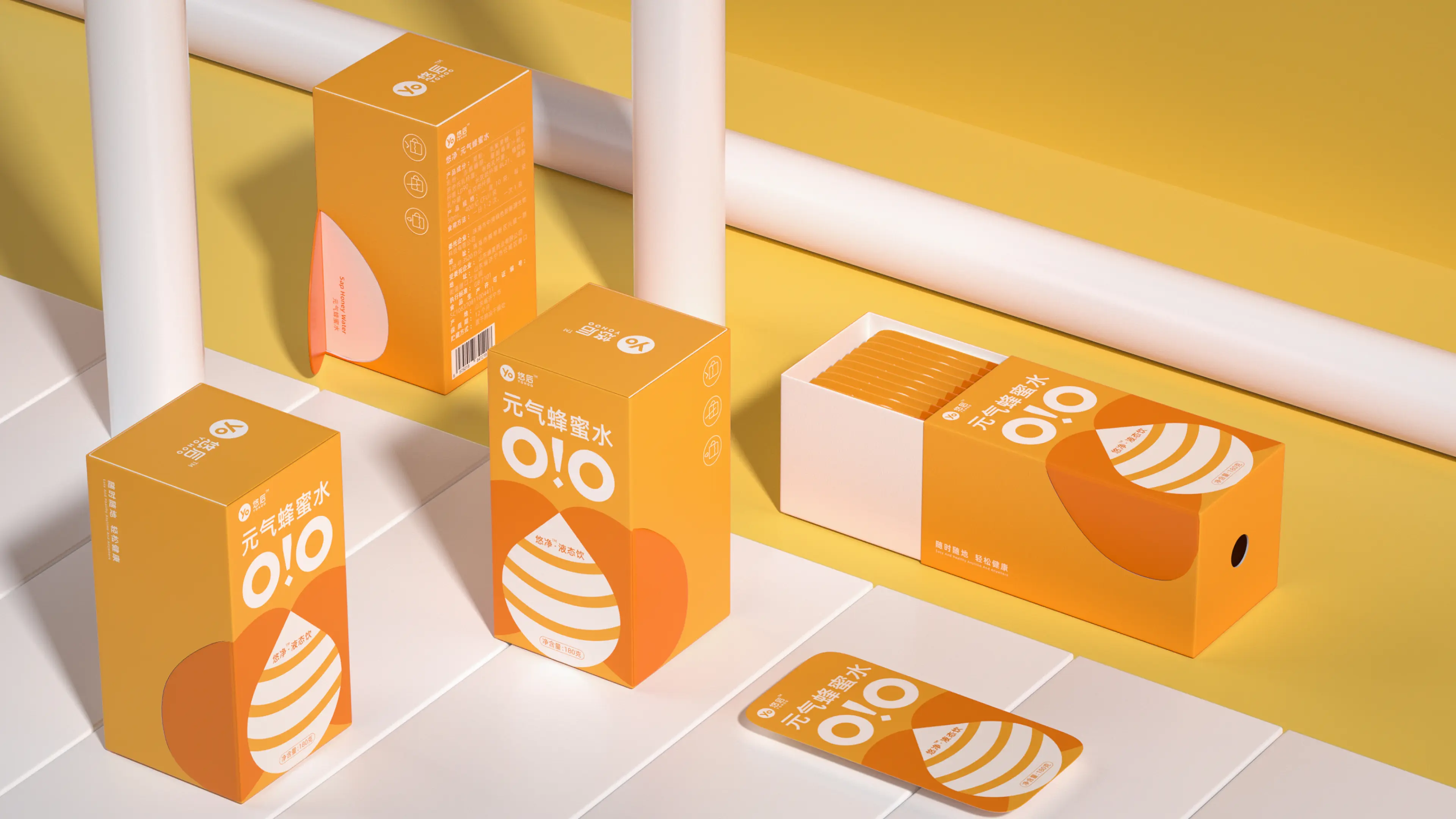
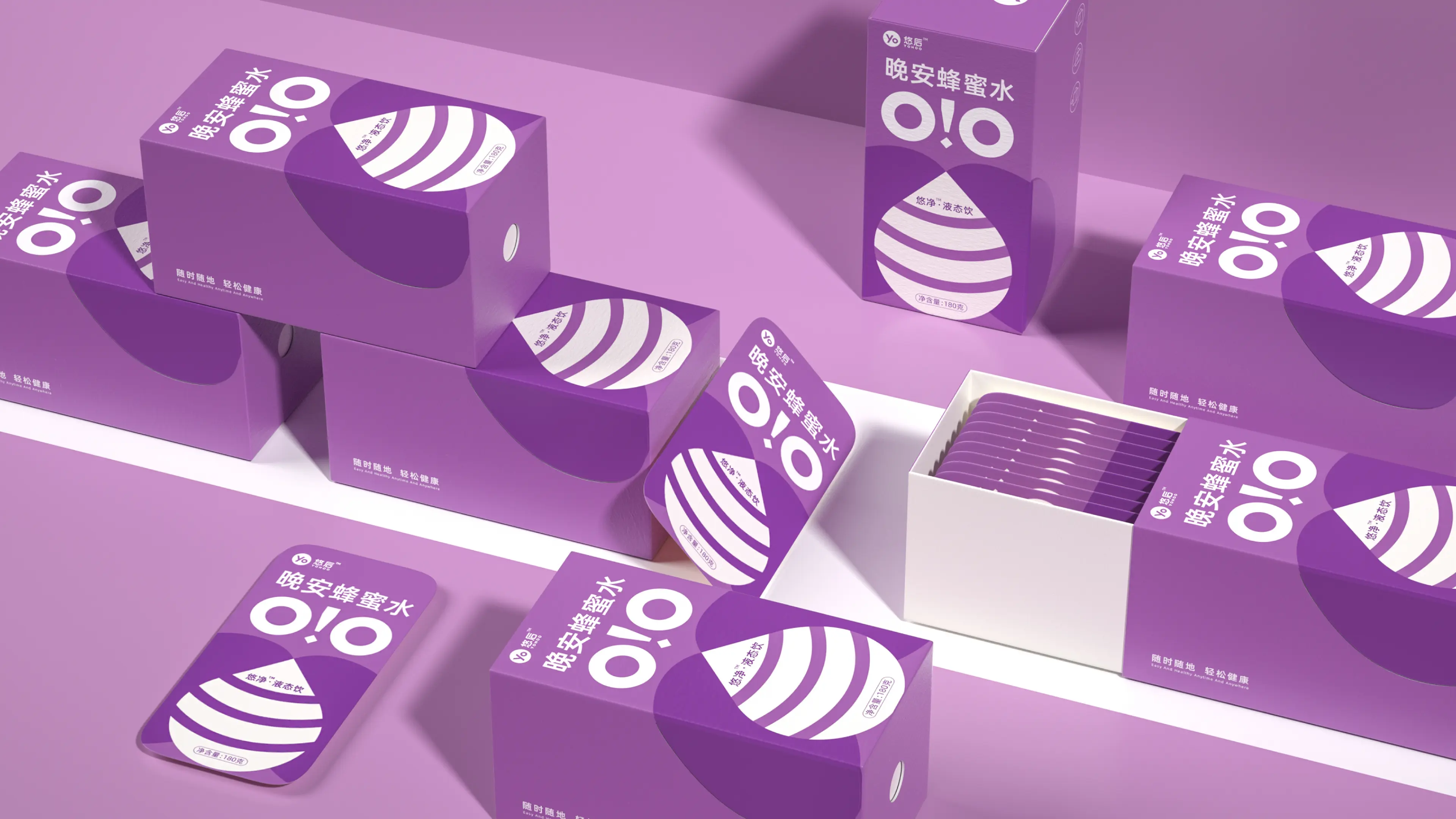
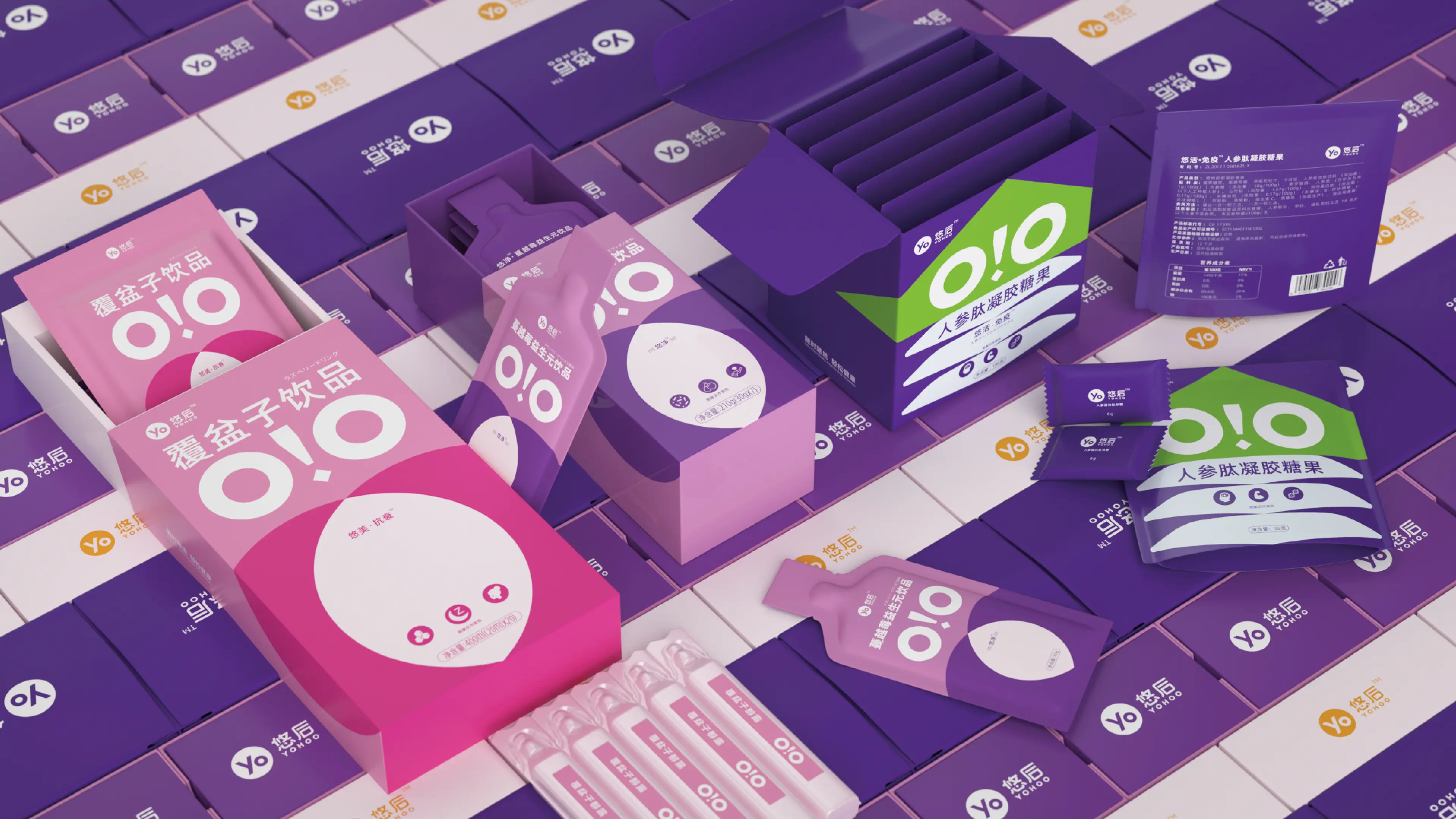
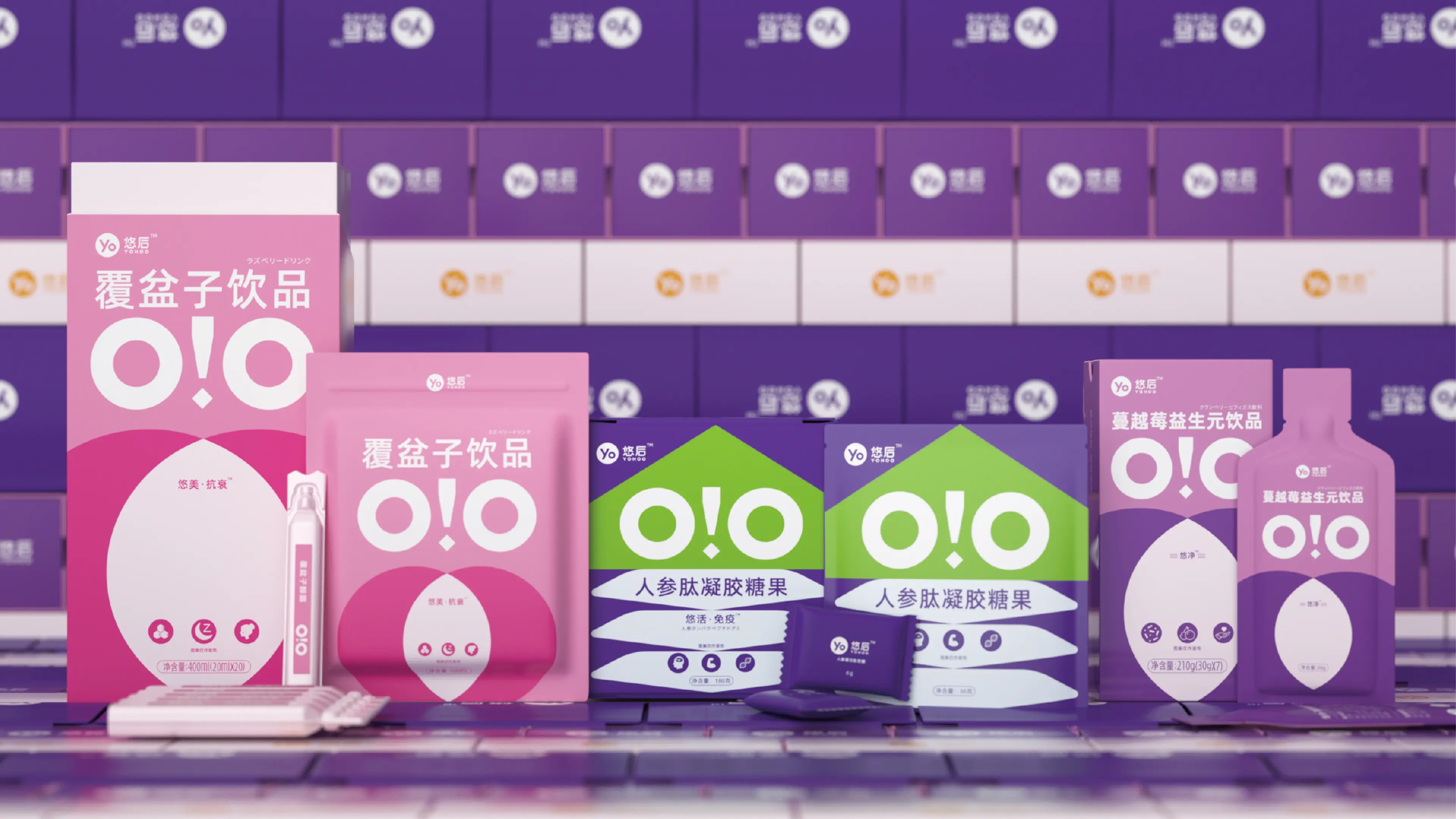
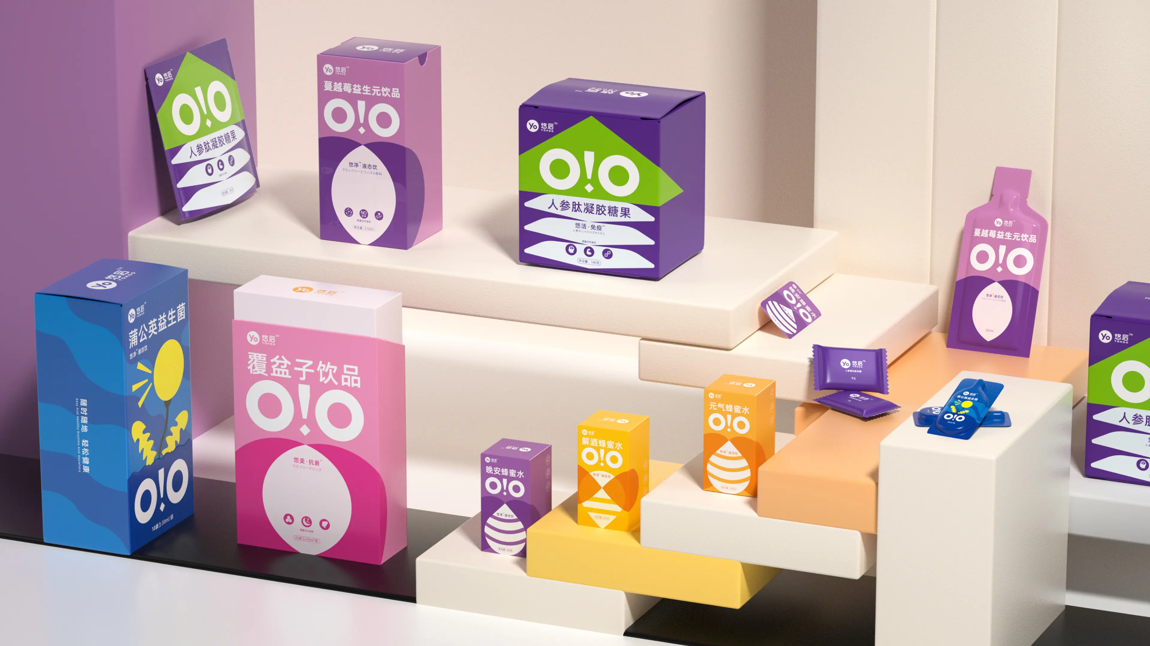
Rather than following the traditional visual language commonly associated with honey beverages, we chose to reinterpret the category through the playful visual world of candy and snacks. The goal was to make Yohoo feel like a health-oriented product that could be shared and enjoyed without the psychological weight often associated with conventional wellness products.
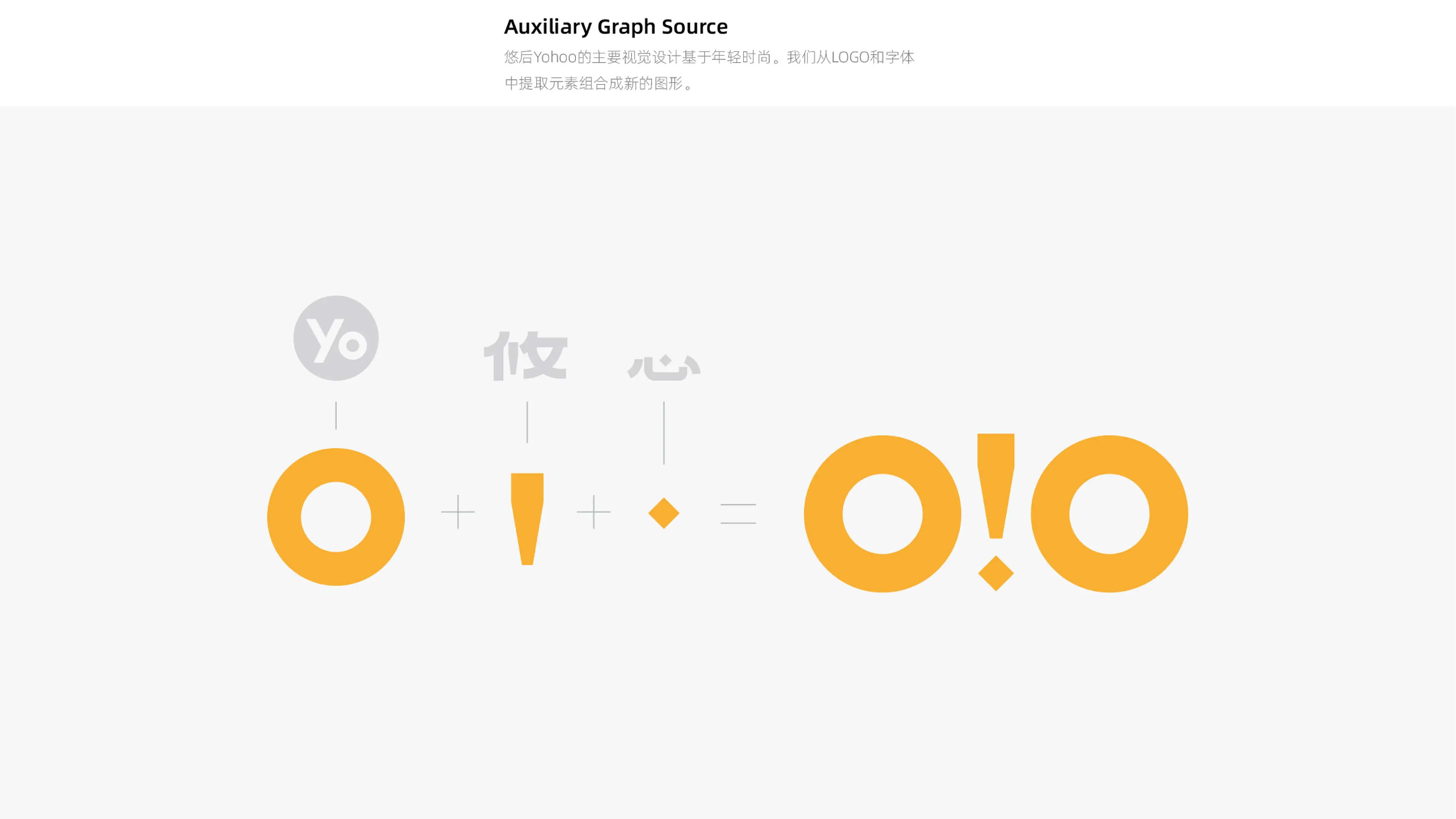
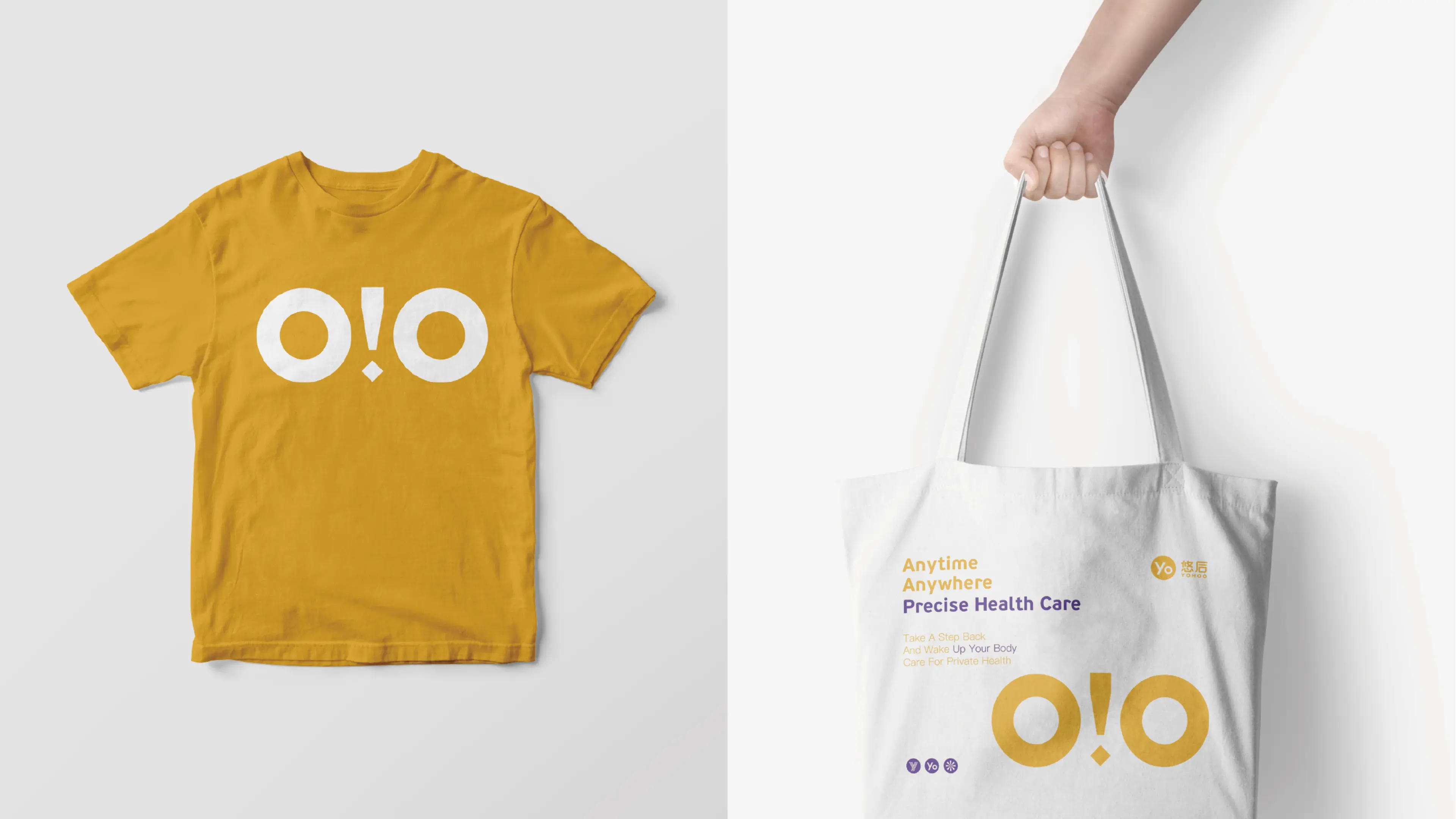
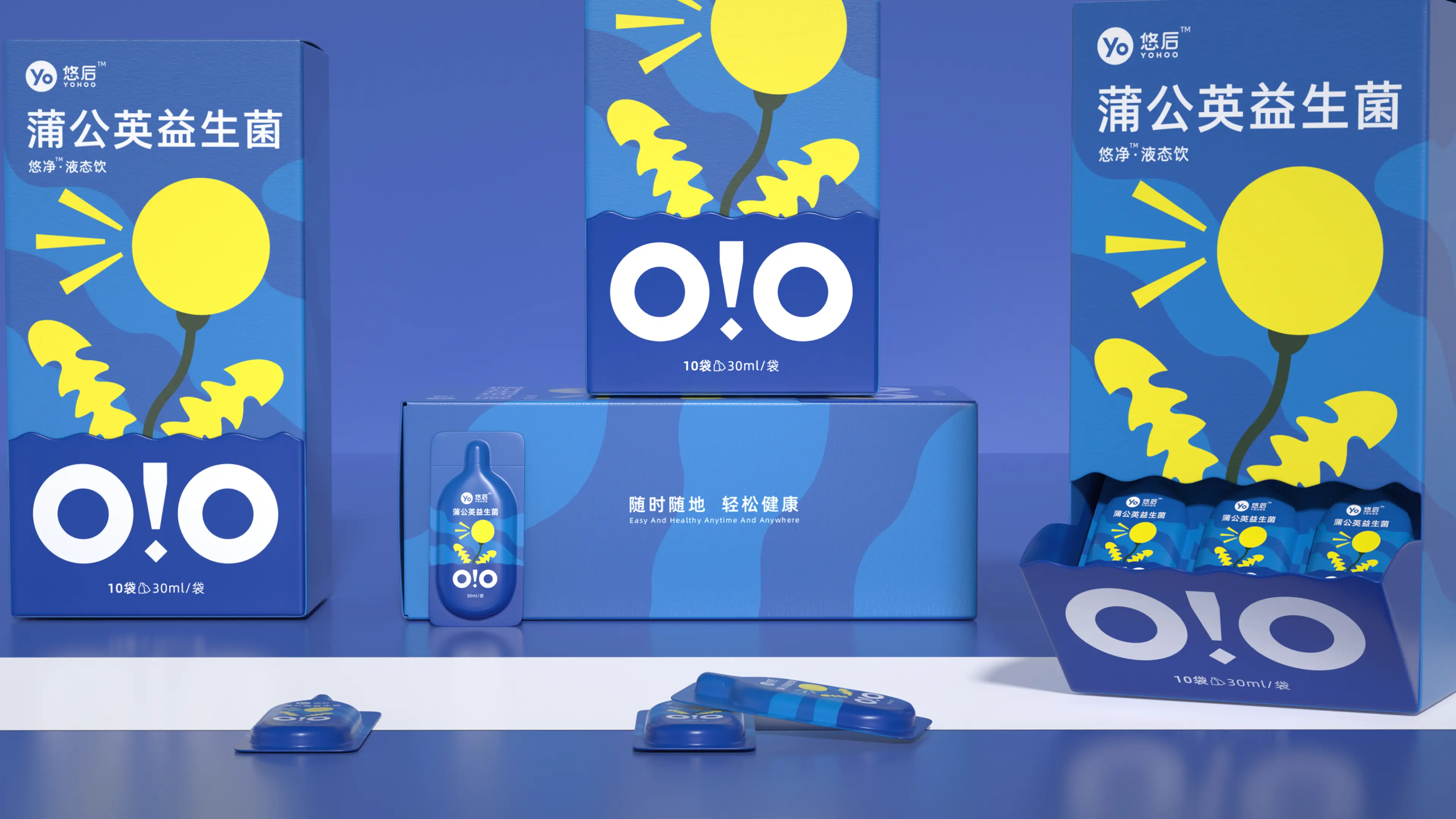
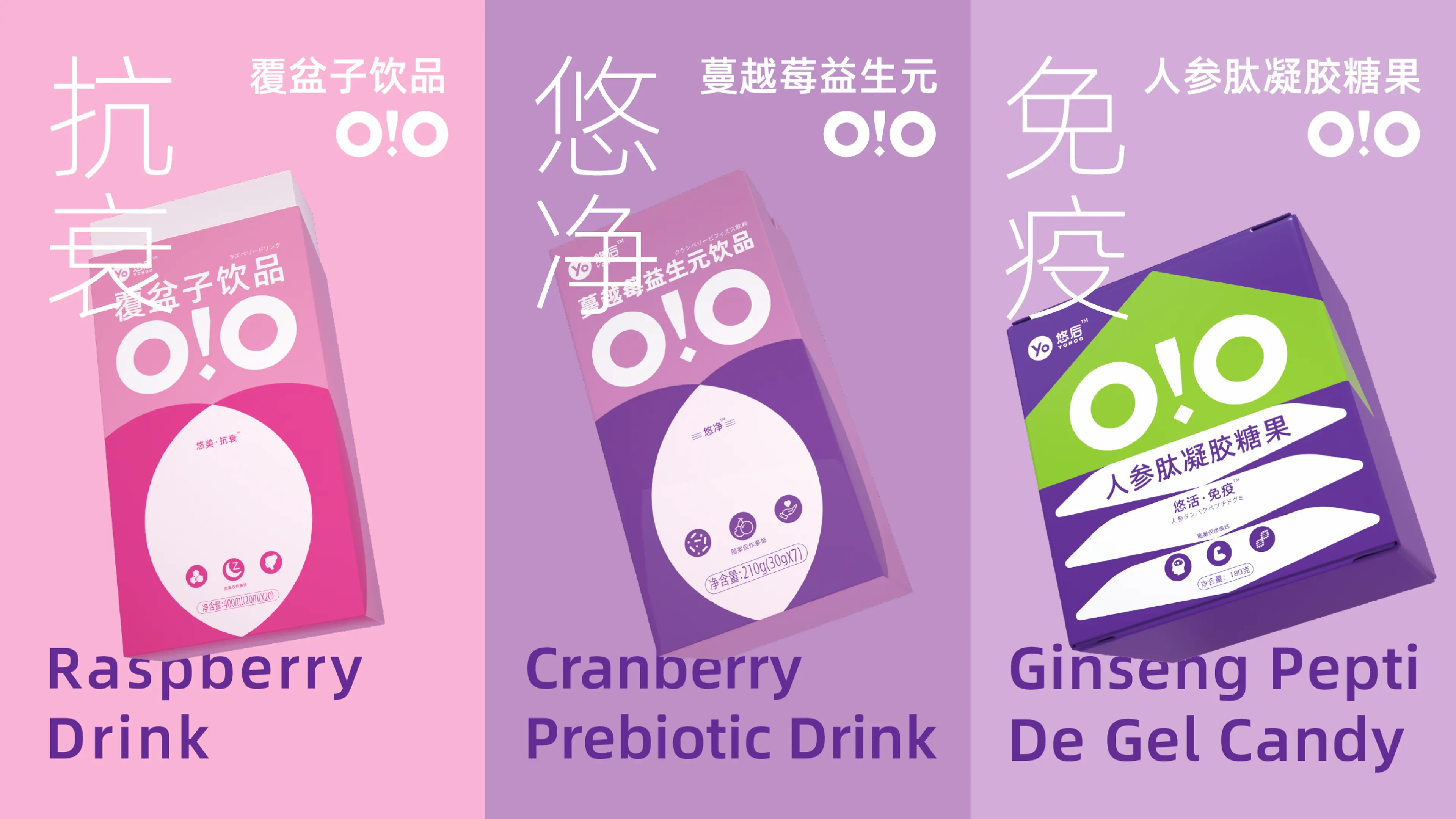
A distinctive supporting graphic was developed from the shape of an owl’s eyes. Applied consistently across packaging and communication materials, this visual element gives Yohoo a highly recognizable and memorable brand signature while introducing a subtle sense of playfulness.
The layout remains clean and relaxed, with a strong focus on the product’s key proposition of healthy refreshment and renewed energy. Natural and lively visual elements were introduced to reinforce a sense of freshness, vitality, and positive everyday energy.
The complete visual system extends across the bottle, outer packaging, and e-commerce promotional materials, creating a coherent and highly recognizable identity across all consumer touchpoints.
Through the alignment of product positioning, visual language, and the aesthetic preferences of younger consumers, Yohoo successfully establishes a fresh, natural, and contemporary expression for a new generation of health beverages.