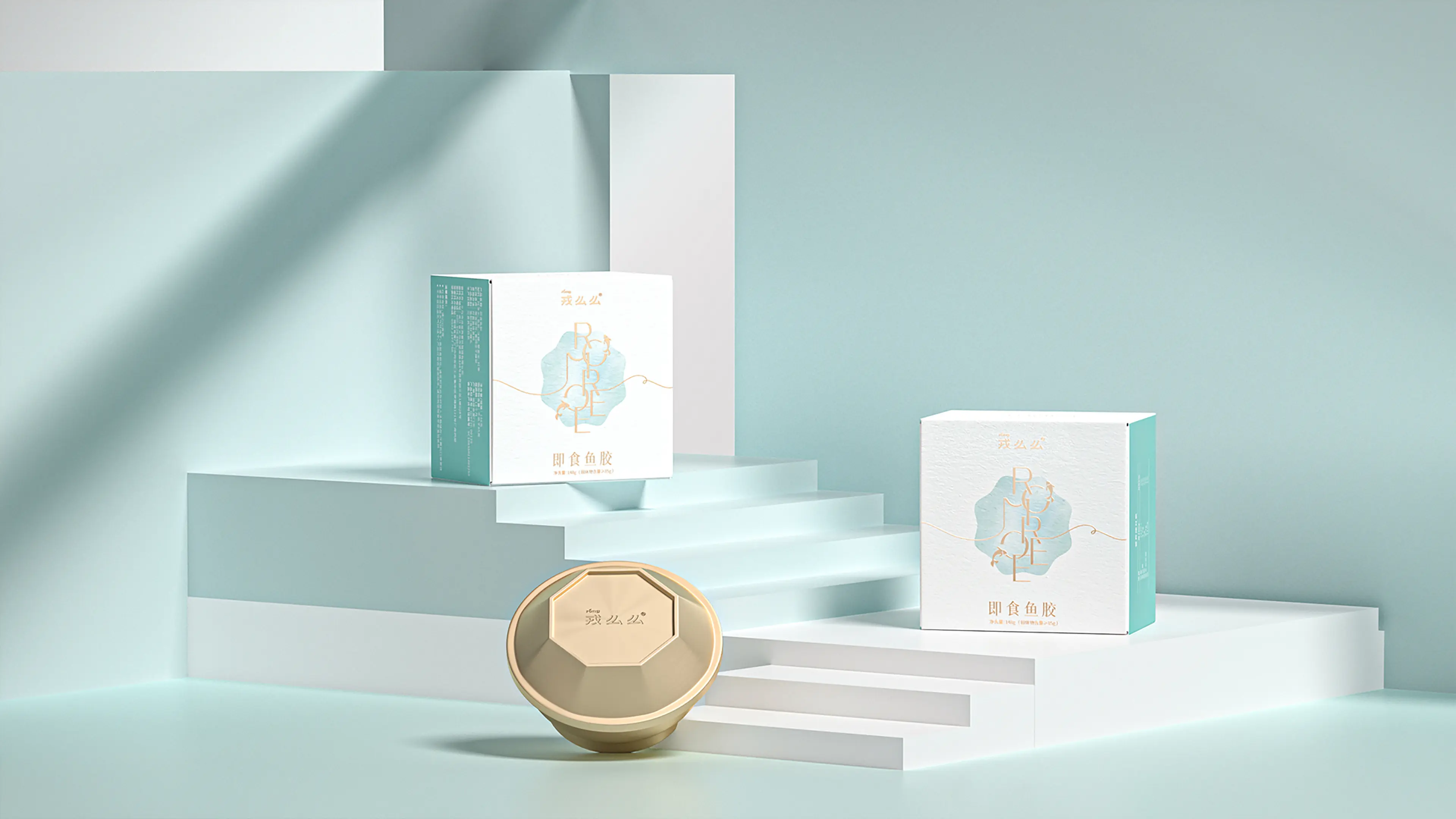
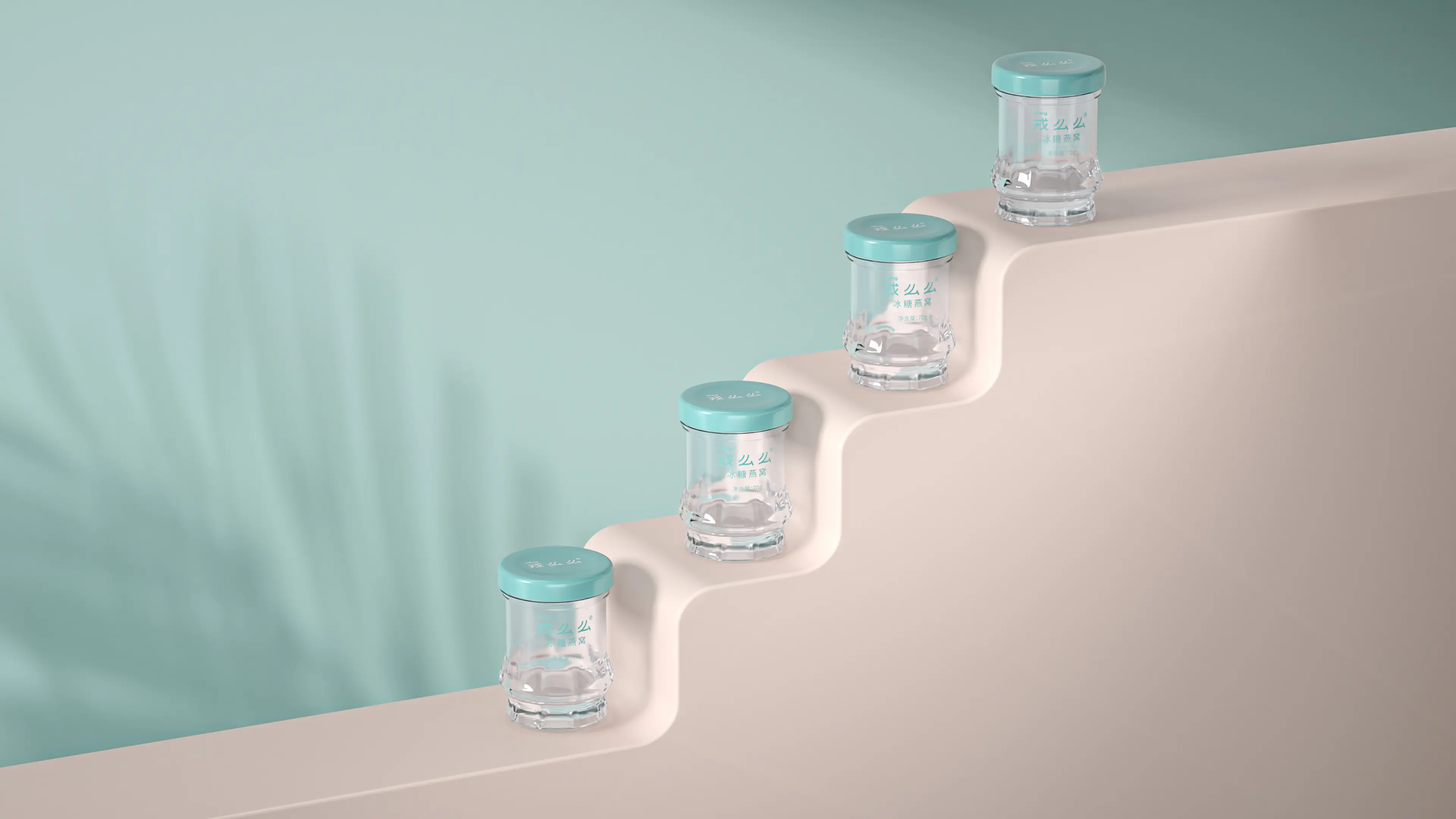
ROMOREE is a nourishment brand based in Yiwu, dedicated to creating pure and premium bird’s nest products. Guided by the core philosophy of “natural purity,” the brand uses modern technology to reinterpret traditional bird’s nest products, bringing renewed vitality to this time-honored wellness category.
With a strong focus on real consumer needs, ROMOREE is committed to creating long-term value through high product quality and thoughtful service. To better suit the daily nourishment needs of office workers and a broader range of consumers, the brand has expanded bird’s nest into more versatile product forms by combining it with a variety of nutritional ingredients.
By introducing more contemporary and lifestyle-oriented bird’s nest products, ROMOREE moves beyond the conventional perception of bird’s nest as a gift-only product, repositioning premium nourishment as something more everyday, accessible, and integrated into modern life.
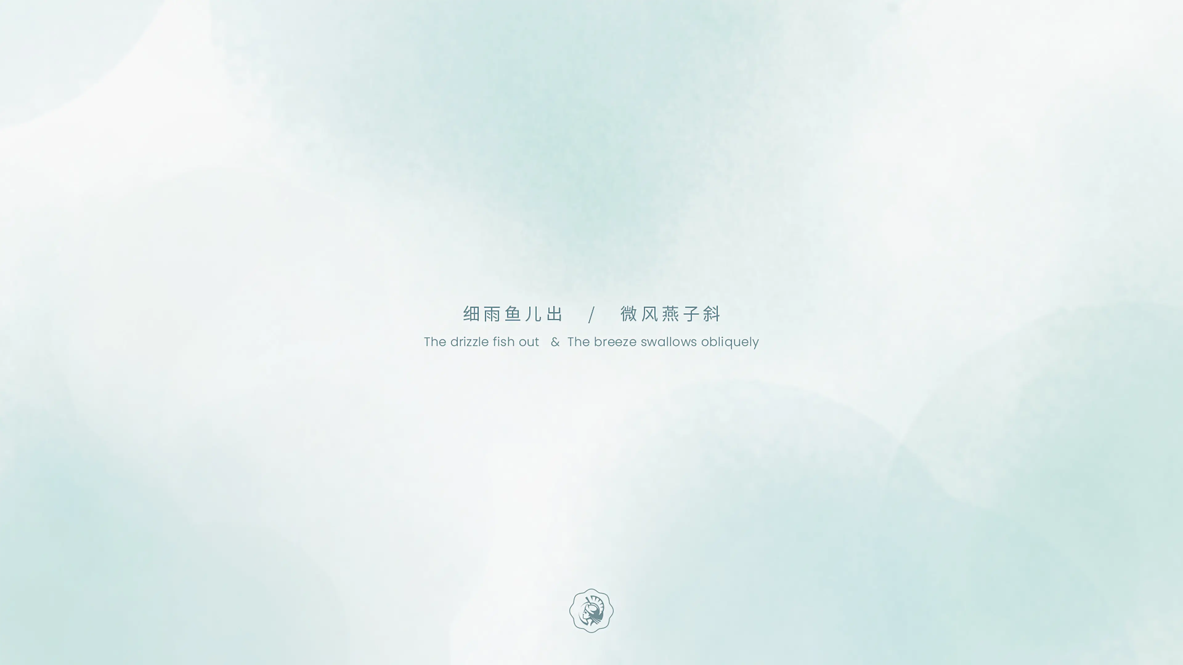
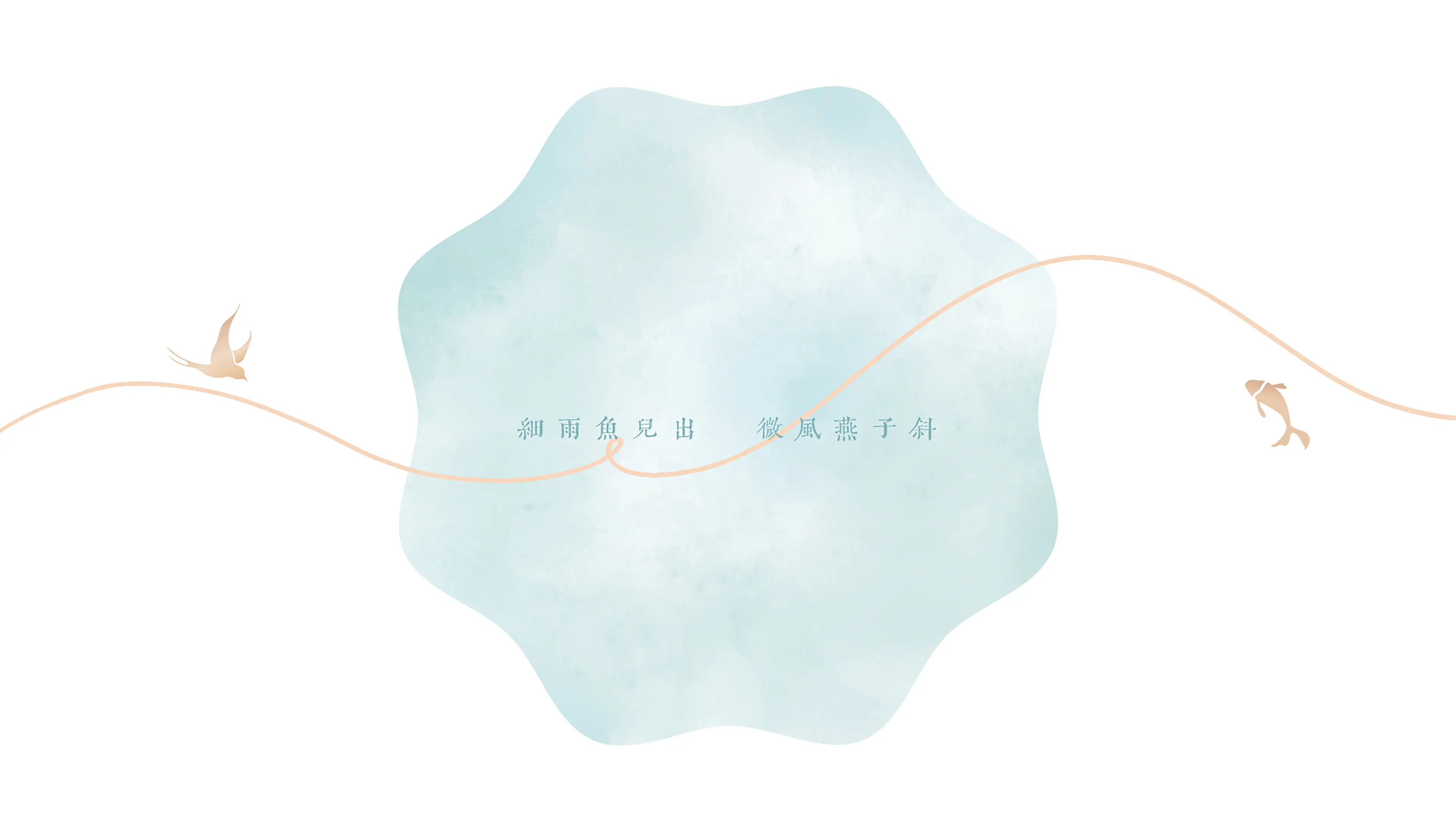
The packaging design draws inspiration from Du Fu’s classic line: “Fish emerge in the fine rain; swallows glide slantwise in the gentle breeze.”
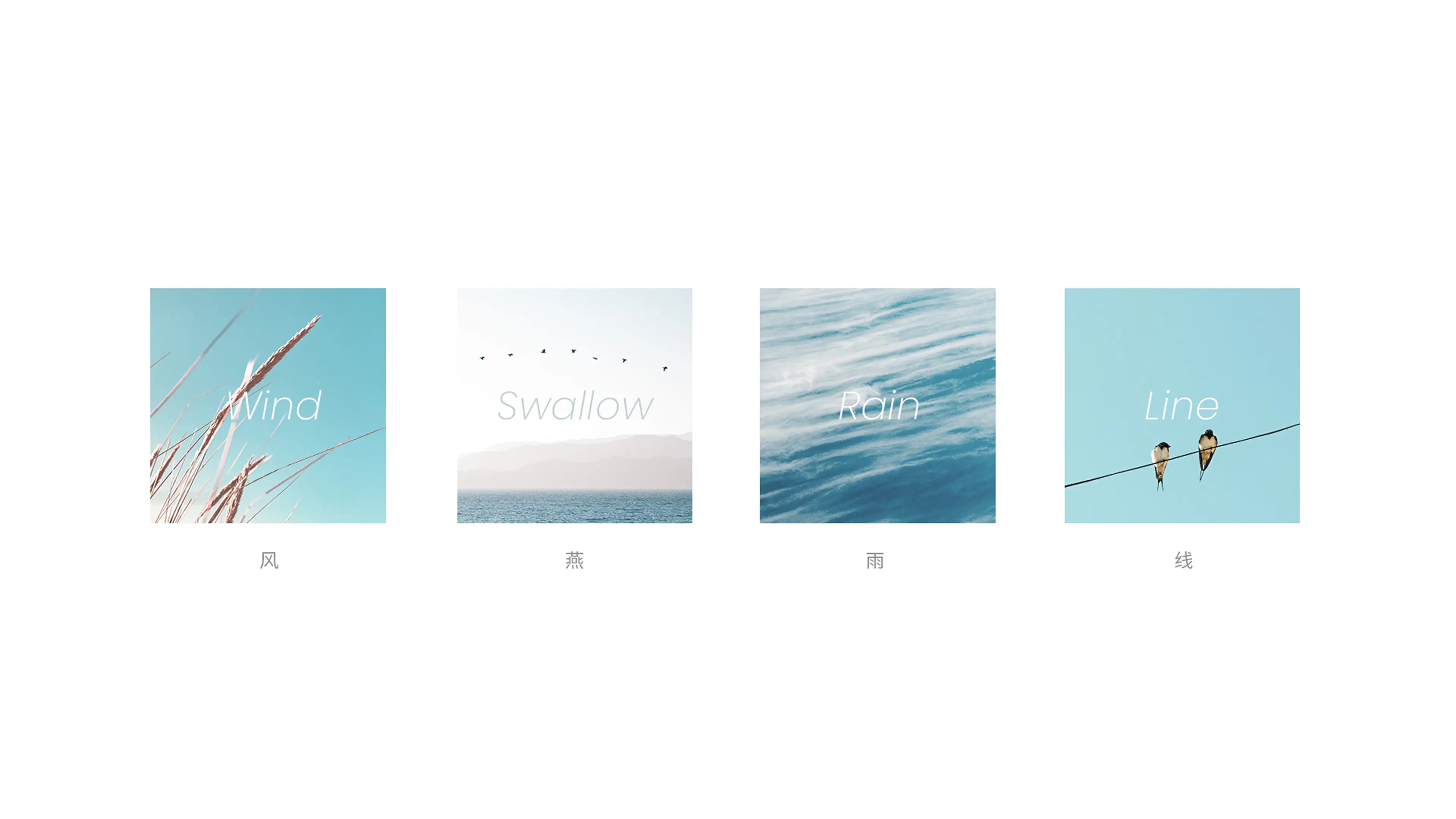
This verse evokes a relaxed and poetic natural scene — misty rain, fish rising through the water, soft wind, and swallows in flight. The vitality of the fish and the lightness of the swallows provided the emotional and visual foundation for the project, shaping a design language rooted in ease, freshness, and natural elegance.
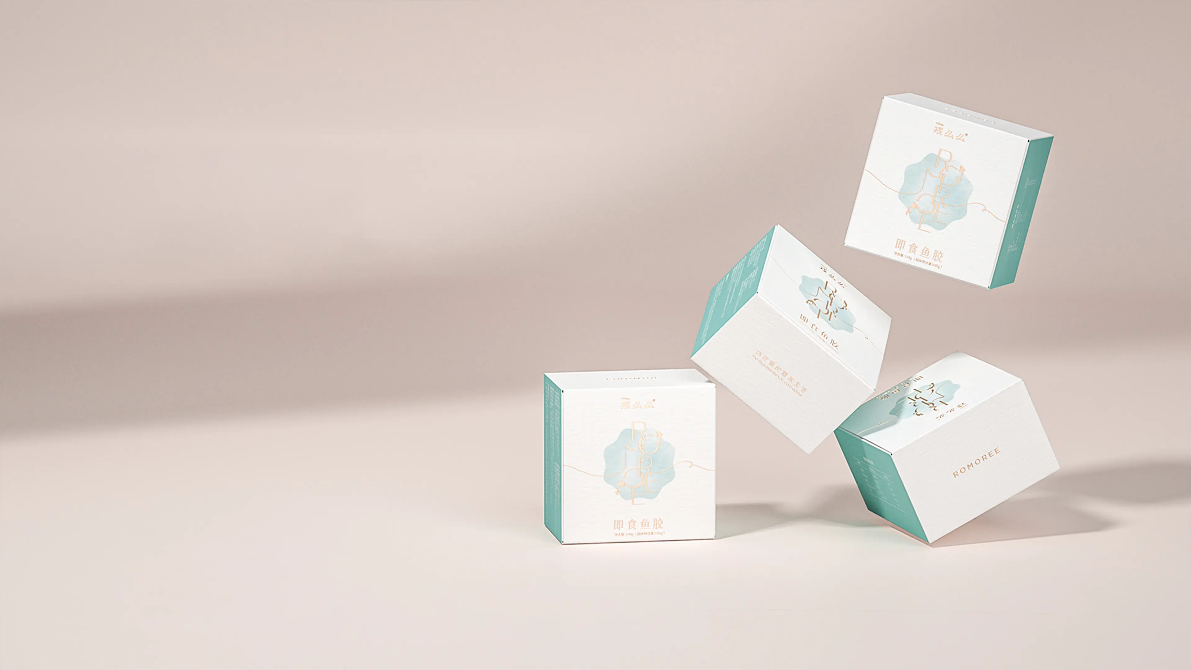
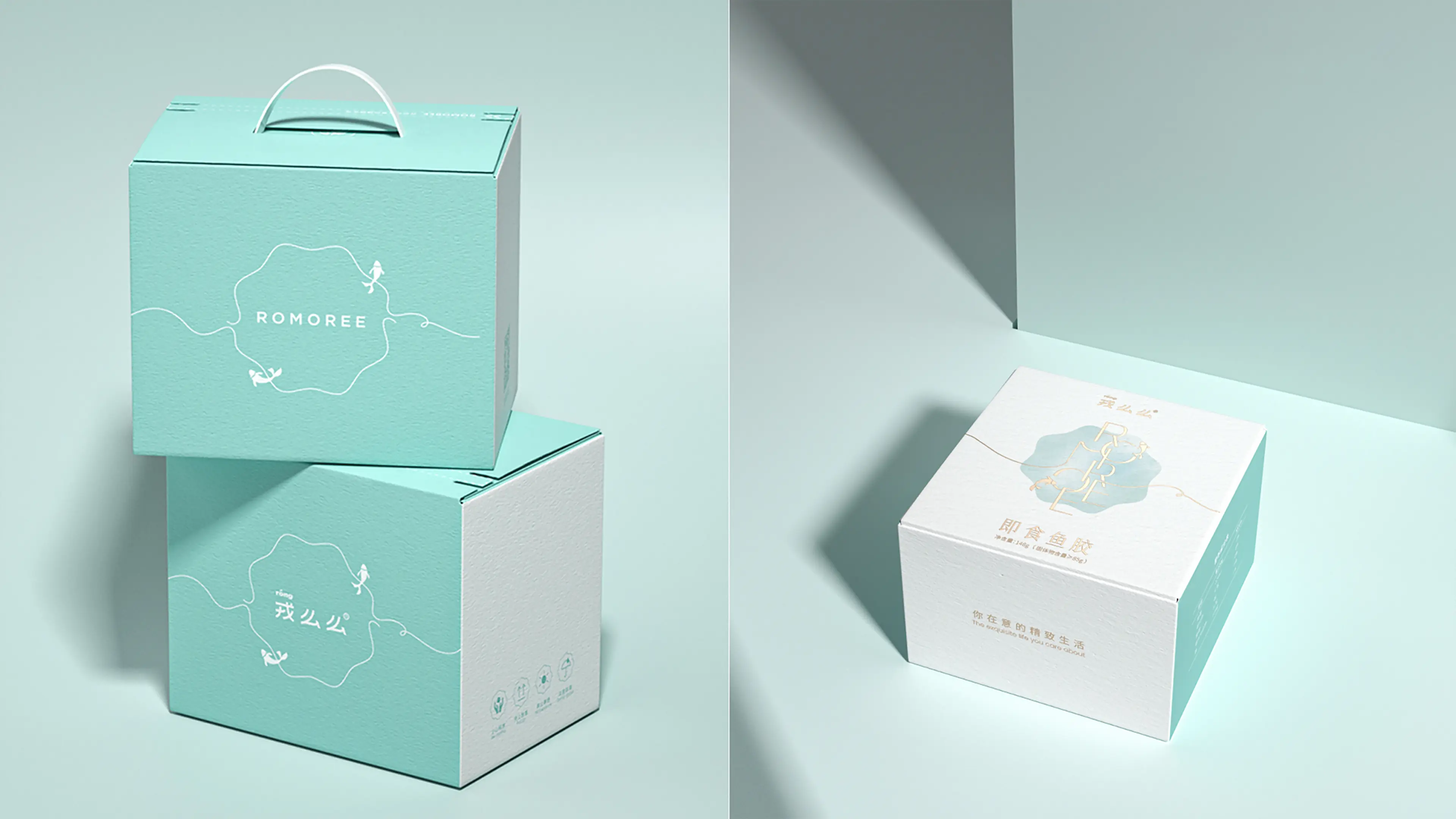
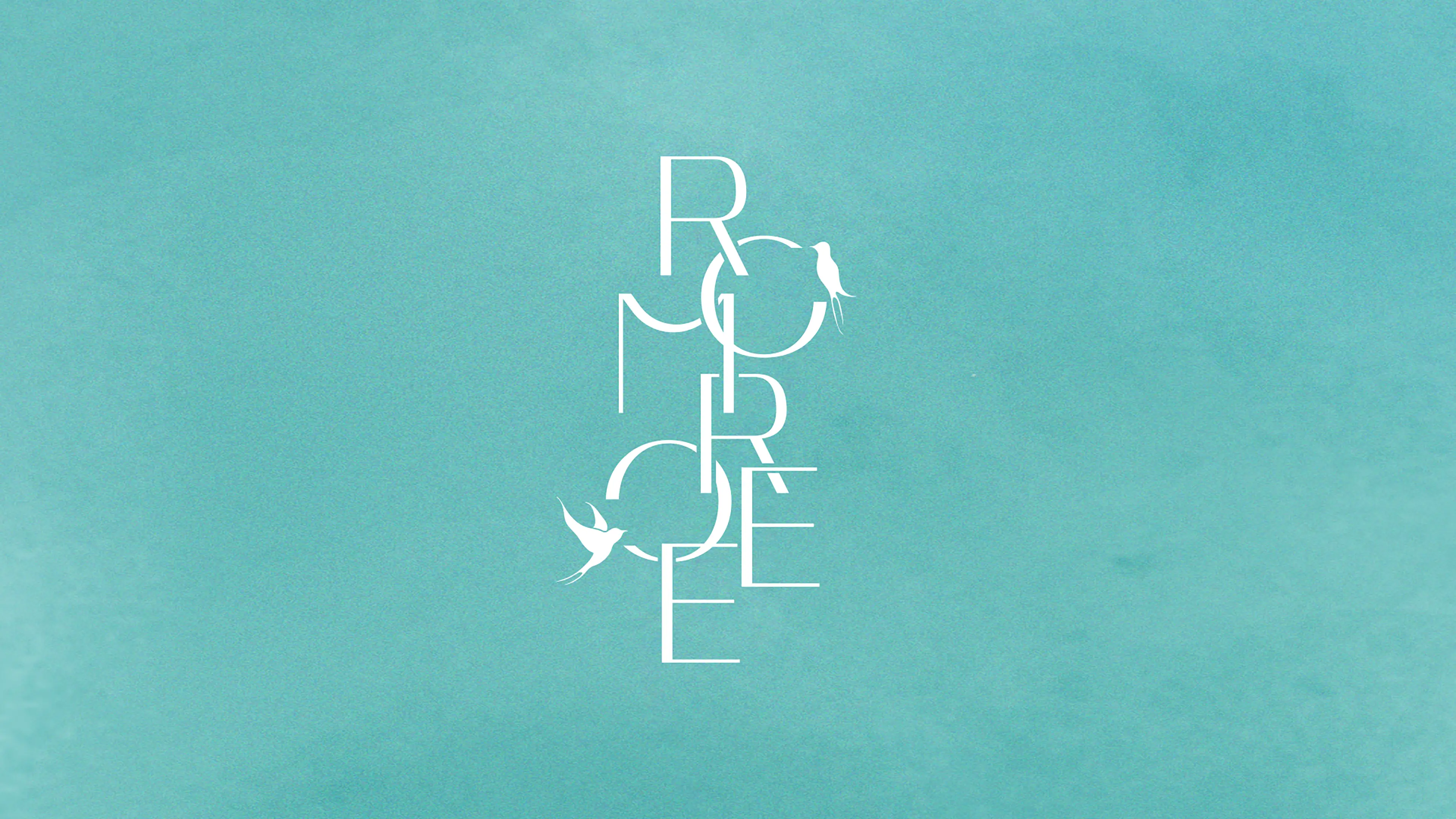
We translated the poetic imagery into a contemporary visual system by abstractly integrating the brand’s two core ingredients — bird’s nest and fish maw — with natural elements such as wind and rain.
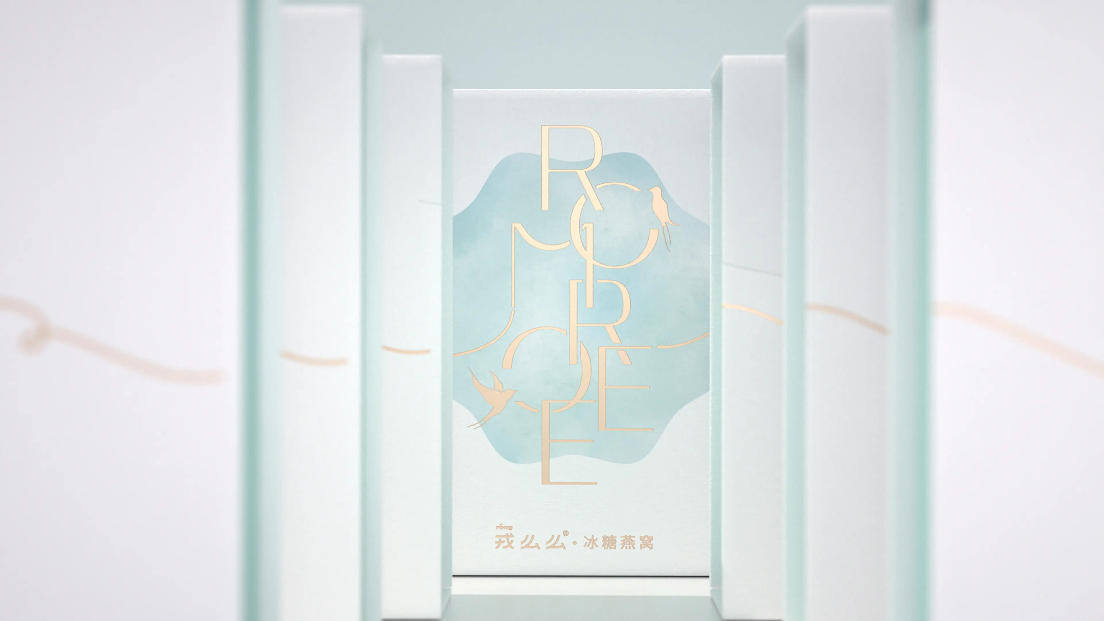
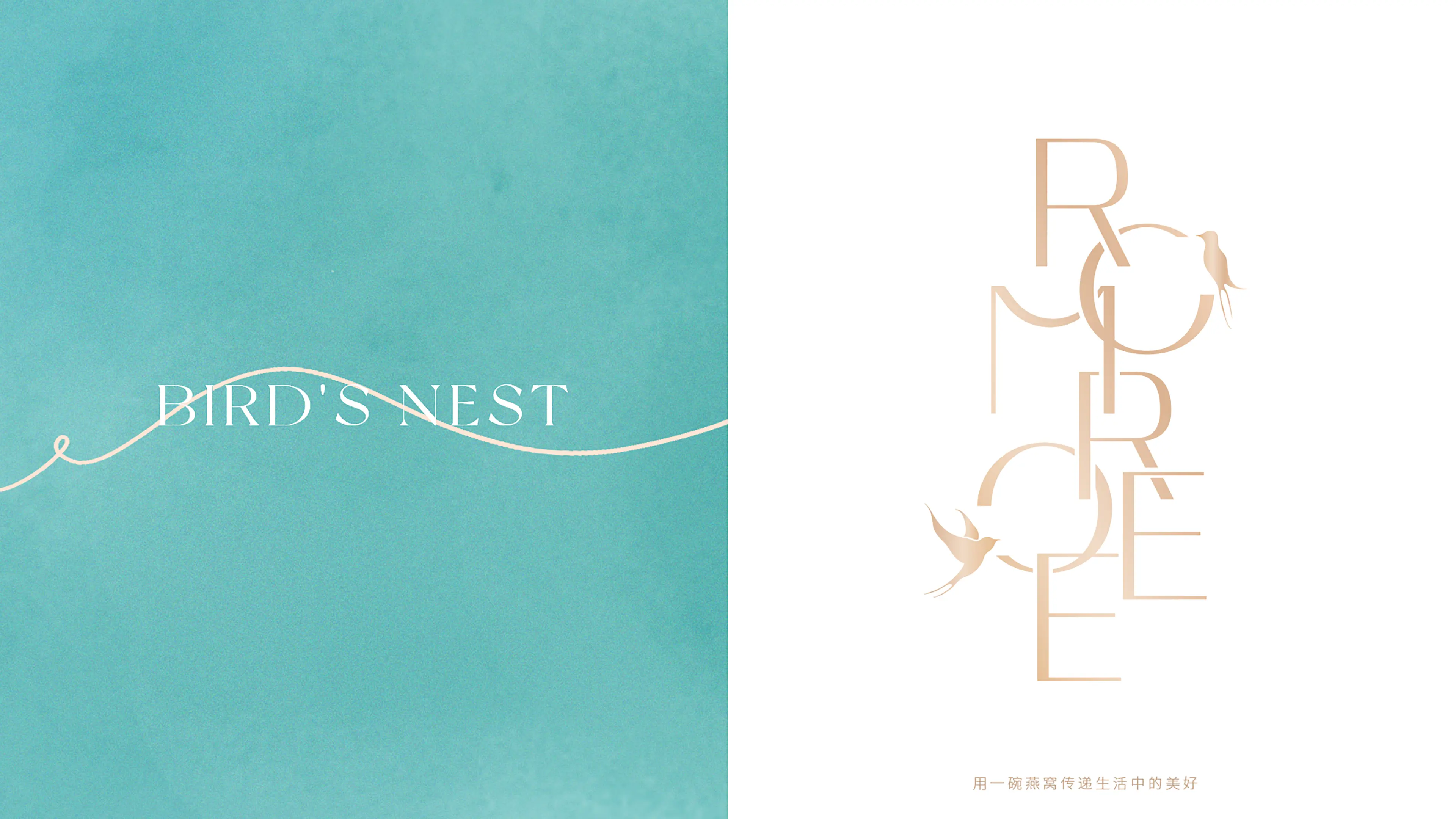
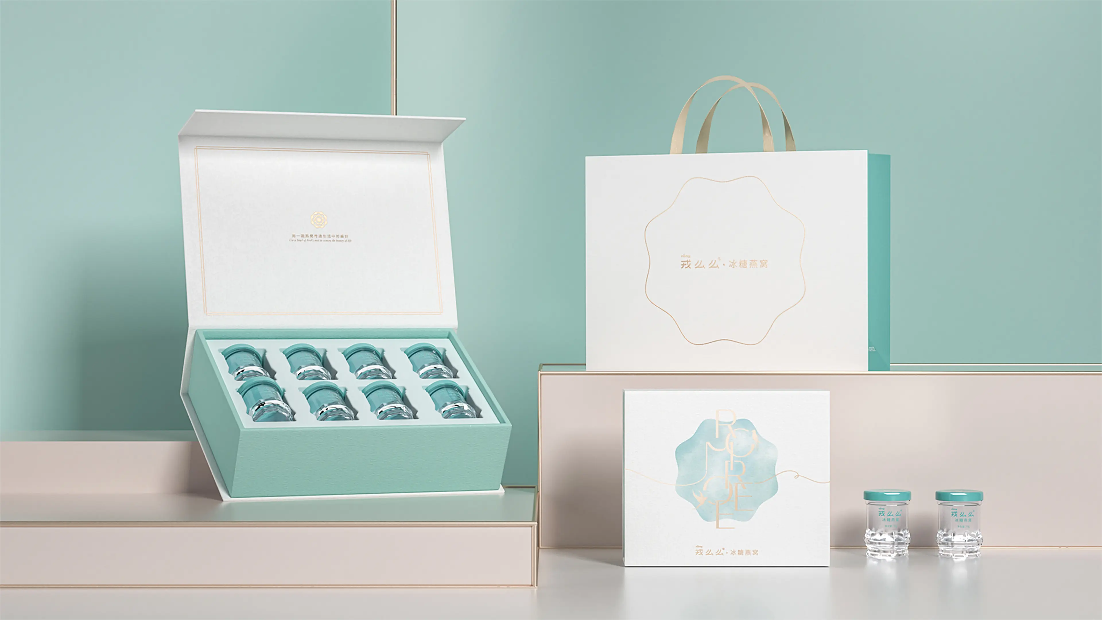
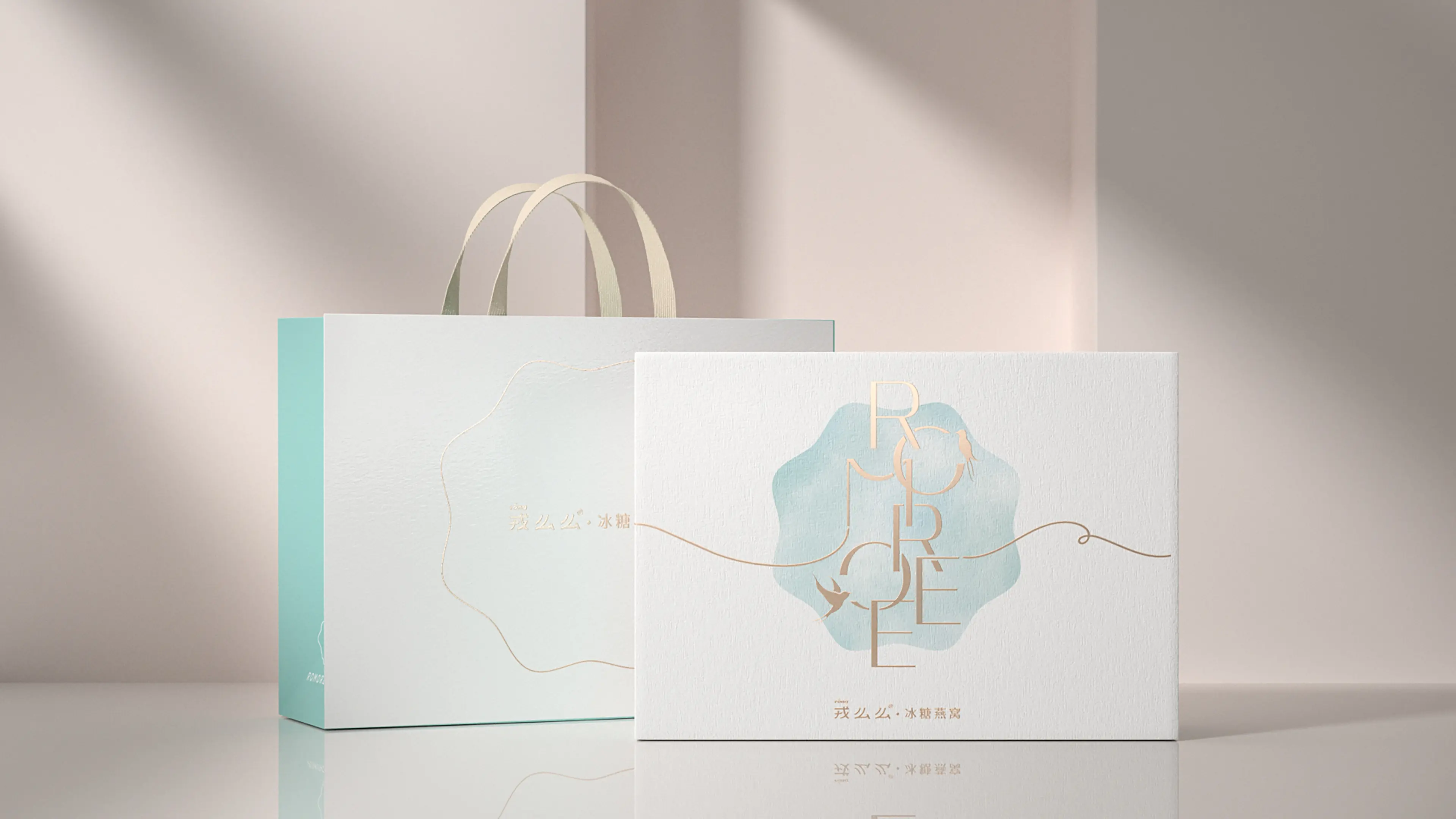
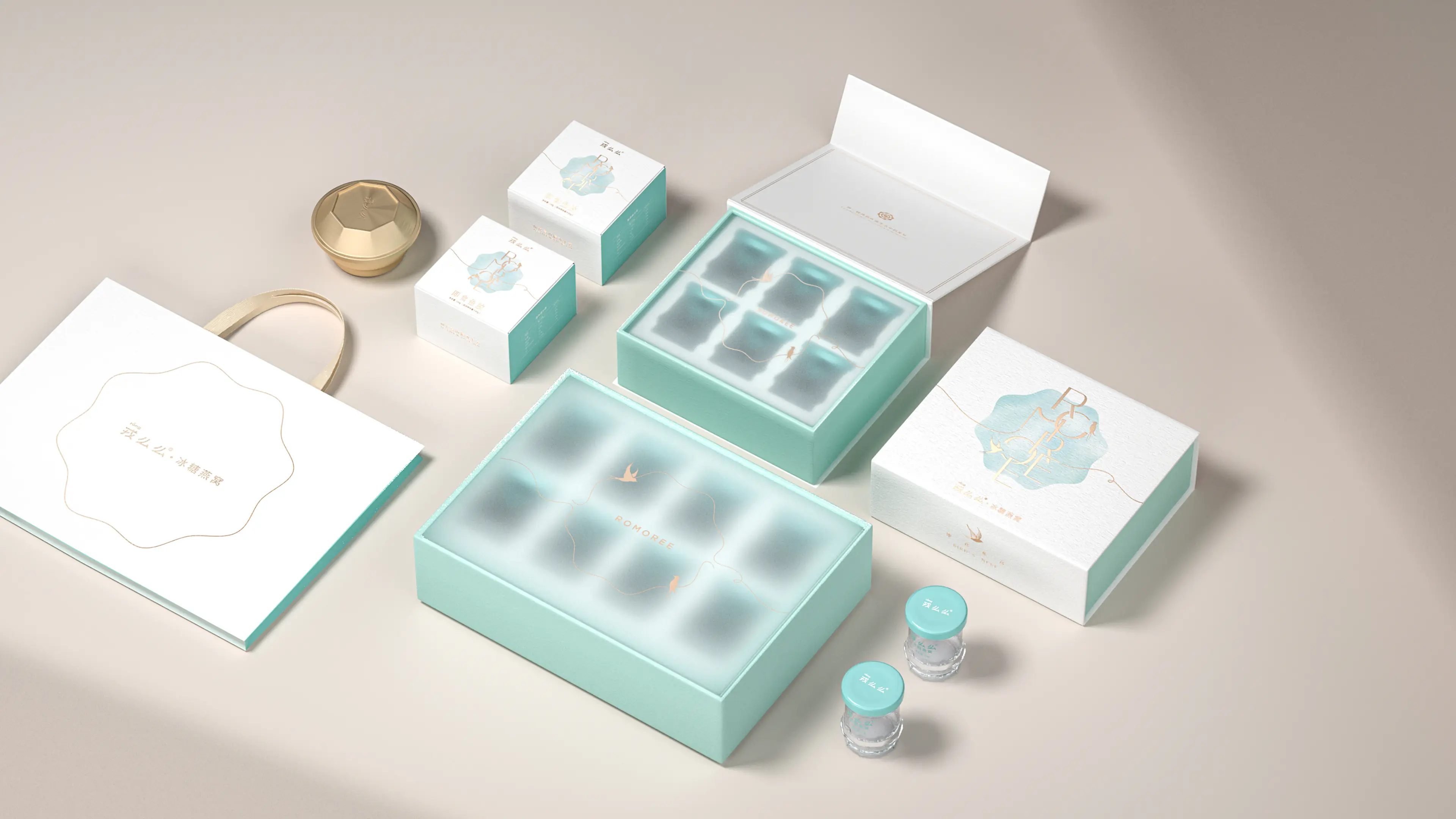
Linework became the central design language throughout the project. Flowing, dynamic curves move gently across the compositions, evoking the movement of breeze, rain, flying swallows, and swimming fish, while also suggesting the purity and delicacy of the product itself.
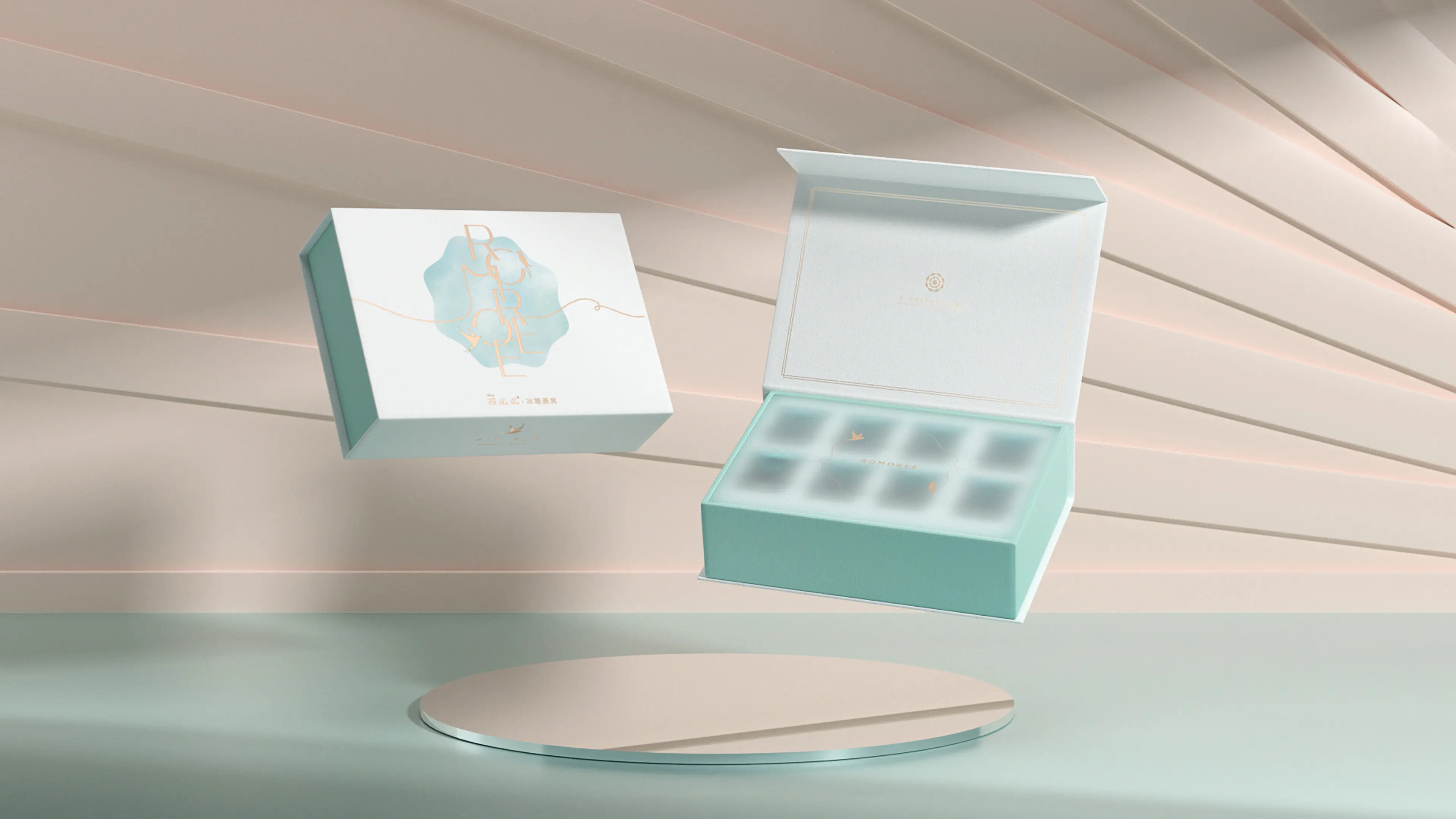
The overall visual expression is minimal yet refined, communicating a sense of sophistication and premium quality. By moving away from the dense and overly traditional design language often associated with conventional wellness products, the new packaging establishes a lighter, more natural, and more contemporary brand character.
The complete visual system extends across the bottle, outer packaging, and online promotional materials, creating a highly unified relationship between brand philosophy, product positioning, and visual expression.