
 | 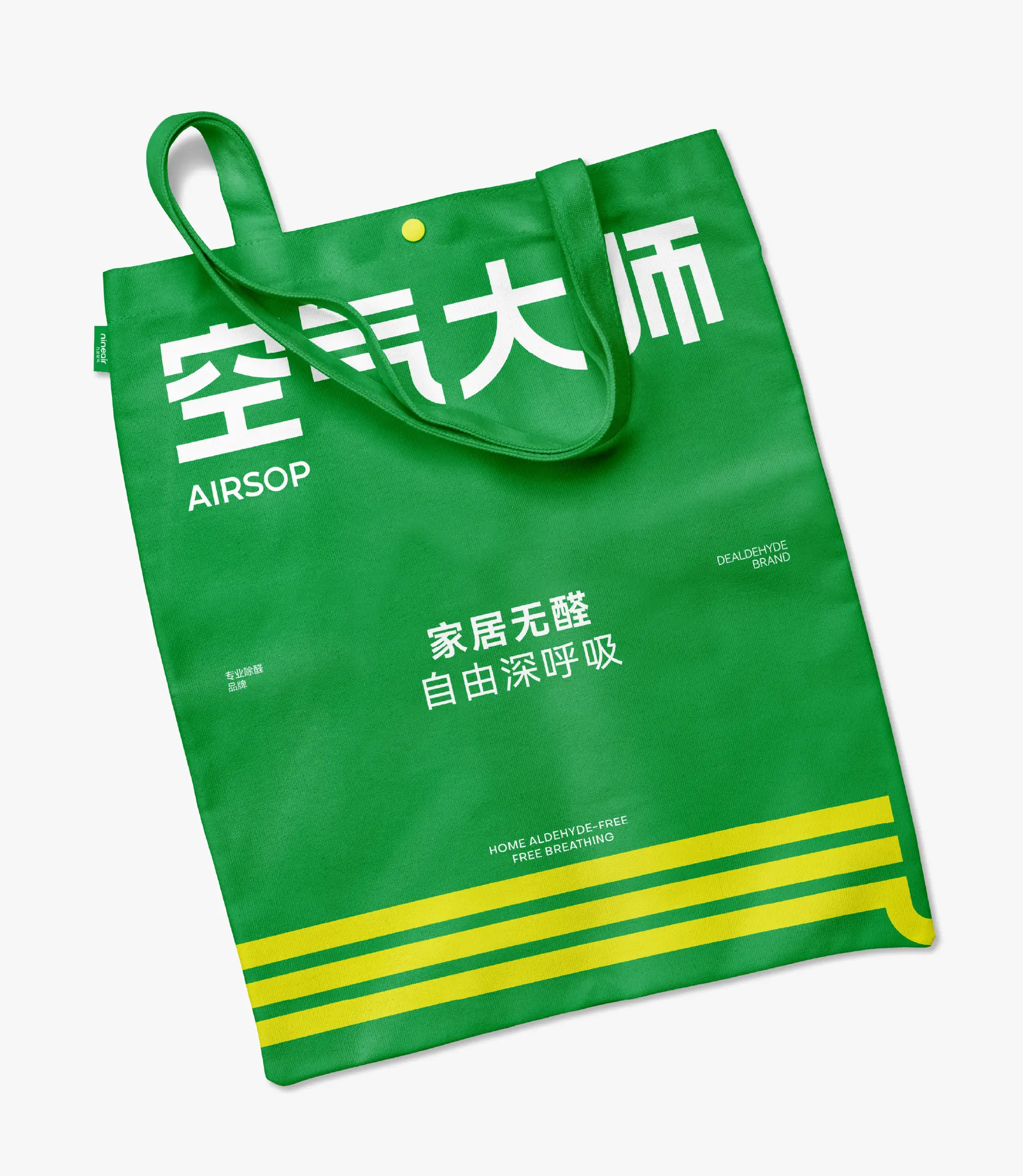 |
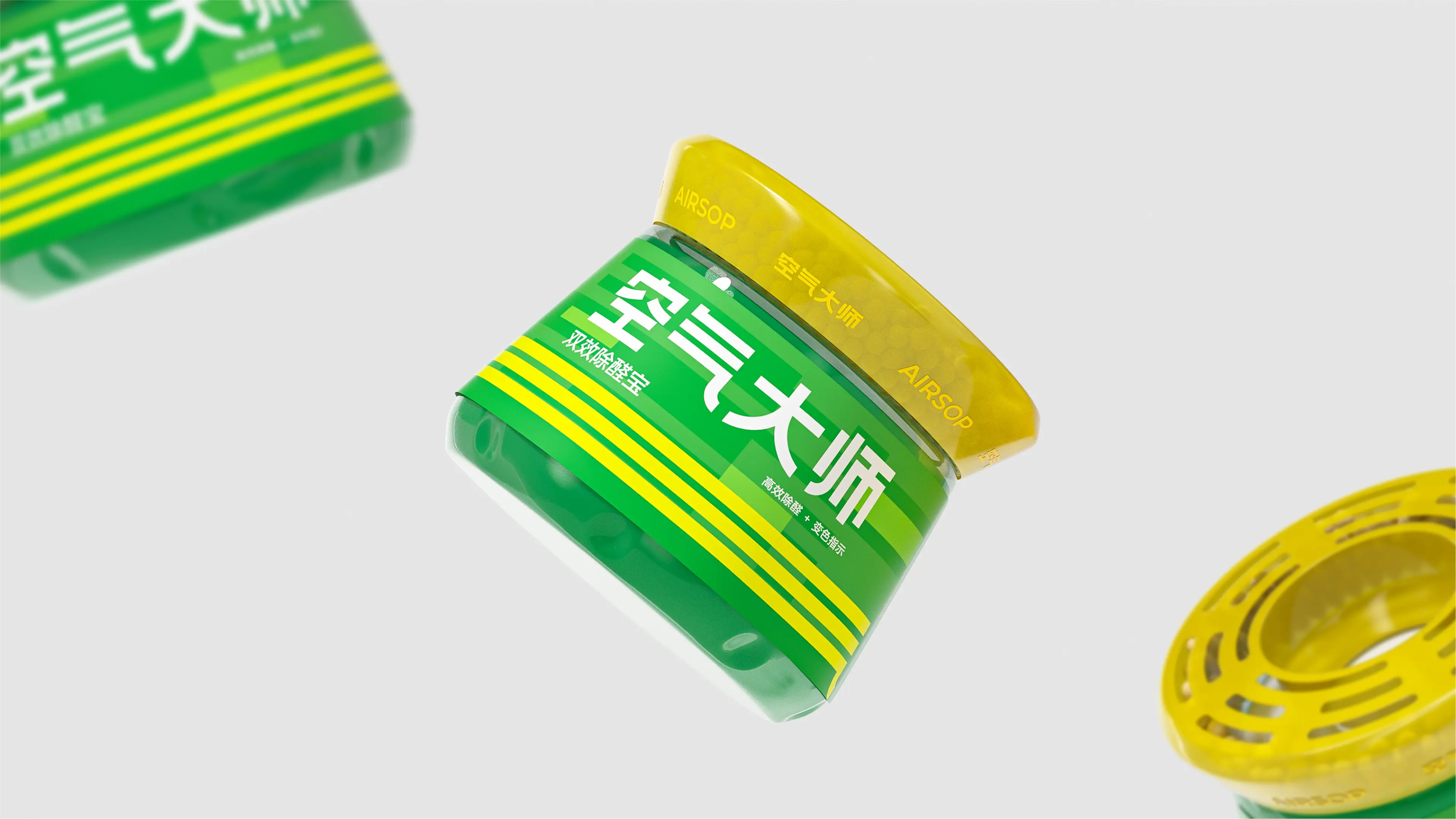
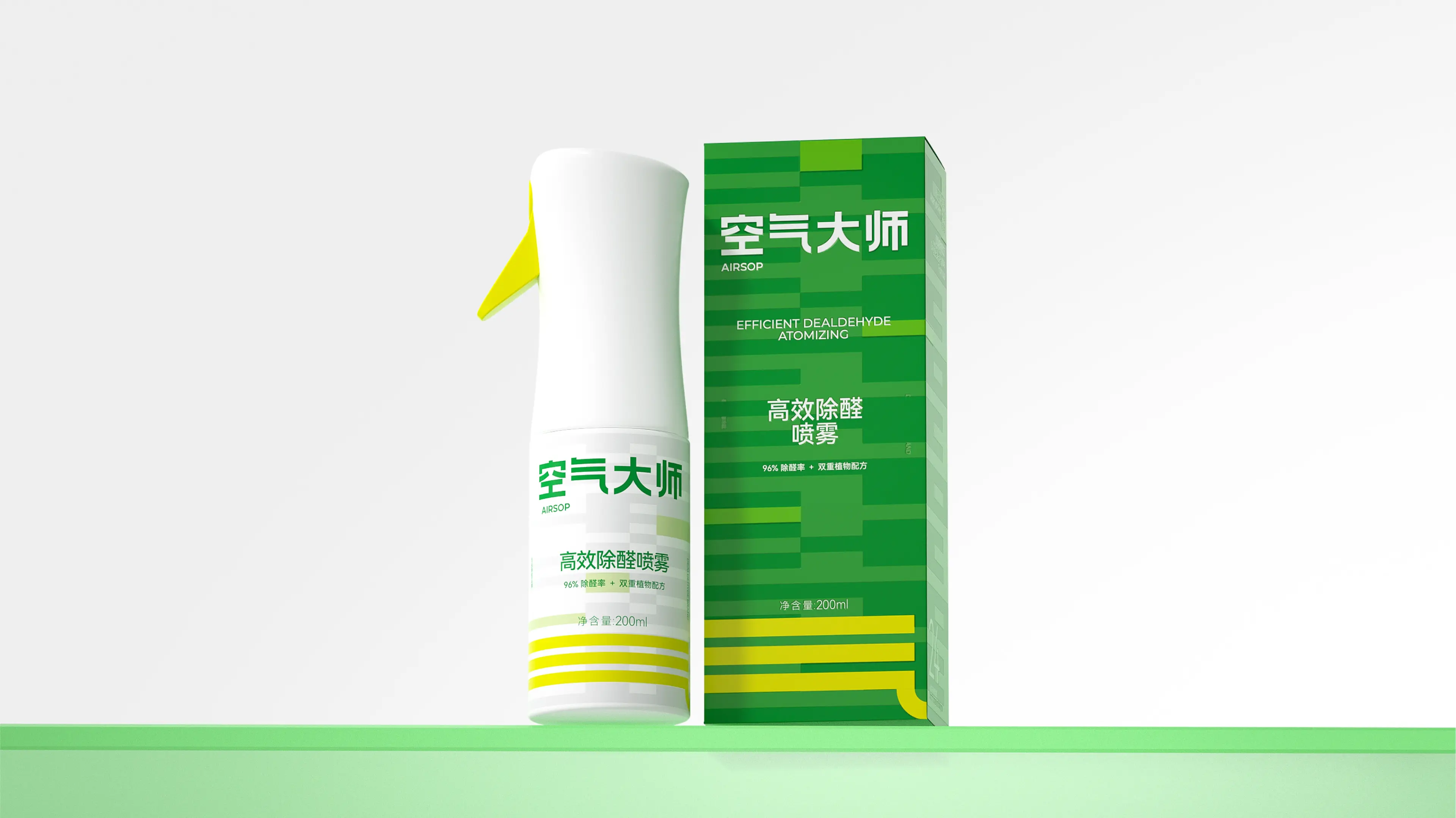
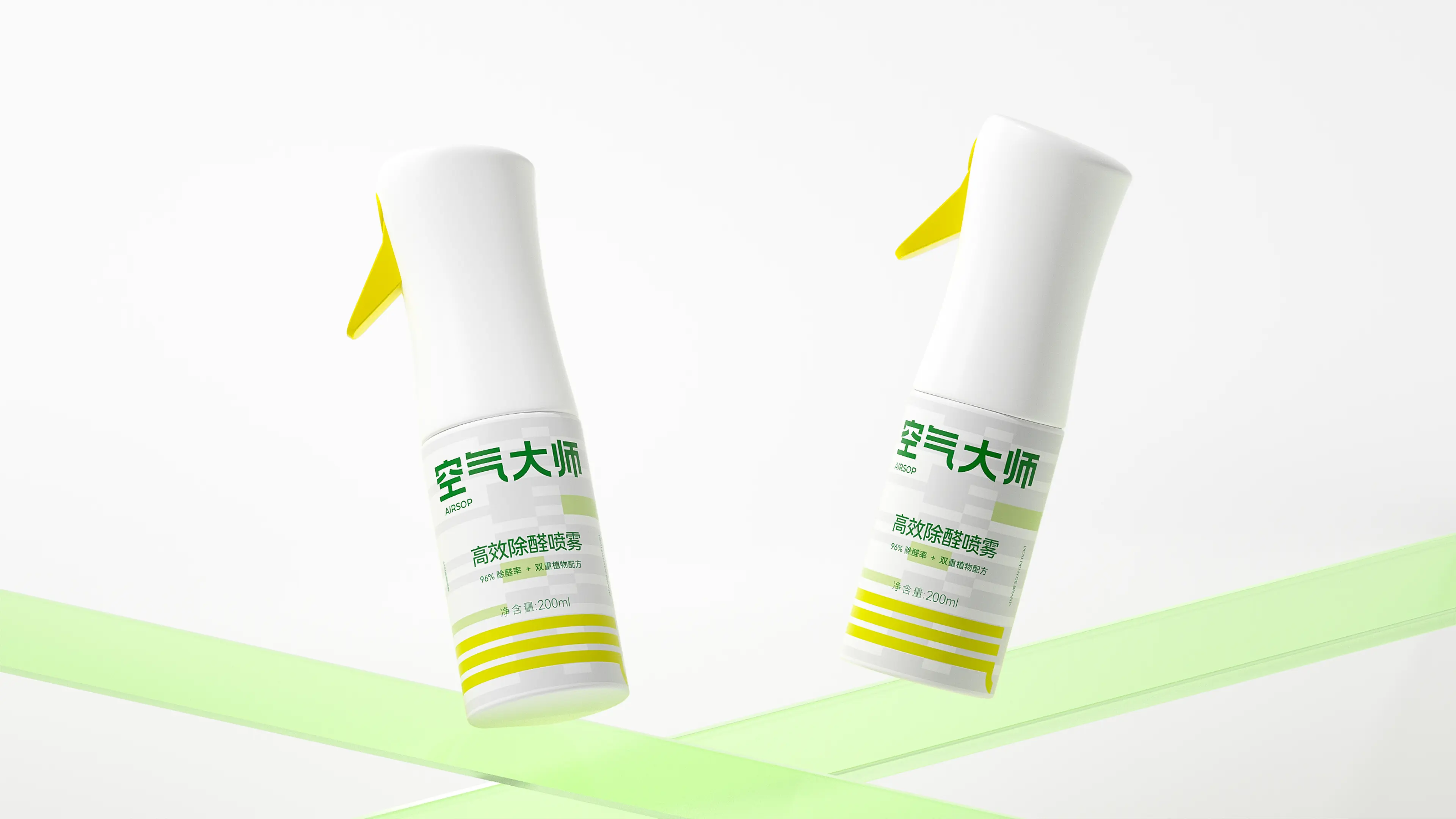
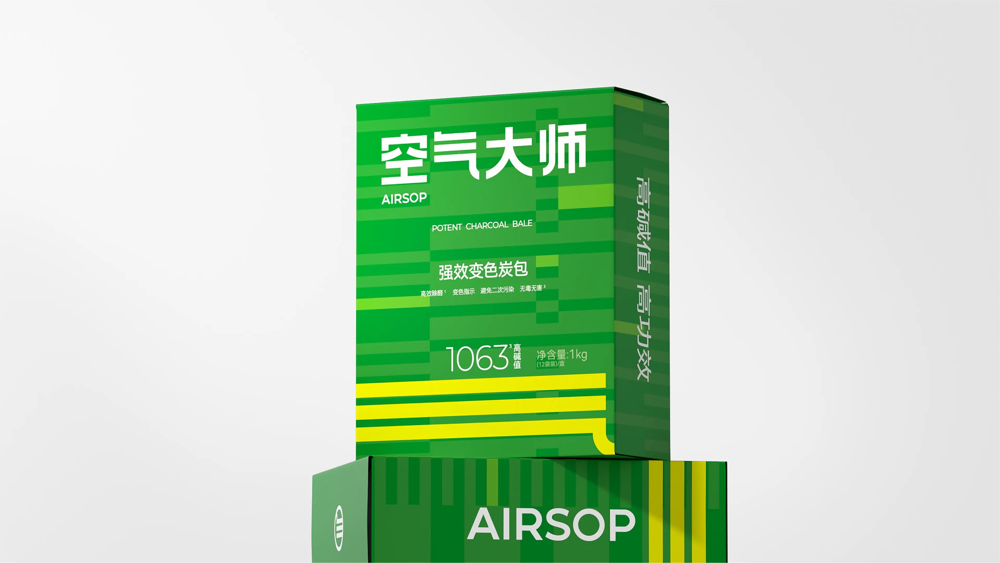
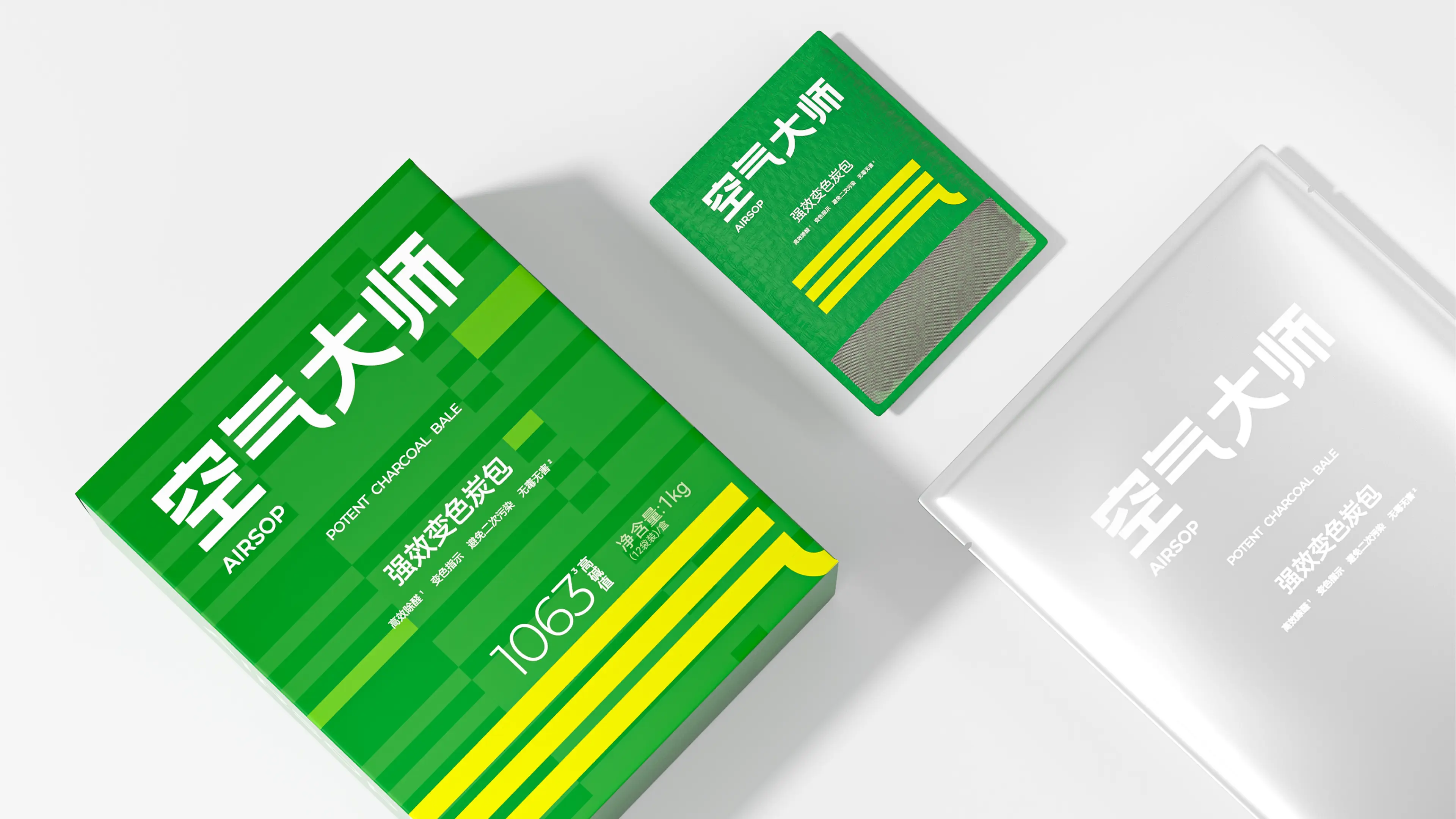
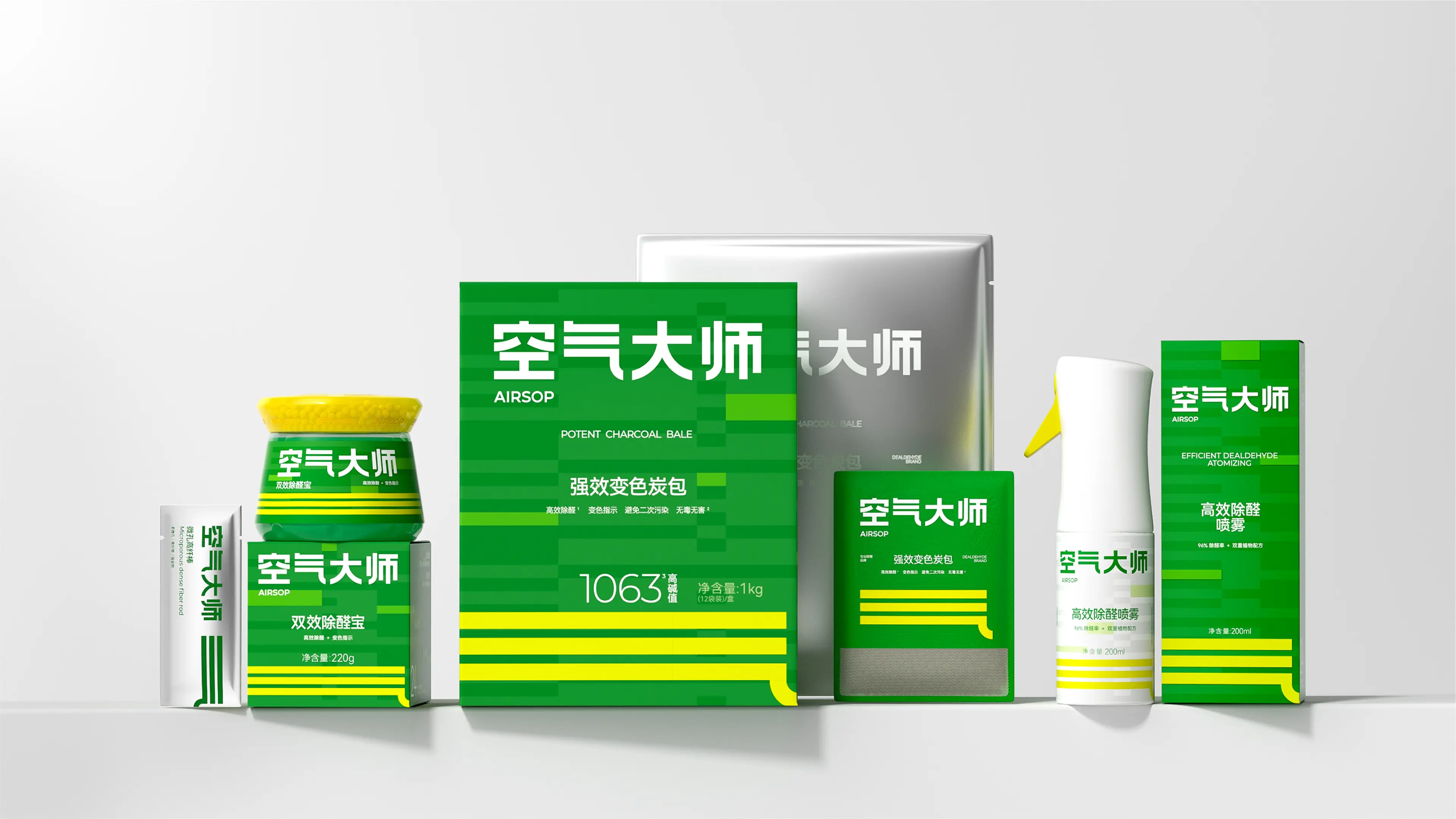
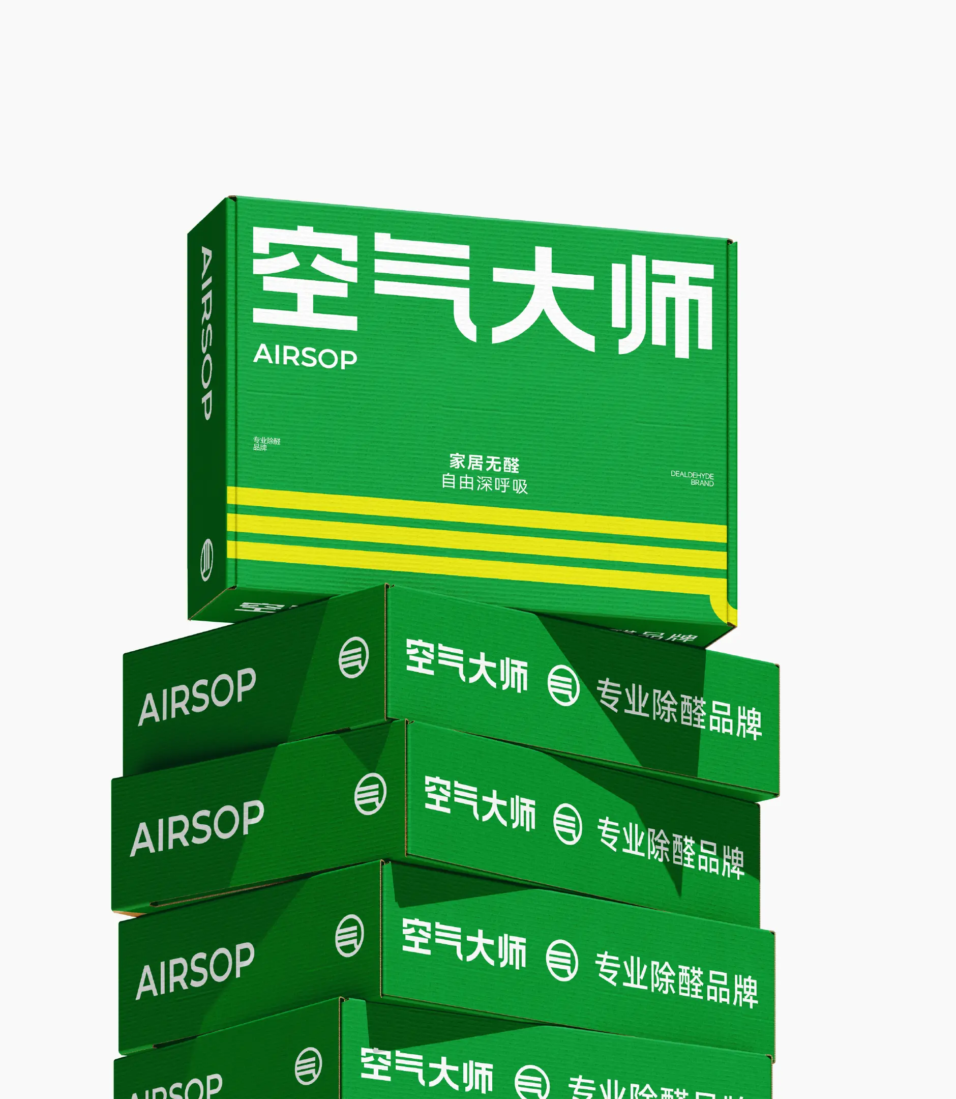
AIRSOP is an emerging brand in the fresh air sector, dedicated to solving the air problems people encounter in daily life and calling on people to pay attention to invisible health issues that cannot be seen or touched. The brand is committed to providing consumers with professional and efficient formaldehyde and odor removal solutions.
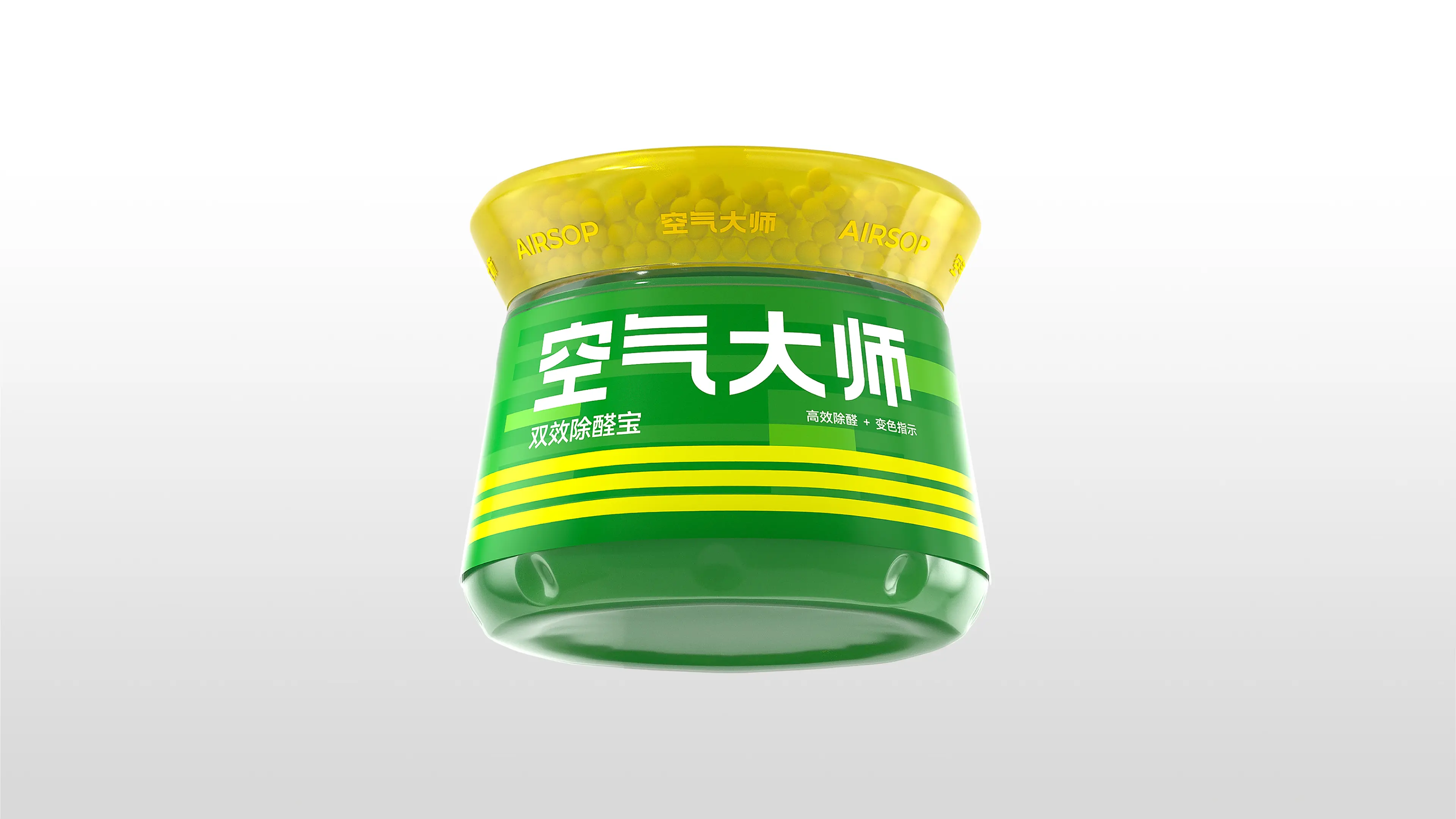
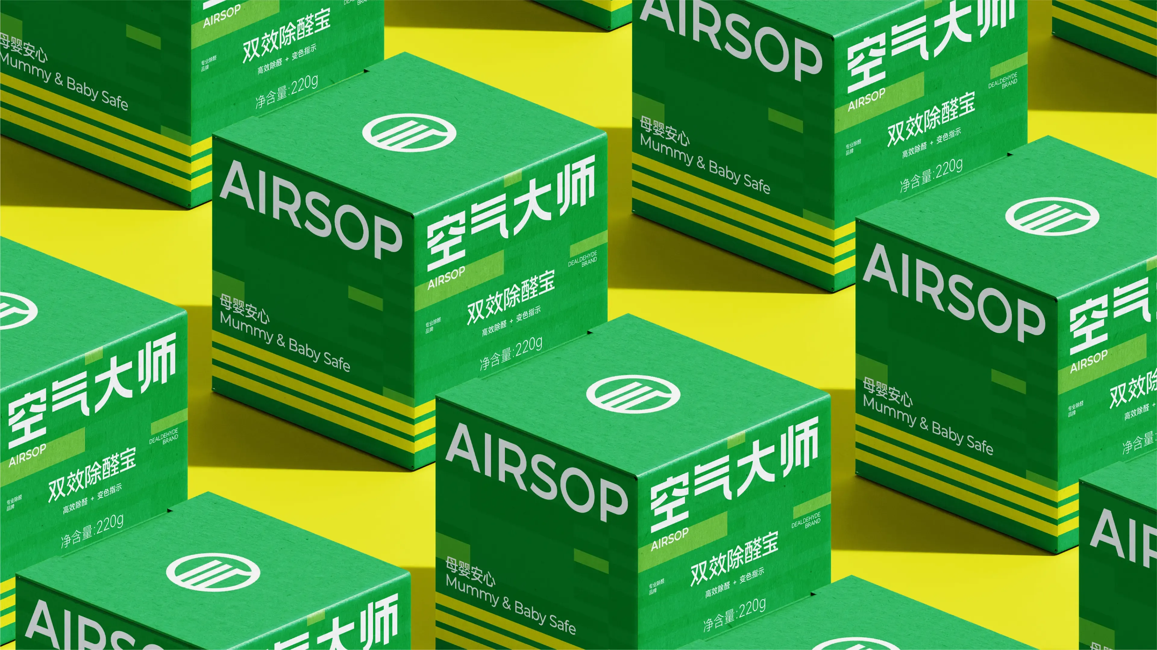
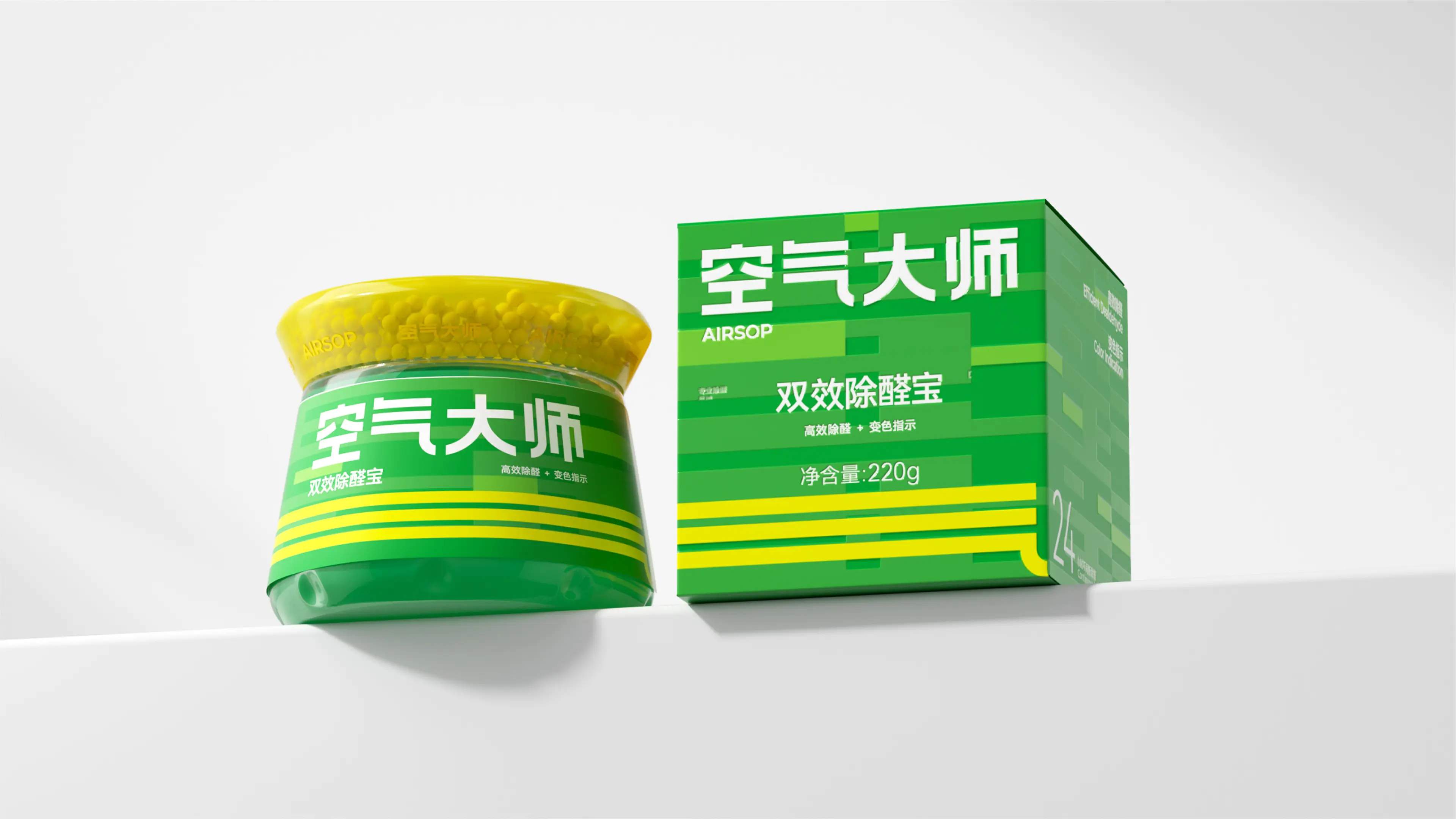
This project mainly focused on packaging design for post-renovation formaldehyde and odor removal products. We observed that the market is severely homogenized, with visuals imitating one another, and no mature brand has successfully stood out in the public eye. Therefore, the core objectives of this design were a strong brand, strong auxiliary graphics, and a strong product form. Based on this insight, three major design directions were established:
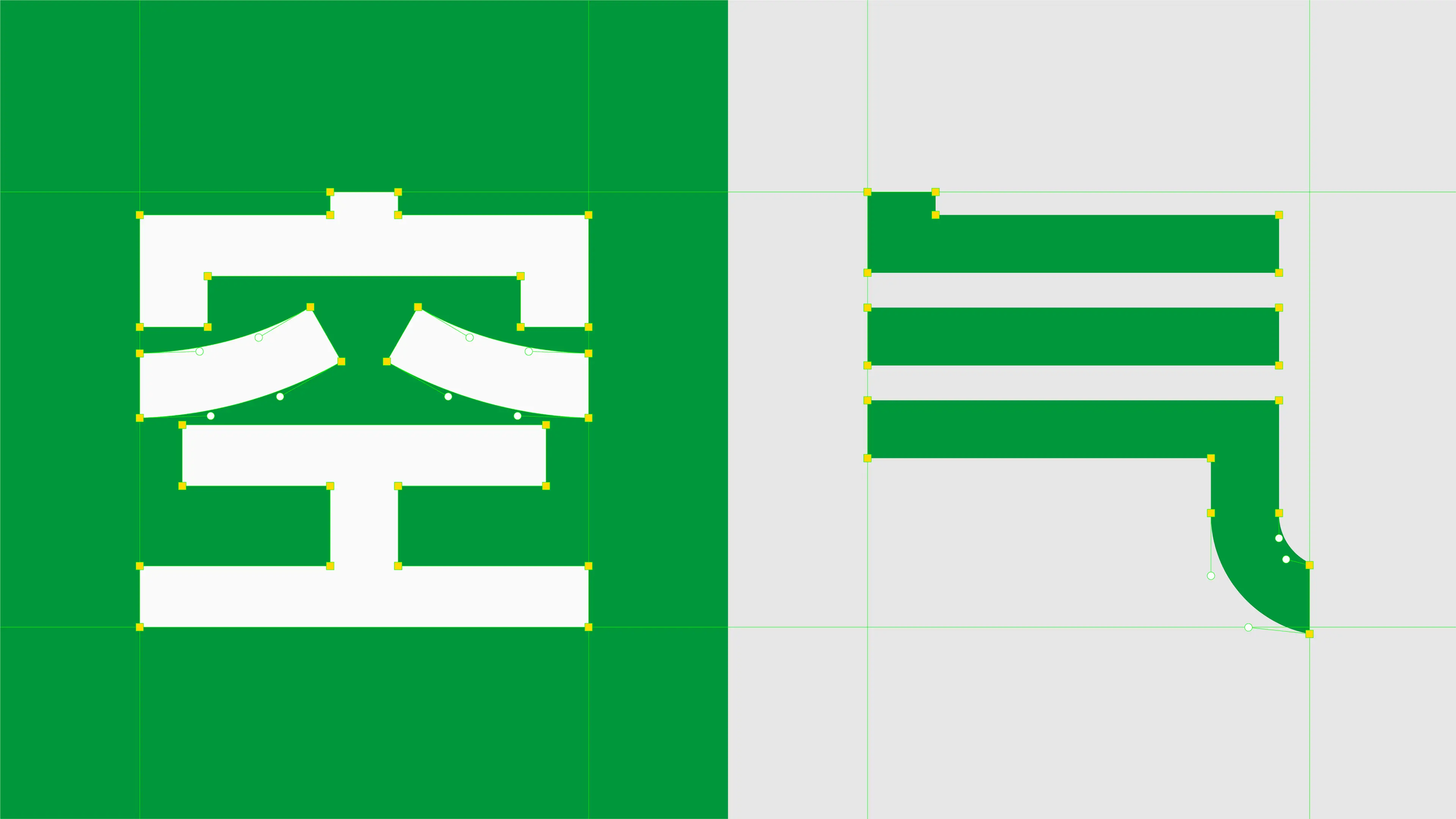
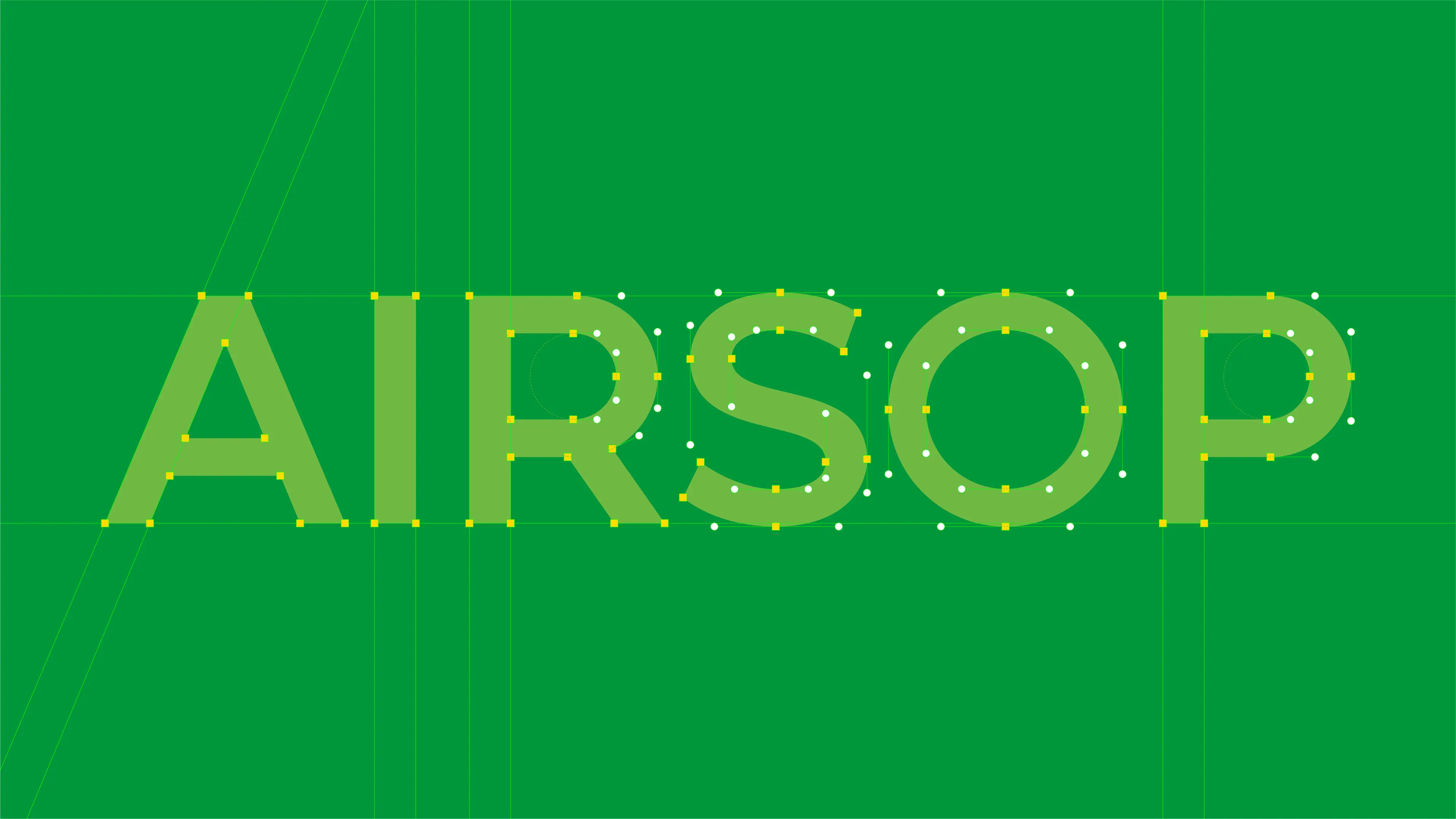
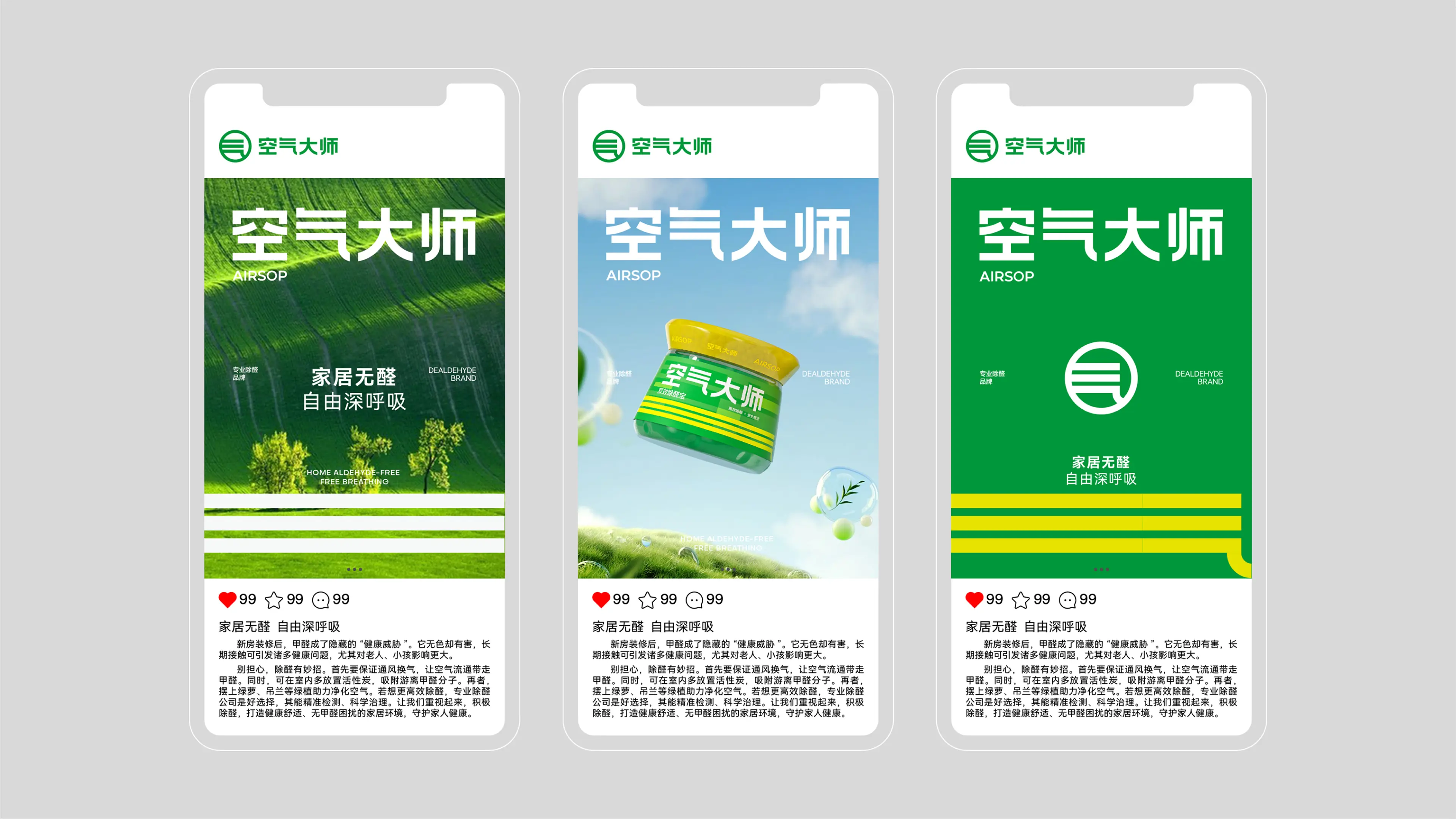
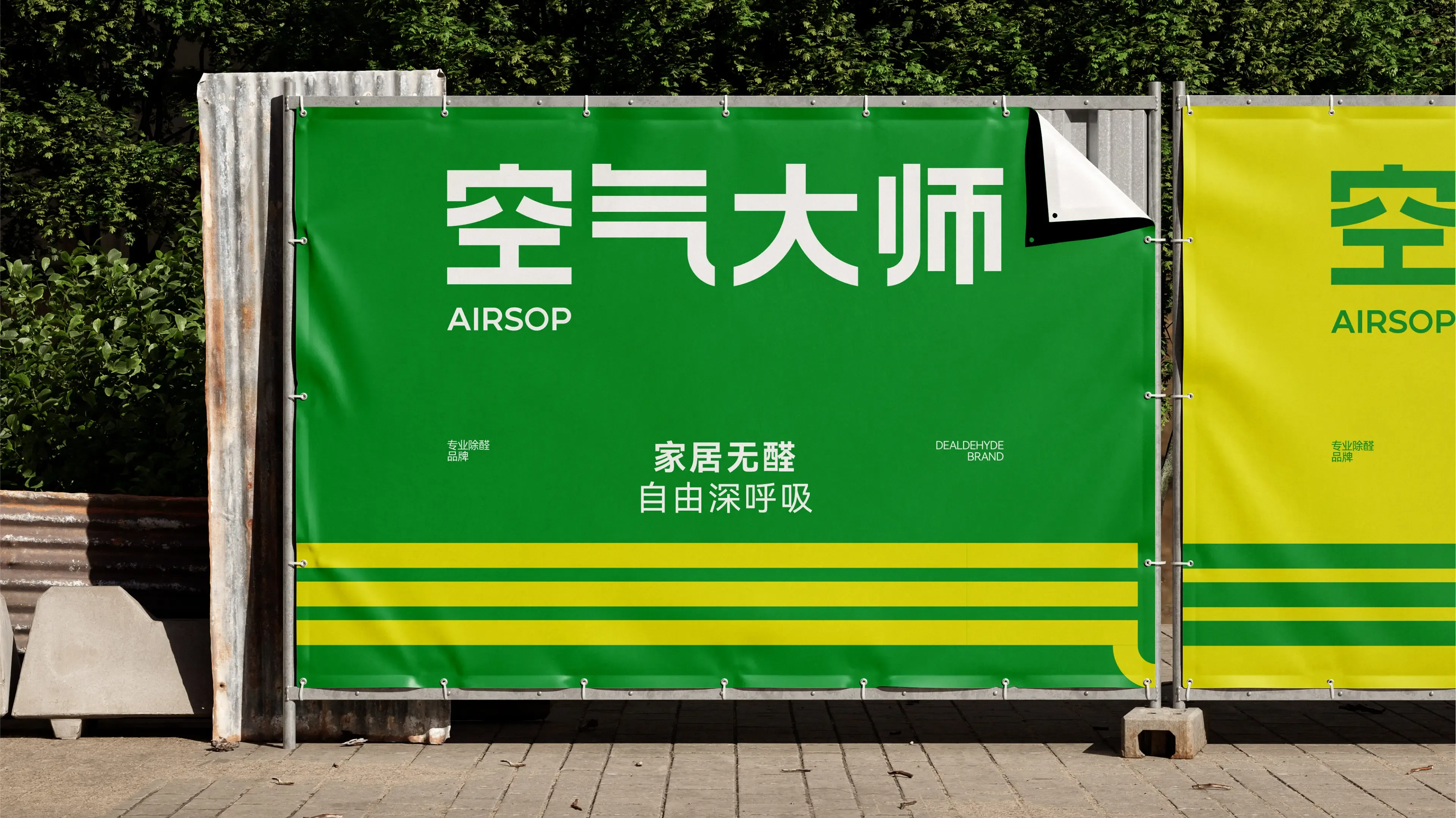
Strong brand: The project extracted the Chinese character “气” (qi, meaning air) as the logo—it is both the core character of the Chinese brand name “空气大师” and an intuitive expression of the product’s functional attributes of formaldehyde and odor removal. Using a Chinese character as the core logo element creates a unique cultural identity in the formaldehyde removal category.
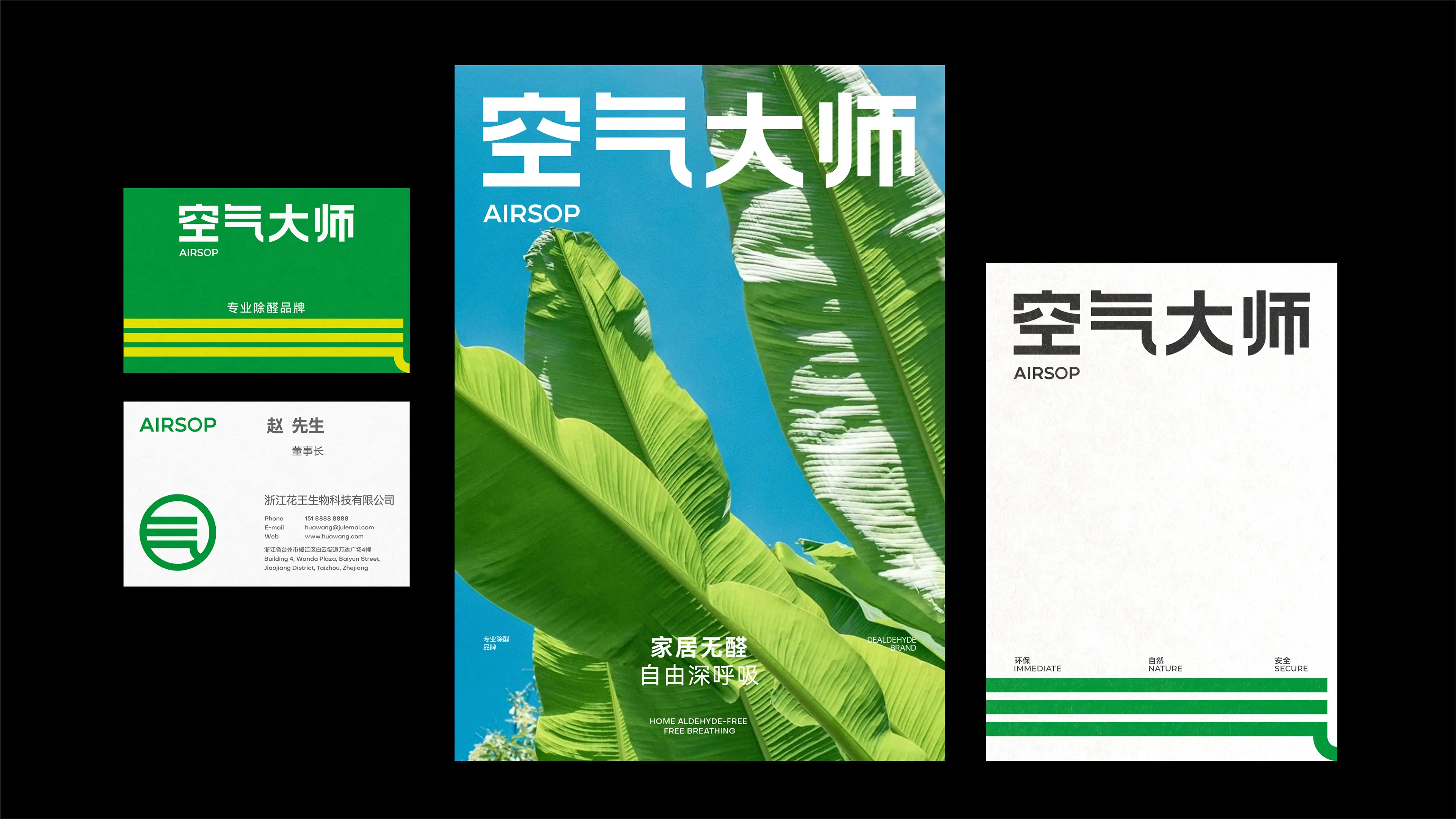
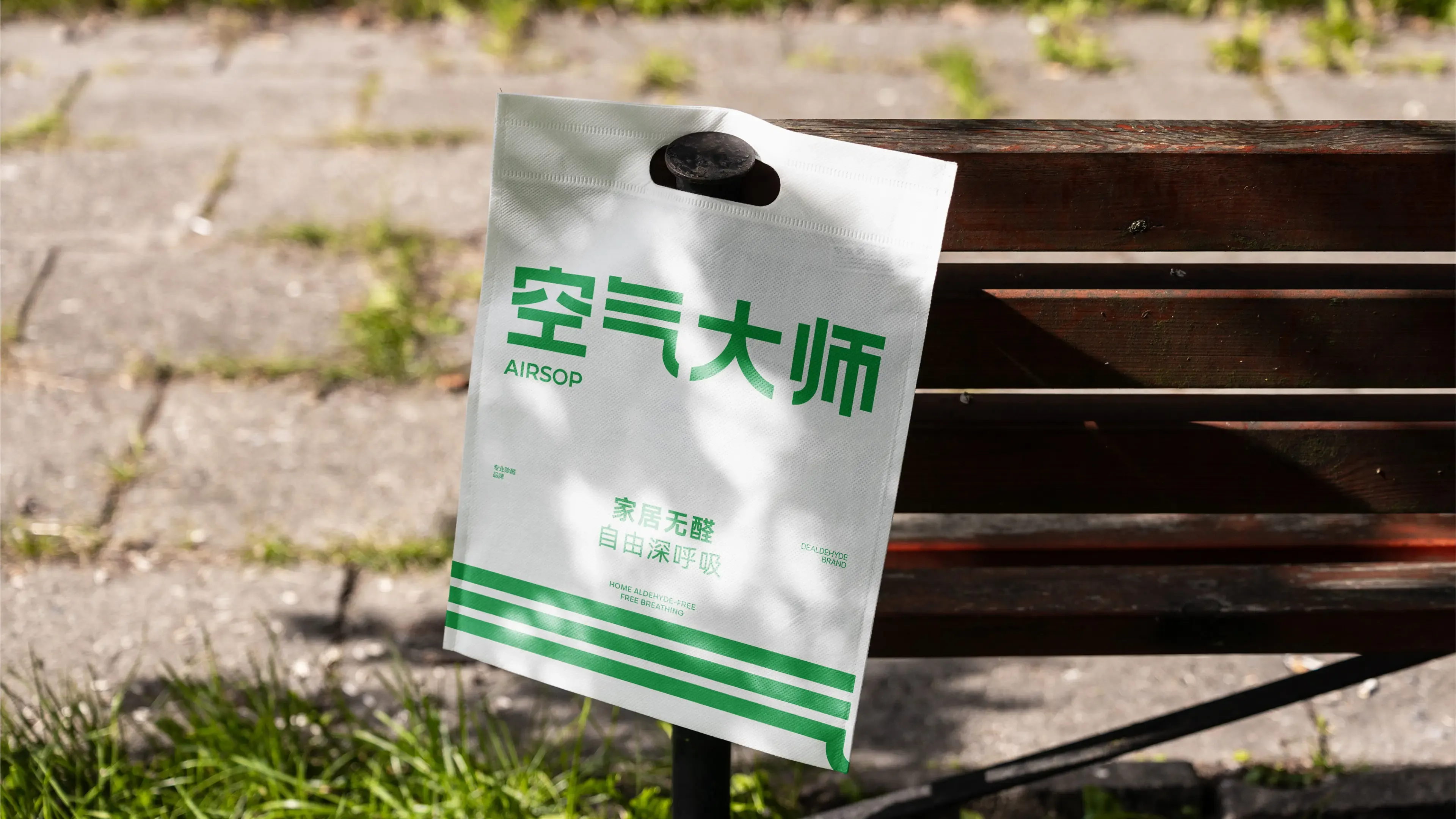
Strong auxiliary graphics: The team used part of the character as an auxiliary graphic, allowing the brand’s visual elements to form a unified and coherent identity language on the packaging and strengthening the brand’s memorability in consumers’ minds.
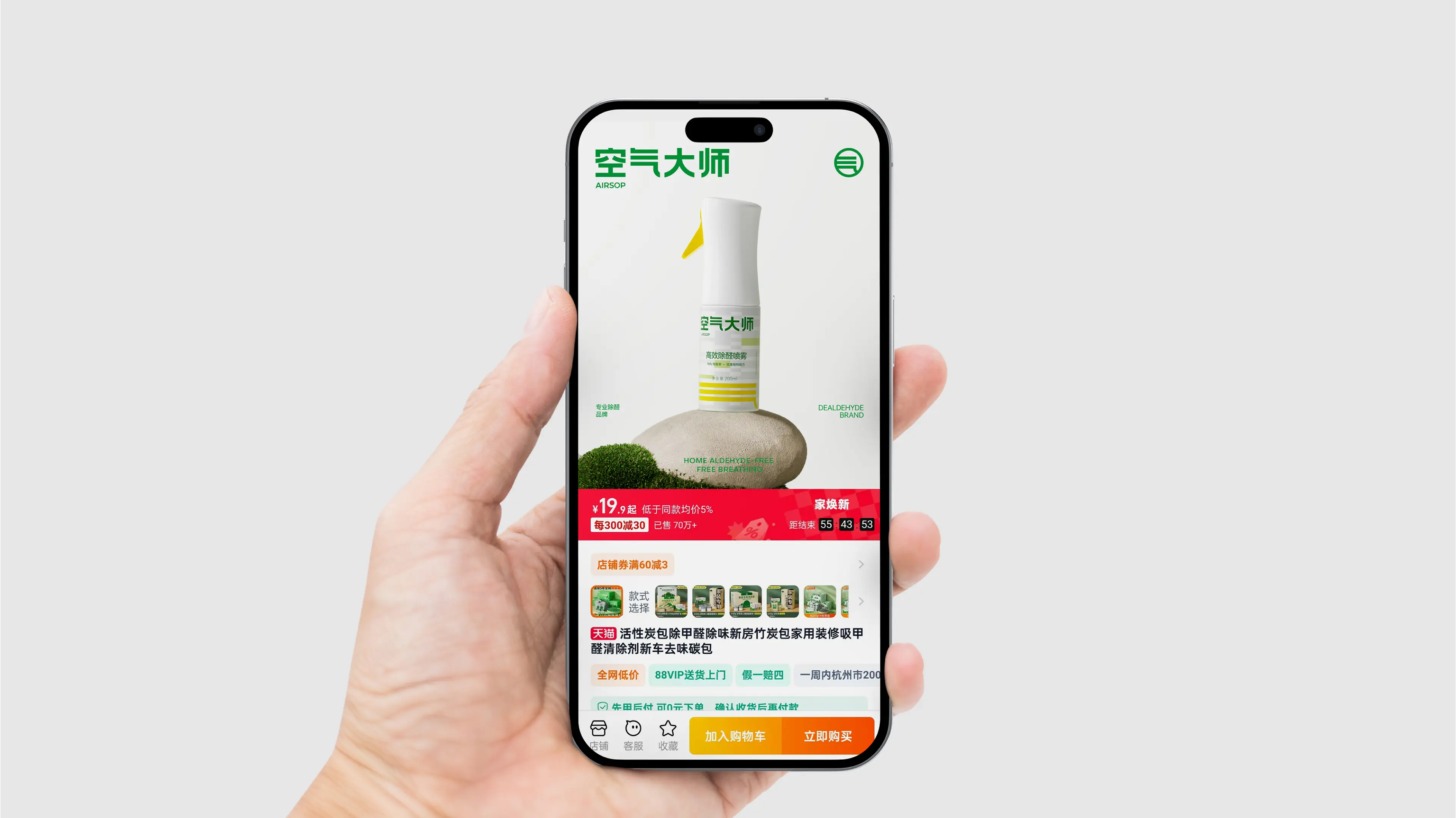
Strong product form: At the product form level, custom mold development was carried out for the upper cap. This decision fully differentiated the product’s physical form from similar products on the market, creating a “recognizable at a glance” visual hammer on shelves and e-commerce pages, effectively enhancing the brand’s recognition efficiency and shelf competitiveness.
Through this brand visual design system combining brand stature, recognition efficiency, and product form innovation, AIRSOP has successfully upgraded from a functional formaldehyde removal product to a professional brand in the formaldehyde removal field with strong visual recognition, clear brand positioning, and differentiated product form assets.
| |