

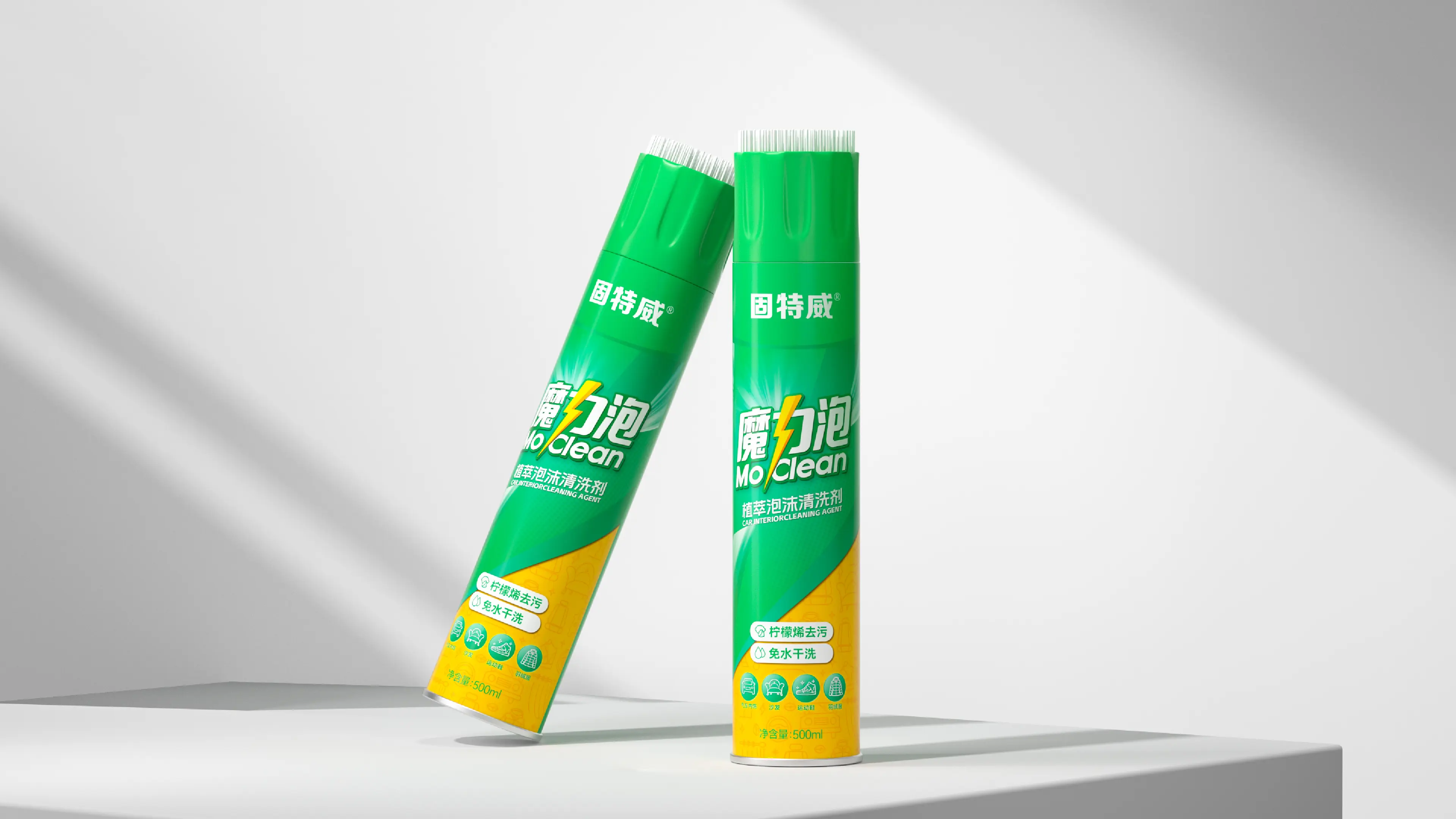
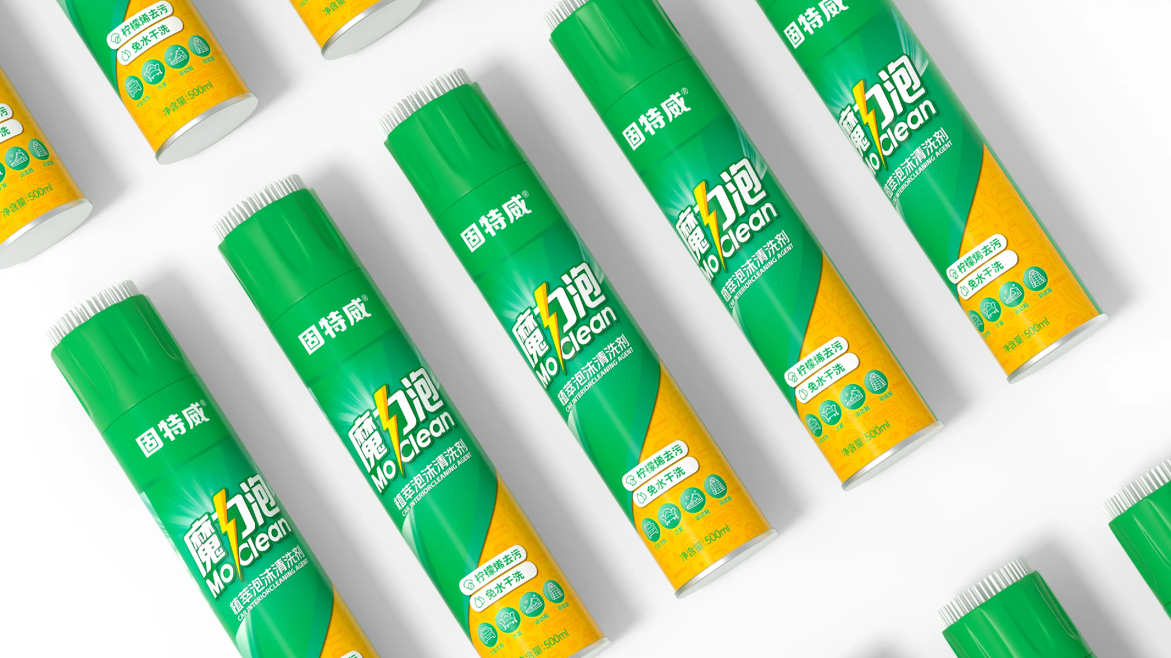
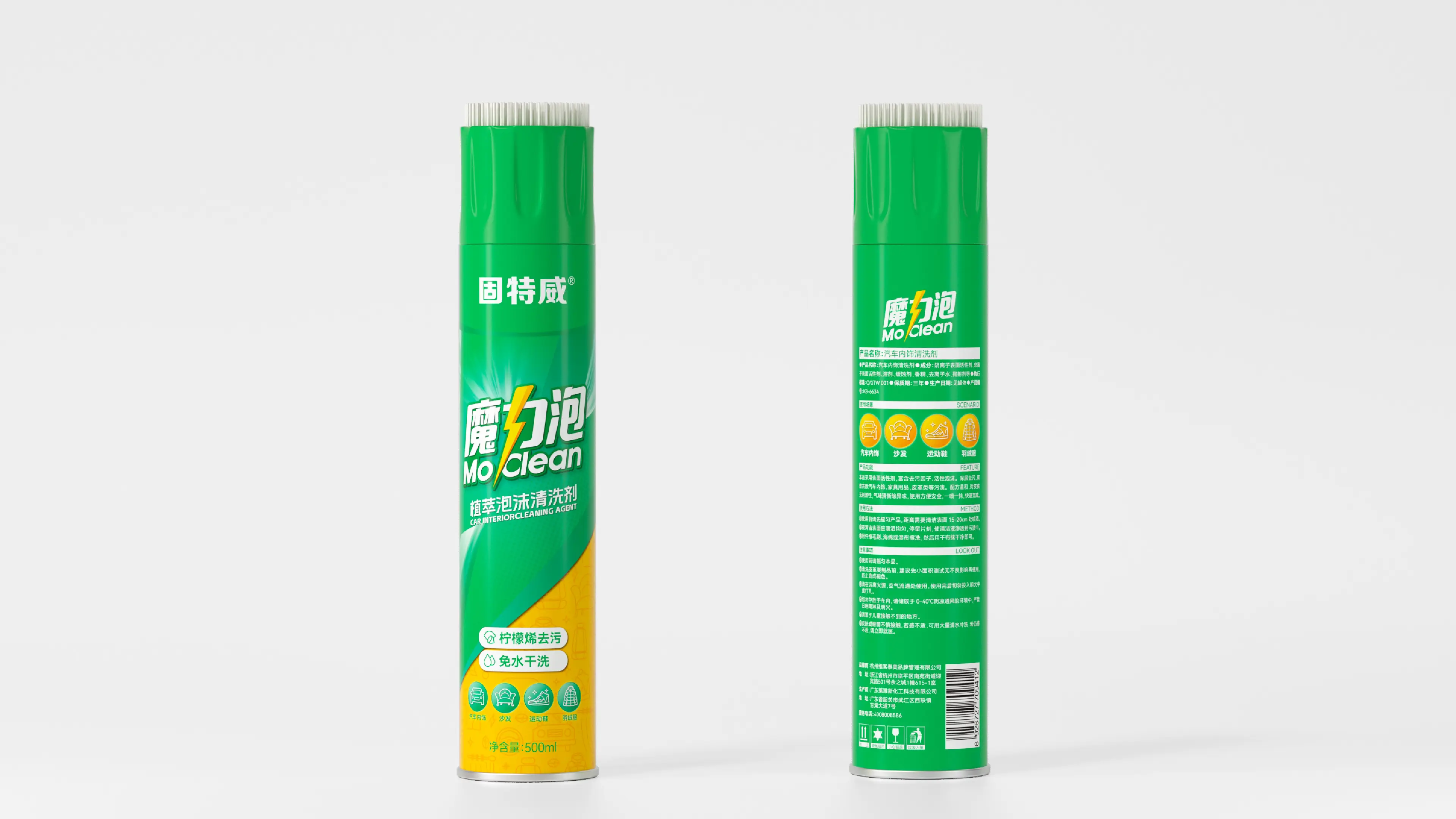
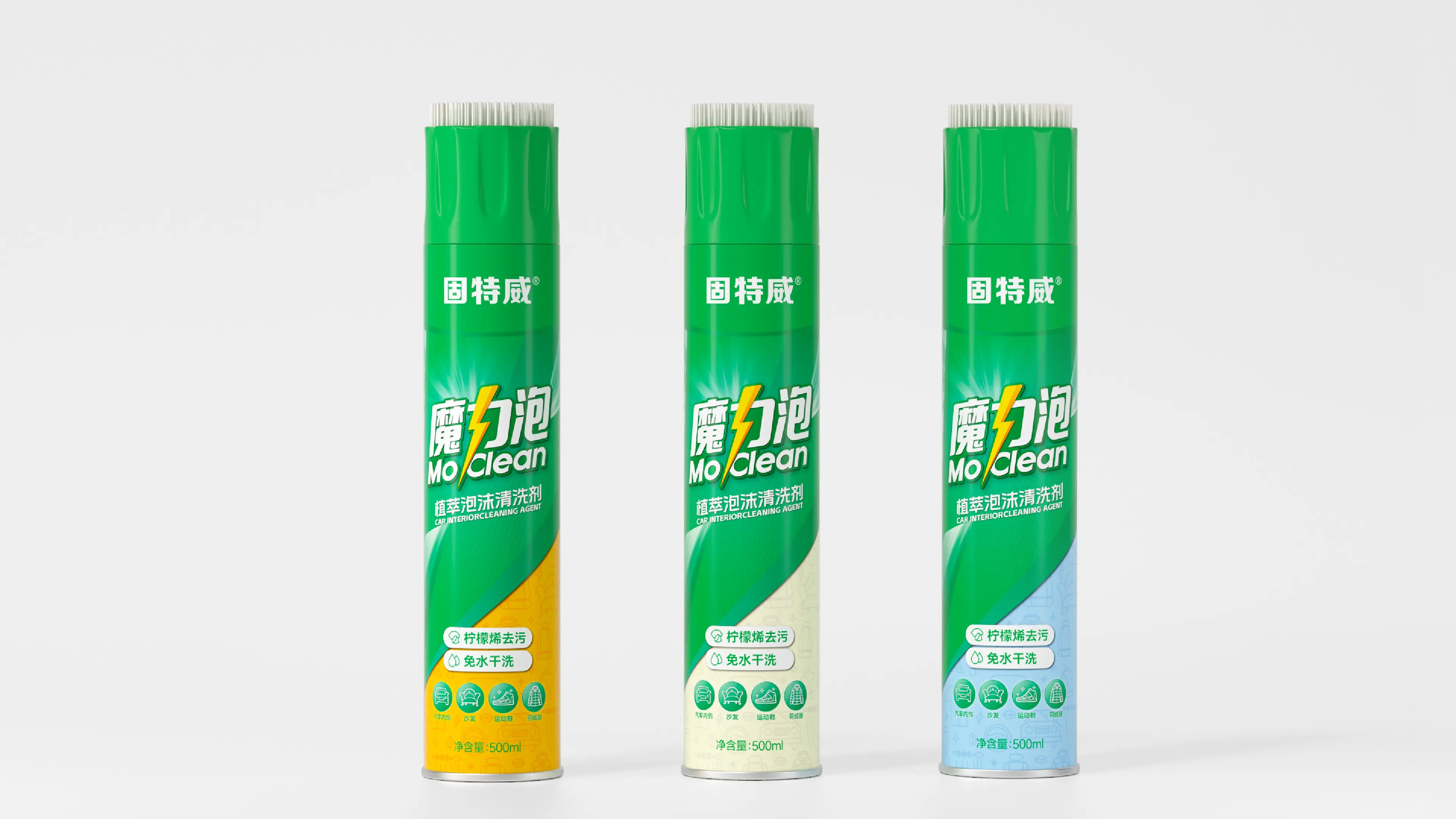
MoClean is a sub-brand under GUTEWEI (Korper Besonders) dedicated to automotive interior cleaning. GUTEWEI was founded in 2008 and is affiliated with Hangzhou Weike Taimei Brand Management Co., Ltd. It is a national brand mainly engaged in automotive detailing and maintenance products. MoClean products function to rapidly remove stains and are committed to providing car owners with a more comfortable interior cleaning experience.
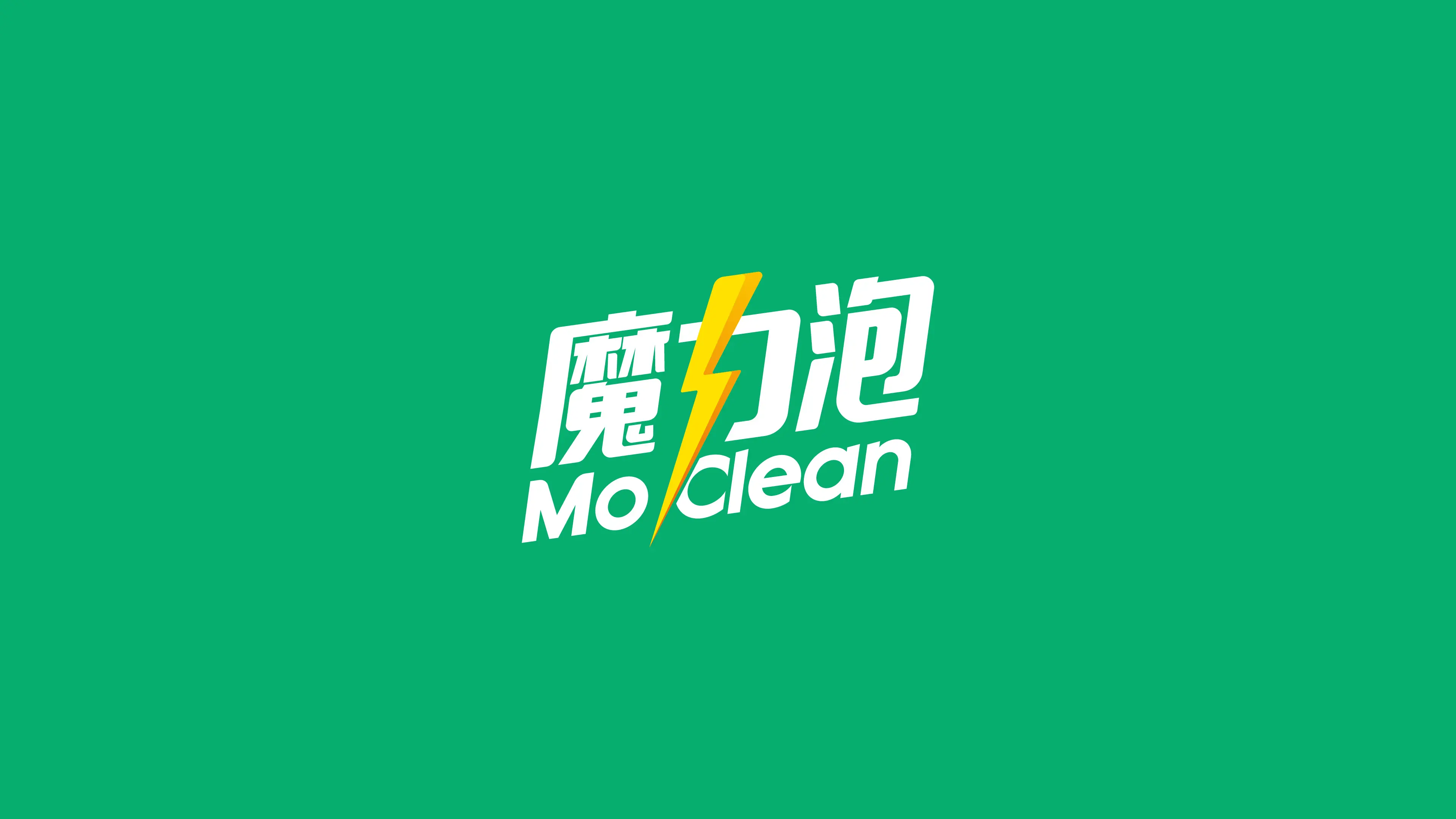
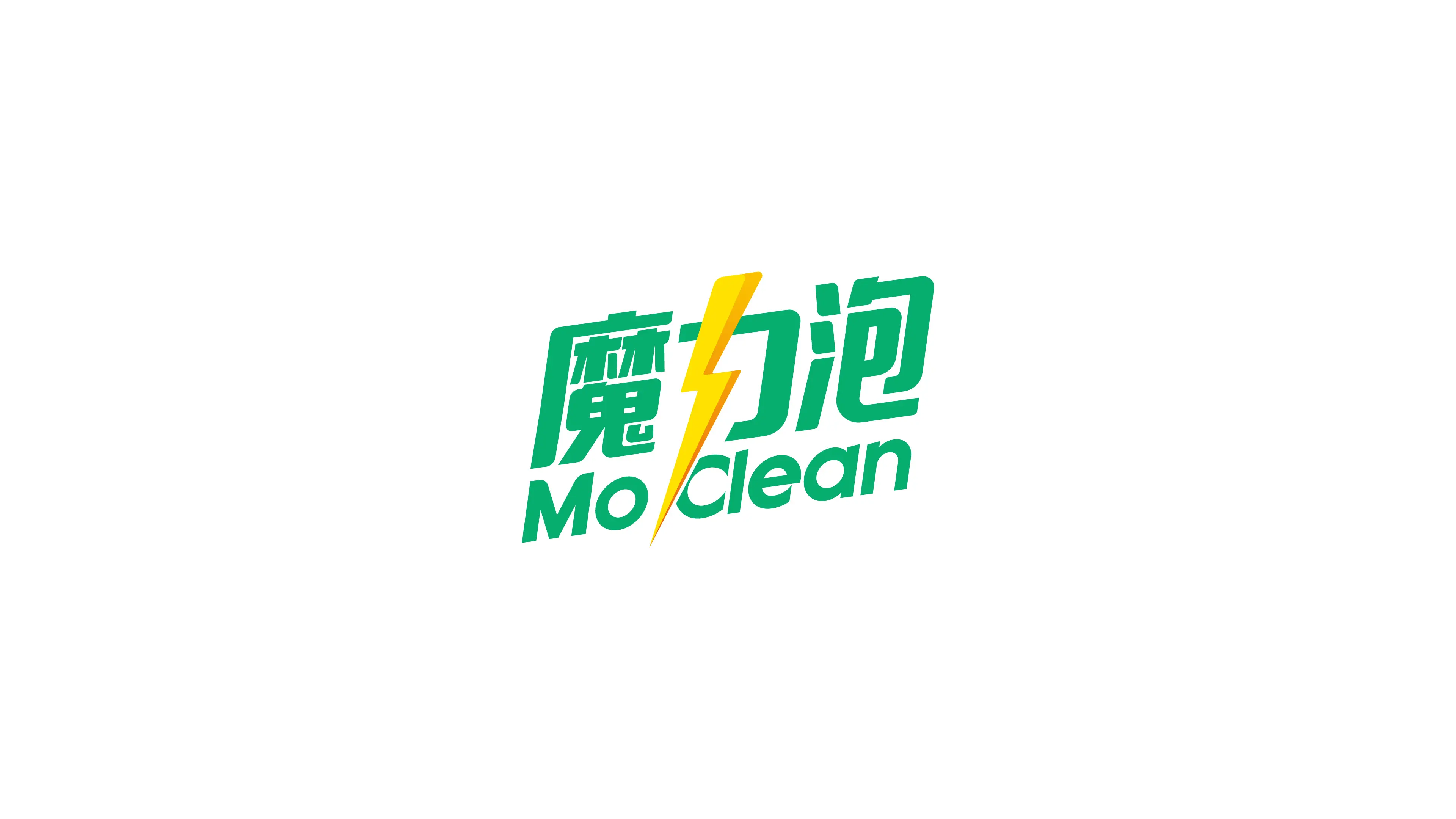
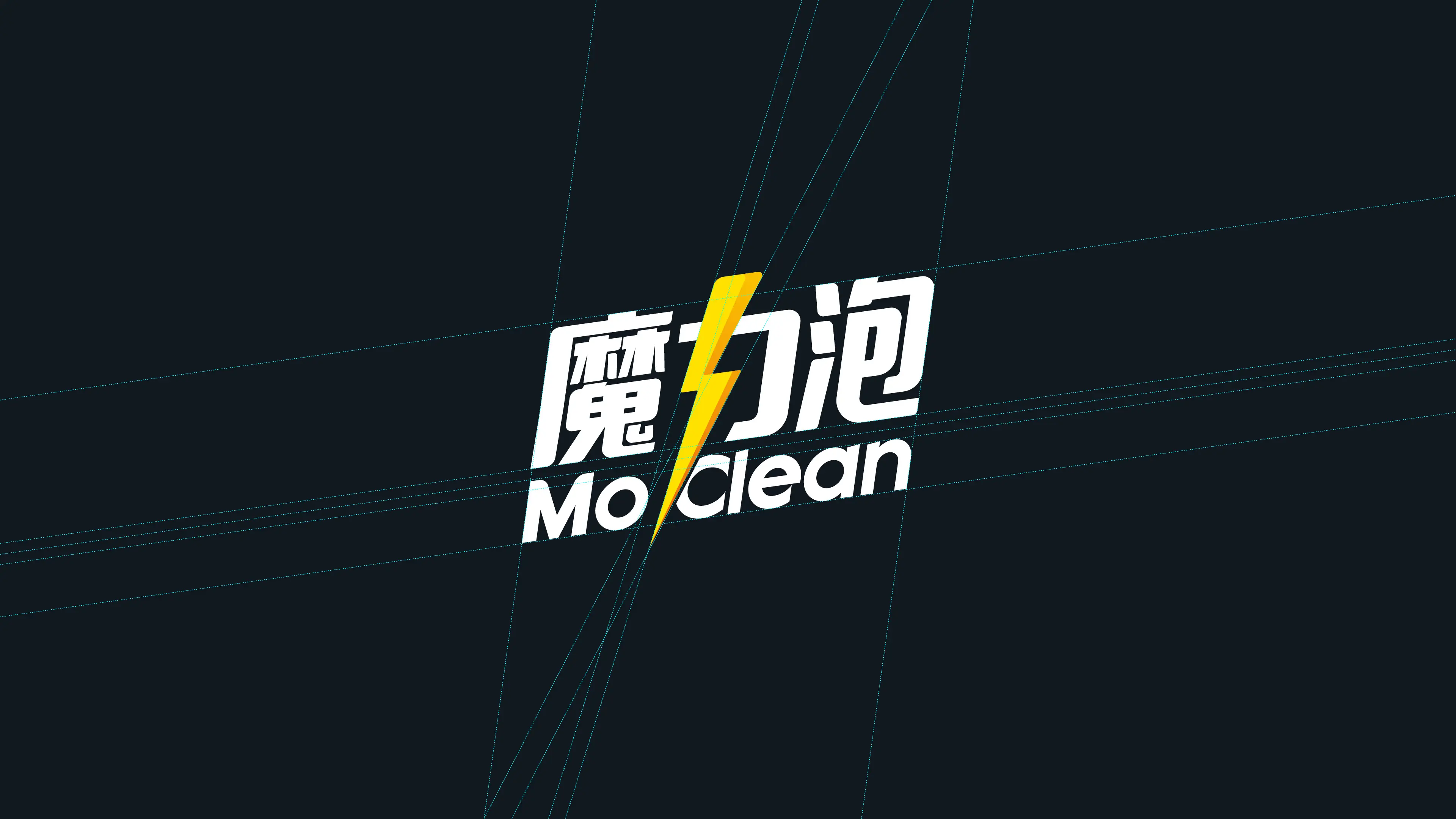
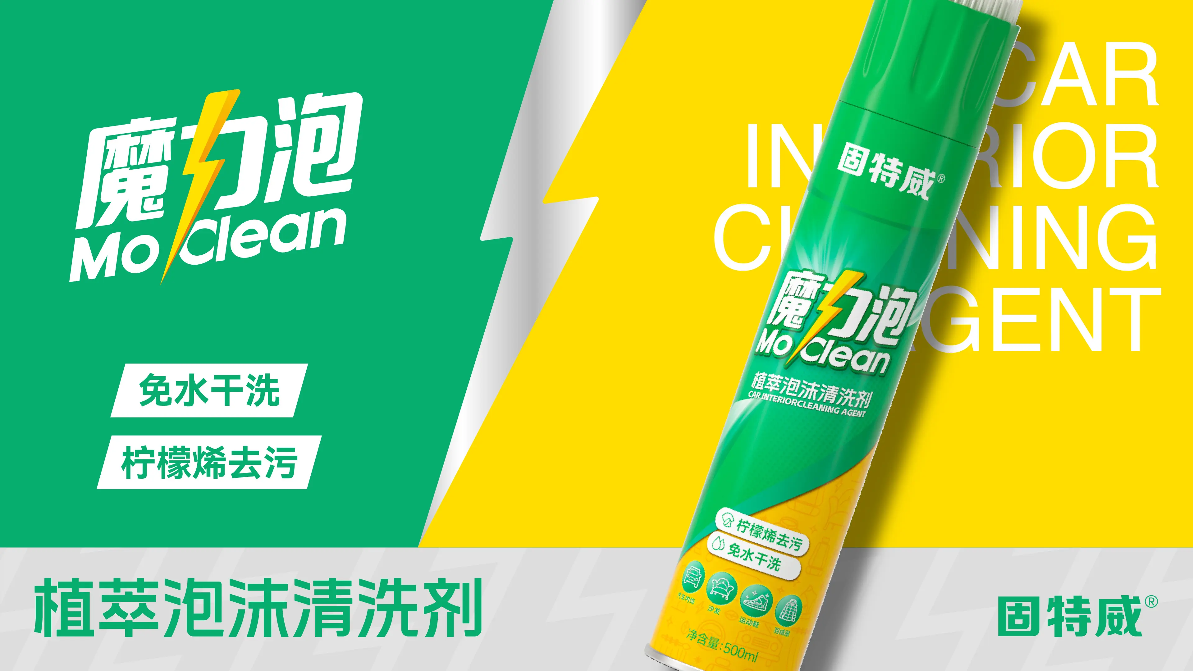
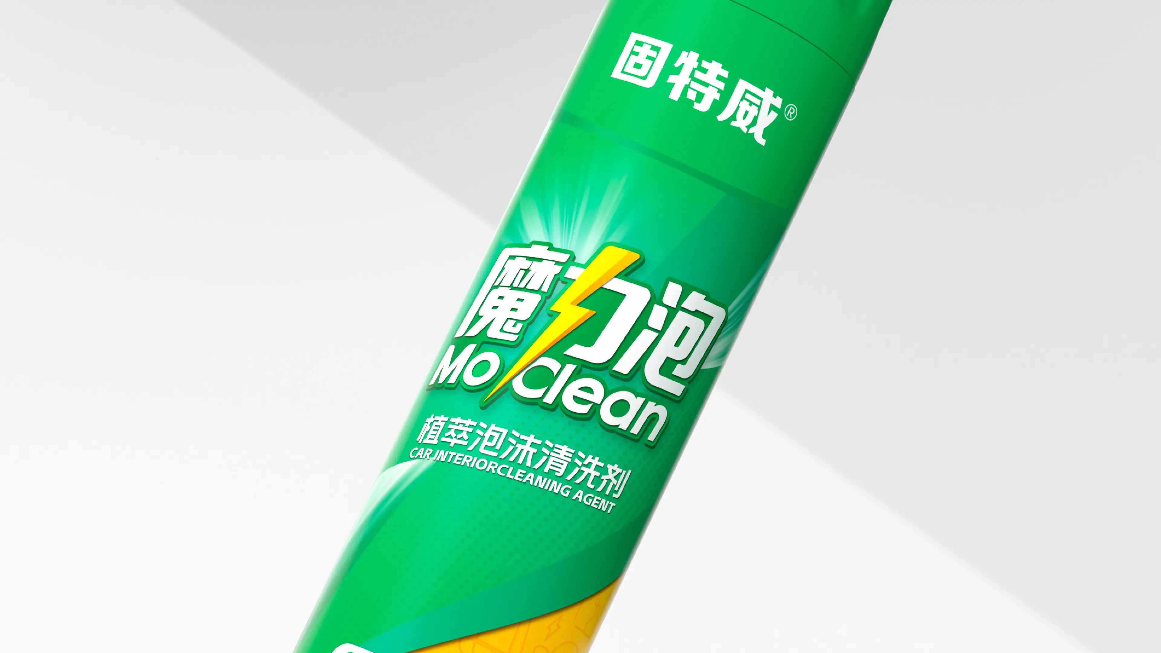
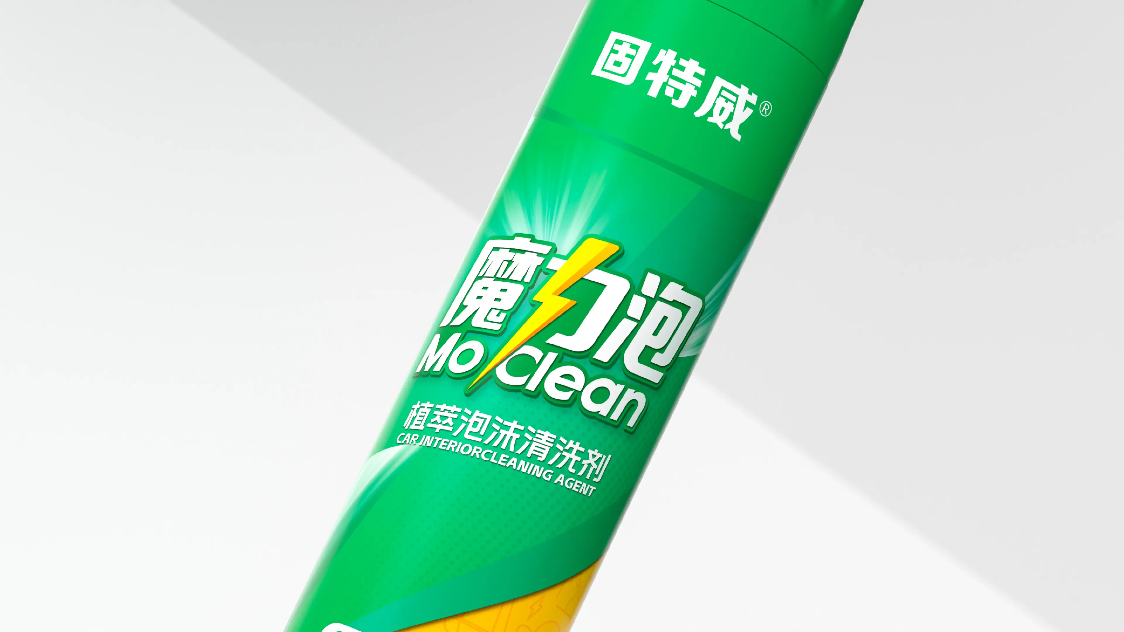
This project was to create a brand typography and visual identity system for MoClean Plant Extract Foam Cleaner. Its core objective was to help the brand establish differentiated visual recognition and brand memory in a market environment where automotive cleaning products are severely homogenized. Typography design was the core breakthrough of this project. In the typeface design of the three Chinese characters “魔力泡” (MoClean), we integrated a lightning bolt element into the Chinese character “力,” intending to convey a visual impression of speed and magic. This not only echoes the product’s functional characteristic of “rapid stain removal,” but also endows the brand name with a dynamic sense of energy. At the same time, this design approach makes the stroke structure of the three characters more balanced and unified. In terms of auxiliary graphics, the team used a bottom diagonal cut as an auxiliary graphic to further strengthen the brand’s visual memory point, giving “魔力泡” an instantly recognizable brand symbol on shelves and e-commerce pages. Through this design system combining recognition efficiency, functional communication, and brand memory, MoClean has successfully upgraded from a functional cleaning product to an automotive interior cleaning brand symbol with strong visual recognition and clear brand tonality.