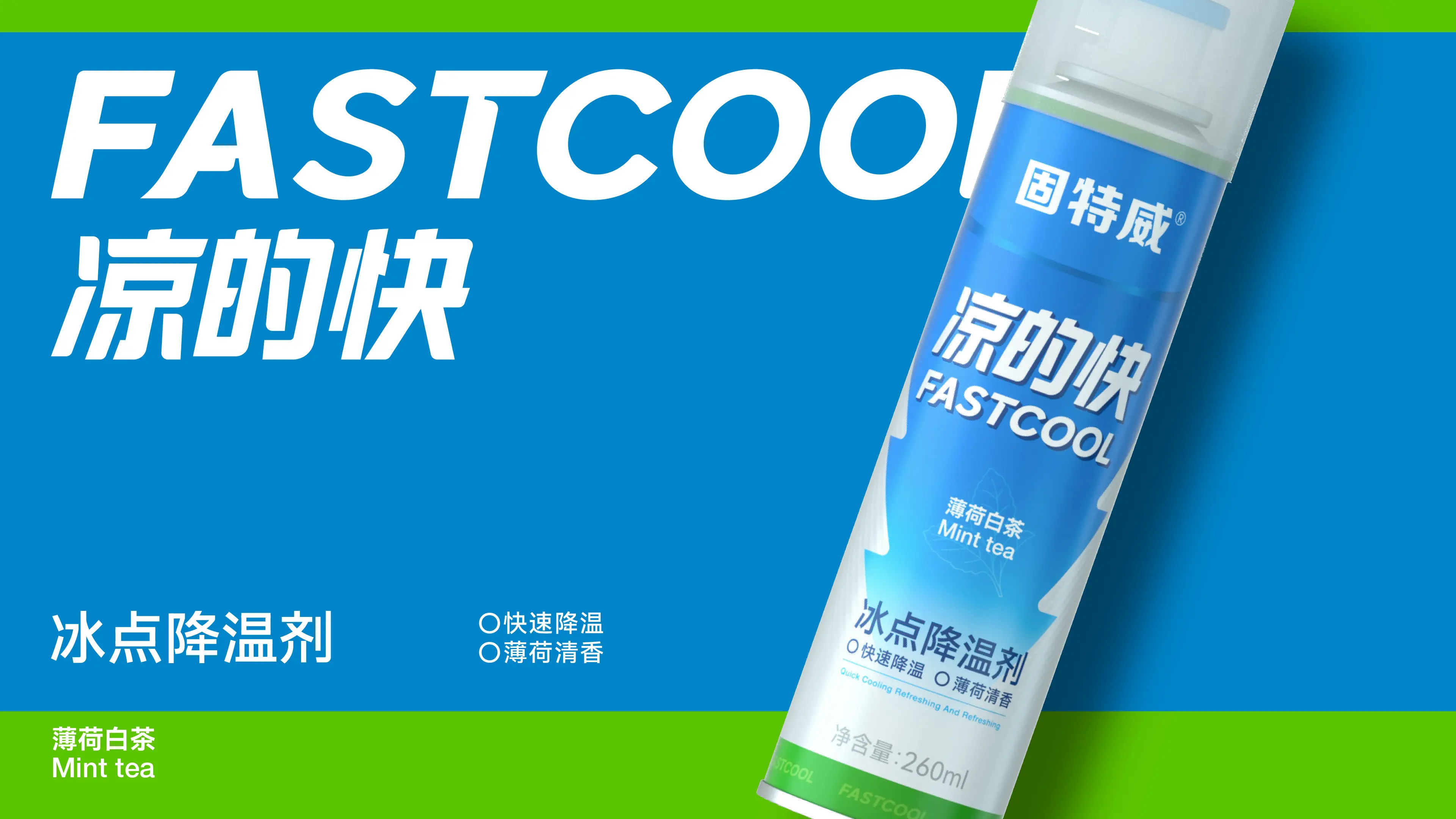
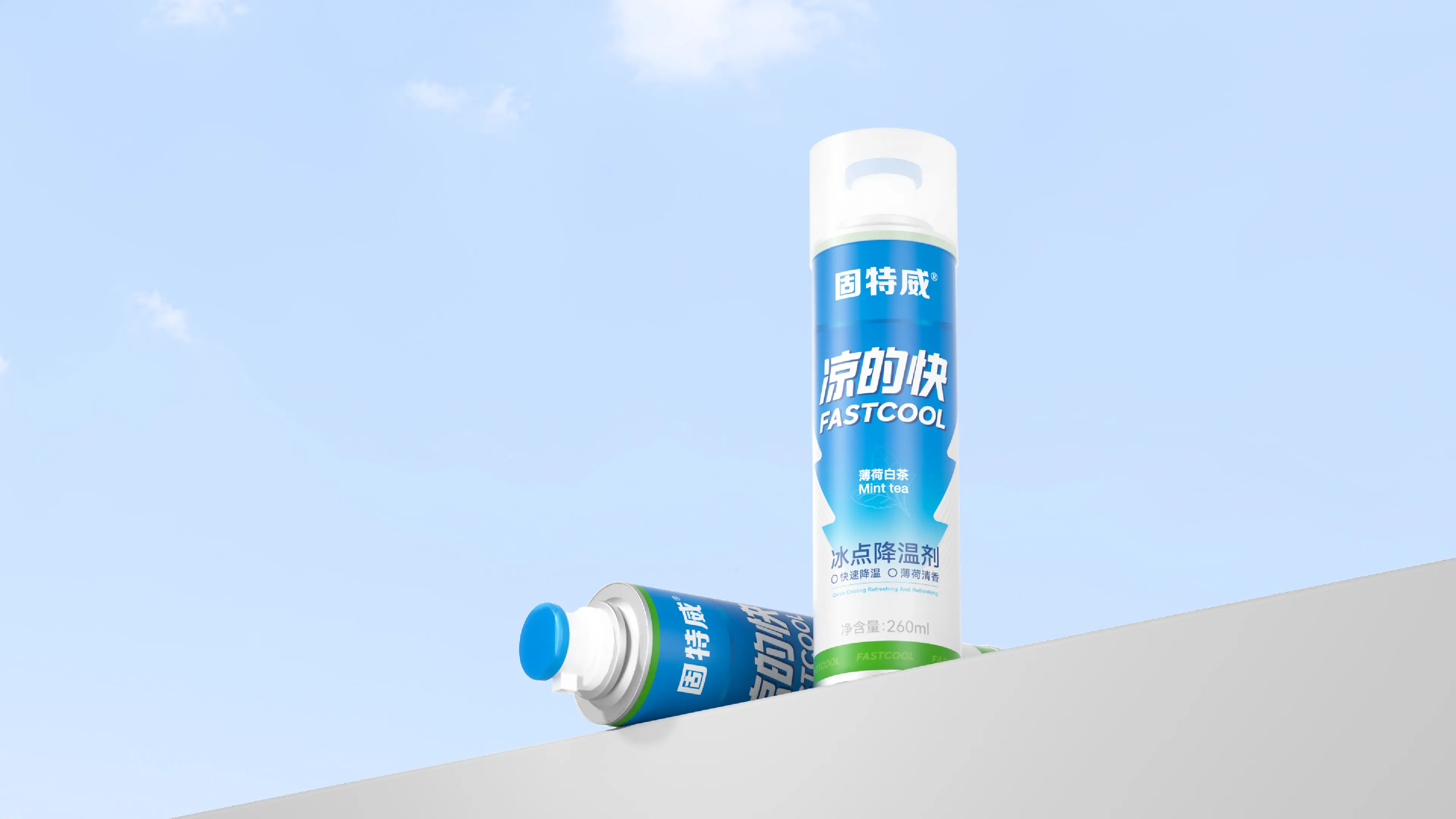
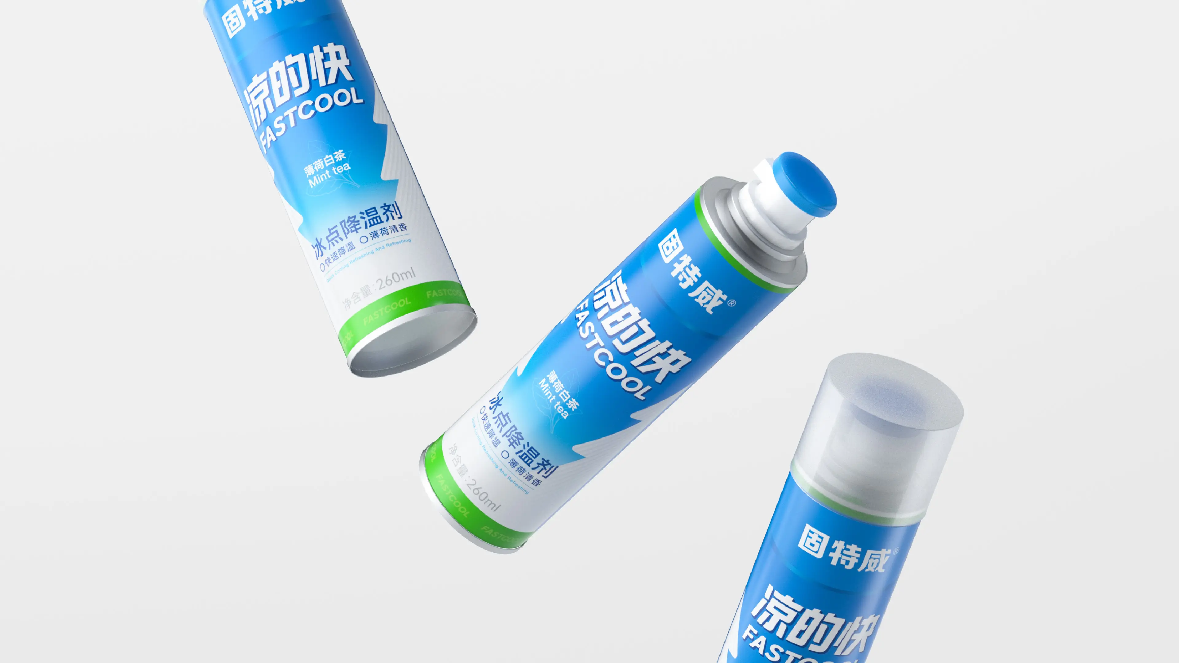
LIANGDEKUAI is a brand under GUTEWEI (Korper Besonders) specializing in in-car cooling. GUTEWEI was founded in 2008 and is affiliated with Hangzhou Weike Taimei Brand Management Co., Ltd. It is a national brand mainly engaged in automotive detailing and maintenance products. LIANGDEKUAI products function to rapidly cool the interior of a car in summer, providing car owners with a more comfortable driving experience. In high summer temperatures, after a car has been exposed to the sun, the interior temperature can reach above 60°C. Through rapid cooling technology, LIANGDEKUAI helps car owners quickly lower the temperature of contact surfaces such as seats and steering wheels before entering the car, enhancing driving and riding comfort.
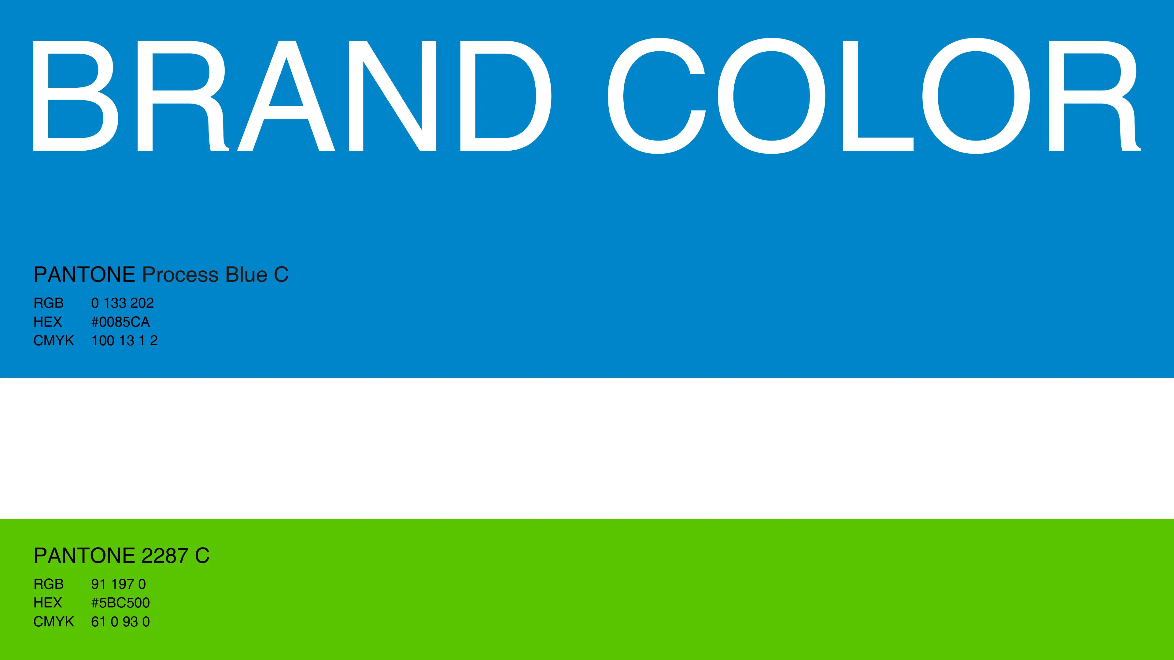
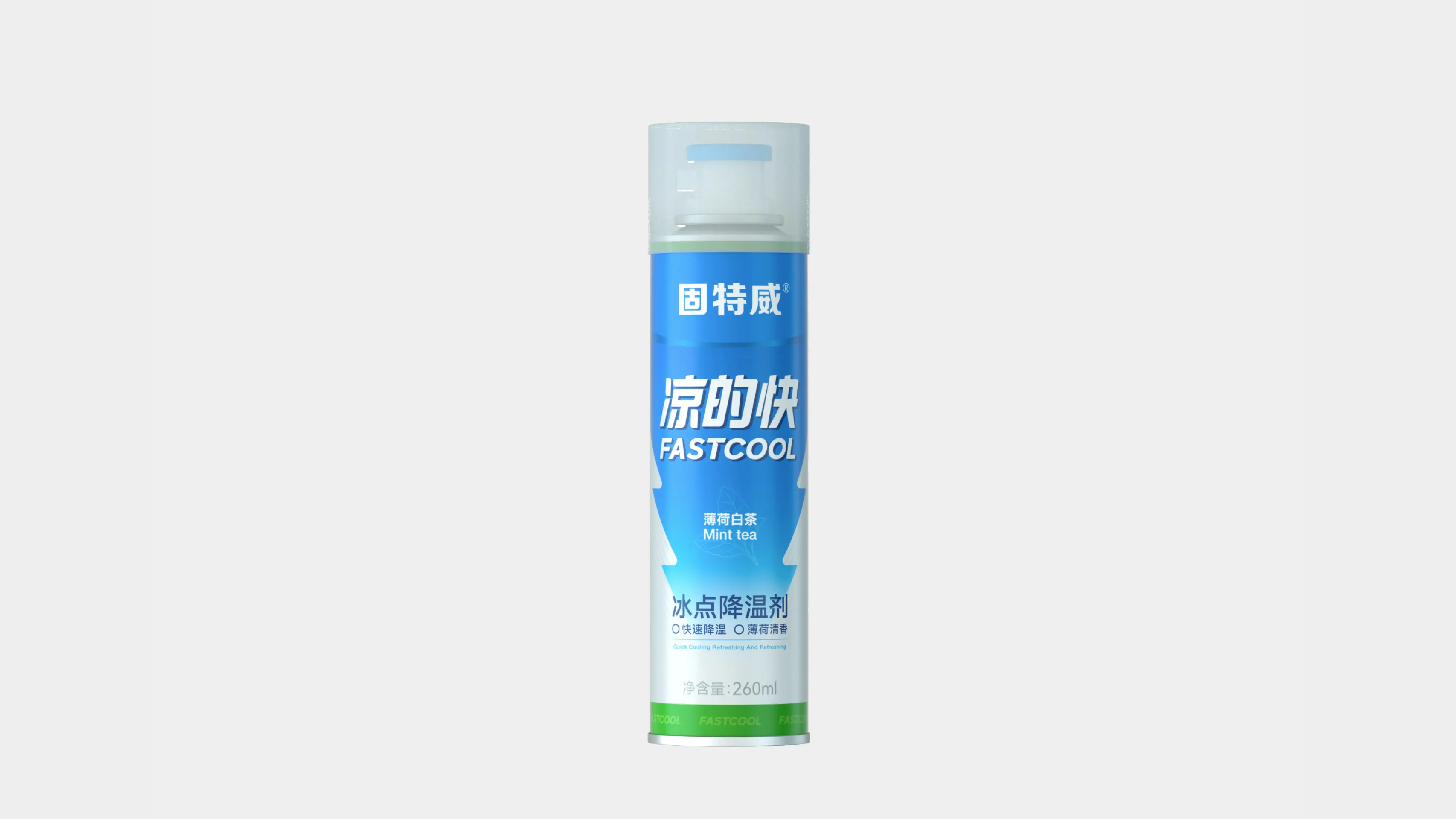
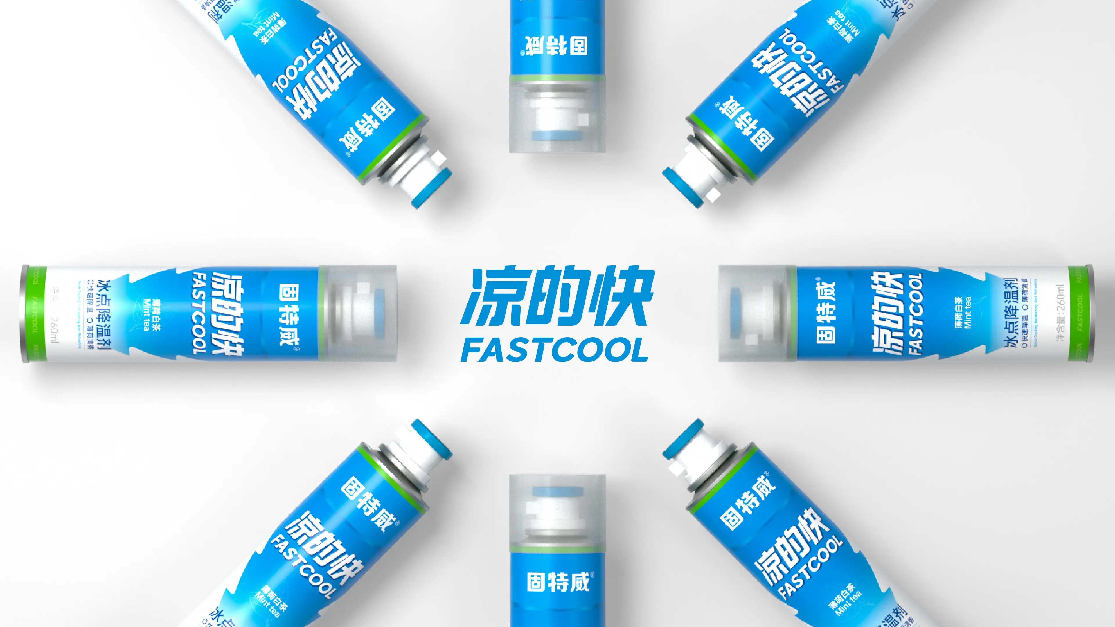
This project was to create a brand visual and packaging design system for LIANGDEKUAI Ice Point Cooling Agent. The core objective was to help the brand establish differentiated visual recognition and brand memory in a market environment where automotive cooling products are severely homogenized. Cool-toned blue was selected as the primary brand color. Visually, blue conveys a sense of coolness and calm, highly compatible with the product’s functional attribute of “rapid cooling,” allowing consumers to perceive the product’s cooling experience the moment they encounter it visually. Combining the sense of speed conveyed by the brand name “LIANGDEKUAI,” a downward arrow visual symbol was designed—the downward arrow intuitively communicates the product function of “temperature drop.” The concise and powerful graphic language creates a strong association between the brand name and product function, effectively reducing consumers’ cognitive cost and strengthening brand memory. Through this design system combining recognition efficiency, functional communication, and brand memory, LIANGDEKUAI has successfully upgraded from a functional cooling product to an automotive cooling brand symbol with strong visual recognition and clear brand tonality.