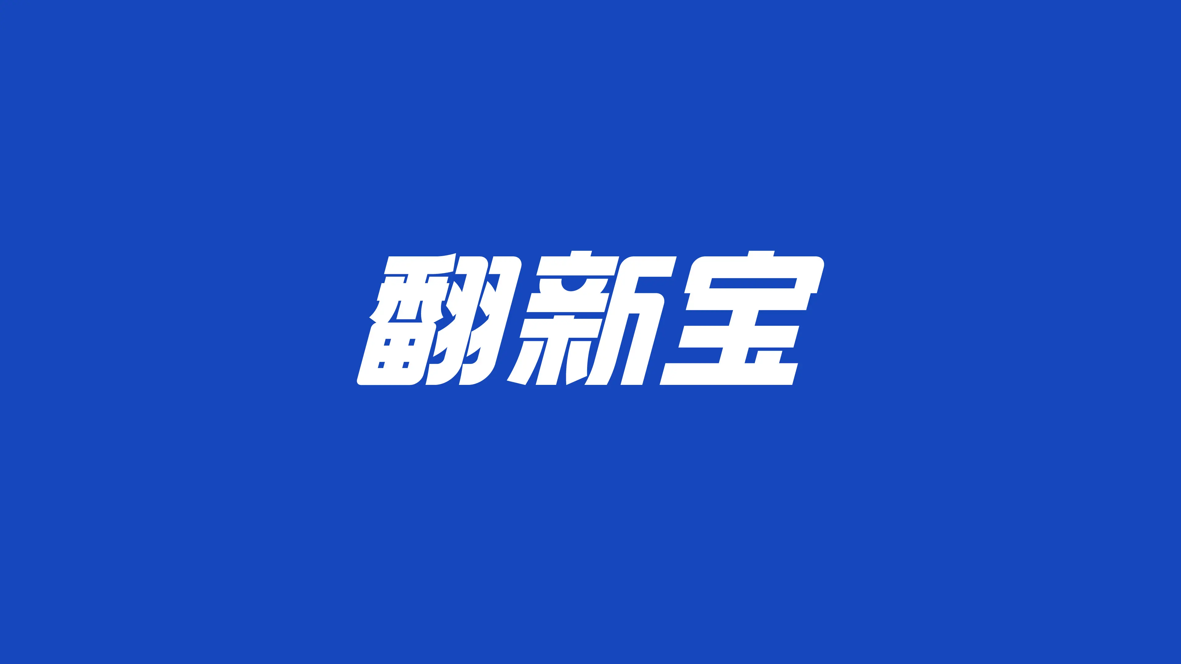
ANXINBAO is a sub-brand under GUTEWEI (Korper Besonders) dedicated to automotive interior cleaning. GUTEWEI was founded in 2008 and is affiliated with Hangzhou Weike Taimei Brand Management Co., Ltd. It is a national brand mainly engaged in automotive detailing and maintenance products. FANXINBAO products function to rapidly remove stains and are committed to providing car owners with a more comfortable in-car environment experience.
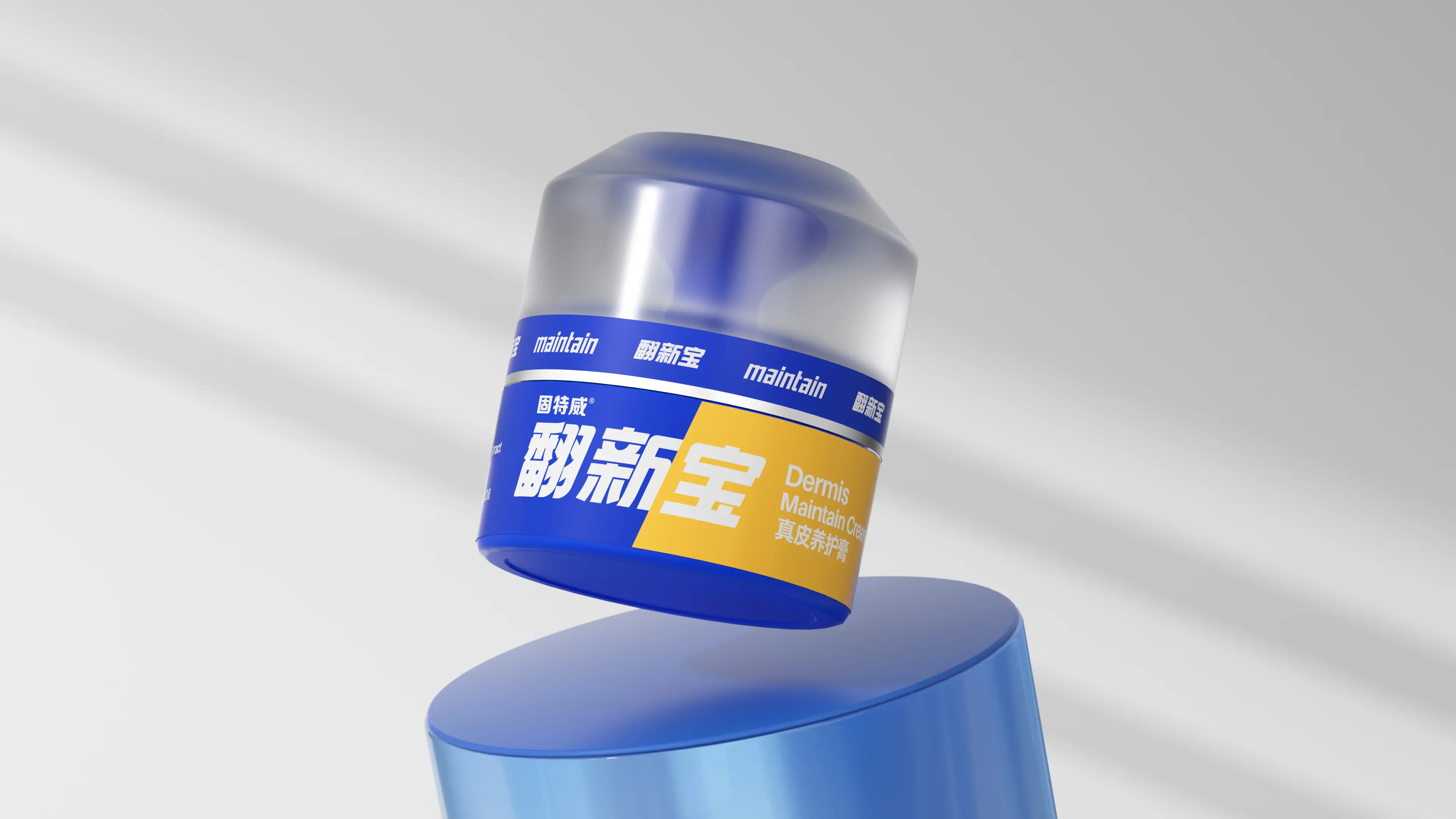
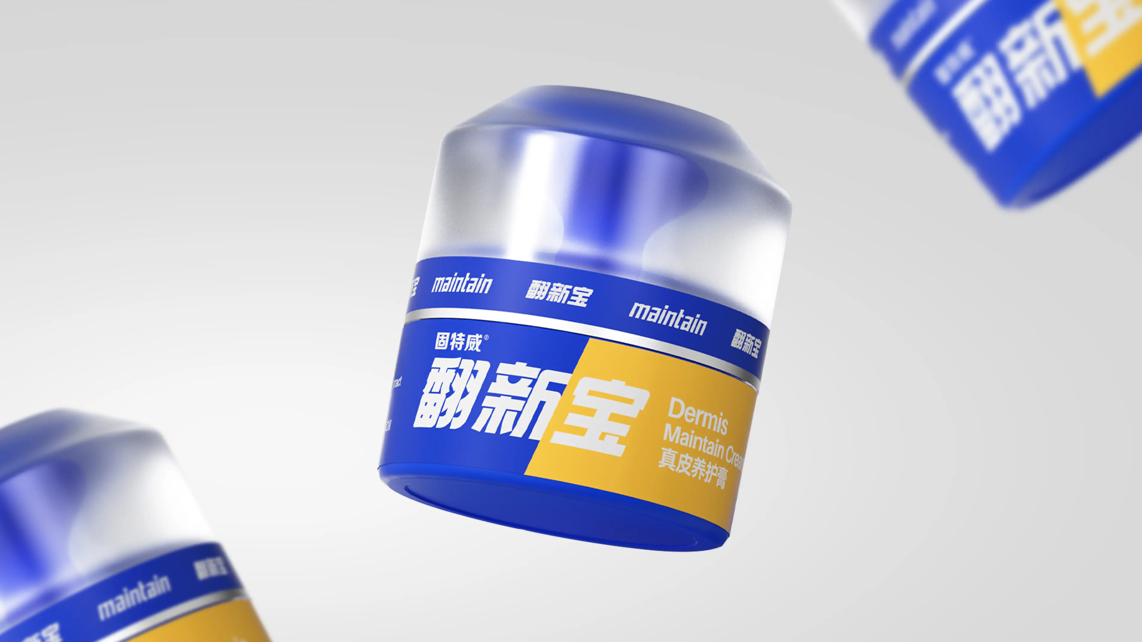
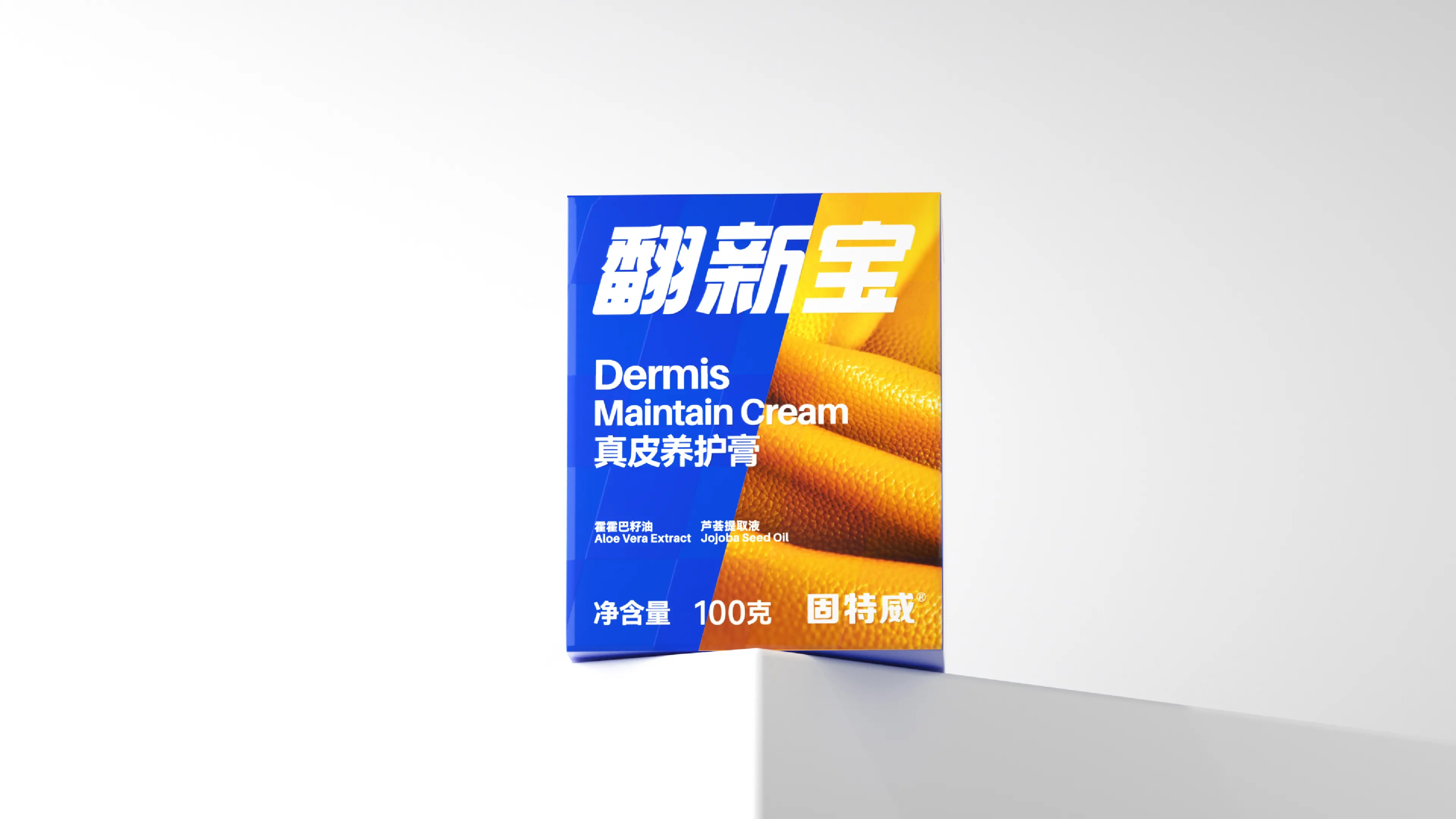
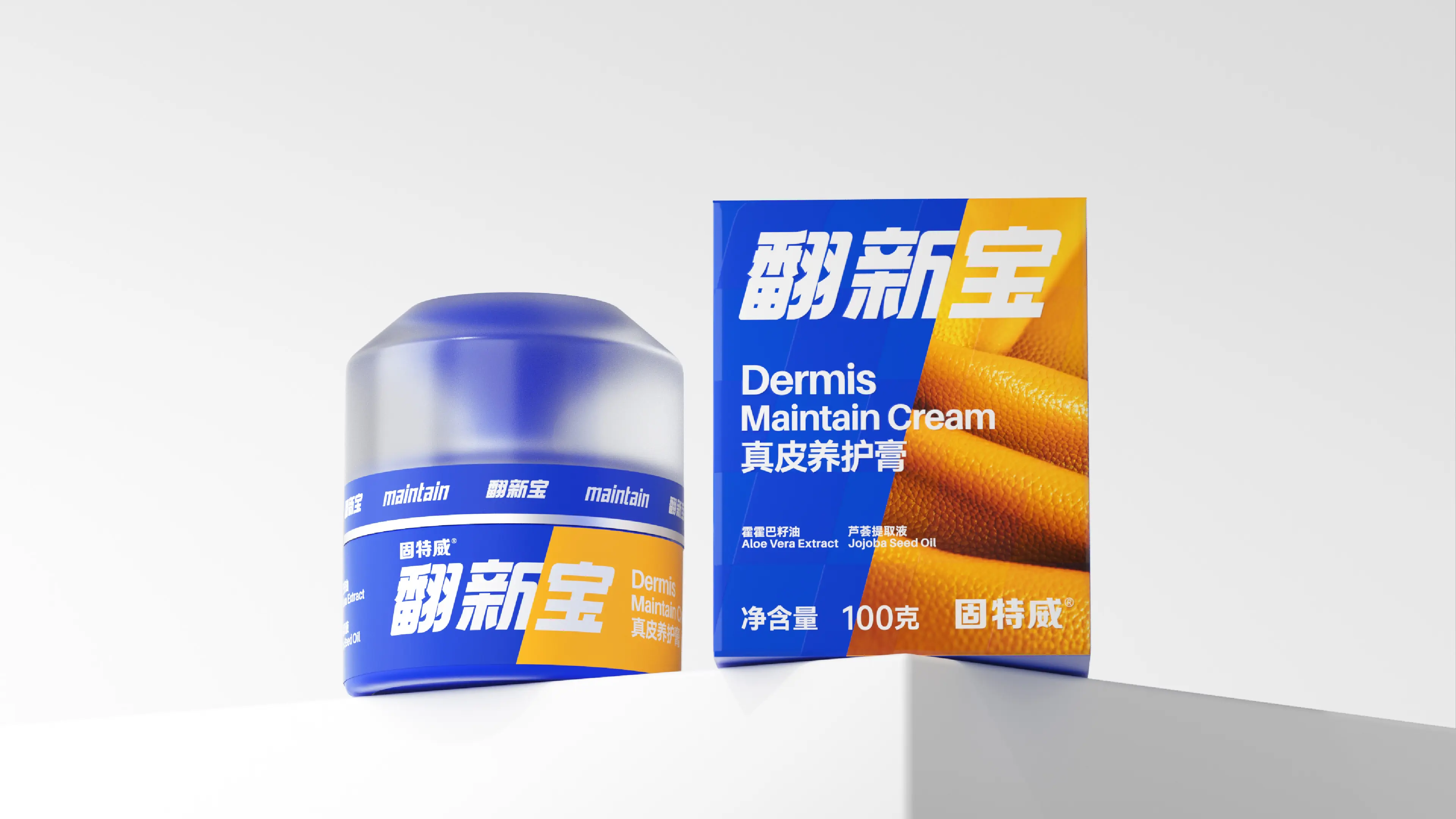
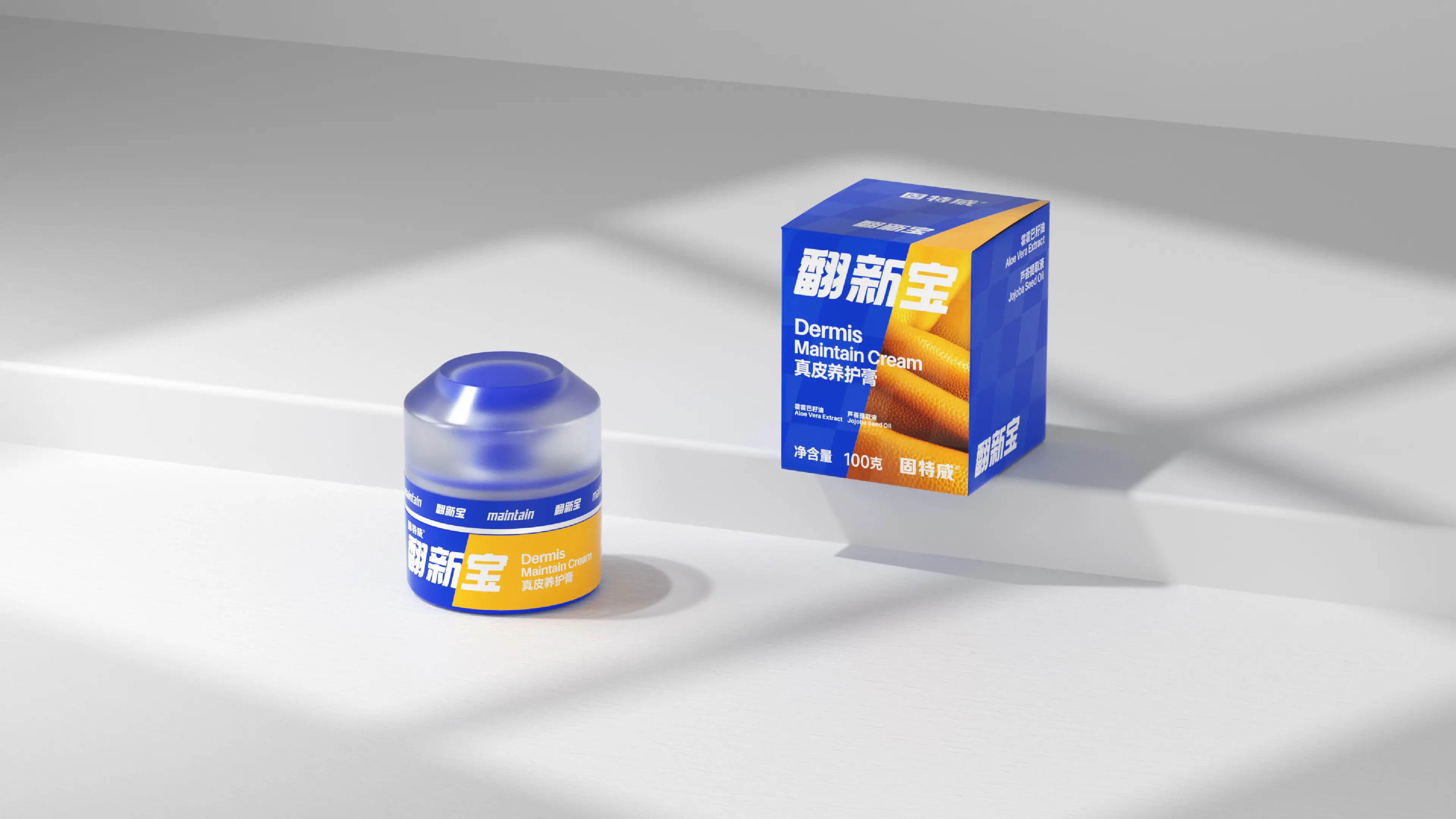
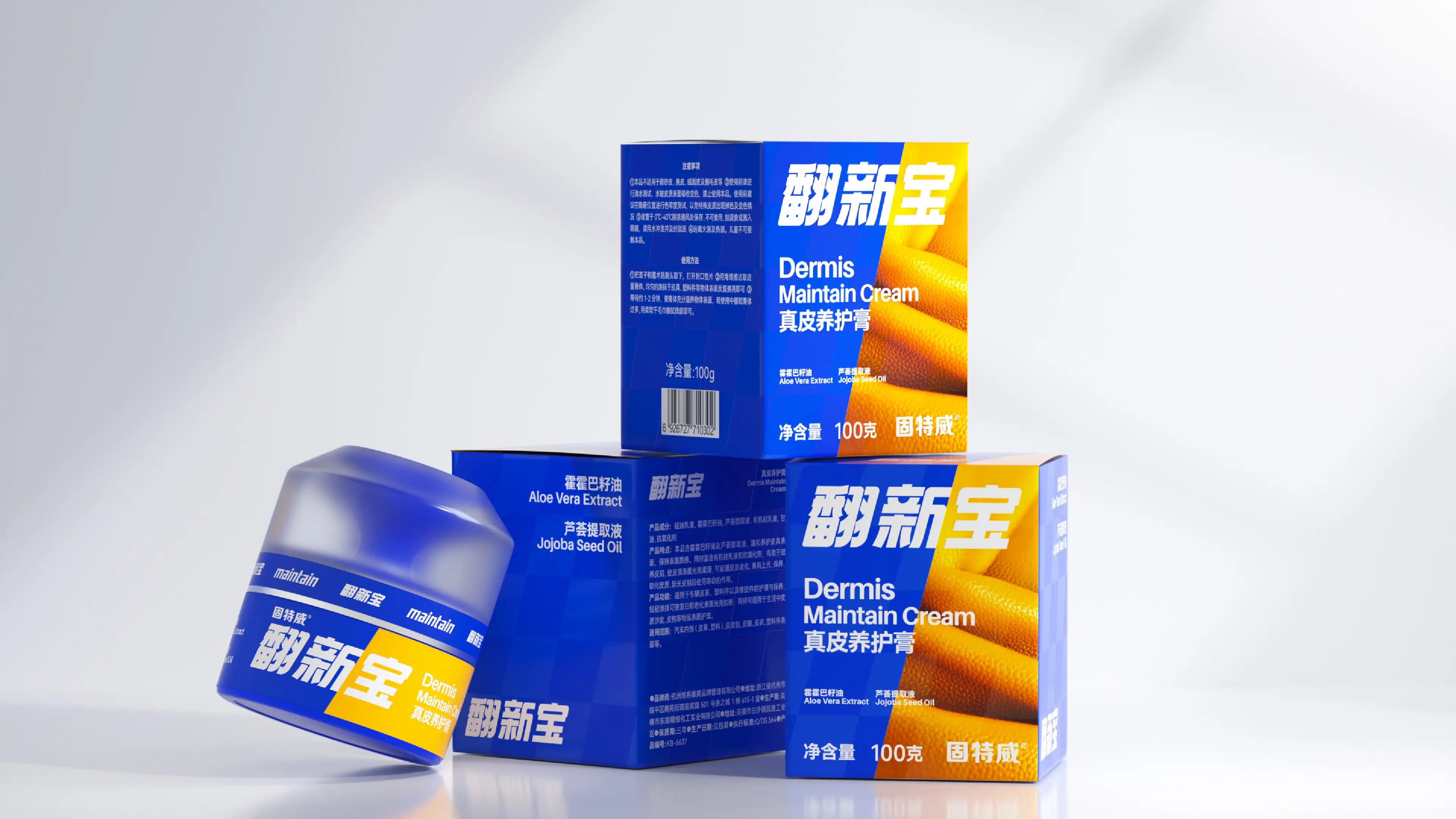
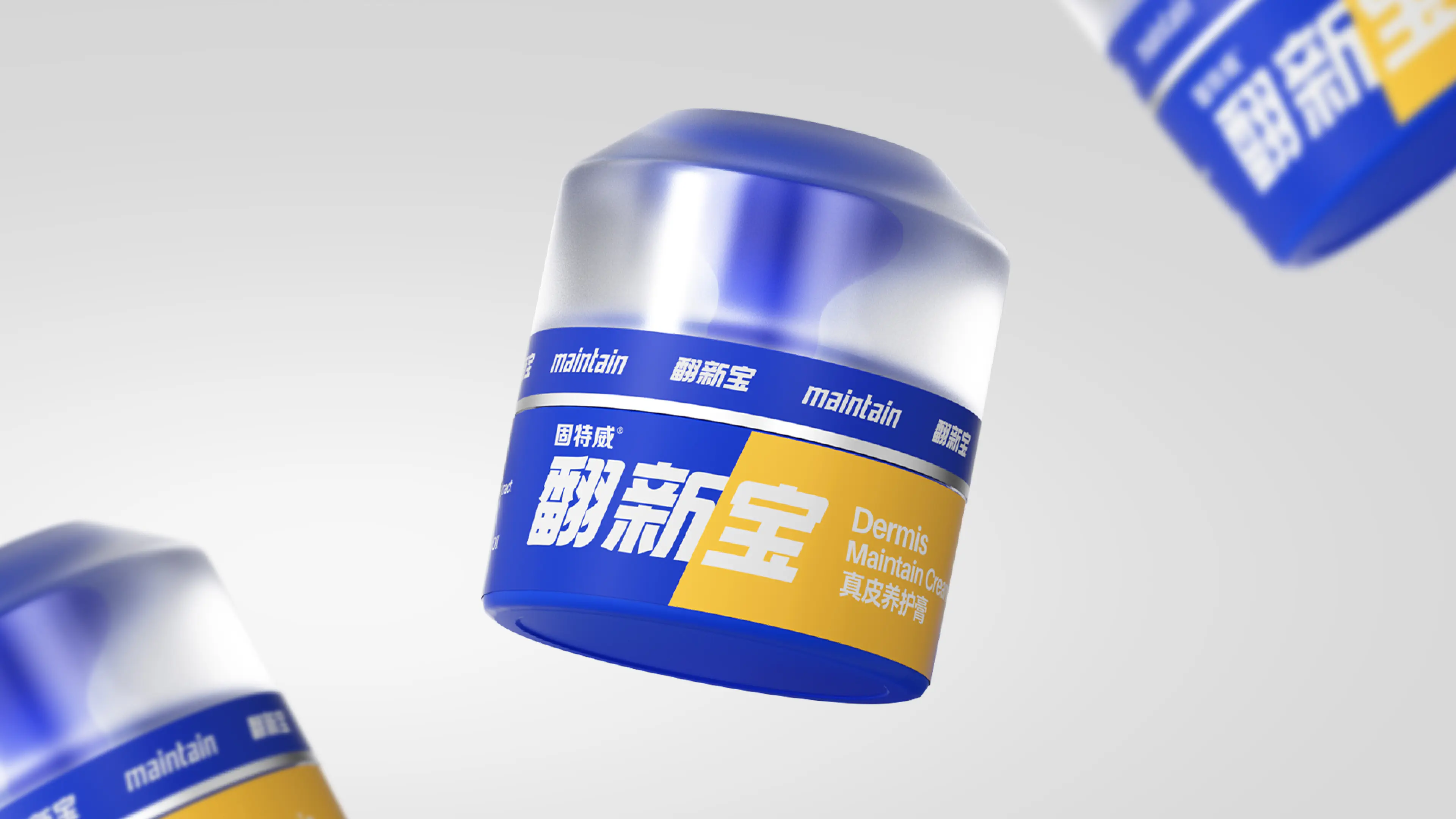
This project was to create a brand visual and packaging design system for FANXINBAO Genuine Leather Care Cream. Its core objective was to help the brand establish a strong recognition effect on the e-commerce side in a market environment where automotive interior cleaning products are severely homogenized. We observed that when consumers purchase automotive interior cleaning products, their most core decision-making basis is the before-and-after effect comparison. Based on this insight, we established the design direction of “comparison visualization.” In terms of color strategy, contrasting yellow and blue were adopted as the primary visual tone: yellow represents the “old, dirty, and dull” state before use, while blue symbolizes the “new, clean, and bright” state after use. This color strategy allows consumers to perceive the core value of the product immediately when browsing e-commerce pages. The before-and-after comparison effect is obvious and clear, effectively shortening the consumer decision-making path. Through this brand visual design system combining recognition efficiency, conversion power, and brand tonality, FANXINBAO has successfully upgraded from a functional cleaning product to a professional automotive interior cleaning brand with strong visual recognition, high e-commerce conversion power, and clear brand positioning.