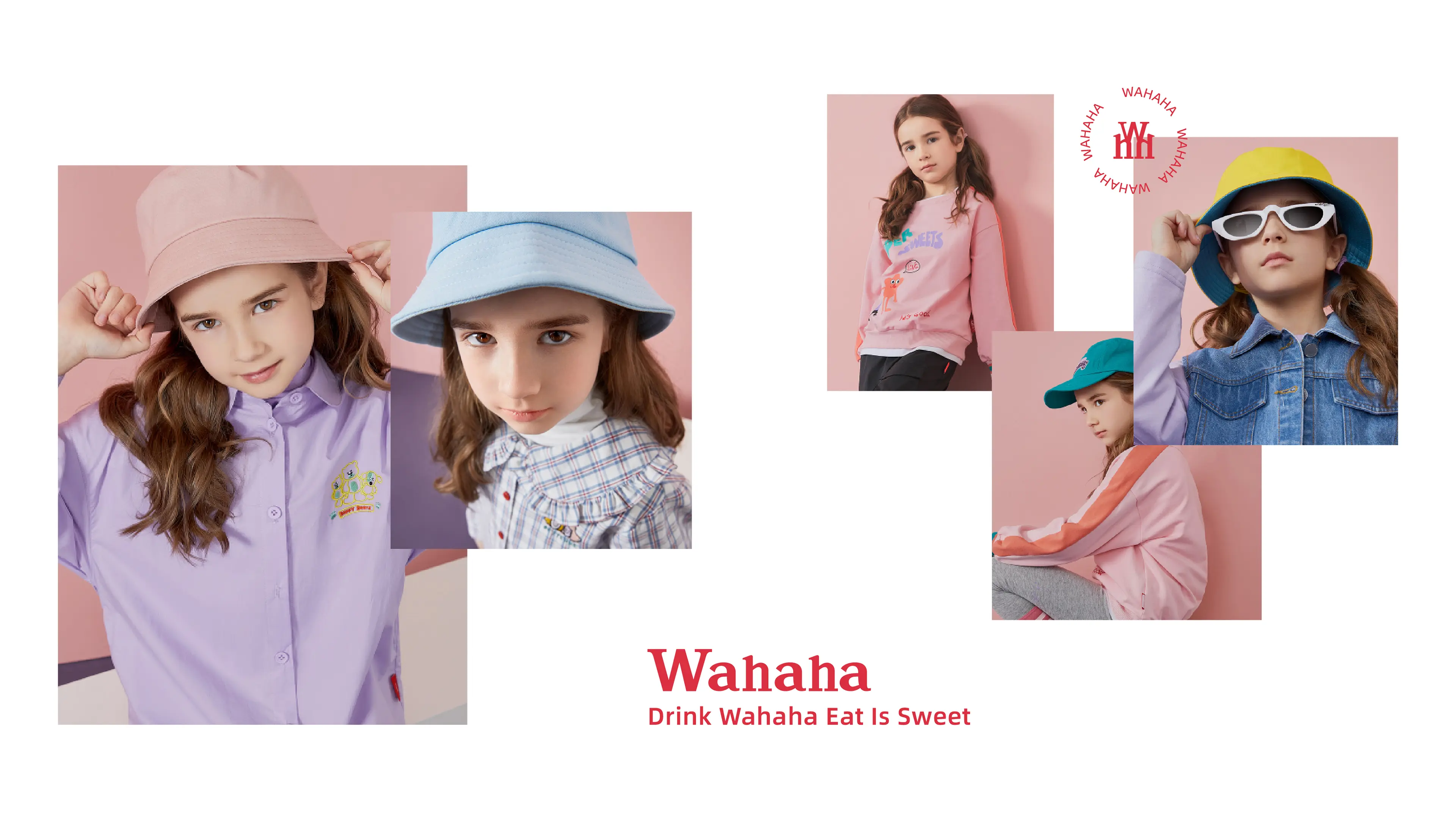
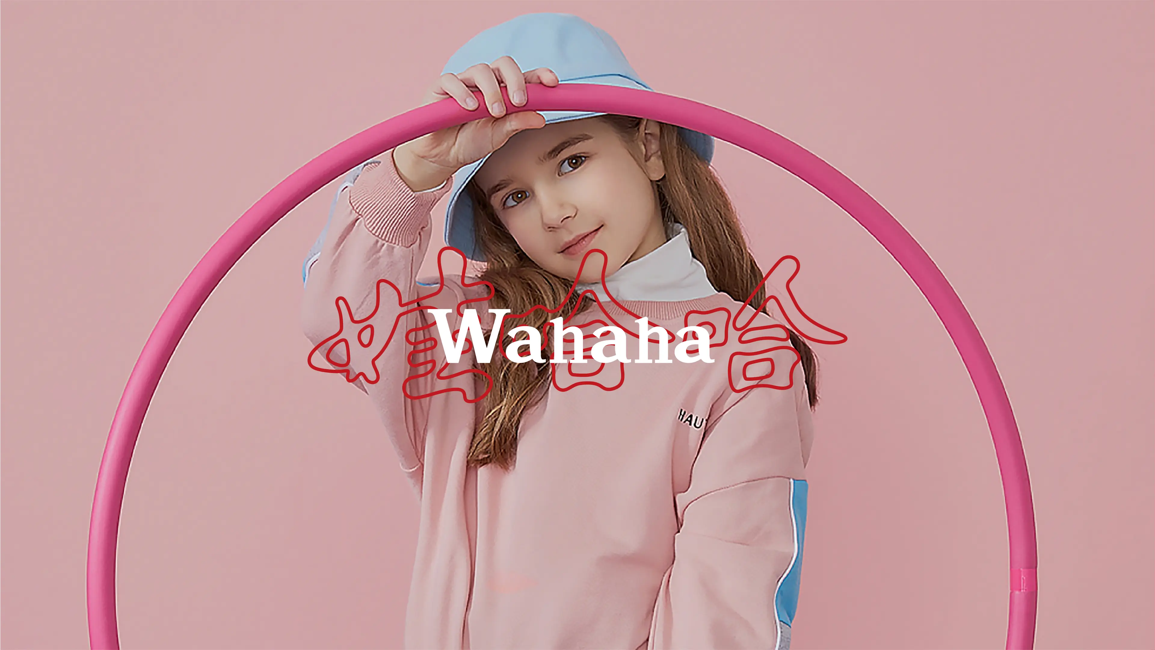

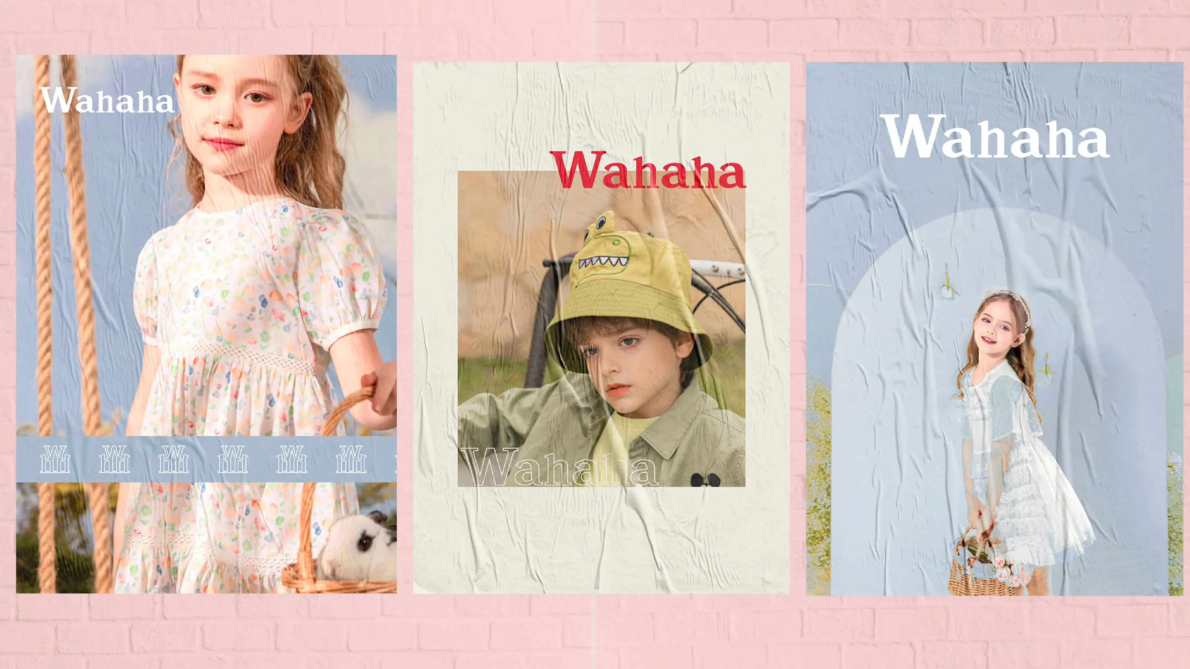

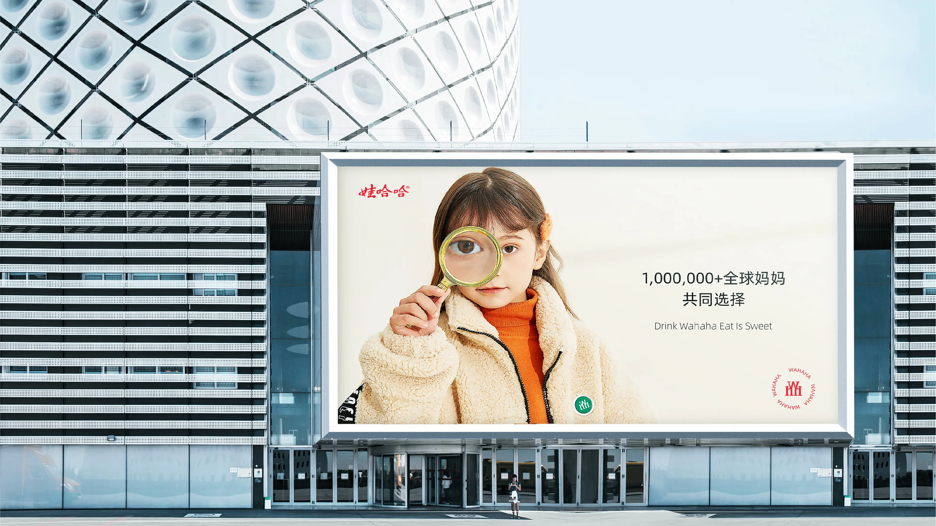


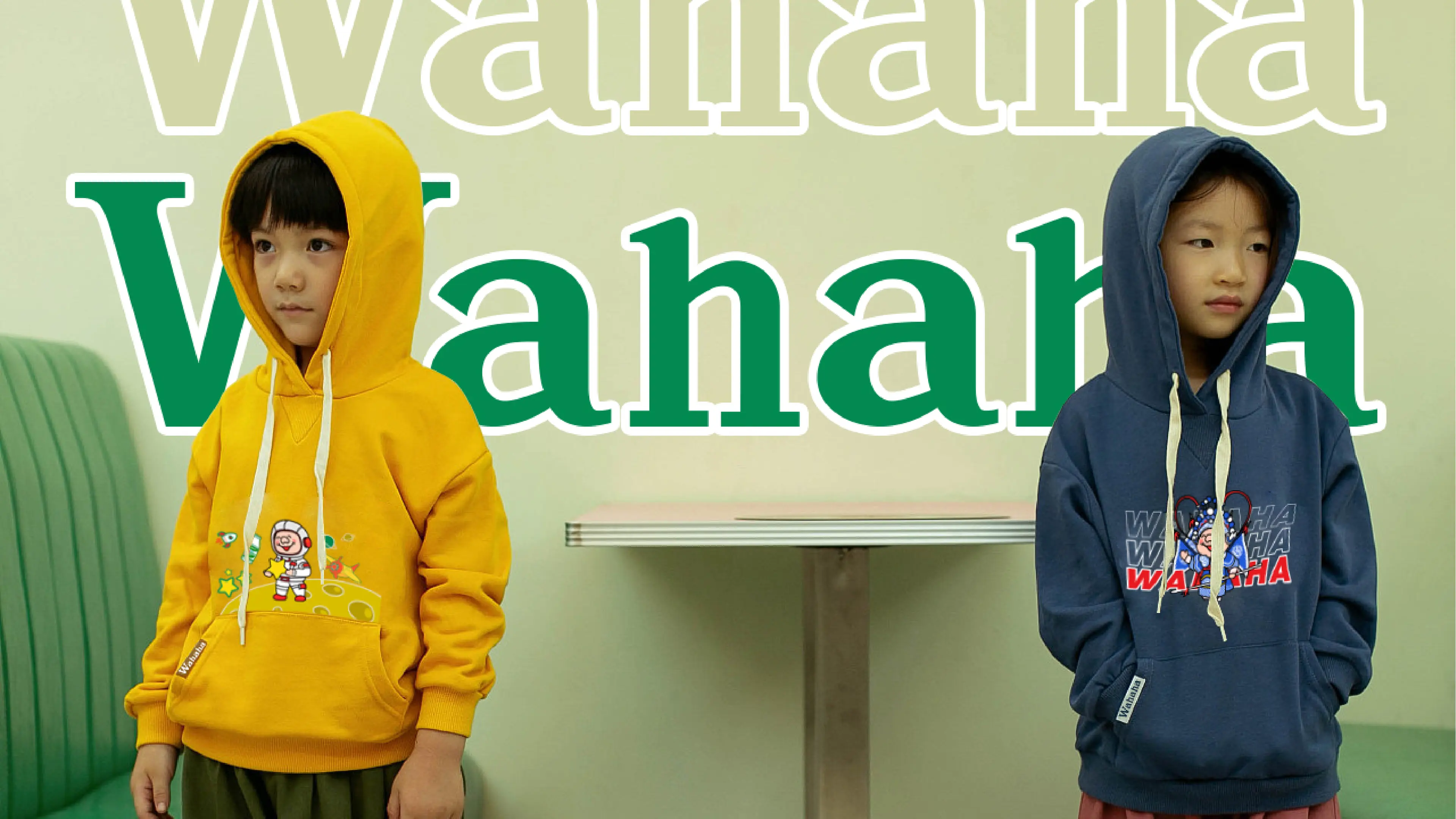
Wahaha Children's Clothing belongs to the national-established group Wahaha and is a children's clothing brand created by the group for its cross-border layout of the children's clothing sector. The brand has been deeply involved in the children's clothing market for 0-14 years old, always adhering to the core concepts of health, comfort, and beauty, selecting safe and environmentally friendly fabrics, and insisting on high-quality workmanship. It targets contemporary parents and children groups. Leveraging Wahaha's decades of accumulated national sentiment and strong brand appeal, the children's clothing product line breaks away from the ordinary children's clothing sector, integrating nostalgic sentiment, national trendiness, and modern children's fashion, creating national children's clothing that combines the warmth of sentiment, safety quality, and trendy aesthetics, protecting children's colorful and happy childhood moments.
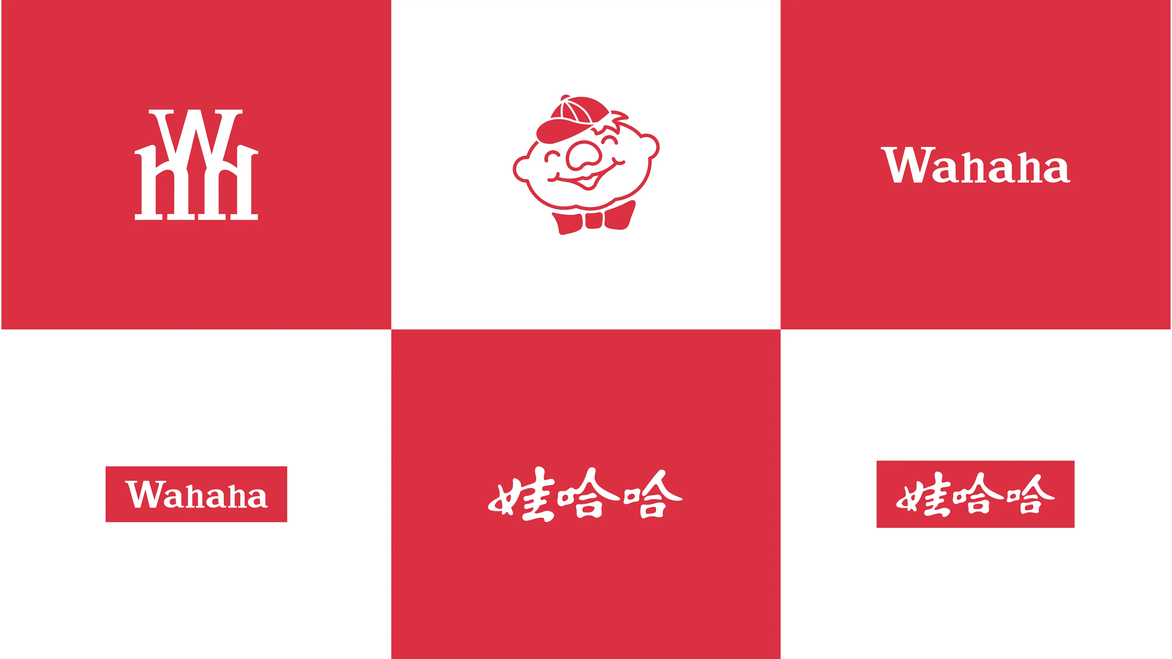
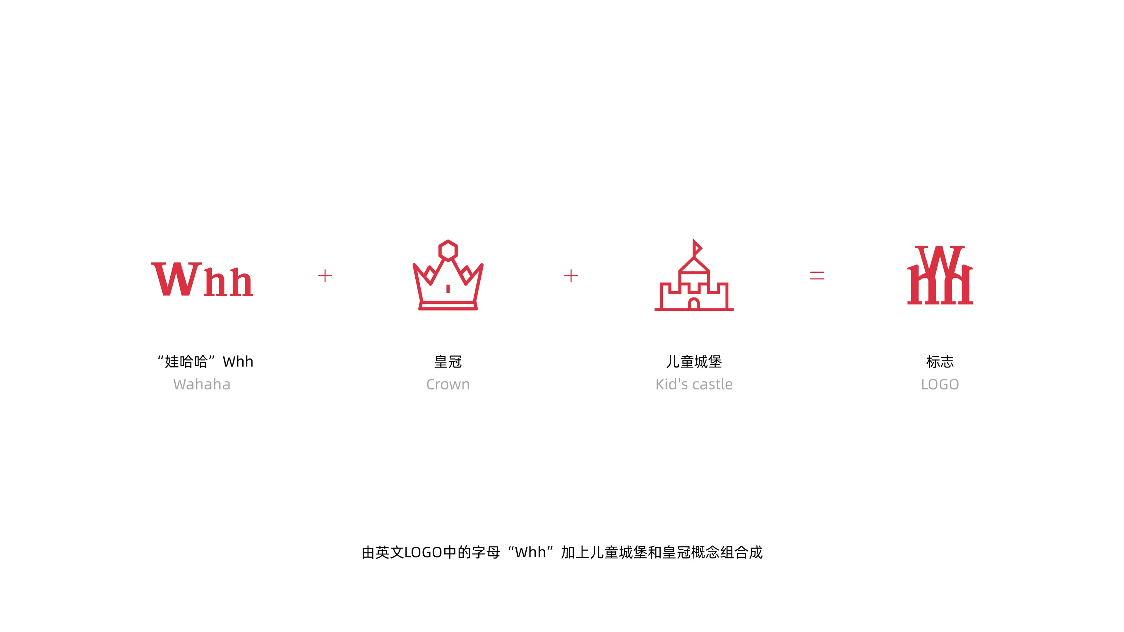
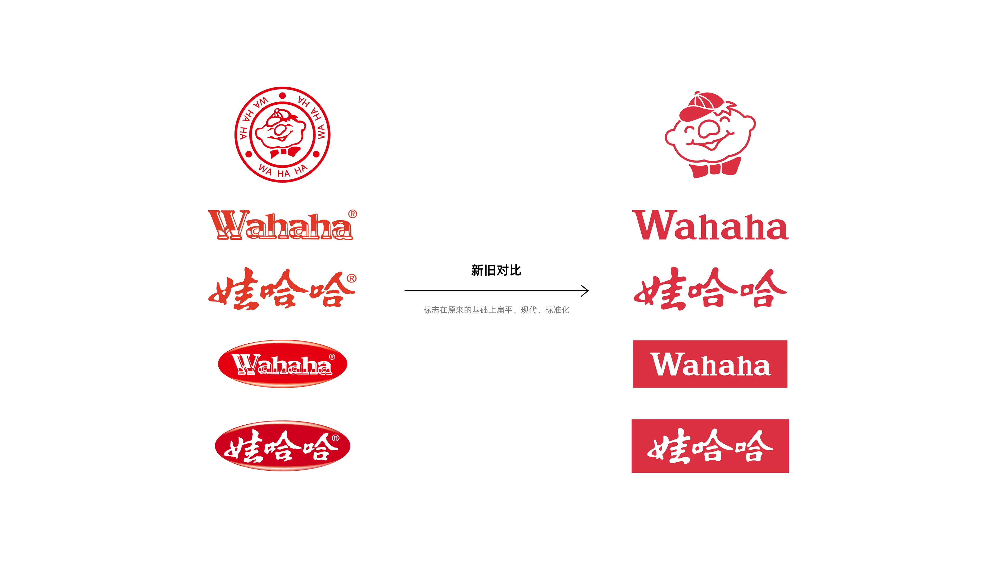
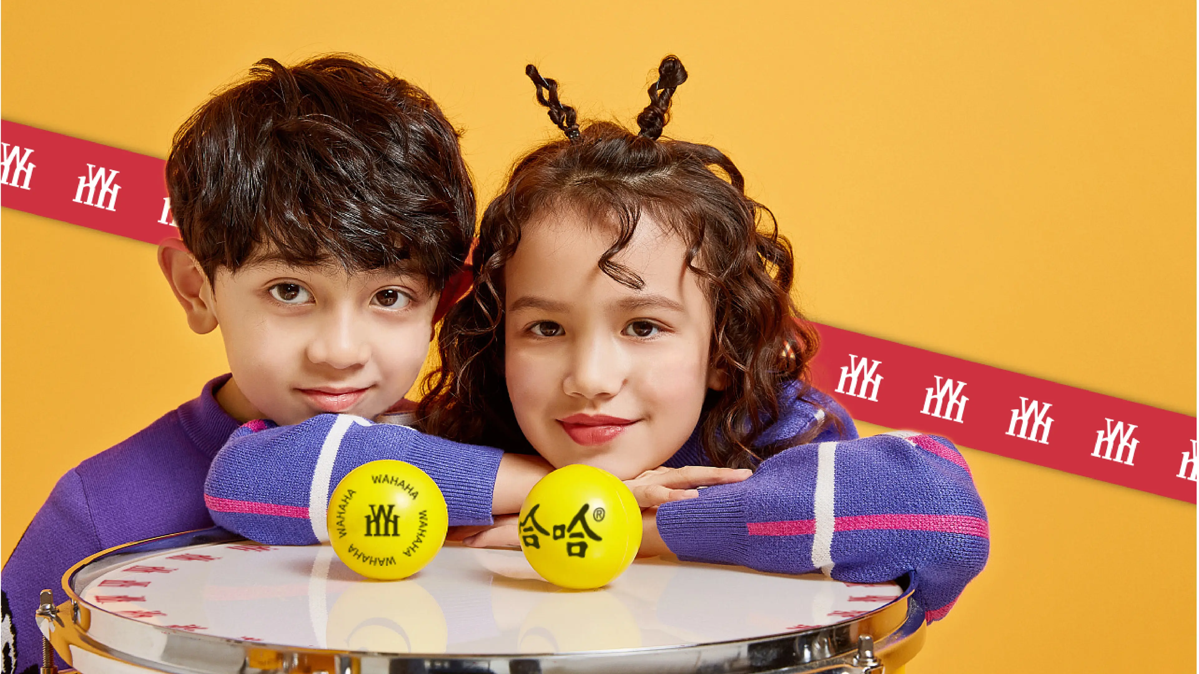
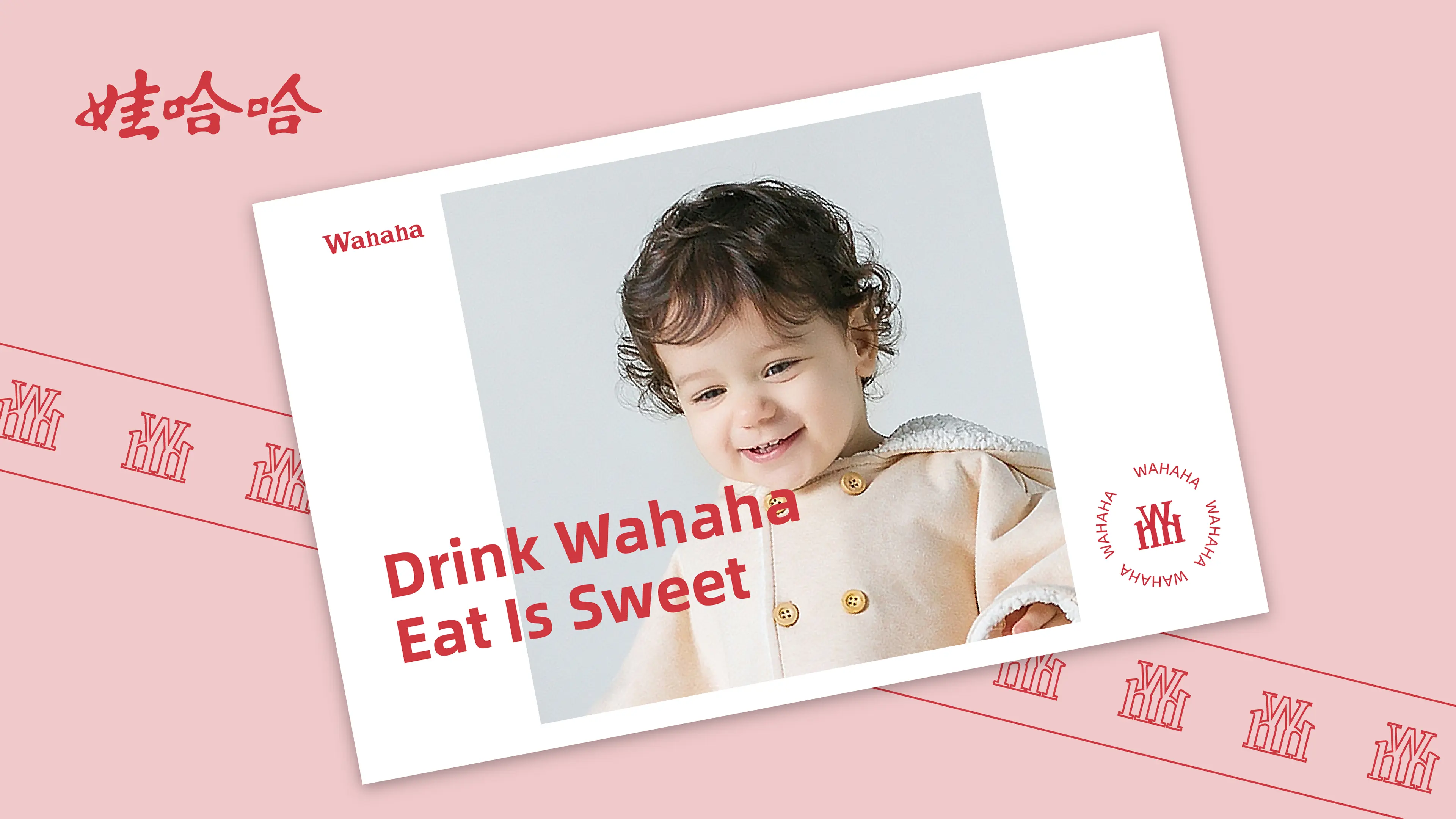
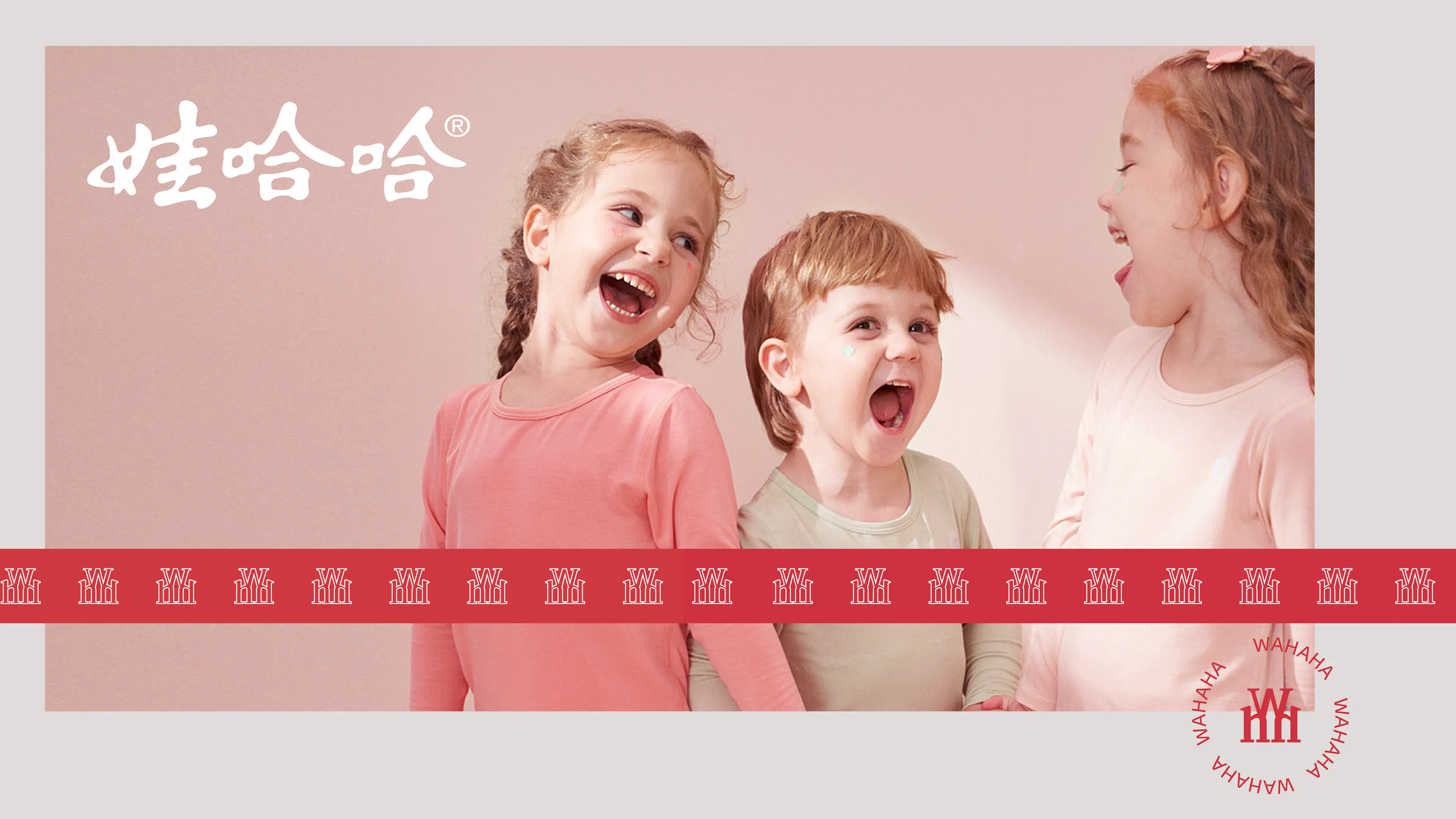
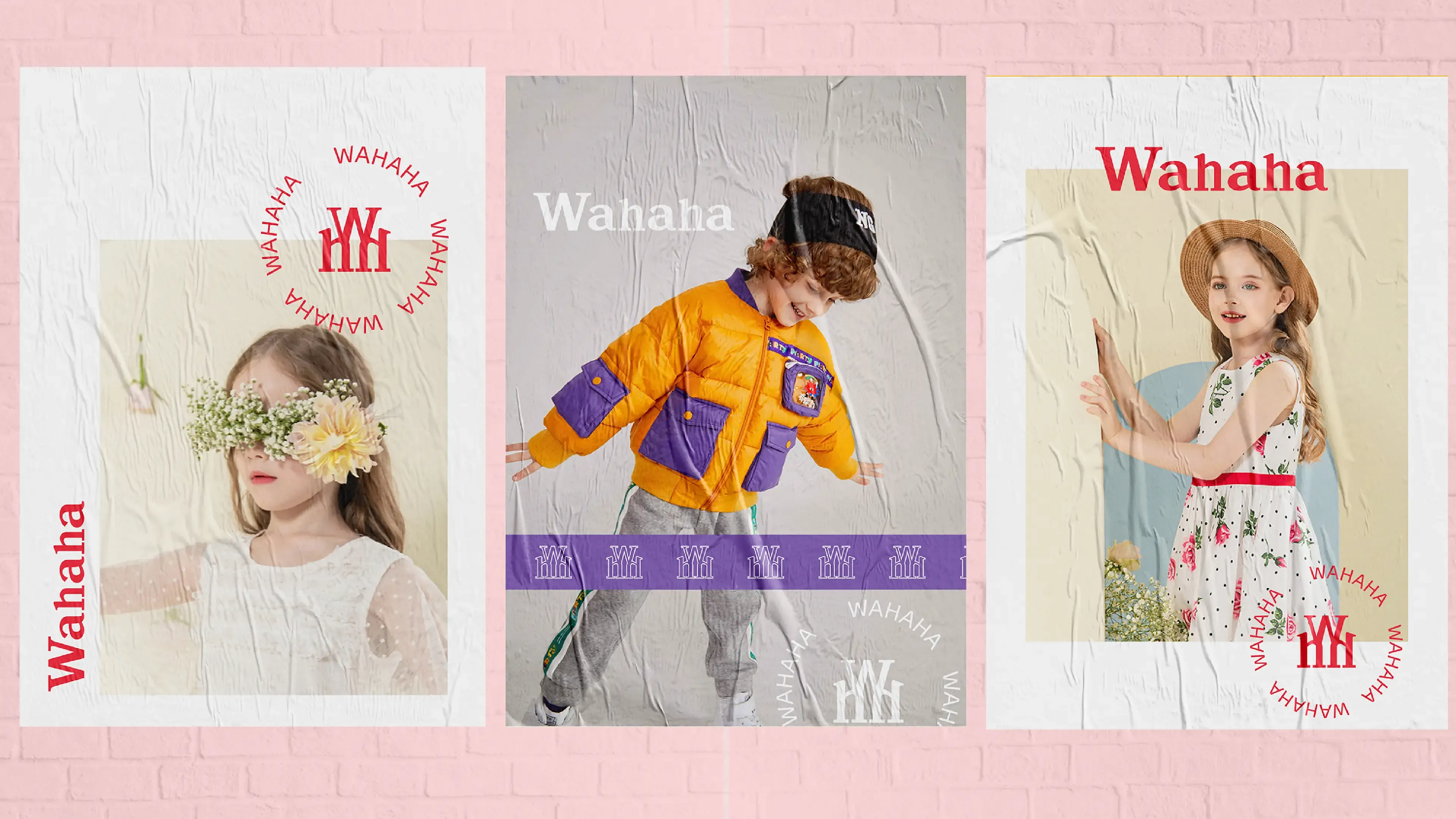
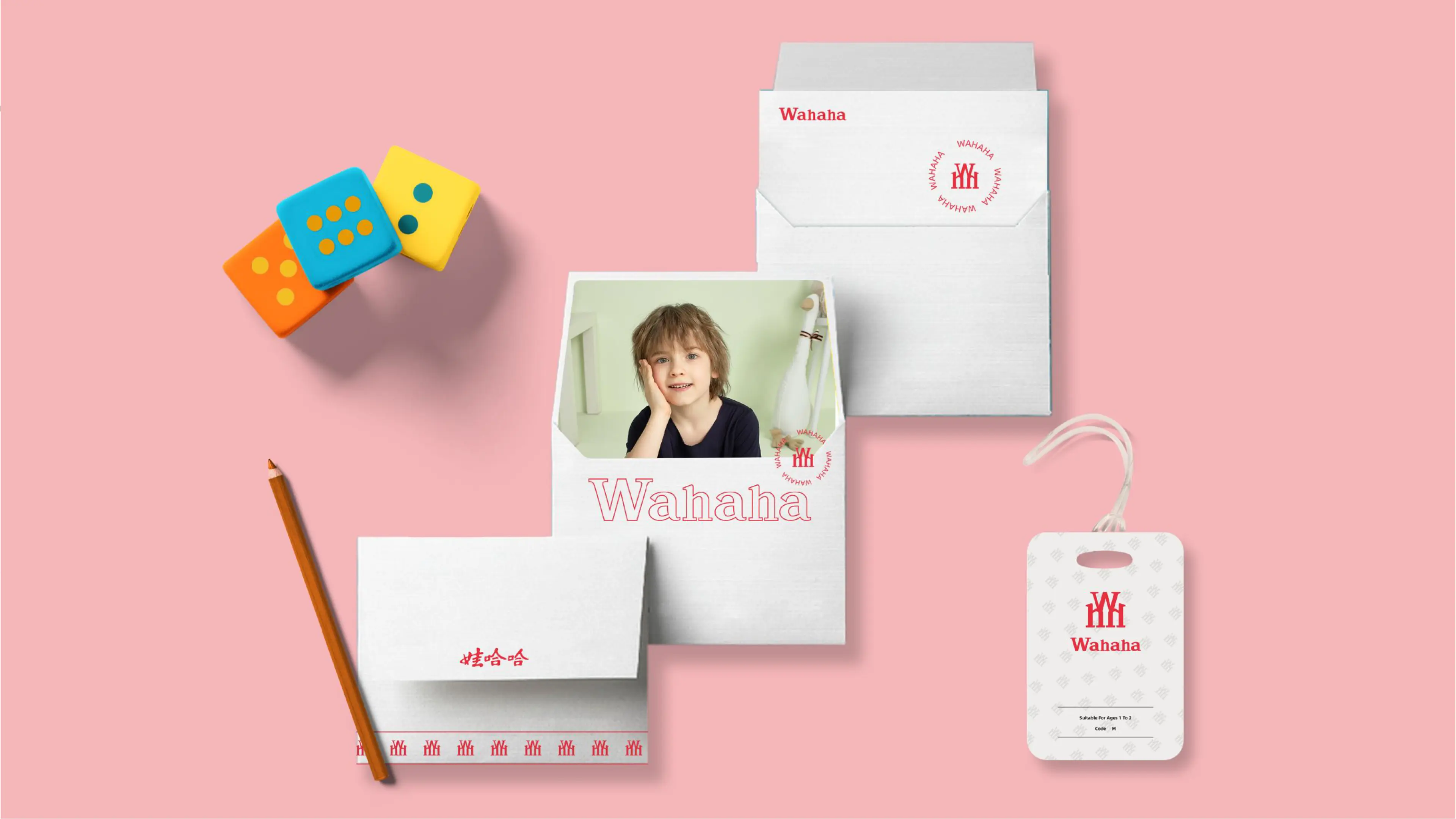
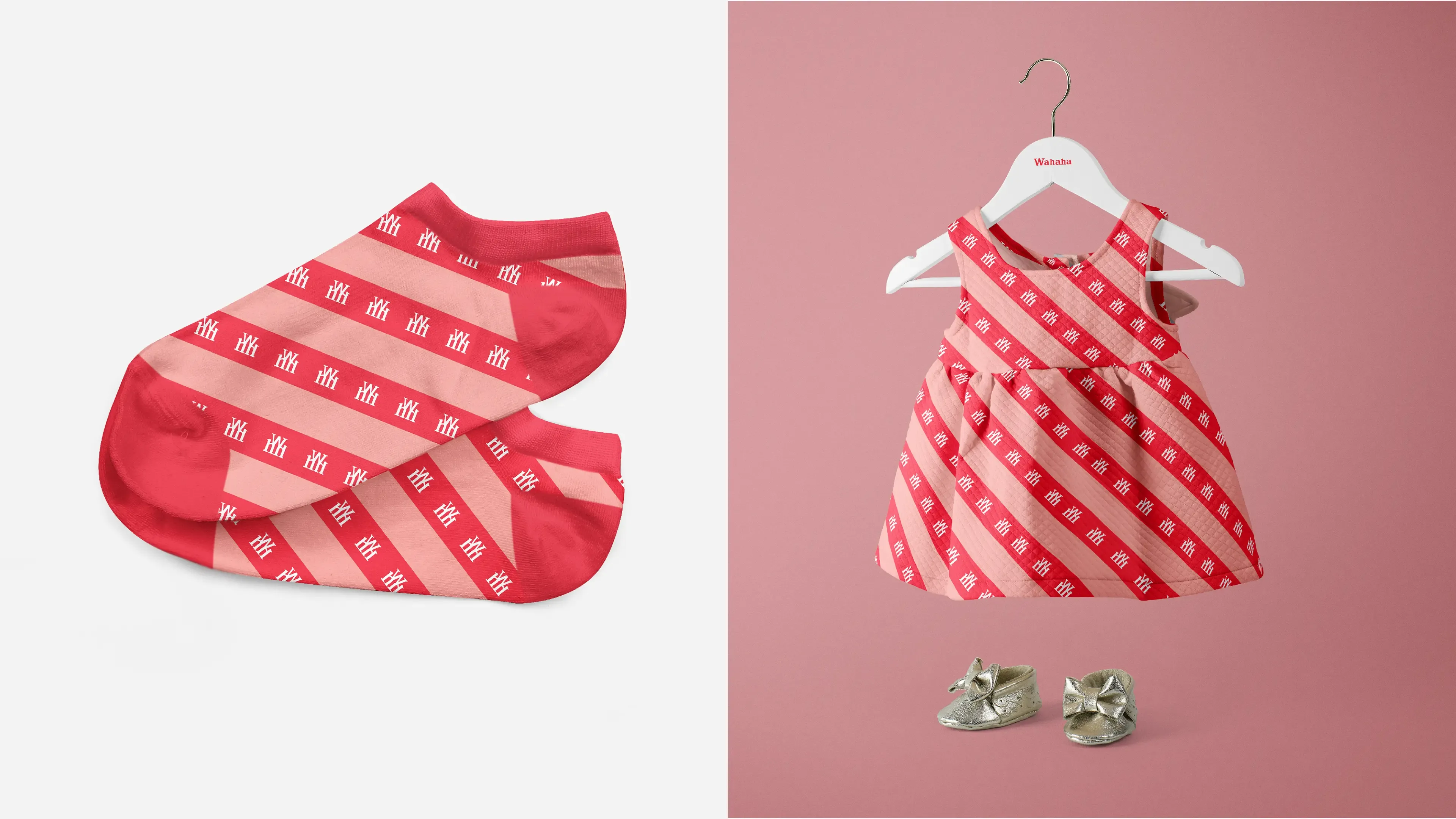
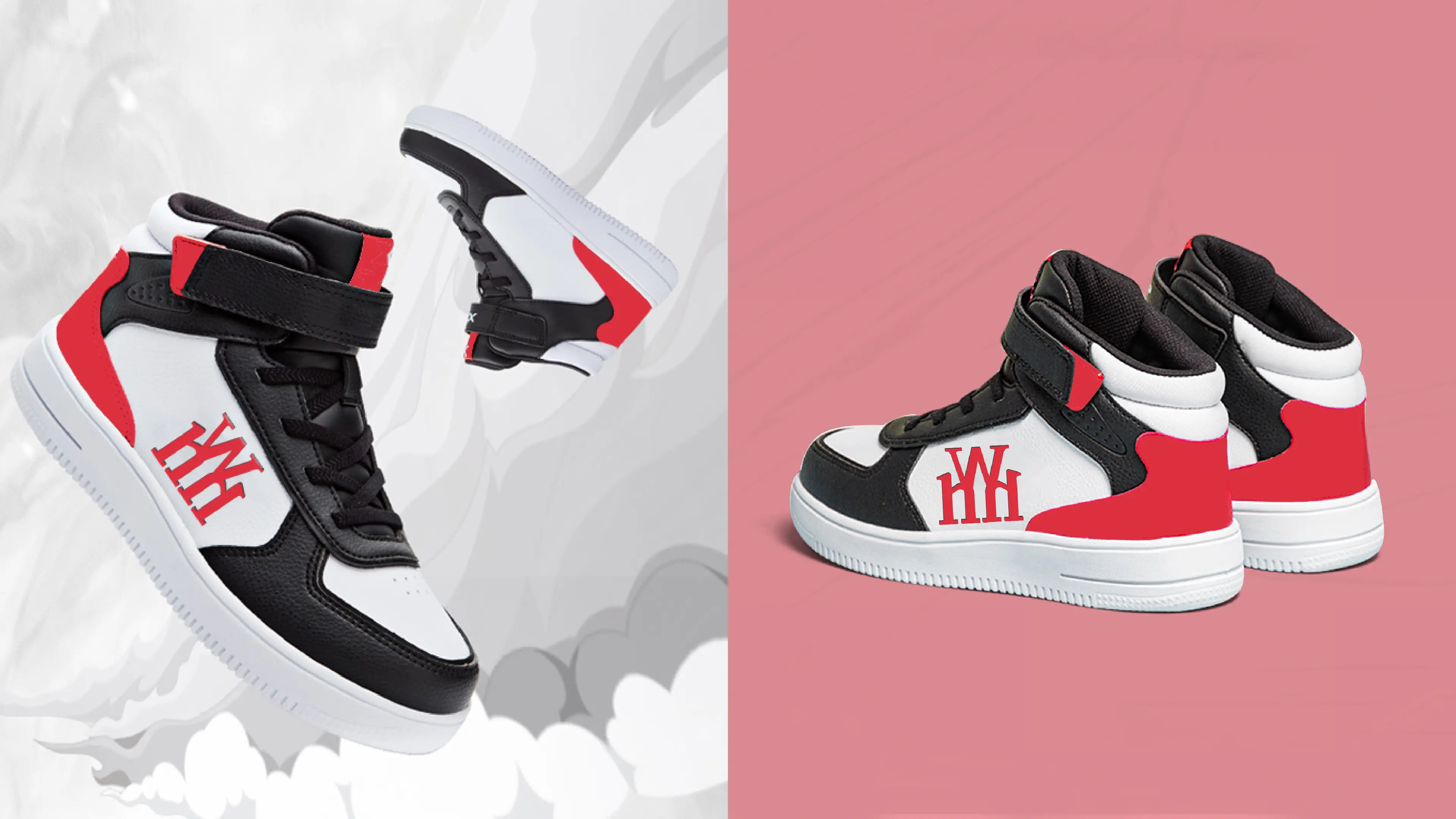
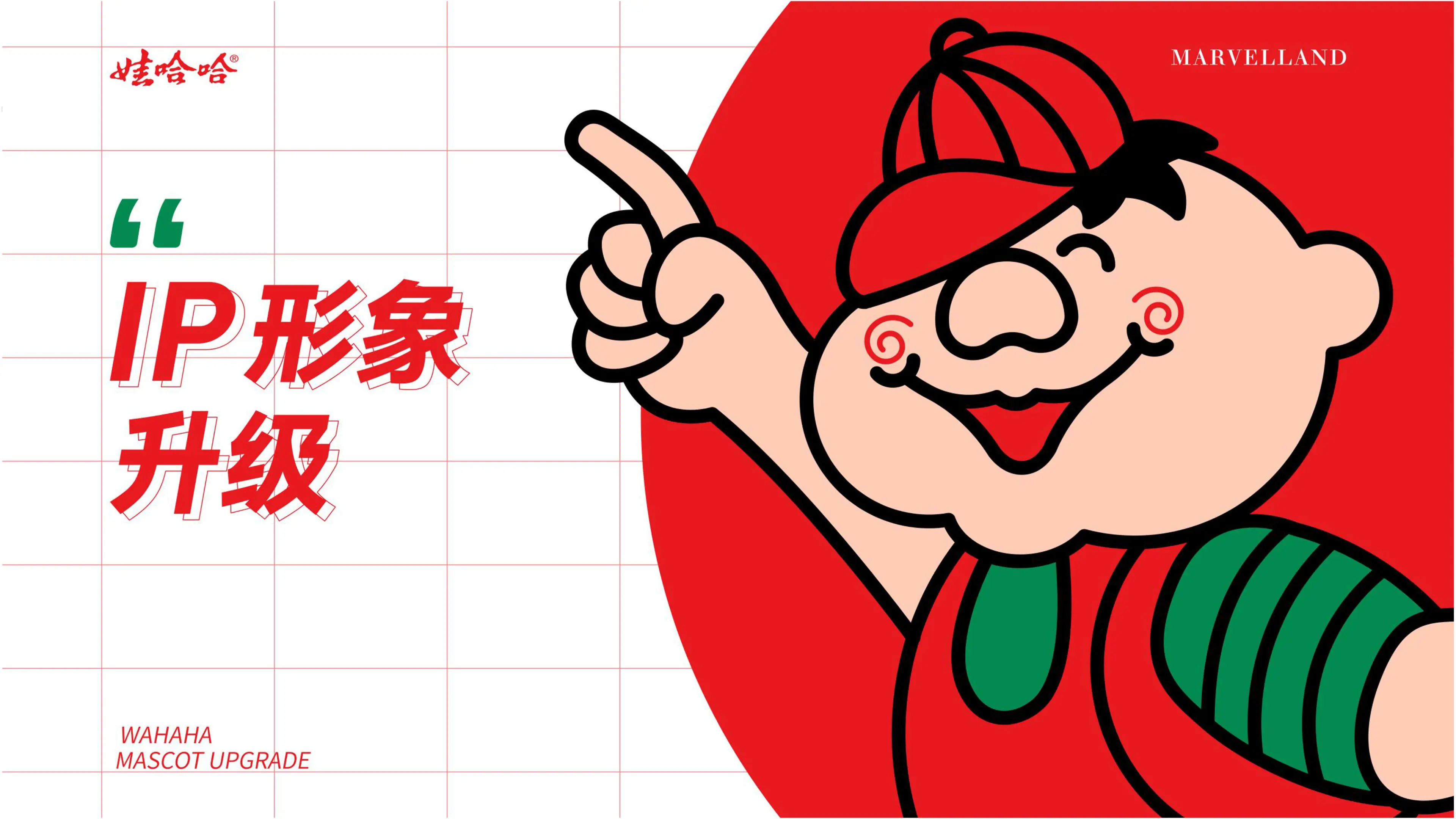
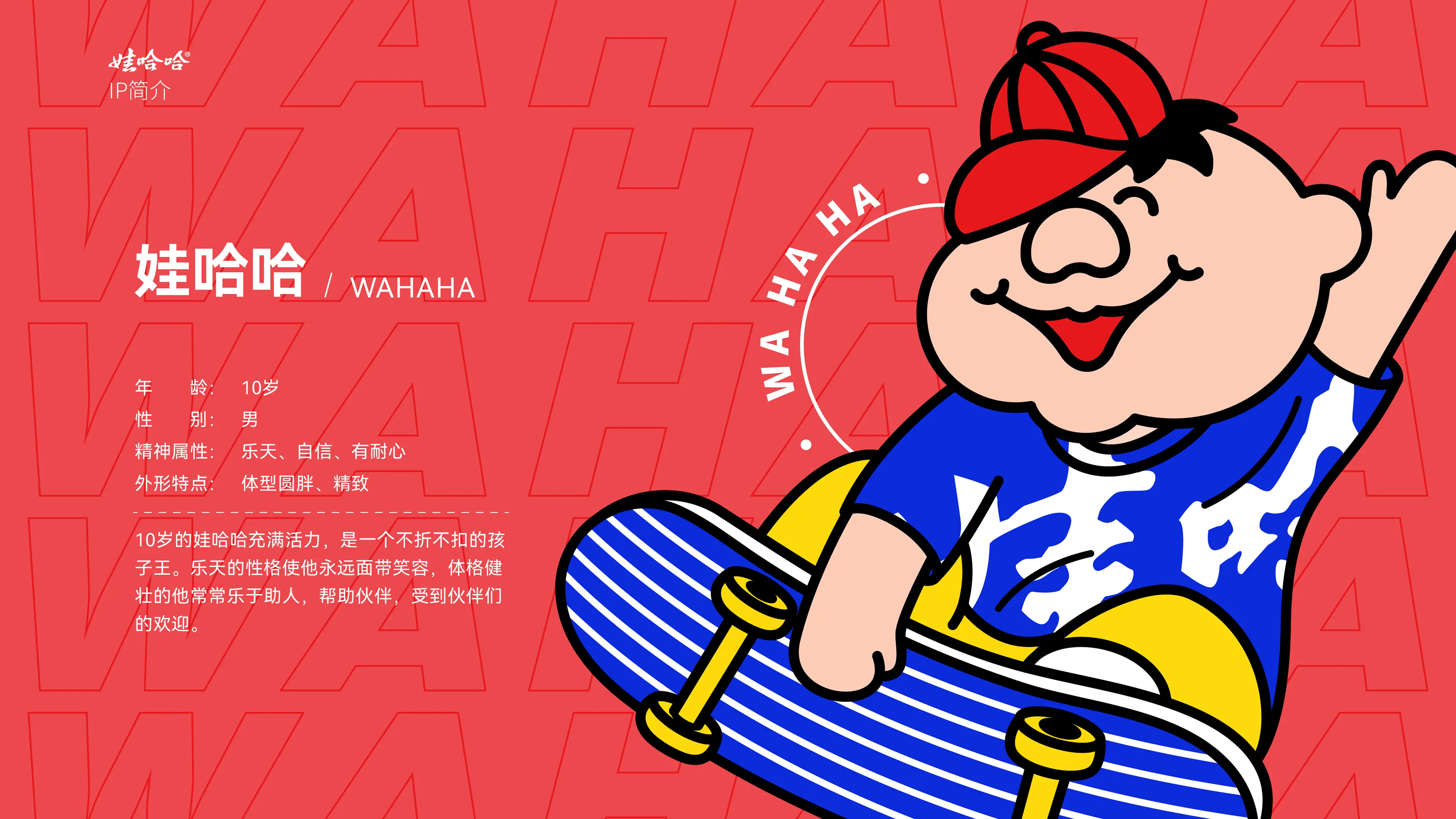
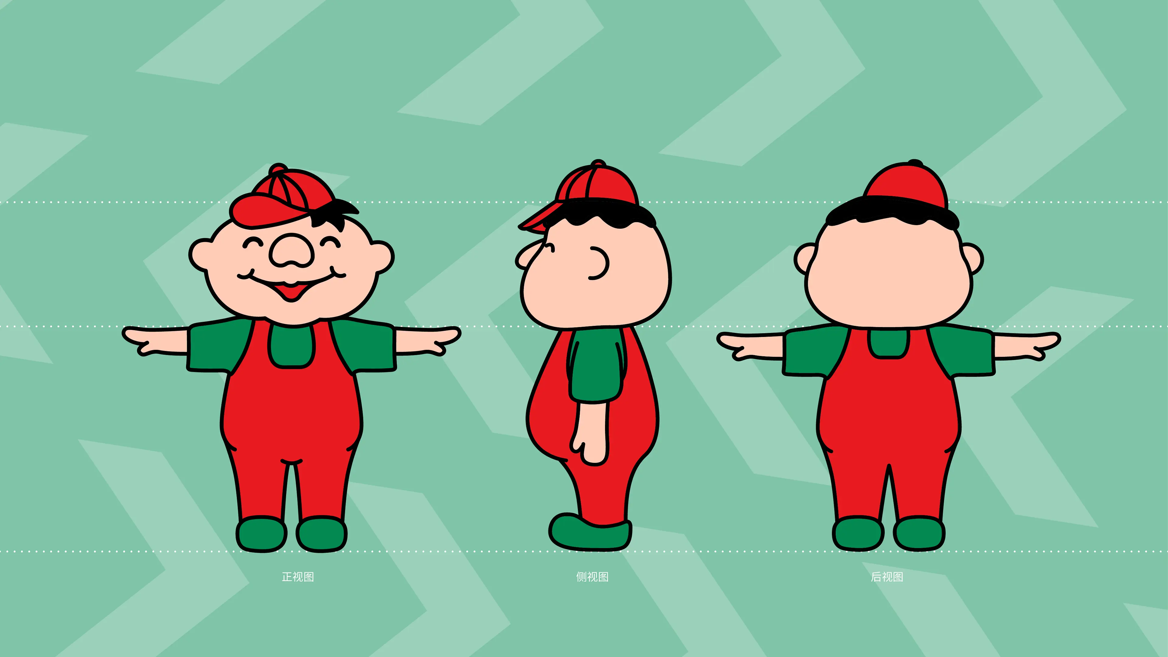
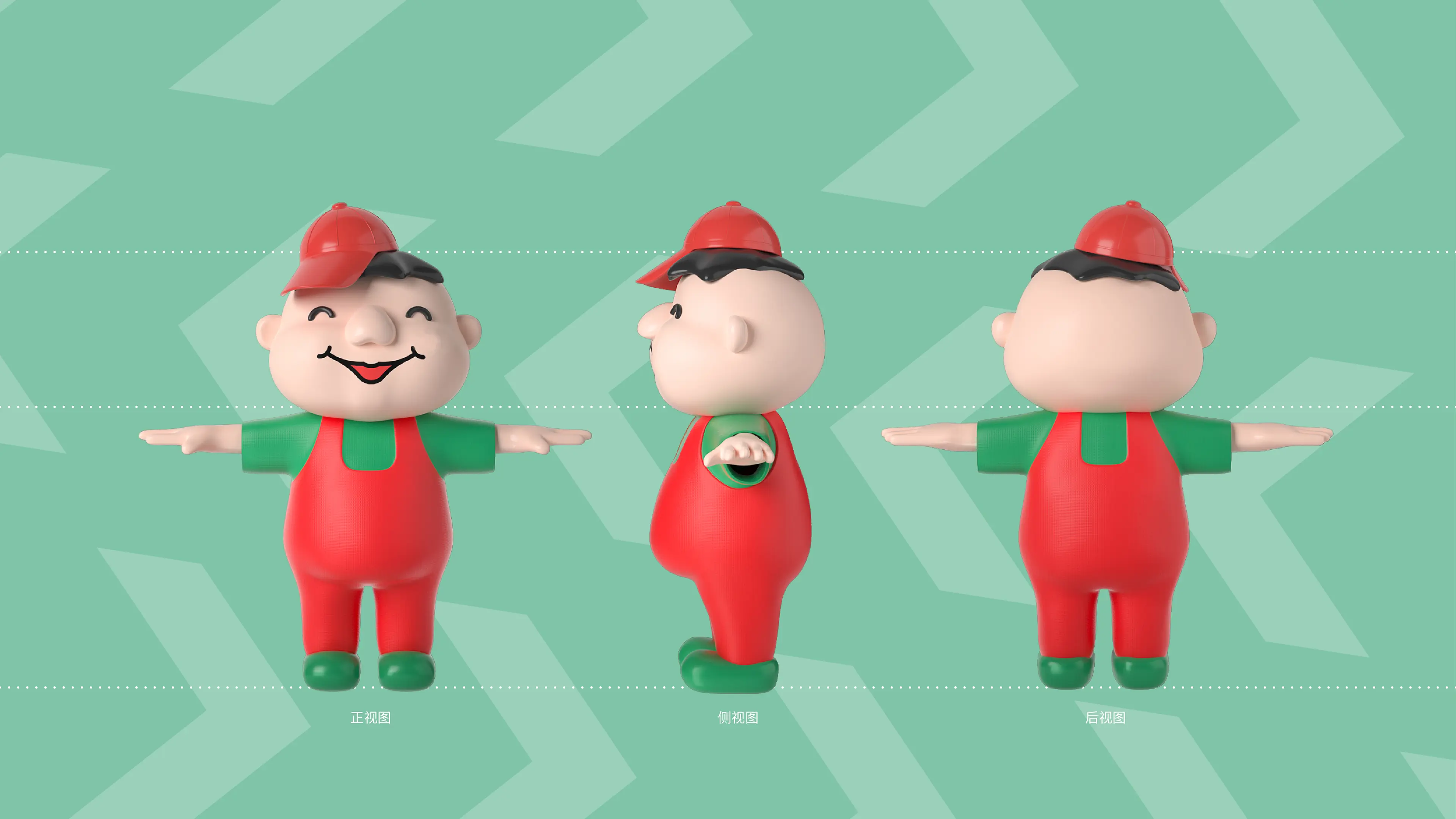
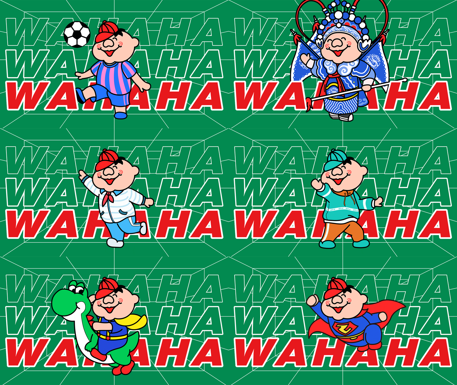
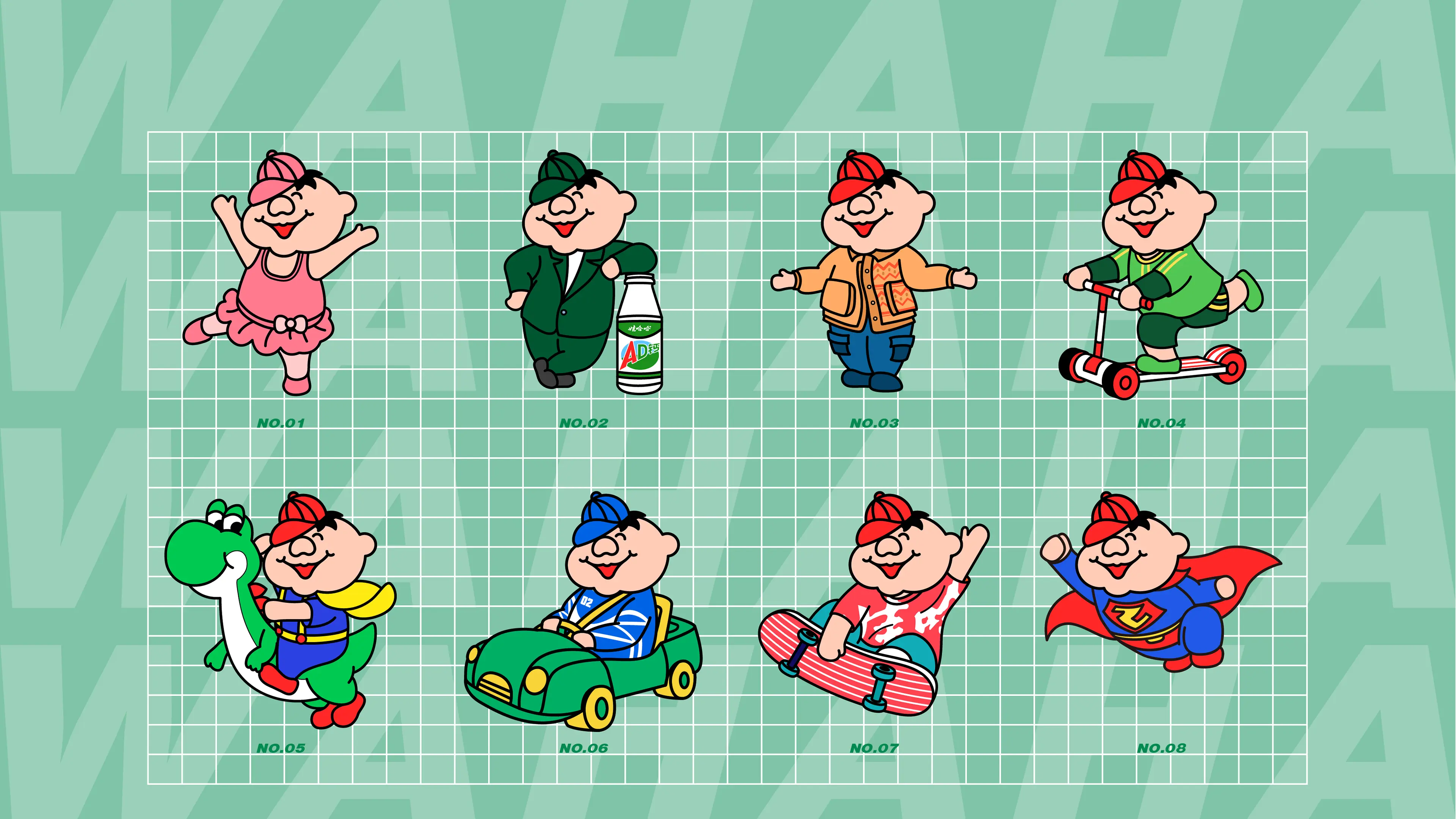
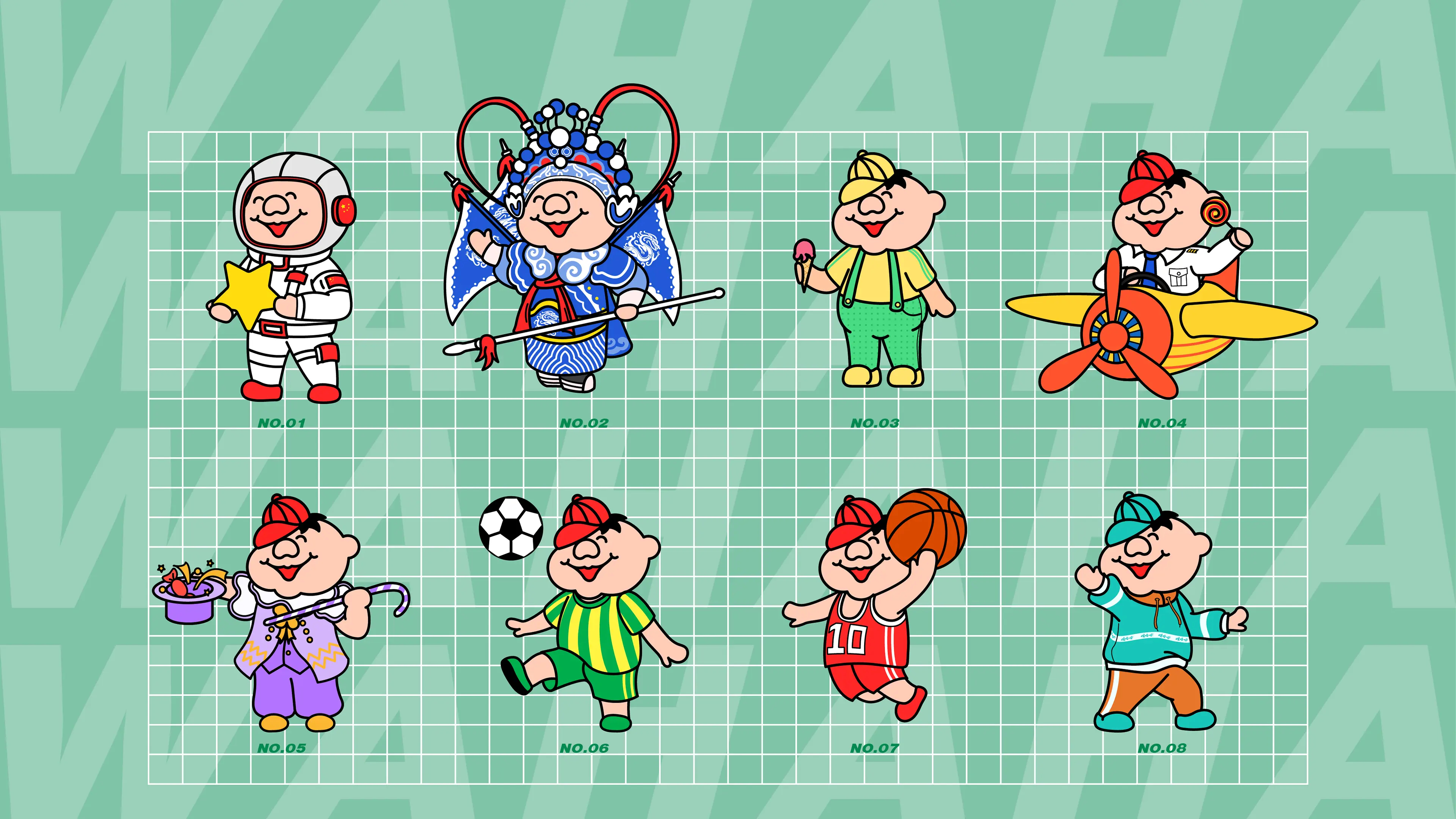
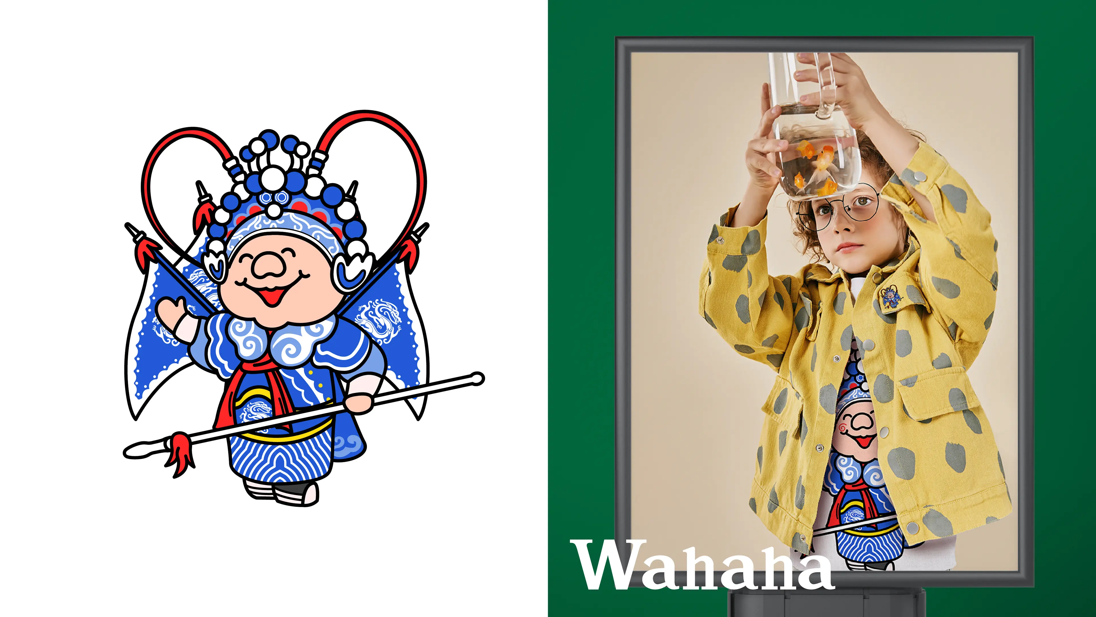
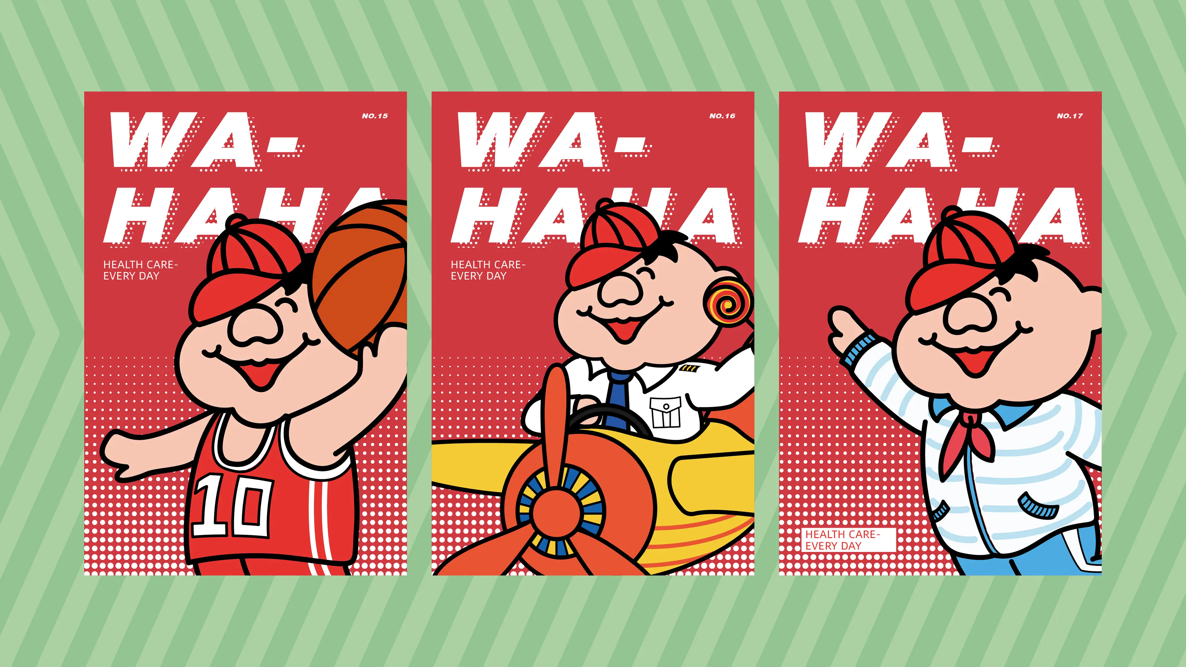
This brand visual upgrade was centered around four core themes: childlike fun, vitality, national sentiment, and parent-child trends. The design team broke away from the traditional ornate and complicated design patterns of children's clothing, visualized Wahaha's national IP genes and the children's clothing sector, and created a unique visual symbol for children's clothing. The color selection was vibrant and bright, with low stimulation, matching the lively and innocent temperament of children; the font shape was round and smooth, with soft and dynamic lines, conveying a relaxed and happy childhood atmosphere.
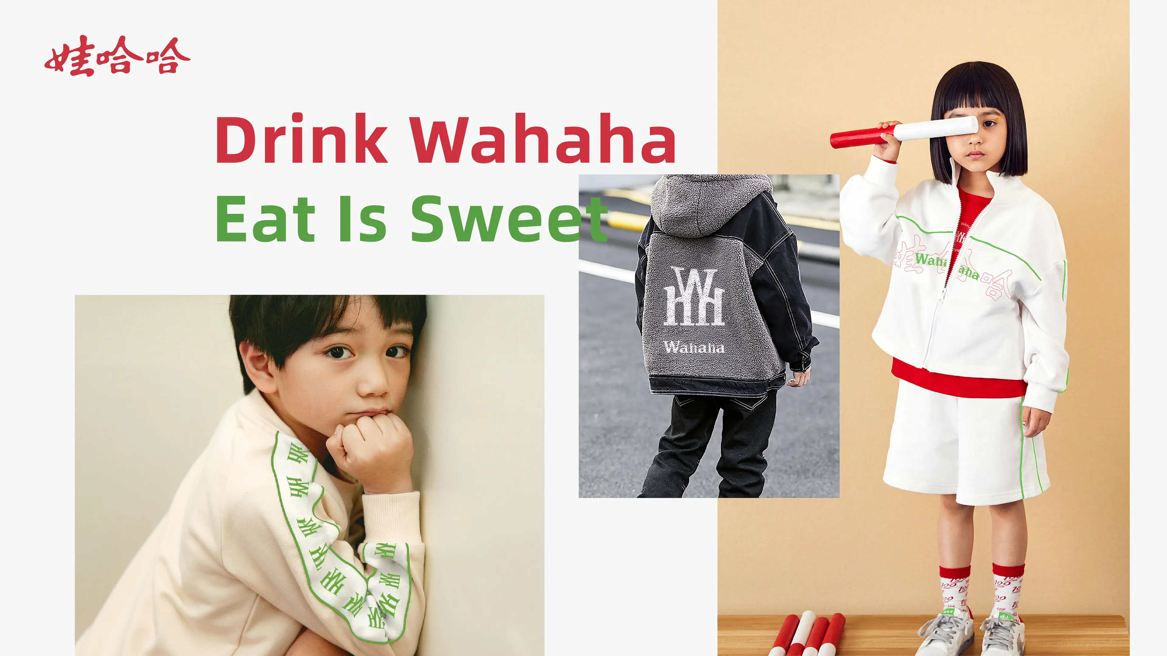
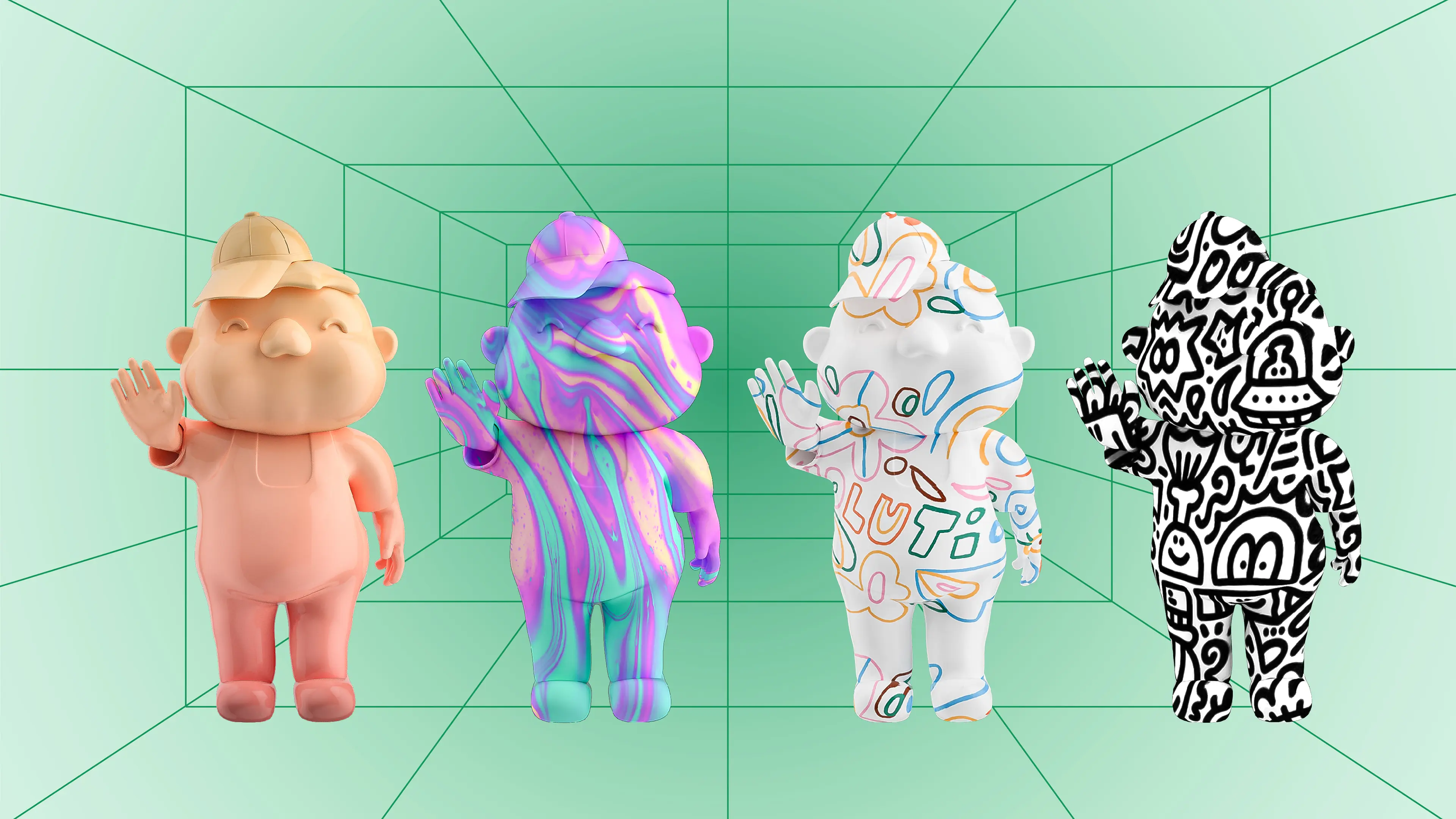
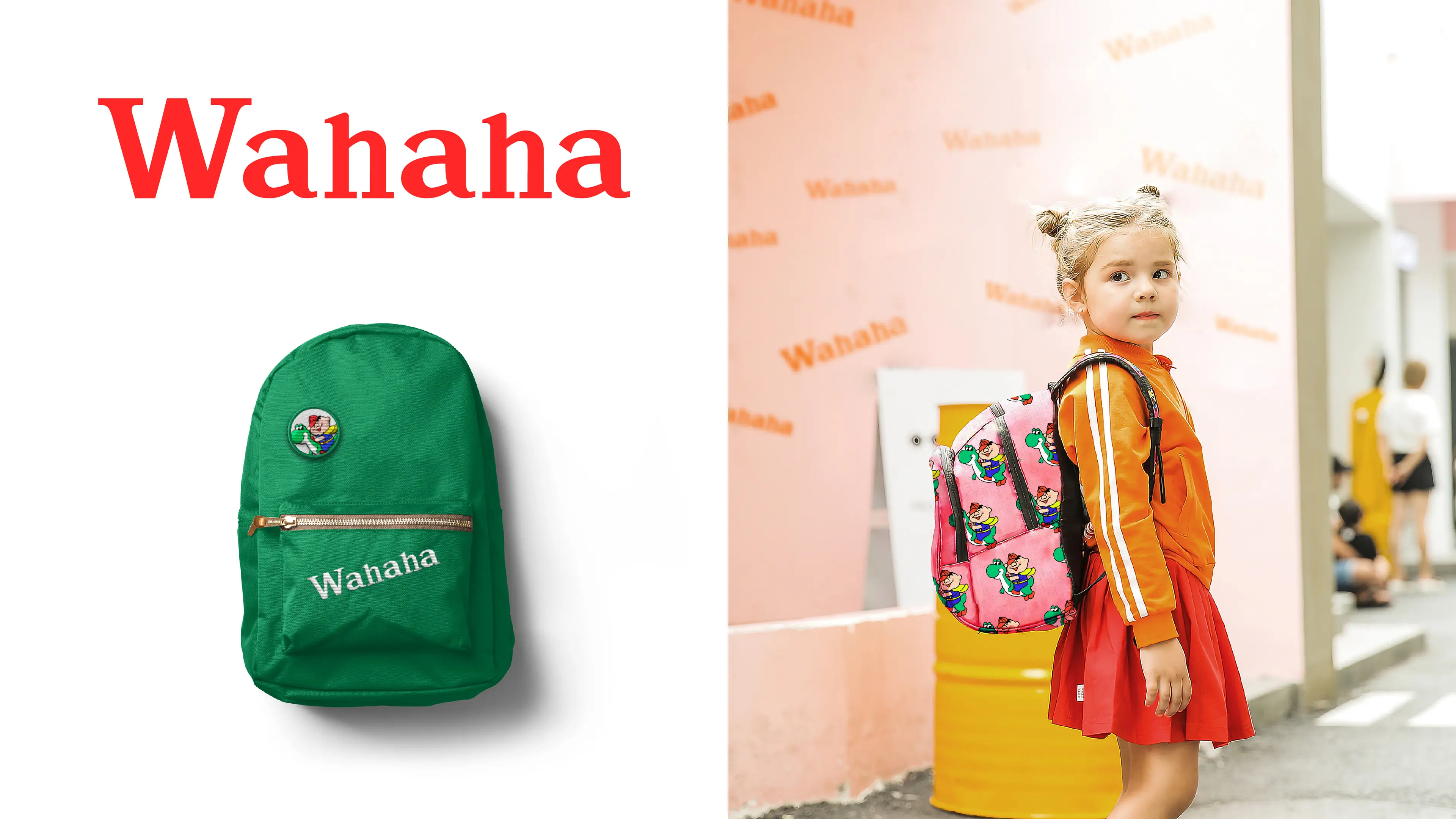
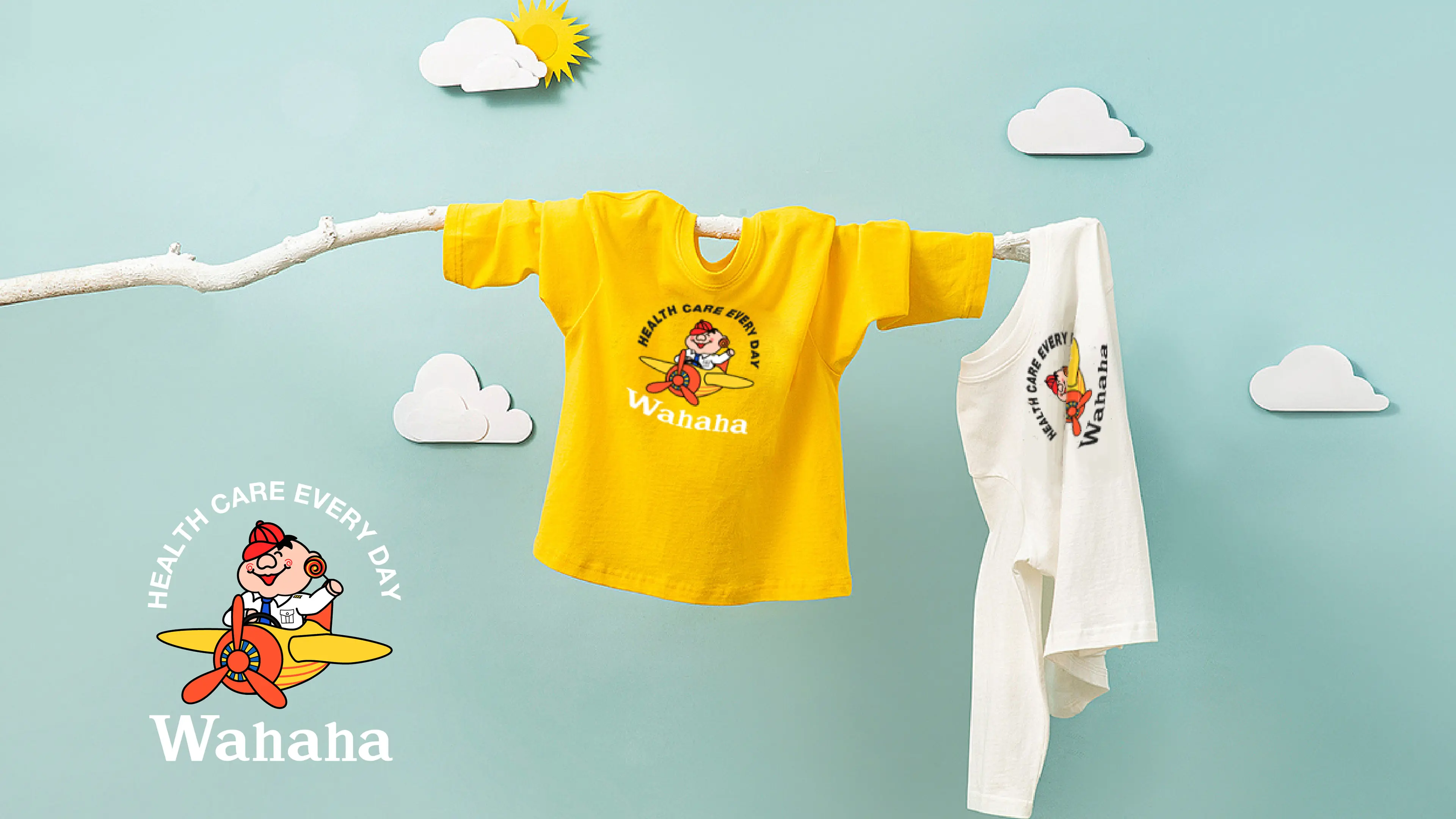
The entire visual system extended from the new LOGO logo, tags, clothing prints, packaging to online e-commerce promotional materials and offline store space materials, establishing a complete and unified children's clothing brand visual system. It not only continues Wahaha's deeply rooted national brand impression but also creates a new and youthful, trendy image for the children's clothing sector, achieving a high degree of unity of national sentiment, children's aesthetics, and brand cross-border positioning.