

 |  |
 | 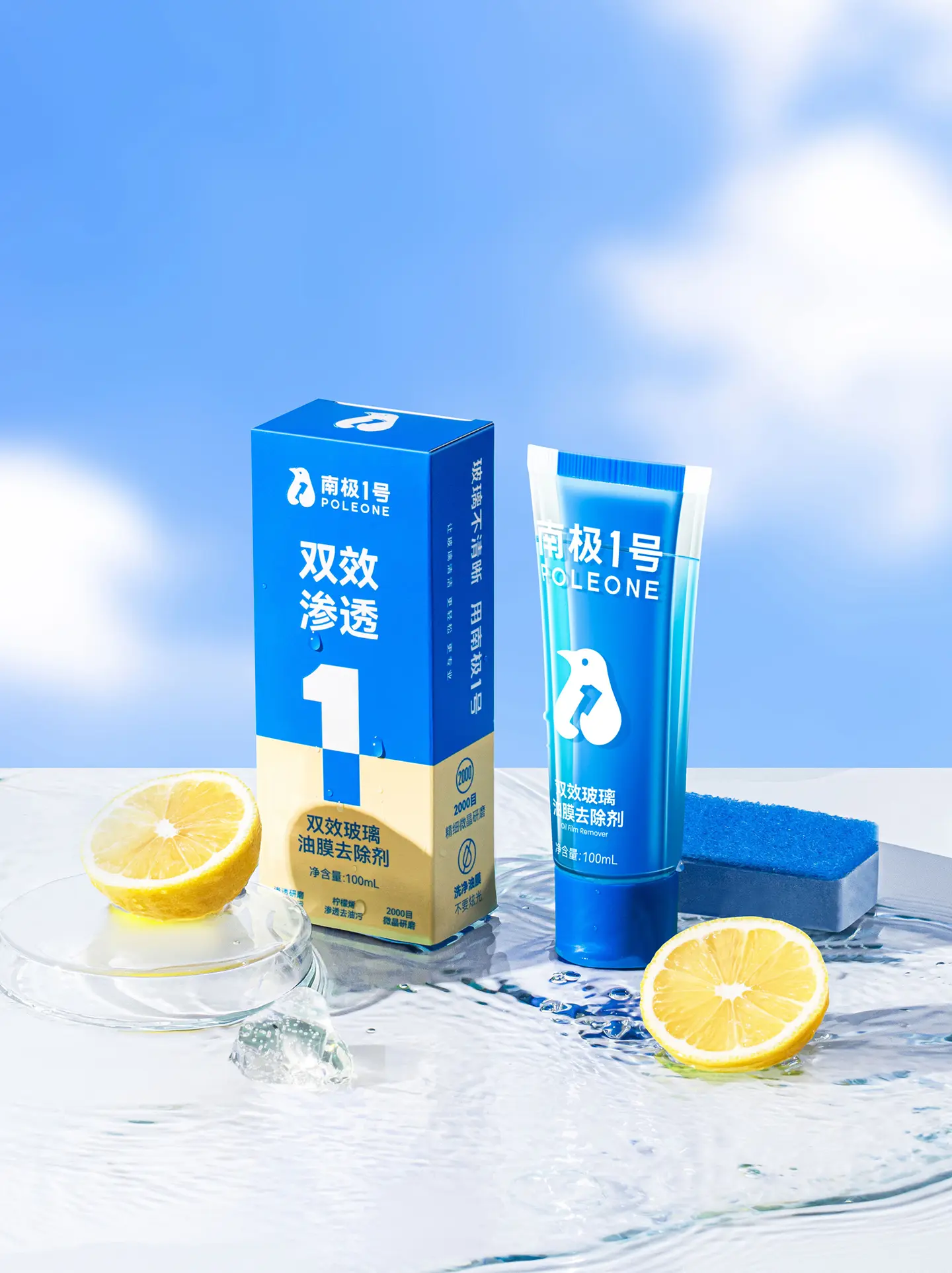 |
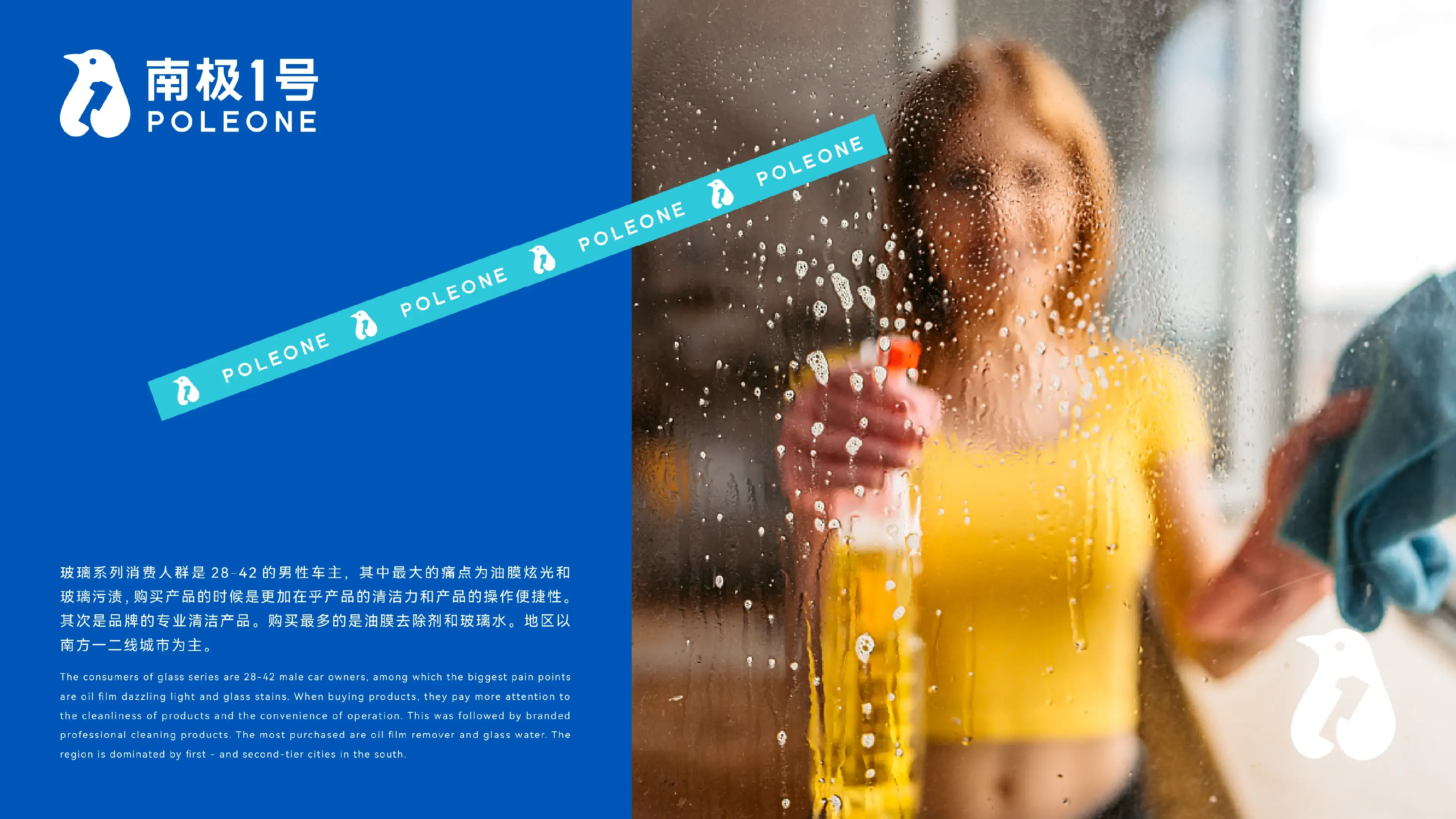
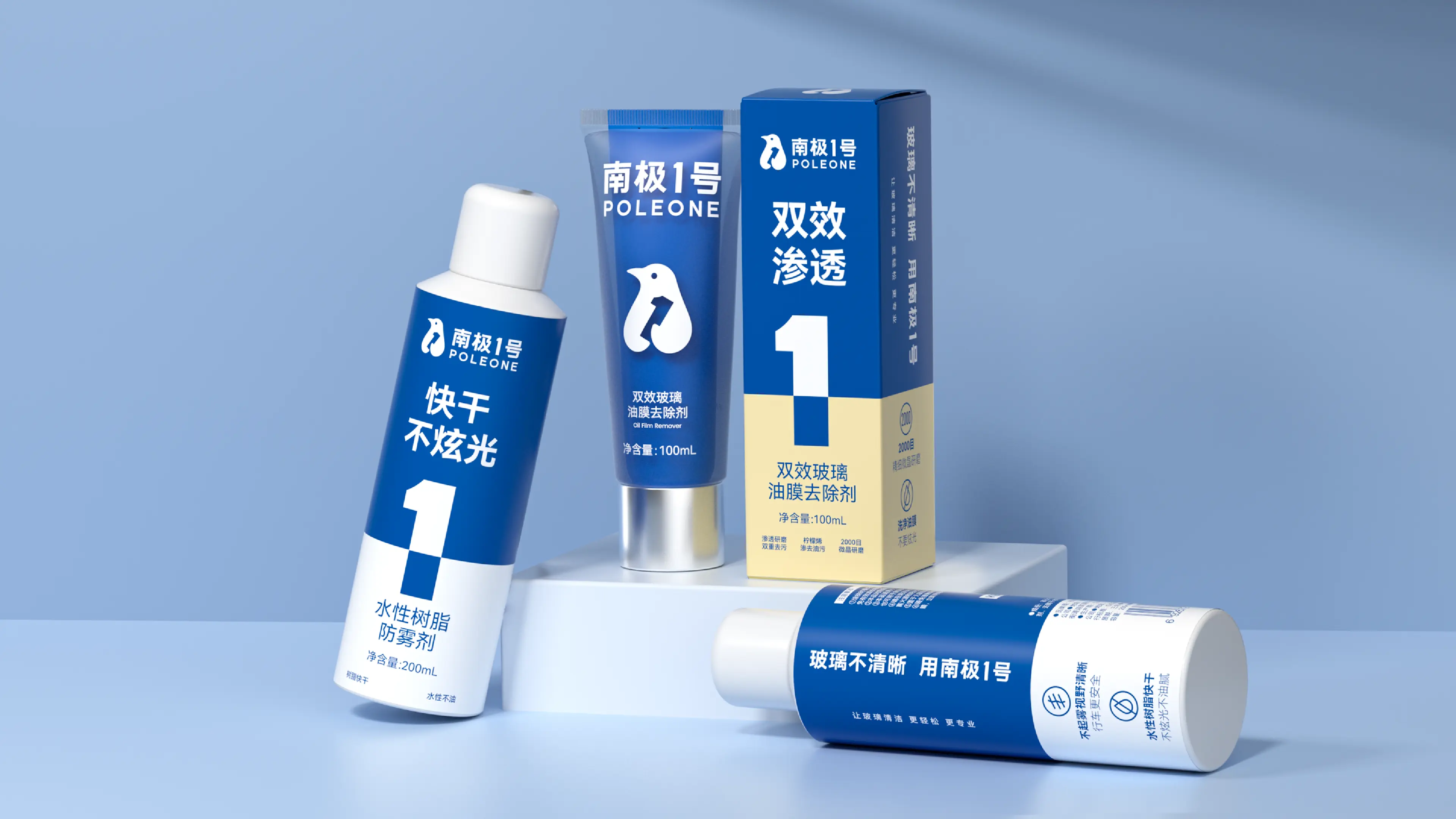
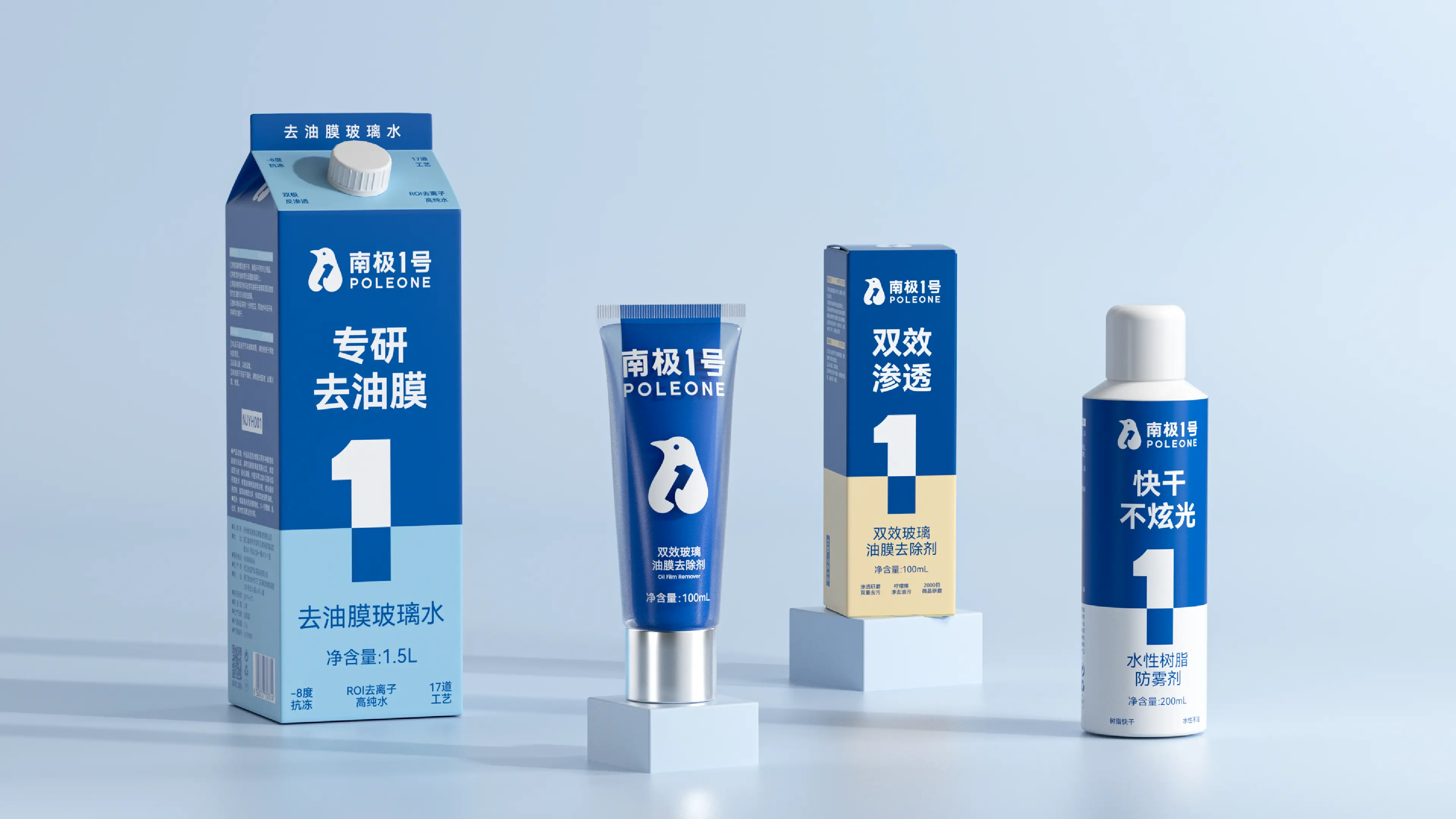
POLEONE is a sub-brand under GUTEWEI (Korper Besonders) dedicated to mid-to-high-end professional glass cleaning and care. GUTEWEI was founded in 2008 and is affiliated with Hangzhou Weike Taimei Brand Management Co., Ltd. It is a national brand mainly engaged in automotive detailing and maintenance products. The POLEONE series primarily addresses two core pain points for car owners during driving—oil film glare and glass stains—providing a more effortless and professional glass cleaning experience. Its target consumers are male car owners aged 28–42, whose purchasing decisions focus more on cleaning power and ease of operation. The product line covers multiple specifications, including dual-action oil film remover, oil film removal windshield washer fluid, and oil film removal cream.
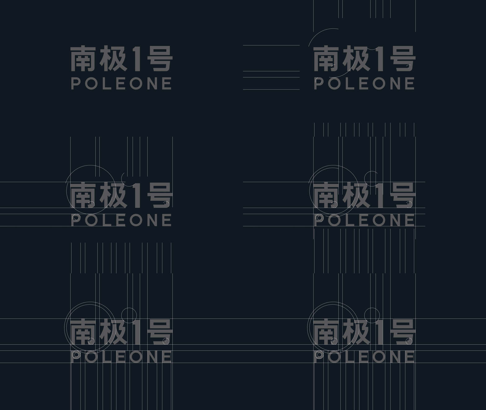
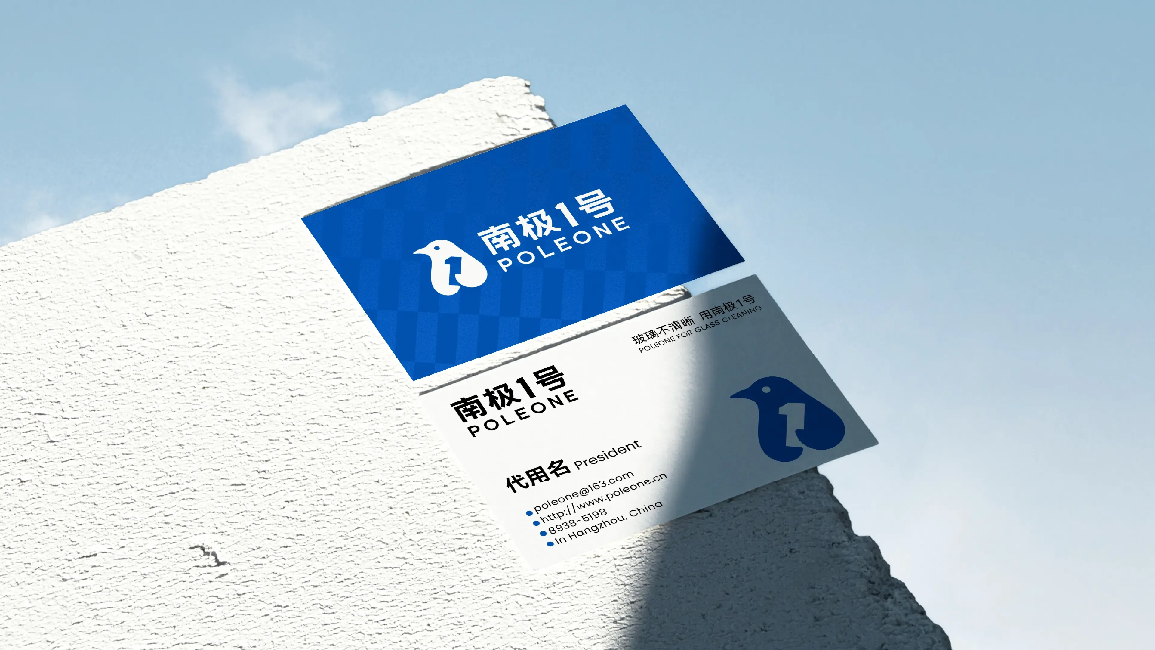
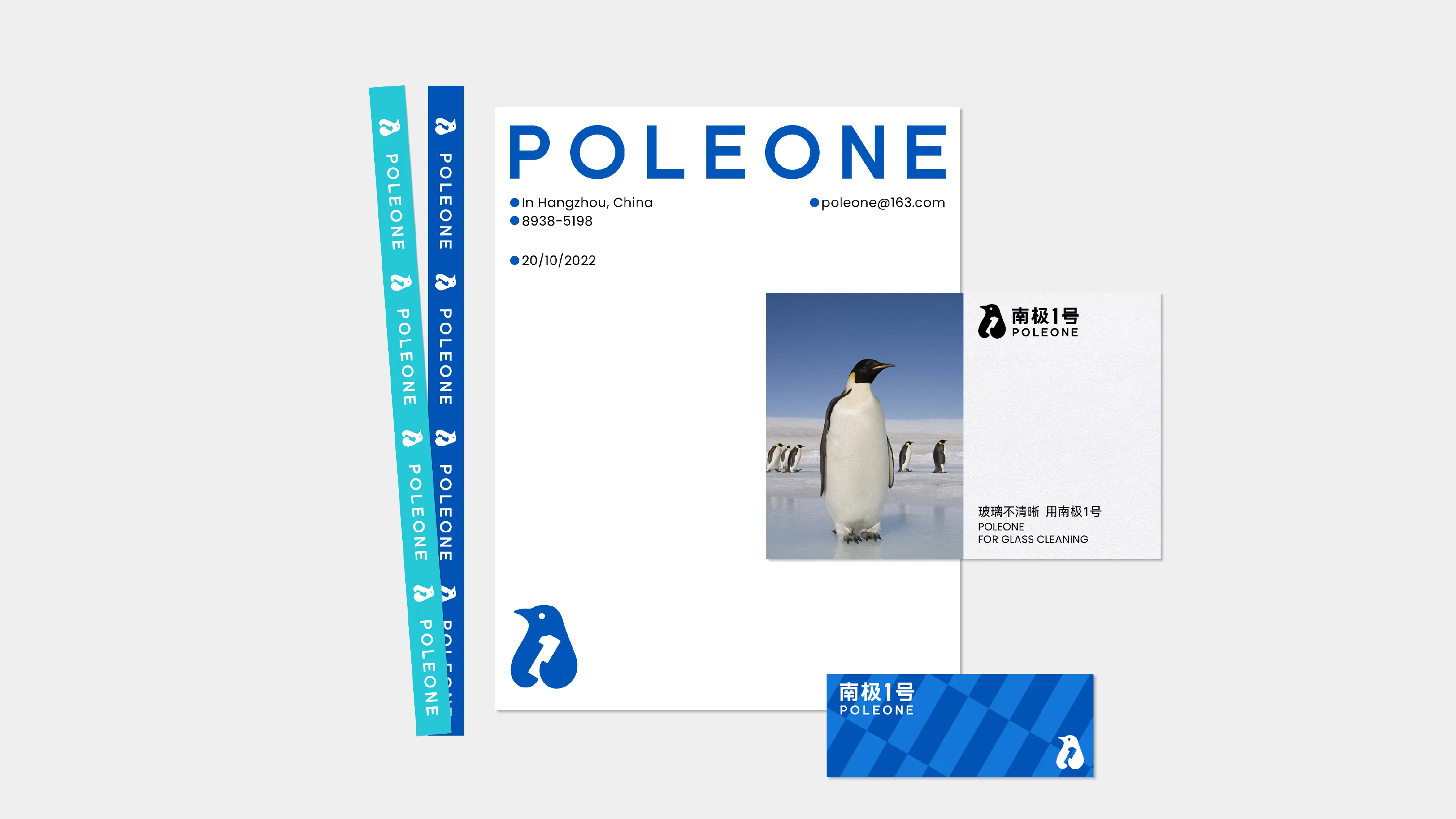
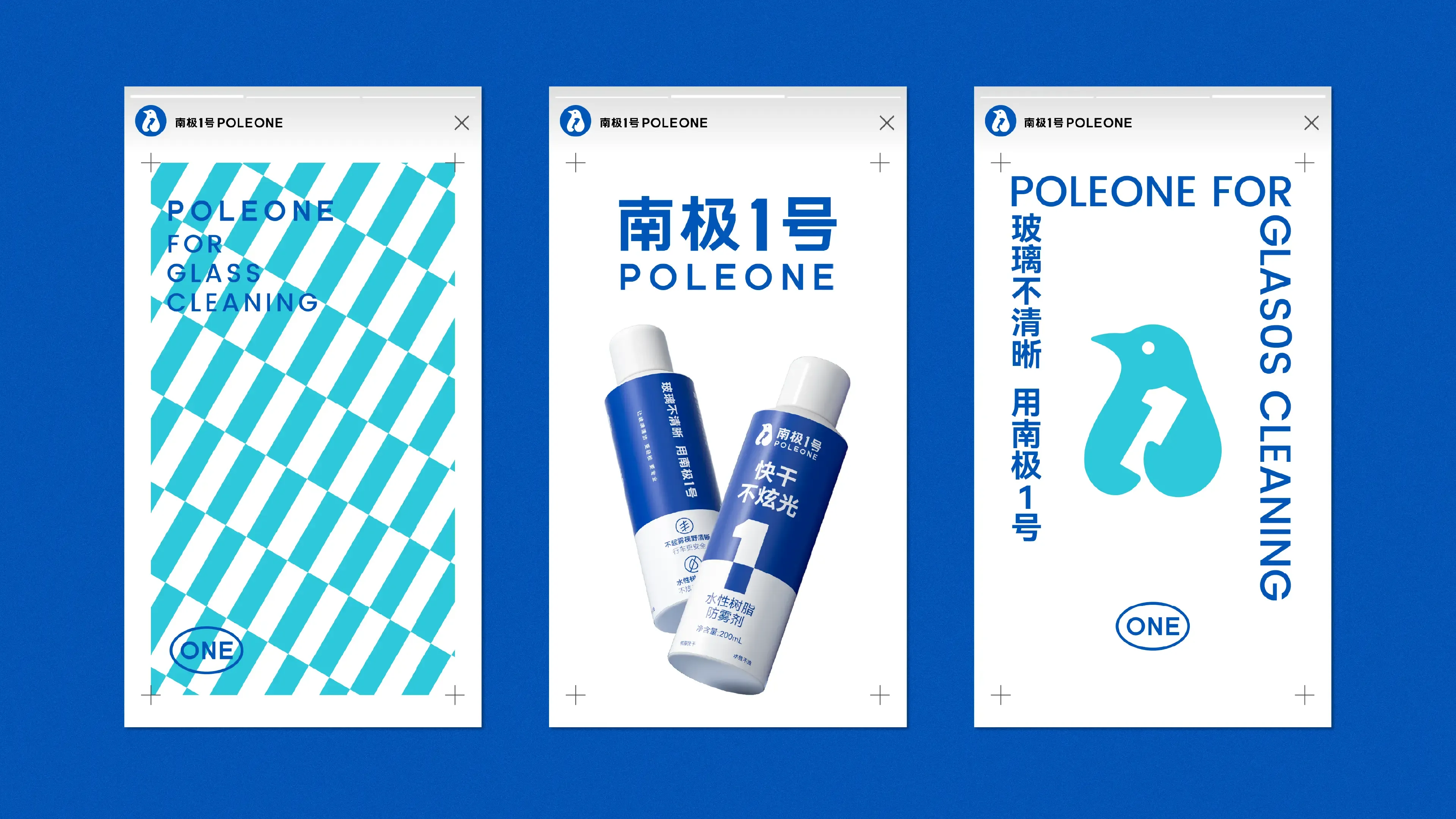
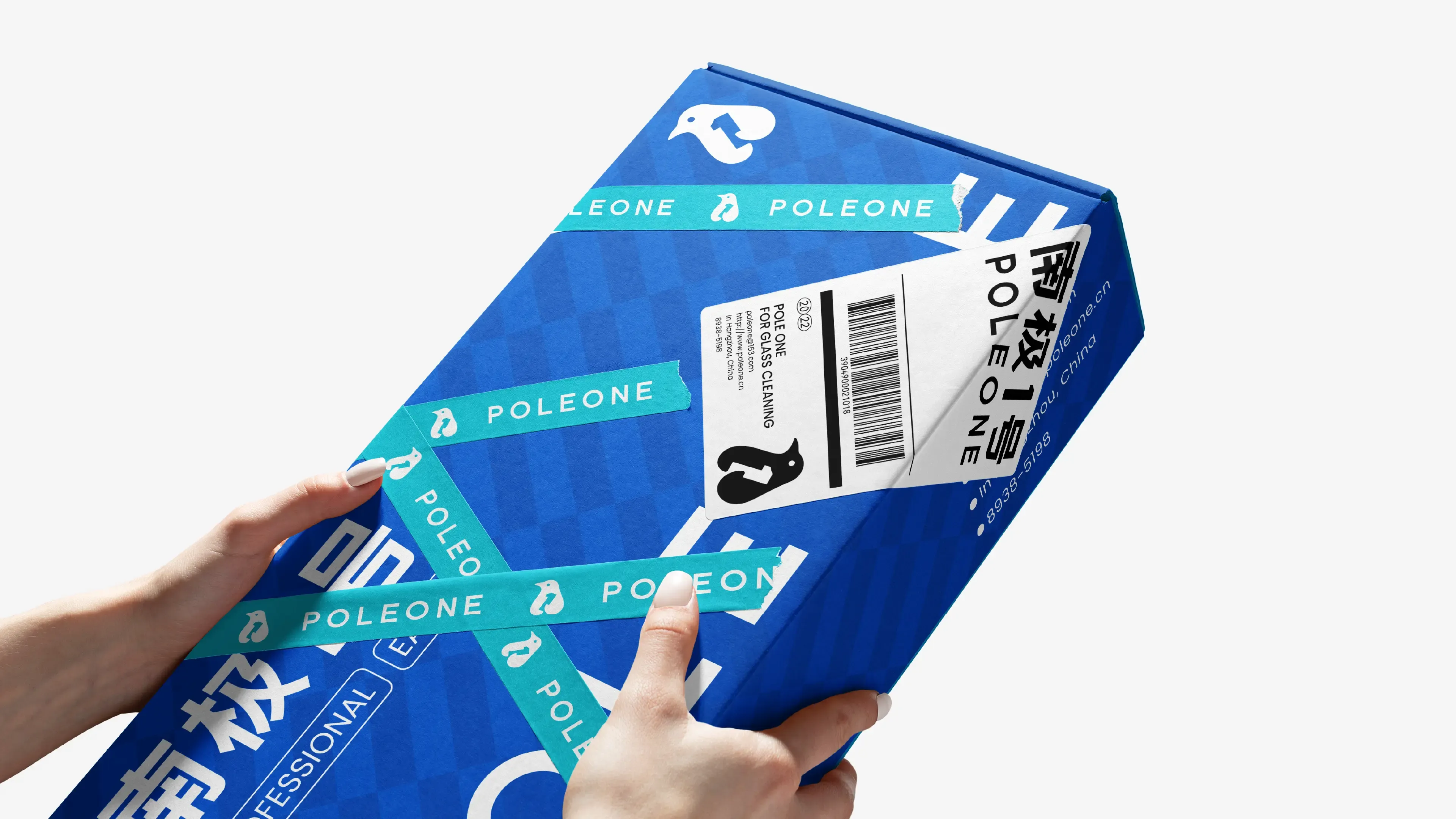
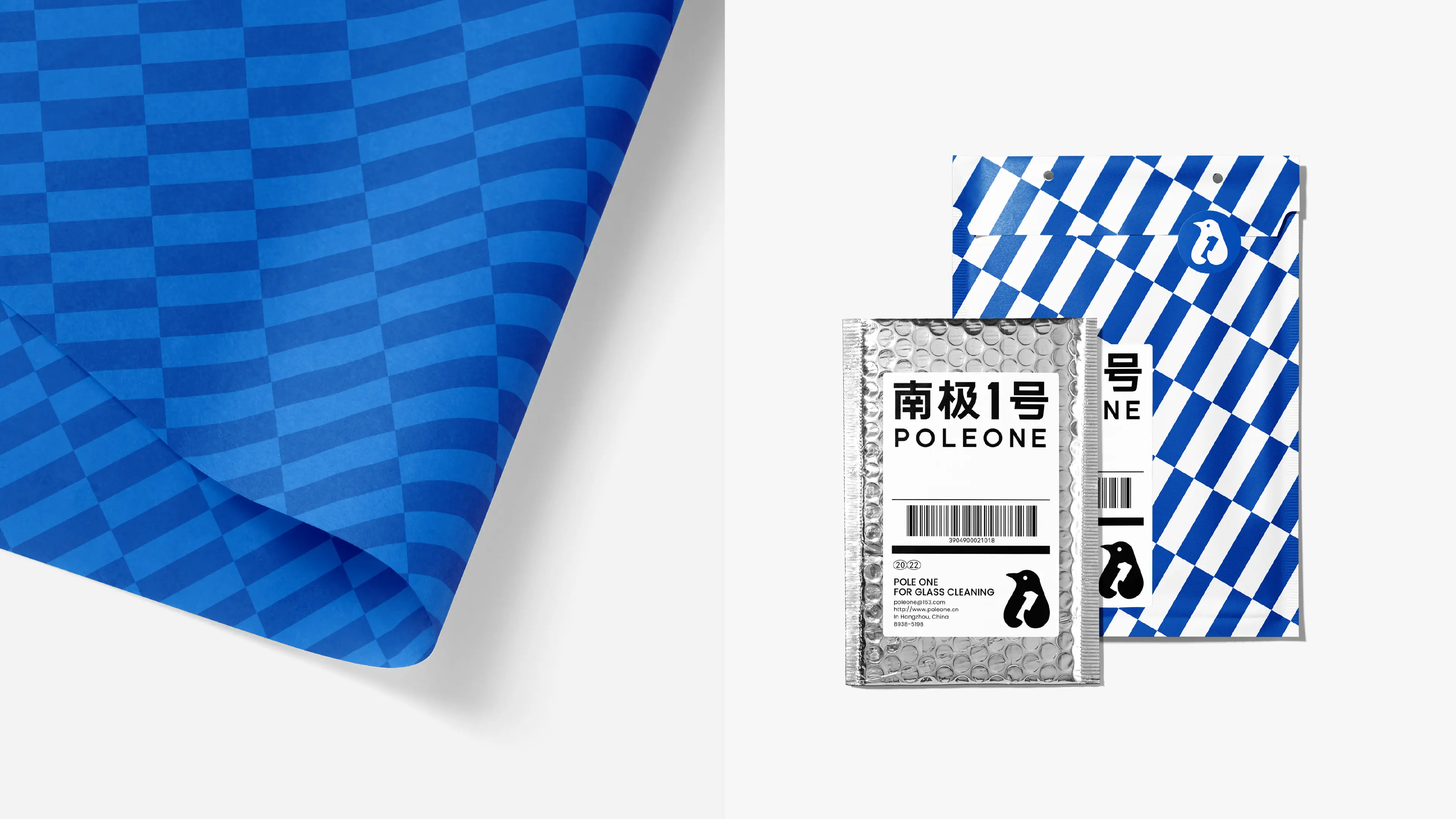
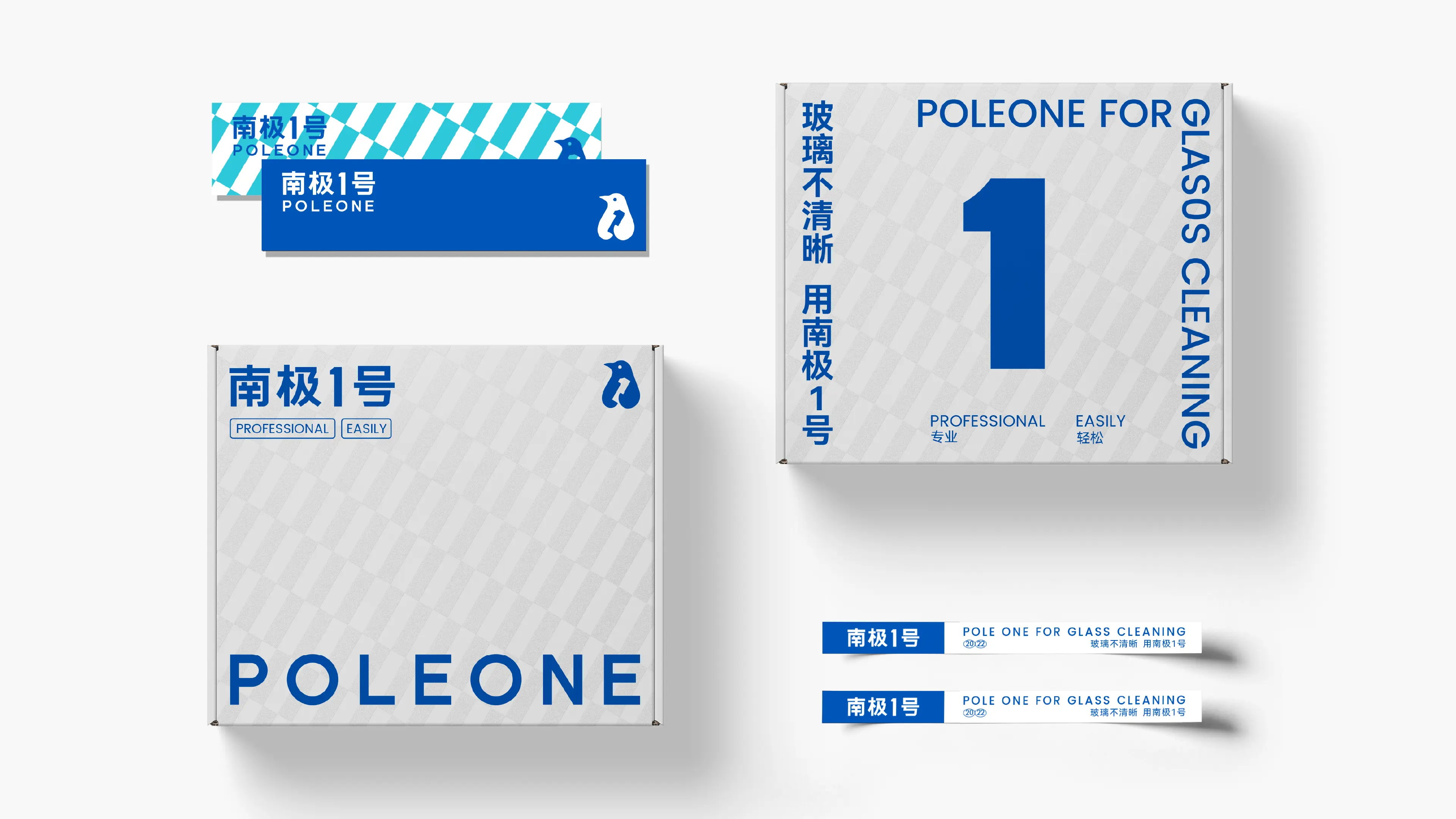
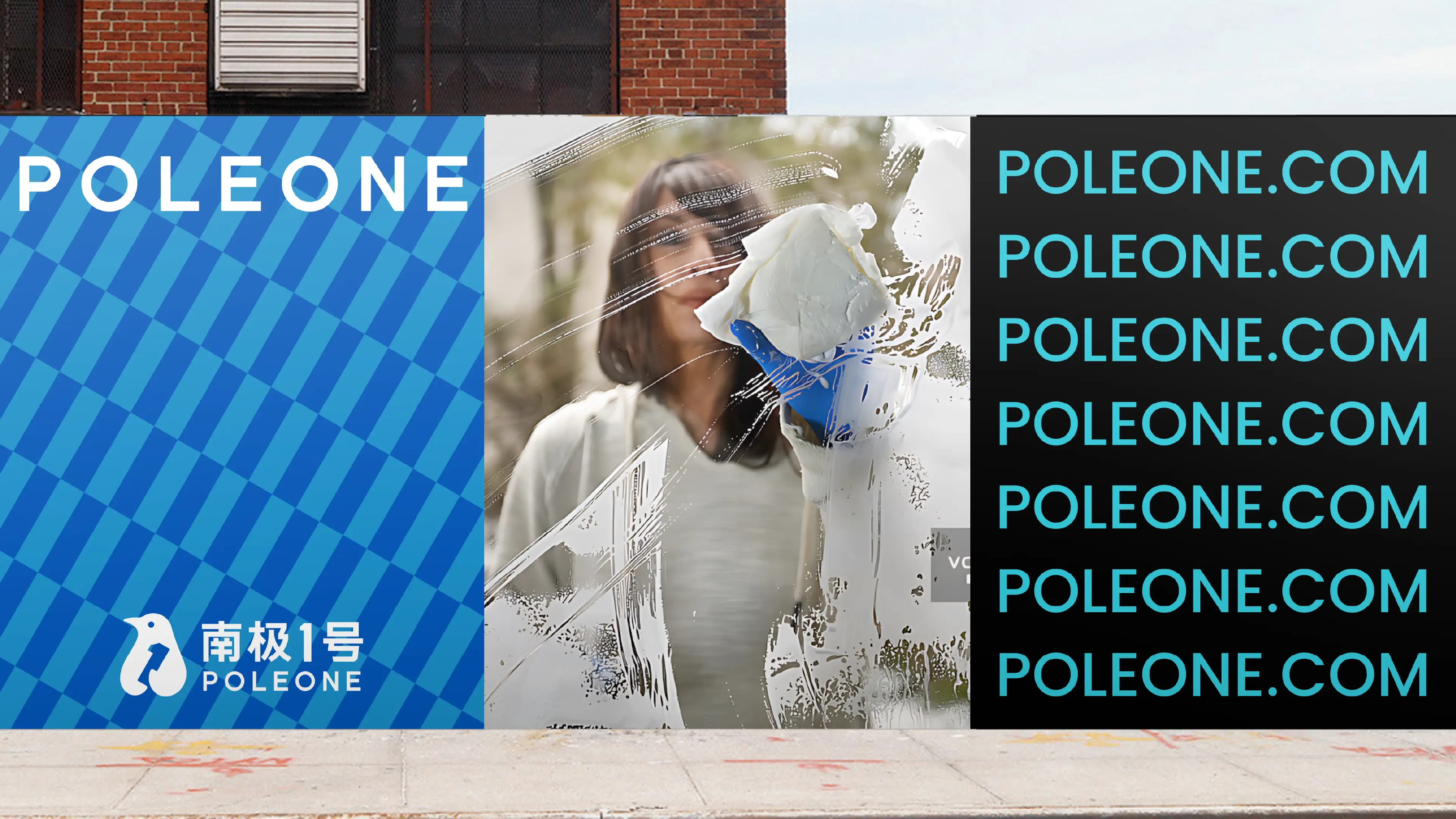
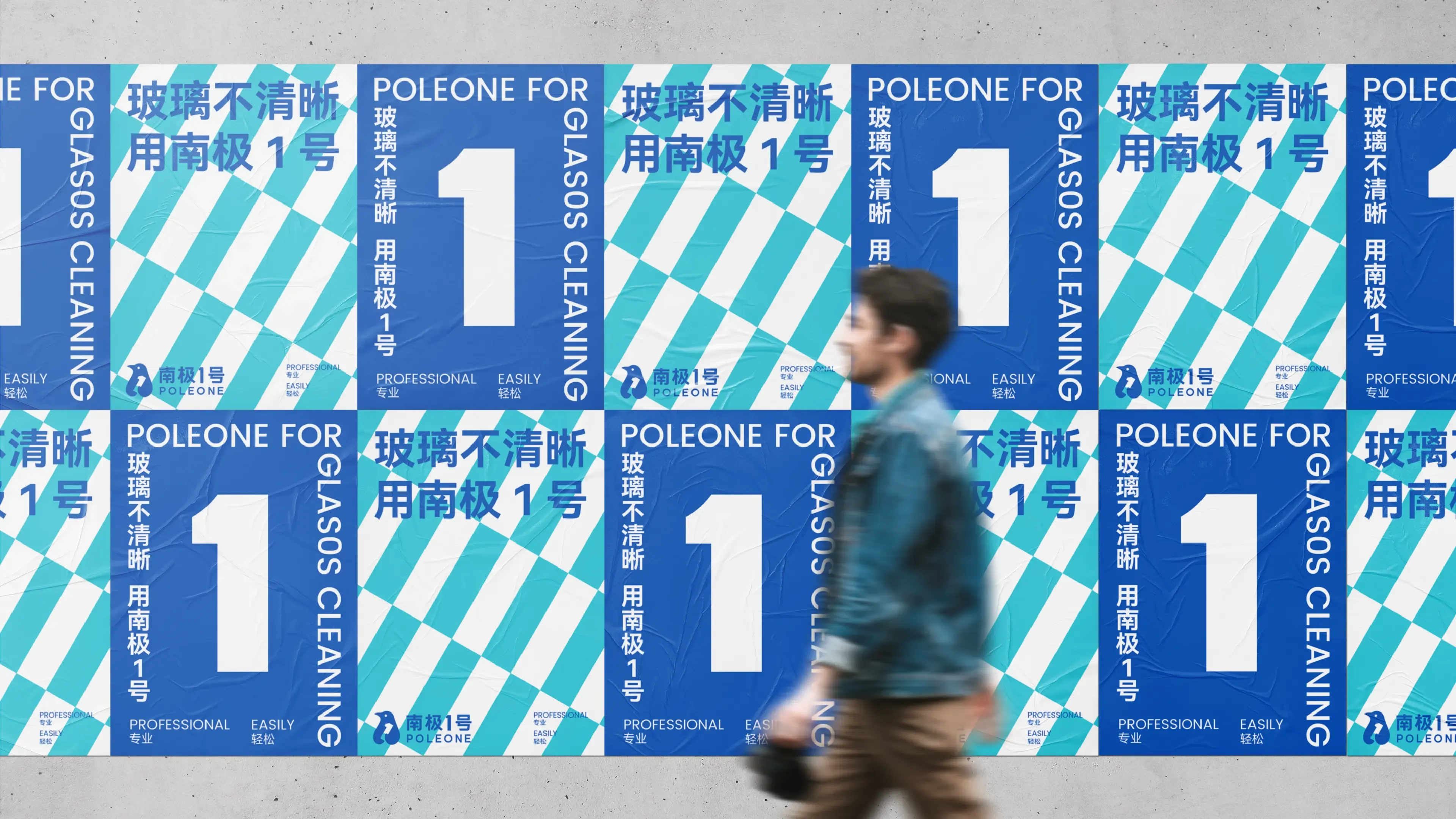
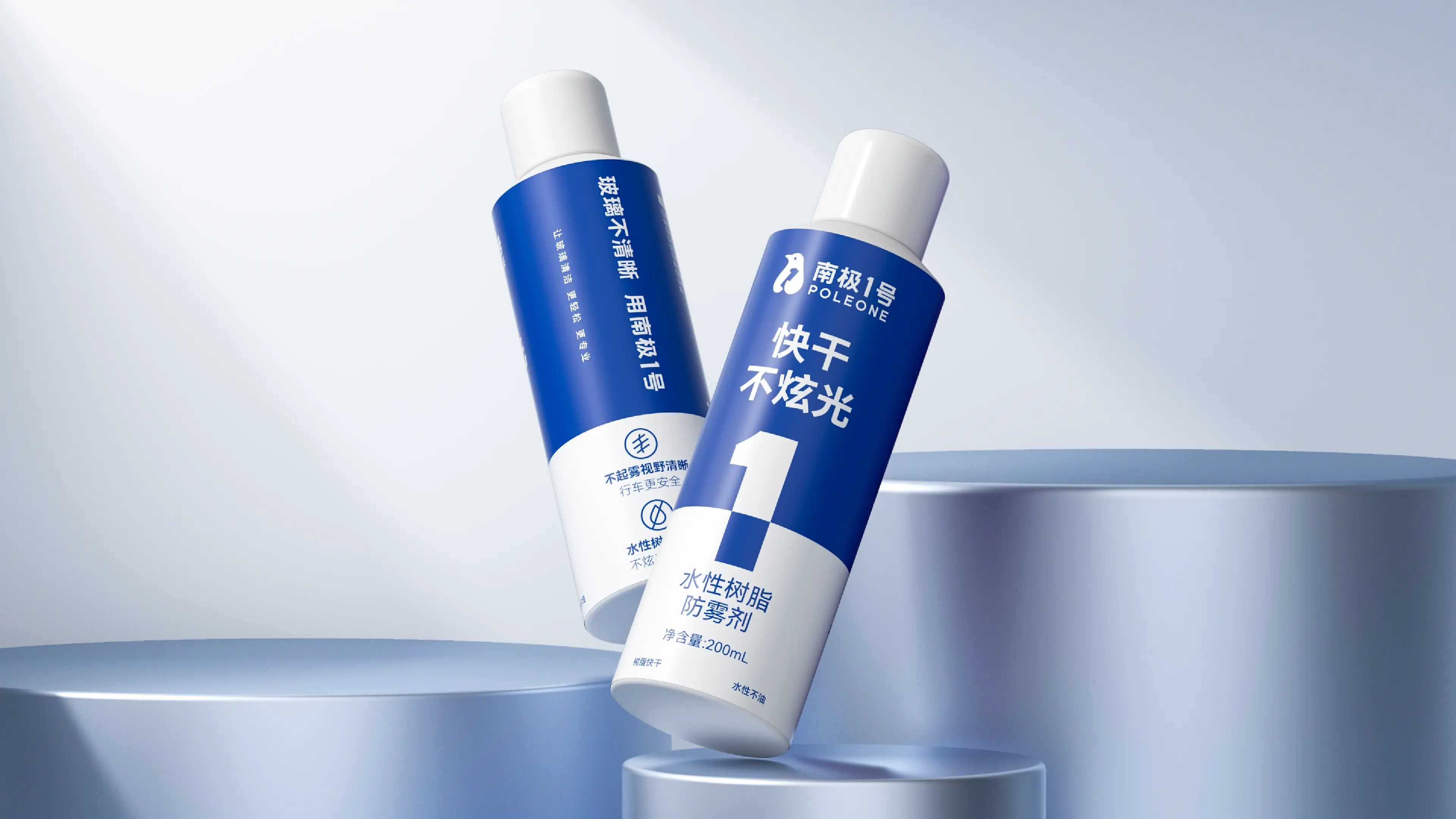
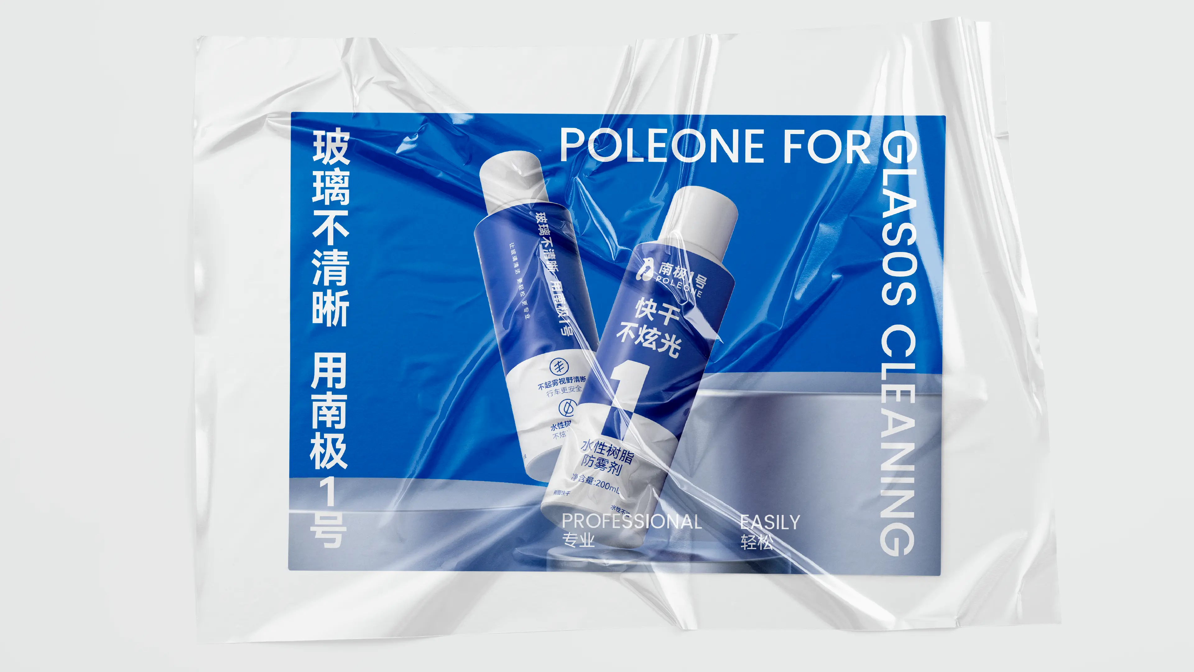
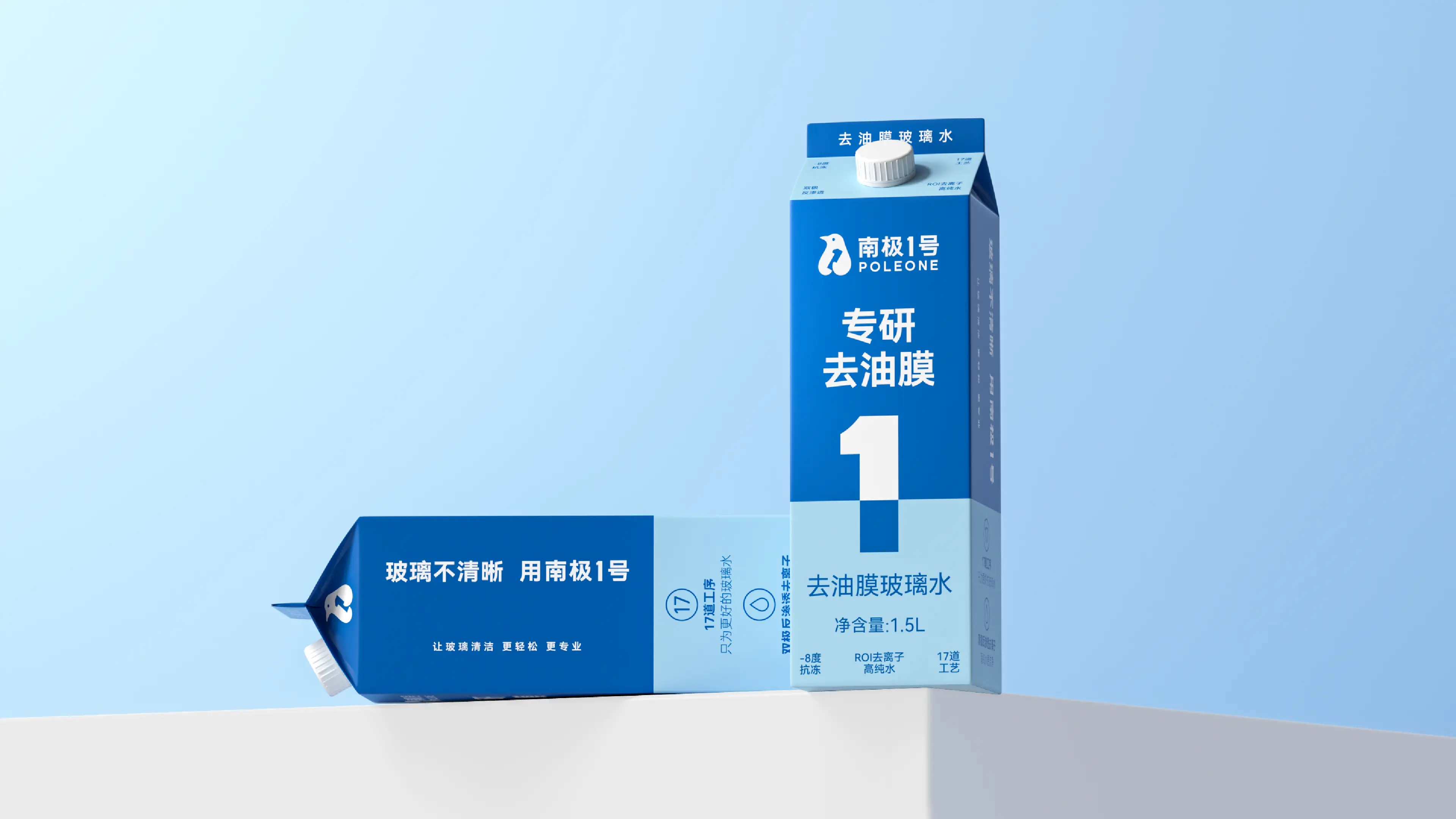
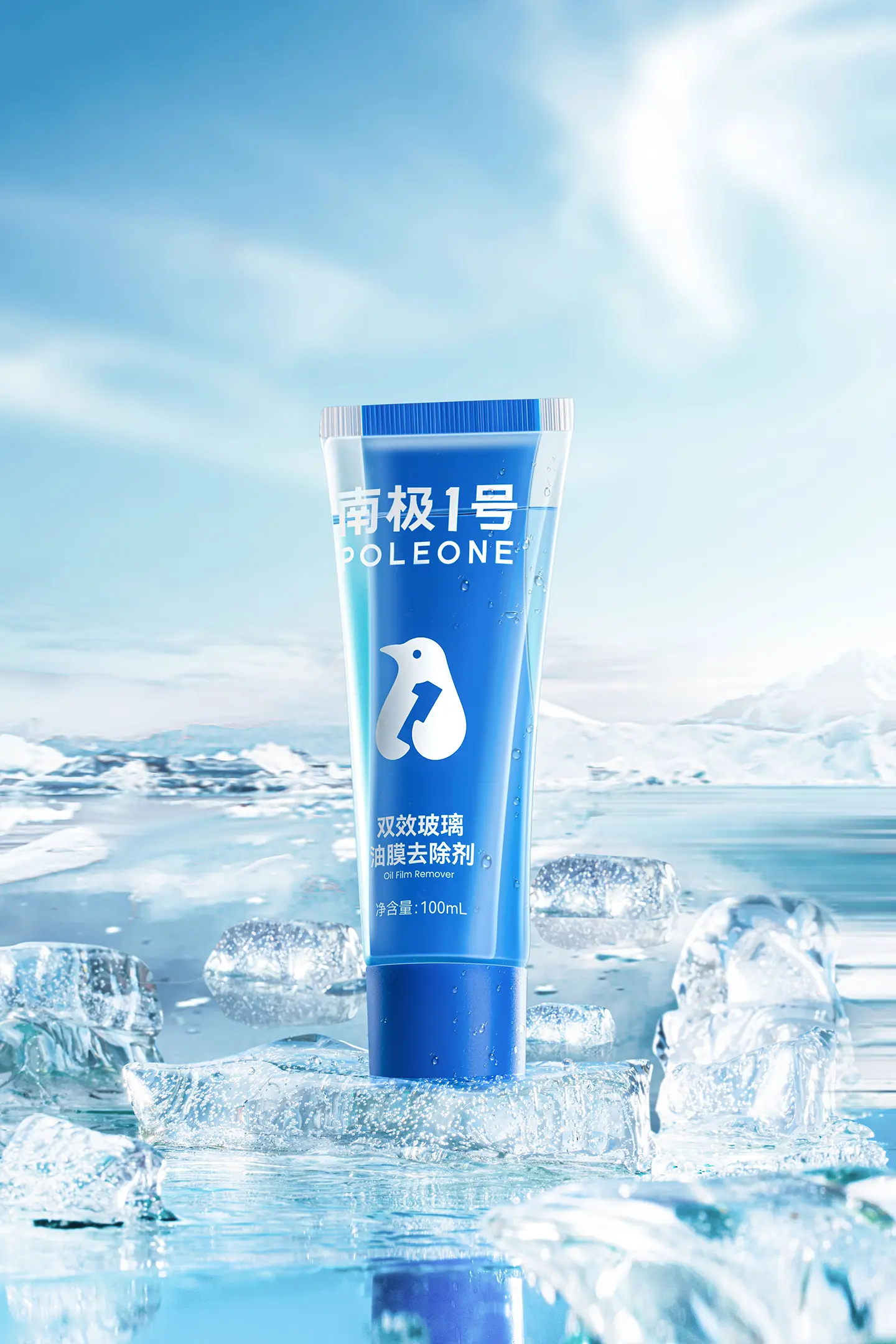
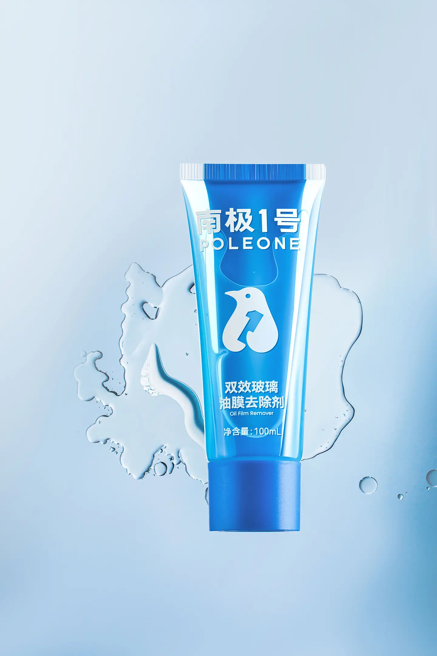
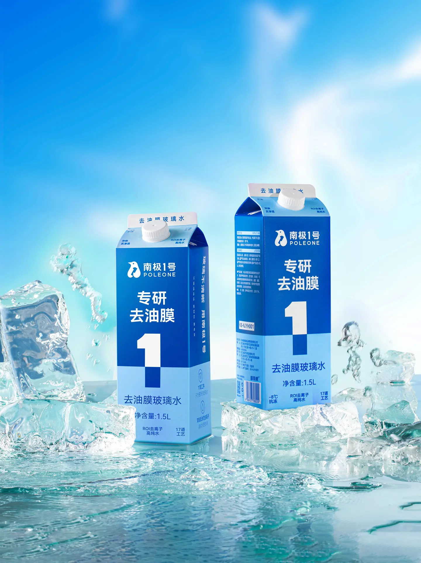
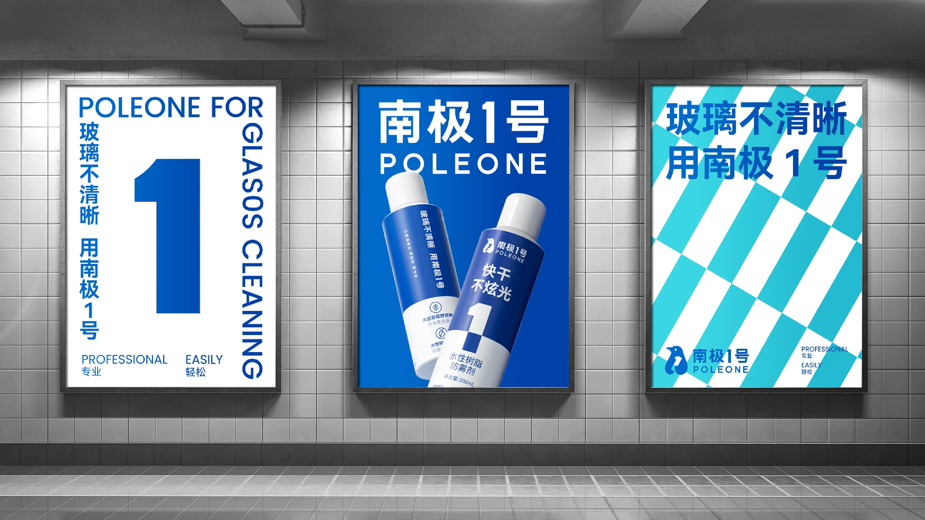
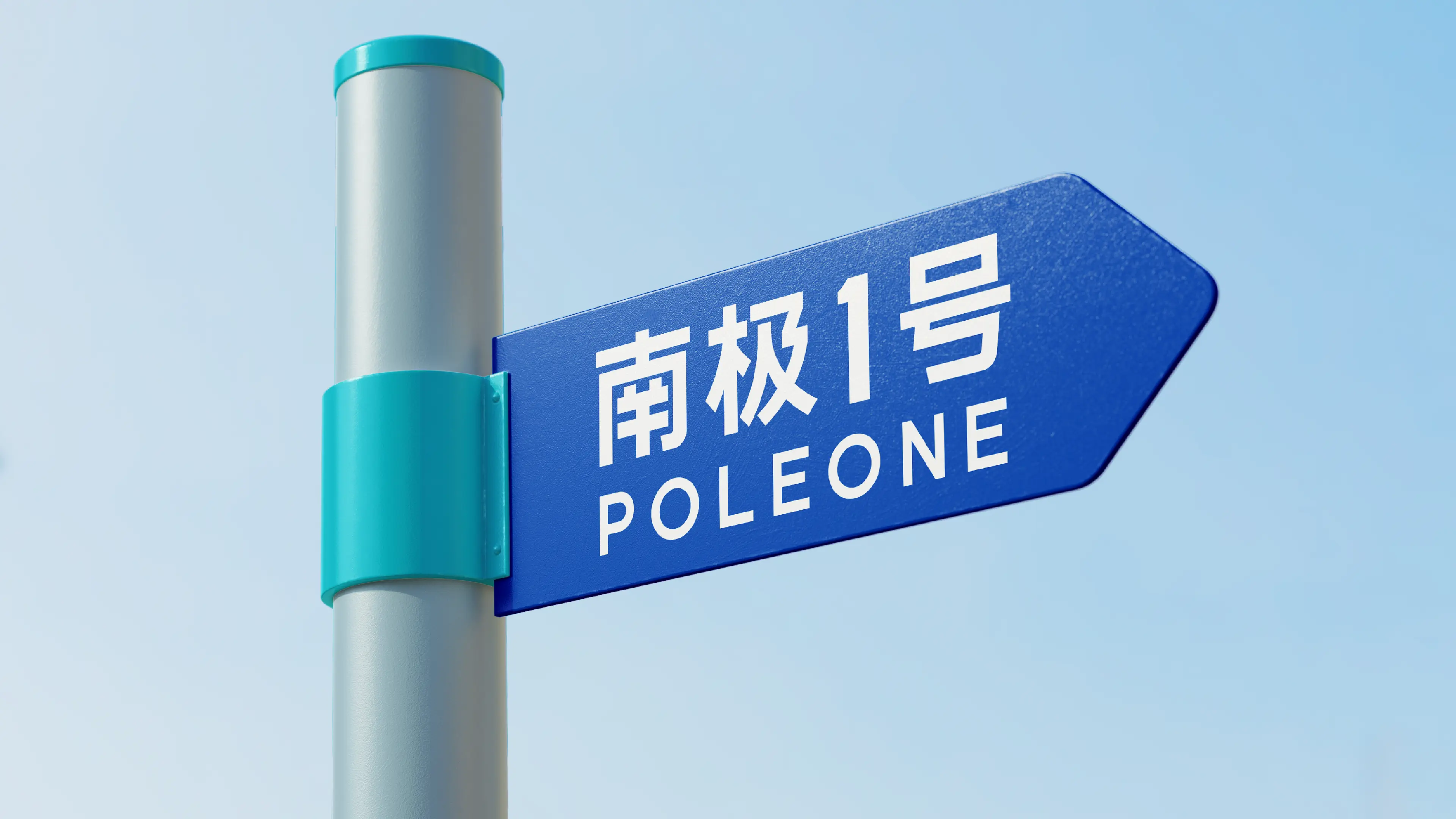
This project was to create a complete full-brand design for POLEONE, with services covering all dimensions such as brand VI design, logo design, and product packaging system design, striving to create high-standard brand and product visuals. The logo design took “South Pole” as its creative origin—when people think of the South Pole, the most intuitive association is penguins. The design team creatively integrated a penguin with the number “1,” using the form of a penguin holding “1” as the graphic logo. This not only reflects the brand’s professionalism but also conveys a relaxed and approachable brand feeling. The packaging design continues and reinforces this visual strategy—using “1” as the core visual symbol on the packaging to ensure it effectively attracts consumers’ attention on both e-commerce pages and offline shelves. In terms of color, a top-and-bottom color division is adopted, using cool tones to interpret the concept of glaciers and further strengthen the “South Pole” brand atmosphere. At the information communication level, the team enlarged the product’s core selling points, helping consumers quickly obtain key information and save decision-making time when purchasing. Through this full-brand design system combining recognition efficiency and brand tonality, POLEONE has successfully upgraded from a functional product to a professional glass care brand symbol with strong visual recognition and high brand trust.
| |
| |