



















TAFULAN Tafulan is affiliated with Hangzhou Yayan Cosmetics Co., Ltd. It was developed under the leadership of a skincare research expert team from MIT and jointly developed with the Boston Cosmetics Research Institute. The brand adheres to the brand concept of simple formulation and scientific skincare. It has been deeply rooted in the field of efficacy-based skincare, precisely matching active ingredients for different skin problems, and is committed to rebuilding the skin's balanced ecosystem, making skincare return to its scientific essence. The retinol concentrate is the brand's core anti-aging item. Relying on the brand's hard-core laboratory research capabilities, it uses retinol as the core anti-aging ingredient, focusing on reducing wrinkles and tightening, improving skin aging marks, targeting urban consumers with initial anti-aging needs, while balancing functionality and mildness, providing consumers with professional, high-value, and cost-effective scientific anti-aging skincare solutions.
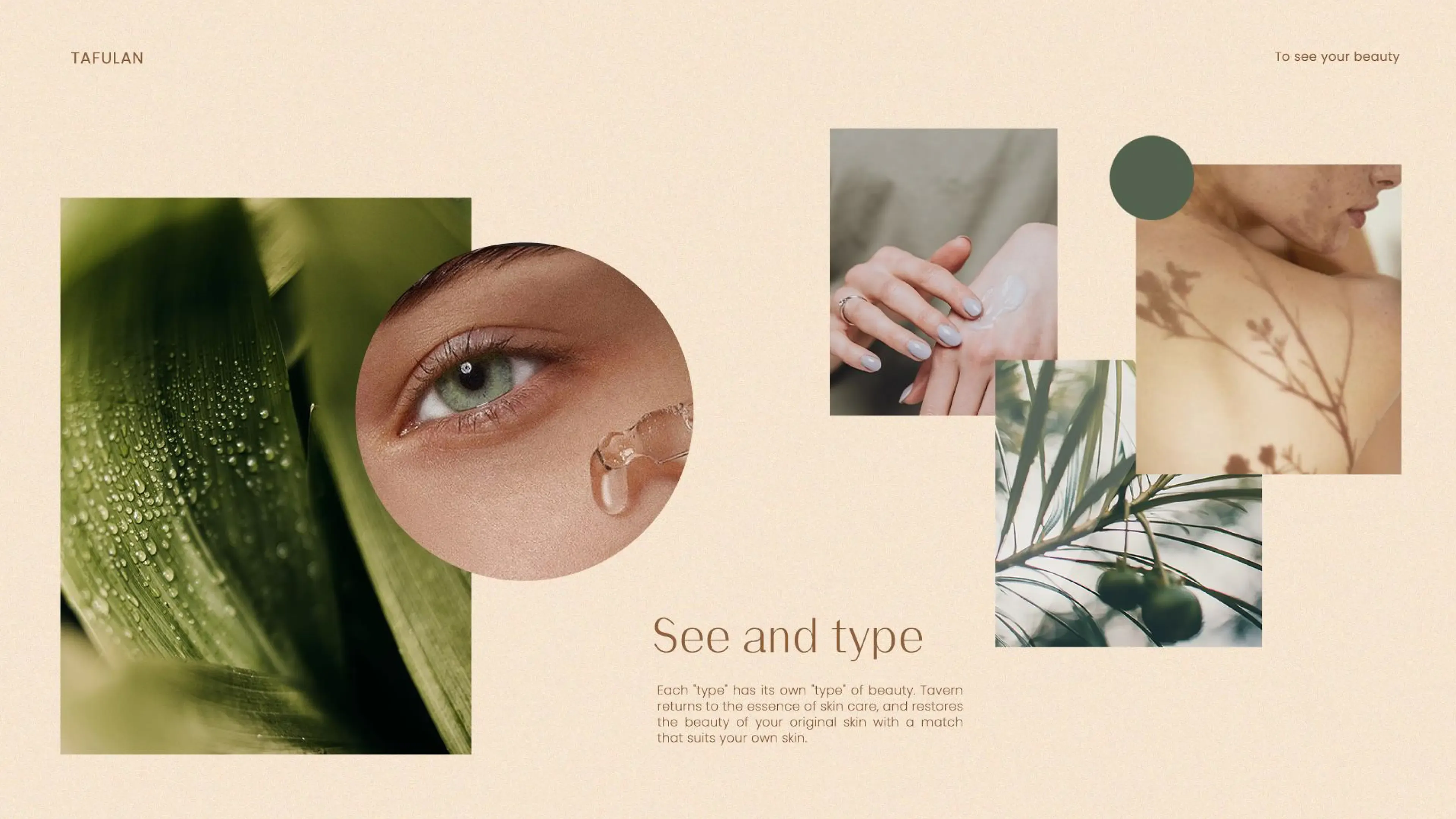
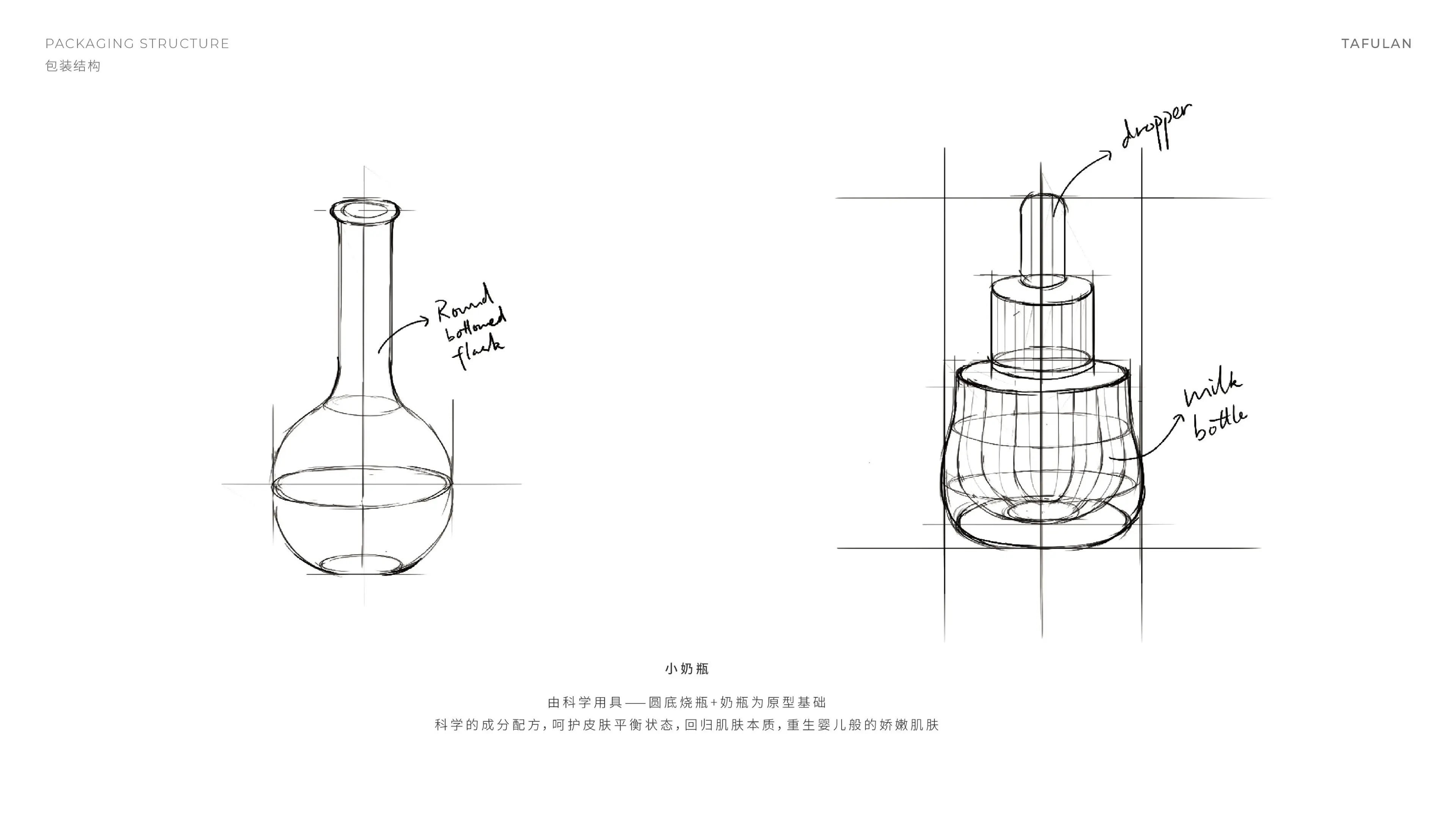
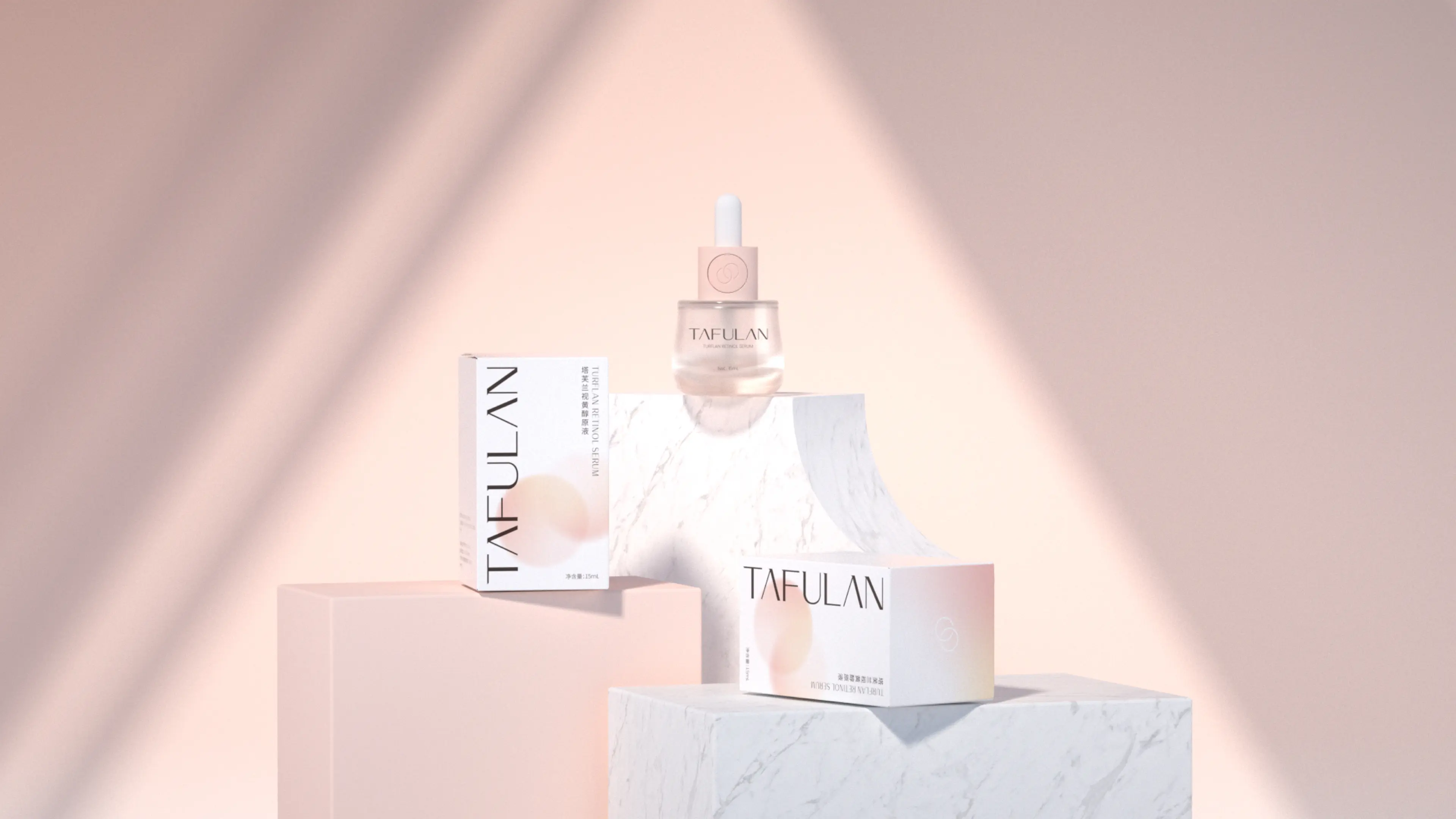
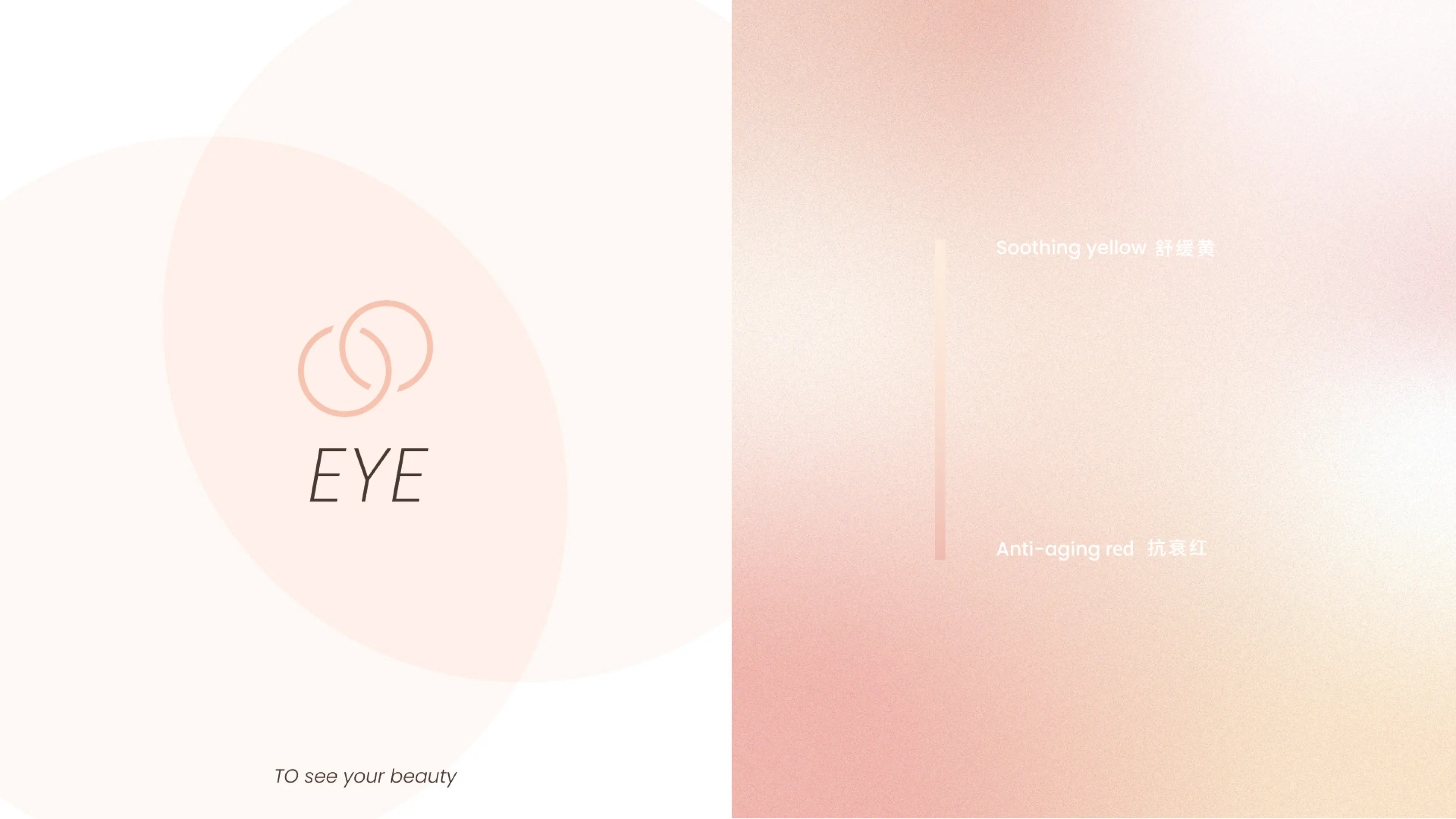
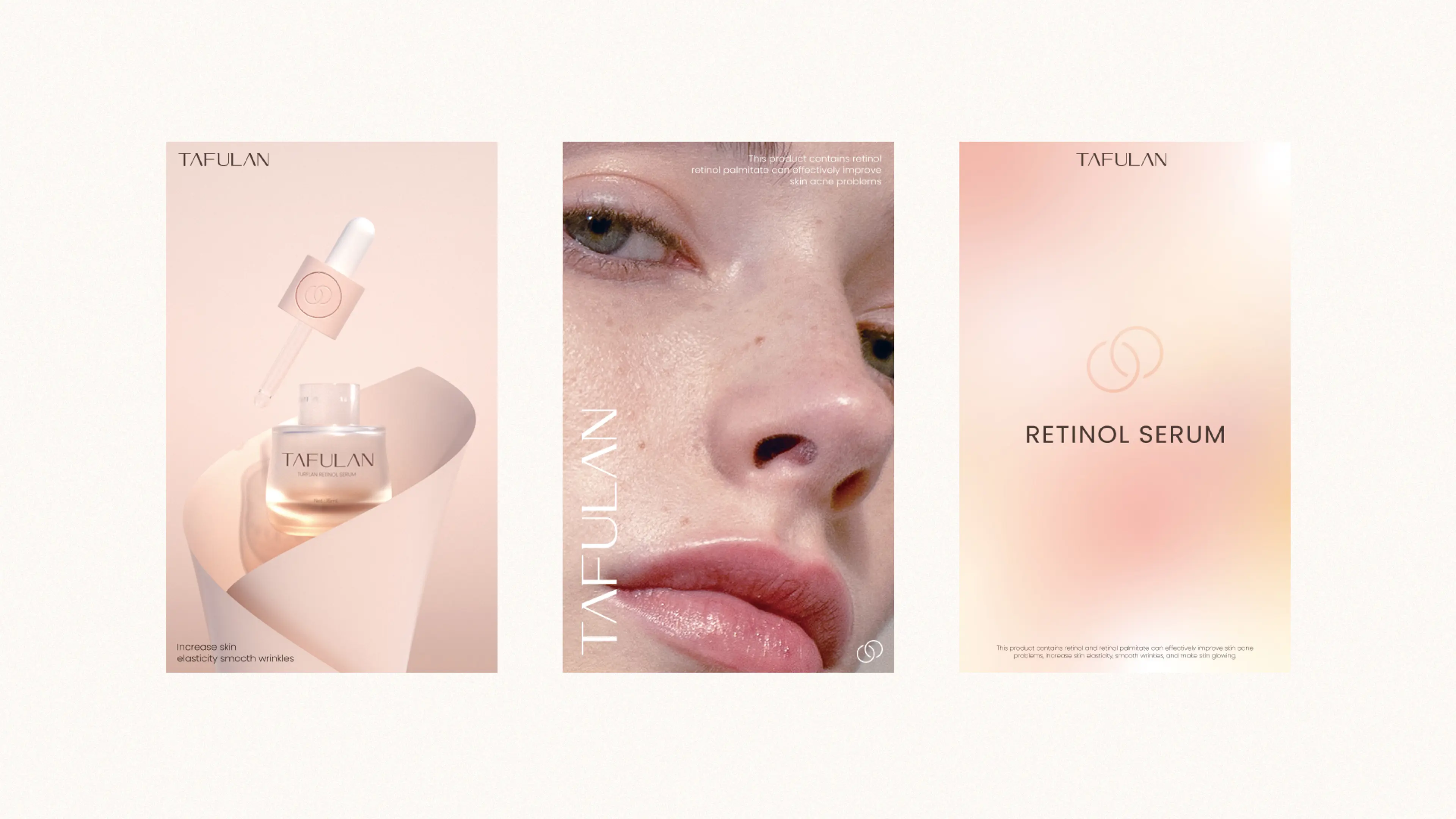
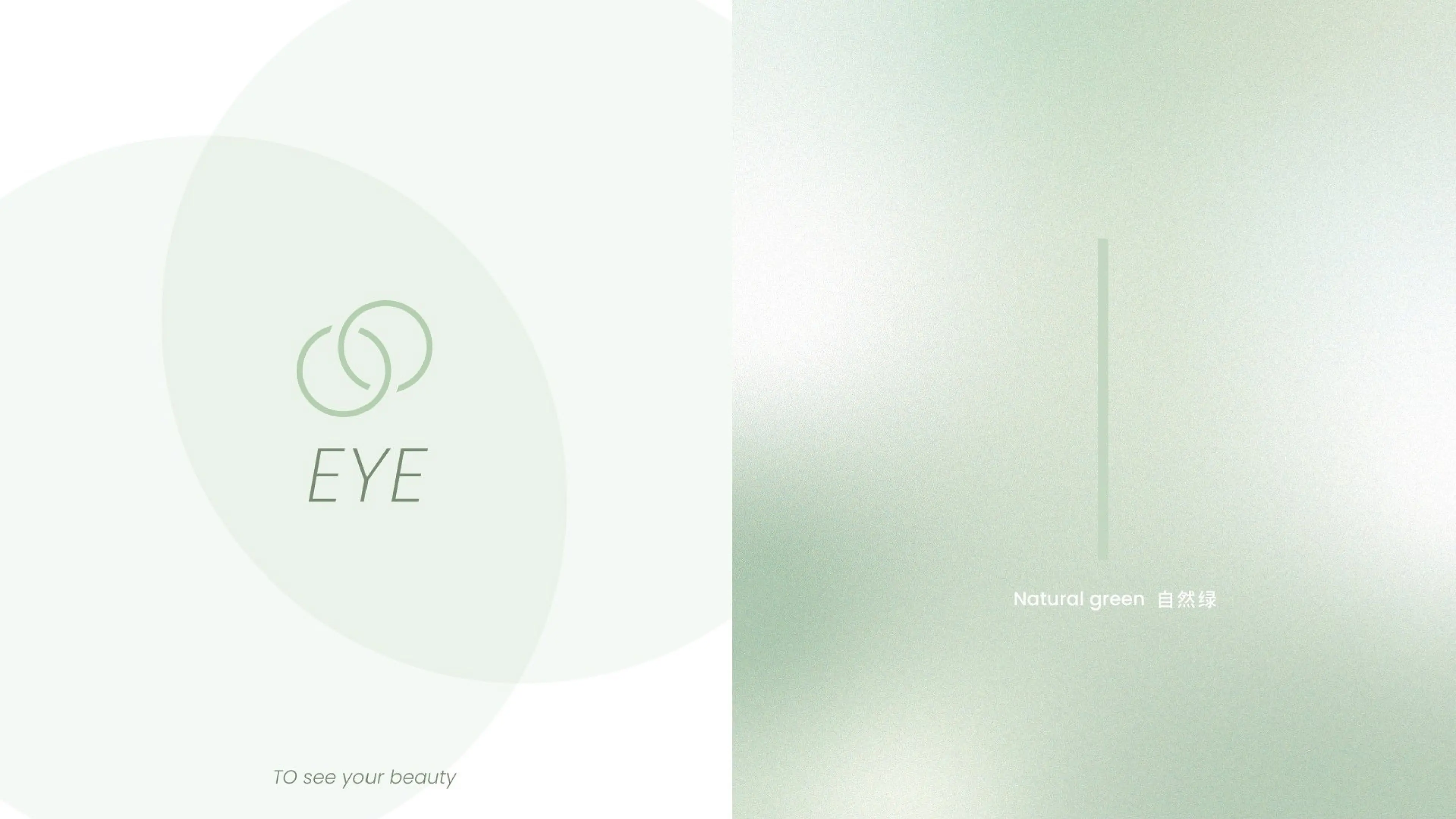
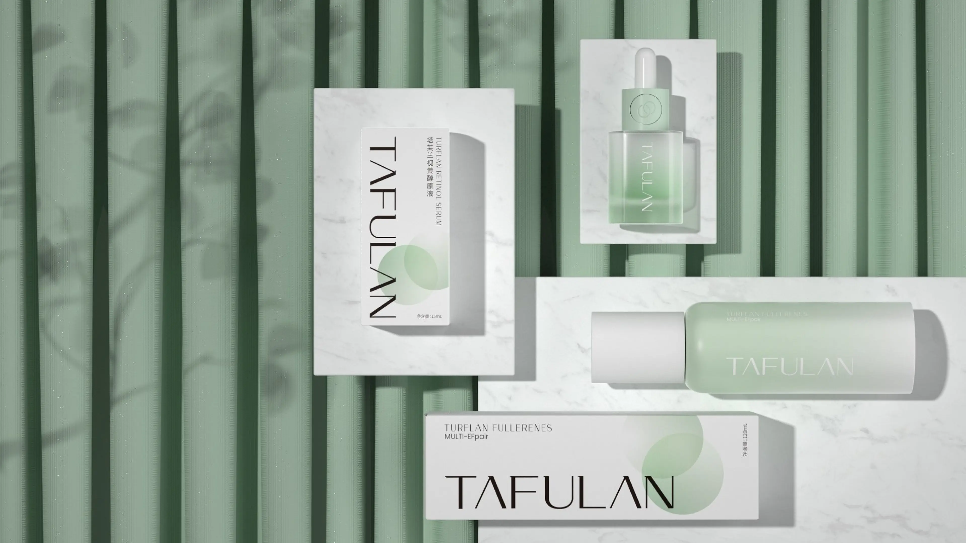
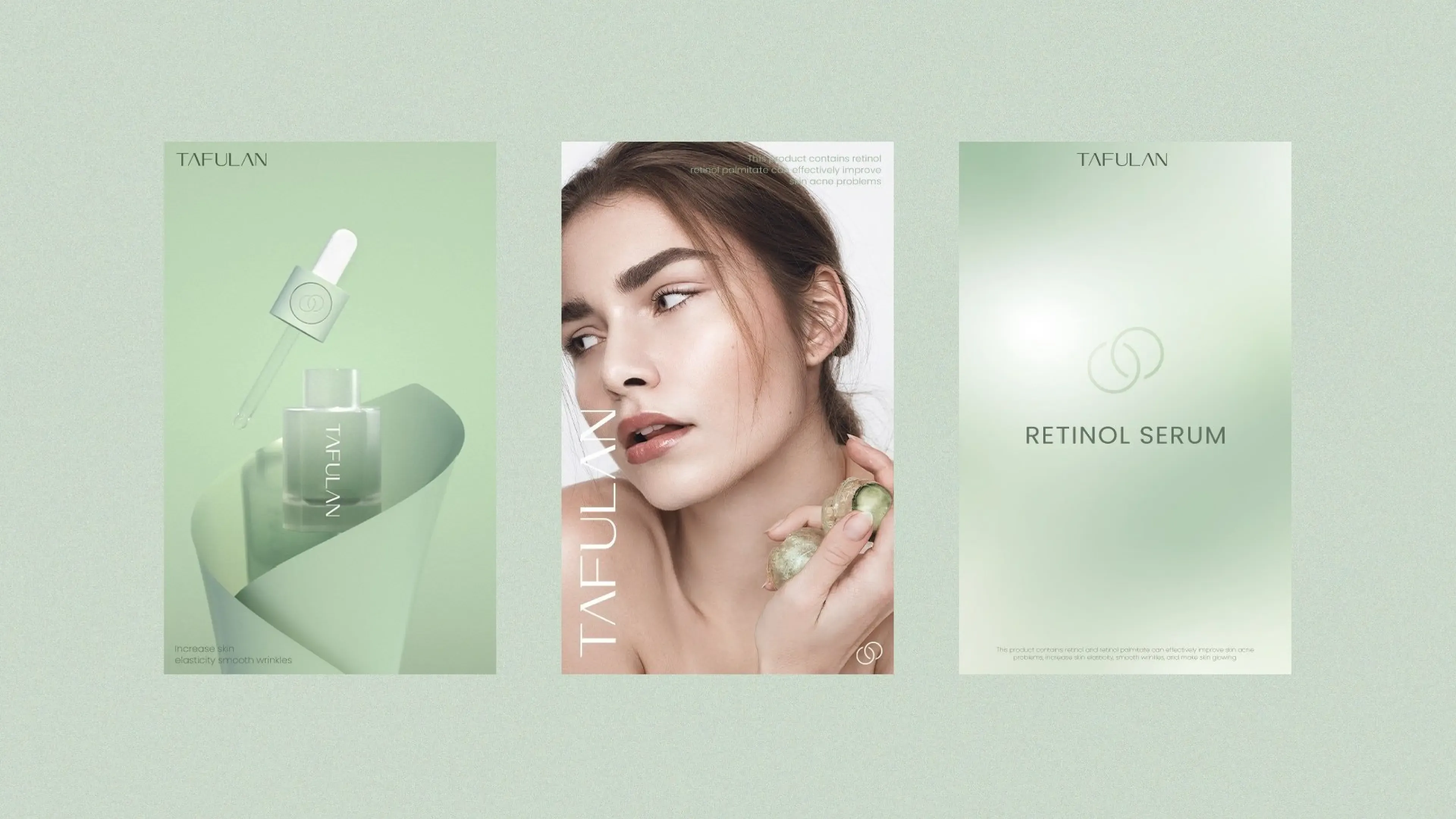
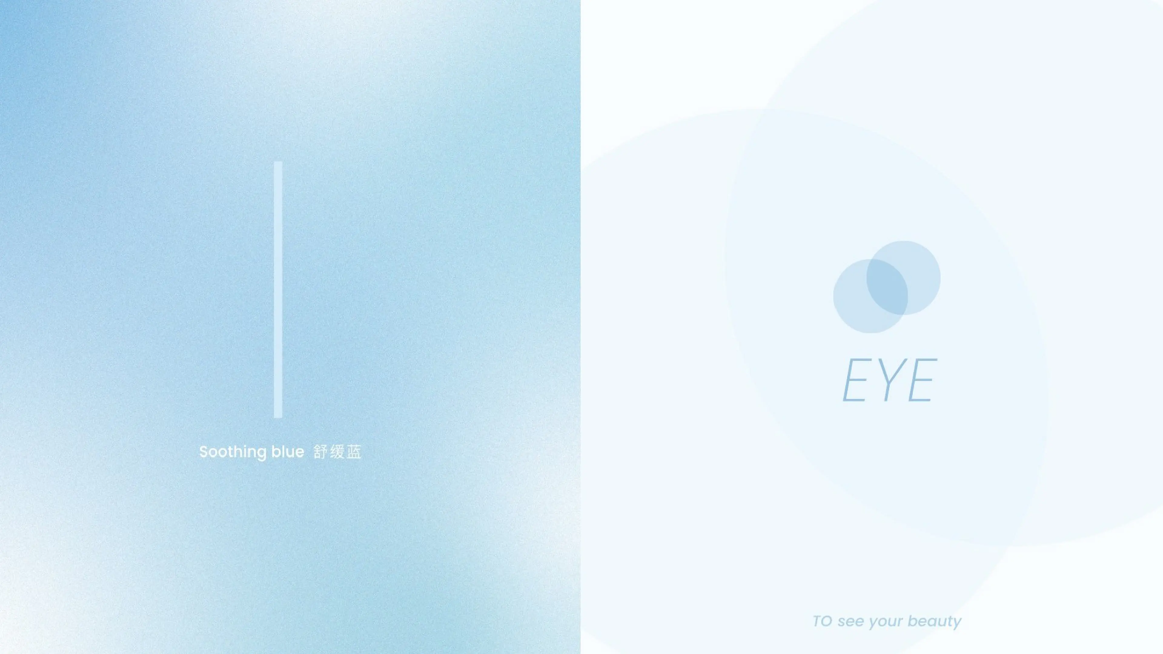
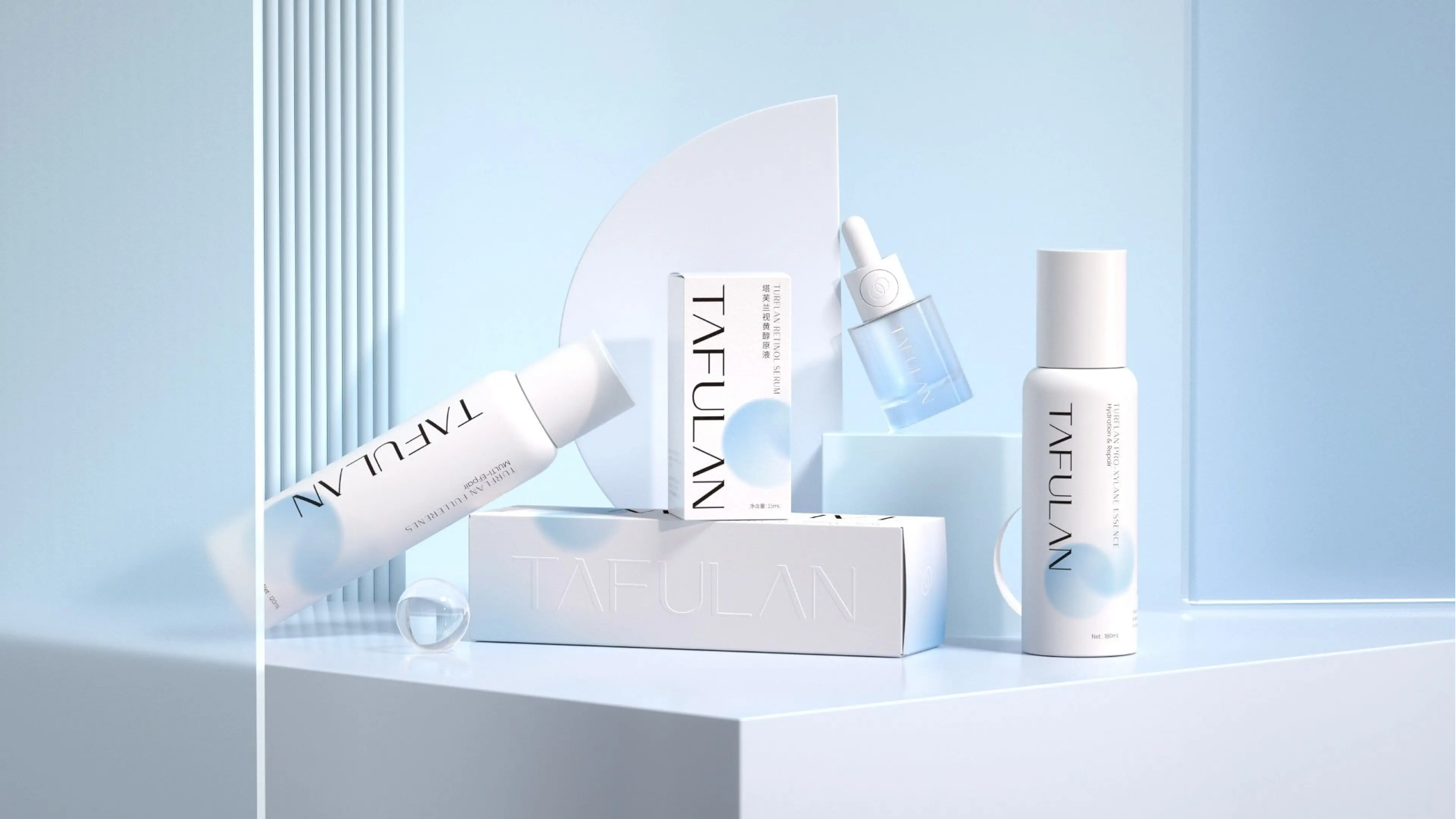
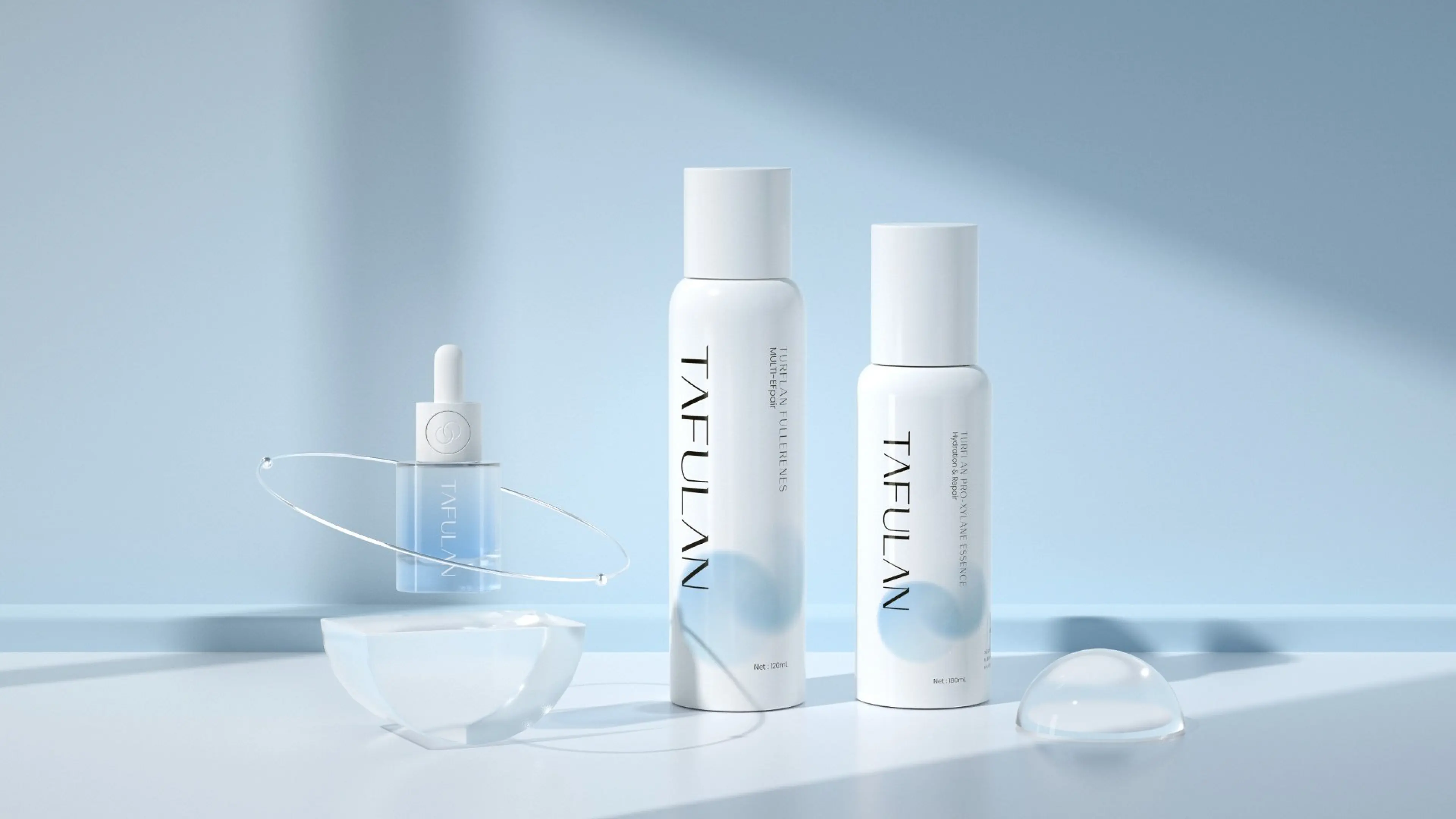
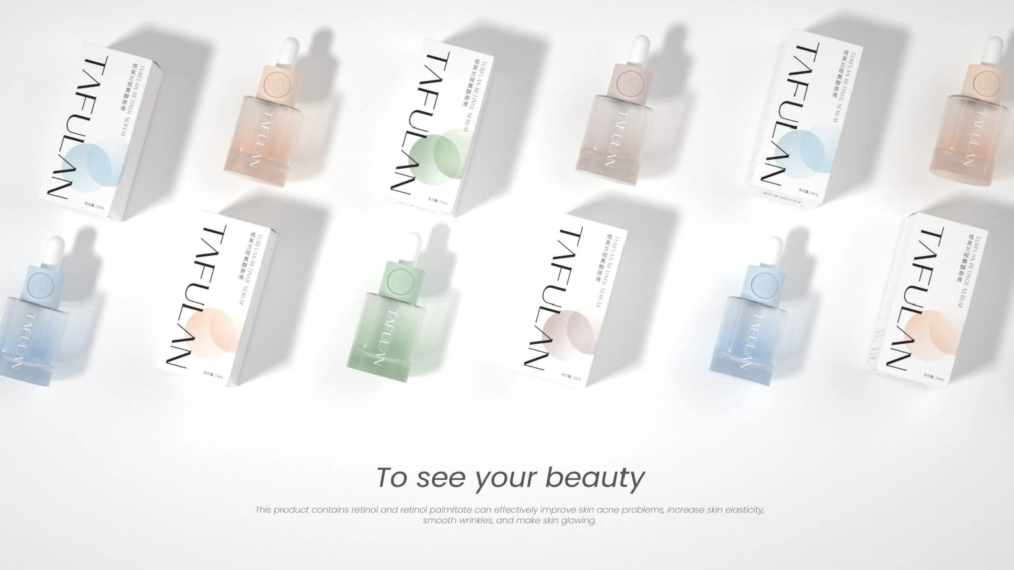
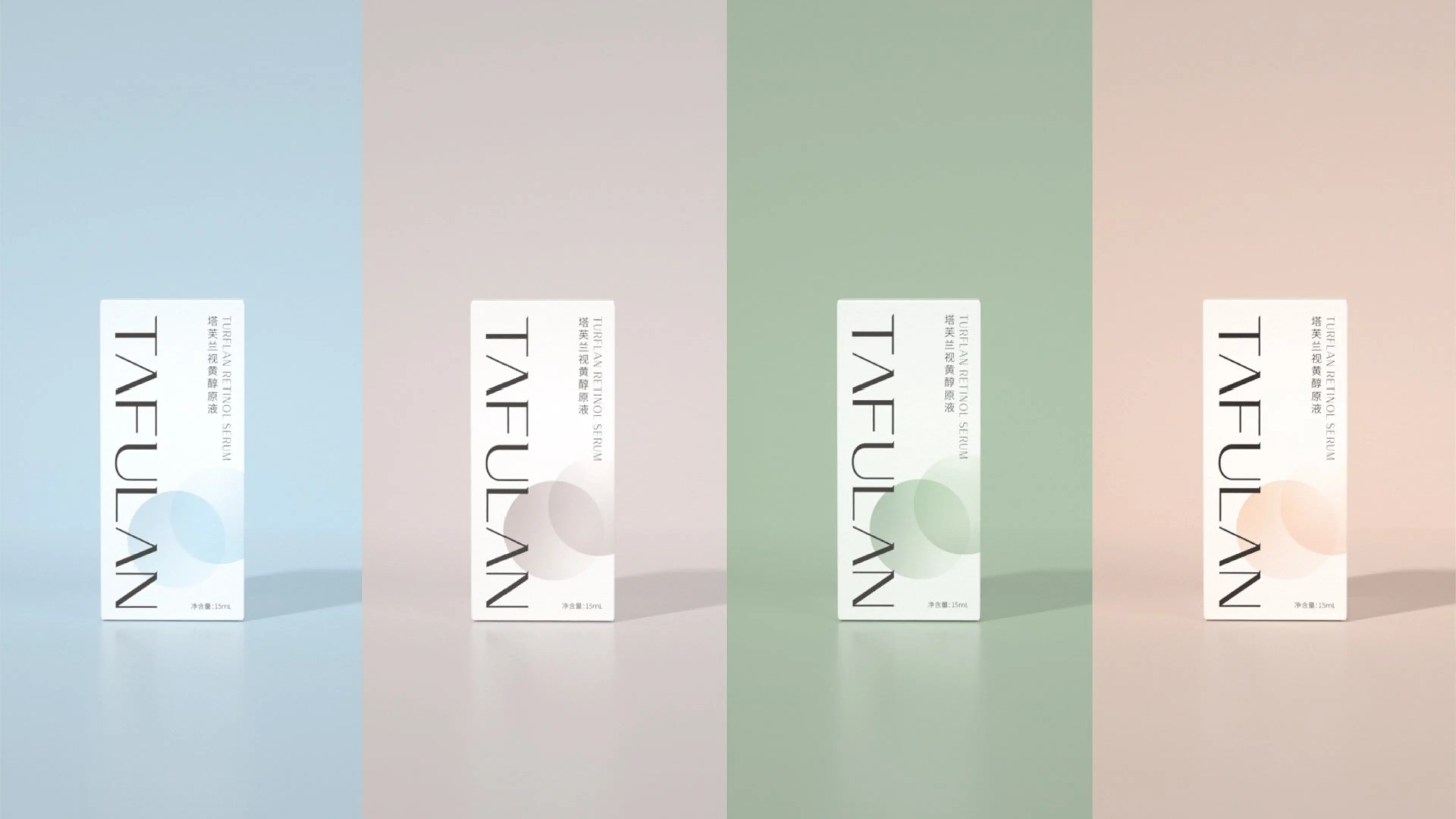
This packaging design was created around the themes of research, simplicity, professionalism, and sophistication. The design team broke away from the exaggerated commercial design patterns of efficacy concentrates in the market, using research-based skincare as the visual core. The color selection was of stable and high-saturation tones, highlighting the brand's image of laboratory skincare and professional efficacy; the layout was restrained and simple, minimizing unnecessary decorations, and highlighting the efficacy attributes of the retinol concentrate, conveying the concept of a simple formulation for skincare. The entire visual system extended to the bottle, outer packaging box, and e-commerce promotional materials, building a unified, complete, and highly recognizable efficacy skincare visual image. With a simple and sophisticated visual language, the brand's research strength is conveyed, achieving a high degree of alignment between brand positioning, product efficacy, and the aesthetic preferences of the target audience.