
SHANGHAI LAOZHOU has been deeply rooted in the Shanghainese Chinese and Western pastry industry for many years. Based in the local Shanghai market, the brand is committed to preserving the traditional craftsmanship of Jiangnan-style pastries.
As one of the brand’s key seasonal spring products, Mugwort Qingtuan is made with carefully selected fresh mugwort, retaining its natural herbal fragrance while recreating the traditional taste of spring in Jiangnan food culture.
The product is designed for multiple occasions, including traditional family consumption, trial purchases by younger consumers, and springtime gifting. While preserving the authentic taste of classic Shanghai pastries, the brand also embraces the aesthetic preferences of a new generation, bringing renewed youthful energy to this traditional seasonal delicacy and introducing spring qingtuan to more households.
This packaging project was developed around the core concept of “Tasting Spring.”
The design team chose to move away from the outdated and conventional visual language often associated with traditional qingtuan packaging, instead exploring the broader cultural meaning of qingtuan within Jiangnan spring traditions.
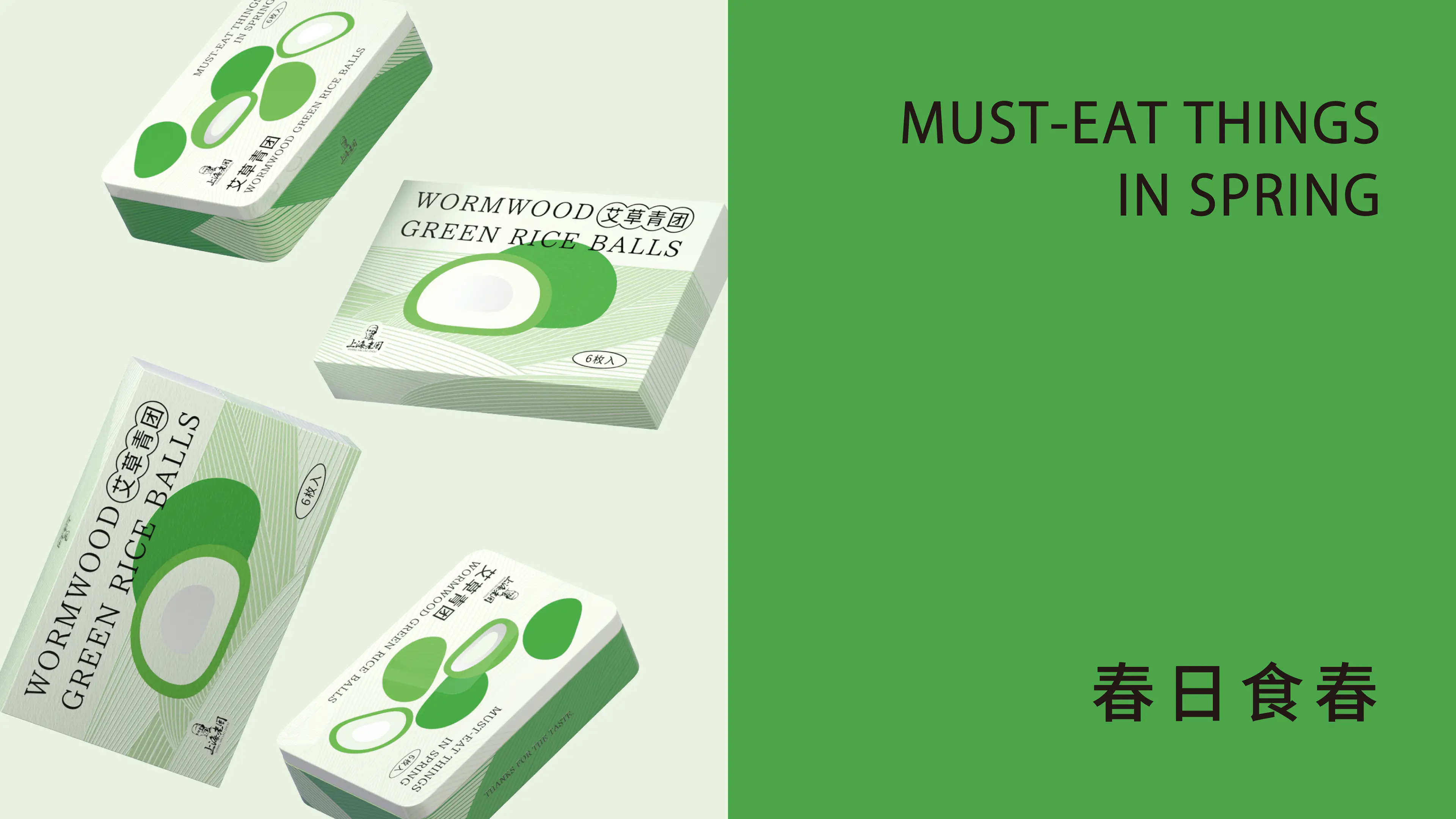
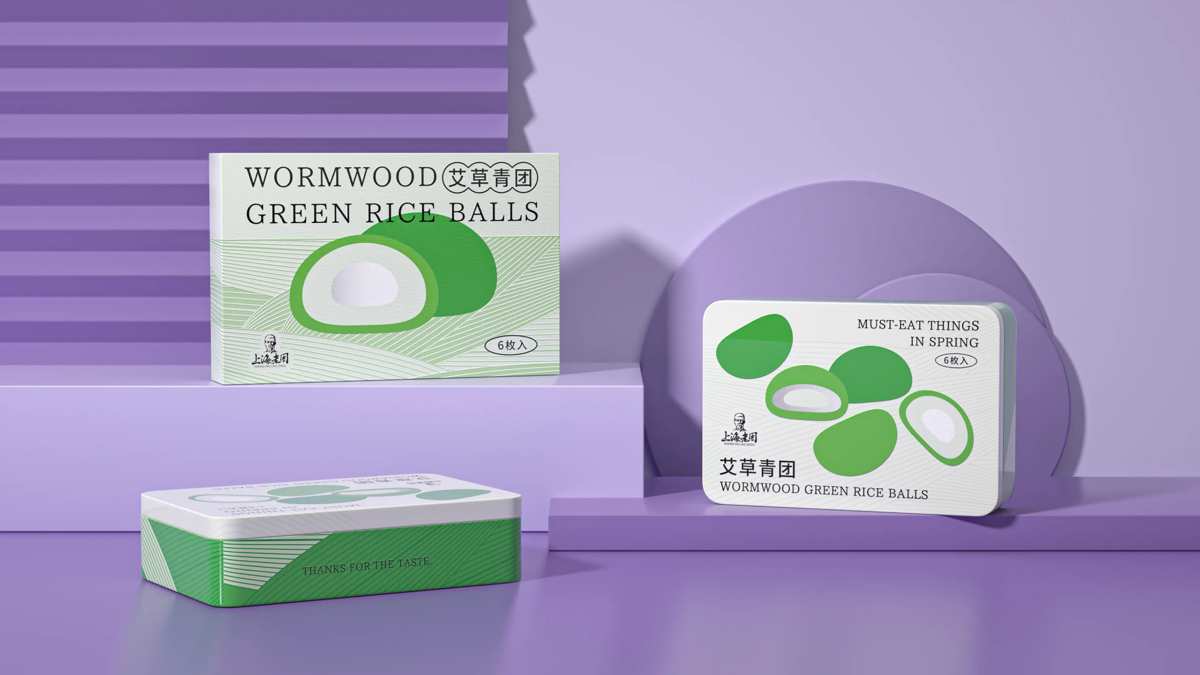
The visual system was built around two key elements: mugwort and the colors of spring.
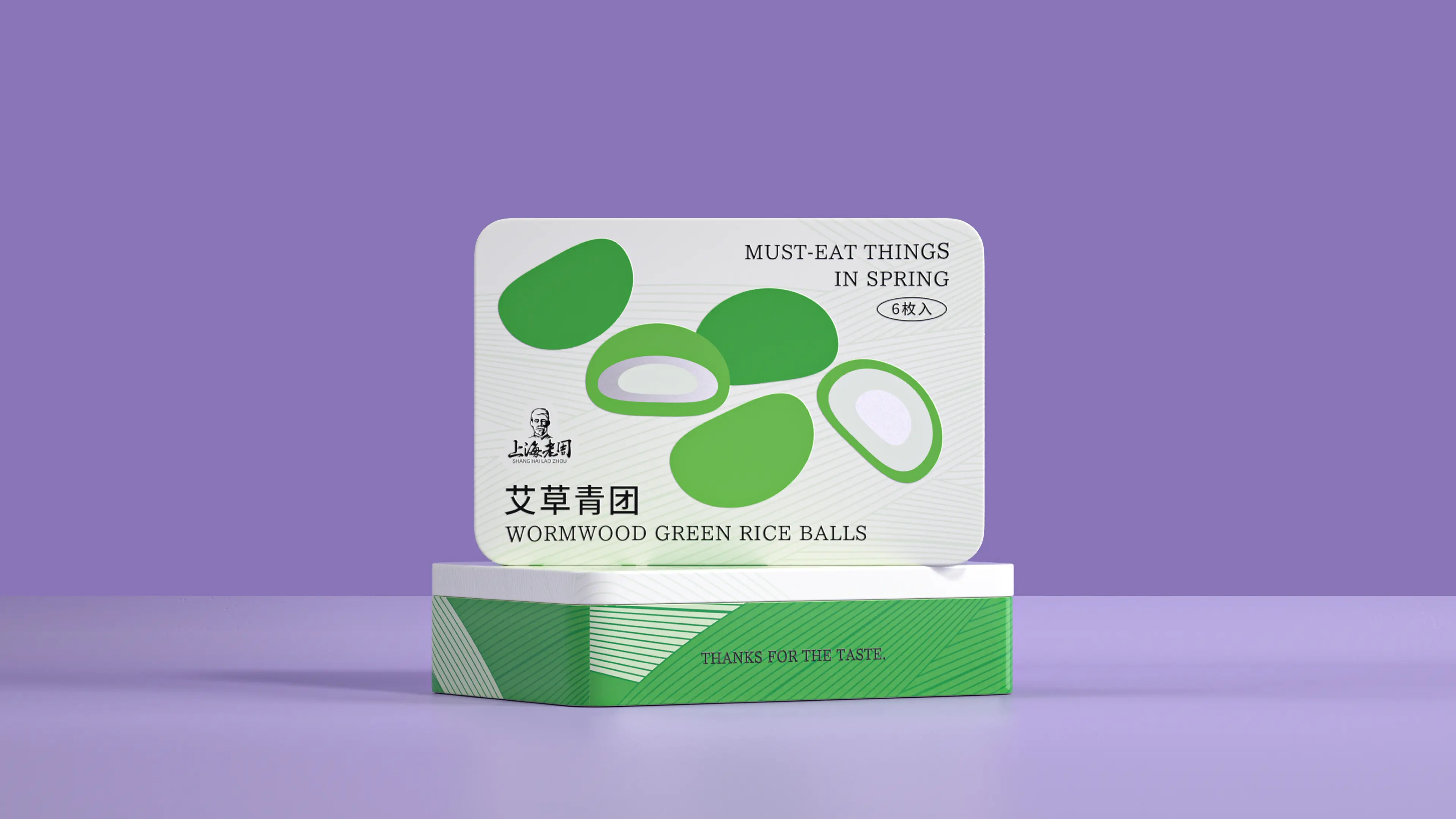
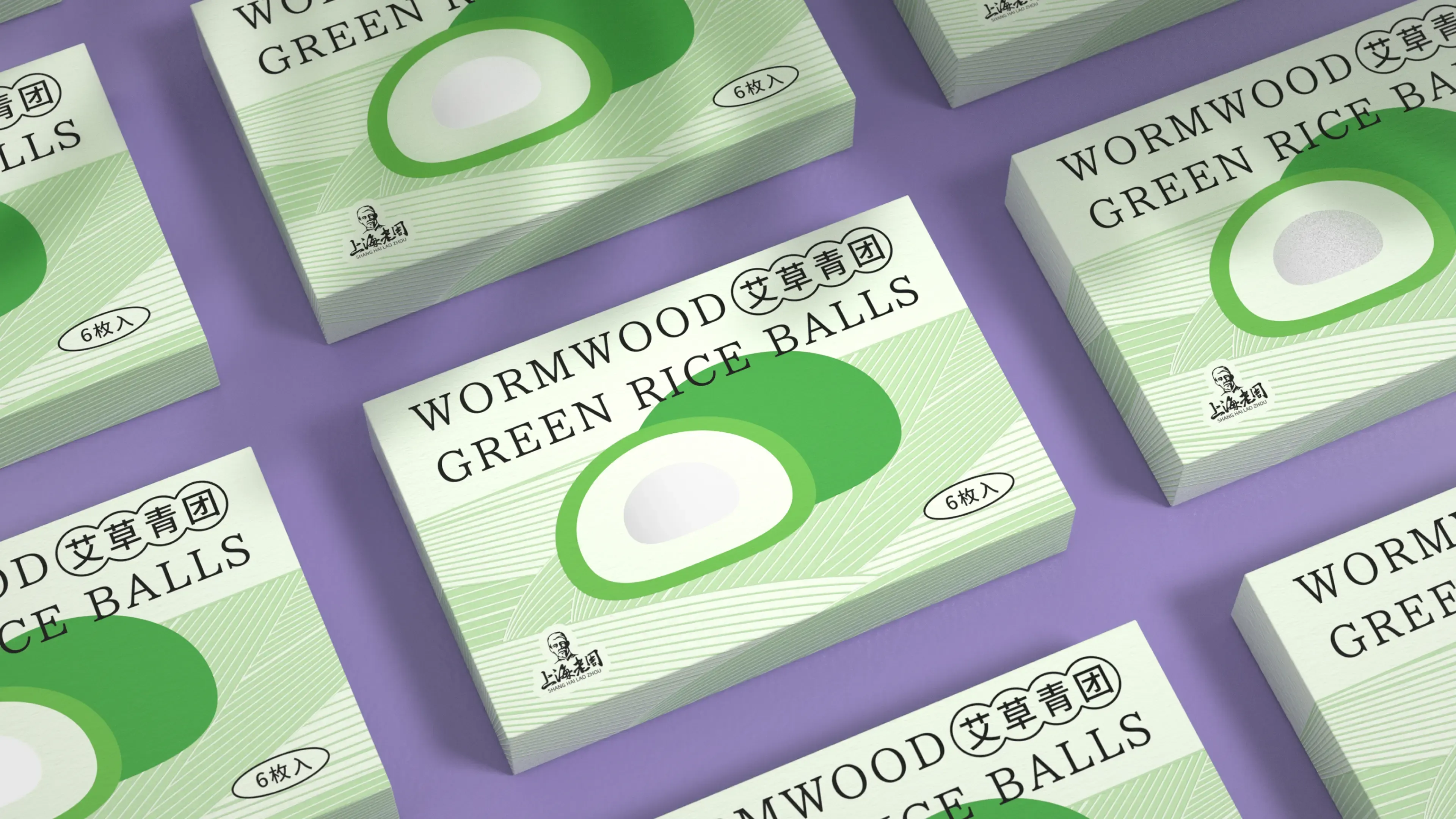
A fresh and gentle mugwort green was selected as the primary visual tone, directly communicating the product’s natural herbal quality and seasonal freshness. This is paired with clean and minimal supporting graphics that evoke the atmosphere of spring breeze, new growth, and the soft scenery of Jiangnan in springtime.
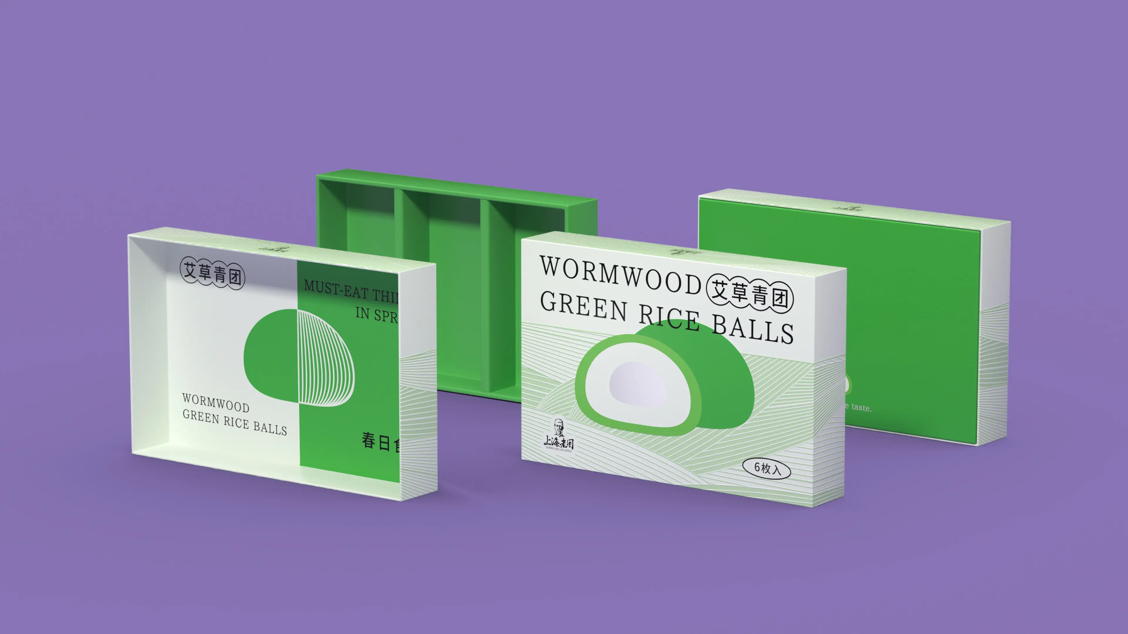
The layout is light, clean, and airy, reducing unnecessary decorative elements while keeping the focus firmly on the product itself and its seasonal identity as Mugwort Qingtuan.
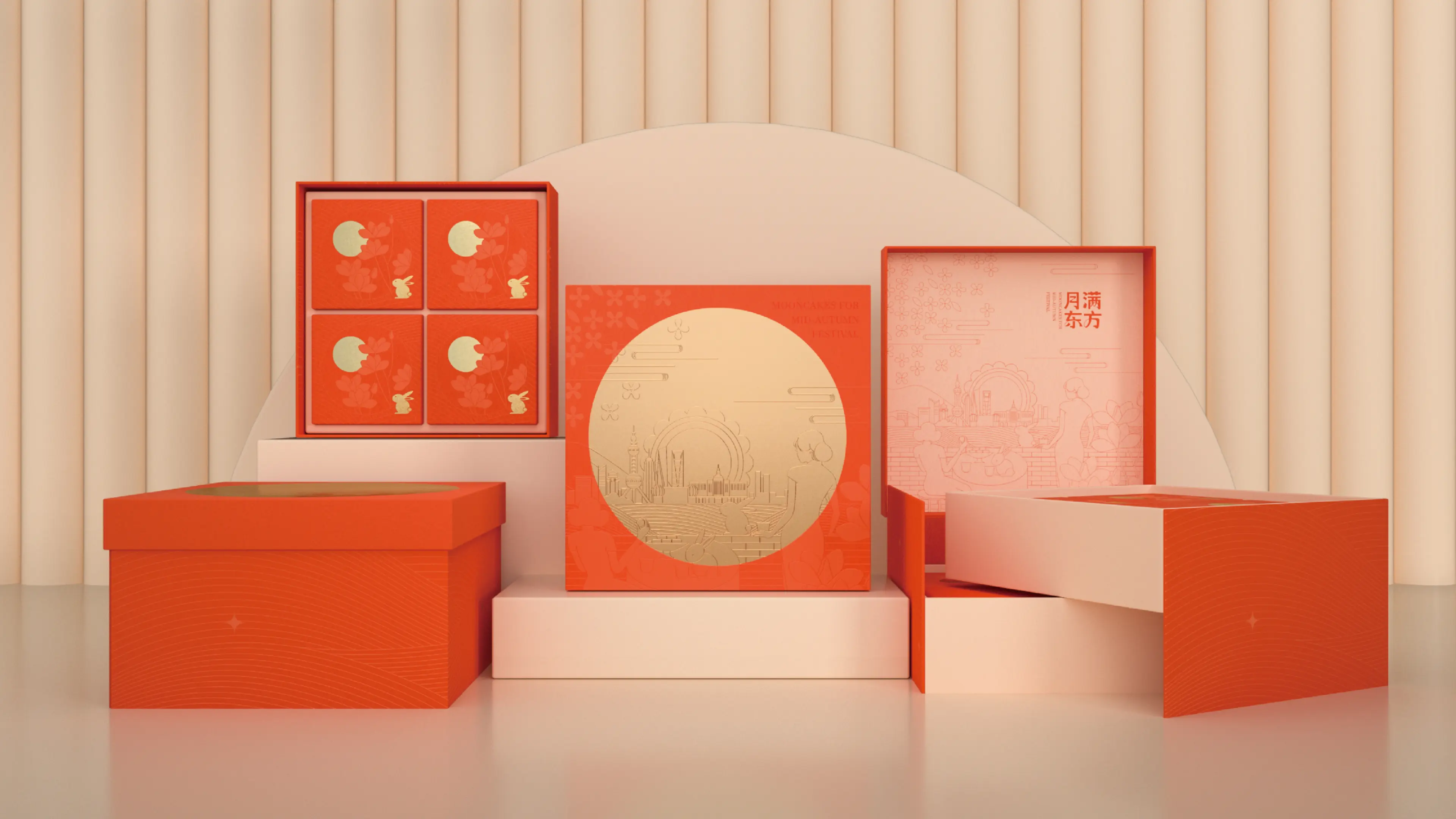
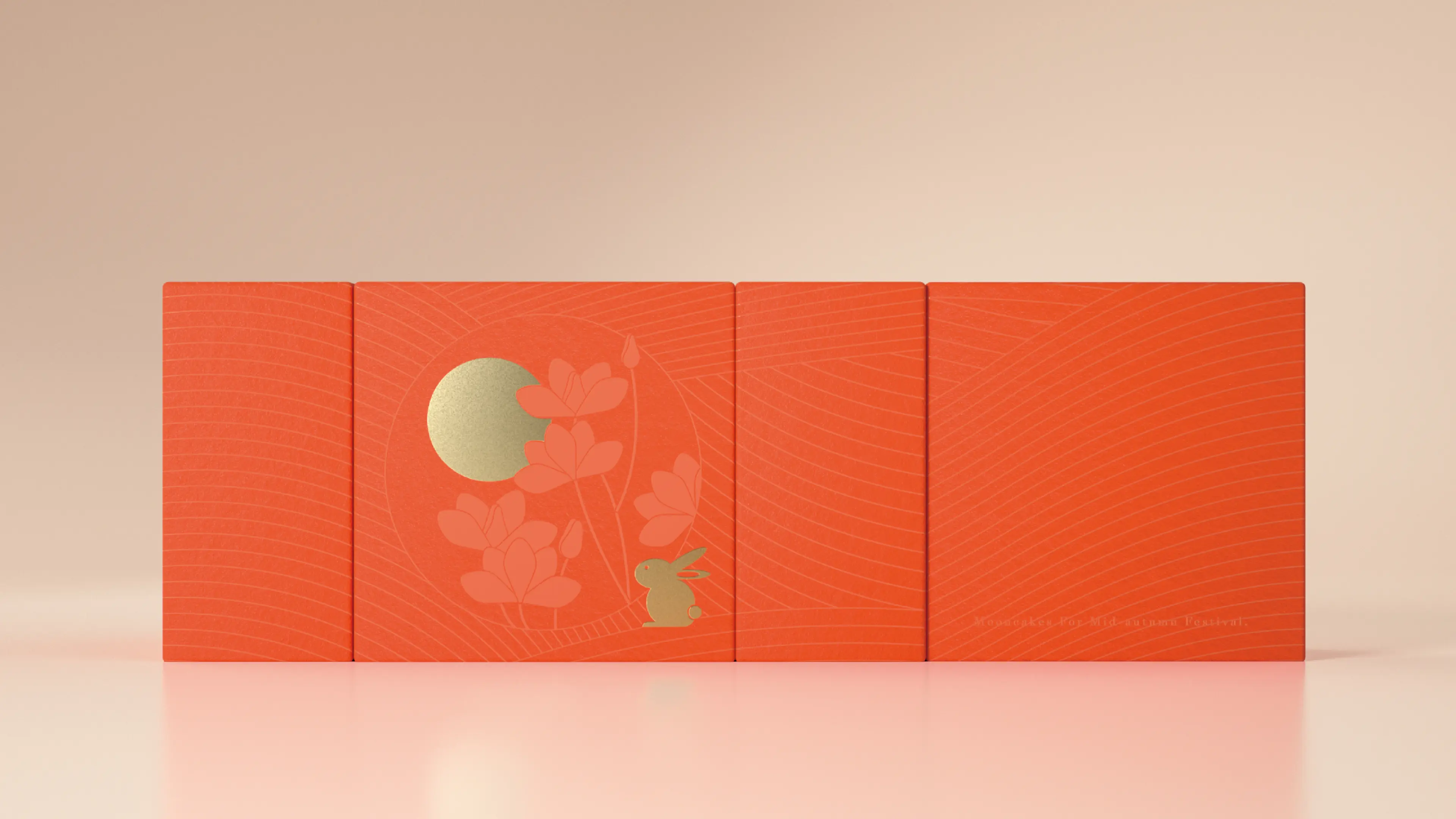
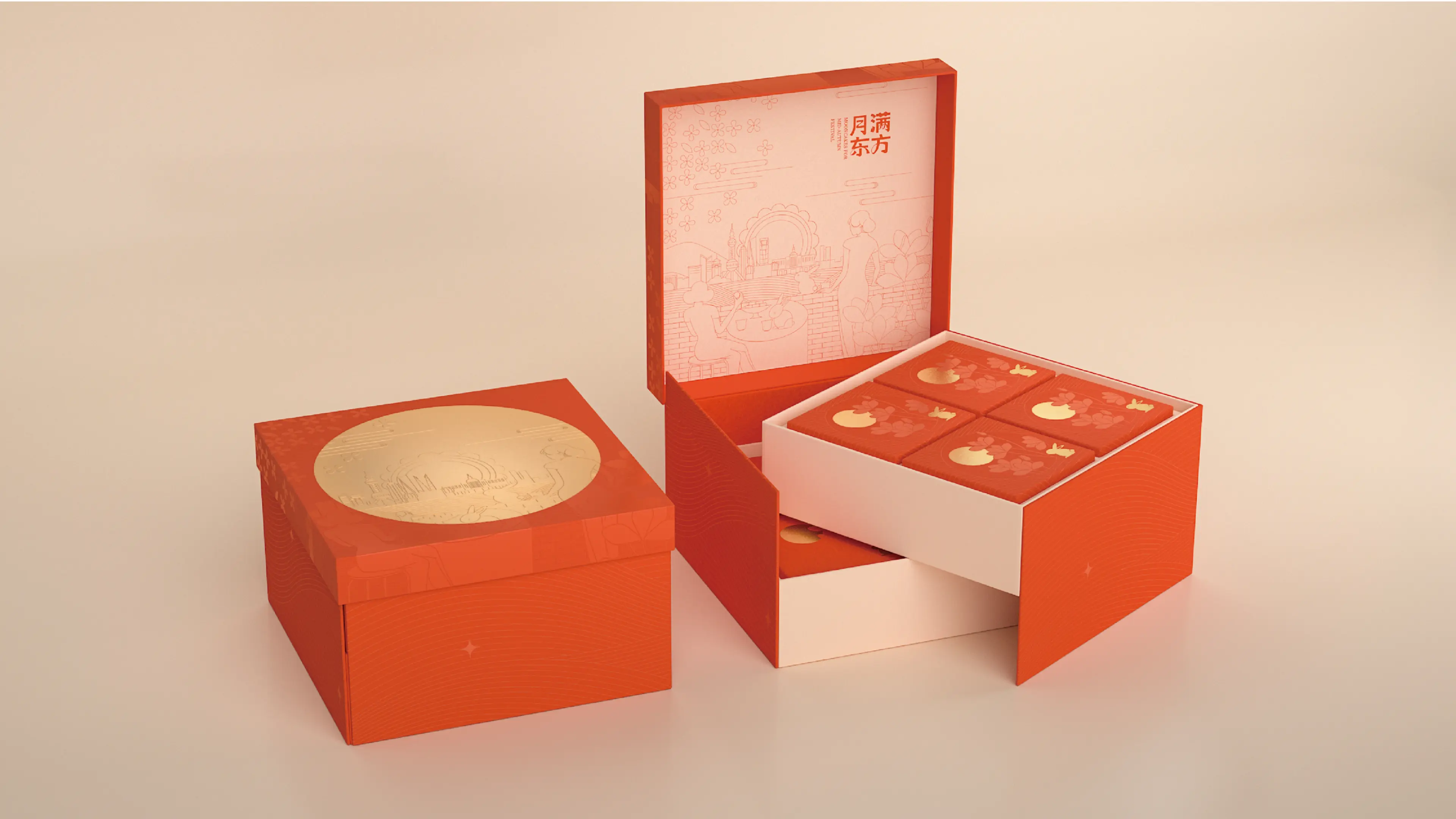
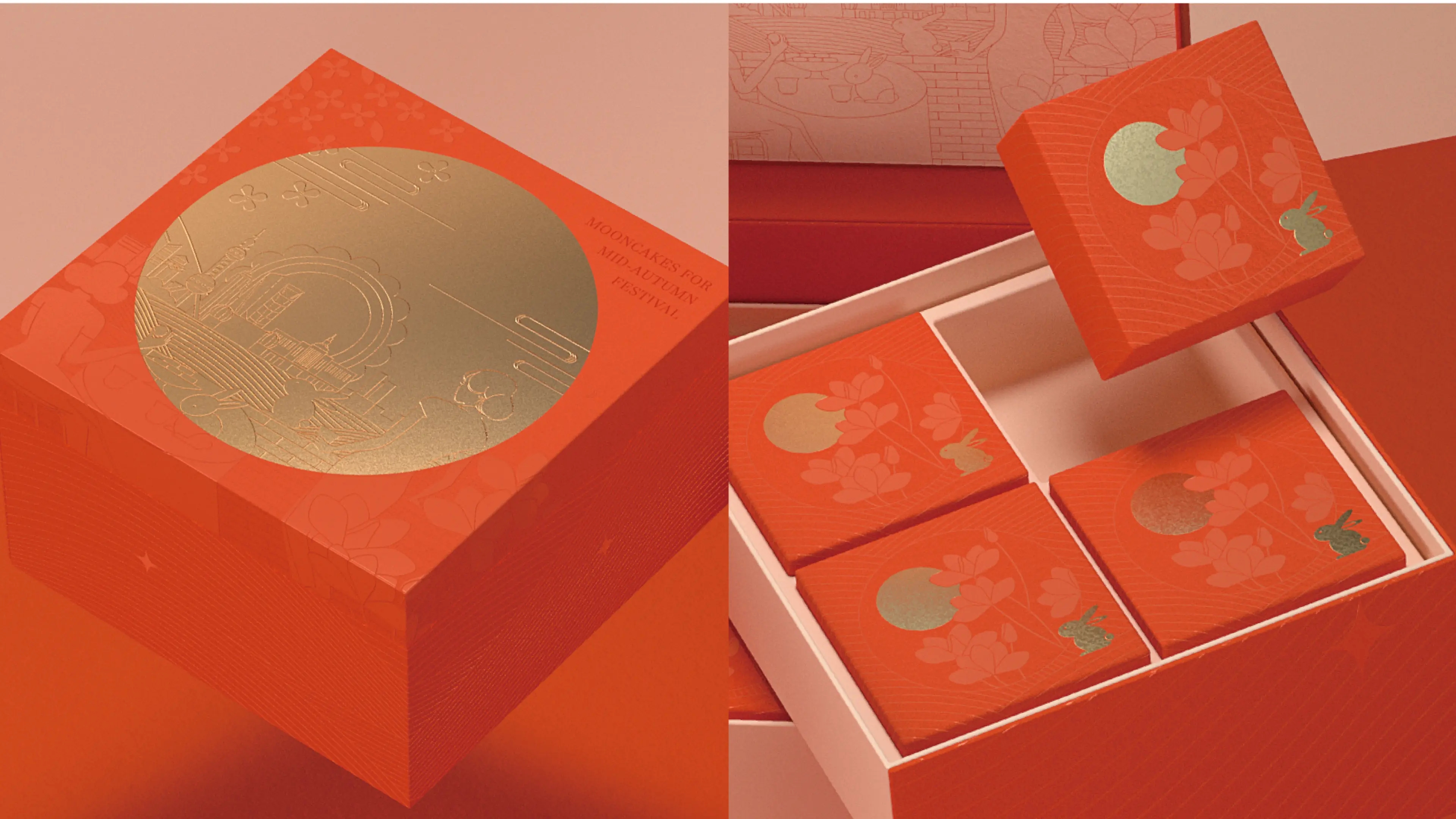
The full visual system extends from paper boxes and tin packaging to online e-commerce promotional materials, creating a unified and complete product identity across all touchpoints.
While retaining the warmth and cultural familiarity of traditional Jiangnan pastries, the design also introduces a more contemporary and trend-aware visual sensibility. The result is an organic fusion of traditional flavor, springtime atmosphere, and youthful aesthetics, helping the brand stand out in the highly competitive seasonal qingtuan market.