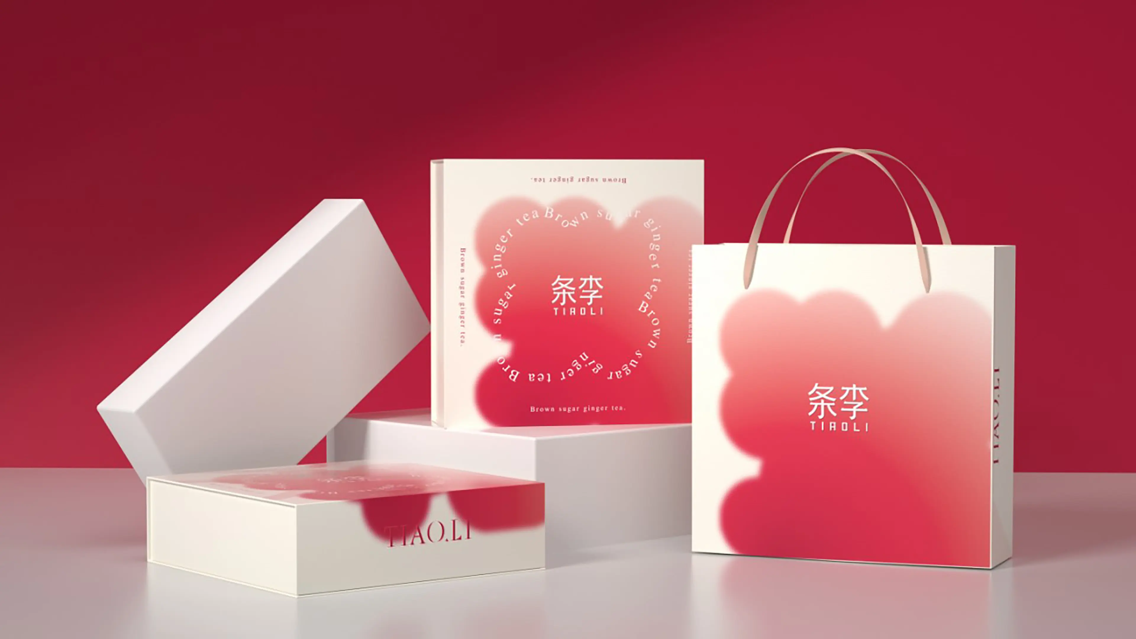
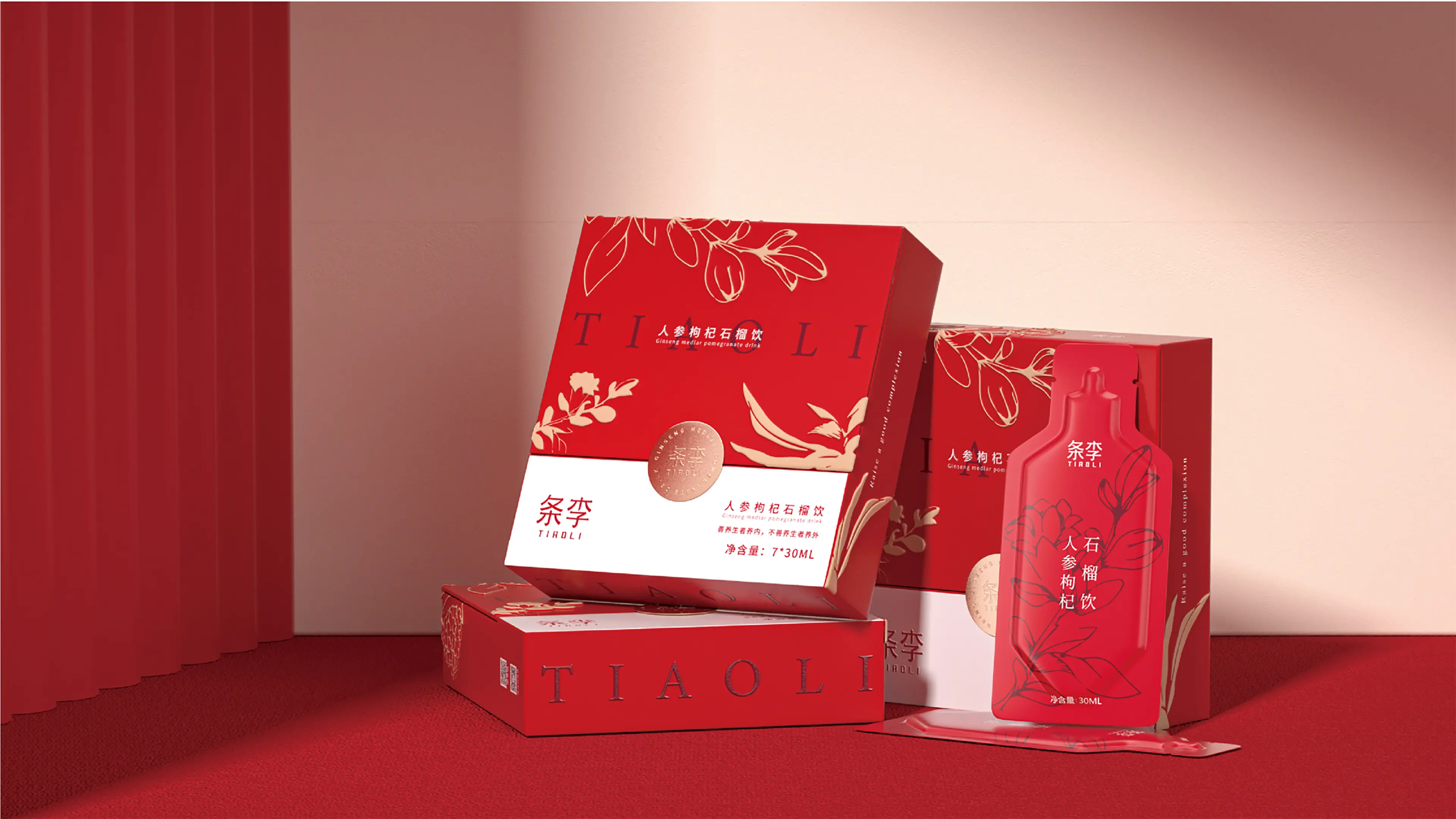
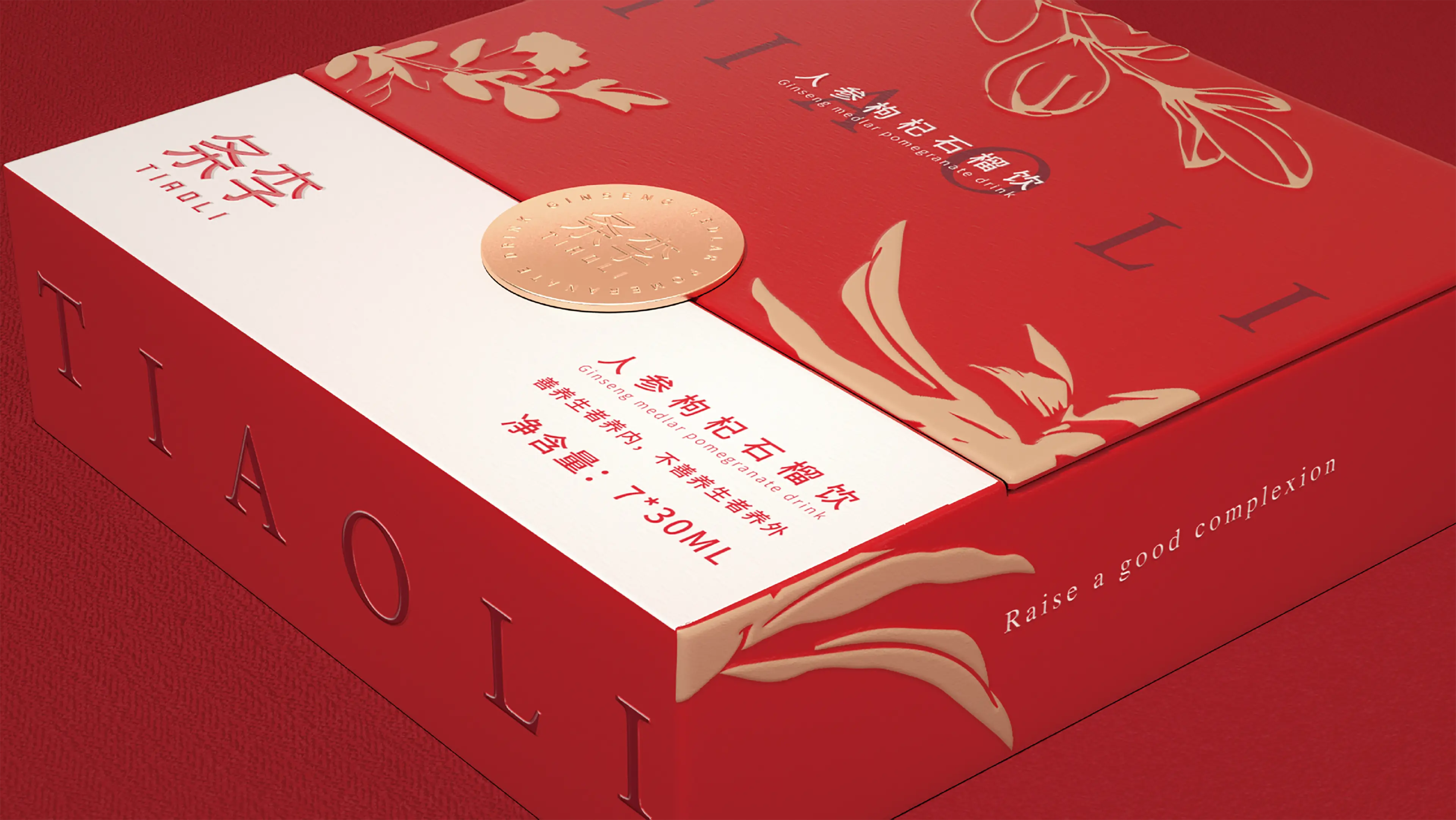
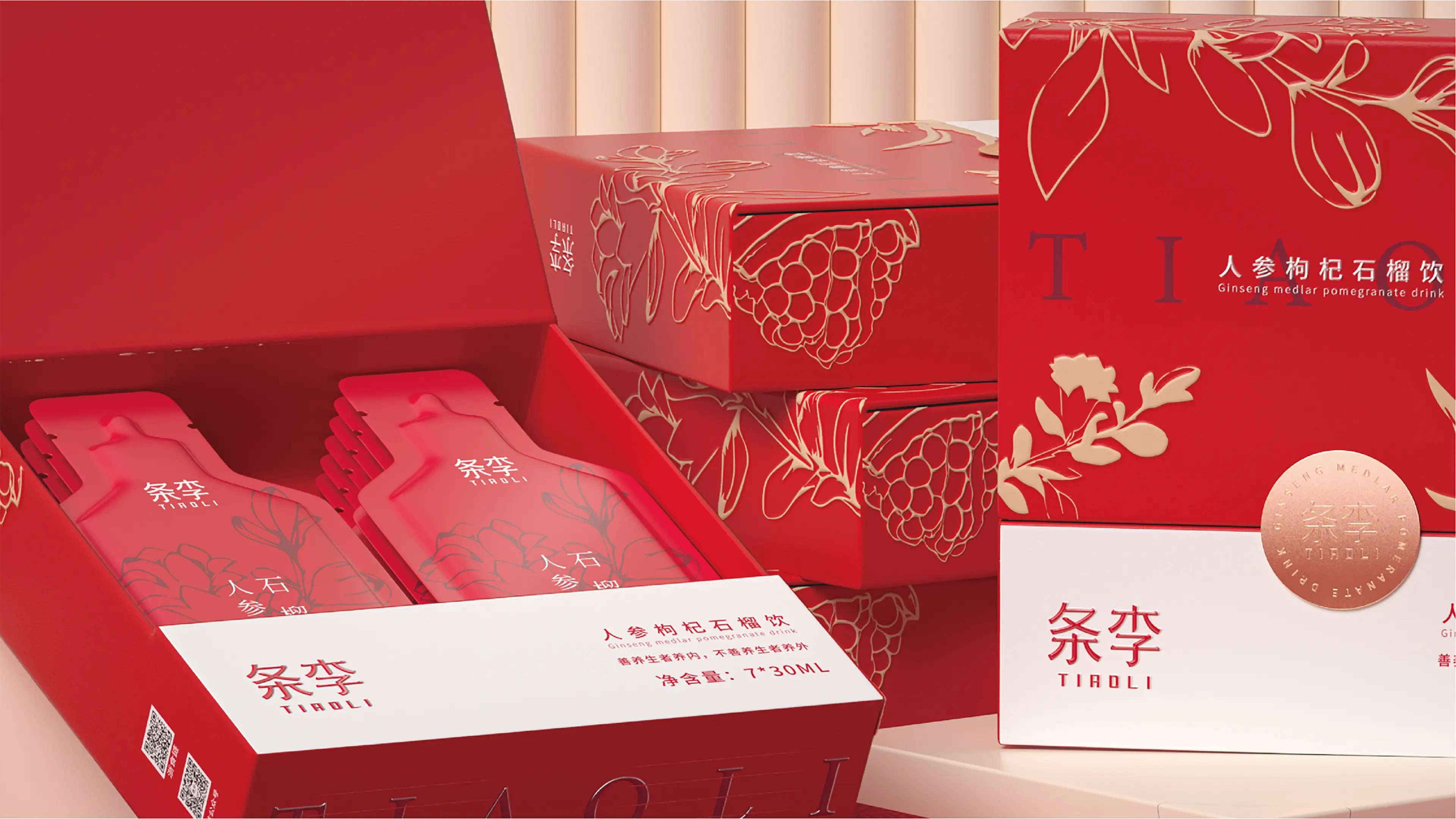
TIAOLI is a contemporary Chinese wellness tea brand focused on younger consumers, with a particular emphasis on women’s everyday nourishment and light wellness.
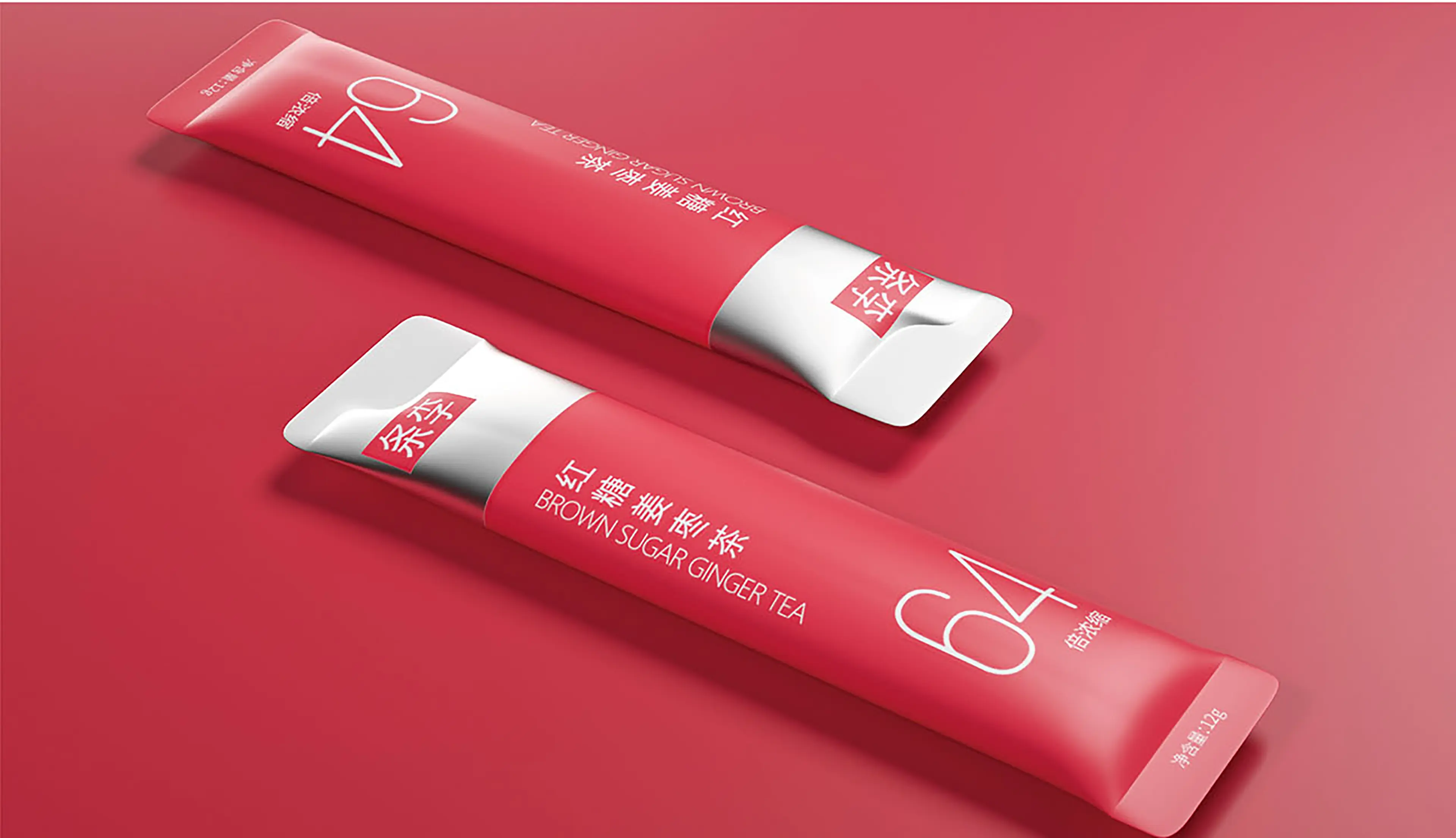
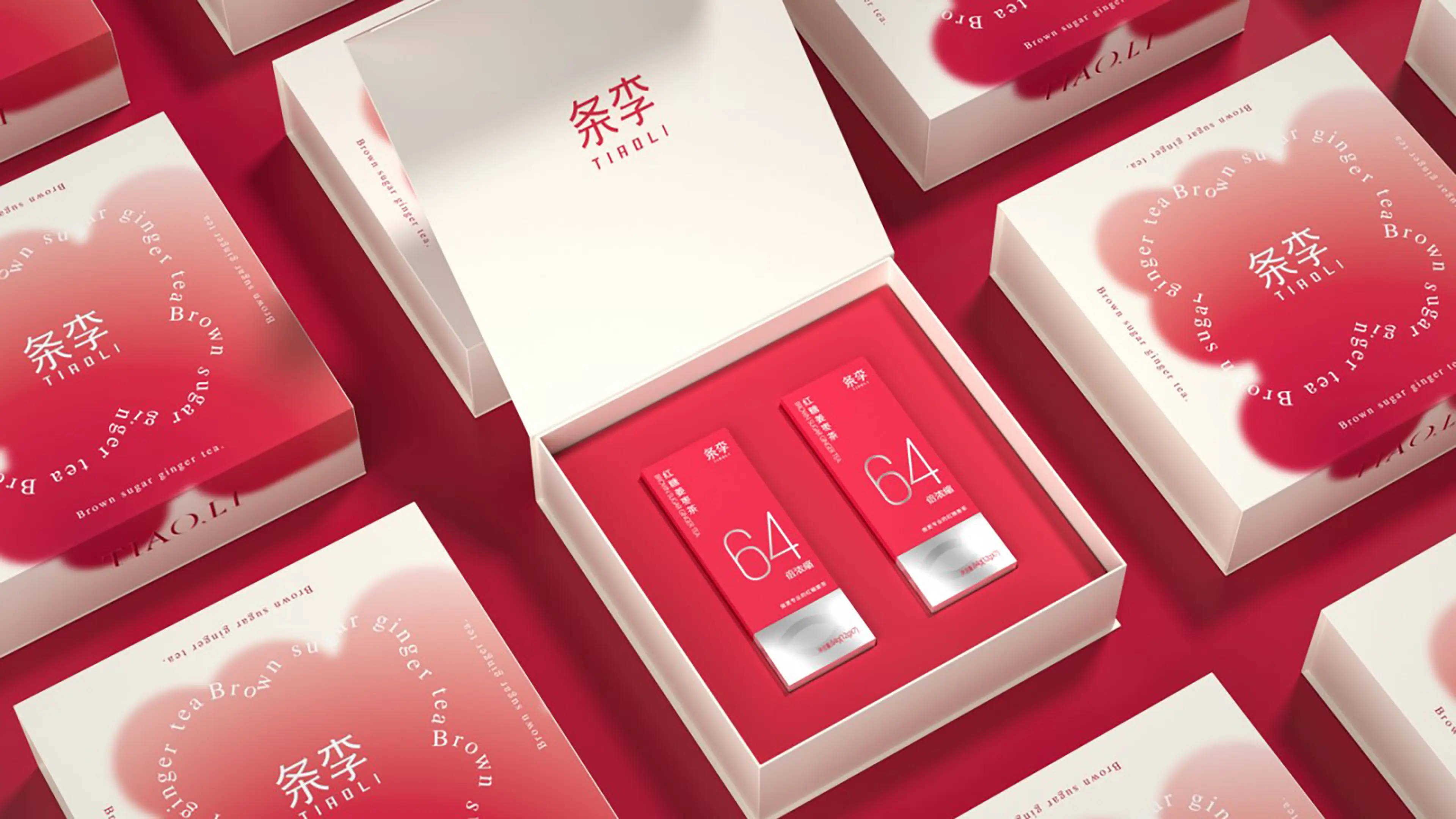
Responding to the growing interest in convenient daily self-care, the brand developed a more professional and fashion-forward interpretation of Brown Sugar Ginger & Jujube Tea. The product features a 64× concentrated formula made from carefully selected ingredients including brown sugar, ginger, and jujube, scientifically proportioned and individually packed for quick and convenient preparation.
Designed for young urban women who value menstrual care and everyday warming nourishment, the product moves away from the outdated image traditionally associated with ginger tea. Instead, TIAOLI transforms a familiar wellness beverage into a refined, portable lifestyle product that offers warmth and care anytime, anywhere.
This packaging project was developed around four core qualities: fashion, refinement, warming nourishment, and portability.
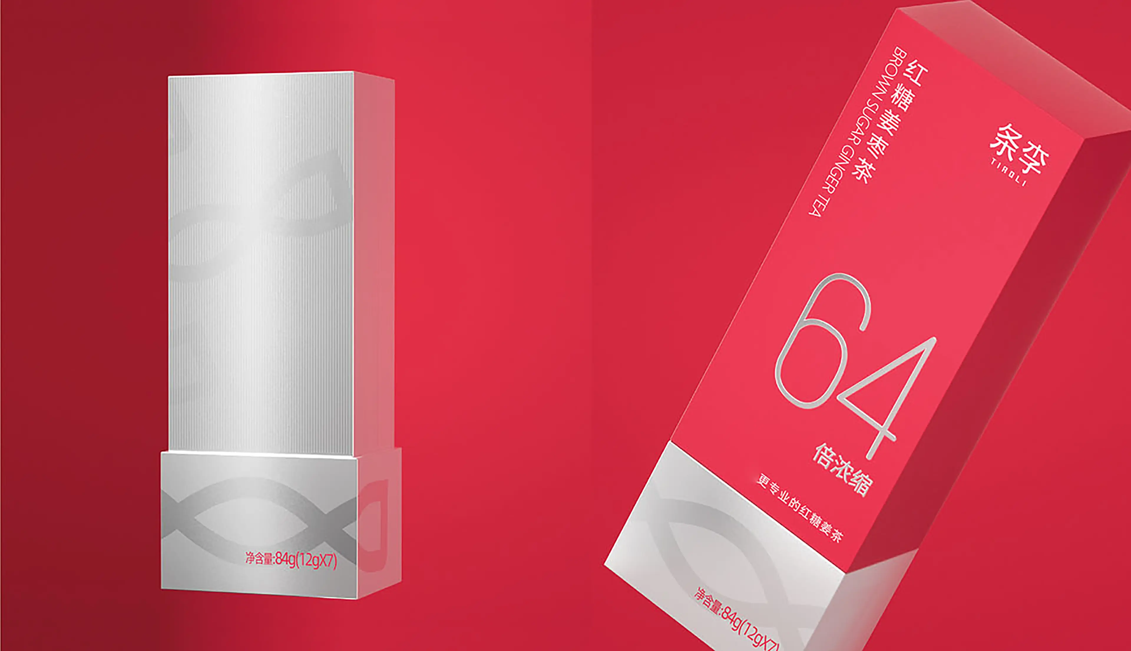
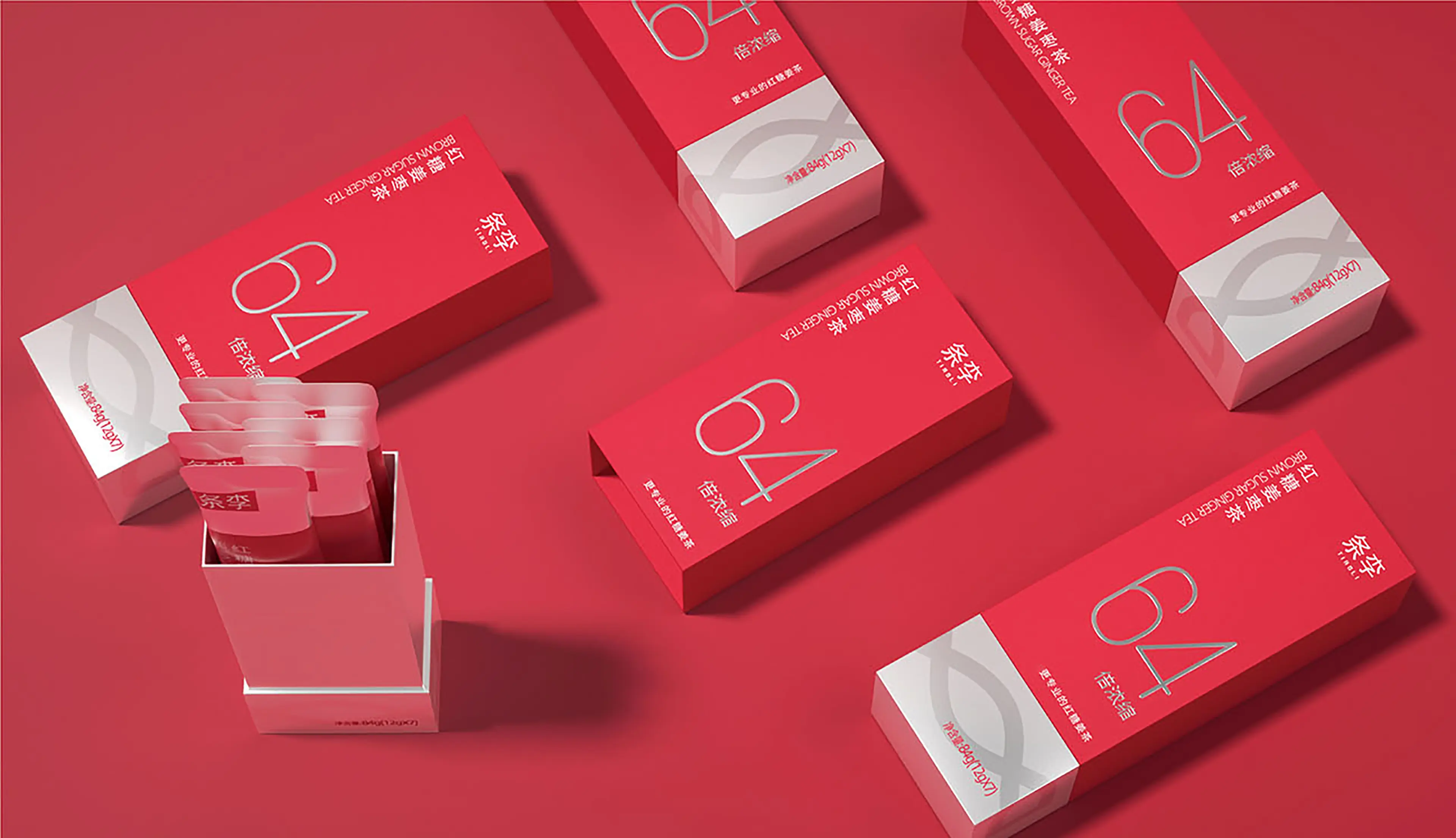
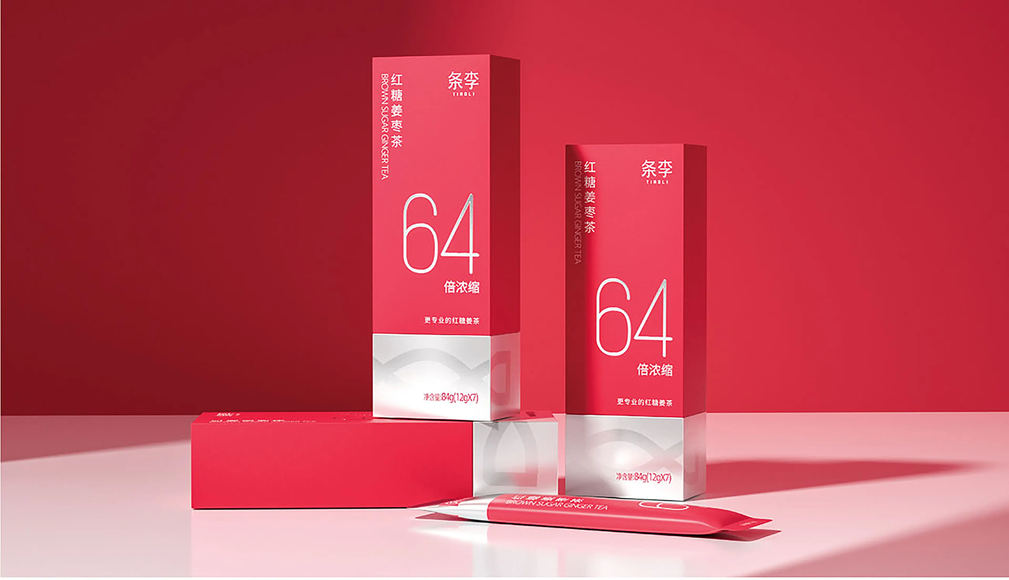
Rather than following the retro and conventional visual language commonly seen in the brown sugar ginger tea category, we took inspiration from the form of a lipstick. The opening mechanism of the package also references the familiar interaction of using lipstick, reinforcing the idea that the product can accompany women in everyday life just like a personal beauty essential.
This concept allows the product to express care and companionship in a more contemporary and emotionally engaging way.
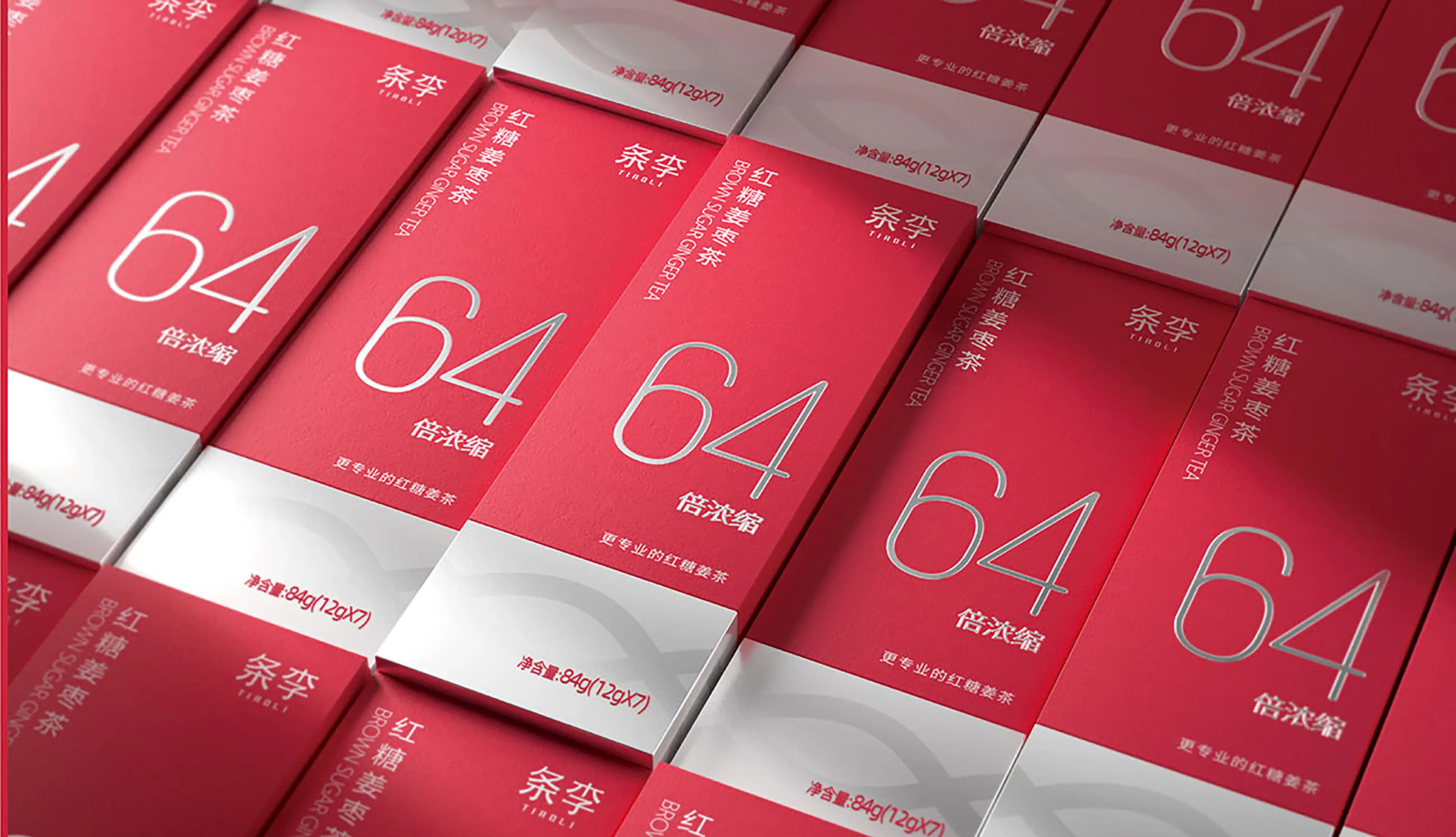
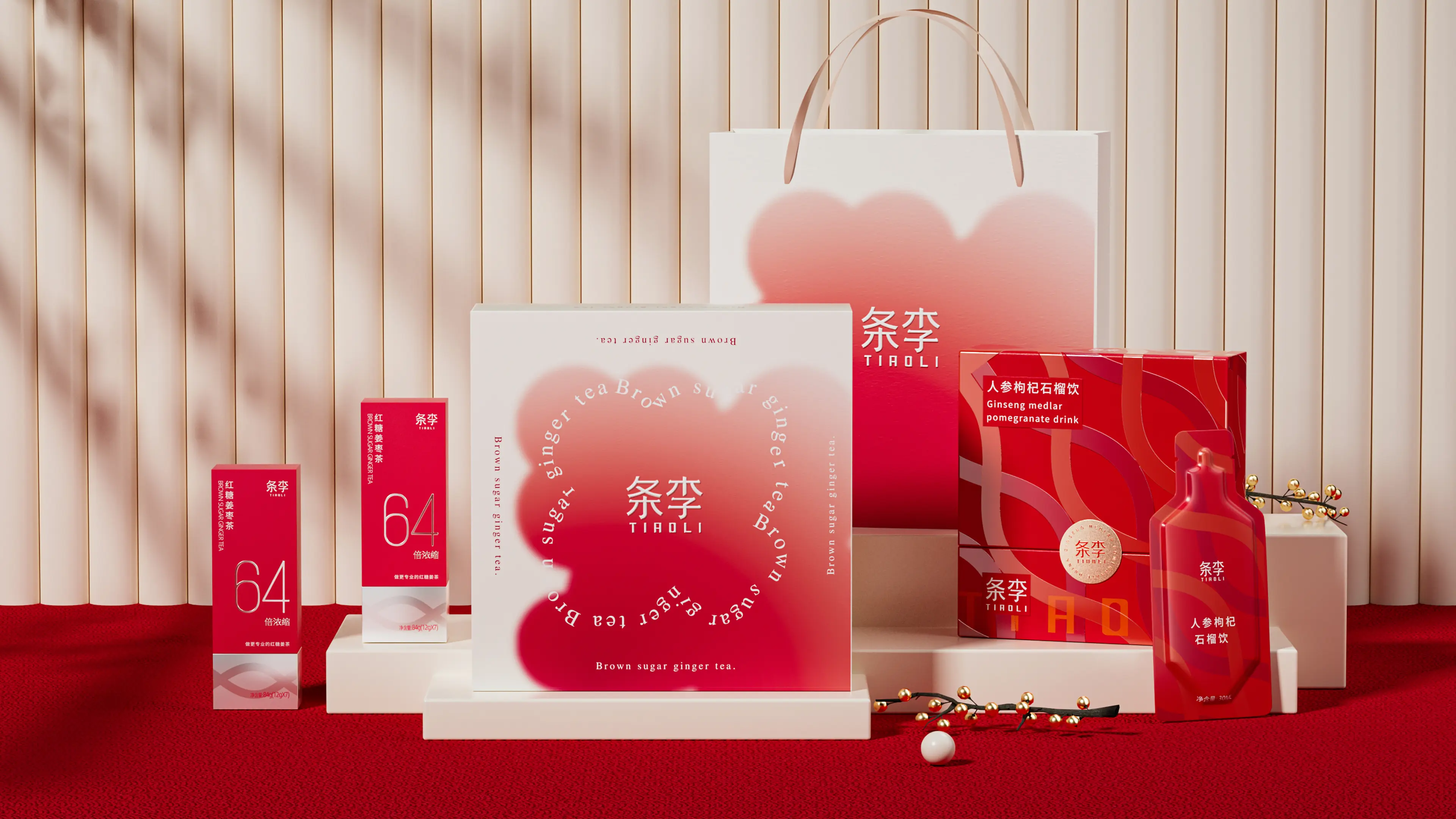
A vivid yet refined red was selected as the primary brand color, communicating warmth, vitality, and nourishment. “64× Concentrated” was elevated as the primary visual selling point, allowing consumers to immediately understand the product’s key functional advantage.
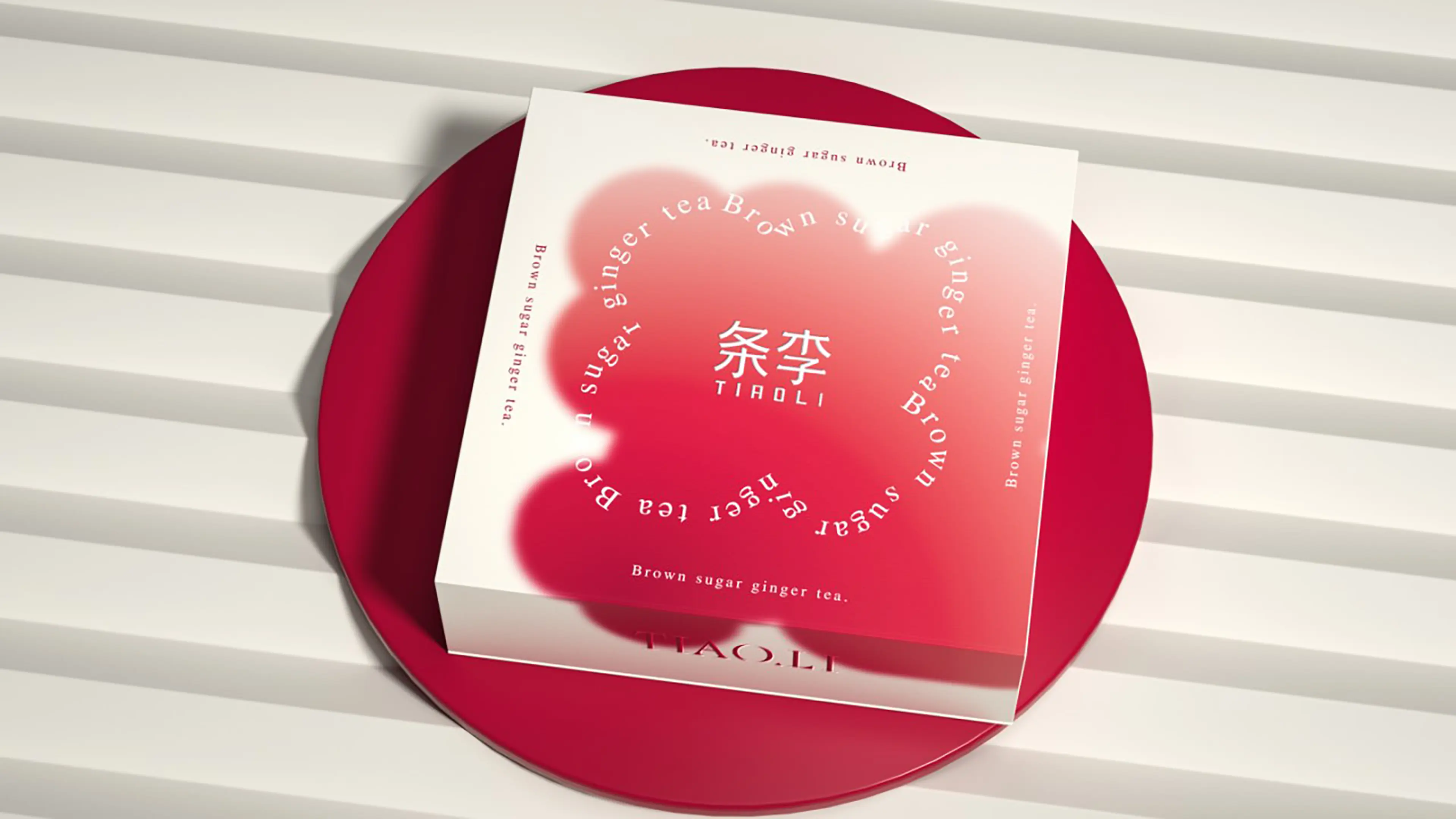
The overall layout remains clean and modern, reducing excessive traditional wellness imagery in favor of a more polished and youthful visual language.
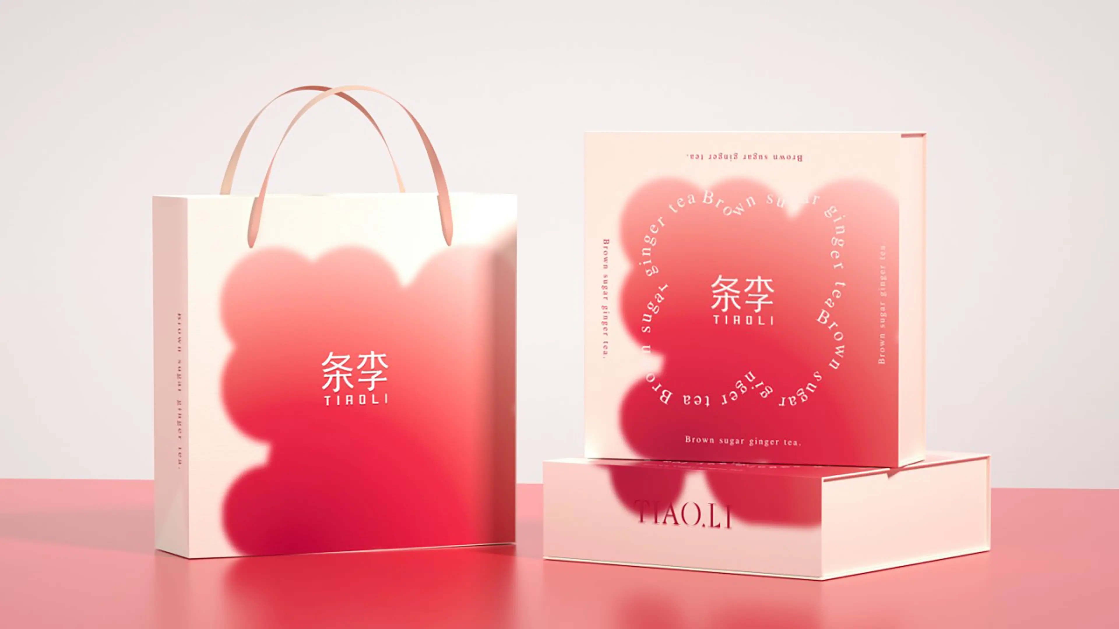
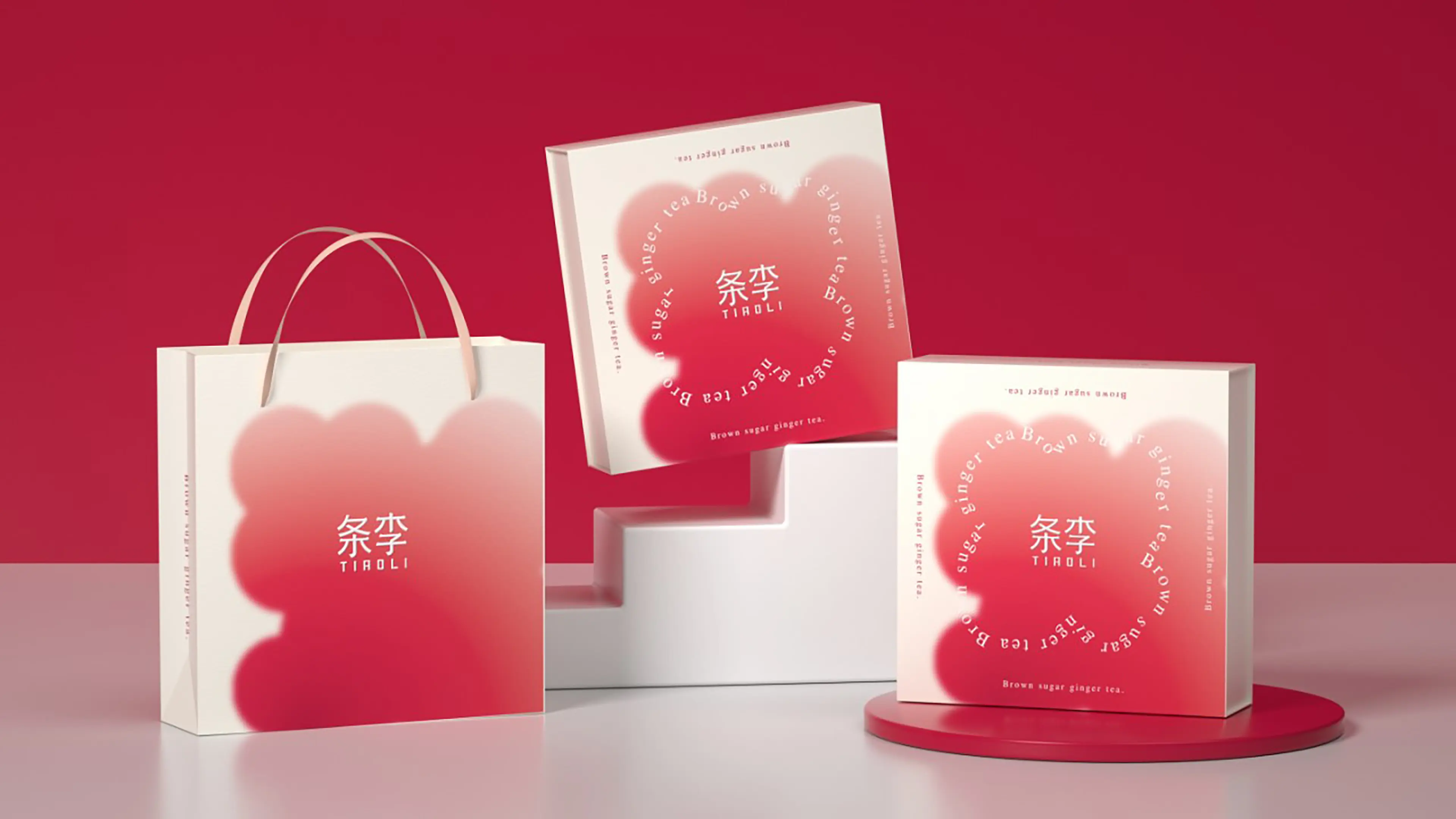
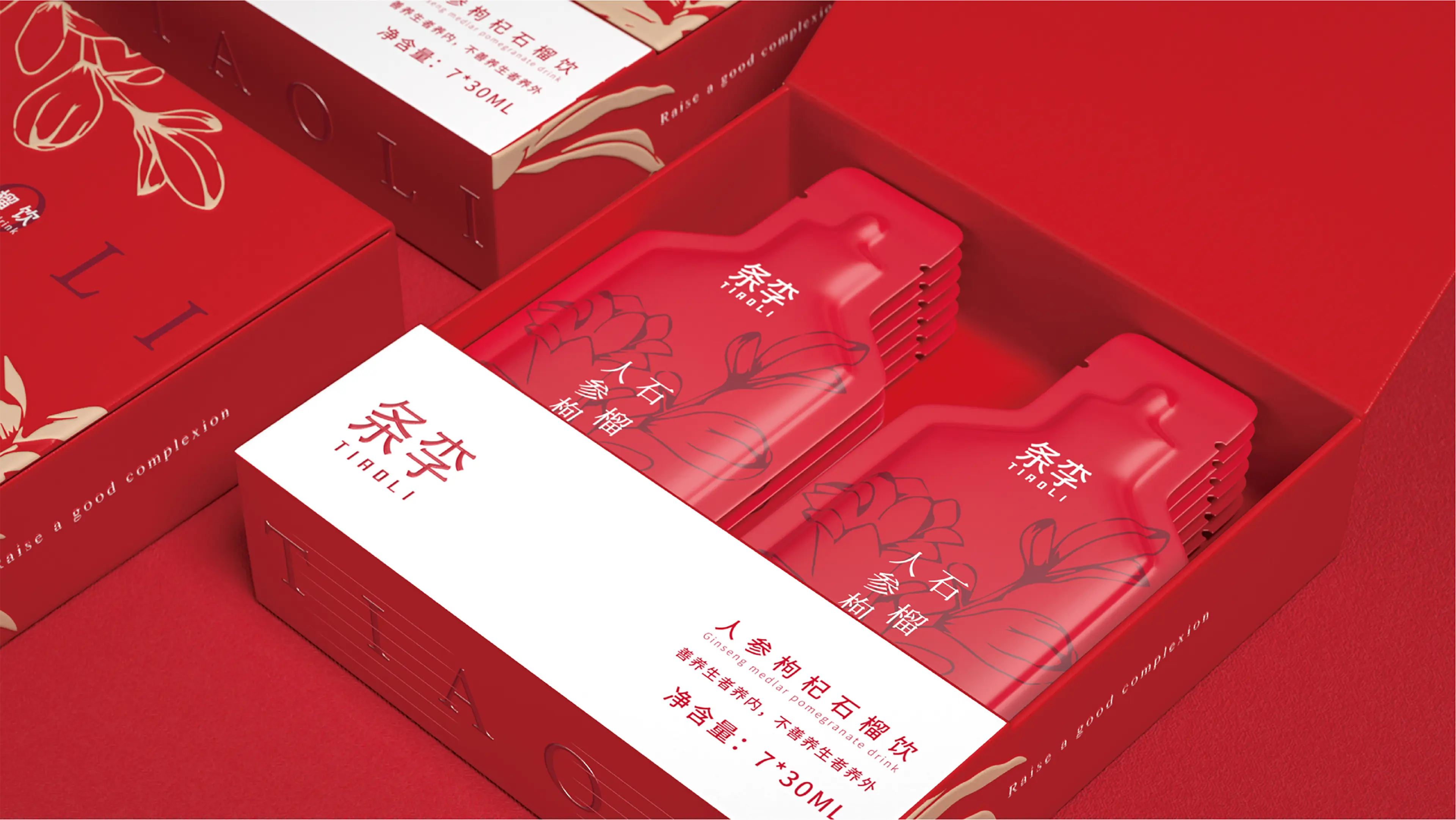
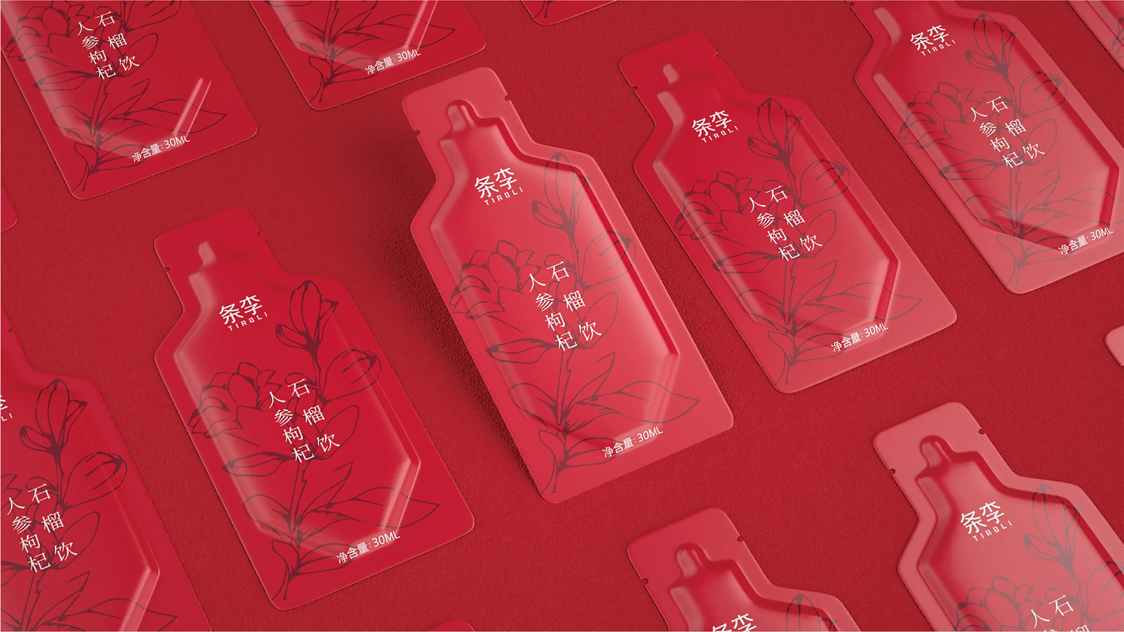
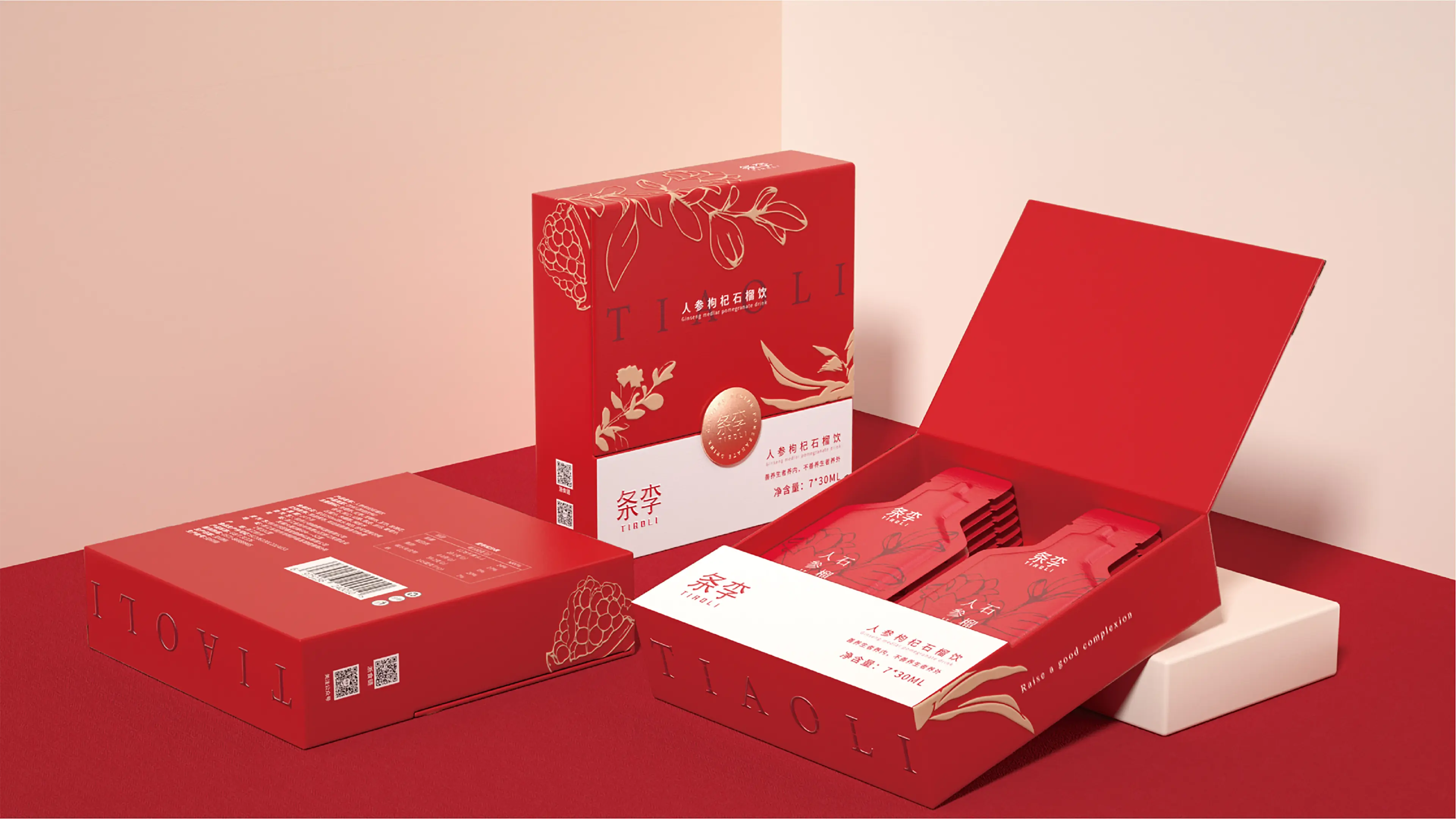
The complete visual system extends across individual stick packs, the lipstick-inspired outer box, gift sets, and e-commerce promotional materials, creating a highly recognizable identity for a new generation of wellness beverages.
By aligning fashion-led packaging innovation, women’s warming wellness, and the aesthetic preferences of younger consumers, the project successfully transforms a traditional ginger tea product into a modern, portable, and highly memorable lifestyle offering.