



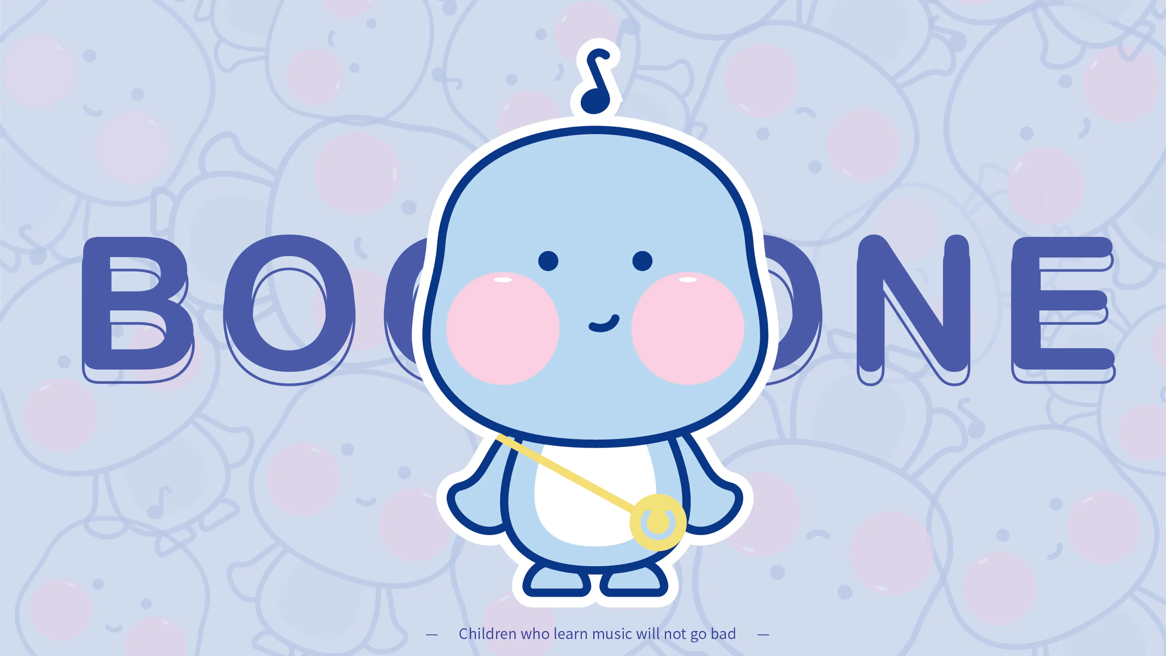
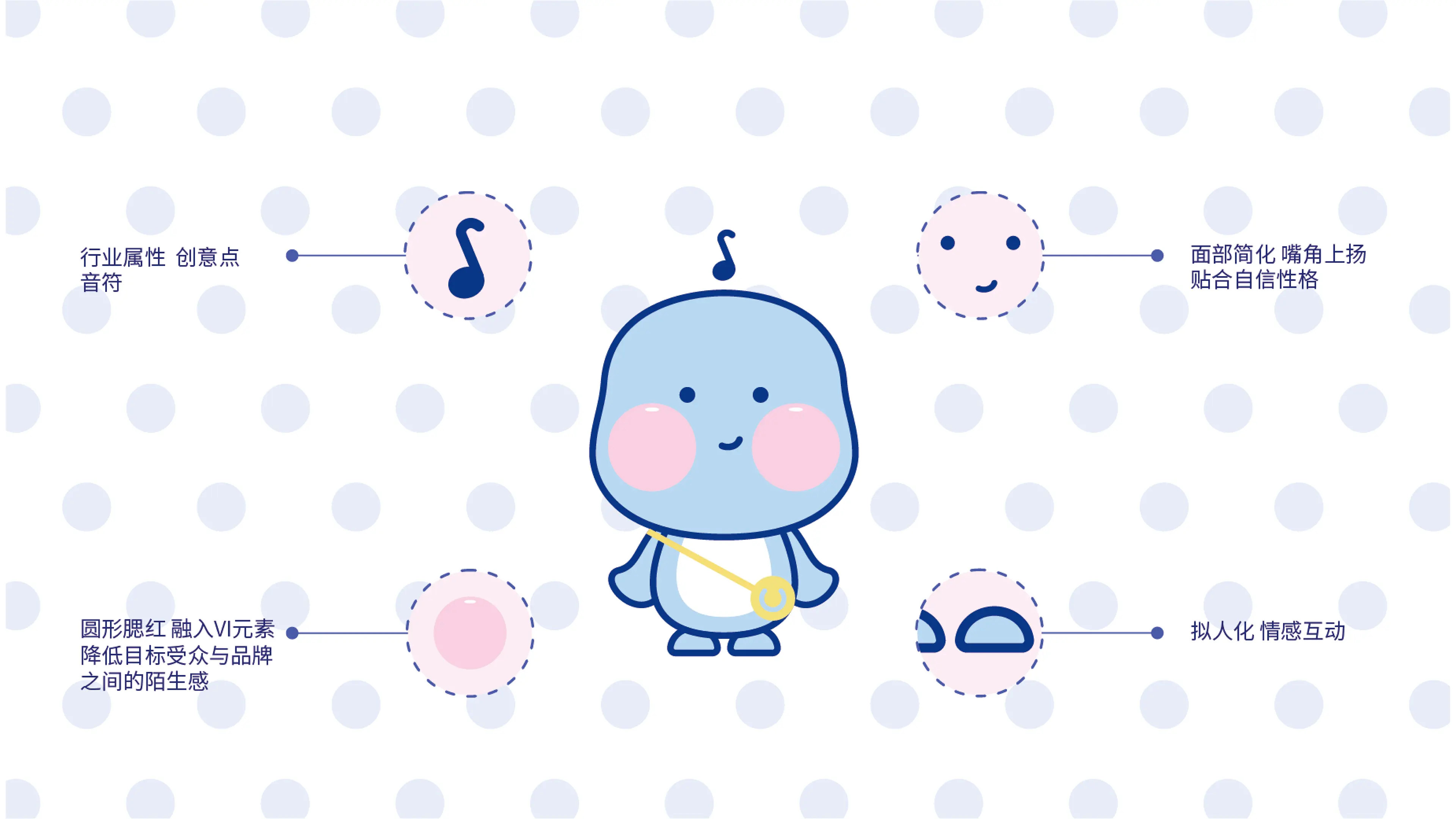
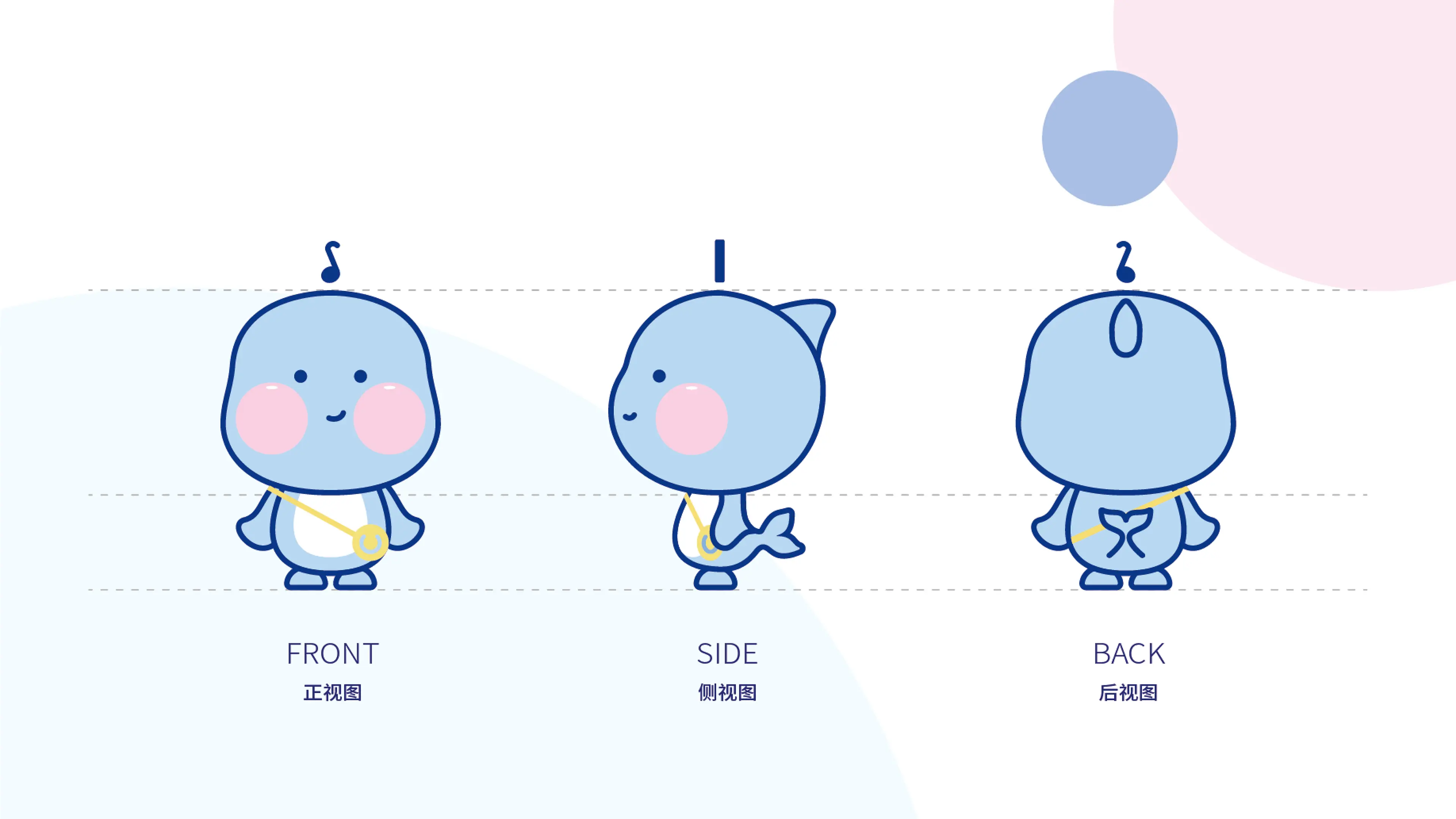
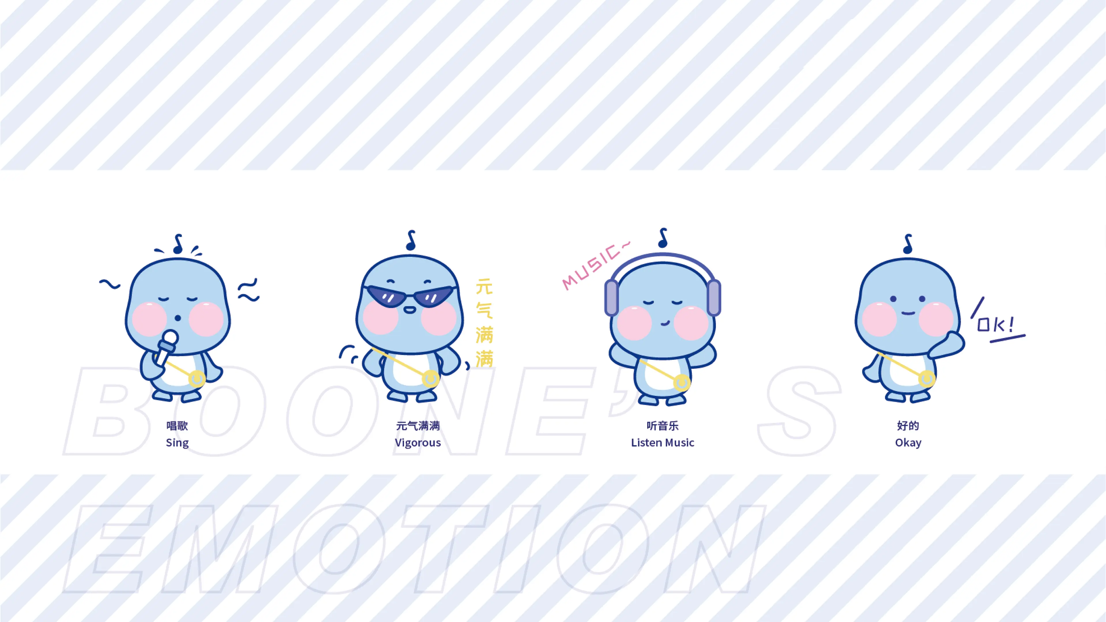
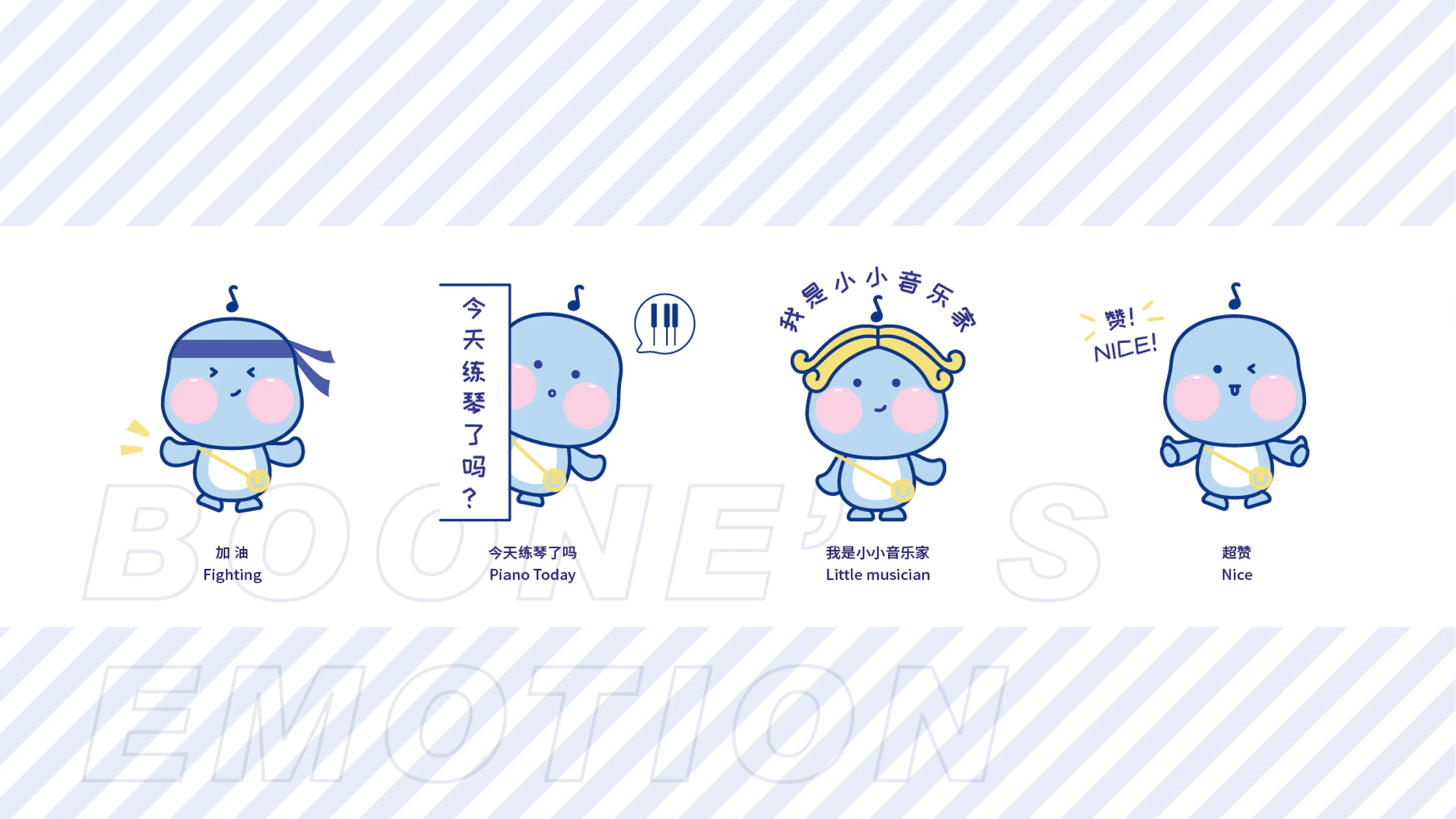
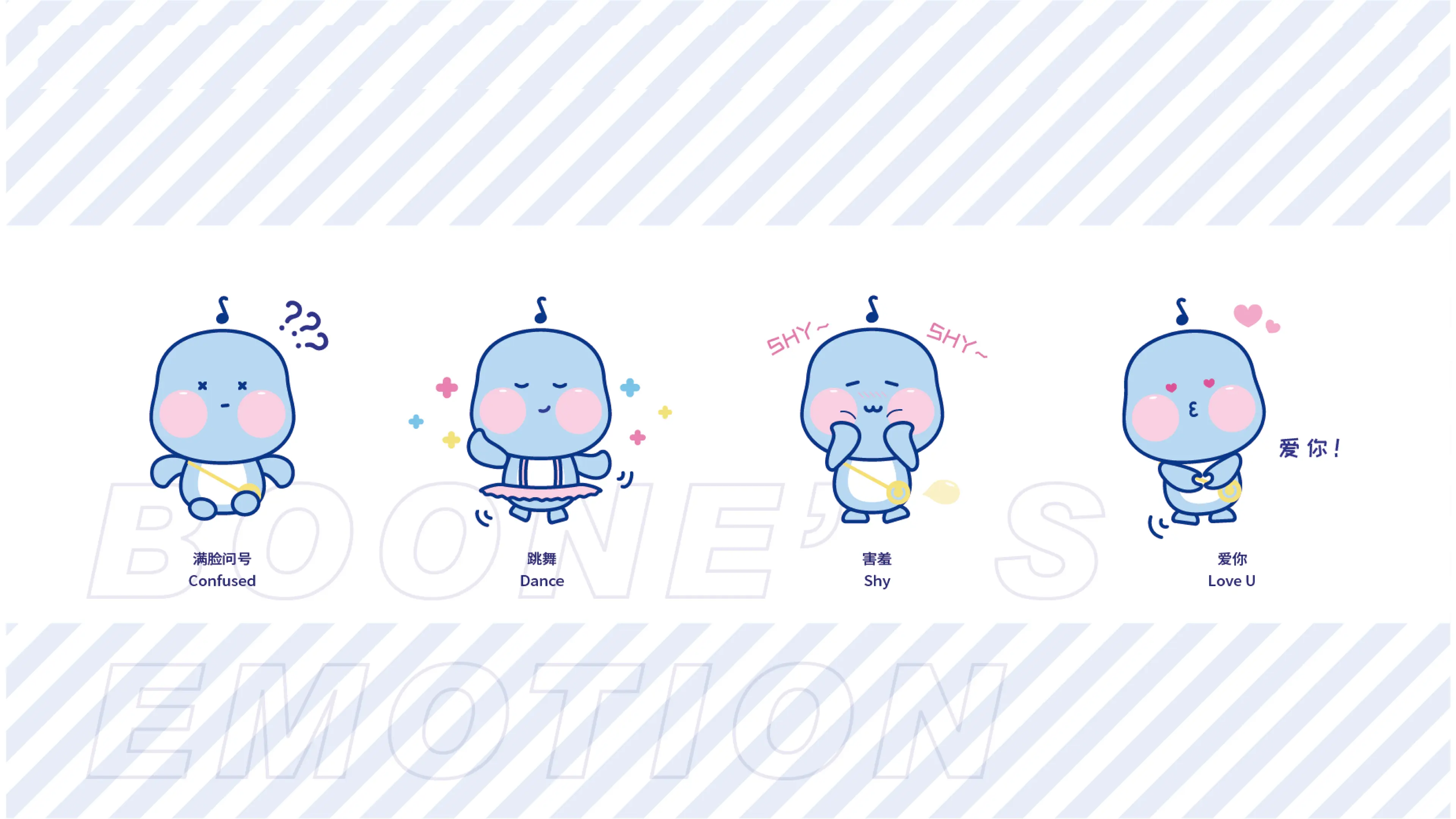
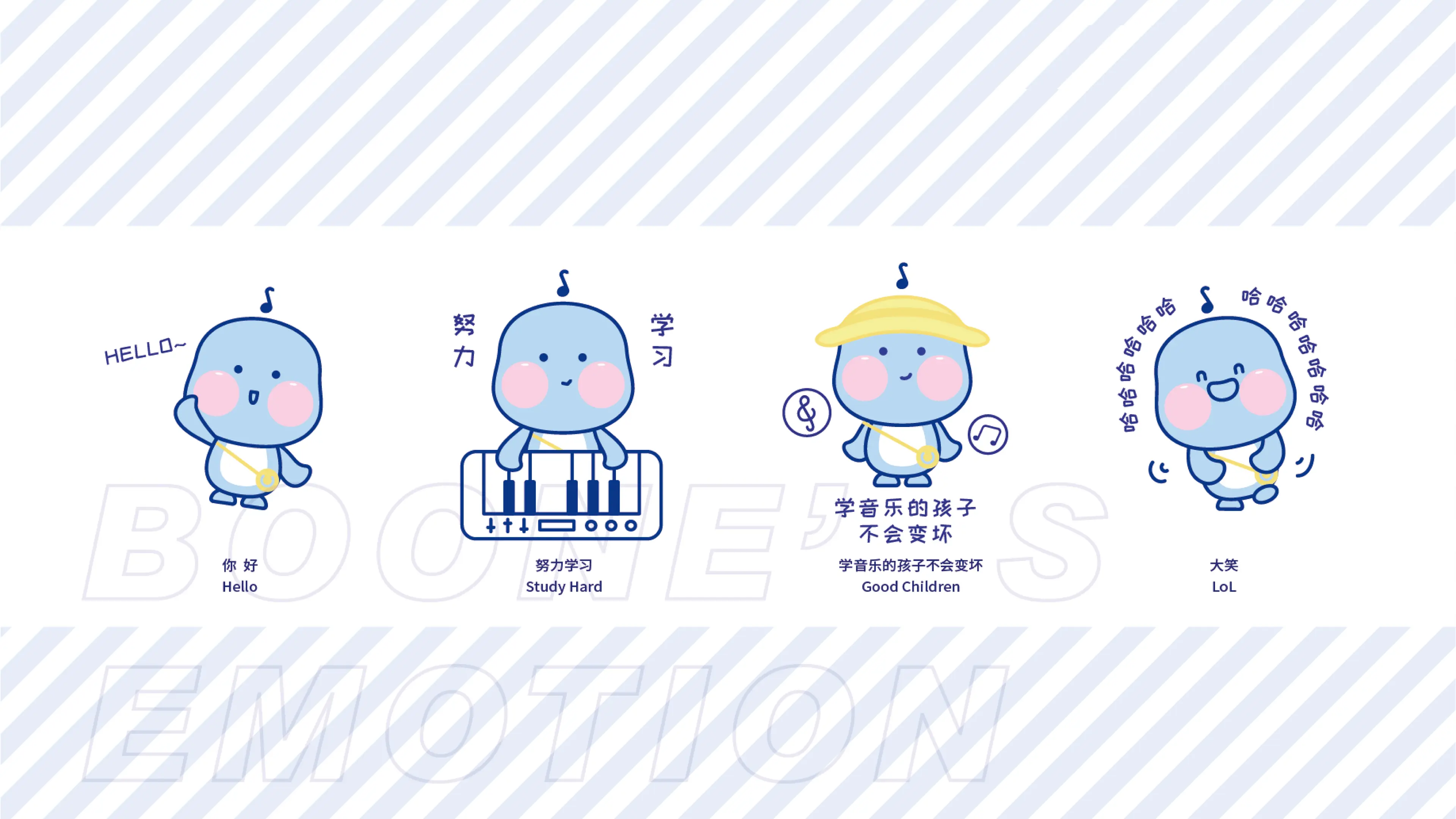
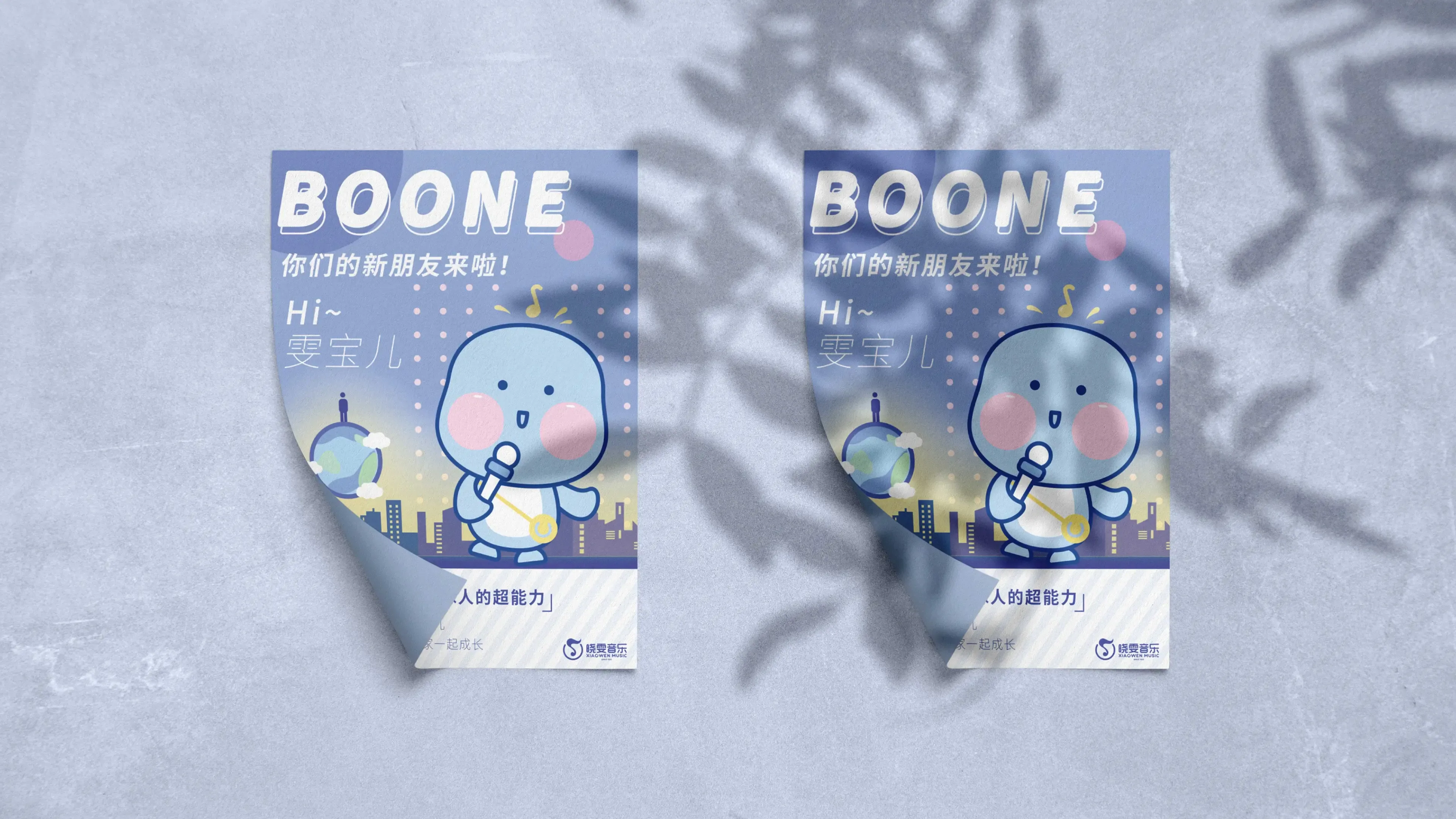
Xiaowen Music Academy was founded in 1989 and is a leading chain education brand in China that has been deeply engaged in children's music education for over 30 years. Its headquarters is located in Shanghai, and the R&D center focuses on teaching innovation in the industry. The chain campuses cover nearly 20 provinces and cities across the country and hundreds of cities, having cultivated millions of young music students. It is a benchmark brand and an industry standard practitioner in the field of music basic education in China. The brand always adheres to the core concept of "popularizing music education and cultivating virtue through music", discarding traditional cramming-style examination teaching, focusing on fun, systematic, and quality-oriented music teaching, covering all categories of courses such as piano, double bass, and vocal music. Relying on self-developed exclusive textbooks and a complete talent cultivation system, it creates a children's music education system with professionalism, fun, and growth potential, deeply penetrating the high-end children's art education market.
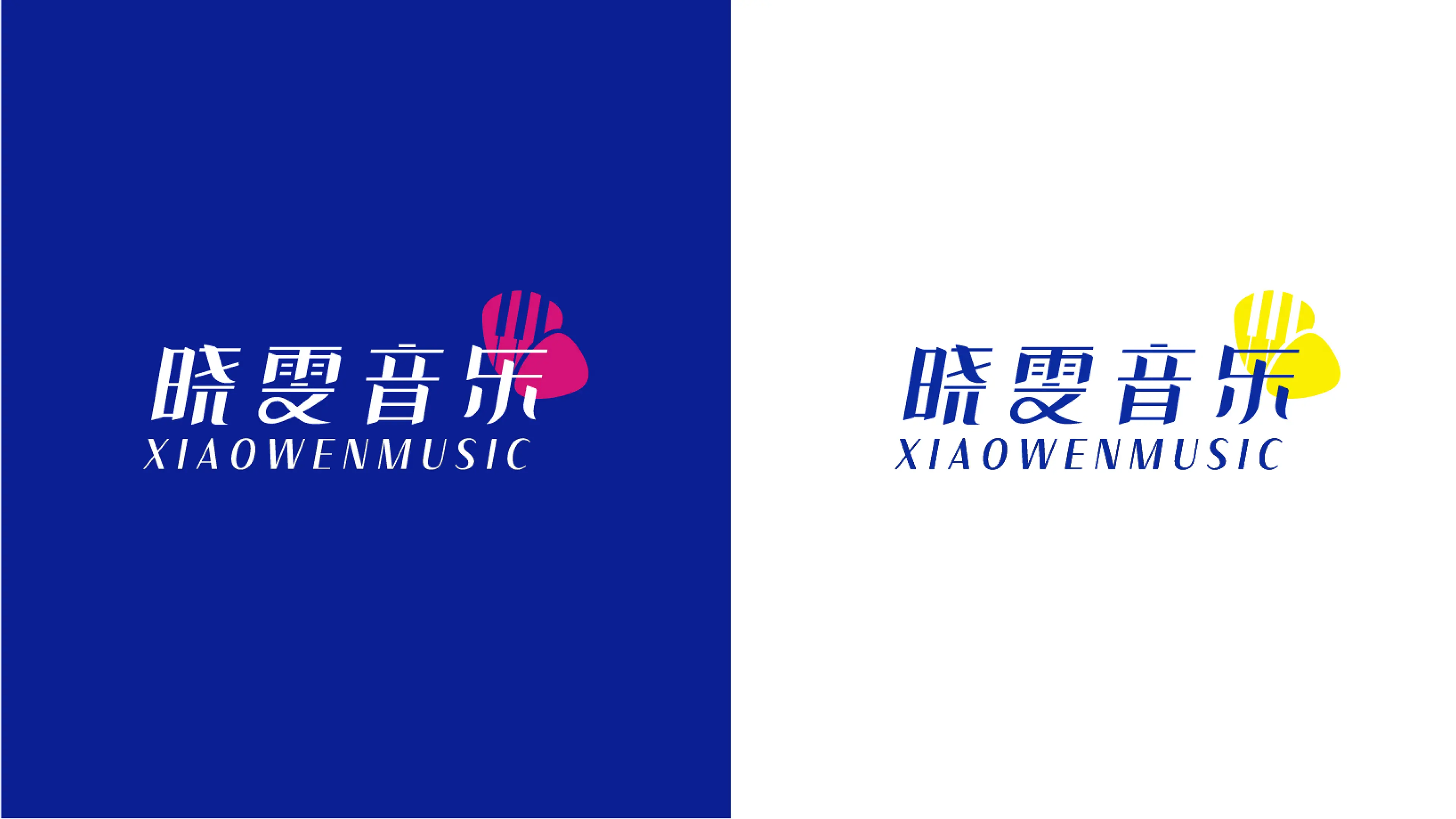
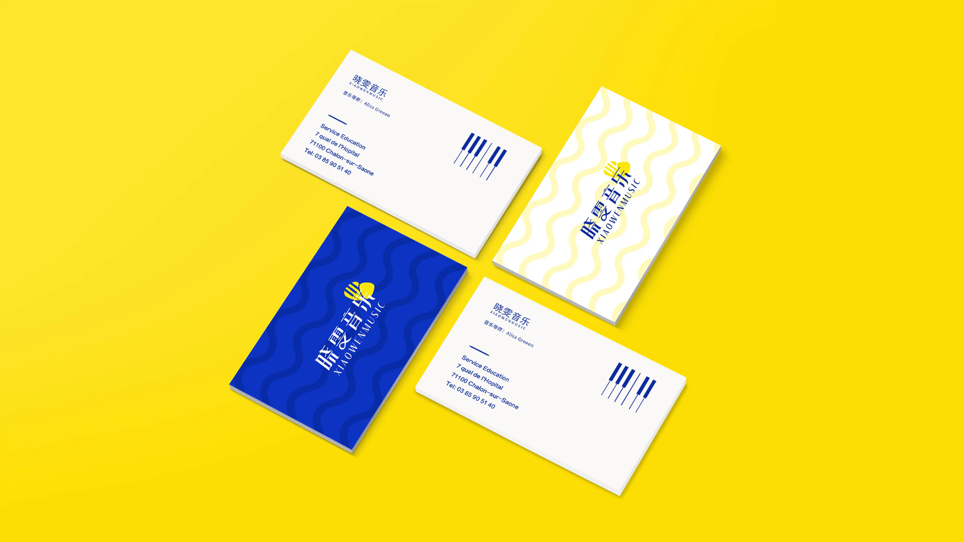
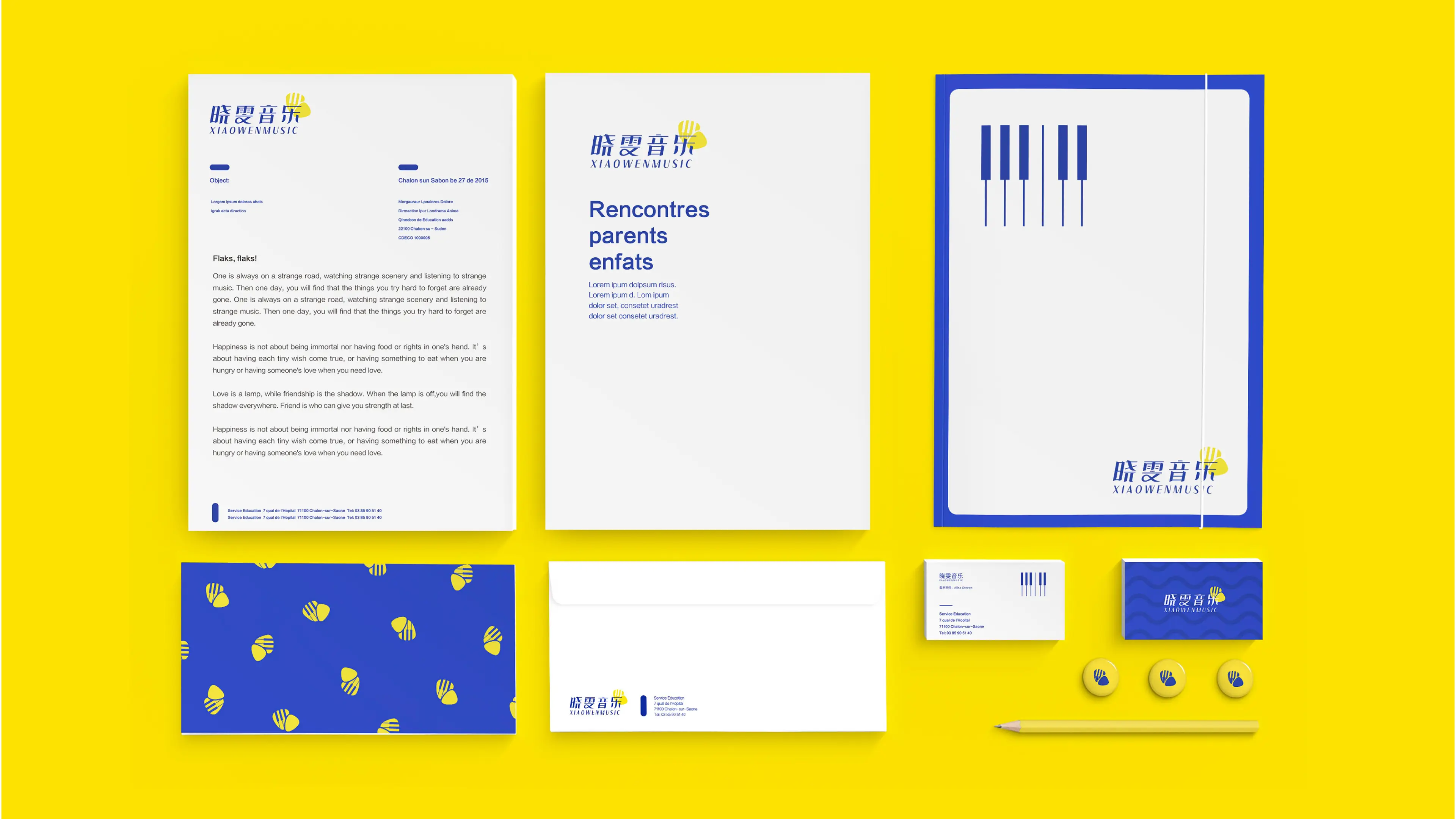
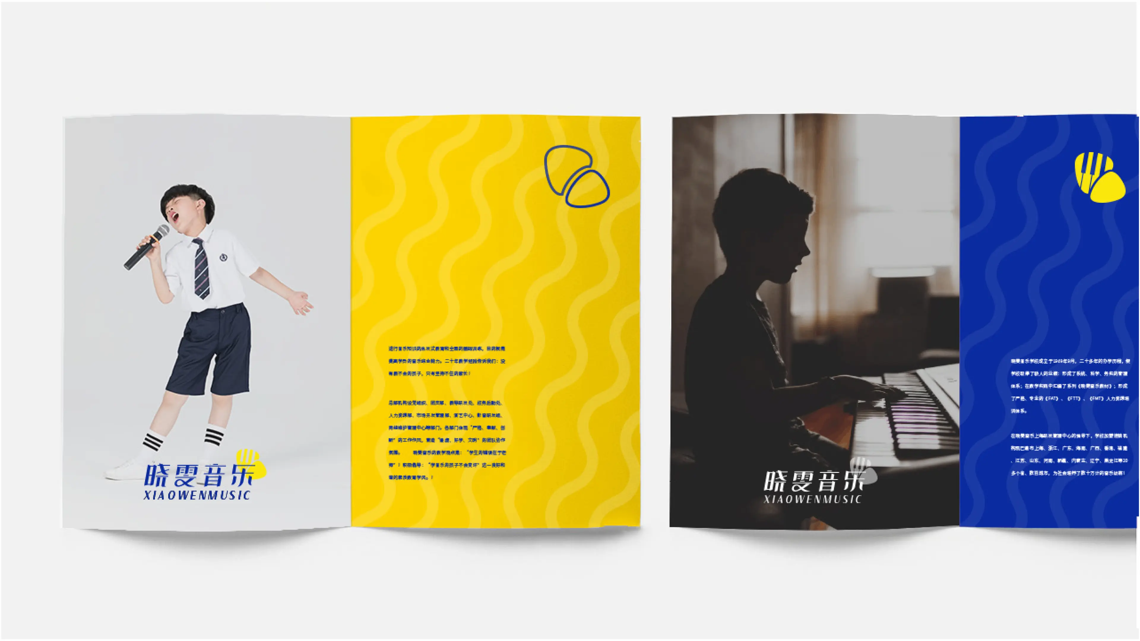
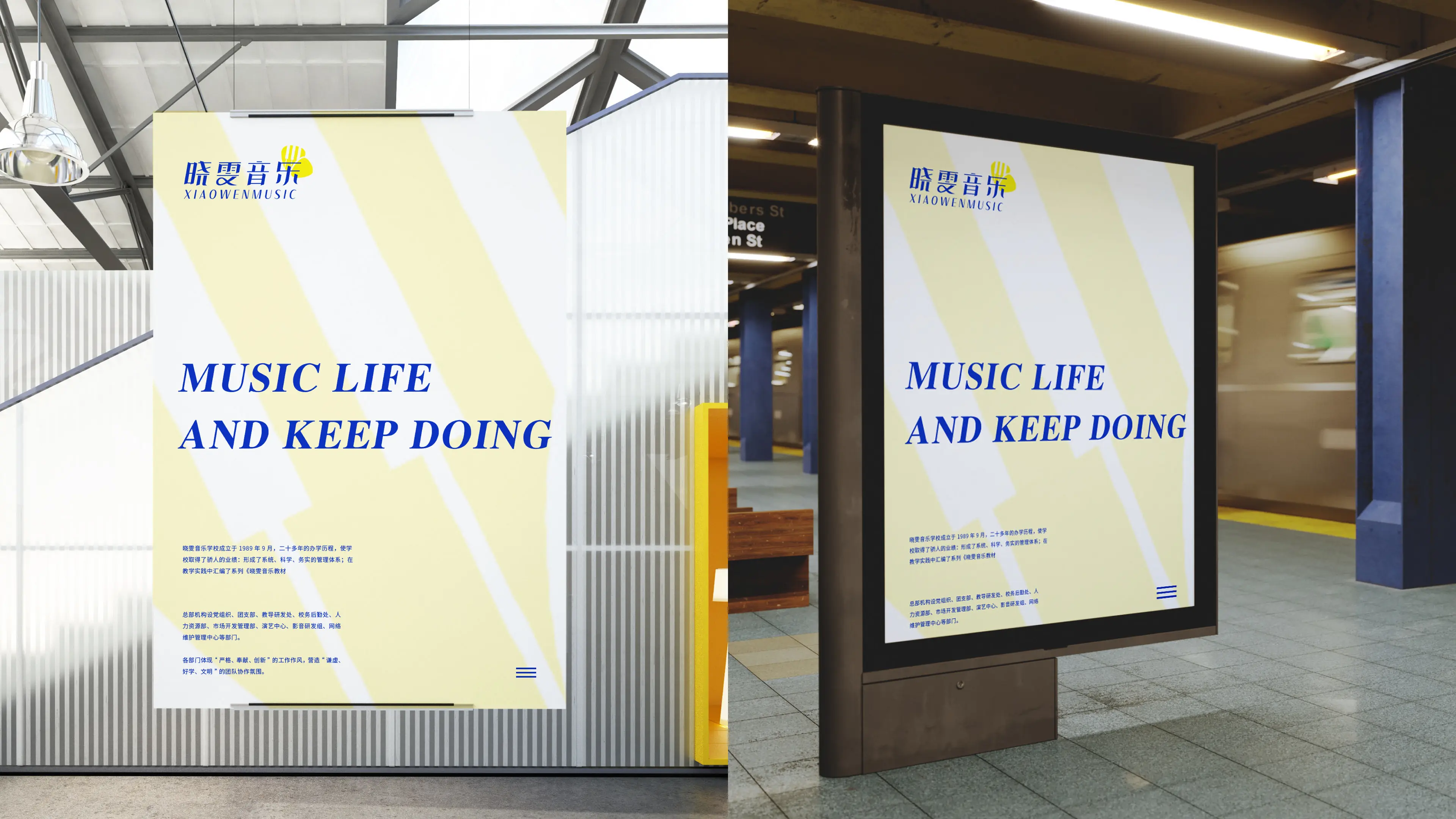
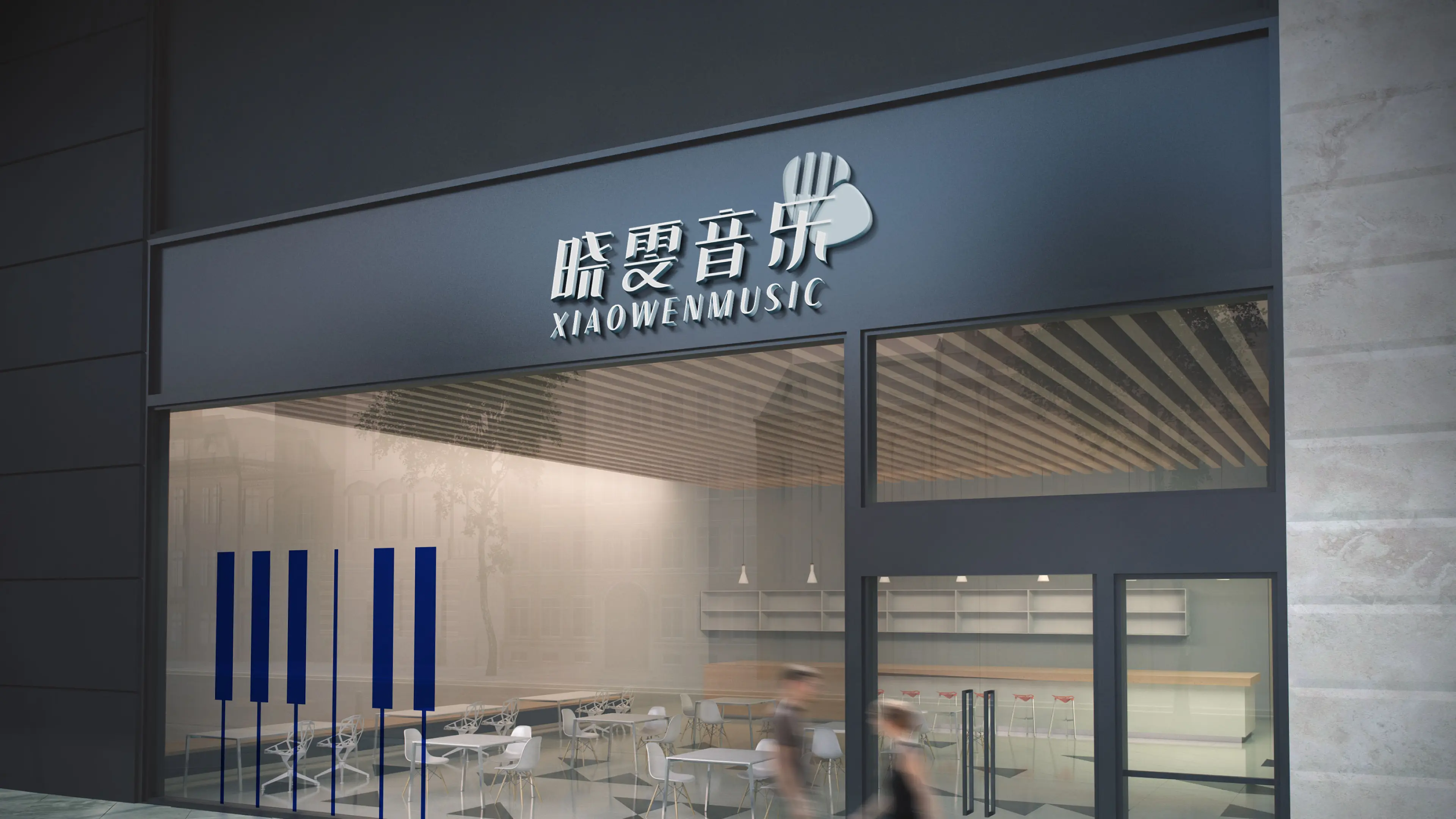
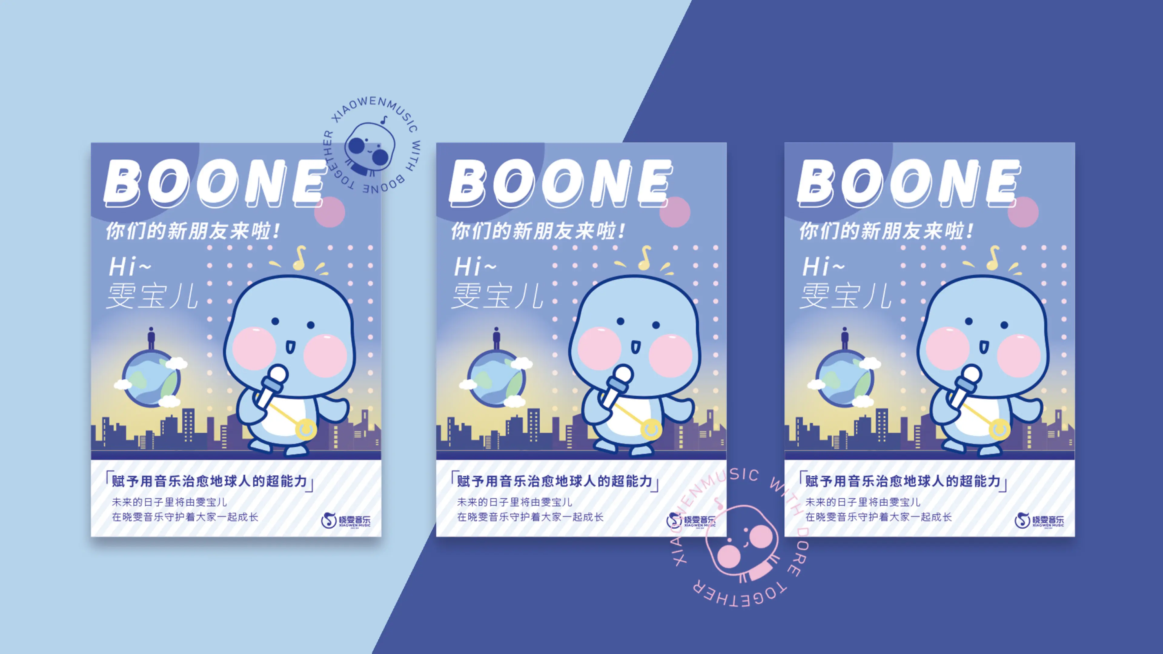
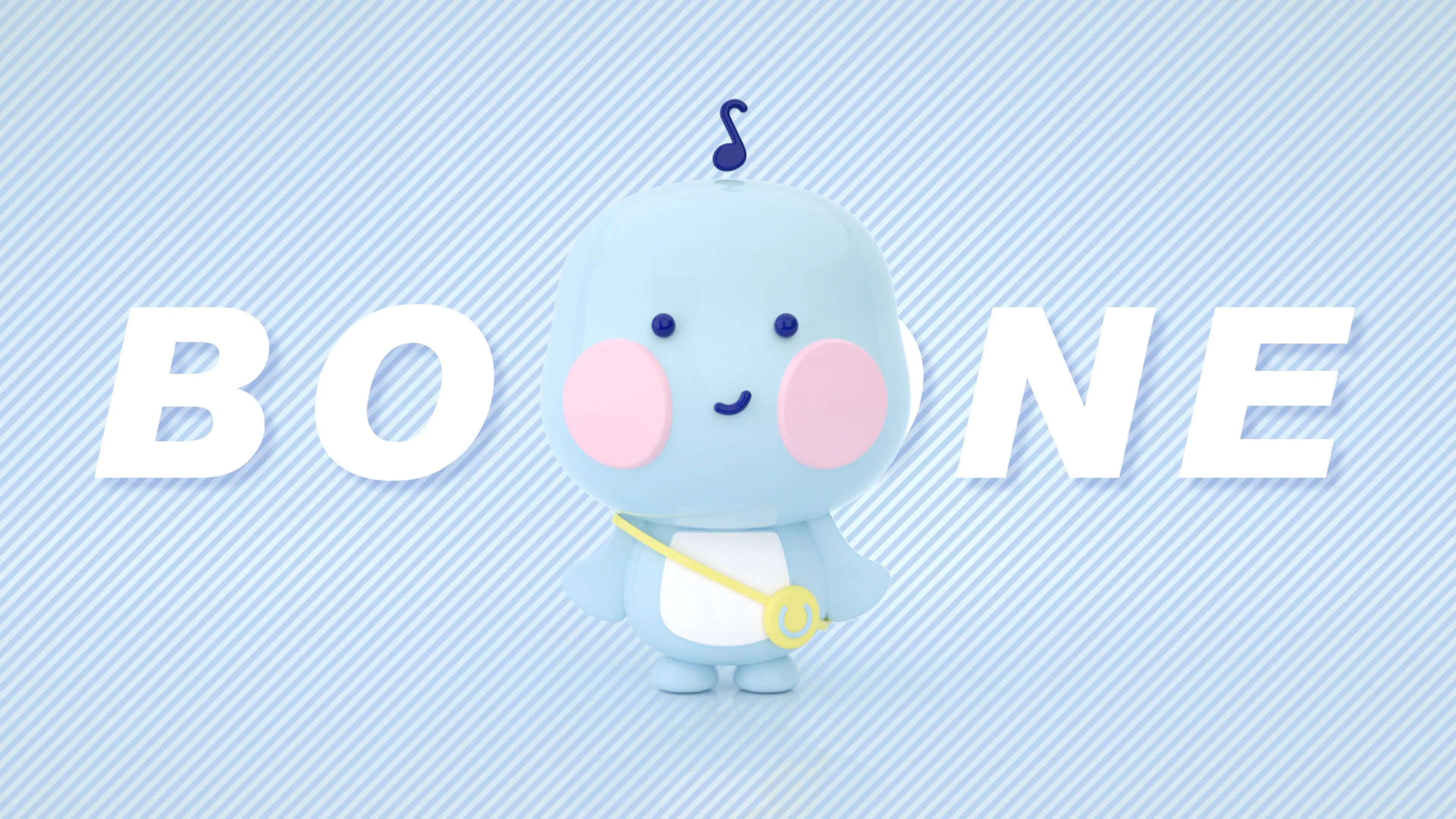
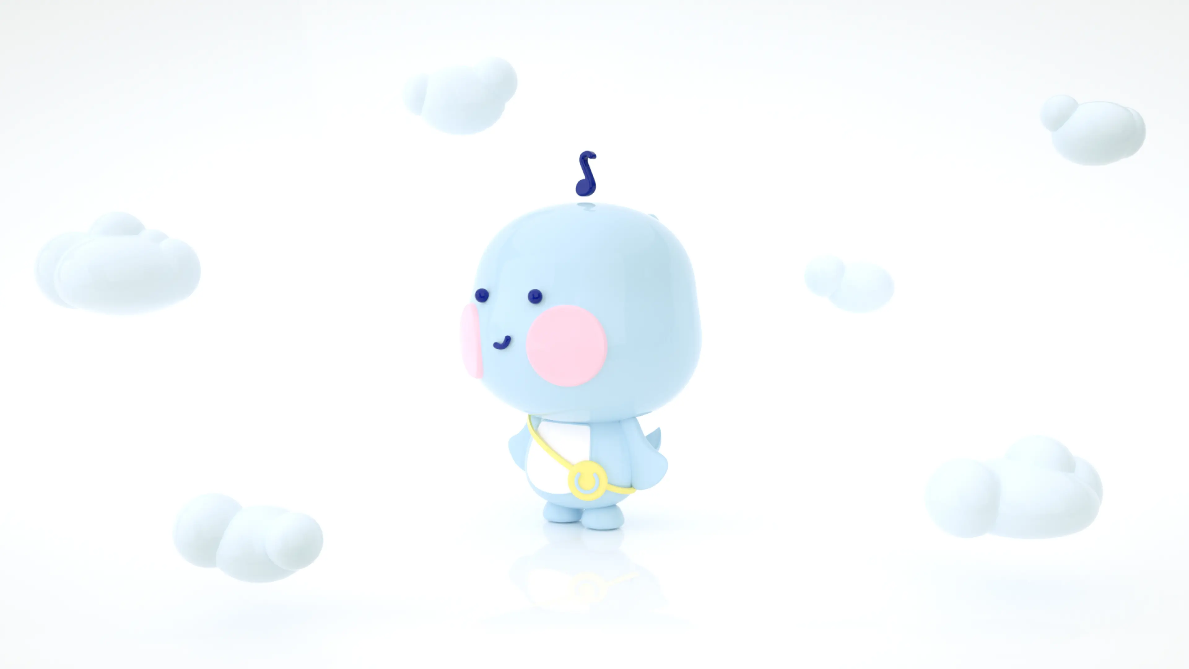
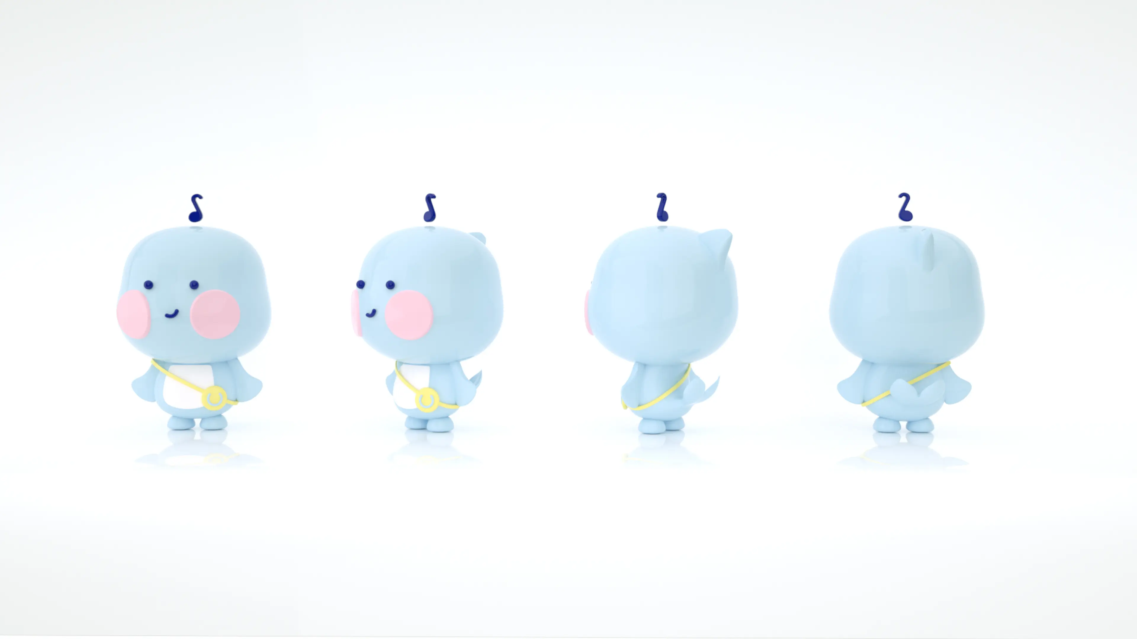
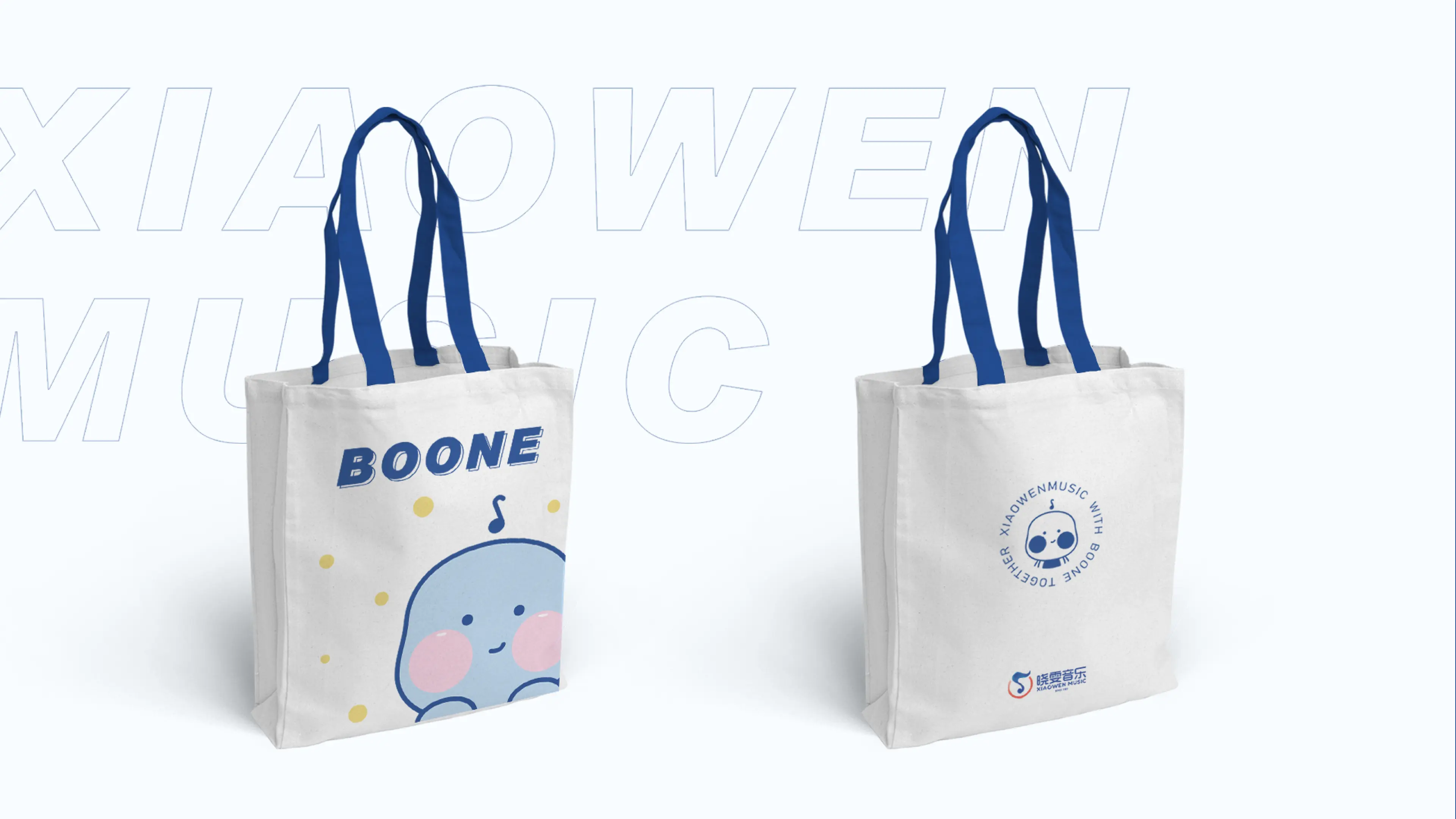
This brand visual upgrade focuses on four core tones: professional music education, gentle and healing, high-end and simple, and youthful vitality. It precisely matches the brand core of children's music education and the brand positioning of high-end chain institutions. The design team abandoned the flashy and complex, highly homogeneous design patterns seen in art institutions, broke away from the visual limitations of traditional training industries, and drew inspiration from music rhythm and artistic aesthetics. They extracted simple and dynamic visual symbols, echoing the lively texture of music art and the vigorous vitality of children's growth. In terms of color, they abandoned high-saturated bright colors and selected soft and high-end brand color schemes, combining the gentle and healing parent-child atmosphere with professional and rigorous educational texture, suitable for all age groups of children's music education scenarios. The font and graphic design are simple and smooth, with clear hierarchy and less redundant decoration, strengthening brand memory points and standardization. The entire visual system covers the brand LOGO system, campus space materials, promotional posters, advertising materials, online new media visuals, and franchise supporting materials in all dimensions, building a standardized, systematic, and high-end national chain brand visual matrix. This design upgrade not only completed the comprehensive renewal of brand visual but also reshaped the brand core value through visual language, precisely conveying Xiaowen Music's 30-year professional music education accumulation and modern, youthful educational concepts, achieving a high degree of alignment between brand heritage, music education tone, contemporary parents' aesthetics, and market development trends, laying a solid visual foundation for the brand's national chain expansion, high-end upgrade, and long-term brand development.