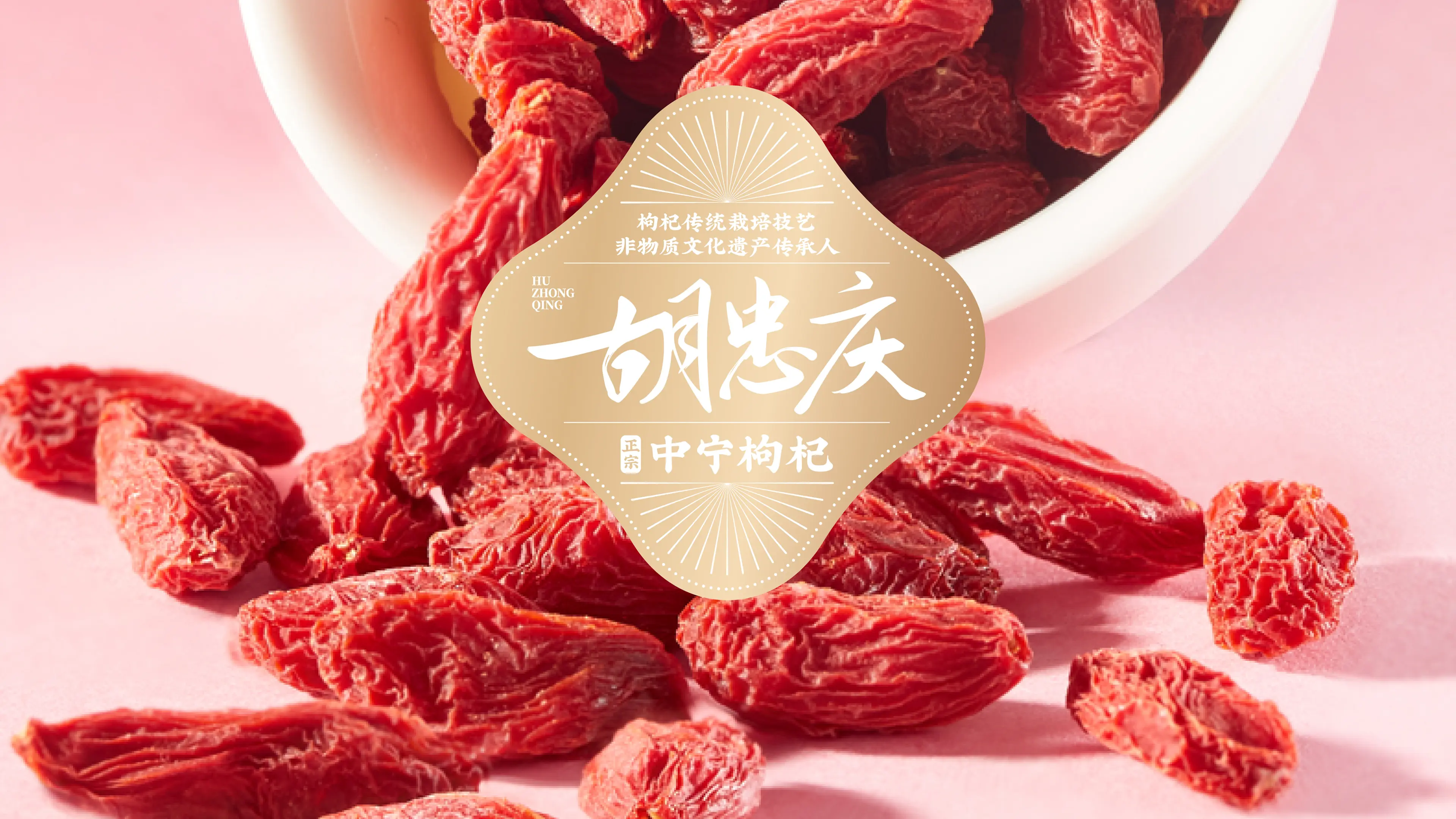
HUZHONGQING is rooted in Zhongning, Ningxia — one of China’s most renowned goji-growing regions — and is a representative local brand specializing in the cultivation, processing, and distribution of goji berries.
Benefiting from Zhongning’s distinctive Yellow River basin environment and long-established growing traditions, the brand carefully selects premium first-harvest goji berries and processes them through controlled drying and sorting methods to preserve their natural character and quality.
HUZHONGQING serves both everyday wellness consumers and the seasonal gifting market. By moving away from the inexpensive, bulk-product image traditionally associated with agricultural produce, the brand aims to reposition authentic Zhongning goji berries as a premium wellness gift that combines regional cultural value with contemporary aesthetics.
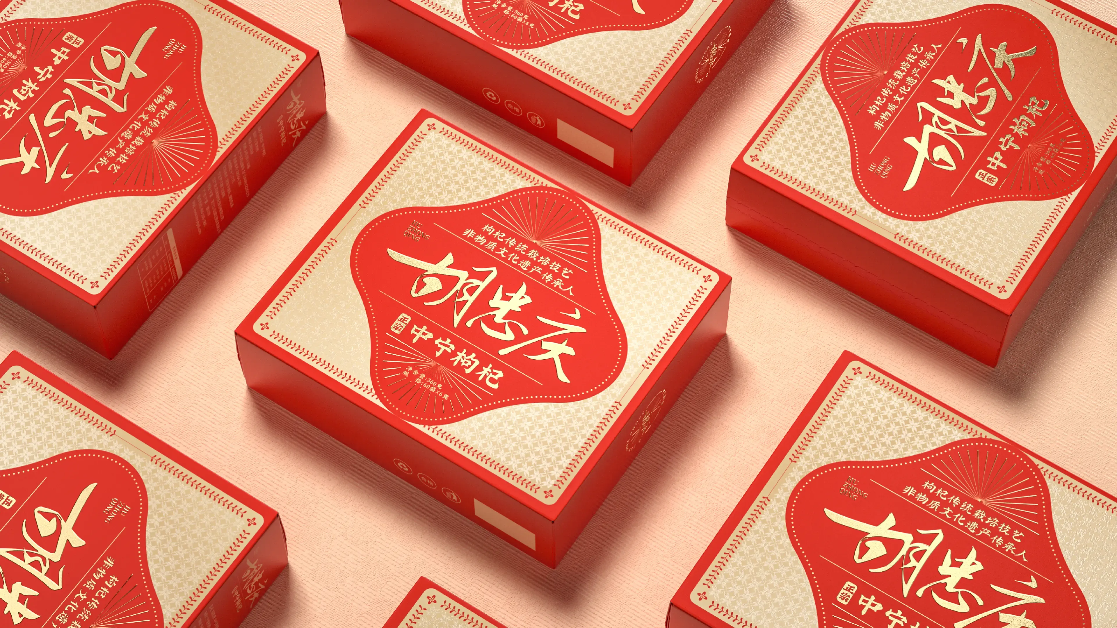
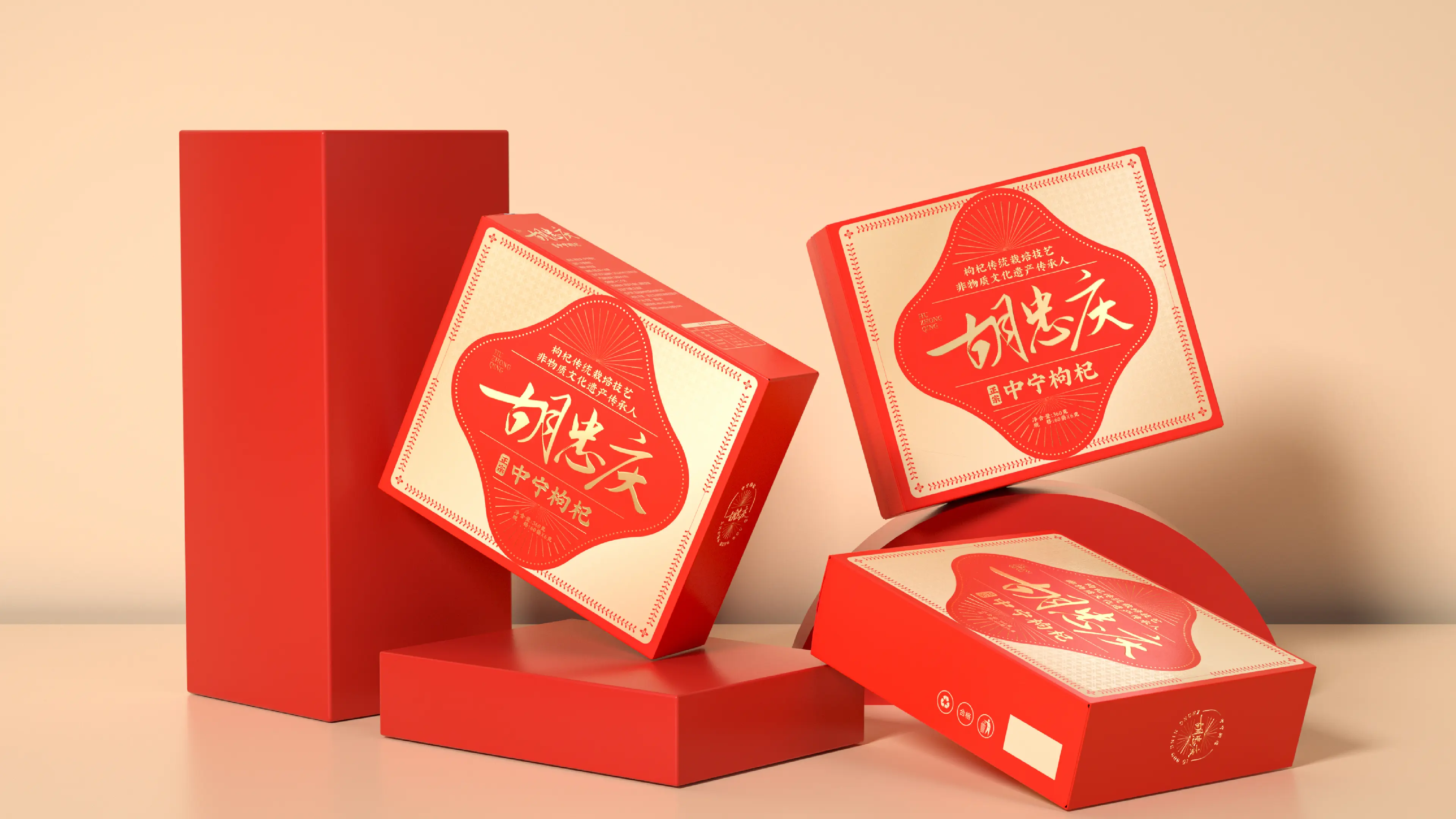
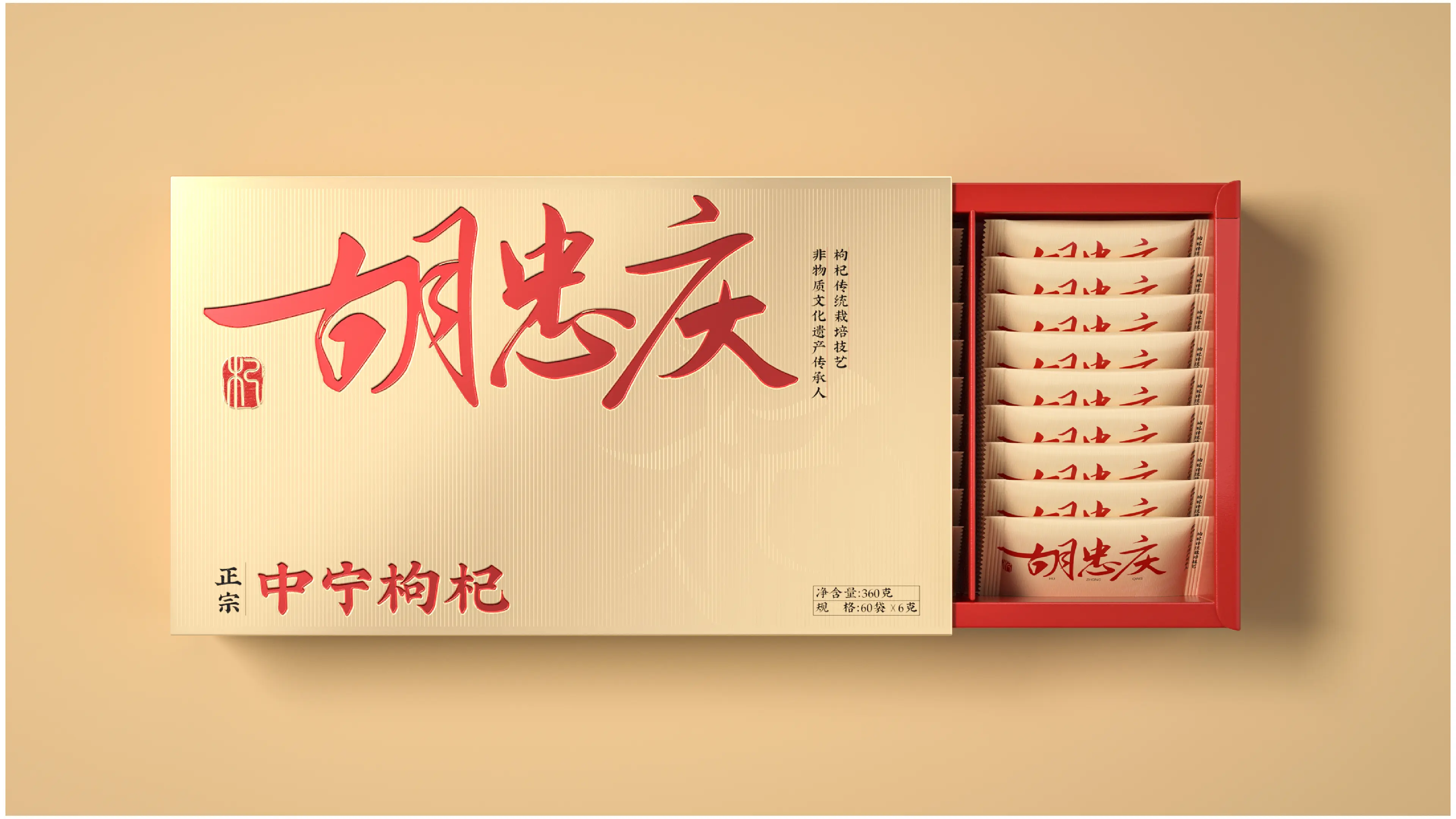
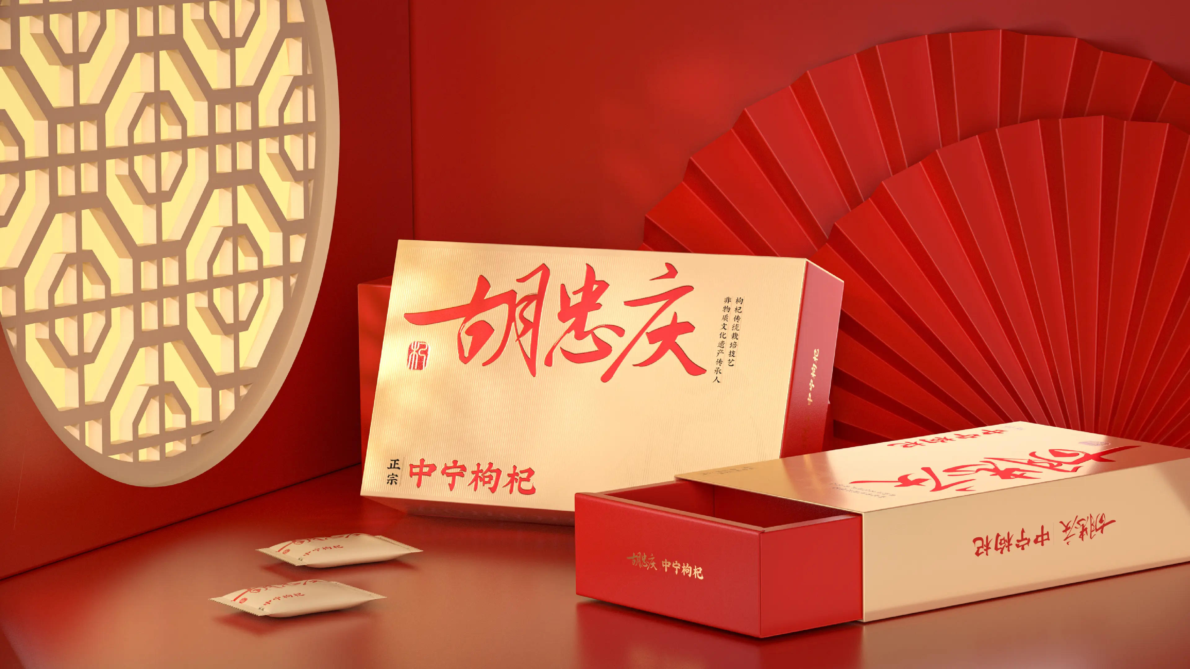
This packaging project was developed around four core qualities: authentic origin, natural wellness, refined Chinese aesthetics, and premium gifting.
Through extensive research into China’s goji and specialty agricultural product market, we identified a recurring problem: outdated packaging, excessive decorative elements, and a lack of clear visual differentiation.
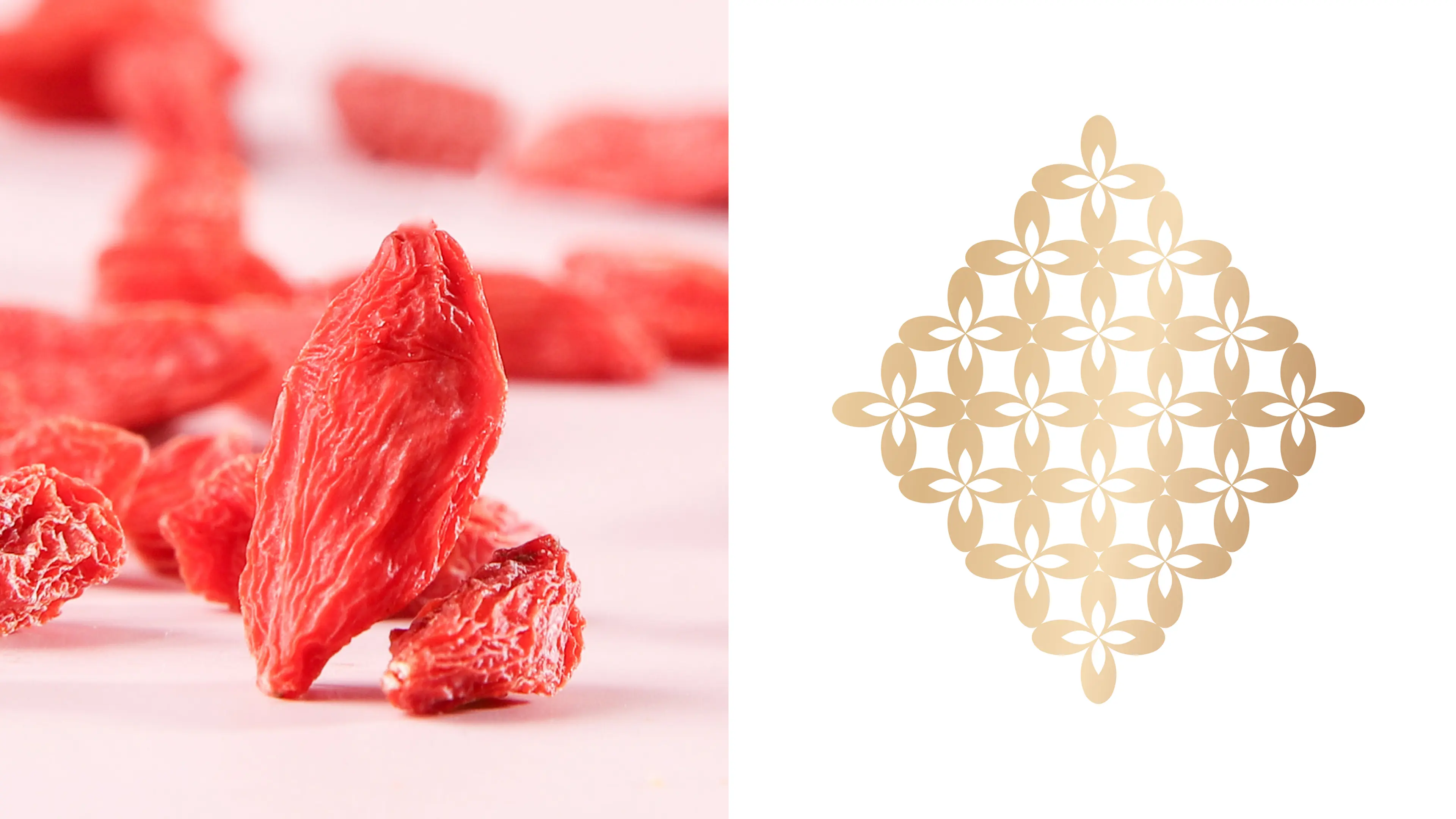
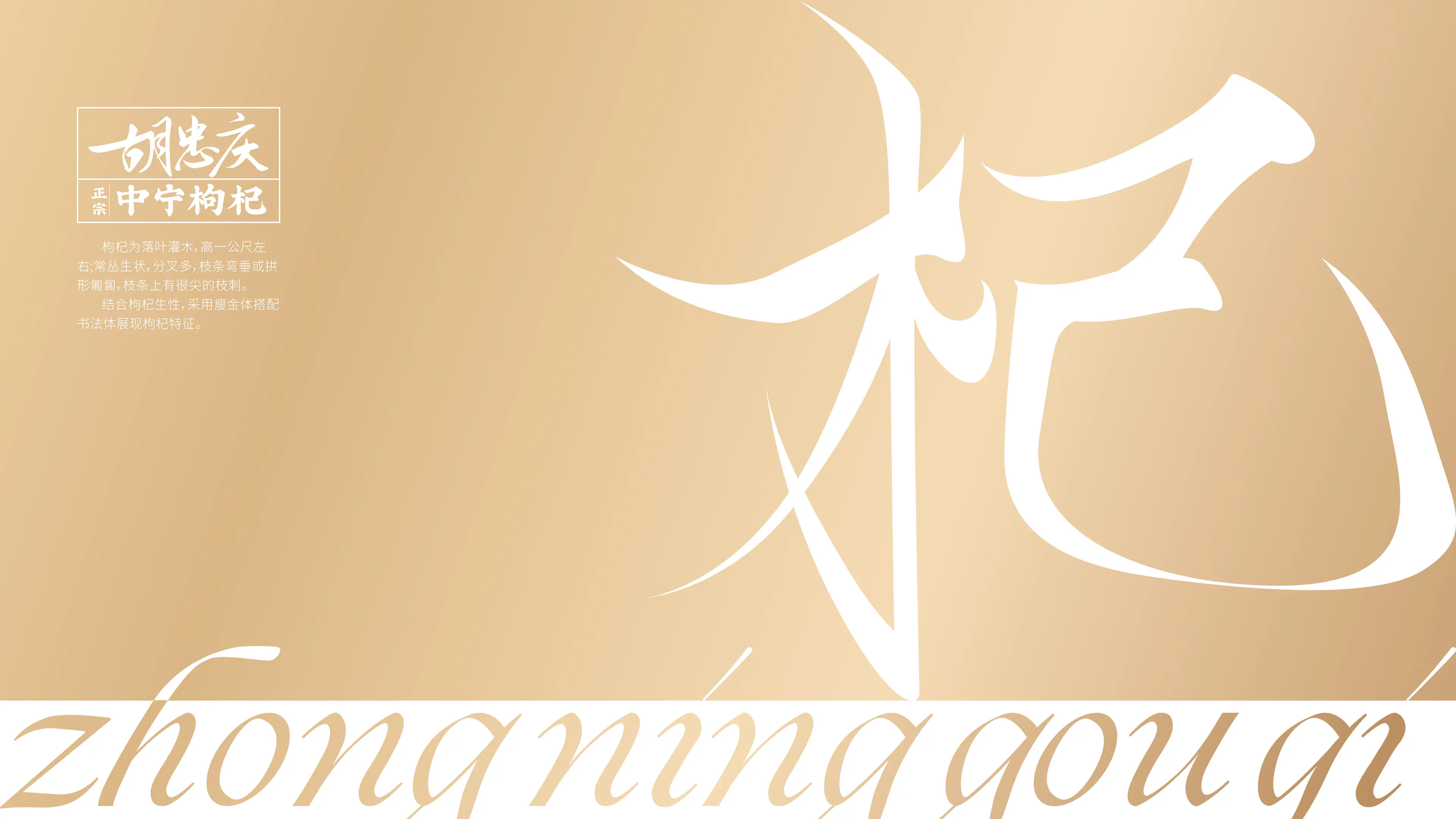
To address this, we explored the cultural landscape of Zhongning and reinterpreted regional imagery — including the Yellow River and the fertile landscapes of Ningxia — through a more contemporary and minimal visual language.
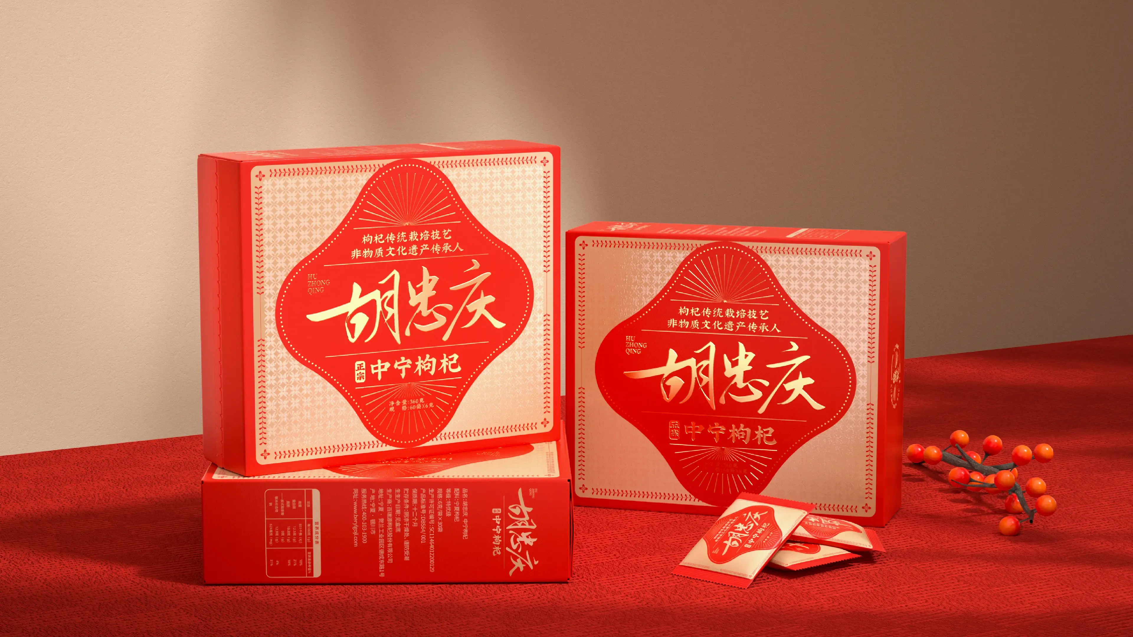
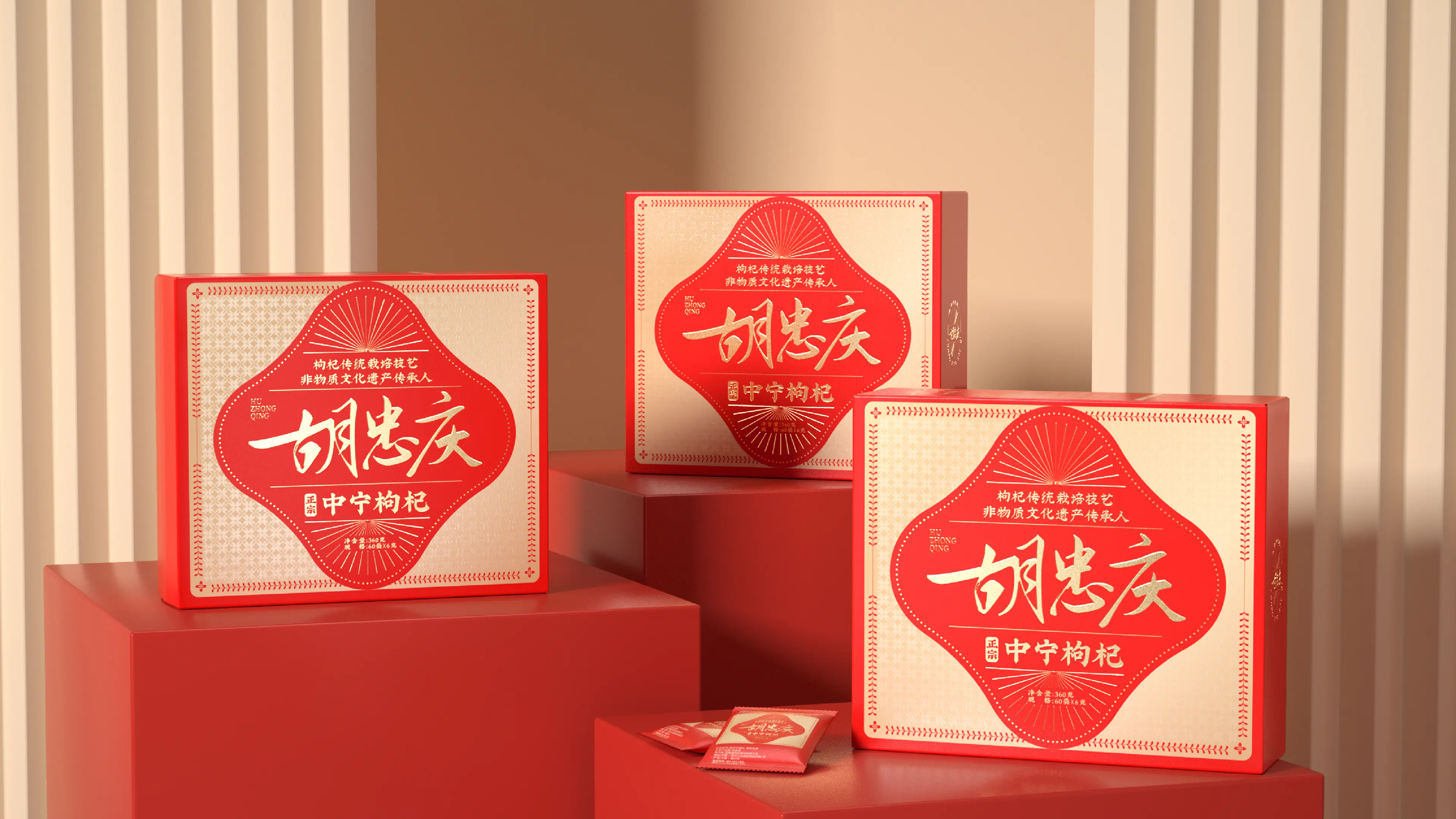
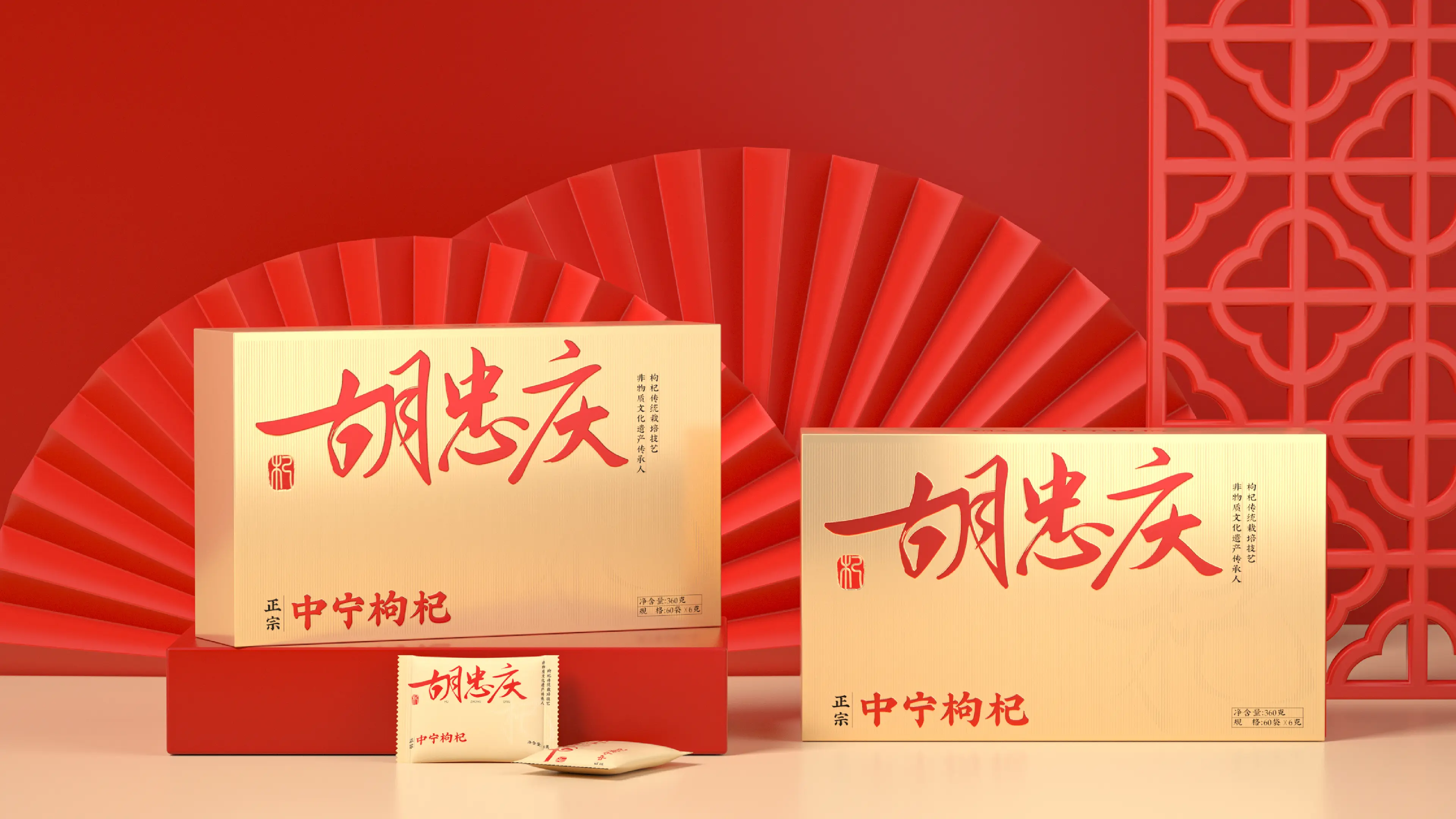
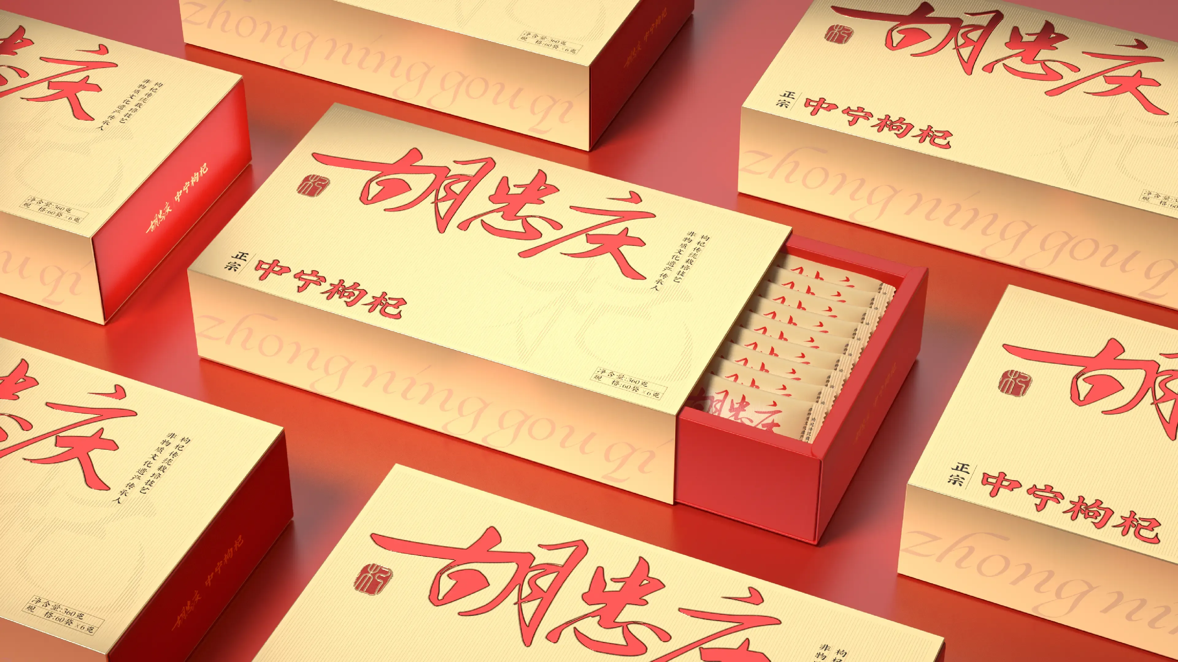
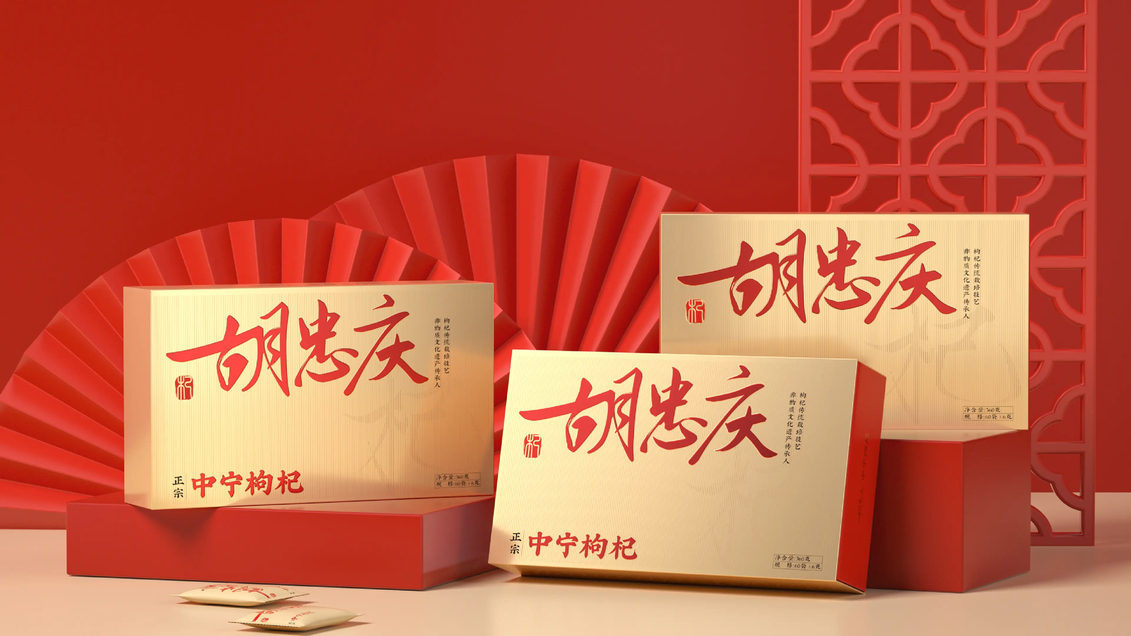
The color system combines a deep, warm red with understated earth tones. The red echoes the natural color of goji berries, while the earth-toned palette reinforces a sense of origin, warmth, and premium gifting.
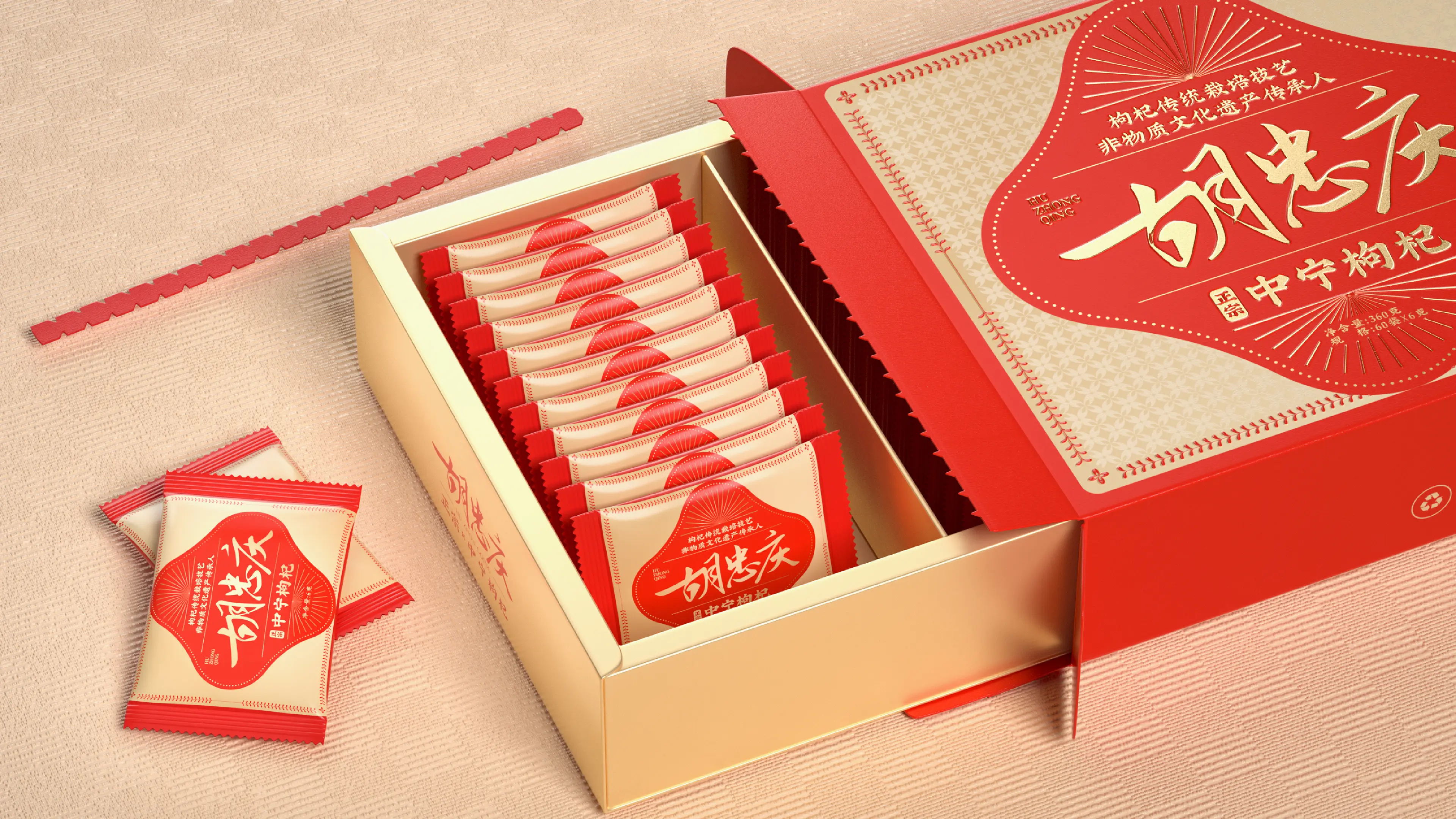
The layout is clean and structured, with a clear information hierarchy that places the key message of “Zhongning Origin” at the center of the visual system.
The complete identity extends across packaged products, seasonal gift boxes, shopping bags, e-commerce product pages, and distributor marketing materials, creating a highly recognizable visual system for this regional specialty product.
Through the redesign, HUZHONGQING successfully strengthened the cultural and commercial value of Zhongning goji berries, transforming a traditional agricultural product into a contemporary premium gift with stronger regional identity, greater shelf recognition, and enhanced brand value.