



 |  |
 |  |
TRUE LOVE Craft Beer is affiliated with Hangzhou TRUE LOVE Craft Beer Co., Ltd., founded in May 2025 with registered capital of RMB 1 million. The brand upholds the German craft brewing tradition and is committed to providing consumers with high-quality craft white beer brewed from whole malt and pure ingredients. The product adopts traditional German brewing techniques, features a high wheat malt content, and contains no auxiliary materials such as rice or starch, adhering to the pure essence of craft beer. The brand has opened a “TRUE LOVE Craft Beer Douyin Store,” reaching young consumer groups through online channels.
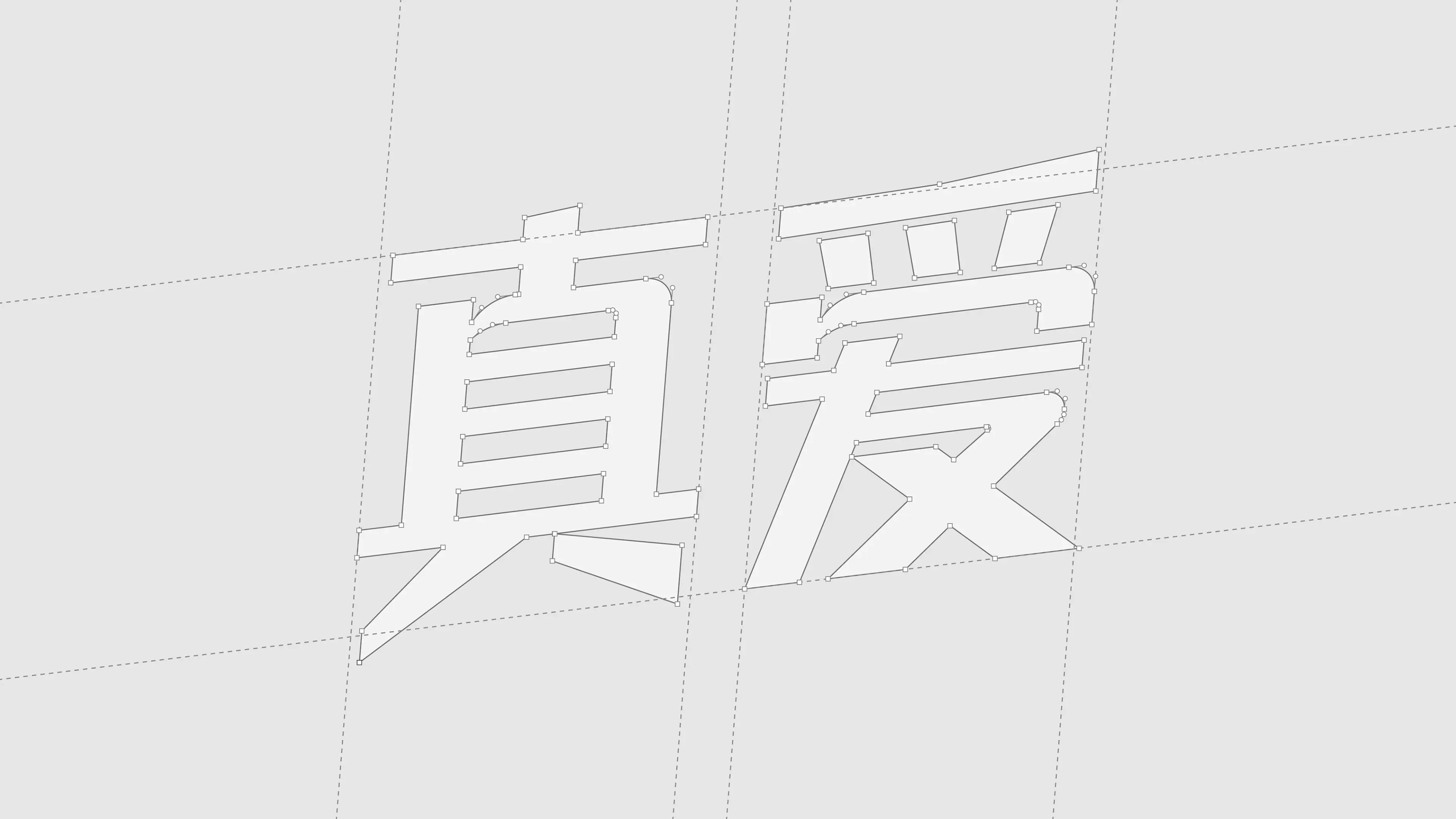
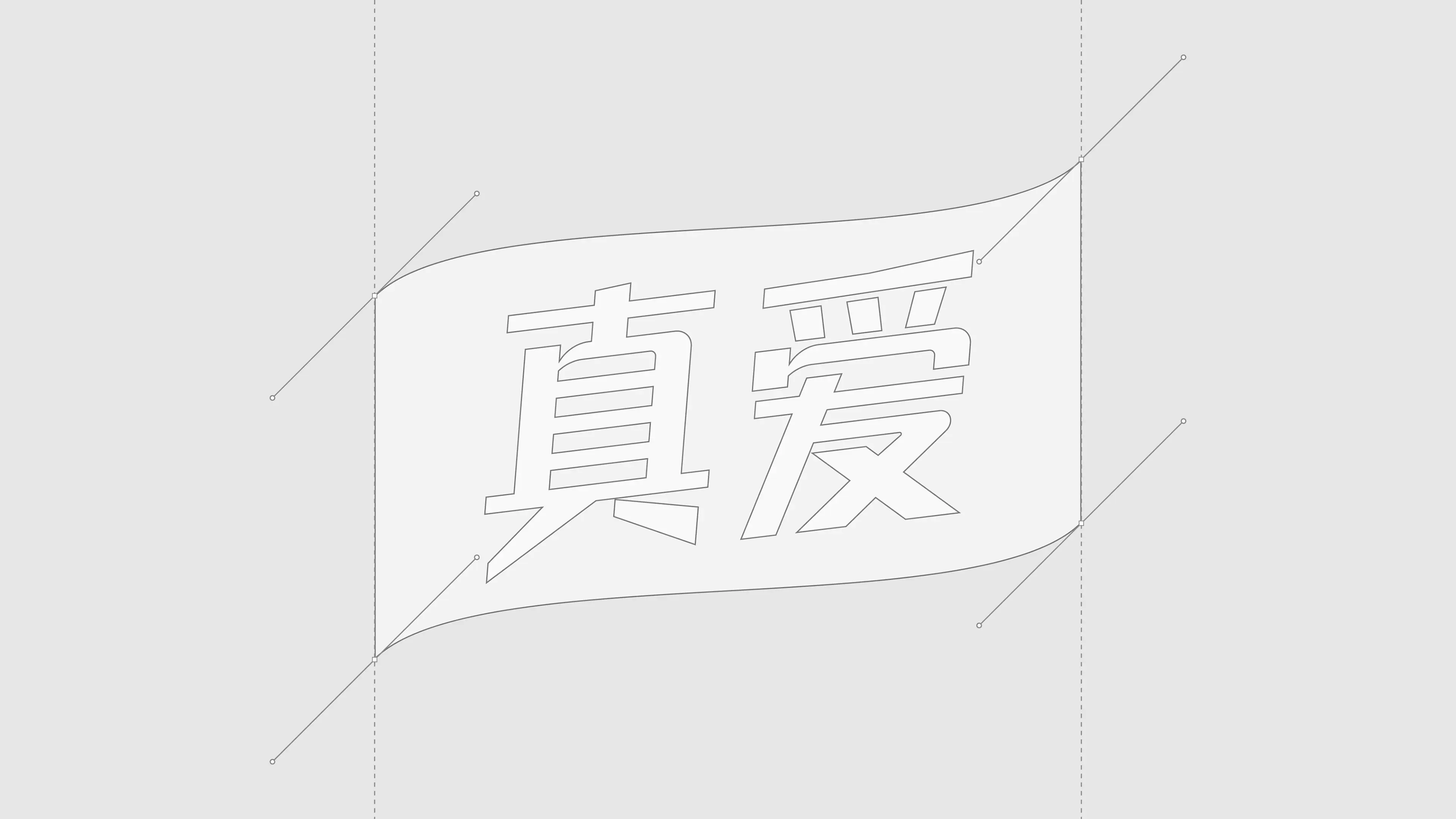
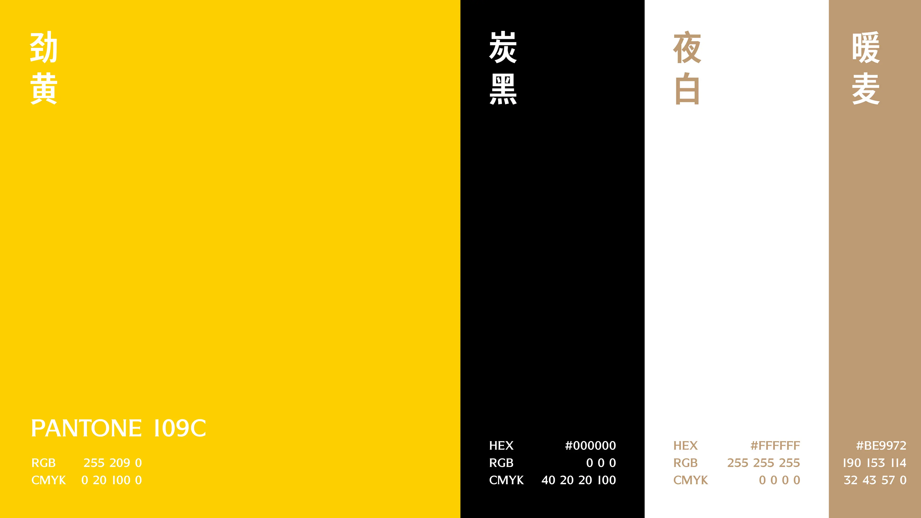
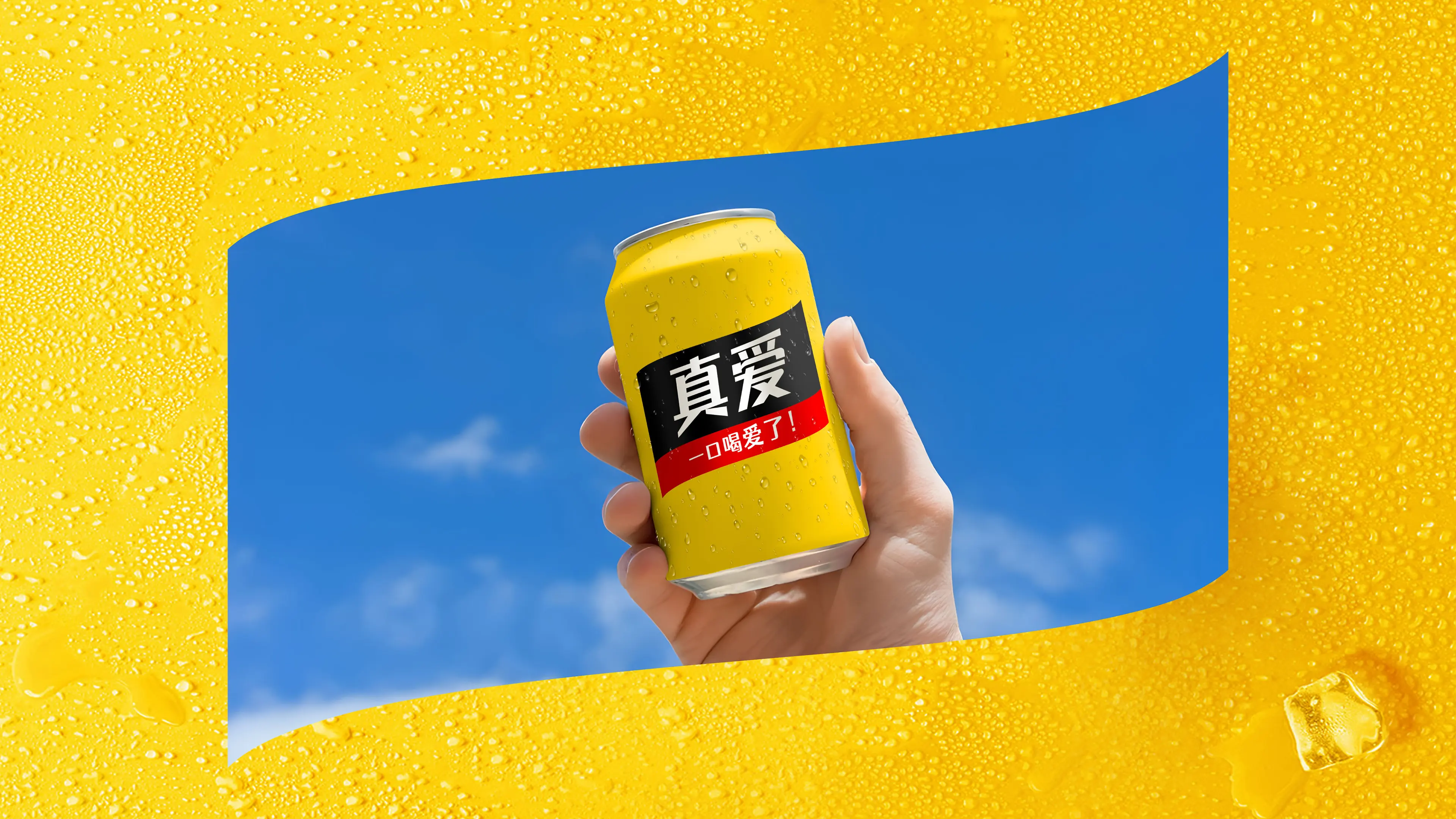
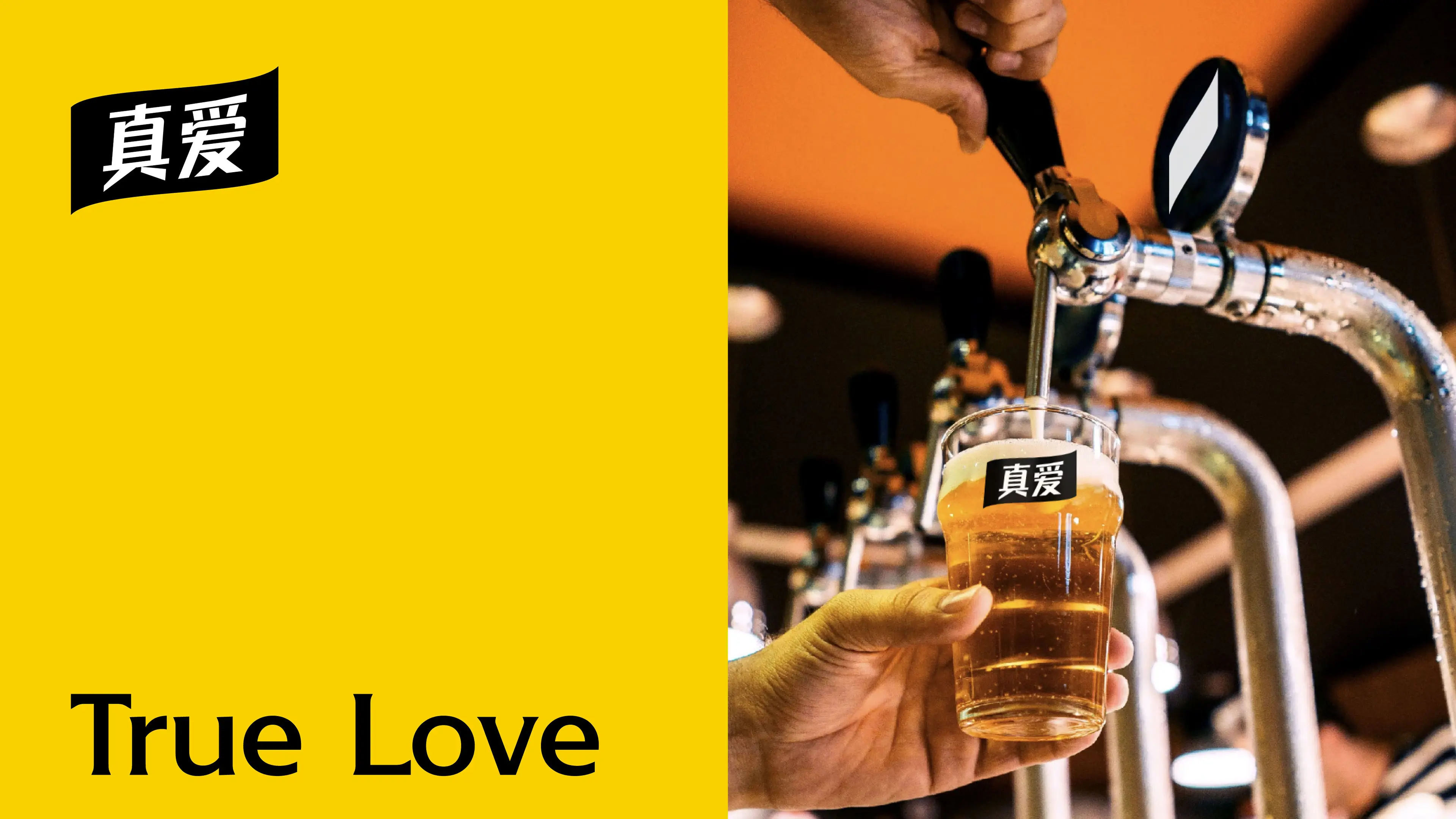
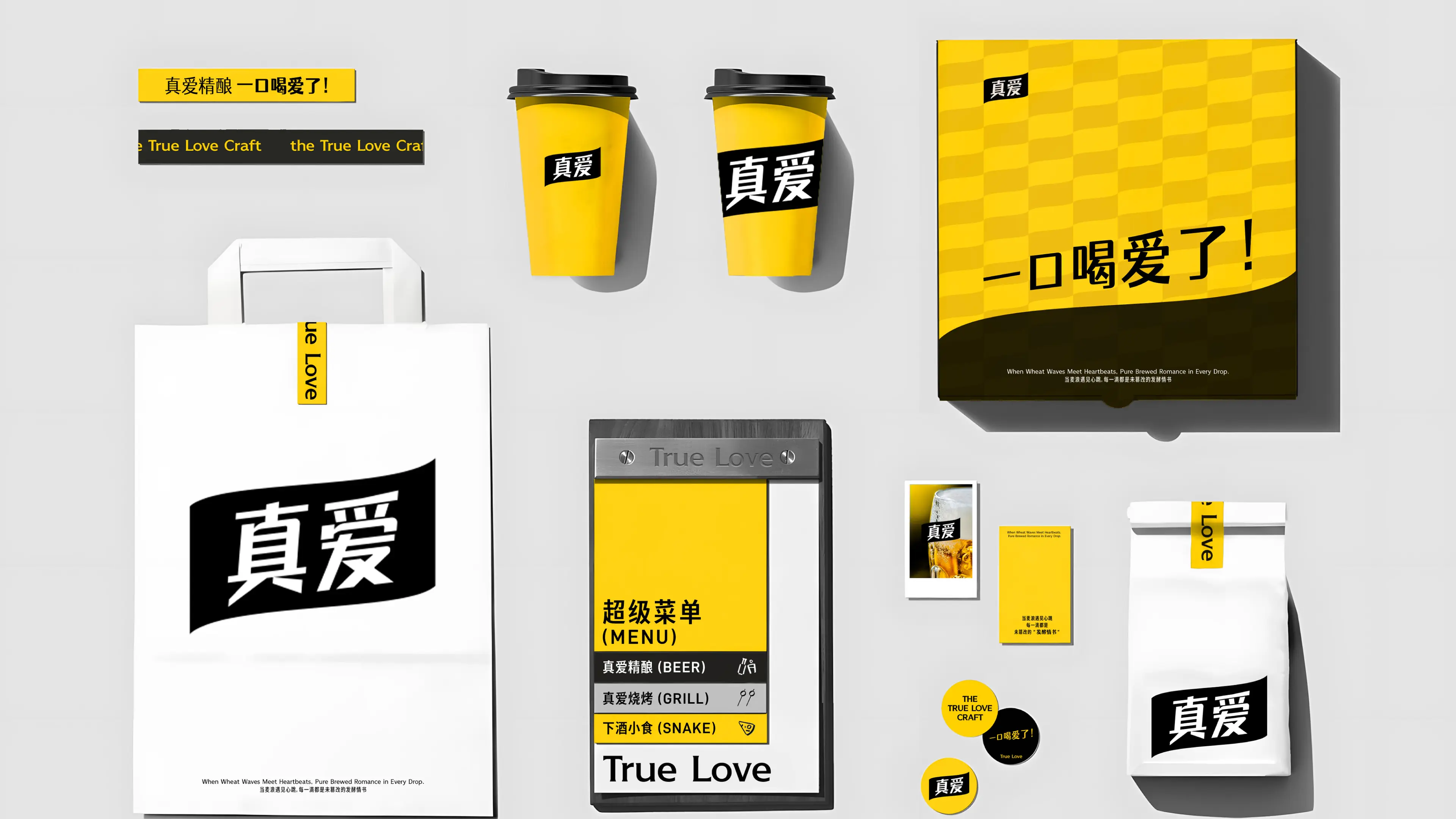
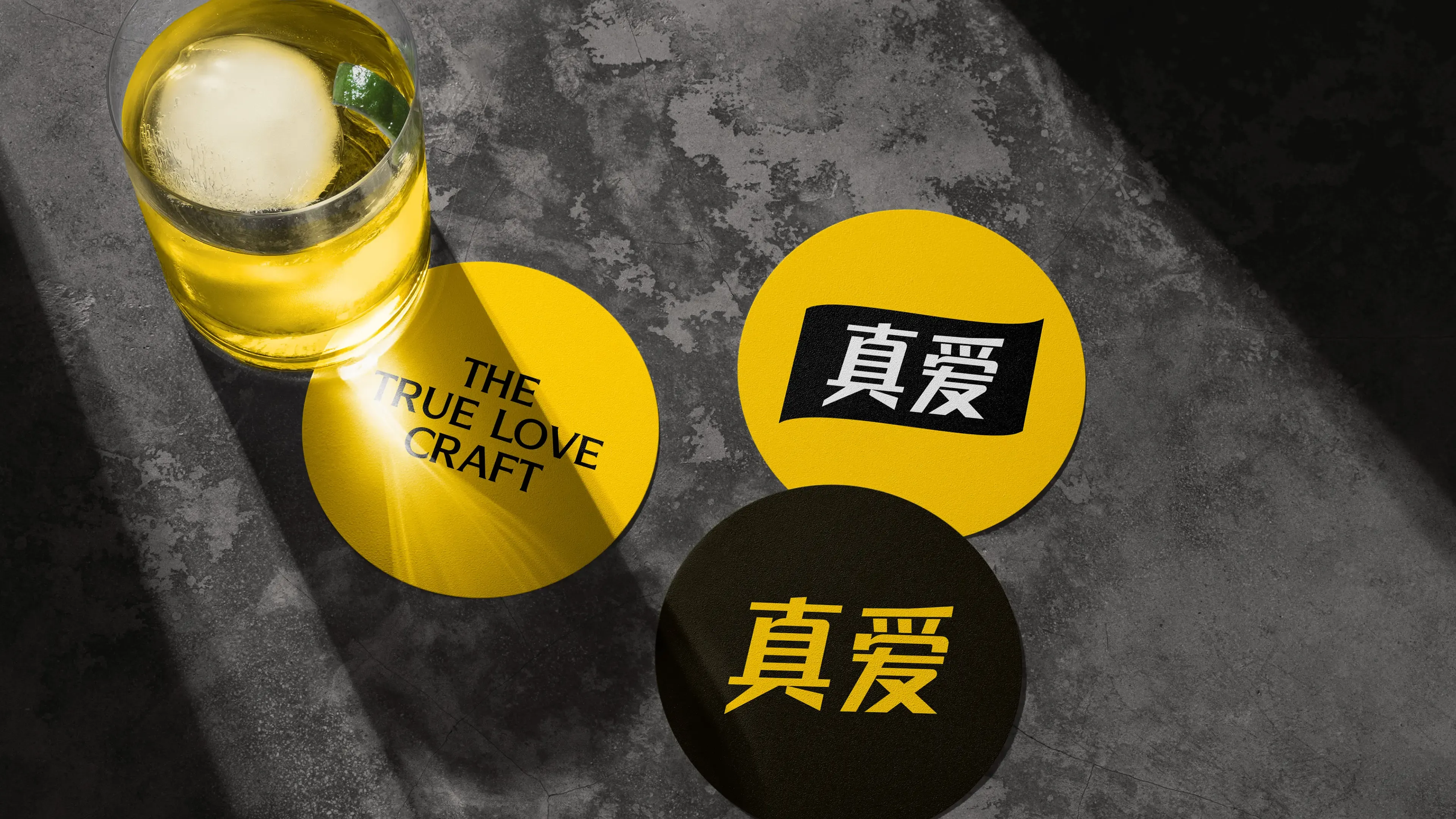
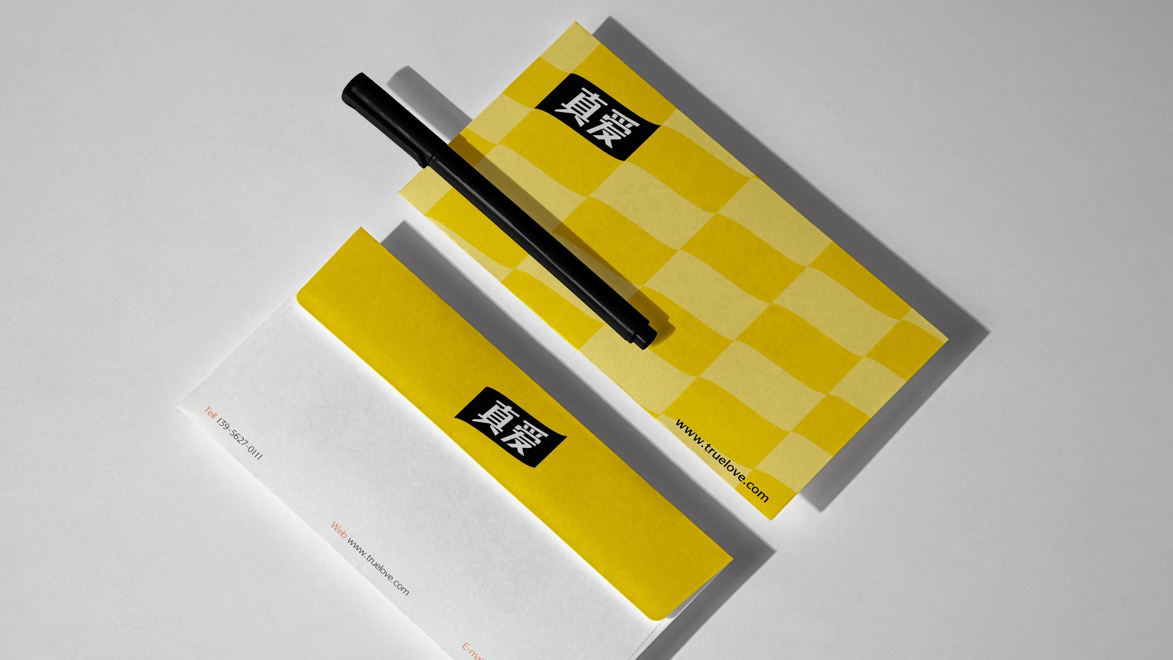
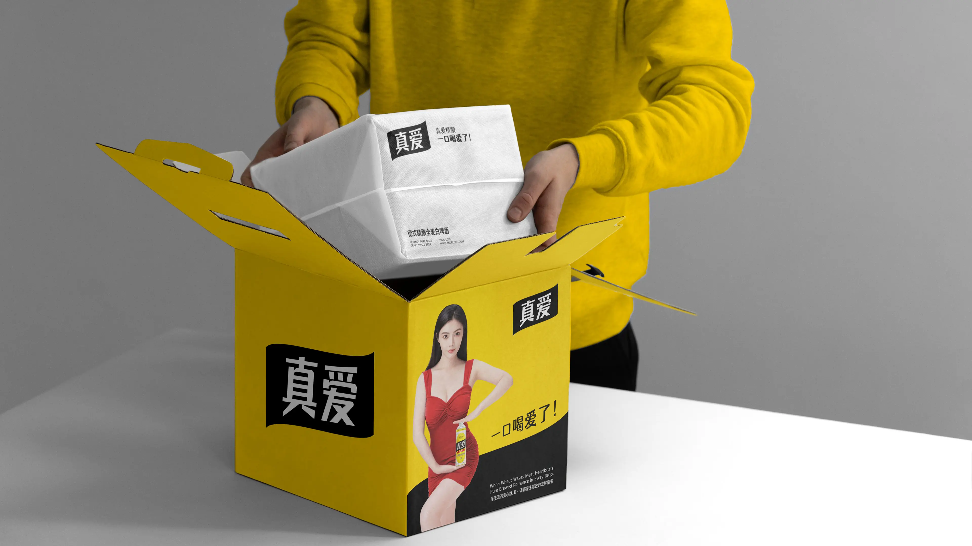
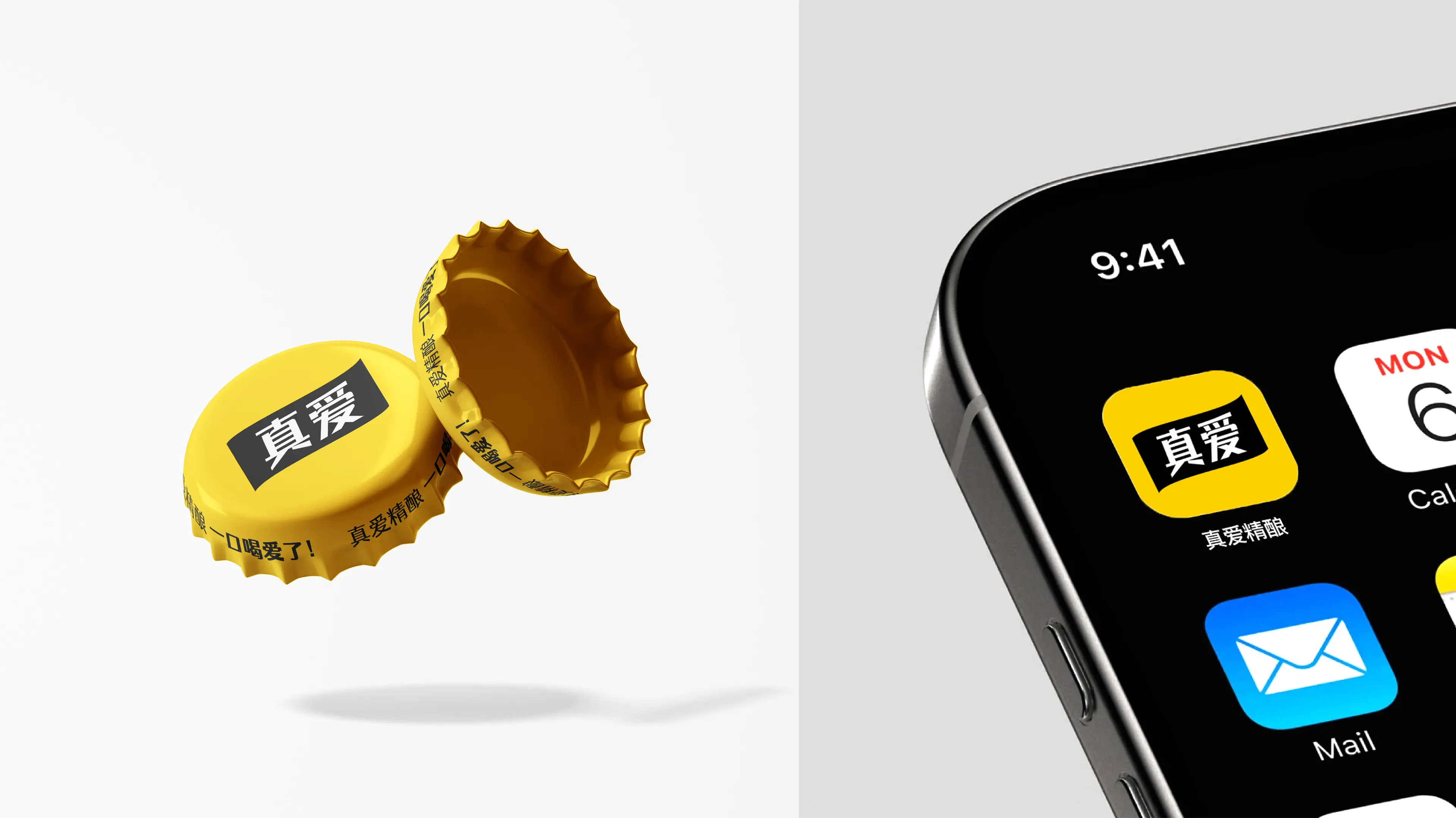
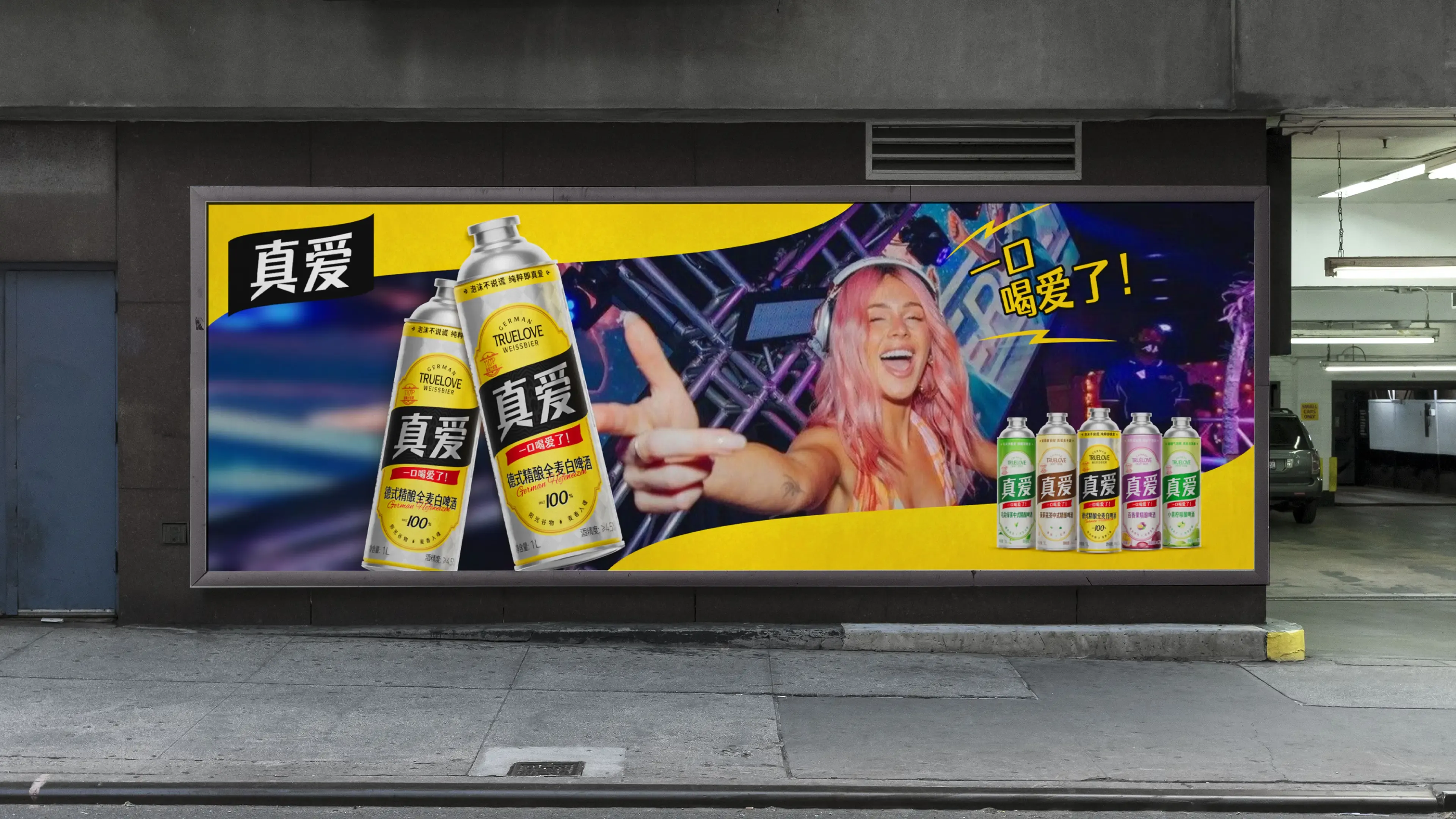
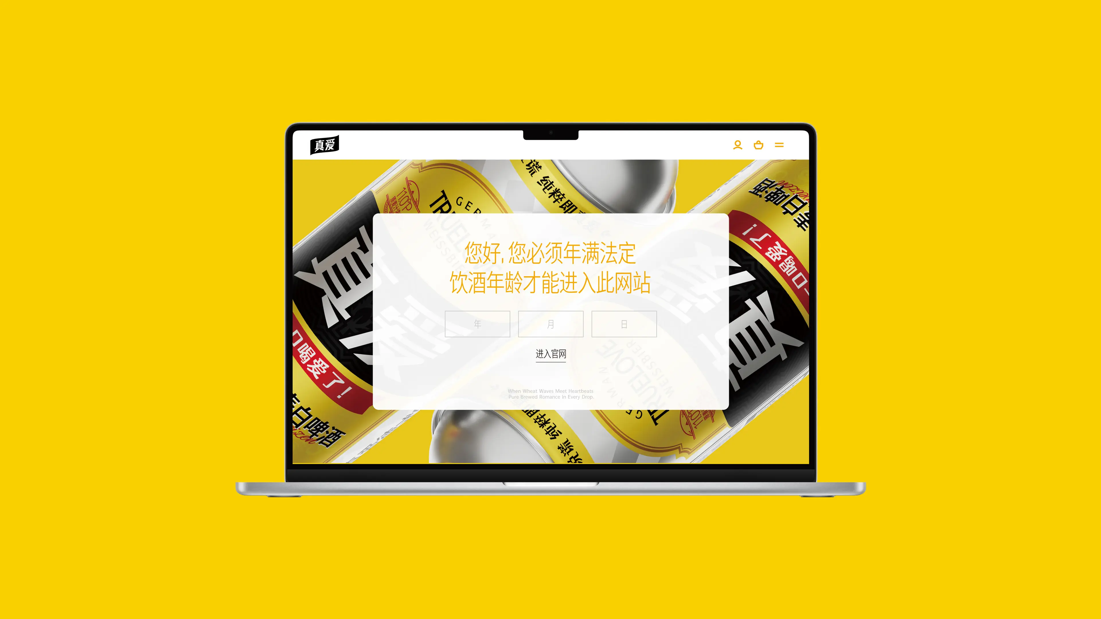
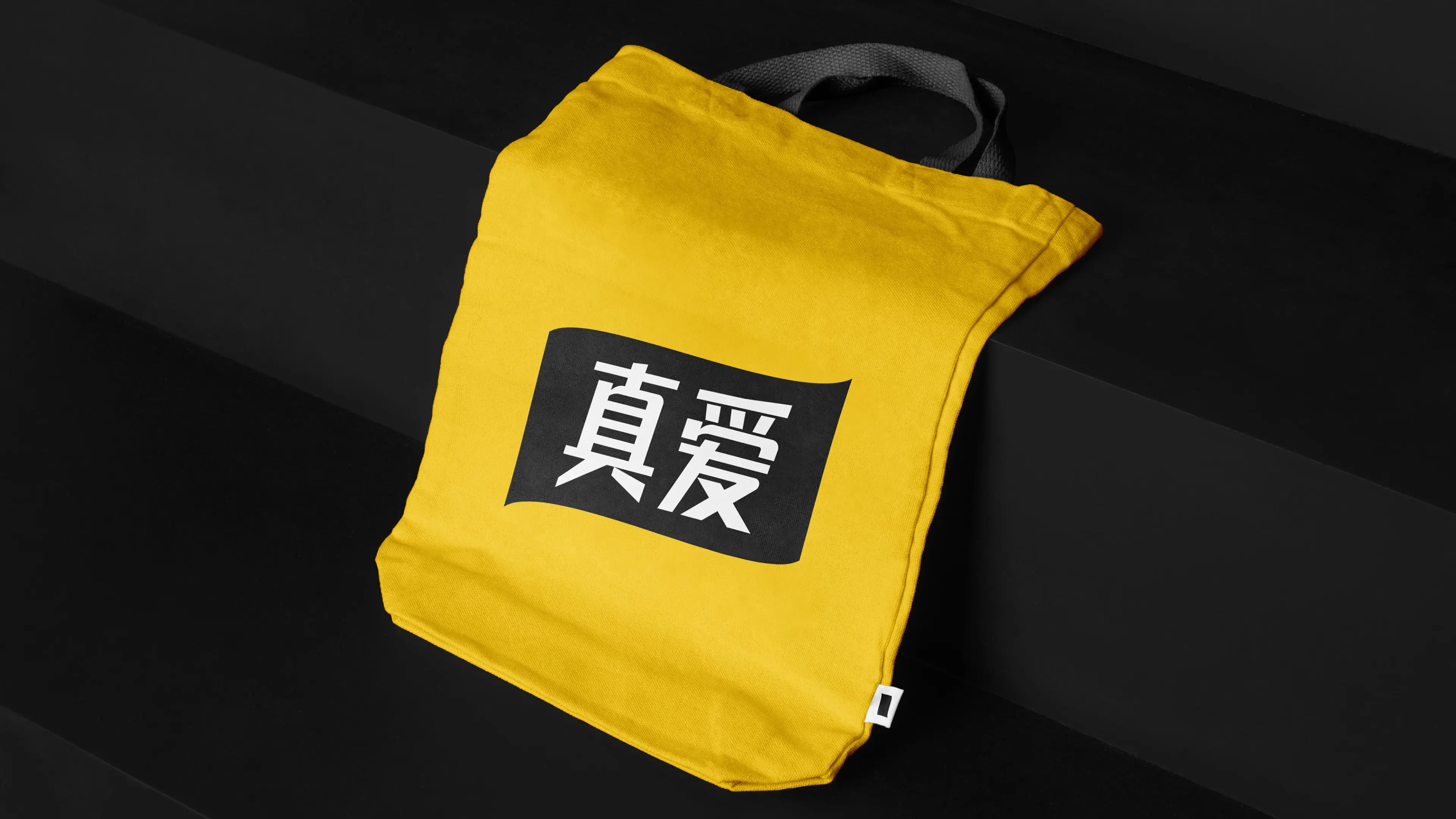
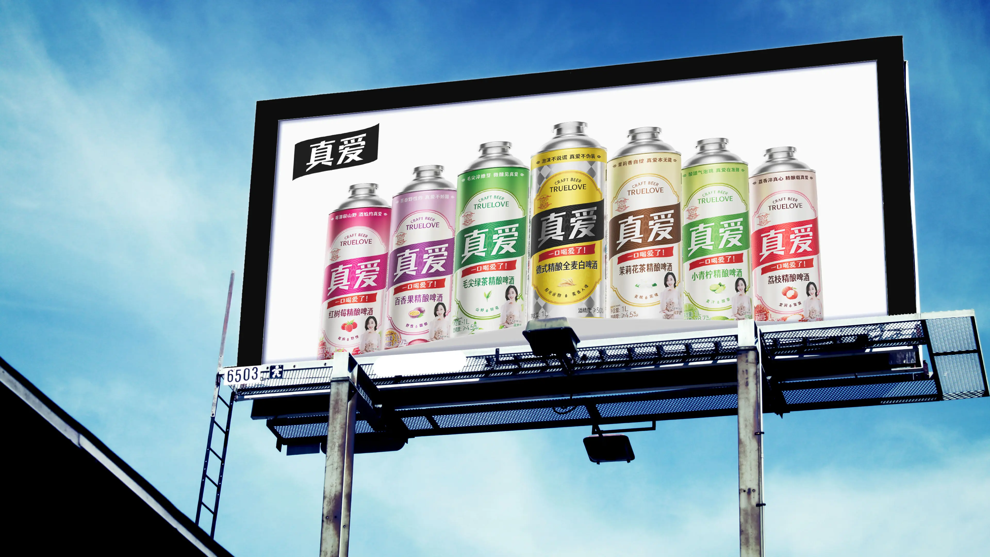
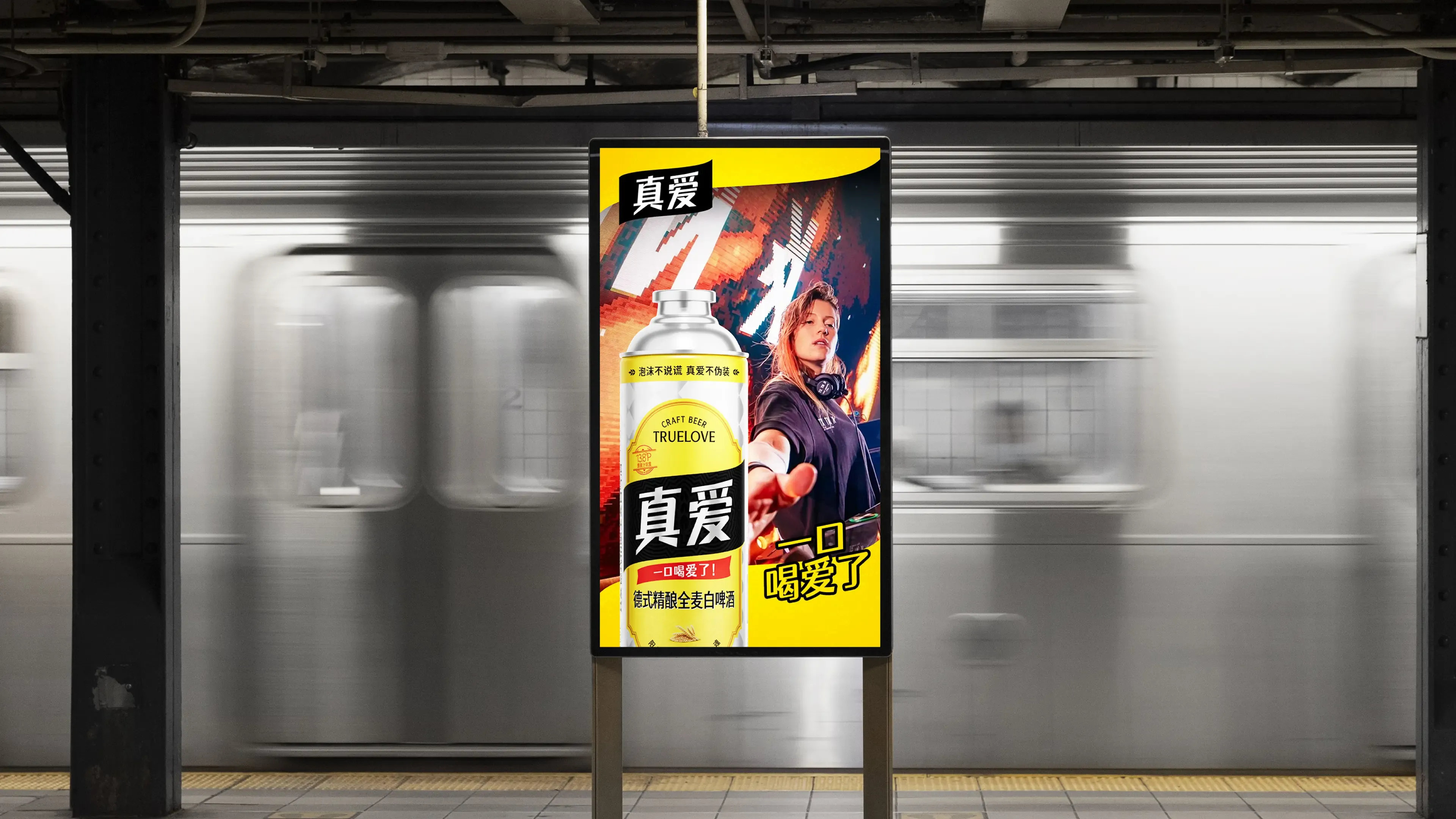
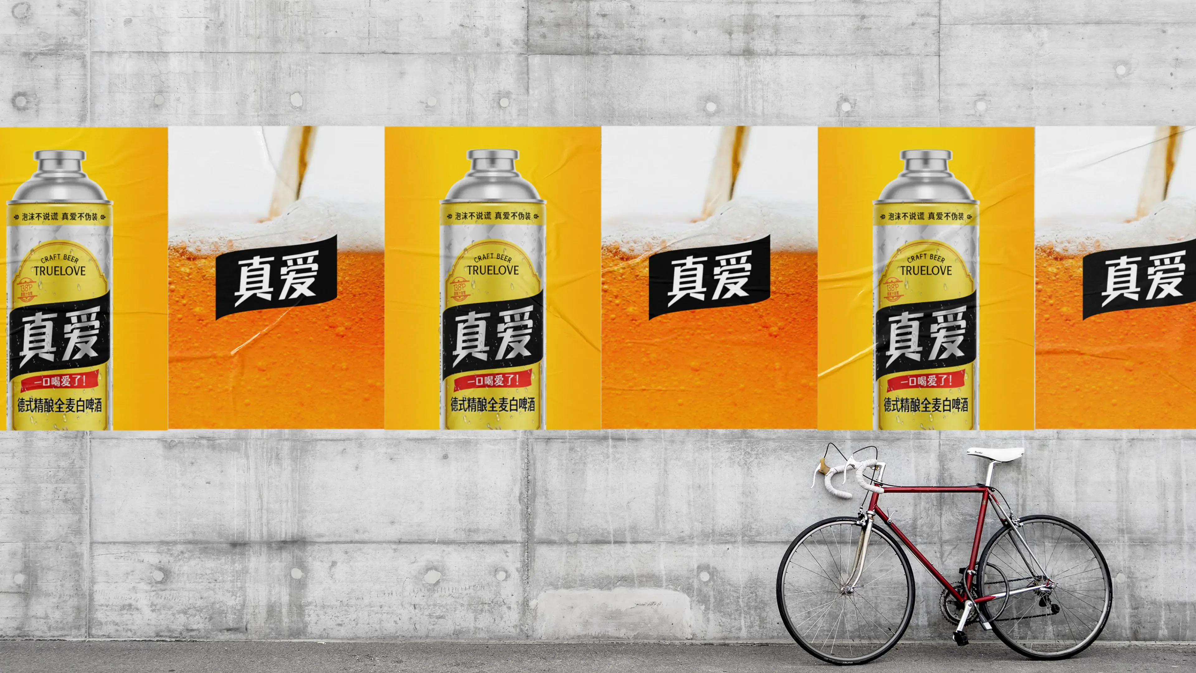
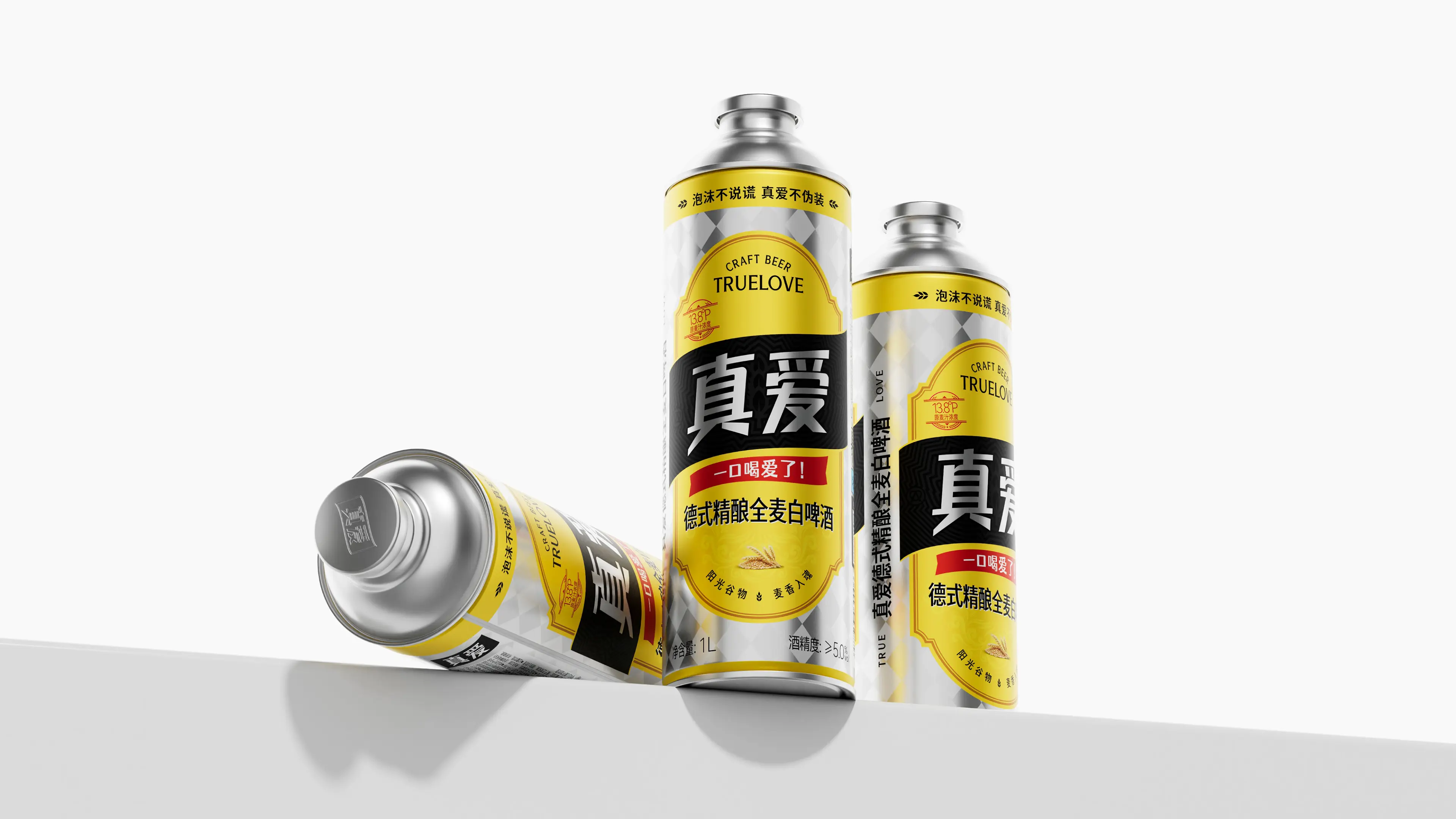
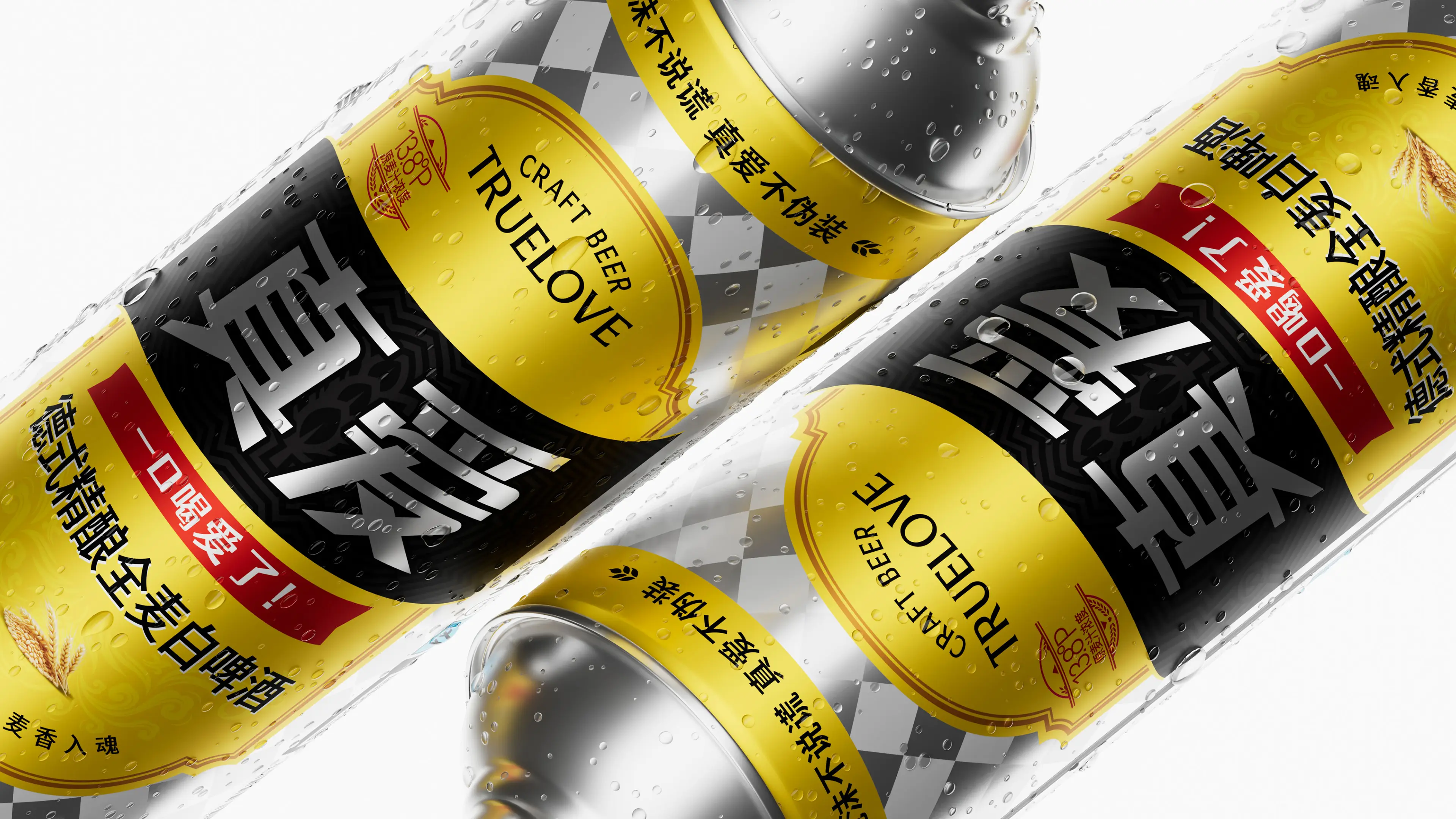
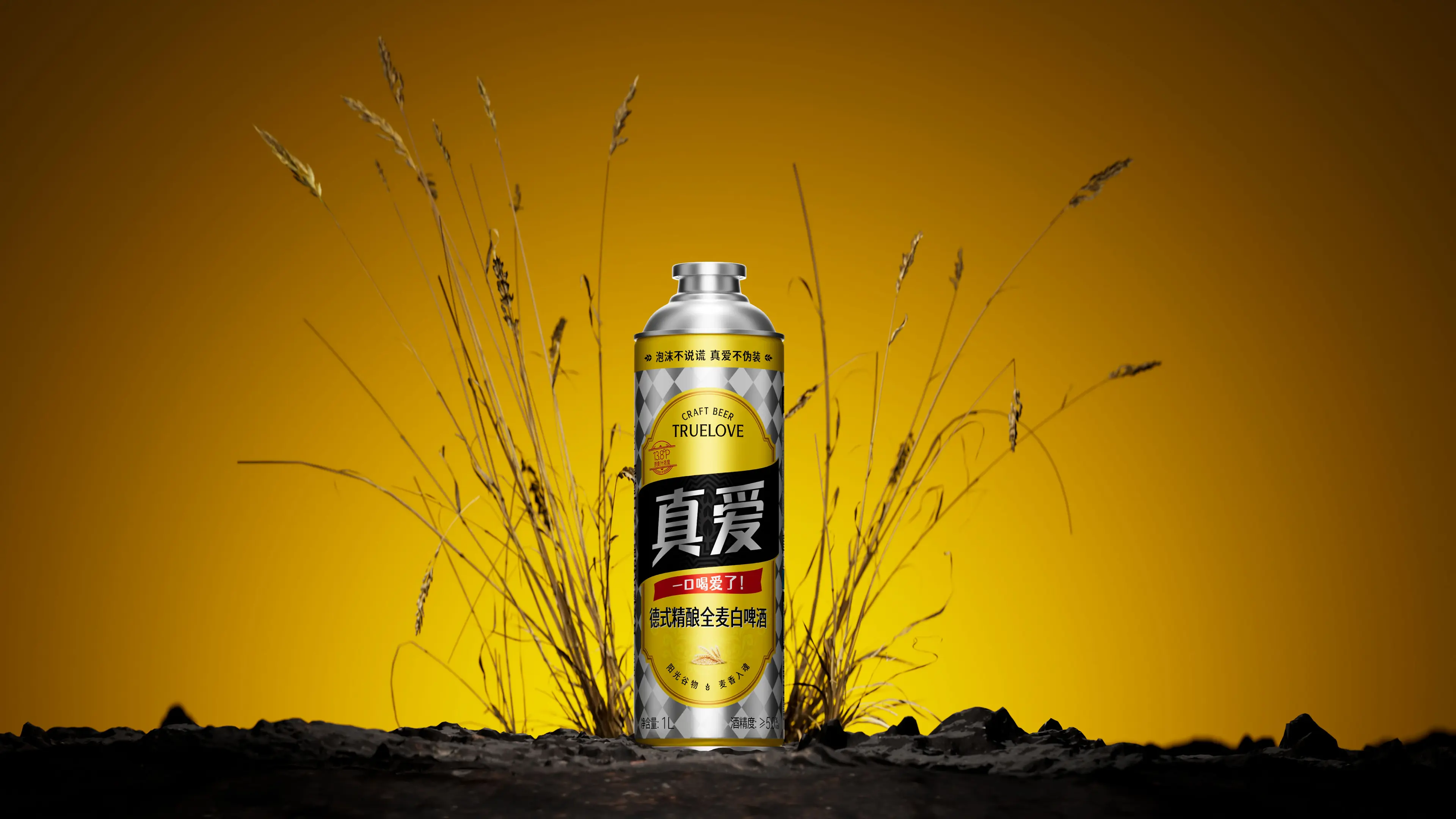
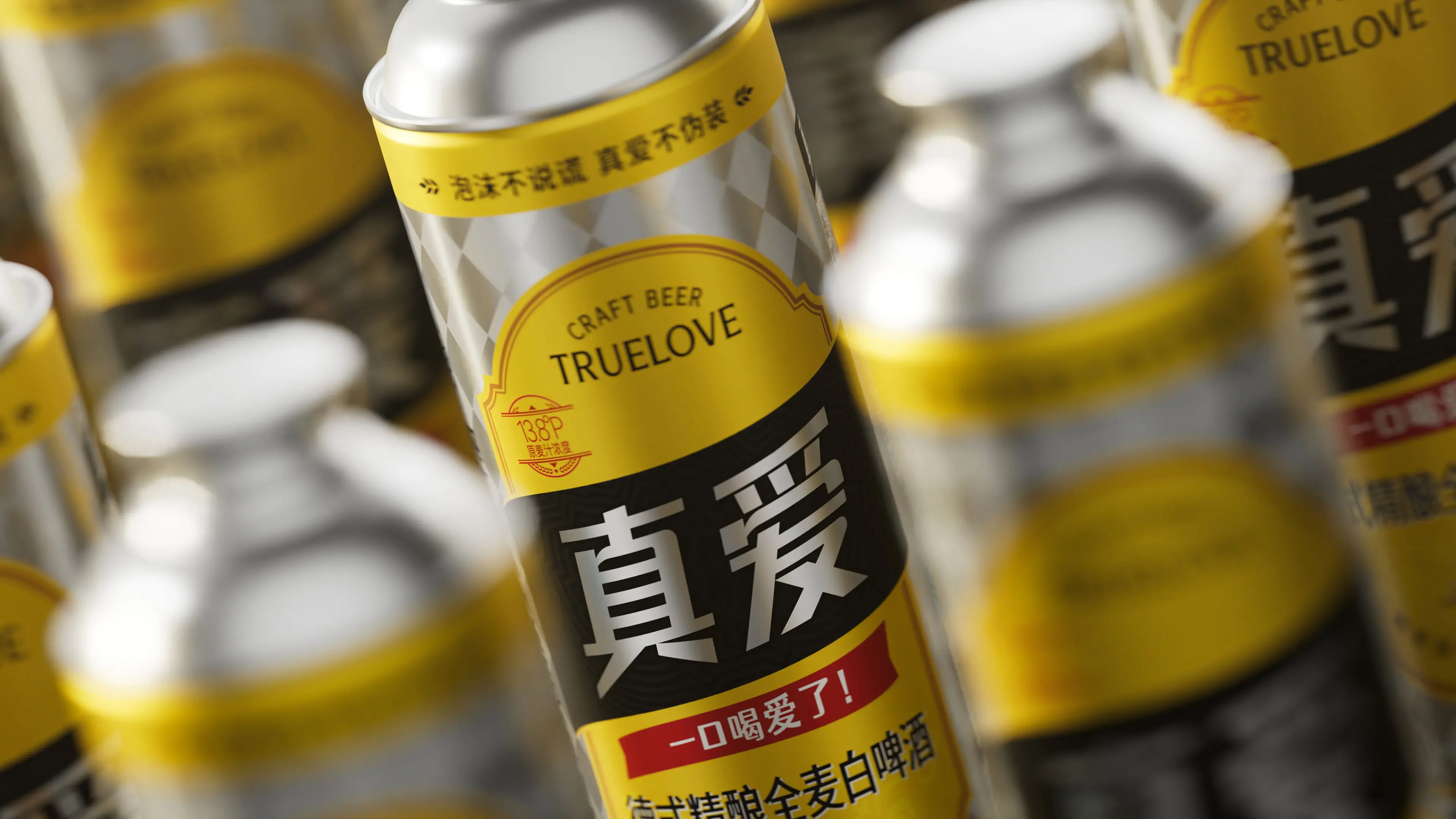
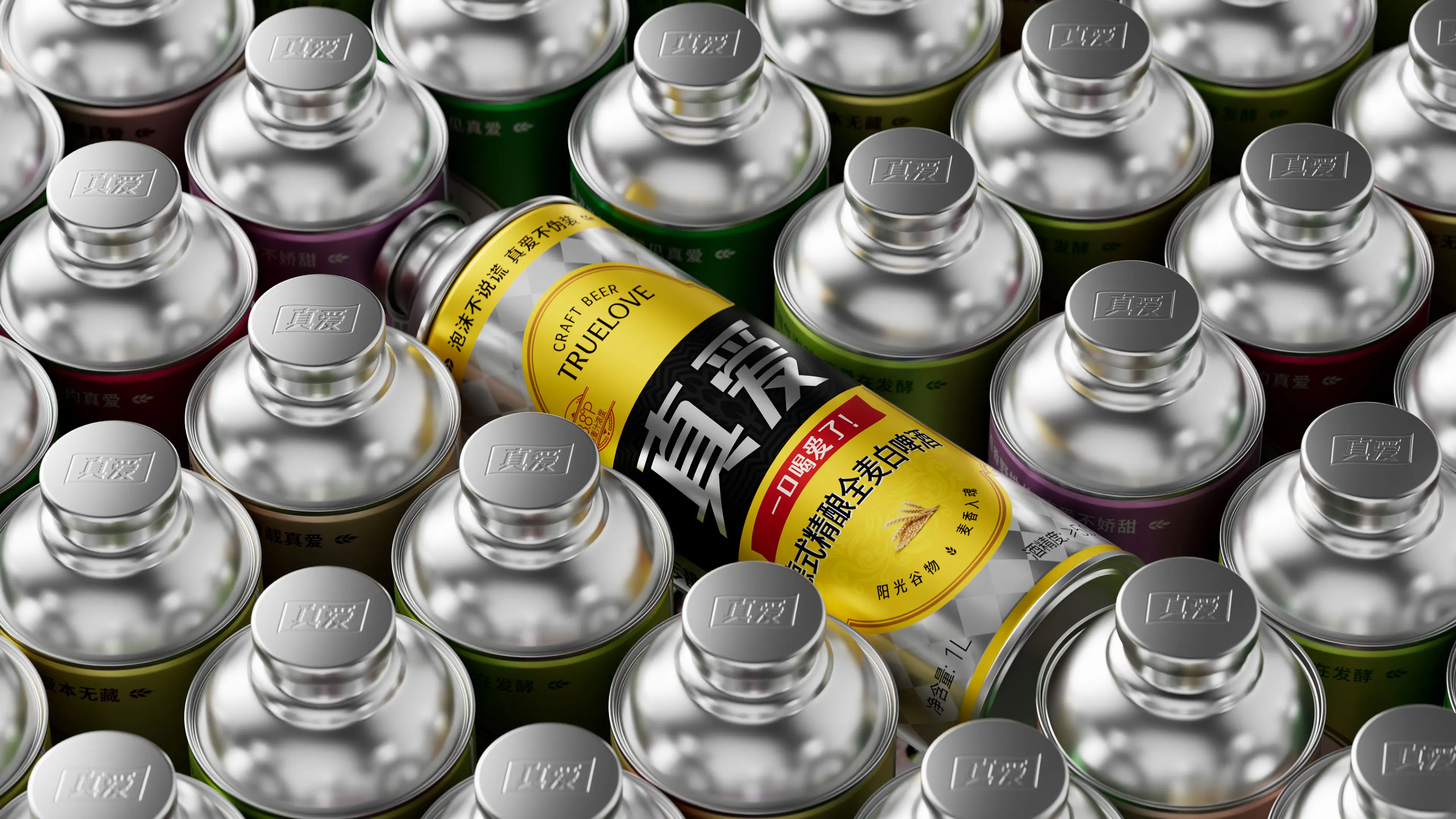
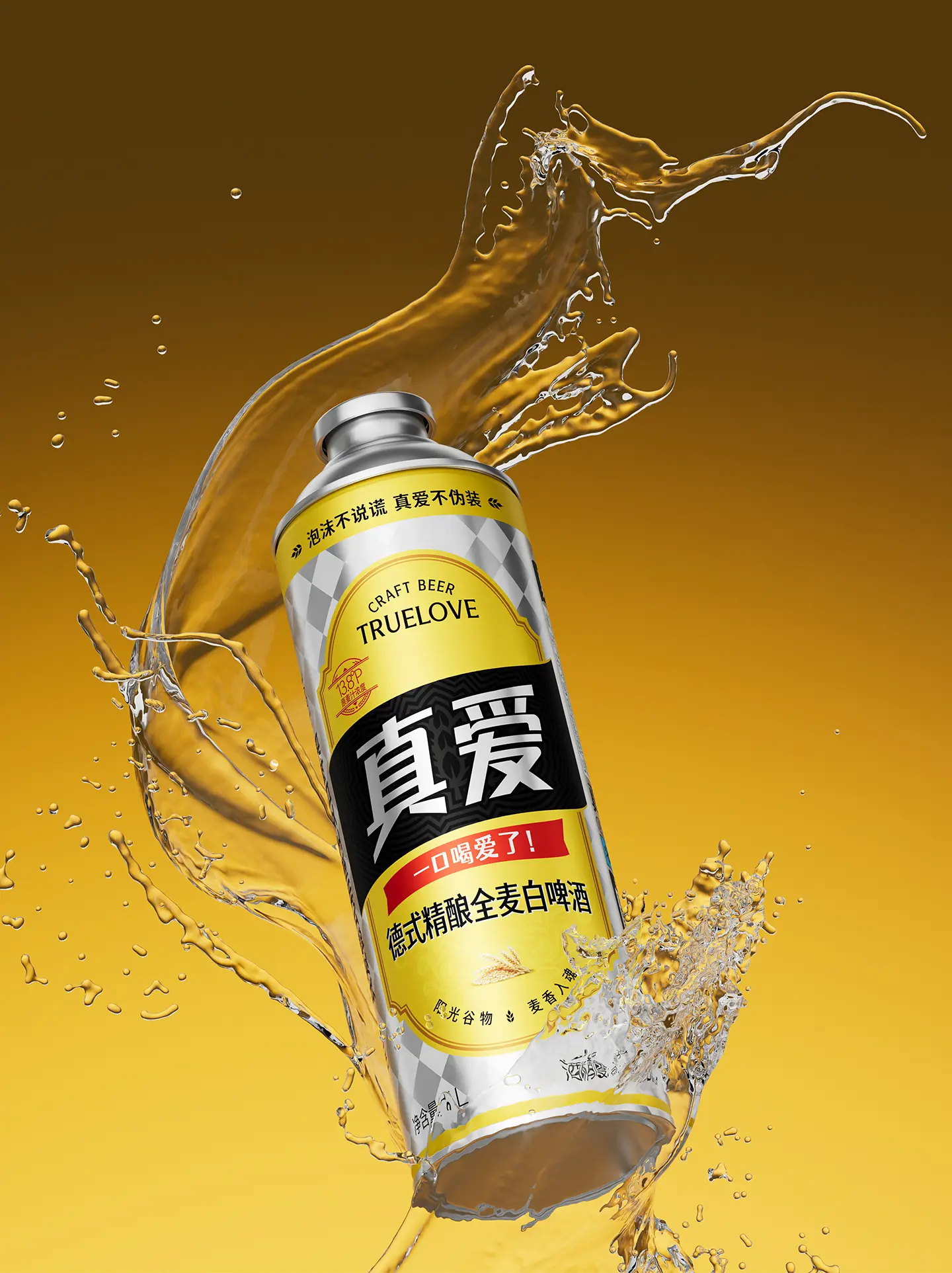
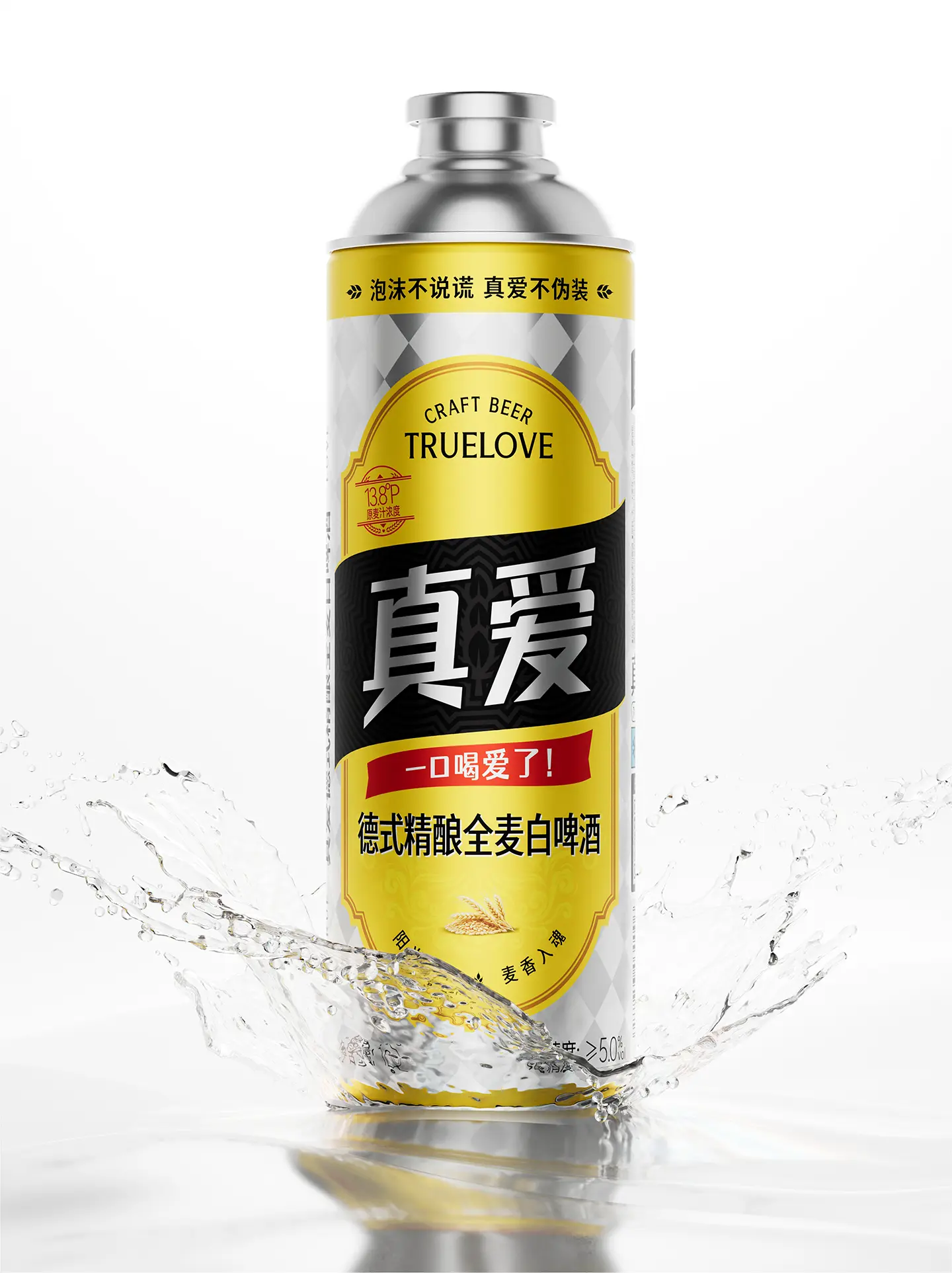
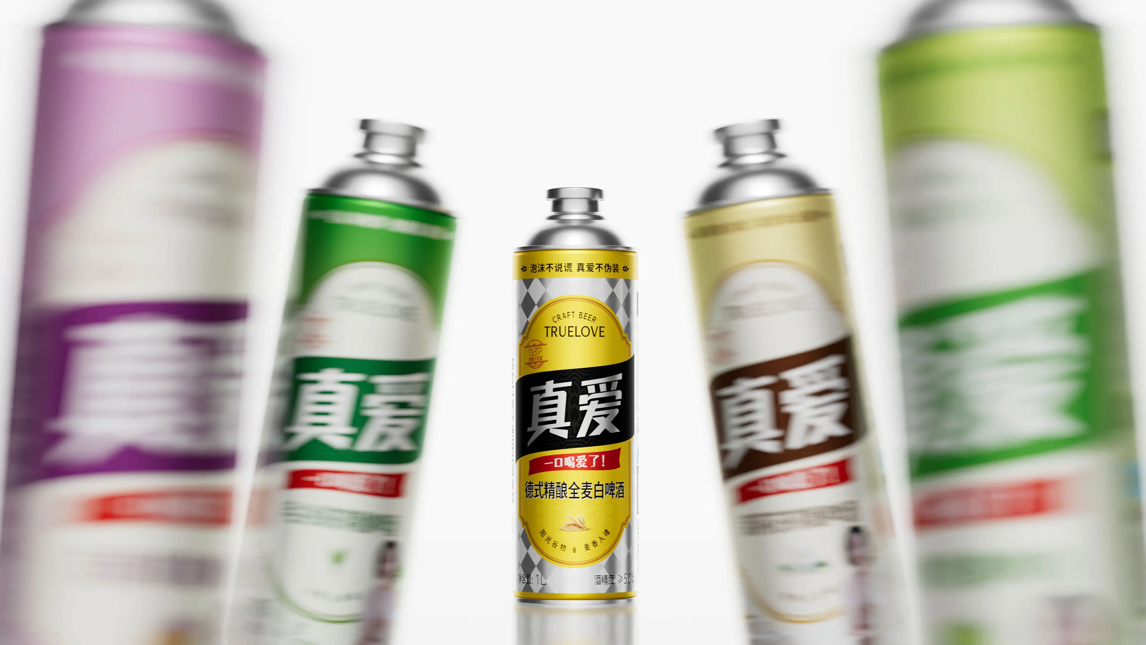
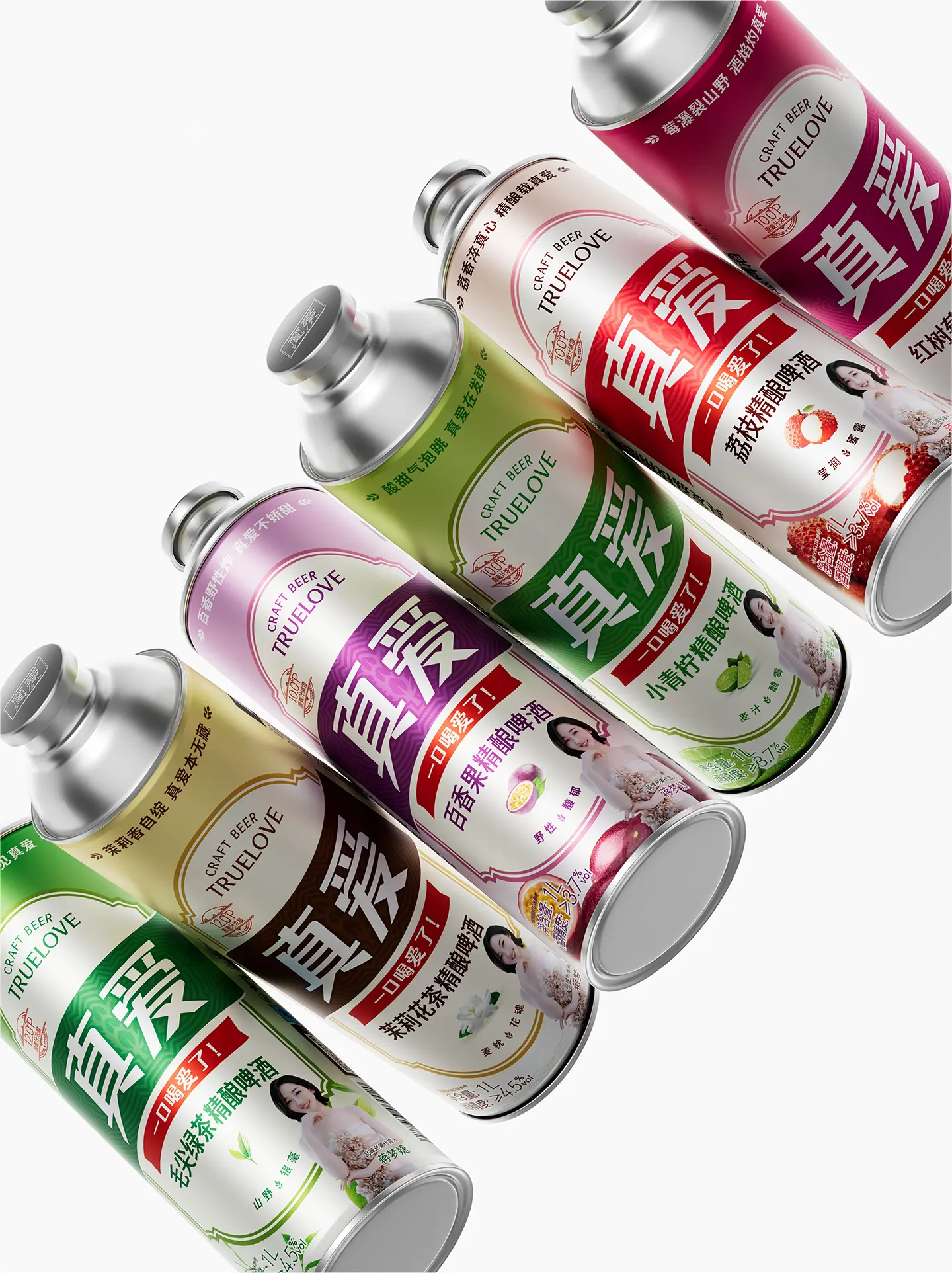
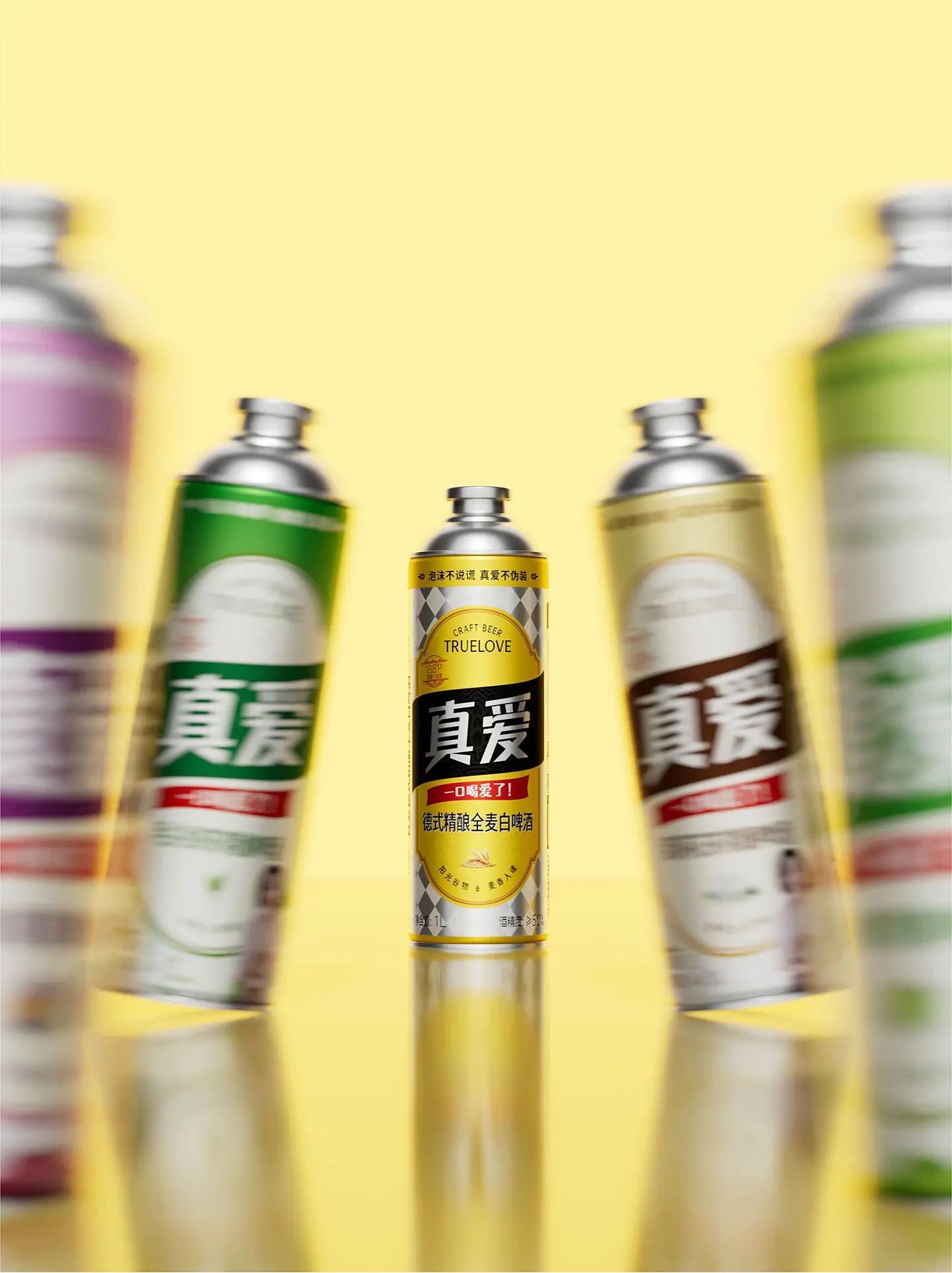
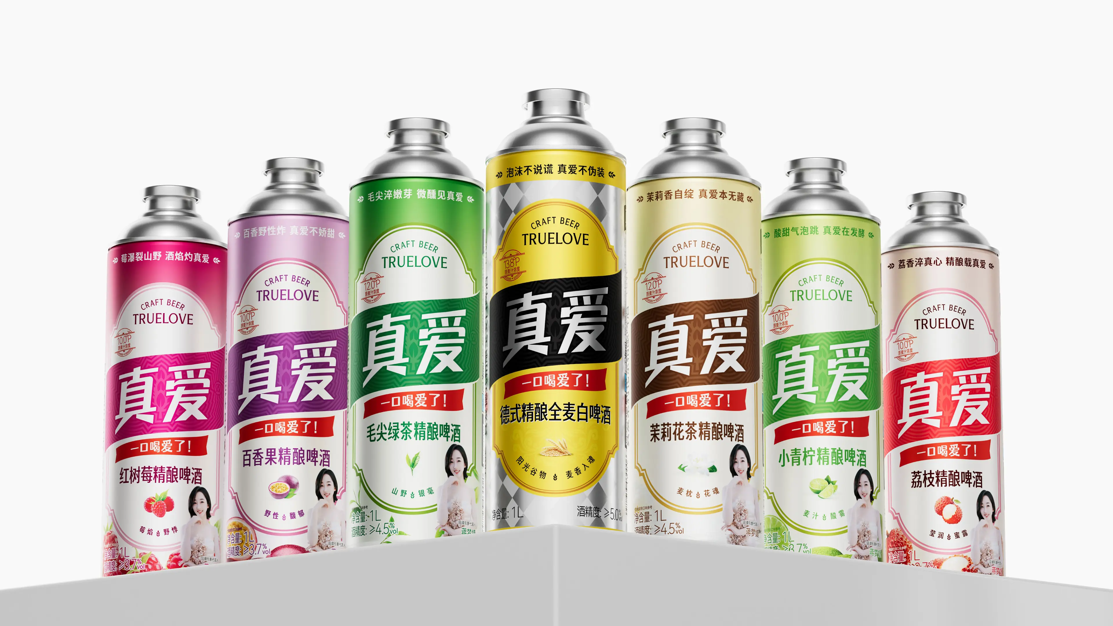
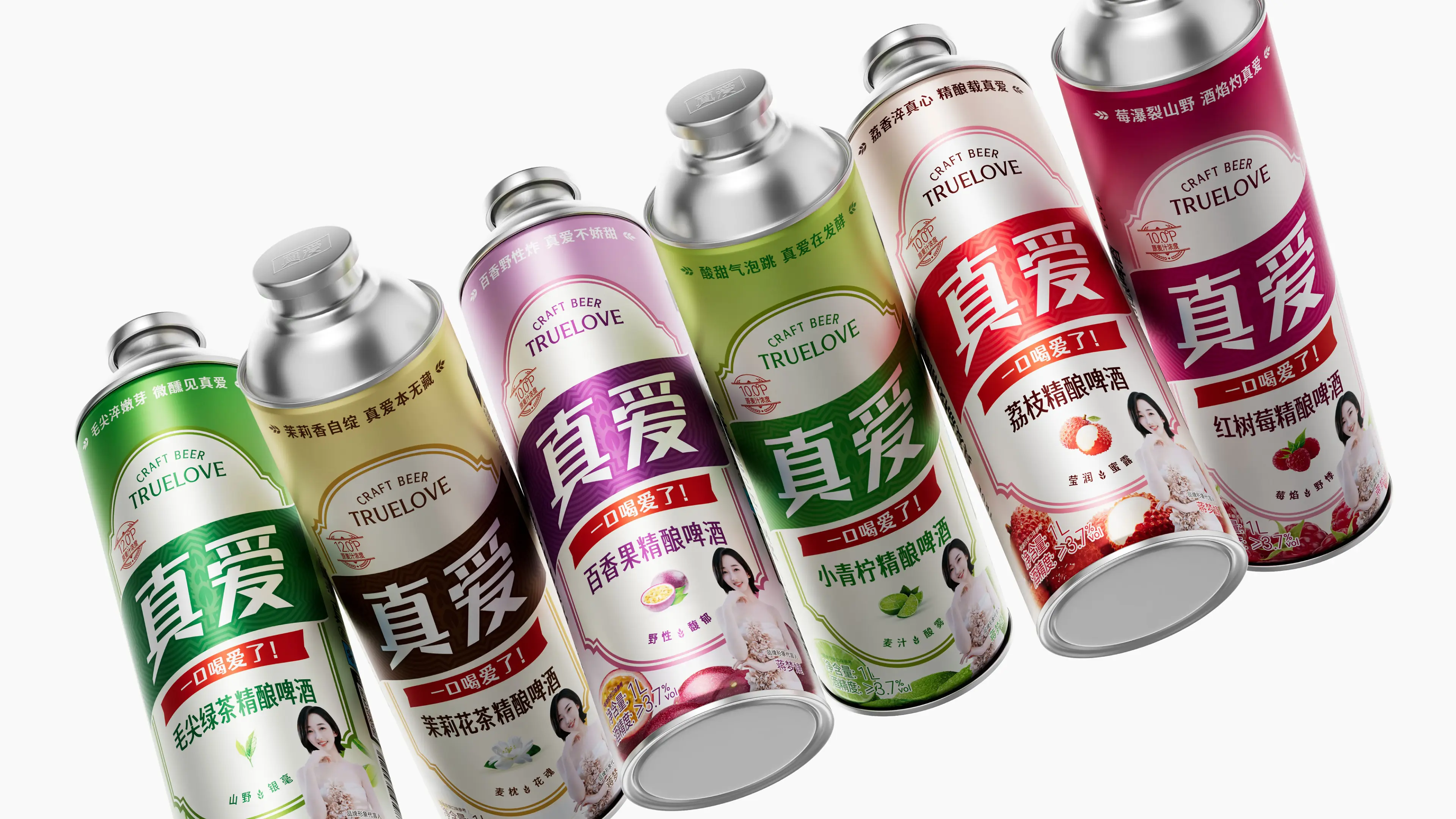
This project takes “German heritage + modern expression” as its core direction, building a complete full-brand design system. The brand uses deep gold and dark green as its primary colors. Gold symbolizes the amber luster and high quality of beer, while dark green echoes the traditional heritage of German beer. The logo is inspired by classic German emblems, embedding the brand name “TRUE LOVE” into the emblem structure to convey inheritance of and reverence for German brewing craftsmanship. Wheat ears and hops run through the entire product series as auxiliary graphics, symbolizing the pure ingredients of whole-malt brewing and the soul of craft beer. The packaging combines classic German serif fonts with modern sans-serif fonts, balancing traditional aesthetics with contemporary reading habits; the bottle label uses concise color-block divisions to build visual order, ensuring the product quickly establishes brand recognition on e-commerce pages and retail shelves. To meet subsequent series development needs, we established a visual identity system that distinguishes categories by color—derivative packaging for different flavors maintains the same key visual structure and brand elements while differentiating through changes in the background color of auxiliary graphic modules. This not only ensures brand consistency but also provides consumers with intuitive purchasing references, effectively reducing recognition costs on retail shelves. Through this brand visual design system combining German heritage, recognition efficiency, and series extensibility, TRUE LOVE German-Style Craft Whole Wheat White Beer has successfully established a brand symbol with strong visual recognition, clear brand positioning, and a sense of quality trust, laying a solid visual foundation for series product development.
| |
| |