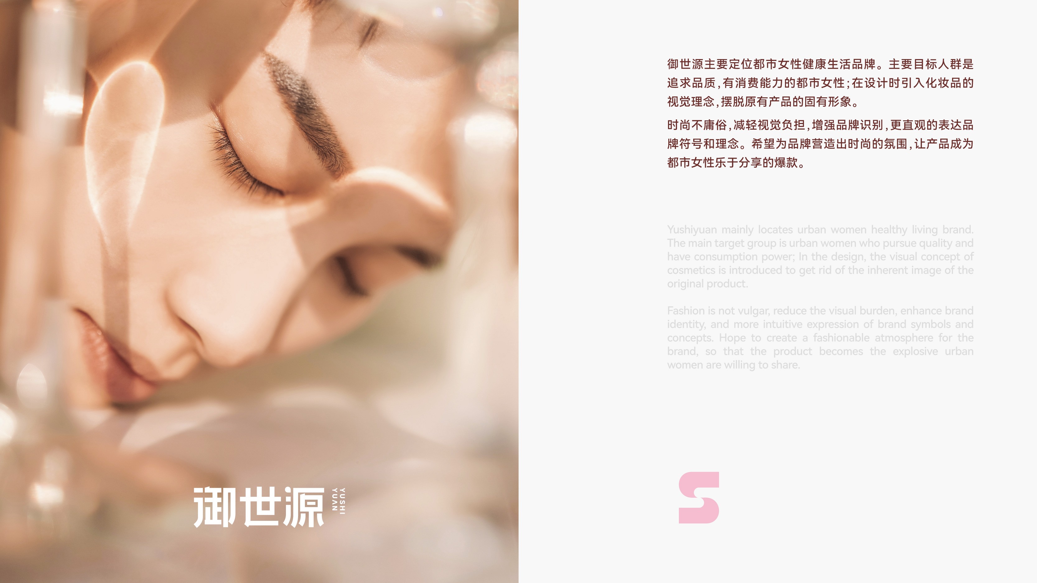
Yushiyuan's parent company is located in Shanghai and was founded in 2018. It is a brand specializing in functional foods, with a primary focus on health issues such as gut health and blood sugar control. It is committed to creating functional foods that suit the constitutions of modern people, improving health conditions, bidding farewell to sub-health, and enhancing physical fitness. The brand is mainly positioned around the healthy lifestyle of urban women, with a target audience of urban women who pursue quality and have purchasing power. Yushiyuan Iron-Rich Gummy, as the brand's core product, focuses on the health needs of urban women for iron and blood supplementation, using a snack-style dosage form to lower the threshold for using traditional health supplements.
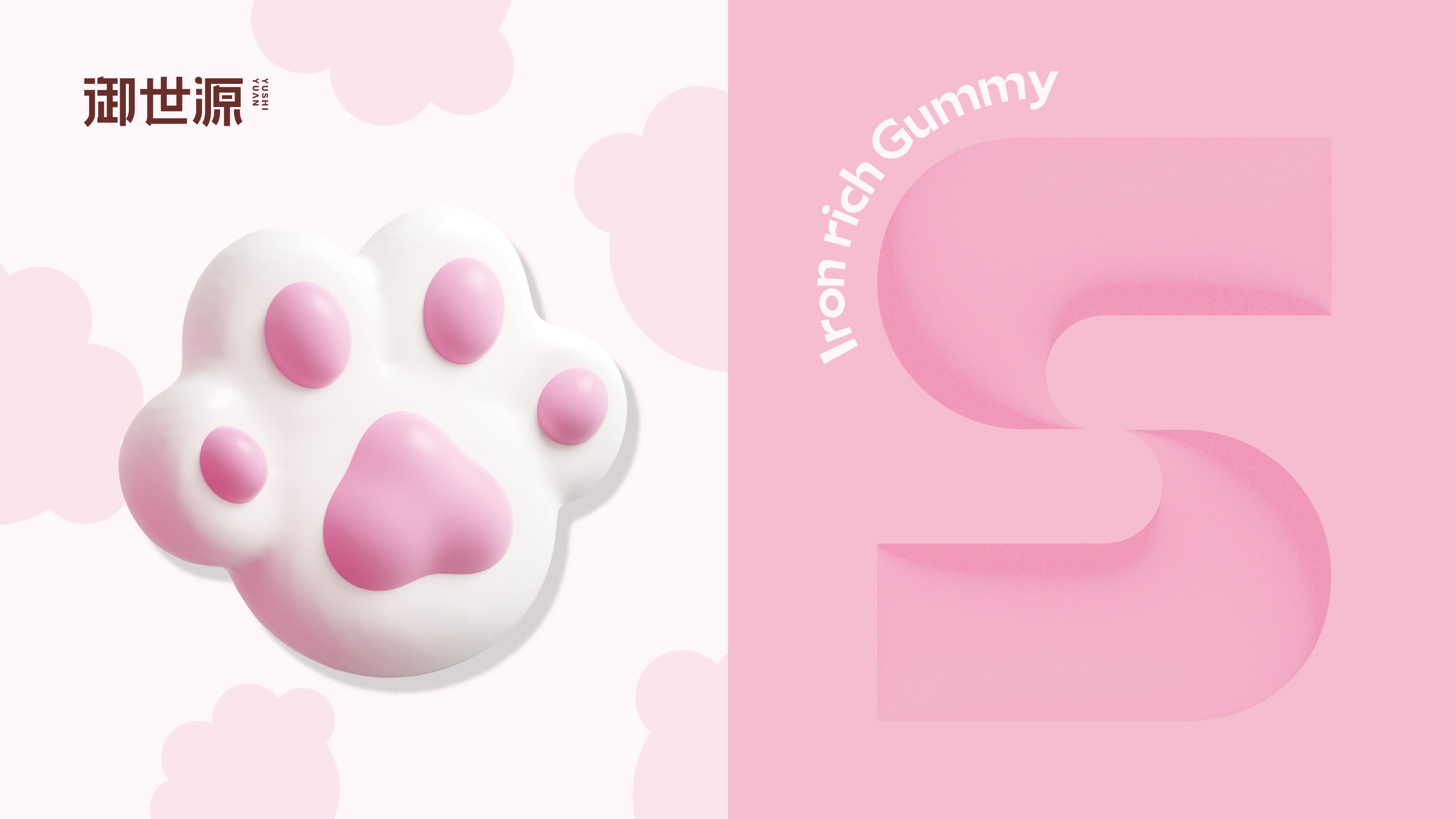
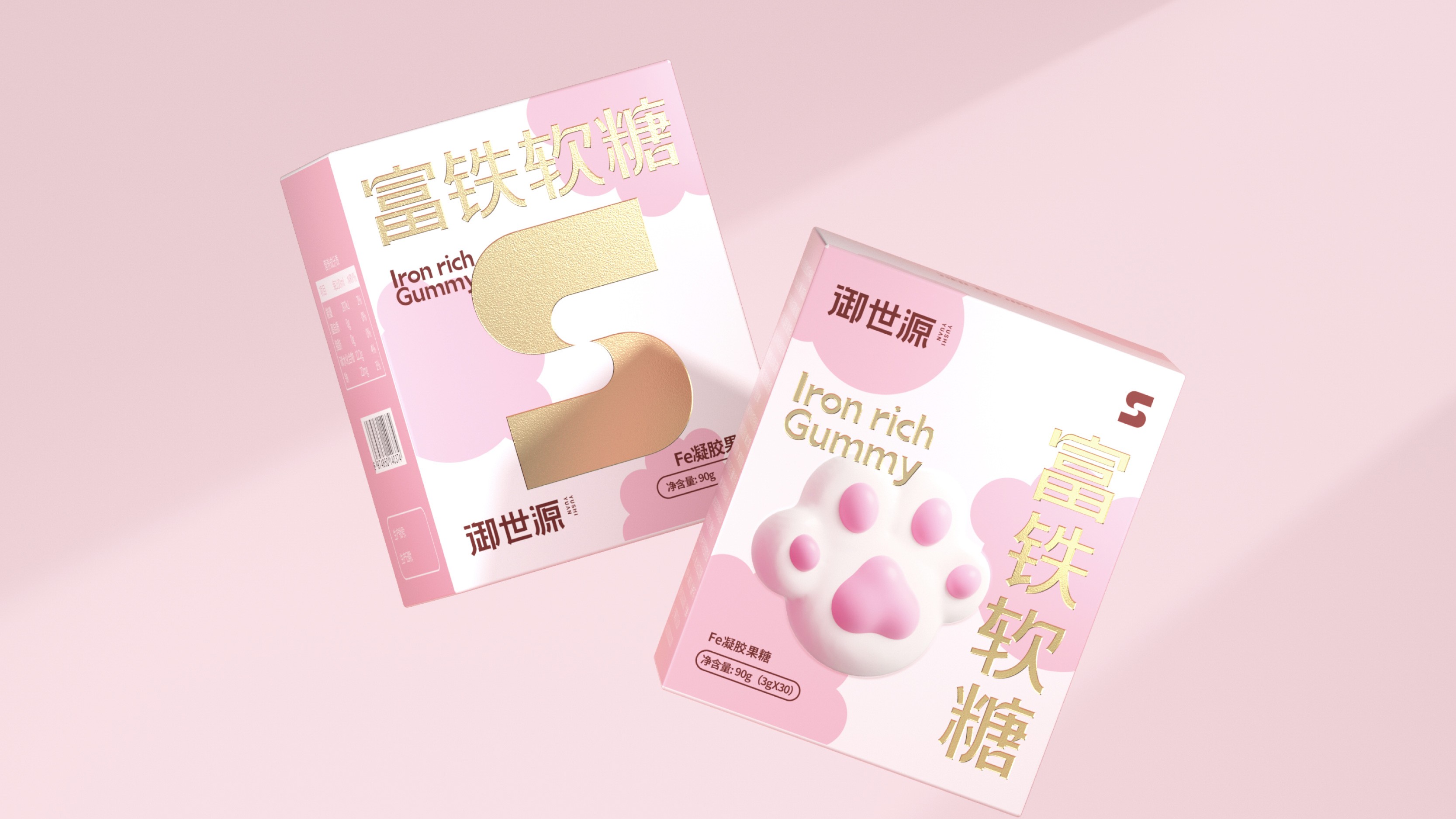
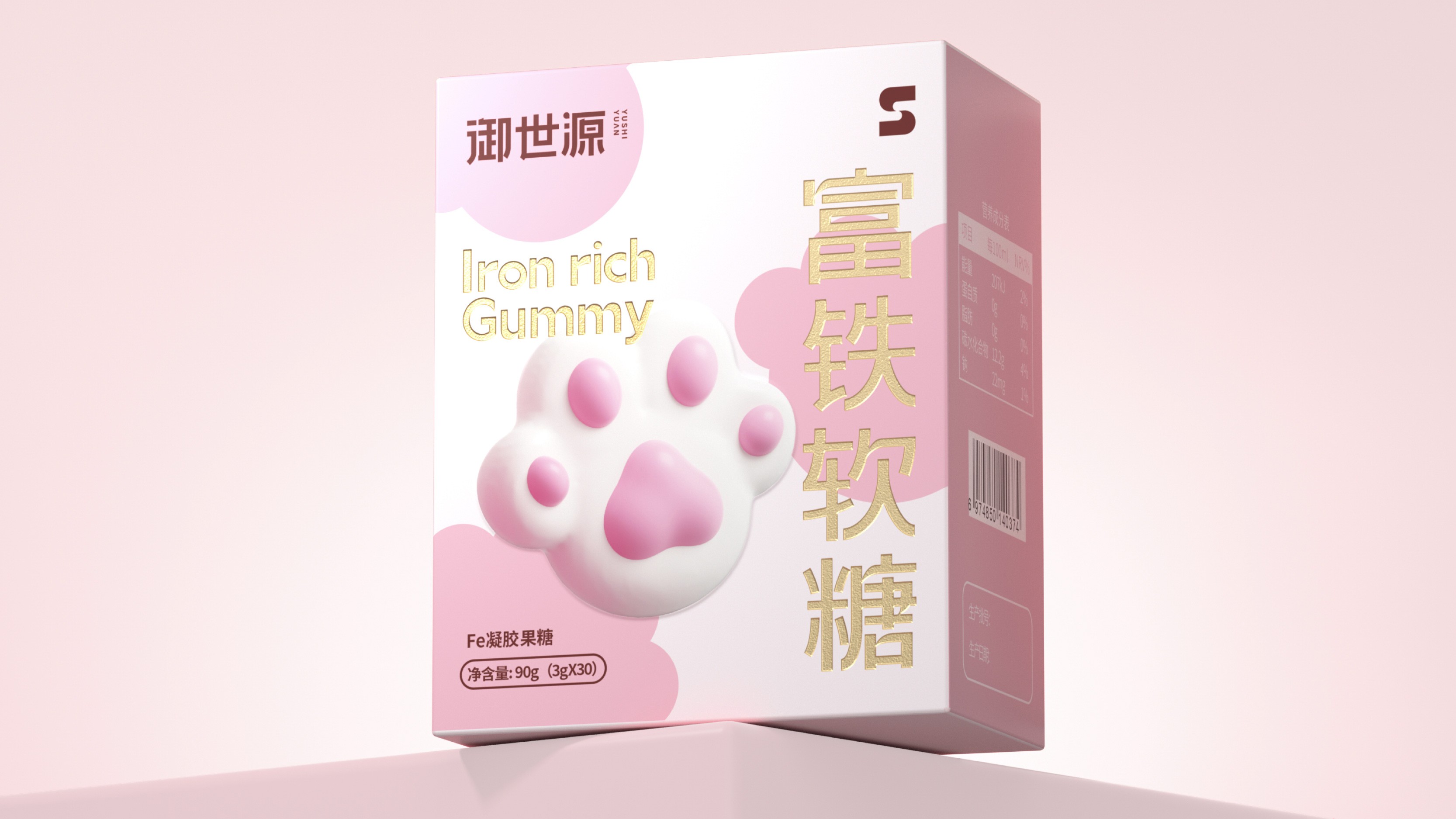
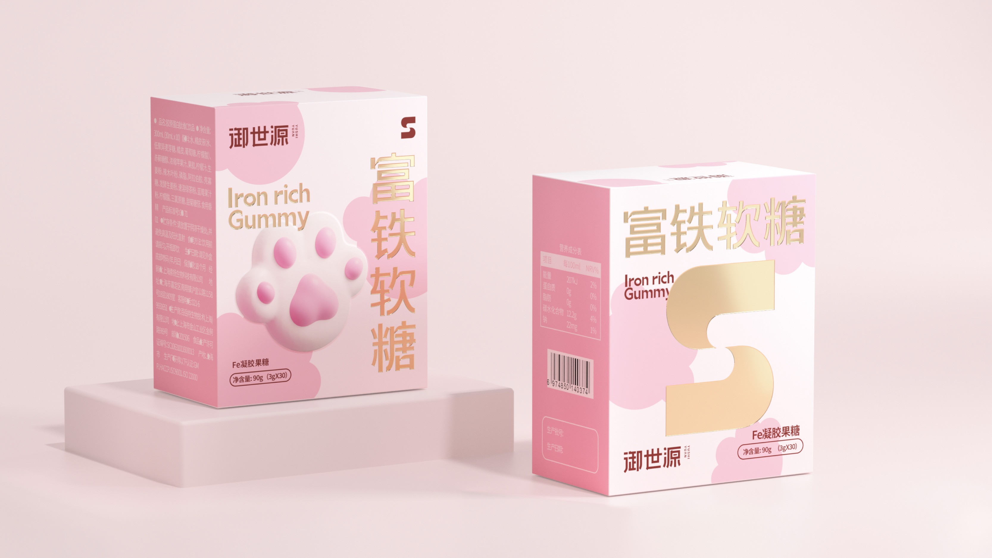
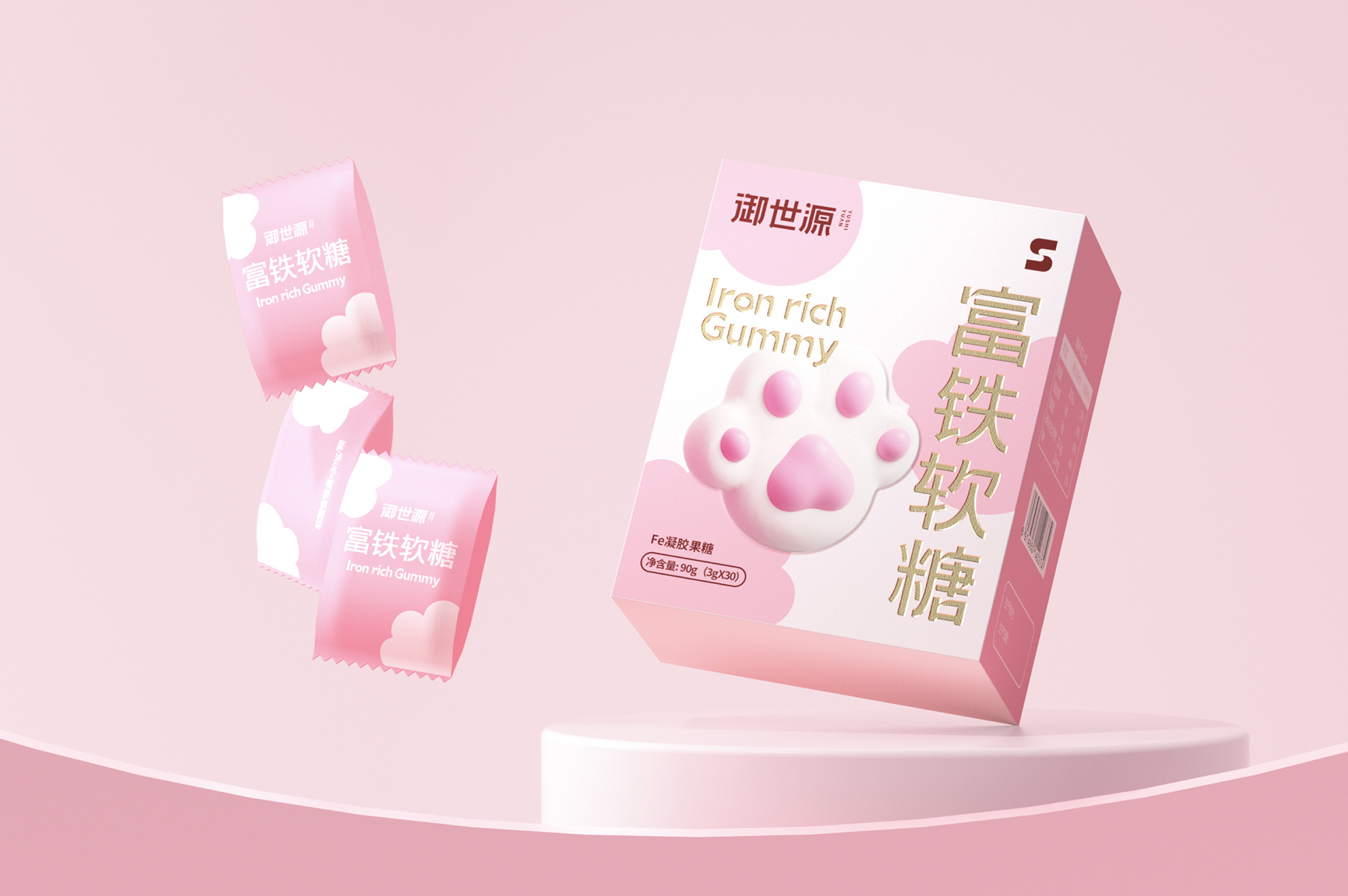
This project involved a comprehensive upgrade of brand visual and packaging design for Yushiyuan Iron-Rich Gummy. The core objective was to help the brand establish differentiated visual recognition and fashionable tonality in the increasingly competitive functional food market. Traditional health supplement packaging generally suffers from rigid imagery and heavy visual burden, making it difficult to reach urban female consumers pursuing a quality lifestyle. To this end, we boldly introduced cosmetic visual concepts, redefining the visual expression of functional foods with a fashionable and lightweight design language — the color palette uses pink, which is more delicate and soft, conveying a gentle and healing brand emotion; the layout incorporates cat paw elements, which are not only playful and cute but also enhance the brand's shareability and topicality in social scenarios. In conceptualizing the packaging main visual, the team conducted secondary design from angles such as raw materials and product shapes. Through this visual system combining fashion sense and recognition, Yushiyuan has successfully shed the inherent image of traditional health supplements, making the product a hit that urban women are eager to share.