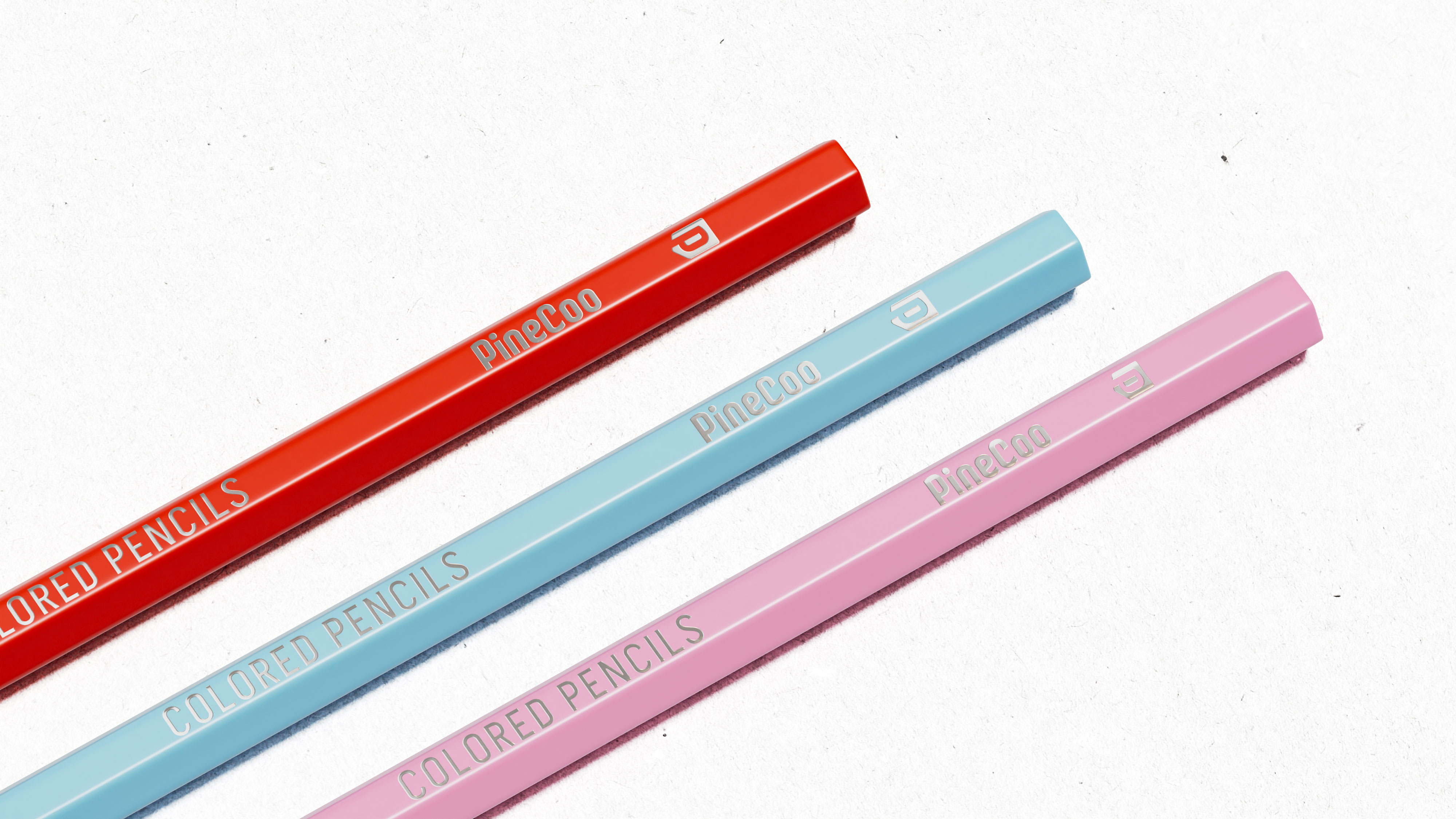
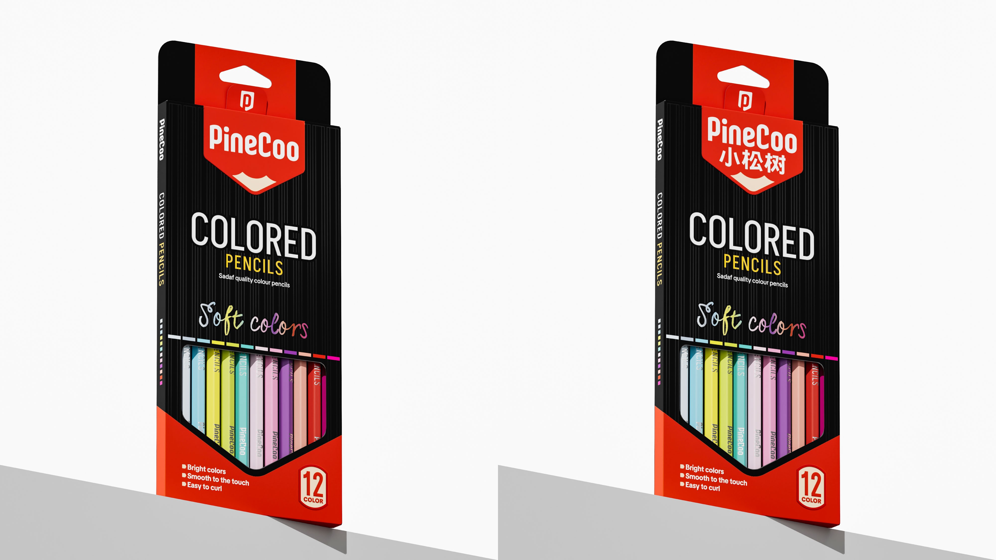
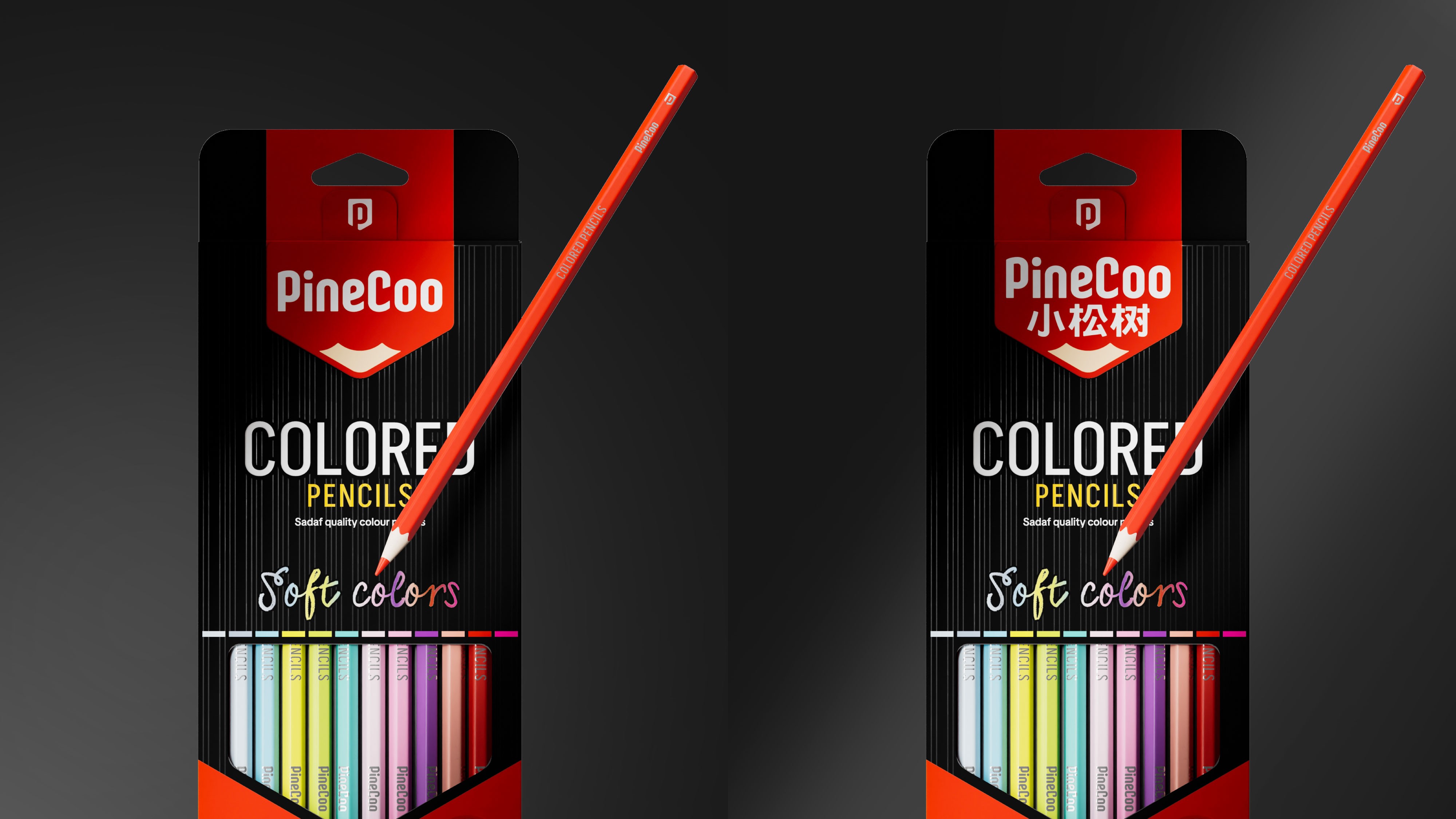
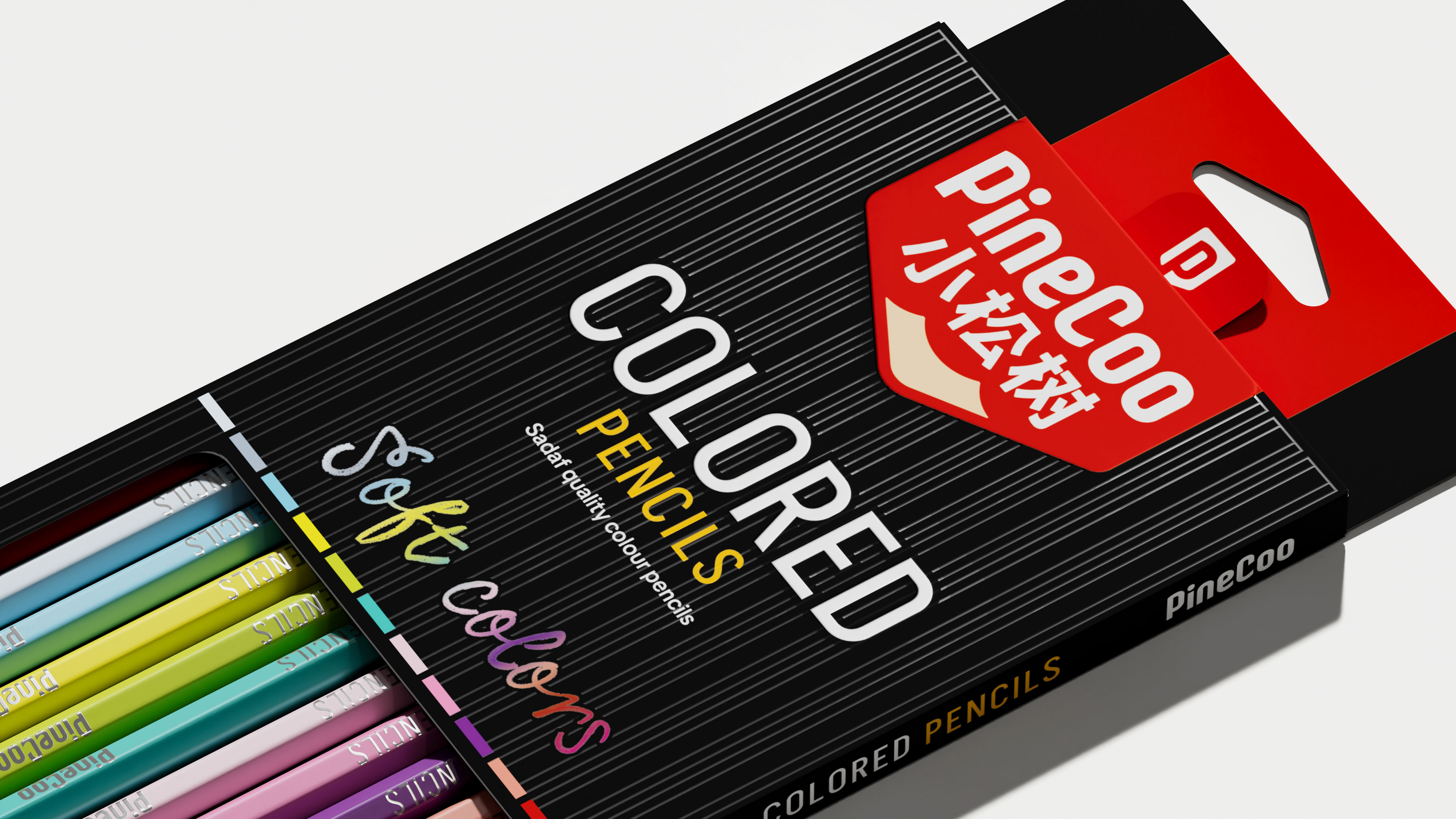
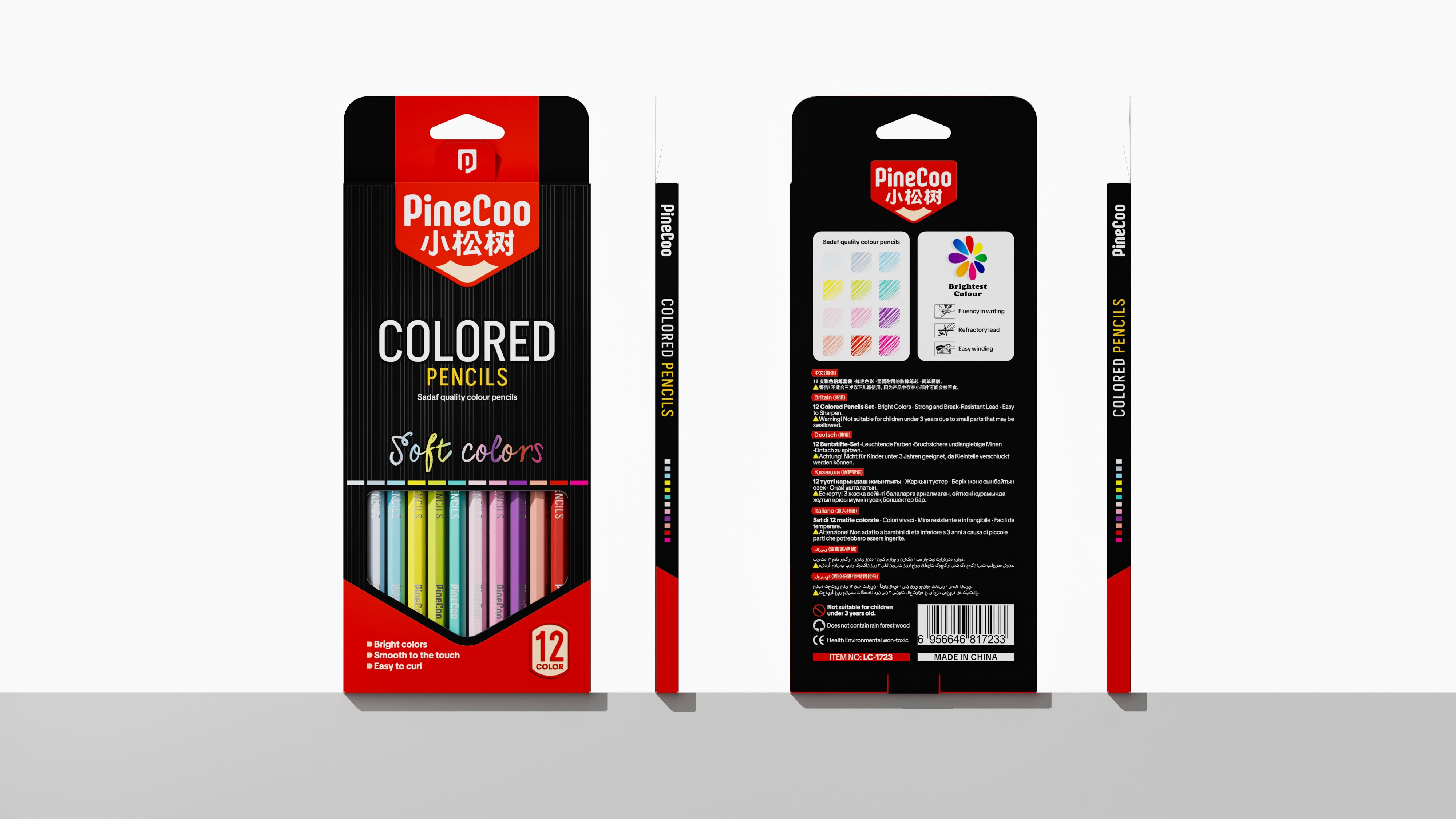
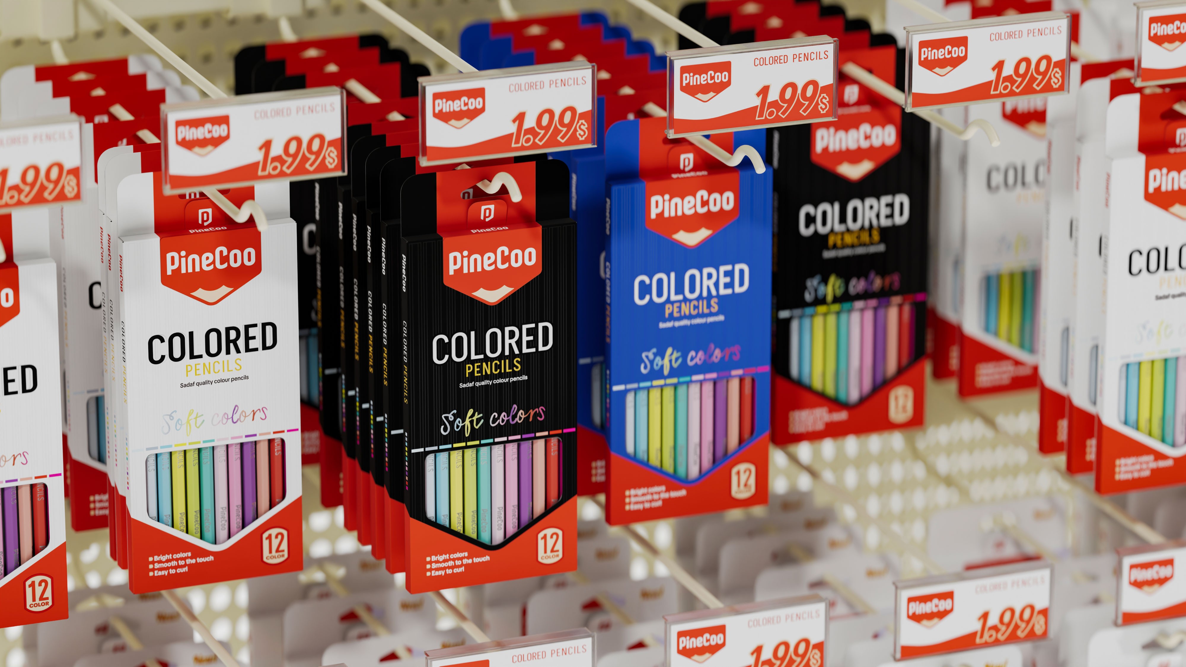
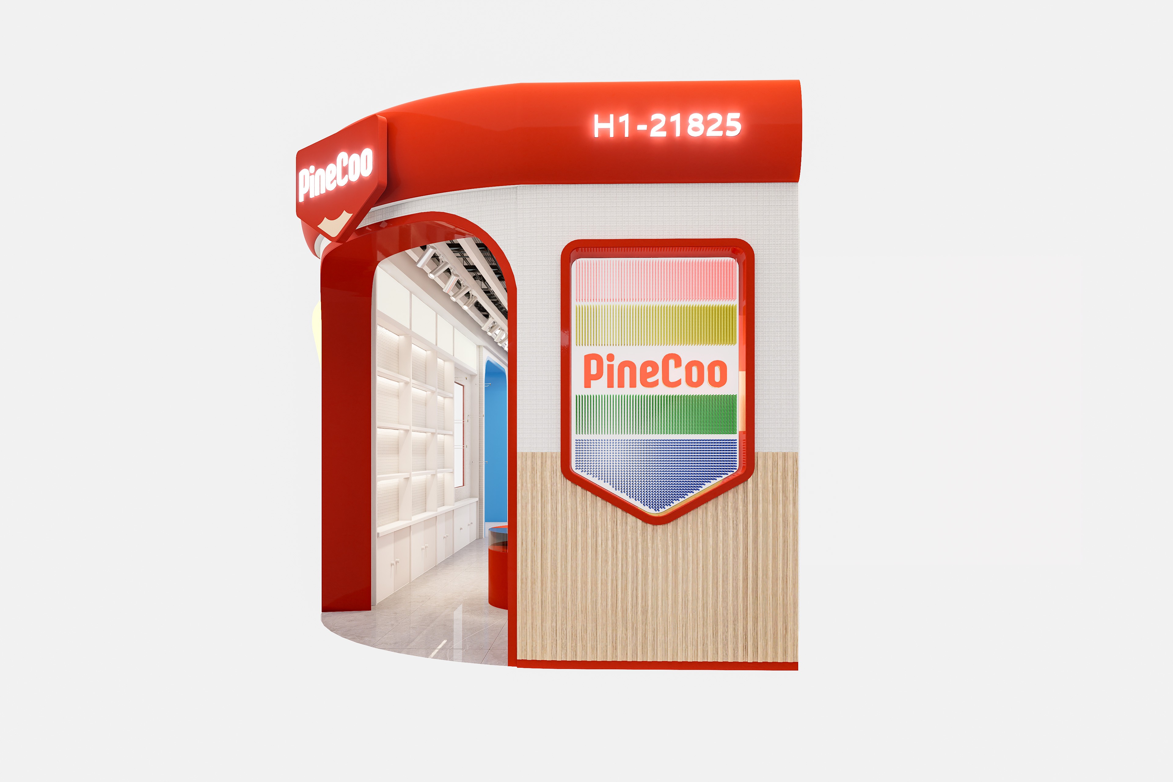
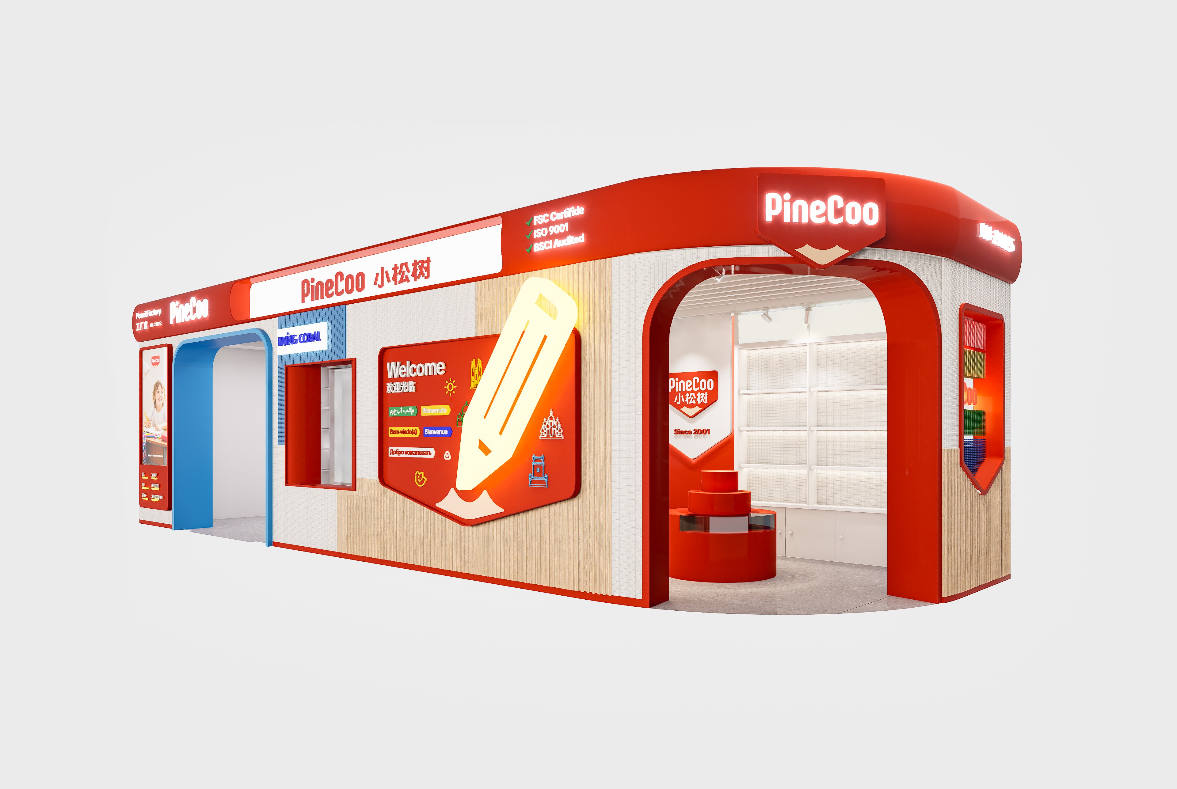
PineCoo is a private enterprise in Yiwu focused on pencil manufacturing and sales, dating back to 2001. Its parent company, Yiwu Hongjun Stationery Co., Ltd., was established in 2000 and is a company specializing in the manufacture and sale of pencils, producing various mid-to-high-end wooden pencils, colored pencils, combined stationery sets, craft pencils, and other products. The company has strong technical strength and product development capabilities, with modern production equipment and assembly lines and a team of highly qualified professional technicians. Its self-owned registered brand, “Little Pine Tree,” offers complete specifications, diverse varieties, superior quality, and exquisite appearance. The products comply with EN71 testing standards and are exported to many countries and regions worldwide.
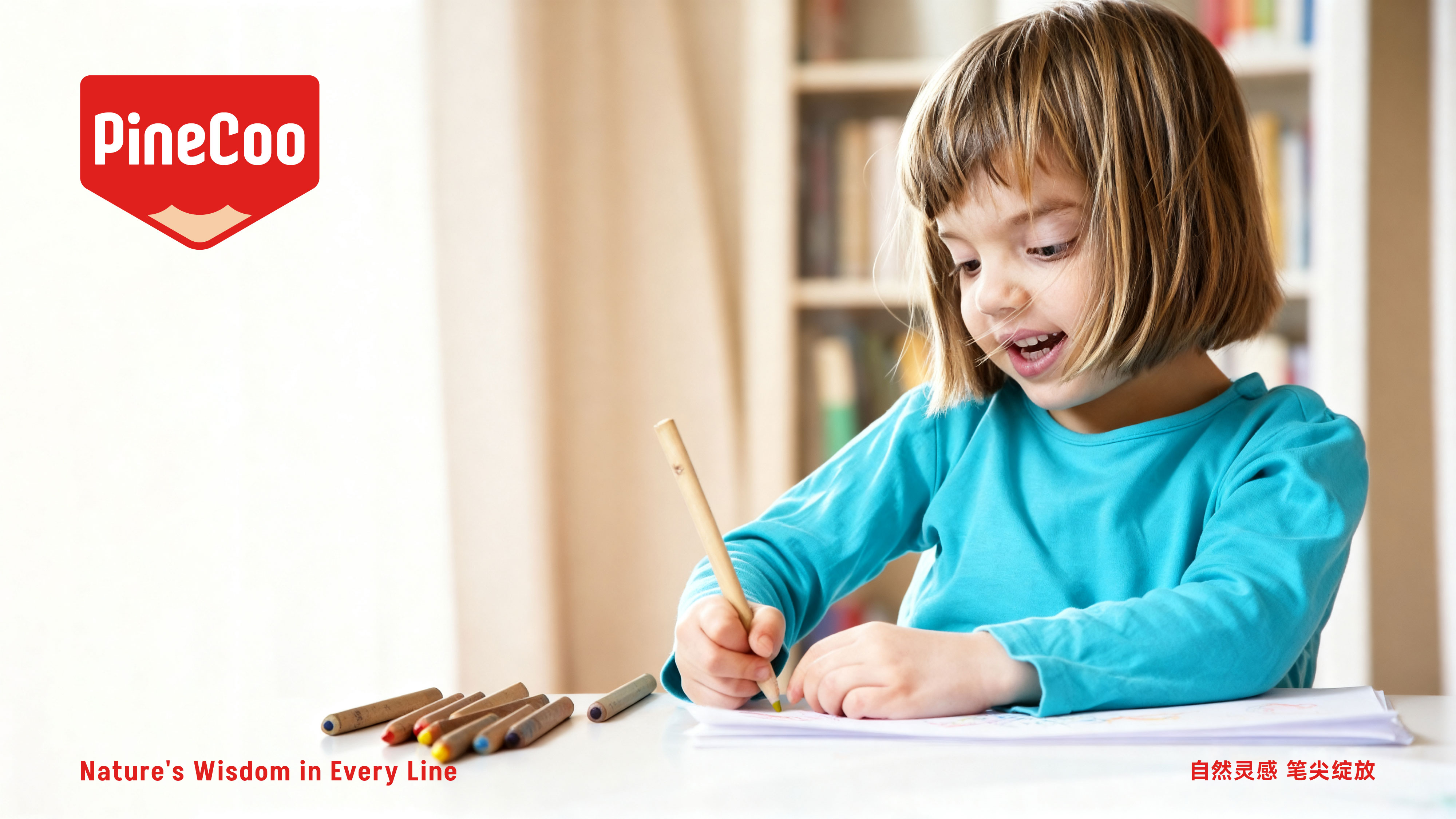
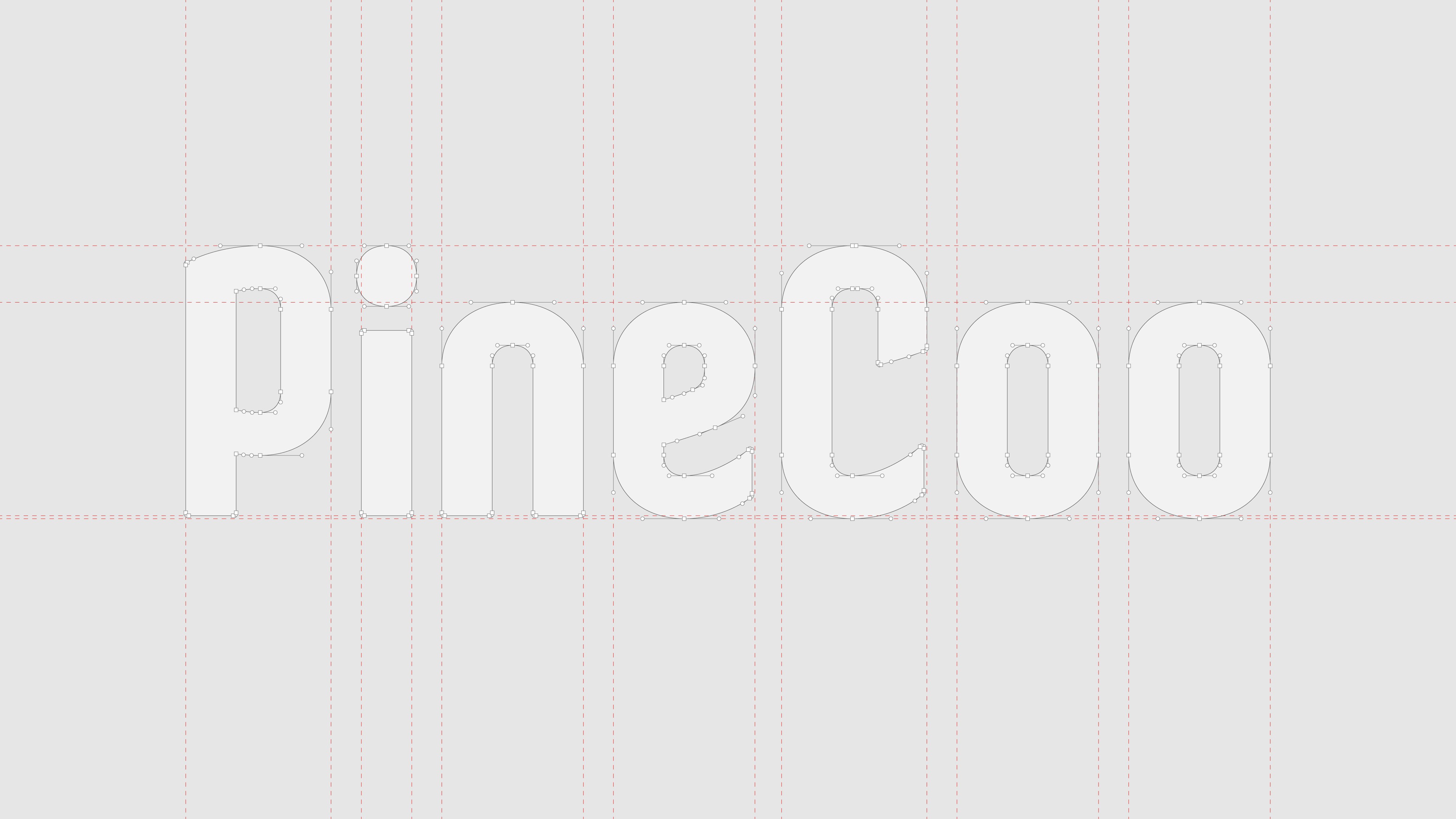
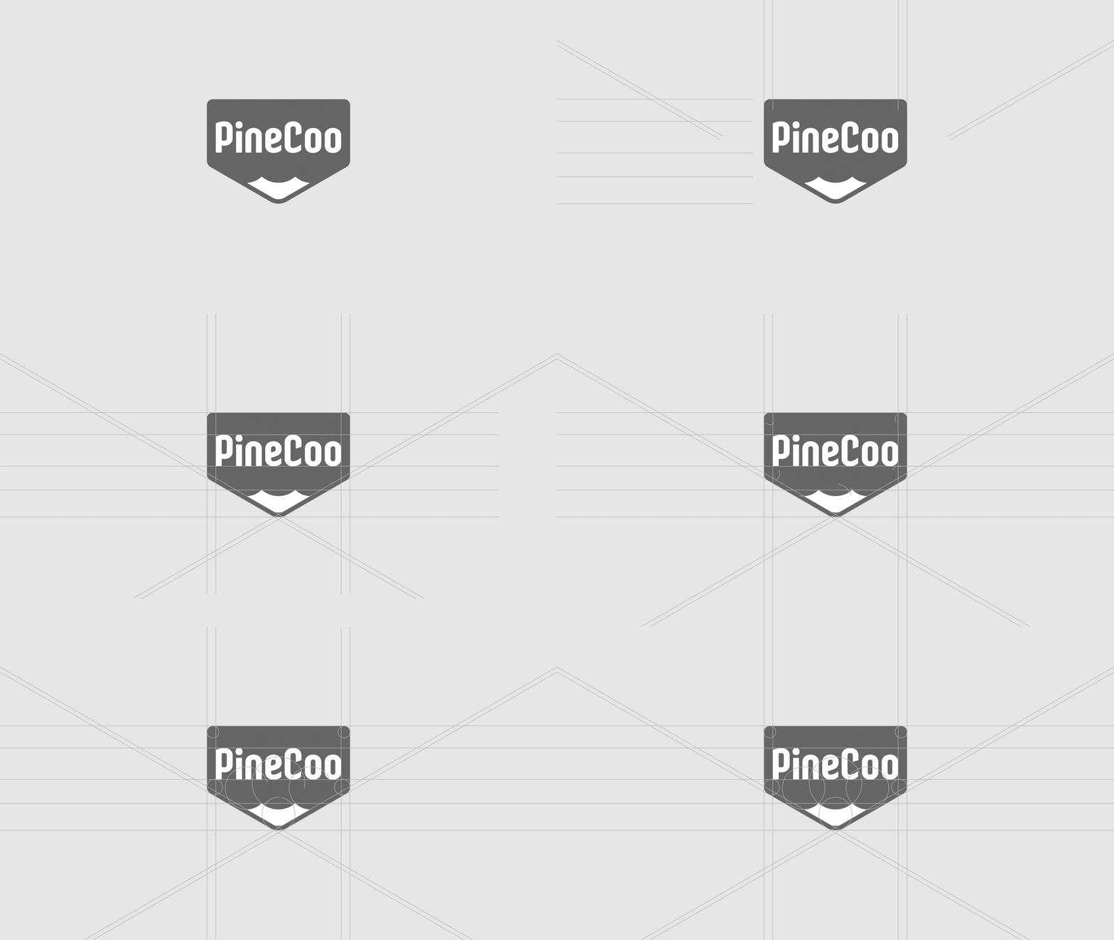
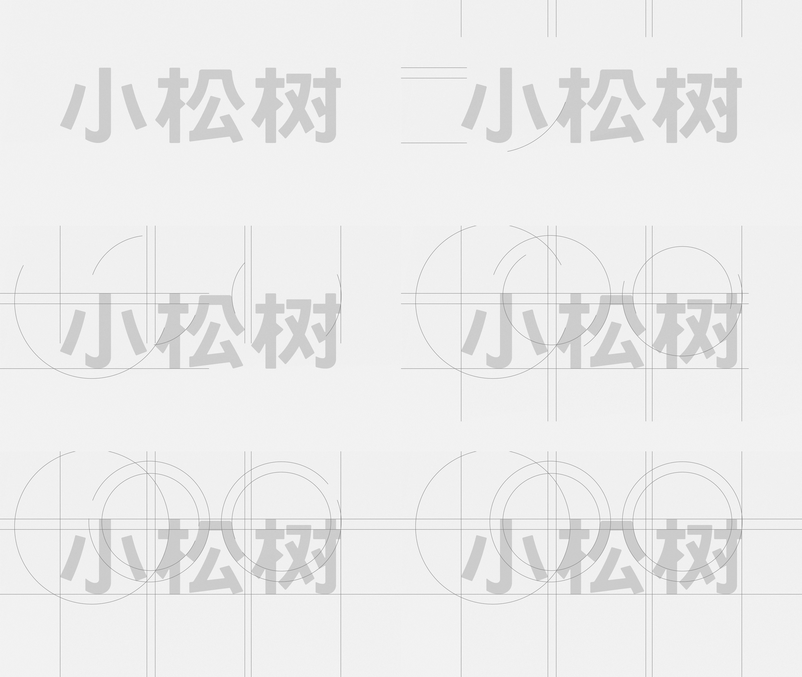
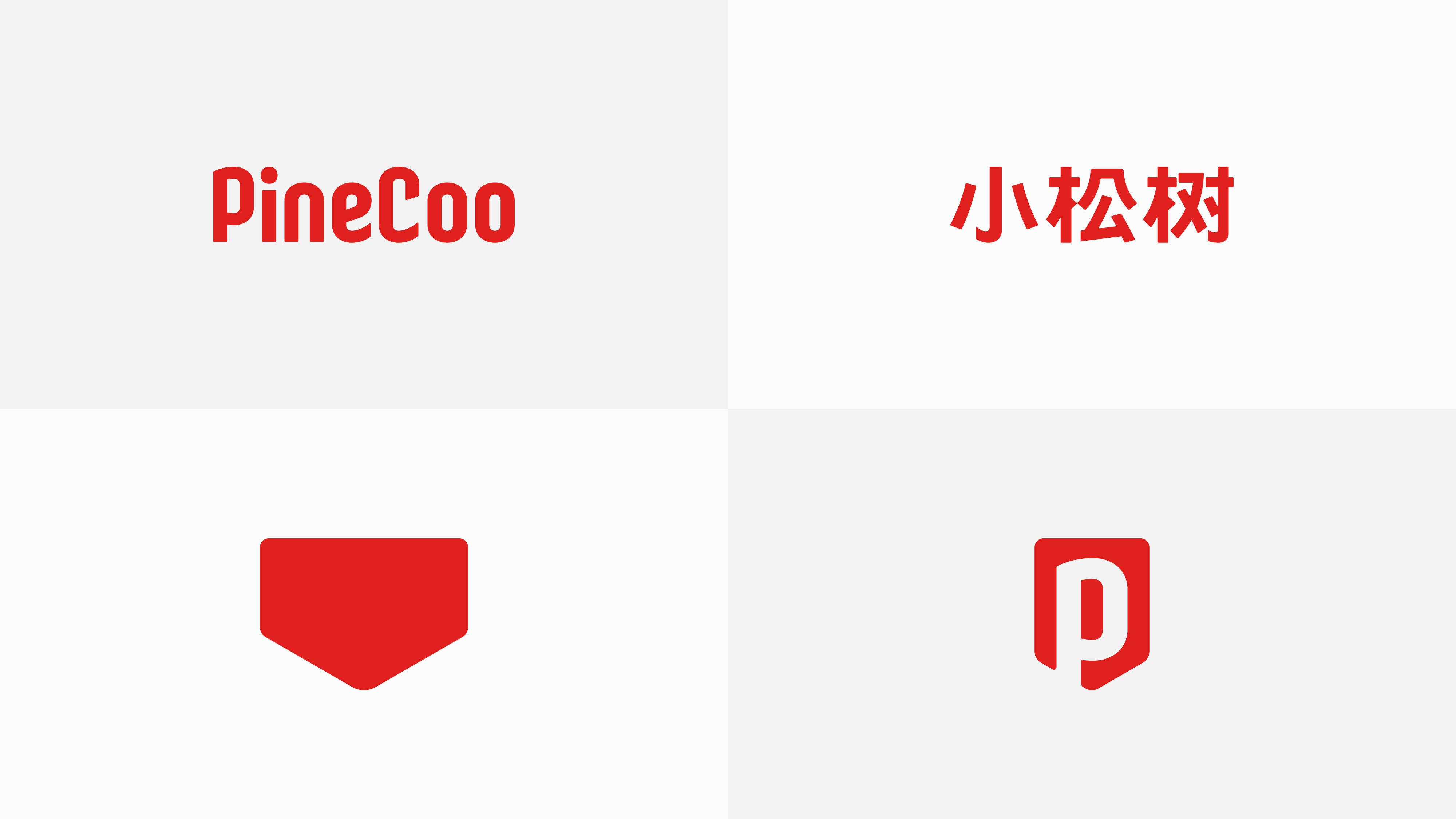
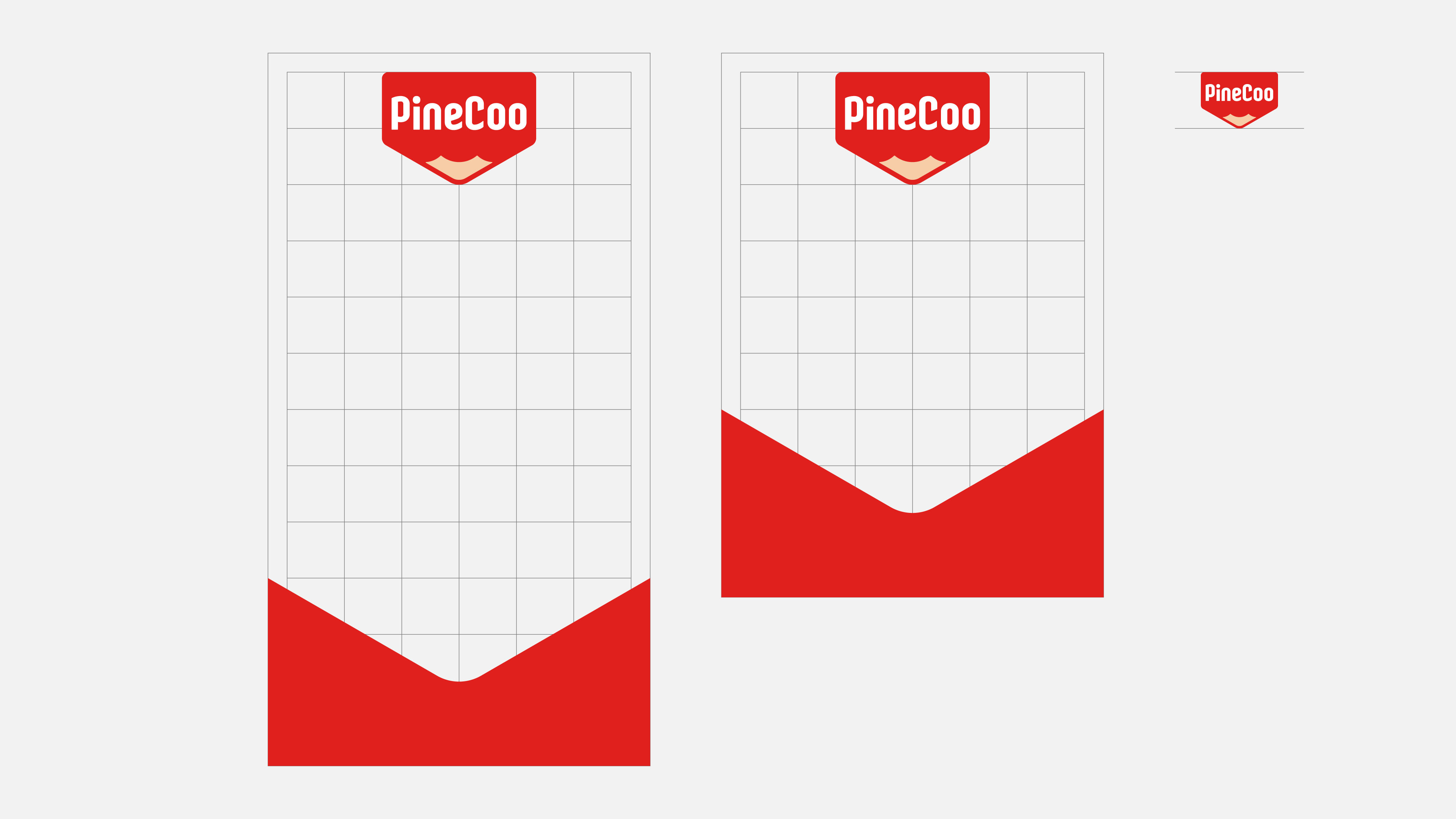
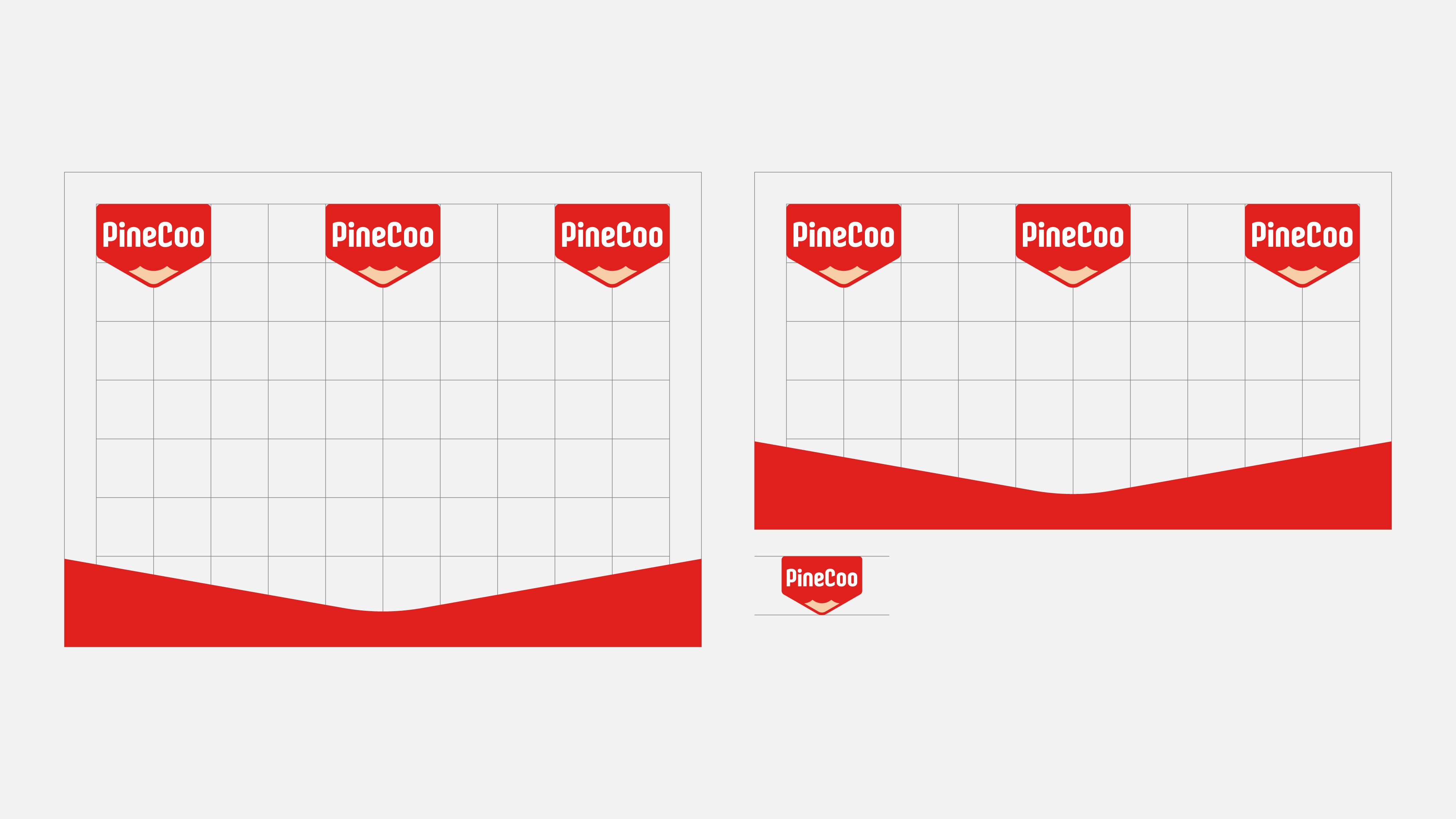
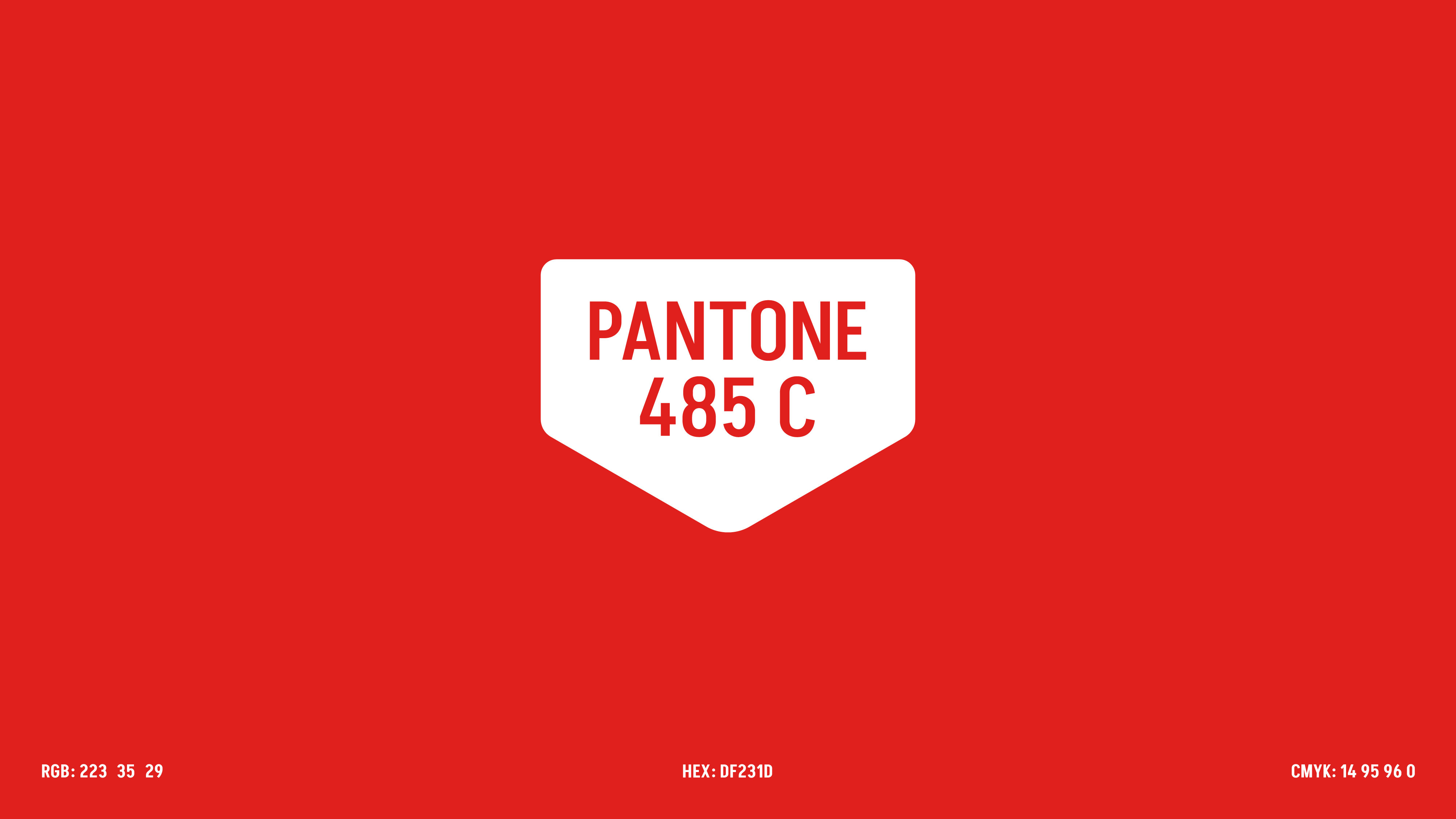
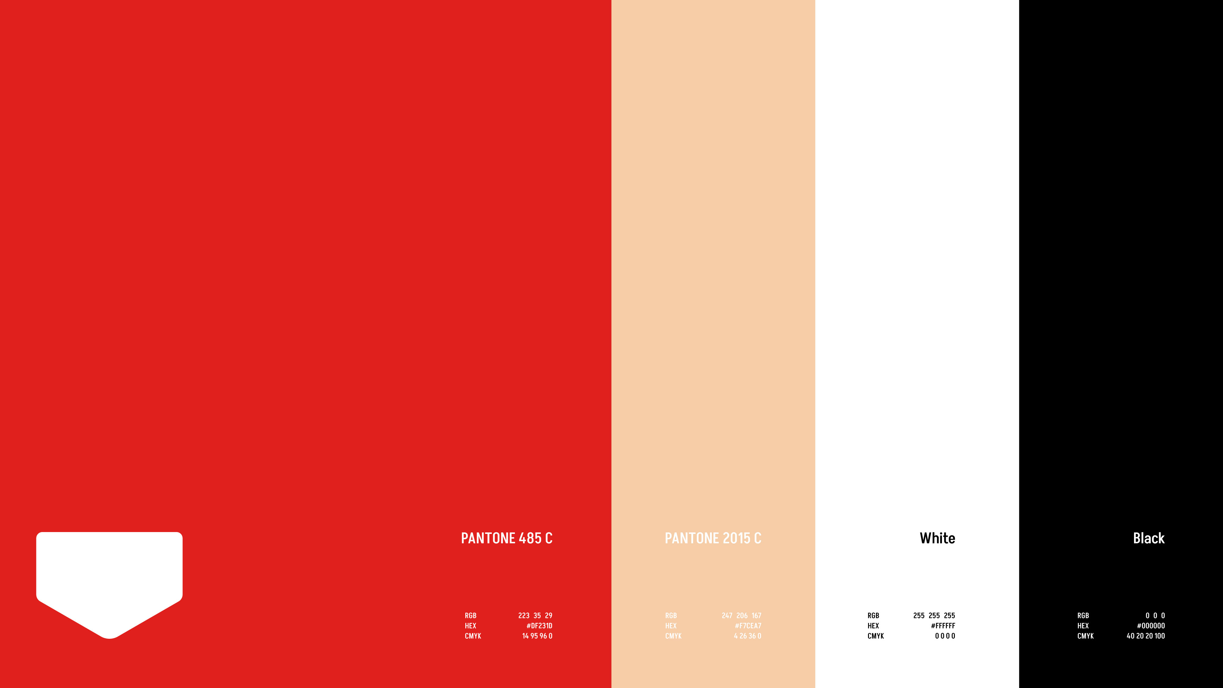
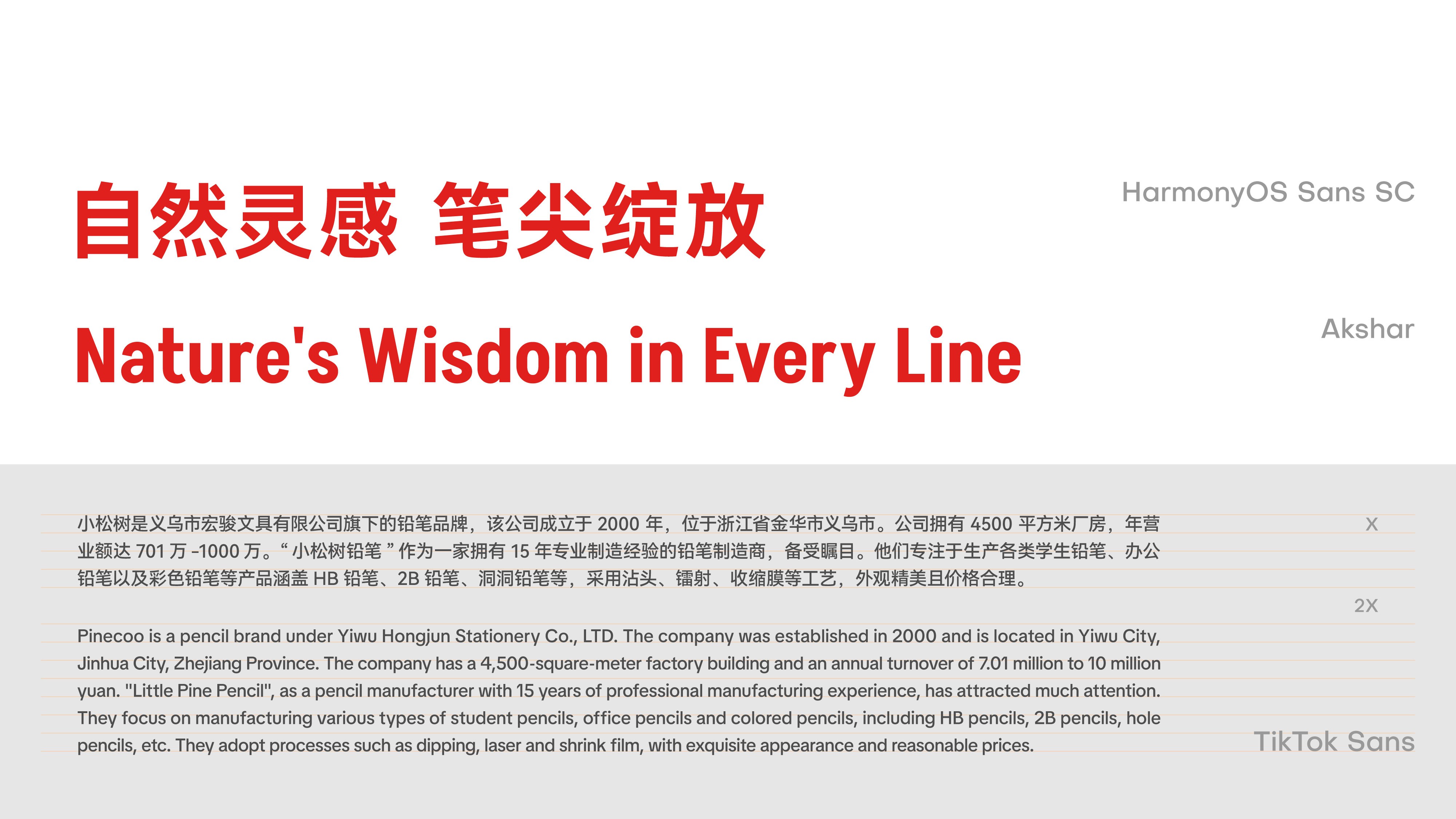
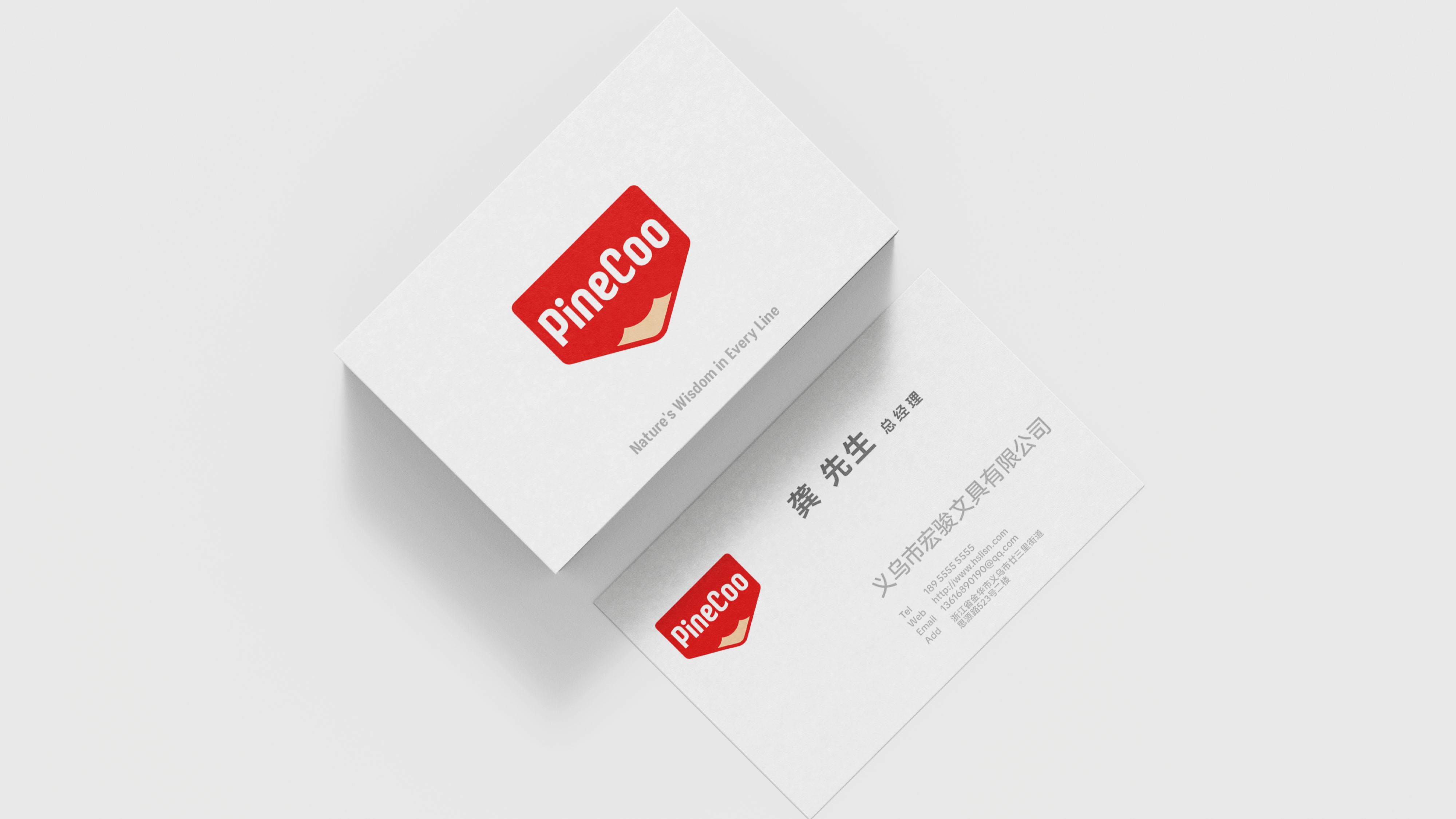
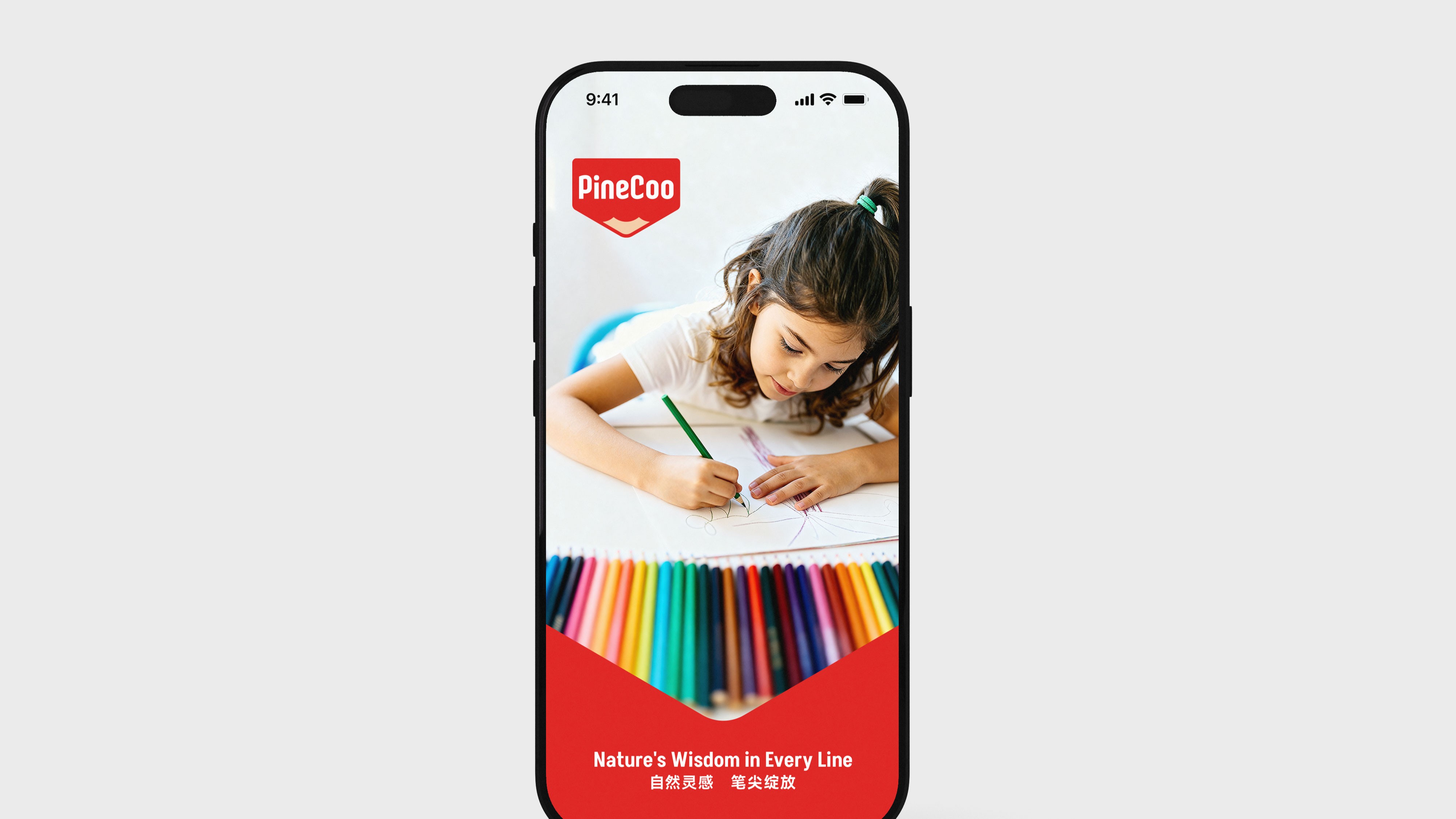
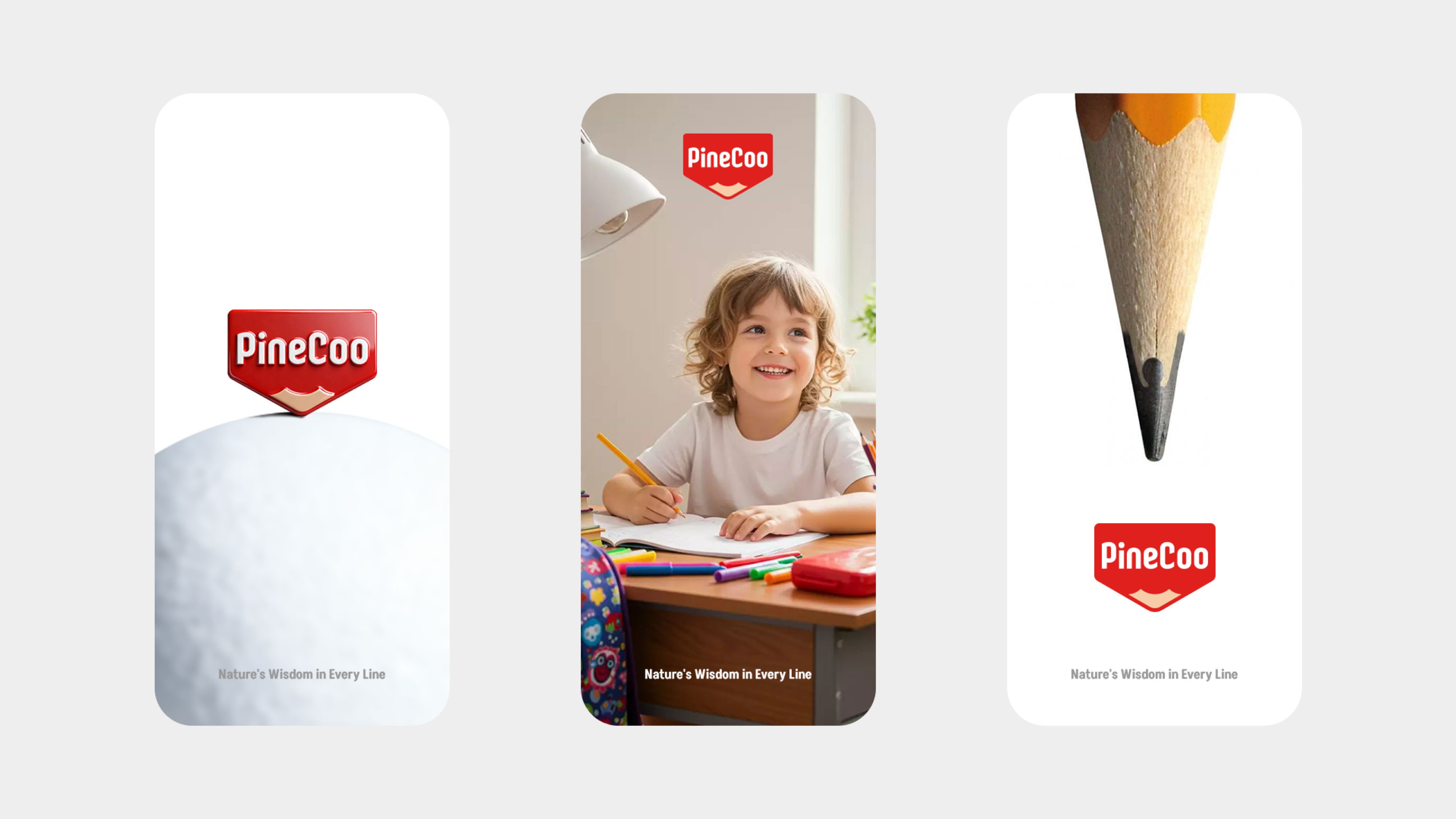
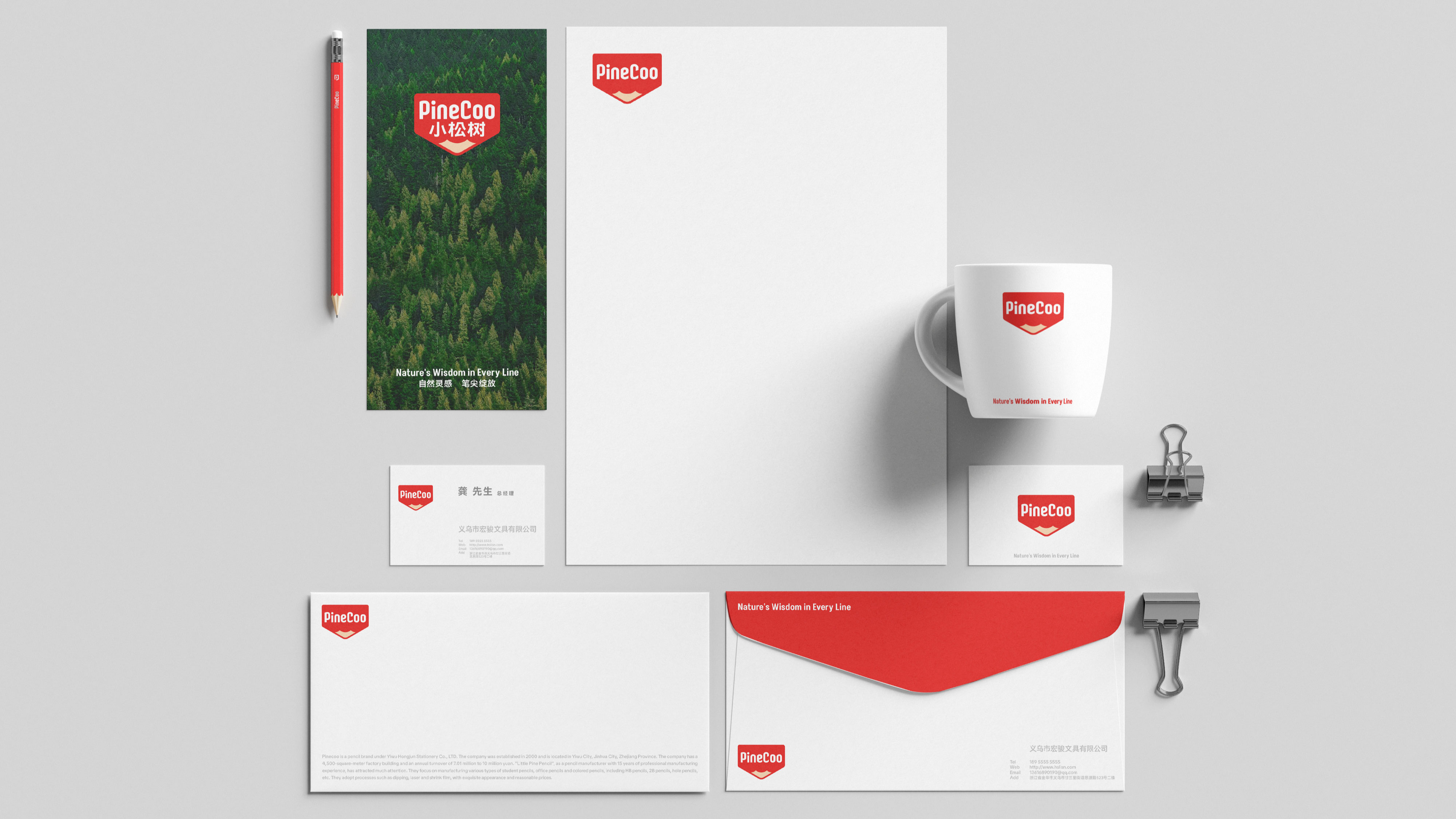
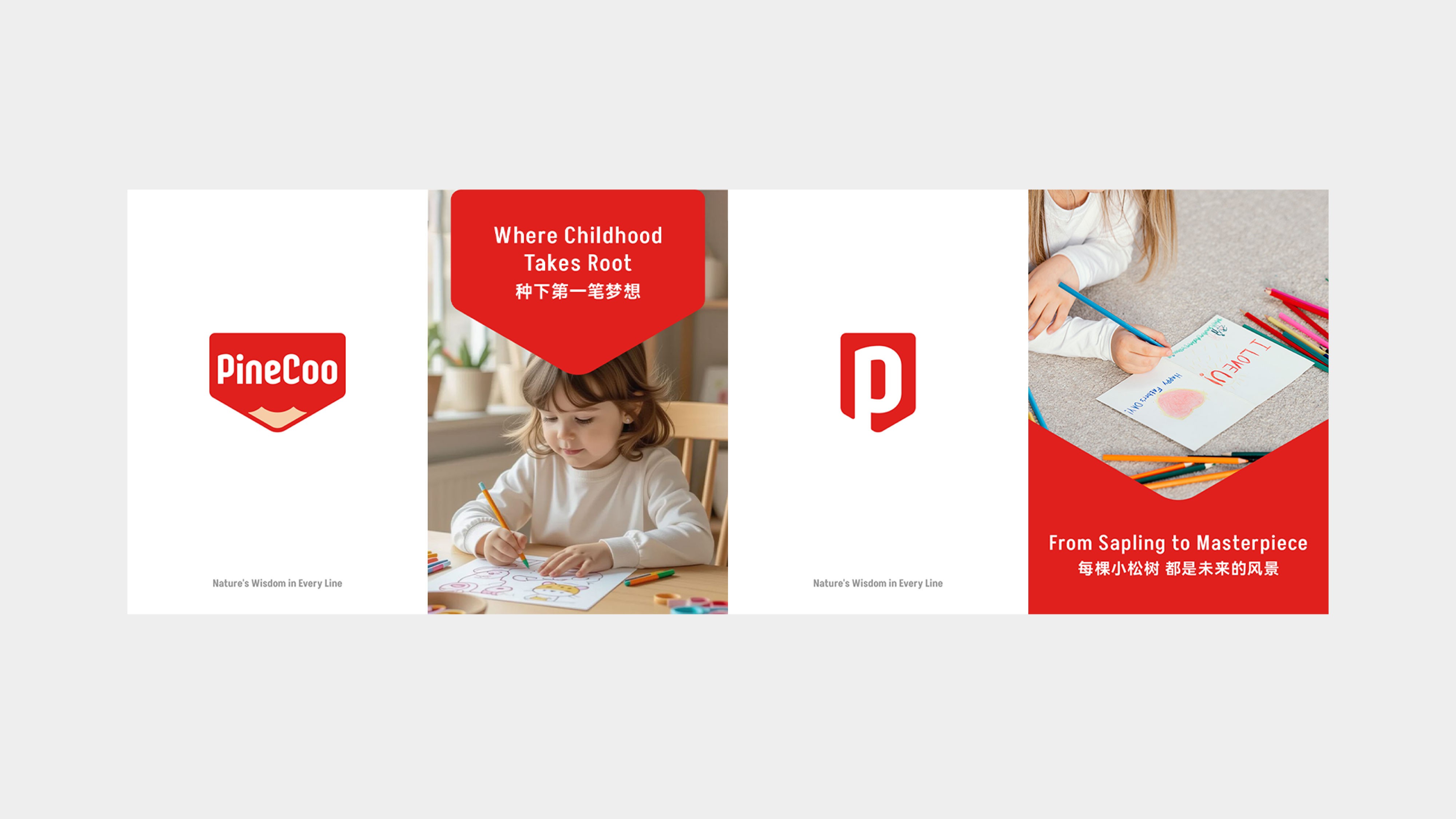
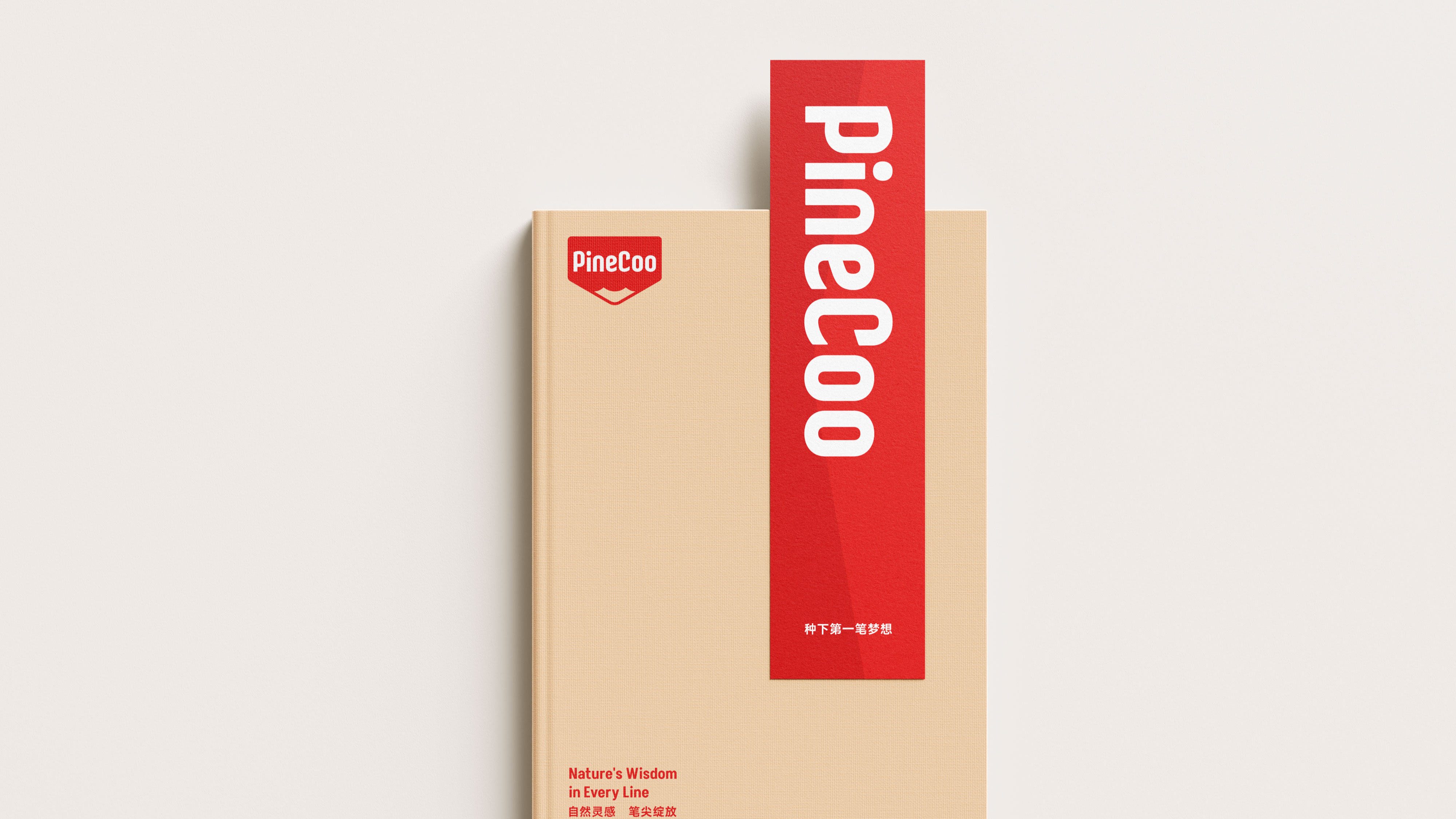
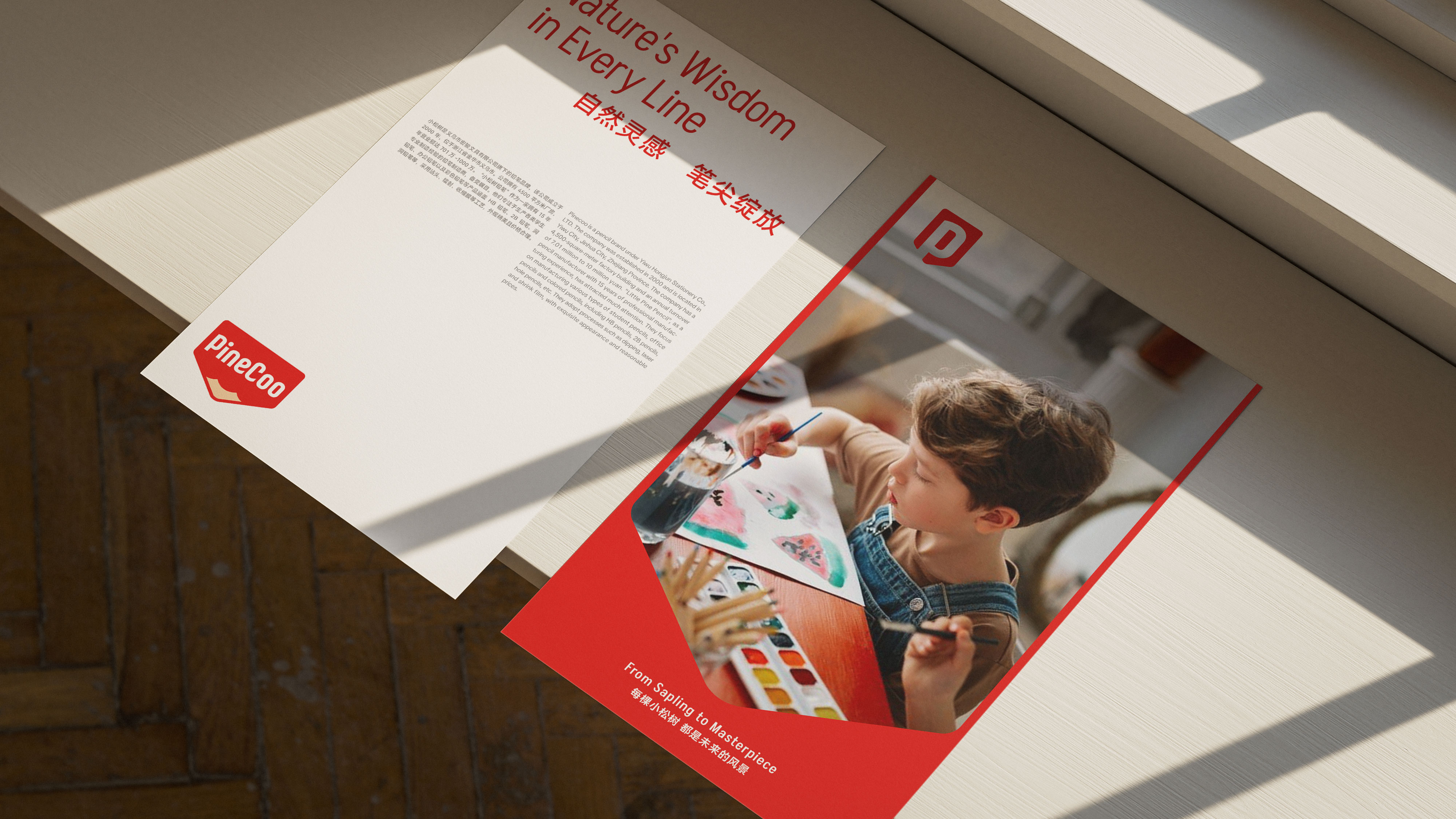
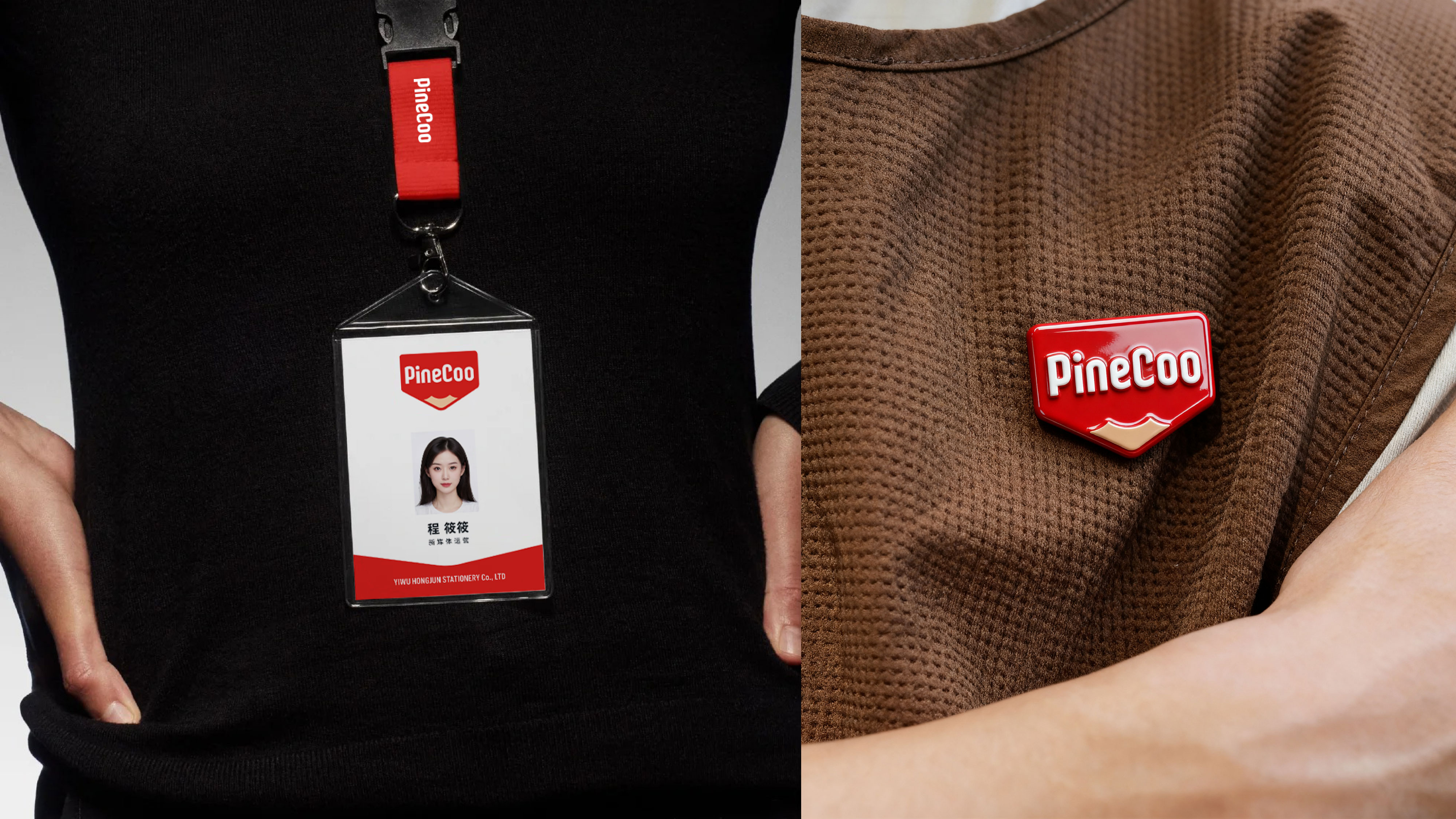
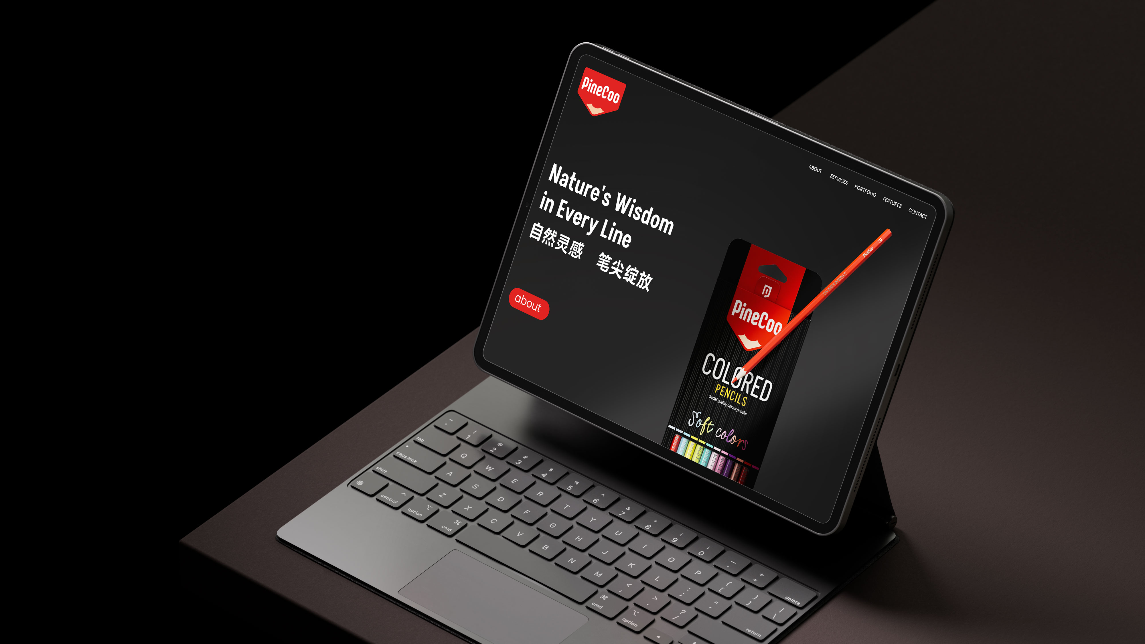
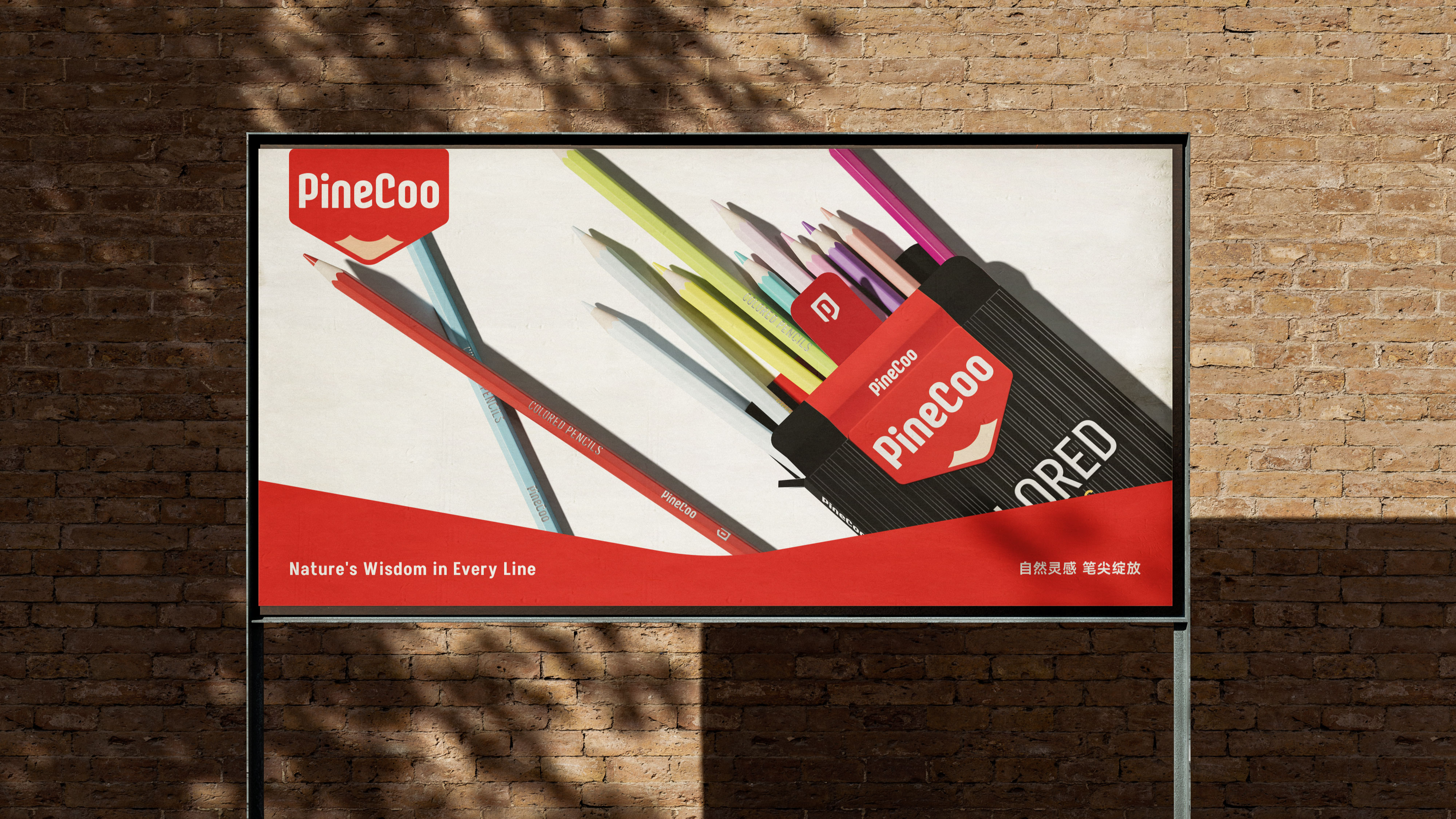
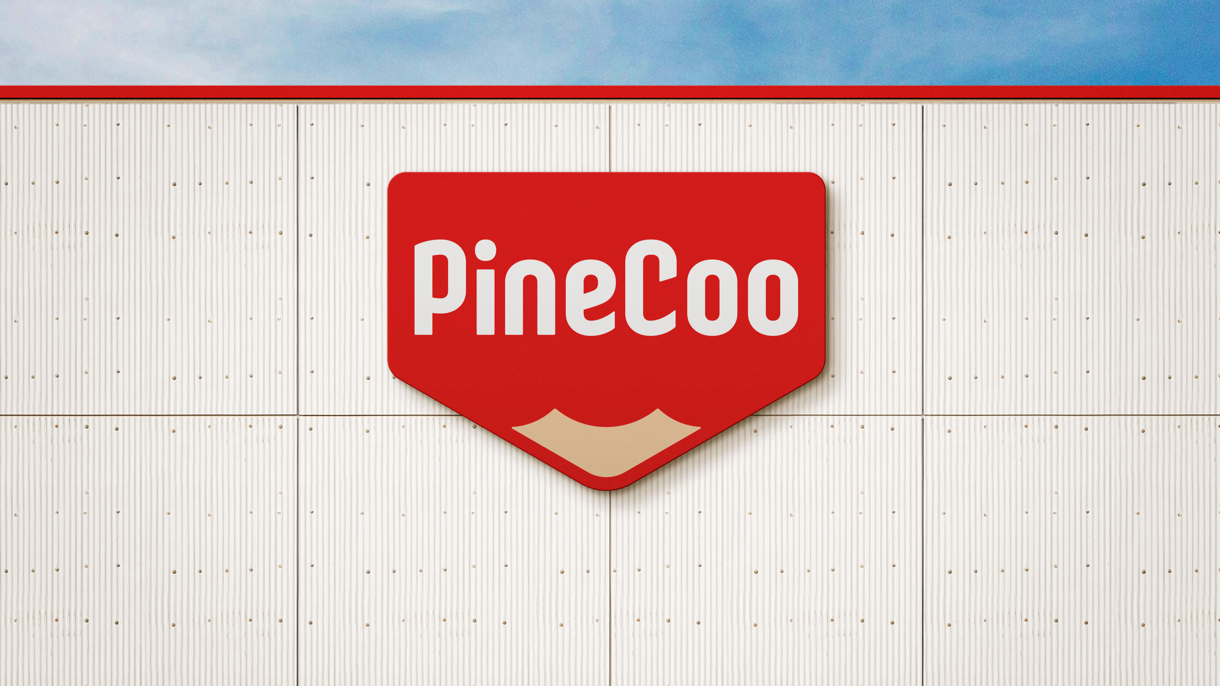
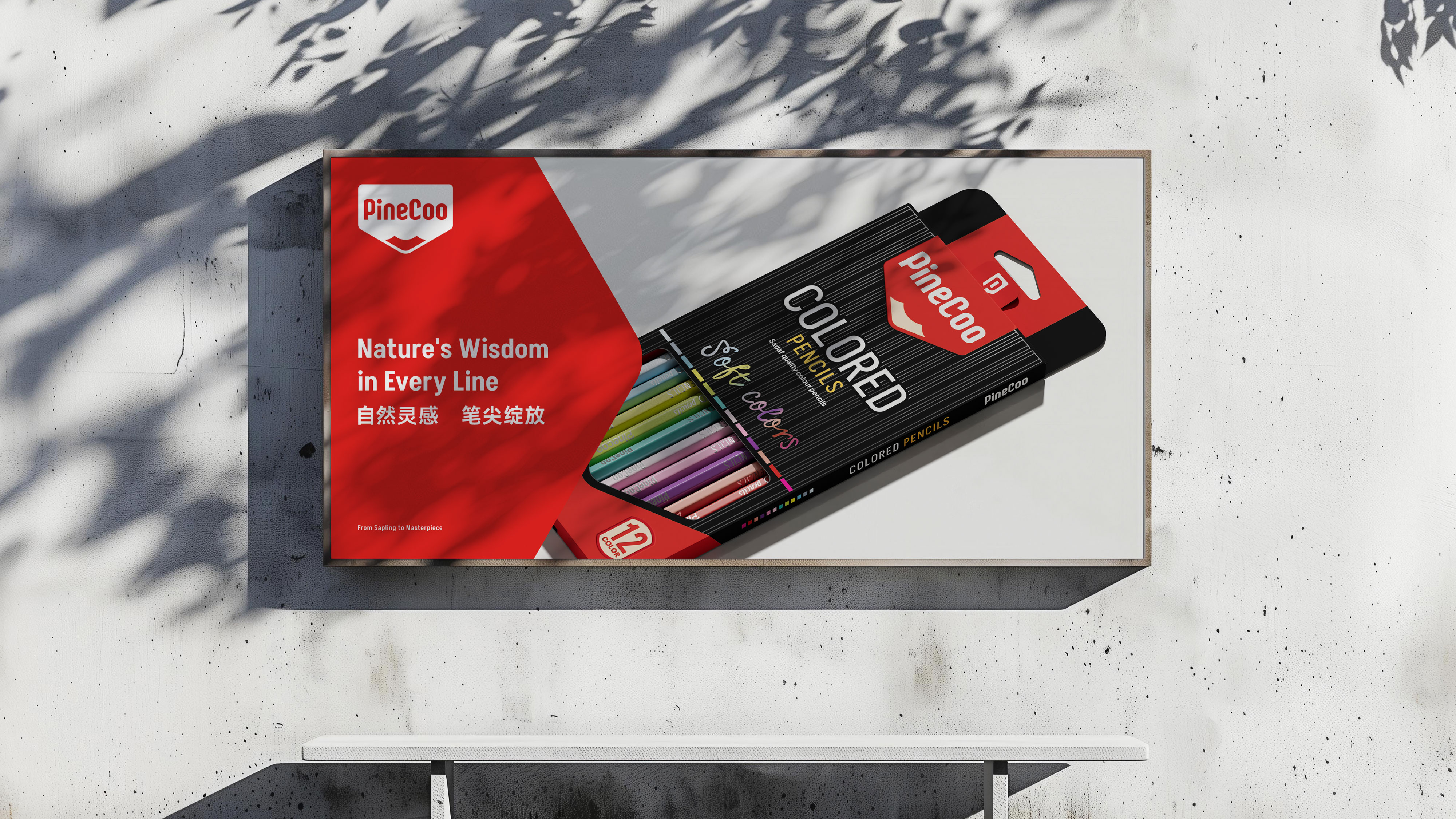
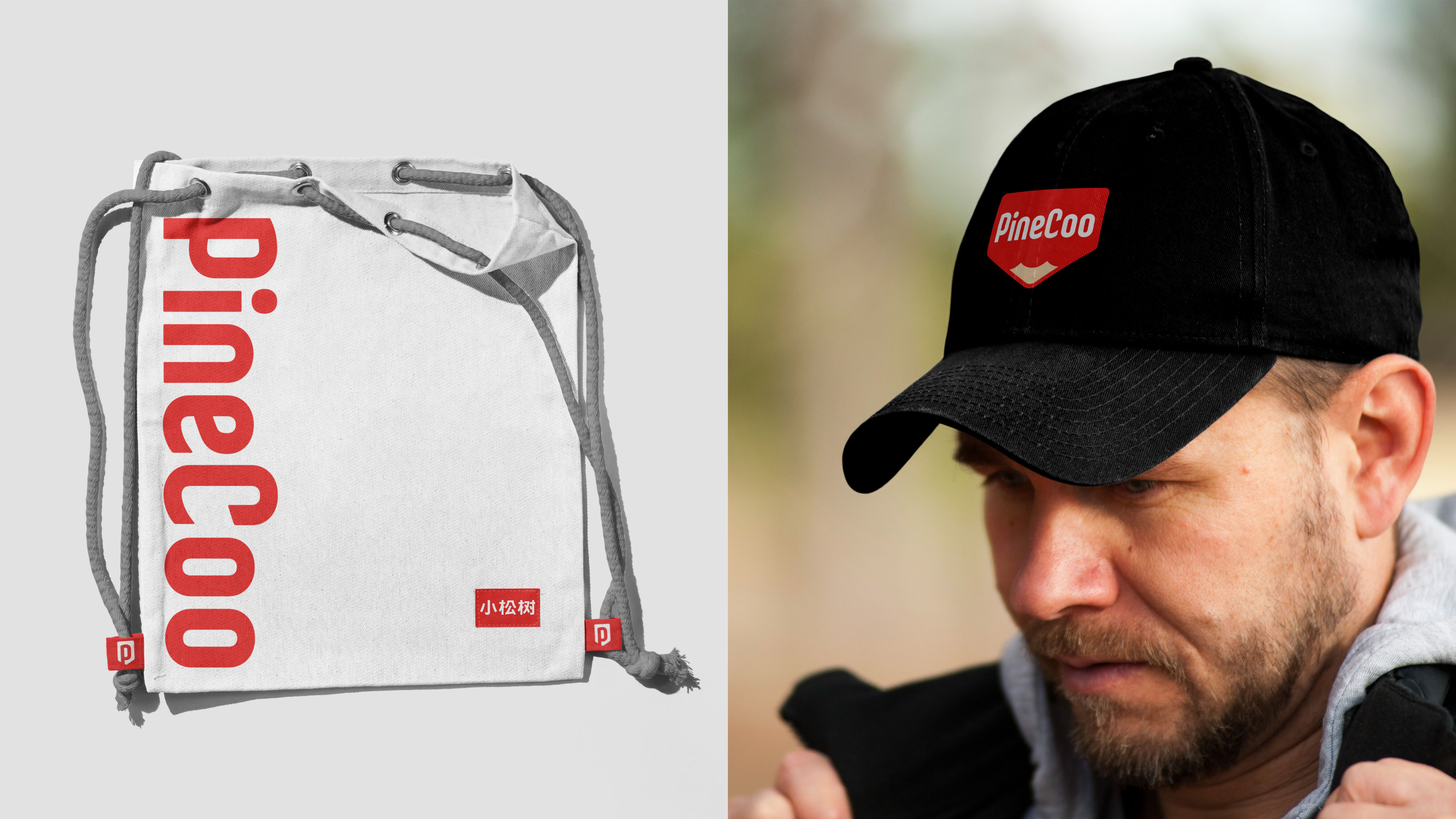
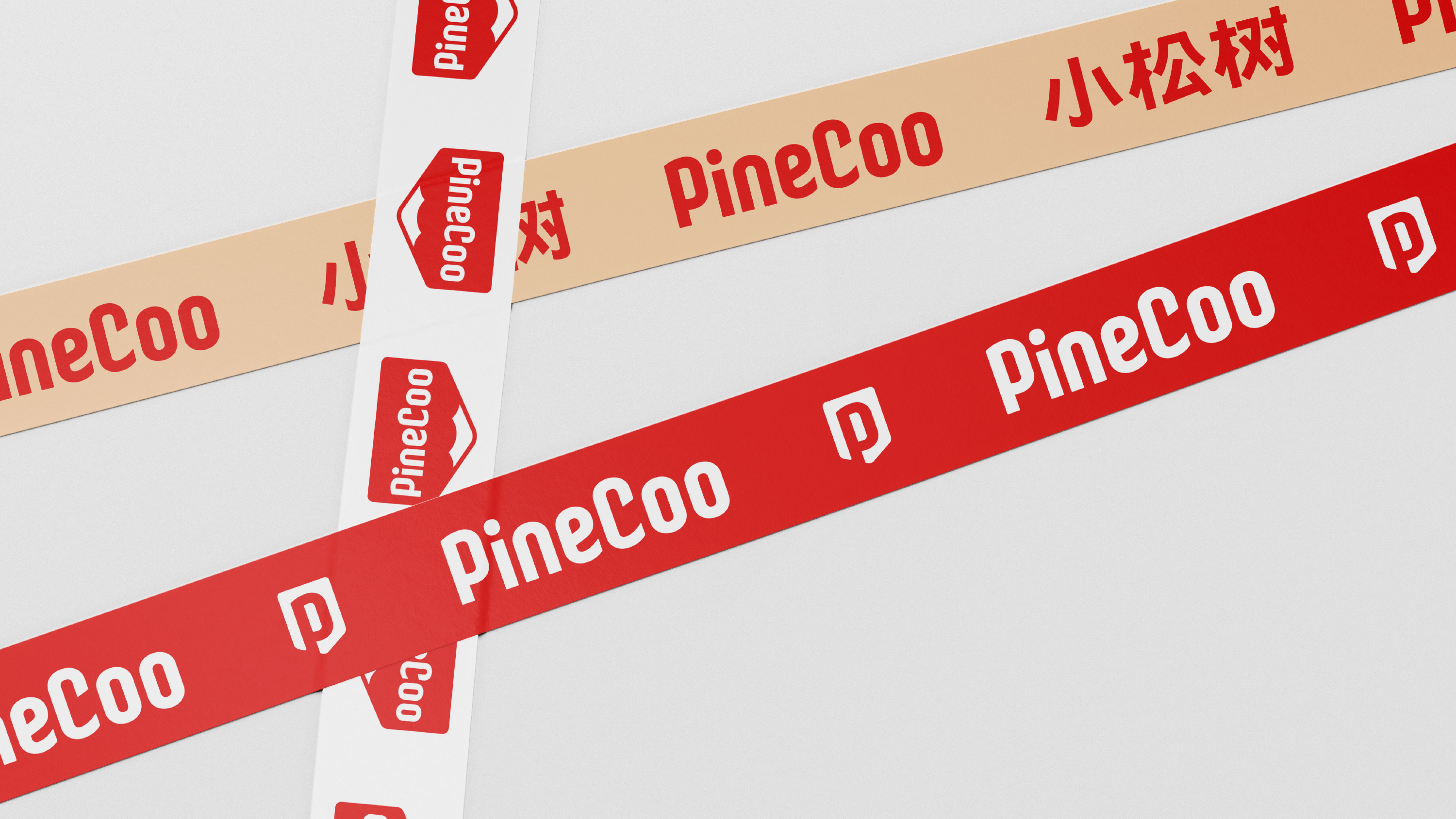
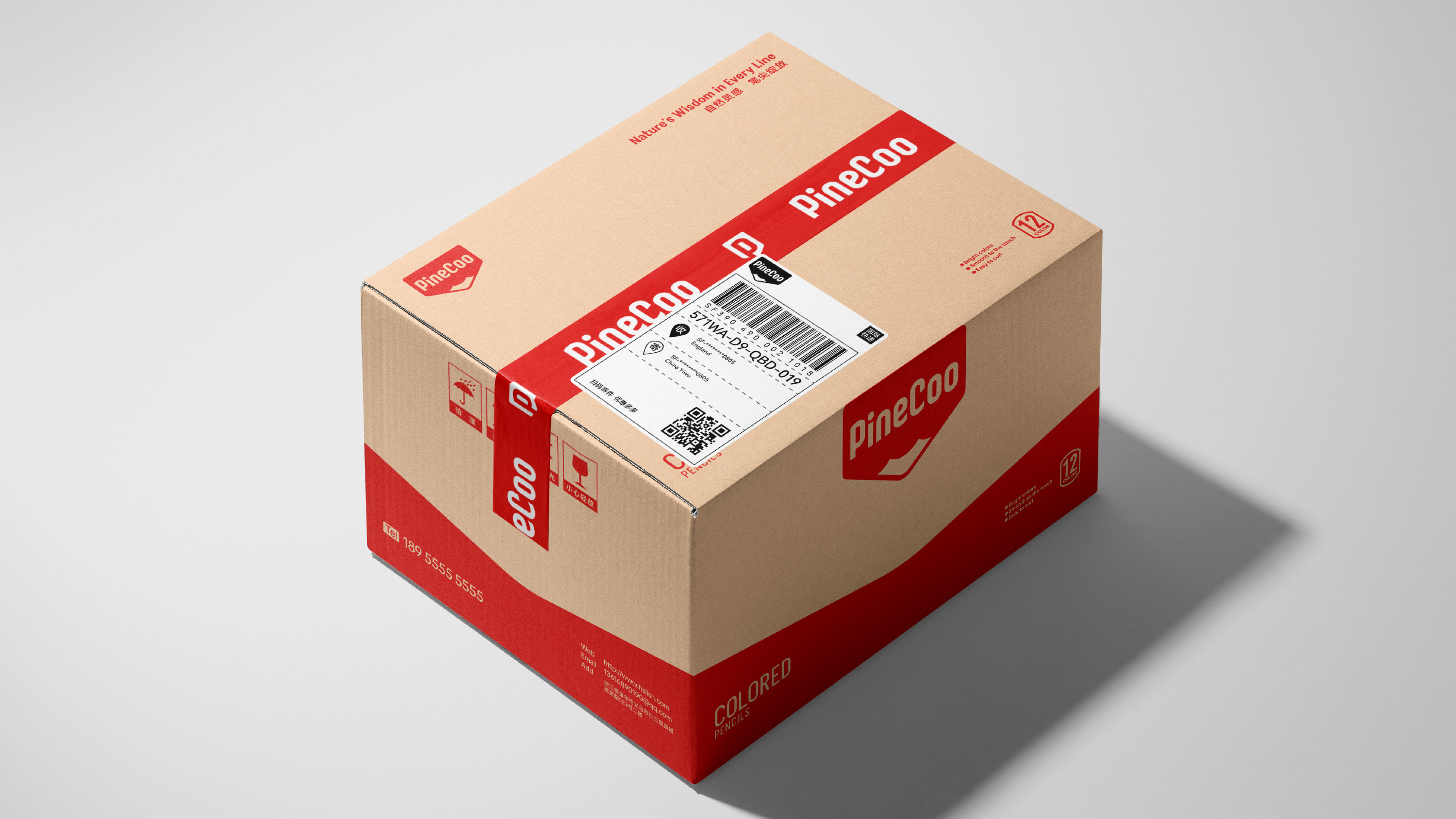
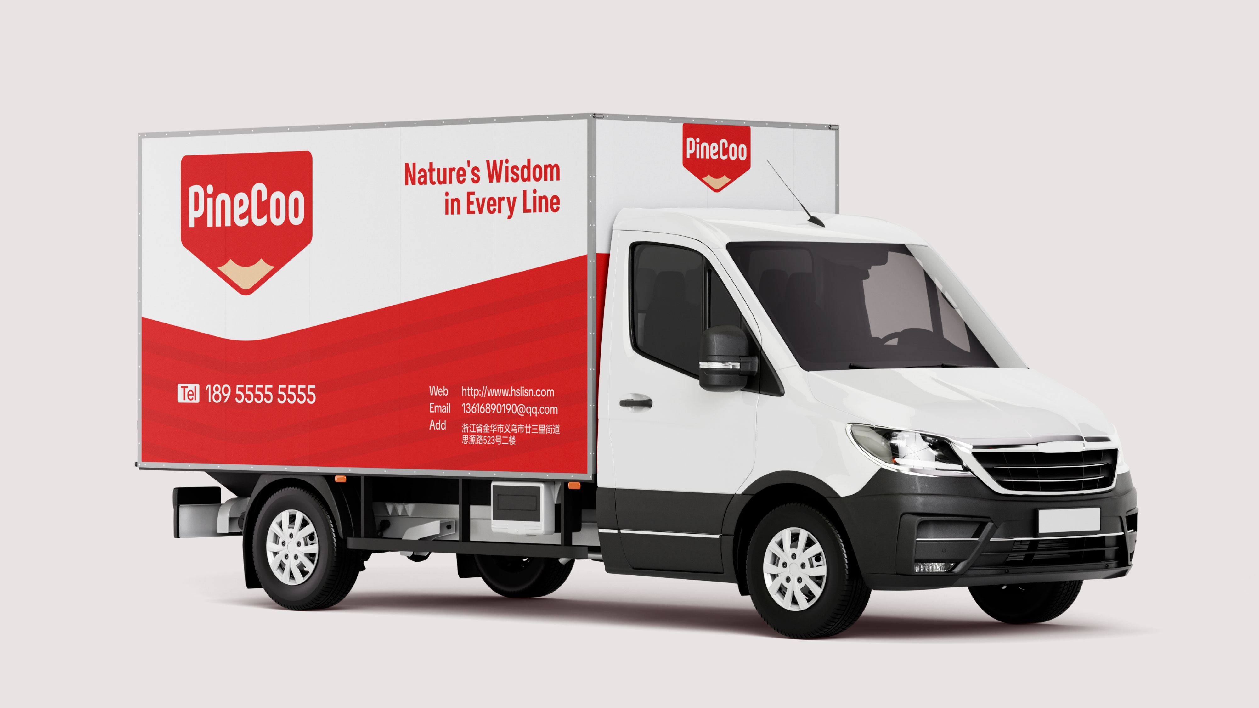
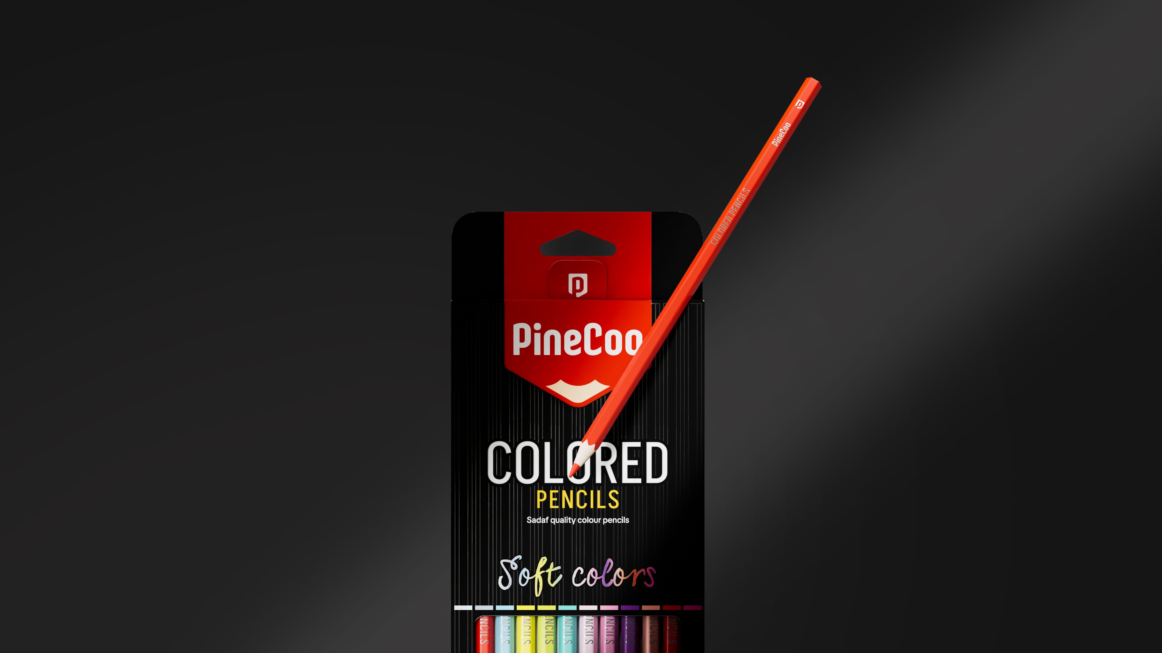
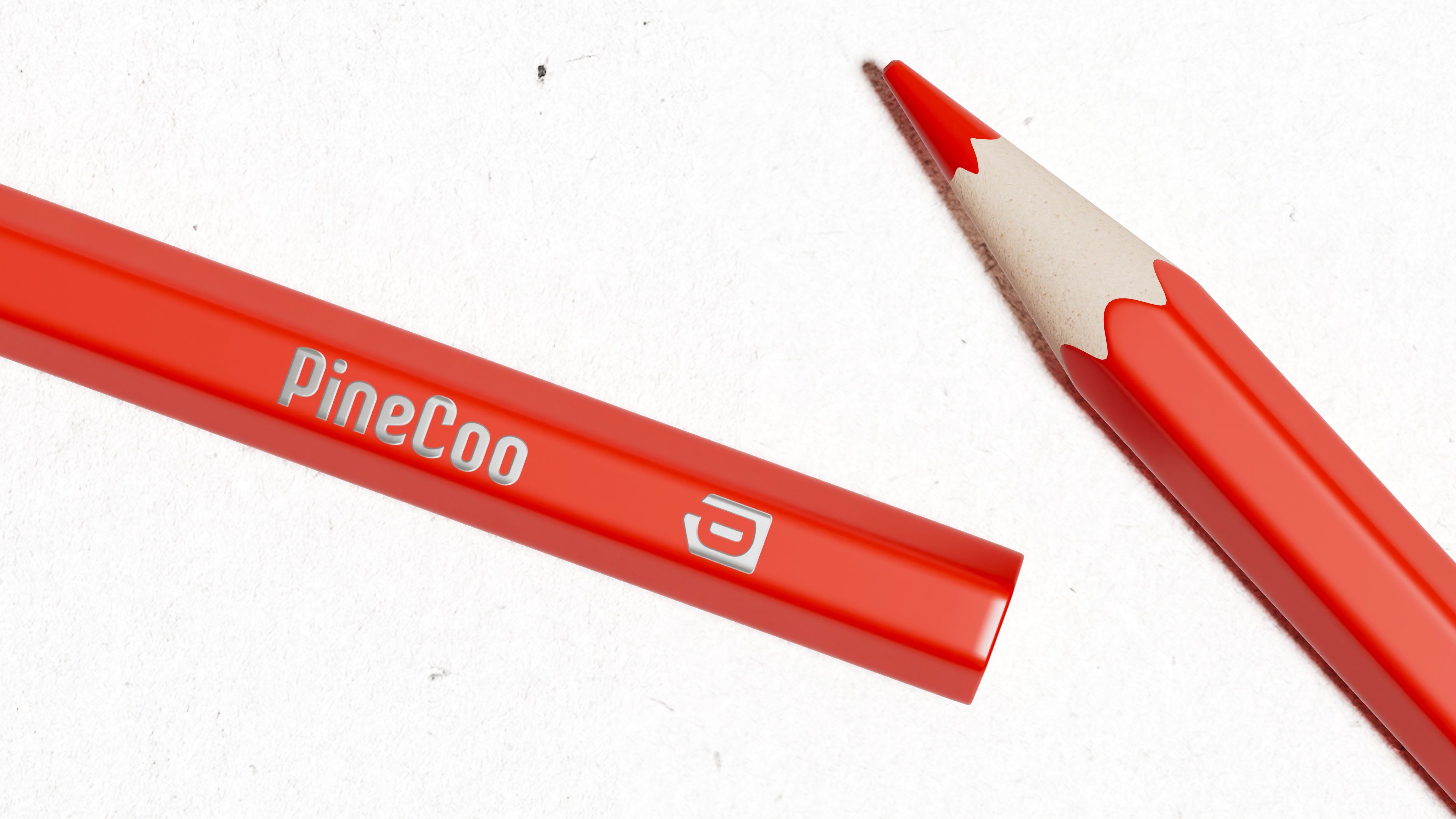
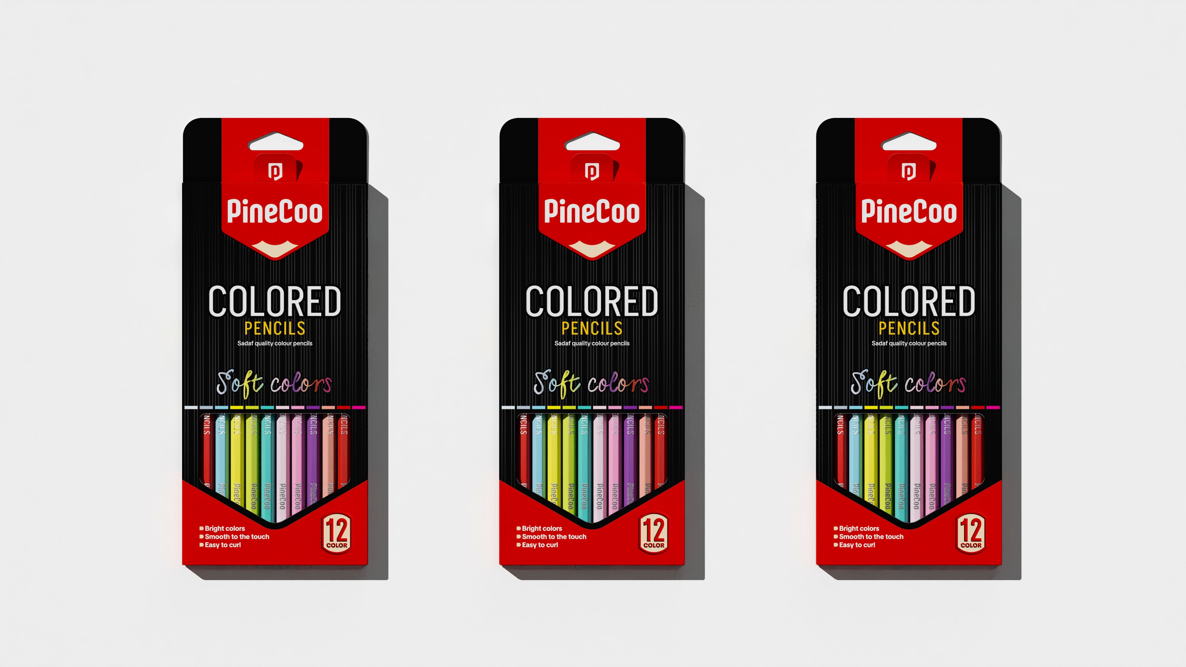
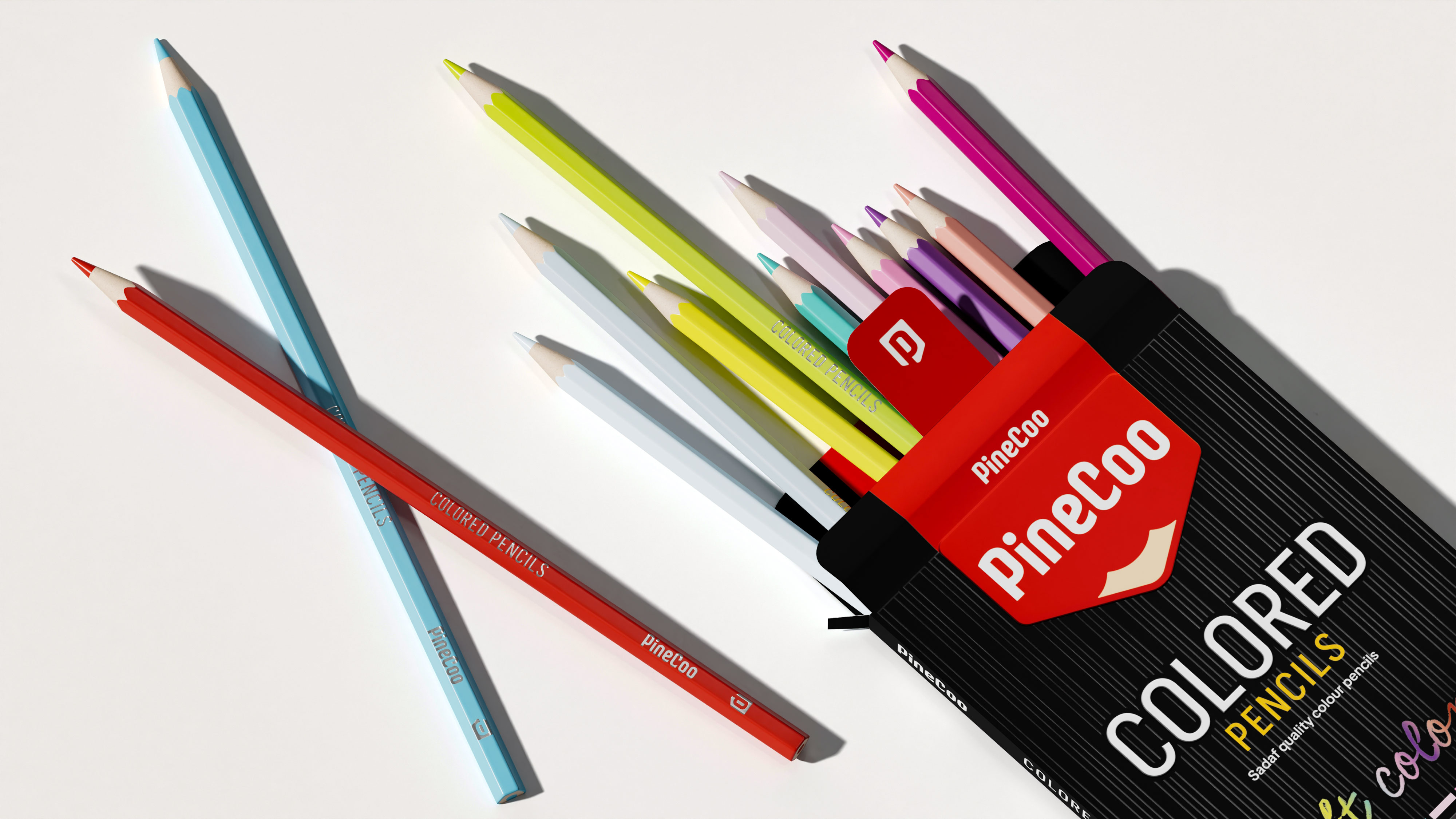
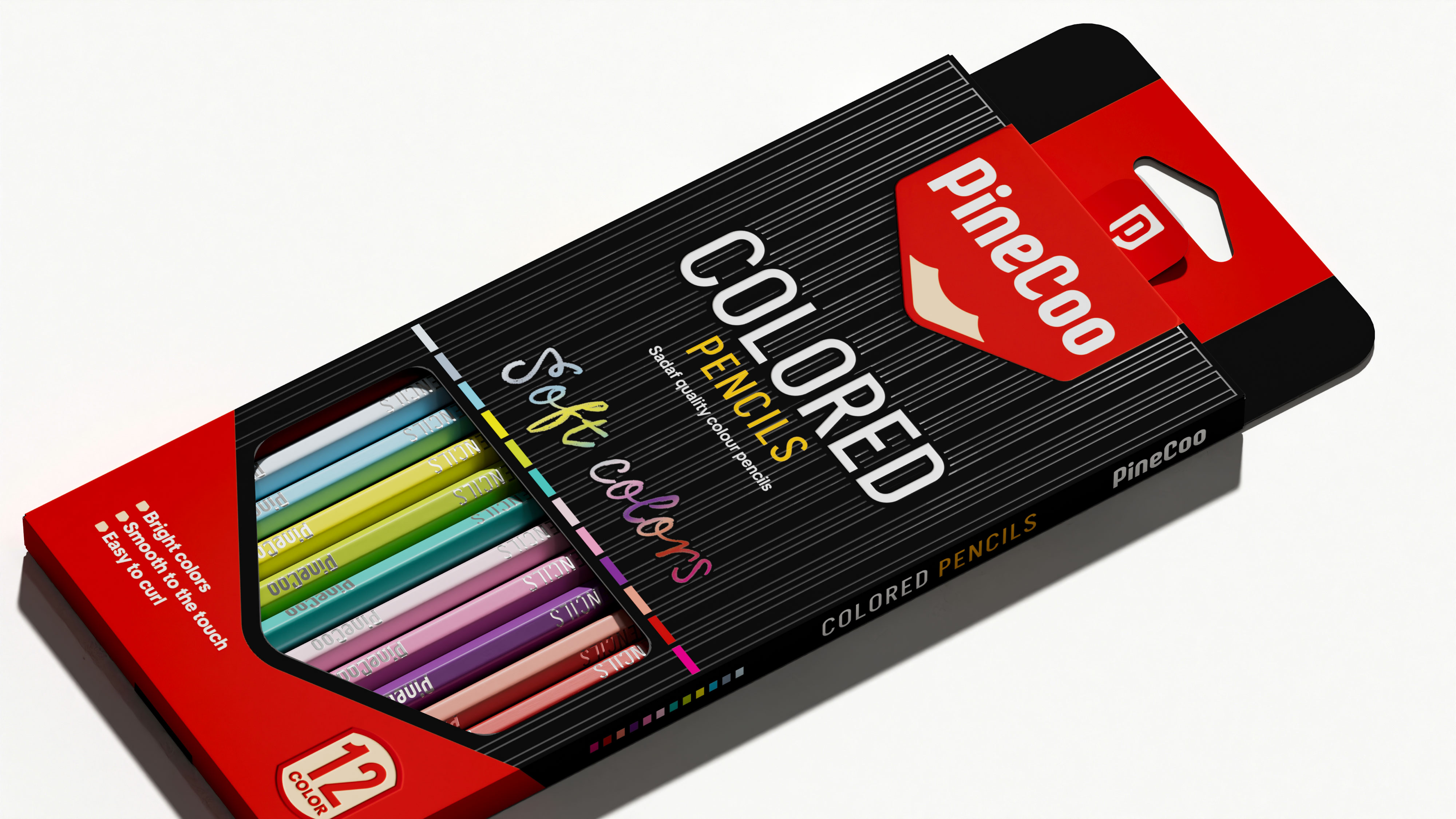
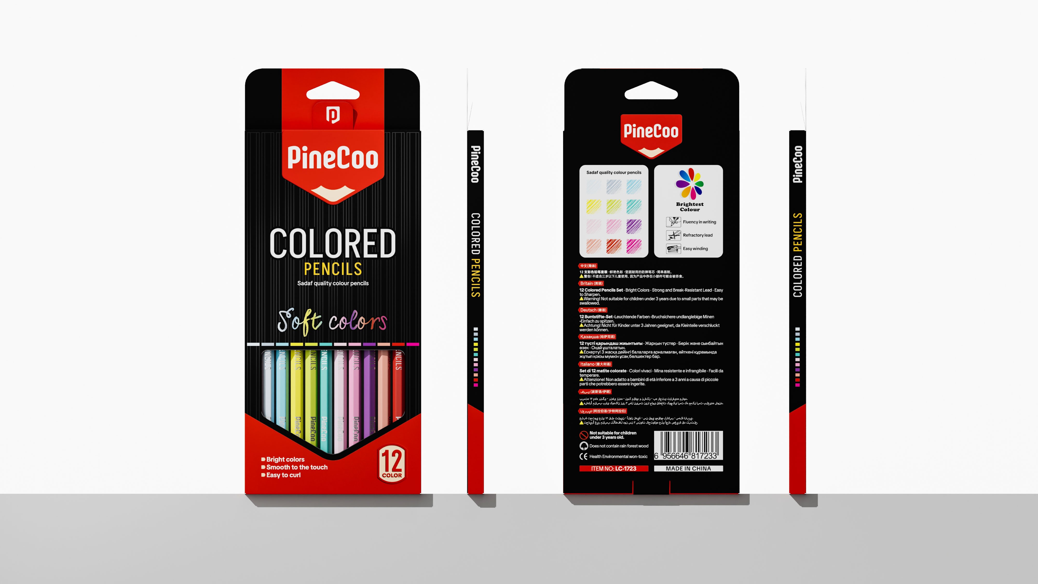
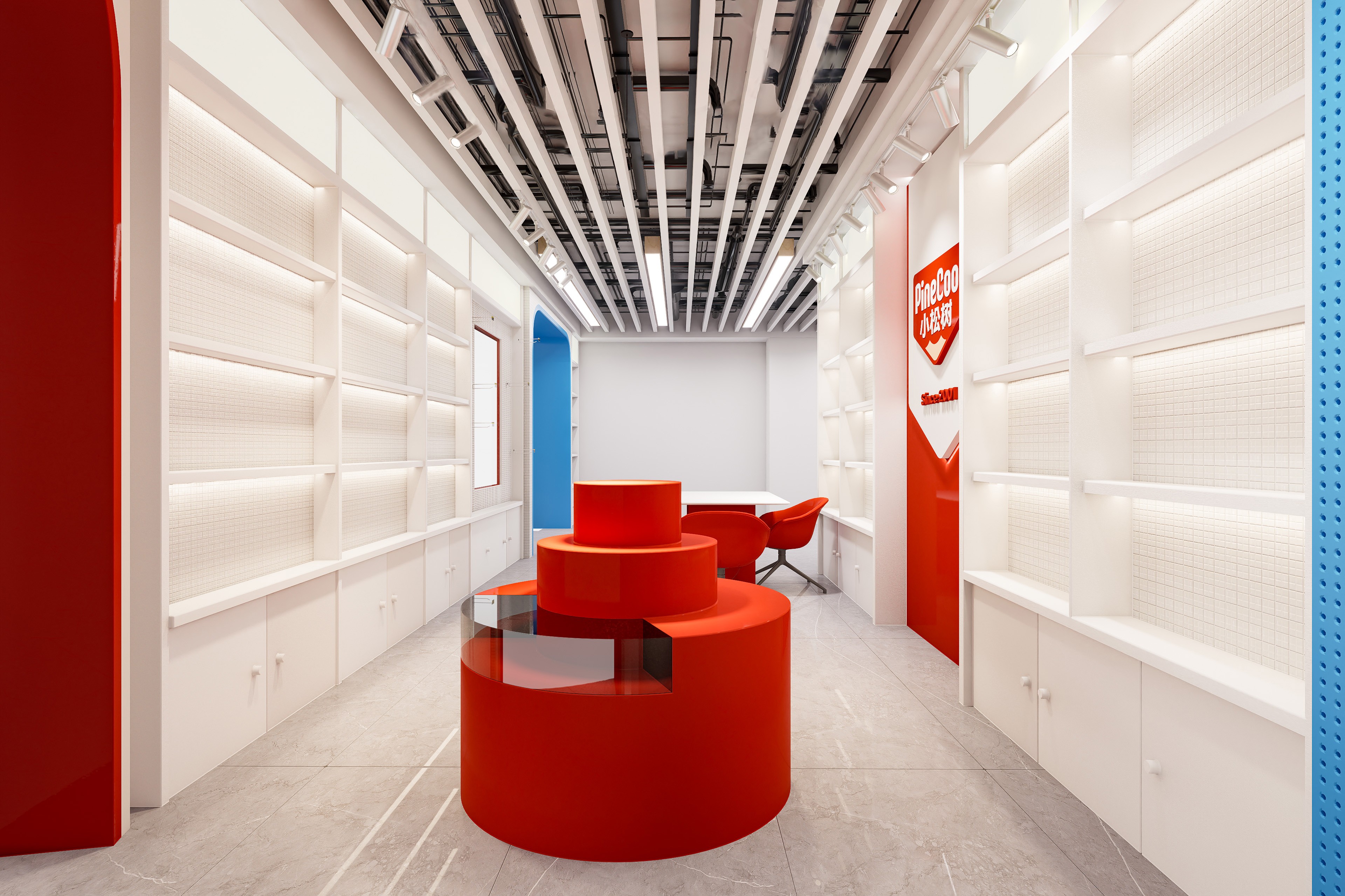
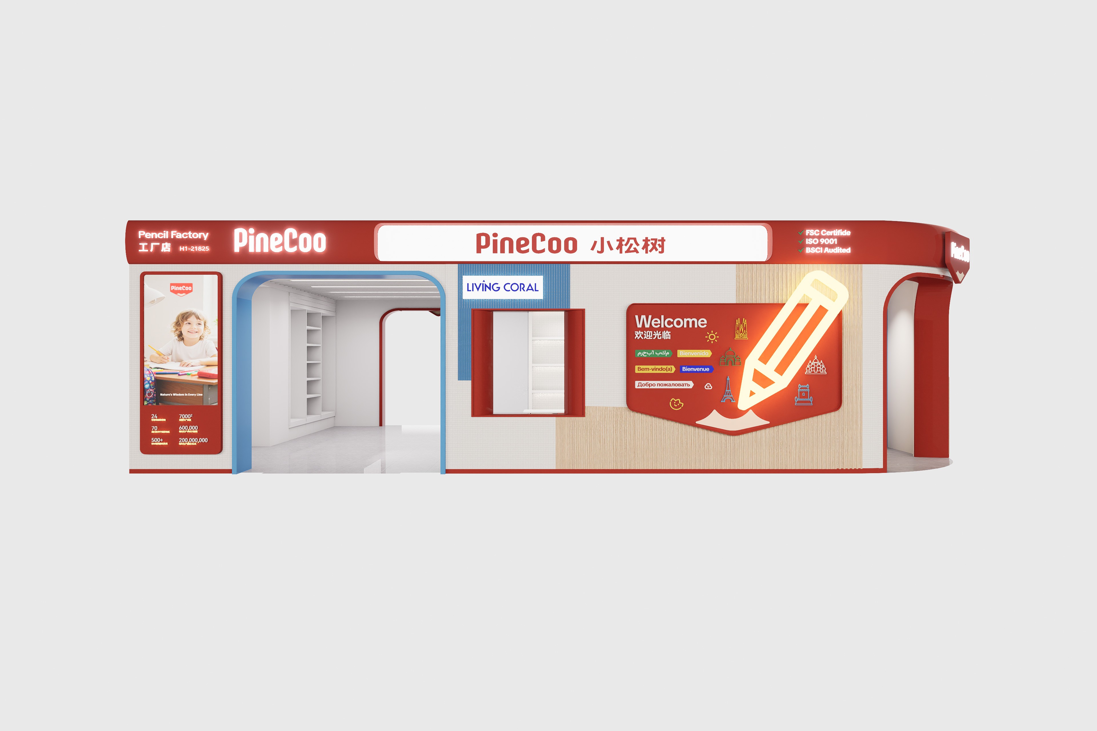
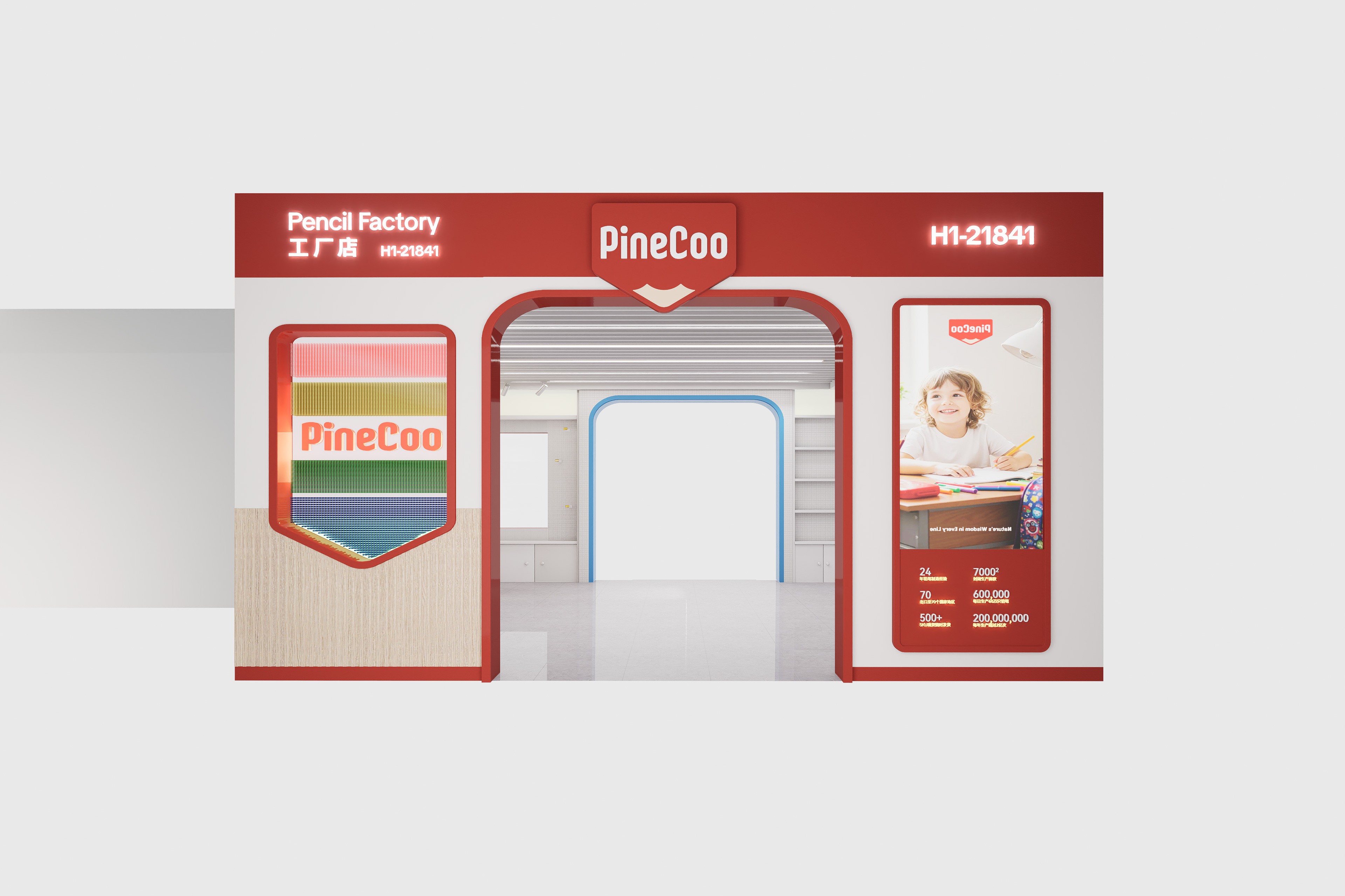
The core objective of this project is to help the brand establish a unified and recognizable brand visual system in a severely homogenized stationery market. Our research found that the toy industry often uses strong colors + large color blocks to emphasize product branding. The challenge PineCoo faced was precisely that it had a large number of SKUs and logos in varying forms, making brand visuals impossible to unify. Based on this insight, we established the design direction of “fun, childlike innocence, and strong recognition.” Typography design: The Chinese and English typefaces were redesigned. The English typeface is more oriented toward fun and childlike innocence, reaching children and young consumer groups with a more lively and friendly visual language. Color and graphic strategy: Adopting design approaches from the toy industry, we used strong colors + large color blocks on colorful and intricate layouts, effectively solving the problem of visual consistency across a multi-SKU product line. Application extension: The refreshed brand visual system not only achieved unified recognition on packaging, but also provided more interesting expressive elements for exhibitions, materials, posters, and even social media, allowing the brand to maintain a consistent brand image across multichannel communication. Through this full-brand design system combining fun, recognition efficiency, and consistency, PineCoo successfully upgraded from a brand with fragmented visuals across multiple SKUs to a benchmark brand in the stationery industry with a unified visual language, strong brand recognition, and global market influence.