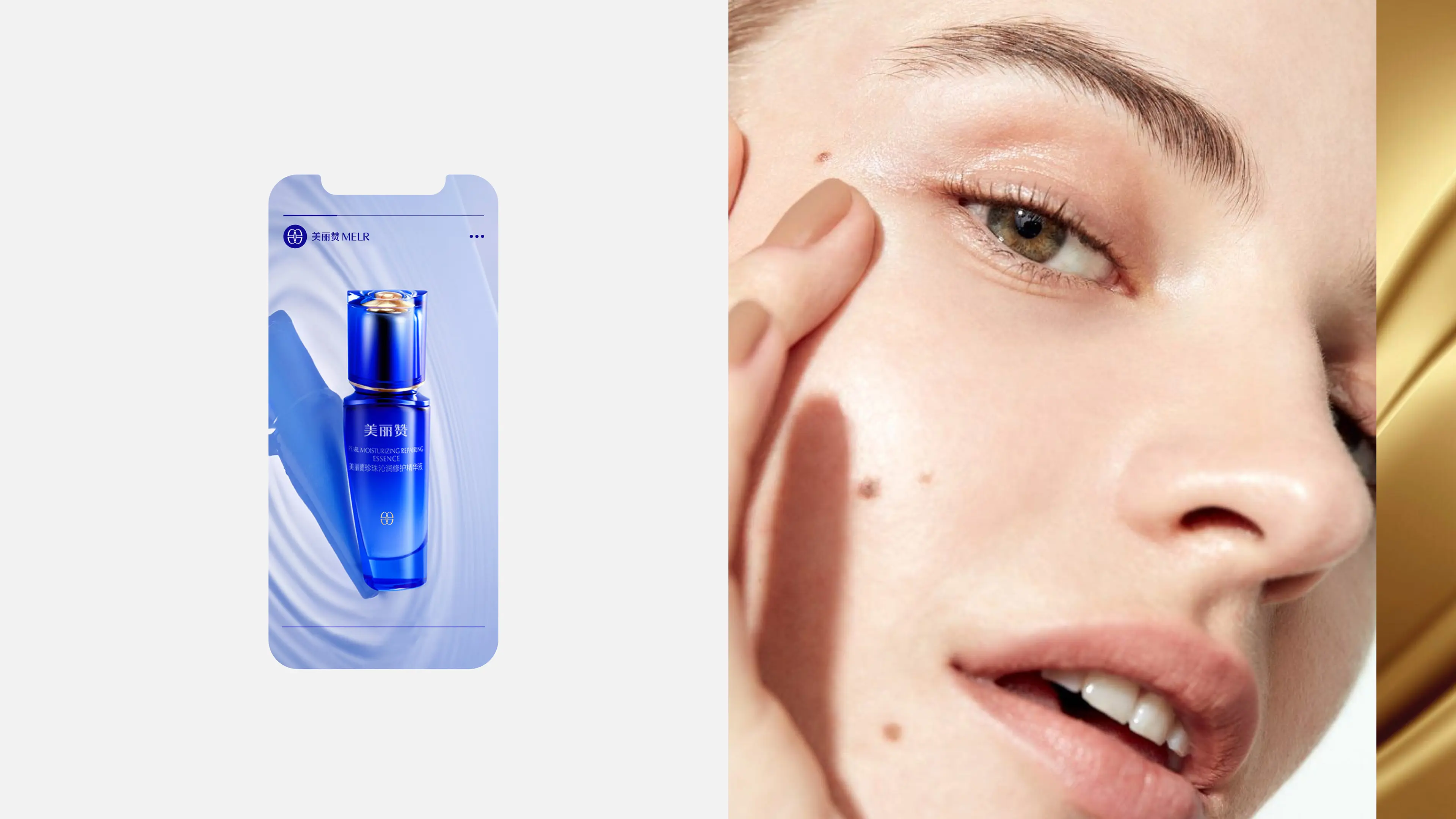
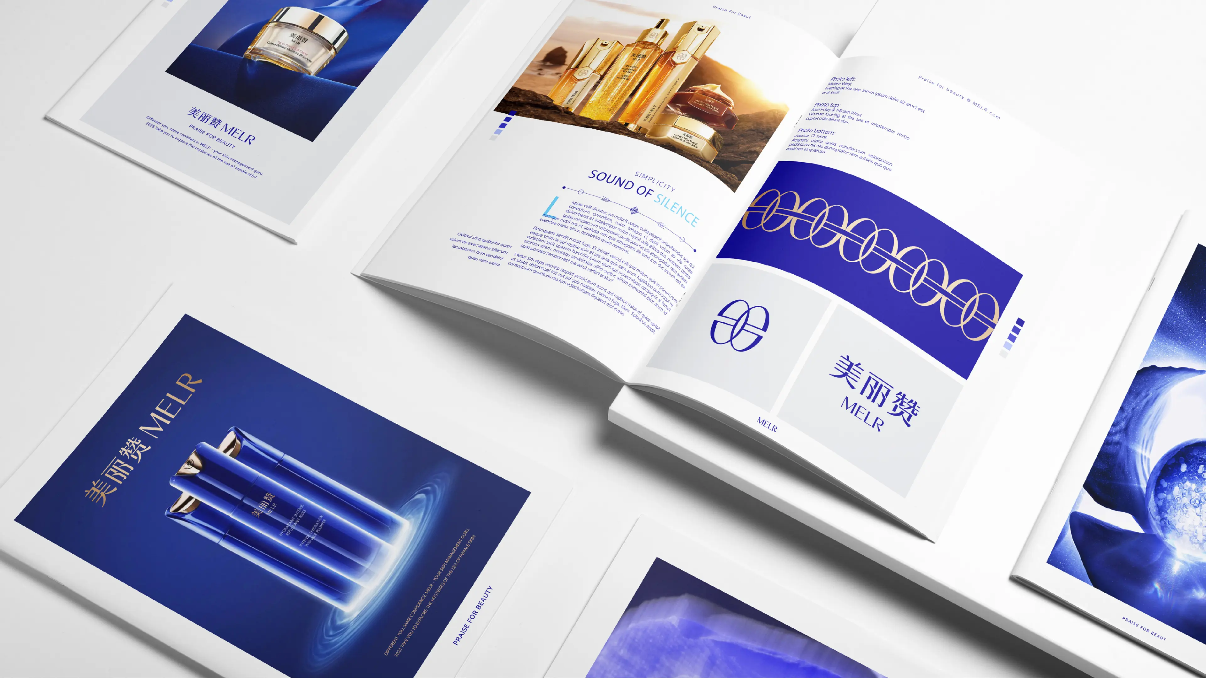
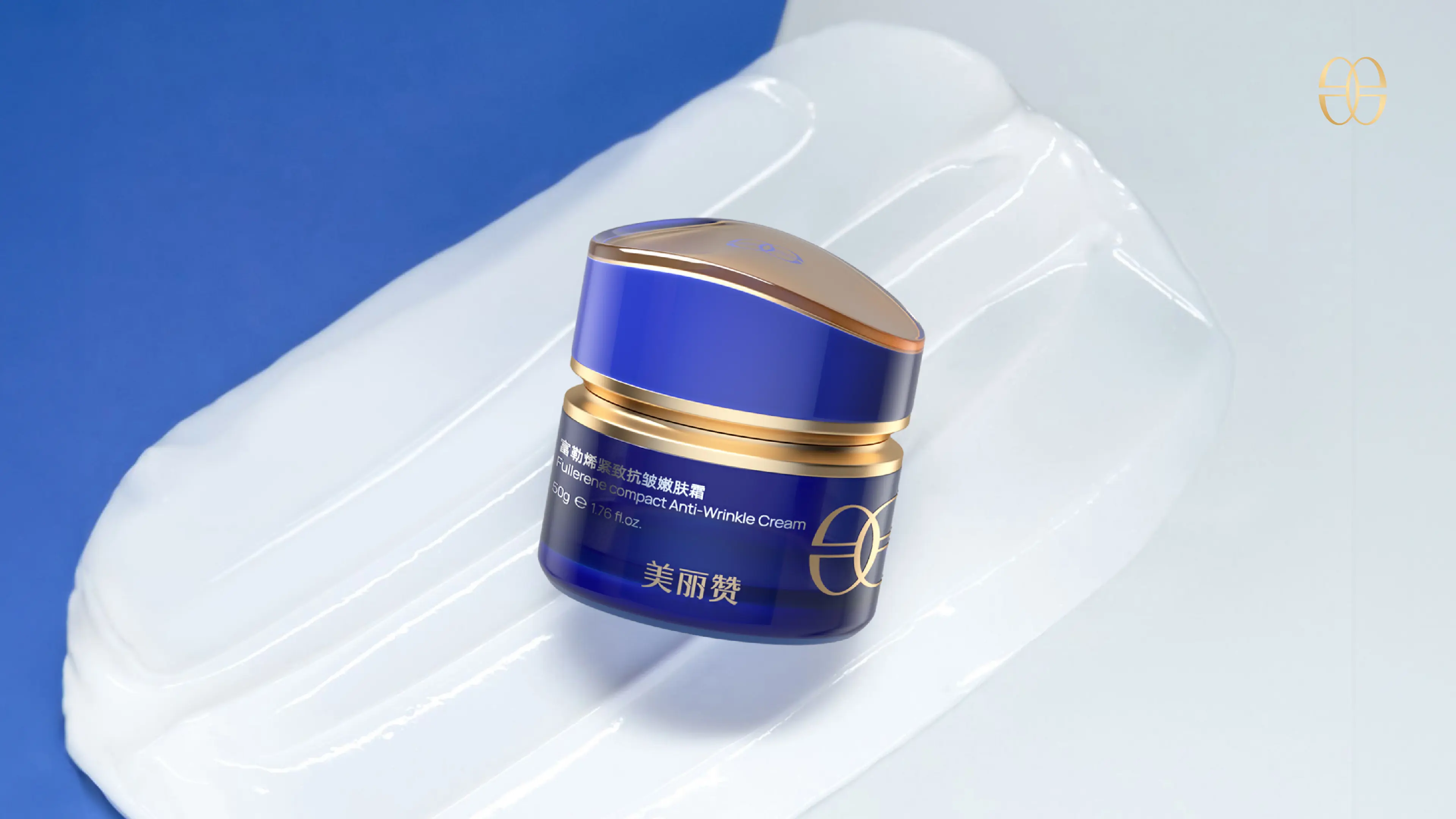
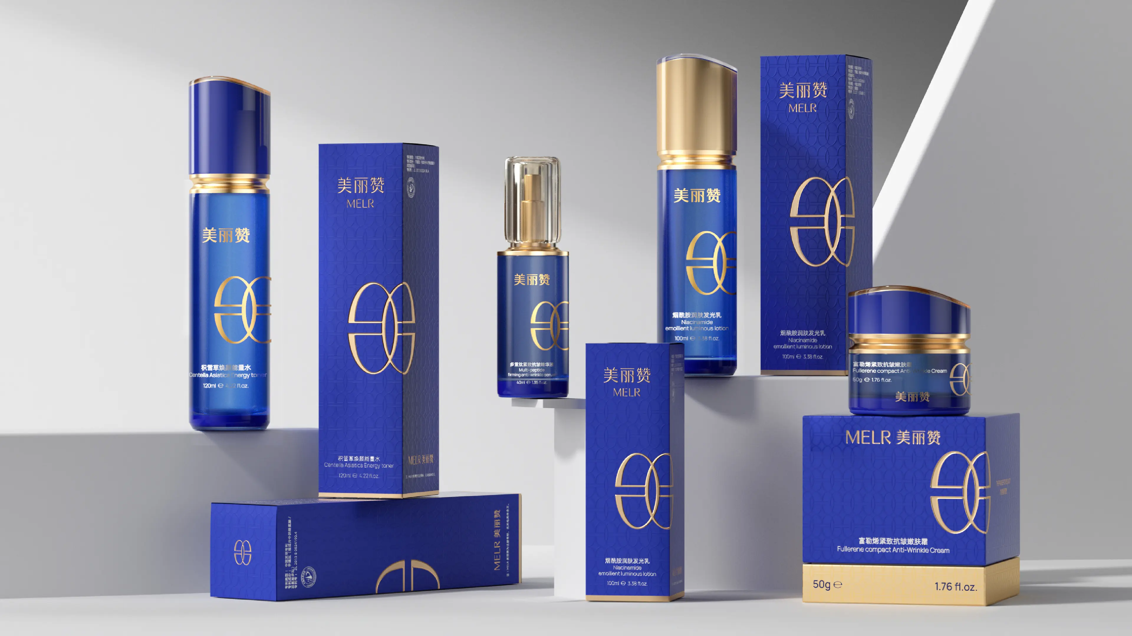
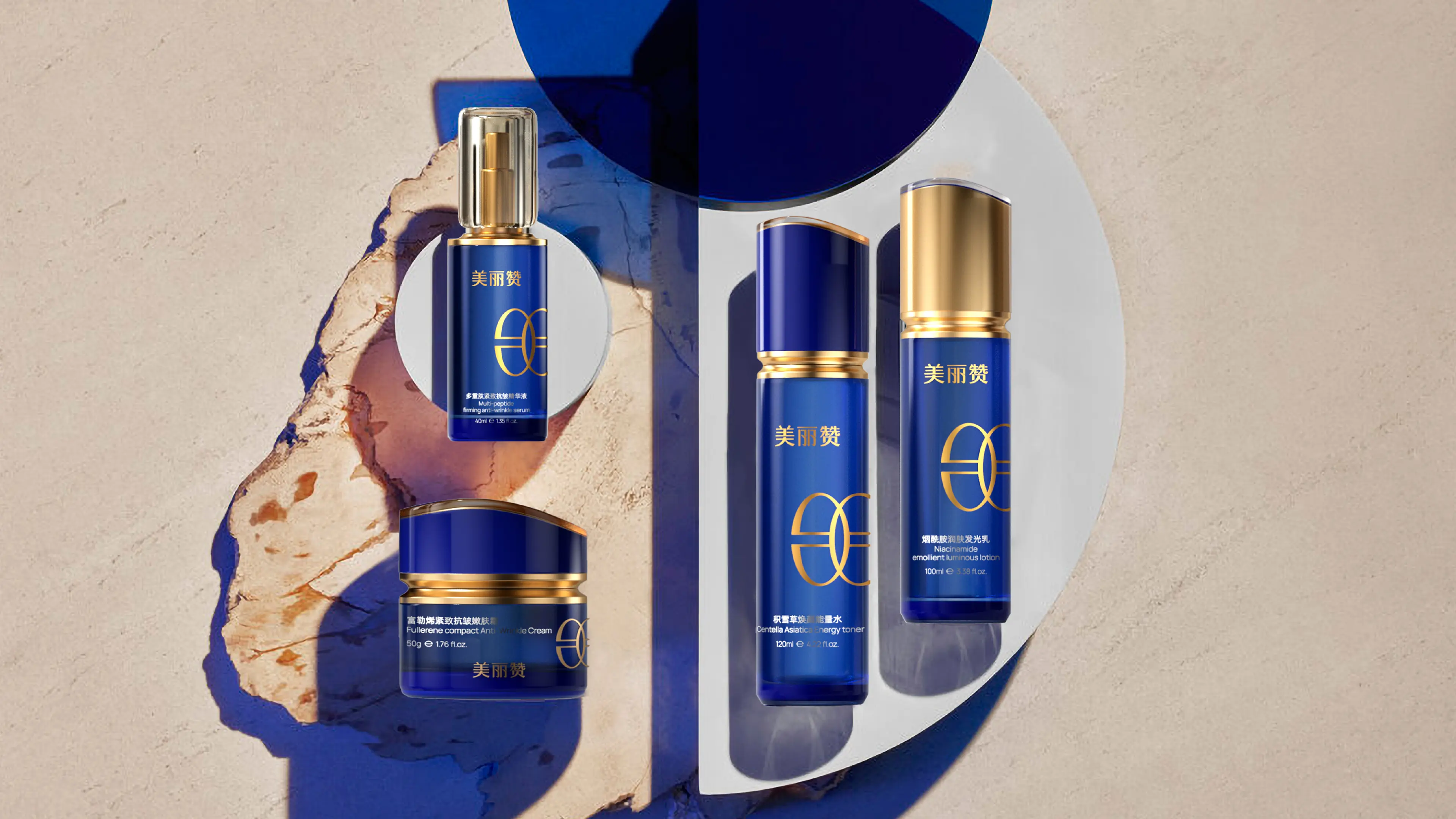
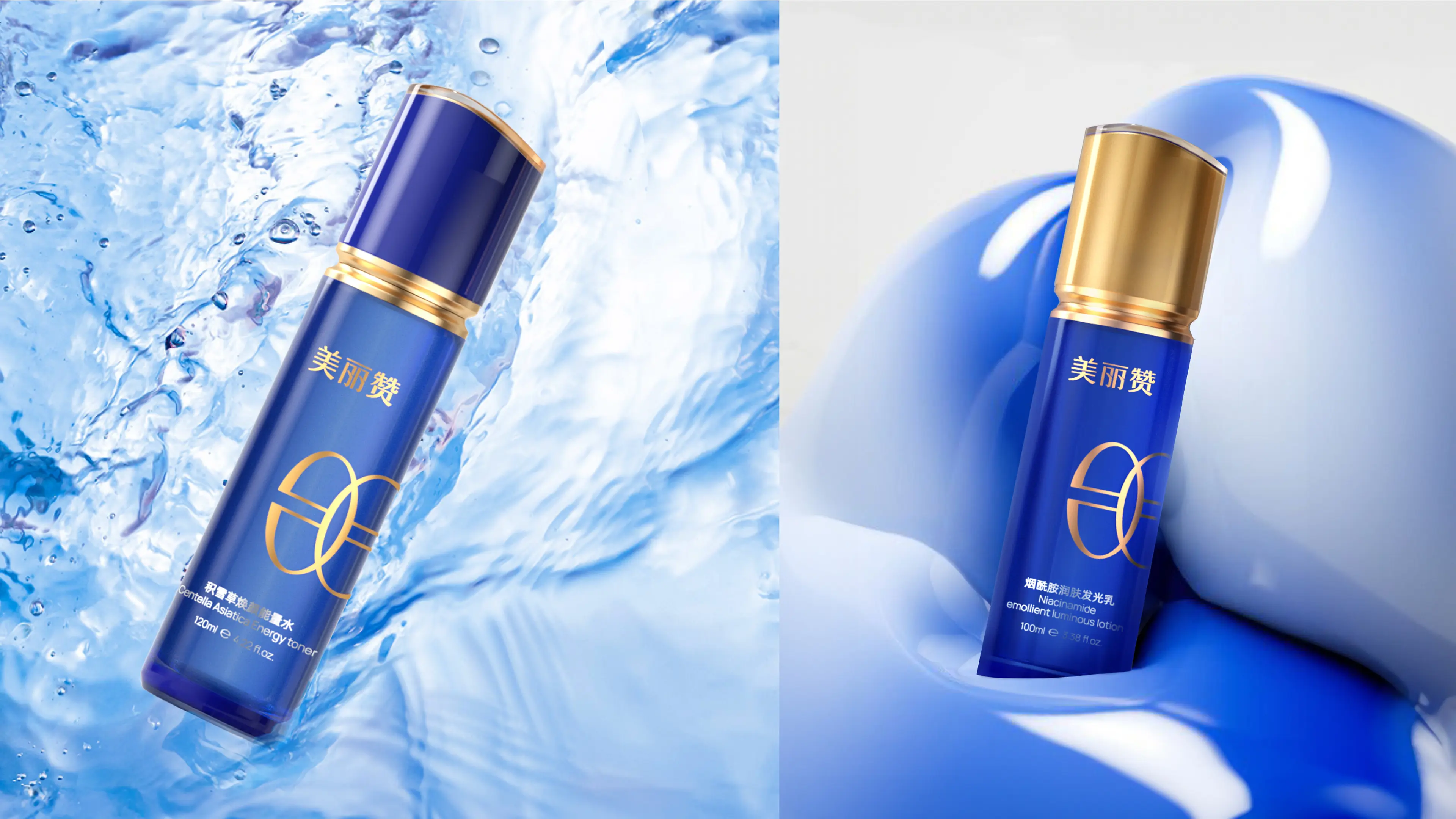
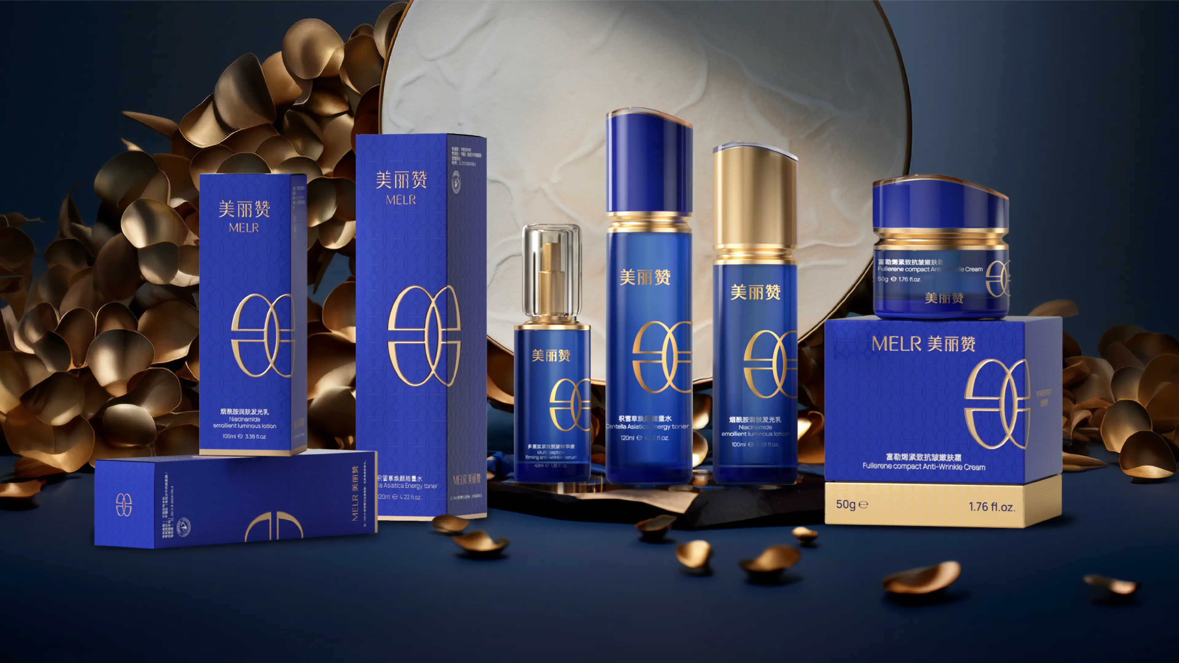
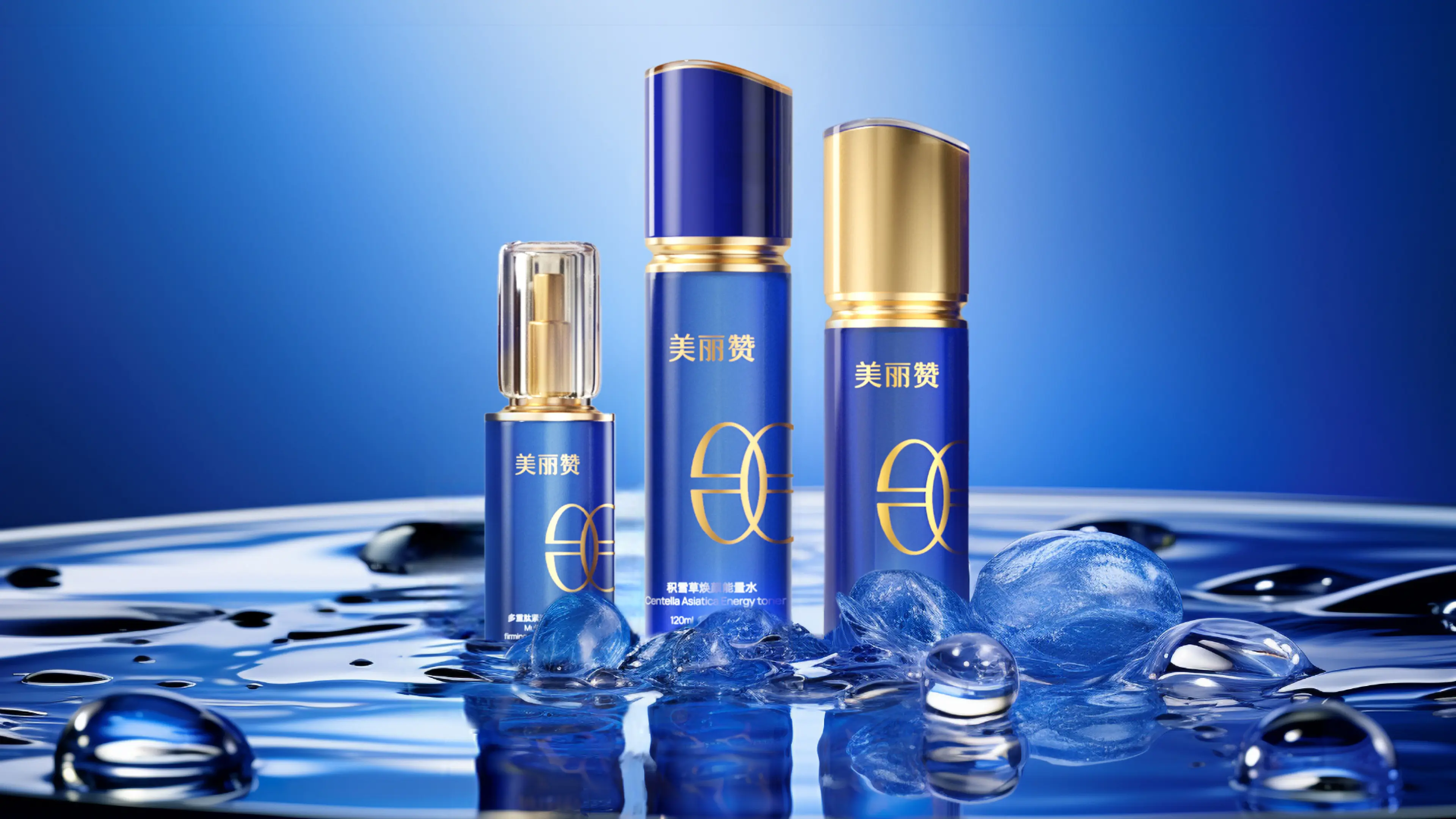
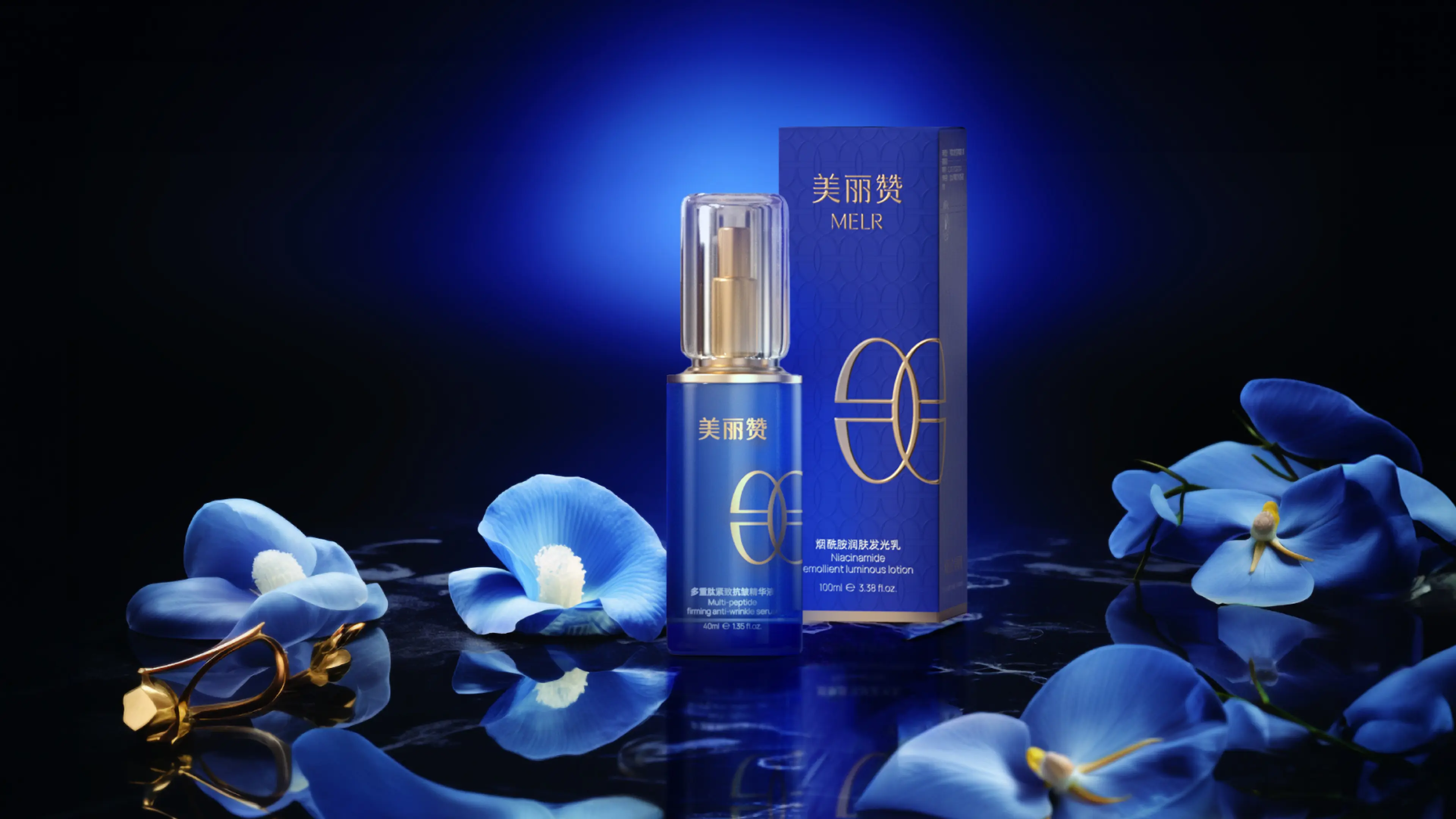
The parent company of MELR is located in Ningbo, Zhejiang Province. It was established in 2022. The product ingredients mainly consist of hyaluronic acid and plant extract essences, targeting the skincare consumer group of women aged 30-40. The brand is committed to empowering skincare products with modern biotechnology and providing scientific and effective anti-aging solutions for urban women.
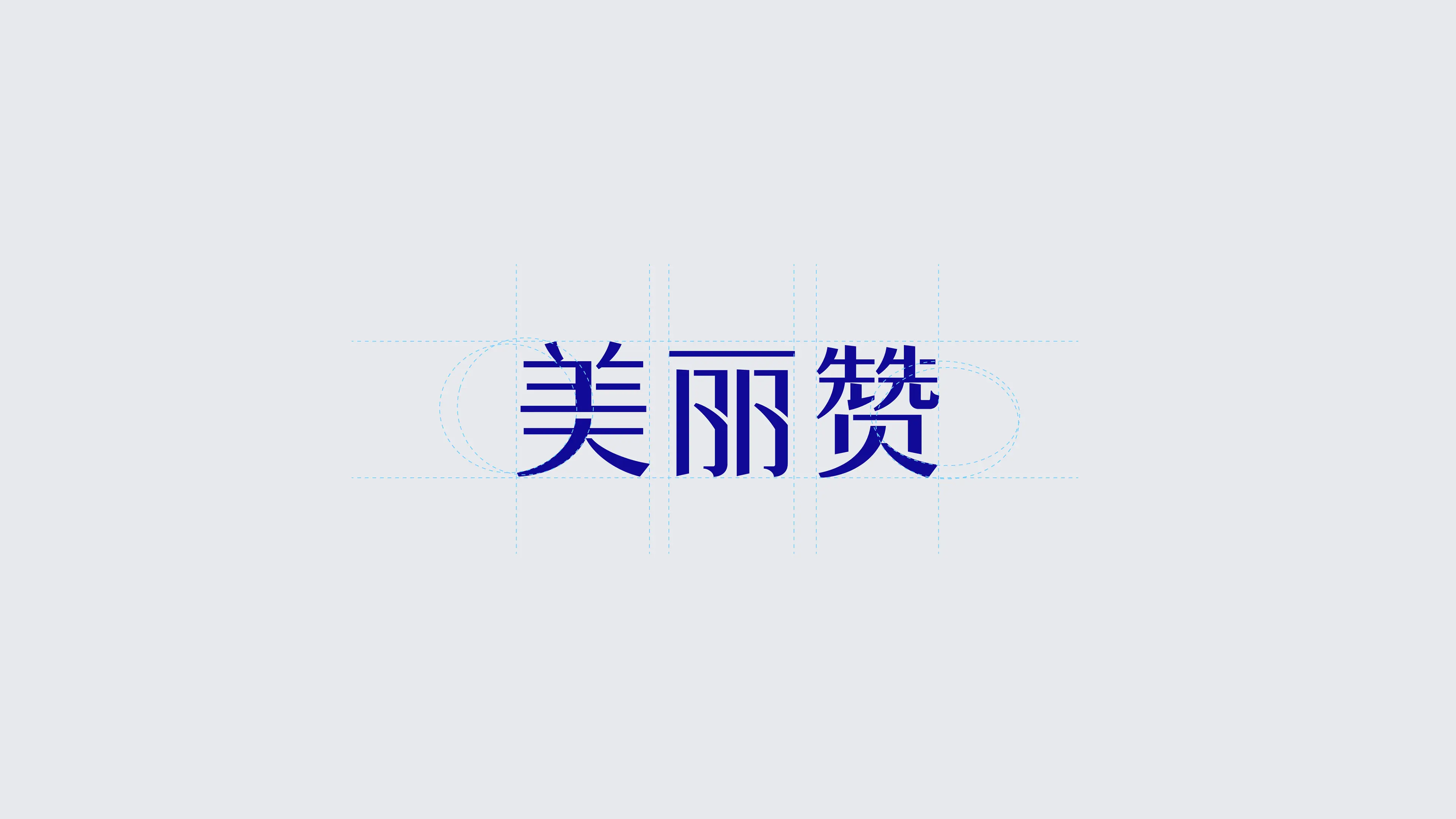
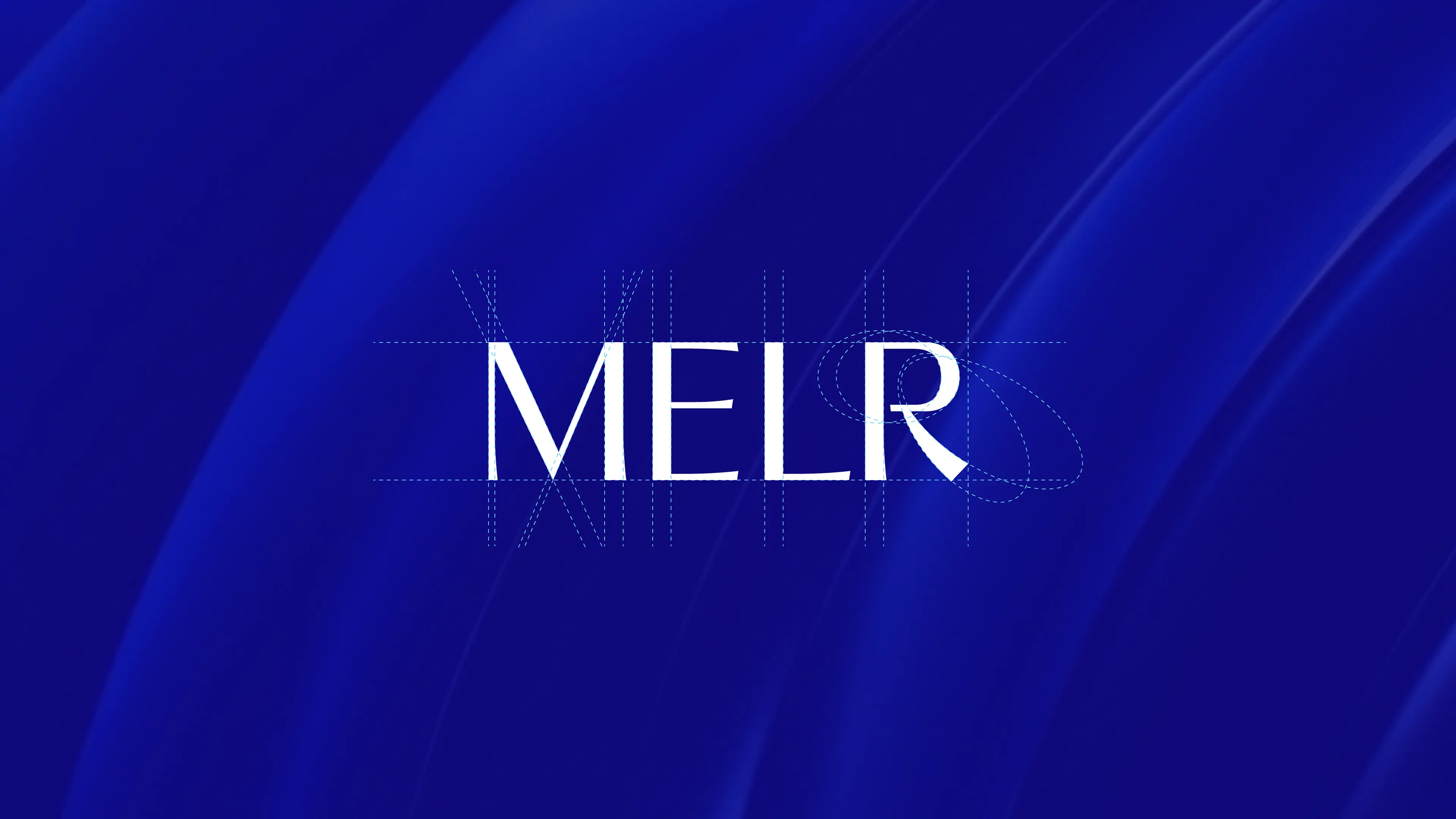
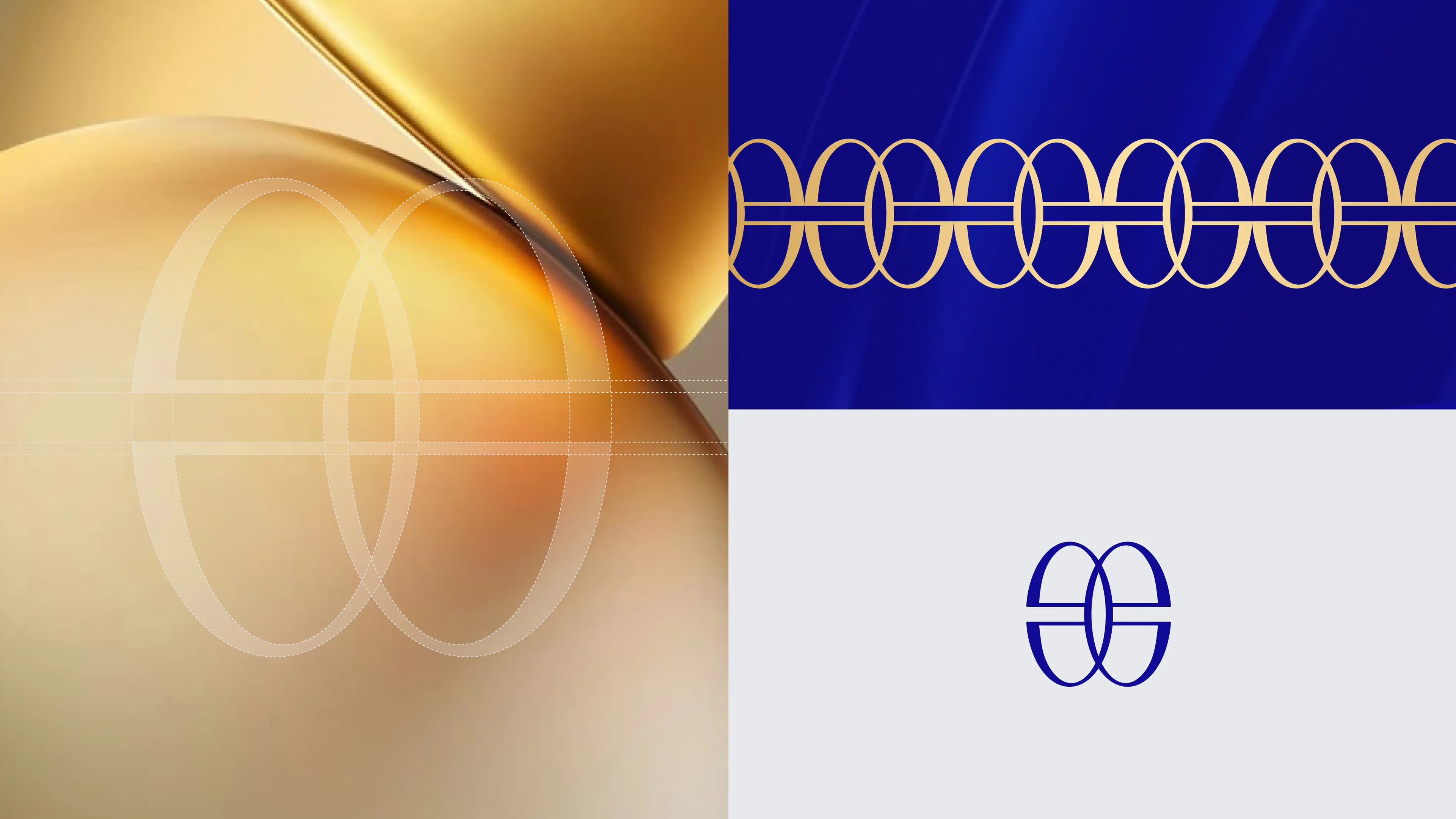
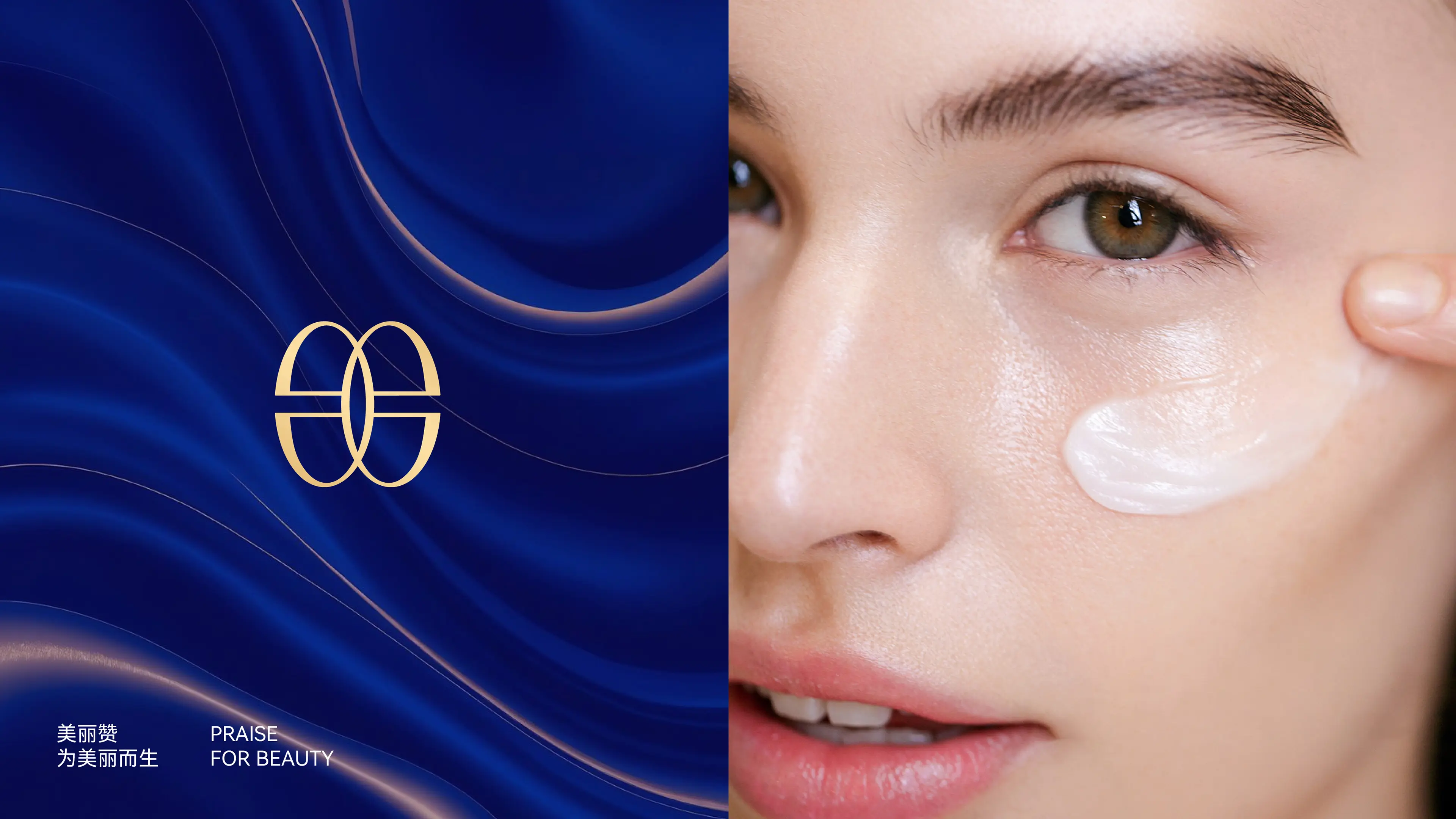
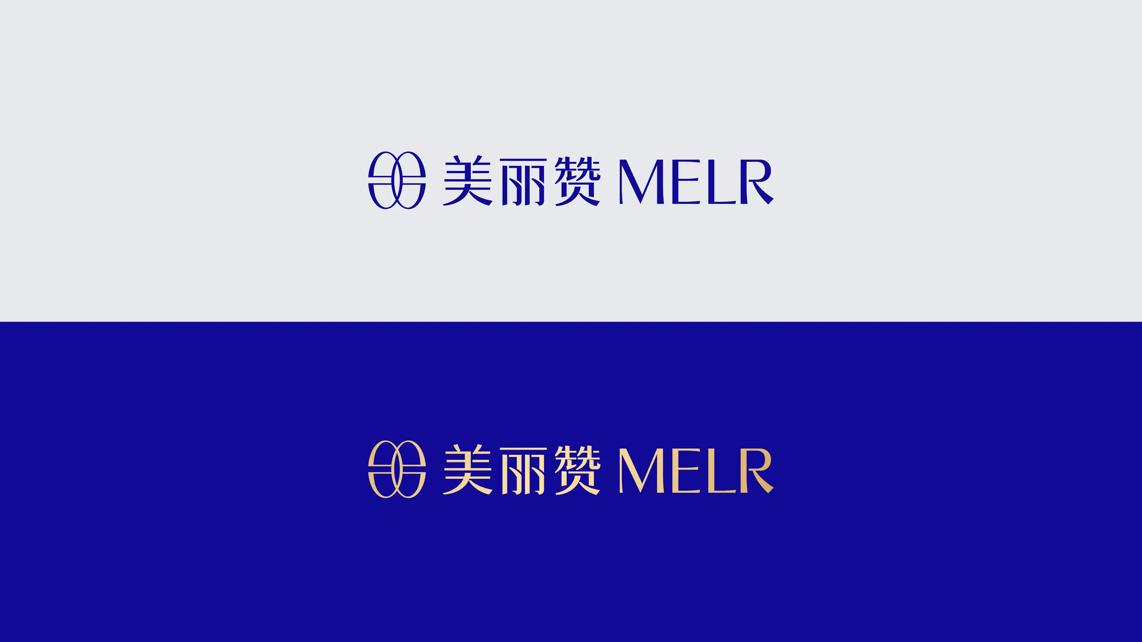
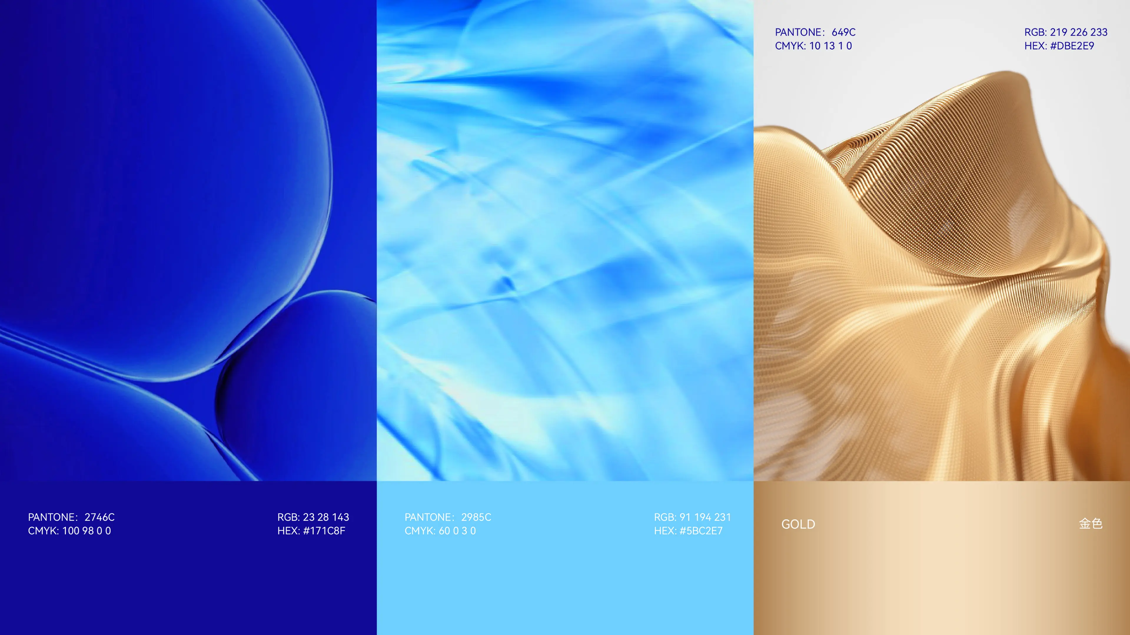
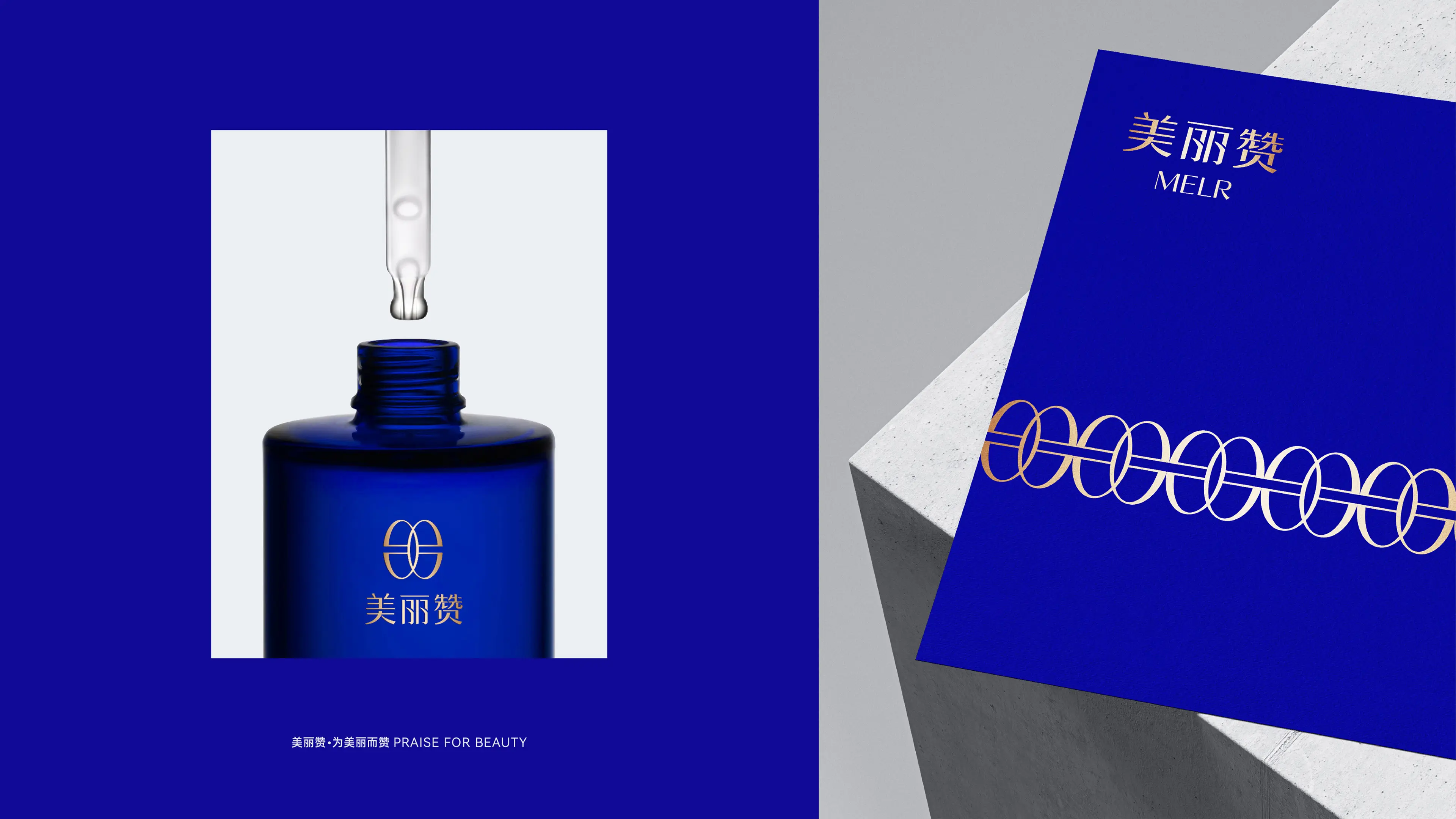
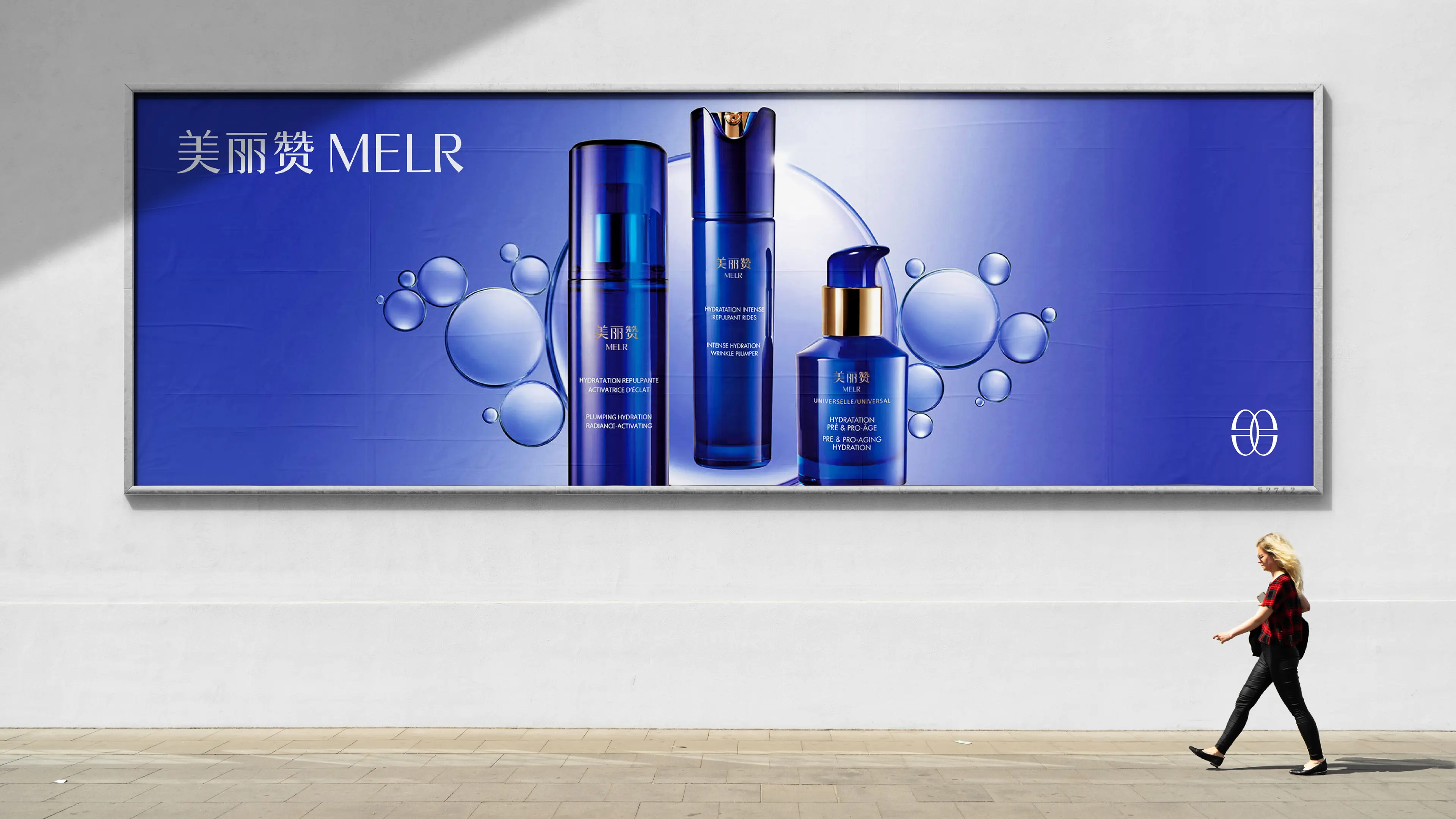
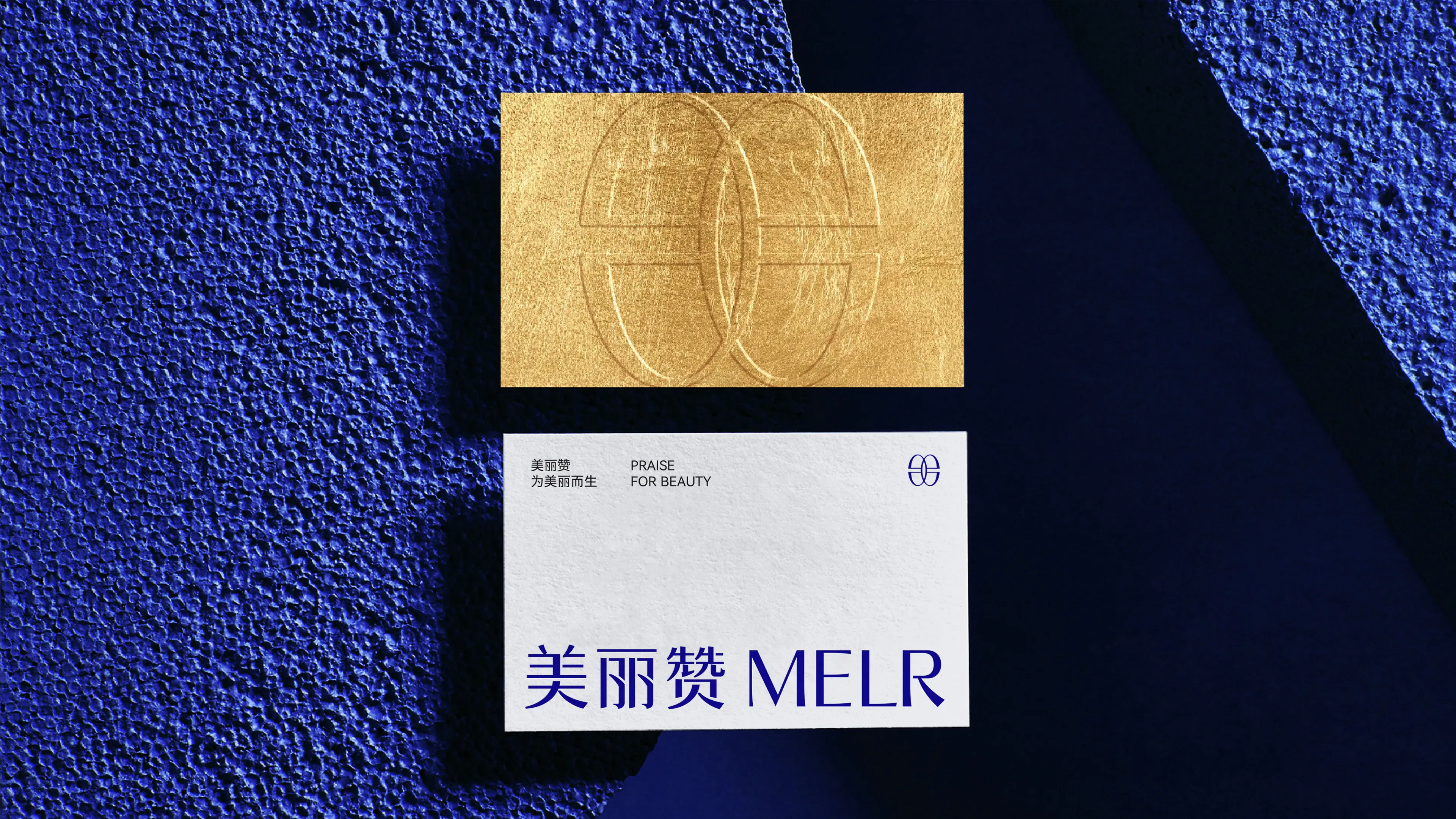
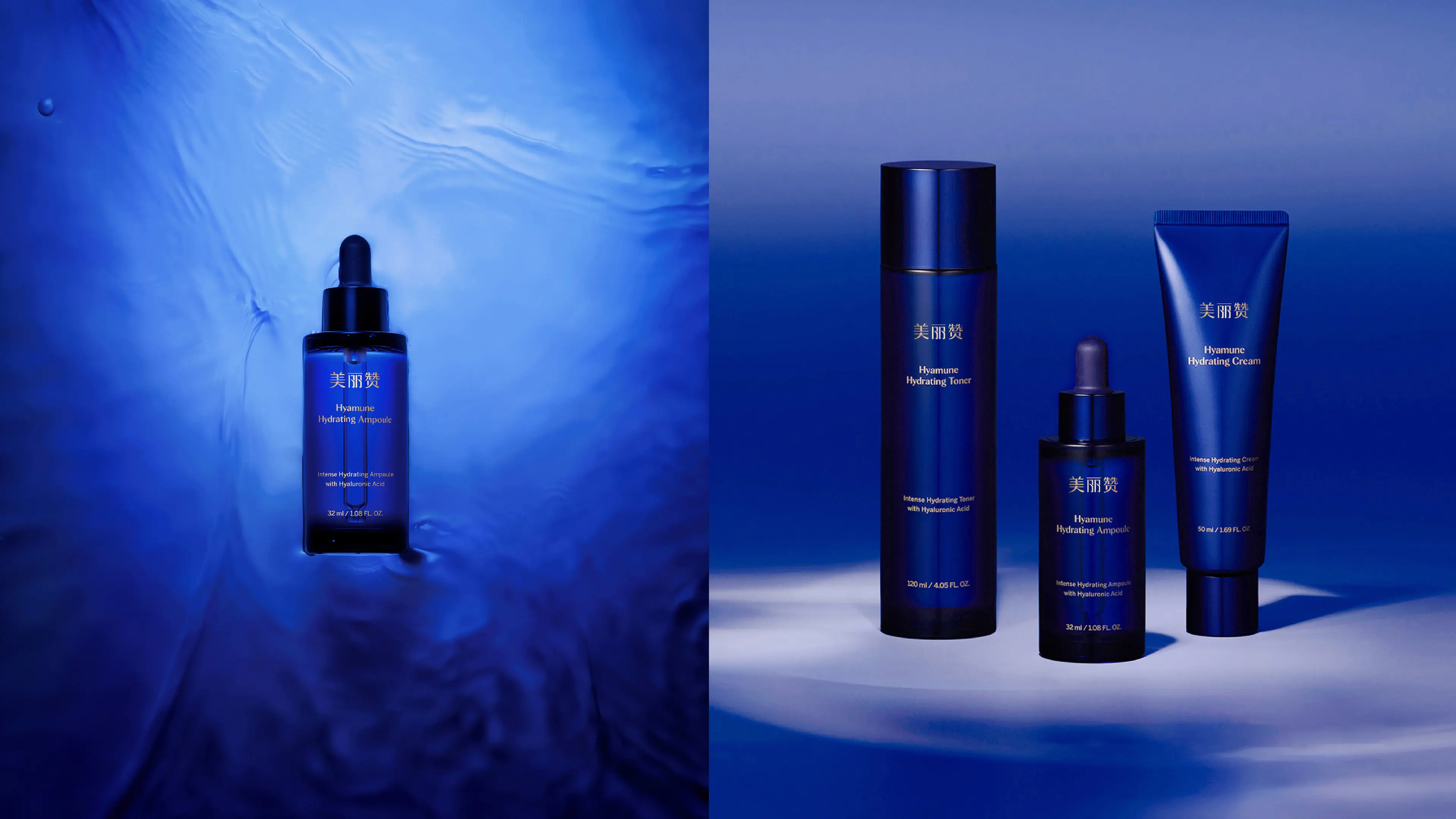
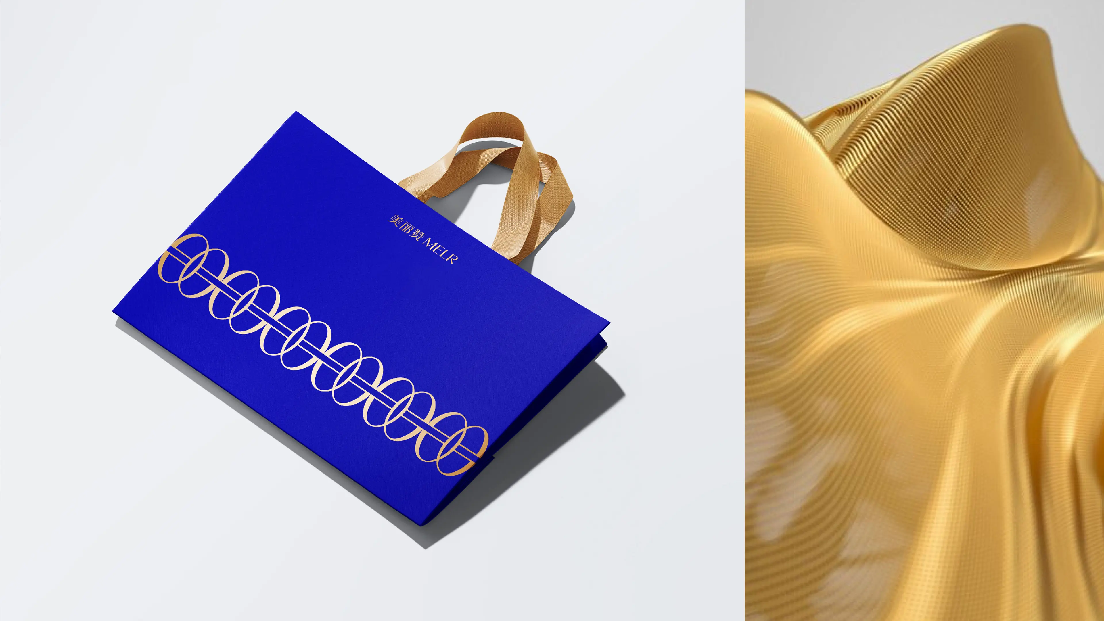
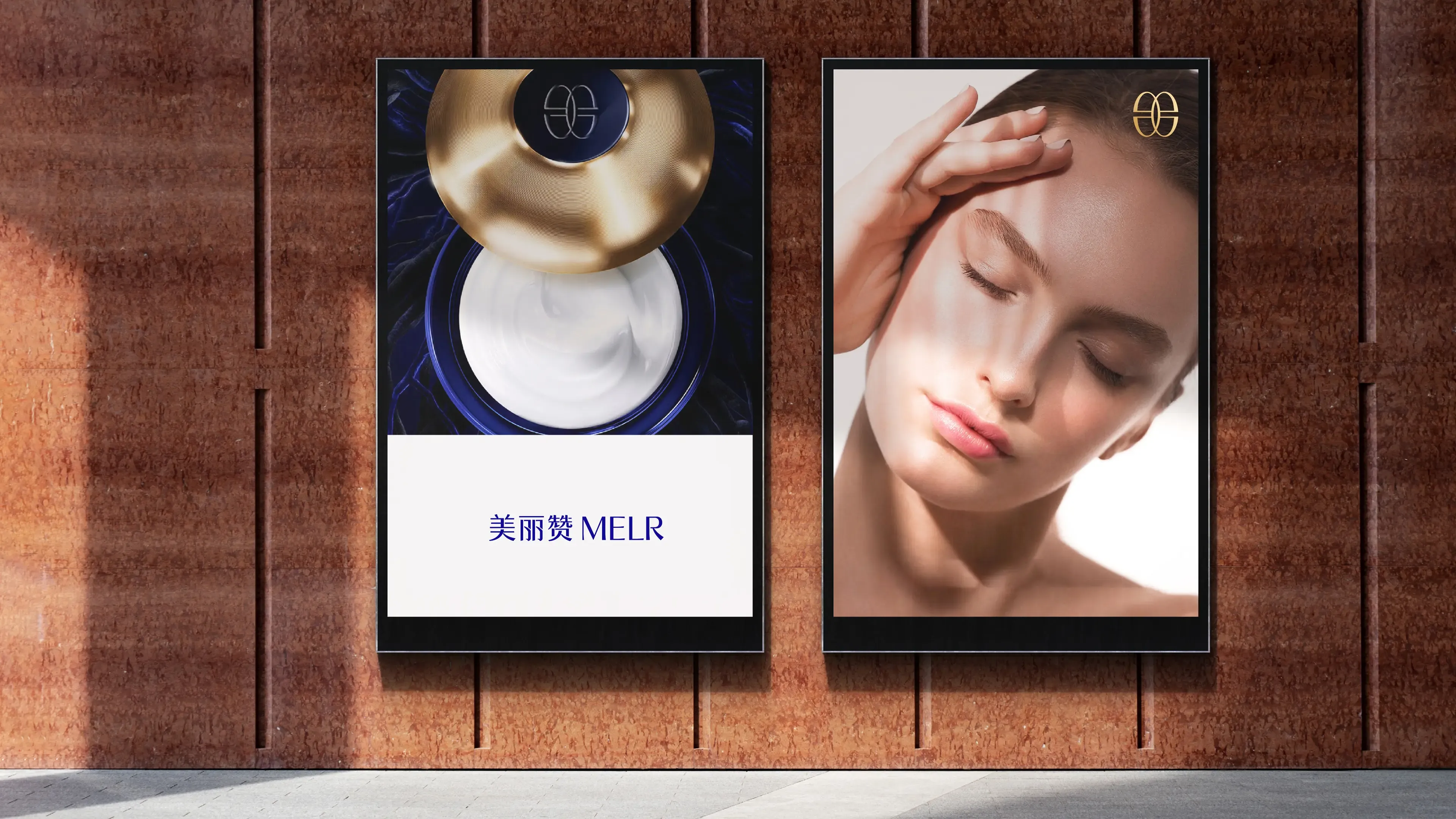
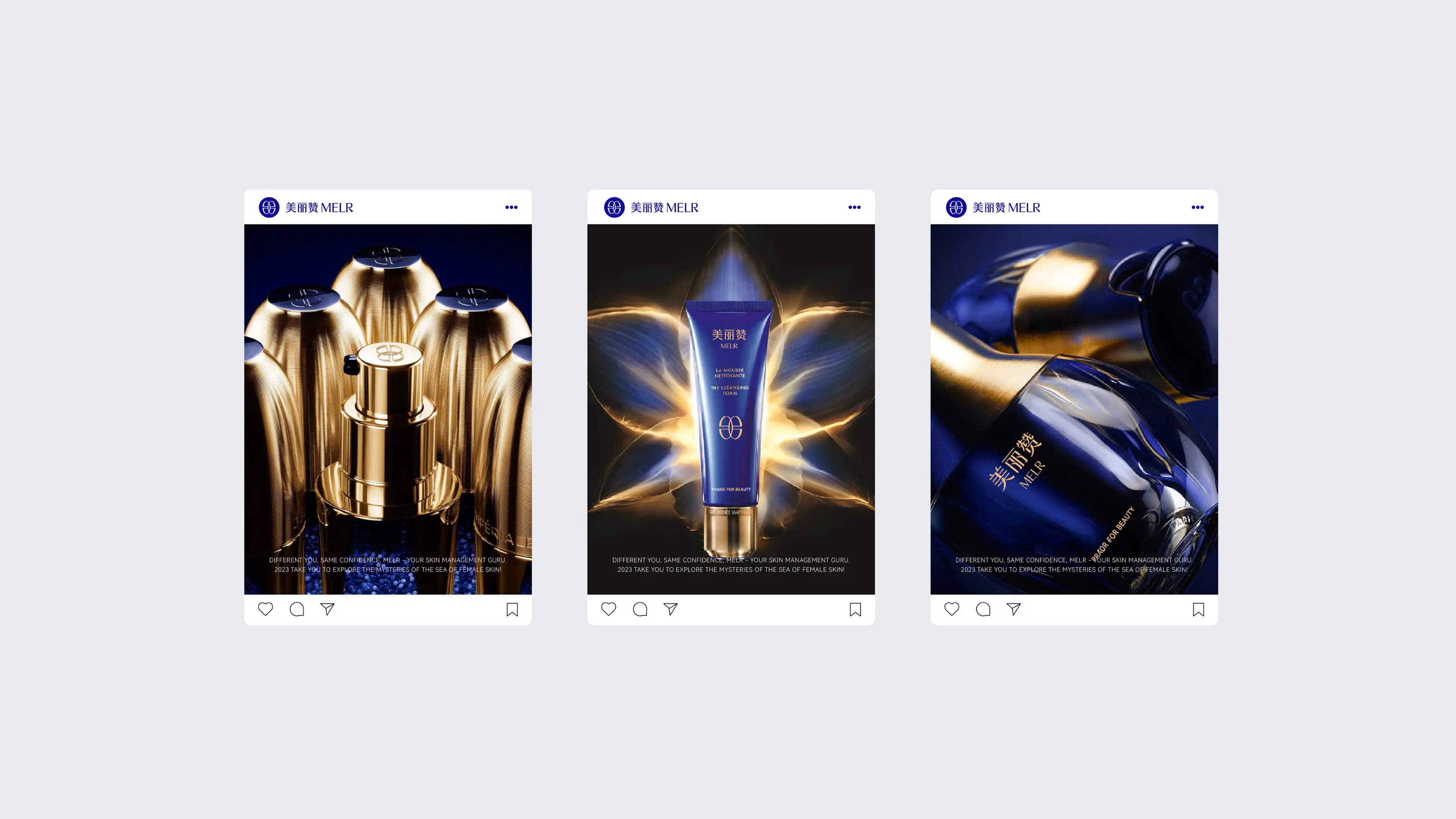
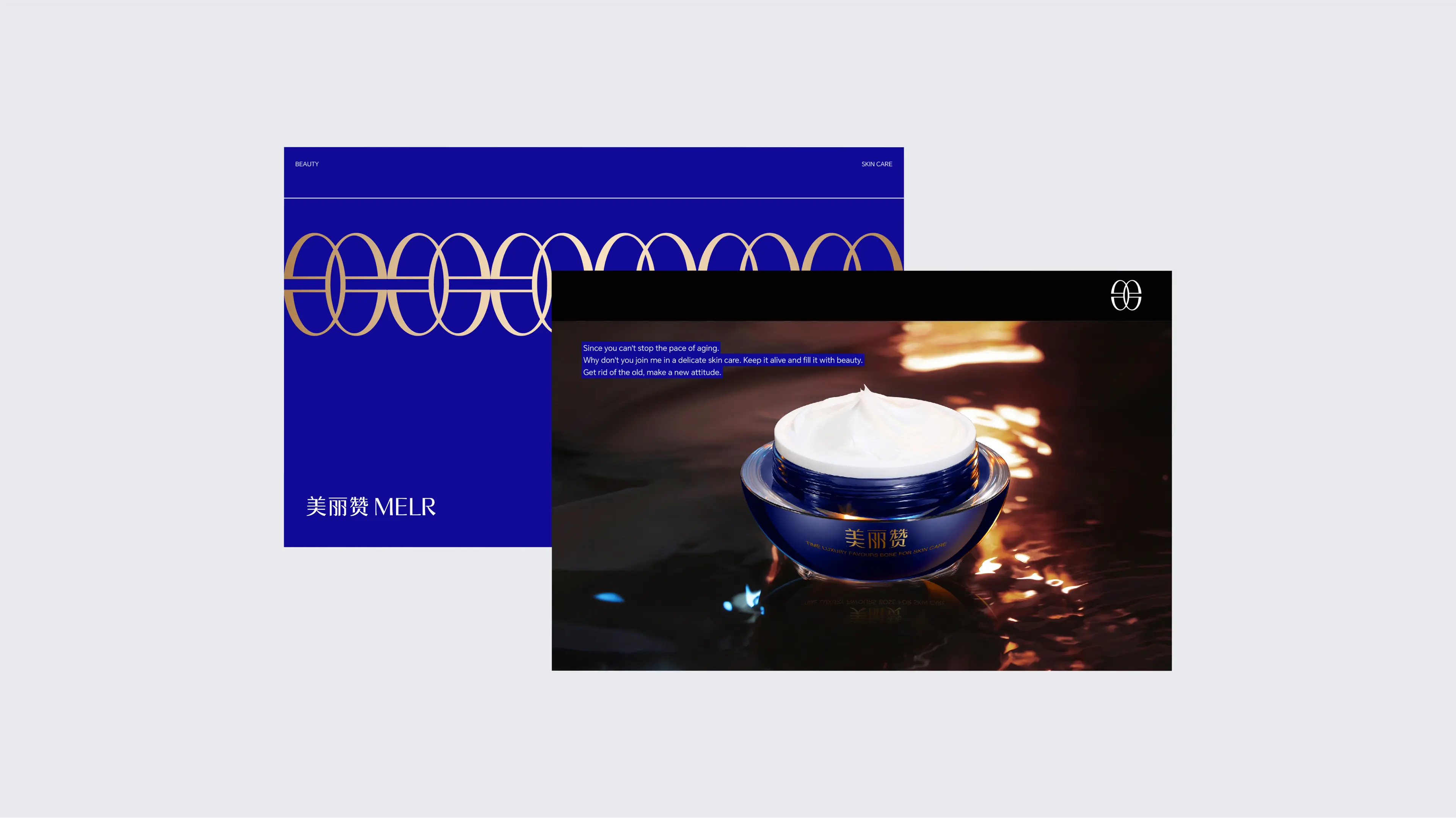
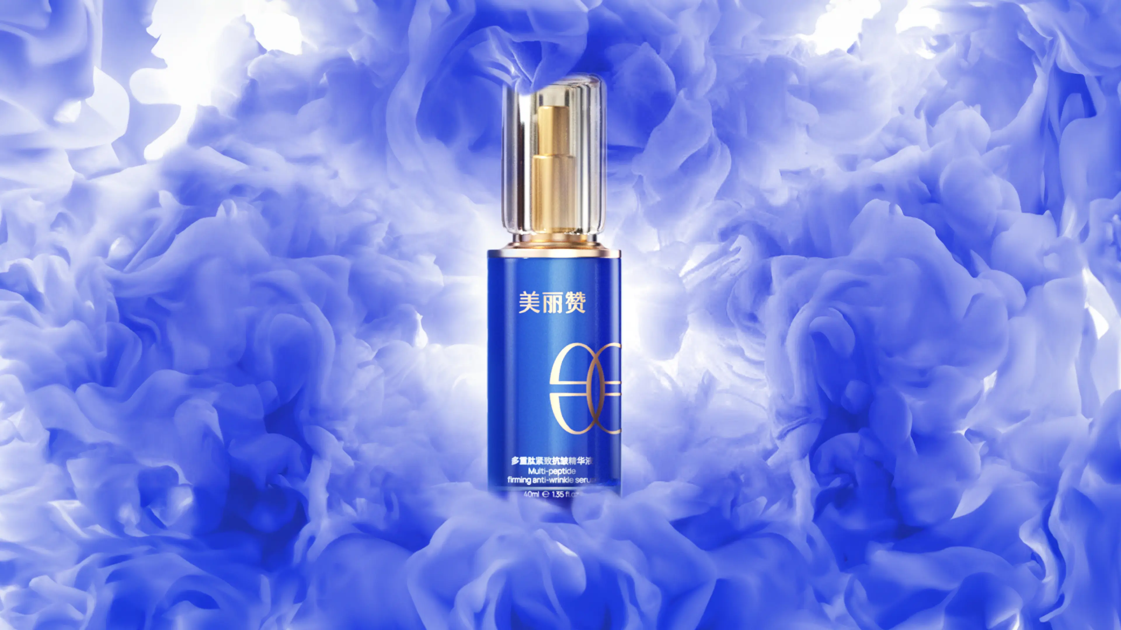
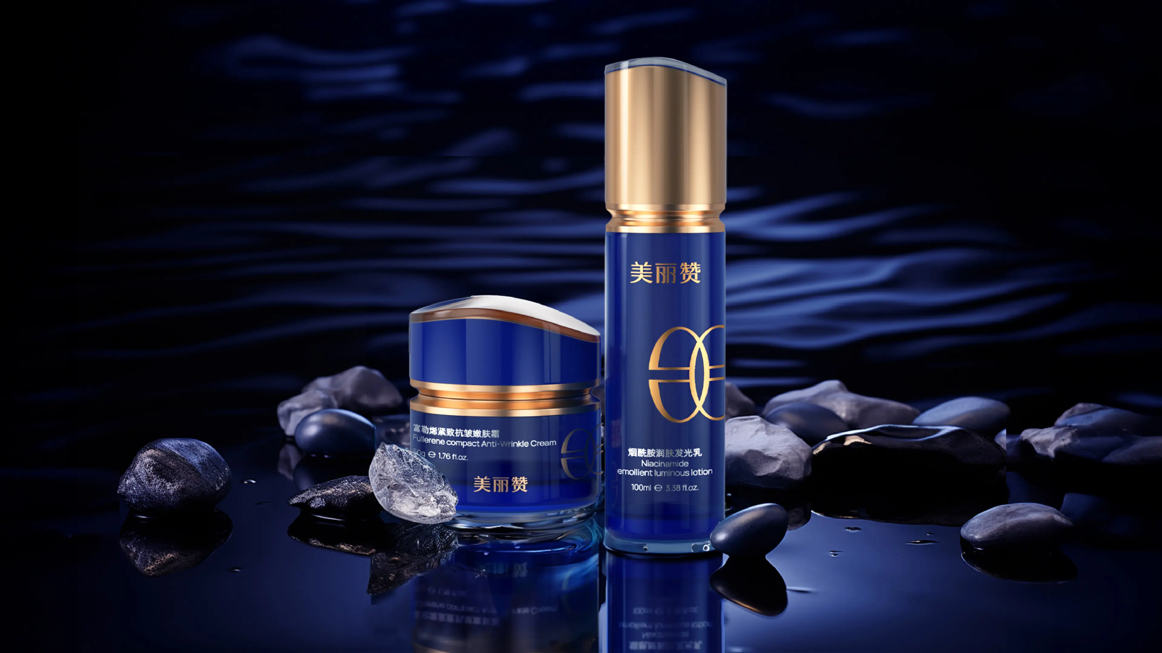
This project is to create a brand visual and packaging design system for the MELR Fullerene Firming Anti-Wrinkle Nourishing Cream. Starting from the core concept of the brand "For Beauty, We Commend", the team established a scientific and professional brand tone in the visual aspect for MELR. The brand color was selected as blue, which is visually more scientific and professional, effectively conveying the core value of the brand "Enabling Beauty with Technology". In the auxiliary graphic design, the team processed the brand name's initial letter "m" into horizontal symmetry, obtaining a unique auxiliary graphic symbol. This design not only strengthened the visual memory of the brand name but also conveyed a precise and rigorous research attitude through the symmetrical aesthetics. The overall packaging presents a simple and professional visual language, allowing the product to have a clear brand recognition on shelves and e-commerce pages, effectively helping the brand establish differentiated visual assets in the efficacy skincare sector.