
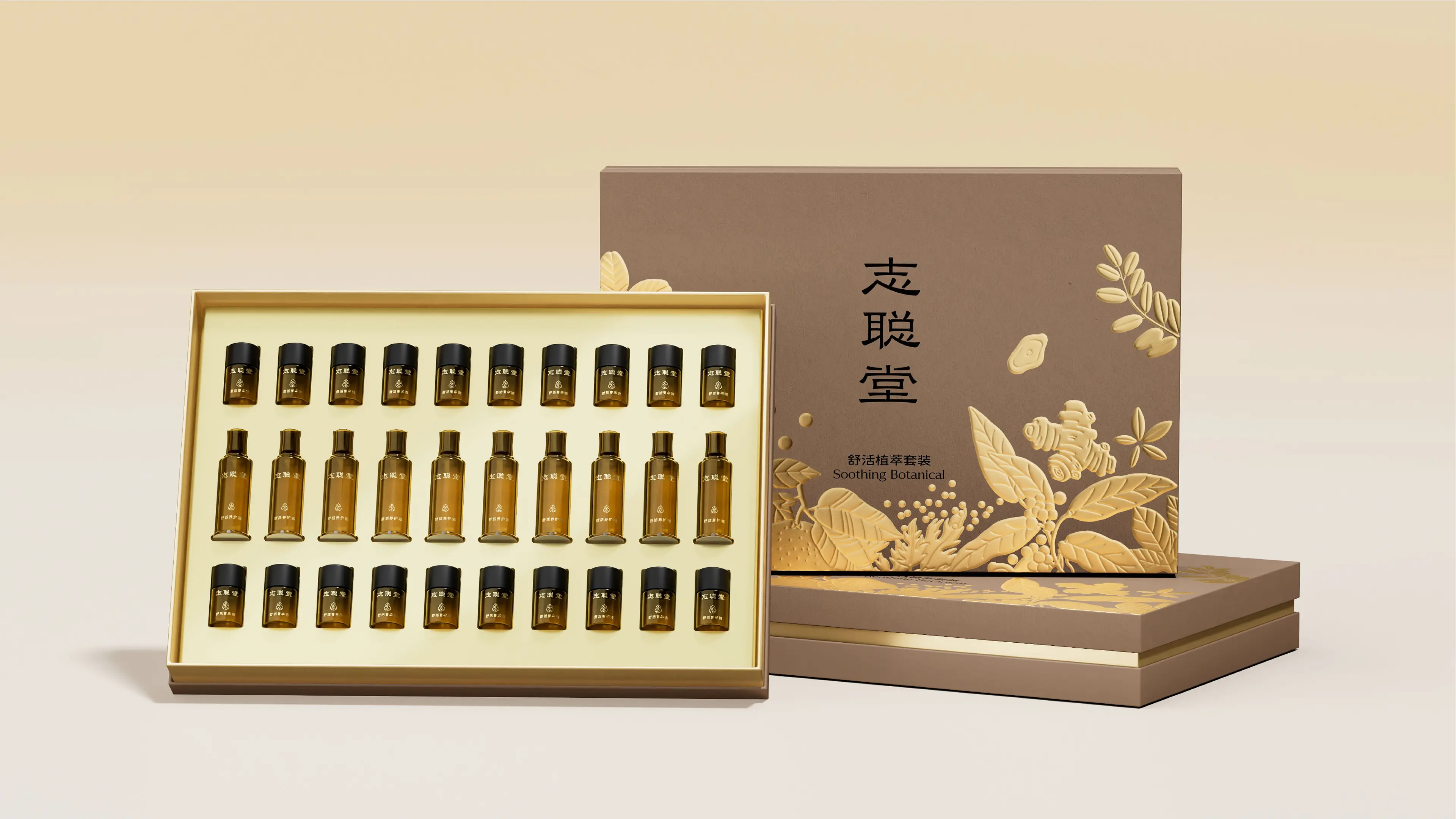
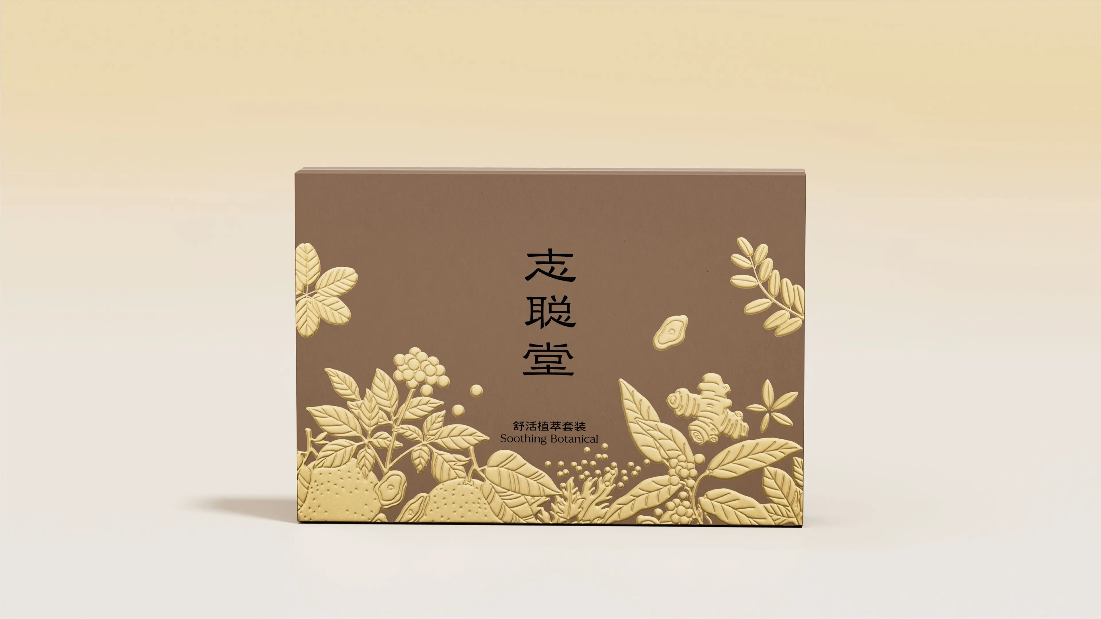
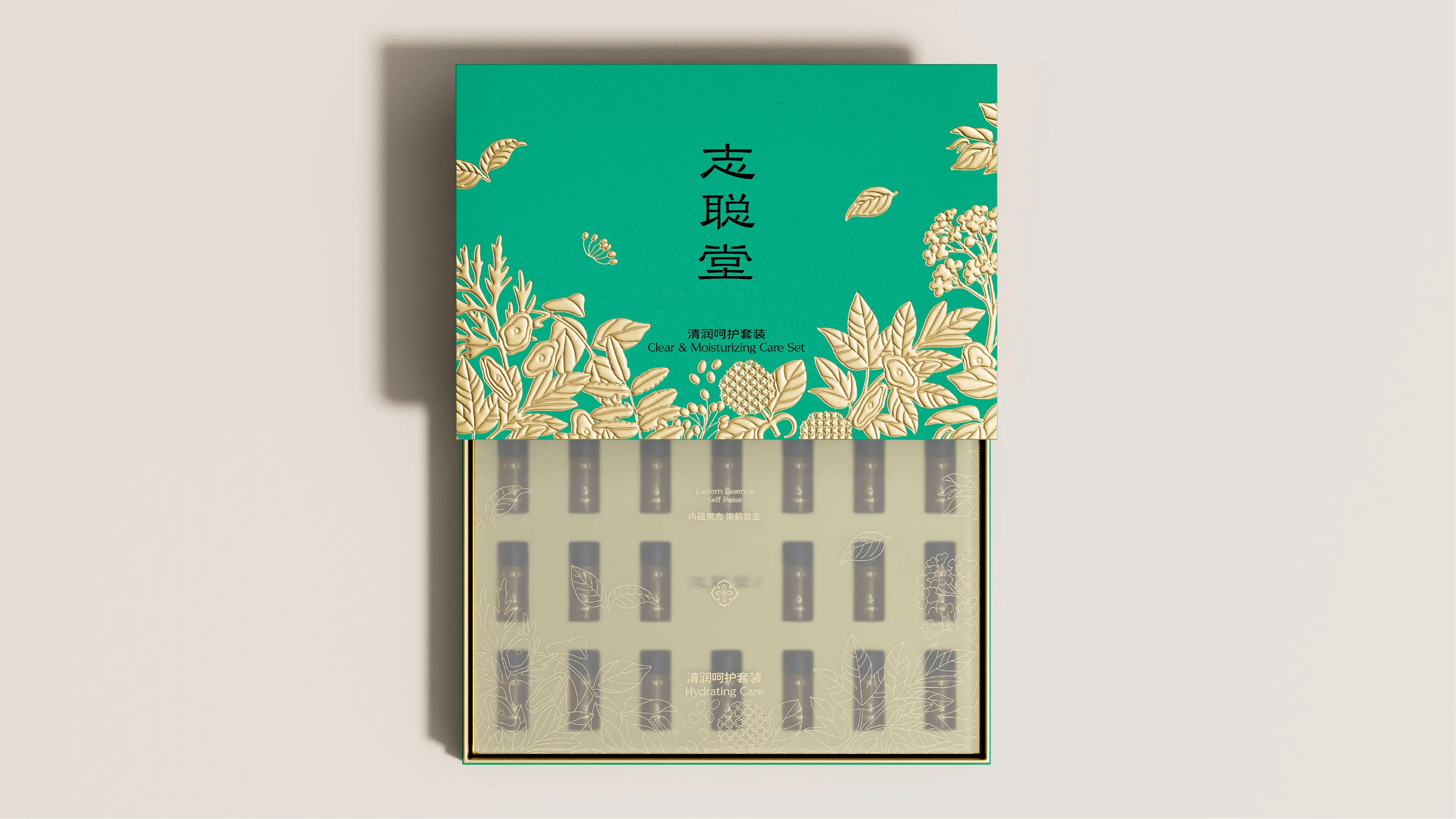
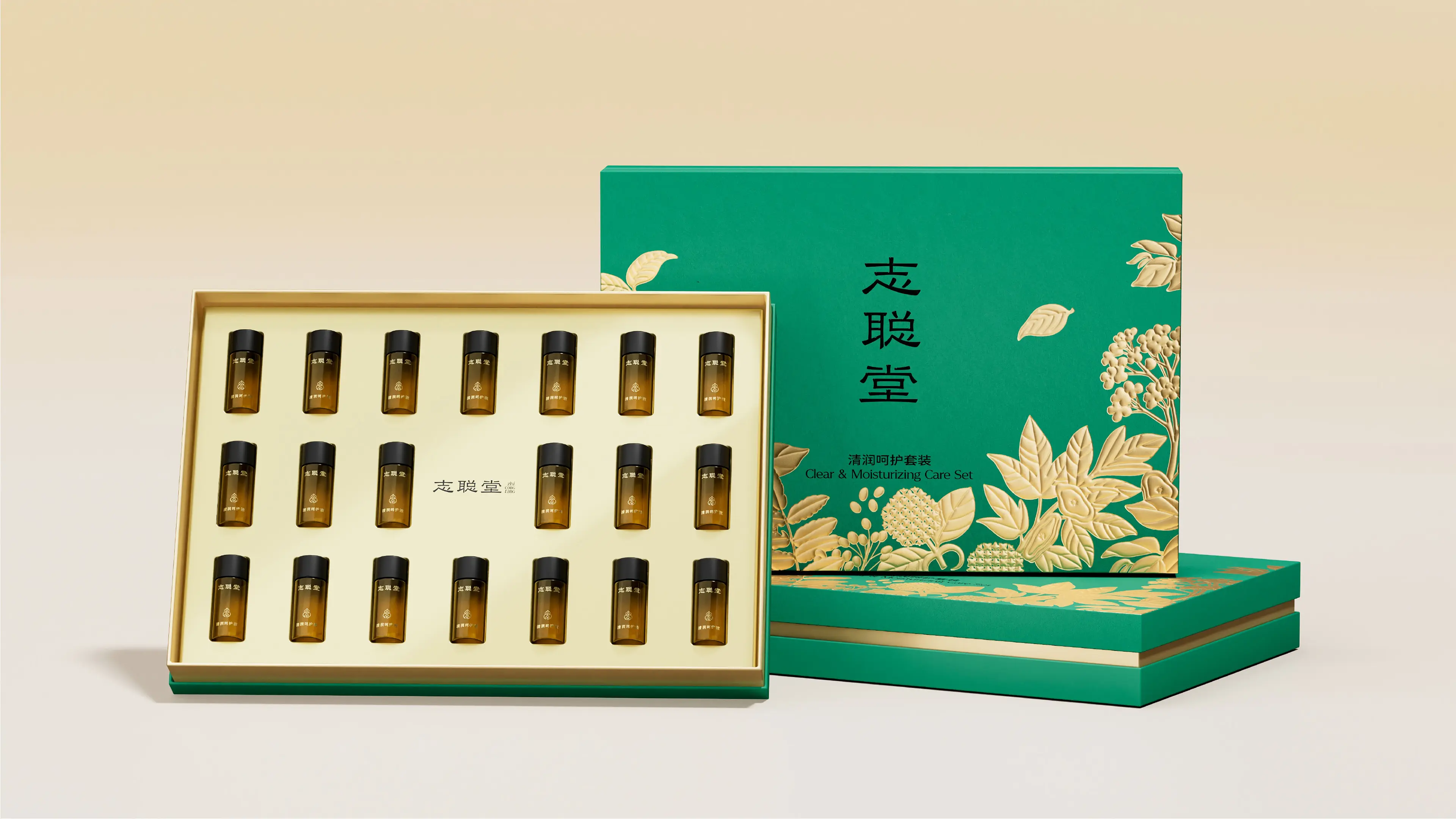
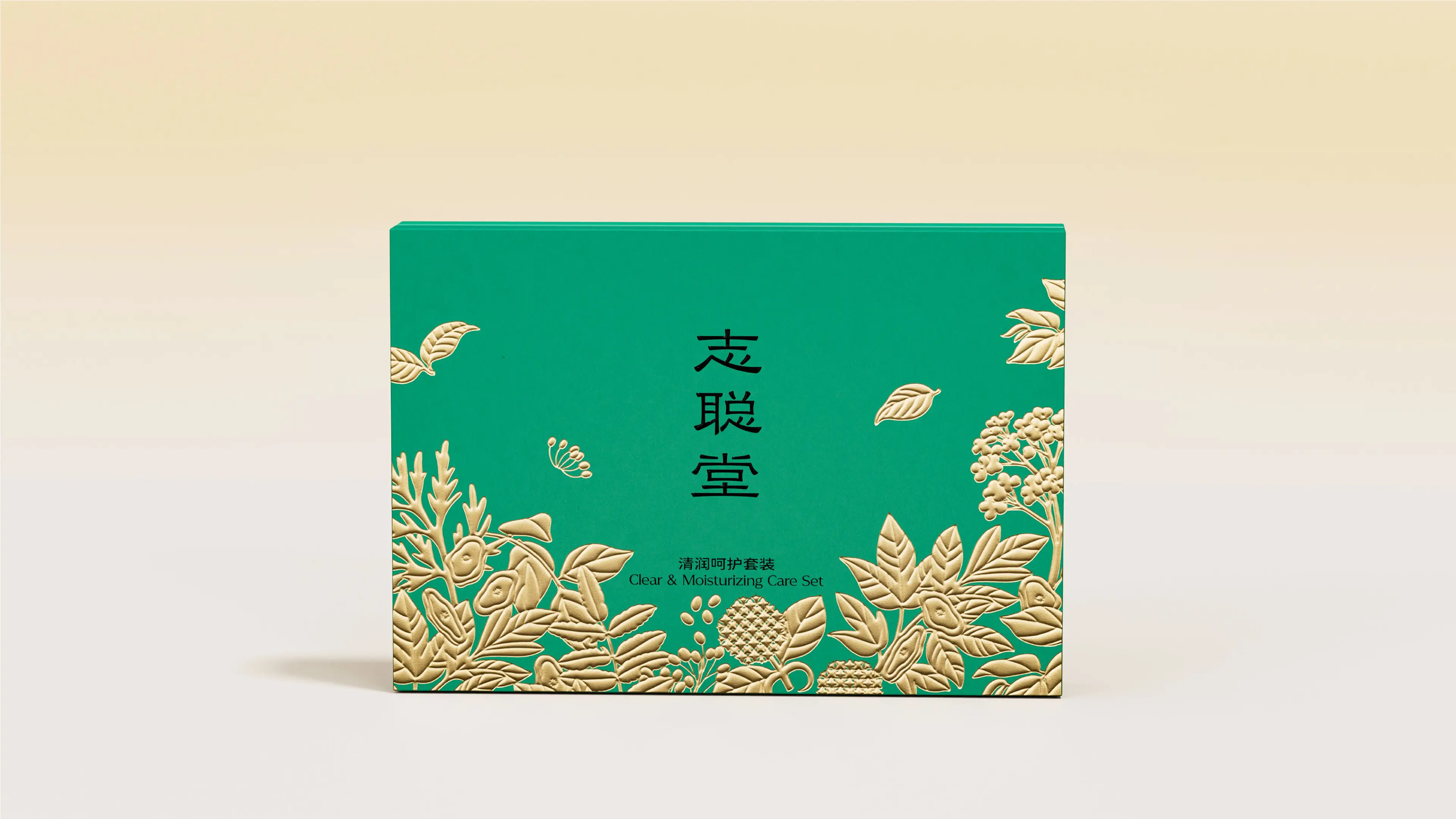
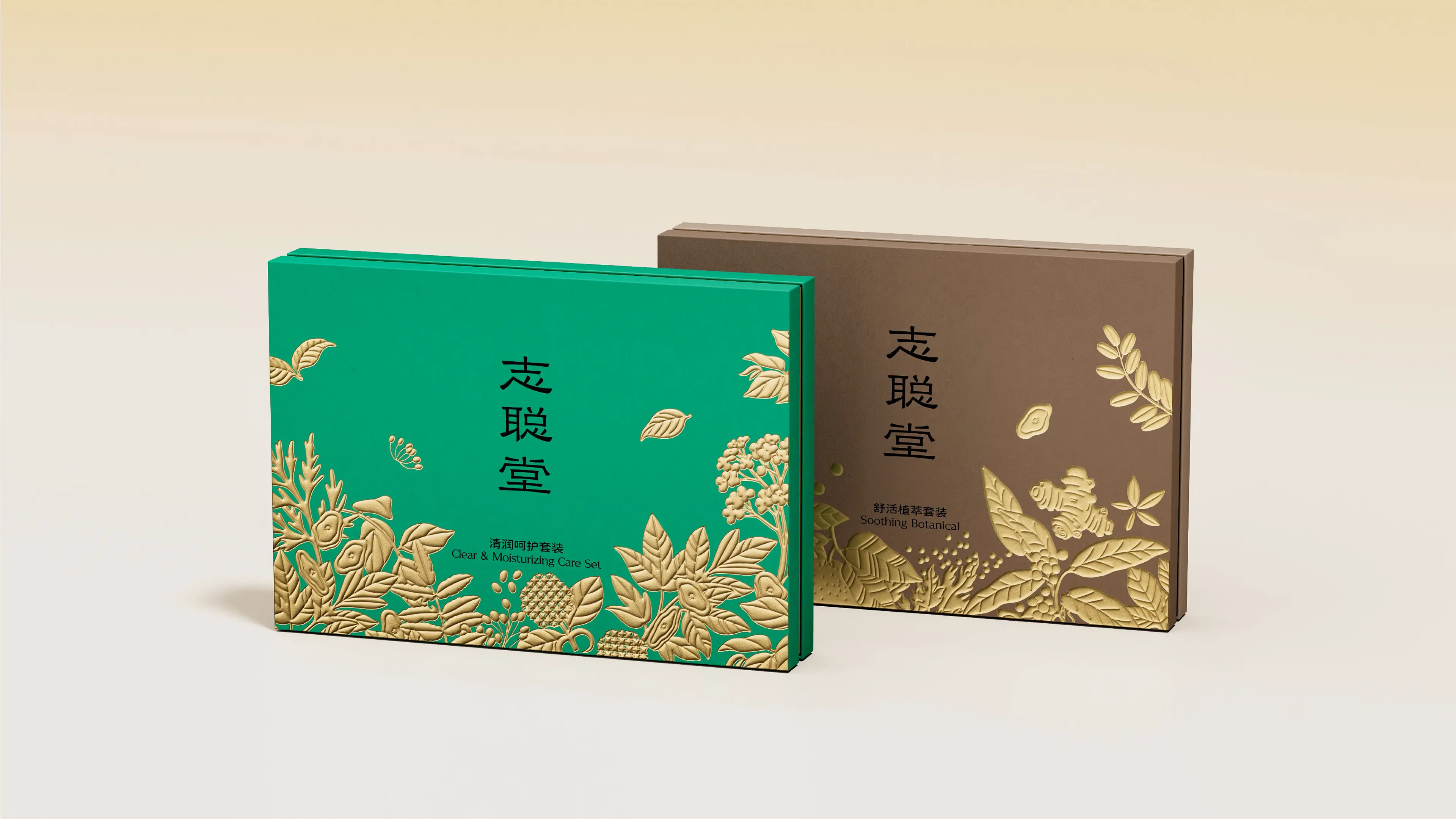
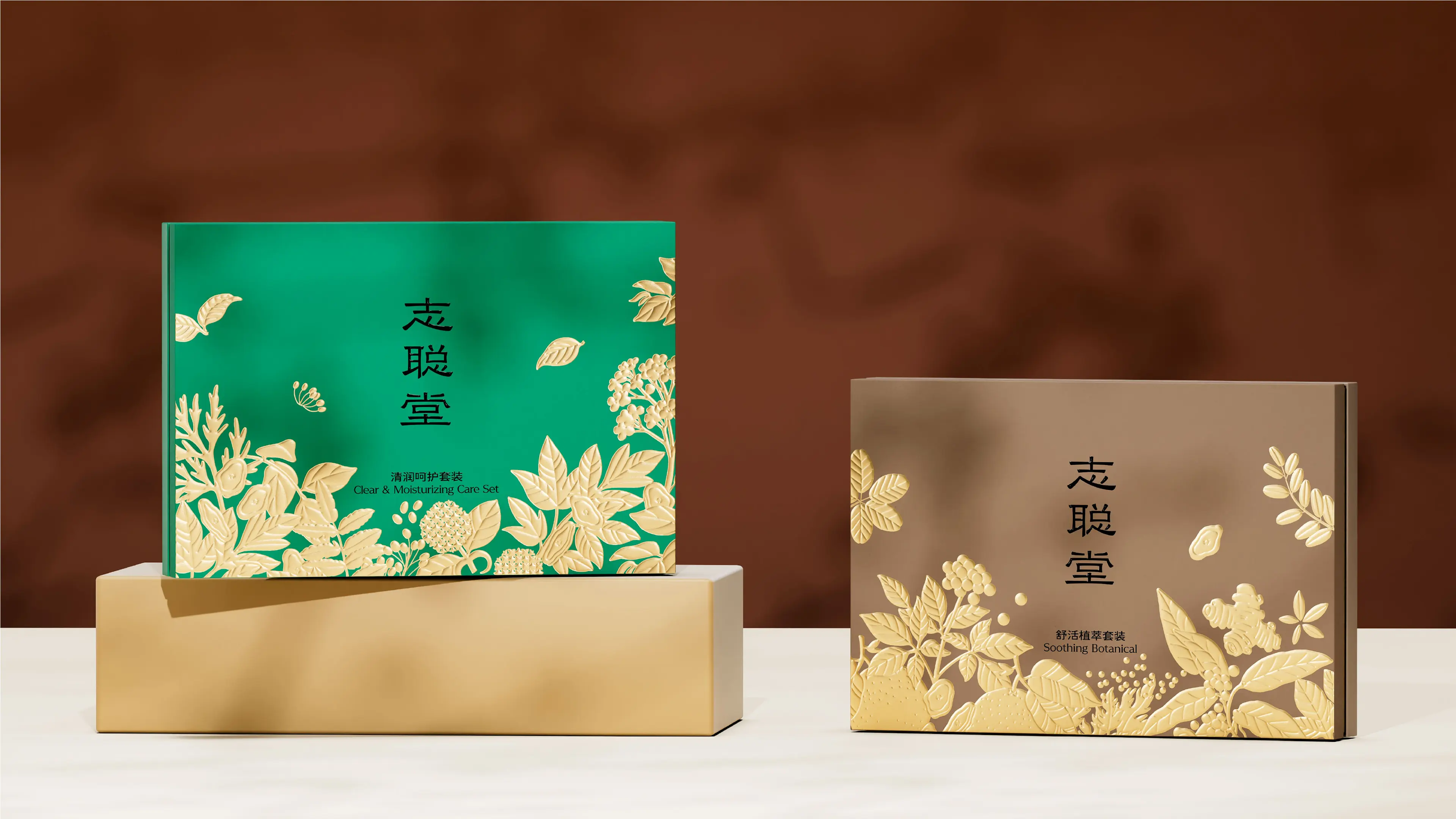
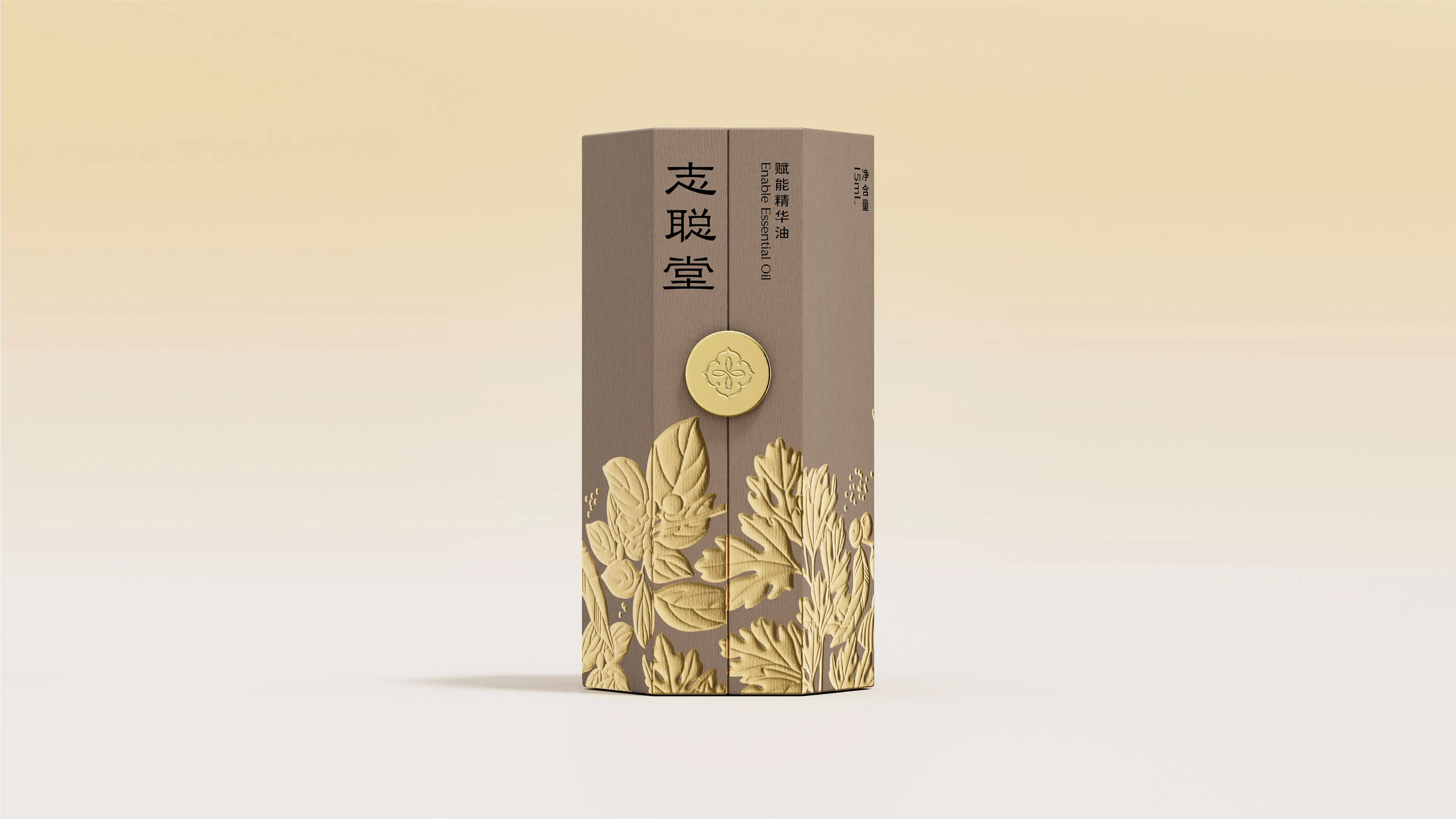
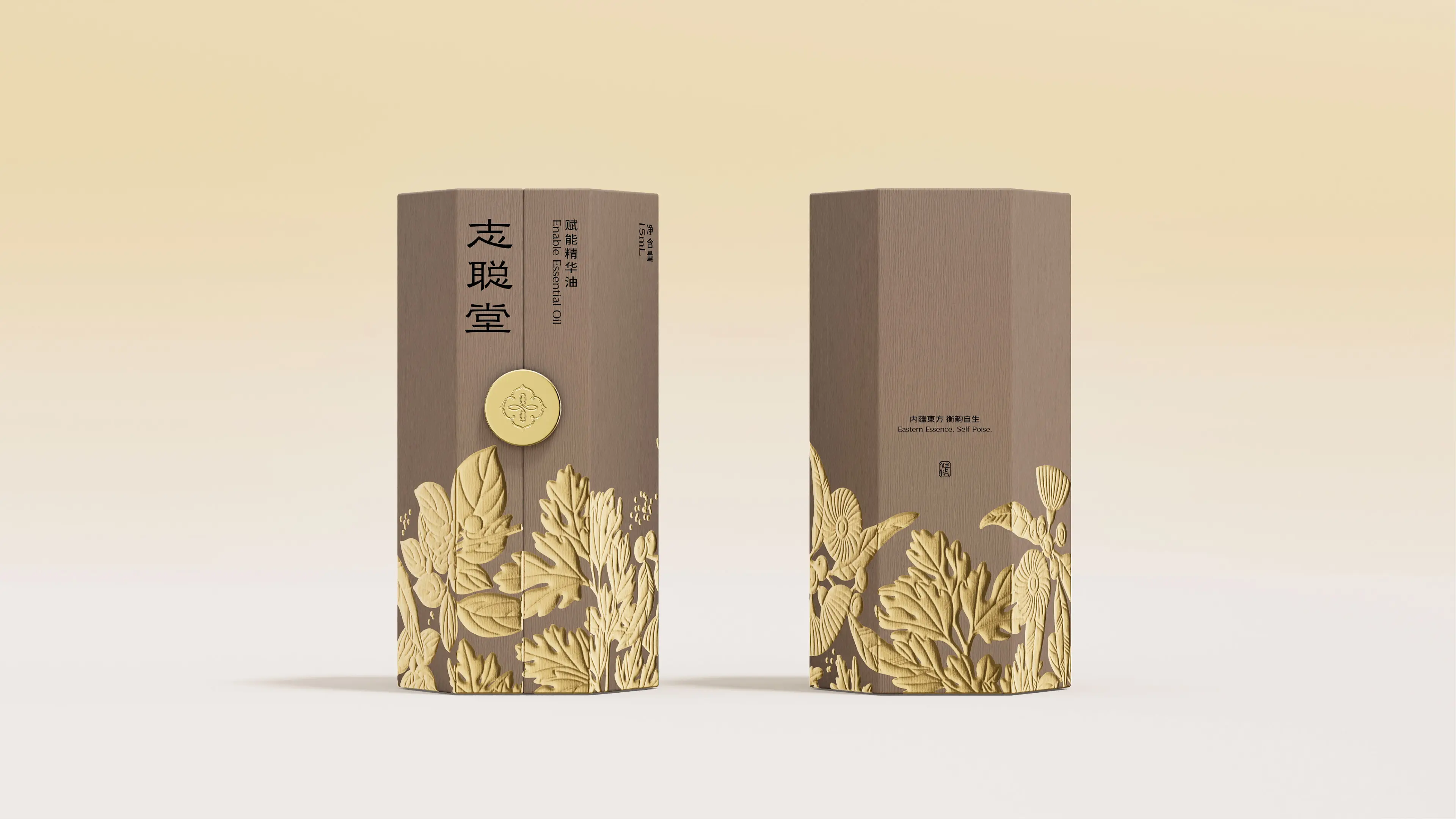
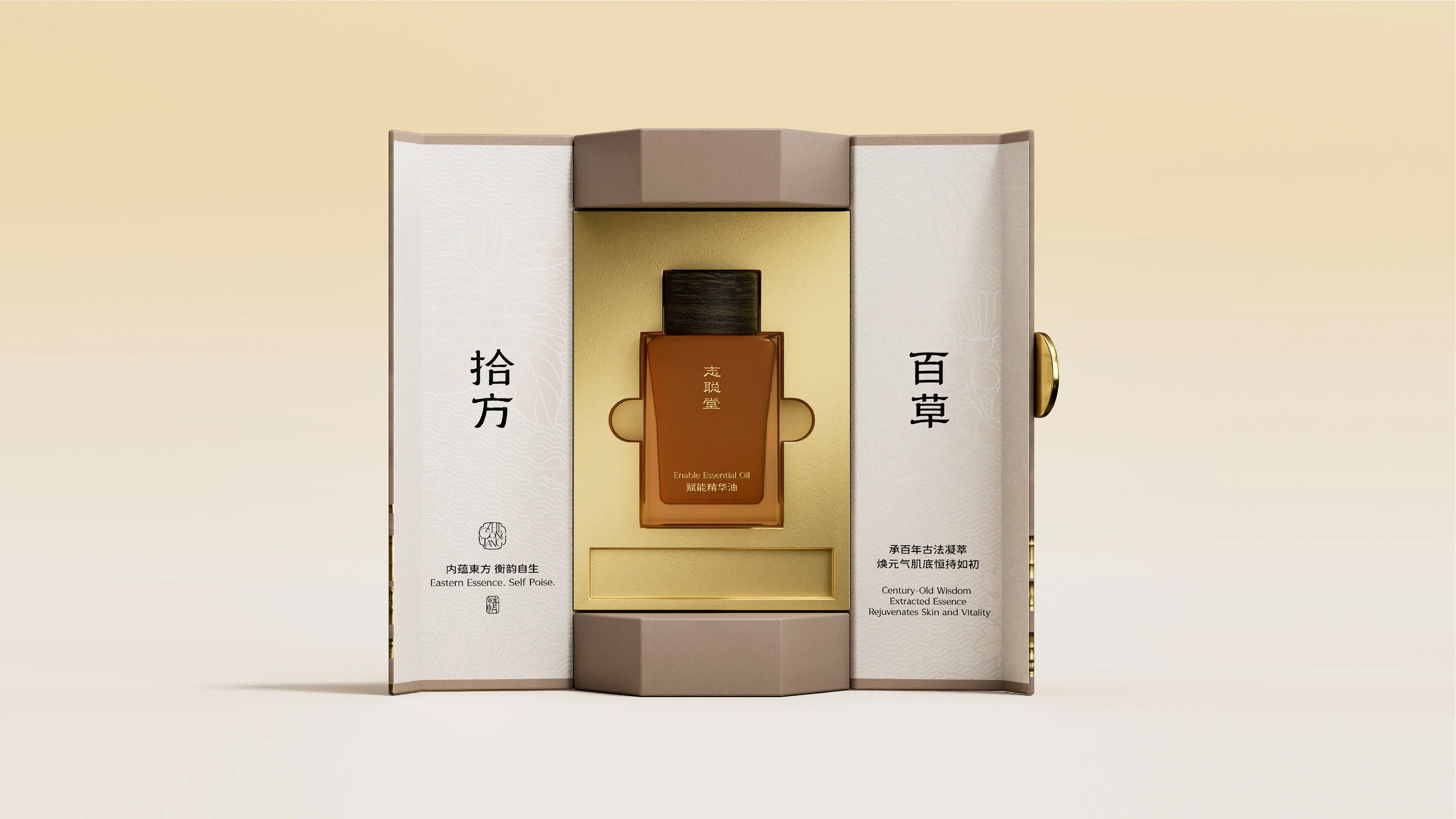
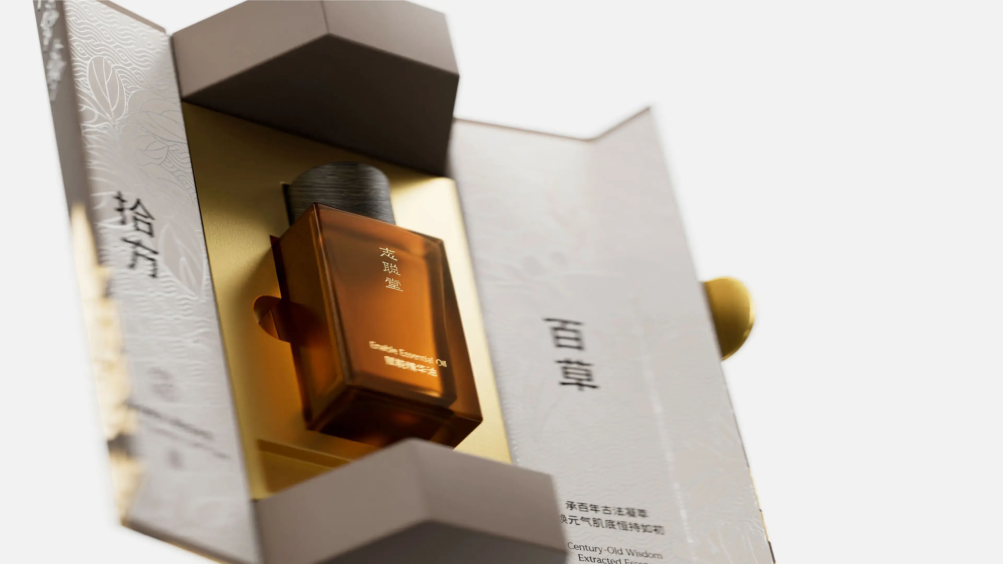
ZHICONGTANG originates from Shi’an Group and inherits the centuries-old medical tradition of Zhang Zhicong (1616–1674), a physician of the Ming and Qing dynasties. Rooted in a secret technique for resolving blood stasis and integrating natural plant extracts such as mugwort, the brand follows the conditioning logic of “unblock first, then tonify.” It focuses on addressing the constitutional problems of modern people characterized by deficiency, cold, dampness, and blood stasis, and upholds the wellness philosophy of “three parts treatment, seven parts nourishment.” Committed to the mission of “with the heart of ancient sages, impart the way of wellness,” the brand provides professional conditioning solutions for mid-to-high-end wellness institutions through a rigorous system of syndrome differentiation and treatment.
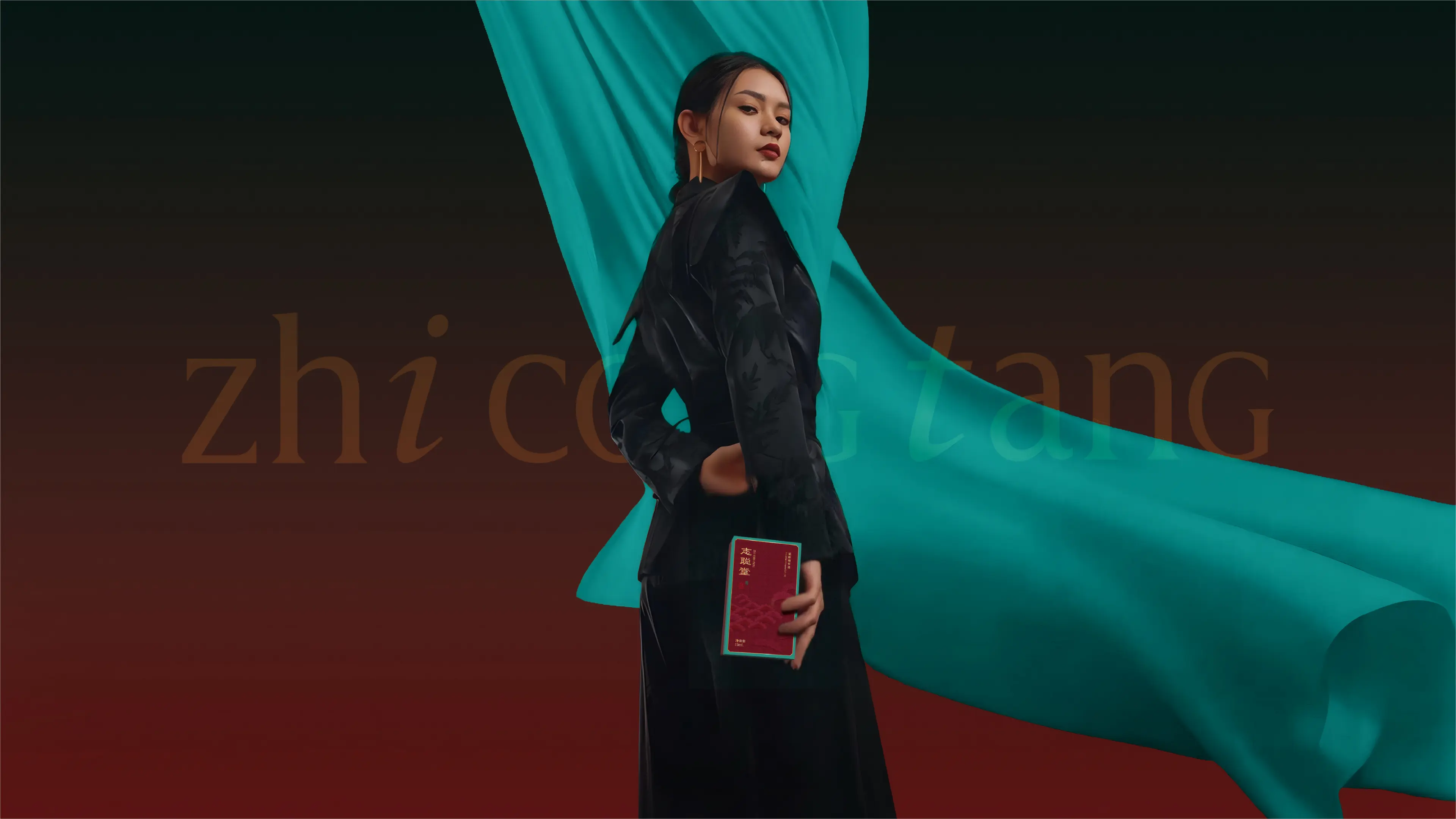
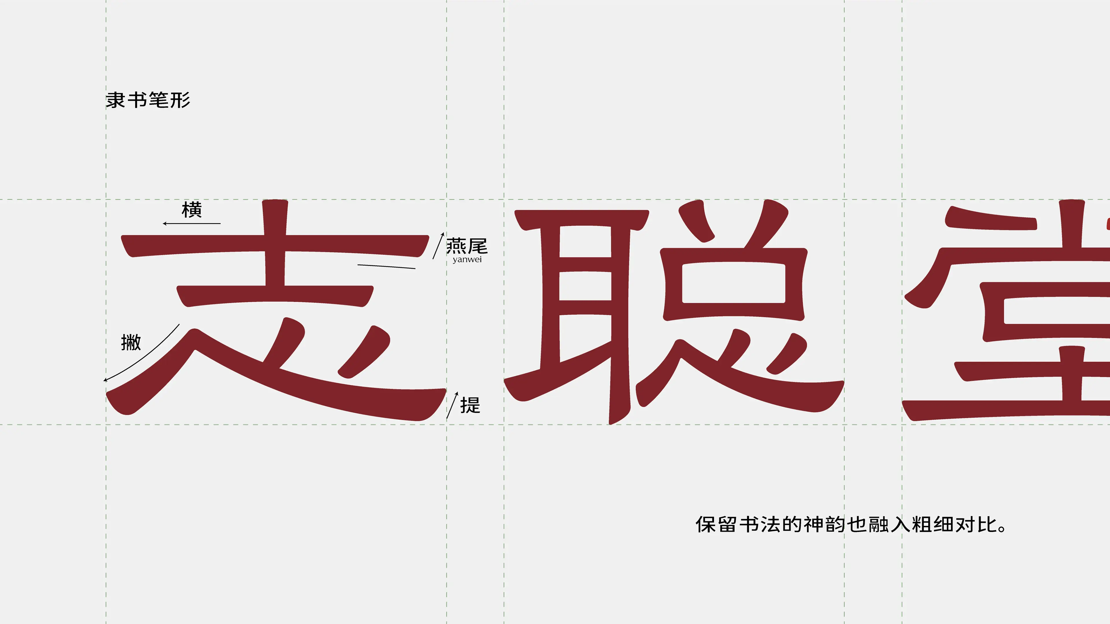
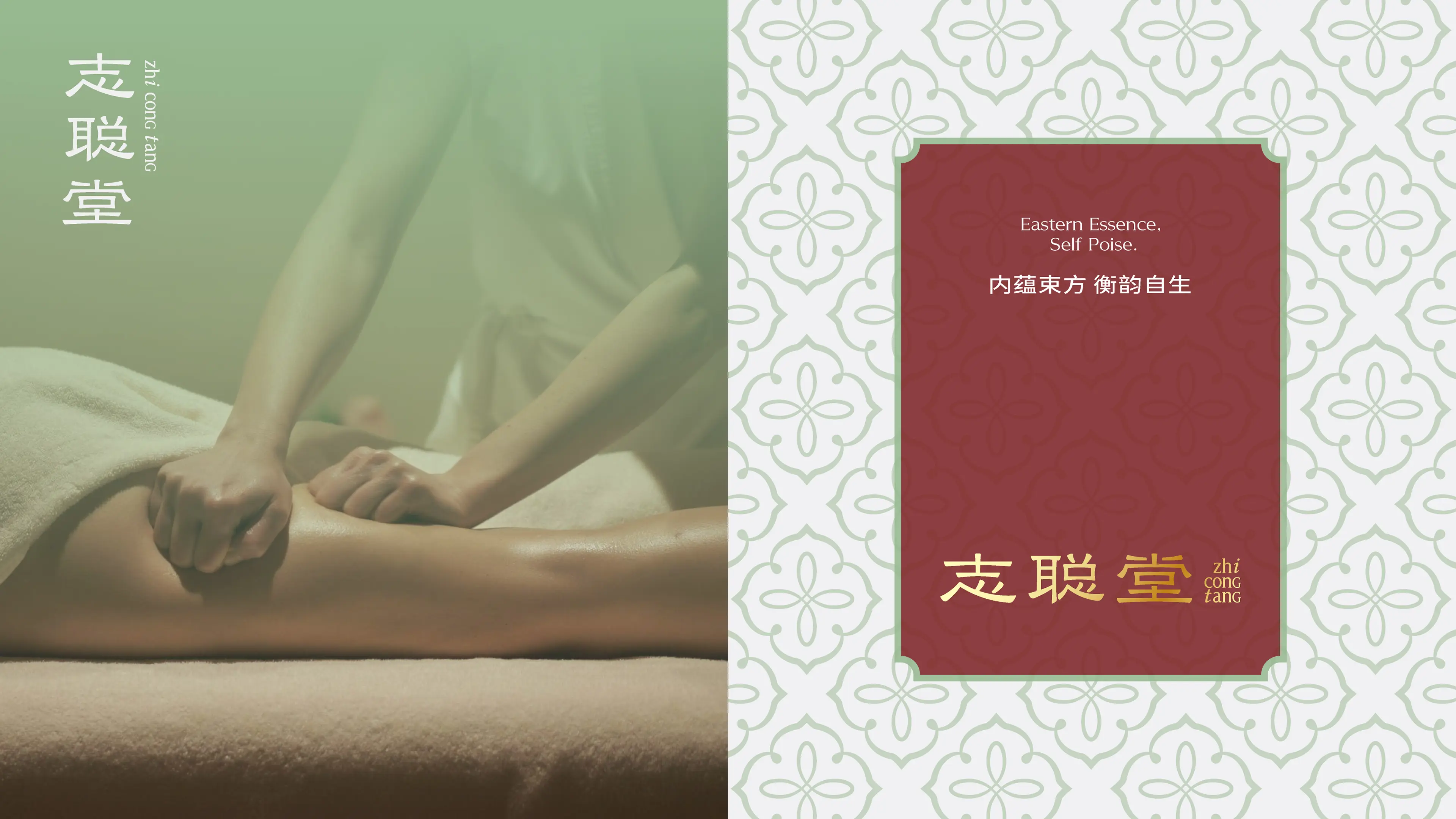
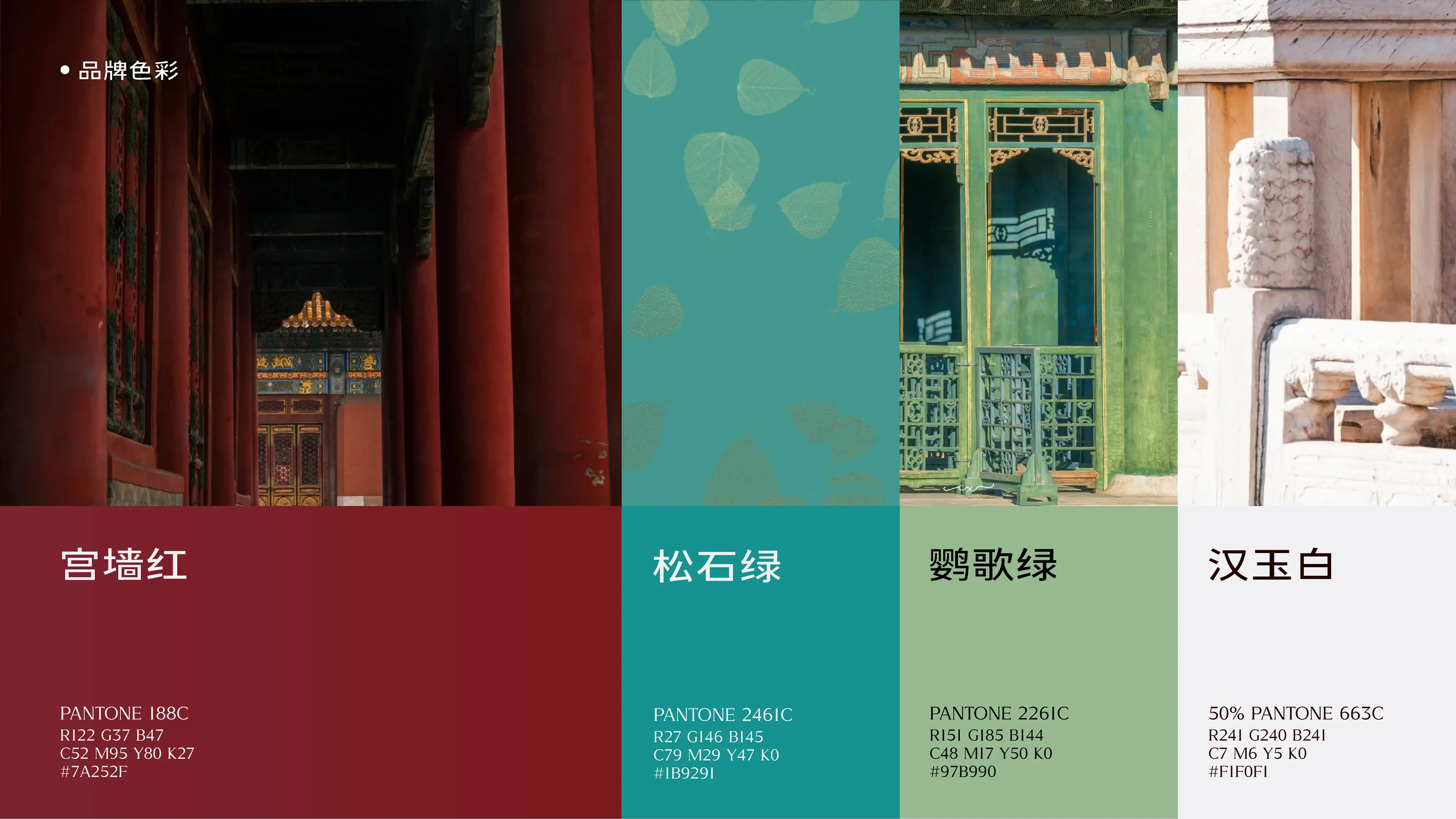
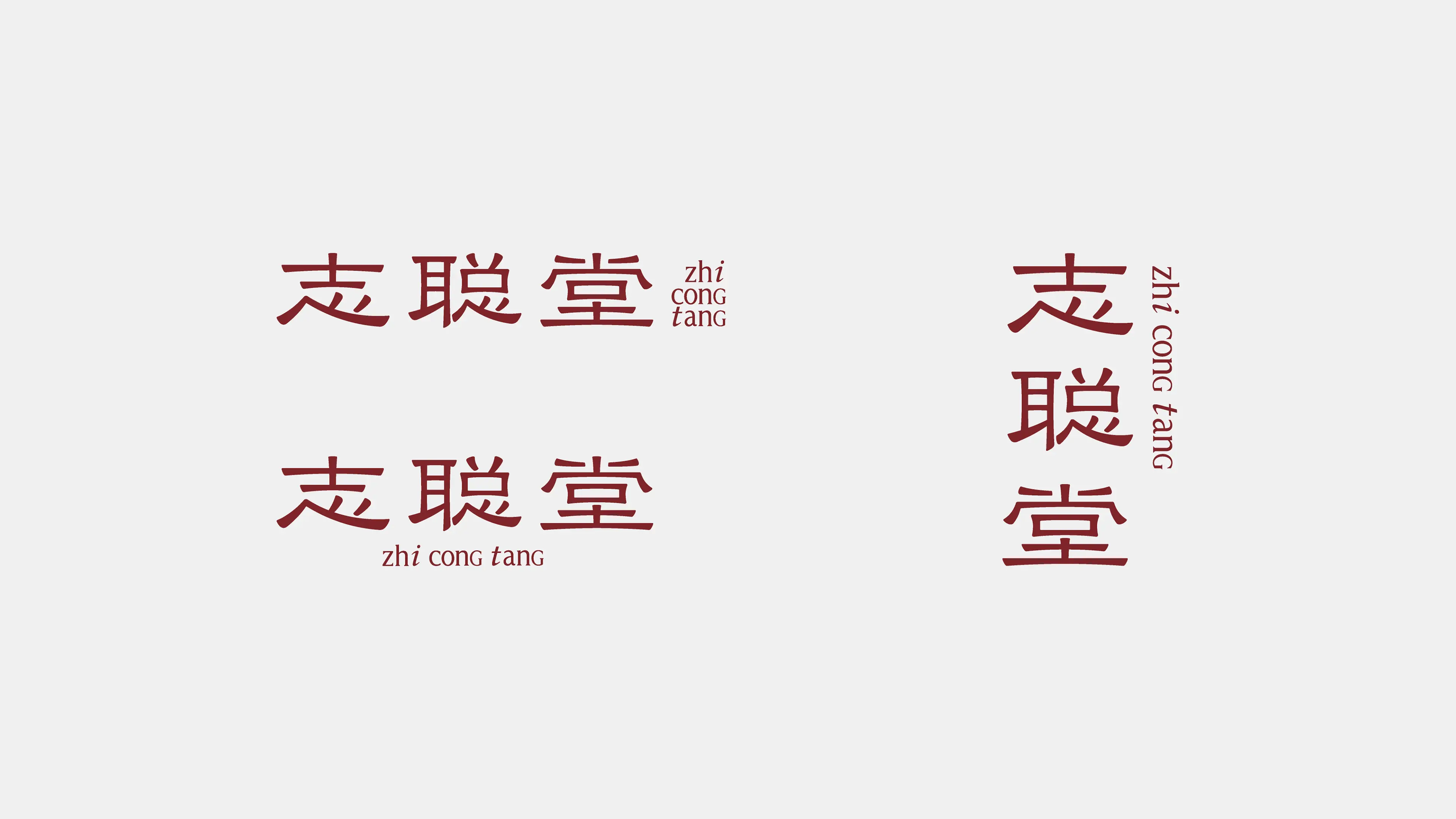
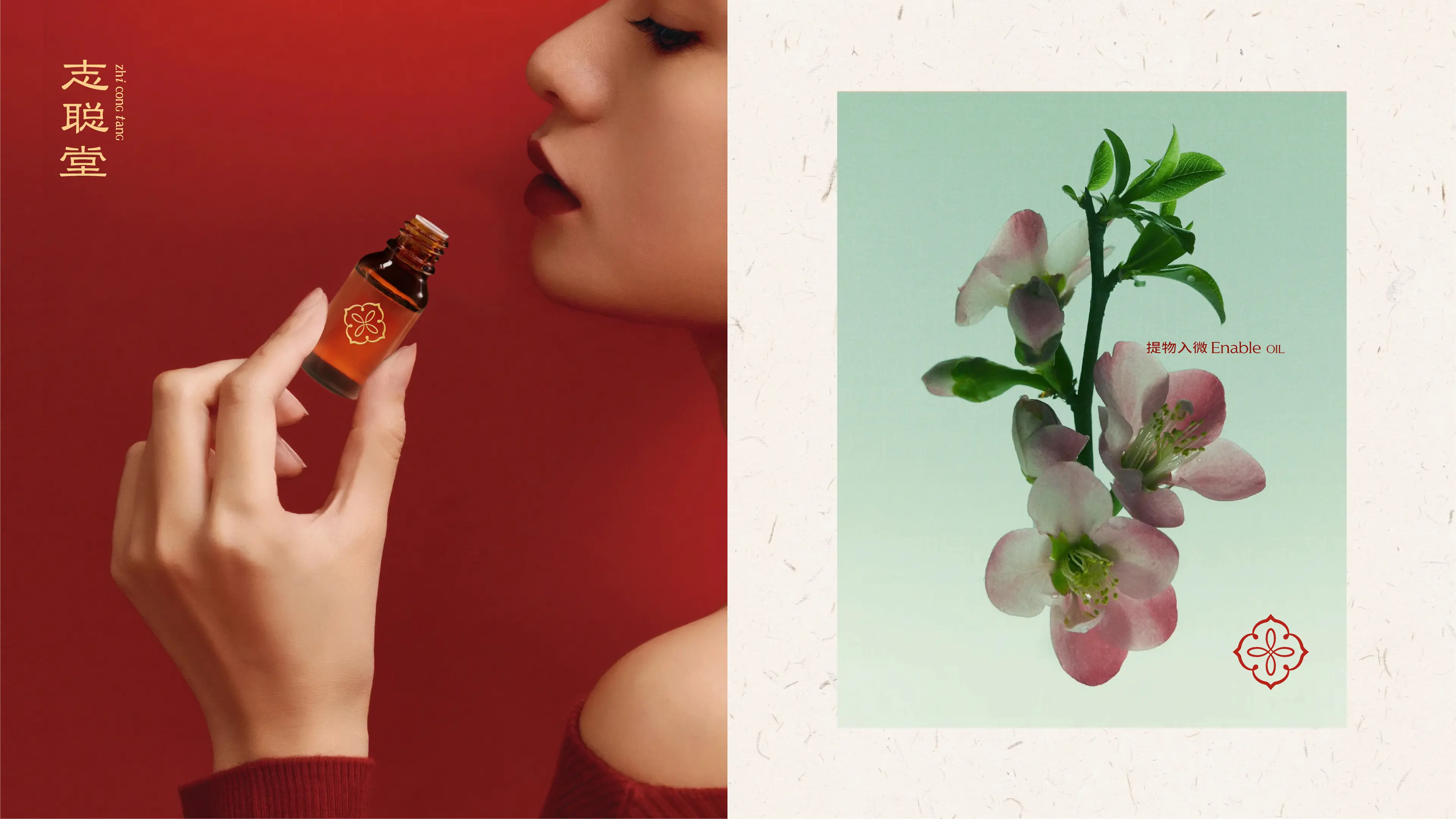
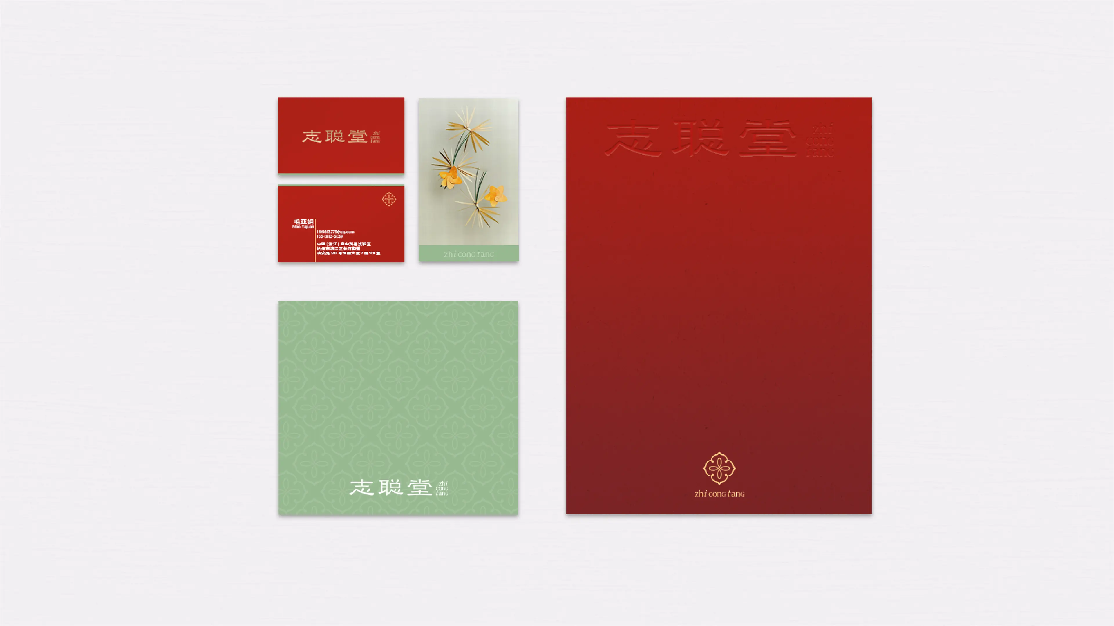
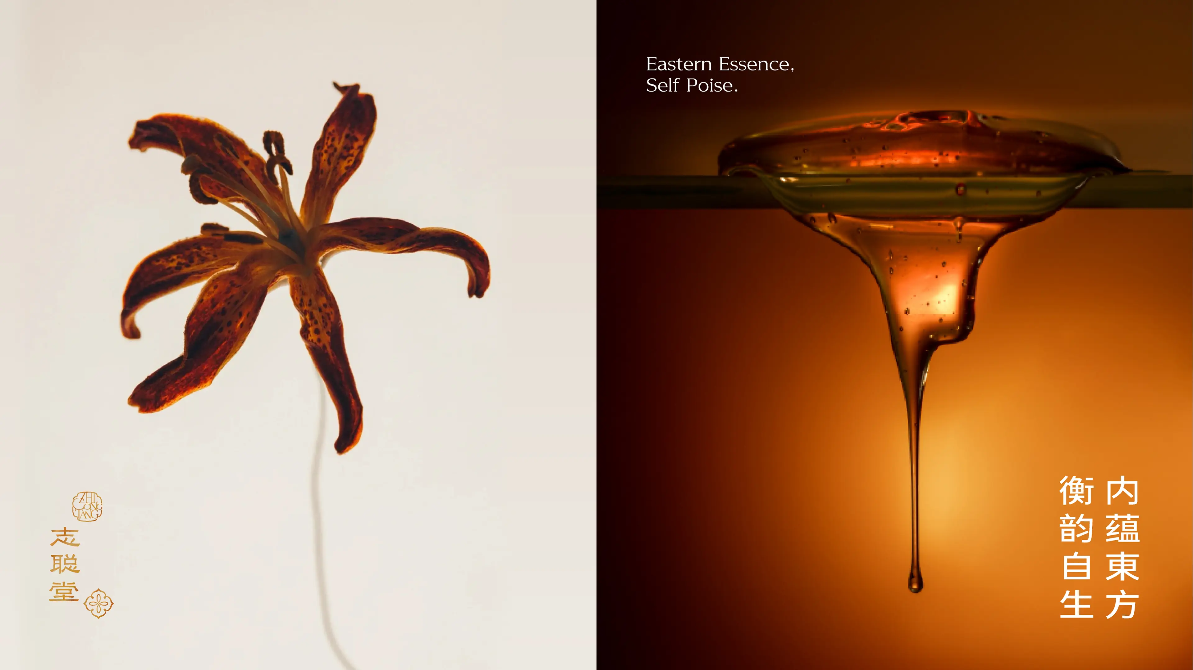
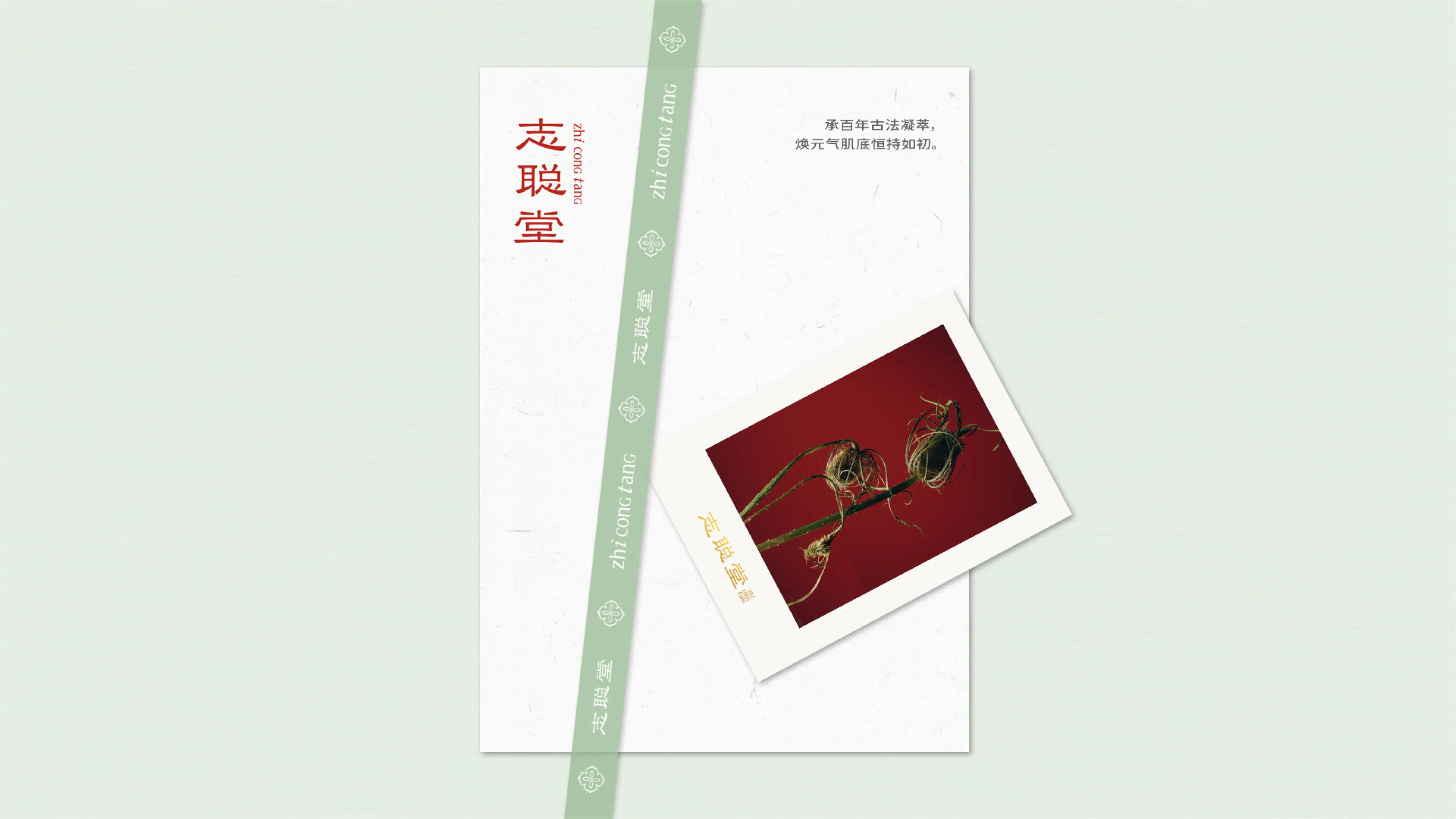
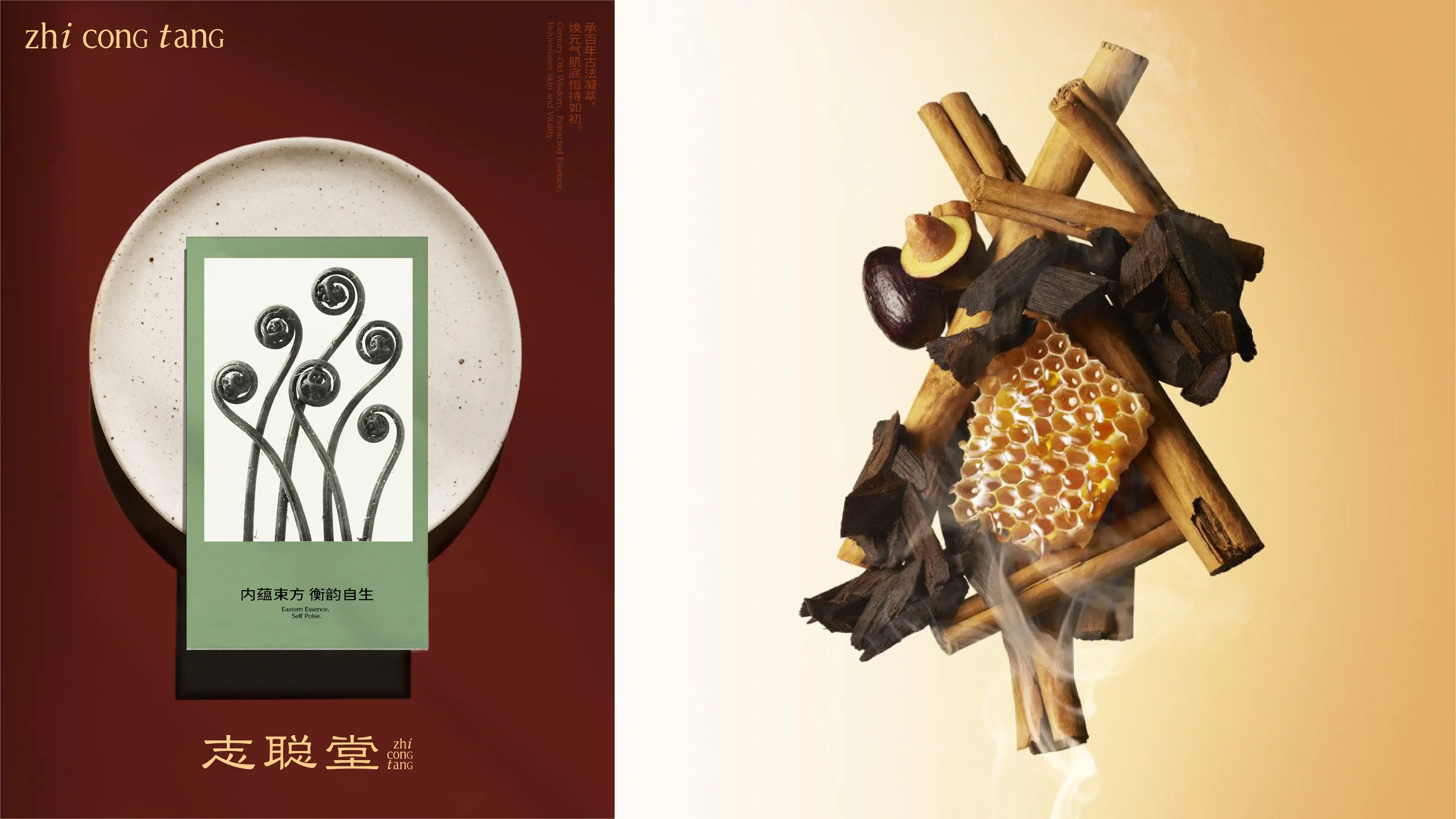
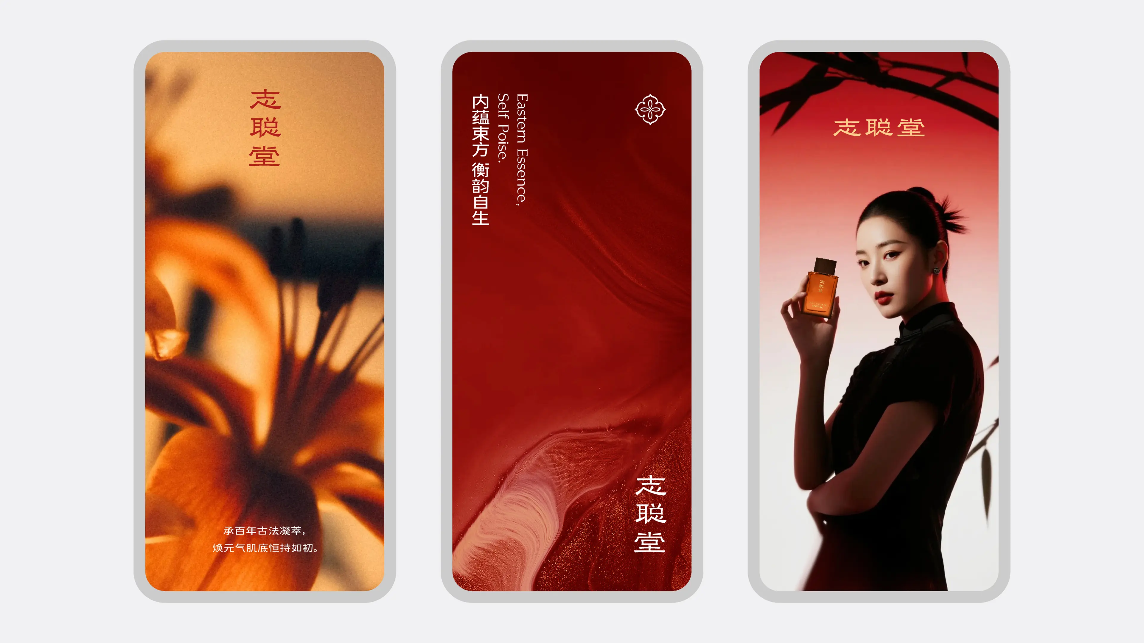
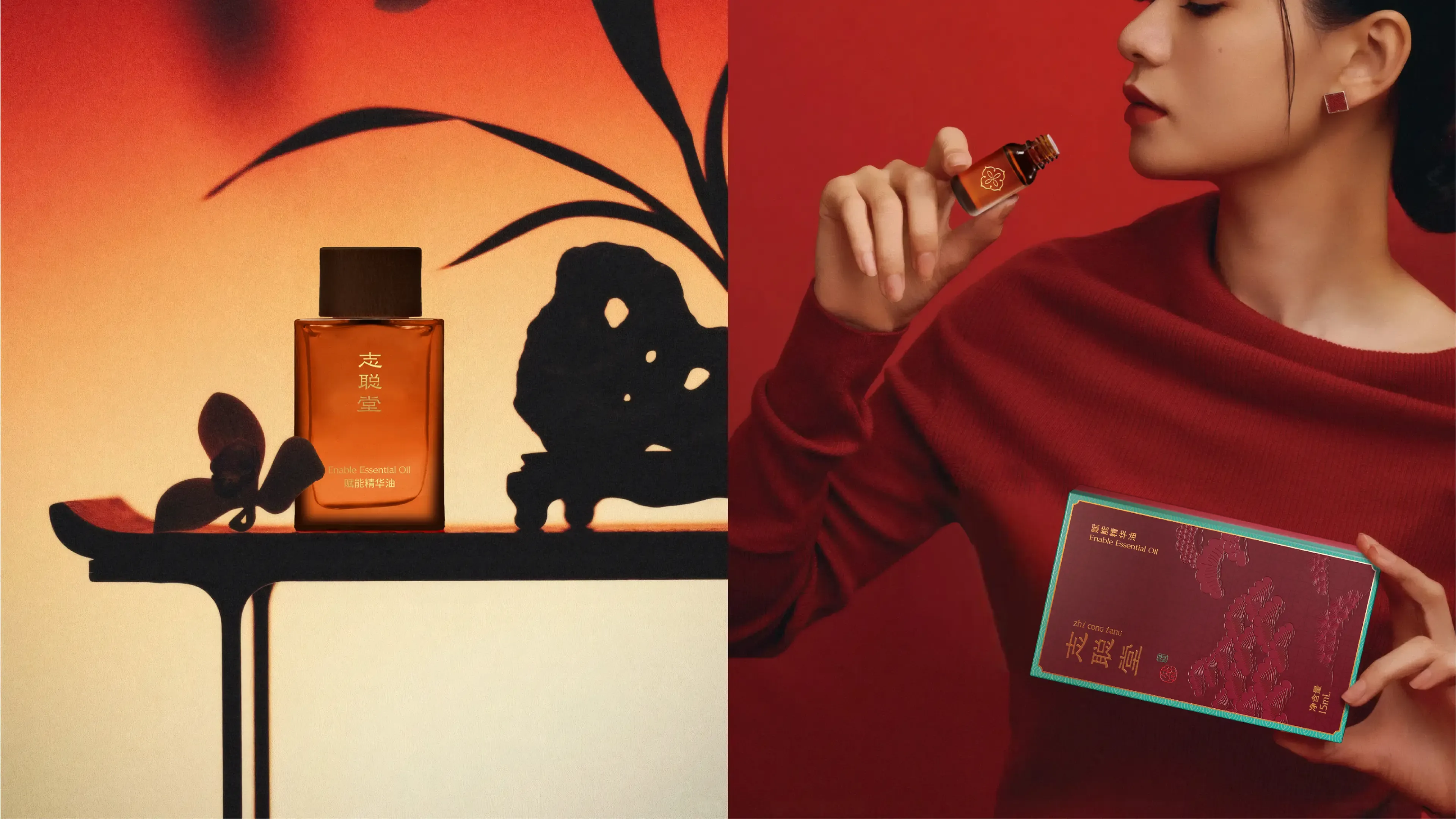
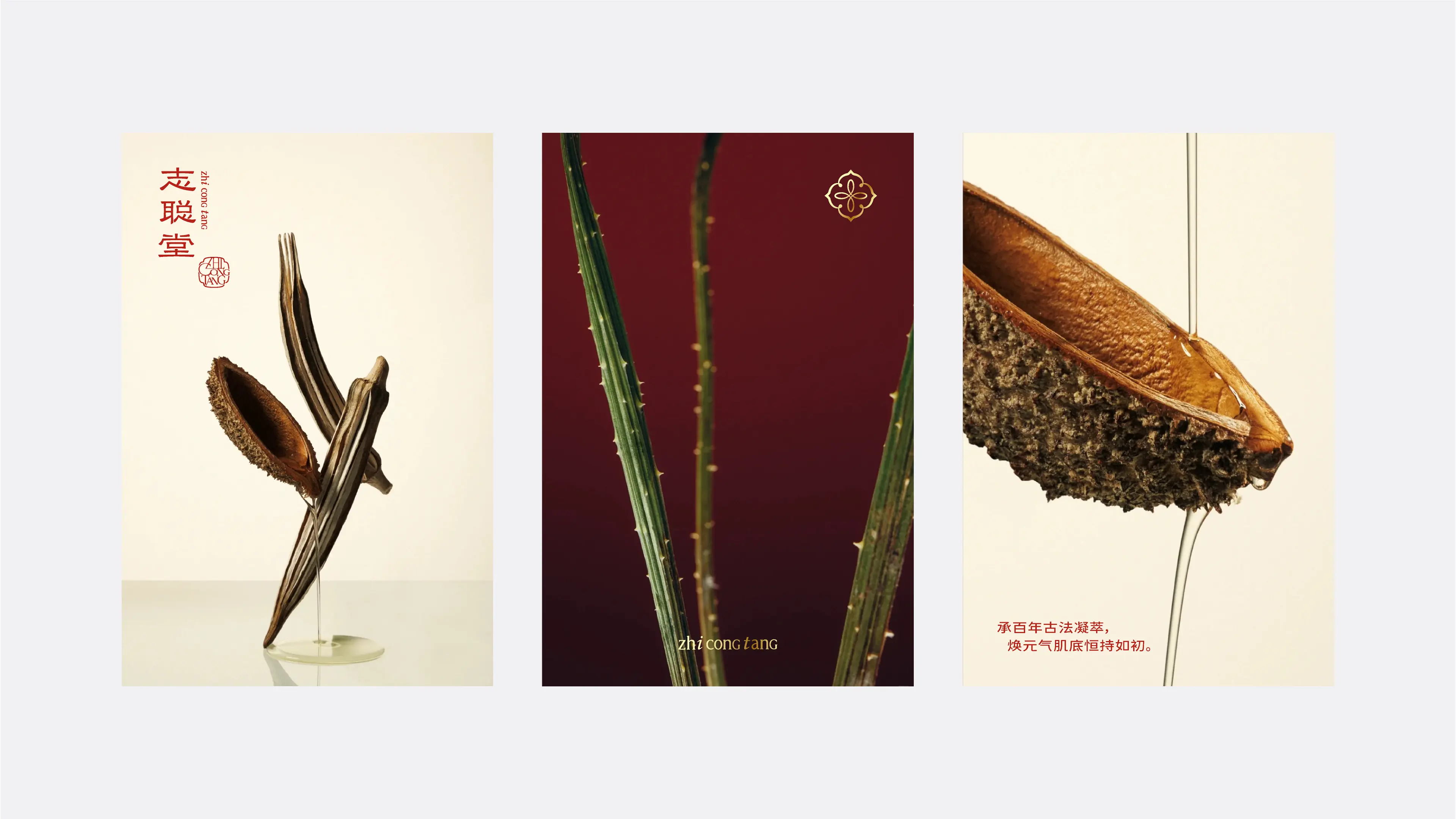
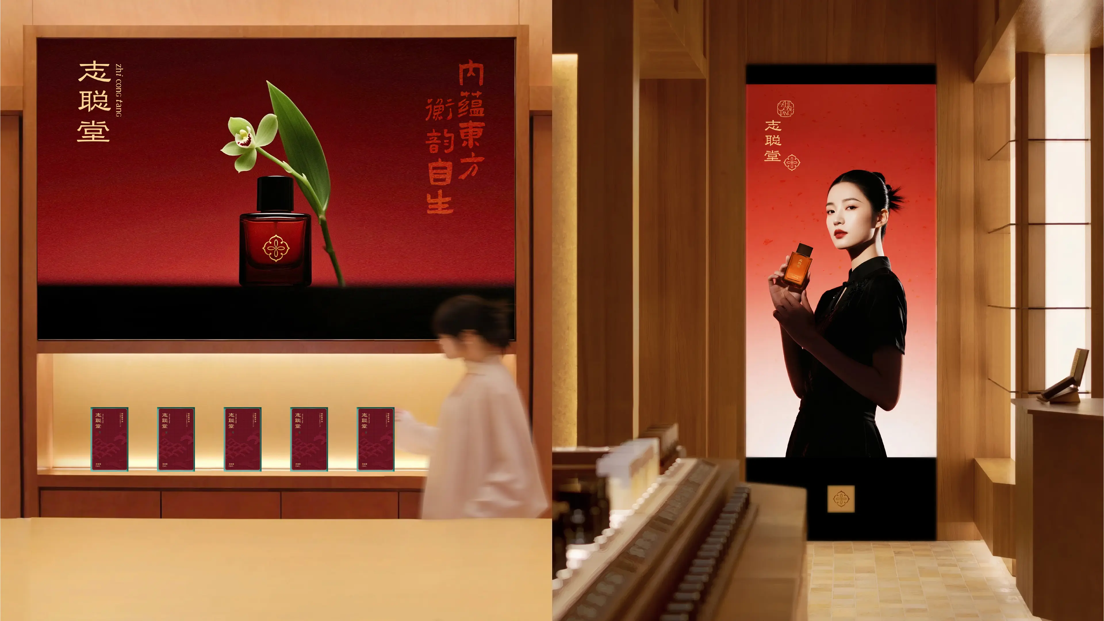
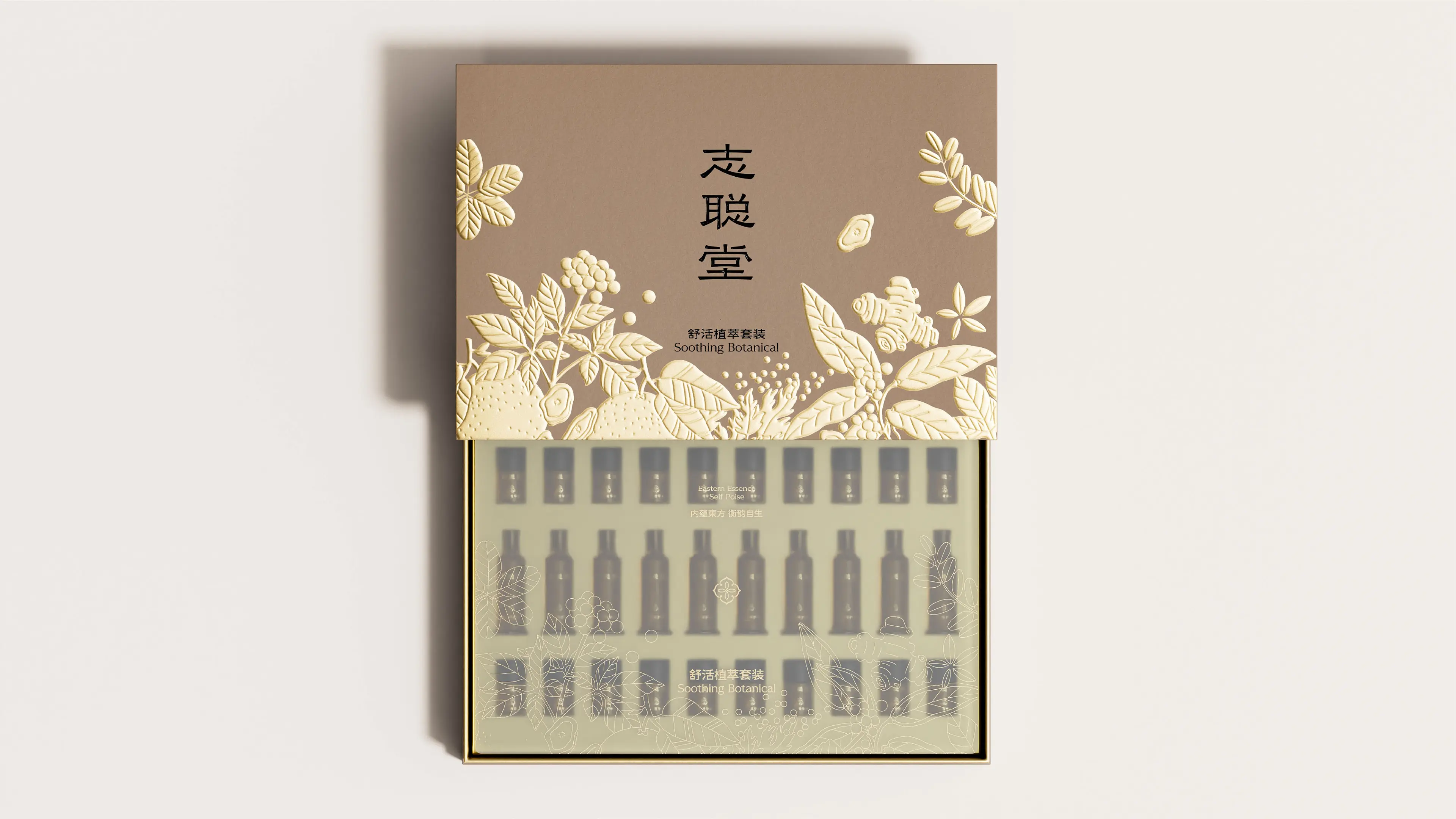
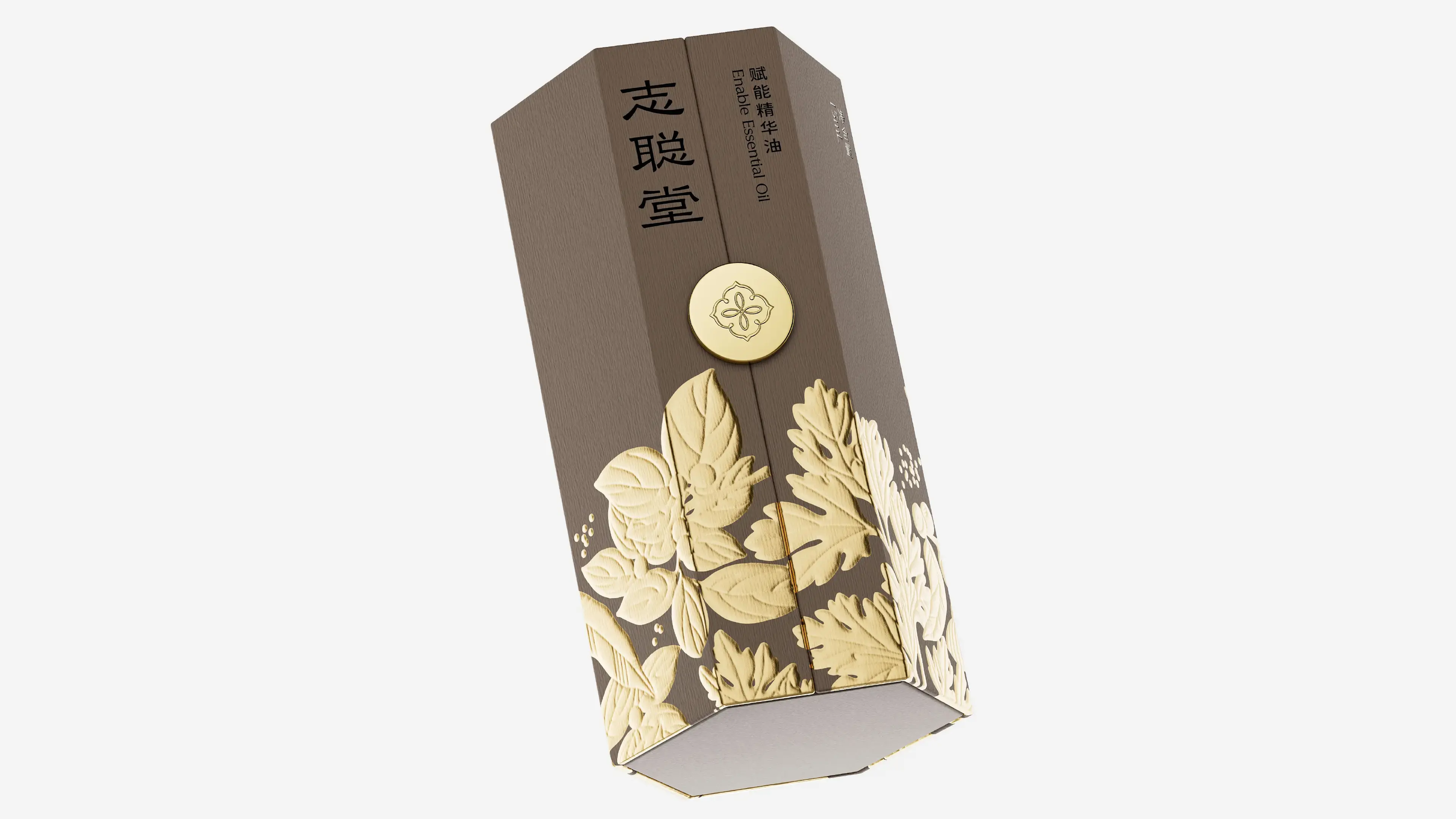
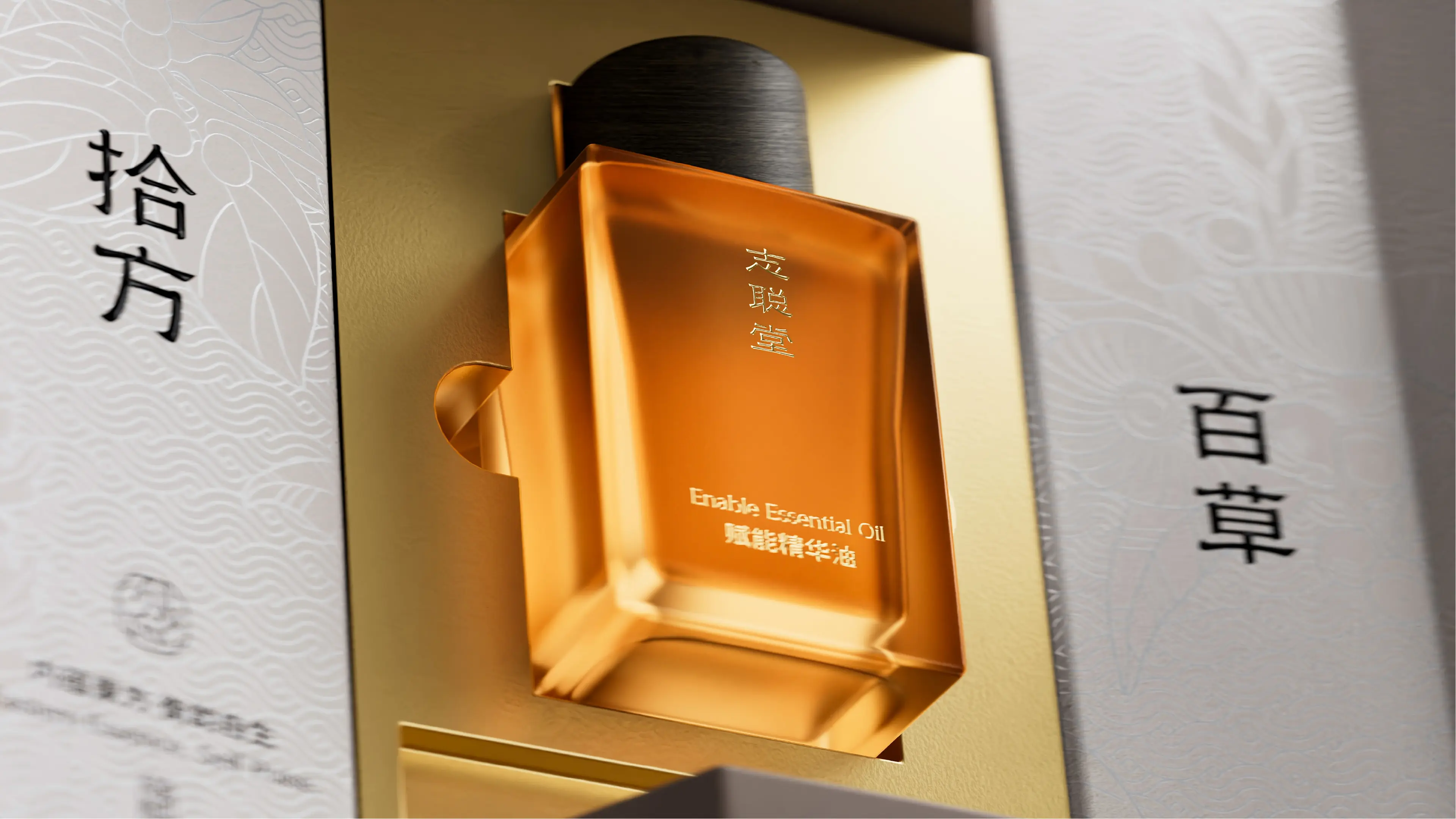
The core objective of this project was to help the brand establish a differentiated visual identity system with traditional Chinese medicine cultural heritage in the essence oil market. Taking “Eastern wisdom as the brush, natural energy as the ink” as the design concept, we established the design direction of “TCM heritage + modern aesthetics.” At the visual level, the team deeply explored the brand’s 400-year TCM cultural DNA and translated core TCM concepts such as the secret technique for resolving blood stasis and “unblock first, then tonify” into visual language. The overall packaging presents a visual style that combines cultural depth with modern quality, enabling the product to establish unique brand recognition on shelves and e-commerce pages. Through this brand visual design system combining cultural heritage, recognition efficiency, and professional tonality, ZHICONGTANG has successfully upgraded from a traditional TCM wellness brand to a modern constitution conditioning brand with clear brand positioning, complete visual identity, and Eastern cultural DNA.