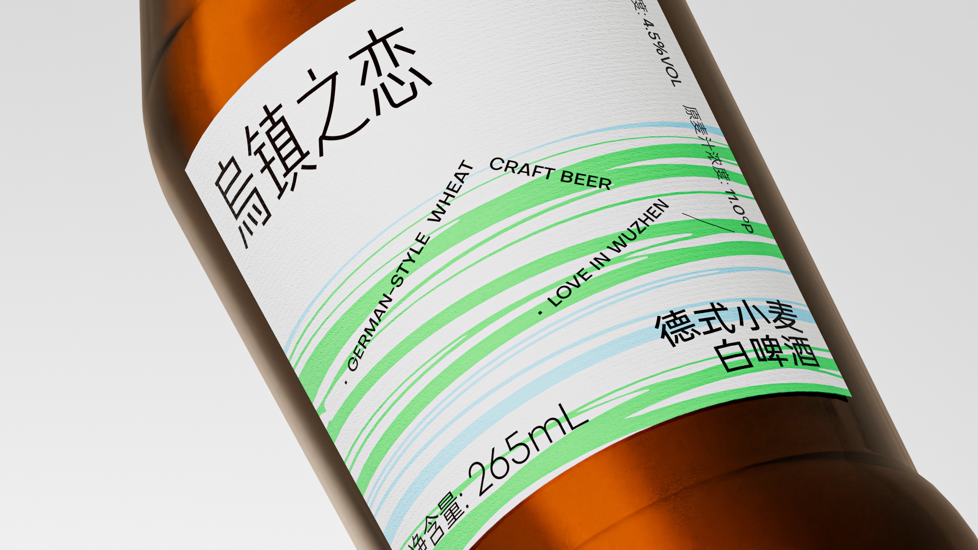
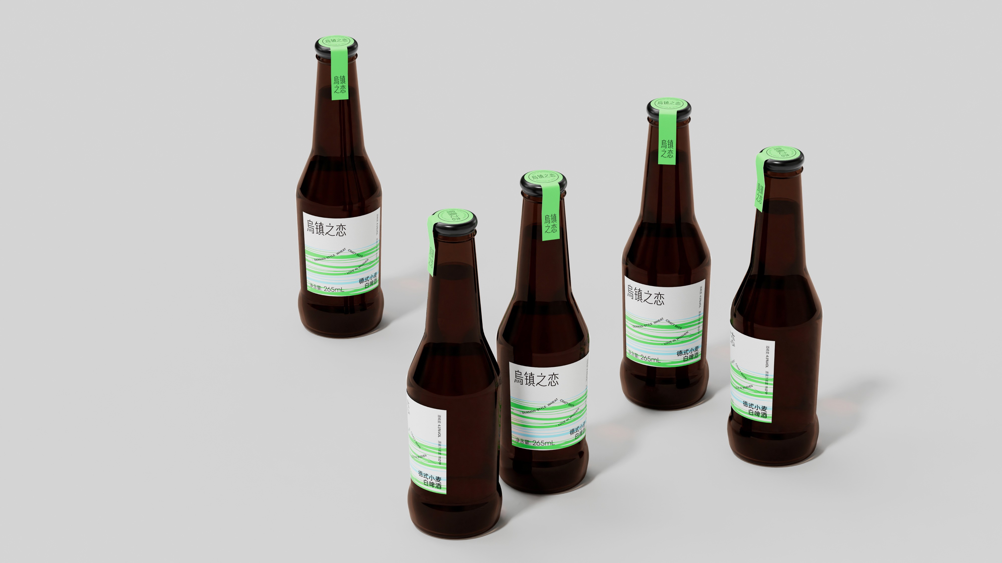
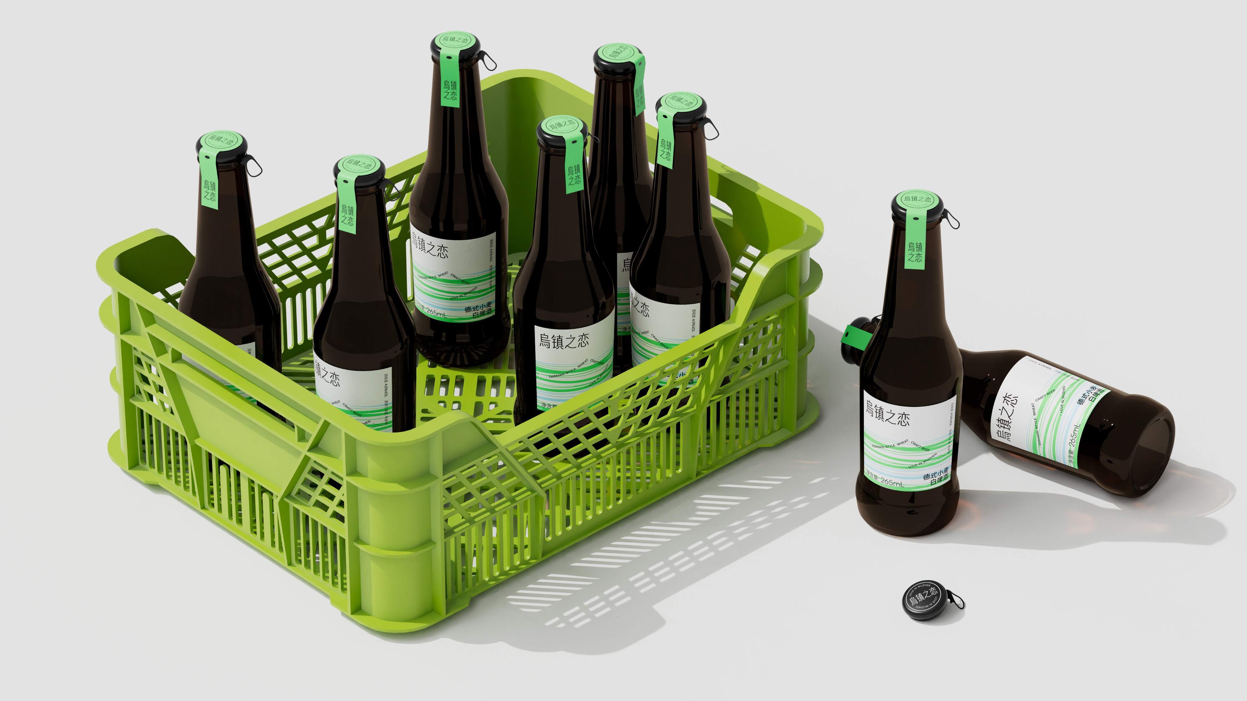
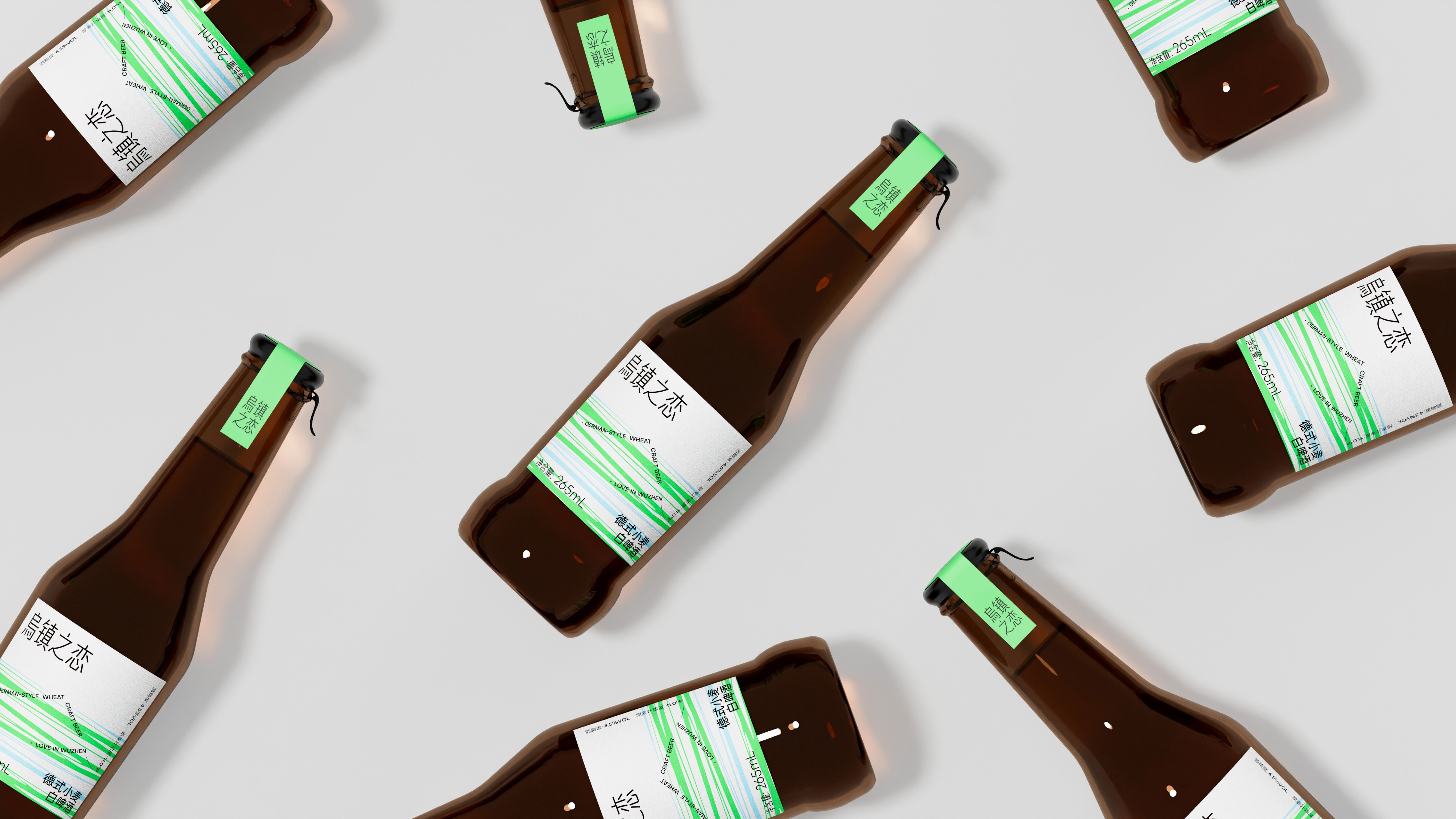
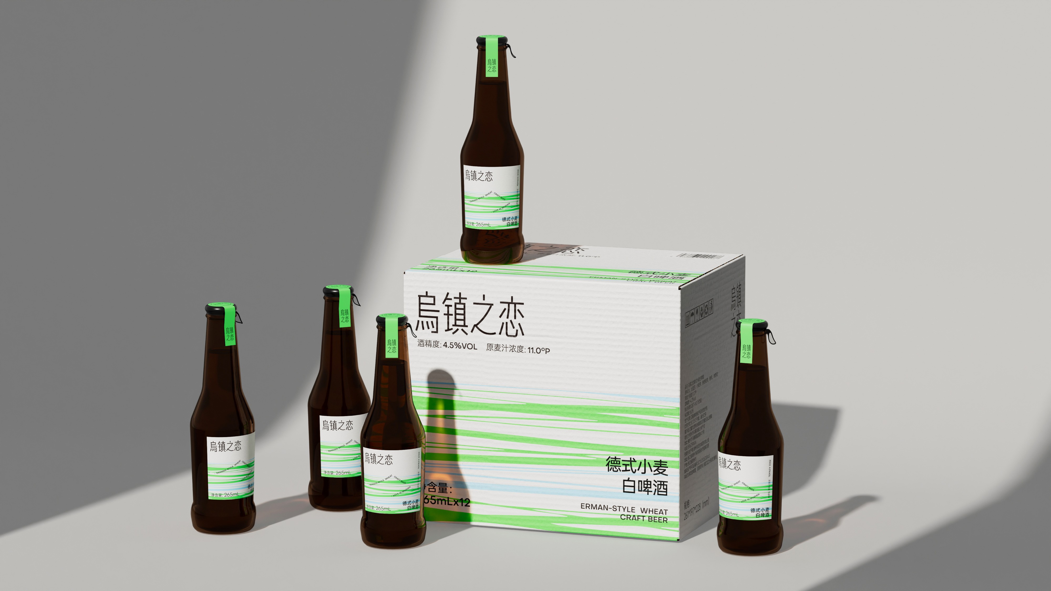
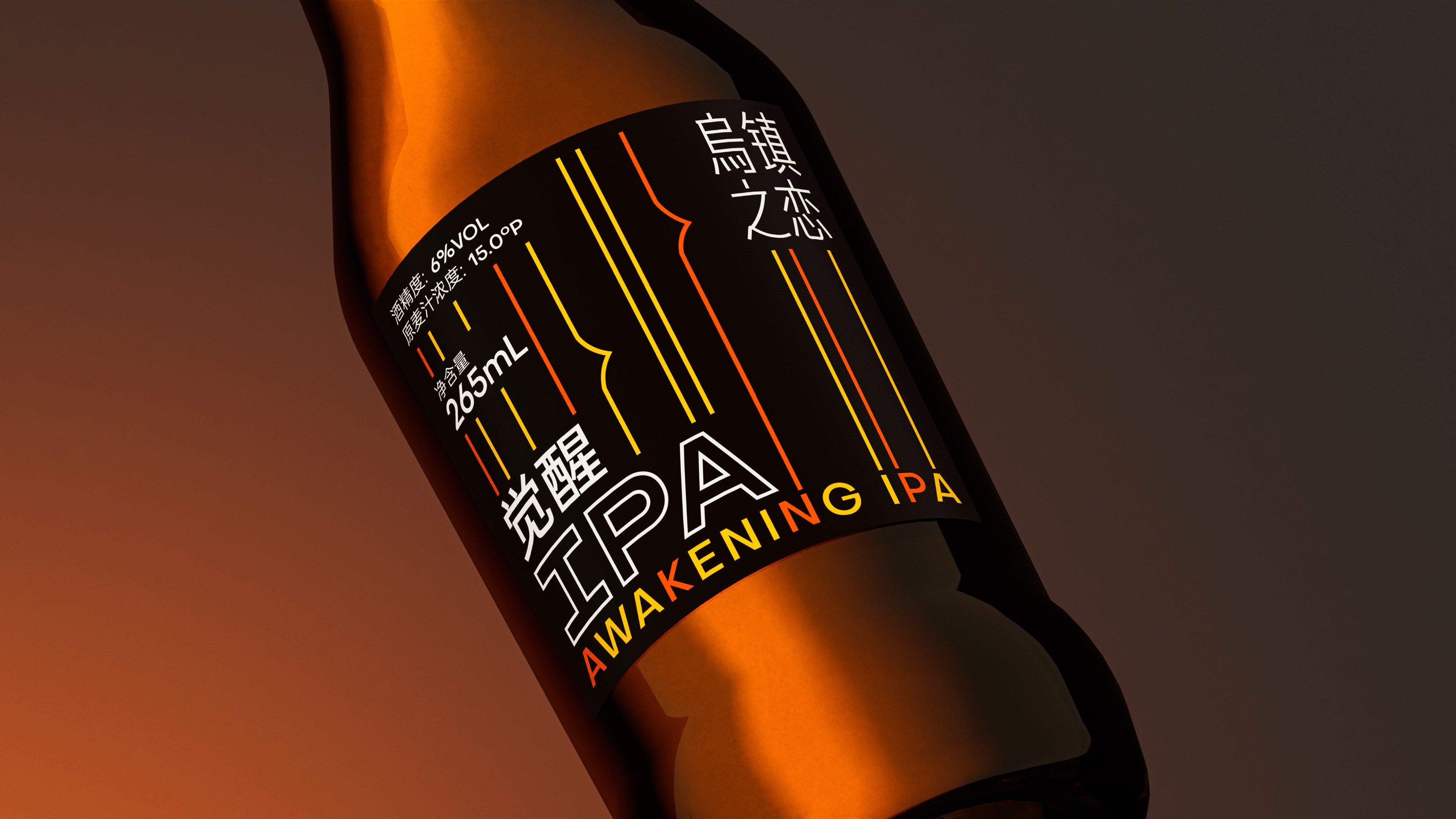
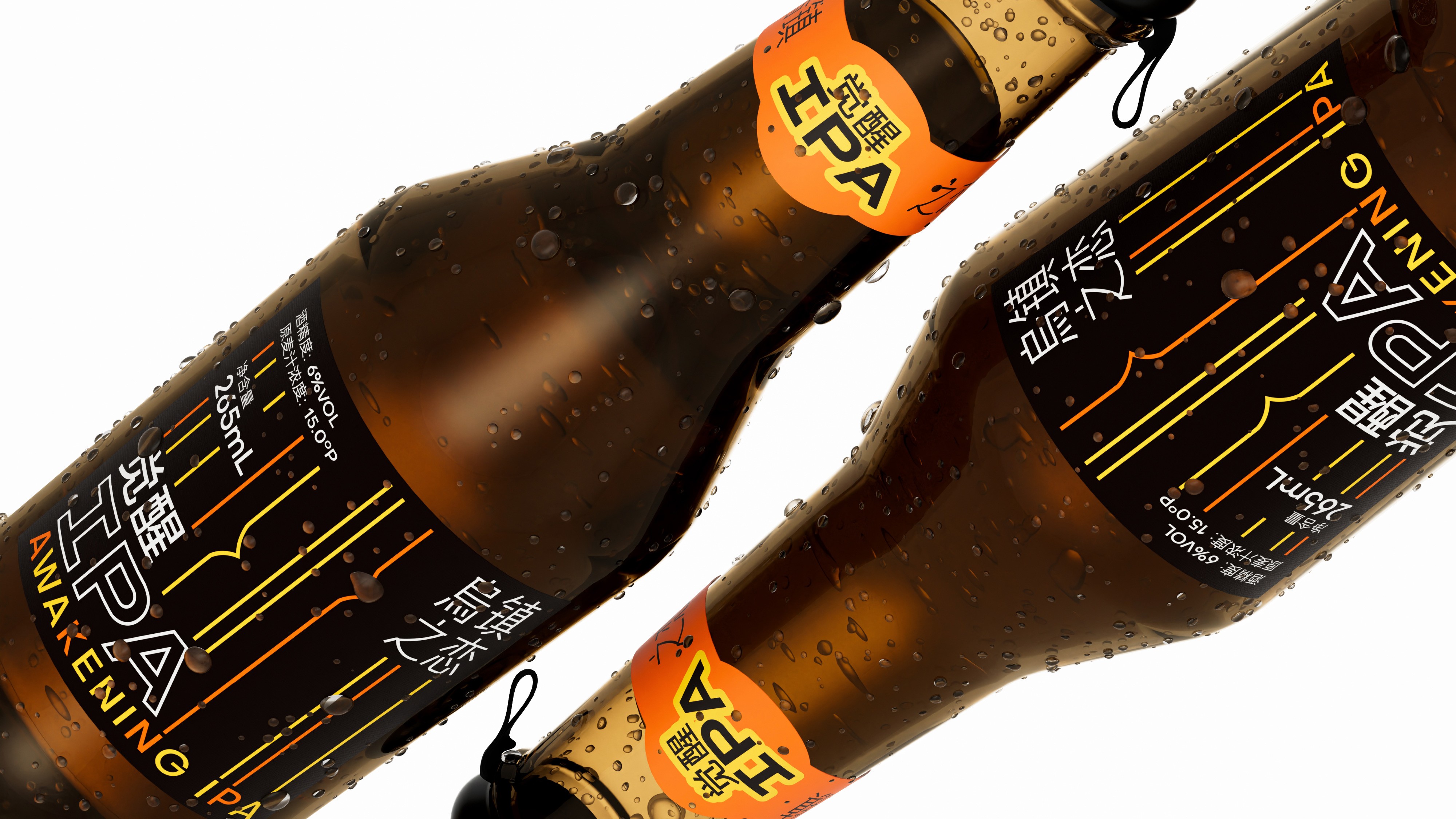
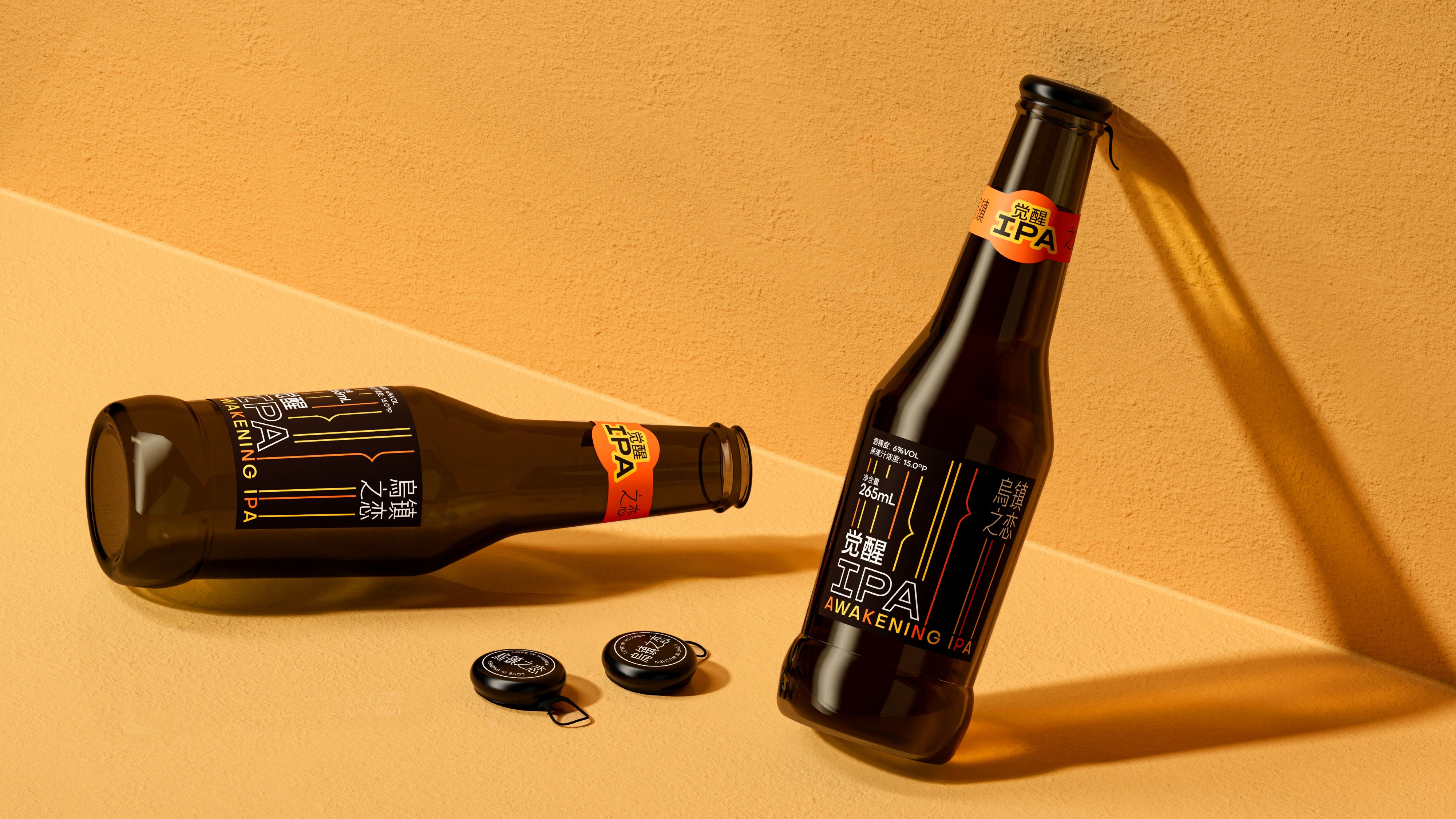
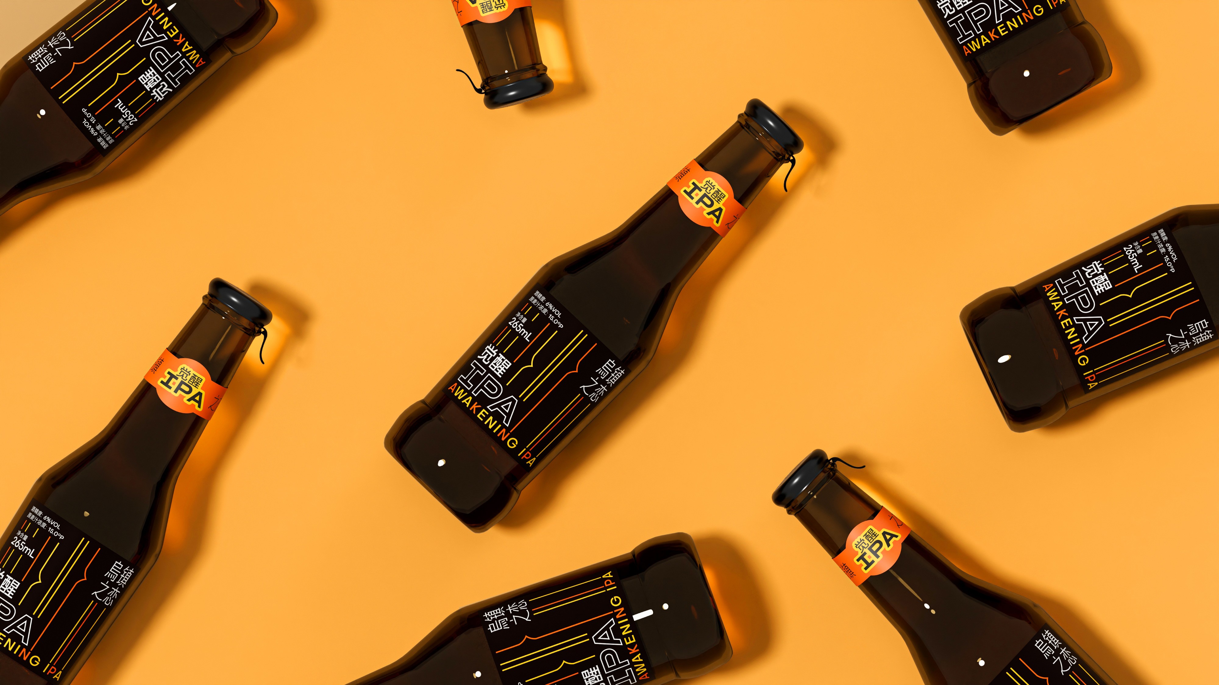
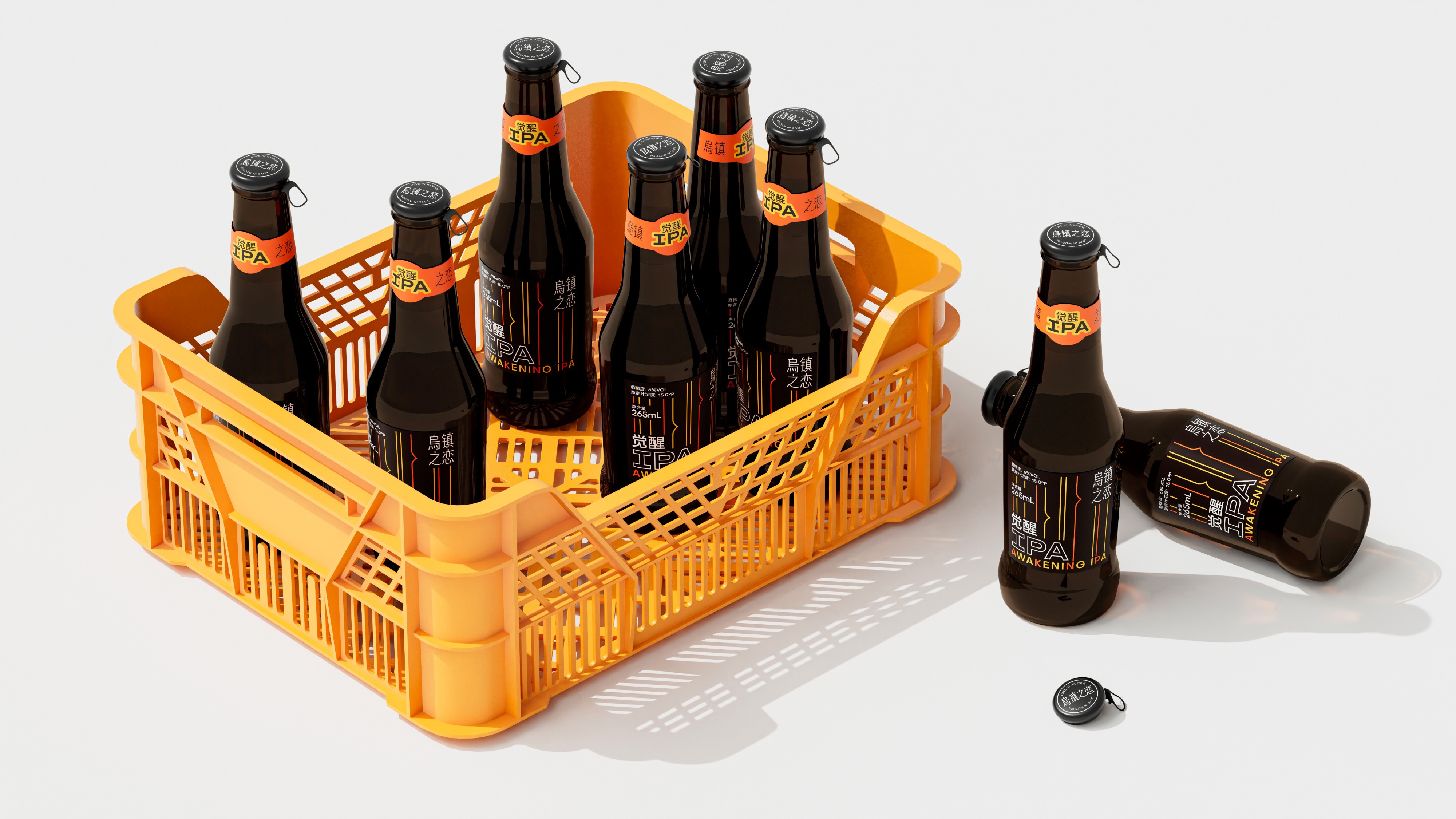
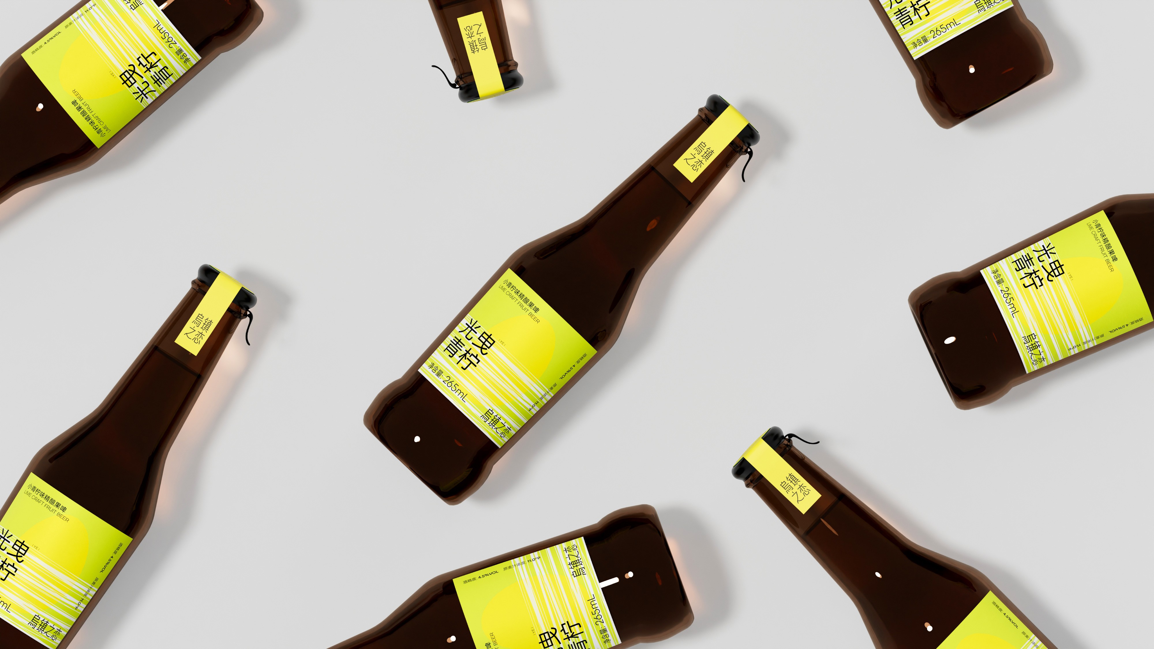
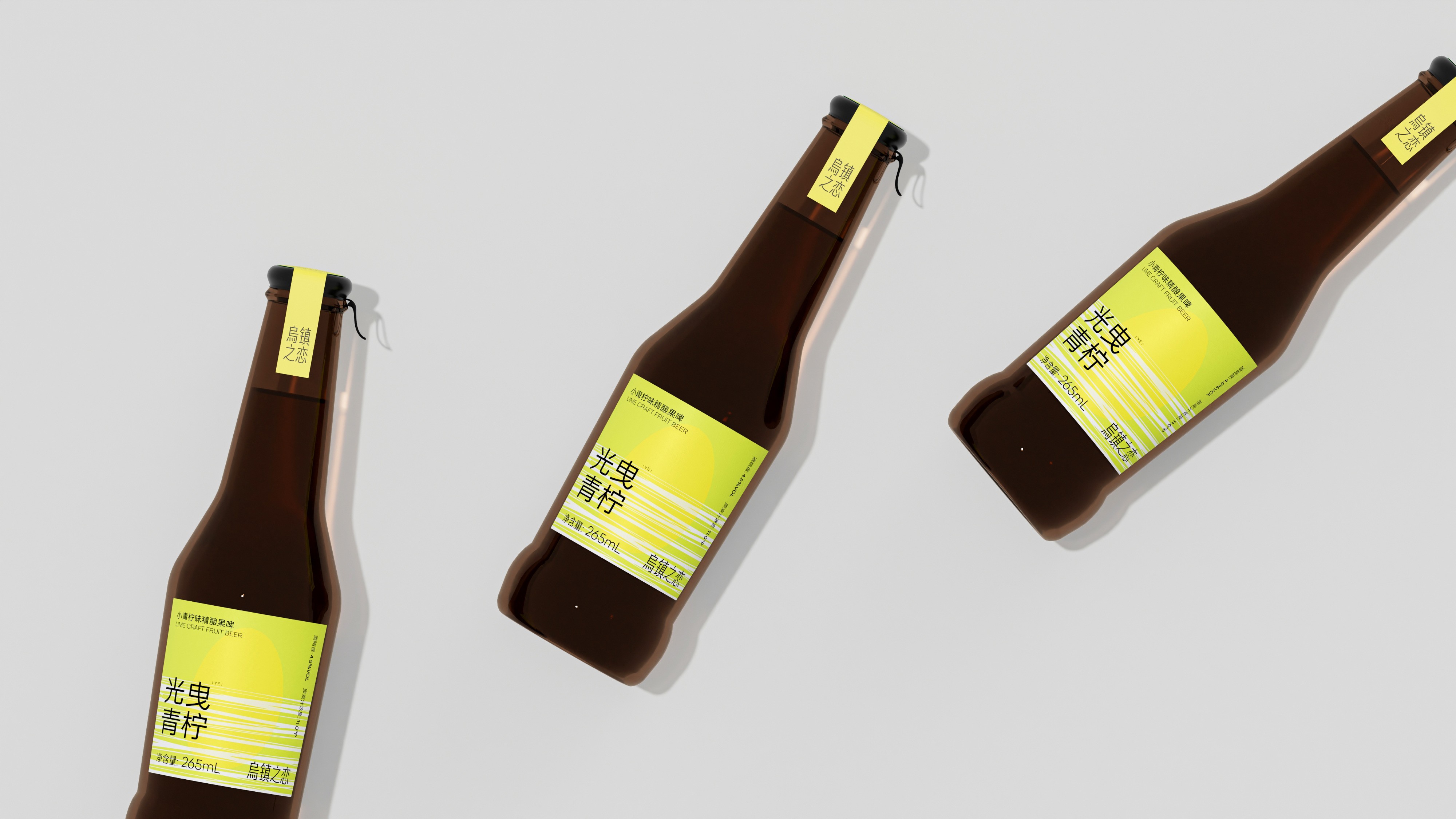
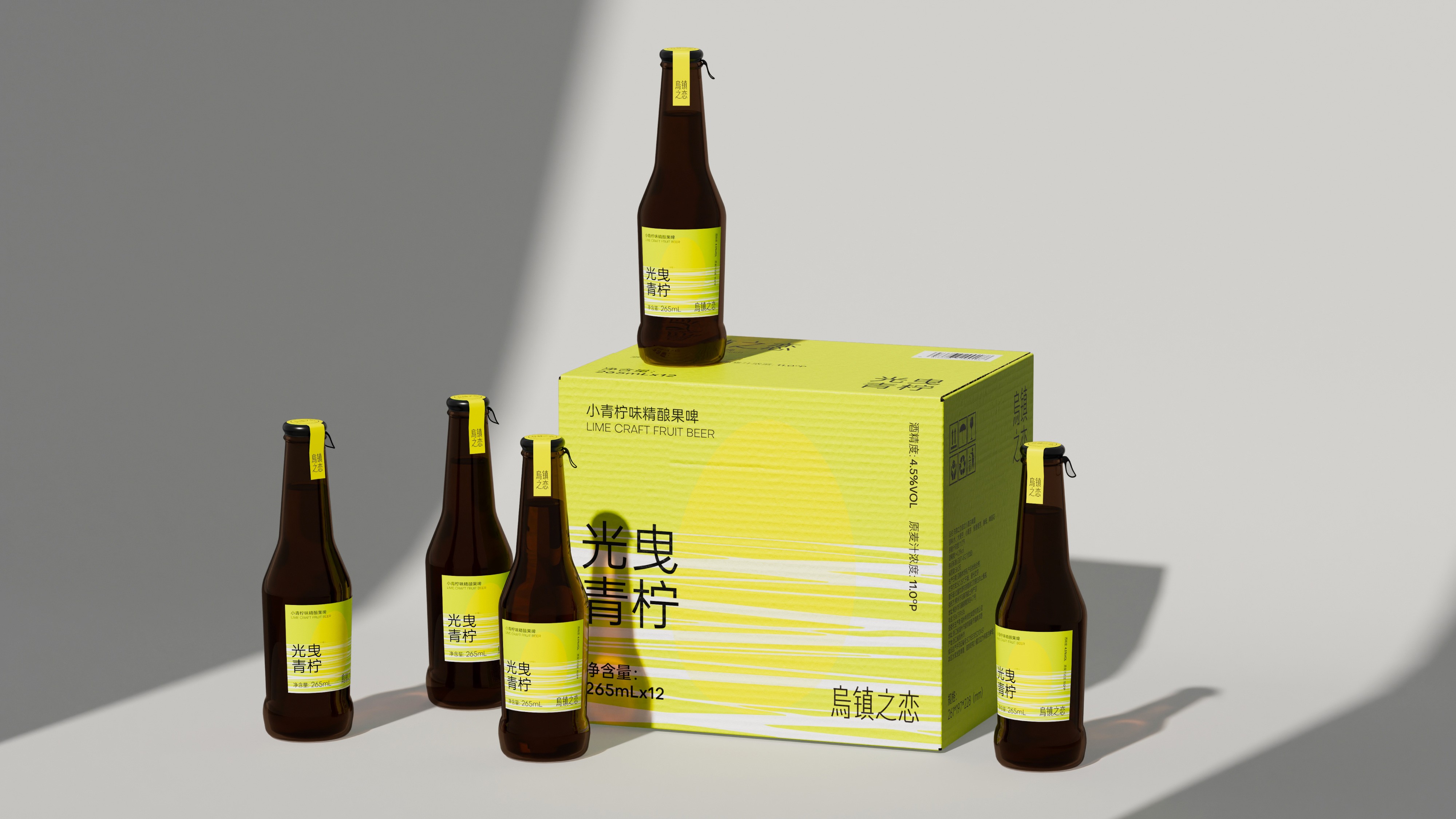
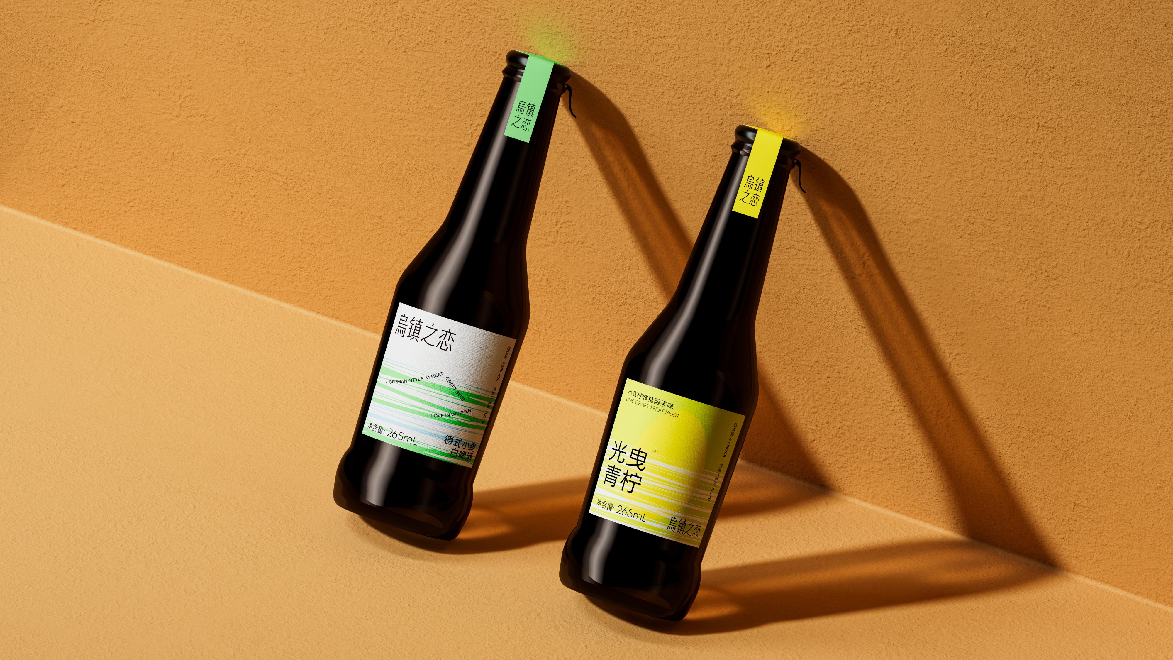
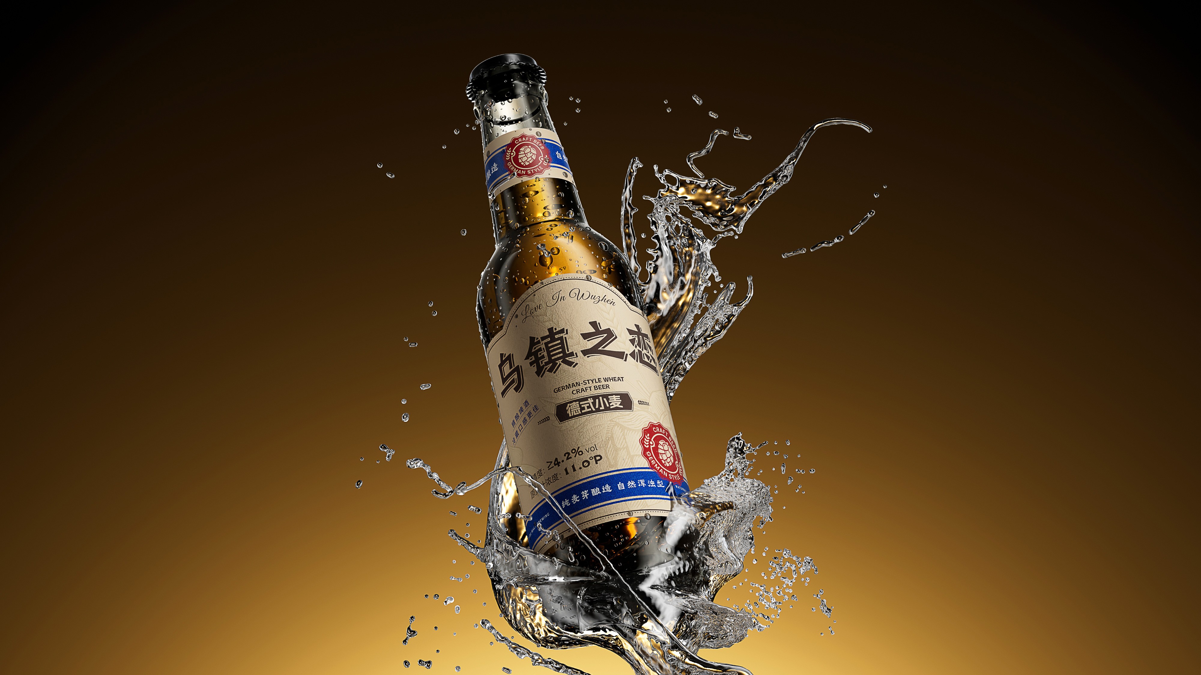
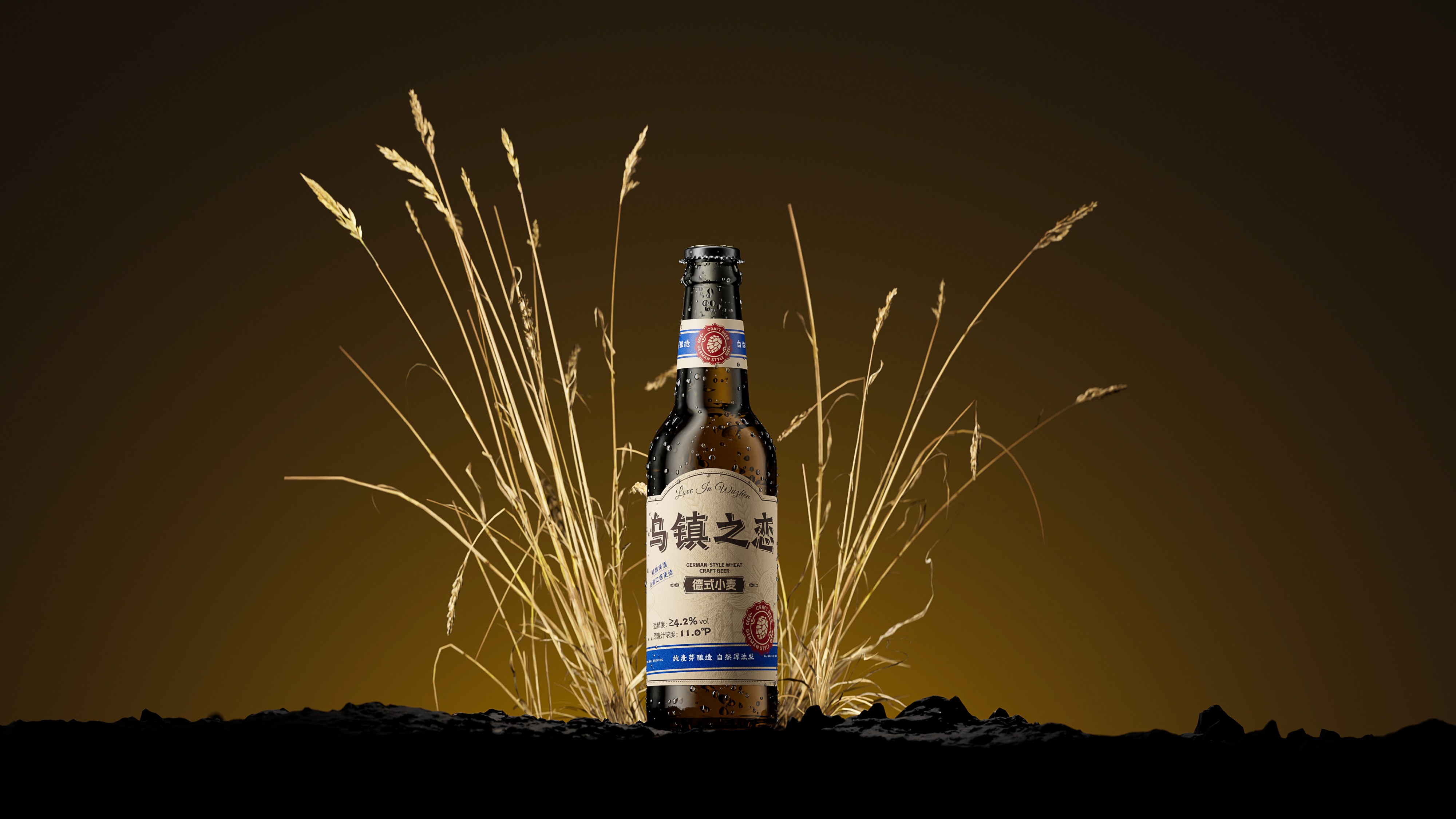
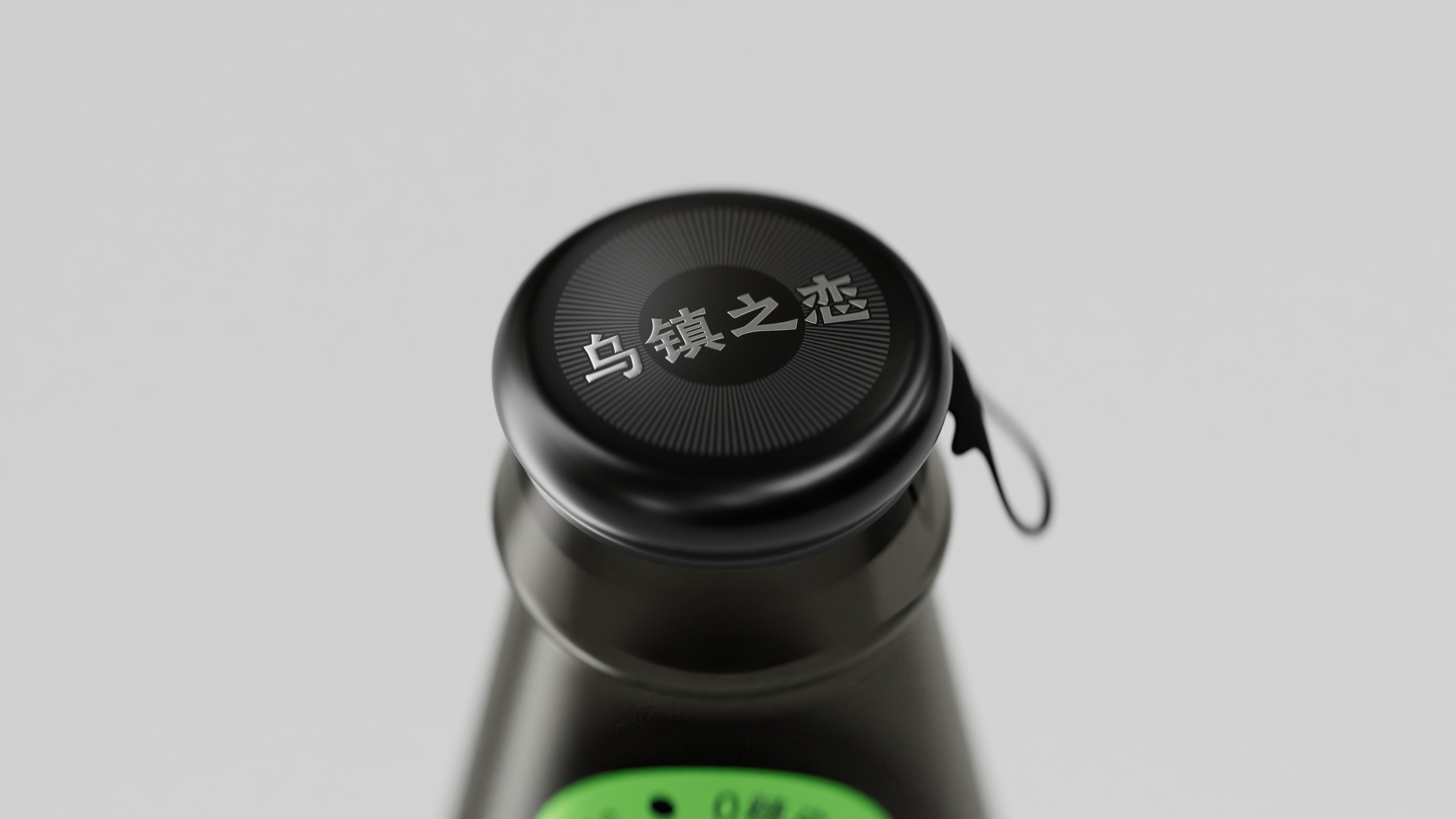
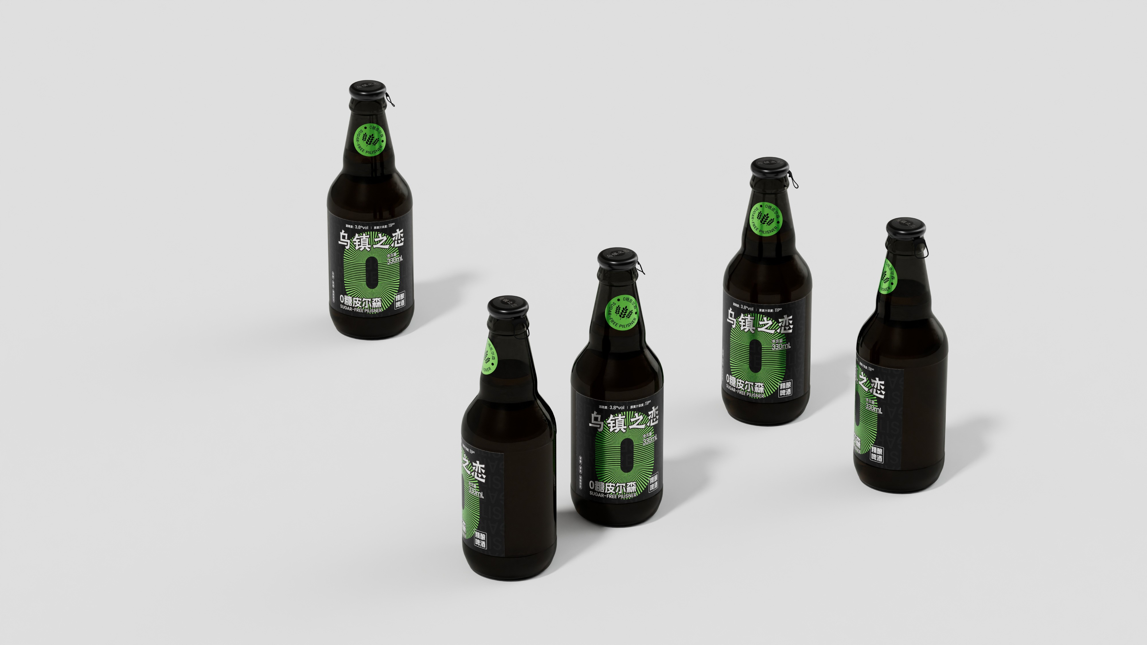
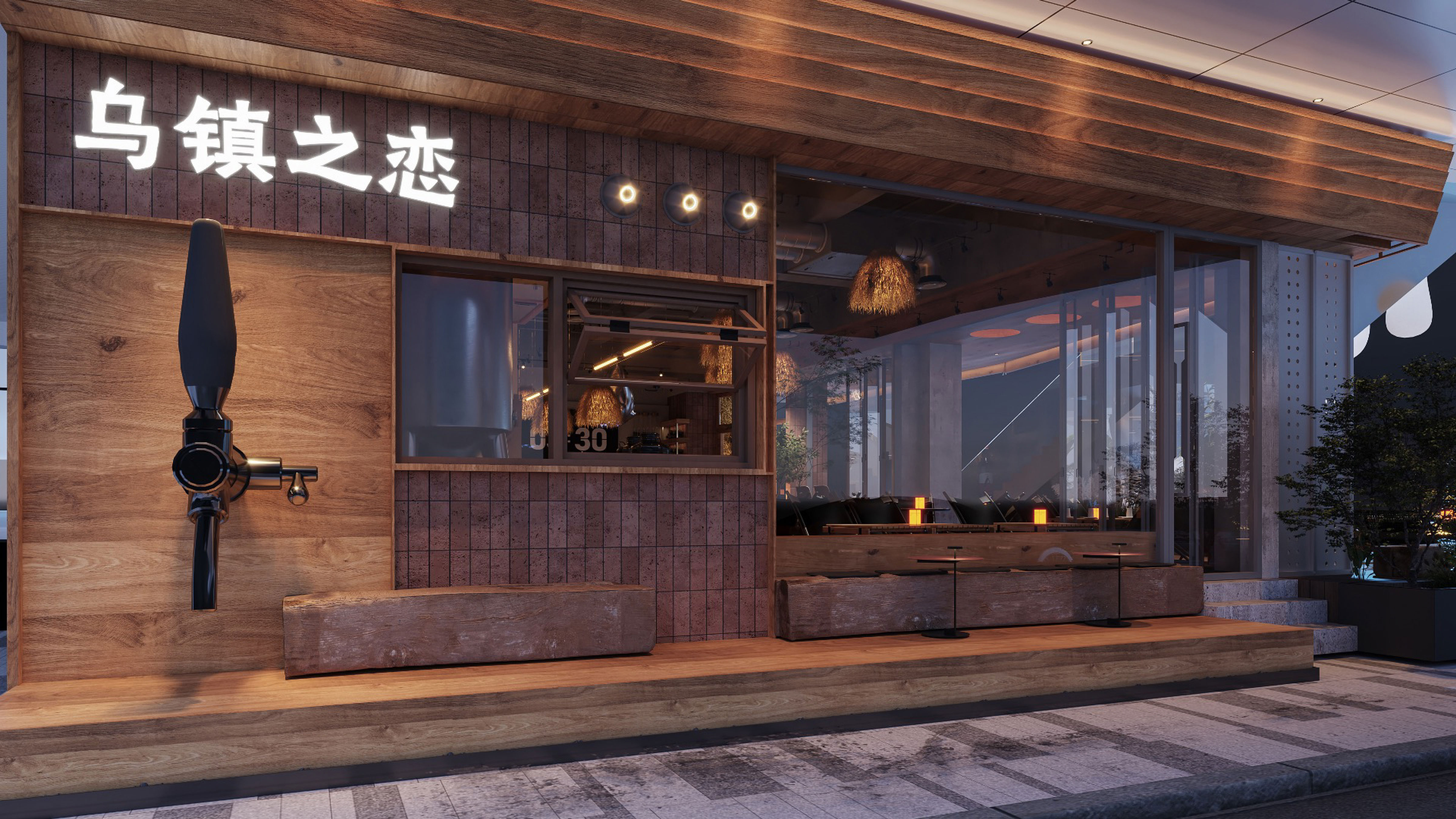
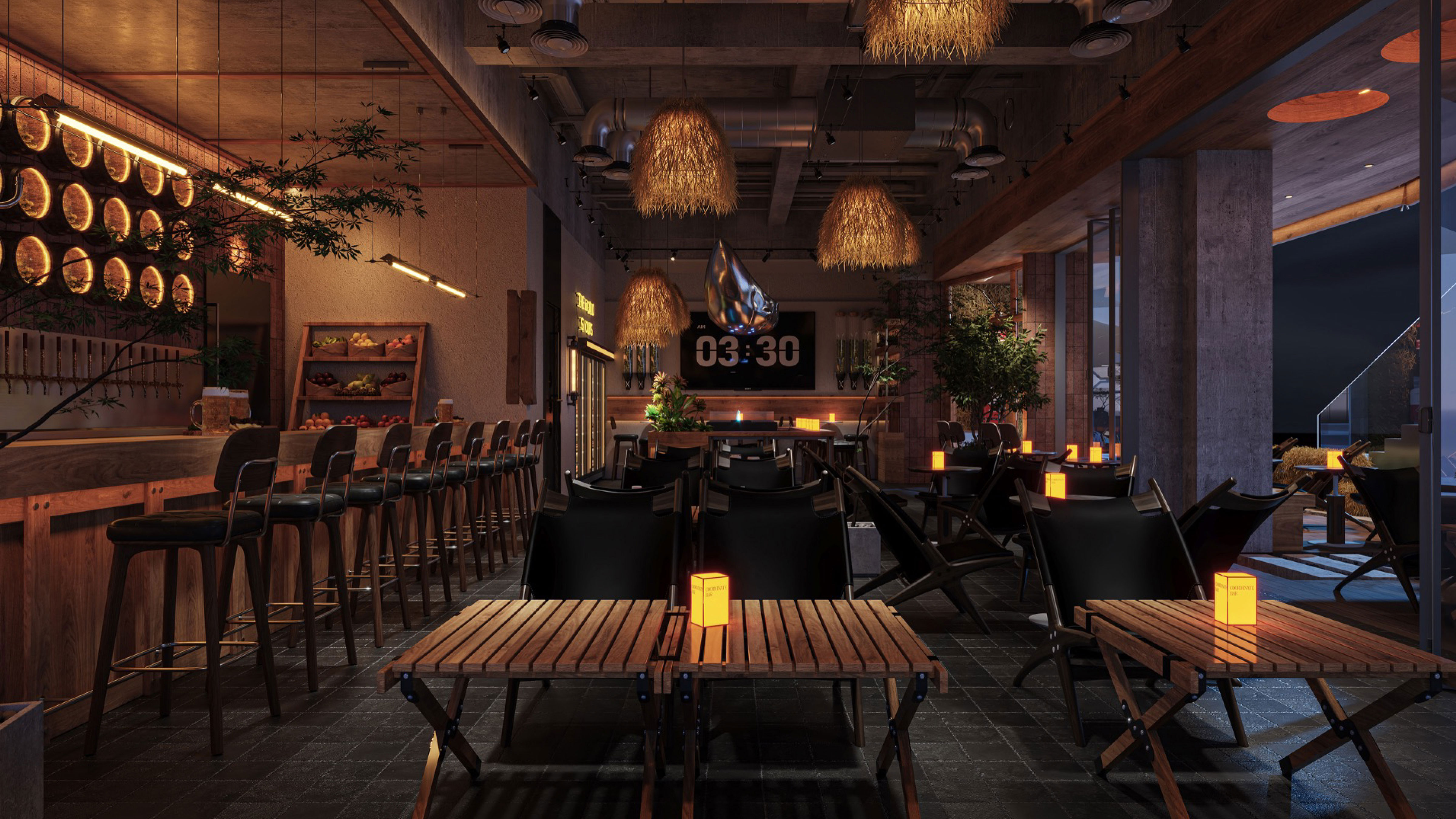
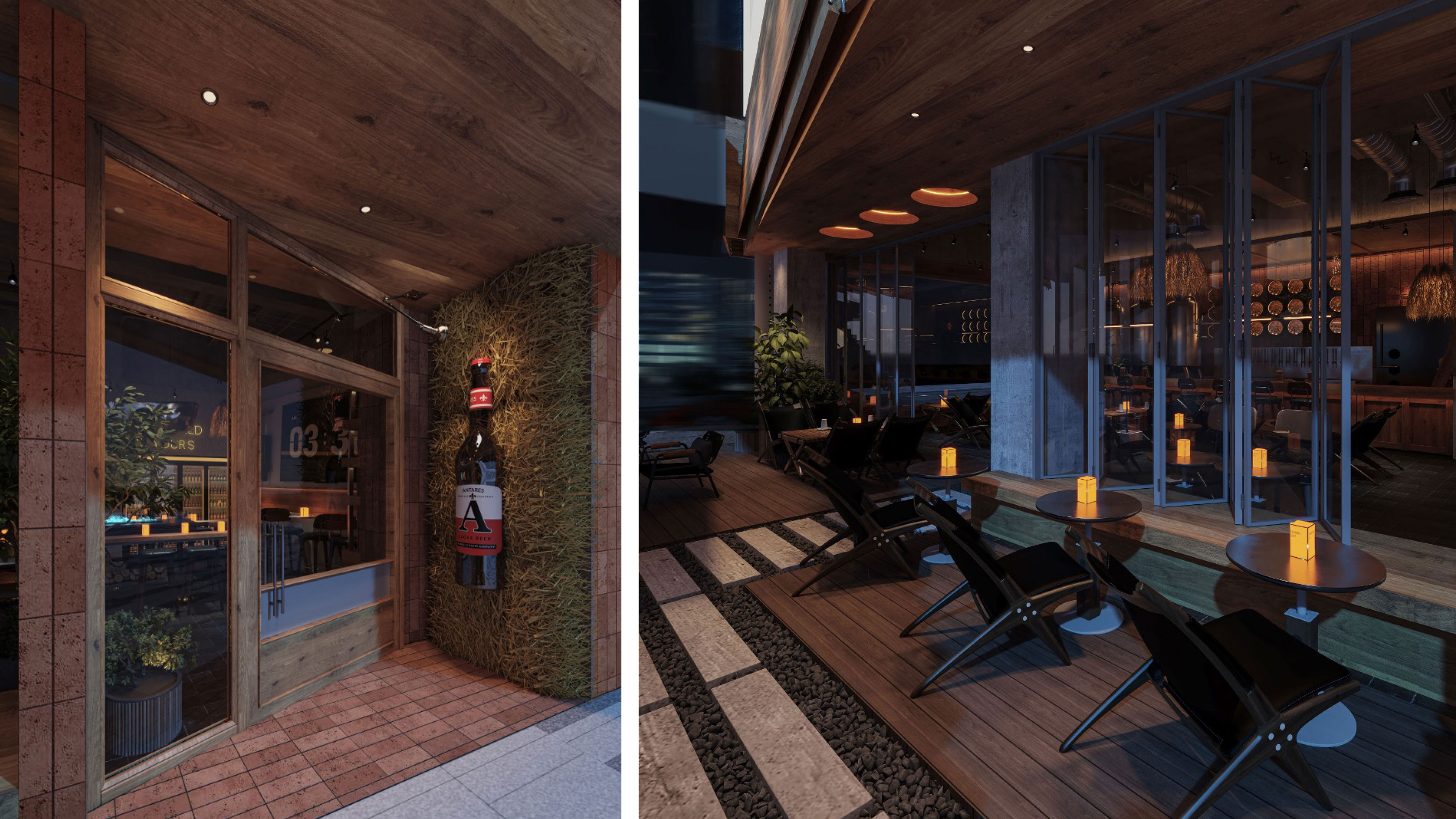
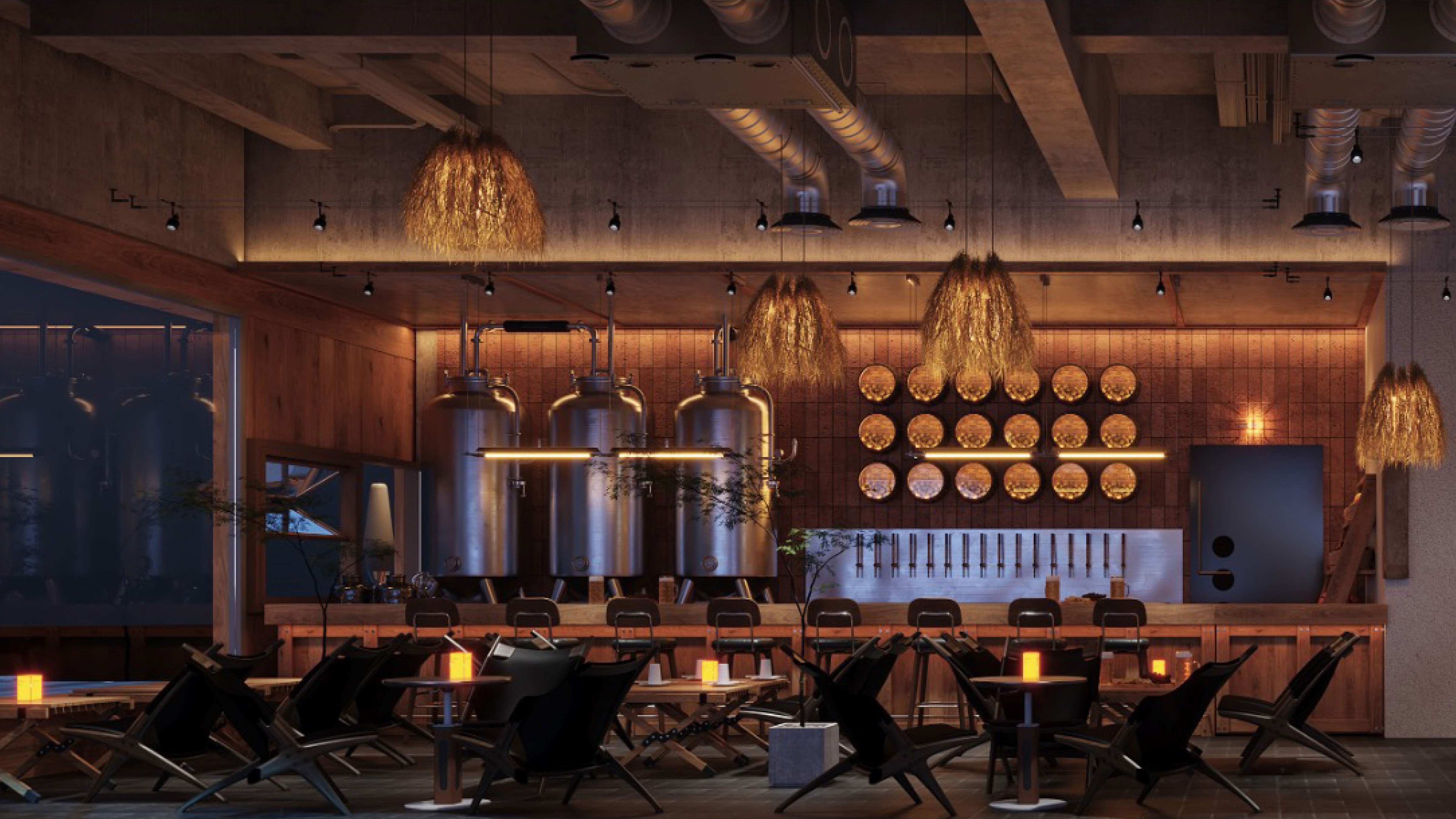
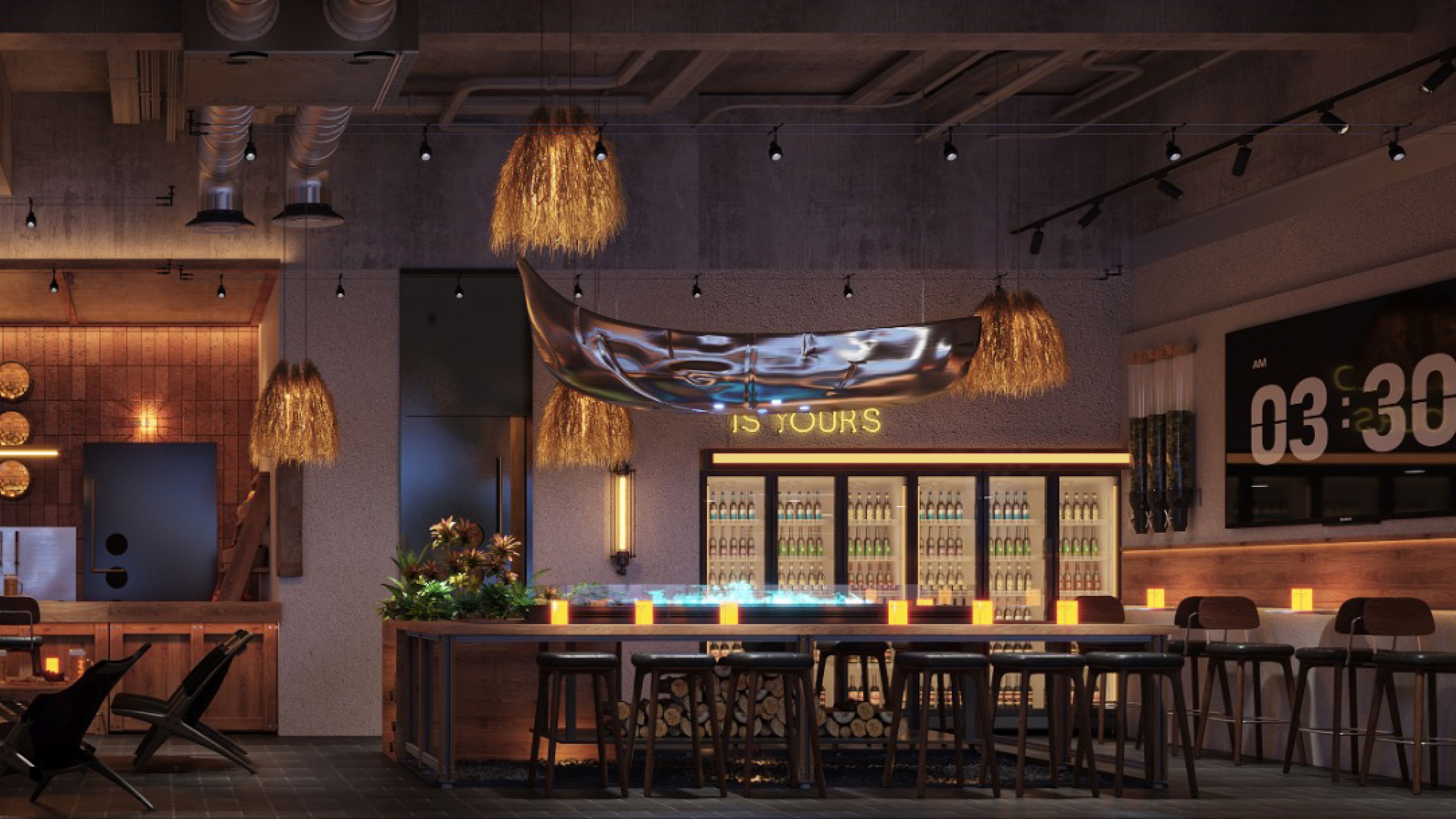
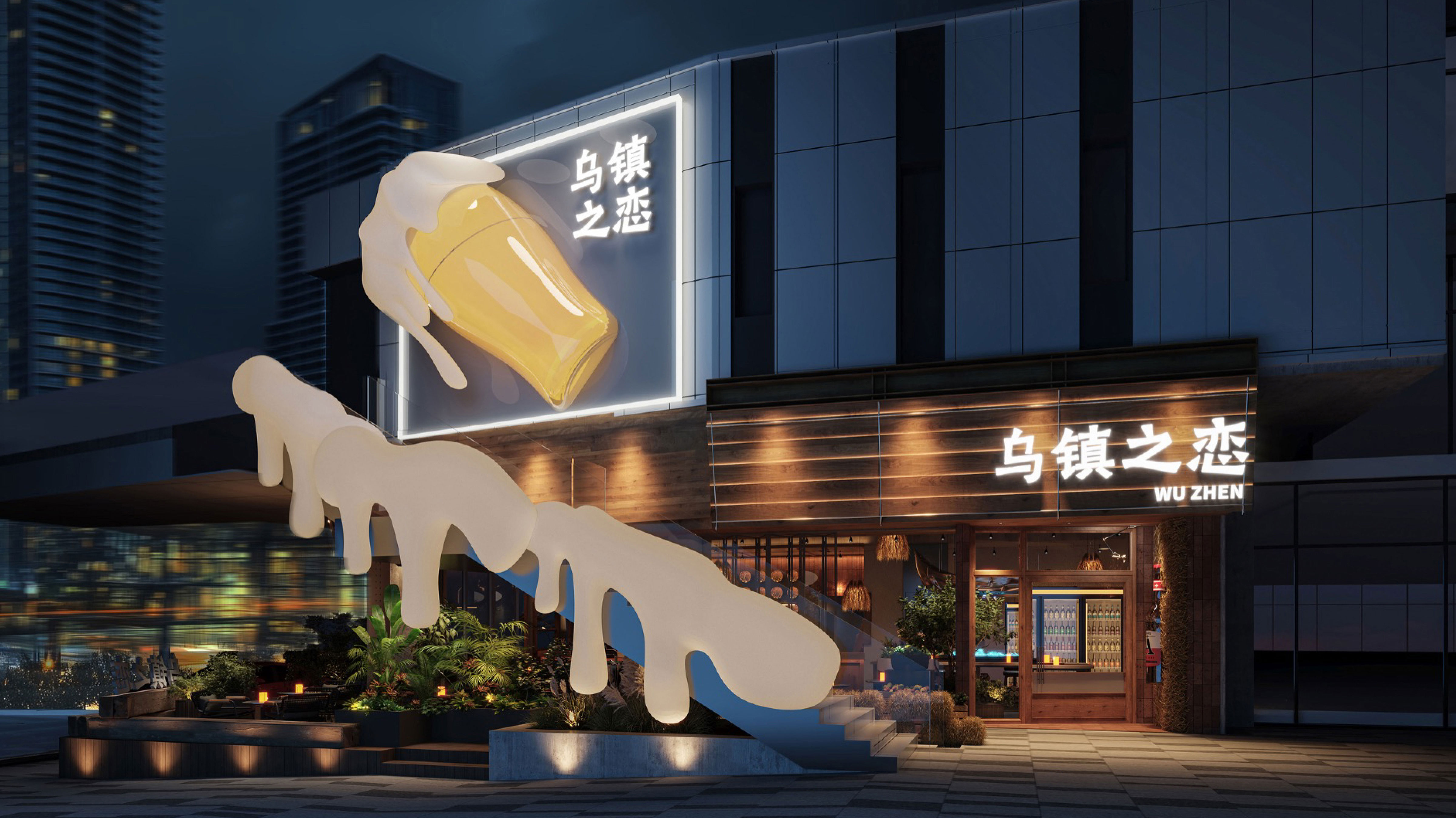
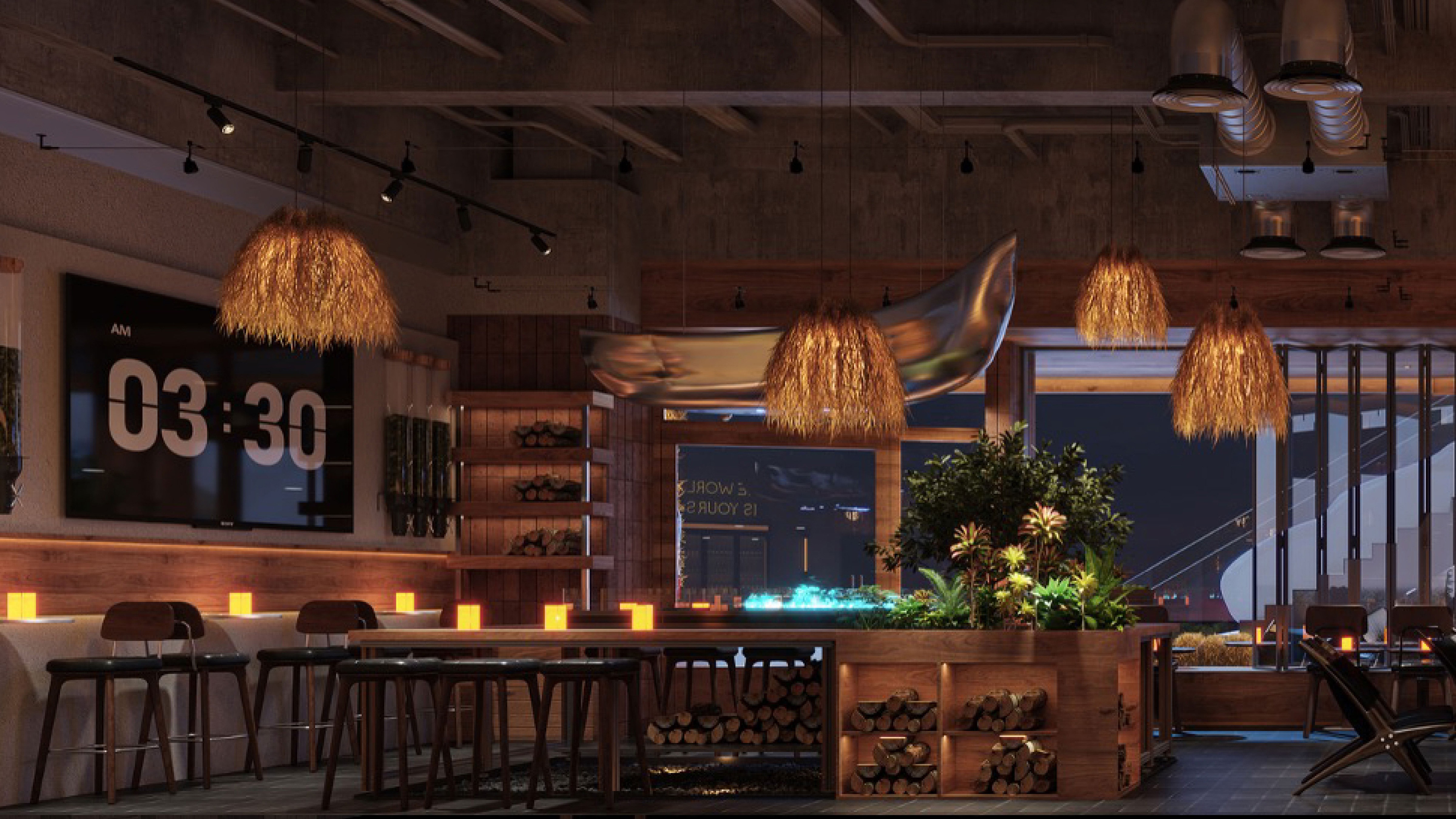
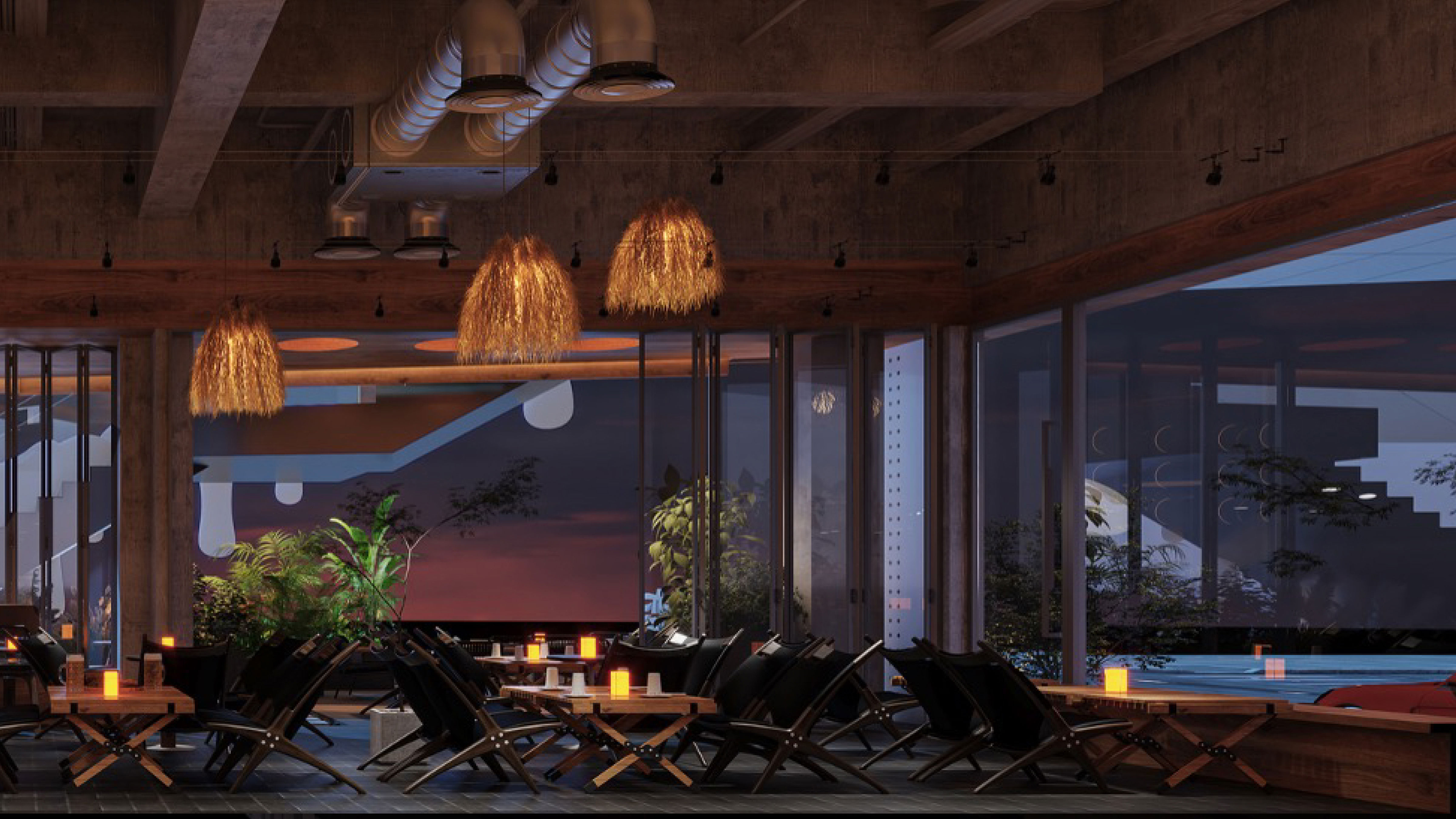
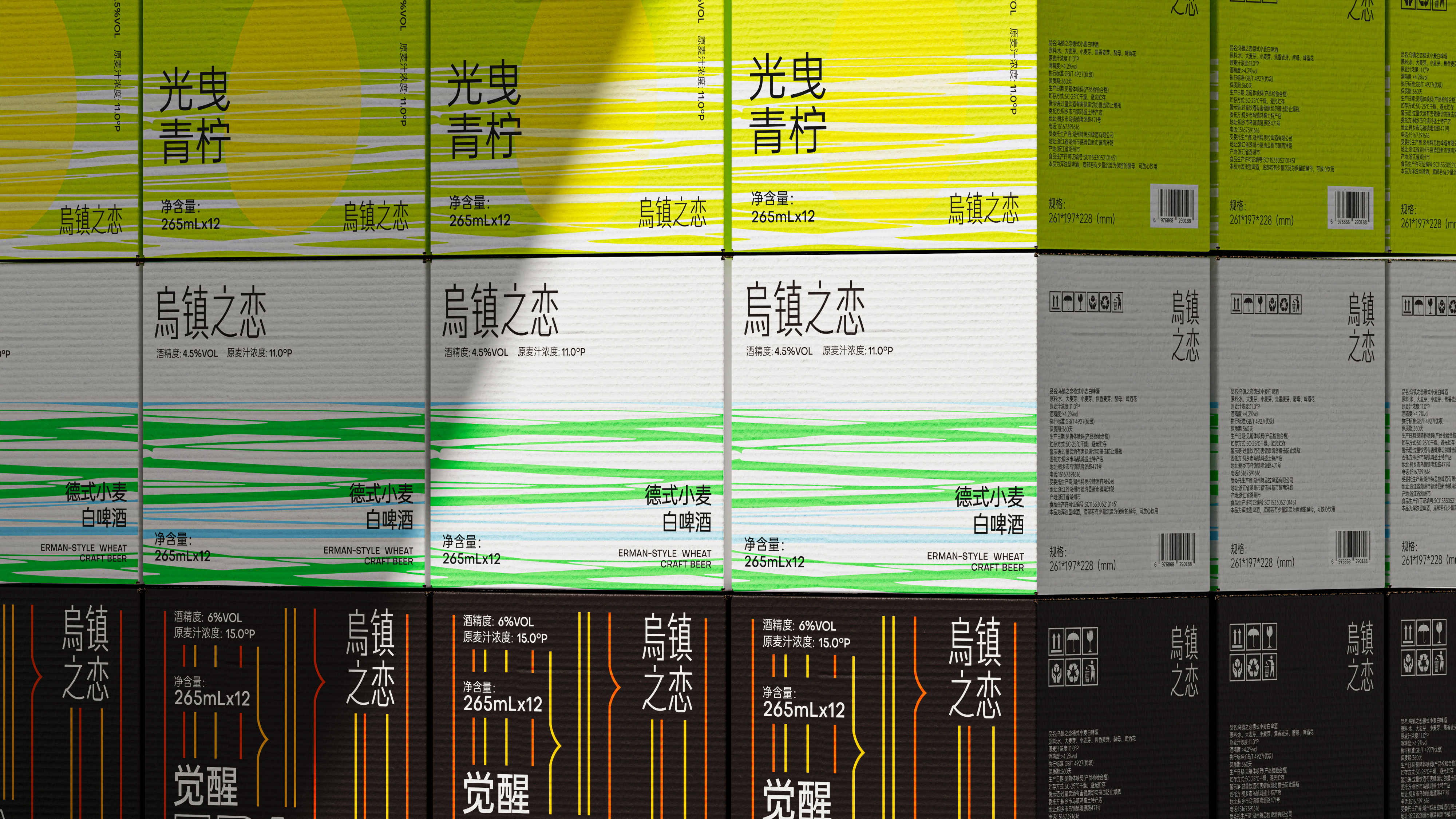
Wuzhen Romance Awakening IPA is a craft beer brand that deeply integrates Jiangnan water town culture with traditional craft brewing techniques. Taking Wuzhen — the permanent venue of the World Internet Conference — as its cultural origin, the brand combines the poetry of a millennium-old ancient town with the bold hop aroma of IPA, striving to create an awakening work that embodies both cultural depth and a modern craft attitude. The product is based on IPA (India Pale Ale), using abundant hops to deliver a rich aroma and a unique taste of refreshing sweetness, echoing the dual meaning of "awakening" — both sensory awakening and cultural awakening.
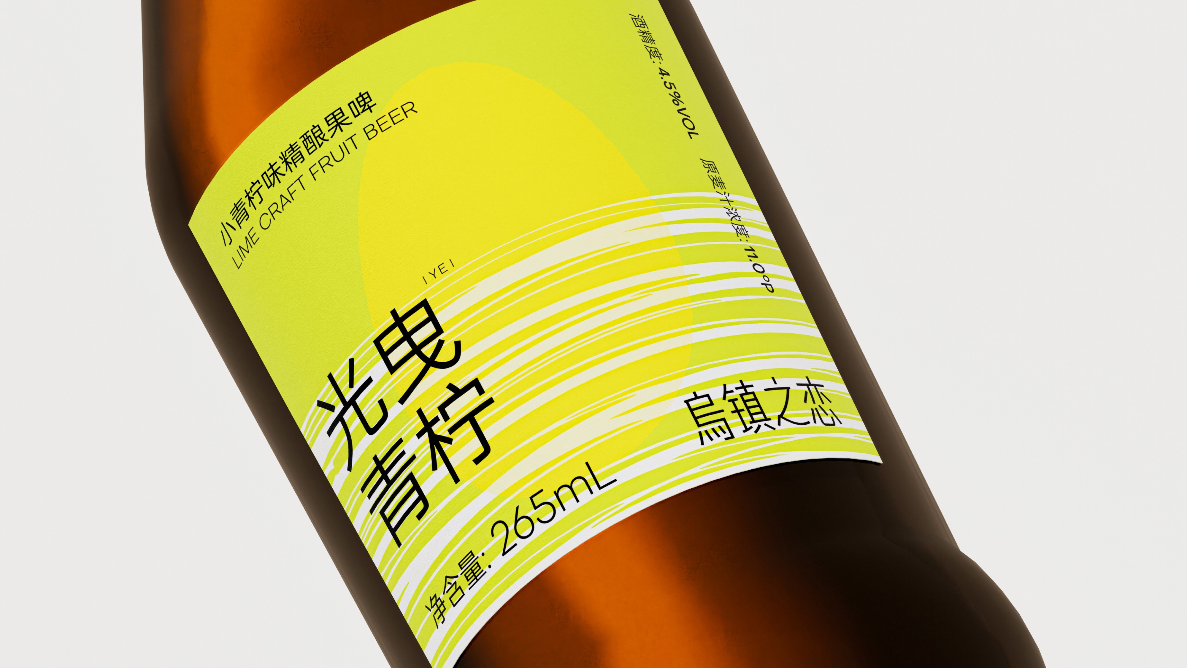
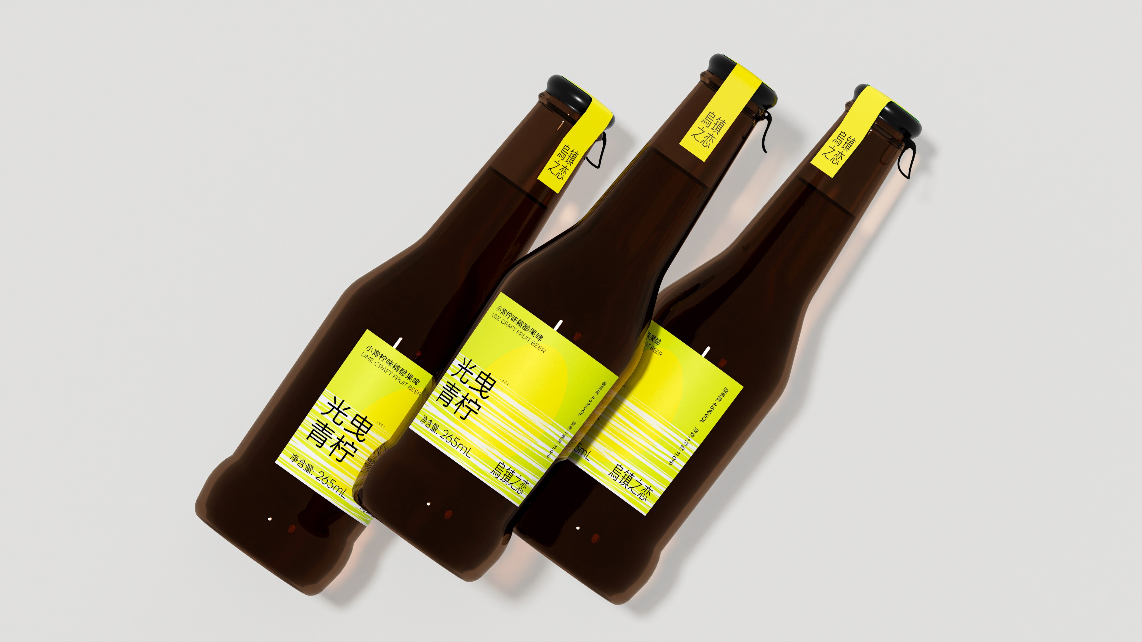
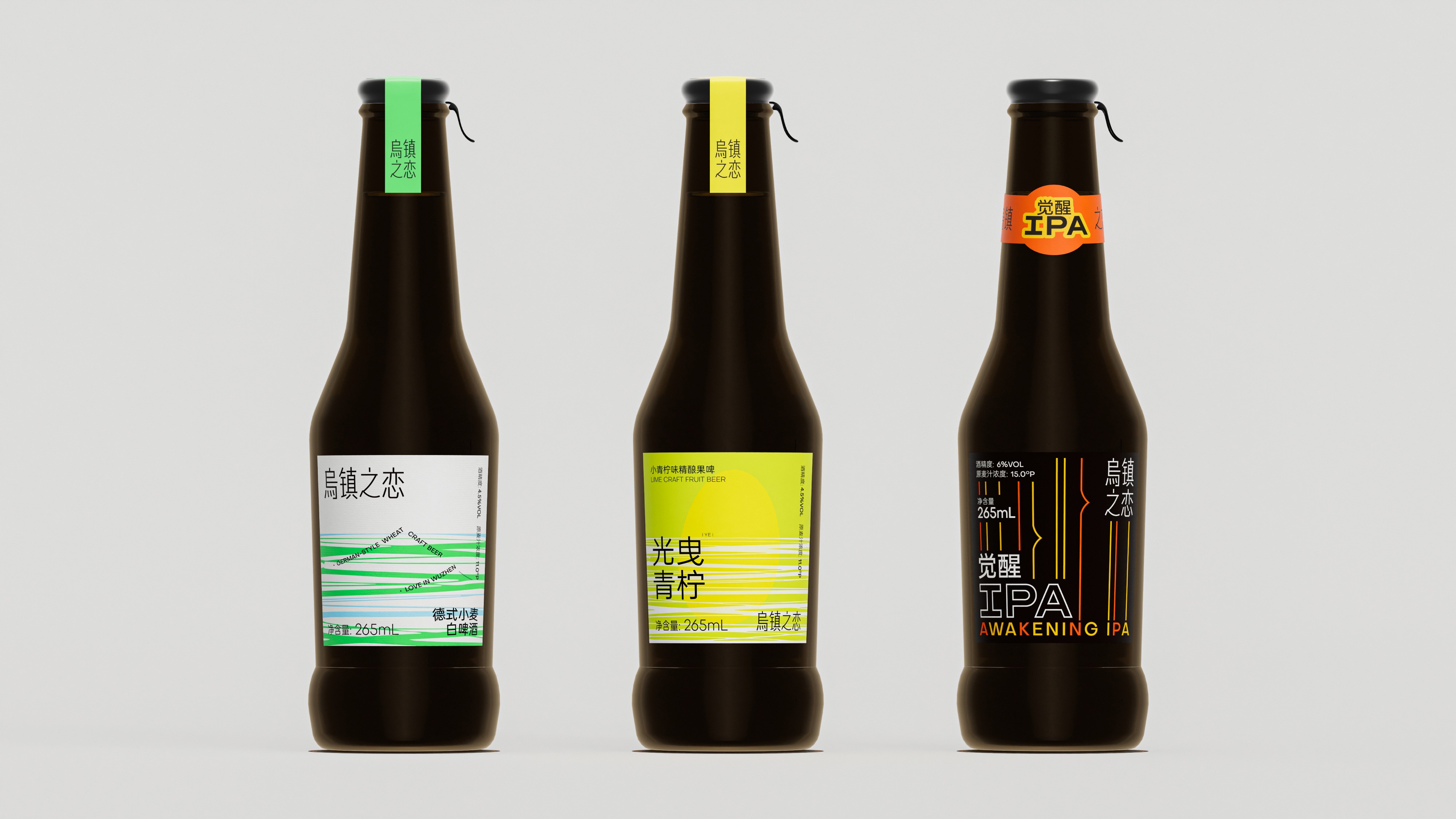
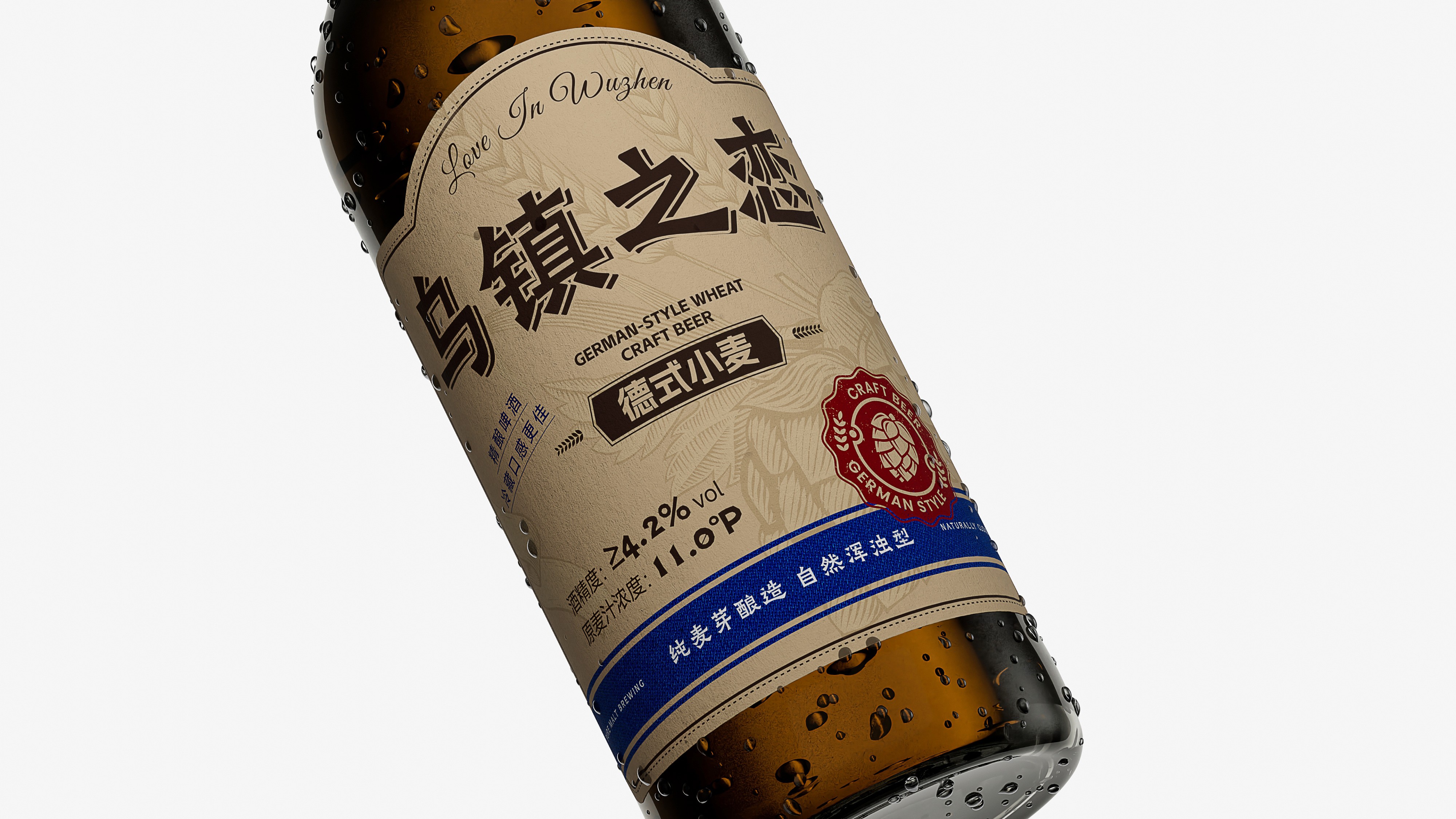
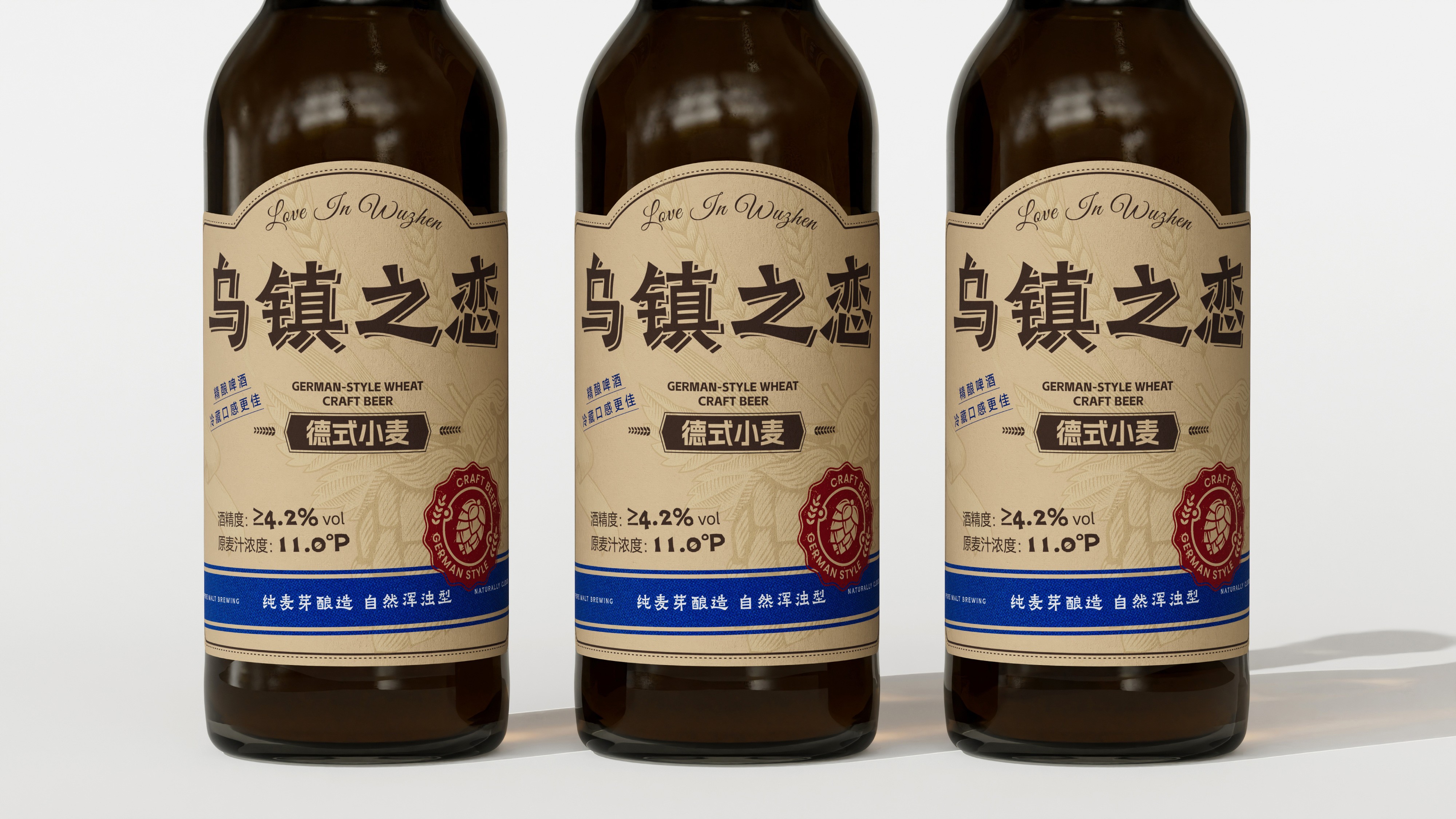
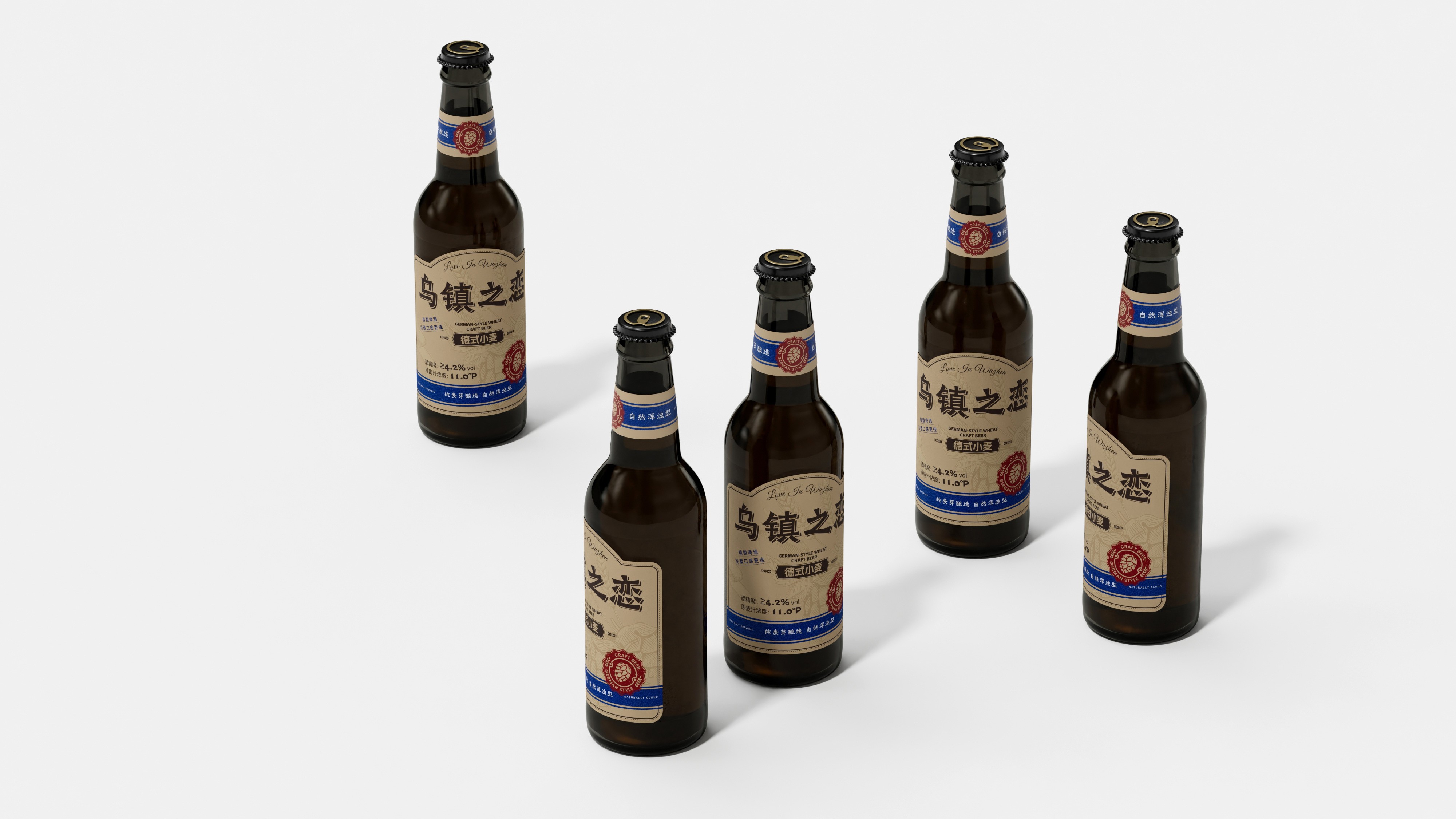
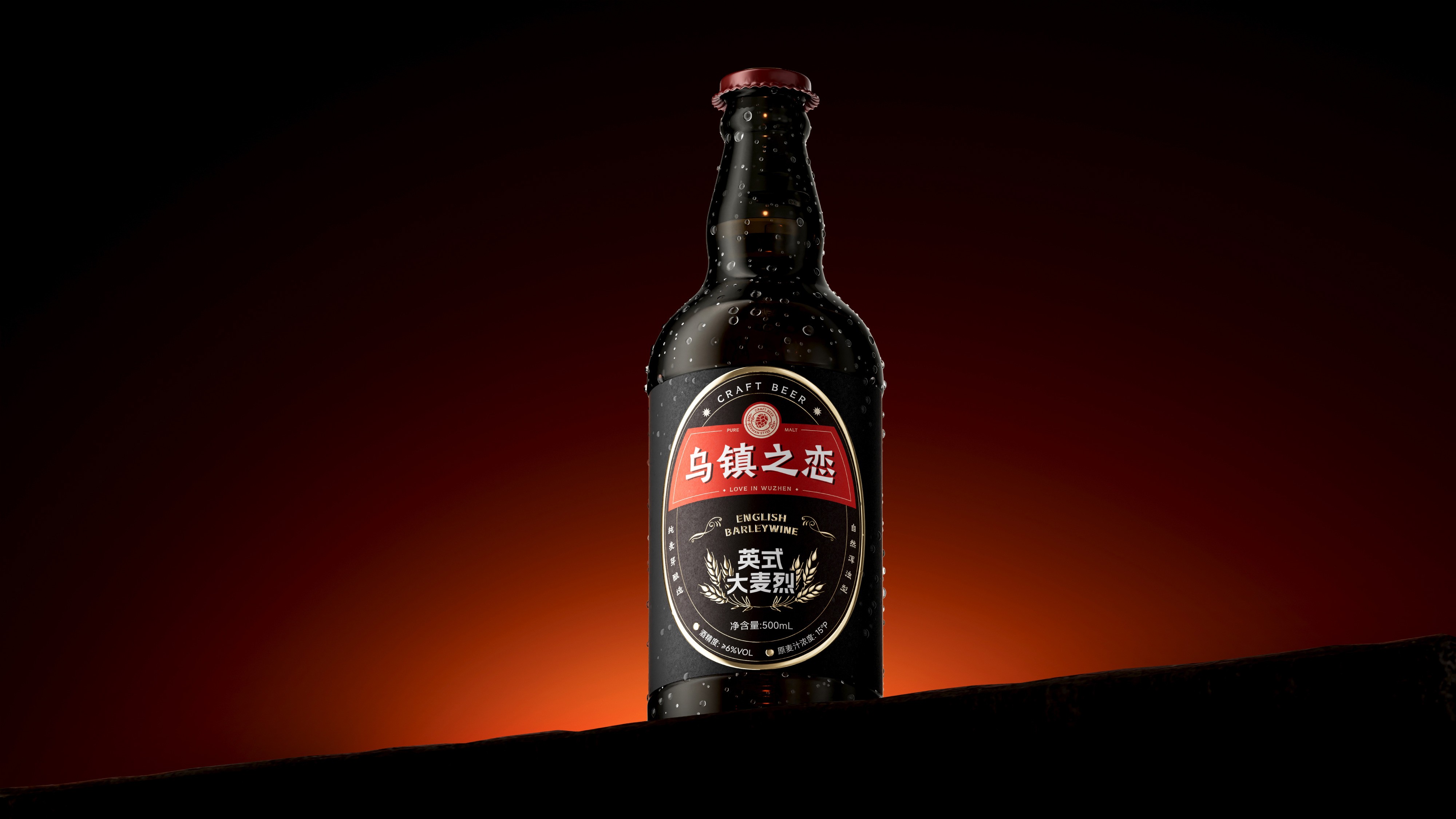
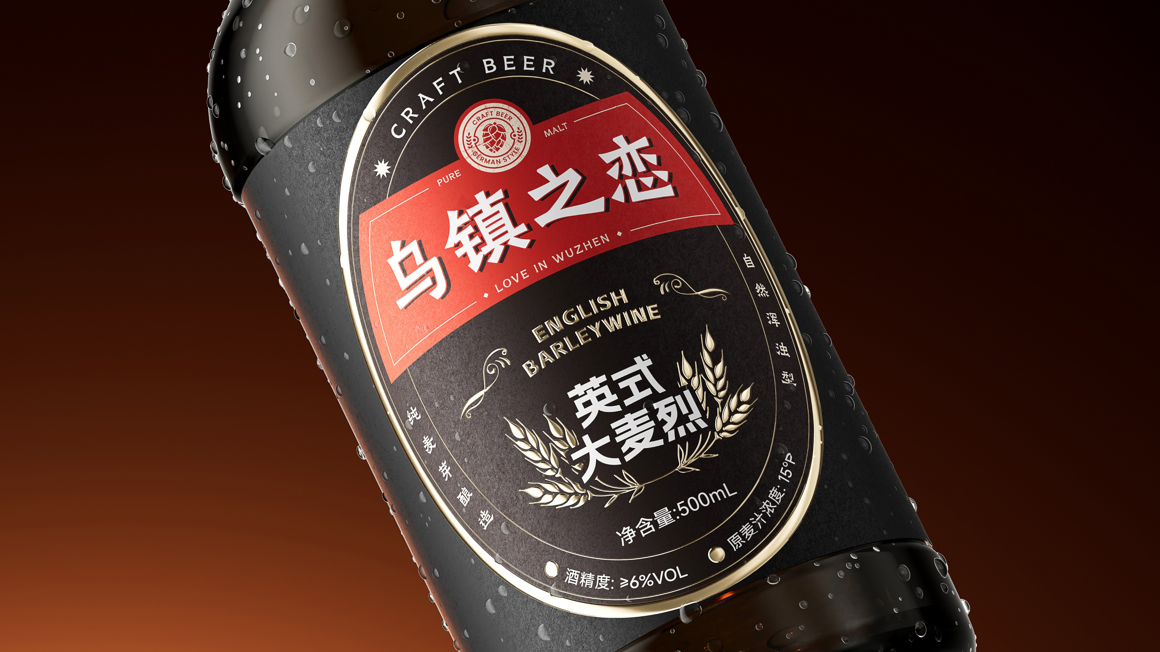
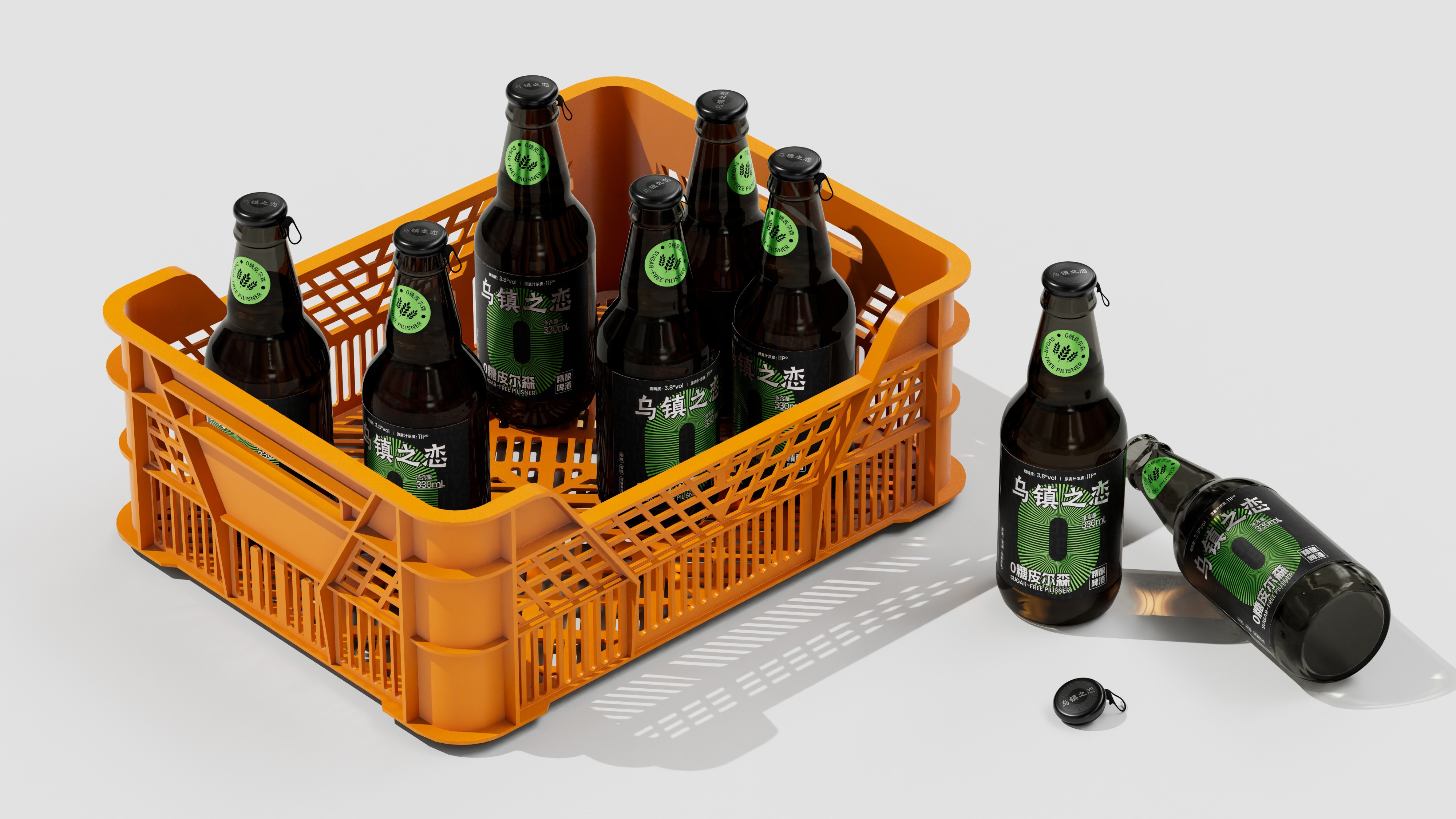
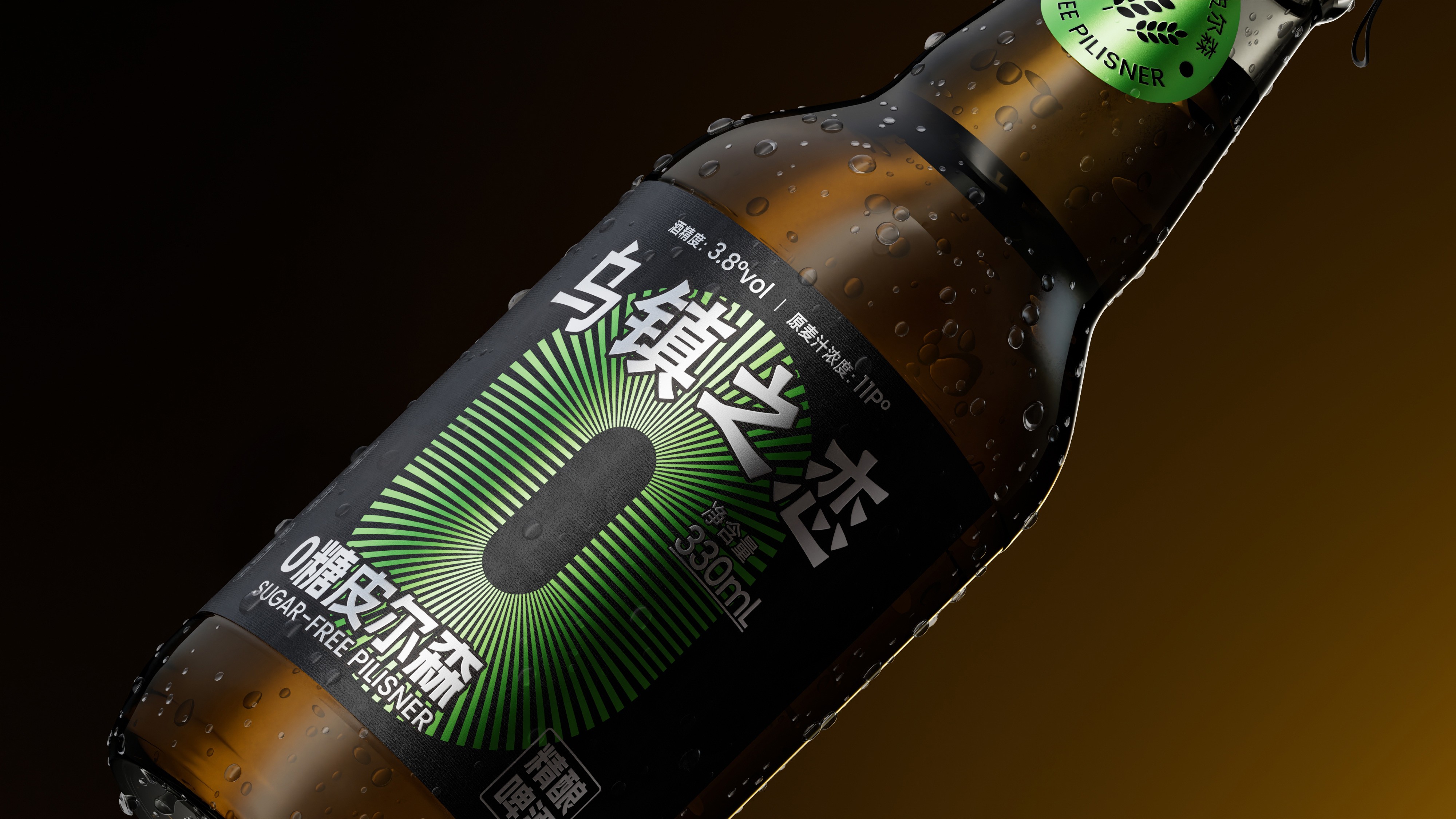
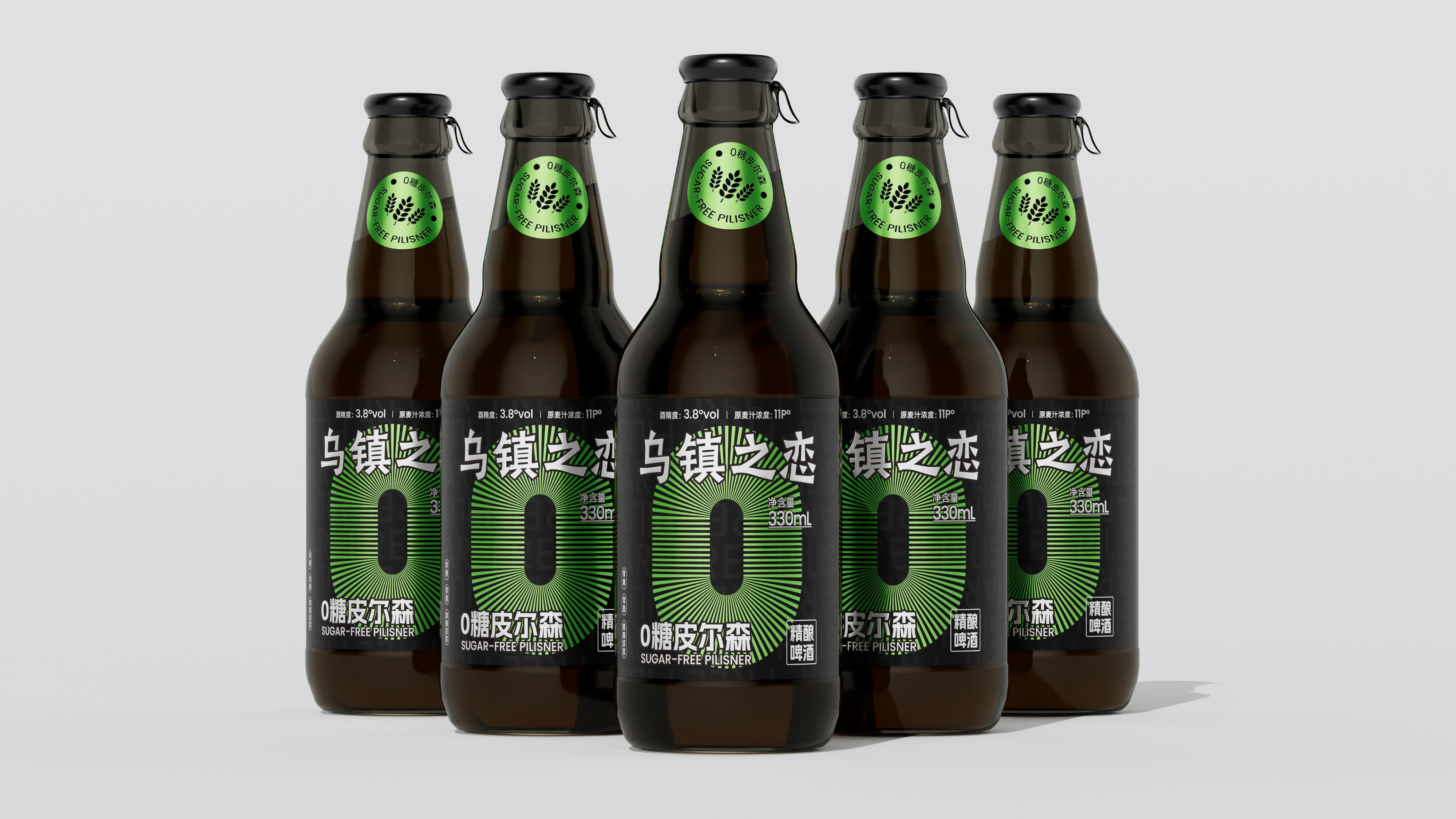
This project built the brand visual system with "Jiangnan heritage + craft attitude" as the core direction. The primary color palette uses ink black-and-white and Jiangnan indigo, echoing Wuzhen's classic imagery of white walls and black tiles as well as the profound quality of craft beer. The logo is inspired by Jiangnan window lattices, with the calligraphic characters "乌镇之恋" embedded within, metaphorically expressing the brand proposition of "open a window, awaken a flavor." Water town elements such as arch bridges, flowing water, and rowing boats serve as auxiliary graphics, forming a clever collision between tradition and modernity with IPA hop elements. The packaging combines calligraphic fonts with modern sans-serif fonts, balancing cultural warmth and shelf recognition efficiency. To meet the needs of series development, a visual system distinguishing categories by Jiangnan's four seasons colors was established — spring green, summer blue, autumn gold, and winter white. Different flavors are distinguished by different seasonal colors, ensuring brand consistency while providing consumers with intuitive purchasing references. Through this brand visual design system combining Jiangnan heritage, recognition efficiency, and series extensibility, Wuzhen Romance Awakening IPA has successfully established a brand symbol with strong visual recognition, clear cultural positioning, and quality trust, laying a solid visual foundation for the brand's continued expansion and series product development in the craft beer sector.