 |
 |  |
 |  |
 |  |
Shenke is affiliated with Huangshan Lishen Daily Necessities Co., Ltd. The company was founded in 2005 and is located in the Bei'an Economic Development Zone, Shexian County, Huangshan City, Anhui Province, with registered capital of RMB 30 million. It is a technology-innovation-oriented enterprise integrating R&D, production, and sales, with business involving public environmental hygiene products, plastic products, electronic products, and other fields. The company currently produces the SHENKE series of products, covering multiple categories such as electric mosquito repellent mats, electric mosquito repellent liquid, electric heaters, and aerosol insecticides. All products are manufactured using advanced high-tech biotechnology and ecological raw materials and contain no substances that pollute the environment or harm human health. The company has 120 employees, among whom more than 90% of the technical and managerial staff hold higher education degrees. Following the core philosophy of “work hard, keep innovating, and pursue excellence,” the company has built a dedicated, efficient, and experienced professional team.
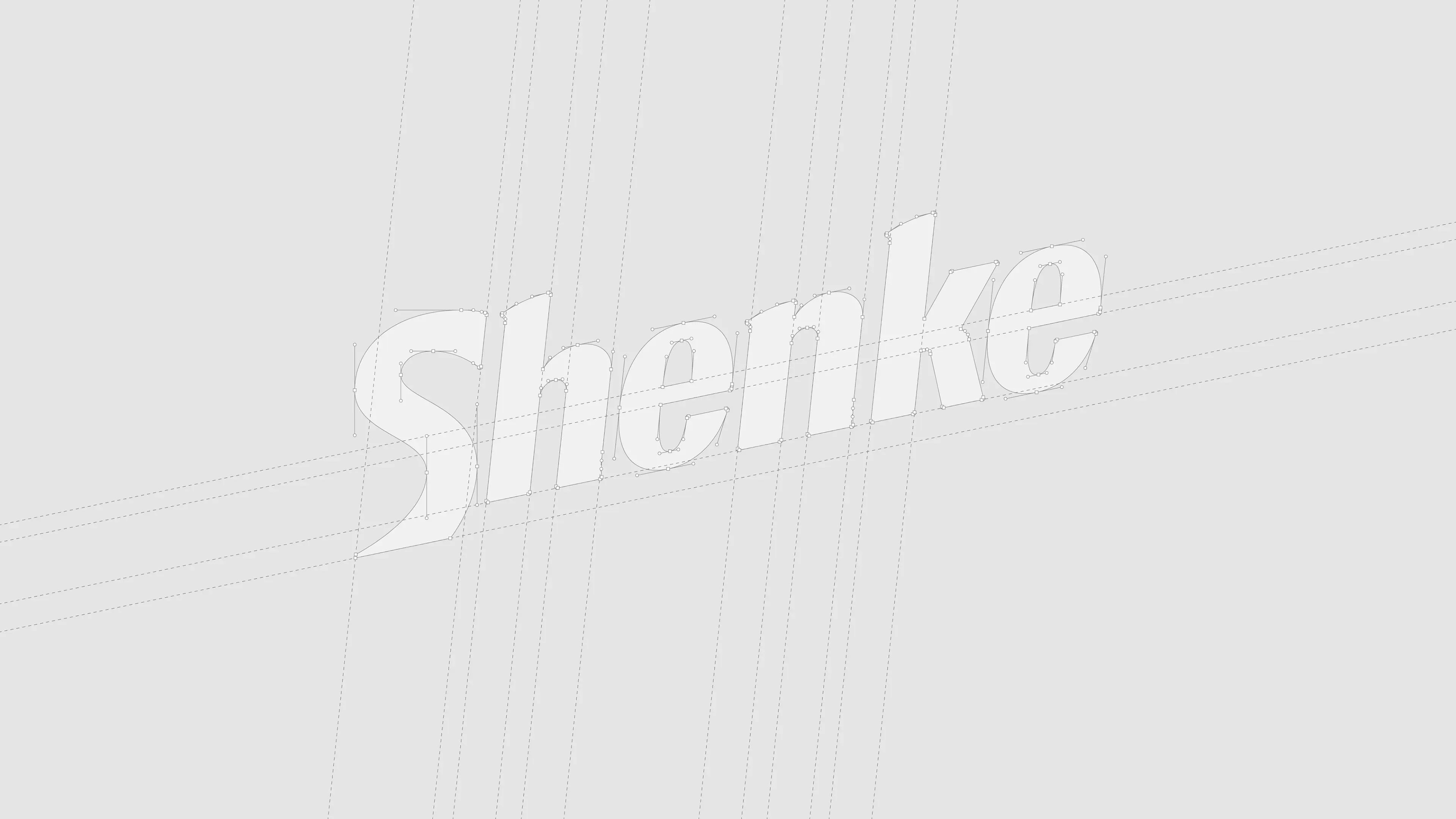
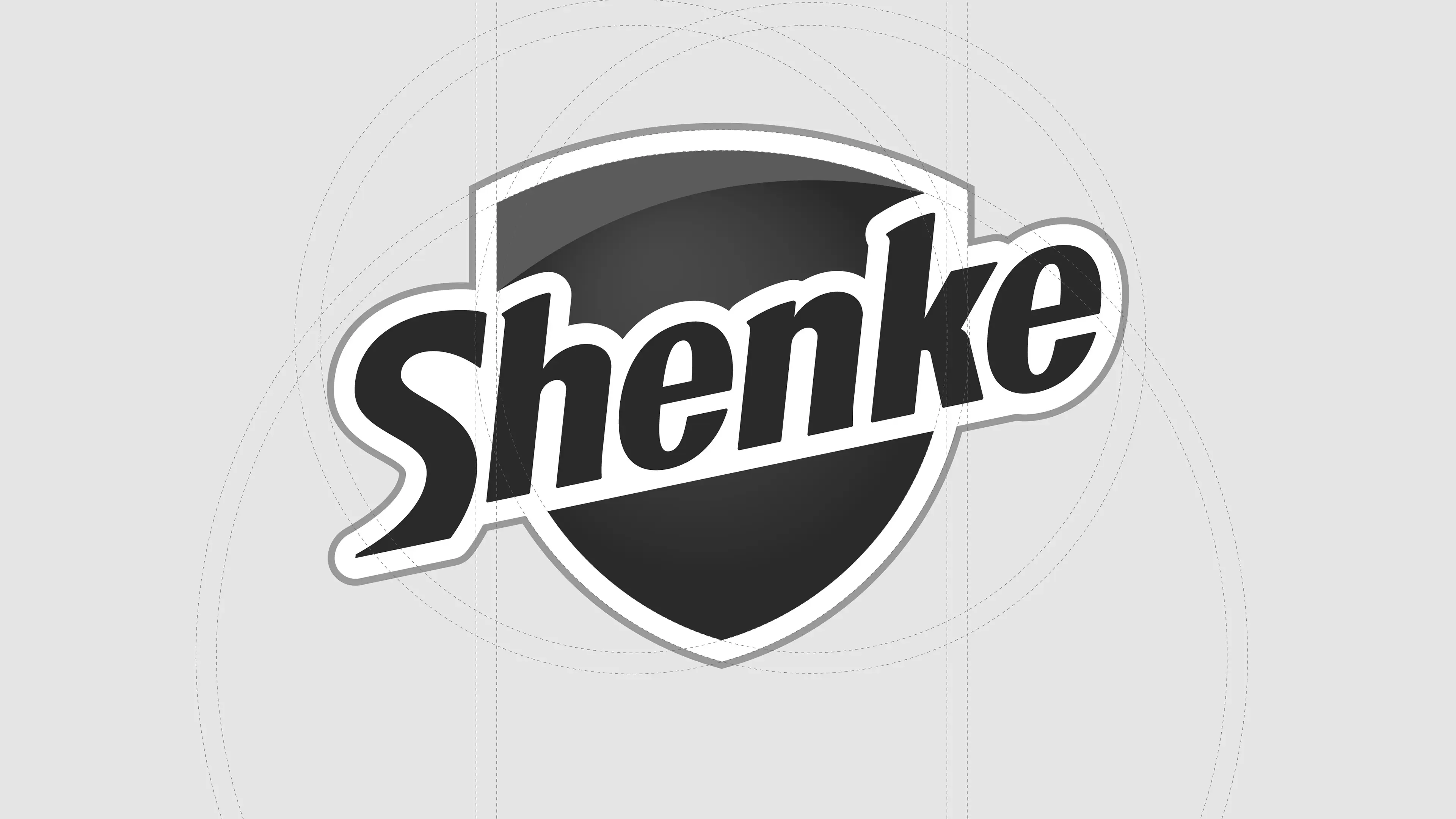
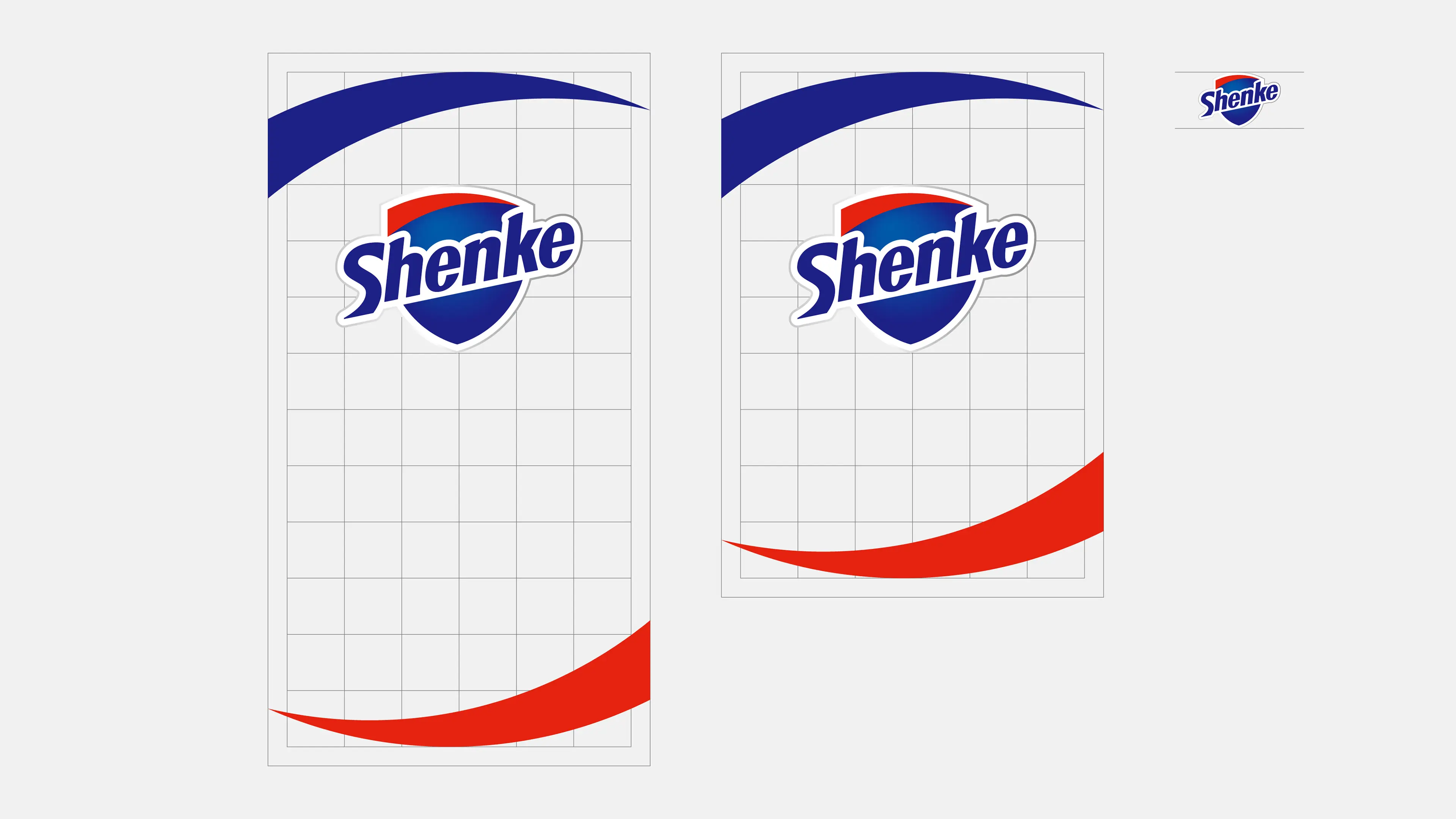
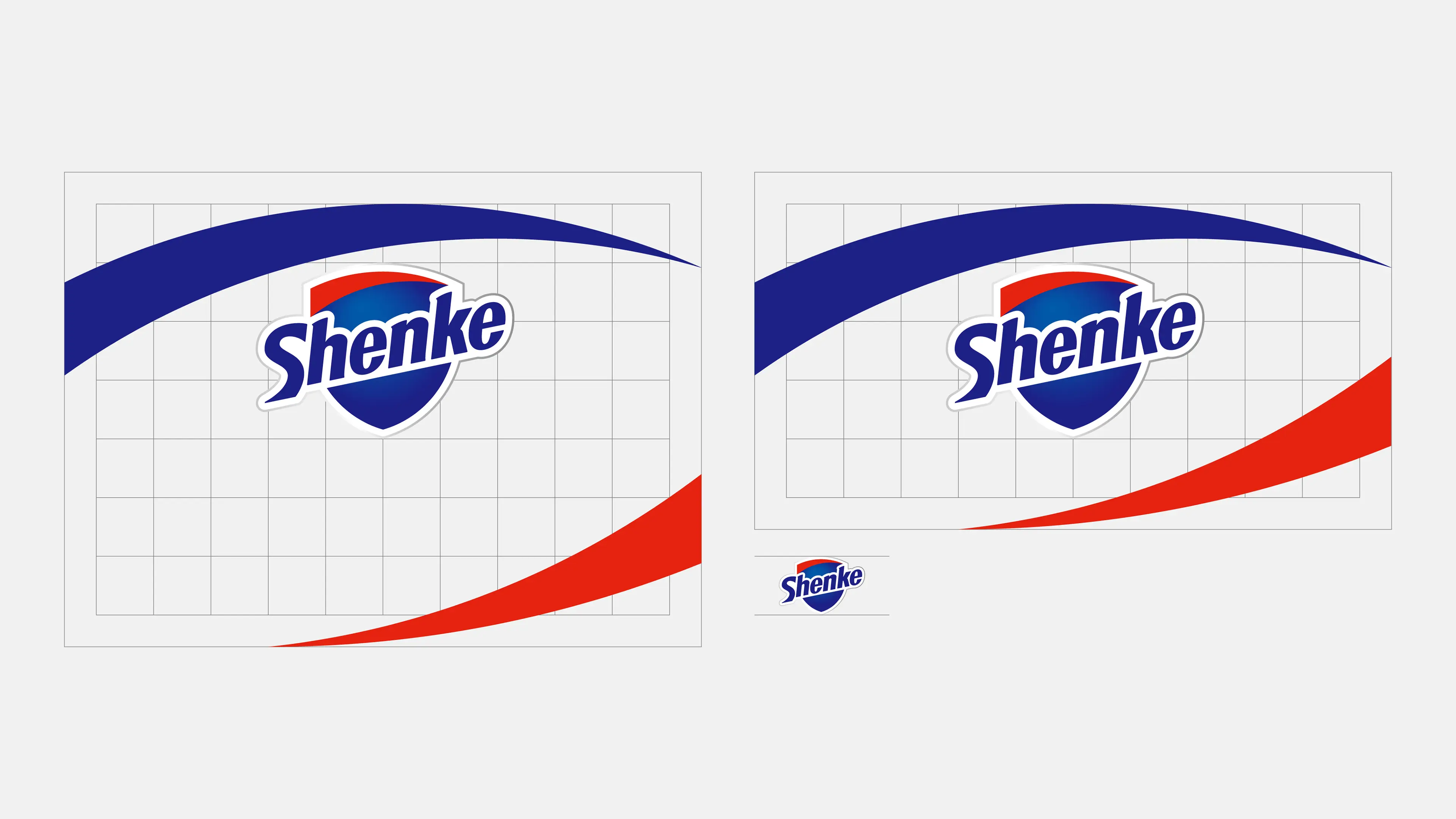
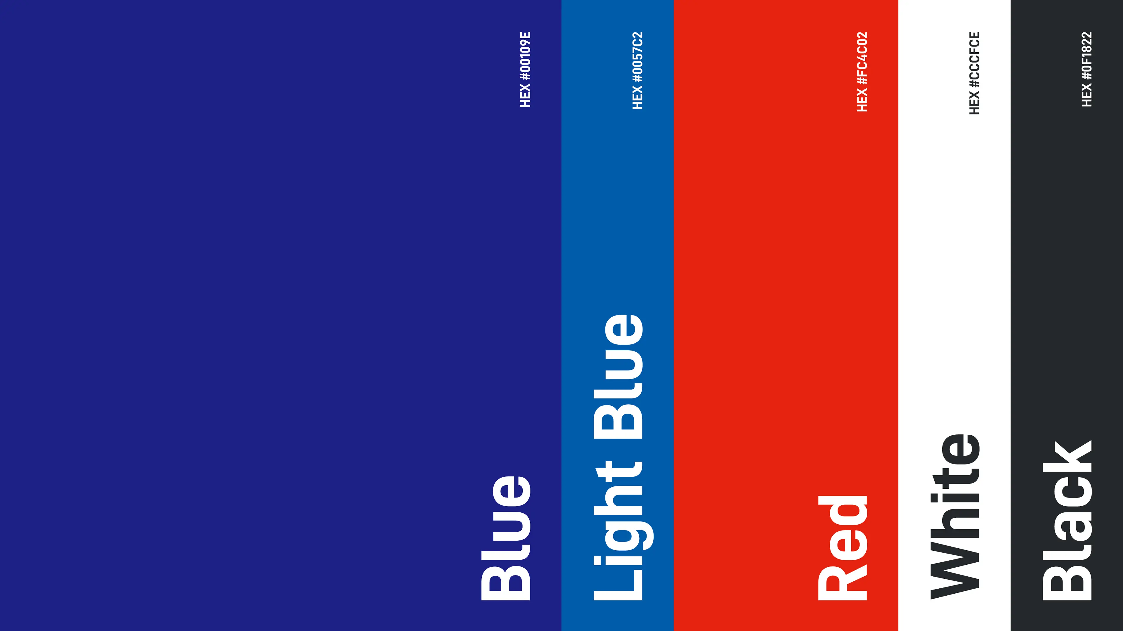
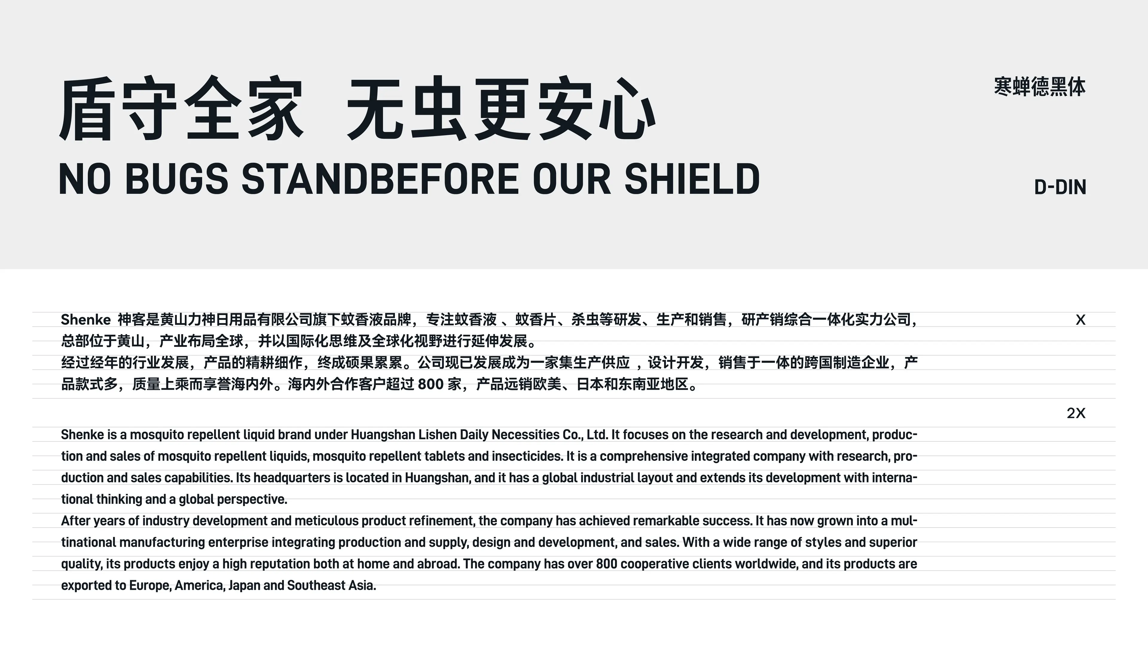
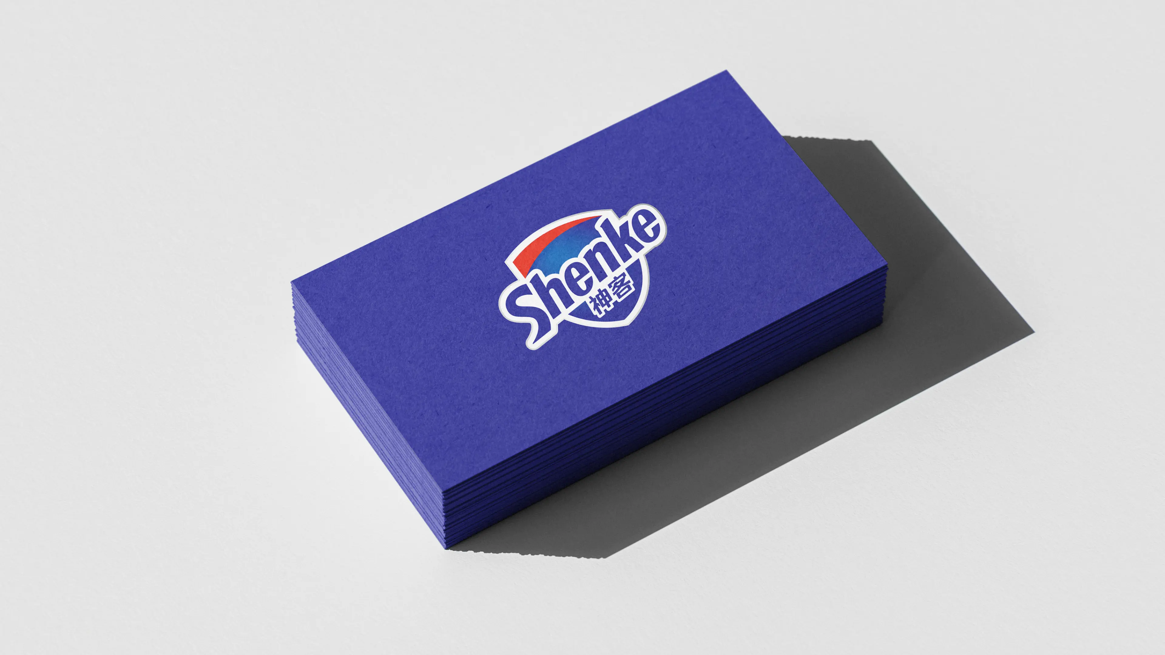
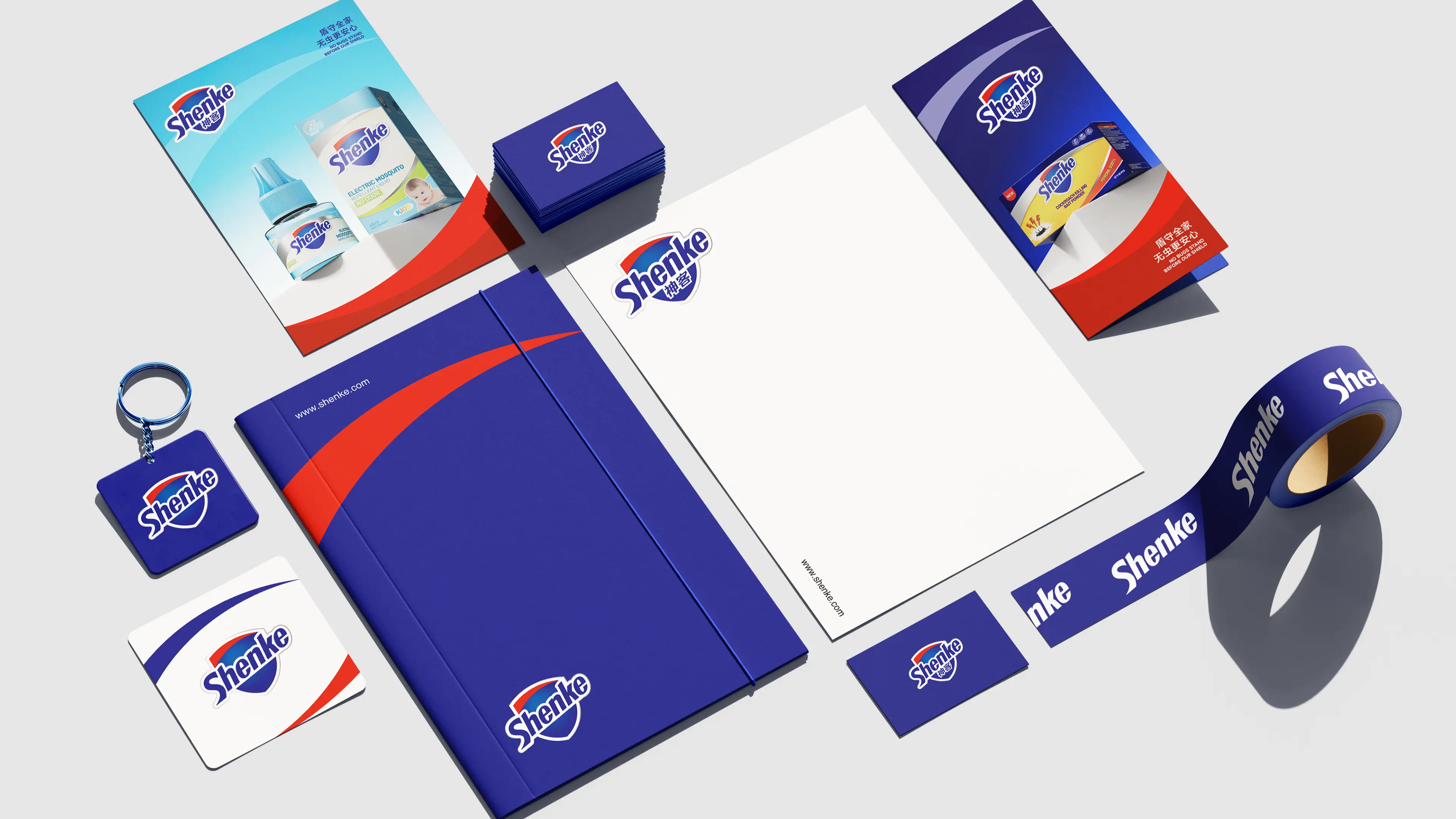
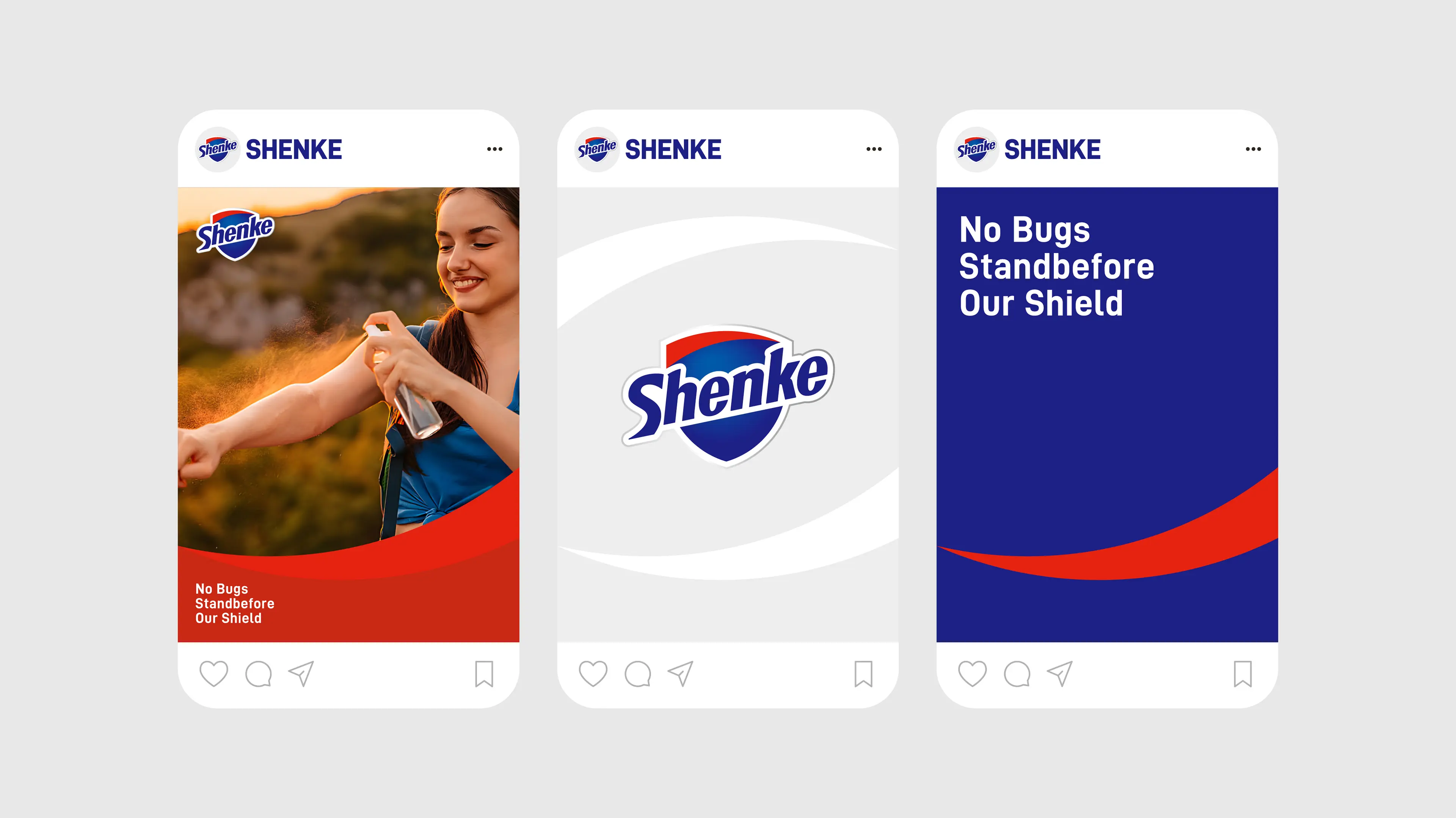
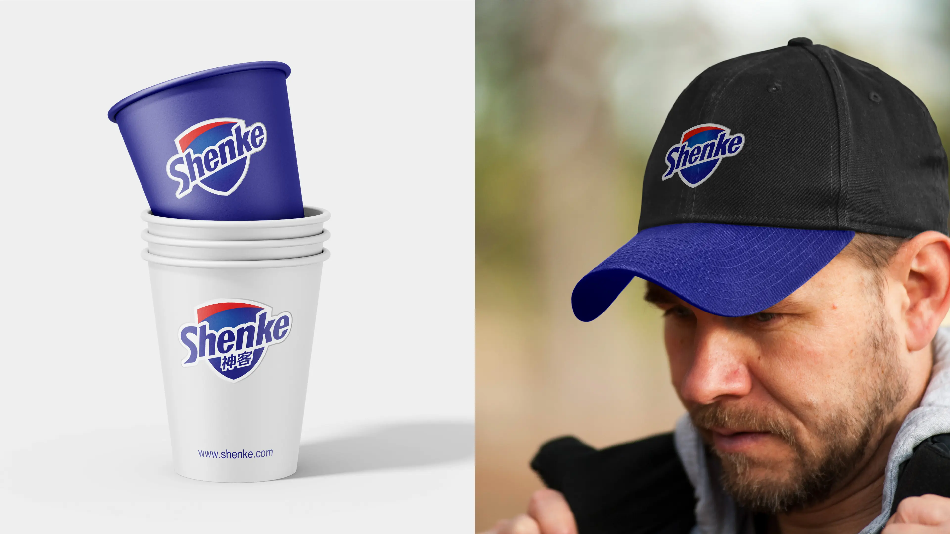
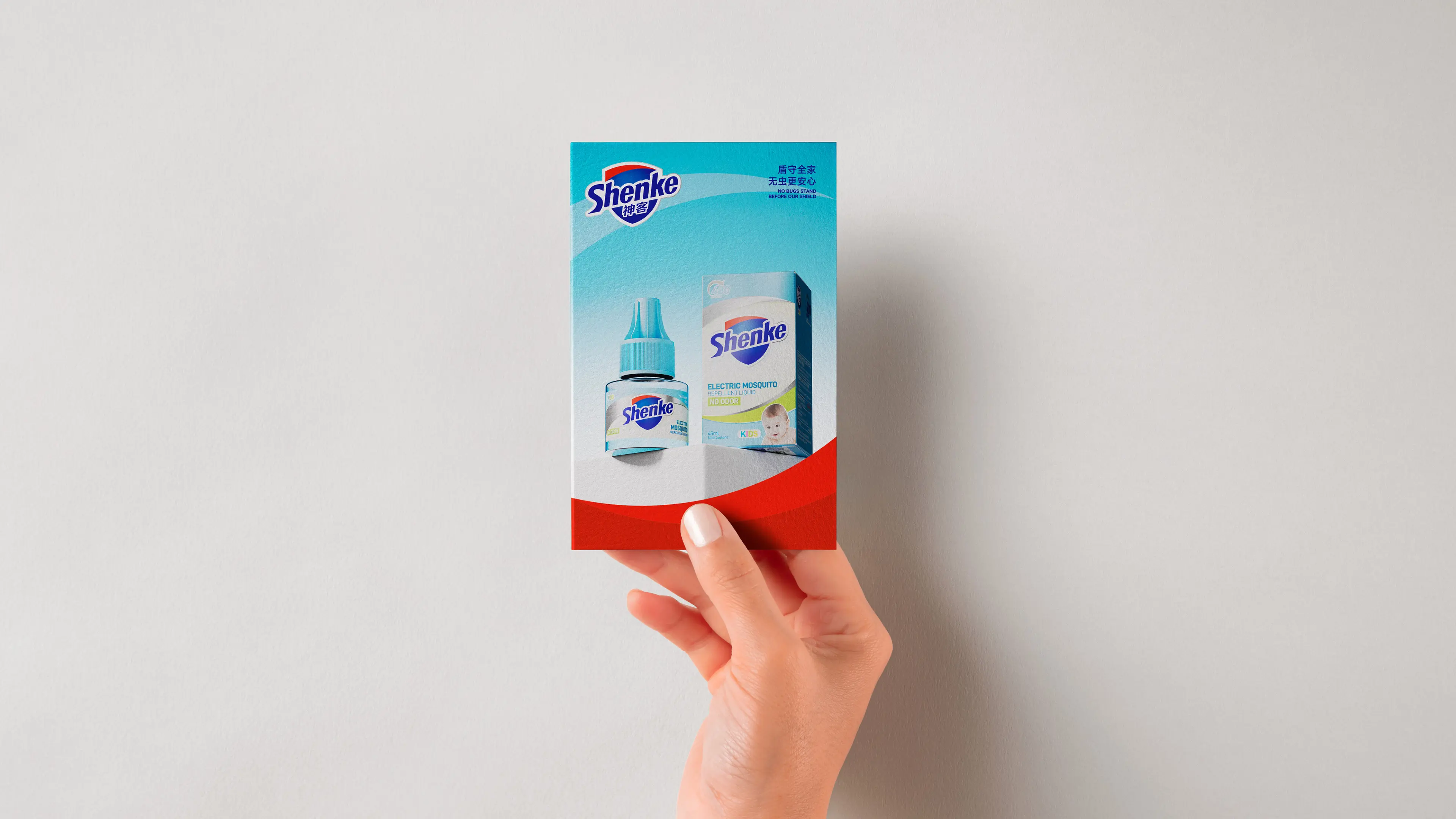
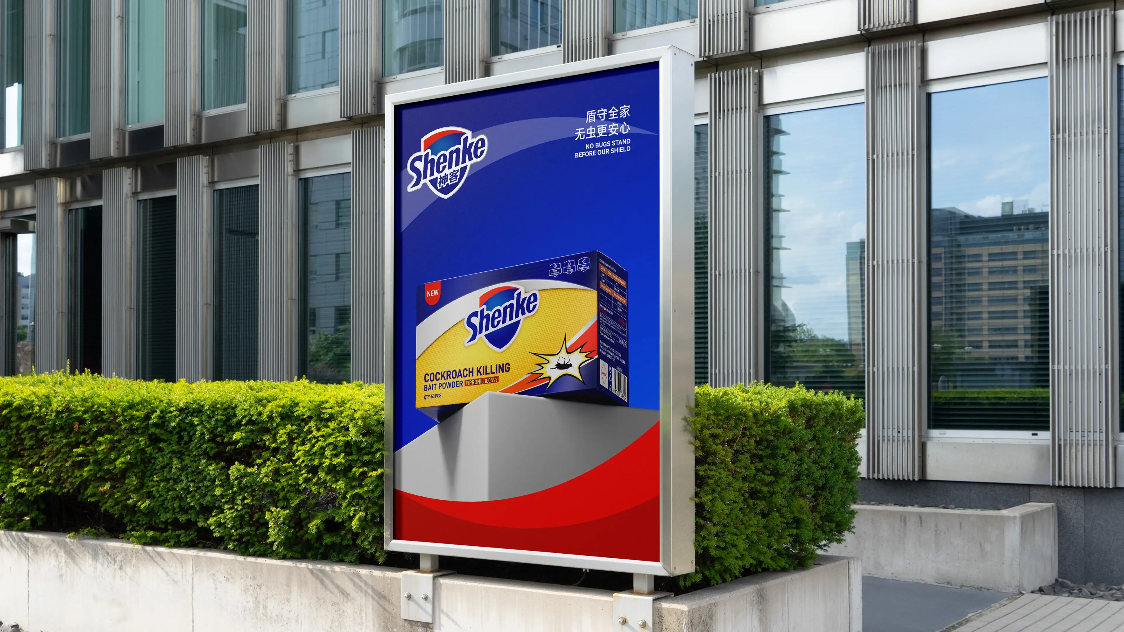
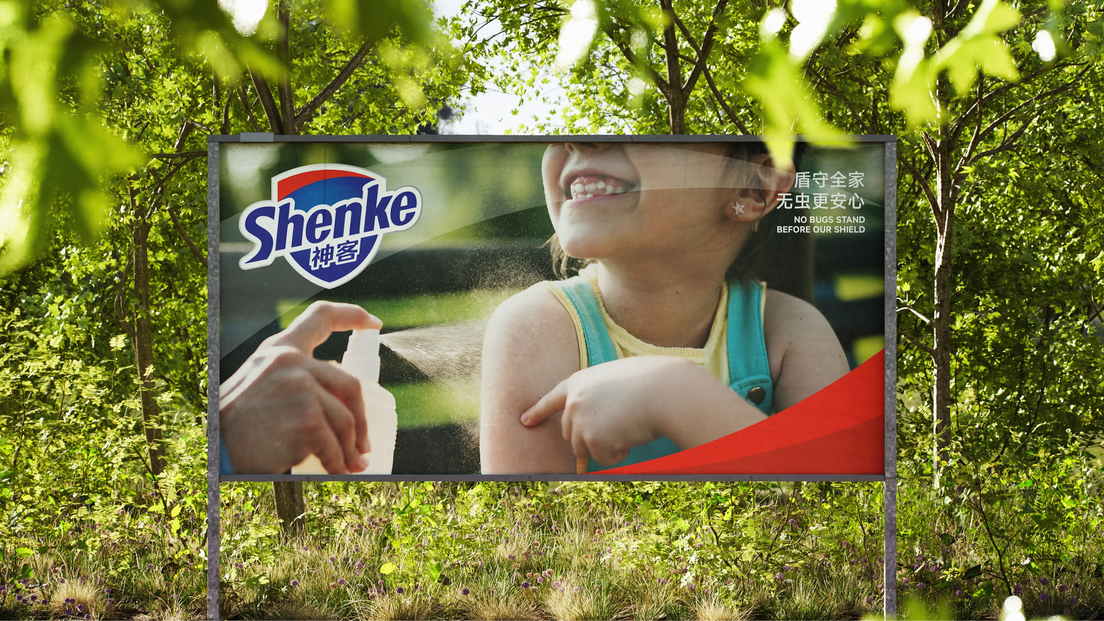
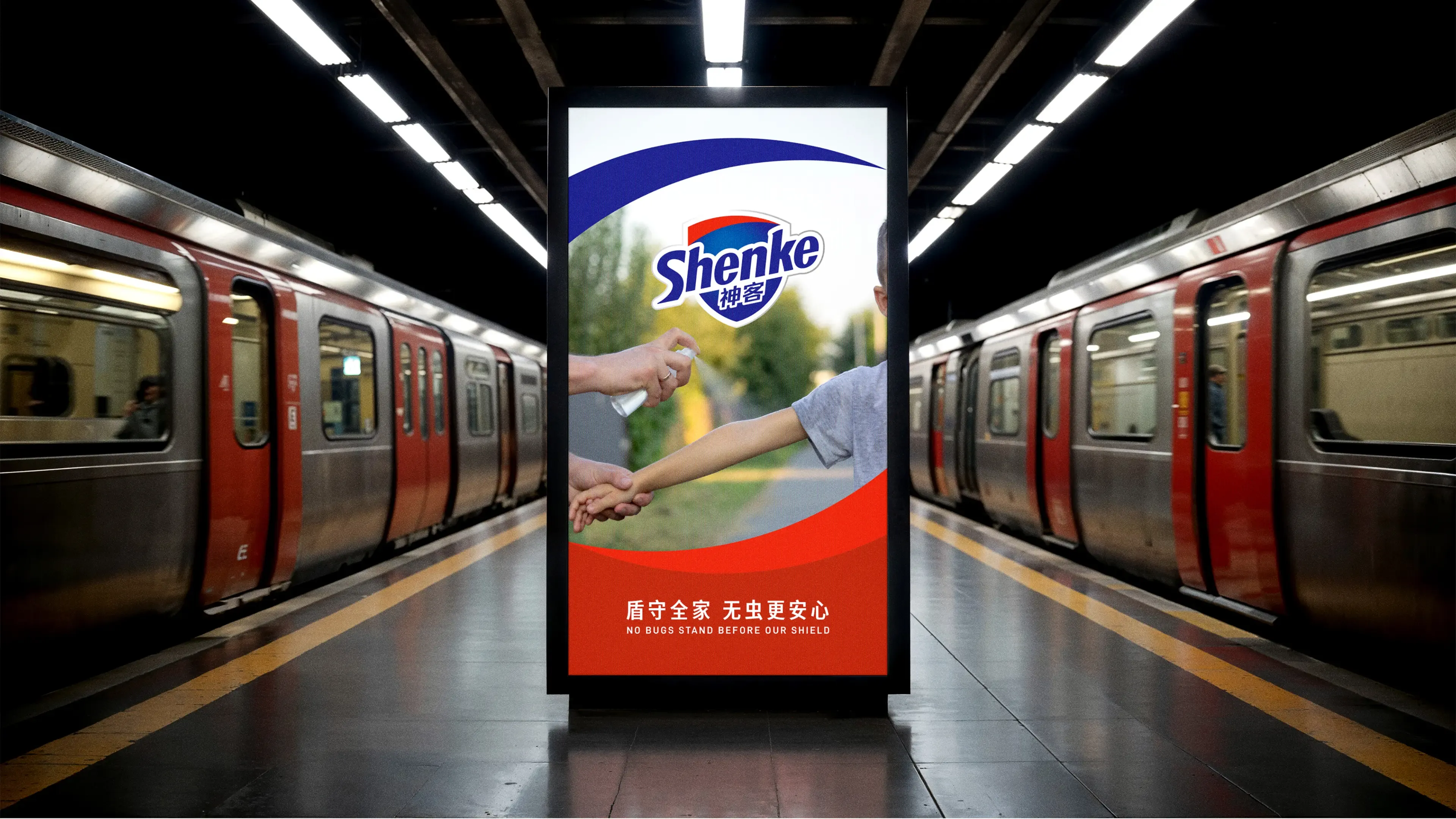
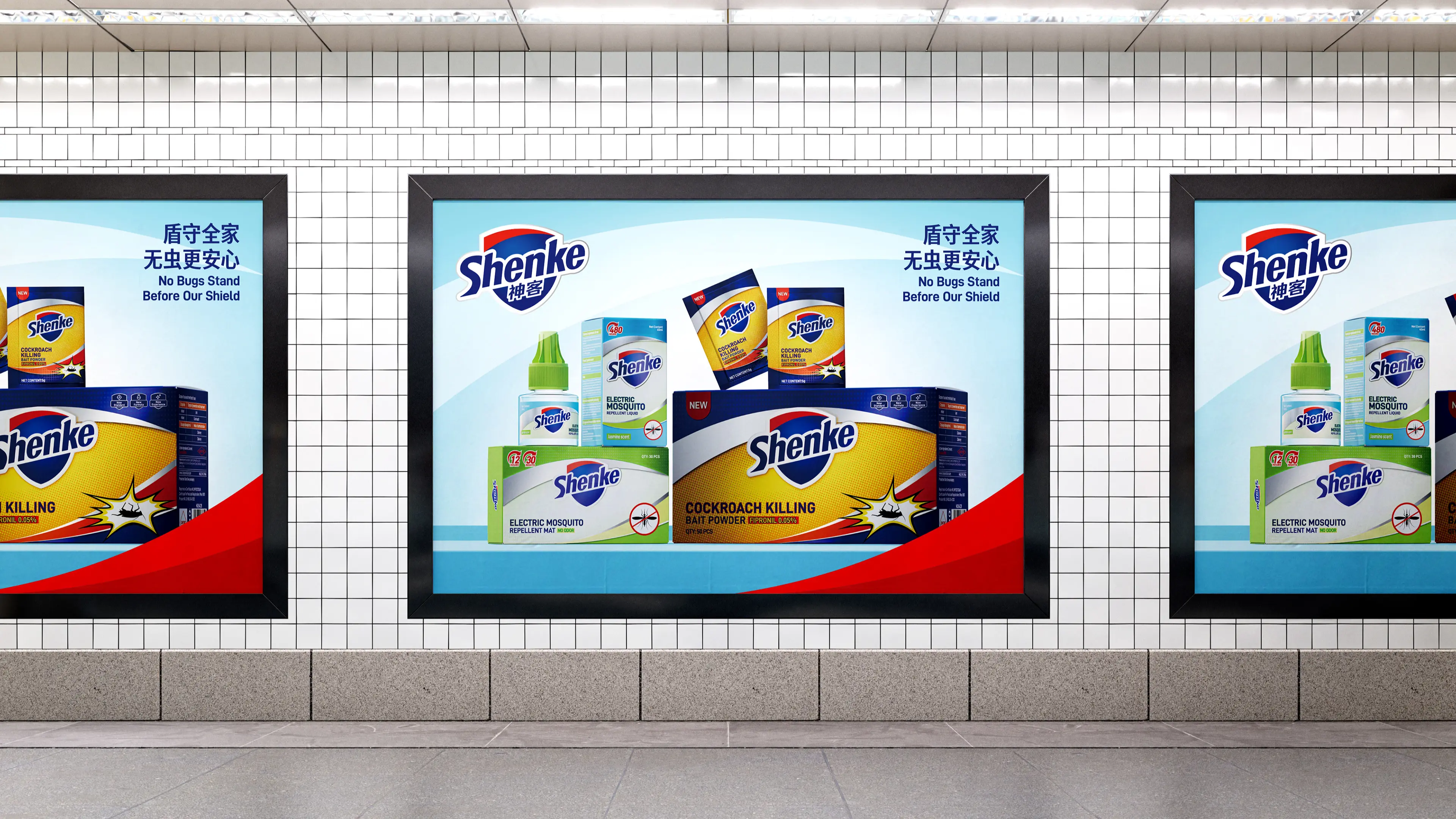
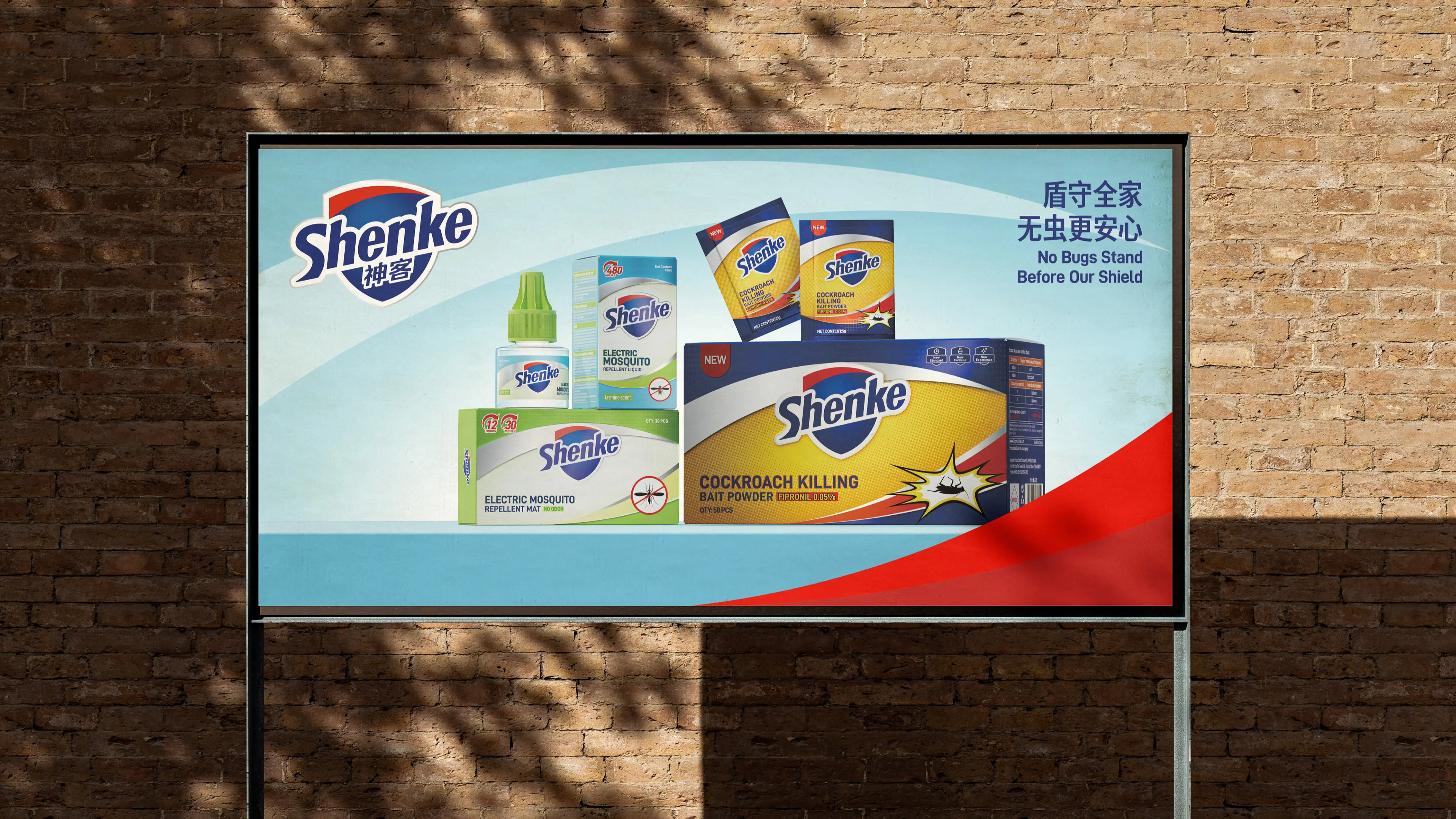
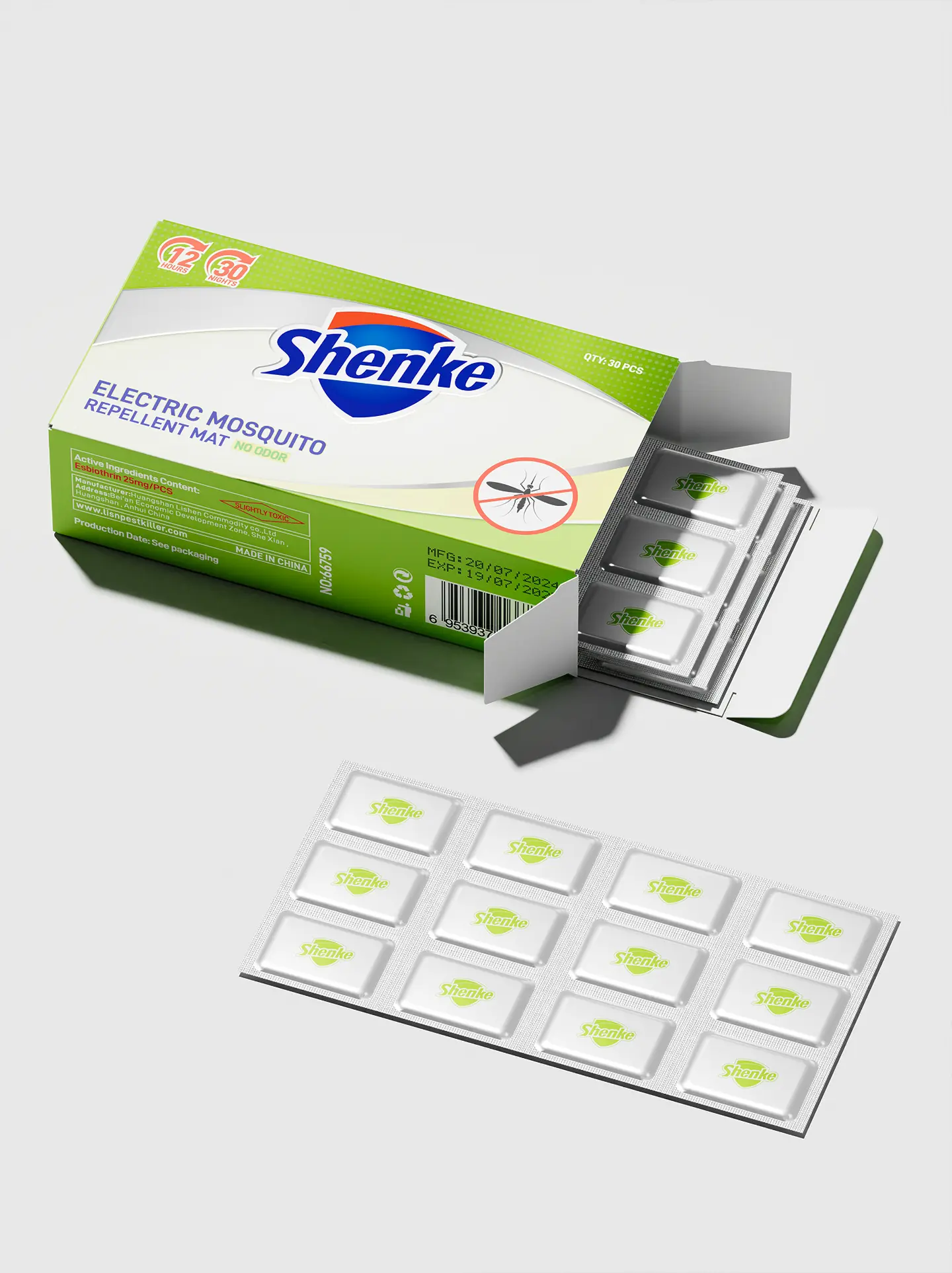
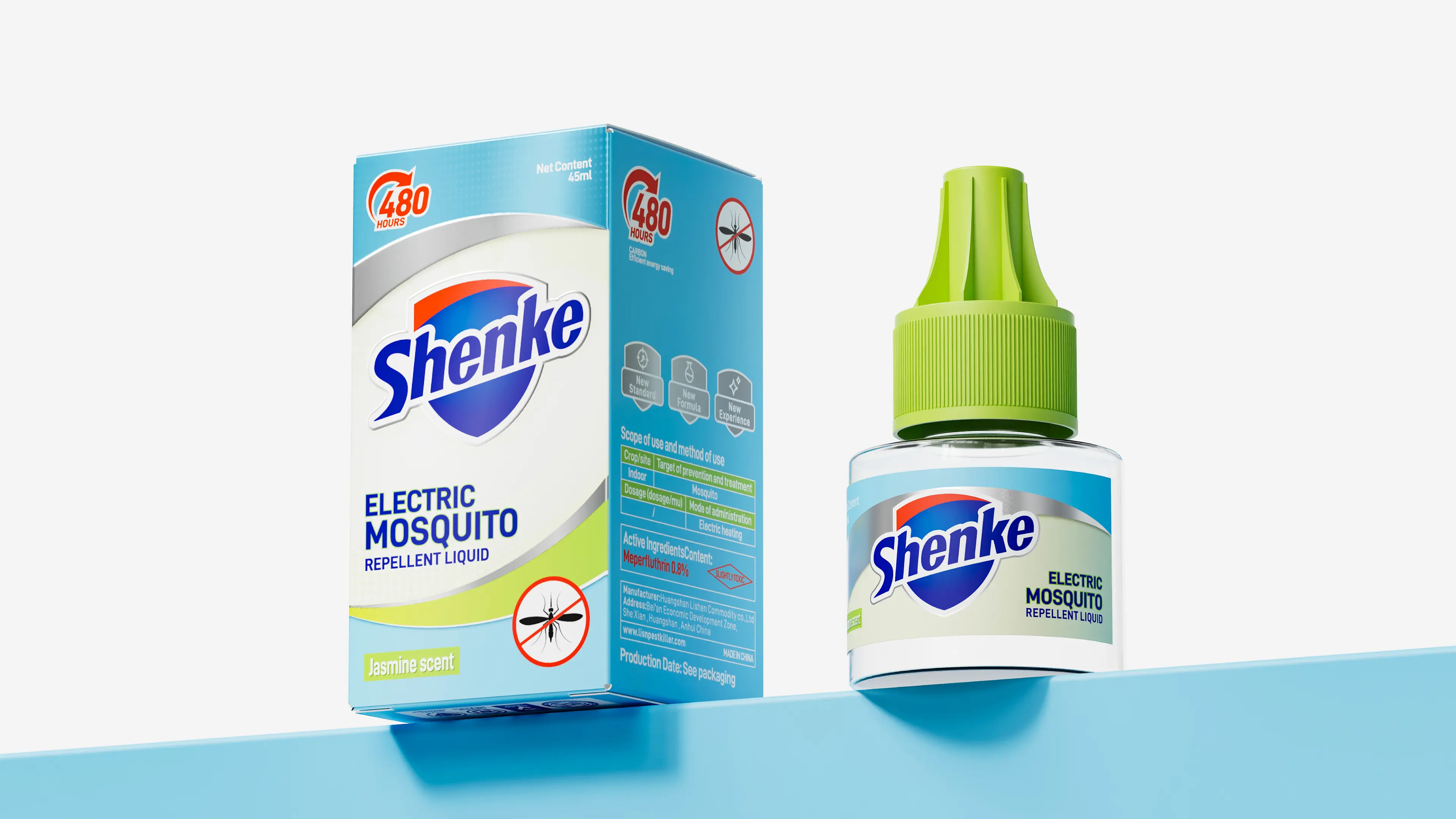
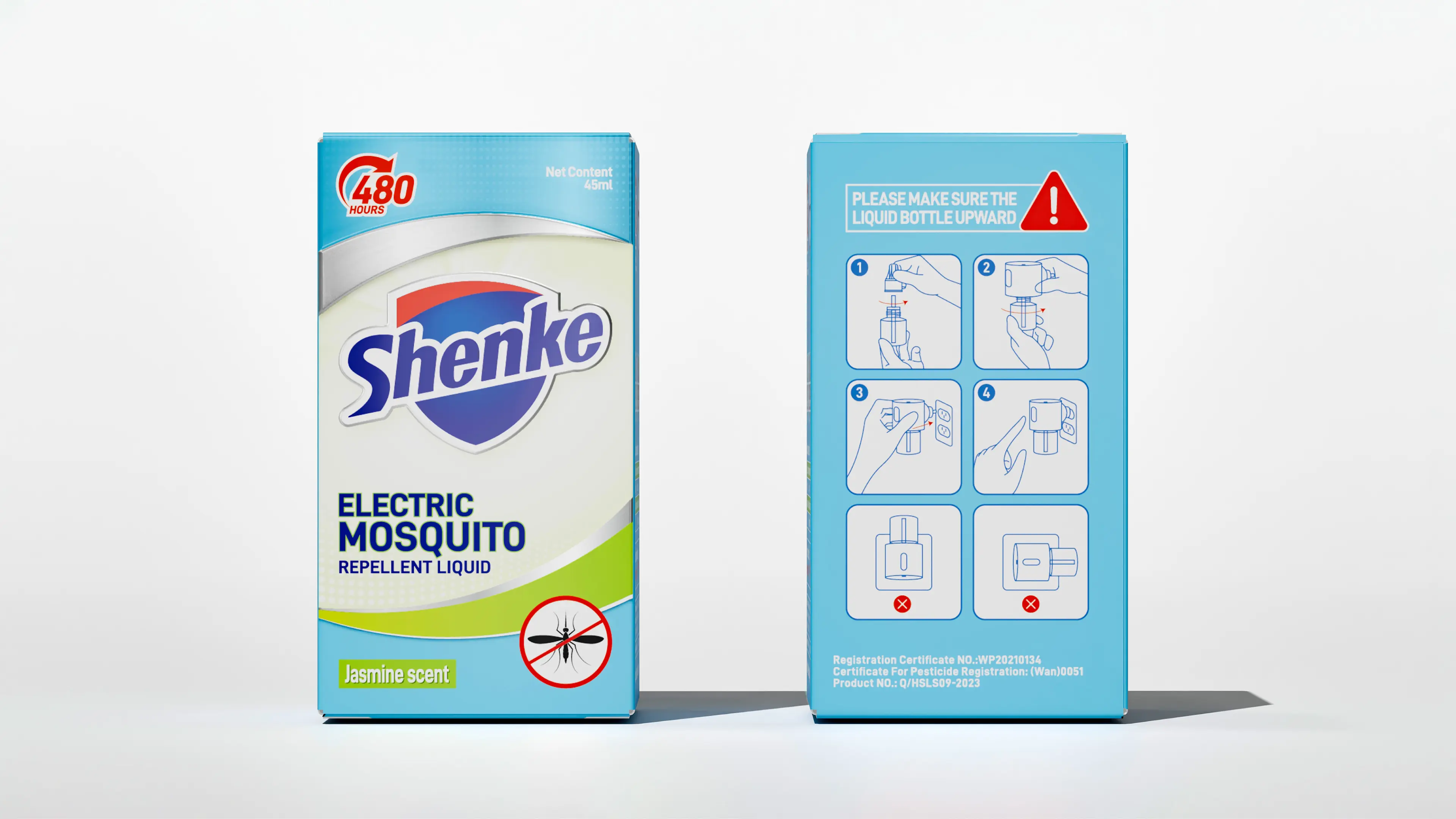
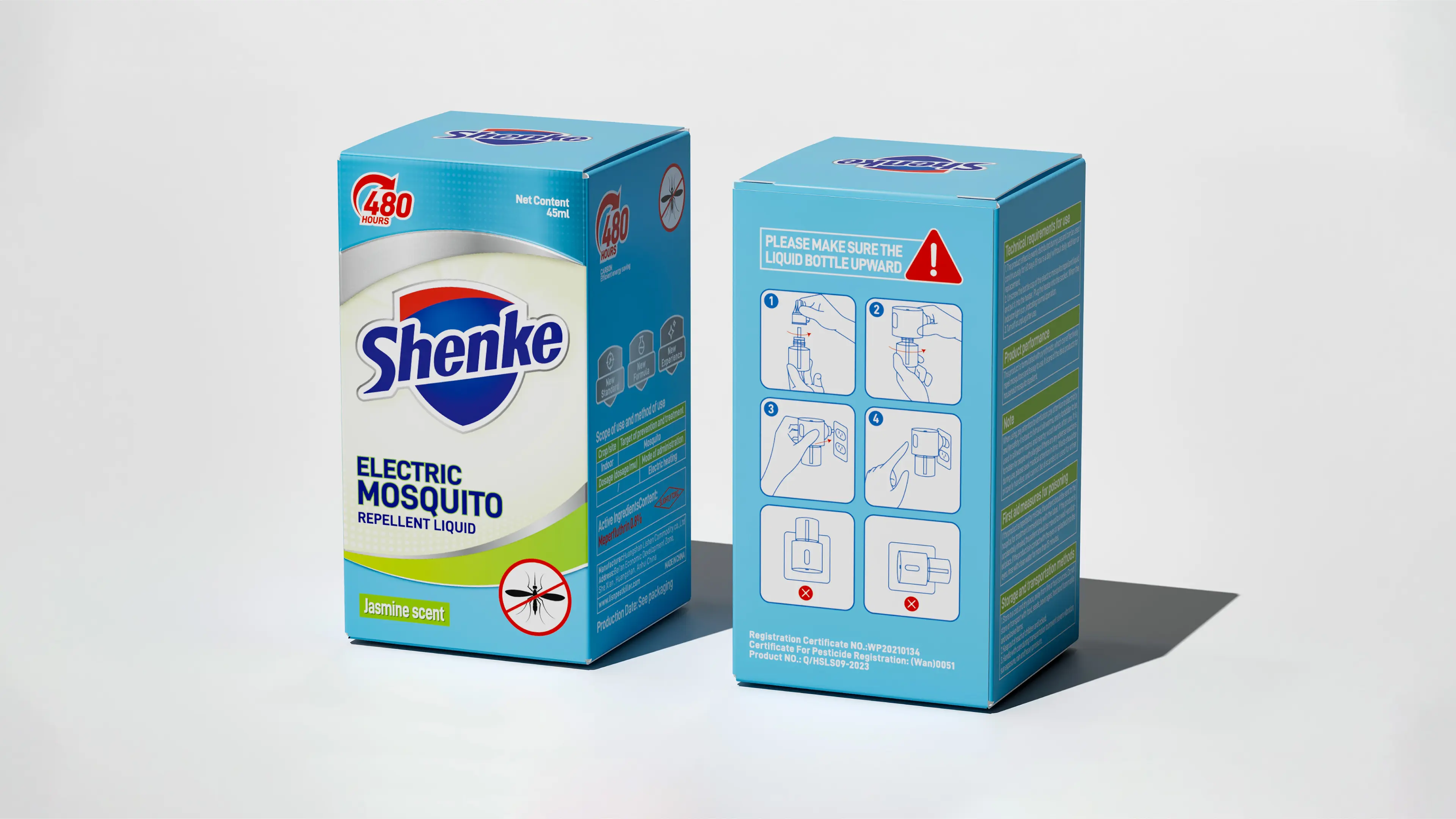
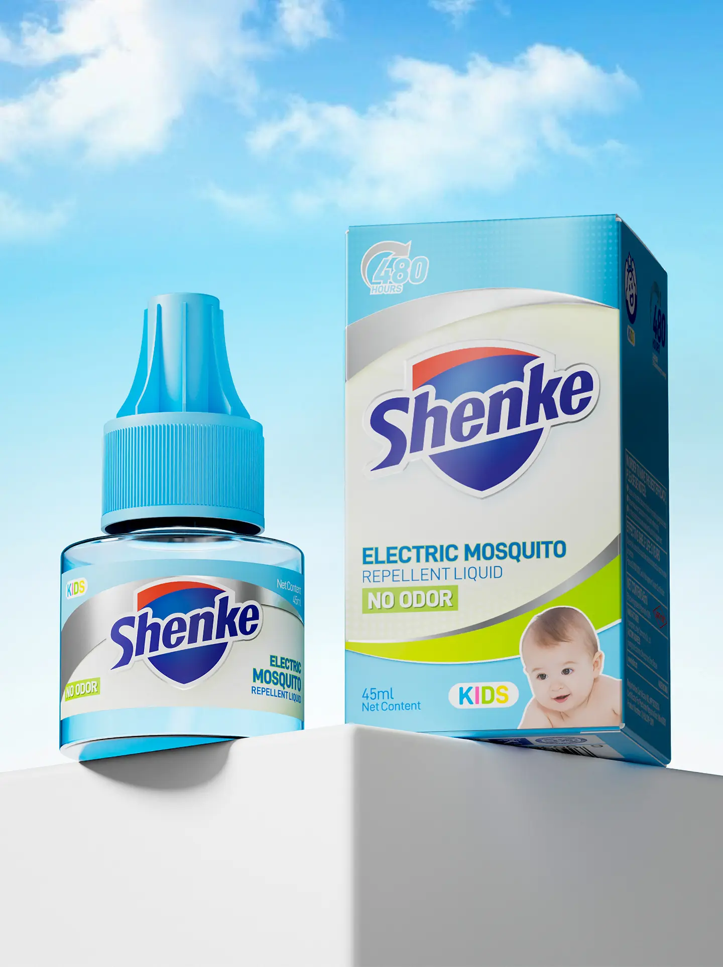
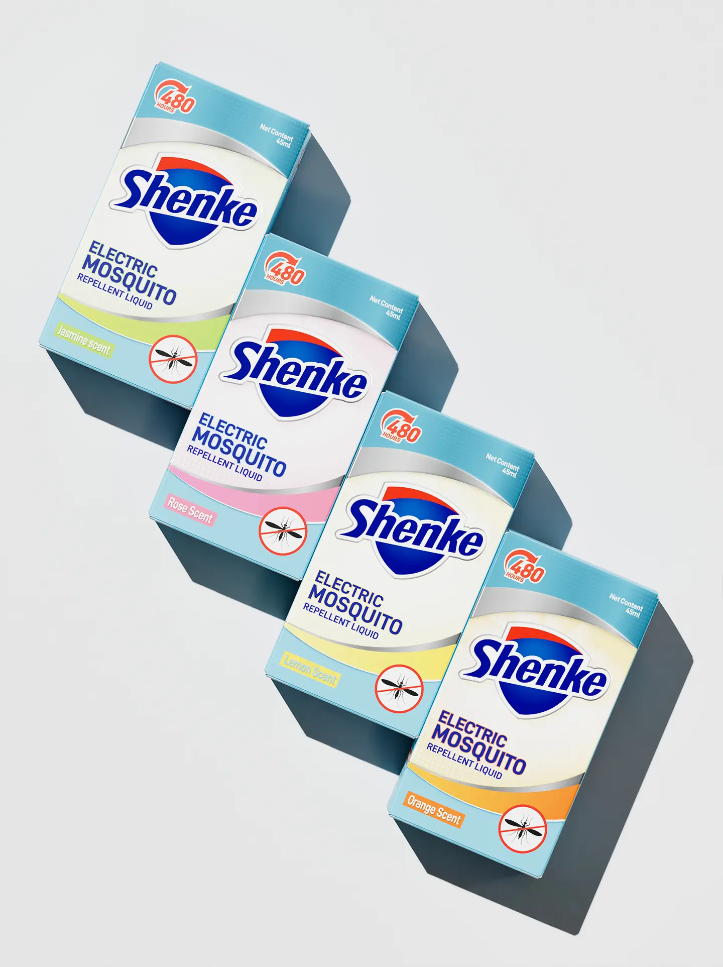
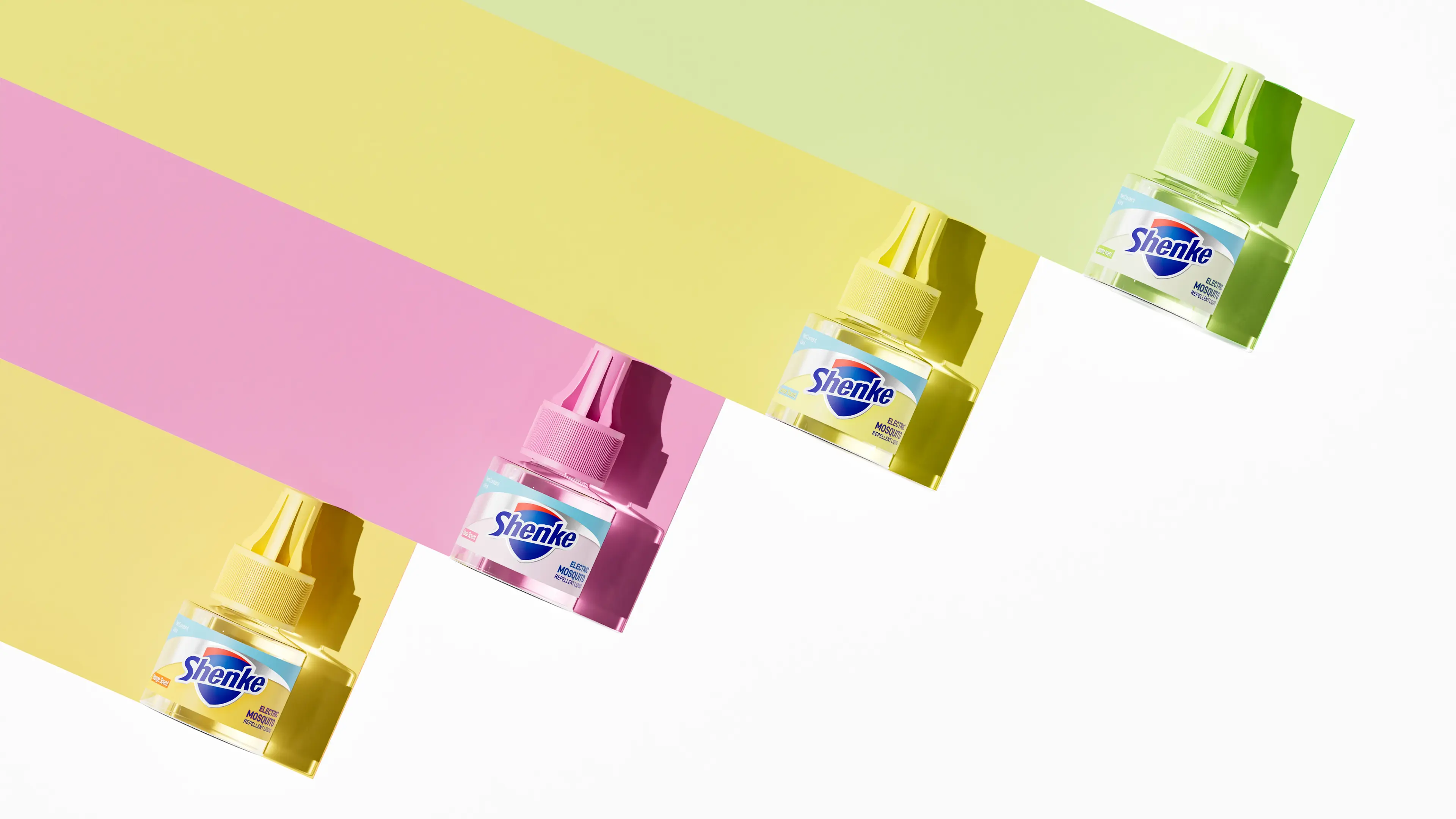
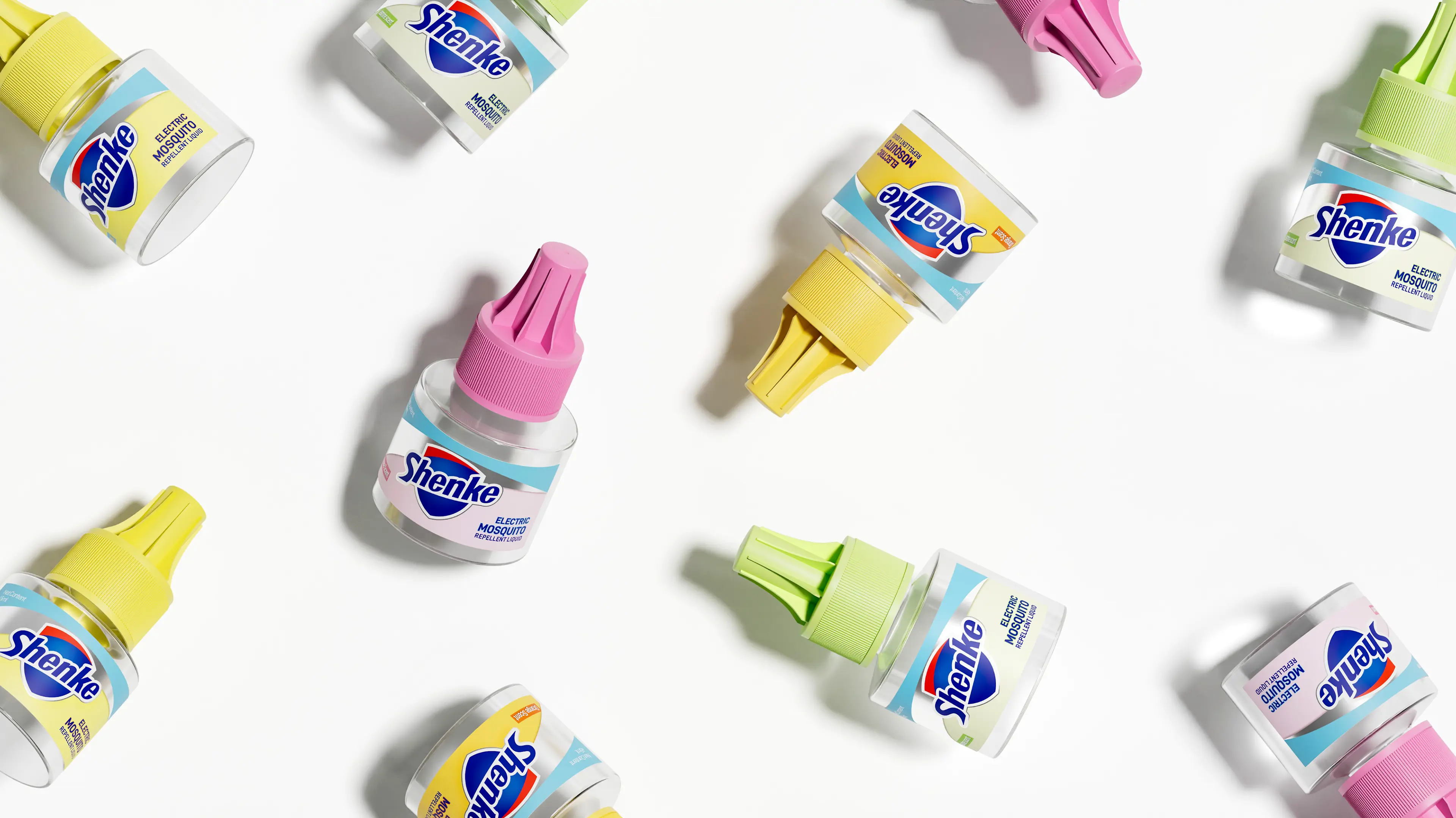
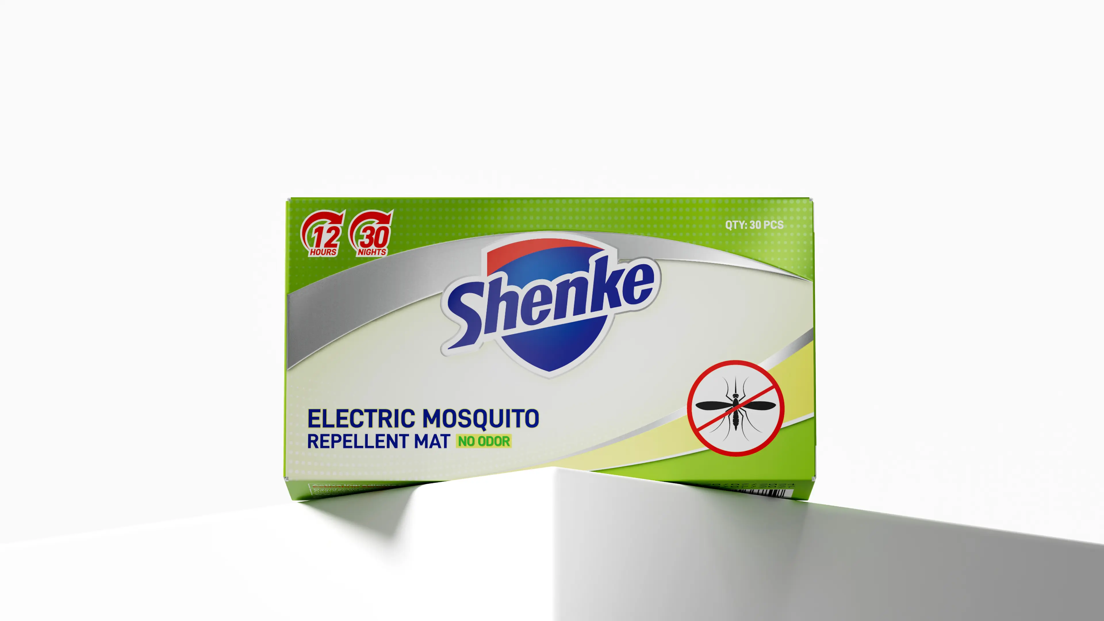
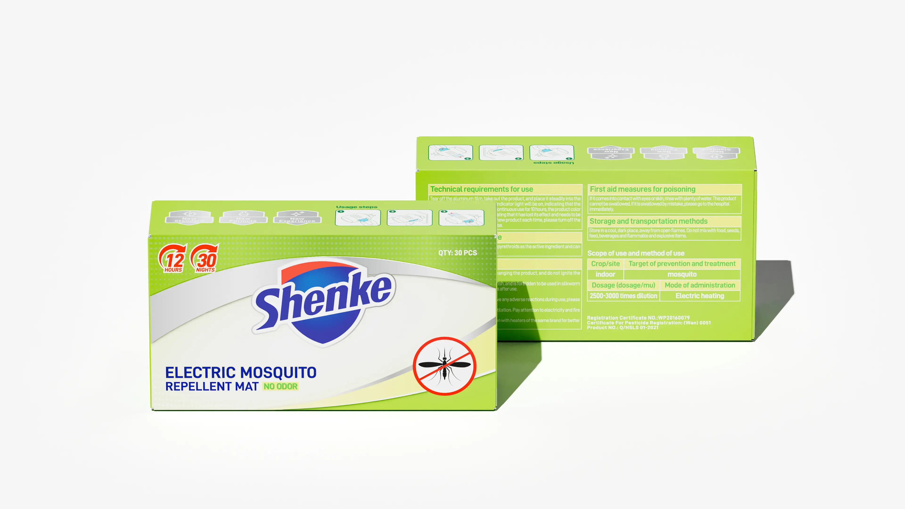
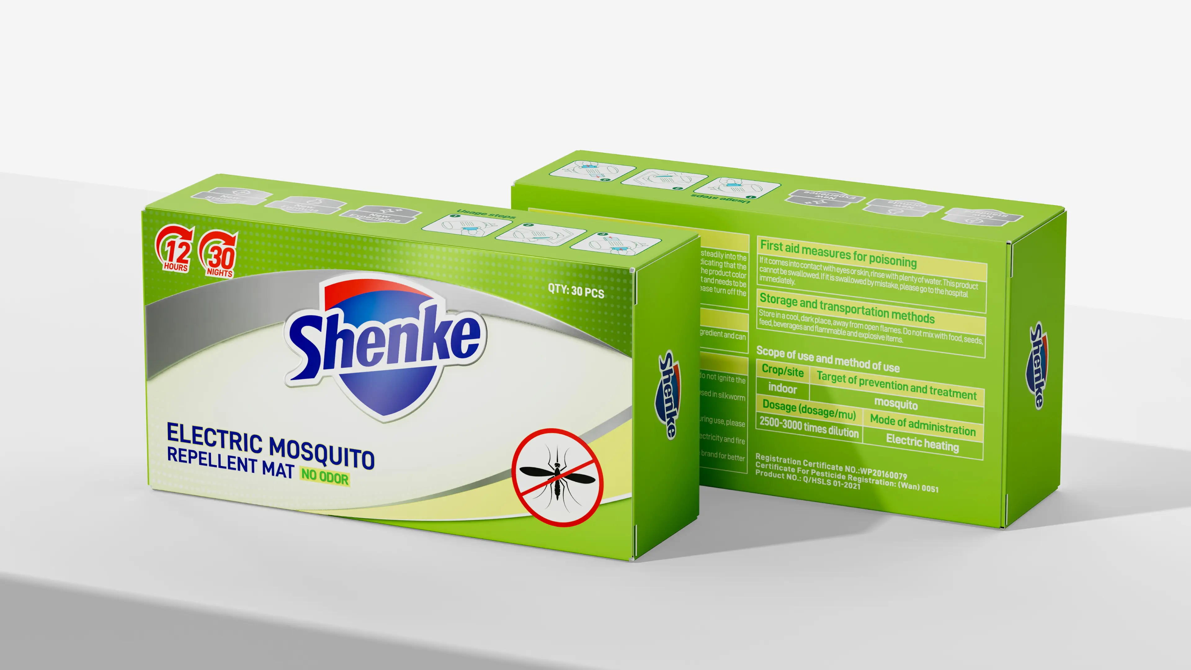
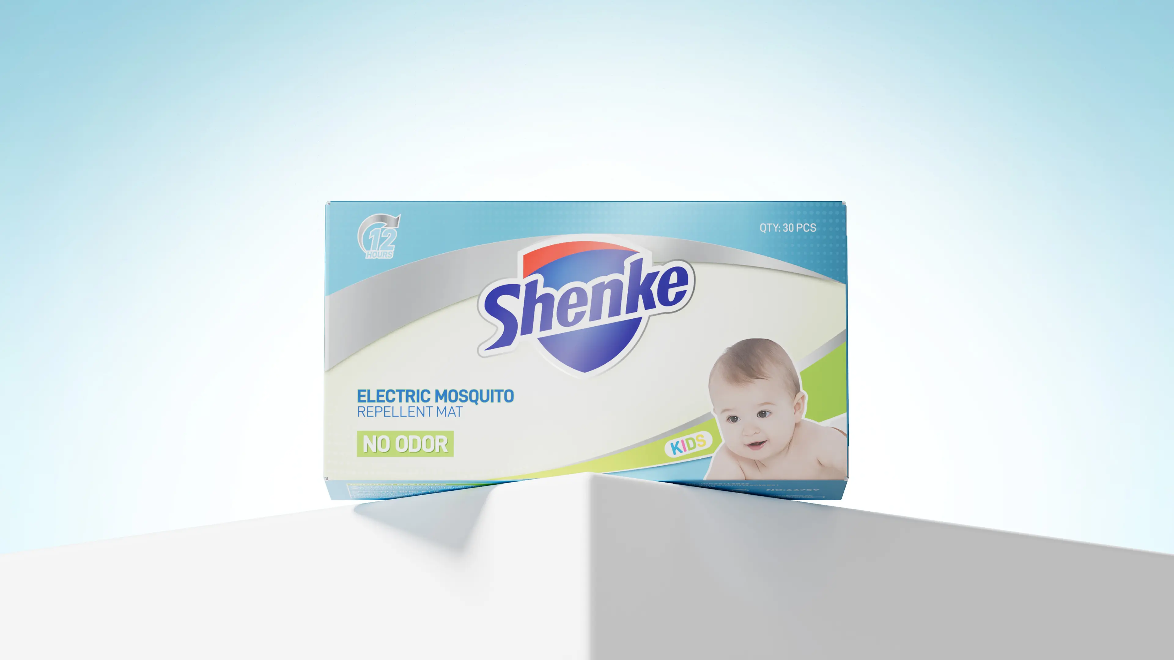
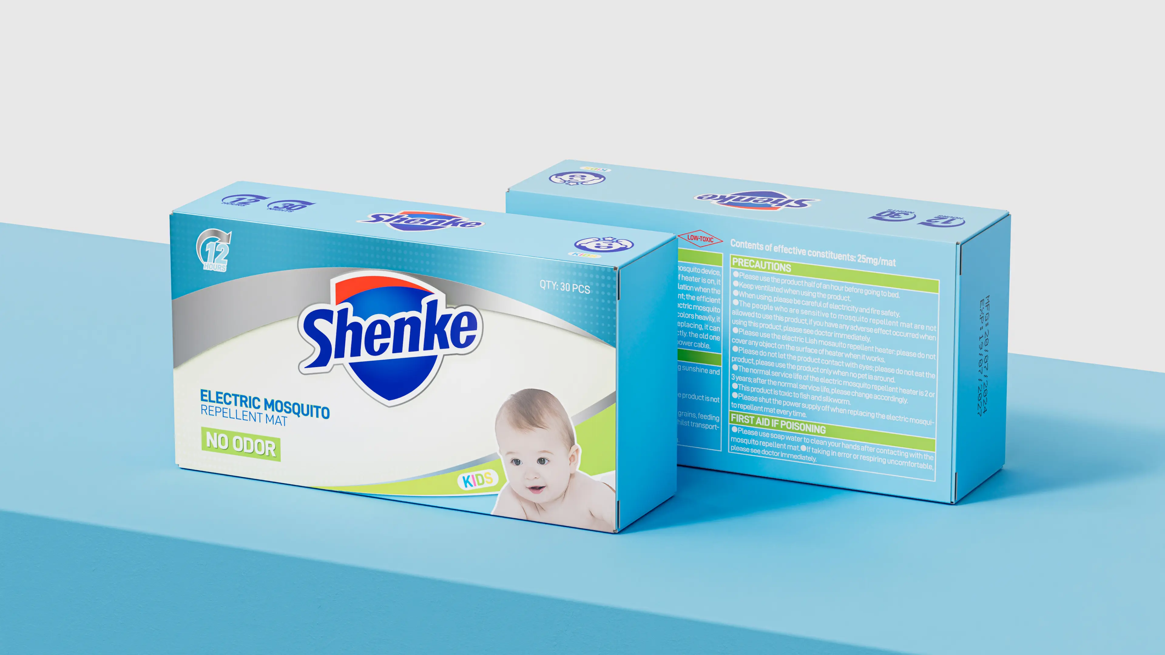
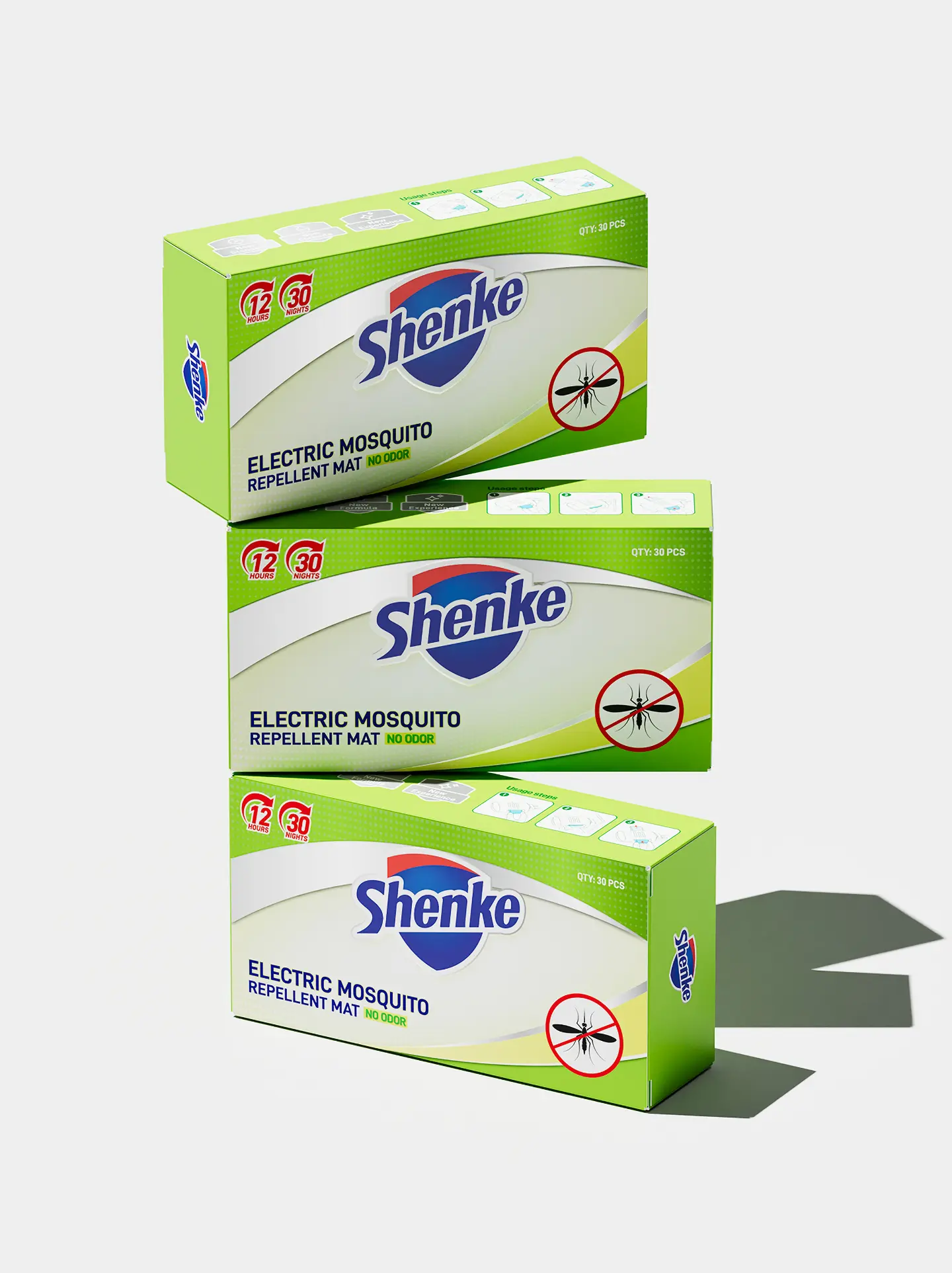
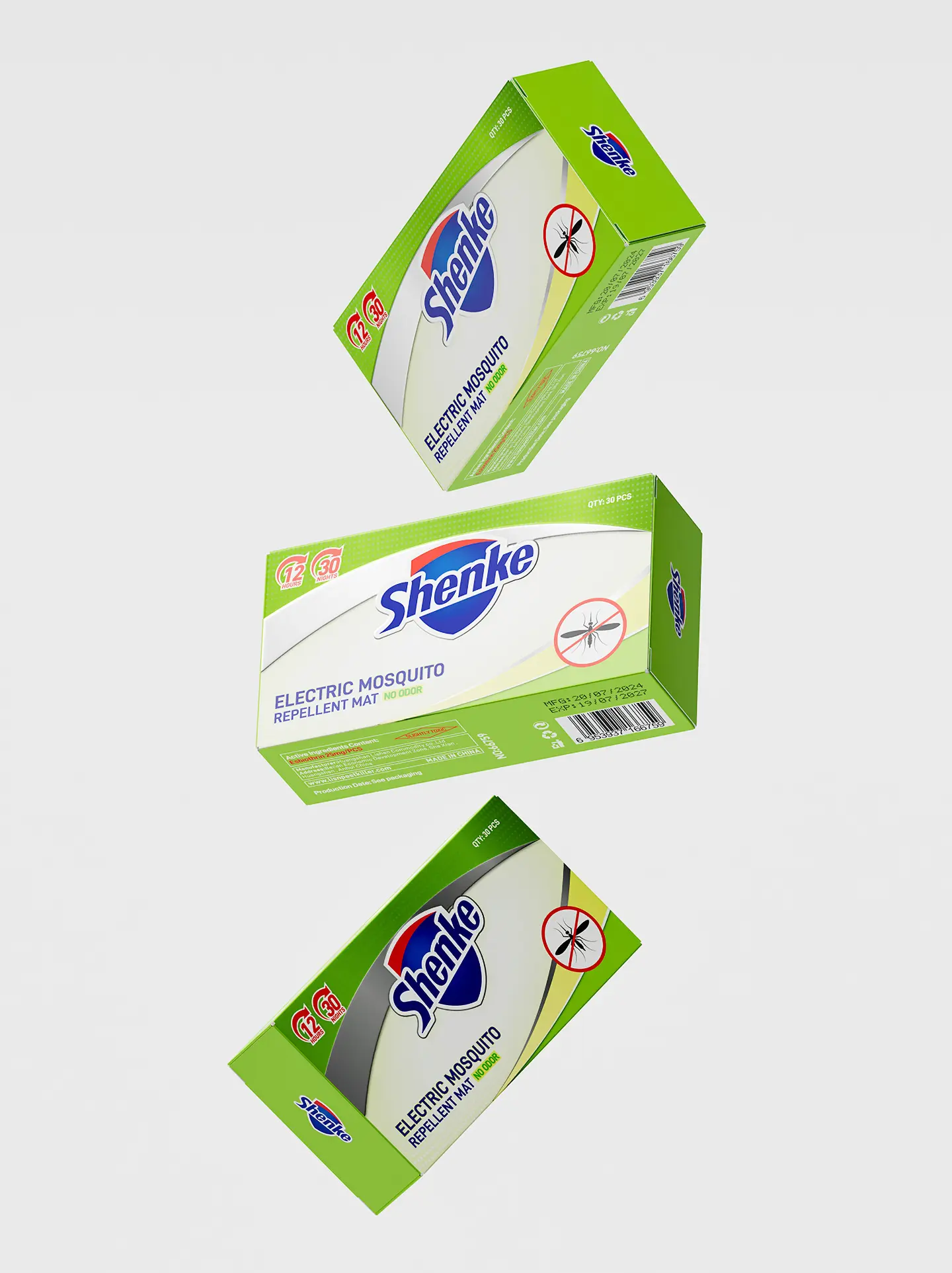
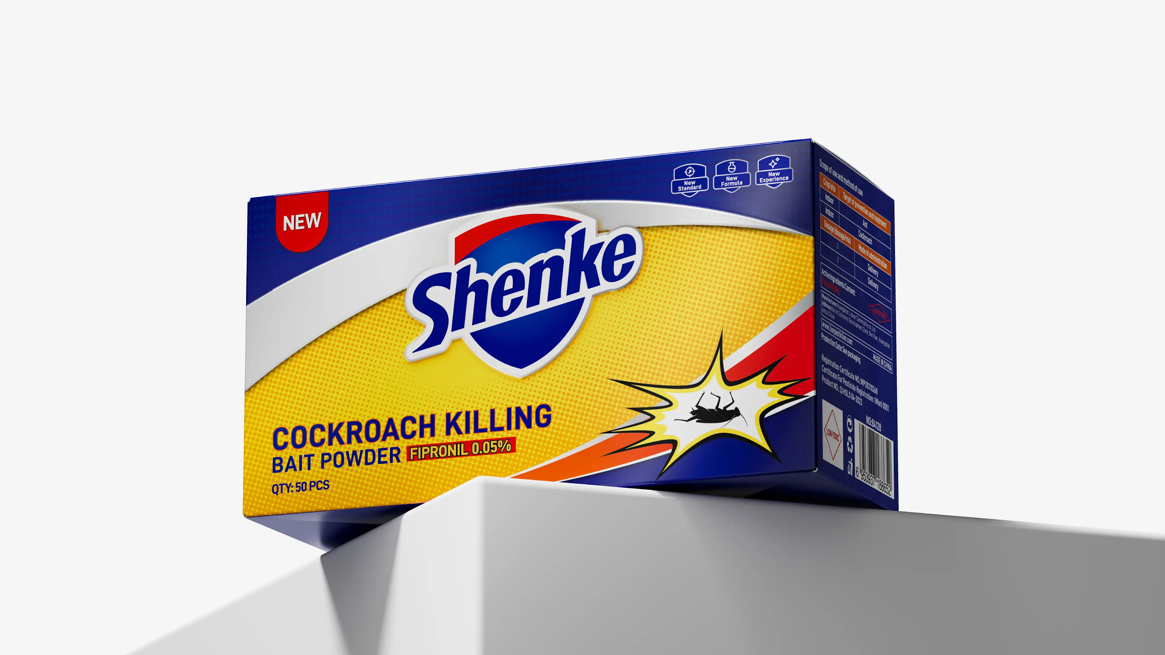
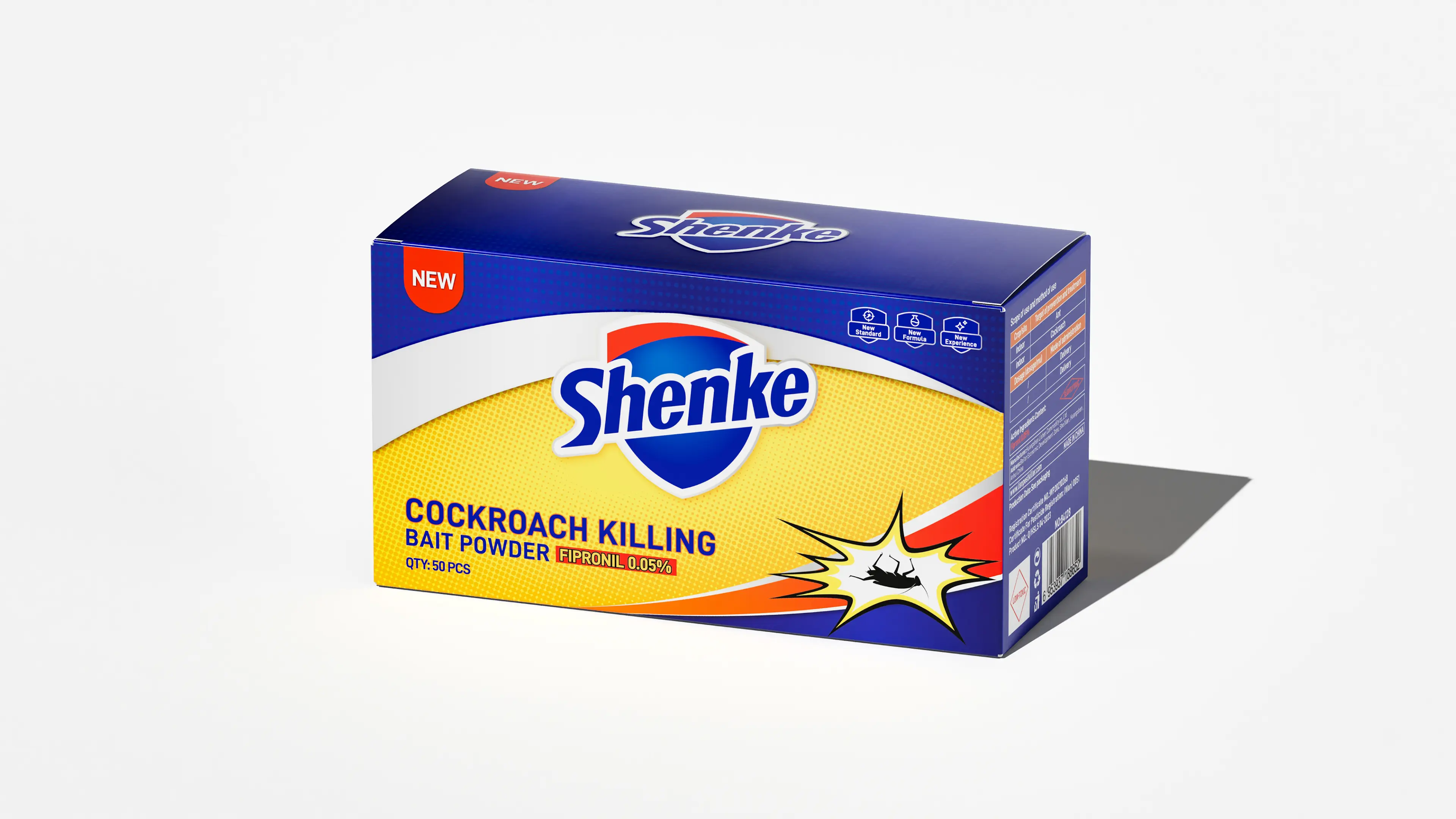
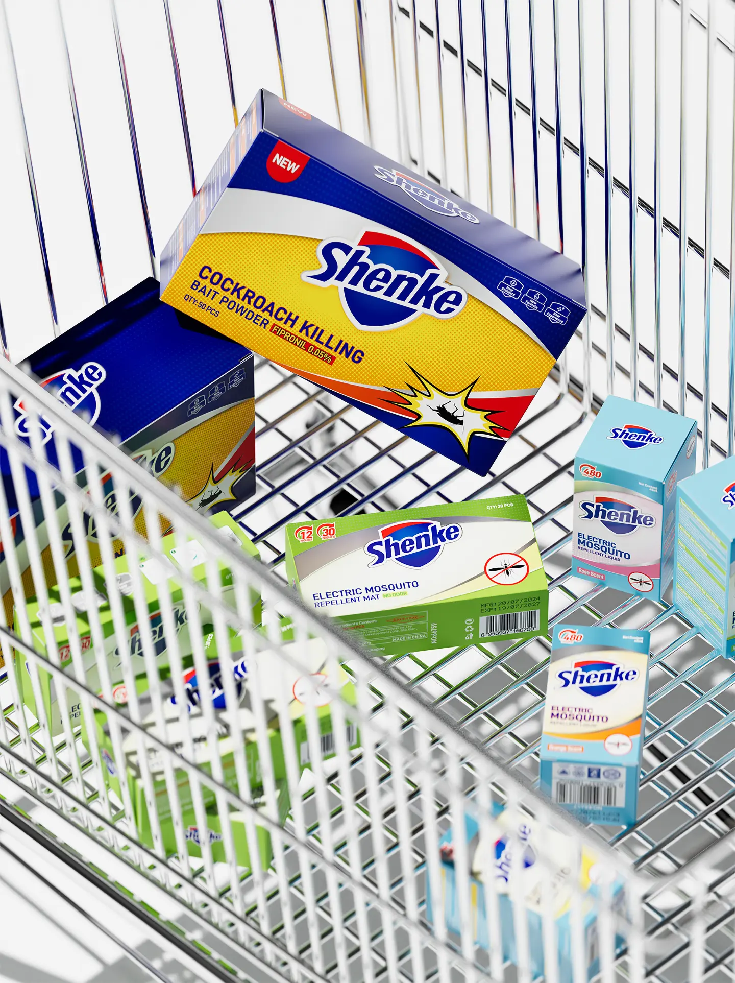
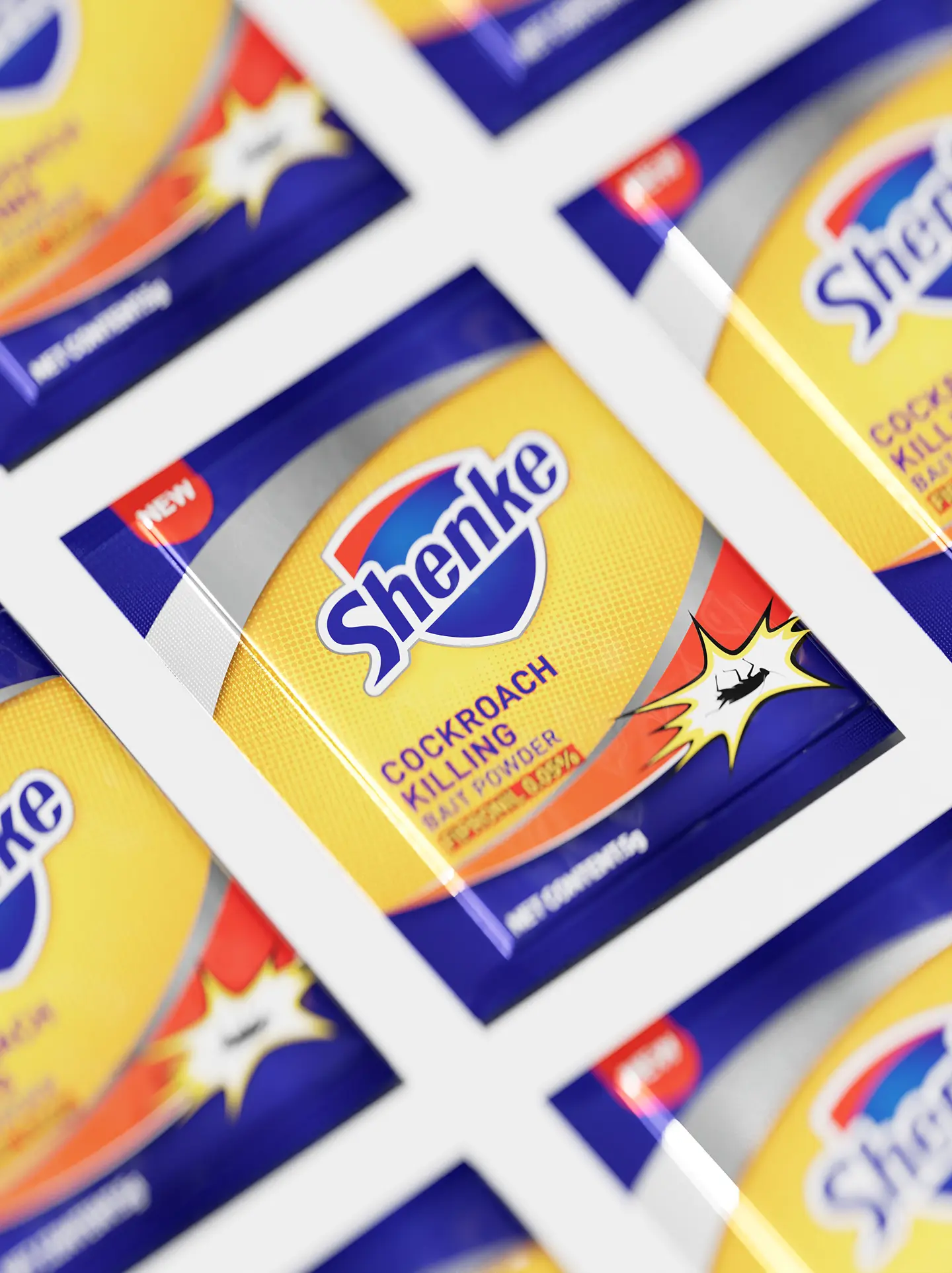
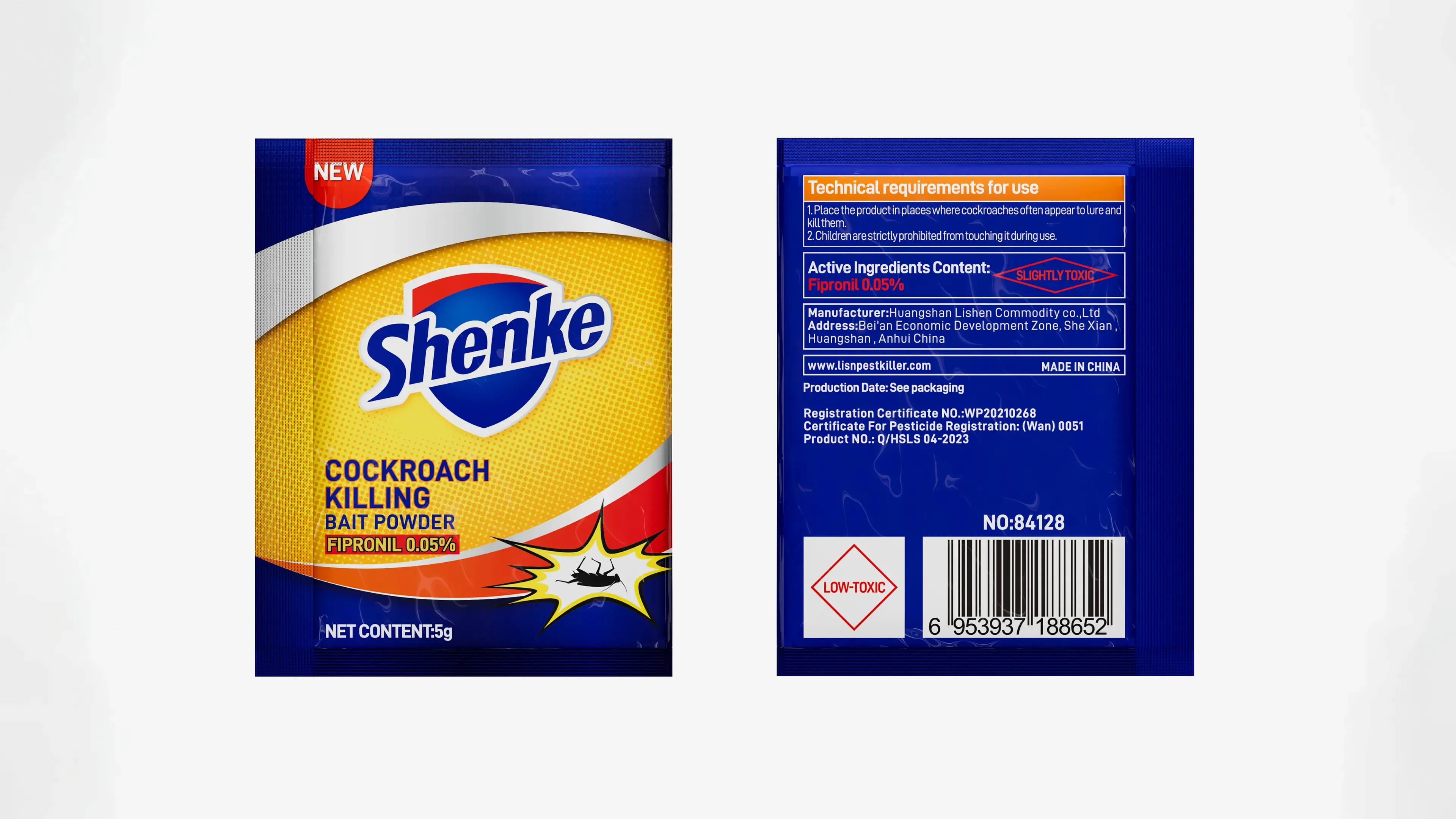
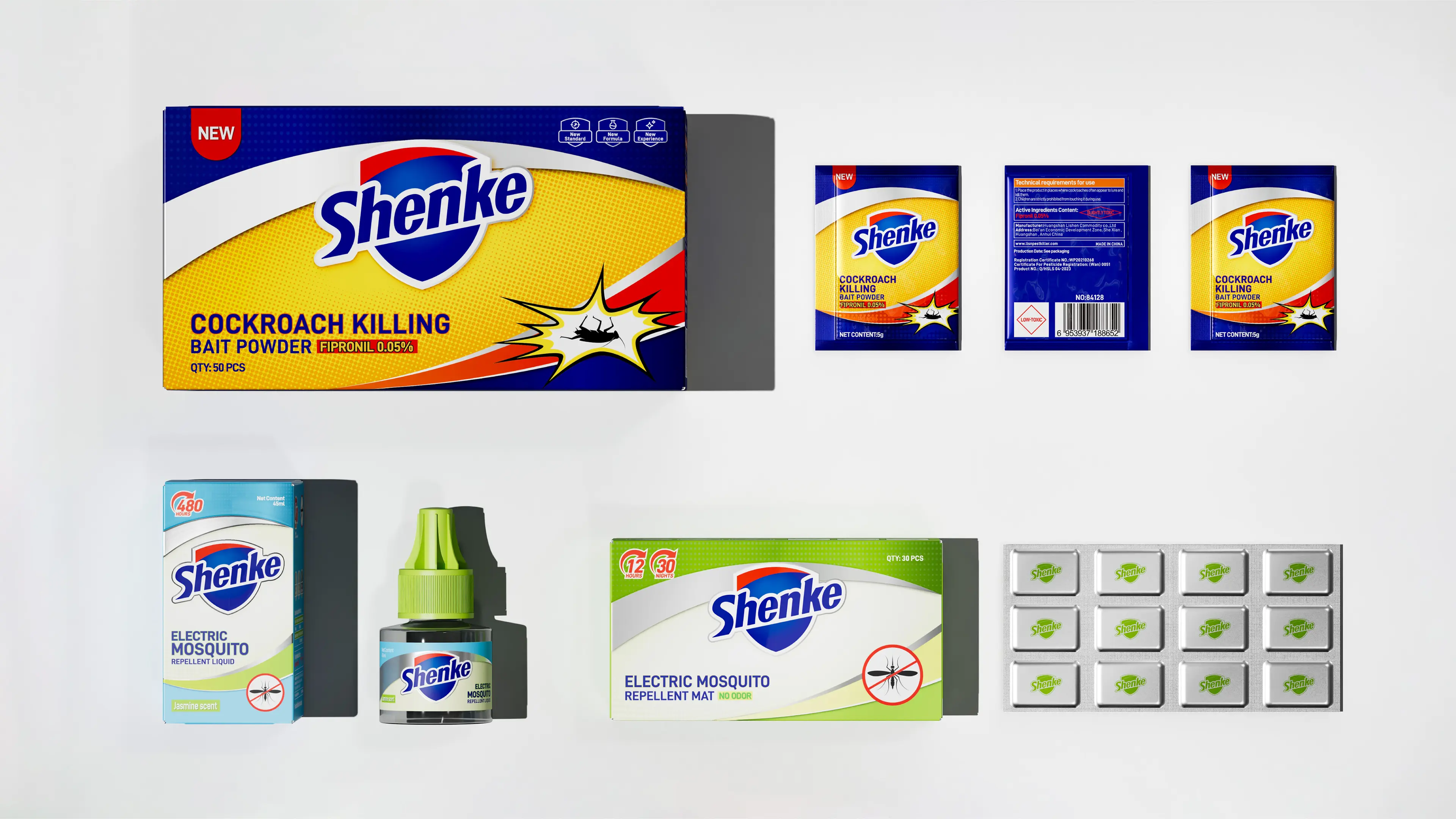
This project was to create a brand visual and packaging design system for Shenke Mosquito Repellent Liquid. The core objective was to help the brand establish a professional, differentiated, and international brand visual identity in the global mosquito repellent product market. We used blue as the primary brand color. Visually, blue conveys a sense of technology, rationality, and cleanliness, precisely echoing the brand’s product DNA of “high-tech biotechnology.” The packaging as a whole uses concise color-block divisions to build visual order, creating a professional and trustworthy brand atmosphere. The auxiliary graphic symbolically treats the initial “S” of the brand name and uses it as an auxiliary graphic running through the entire product series. Presented in a simple, modern geometric form, this visual element forms a unified identity language in packaging layouts, effectively strengthening the brand’s memorability on retail shelves and e-commerce pages. The packaging uses clear sans-serif fonts to ensure high readability of product information in global markets. In terms of information hierarchy, the brand name and core selling points are enlarged and highlighted, while product function descriptions are presented in a concise icon-based language, reducing consumers’ information acquisition cost. Brand visual elements have been fully extended to the packaging layouts of the entire product line, including electric mosquito repellent liquid, mosquito repellent spray, mosquito killers, and electric heaters, forming a unified and coherent brand identity language. Through this brand visual design system combining technological tonality, recognition efficiency, and an international perspective, Shenke has successfully upgraded from a functional mosquito repellent product to a professional brand in the mosquito repellent industry with strong visual recognition, clear brand positioning, and global market influence.
|
| |
| |
| |