
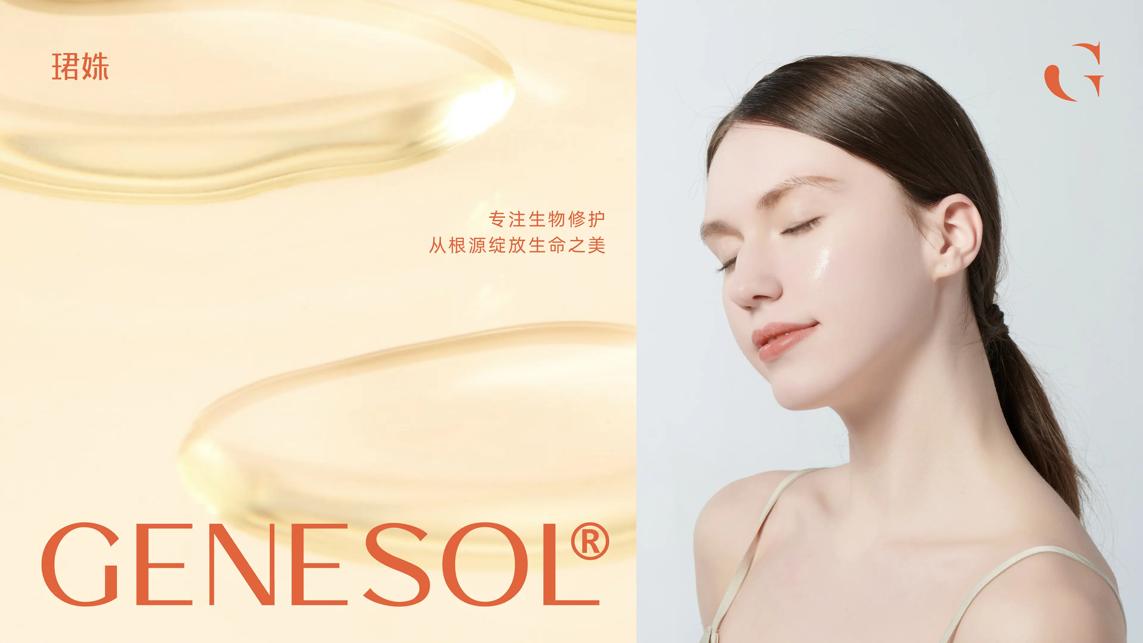
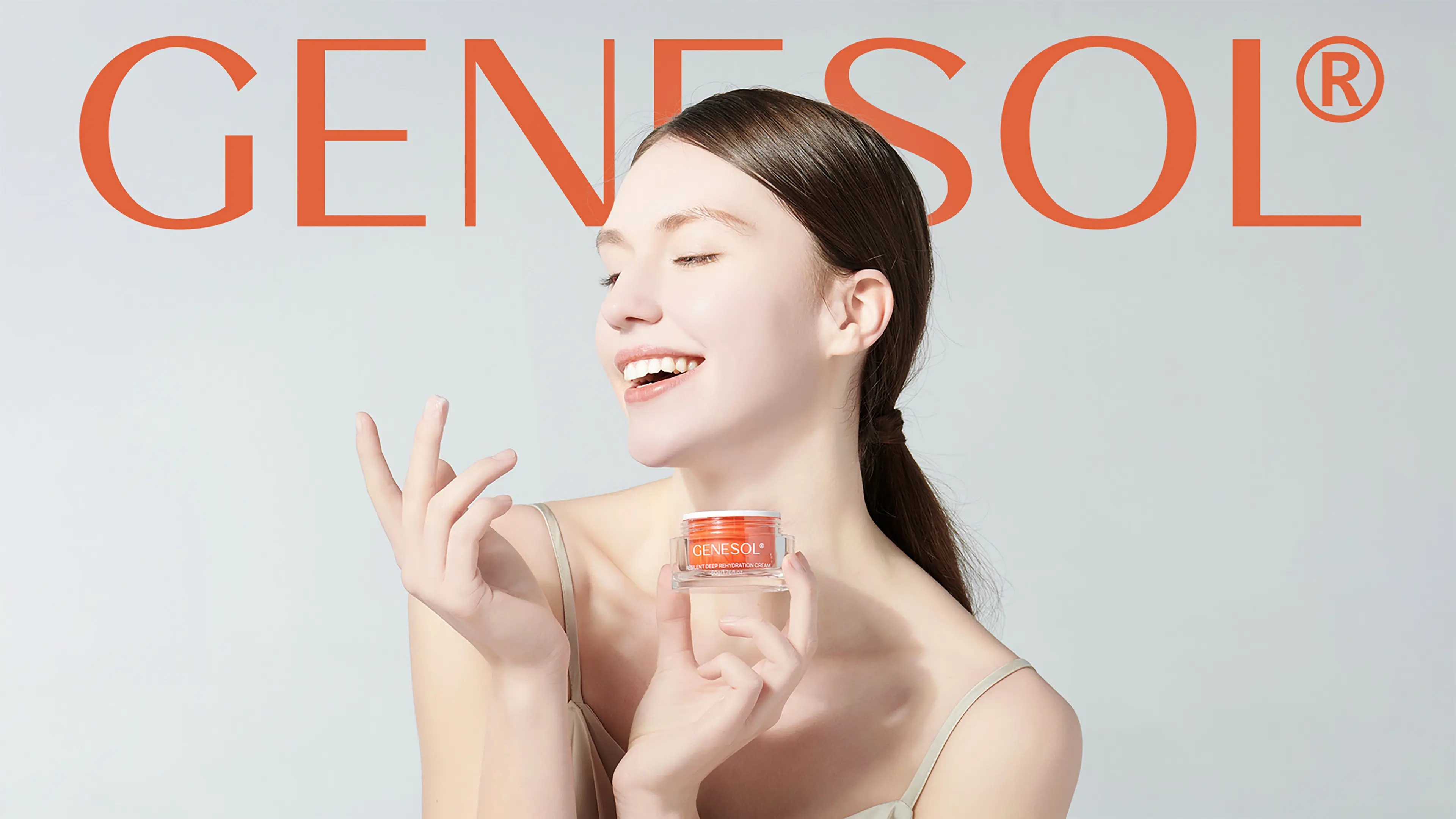


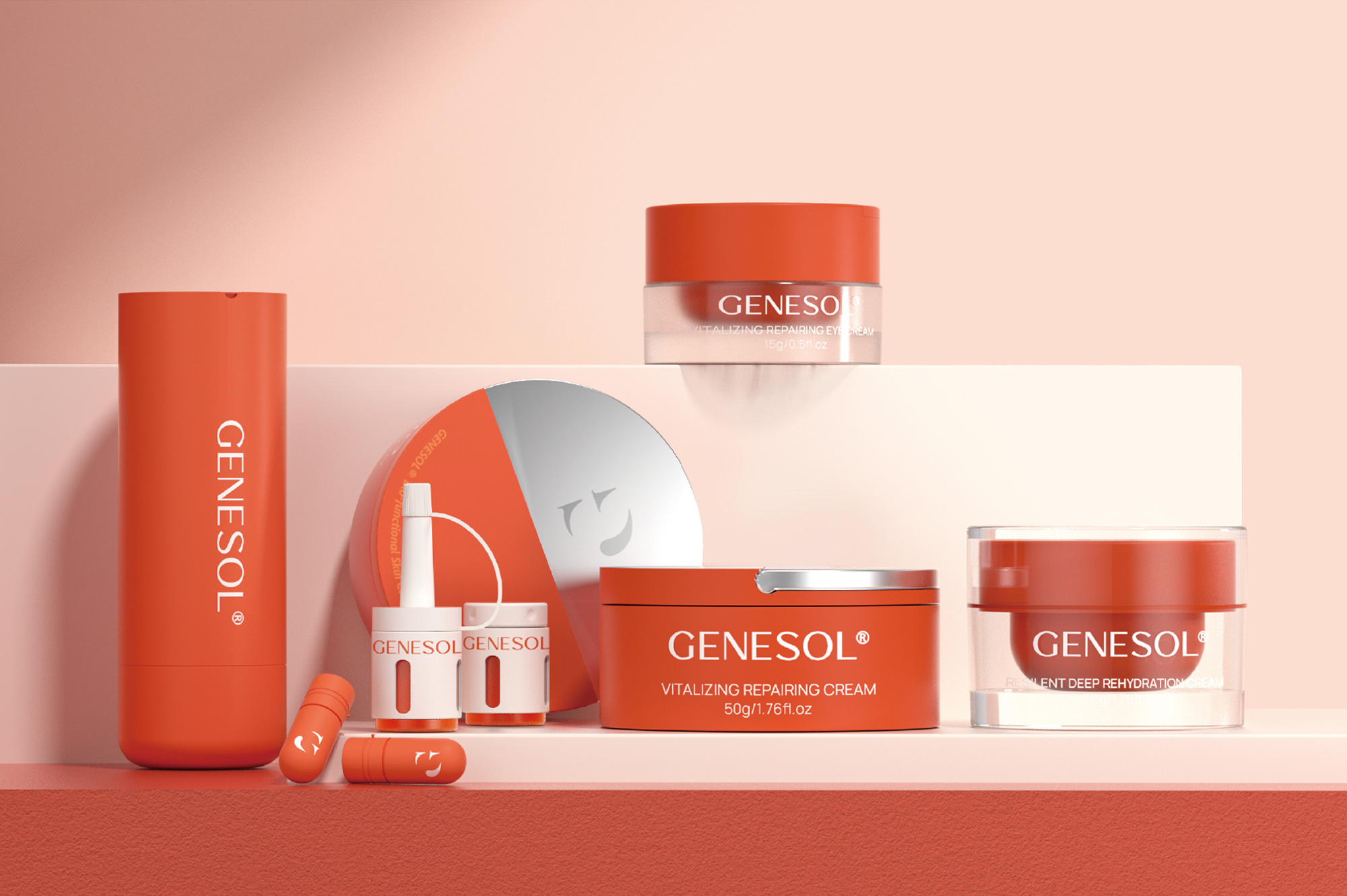
GENESOL is a brand founded by a PhD in biology who has continuously explored and pursued the realization of women's beauty and natural health in the skincare field. With exceptional craftsmanship, the brand leverages modern molecular biology and cell biology principles and technologies, focusing on molecular and cellular bio-functional skincare. Based on the metabolic and self-repair mechanisms of the organism itself, it restarts the skin's self-repair capacity according to pharmaceutical-grade and dermatological-grade standards. The brand fundamentally addresses potential skin aging and damage issues, bringing natural beauty and health to women.
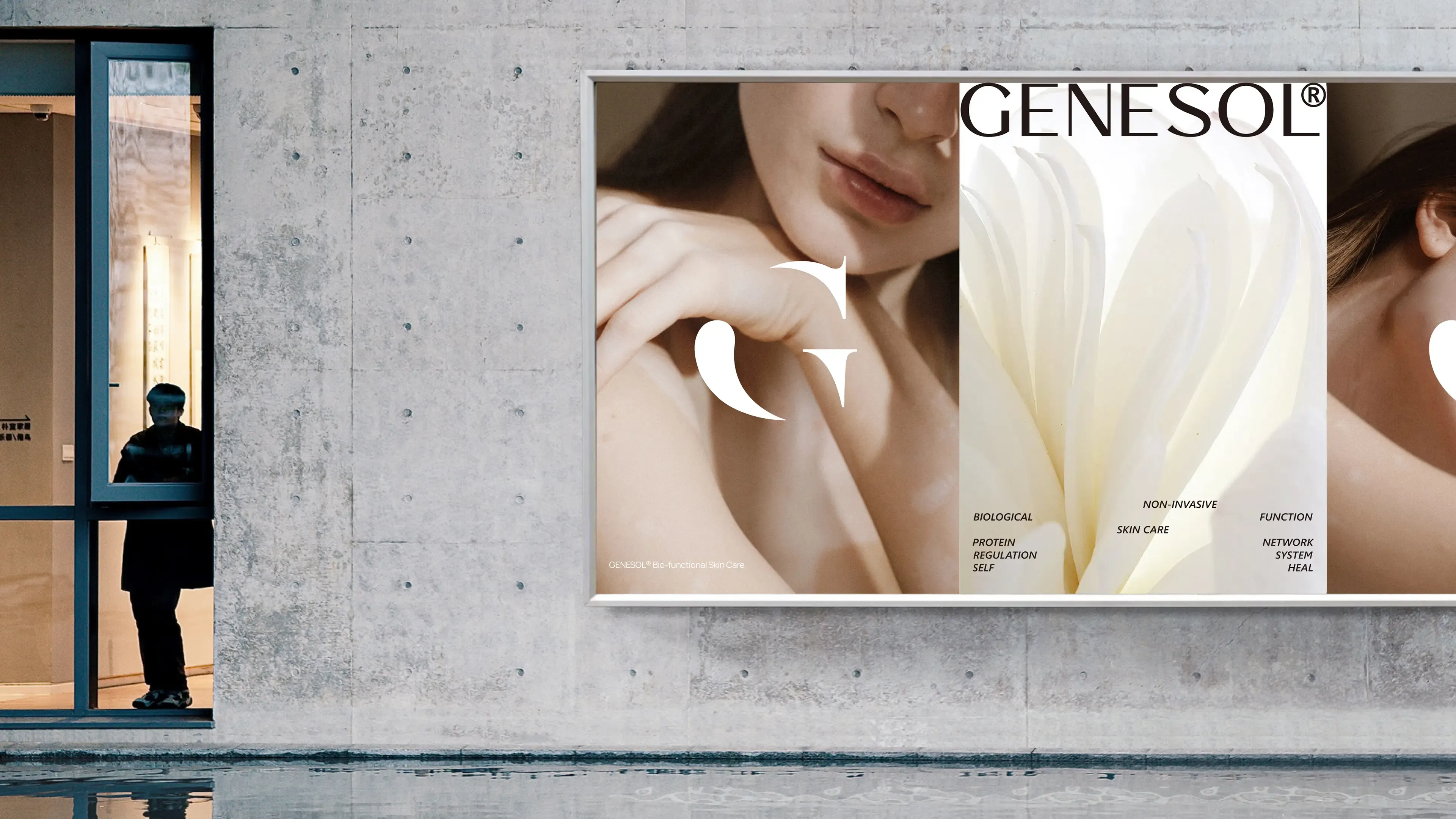
The brand continuously launches new bio-functional skincare products, with protein network regulation as the primary system and natural biological extracts as the auxiliary system. From point to surface, from superficial to deep, it addresses skin tissue issues from the root in a multi-dimensional manner, solving skin aging and damage problems through scientific thinking of holistic synergy and multi-level regulation.
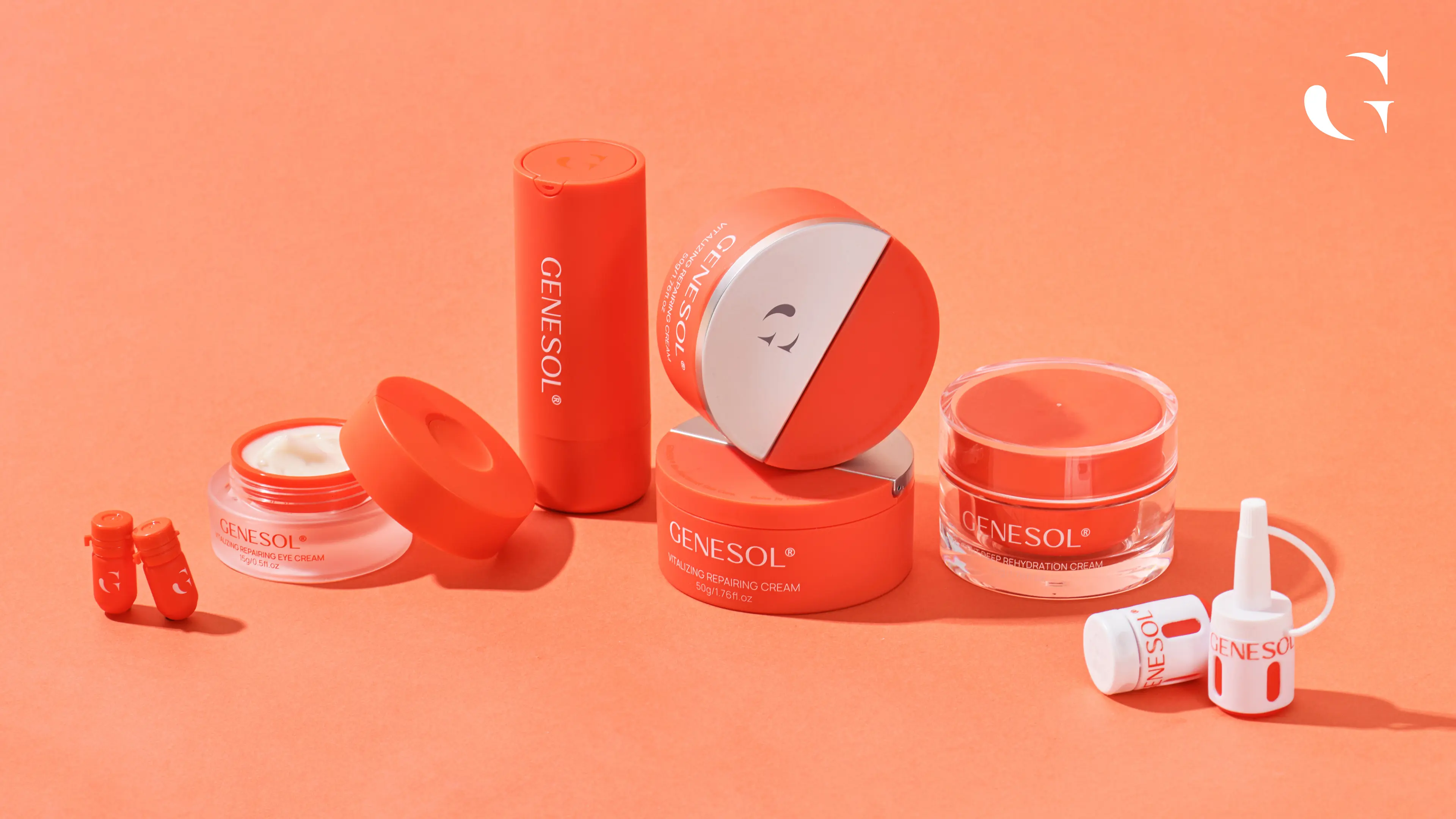
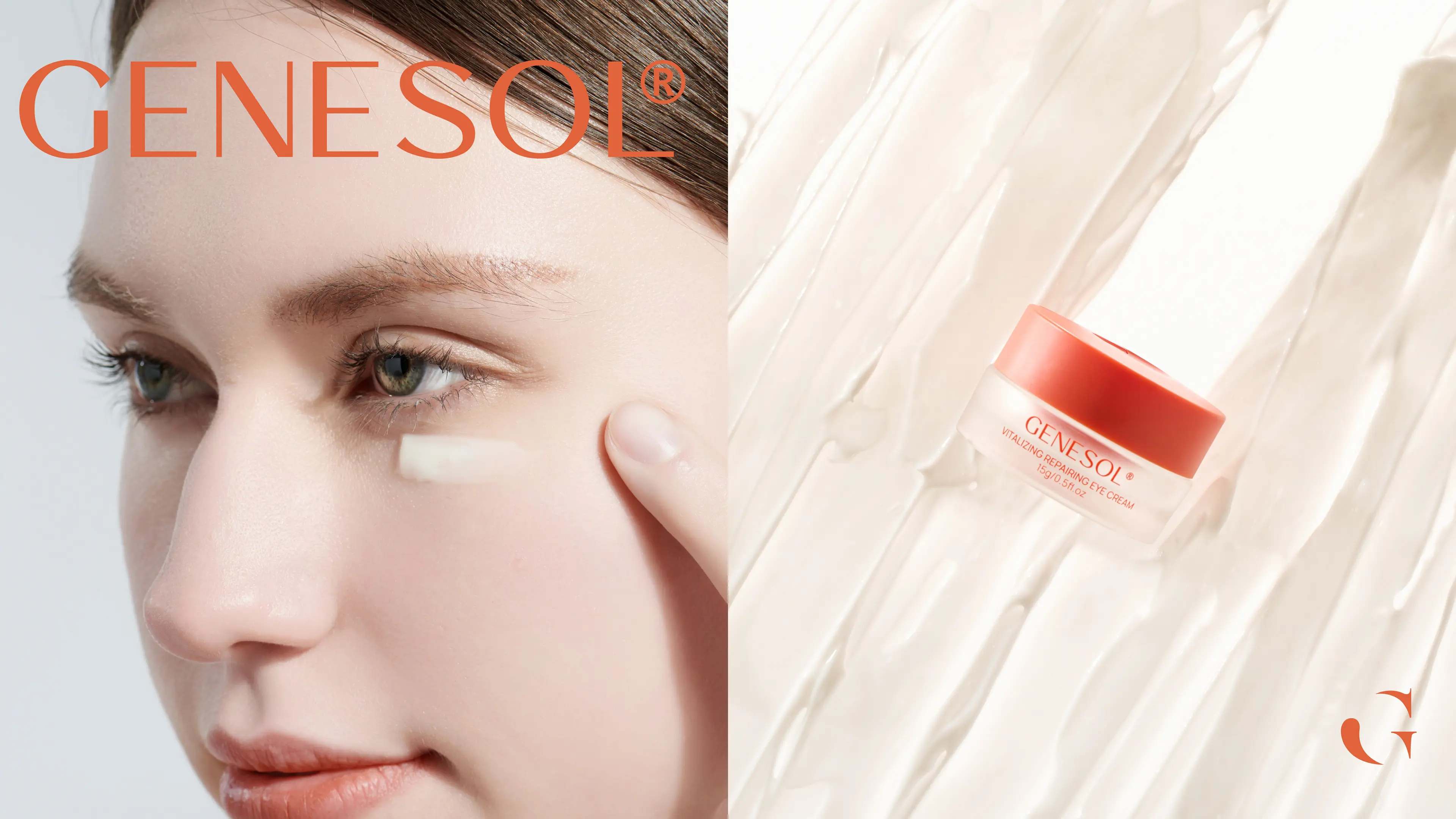
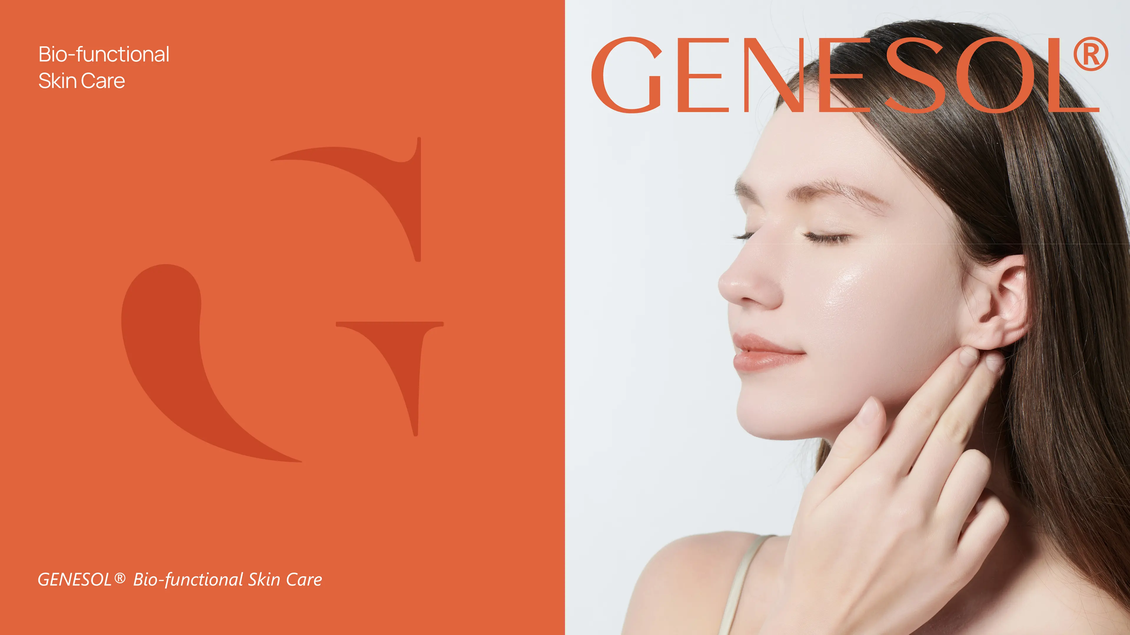
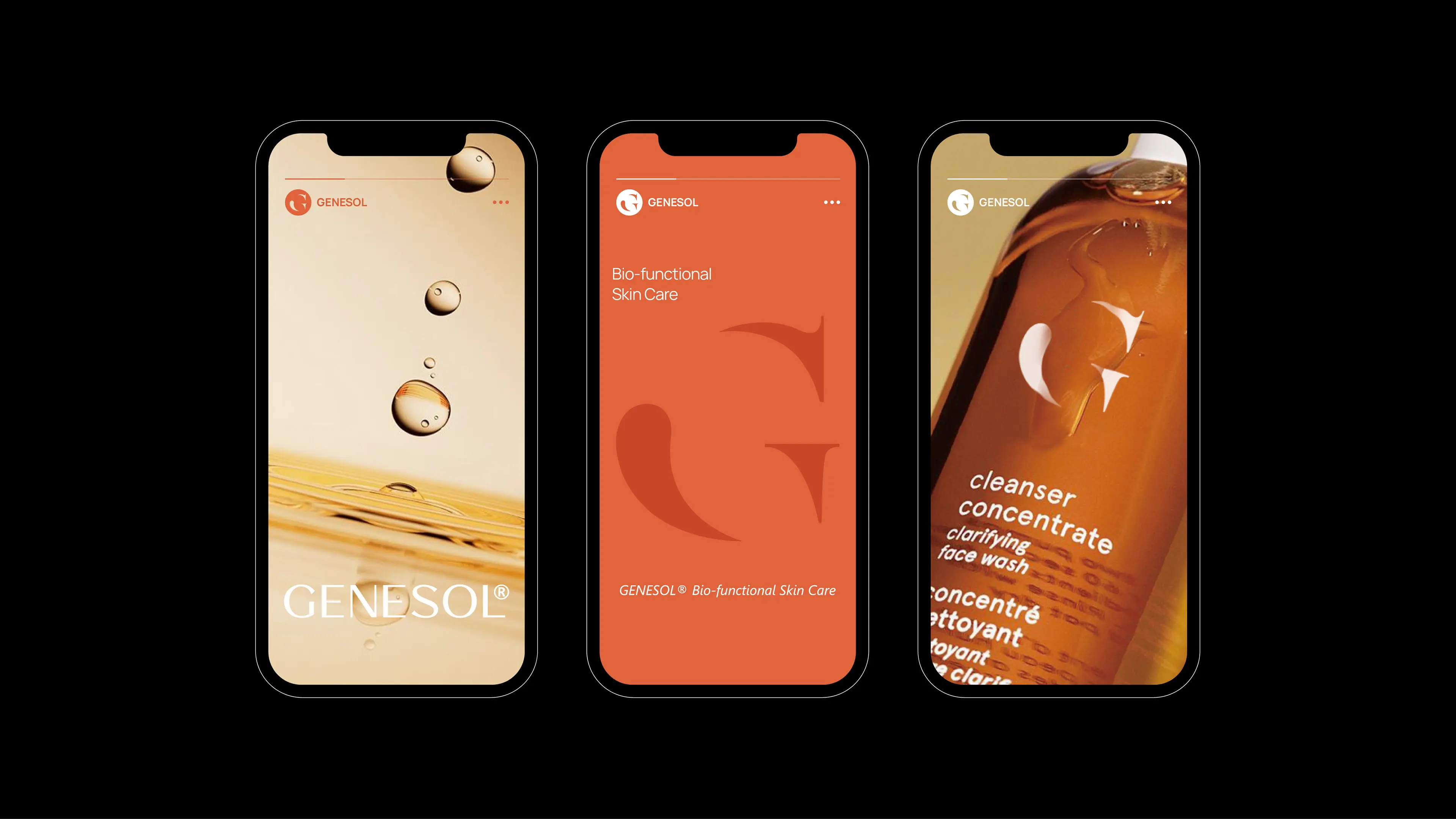
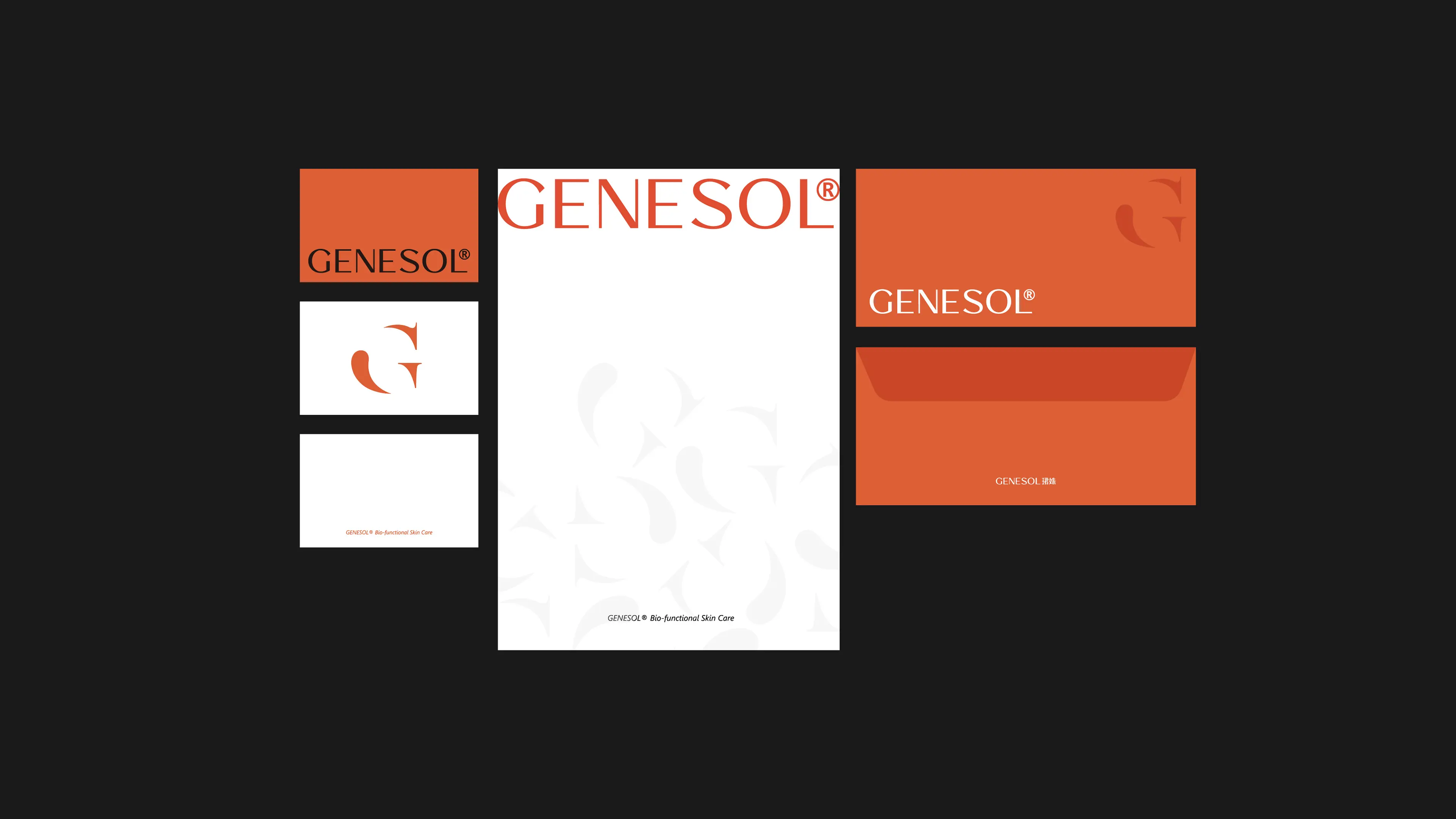
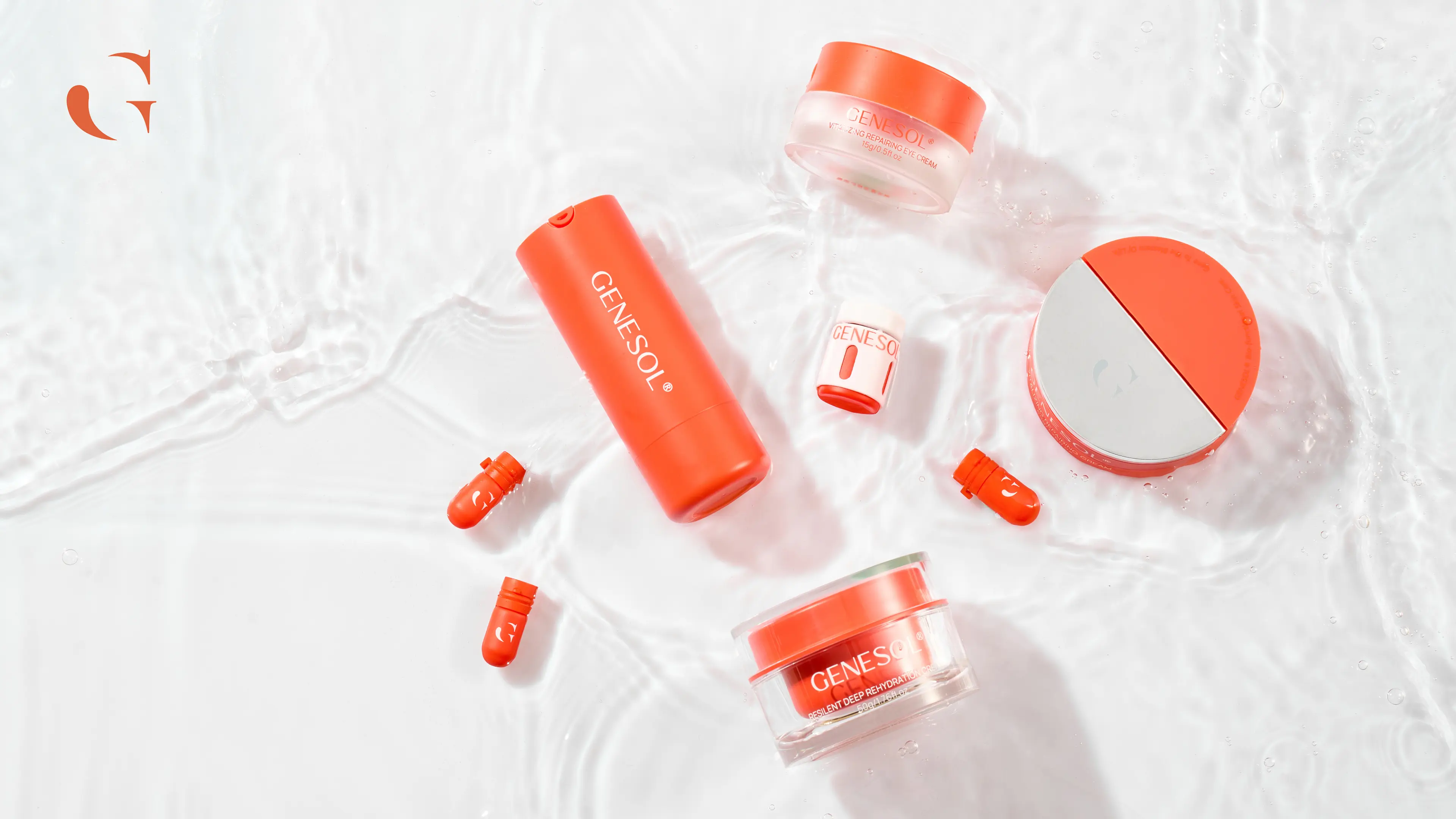
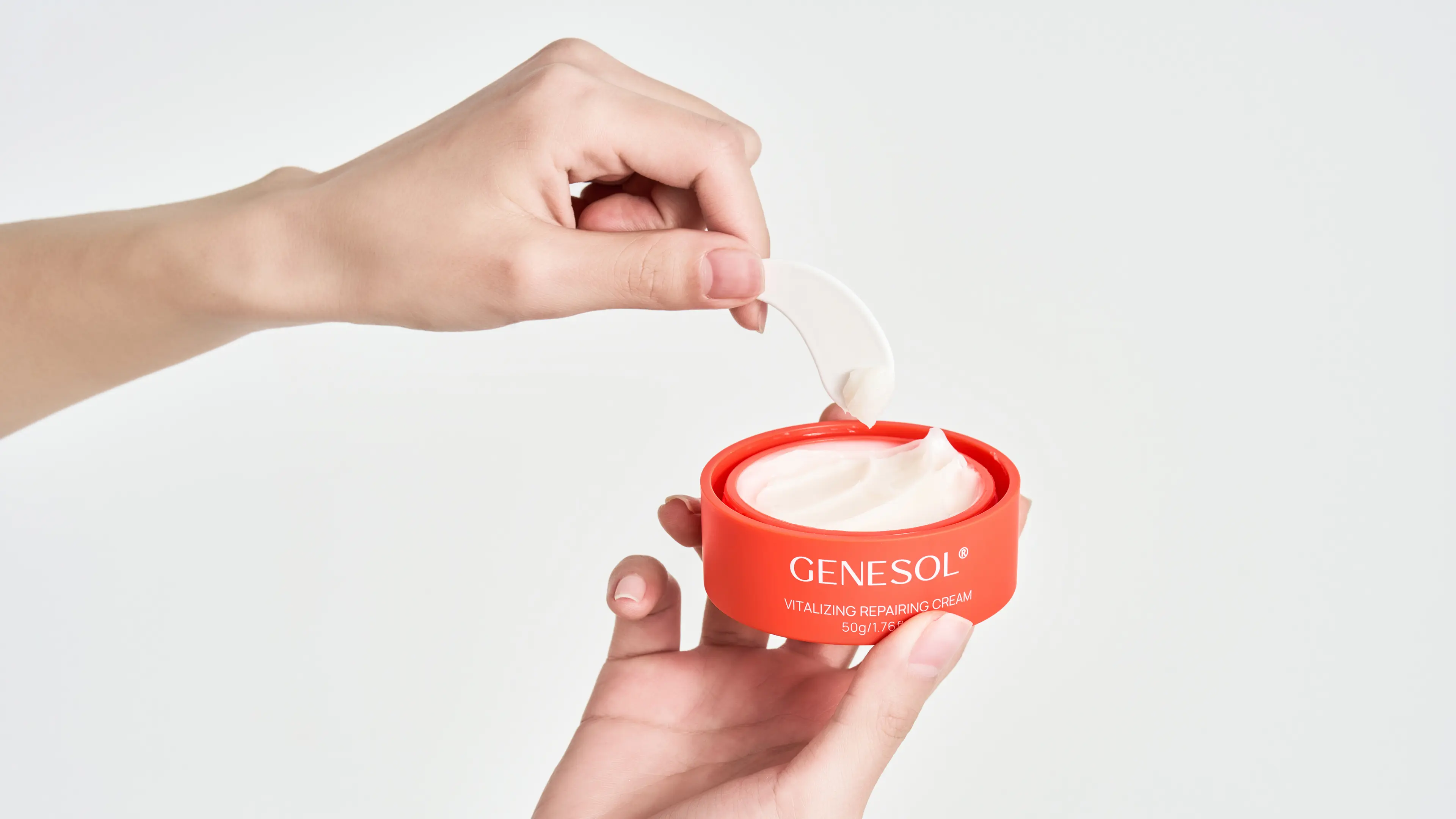
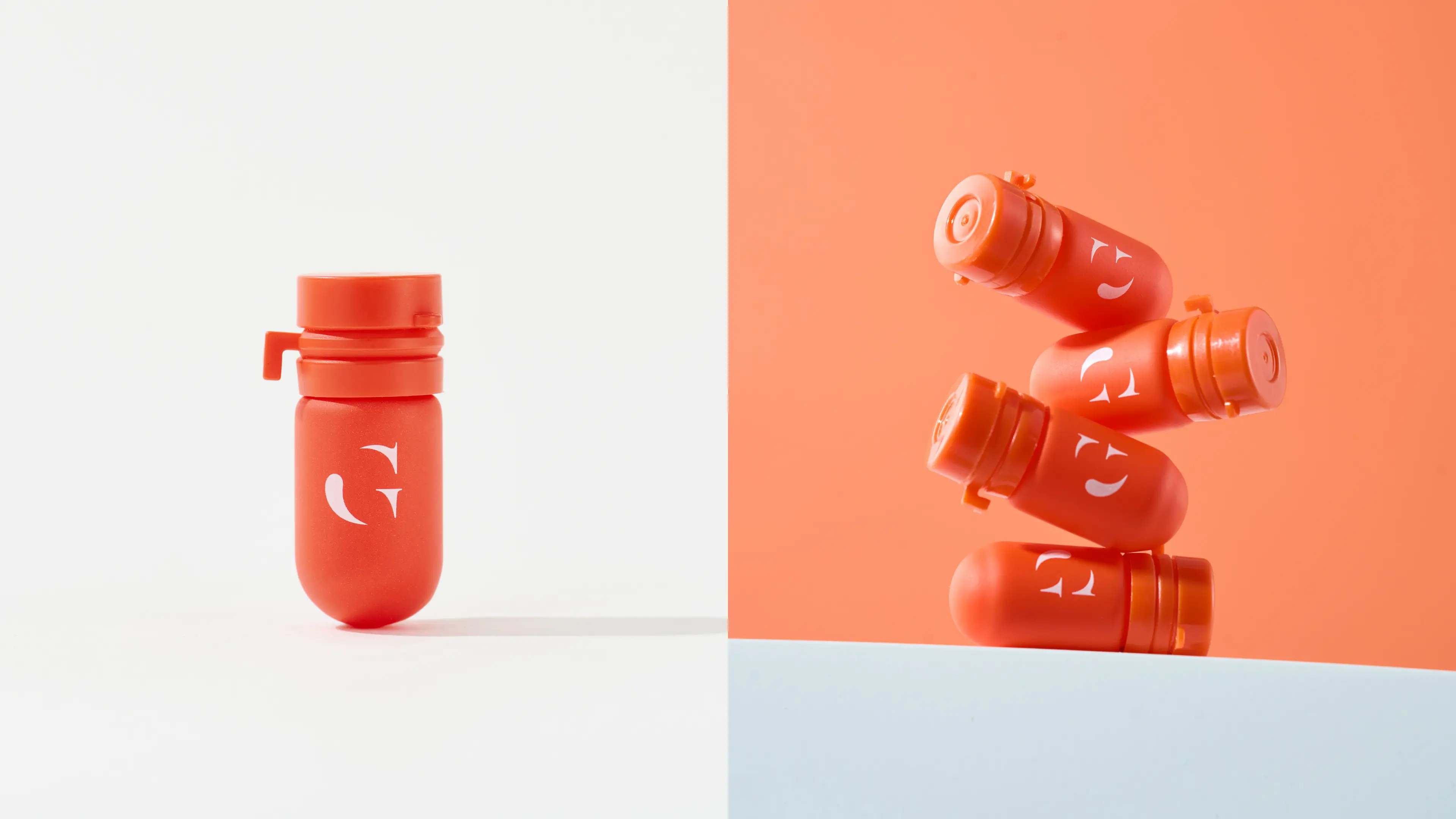
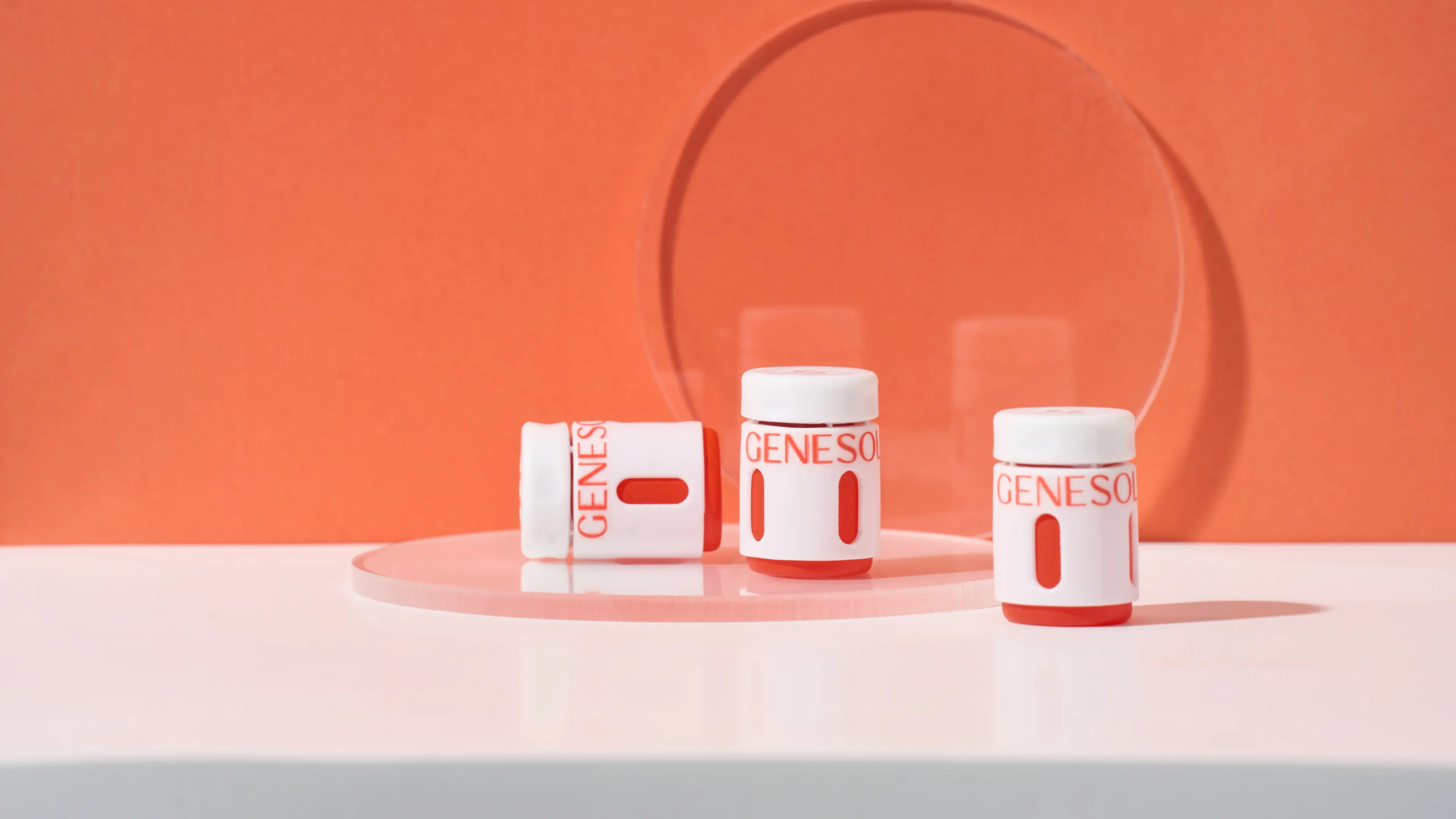
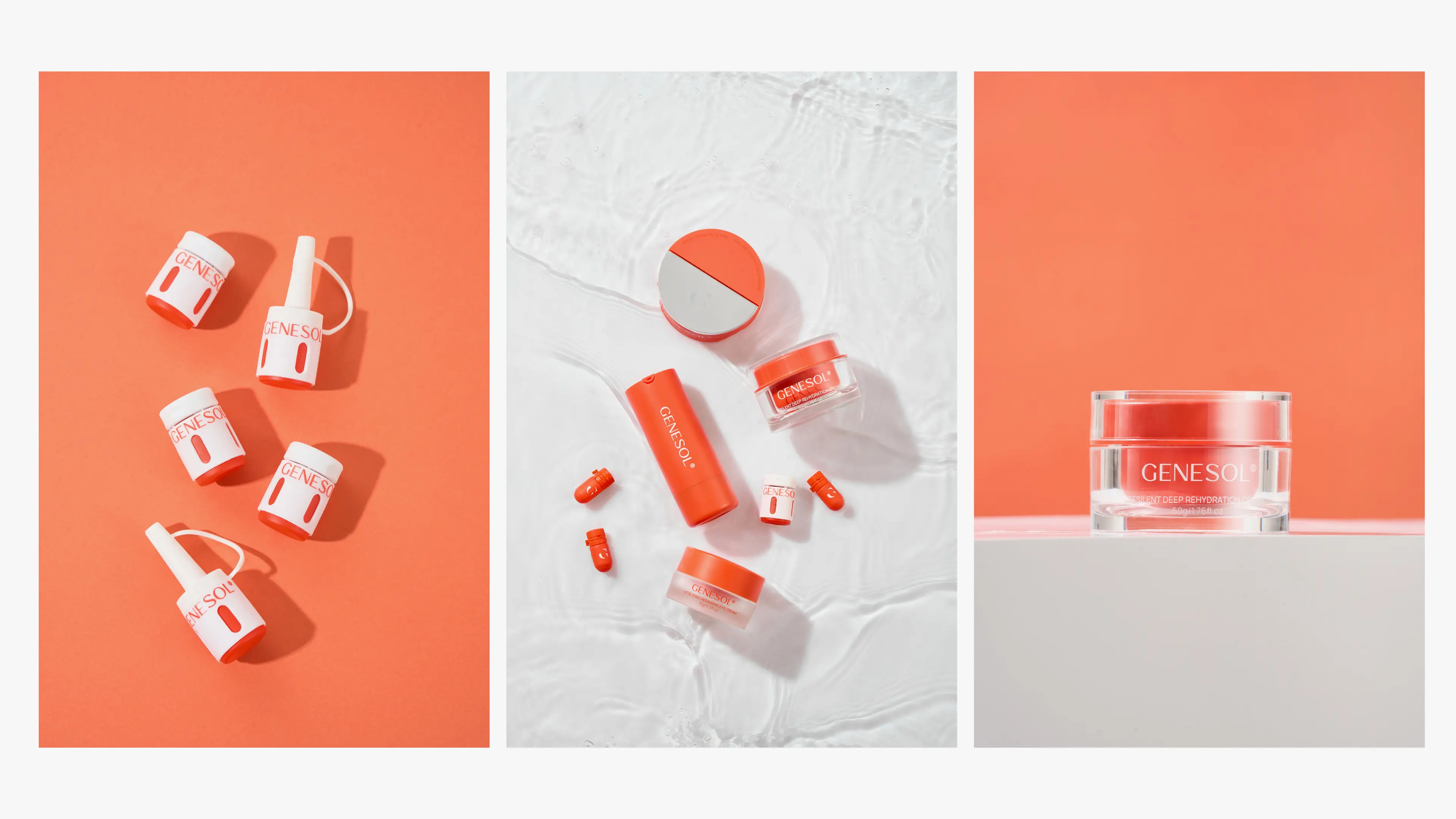
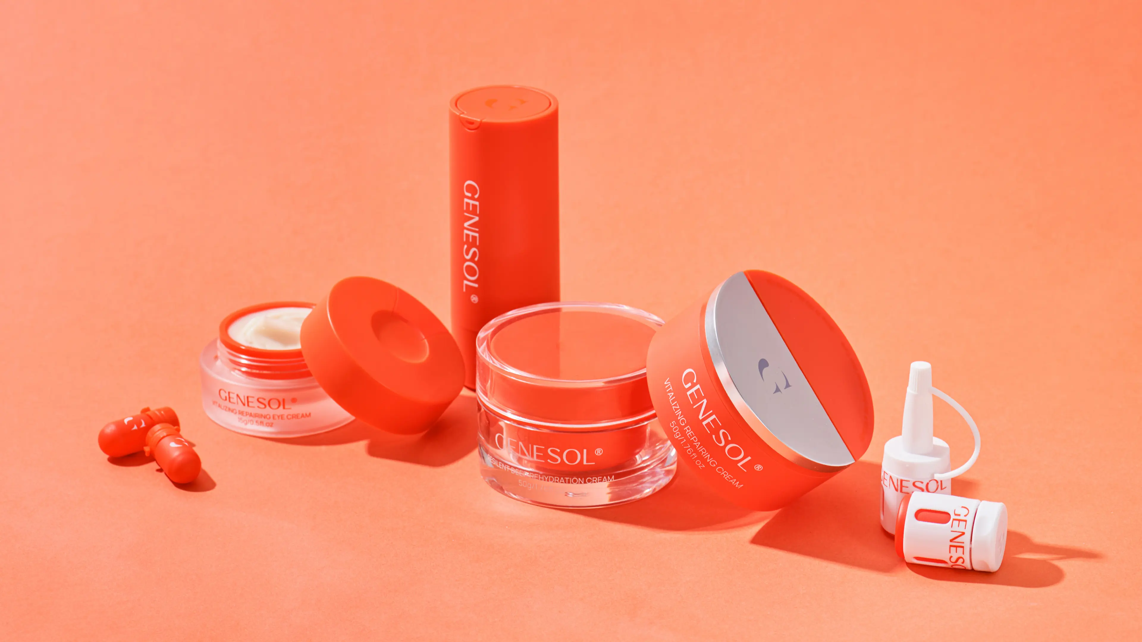
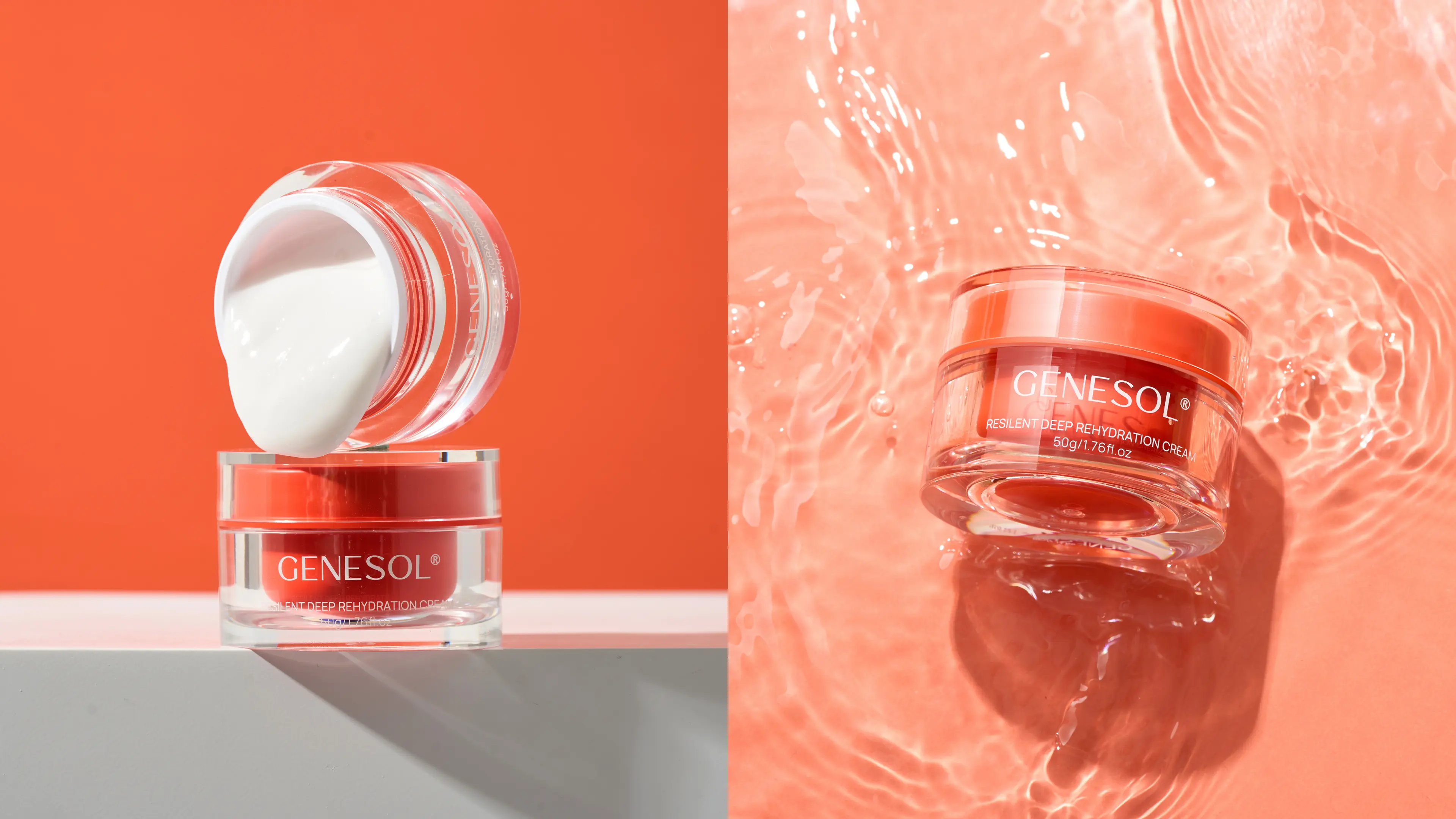
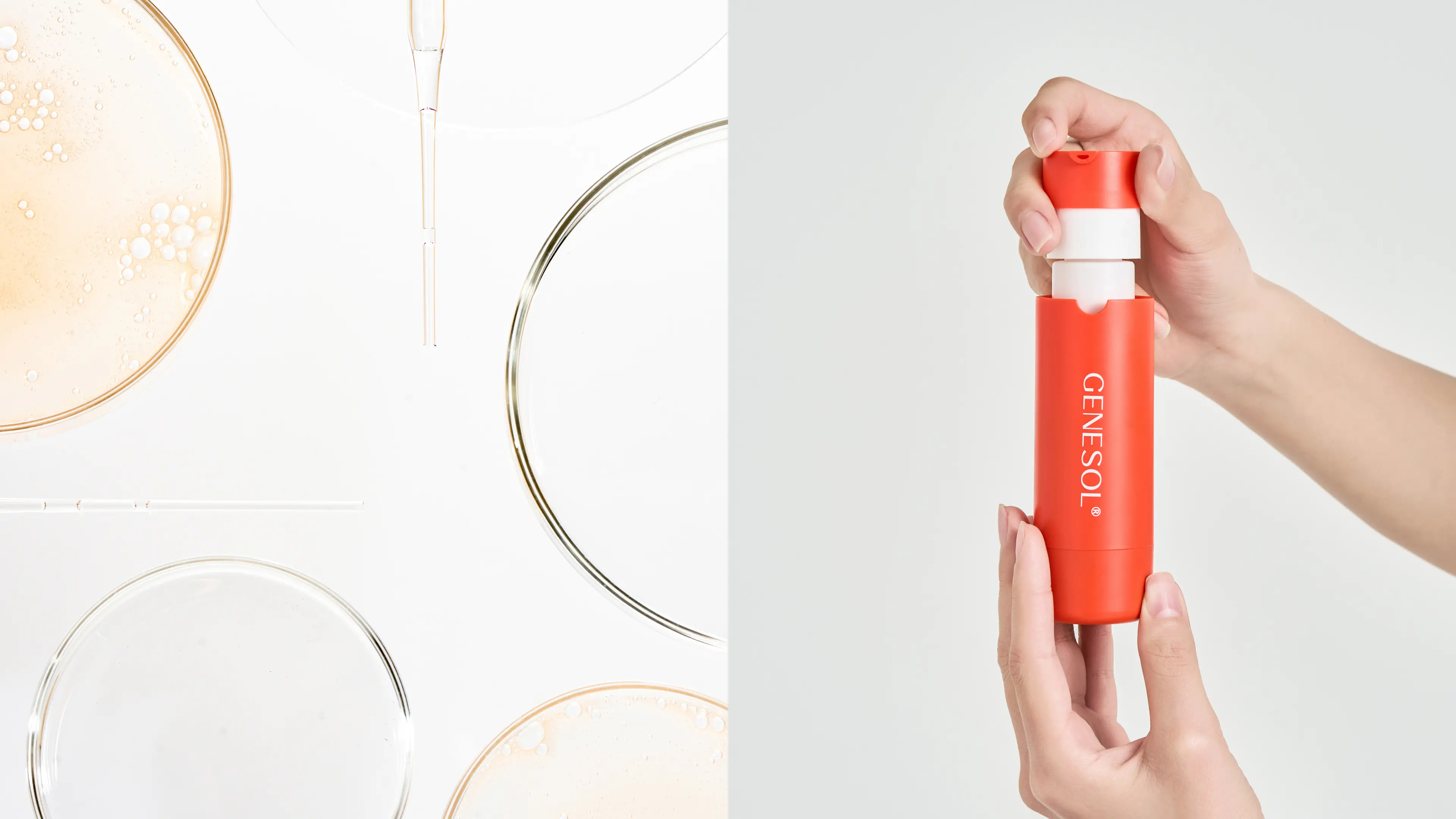
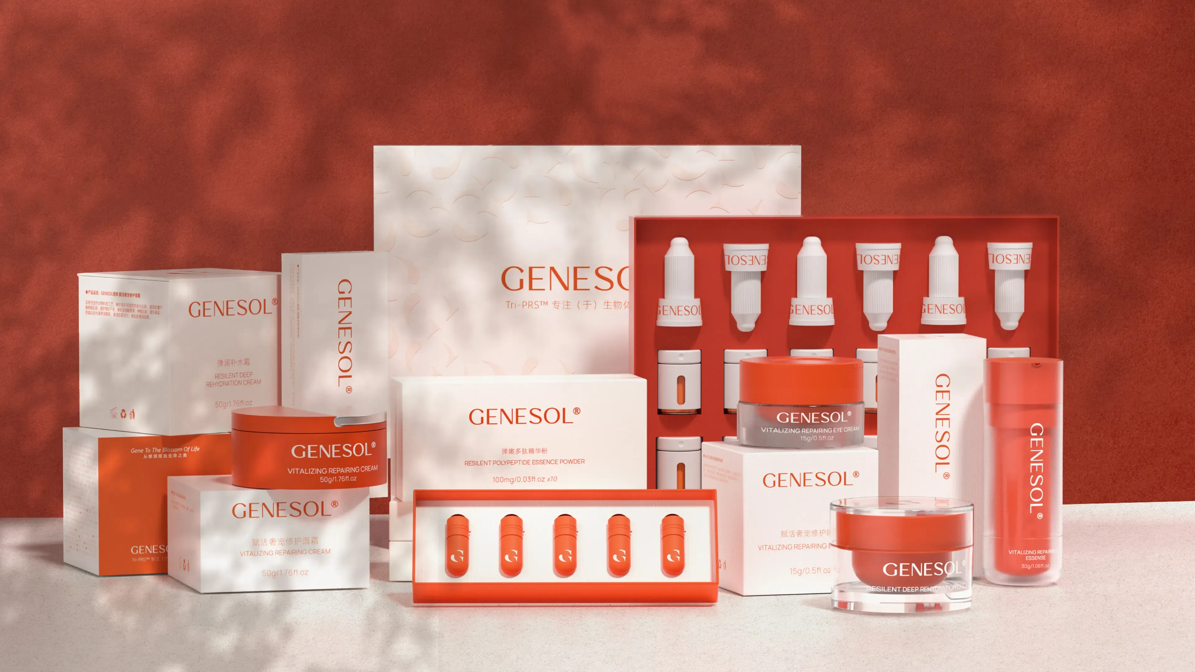
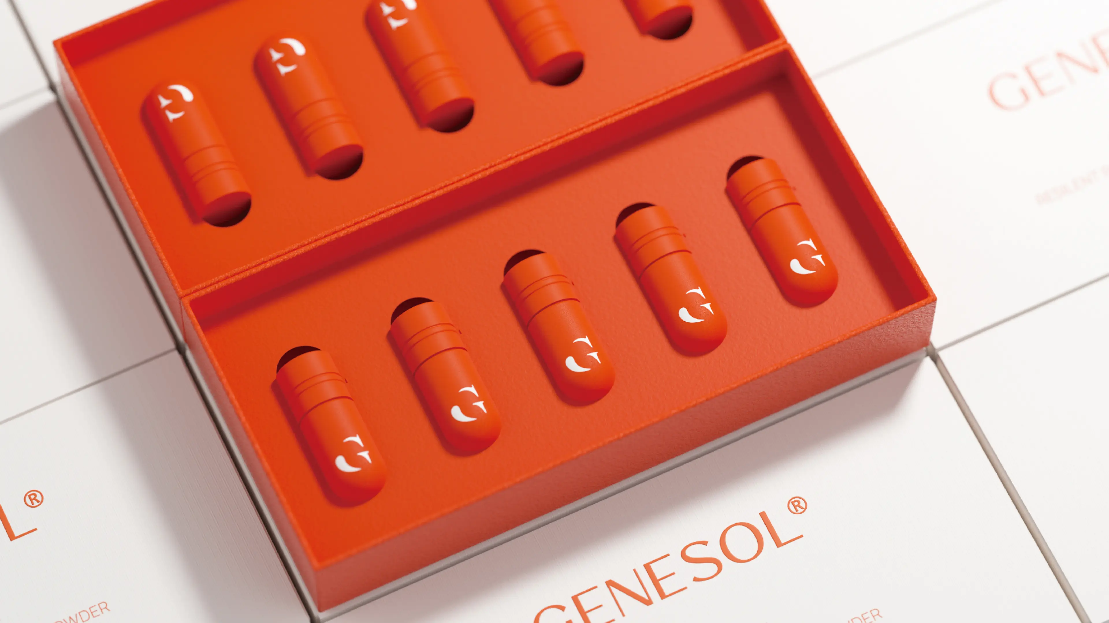
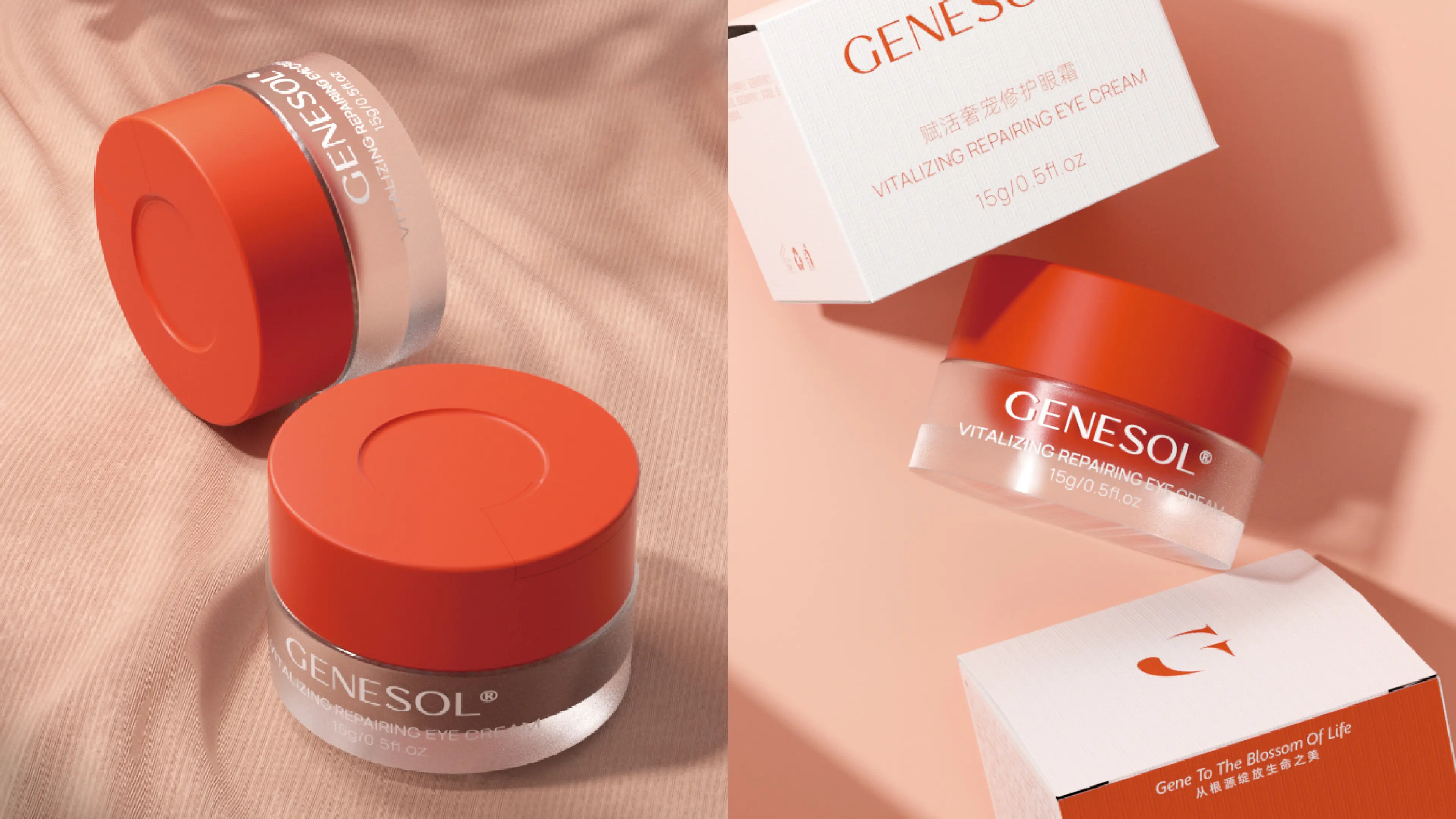
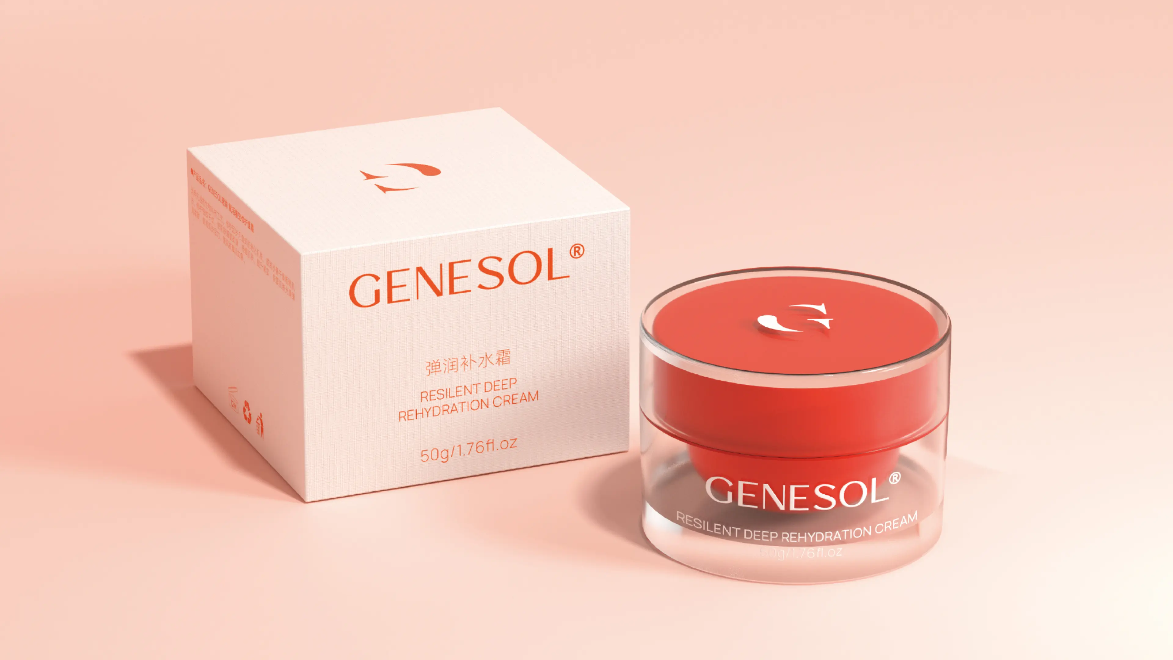
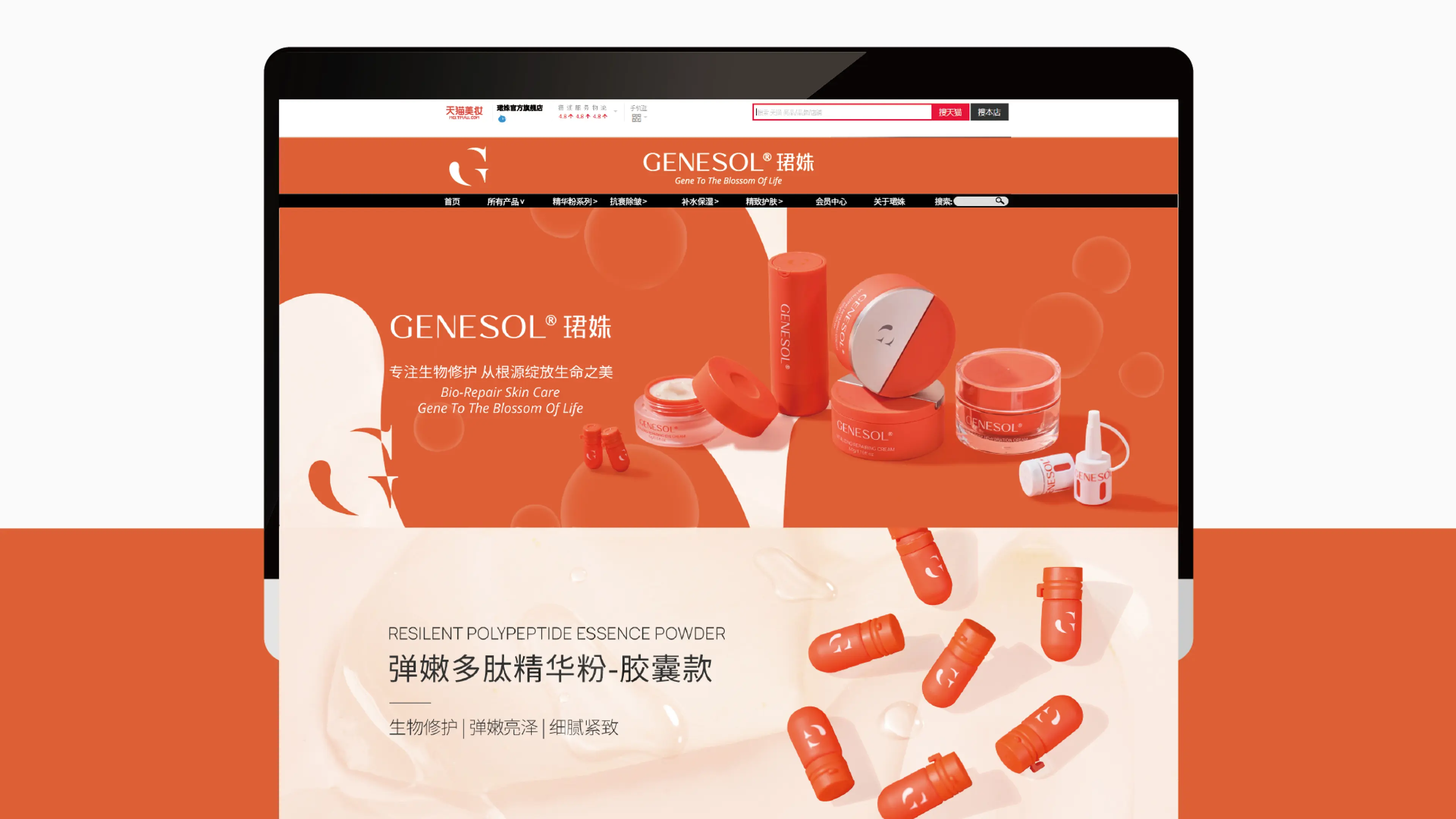
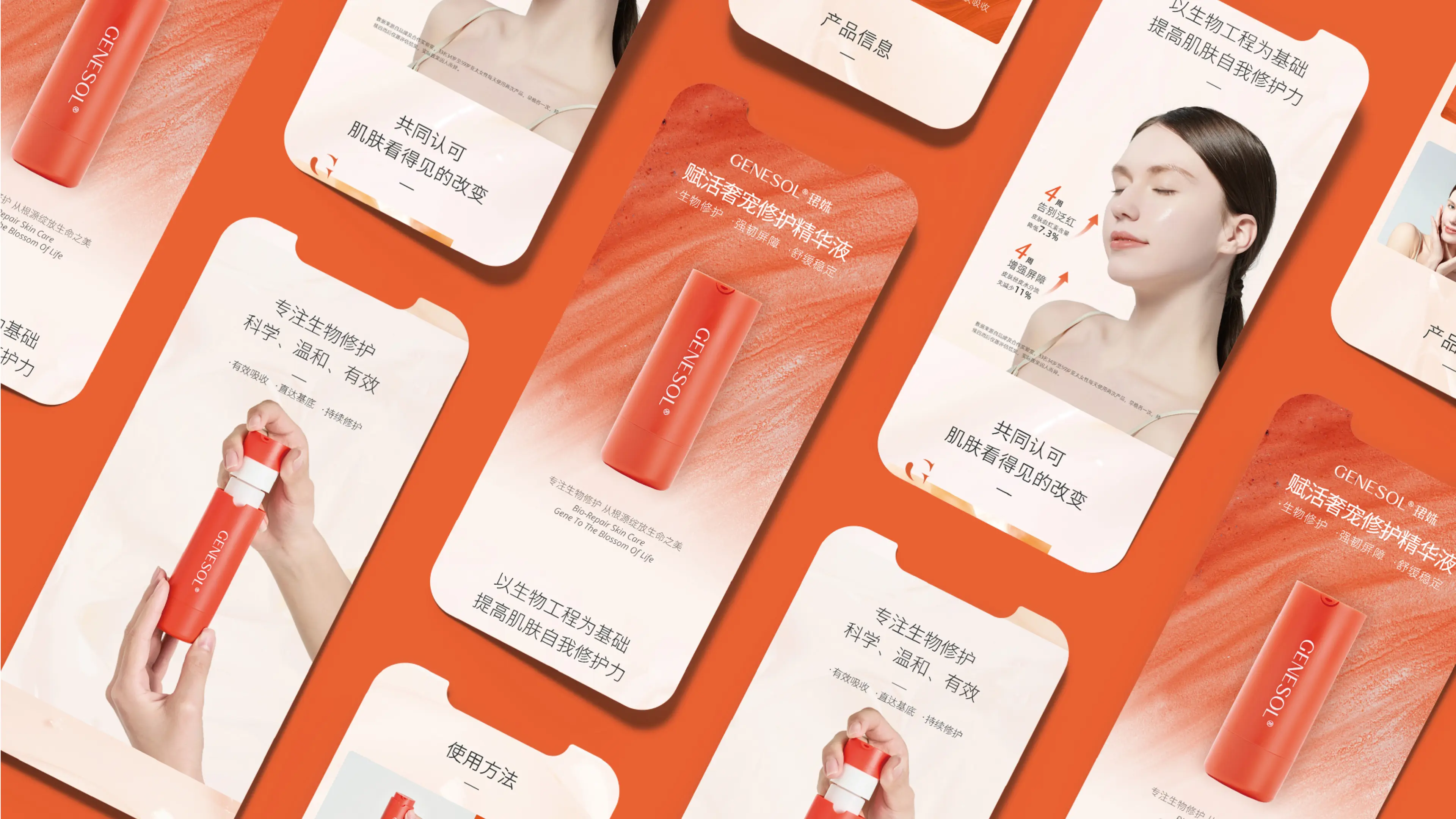
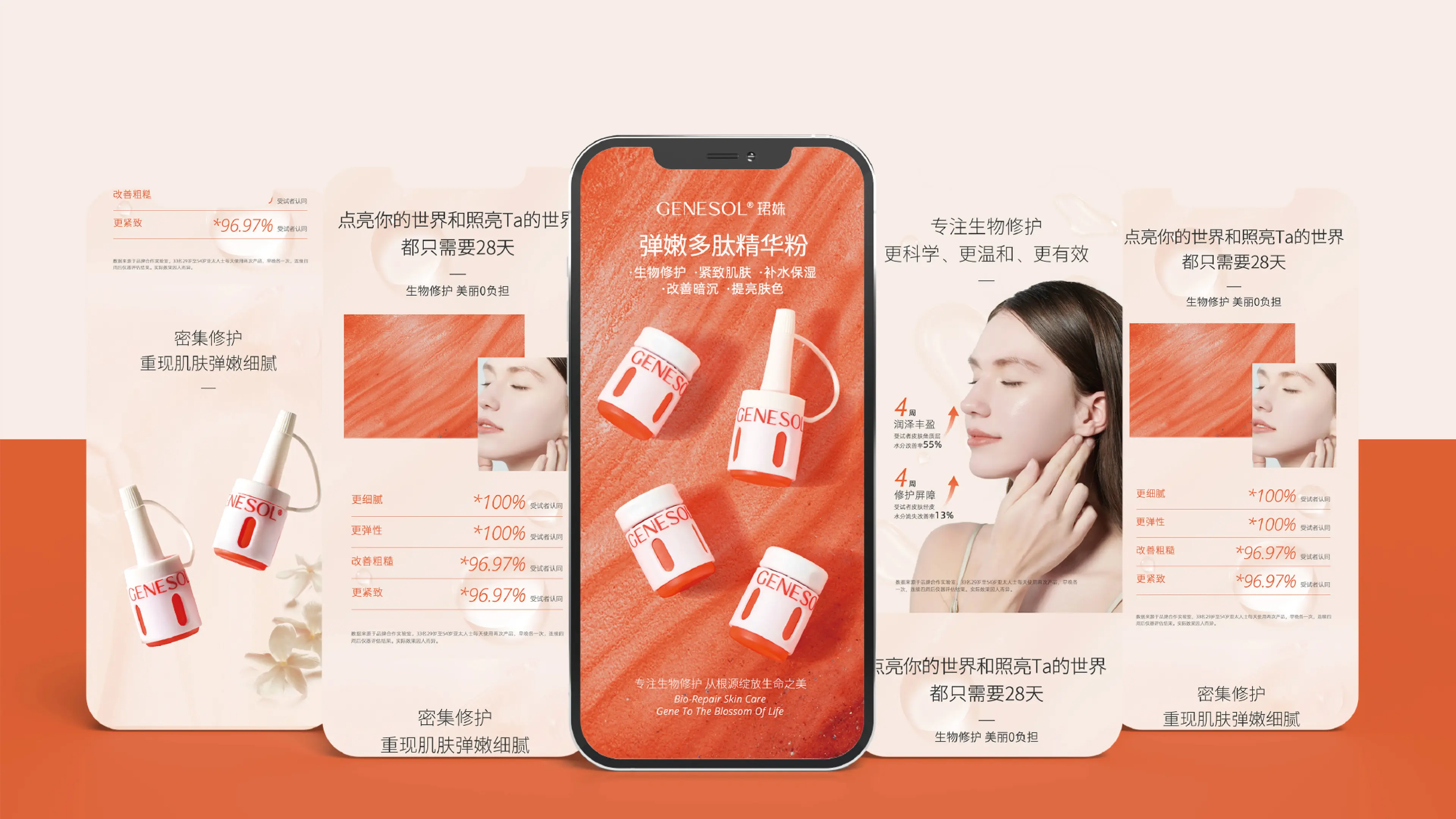
This project involved creating full-case brand design and packaging experience optimization and upgrading for GENESOL. The core objective was to help the brand establish a visual identity system and product experience standards oriented toward mass consumers at the critical juncture of its transformation from professional clinical channels to the mass consumer market. In terms of brand color design, the same orange as the formula was chosen as the primary brand color. Orange symbolizes vitality and efficacy, echoing the brand's professional attribute of "bio-functional skincare" while bridging the distance with mass consumers through a warm and bright visual experience. The core challenge in the brand's transition from clinical to mass consumer market lies in the fact that: in clinical scenarios, products are operated by professional beauticians, whereas in mass consumer scenarios, consumers need to use them independently. Therefore, in packaging material design, priority was given to consumers, selecting convenient and easy-to-use bottle shapes to lower the threshold for consumer use. Some vials were even redesigned through new mold development to ensure the integrity and consistency of the product experience.
Through this full-case design system that combines professional tonality, recognition efficiency, and humanized experience, GENESOL has successfully upgraded from a professional clinical skincare brand to a bio-functional skincare brand with strong visual recognition, high product friendliness, and mass market penetration.