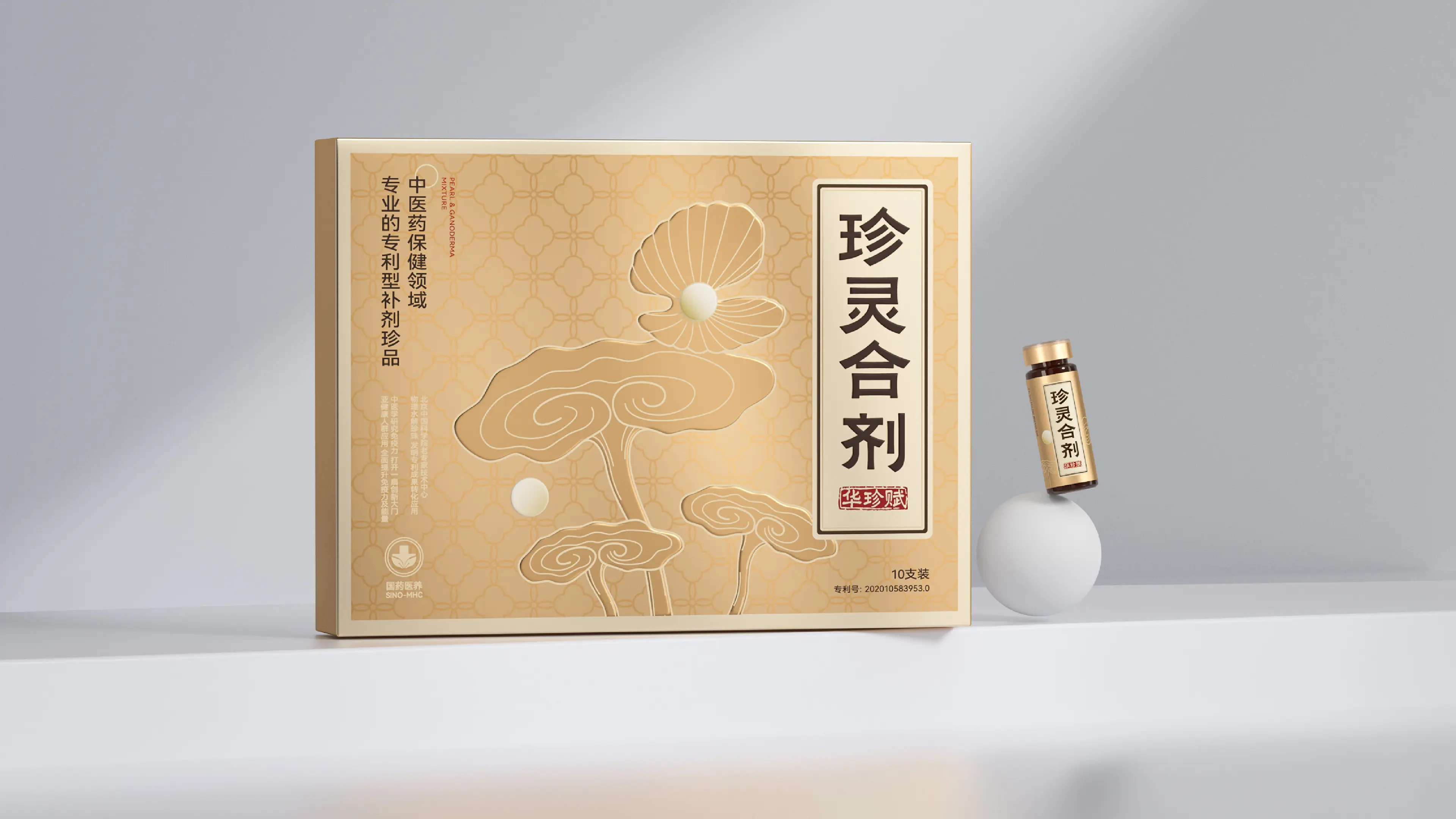
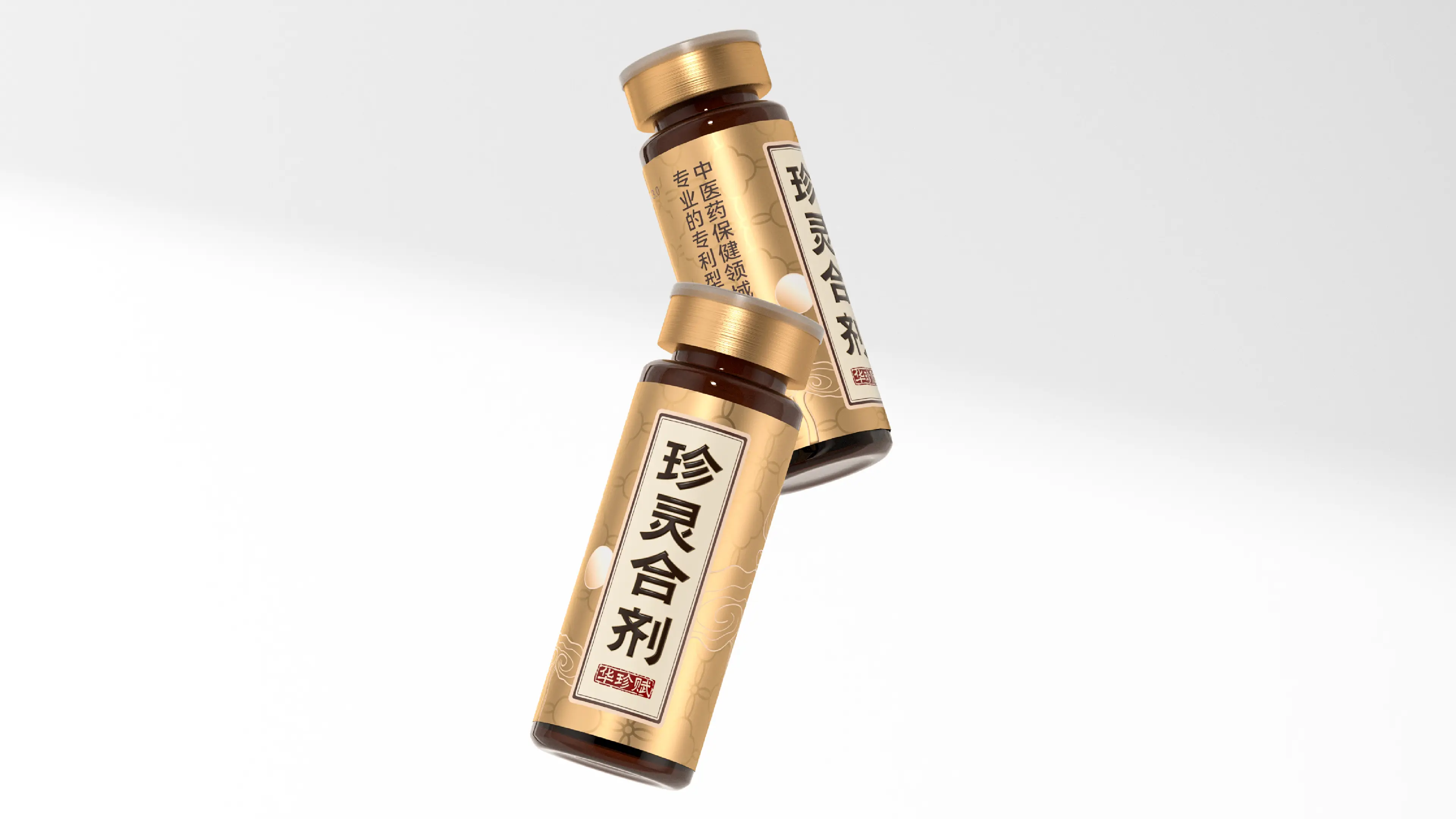
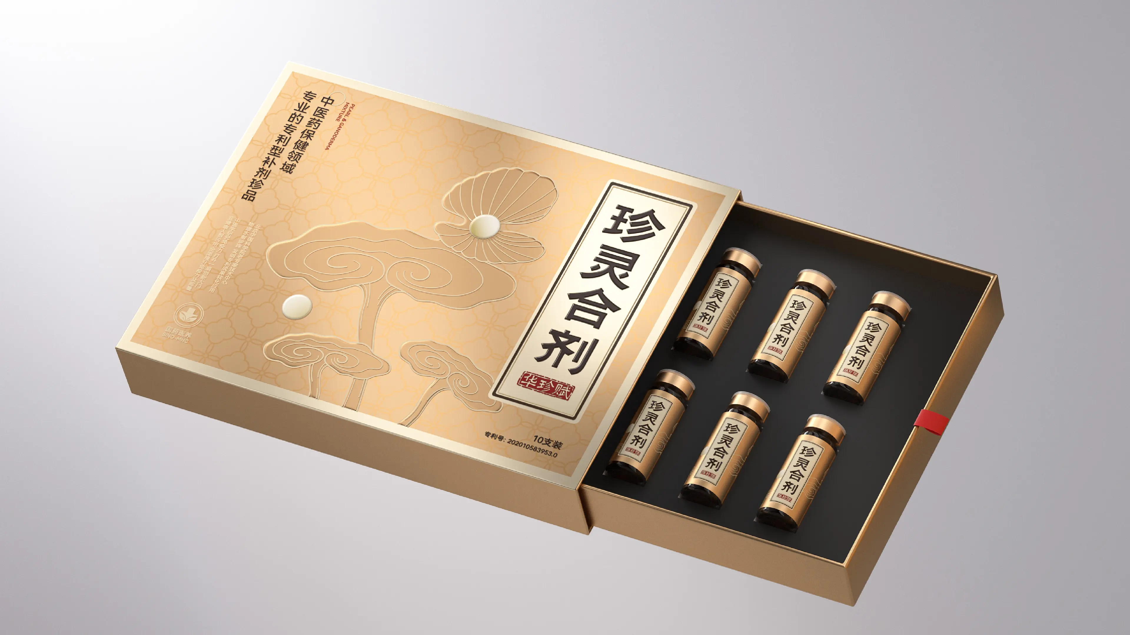
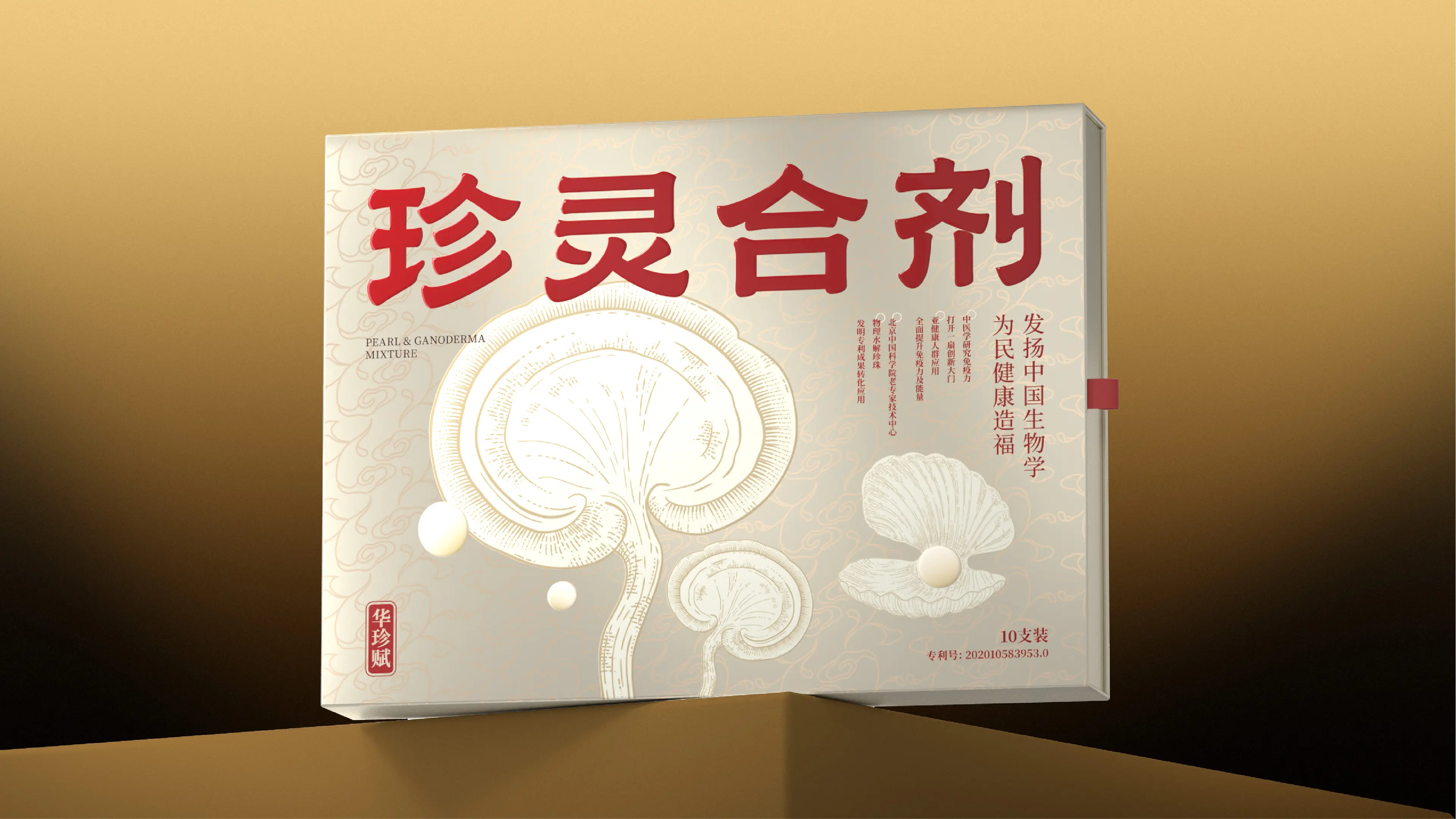
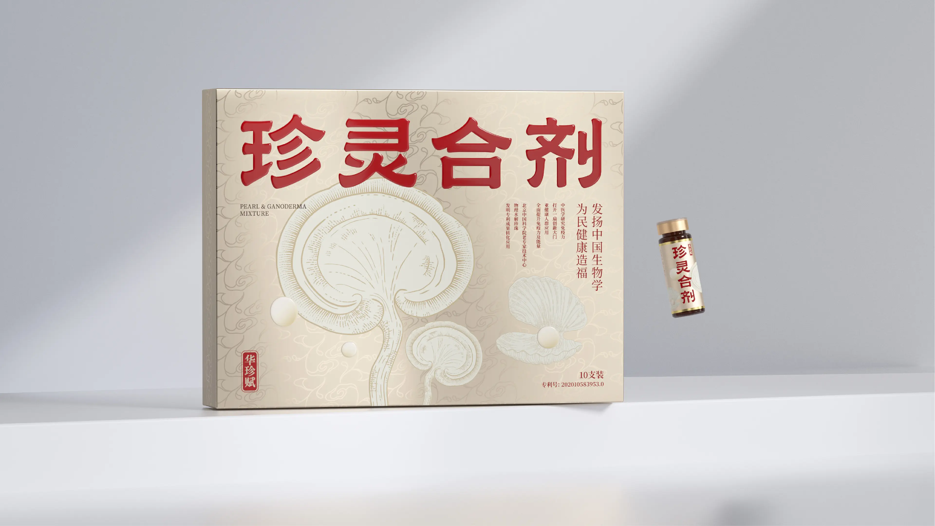
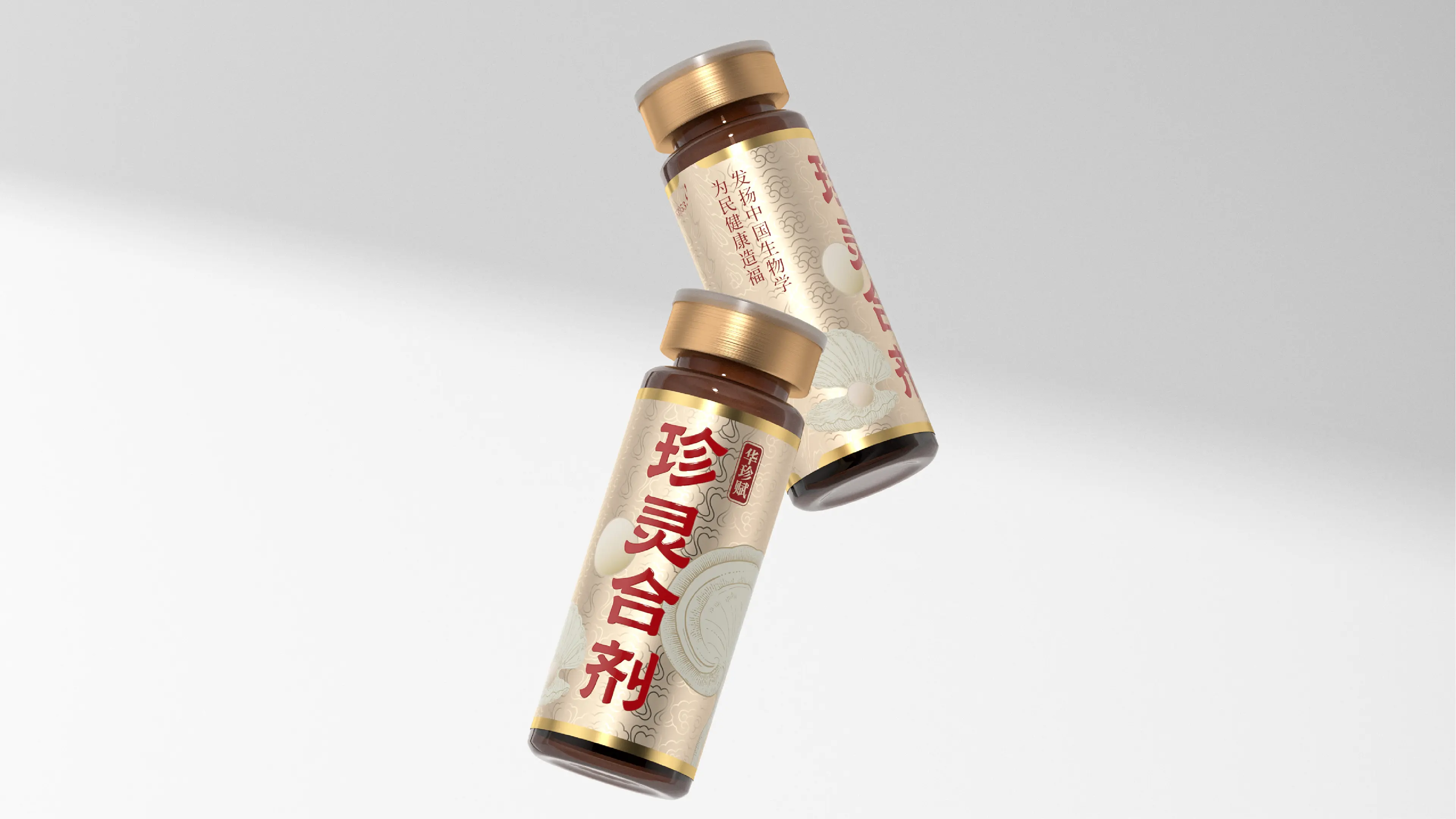
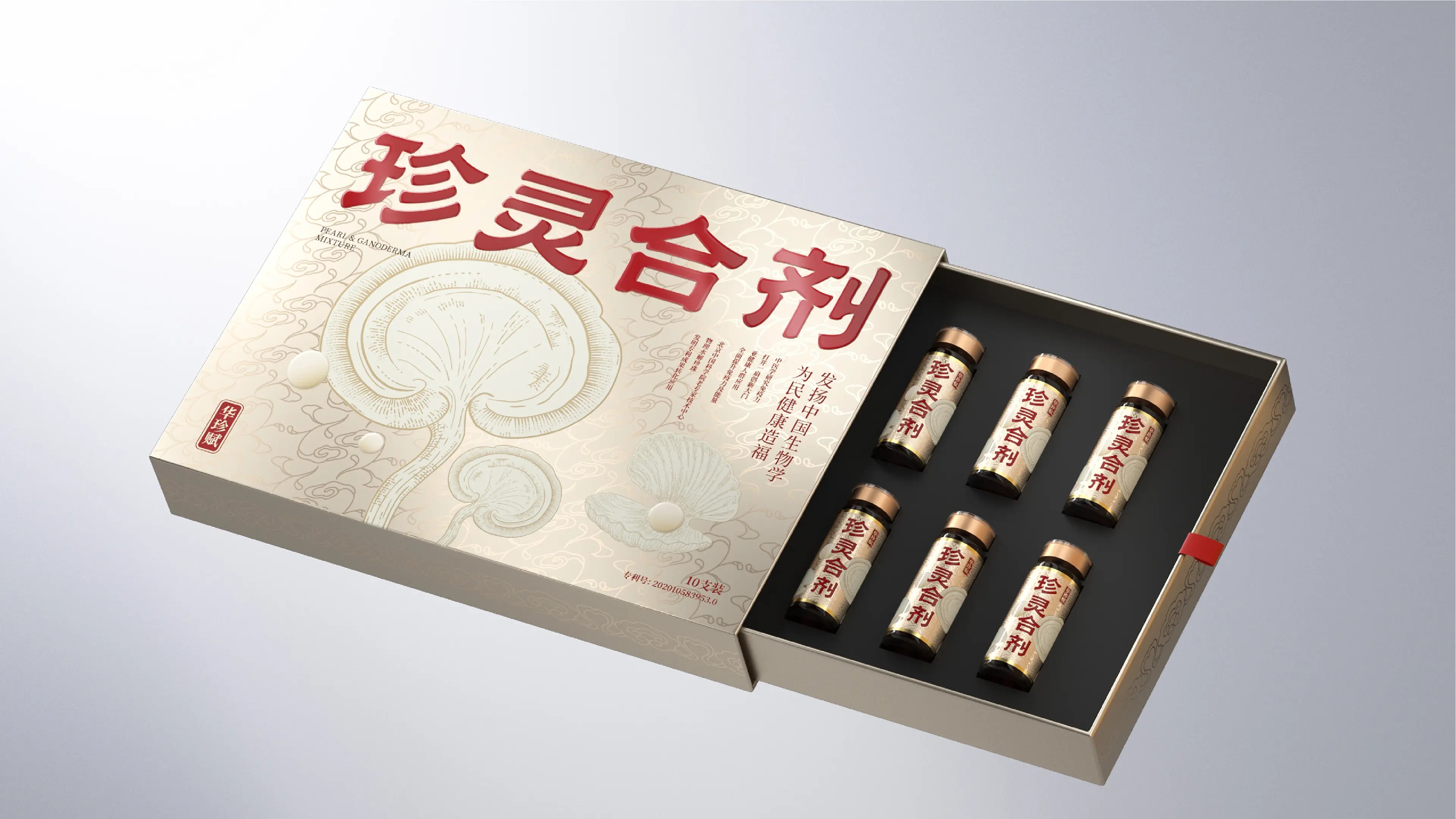
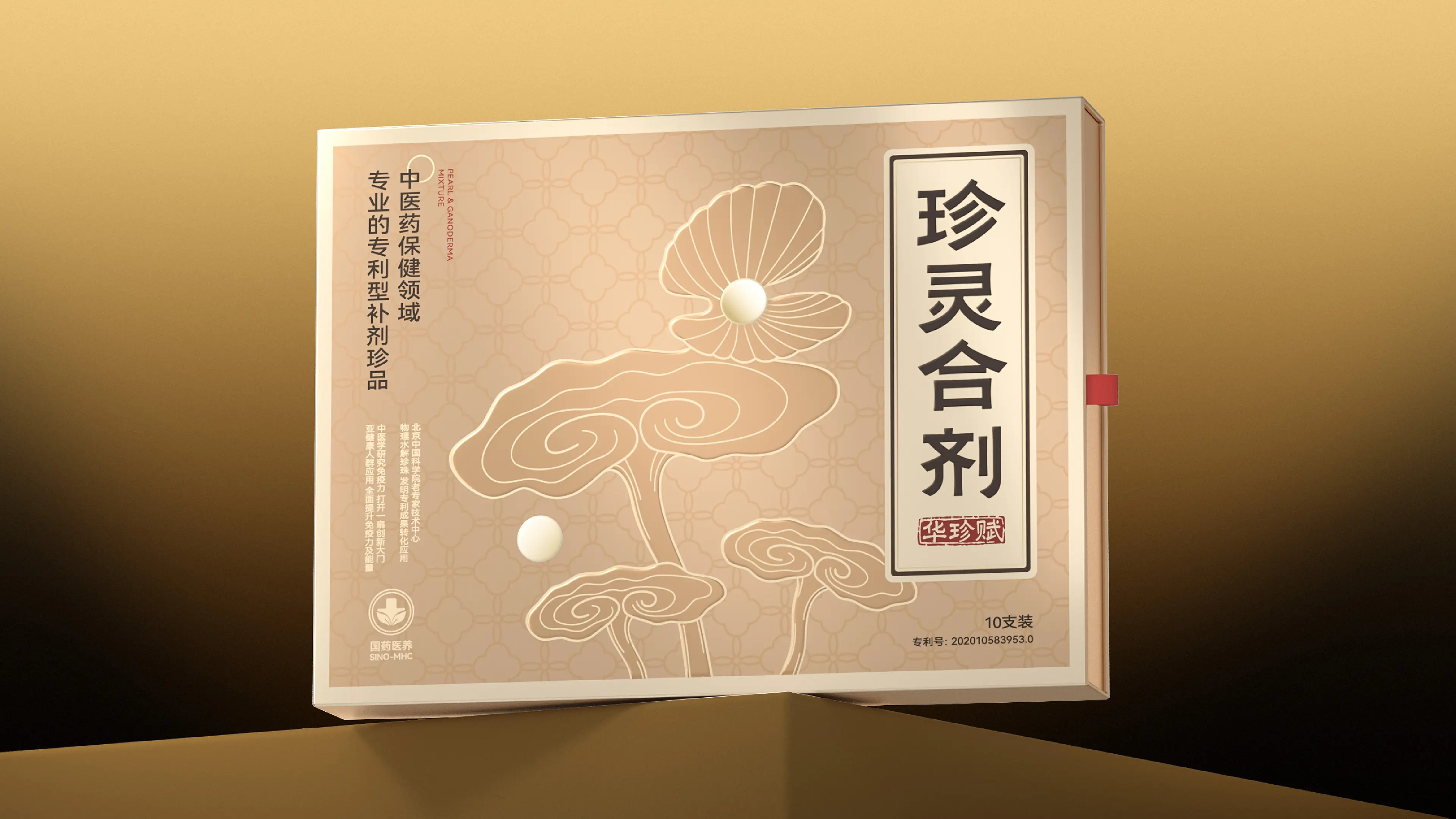
This project was initiated by representatives of 13 partners (including scientists and PhDs), who approached us hoping to complete the brand building and packaging design development for “Zhenling Mixture” with gift-giving attributes in private-domain channels.
The overall layout uses a traditional Chinese gongbi-style illustration of lingzhi (reishi mushroom) and pearls as the key visual. The typeface selected is a clerical-script-inspired sans-serif (heiti) with horizontal and vertical strokes and a square, flat structure. The product color scheme and packaging materials are optimized to emphasize the product’s gift-giving attribute. Targeting the consumption scenario of visiting patients, the visual style is designed to convey a sense of efficacy and value to consumers.