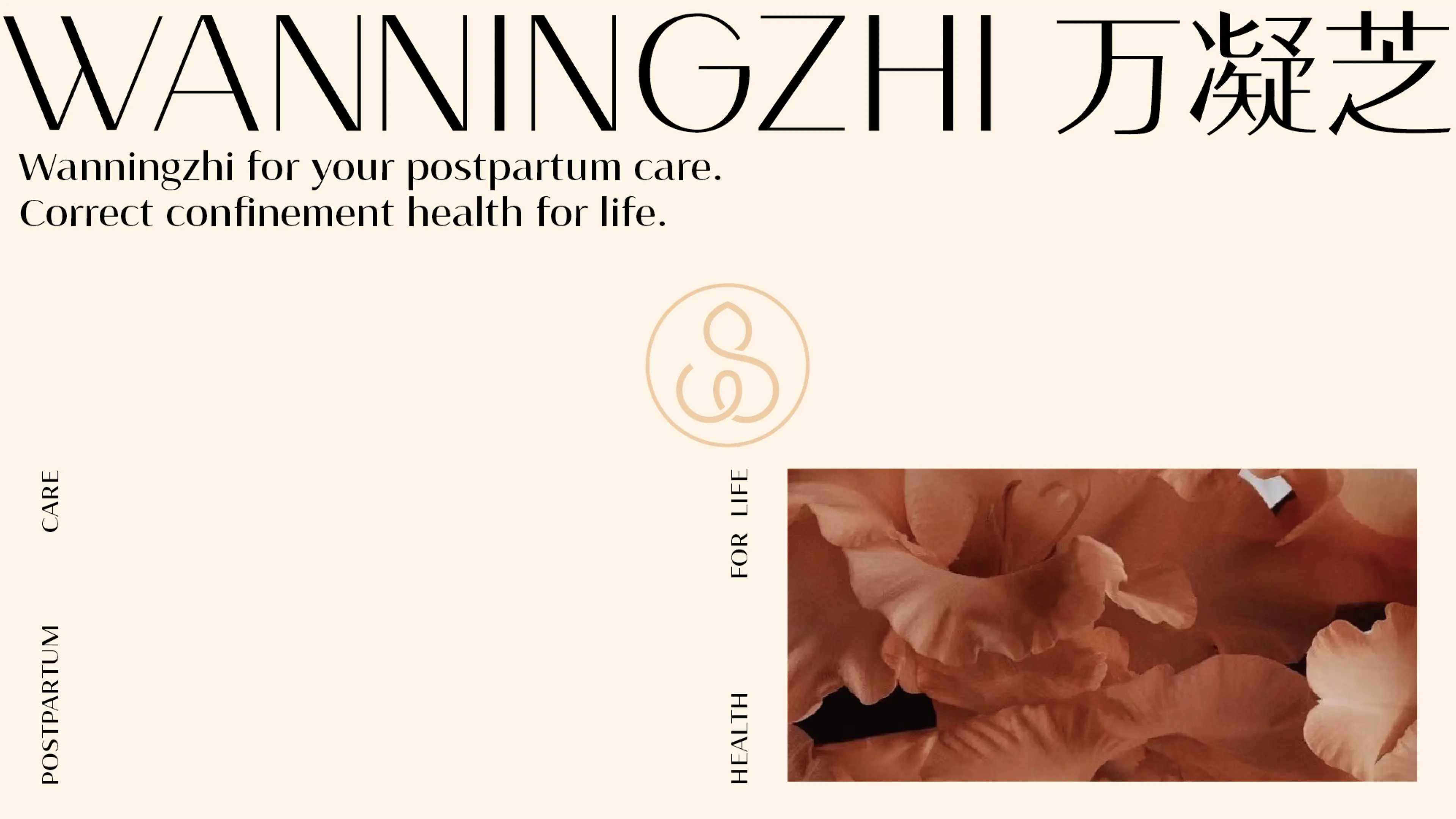
WANNINGZHI is a wellness and nourishment brand focused on postpartum recovery for women. Guided by the positioning of “Your Personal Maternal Wellness Companion,” the brand is committed to providing personalized postpartum recovery and confinement-care solutions.
Its product portfolio includes herbal pastes, tea sachets, nourishing soups, wellness porridges, and other complementary products, offering a more systematic approach to the different nutritional and recovery needs women experience throughout the maternal journey.
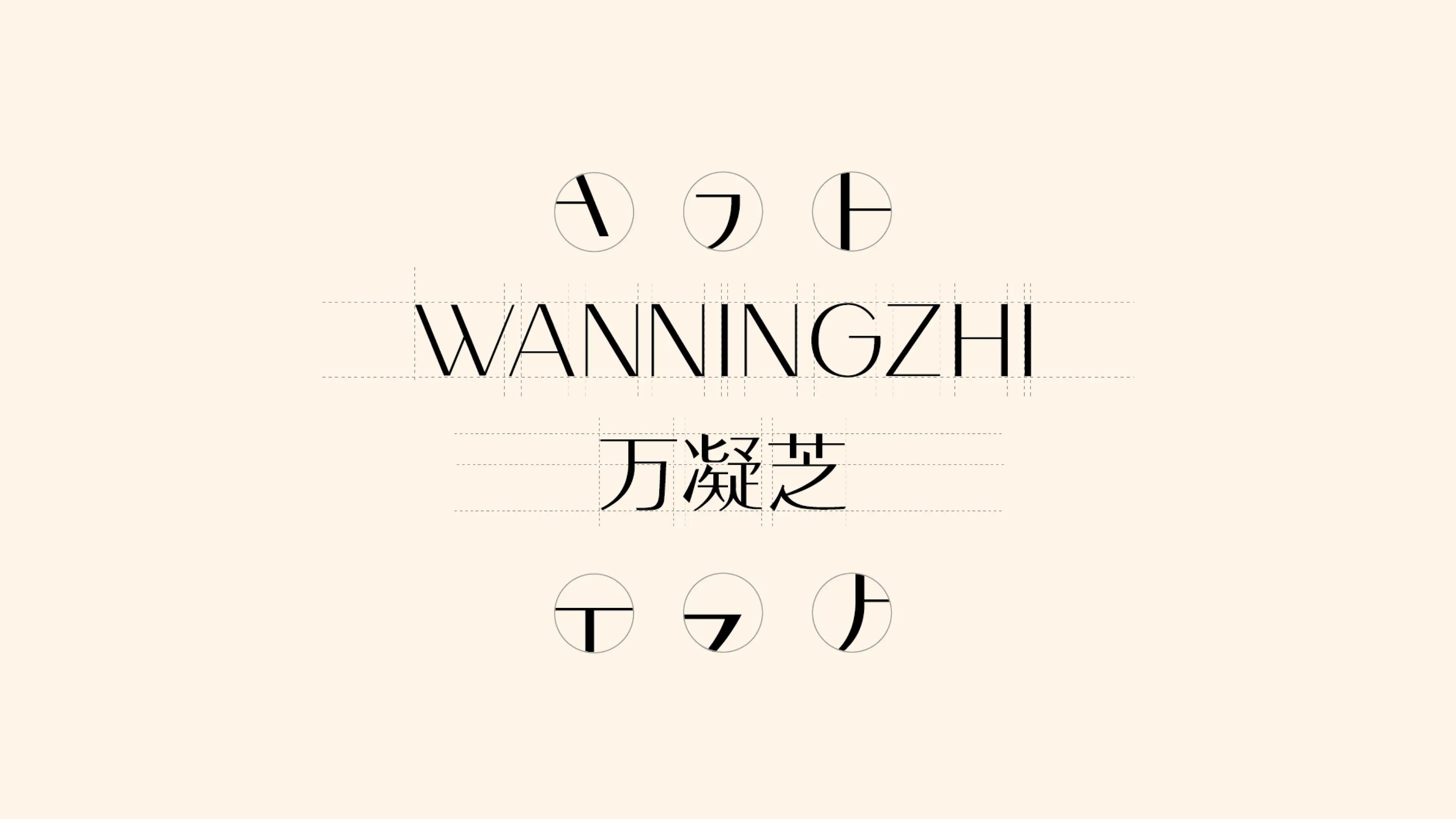
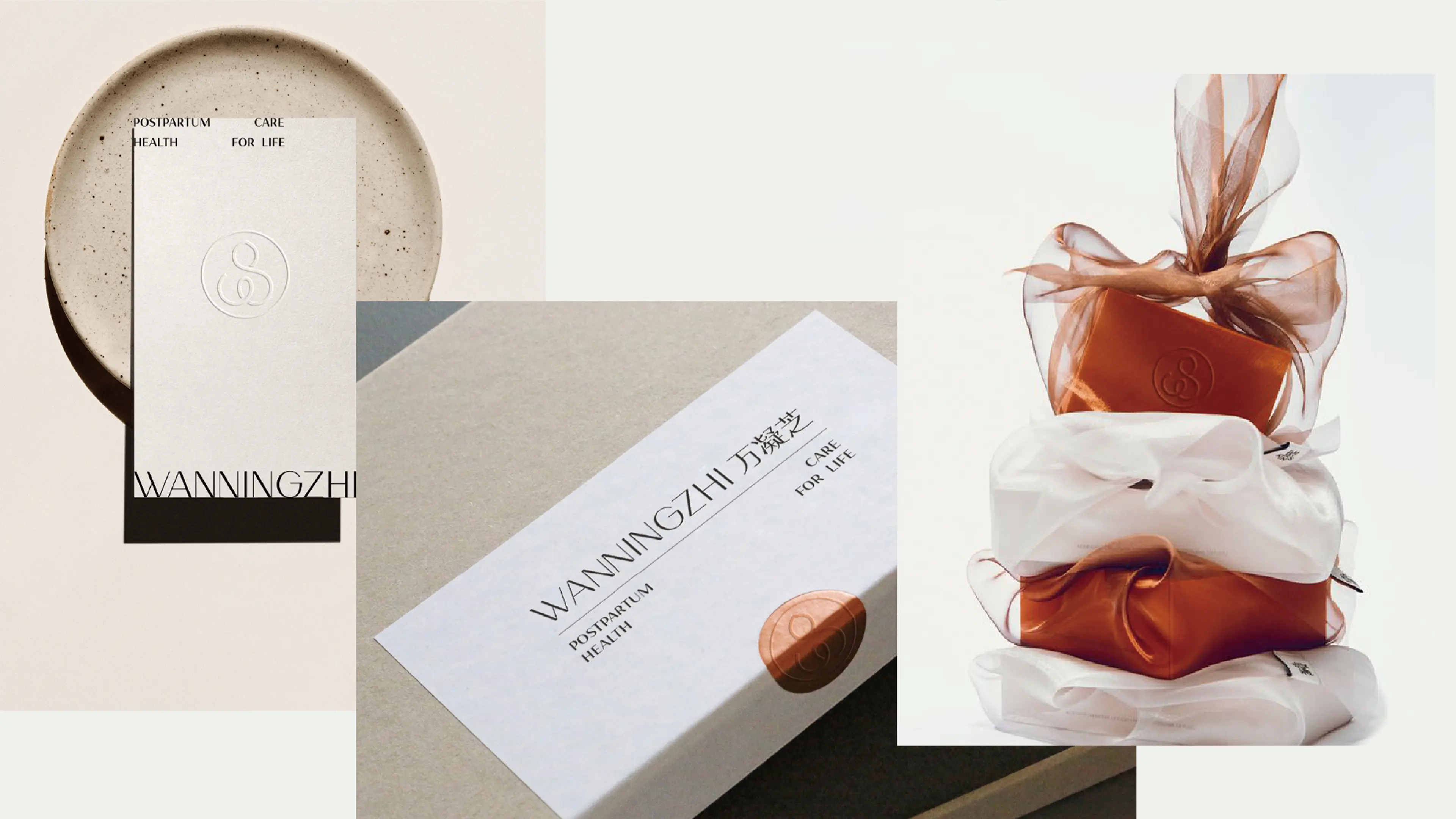
This project involved the development of a complete brand system for WANNINGZHI, covering key areas including logo design, visual identity, and packaging design.
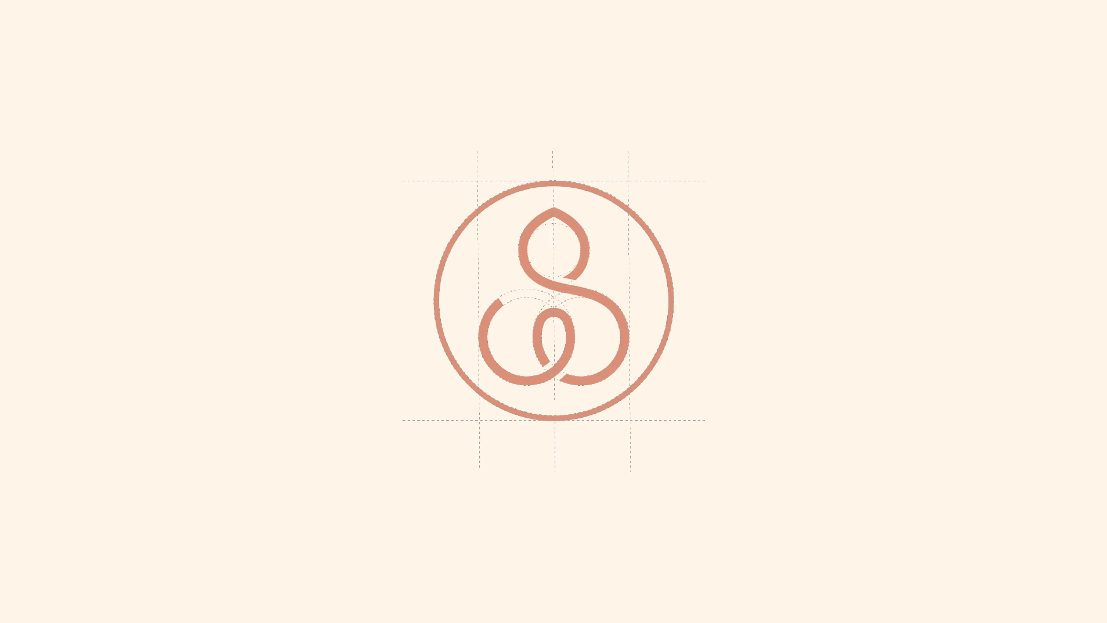
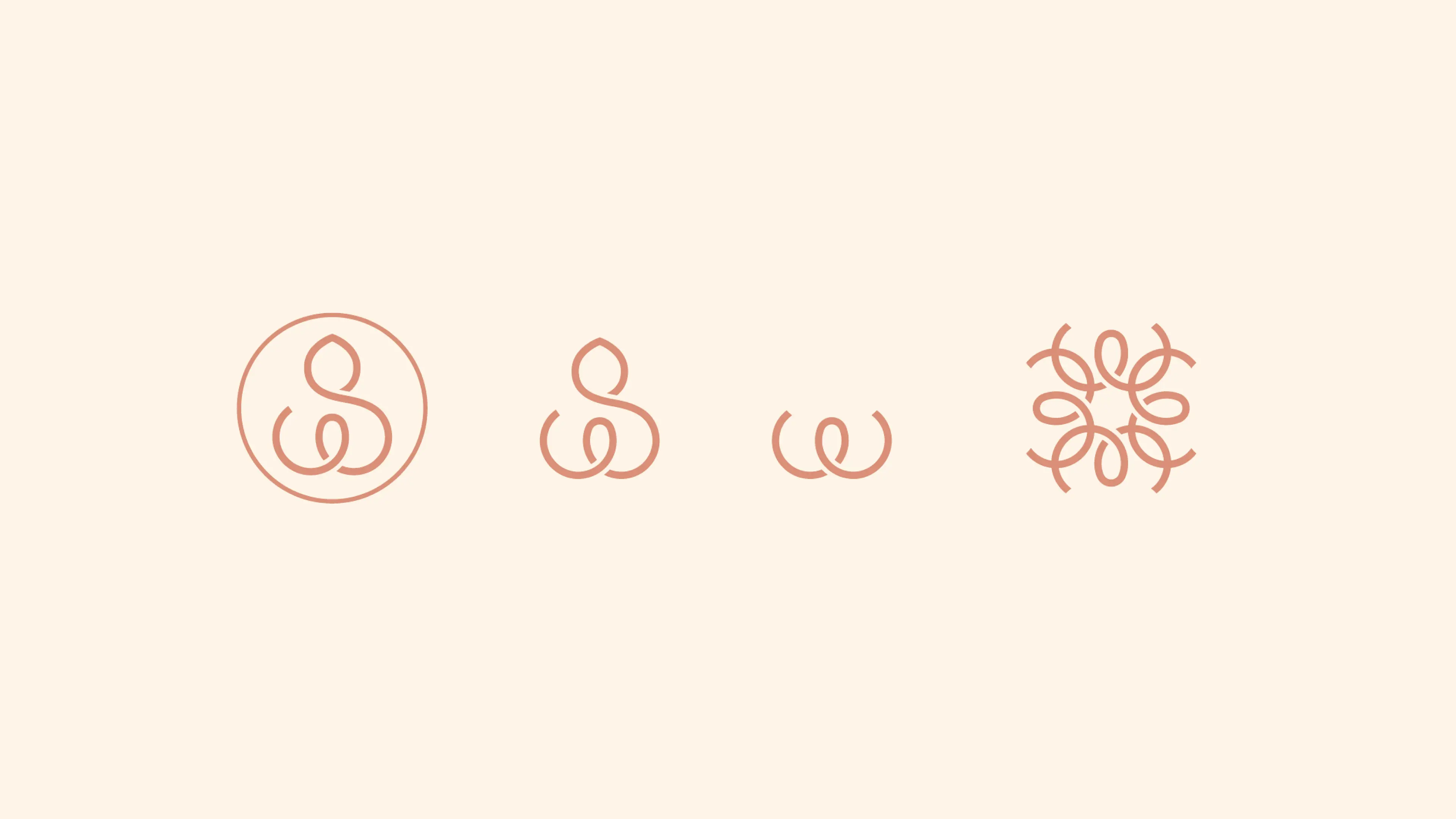
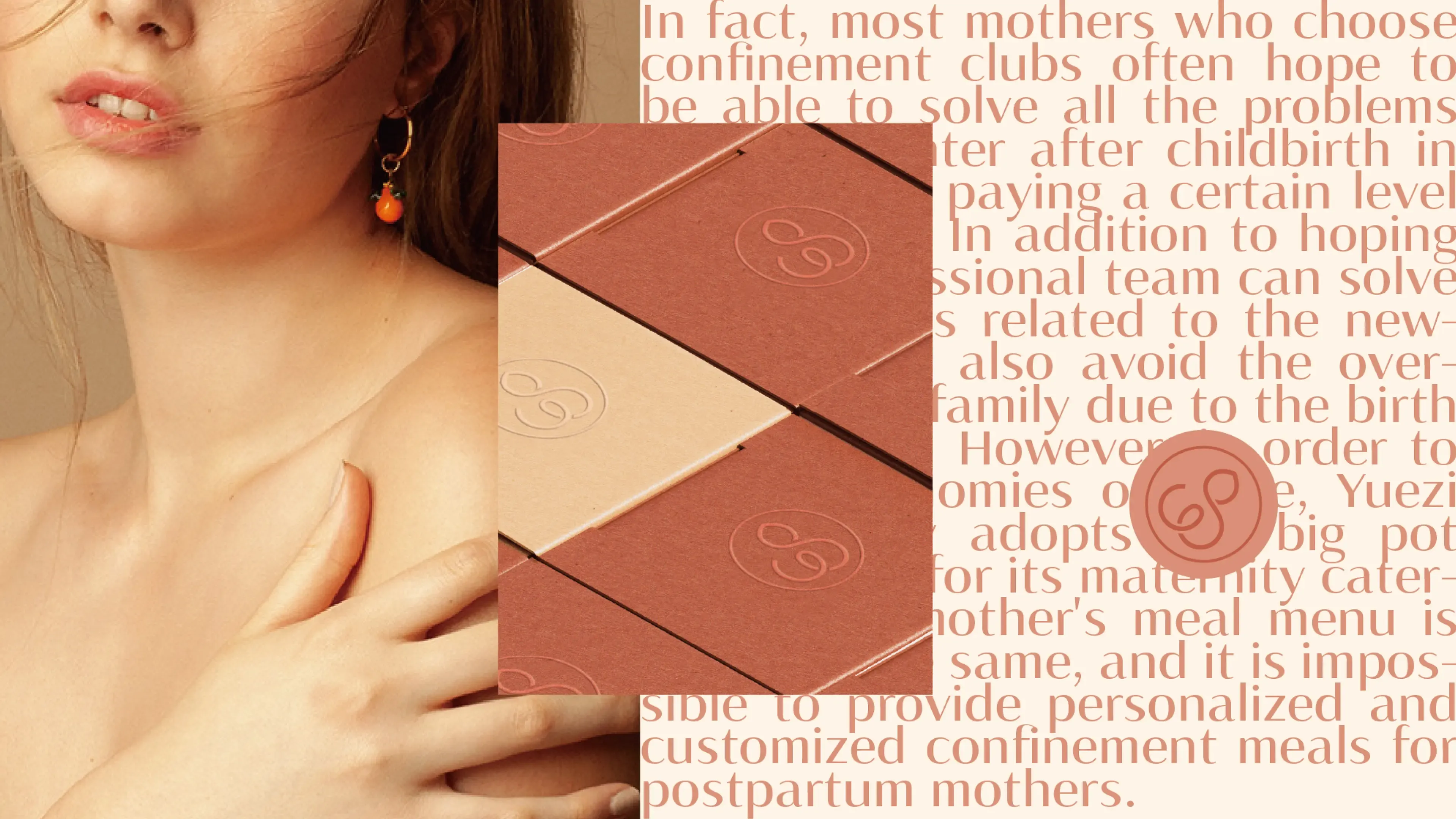
The logo serves as the central expression of the brand’s visual identity.
Inspired by WANNINGZHI’s core philosophy of maternal recovery and caring for women, we brought together three symbolic elements within a single mark: a flower bud about to bloom, representing new life and hope; a mother embracing her newborn, expressing care and protection; and the initial letter “W,” strengthening brand recognition.
The integration of these three images allows the logo to communicate both warmth and professionalism while conveying a strong sense of life, renewal, and maternal care.
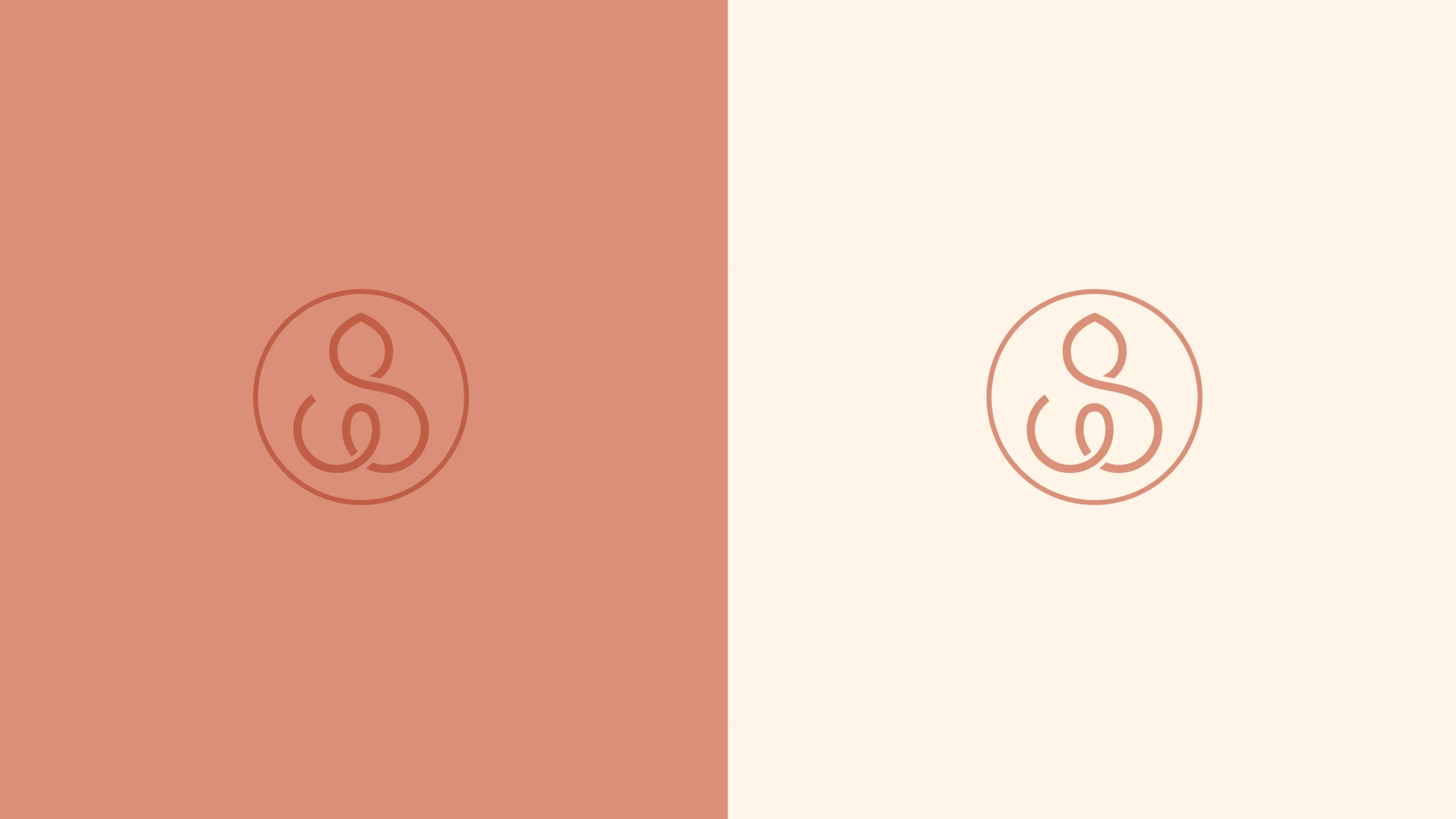
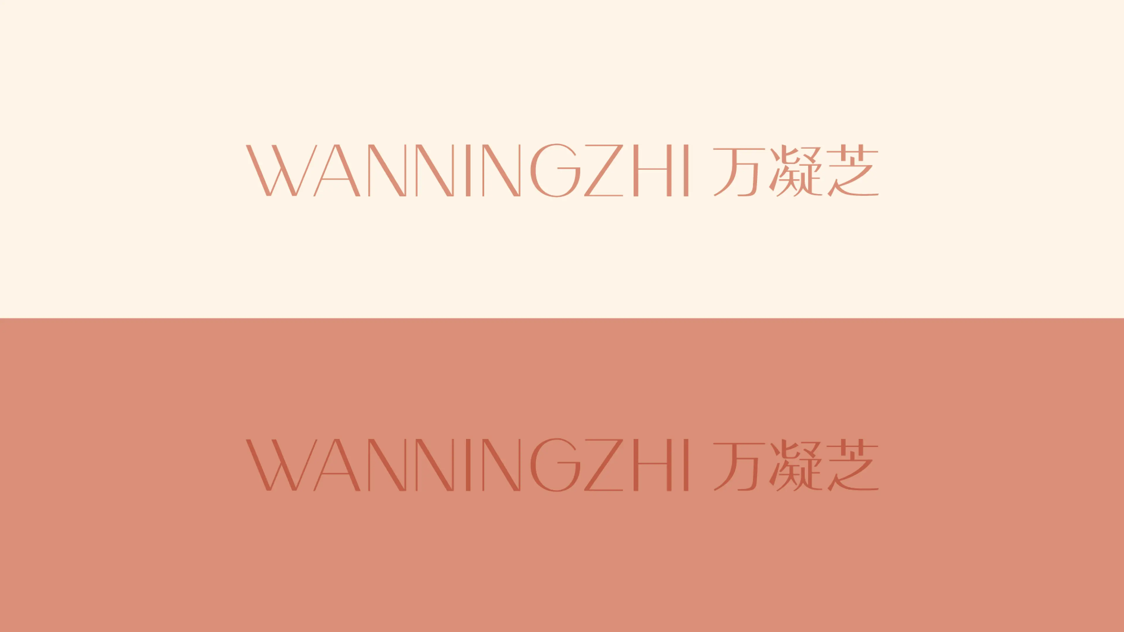
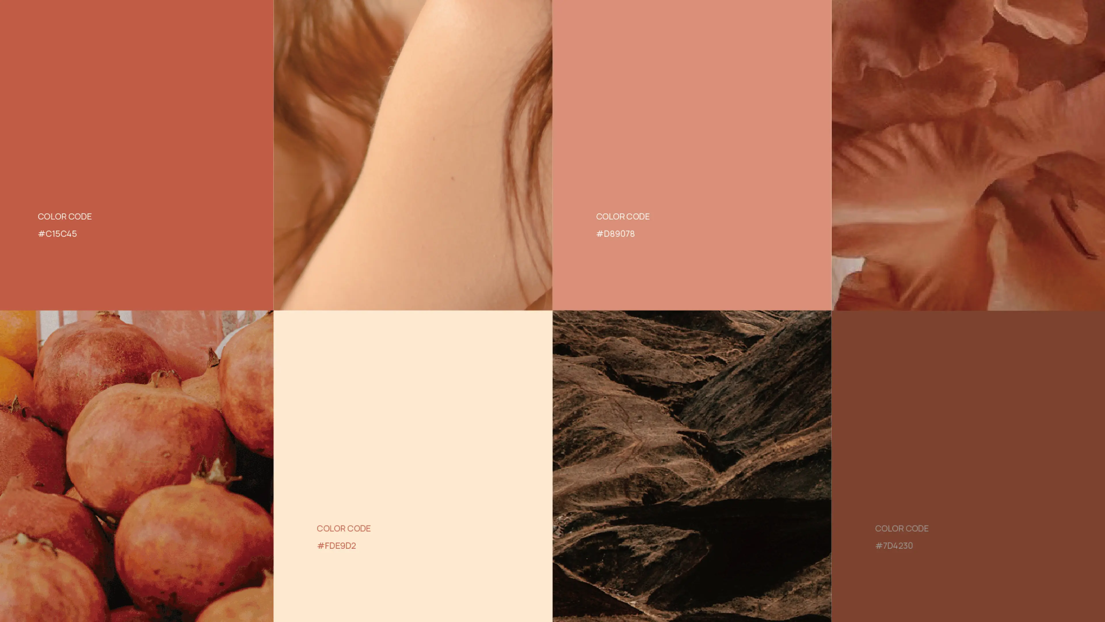
The brand color system was developed around the gentle and intimate emotional atmosphere of pregnancy and postpartum care. Coral red, soft peach, and skin-toned pink were selected as the primary palette.
Coral red conveys vitality and warmth; soft peach reflects femininity, tenderness, and new beginnings; while skin-toned pink creates a sense of closeness, comfort, and reassurance. Together, the three colors establish a warm and nurturing visual atmosphere, allowing consumers to immediately feel a sense of care, understanding, and emotional connection.
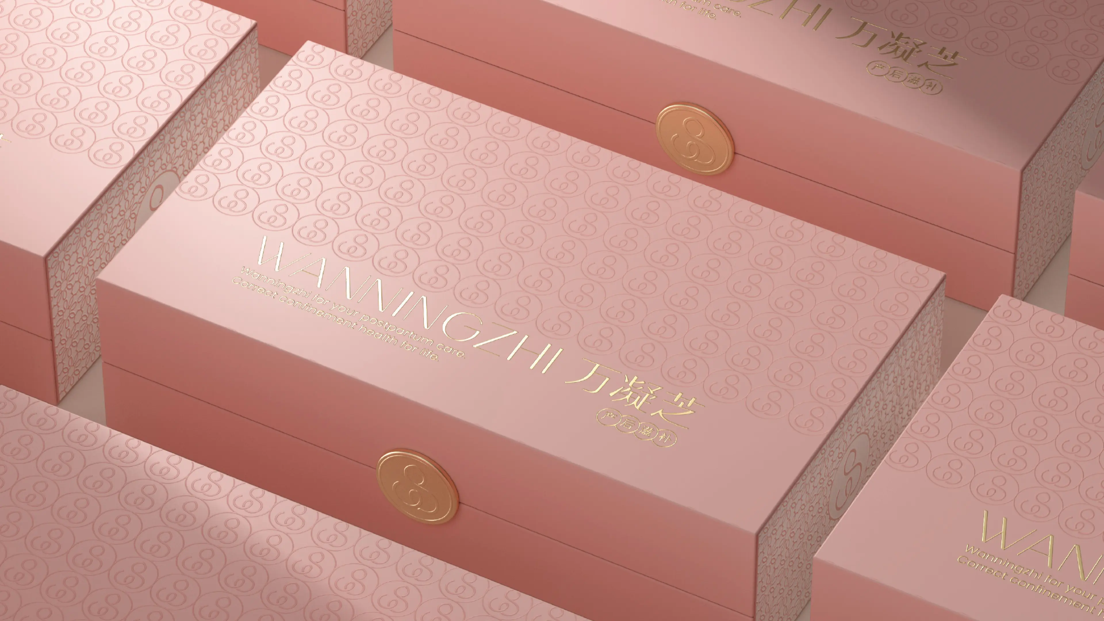
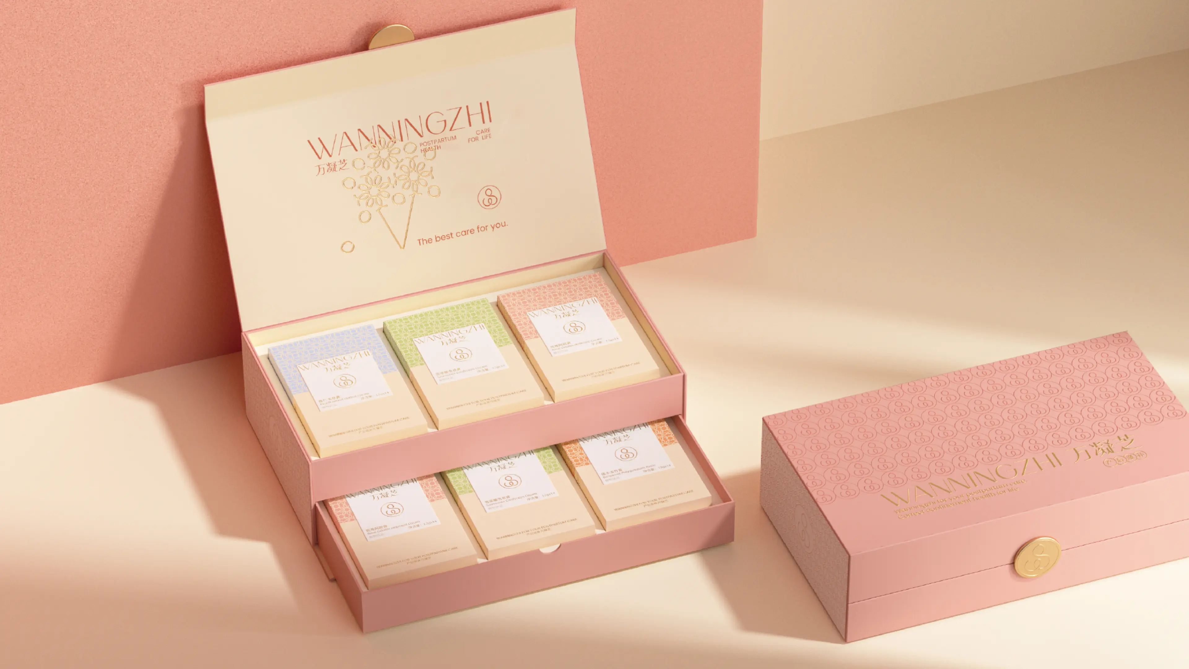
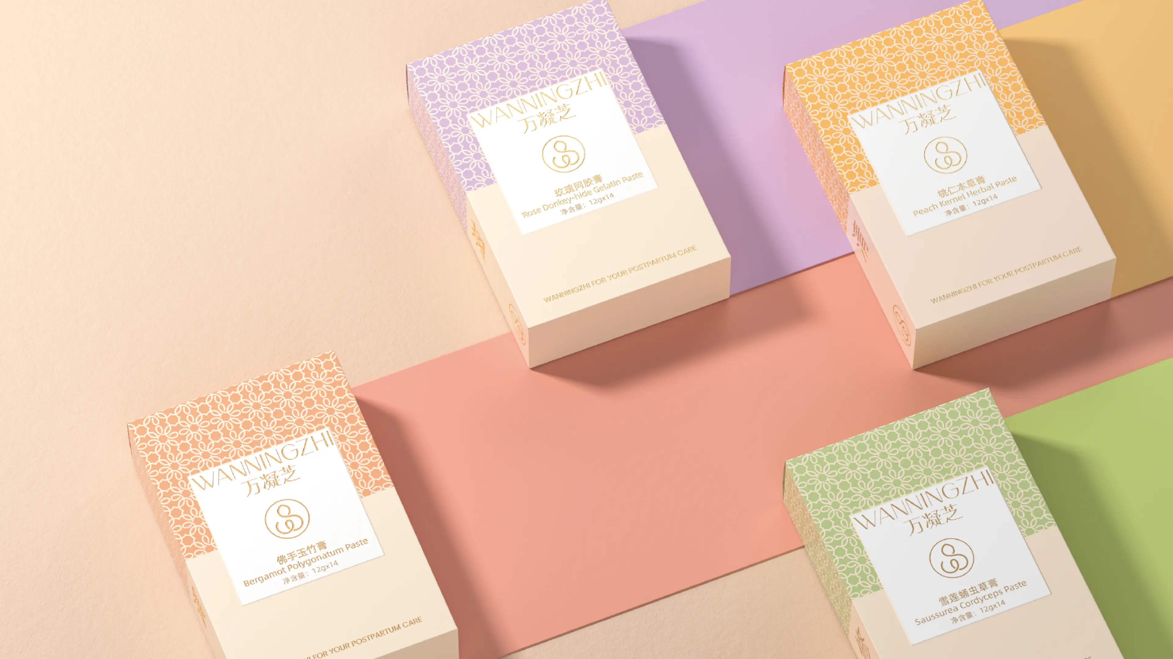
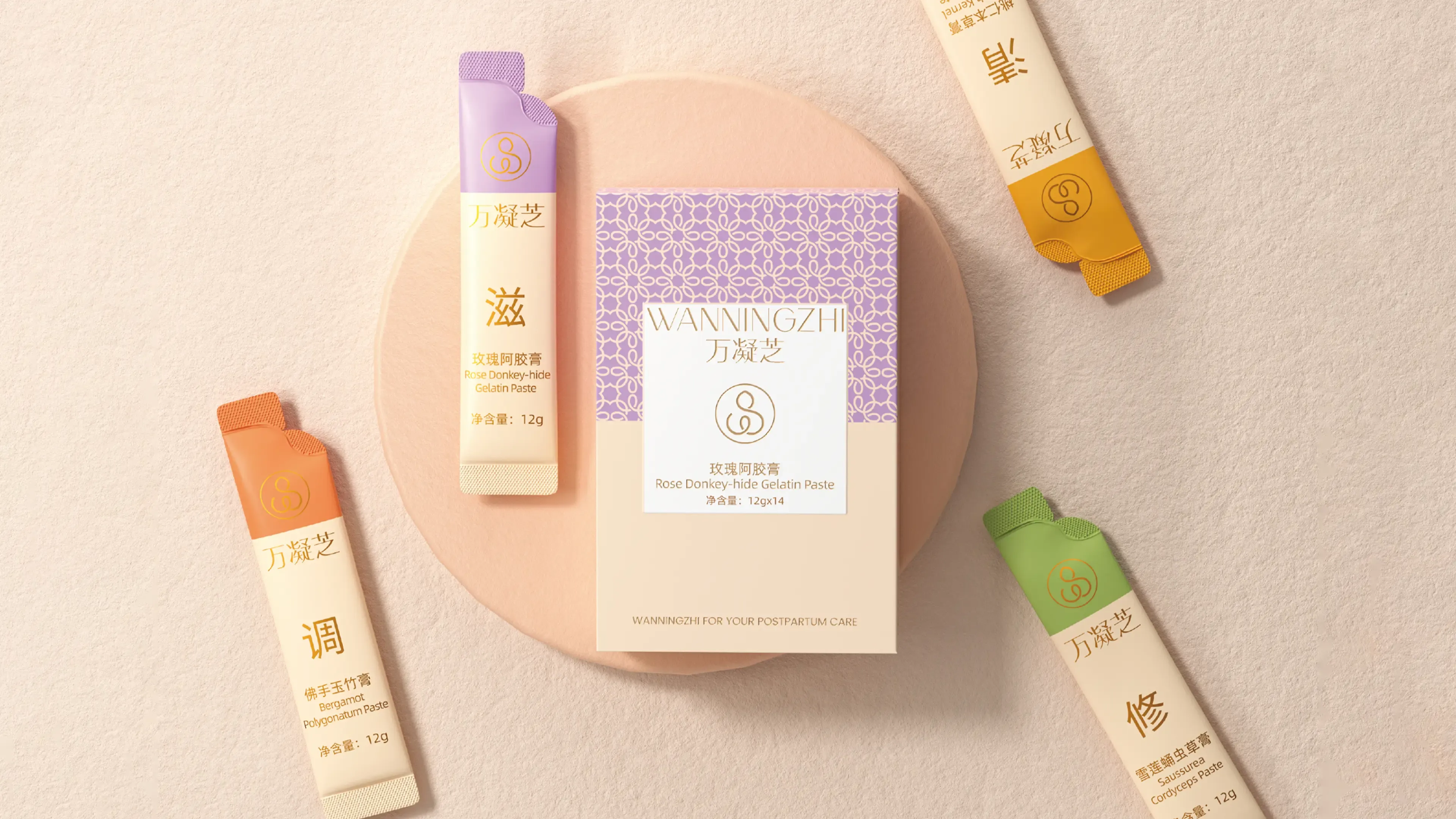
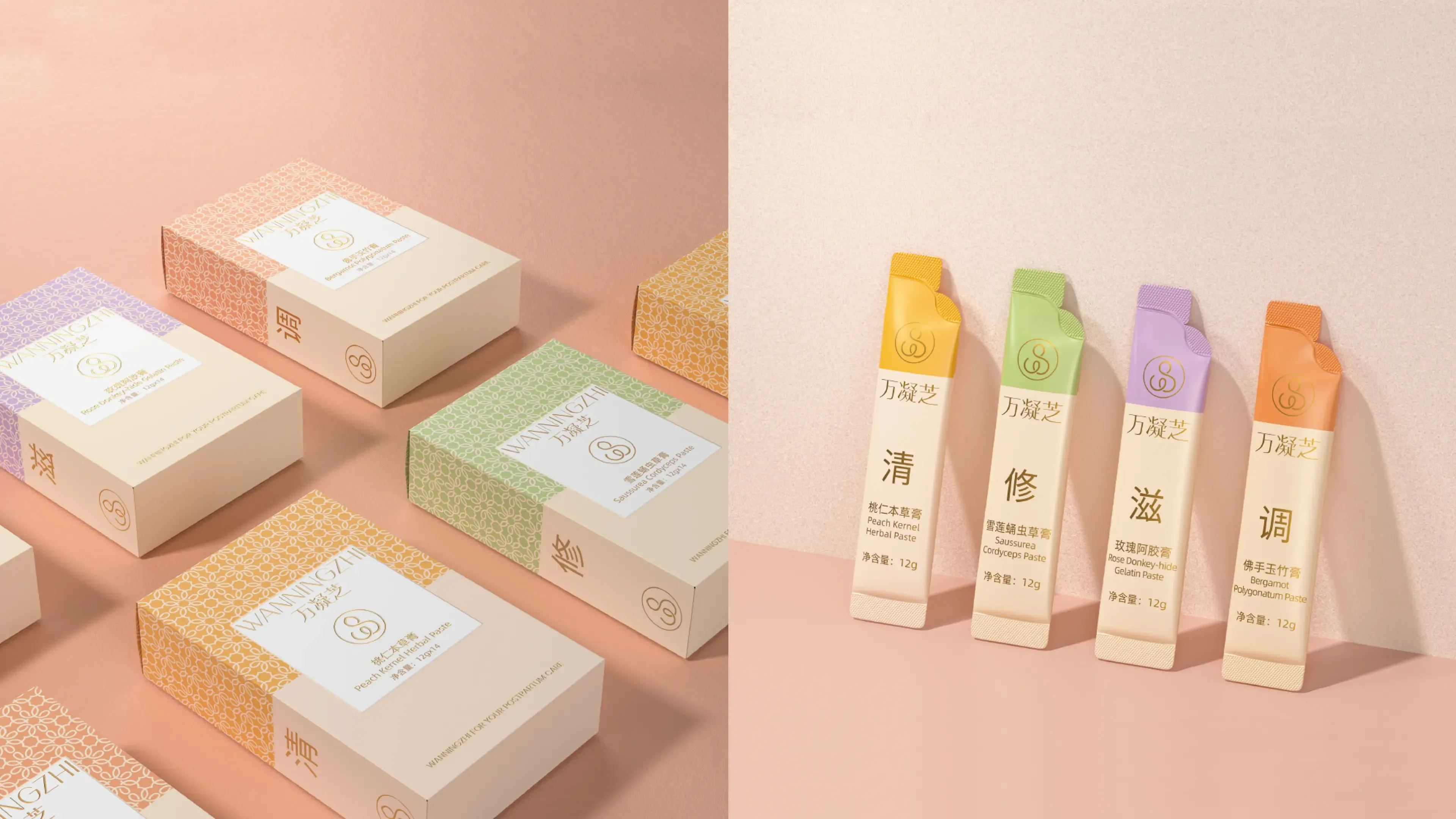
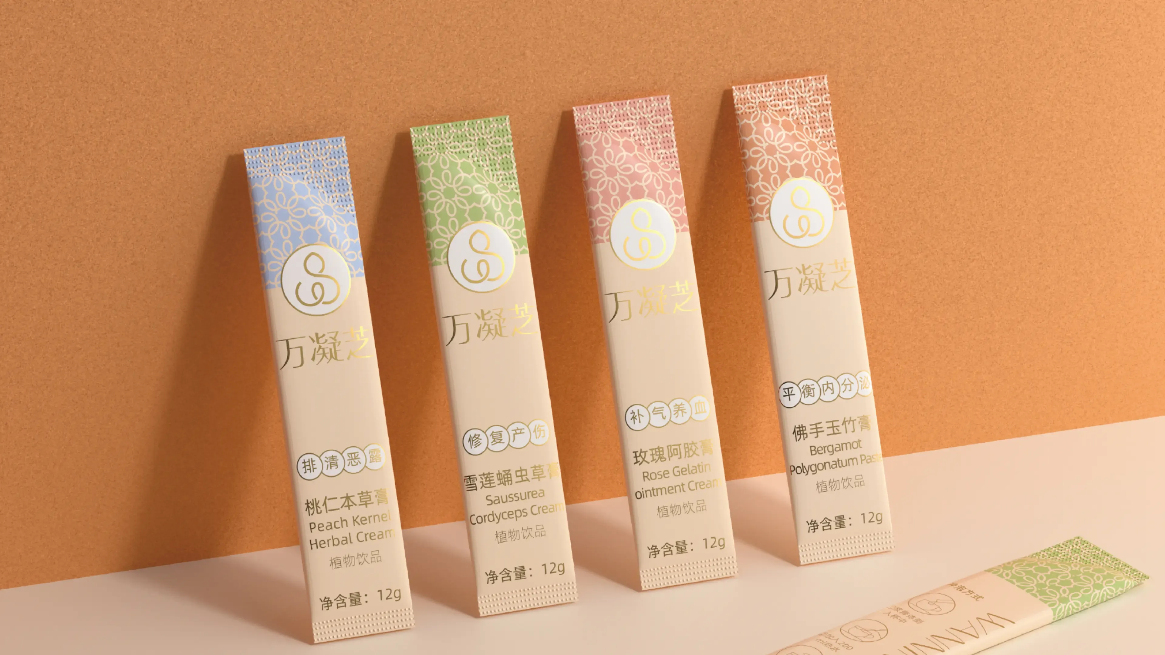
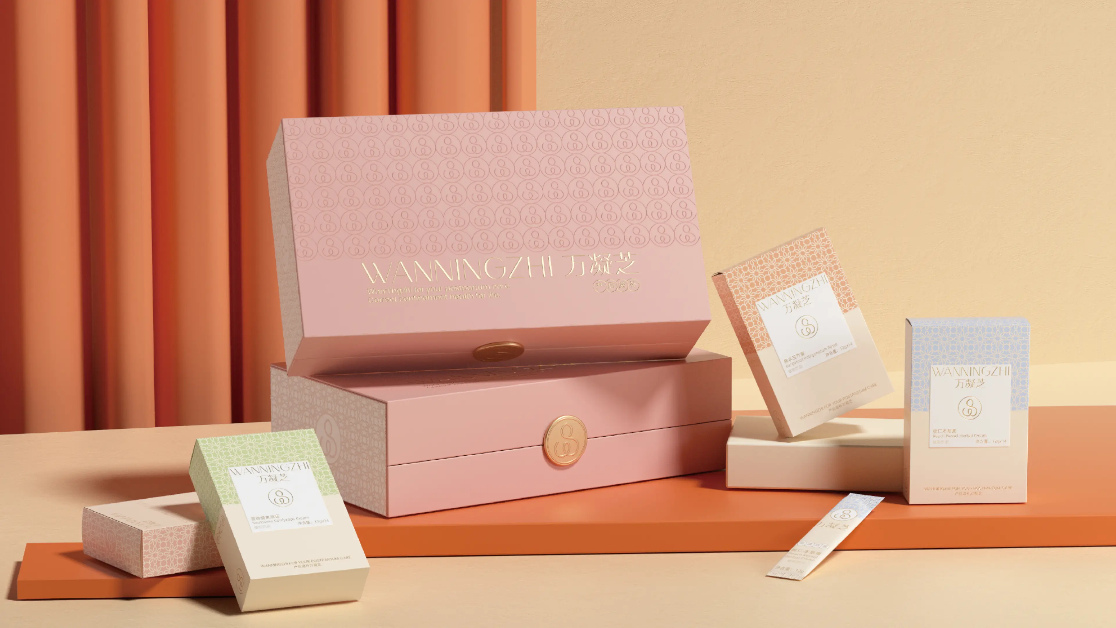
The packaging system was specifically developed for WANNINGZHI’s postpartum herbal paste products.
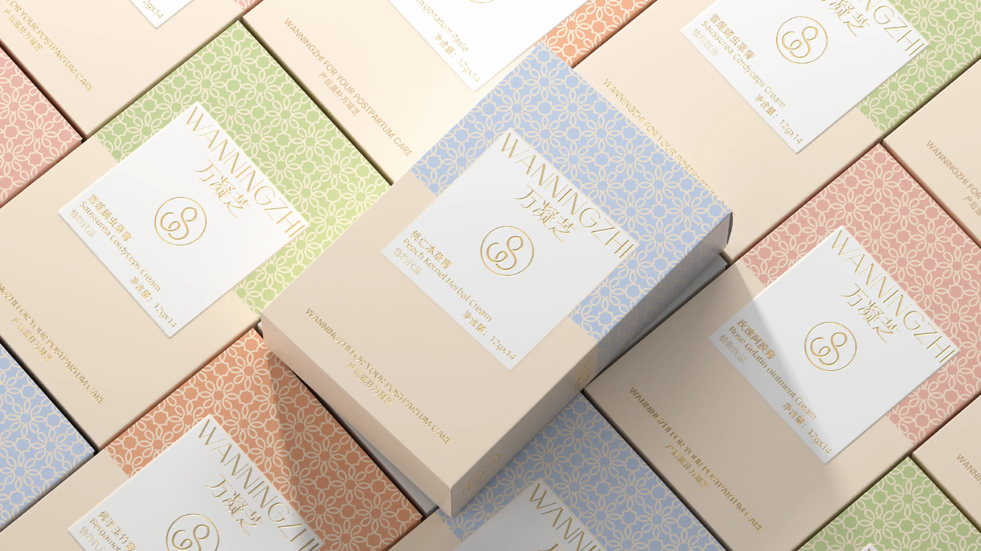
Based on the different stages of postpartum recovery, the design team extracted four key concepts — “Cleanse, Restore, Nourish, and Rebalance” — and translated them into the packaging system. Each concept corresponds to a different stage and focus of postpartum care, allowing consumers to understand the role and sequence of the products more intuitively through the packaging itself.
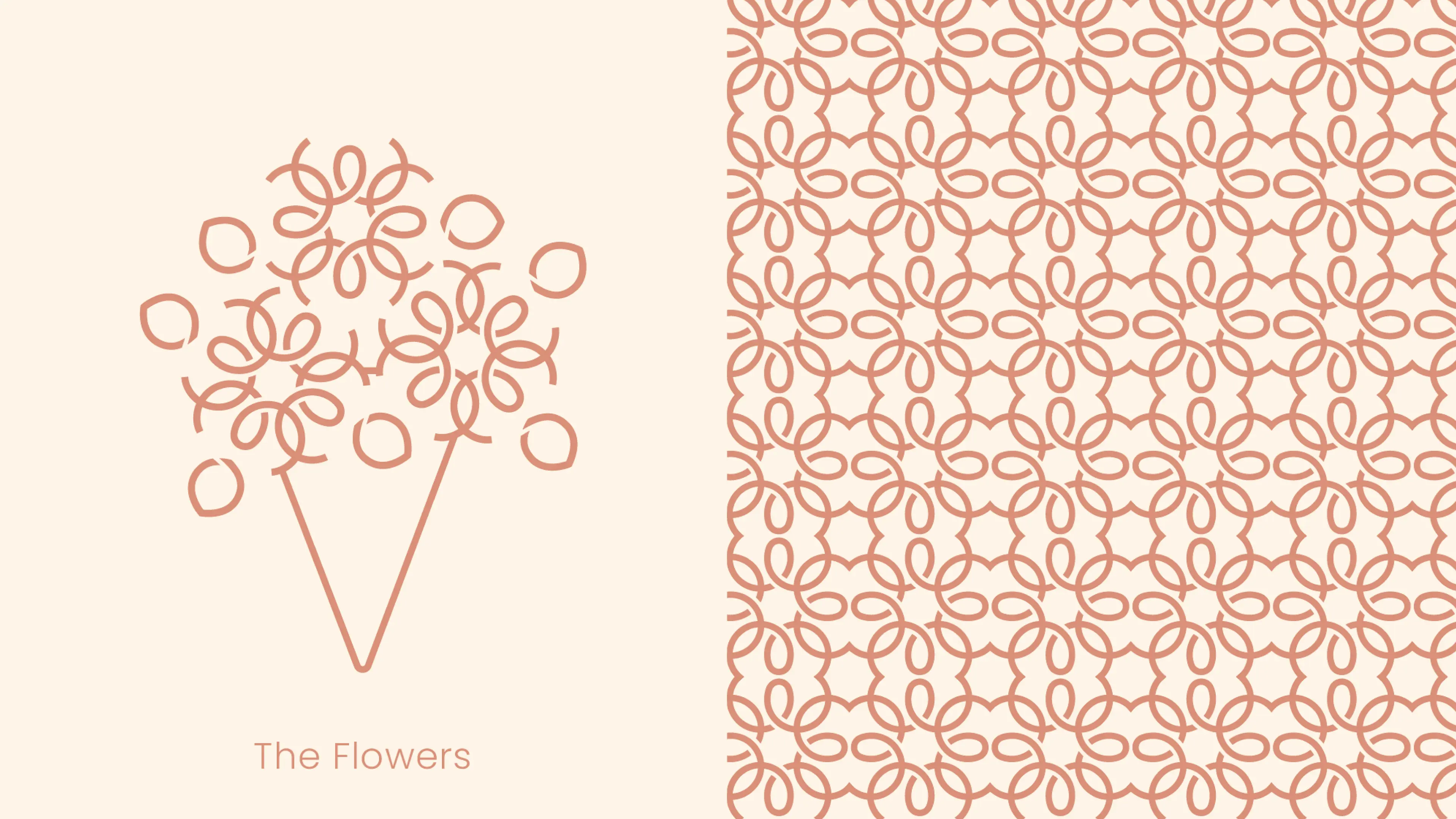
The brand’s supporting graphic system is continuously repeated across the packaging surface, creating a unified and coherent shelf presence throughout the entire product range. This visual consistency strengthens overall brand recognition while reinforcing a sense of professionalism and trust.
Through a comprehensive design system that balances emotional warmth, visual recognition, and professional credibility, WANNINGZHI successfully evolved from a functional nourishment product into a distinctive maternal wellness brand with strong visual identity, emotional connection, and trusted expertise.