
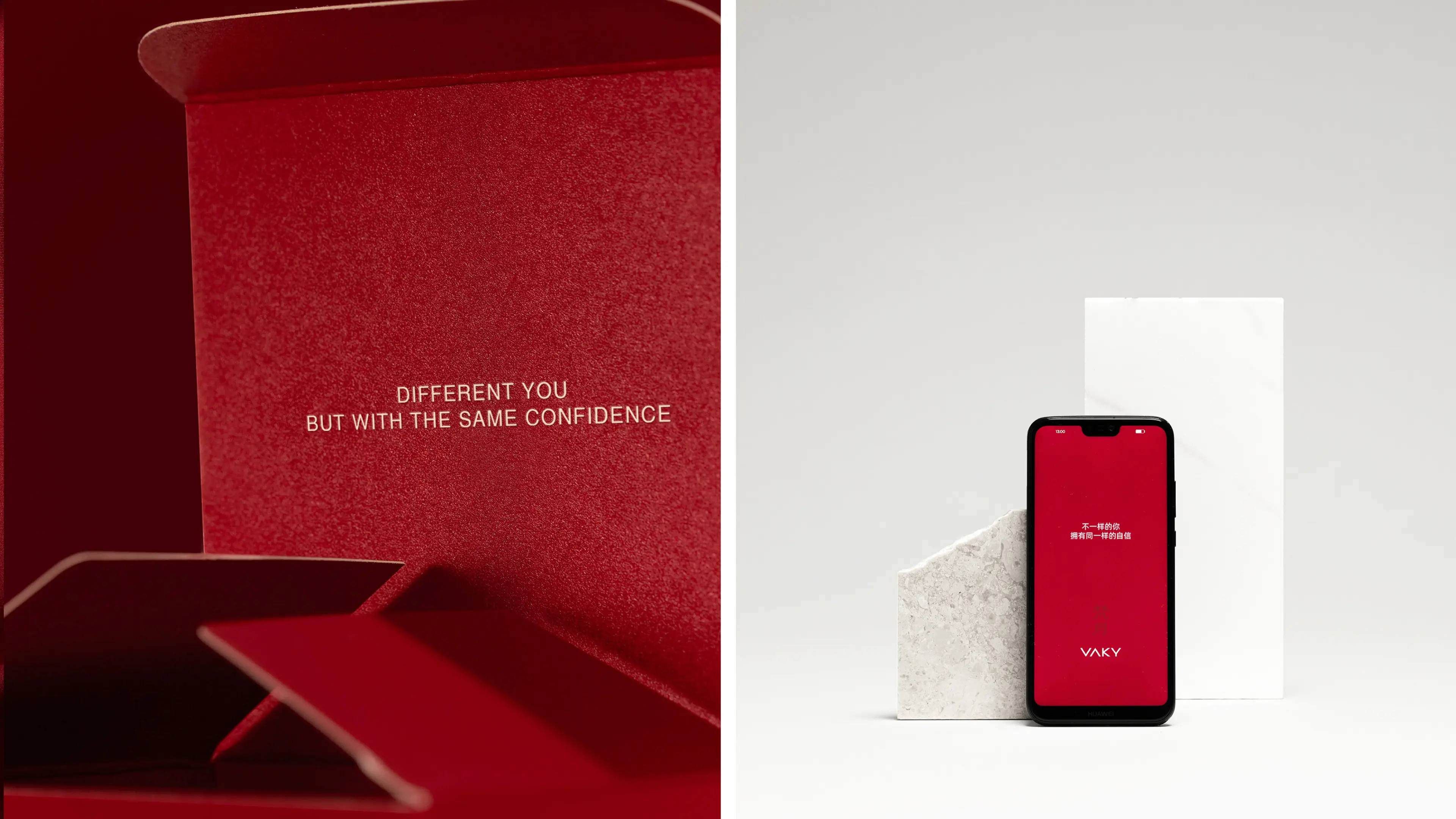
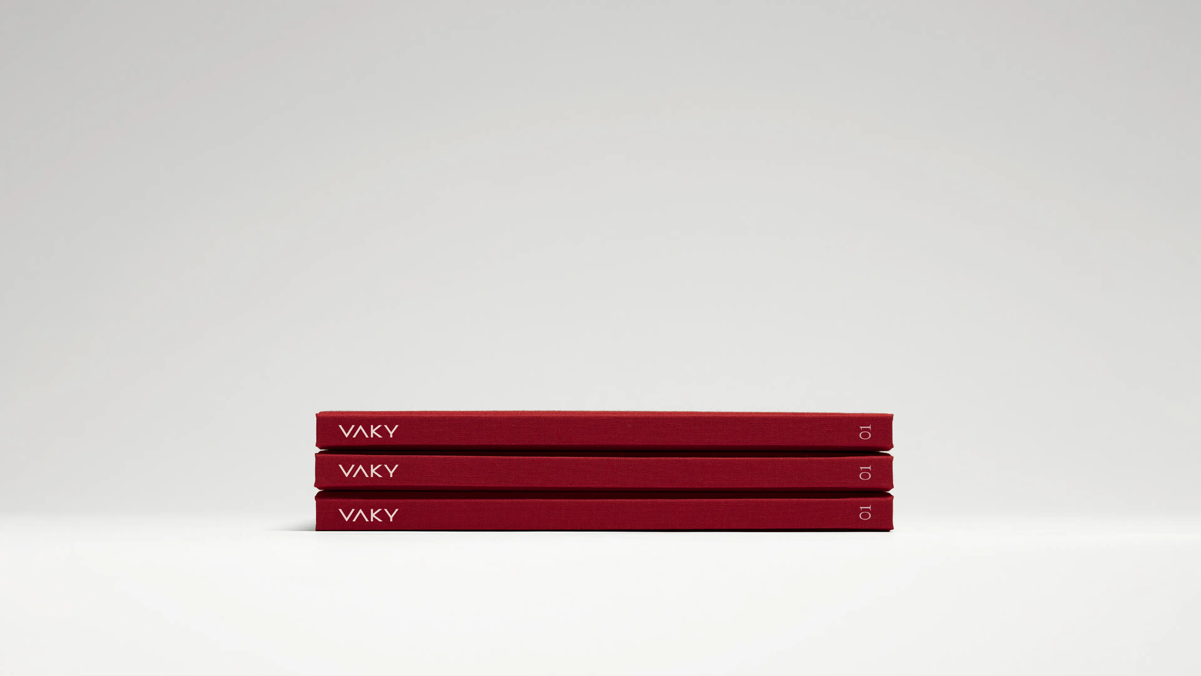
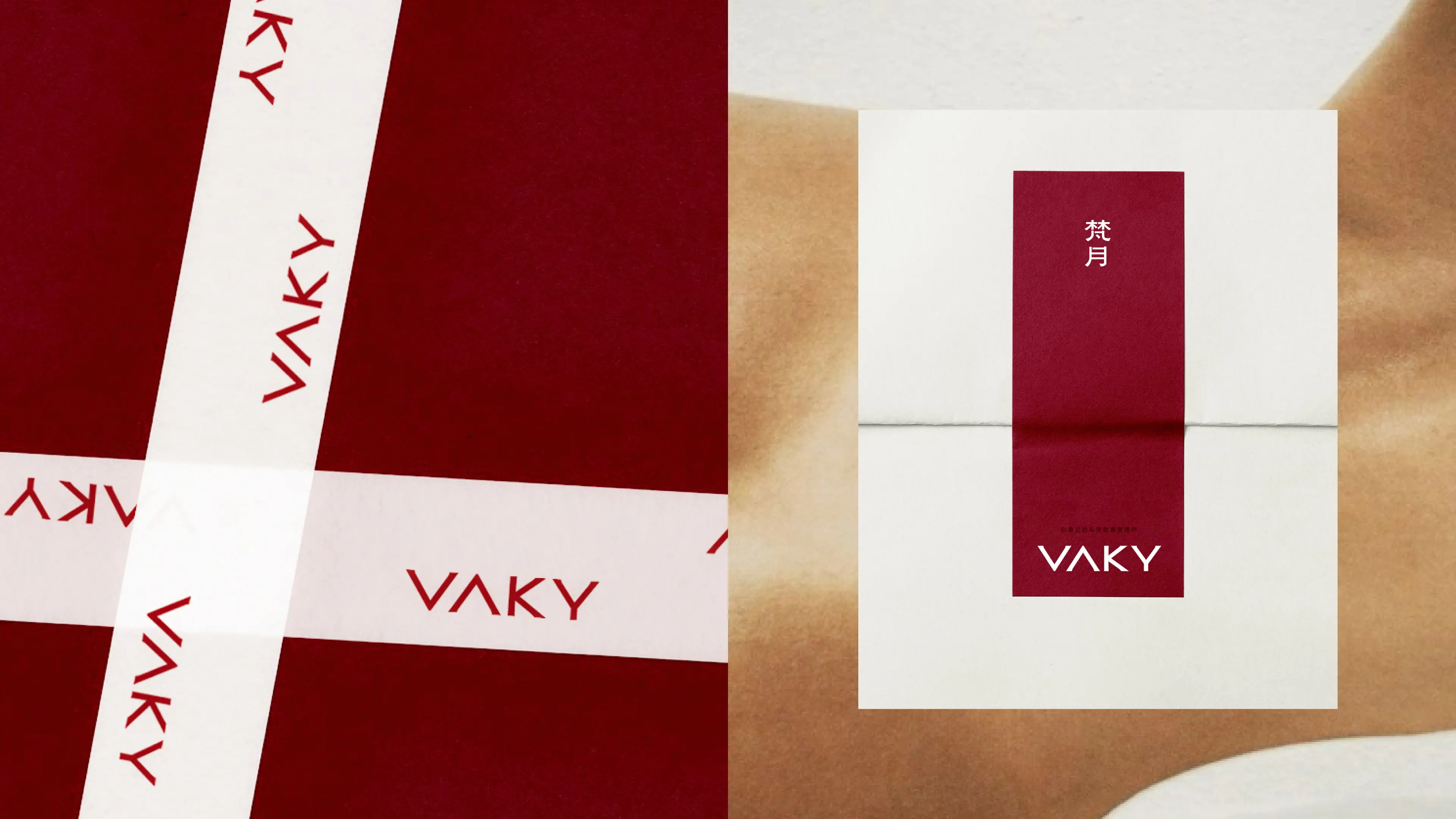
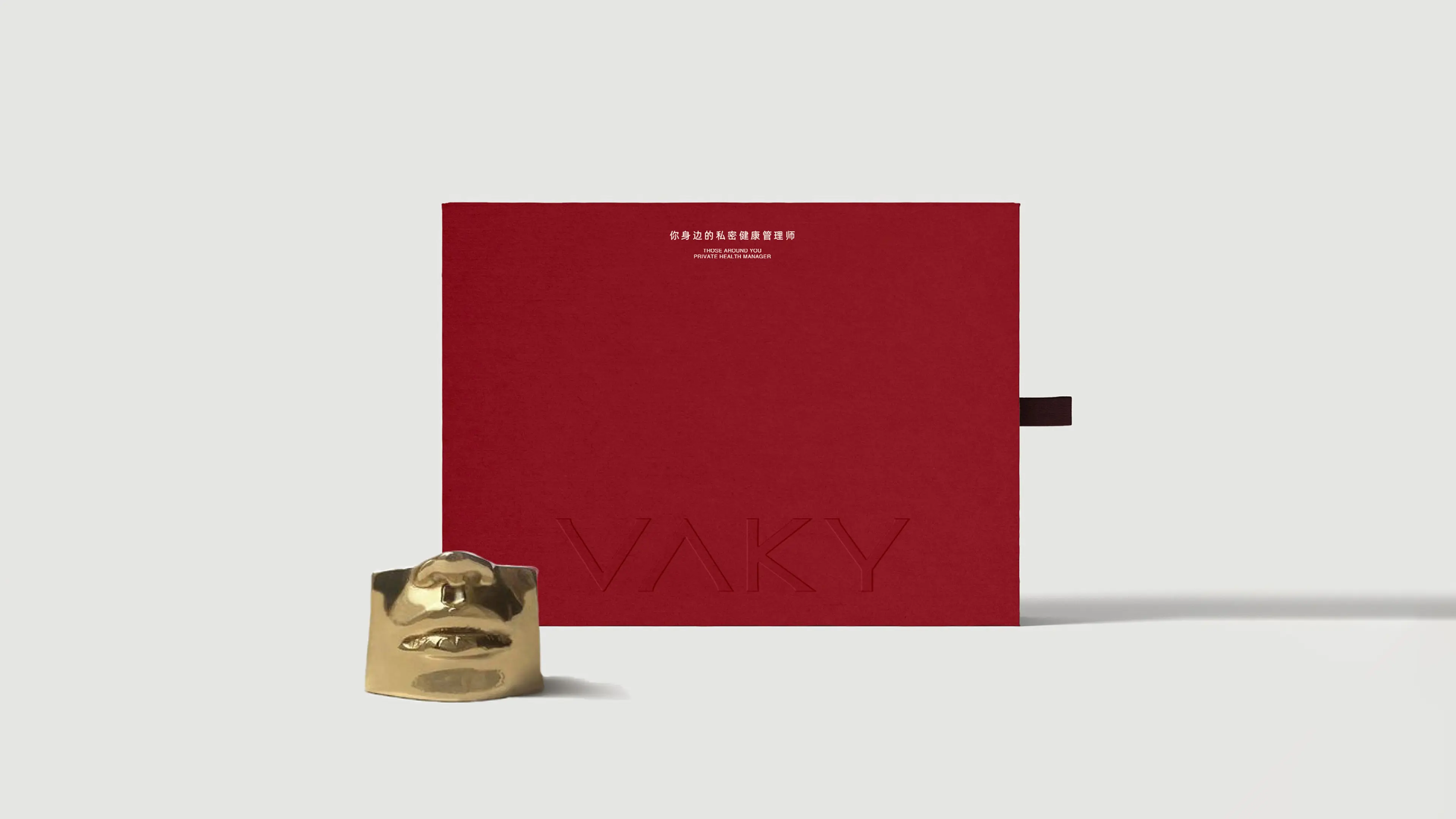
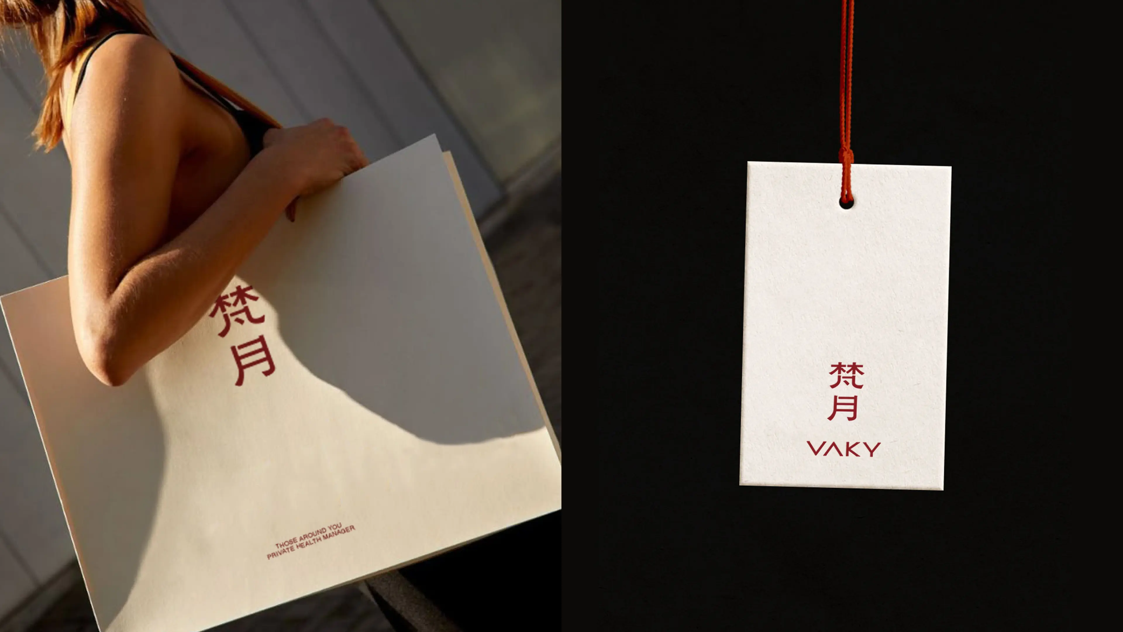
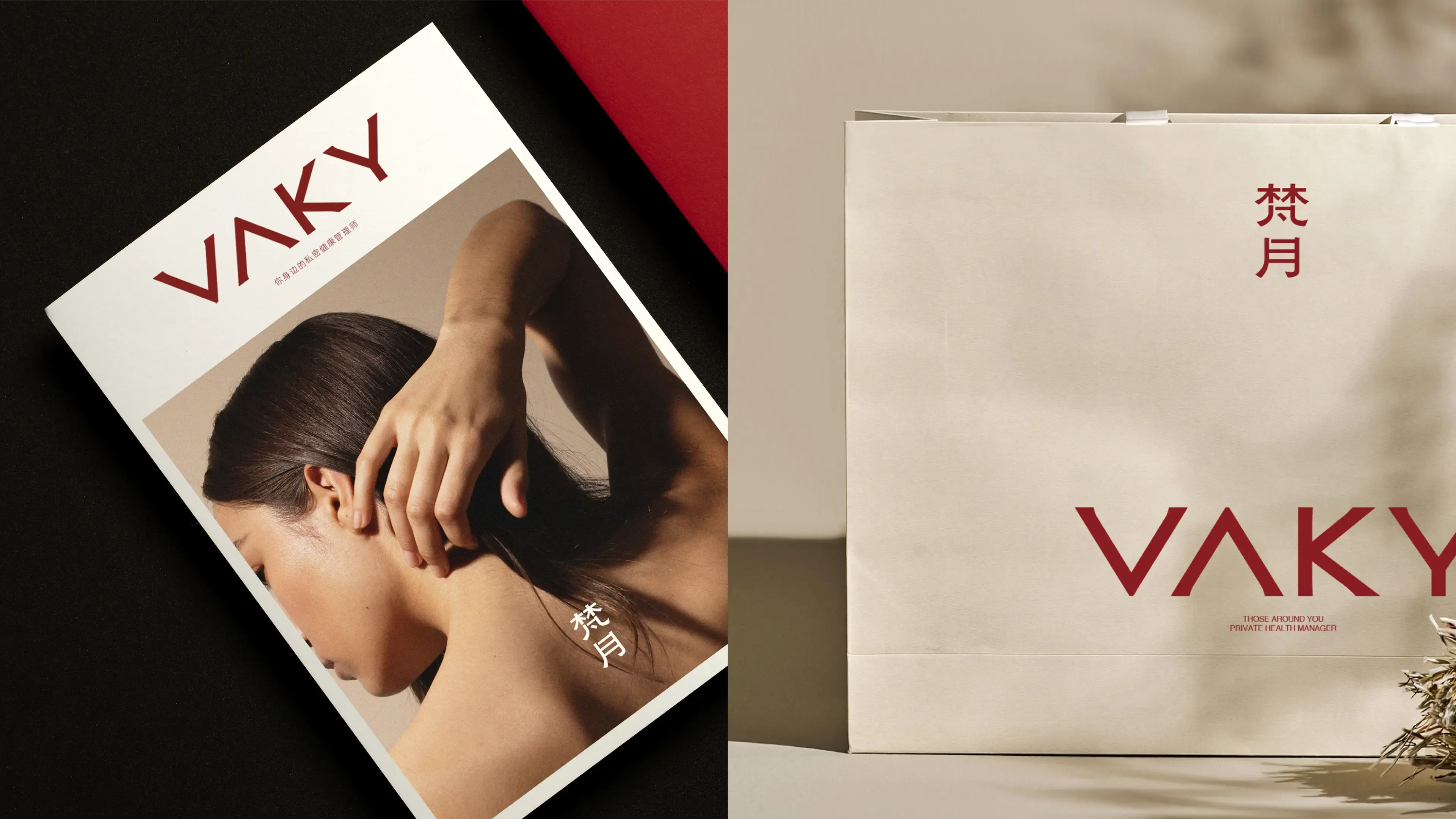

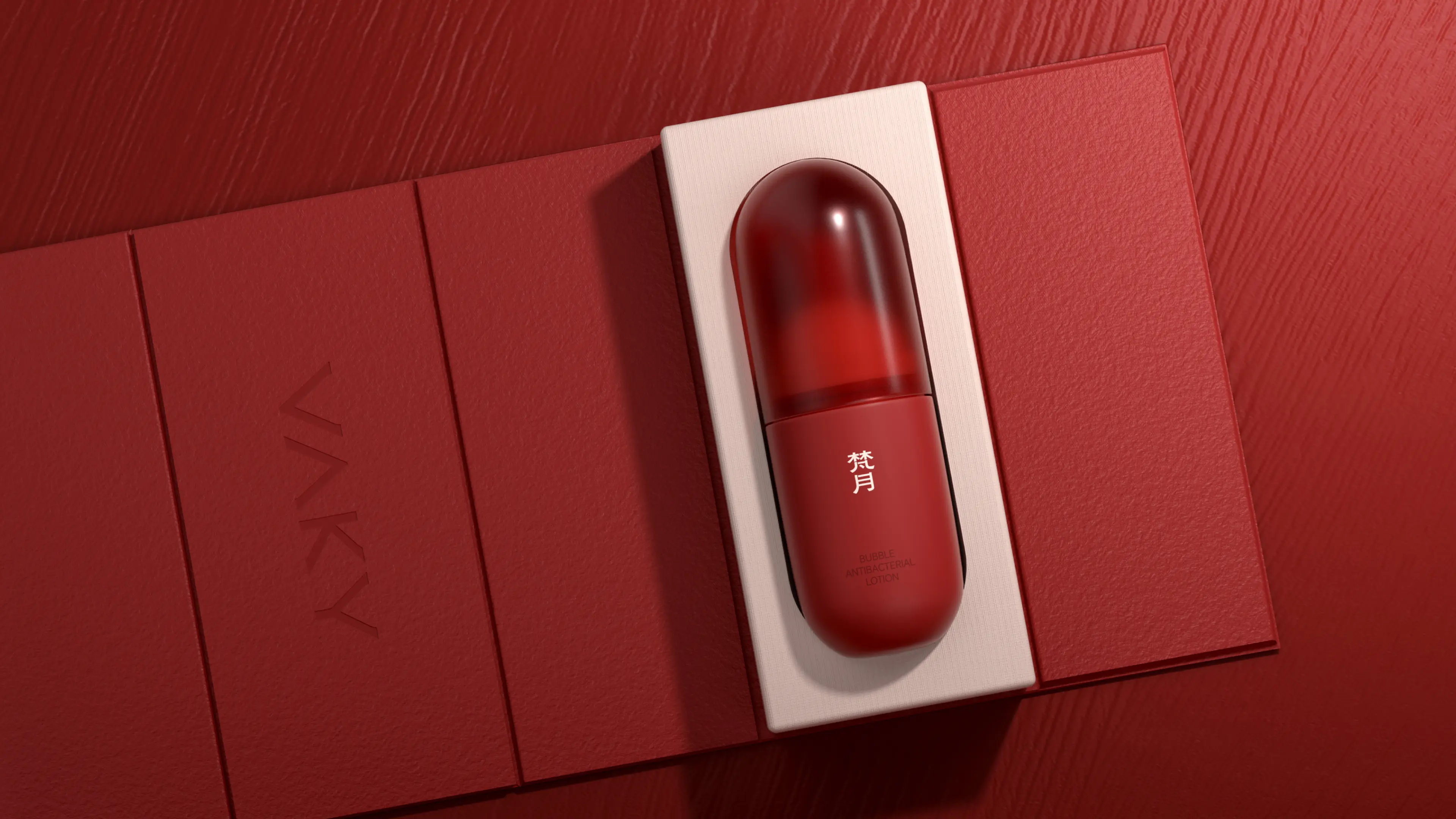
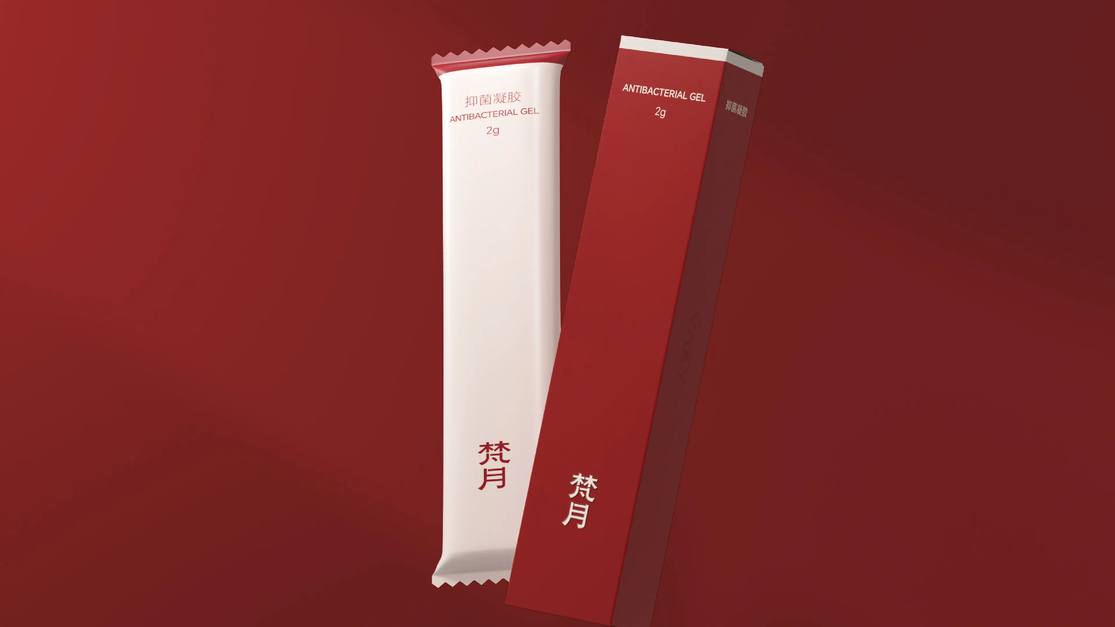
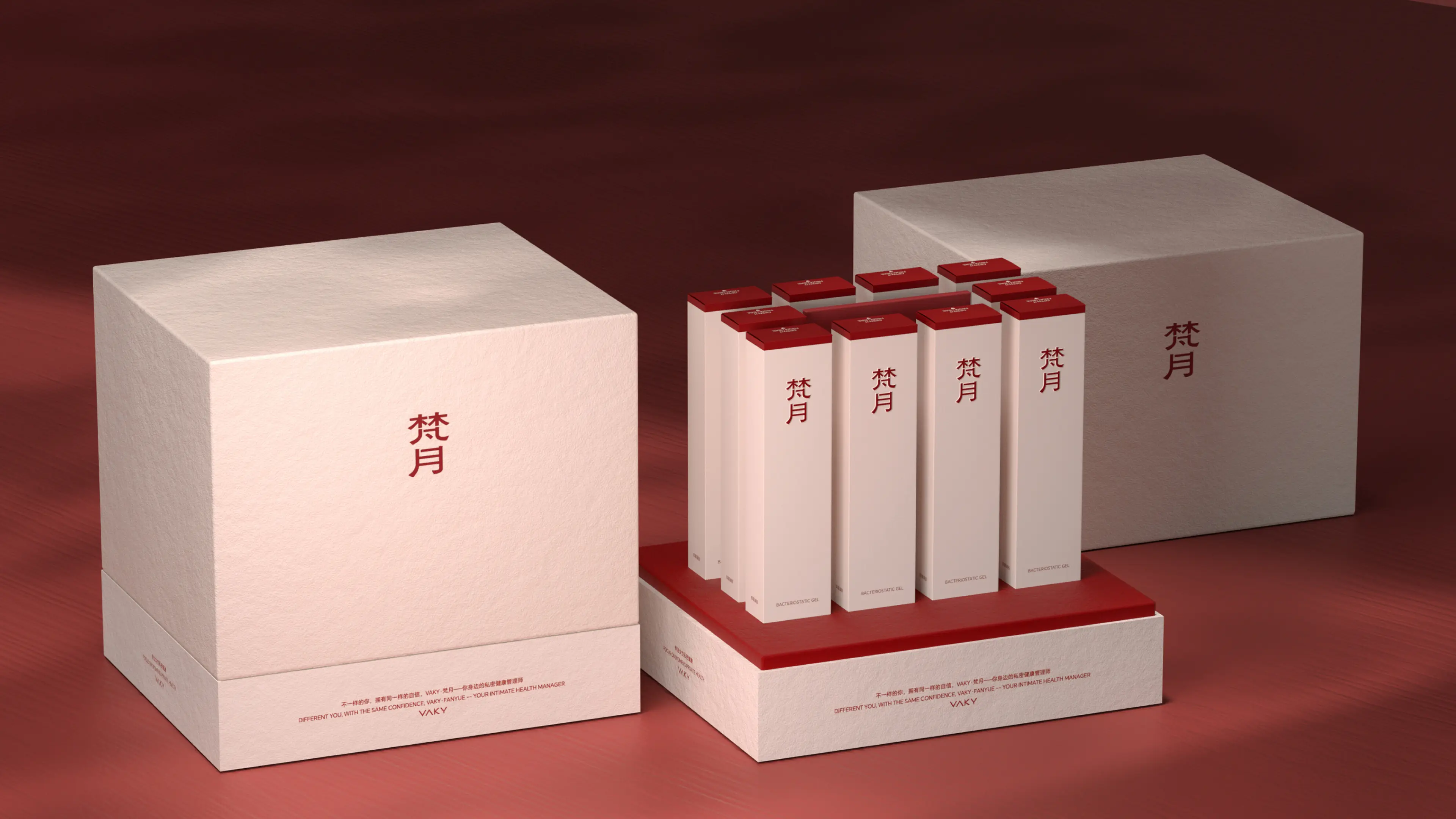
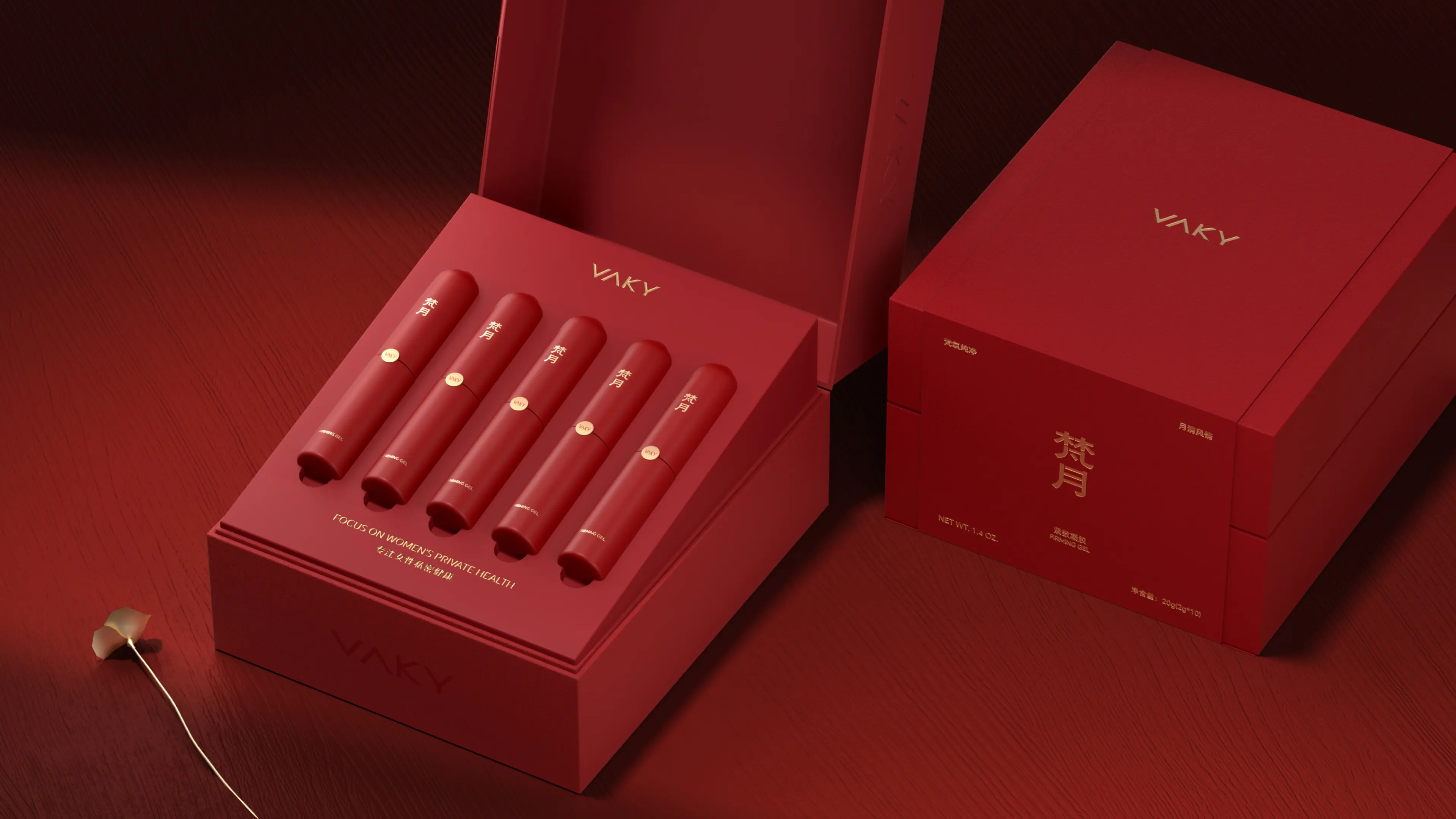
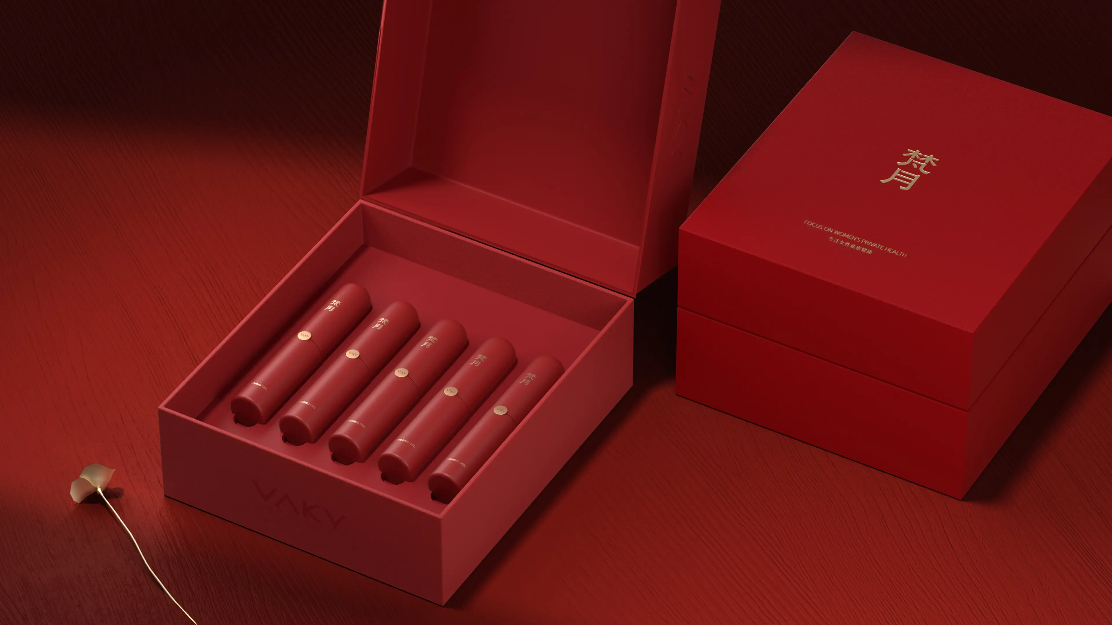
VAKY is a brand focused on women’s intimate health, mainly sold through private-domain channels. The brand is committed to creating a safe, healthy, and comfortable environment for women, and hopes to break the sense of distance and insecurity that traditional intimate care products bring to consumers. Against the backdrop of a growing women’s intimate health market with a relatively low degree of brandization, VAKY hopes to establish a professional and trustworthy brand image through systematic brand building.
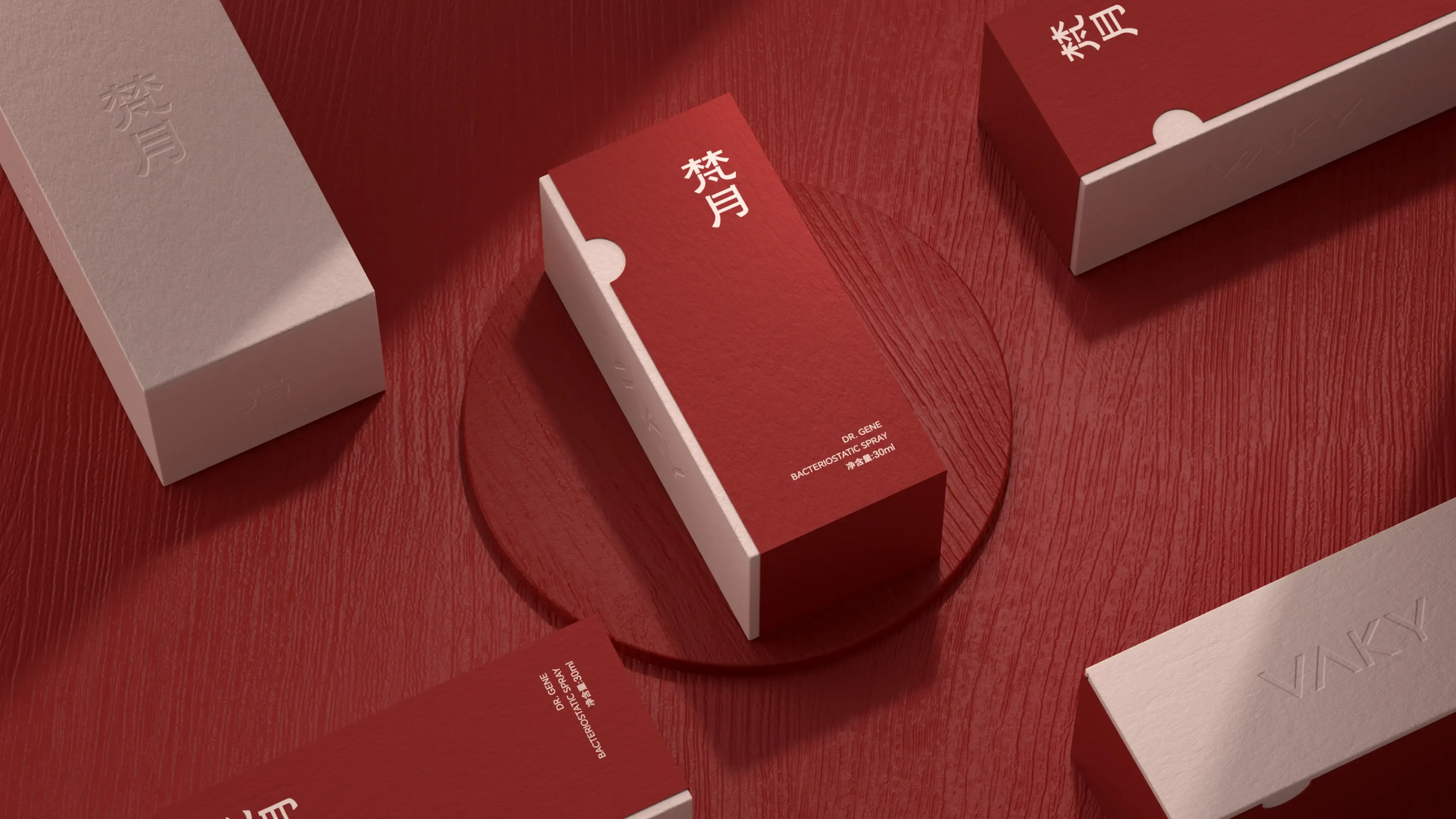
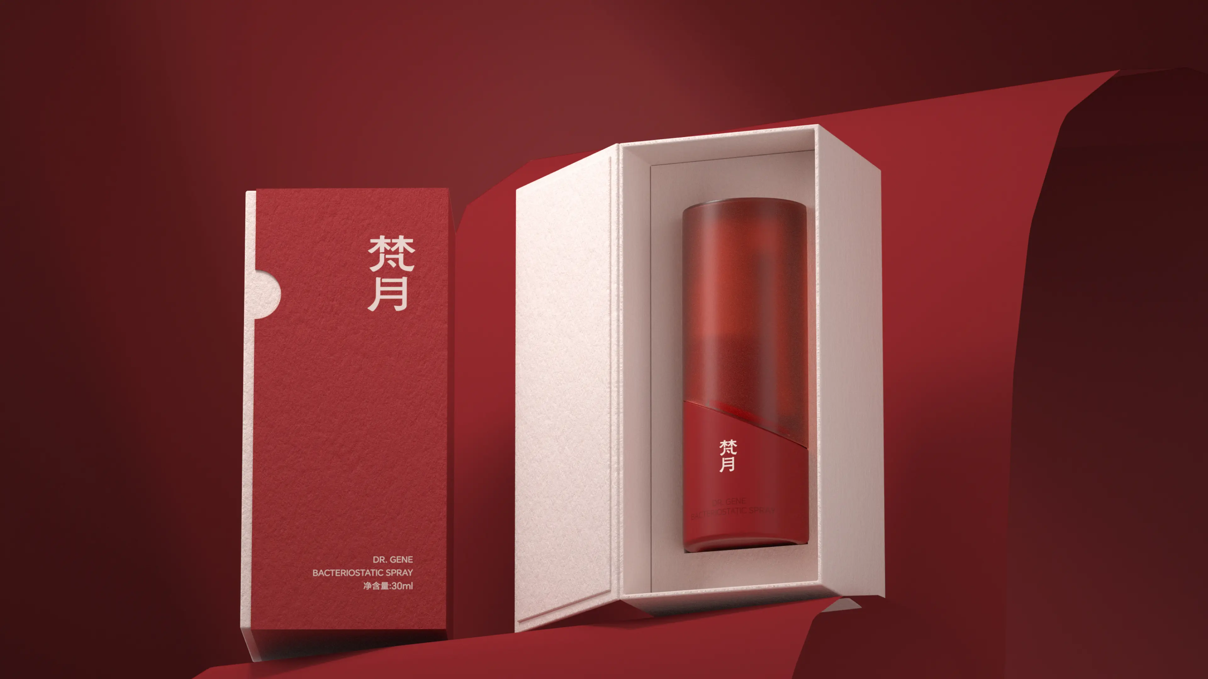
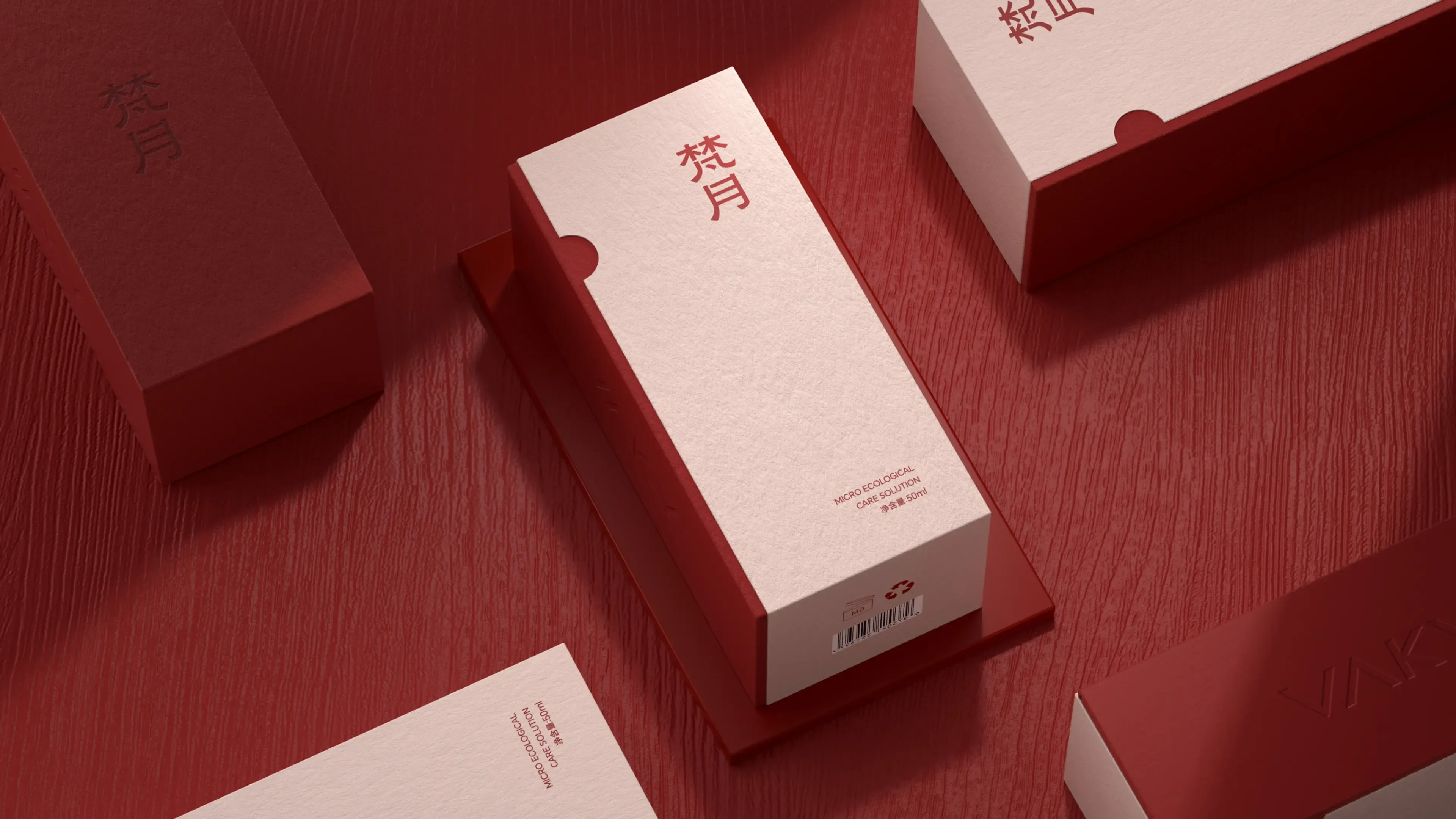
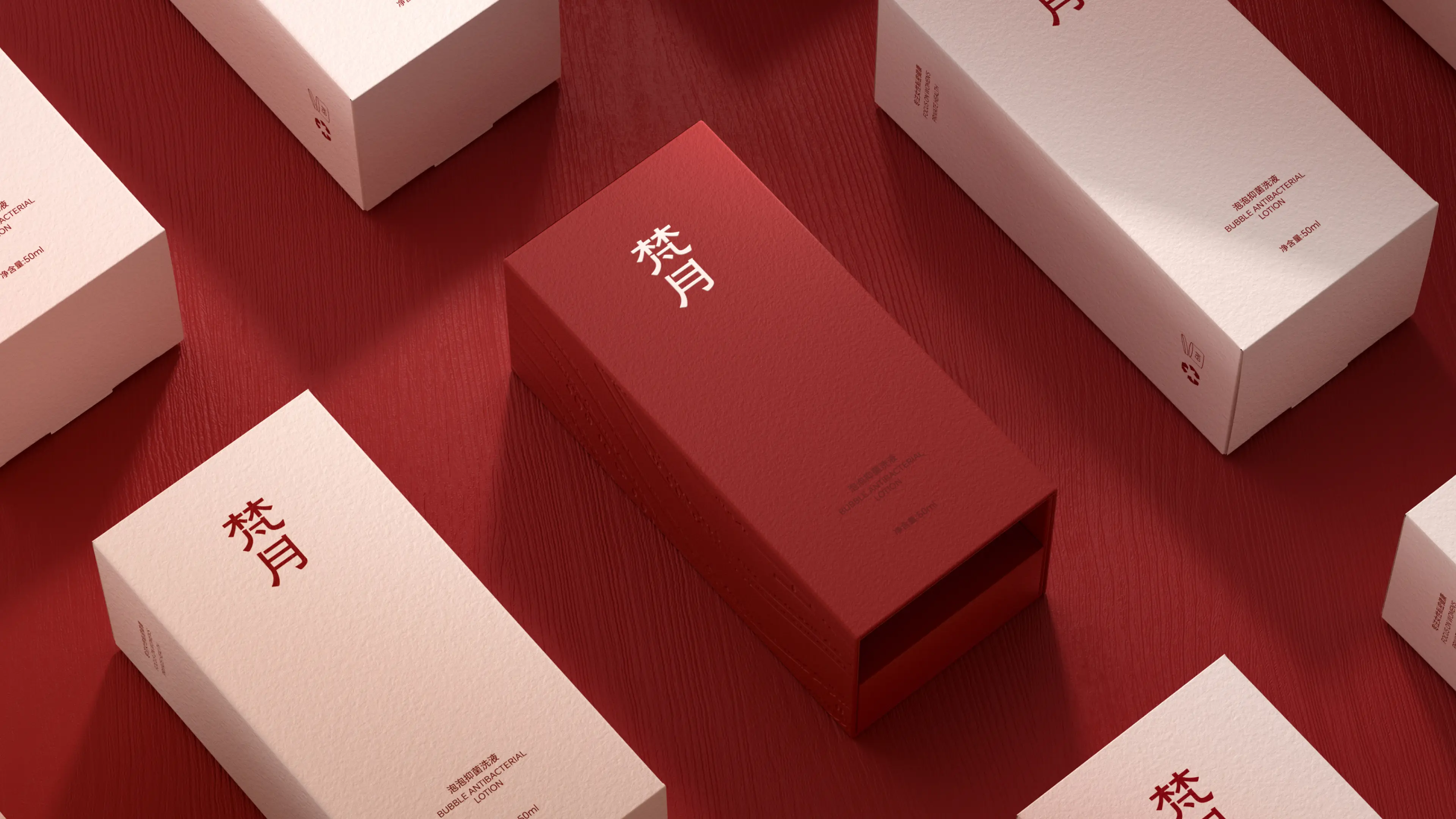
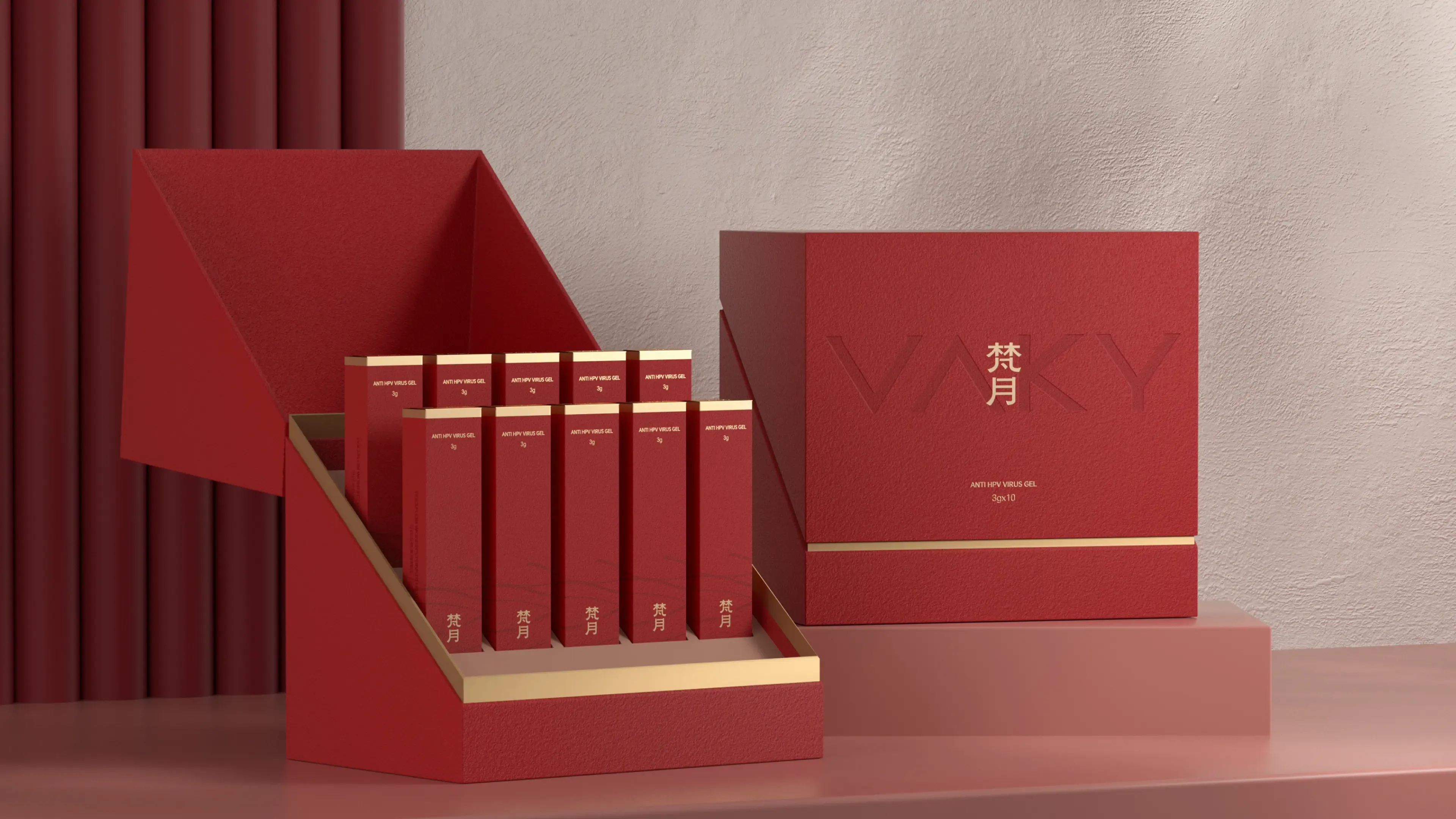
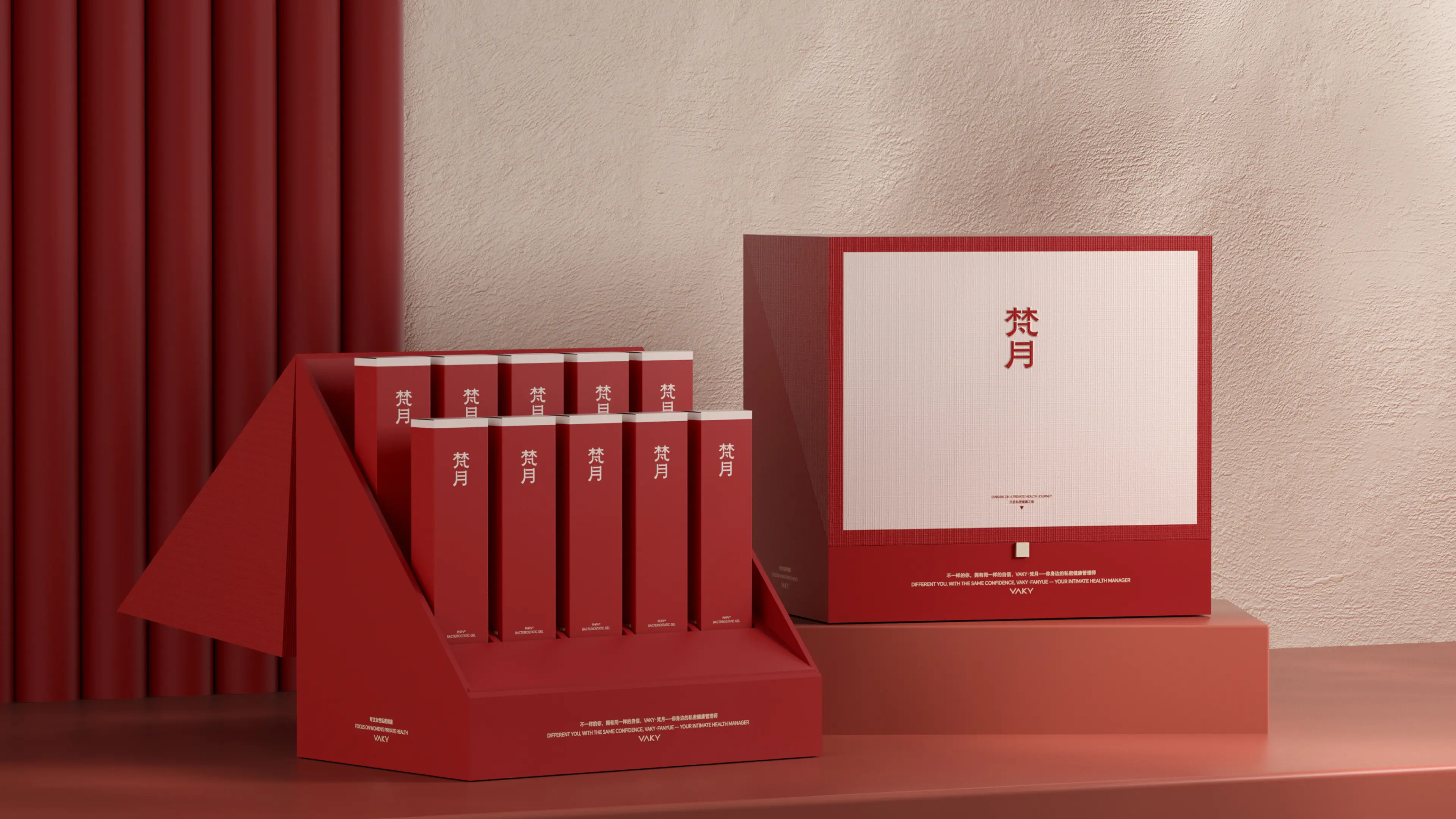
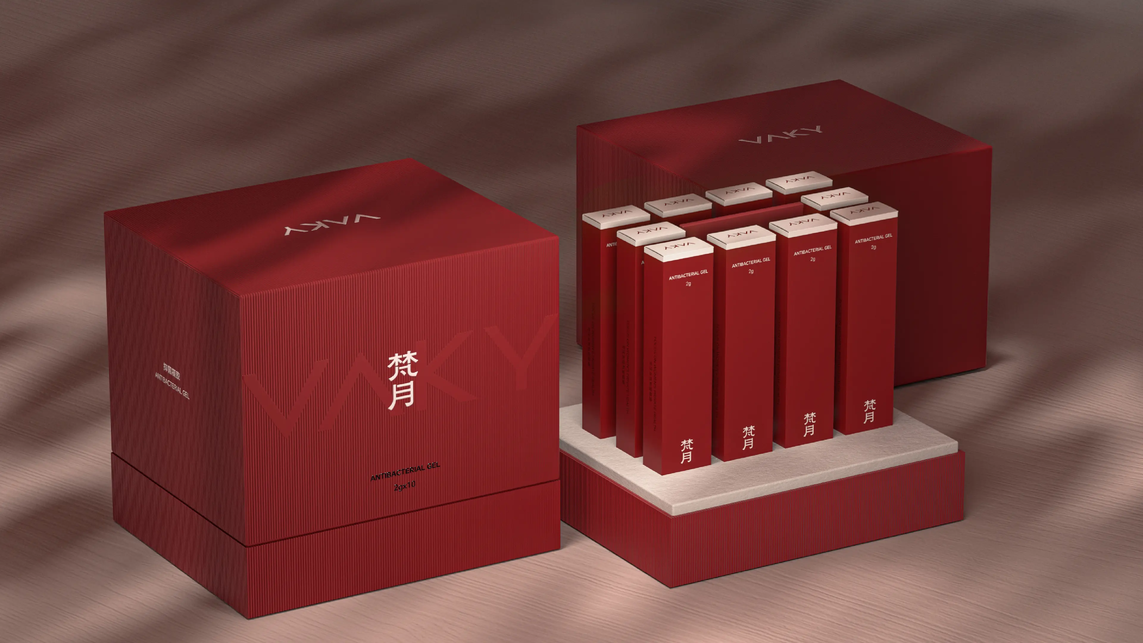
This project was to create a complete comprehensive brand design for VAKY, with services covering core dimensions such as brand design and packaging design. In the early stage of the project, we established “elegance and temperament” as the core of visual creation, with “simplicity,” “modernity,” and “intuitiveness” as design principles, aiming to convey the brand philosophy and create a premium and distinctive visual atmosphere. Cross-industry design thinking was the core breakthrough of this project. We observed that traditional intimate care product packaging often carries a strong “medicinal feel” or “functional feel,” which easily creates distance or even resistance among consumers—the hidden psychological demand of consumers for intimate care products is actually to “treat intimate areas gently, as if caring for facial skin.” Based on this deep insight, we boldly proposed: redefine intimate care products with the design language of skincare products. This decision meant that intimate care product packaging is no longer a simple functional container, but, like high-end creams and serums, conveys a brand emotion of refinement, professionalism, and self-care. From visual logic, typeface selection, and color system to materials and craftsmanship, it fully benchmarks against the texture standards of leading skincare brands.
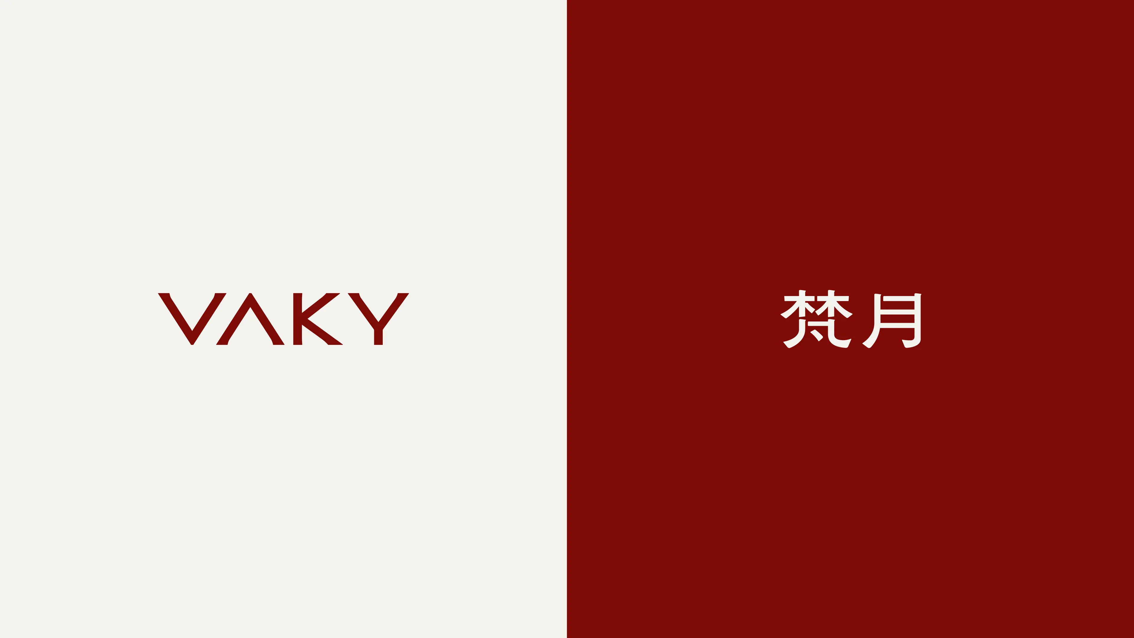
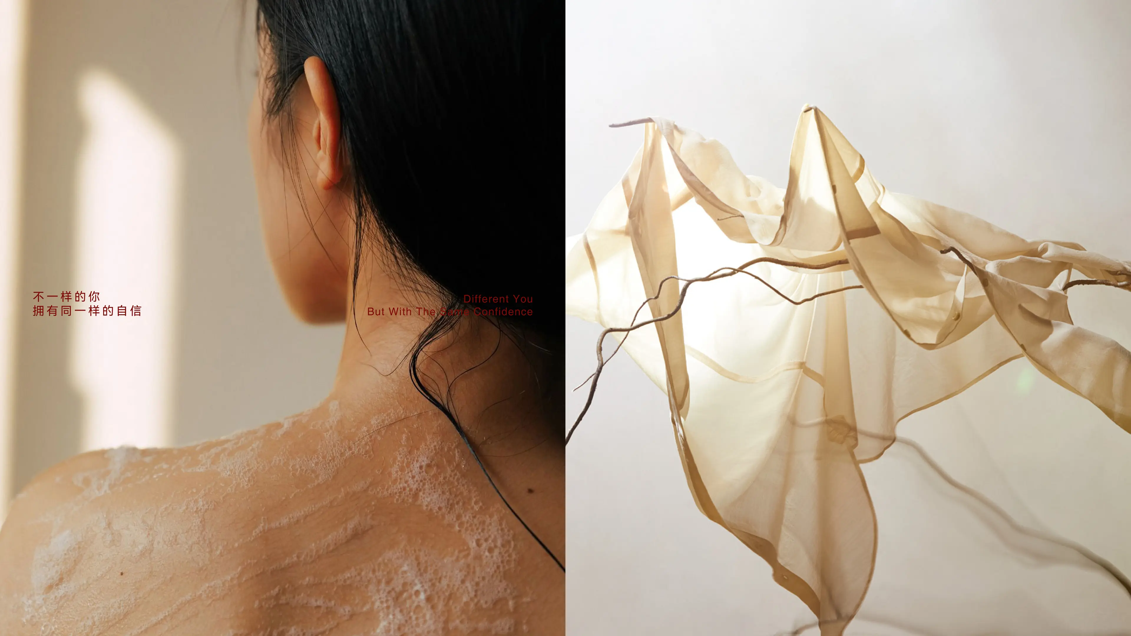
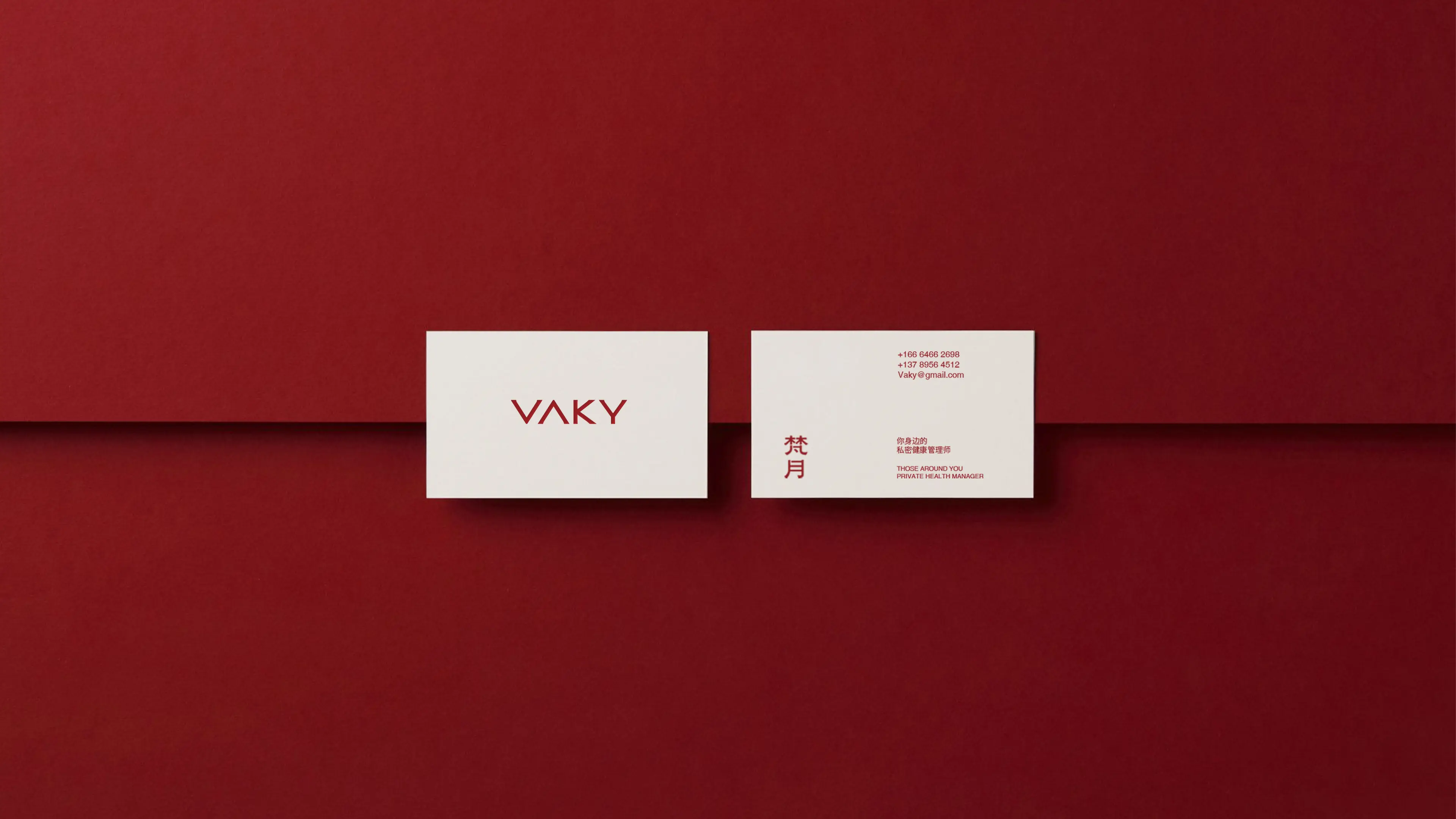
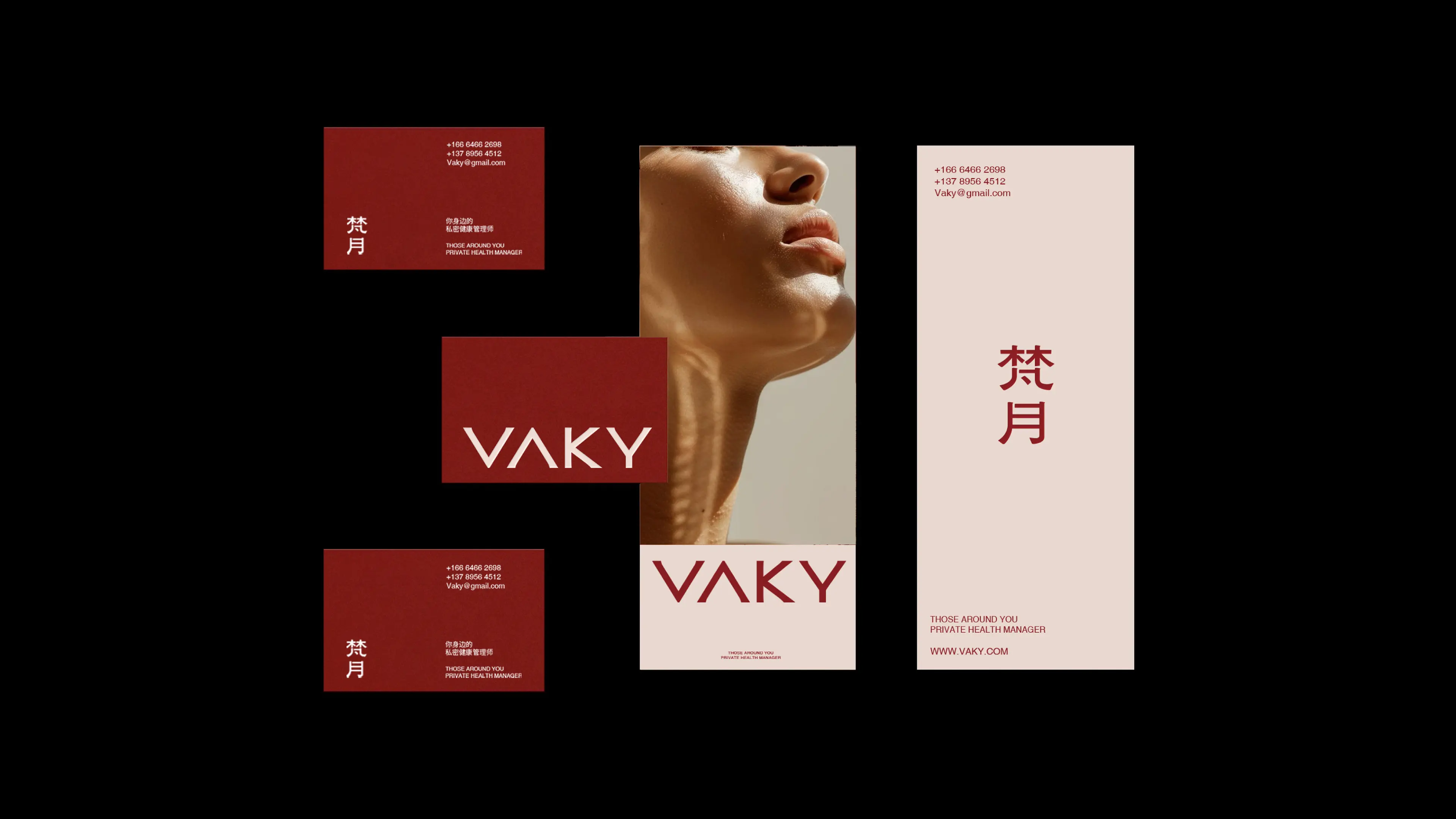
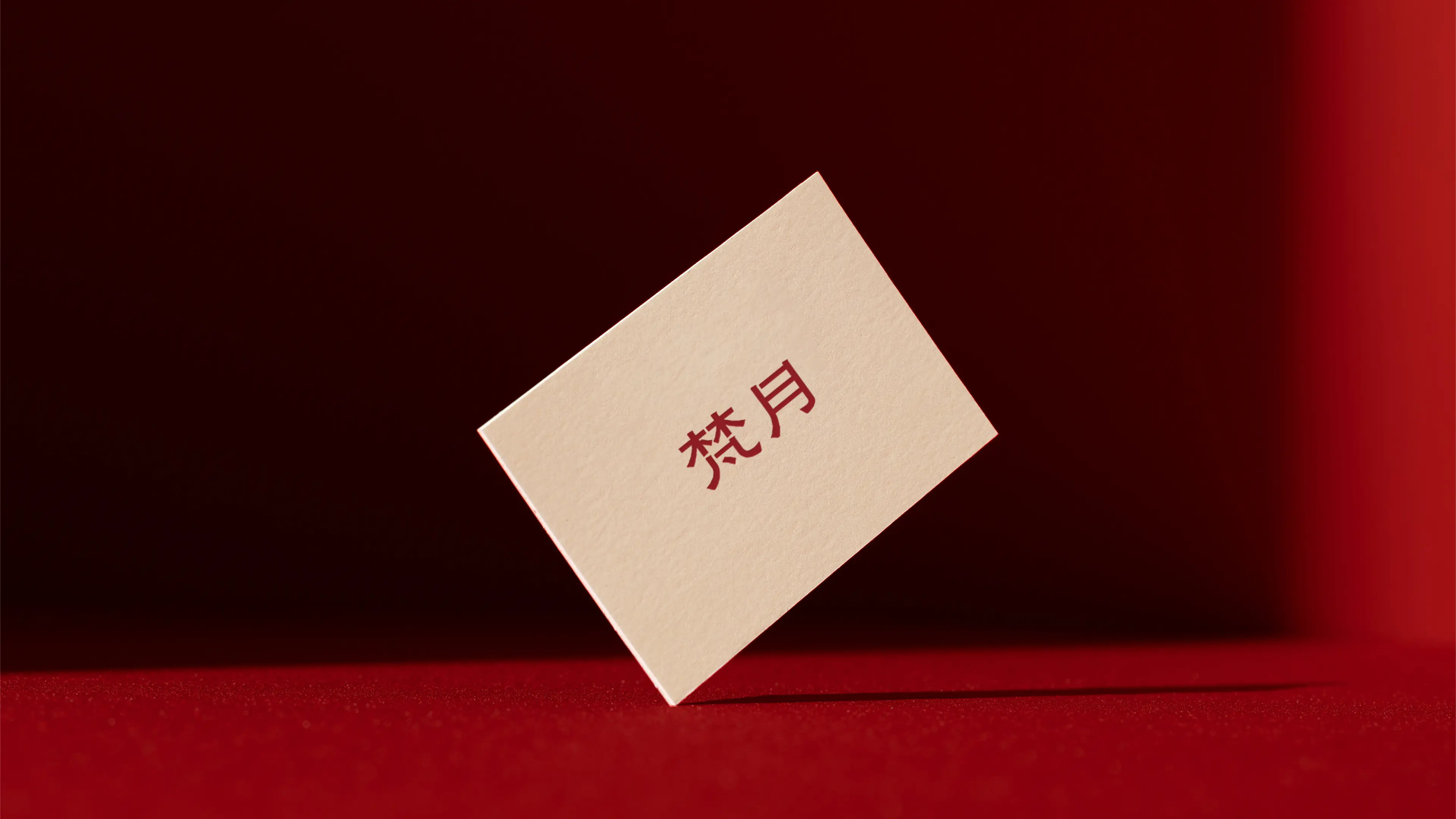
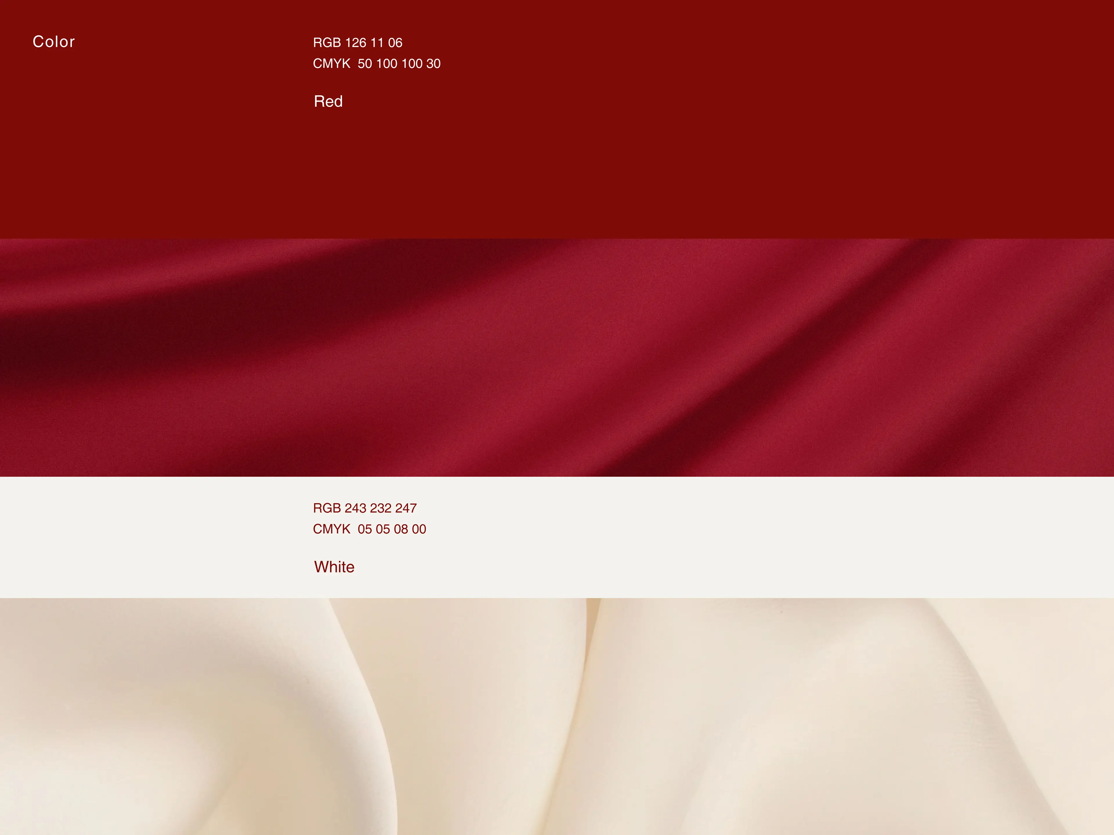
In terms of visual language, the overall style adopts a nude-toned design, using colors close to skin to echo the natural attributes and gentleness of the women’s intimate category; for typography, Chinese-style clerical script is used, making the brand visual effect more classic, safe, and culturally grounded. The packaging design aims to approach women with a relatively “bare” visual, so that the moment consumers come into contact with the product, what they feel is not a “medical feel” but a “skincare ritual sense,” creating a healthier and safer environment for women. Through this comprehensive brand design system combining aesthetic height and category-breaking innovation, VAKY has successfully upgraded from a functional intimate care product to a women’s intimate health brand symbol with premium brand tonality, strong visual recognition, and deep consumer trust.