
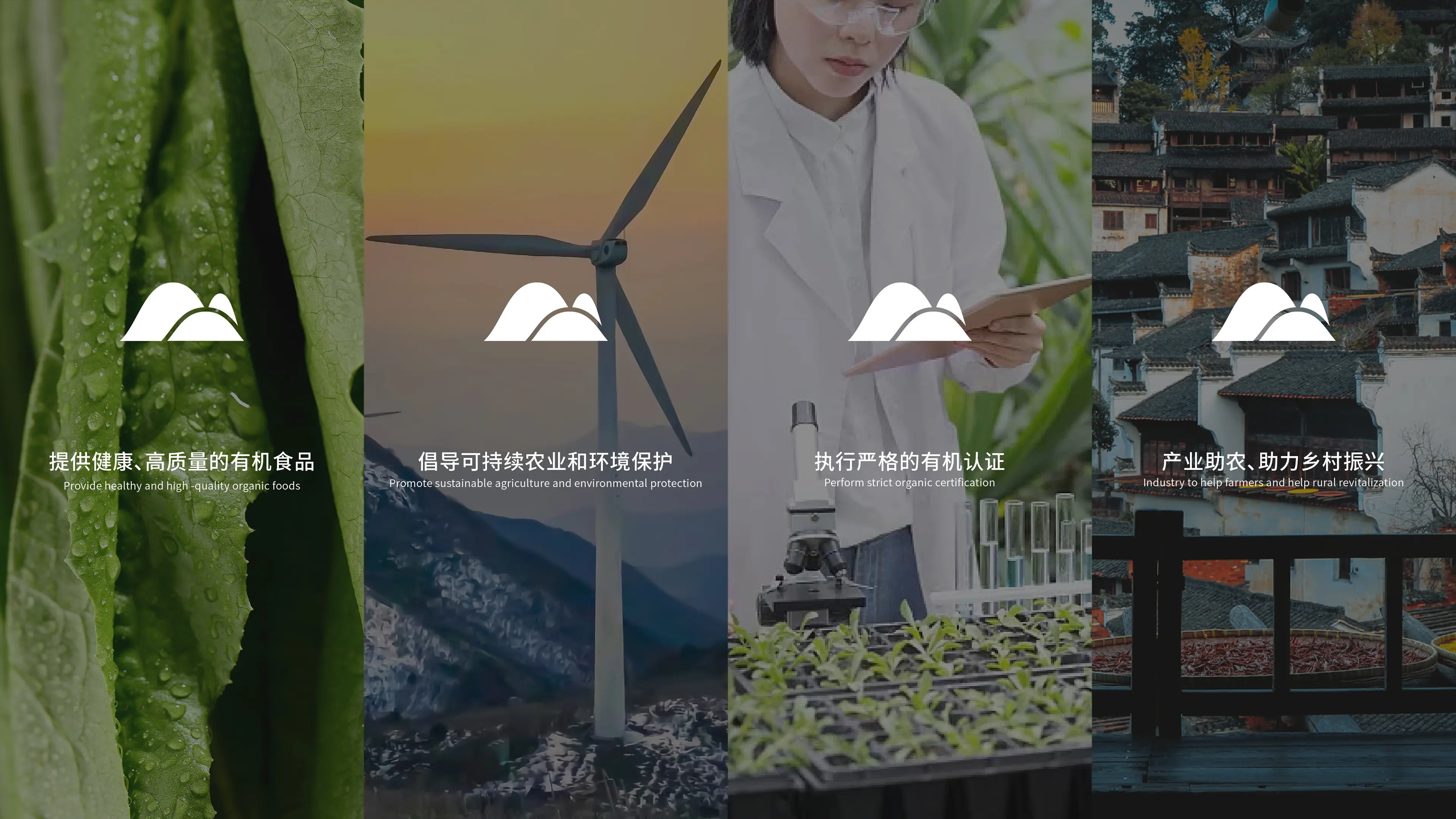
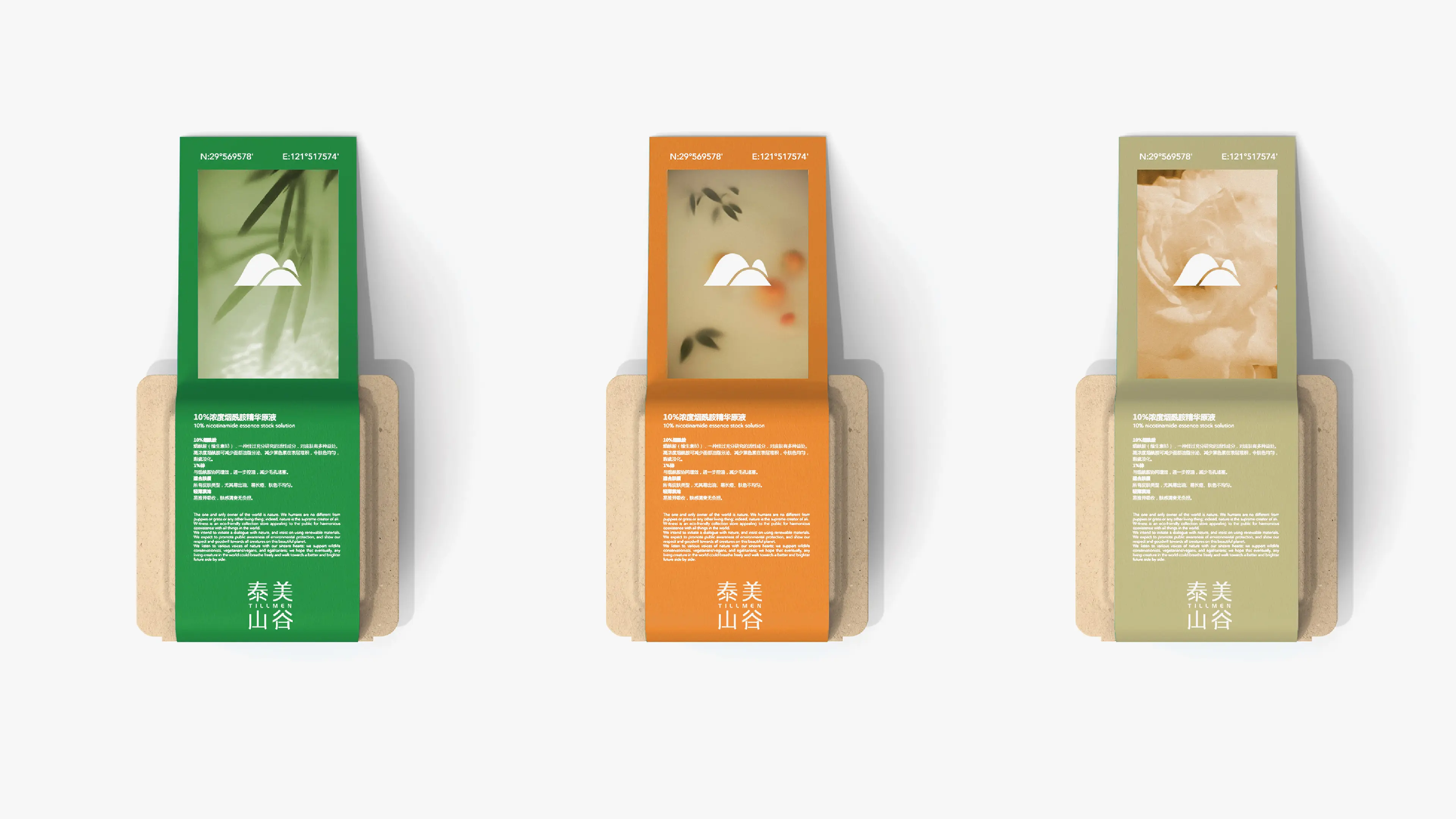
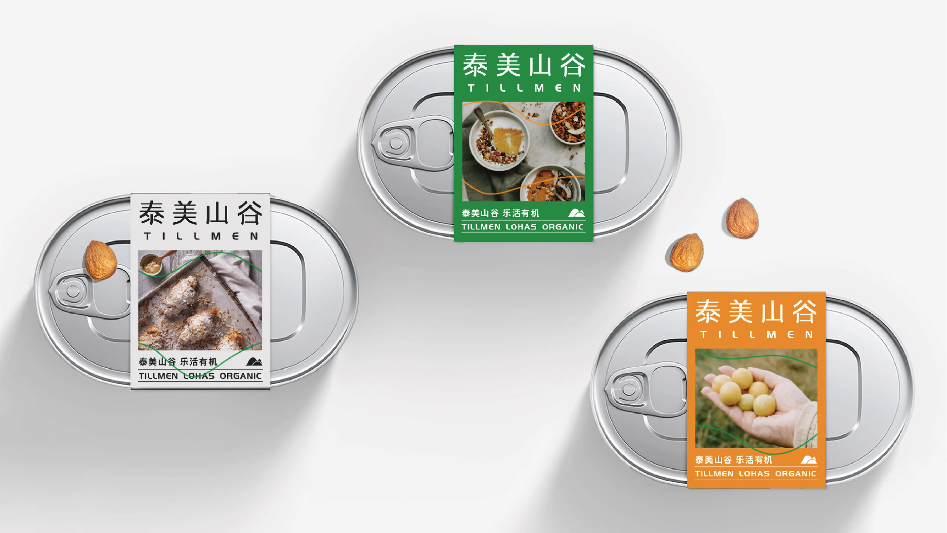

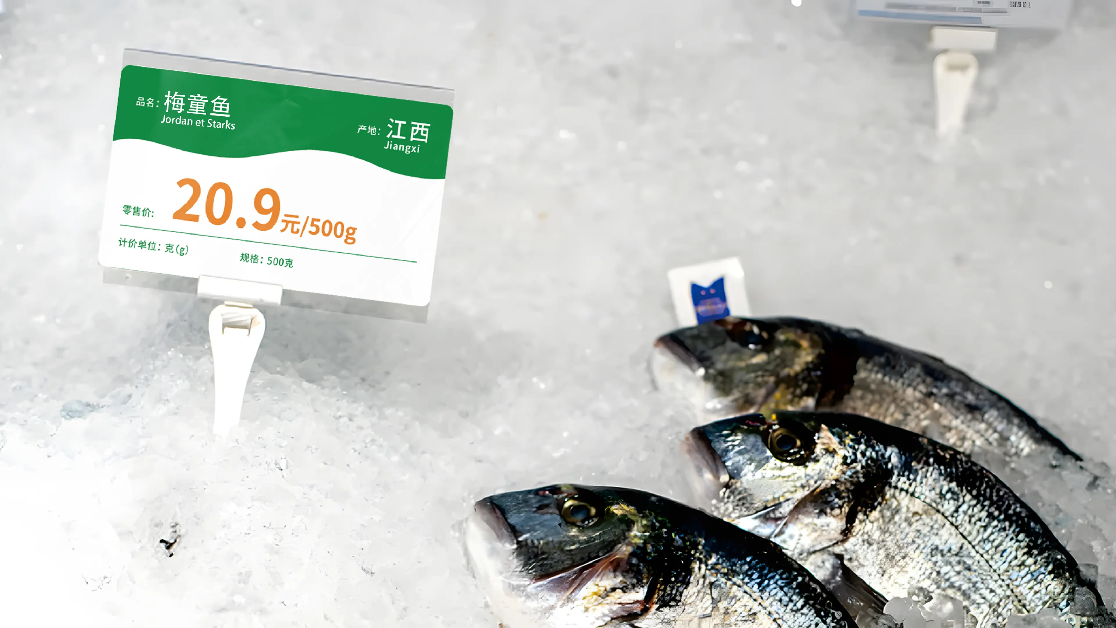
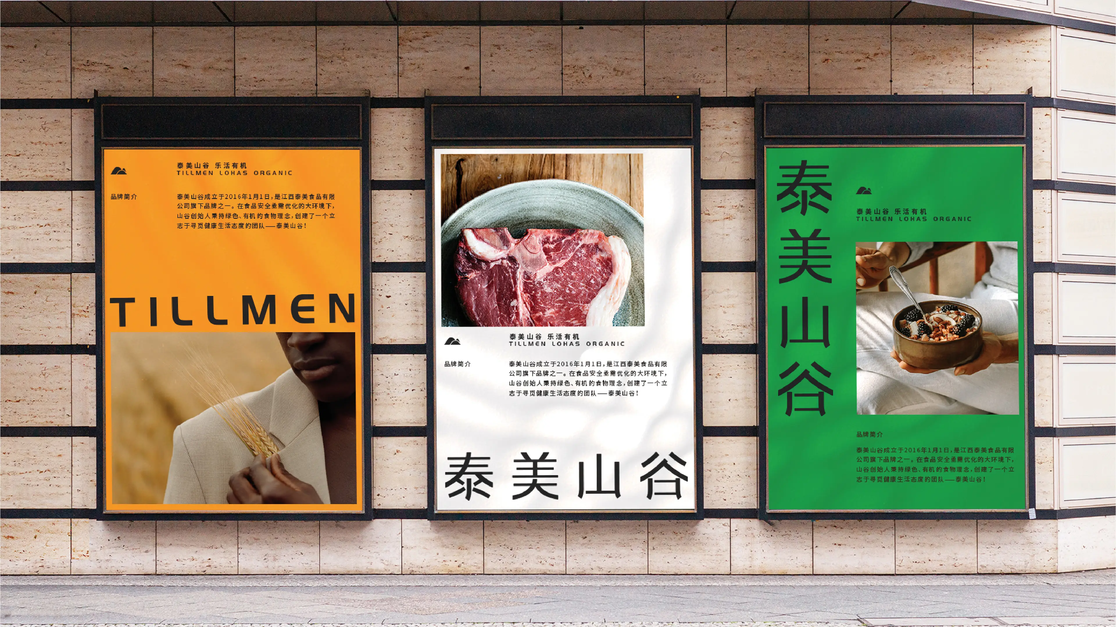
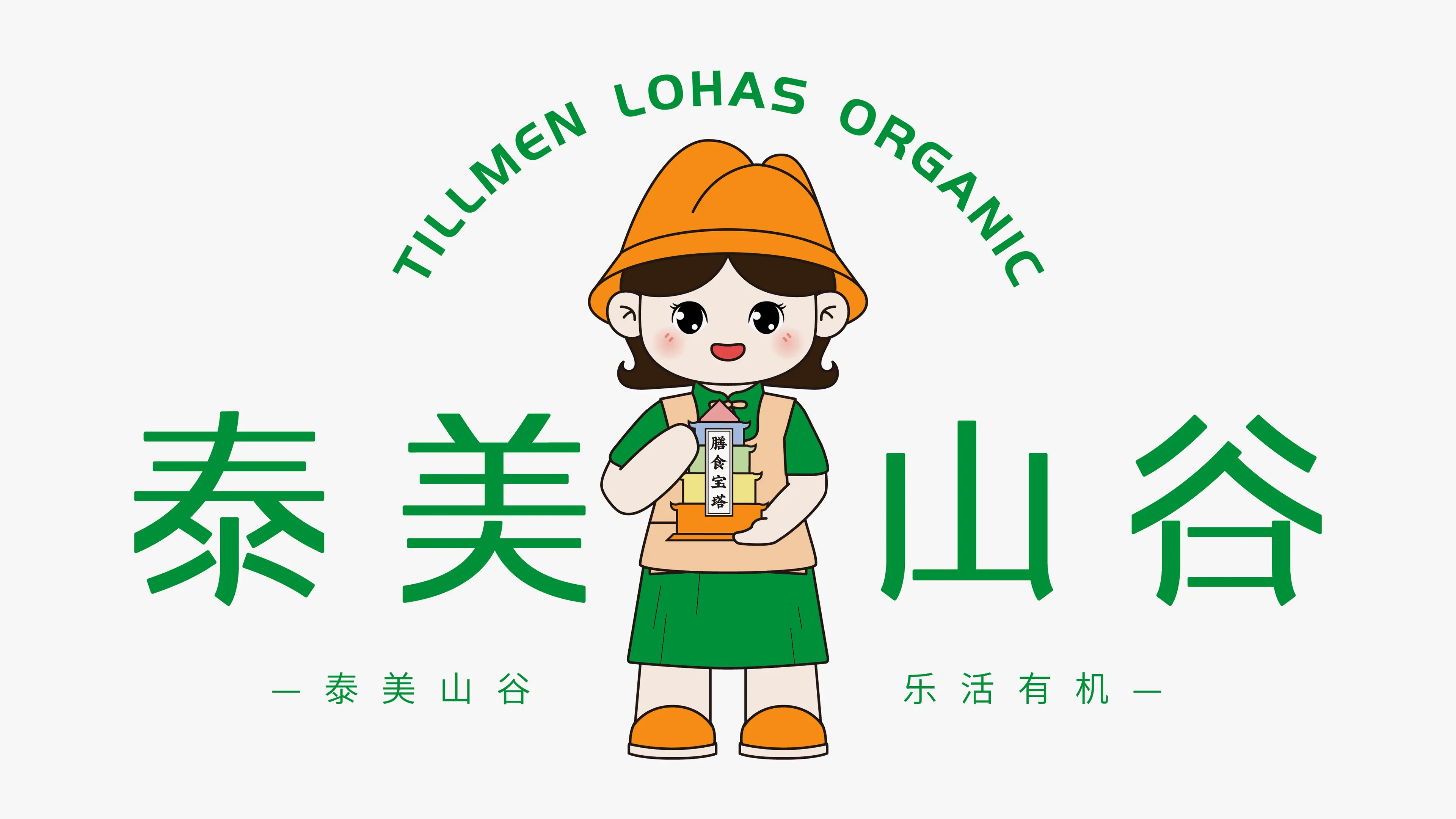
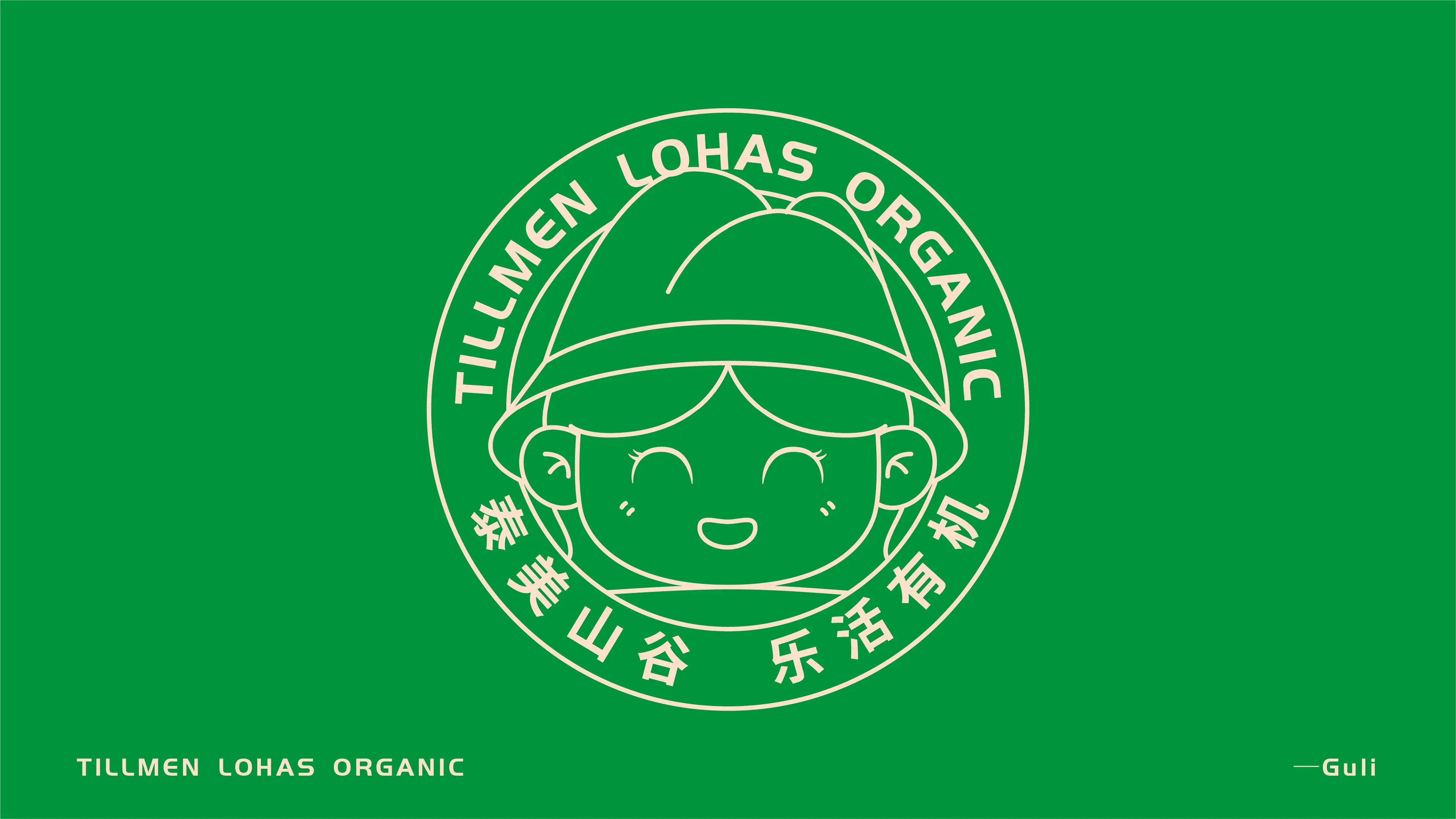

Tillmen was established on January 1, 2016, and is one of the brands under Jiangxi Taimei Food Co., Ltd. In an environment where food safety urgently needs improvement, the founder, upholding a green and organic food philosophy, created a team dedicated to seeking a healthy lifestyle. The brand mission is to "satisfy every family's organic needs and enhance every family's quality of life," with a brand positioning as a "one-stop organic lifestyle shopping platform" and the brand slogan "Tillmen, LOHAS Organic." Products cover categories including meat, eggs, mushrooms, vegetables, and cooking oil. The brand's original positioning was "seeking the original taste," dedicated to conveying a healthy and organic lifestyle to modern people.
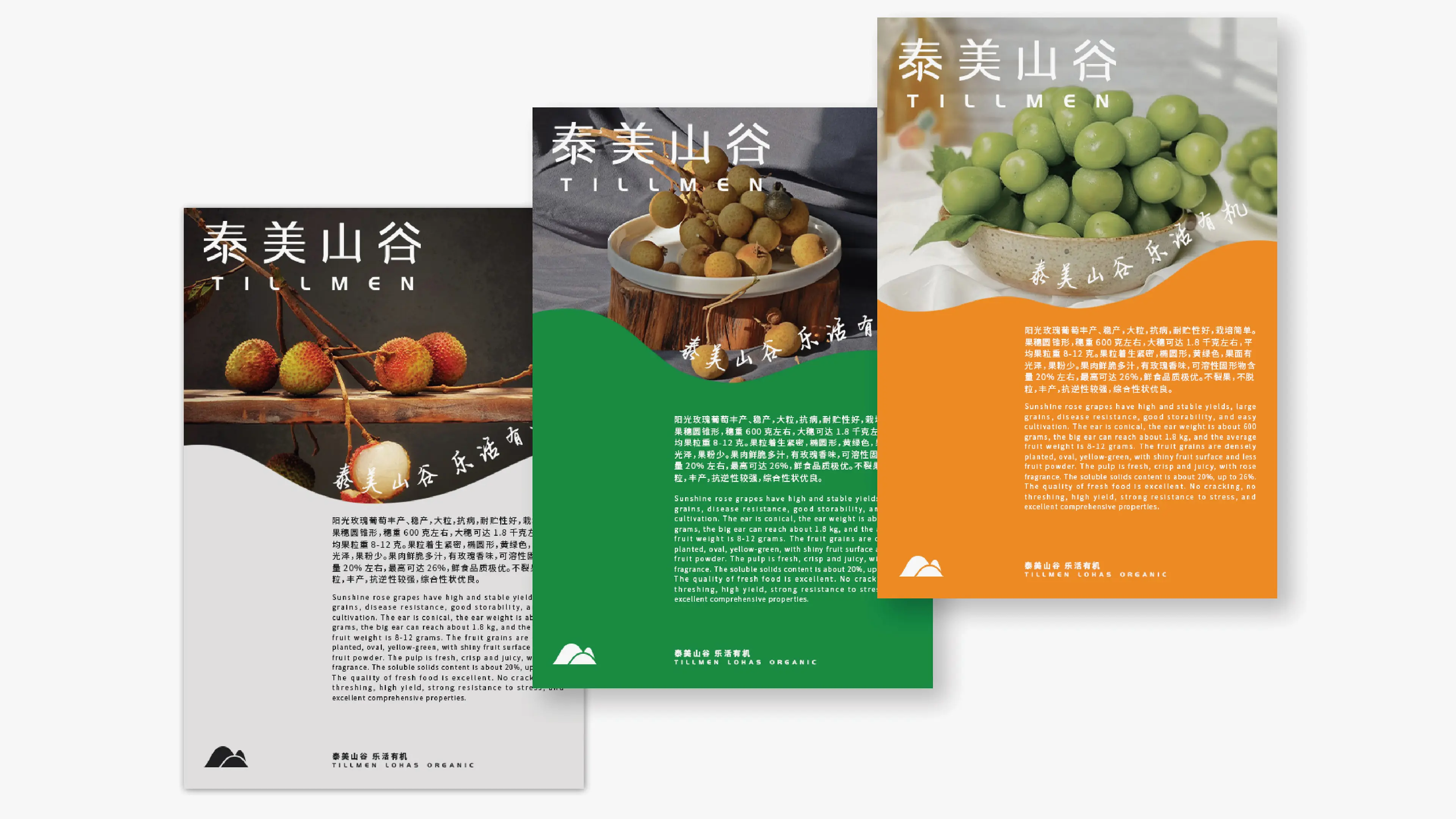
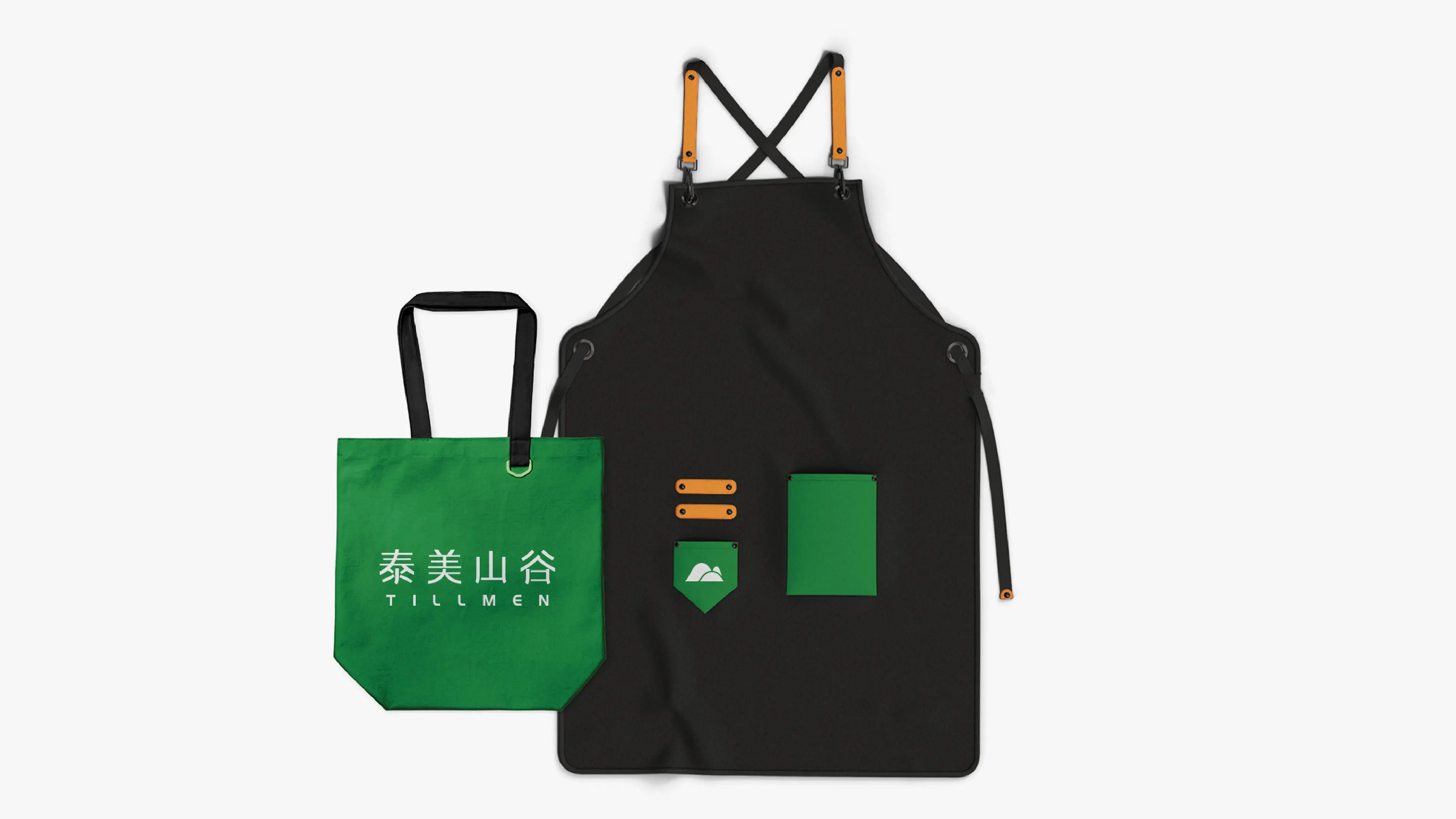
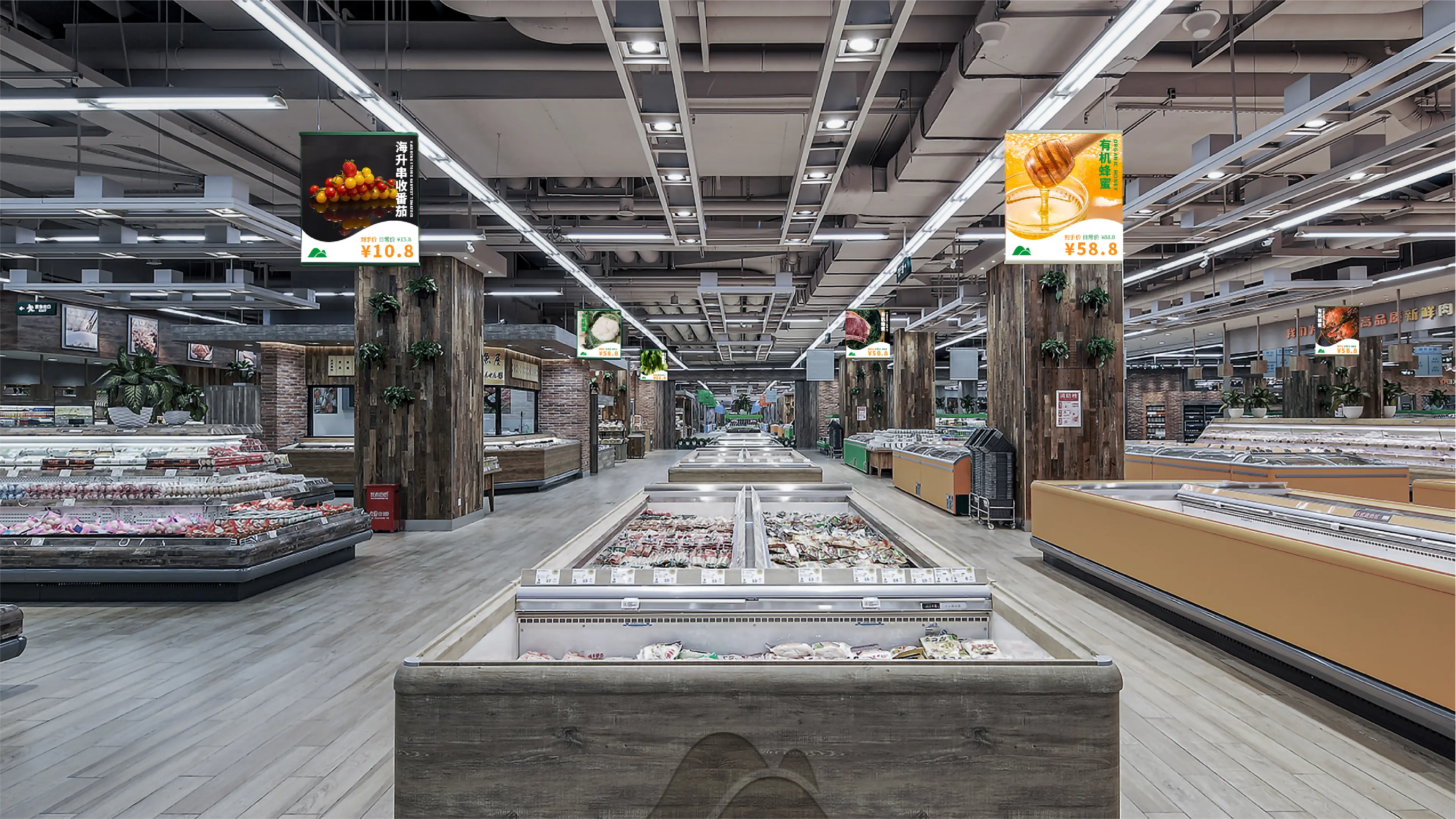
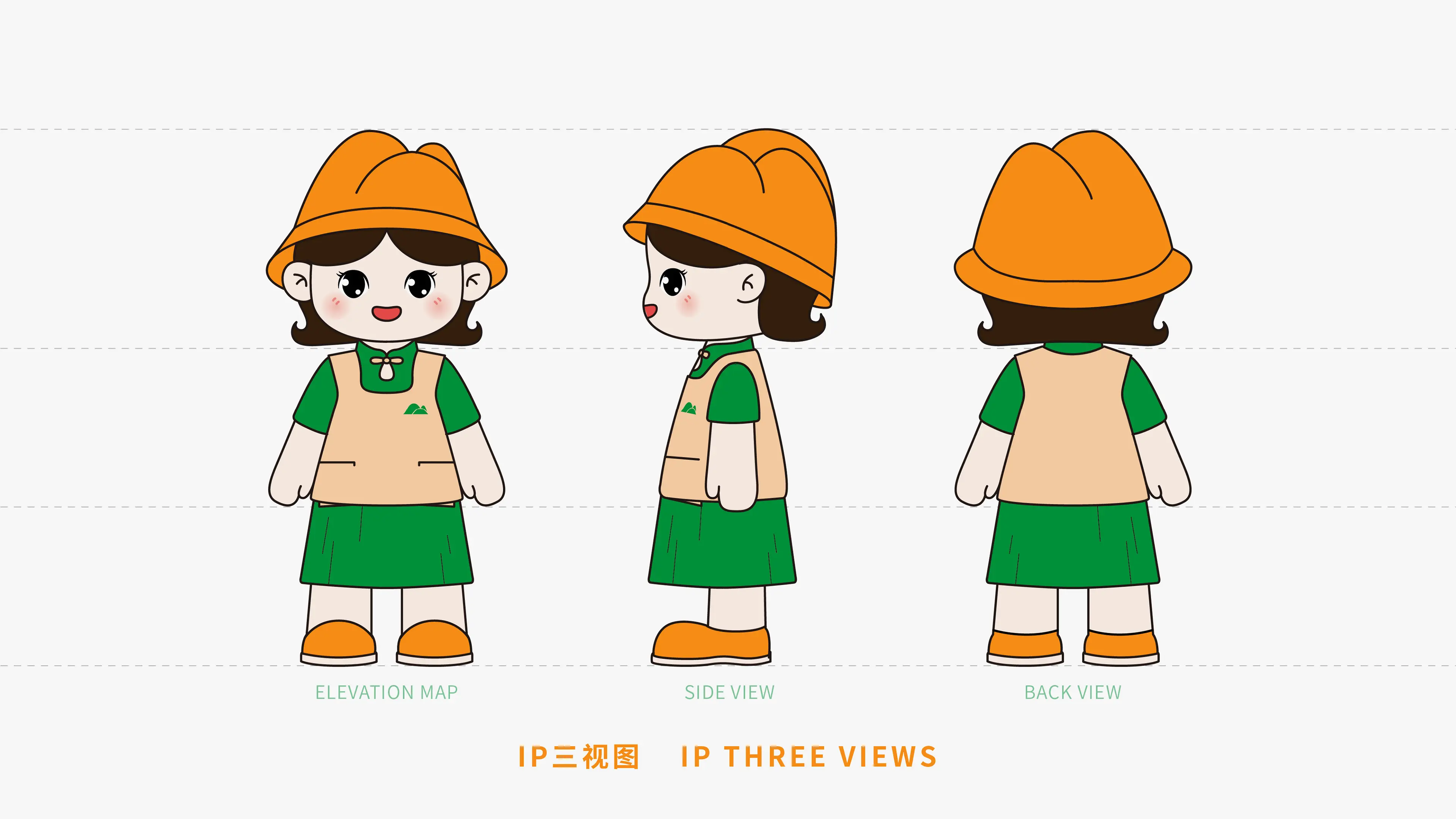
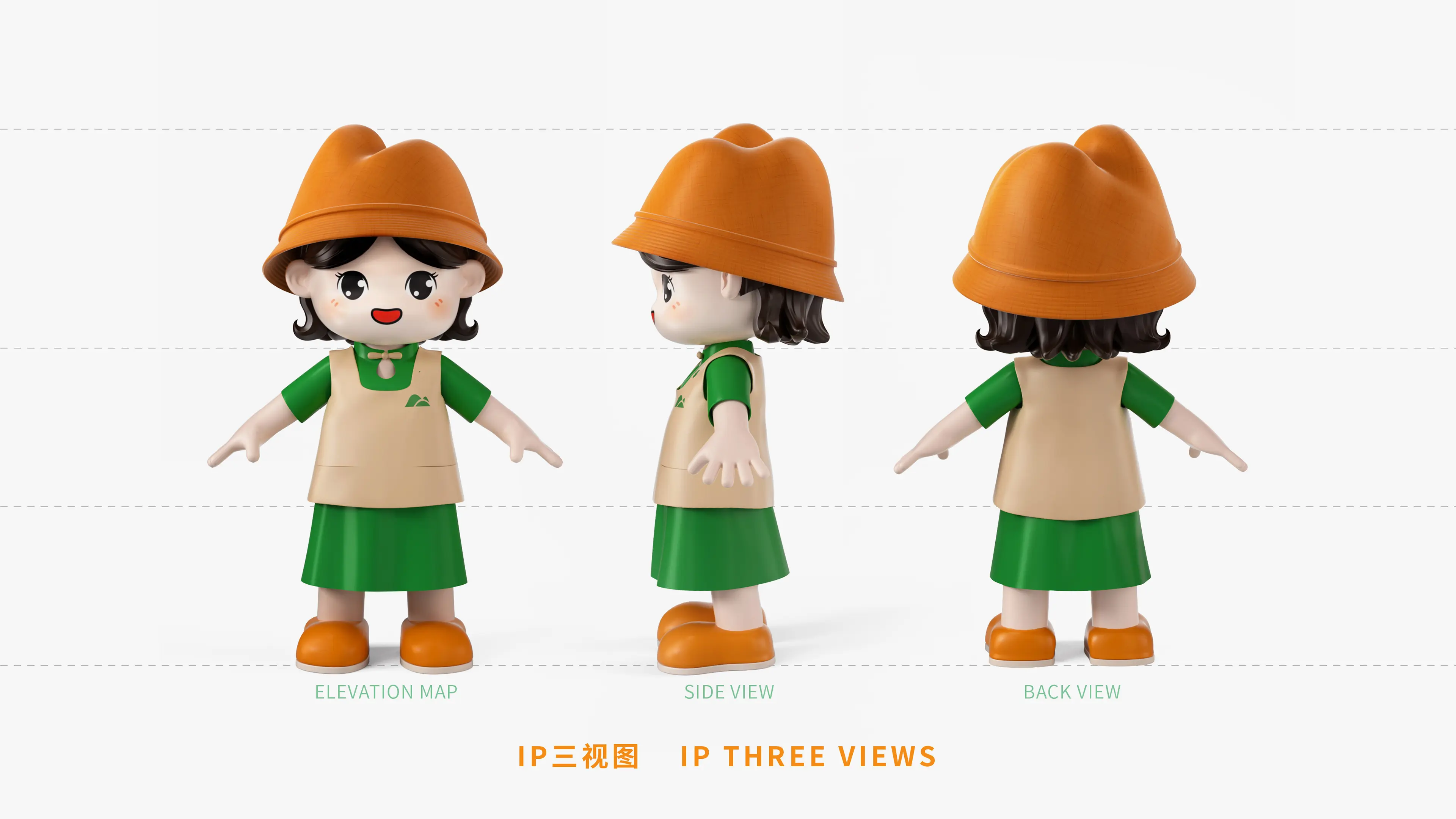
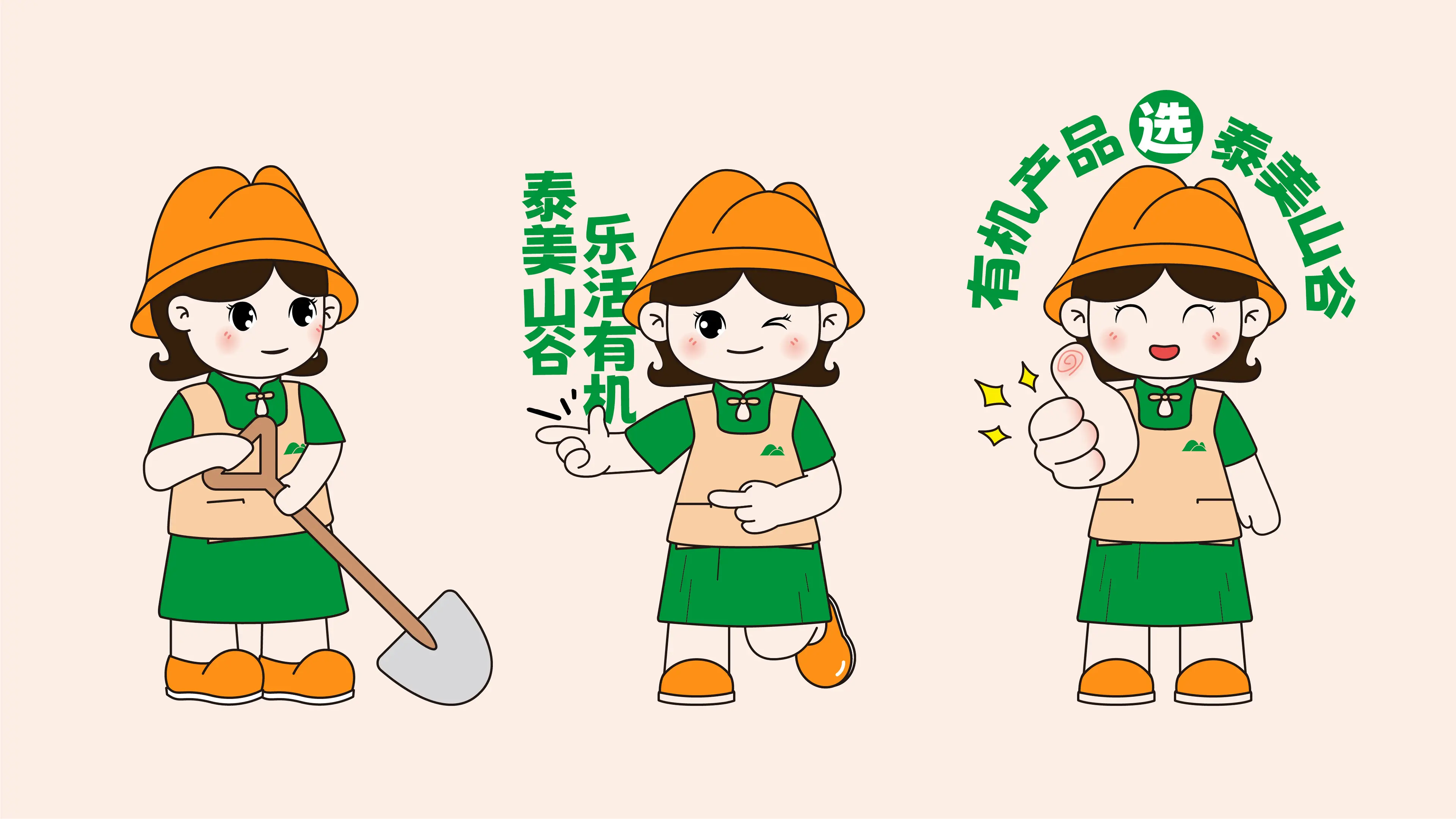
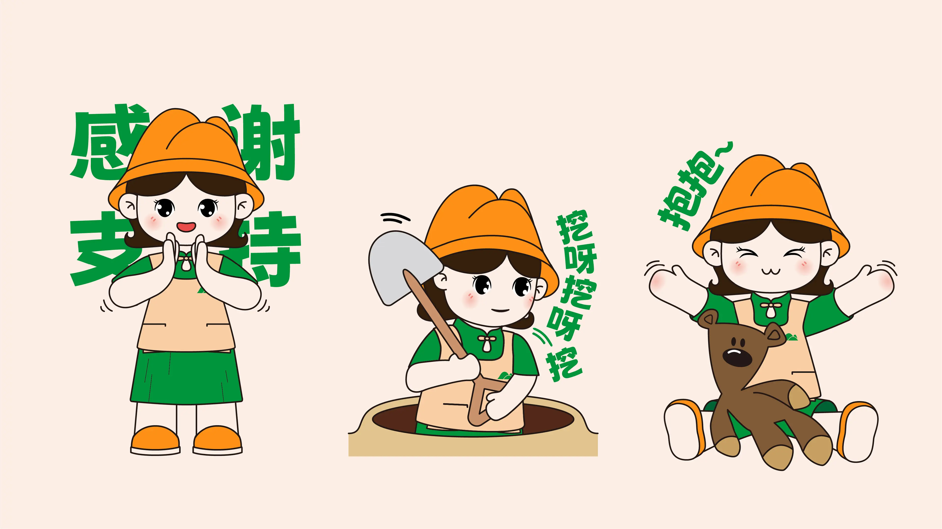
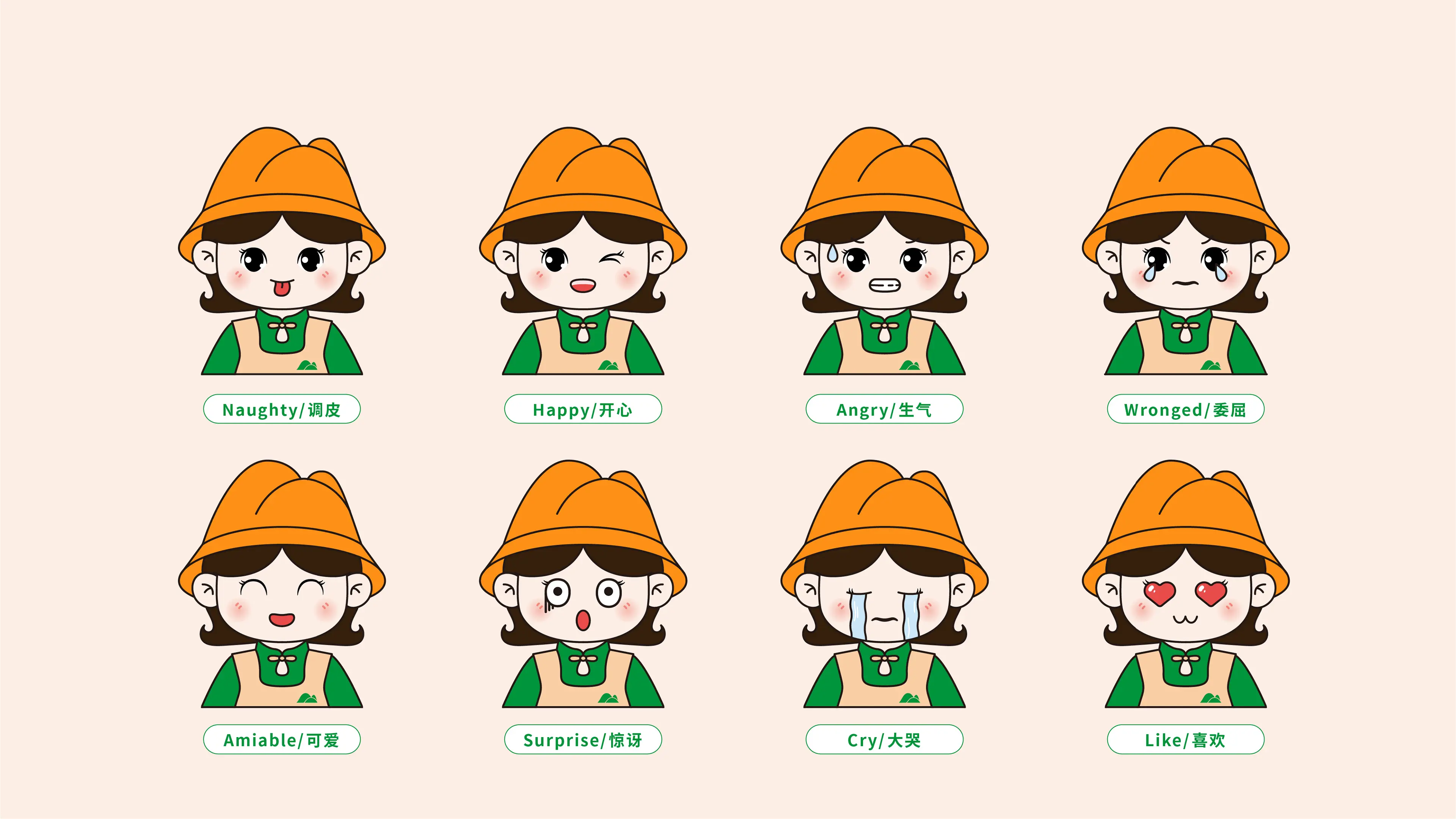
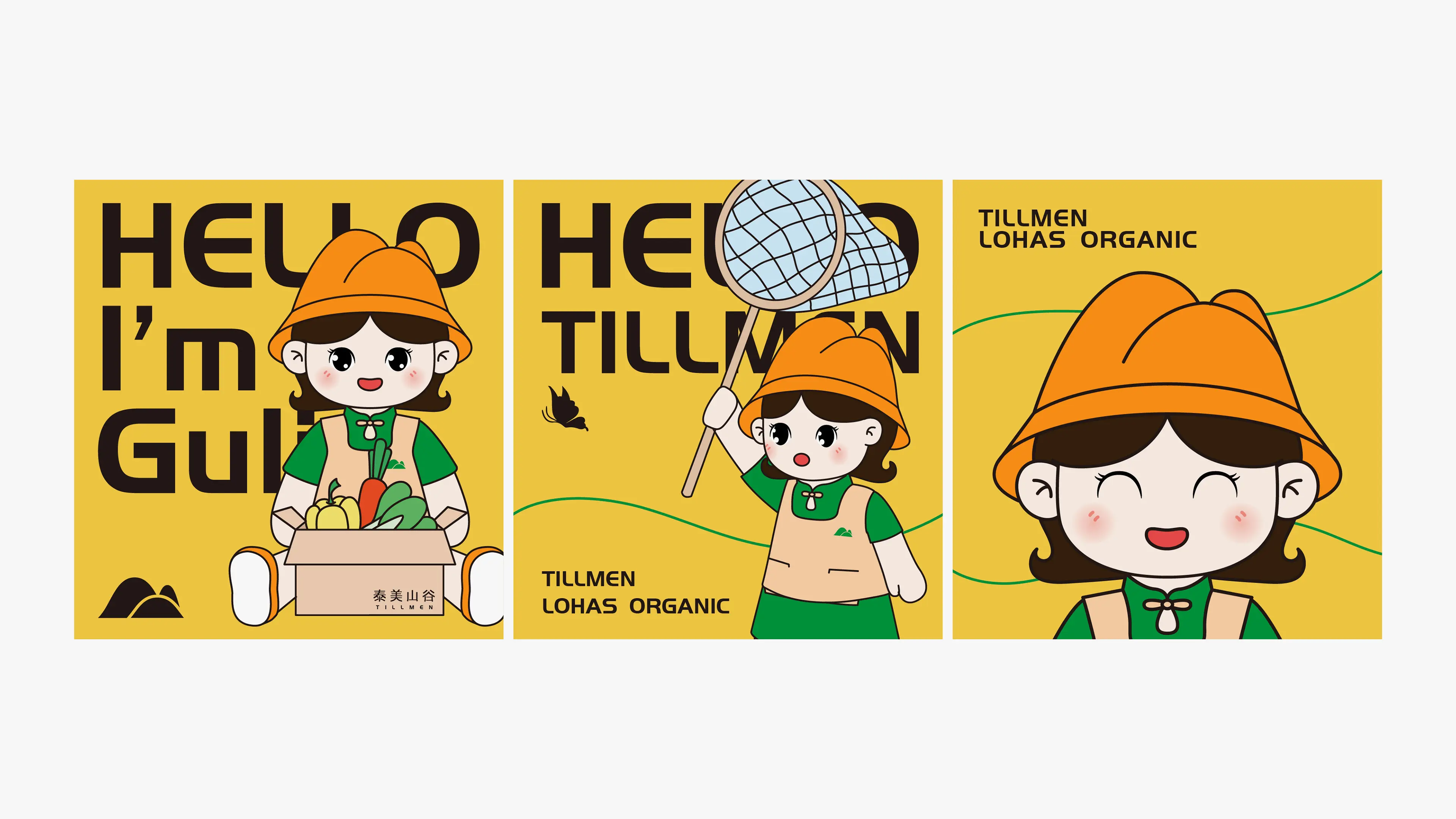
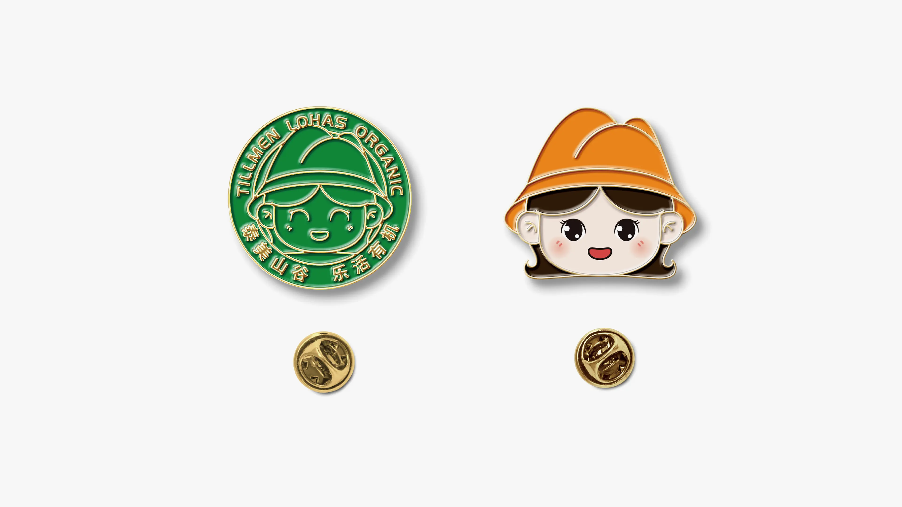
This project involved creating a complete full-case brand design for Tillmen, with services covering the full spectrum including logo design, VI design, IP design, and collateral design.
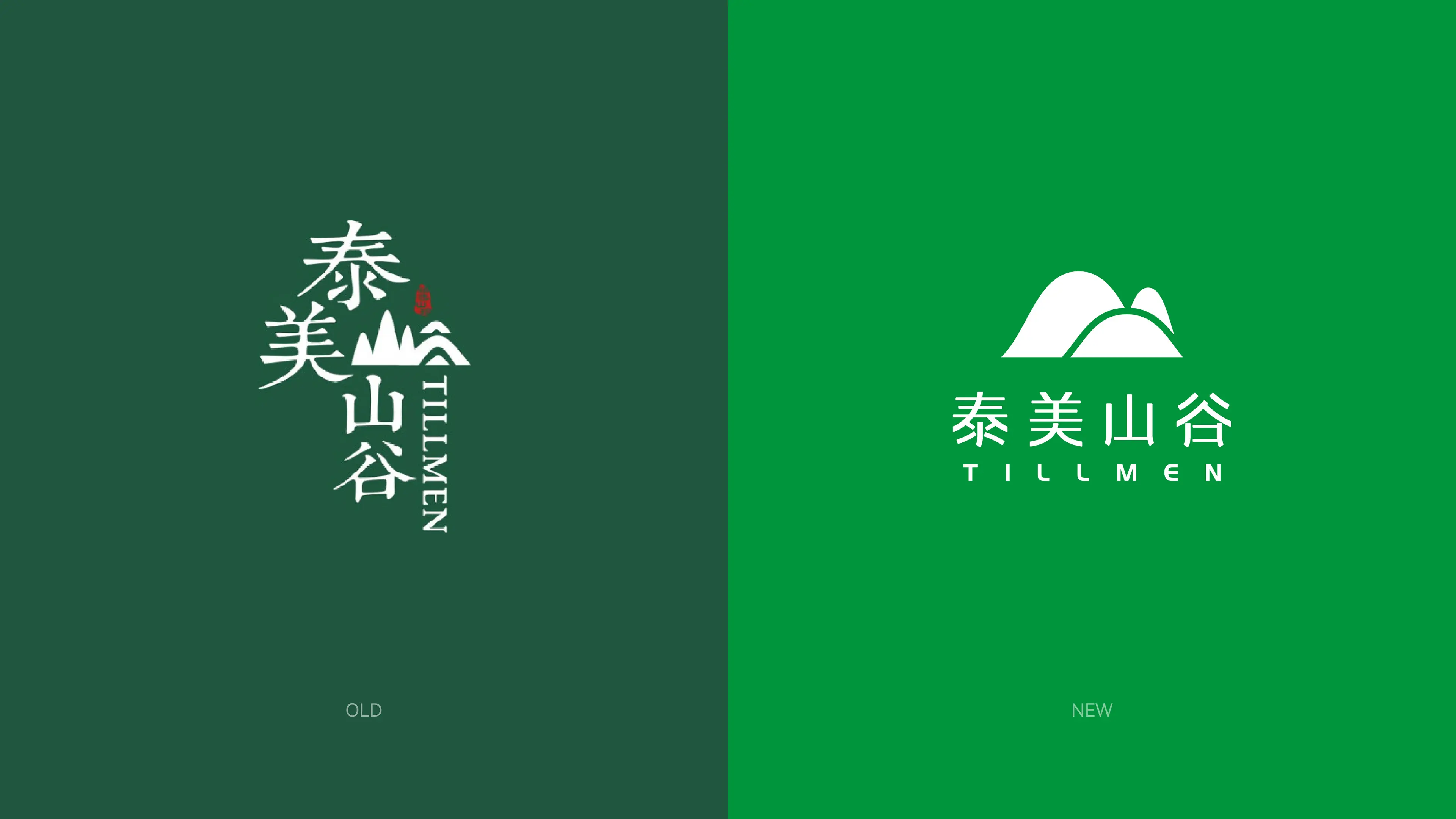
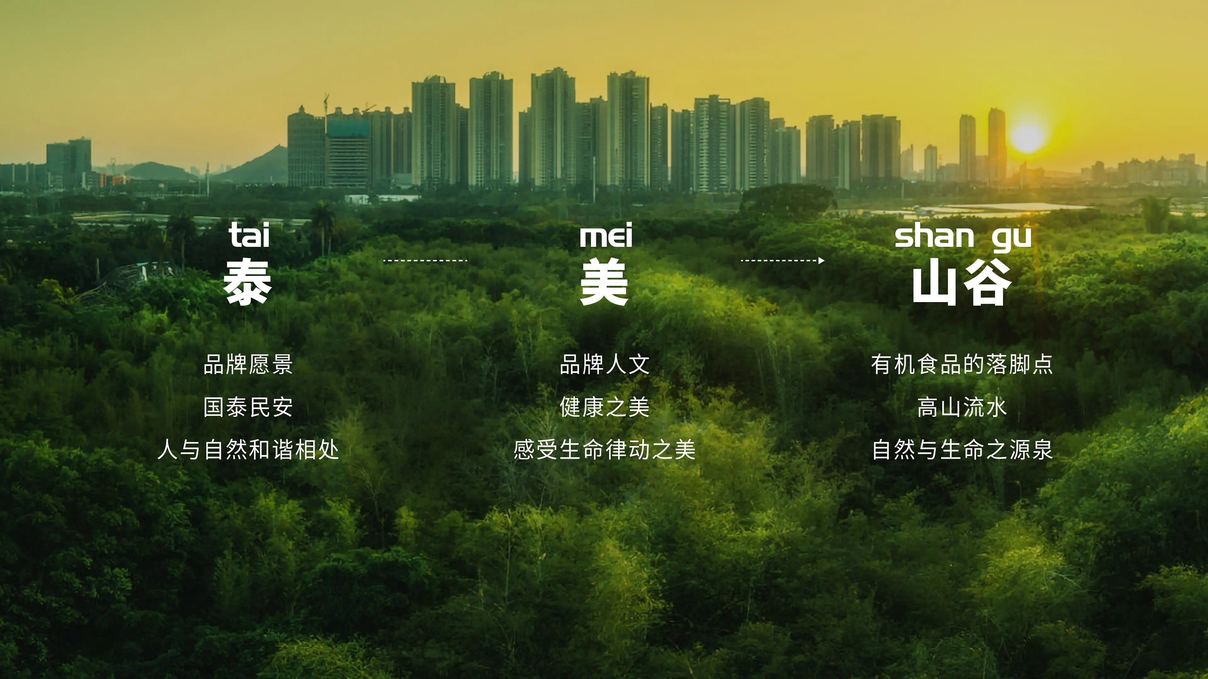
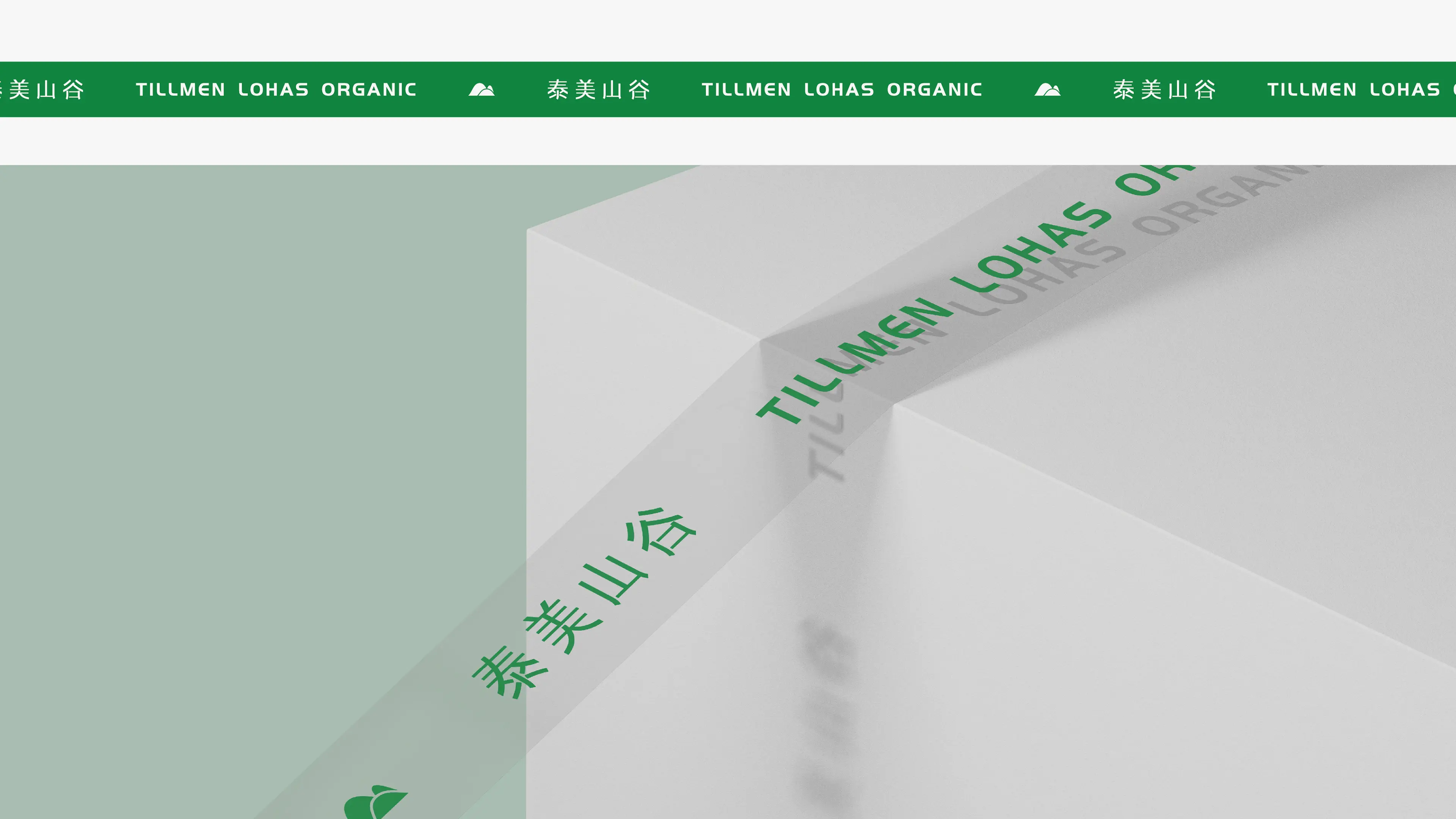
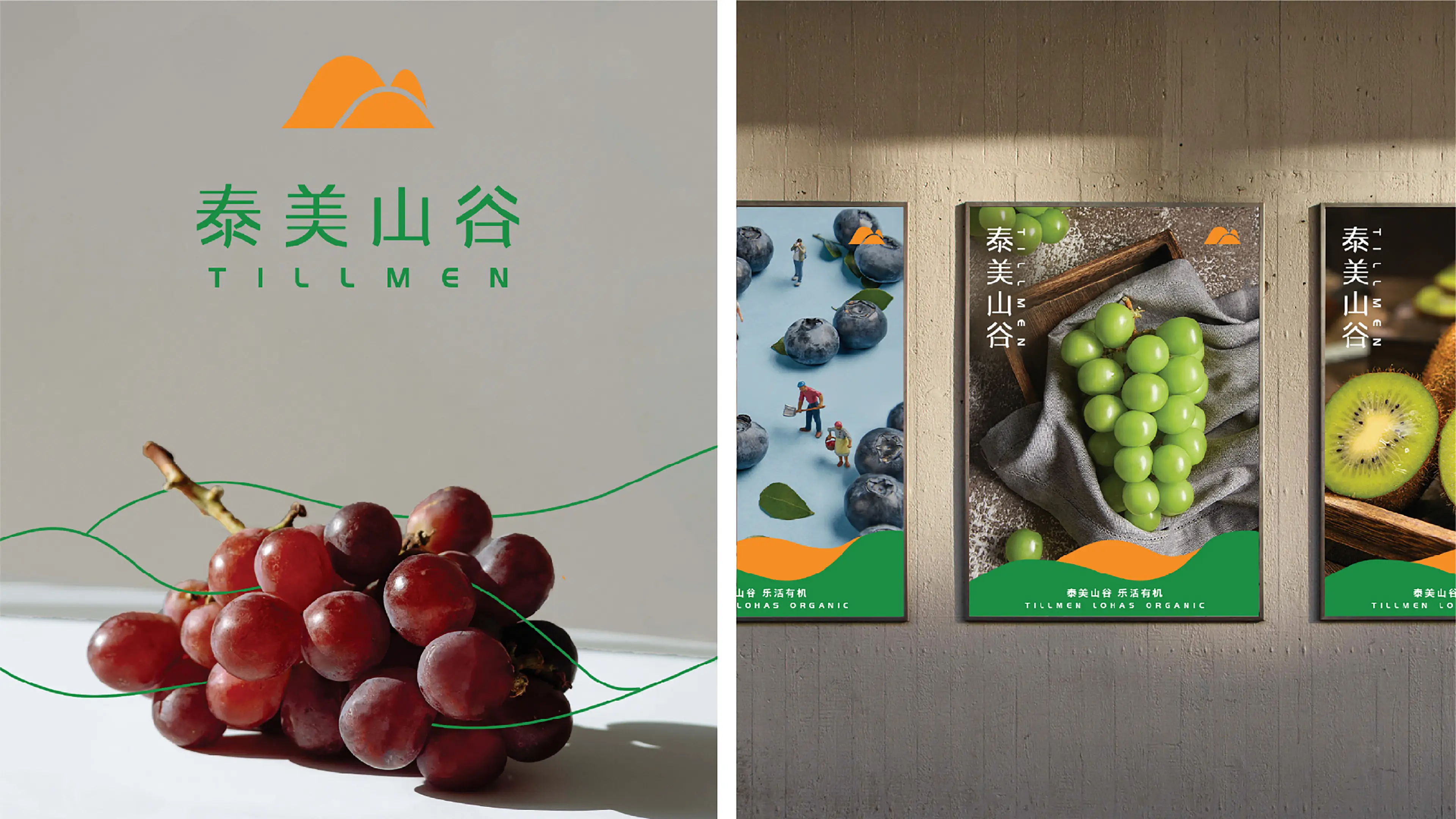
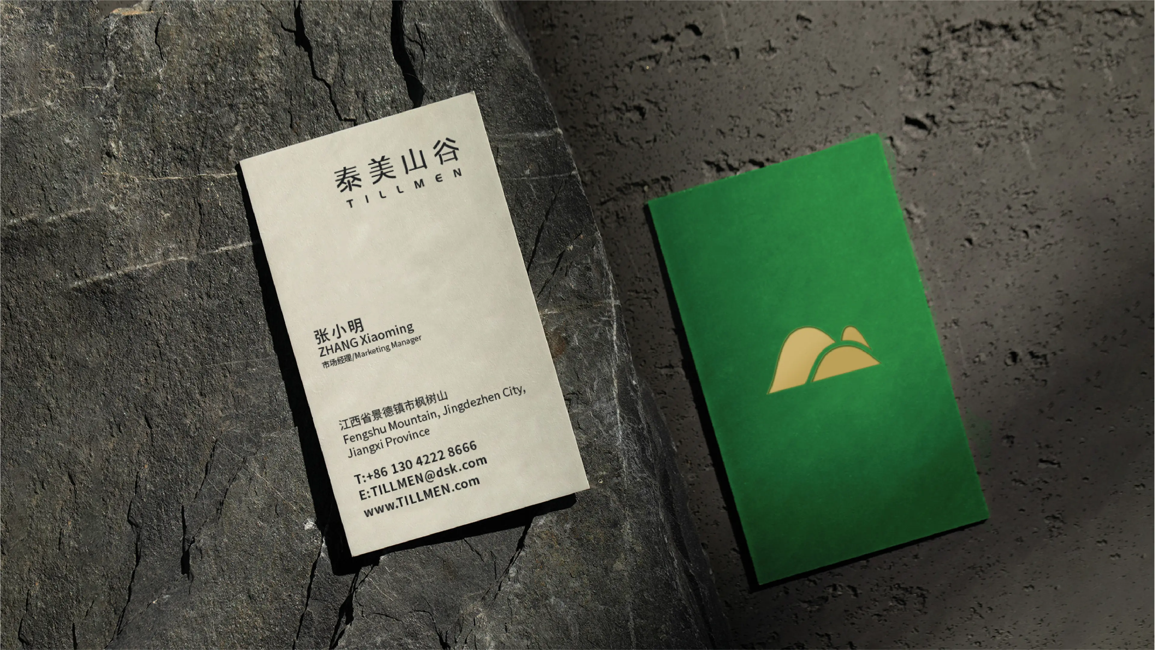
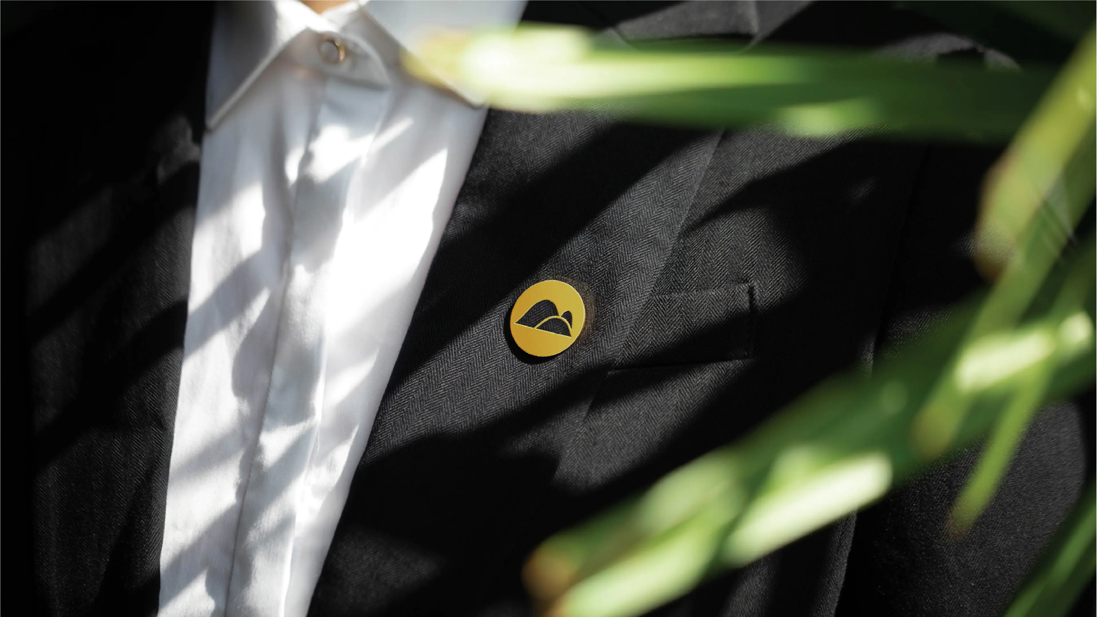
Logo design is the core expression of this brand refresh. Building on the brand's original graphic logo, by refining and simplifying the form of a valley, consumers can intuitively associate it with the brand's attributes. At the same time, this design interprets the brand's three major visions — "Tai: national peace and prosperity, harmony between humanity and nature; Mei: the beauty of health, feeling the beauty of life's rhythm; Valley: where high mountains and flowing water meet, the source of nature and life" — the three are interconnected and integrated as one.
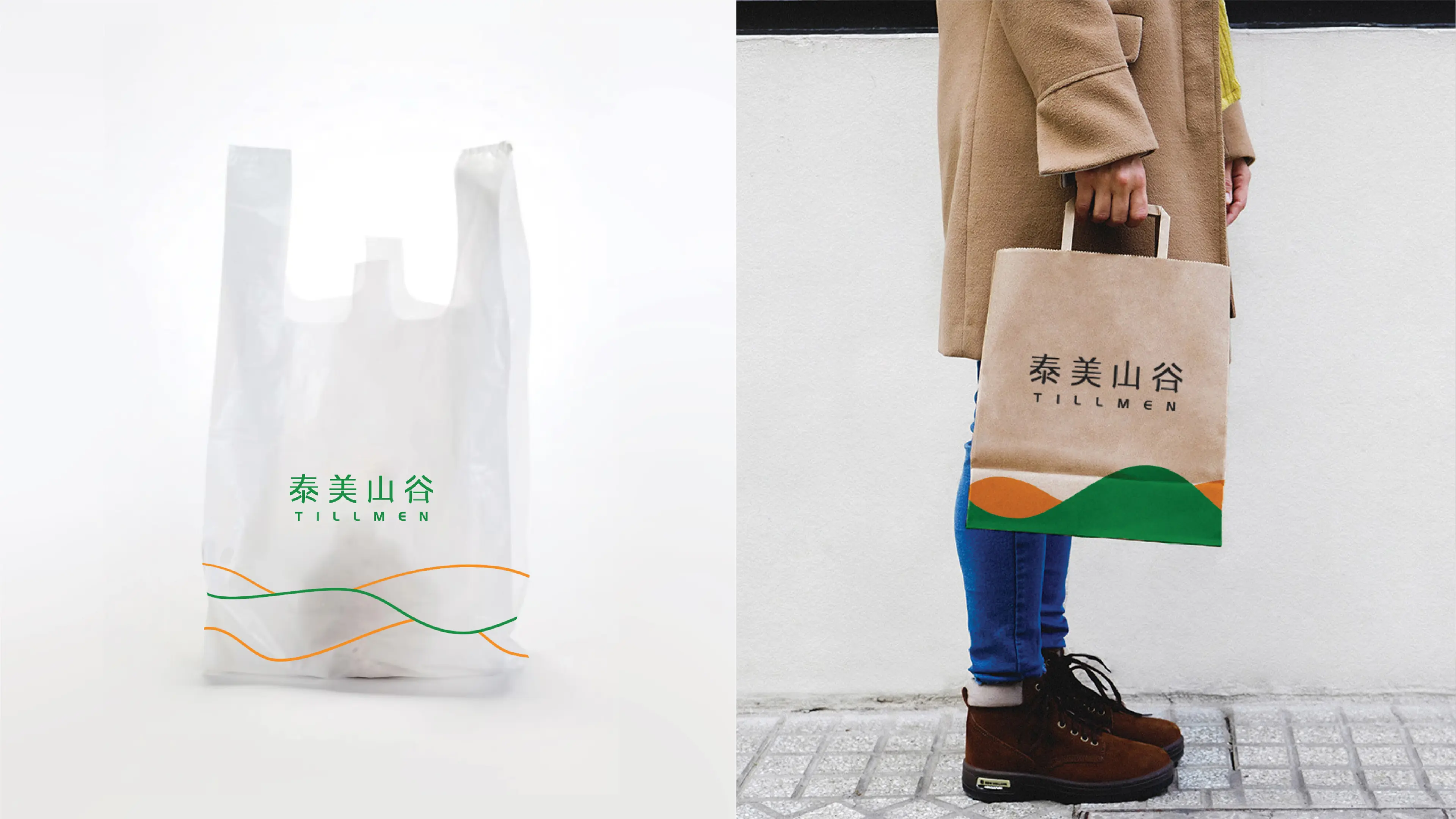
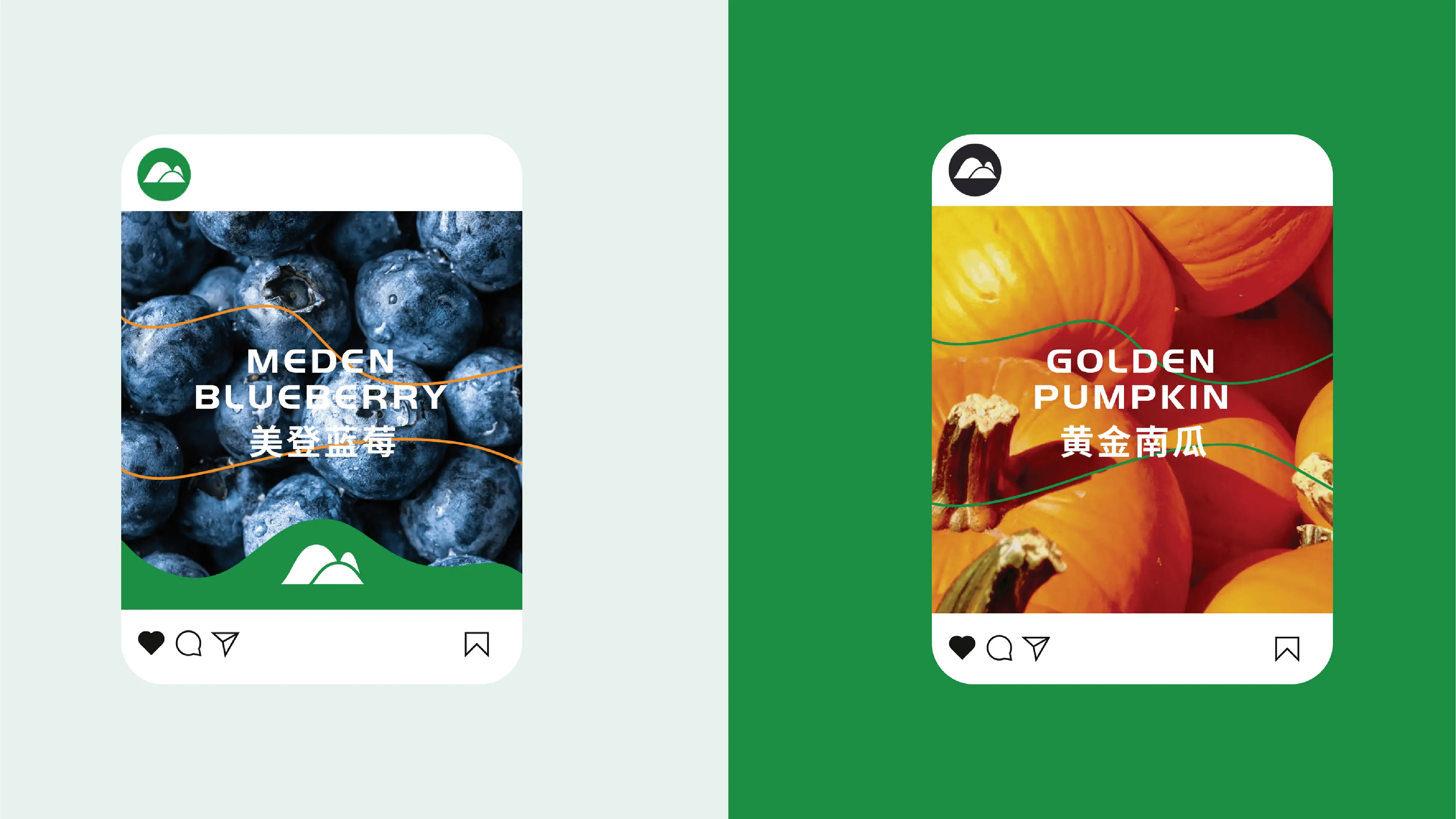
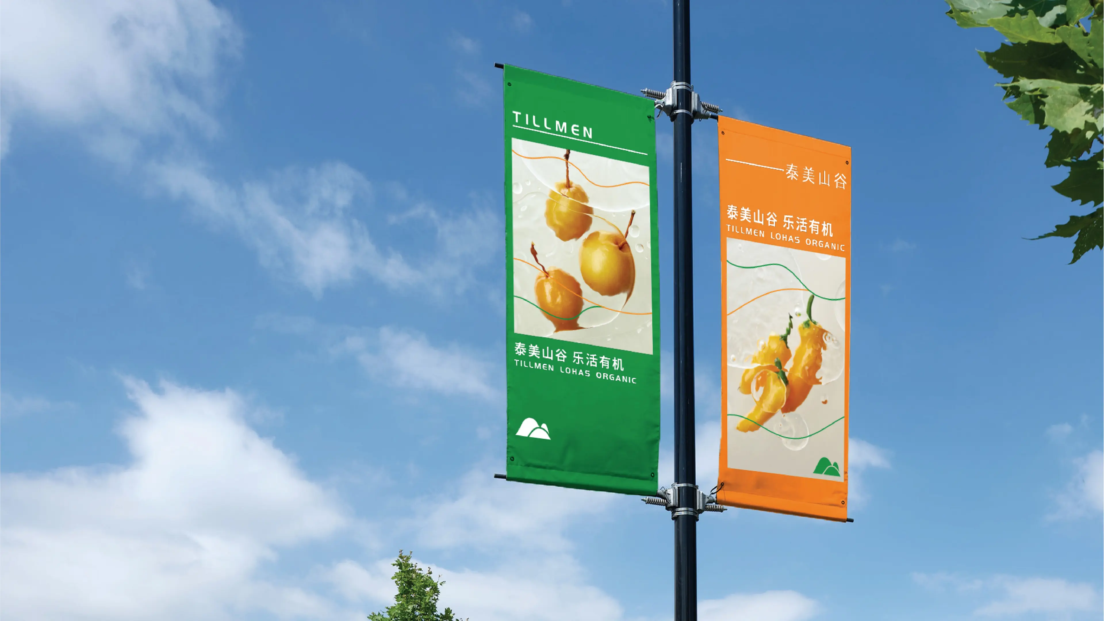
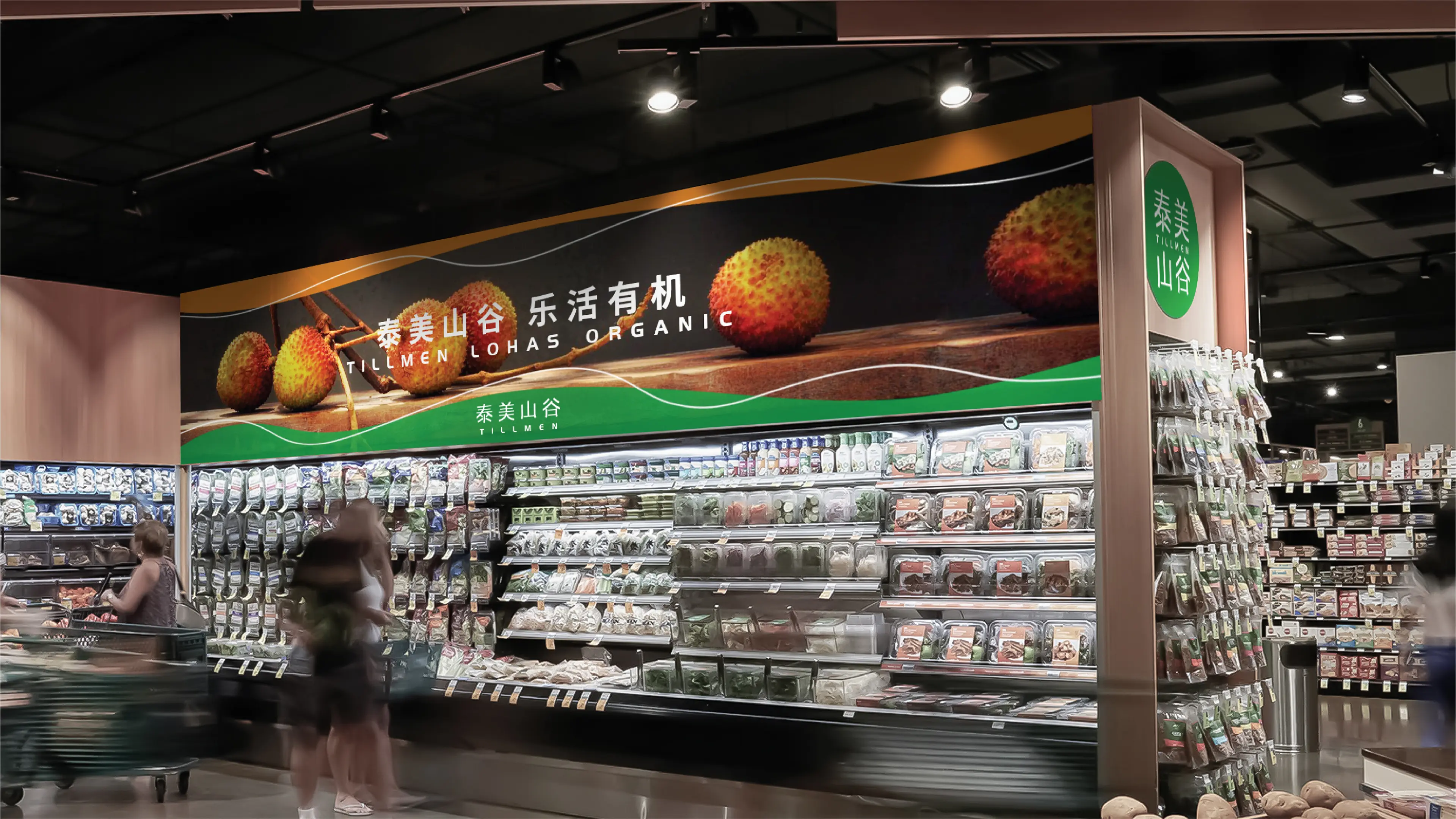
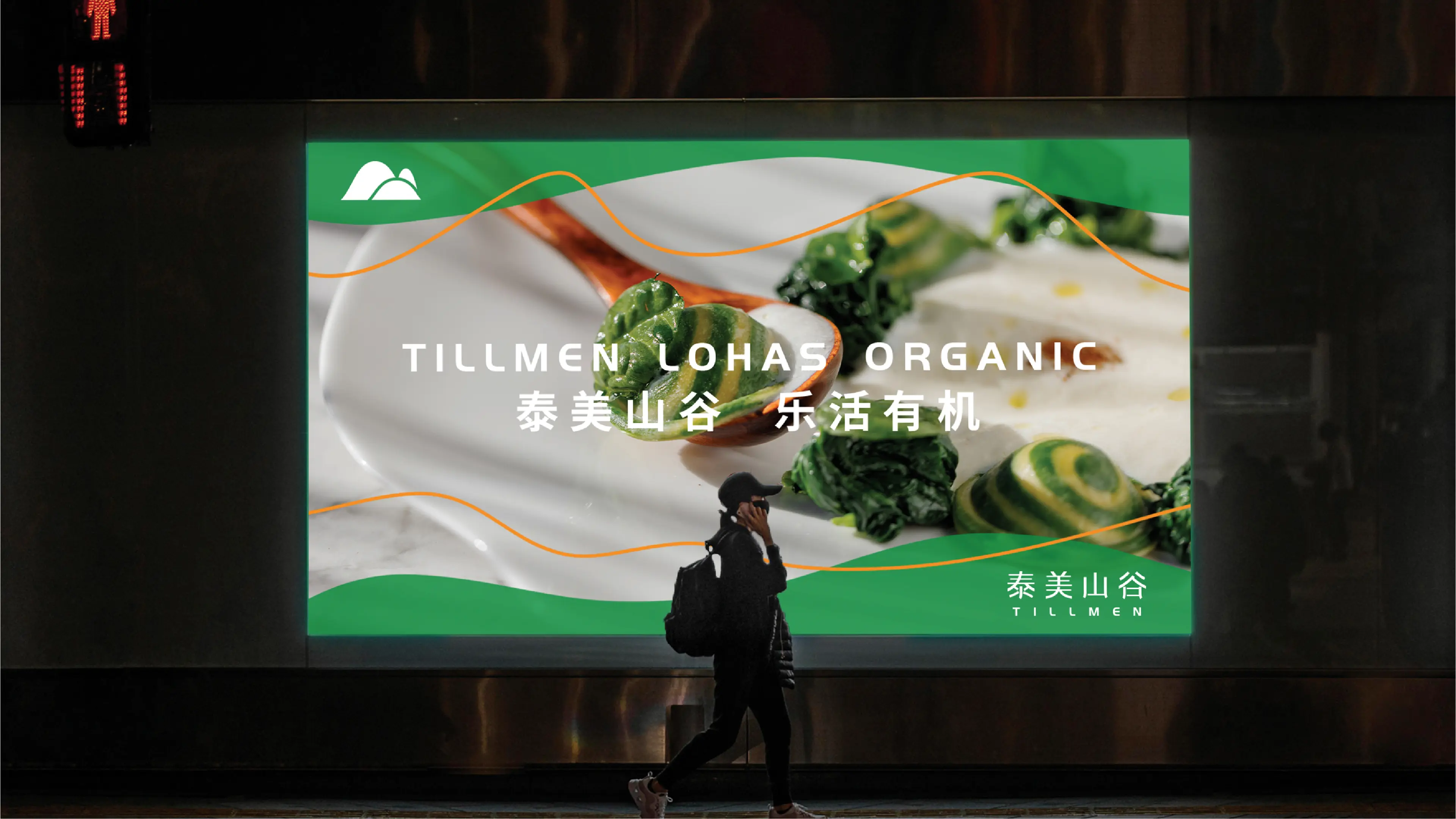
The auxiliary graphics use "curves" as the core element, symbolizing winding mountain peaks, with valleys formed between the peaks. This design not only further interprets the brand logo but also effectively enriches brand communication and strengthens the brand image, enabling it to form distinctly differentiated recognition from competitors.
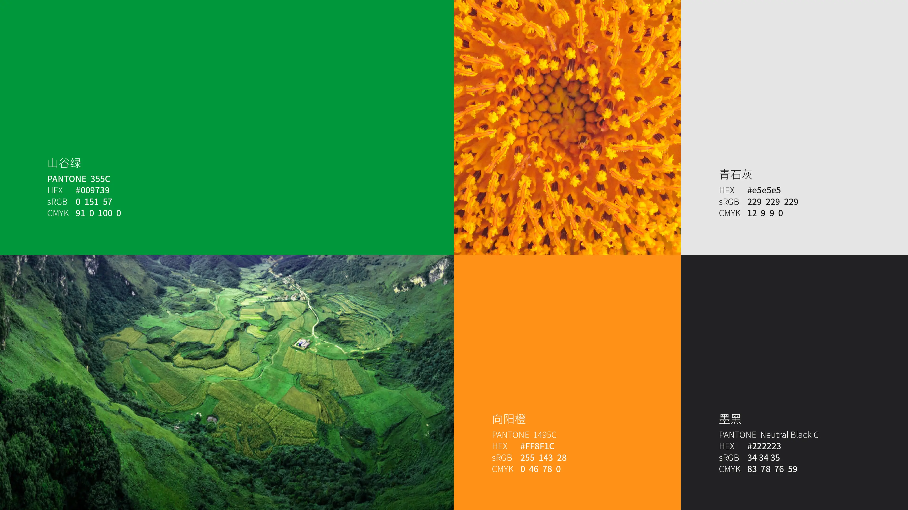
Through this full-case design system combining brand upgrading, recognition efficiency, and organic tonality, Tillmen has successfully upgraded from an agricultural product brand to a one-stop organic lifestyle shopping platform with strong visual recognition, clear brand positioning, and complete brand assets.